Click to enlarge
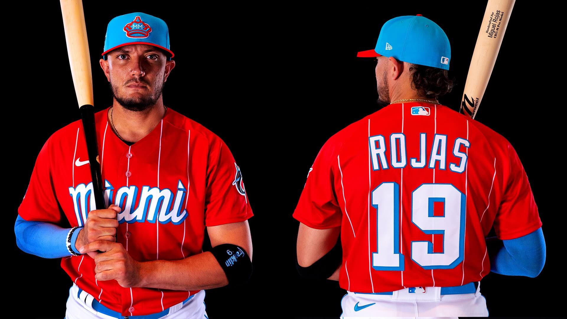
We’ve known for well over a month now that the Marlins’ new “City Connect” alternate uni would be making its own-field debut this Friday, May 21, but we didn’t know when they’d be unveiling the design. We finally got to see it yesterday, as the team unveiled the new uni.
As Nike “storytelling” uniforms go, this is a good one, because they’re actually telling a baseball story. The uniform is a tribute to the Havana Sugar Kings, a Triple-A Reds affiliate that played in Cuba from 1946 through 1960. Miami, of course, has a large Cuban population, many members of which still fondly recall the Sugar Kings.
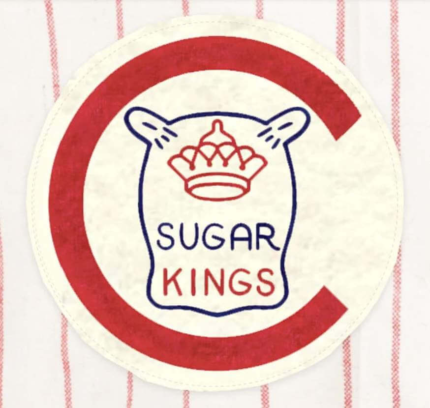
The design is not a straight Sugar Kings throwback (if you want that, Ebbets Field Flannels has you covered for home and road versions) but is inspired by the feel of the Sugar Kings’ old look. For example, the Sugar Kings’ 1959 home uni featured a sleeve patch depicting a sack of sugar with a crown:
The Marlins will have a similar sleeve patch on their new alternate uniform, and the crown is also serving as their new cap logo:
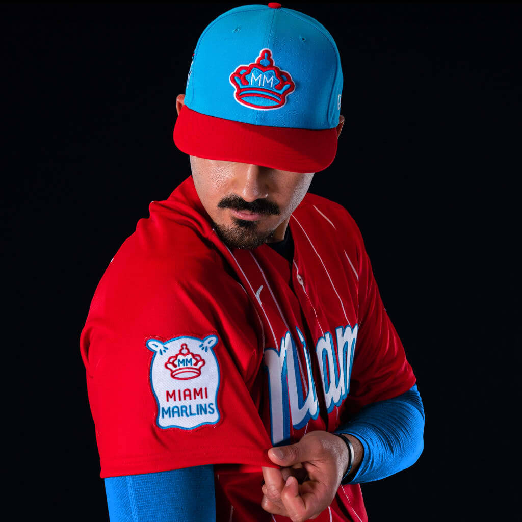
All of the accessories — base-layer shirt, belt, and socks — will be blue, just like the cap:
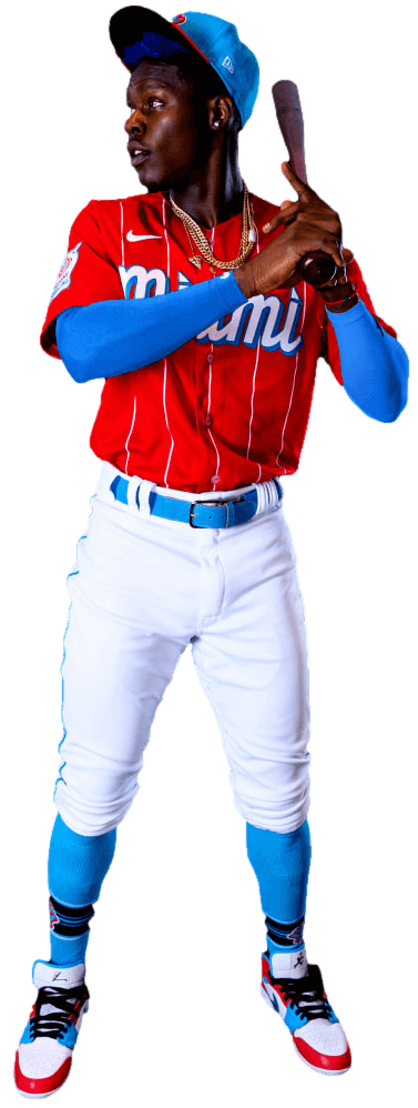
I like this a lot. A few thoughts:
• The Marlins have changed their identity so often and so radically over the years that they of all teams can get away with wearing something that doesn’t resemble their usual look. It’s not like anyone’s wedded to their current visual identity, right? So they’re a much better team for this type of experimentation than the Red Sox were.
• It would’ve been sooooooo easy for them to do the Miami Vice thing, or to find some other excuse to do pink and blue. Kudos to all involved for not going that lazy route.
• On the other hand, the Sugar Kings tie-in is such a perfect fit for the Marlins that you wonder why they didn’t do it sooner. Like, it shouldn’t have taken a uniform deal with Nike to come up with this.
• Speaking of which: Imagine how great Nike’s alternate uniform program could be if they stuck to telling baseball stories (or basketball for the NBA, or football for the NFL, and so on) instead of doing the tourism-bureau thing where they tie themselves into knots coming up with tortured non-sports rationales for bad designs. More of this approach, please.
The Marlins will wear this uniform for all three games of this weekend’s series against the Mets, and then later this season for five more weekend series. You can see all the dates here, and there’s additional info here and here.
Next up: The White Sox’s new Nikefied alternate uni is due to make its on-field debut on June 5, so we’ll presumably see the unveiling either just before or just after Memorial Day. Stay tuned.
Click to enlarge
Collector’s Corner
By Brinke Guthrie
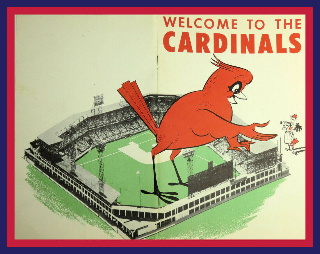
“Welcome to the Big Leagues, young fella!” Check out this 1950s “orientation” booklet from the St. Louis Cardinals. The seller says:
This pamphlet was produced by the St. Louis Cardinals in the early 1950s. A copy was given to all new members of their major and minor league teams, but it is probably geared to the young ballplayer who is just being brought into the farm system. The pamphlet provides information about the ownership, history of the team, members of staff, key personnel, facilities, all-time stars of the team, etc. Lots of great fun information and trivia about the Cardinals.
It looks like the booklet was published in 1954, shortly after the team was purchased by Anheuser-Busch.
The cover has an image of Sportsman’s Park, which became the first Busch Stadium.
Hmmmm. Did other teams publish similar orientation guides?
Now for the rest of this week’s lineup:
• This is a 12″ tall Bobby Orr action figure. Not sure why Hasbro made this in 1993, more than a decade after Orr’s retirement. And did Orr really look at the pre-production prototype and say, “Yep, nailed it! Looks like me!”
• Notice the details of the artwork on this Johnny Bench “Batter Up” swing trainer thing. This is from 1977, but Bench is shown wearing a late 1960s or early-’70s uni, the C-Reds logo is blanked out, and he’s wearing red Adidas with white trim, which the team prohibited.
• Nice artwork on the cover of this 1963 Post Cereal CFL football album, and you get 81 cards with it!
• The Master — that’s Dave Boss, of course — did a 1965 Cleveland Browns painting complete with the ill-fated “CB” logo.
• Herschel Walker of the Dallas Cowboys (before the trade that fleeced the Vikings) was the cover star of this 1987 J.C. Penney NFL catalog.
• Here’s a nice-looking 1950s glass with the New York (baseball) Giants logo.
• You just can’t beat the retro style of these old Chicago Cubs programs with the Otis Shepard artwork, like this this one from a 1971 game against the St. Louis Cardinals.
• This set of three San Francisco 49ers bumper stickers includes their local radio stations at the time, KCBS and KSFO.
• The wives of Green Bay Packers players provided recipes for this 1971 cookbook. How many different brat recipes do you think are in there?
• Pizza chain Four Star Pizza sponsored this 1986 Pittsburgh Pirates bumper sticker: “The New Bucs. We Play Hardball.”
• And finally, in honor of yesterday’s Purple Amnesty Day, this 1960s Minnesota Vikings bobblehead!
The Ticker
By Alex Hider

Baseball News: Former Milwaukee Braves P Lew Burdette was a righty. But — in addition to having his first name spelled wrong — his 1959 Topps card features him posing as a lefty. According to legend, Burdette wore Warren Spahn’s glove for the photo (from Peter Wunsch). … This Athletic piece (hard paywall) about MLB caps incorrectly states that the Orioles currently wear four cap designs, mistakenly noting they wear an all-black cap. In fact, they only regularly wear three caps — a black cap with an orange bill, a cap with a white front panel and the apostrophe catastrophe cap (from Andrew Cosentino). … The Evansville Otters of the independent Frontier League have unveiled their new uniforms (from @MiLBPromos). … Staying in the minors, the Fredericksburg Nationals are wearing “Harambe” jerseys later this month. They honor the gorilla killed at the Cincinnati Zoo in 2016 on what would be his 22nd birthday (also from @MiLBPromos). … The Brooklyn Cyclones, the Mets’ High-A affiliate, will wear gold-trimmed uniforms today (from Benjamin Engle). … In honor of yesterday’s Purp Walk, Al Gruwell noted that Burlington High School in Iowa has two different shades of purple on its softball uniforms. … Oconomowoc, Wis. — the town whose name must surely set the record for most non-consecutive uses of the letter “o” — is building a baseball stadium for a new American Association club. While the stadium isn’t even completed yet, they’re so eager to sell the naming rights that renderings of the stadium include signage that reads, “Naming Rights Ballpark” (from Mike Nessen). … Speaking of naming rights, the minor league ballpark in Gastonia, N.C., has a new name (from Timmy Donahue). … Greg Schwanbeck is having his astronomy students make baseball cards for famous astronomers, spacecraft, or celestial objects. Sounds like a fun project!

Football News: Giants coaches appeared to be wearing the official 2021 training camp caps at the team’s rookie minicamp. The template shows the team’s pants striping running behind the cap logo (from Mark Gonillo). … In honor of yesterday’s Purp Walk, Steve Sayre sent along footage of the famous 1964 Vikings/Cowboys game where the Vikes went mono-purple due to a uniform mixup. … Steelers rookie P Pressley Harvin III wears one glove on the field — but that glove switches hands depending on whether he’s punting or holding an extra point (from @asa_m_d). … In a photo posted to Instagram, Rams QB Matt Stafford was wearing a sweatband with a zipper on it — likely a wristband that houses an Apple Watch or another piece of wearable tech (from @zachwatts_). … Iroquois High School in New York is pairing gradient jerseys with a unique pants design this season (from Michael Blake Raymer). … Broncos rookie OL Quinn Meinerz hasn’t even played a game yet, but he’s already becoming a folk hero for hiking up his practice jersey and “letting his belly breathe” (from Trevor Williams).

Hockey News: Canucks G Braden Holtby was wearing the wrong breezers last night — he had stripes, but the rest of the team went sans stripes (from @NhlUni). … The Utica Comets are switching affiliations from the Canucks to the Devils and are changing their color scheme to match (from Jason Hutchins). … Check out this photo of Phil Collins wearing a North Stars sweater (T-shirt?) back in the day (from Michael Cooperman). … A new study has determined that the Maple Leafs’ logo is the basis for the most tattoos of any team logo in North America (from Ted Arnold).

Soccer News: Well, that didn’t take long: After harsh fan backlash, the Columbus Crew’s ownership has agreed to restore “Crew” to the team’s name and make other adjustments to the team’s recently announced rebranding. … A new website lets customers verify the authenticity of the soccer jerseys they’ve purchased (from Trevor Williams). … PSG midfielder Julián Draxler signed a contract extension yesterday that keeps him with the team until 2024, so the team gave him a No. 2024 jersey to celebrate (from our own Anthony Emerson). … English Championship club Blackburn Rovers is switching its uniform manufacturer from Umbro to Macron (from Ed Zelaski). … New home kit for Juventus (from @TwoSeamGripe). … From our own Jamie Rathjen: “English club Queens Park Rangers got Kiyan Prince, a 15-year-old player who was stabbed to death 15 years ago today, added to the FIFA video game. EA, QPR, Prince’s dad, and others basically imagined what player he would be like as a 30-year-old, and had him wear No. 30.”
Olympics News: The Serbian men’s national volleyball team has unveiled their look for 2021 (from Jeremy Brahm). … Australia has unveiled the uniforms they’ll be wearing during the opening and closing ceremonies at the Tokyo games (from Phil).

Grab Bag: British collegiate rivals Cambridge and Oxford played each other in men’s and women’s field hockey over the weekend. A Cambridge sports Twitter account seized on the fact that Oxford players weren’t wearing sleeves as a way to mock their rivals (from our own Jamie Rathjen). … In yesterday’s Ticker, we noted that McLaren’s Formula One team will use a one-off livery during next week’s race. Cameron McKinley sends along a piece that explains how the circuit came to adopt rules that allow for one-off paint schemes. … New indigenous jersey for Wests Tigers of the Australian National Rugby League (from @altimetr). … Musician Jake Trego was diagnosed with cancer a few months ago and has been collecting baseball caps and sharing them on social media. His tweets have inspired other social media users, and some teams, to send him caps of their own. On Sunday, he shared an update on the recent additions to his collection. … The remaining submissions are from Kary Klismet: New uniforms for South Korea’s navy. … Evangel University, an NAIA school in Missouri, is seeking public recommendations for a new team name after moving away from Crusaders. … The Brisbane Lions of the Australian Football League broken ground on a new stadium that will be the new home of the club’s women’s team and the training facility for the men’s team.
My thanks to everyone who helped make yesterday’s Purp Walk so much fun! We received 29 membership orders, including one from Patrick Reed, who was randomly selected from yesterday’s enrollees to receive his card in a purple-trimmed flannel card-holder pocket made by the great Wafflebored. Congrats, Patrick! — Paul
I like what the Marlins did, but to say that having a Vice jersey is a bit lazy is a stretch. Vice is Miami. It is the history of Miami during a permanent cultural shift of the city and the area. I still think the Marlins need to go back to the original “Florida Marlins”. The Florida Marlins was a unifying identity for the whole community. The Heat Vice gear is far and away the highest selling gear in the NBA.
It would be lazy for the Marlins to do it because the Heat already spent the past several years milking that trope.
I am not from the area, but I always thought Florida Marlins wasn’t very good, especially once the Rays came around. State designations work when you only really have one major metro area in said state that would host a major league team, obviously that isn’t the case in Florida.
I think the switch to Miami actually creates more pride in their home city and Miami metro area. But with regard to their uniform design, yes, I agree going back to the original, or something incredible close would be the best option. They even had an M batting practice cap logo from that era they could have easily made the primary cap logo.
Allowing the Colorado Rockies and Florida Marlins instead of teams representing Denver and Miami was the most egregious mistake Bud Selig ever made since the National League had always been purely a city team league. I will never forgive him.
In retrospect, it was kind of the beginning of the end for the NL as now we are looking at having the disgusting DH full time as well. So sad for such a great league.
Fair point, but I think we can look to Ford Frick for uncapping the bottle and allowing the genie to escape. When Washington moved to Minneapolis, the team should have been called the Minneapolis (or MSP, if you want to give the Twin Cities equal billing) Twins. MLB (pre-Selig, again, this time with Bowie Kuhn at the helm) then repeated this with the second Washington team moving to Arlington, but allowing them to be called “Texas”.
Now, you could argue that “Twins” represents the “Twin Cities” and hence, MSP was superfluous, and “Texas Rangers” worked well at the time in referencing the law agency.
But the practice of allowing a team to be named for a “state” rather than a “city” predates the Rockies & Marlins.
You are certainly correct that these two teams were the first NL teams to have state, rather than city monikers, but I’d argue that ship had already sailed in the AL, and the NL was simply playing catch up. YMMV.
When Washington moved to Minneapolis, the team should have been called the Minneapolis (or MSP, if you want to give the Twin Cities equal billing) Twins
There’s NO way back in the day that “MSP” would’ve been used. Besides, if you’re not going with a state designation, they should’ve been called the Bloomington Twins…just like your Giants should be called East Rutherford if not New Jersey. ;)
Allowing the Colorado Rockies and Florida Marlins instead of teams representing Denver and Miami was the most egregious mistake Bud Selig ever made
The ’94 strike/lockout and allowing Every. Single. Player. to wear a league-wide retired number are more than a tad higher on his list of missteps…
“Allowing the Colorado Rockies and Florida Marlins instead of teams representing Denver and Miami was the most egregious mistake Bud Selig ever made”
One point of clarification and one quick rebuttal from a Rockies fan (nominally, at least, considering the ownership’s near-criminal efforts to dismantle the team and obliterate the last vestiges of goodwill with the fans).
First, for all of Selig’s shortcomings as commissioner, you can’t blame the names of the Florida Marlins and Colorado Rockies on him. The expansion committee that selected those bids did so in June of 1991, which occurred under Fay Vincent’s watch. Both teams had their names and identities in place that same year (the Rockies, in particular, pretty much immediately after the announcement that they’d been awarded the franchise).
Secondly, speaking as a Denver resident and longtime fan of virtually all the professional sports teams here, I can tell you that local sports fans definitely feel their teams represent not only the city of Denver, but, in turn, the sate of Colorado, the Rocky Mountain region, and in some ways, an the entire Mountain Time Zone (with all due respect those comparative late-comers in Utah). As a region that was long underserved by major leagues before the arrival of the Denver Broncos (and underserved any longer than that for baseball fans), the Denver teams have long drawn support from far beyond the Denver metro area – and have often cultivated that support. So it feels appropriate, at least to us locals, for the baseball team to have the state’s name attached to it. And let’s face it, “Colorado Rockies” sounds better than “Denver Rockies.”
So I guess the California Angels were bad? The Minnesota Twins are bad? The Texas Rangers are bad?
I Still Call Them The California Angels
I think the Vice thing is for sure the Heat’s deal and copying it is lame, particularly when you consider that the Vice thing is already borrowing someone else’s idea, and the Marlins’ current look is sort of a halfway attempt to copy it anyway. Miami and south Florida have so much culture and lots of it has a similar level of brightly colored, unique graphic elements to draw from. Including the Caribbean, Latino, and Art Deco influences. Besides, while heat and Vice are actual specific things, they can both be used sort of ambiguously to refer to the sultry, sexy, no rules fun that Miami is known for. A marlin is a fish.
Typo: were should be wear in the O’s hat item.
Fixed.
Oops. “. . . whose first priority isn’t sports.
I screwed up.
Jeez, I screwed up again and corrected the wrong post.
I blame it on decaf.
I don’t care about soccer, but congrats to the Crew fans for telling the Haslams to take their marketing b.s. and shove it.
Of course, the Crew front office didn’t have enough humility to admit that they screwed this up royally. Instead they issued this corporate-speak pap: “This evening, a positive, collaborative discussion took place between Crew investor-operators, front office executives and a diverse group from the Crew community regarding the future of the Club’s brand and the Club’s commitment to its supporter community.” Blah blah blah blah blahbetty blah blah. (What the hell are “investor-operators”?)
This is what happens when sports are run by people whose first priority is sports.
Nice going, Columbus fans!
Oops. “. . . whose first priority isn’t sports.
(Thanks for the save, Paul.)
My dude in the 4th Marlins photo had his shoelaces photoshopped out!
If I put aside my dislike for alternate uniforms as well as for colored tops in baseball, I have to agree with Paul that the Marlins’ set here is great.
100% agree with Paul’s assessment that these alternates actually have value if they tell a baseball story instead of just some city related nonsense. And in that regard I can sort of get behind something like this, especially since baseball plays so many games that a series or two of an alternate design does not dilute the teams visual identity. However that last bit is sort of conditional on the team not already having multiple alternate designs, which unfortunately isn’t the case throughout baseball.
I agree that, done properly, this will be a gorgeous jersey, but I’m seeing varying pictures of how the pinstripes will fit in to the Nike tailoring template. There are shots of the jersey laying flat and the Nike tapered side panels are not striped and it makes the whole thing look cheap and really diminishes the overall design, but I’ve seen plenty of images where the stripes seem to go all the way around. Here’s hoping it’s the latter, and not just for retail versions. Not only is this a great homage but the color scheme is essentially the Marlins current colors. They could tweak the logos and make this a regular part of the rotation.
Comparing the original sugar kings uni to this one now I wish the pinstripes on the Marlins uni were more traditional (ie closer together) and were also on the sleeves. I also am not a fan of the socks. Something more traditional would have fit the look better. Maybe just simple red stripes at the top. Of the sock.
If people look hard enough, there are plenty of pictures of the band Genesis wearing the hockey sweaters of various teams..
Proofreading: “THAT Marlins will have a similar sleeve patch” should be “THE Marlins,” I think.
Yup. Fixed.
The Orr action figure in the Collector’s Corner is from 1998. Mid to late 1990s, Hasbro did a series of 12” figures, mostly baseball, about half current and half former players. Likenesses were hit or miss, but for the most part the uniforms were terrific. I picked up a Nomar figure, disassembled the uniform with a seam ripper, and used the parts to make a pattern to sew a custom uniform for my fantasy team.
That sounds amazing! Please, please, please share that with Uni Watch!
(My original comment was supposed to go here, so now I’m putting it here.)
That sounds amazing! Please, please, please share that with Uni Watch!
The new Marlins uni idea way better than what they are currently wearing. Go back to the original Marlins uni it adopt this one and get rid of their current rubbish.
here’s the browns Training Camp cap
link
comes in form of a visor too
link
All of these City Connect uniforms are getting an F from me unless a team comes out with something that isn’t a softball jersey. These are nothing but glorified minor league uniforms; minor league teams already run out several different theme uniforms annually, and now MLB appears poised to do the same thing.
The Sugar Kings literally were a minor league team.
So were the San Diego Padres.
I feel the Marlins did a great job with this uniform, and I agree with John these are better than their current look, but I feel the same way about all these alternates across all sports and the amount of them coming out cheapens the feeling they’re trying to put across.
I absolutely love the City Connect uniforms so far.
I can’t wait to see what Nike dreams up for the Yankees I hope they are bold and agressive.
“I felt a great disturbance in the Force. As if millions of voices cried out in terror, and were suddenly silenced. I fear something terrible has happened.”
And I’m a Yankees hater…
That it hasn’t been covered here it that the game exists? As a forever reader, I’m guessing it was covered but I’m just not recalling it.
Evidence at the 6:07 mark: link
“Check out this photo of Phil Collins wearing a North Stars sweater (T-shirt?) back in the day (from Michael Cooperman).”
He wore the North Stars sweater during Genesis’ video – or a semblance of one in pre-MTV – for “Ripples.” The album, “A Trick of the Tail,” was released in 1976. Clip: link
Tony Bank wears a Canucks jersey in the “Follow You Follow Me” video: link
And the whole band appears to be wearing Cowboys jerseys in this concert footage from Dallas: link
*Tony Banks
Glenn Frey of the Eagles wearing a Blackhawks jersey
link
From a webpage of Eagles in sporting attire:
link
Those are sharp.
While red/blue overall is overdone, red and that medium blue (darker than powder) is not, and it’s a combo I very much like.
Thanks Paul! Glad that I finally got my act together and did the Purp Walk this year. And thanks to Wafflebored for his outstanding creation!
The link for the Vikings mono-purple game actually takes us to the 1964 Detroit Lions highlight video.
Interestingly enough, one of the Lions-Vikings games in that video is a white-on-white game. Not sure if we’ve heard the history behind that one.
You’re kidding, right?
Do’h! It started white-on-white, then the Vikes changed jerseys, didn’t they? I guess I needed to watch a little longer.
Joel, if you want a refresher, this video provides some decent coverage of the white-on-white game between the Lions and the Vikings that then became the mono-purple game:
link
Adolescent snarkiness of the host aside, the substantive content is solid enough and the information is accurate.
The Vikings’ mono-purple portion of the video starts at the 7:02 mark:
link
Yeah – the video wasn’t cued up, but once the 64 uni highlights begin, many of us may forget what we were expecting!
The white-on-white part starts at 6:01 with the announcer noting, “Confusion reigns…”
I imagine that wristband Matt Stafford is wearing in the ticker houses the contact tracing device they used last year.
‘I still call it Naming Rights Ballpark”
Reminds me of the sample jerseys that have “Your Name” as the NOB (which I’d rather wear than a jersey with an actual NOB).
They Should Call It “Your Name” Ballpark.
Been a daily reader for years. Thanks for all the content! Today’s entry is a perfect example of uni-watch excellence. The lead story mixes history, aesthetic commentary, and suggestions for inspiration across the uni-verse. Great work!! Never heard of the Havana Sugar Kings before (unreal name—love it!). Love the wider pin stripes and the perfect contrast with red and light blue. And I love the suggestion that baseball teams can tell baseball stories with their alternates.
For something we all consume for a few minutes each day, I’m consistently impressed with the opening story at uni-watch. Today was perfection.
Thanks, Liam!
Seconded! Nicely stated, Liam. And well done, as always, Paul!
It would seem that no one from Iriquois High School bothered to check the NFHS rules before ordering those jerseys as they are illegal. Gradients aren’t allowed on football jerseys.
According to Rules 1-5-1b(2) & 1-5-1b(3), except for certain parts of the jersey (numbers, decorative stripe, within the collar, side seam), jerseys must be solid white (visiting team) or solid dark (home team).
link
“There are no rules in this place. Anything goes. It’s Thunderdome!”
It would be nice if officials enforced the rules, but….
link
As a high school official in North Carolina, when we have a team with jerseys that don’t conform to the rules, we will still play the game…BUT we will notify the state office. We’re not going to cancel a game because of gradients on the jerseys (even though, on principle alone, we should!)
Honestly, the Marlins should just adopt that color scheme instead of what they have now. That’s so much more Miami than the black and neon mess they currently wear. Those unis are beautiful.
Either stay with the Sugar Kings look (but Respect The Placket, swooshketeers) or go back to the original teal-heavy Florida Marlins uni. Everything in between has been a disaster.
It really is a great color scheme. Shadow numbers are a nice touch as well. Would love to see how this looks as a white uniform.
It’s pretty close to what they have now if they drop the black & it’s a TON of black.
regarding the St Louis Cardinals orientation booklet that was mentioned in Collector’s Corner, the Dallas Cowboys also did one back in the 1960’s
Greg Schwanbeck is having his astronomy students make baseball cards for famous astronomers, spacecraft, or celestial objects
Genius.
I would
loveLOVE a set of astronaut trading cards. If this isn’t already a thing, someone make it so!There’s at least one set that I’m aware of.
link
The one thing I don’t love about that Marlins uniform is the color scheme. MLB is not, at the moment, lacking for teams that wear red, white, and blue. Swap the red for literally any color other than black or gray, then slap a non-black, non-color-on-color Marlins M logo on the cap, and I’m all in. The distinctive stripe pattern is my favorite element; that seems like an obvious element to incorporate into all Marlins jerseys right now.
And if the Marlins don’t do this, well, we’ll have a good start on a future uniform for the expansion Havana Cohetes.
MLB is not, at the moment, lacking for teams that wear red, white, and blue.
Yeah, but not *that* shade of blue.
As Señor Chang said in “Community,” “I’ll allow it!”
Based on the pictures provided I like everything that the Marlins’ city uniforms offer, the colors, cap logo, drop shadows and sleeve patch. A+
Hopefully these become their permanents. Beautiful.
Looks like #21 on the Serbian Volleyball team has an upside-down “2”…
Definitely
I like! I’m surprised that the Marlins didn’t do this sooner as well! Maybe it was Sugar Kings’ affiliation with the Reds that delayed the homage to the team by the Marlins. Name/identity rights and whatnot.
The Nationals “Harambe” jersey would make for a fantastic membership card
Outside of the metropolitan Cincinnati area, the fact that this is still being done five years later is a bit much, no?
Surely MiLB has some new tropes to fall back on at this point…
The franchise has been more or less frozen in amber for well over five years as it’s tried to complete a since-abandoned stadium development project in Woodbridge and then negotiated the move to Fredericksburg. Then 2020 wiped out what would have been the team’s inaugural season in their new location. I will not be surprised if other artifacts from the 2011-2017 timeframe pop up in Fred Nats promotions this year!
I love everything about these uniforms. From a pure aesthetic standpoint, they look beautiful. Beyond that, I know that my father (who came to Miami from Cuba as a 9-year-old with is family as part of a short-lived program that allowed Cubans to leave for the US after Castro took power)would adore them if he were still alive.
Paul, RE: The Orioles cap, could The Athletic have been referring to the team’s batting practice cap? It is all black. While not worn on the field, I could see how a BP cap that’s worn every day before every game could be descried as “currently worn.”
Re the Marlins fauxbacking to a team from Havana, Cubana: Nike calls these uniforms “City Connect,” but I guess they never said the city the team is connecting to had to be their own!
The Bobby Orr figure looks more like an Adam Sandler Happy Gilmore figure. If not for the name on the back I would be convinced that’s what they were going for (I know Happy Gilmore didn’t come out until 1996, and this was made in 1993, but sometimes sellers on eBay make up dates)
The weird thing is that this figure is from 1998 (props to the eBay listing for at least getting the decade right!), and it followed a 1997 Orr figure in the white home uniform that featured a much better likeness: link
Why abandon that head sculpt for the generic one less than a year later?
(Note that this listing also says 1993, so I assume there’s some trademark date somewhere on the figure relating to the Starting Lineup brand that sellers are misreading as a production date.)
loving that marlins. if the pantaloons were rosie too, man would that be super groovy cat pajamas.
In preparation for the 100th anniversary of the Tulsa Race Massacre, alocal sneaker store and Philbrook Museum teamed up to release a jersey/hat collaboration for the T-Town Clowns, a Negro League team from the 1940s.
link
Nice effort, but the Nike logos really take me out of it. Also, if you read the comments, someone is claiming to be a descendant of the owner of the team, and is discussing seeking authorization from the family to use the logos (though it looks like the second part of the comment was deleted as I was writing this post).
I love those Marlins City Connect jerseys, but they would look so much better without the NOBs.