By Phil Hecken
Follow @PhilHecken
What’s up everyone? Hope everyone had a good week and you’re all staying safe.
A couple weekends ago, I did an interview with Bowen Hobbs, who also graced us with two divisions of NFL concepts (the whole shebang — logos, alternate logos, uniforms, helmets, etc. etc.). It was a tremendous undertaking and if you missed that, please click here. Last weekend we had Volume II of that undertaking.
I’m back again today with Bowen as he brings us the final three divisions (NFC North, NFC South, and NFC West). There’s a lot to get to, so I’ll turn it over to Bowen right now.
NFL Redesigns, Volume III
By Bowen Hobbs
Hi everybody! It’s Bowen Hobbs back with a collection of redesign concepts I developed for the NFL. Each team has a team signature (primary logo + team name), primary icon/logo, secondary logo, “coaches cap” logo (minimal typographic logo), a custom font, and four uniforms (home, away, alternate, and throwback). As with my other series, one of my goals was to make each redesign feel like the team without using any of their current symbols, except on throwback uniforms. I also changed the one-shell rule to a two-shell guideline to allow for more accurate throwback designs.
NFC North
Chicago Bears
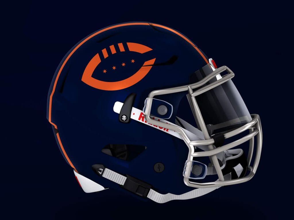
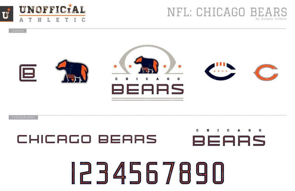
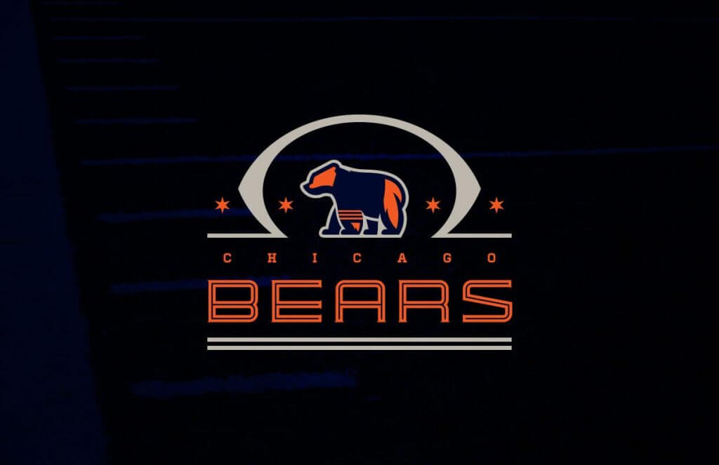
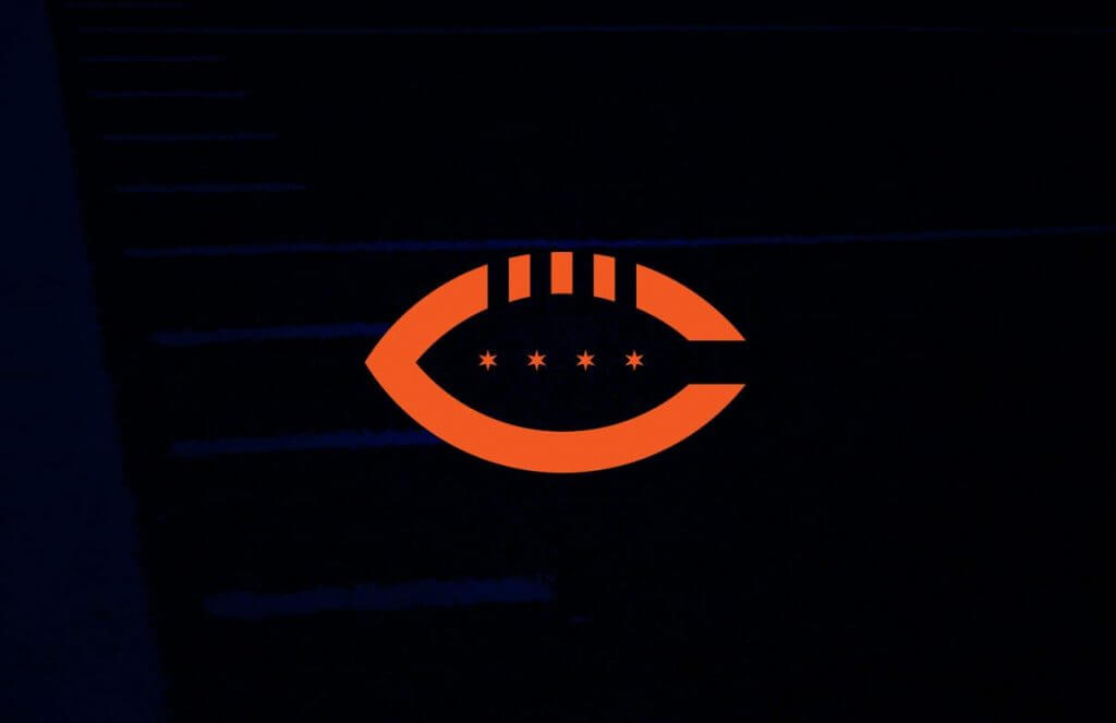
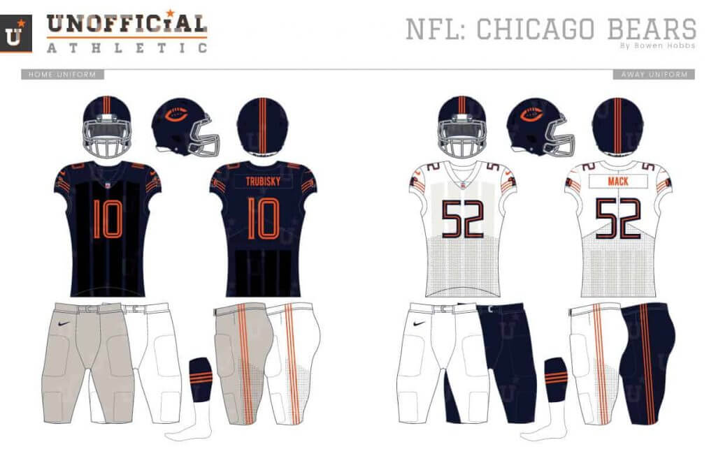
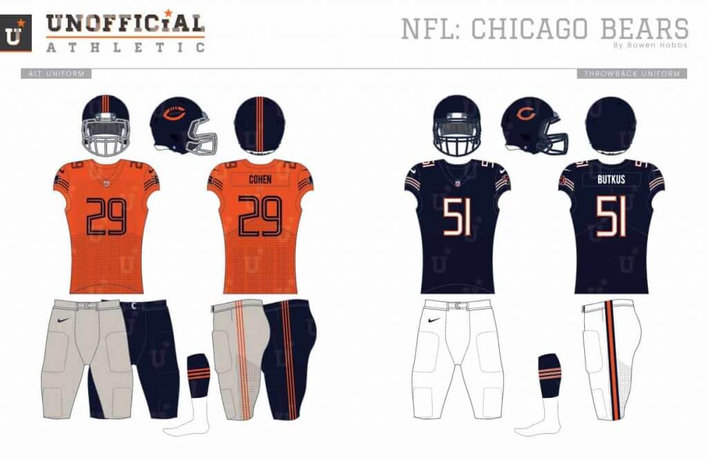
While the Bears’ brand is a classic, a few small things have always bugged me: The wishbone-C is used by other teams such as the Reds and Twins, and the stripes don’t match on their home and away uniforms. My redesign starts with a walking bear in a triple-striped jersey complemented by a football and four six-pointed stars. The typeface is a serifed inline font with a low x-height, while the secondary mark is a football-C with three-stripes and four stars. The uniforms feature three single-color stripes on each sleeve and a sublimated pattern on the torso that mimics the padded shirts of yesteryear.
Detroit Lions
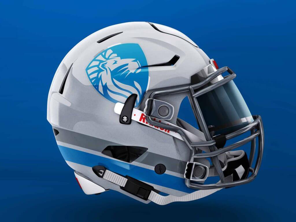
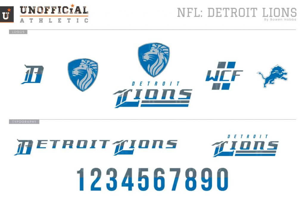
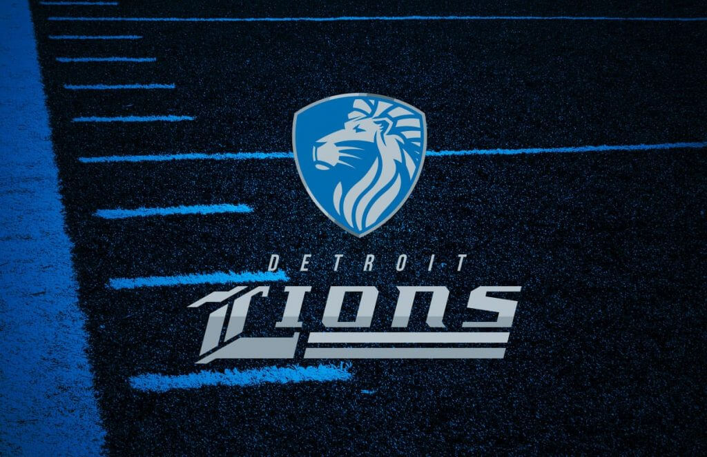
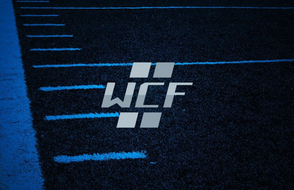
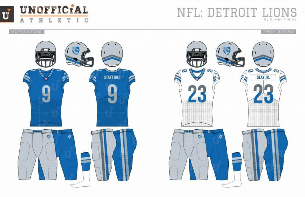
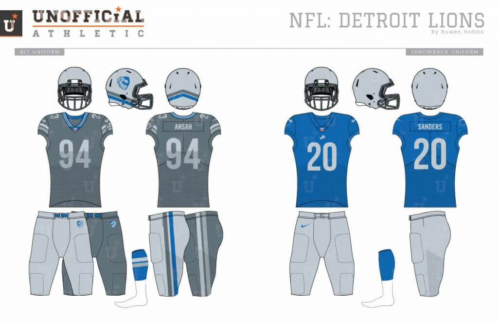
There is a lot to like regarding the Lions’ current brand, from the updated lion logo to the team removing black from its official colors. My Lions redesign starts with a stoic lion inside a shield as the primary icon. An updated William Clay Ford memorial stands in as the secondary logo. The wordmarks use a modernized blackletter font, while the numbers opt for a two-toned sans serif. The helmets use a double-stripe along the jawline instead of down the center. The two-stripe theme extends to the jersey collars, sleeve stripes, and pant legs.
Green Bay Packers
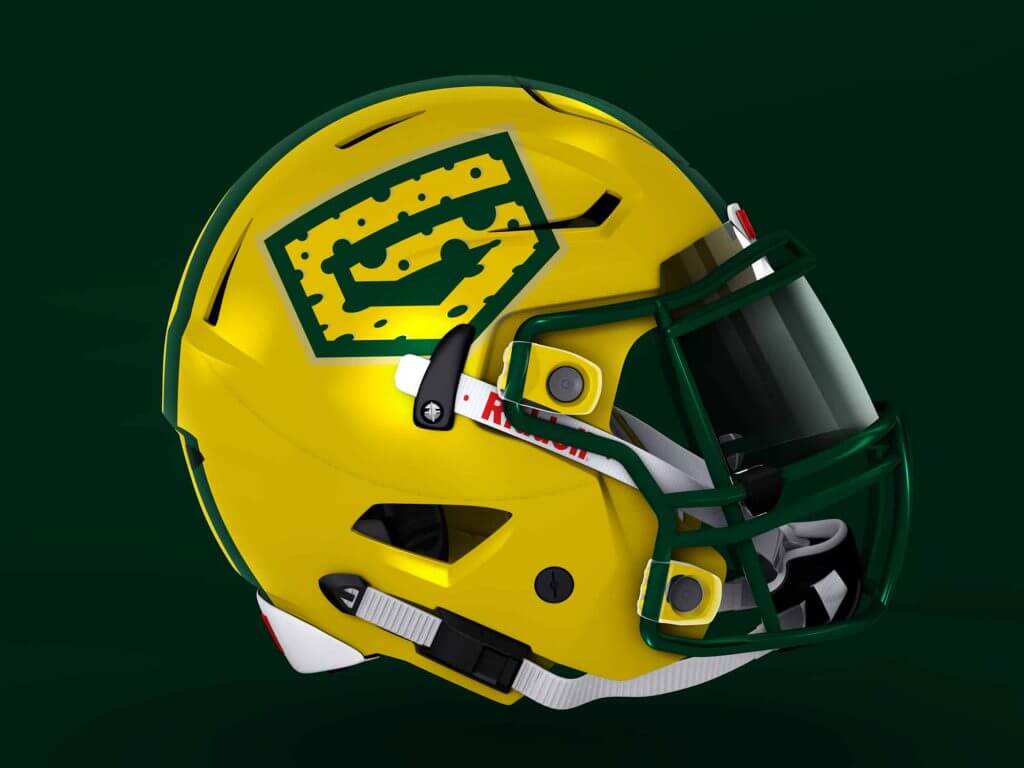
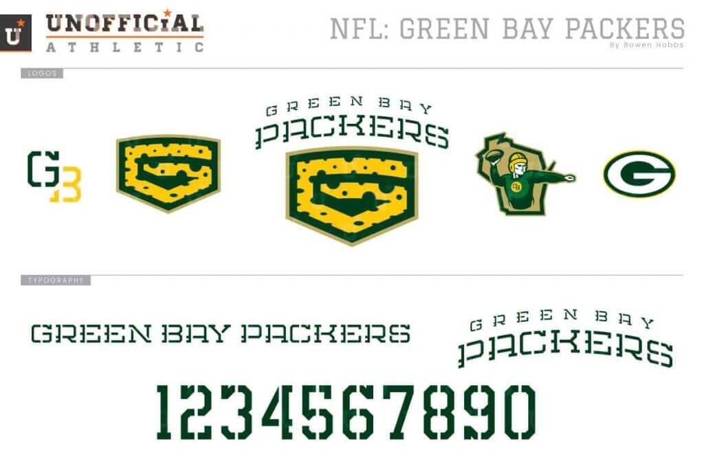
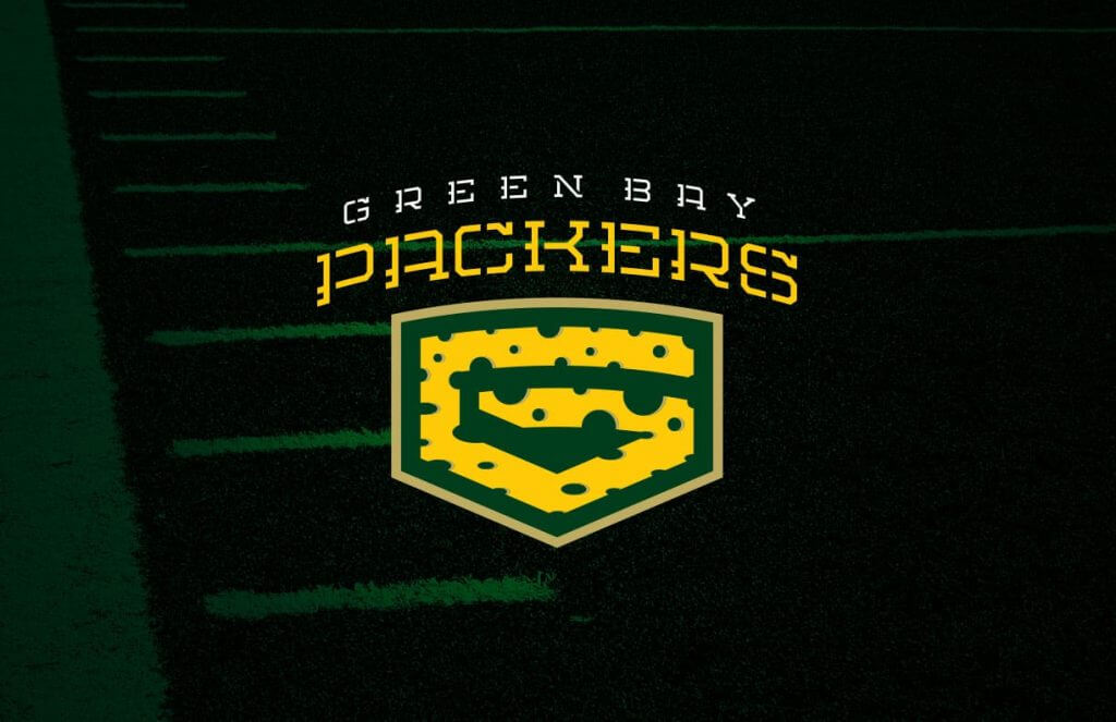
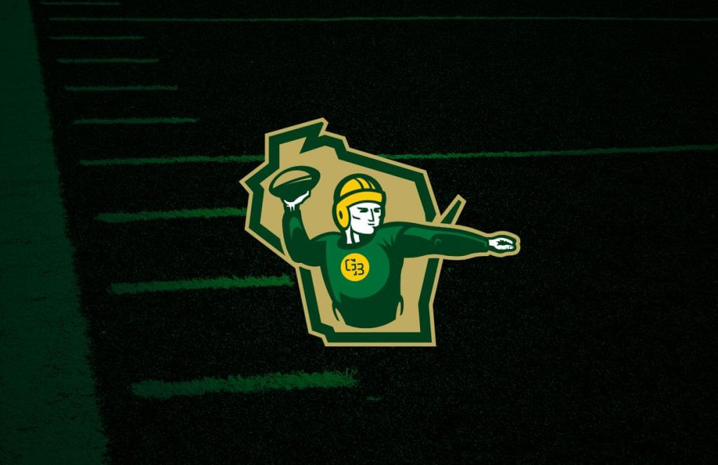
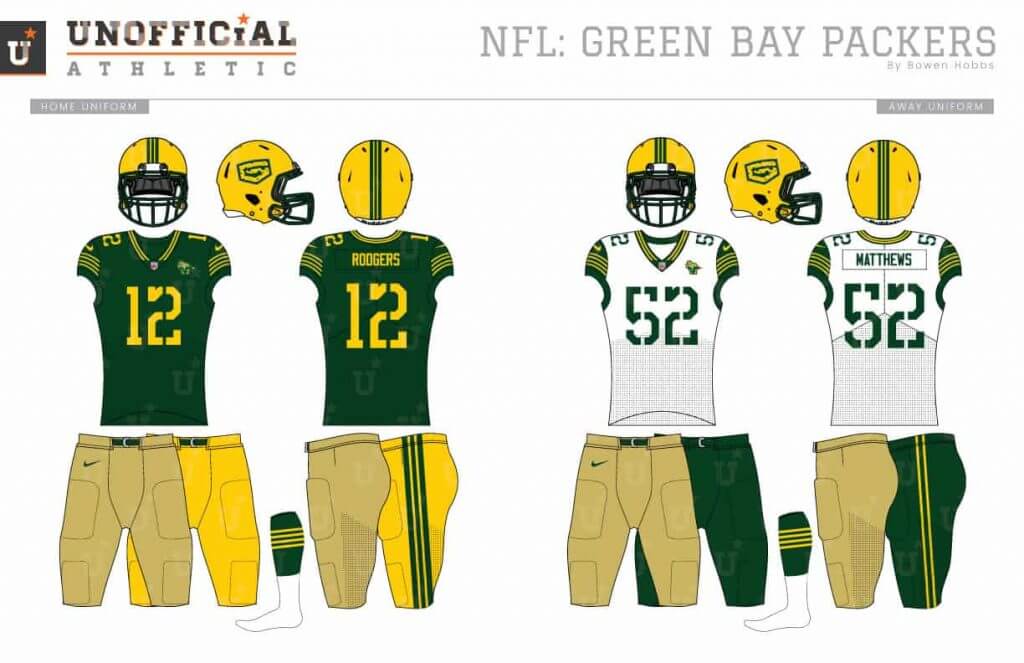
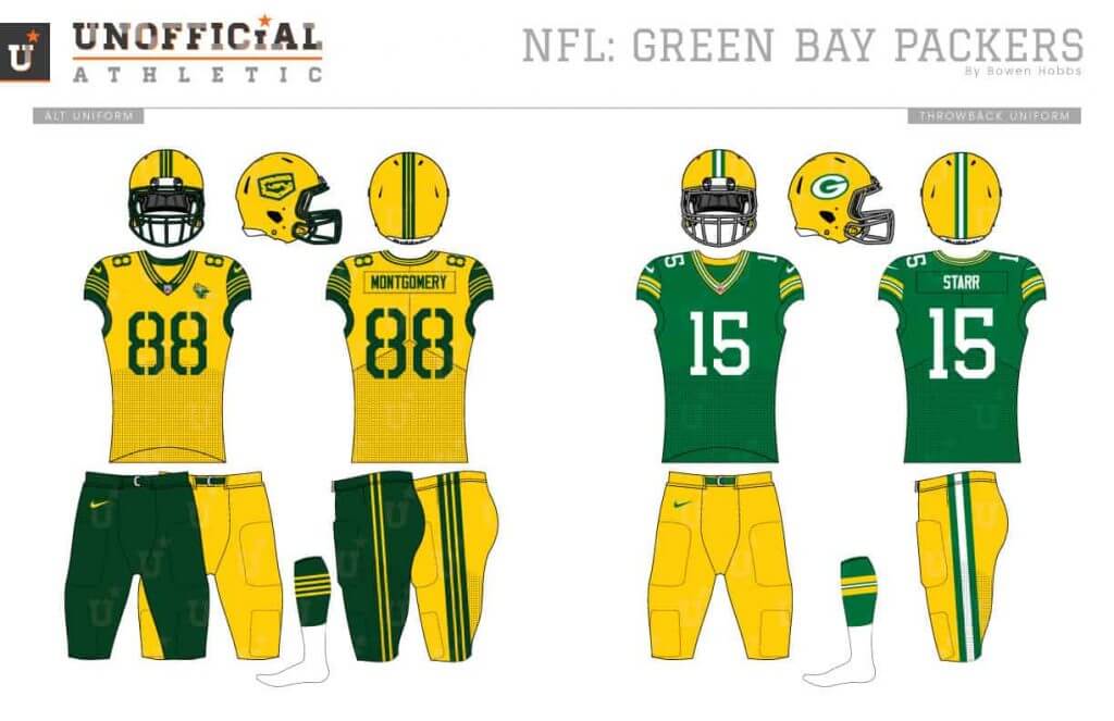
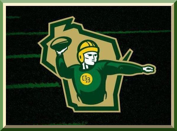
Growing up in Packer country, I know there is no way to updated the oval-G, so I went in a totally different direction. The new primary logo is a cheese wedge-G, while the secondary is an old-timey football player against the state of Wisconsin. The new typeface combines the team’s stencil letters and block numbers into one font. The uniforms feature two striping patterns: one for the vertical stripes on the helmet and pants, and one for the horizontal stripes on the sleeves and socks. The sleeves are forest green on the away and alternate jerseys.
Minnesota Vikings
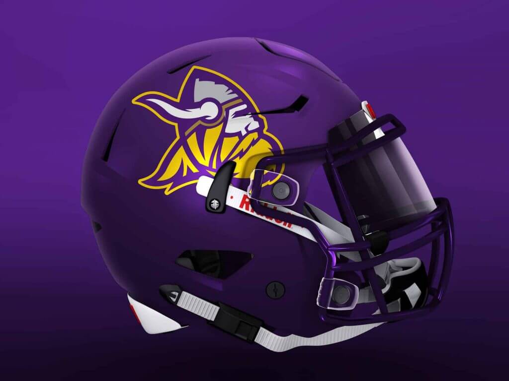
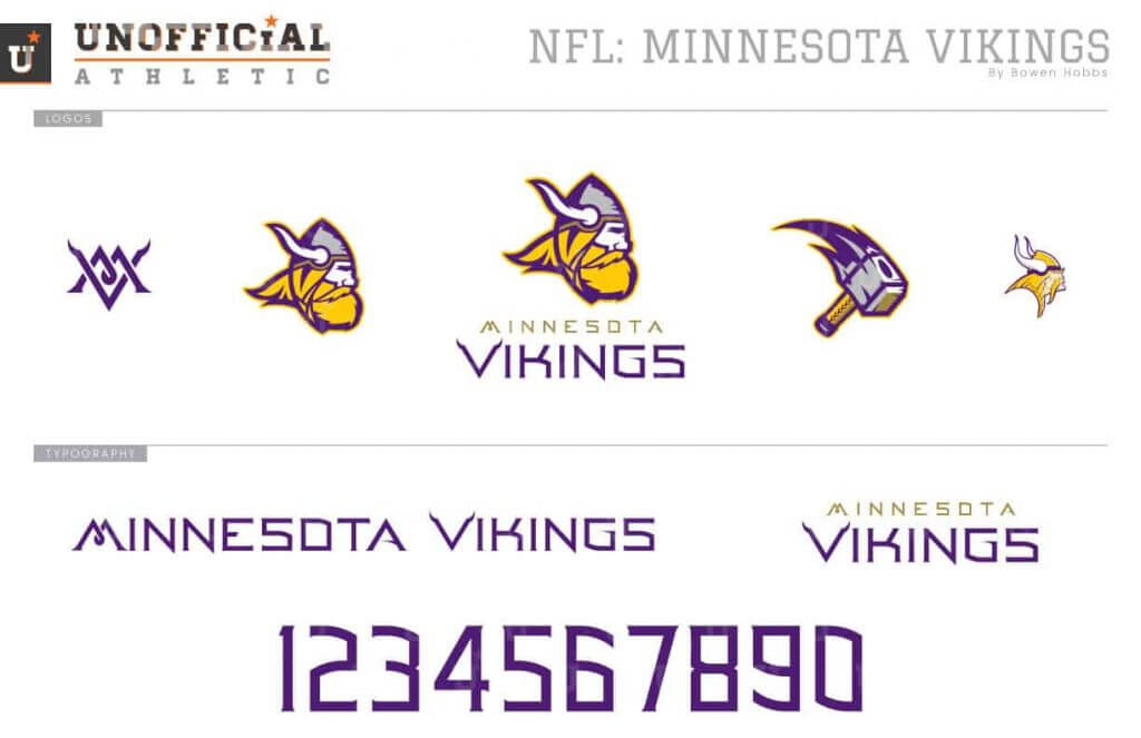
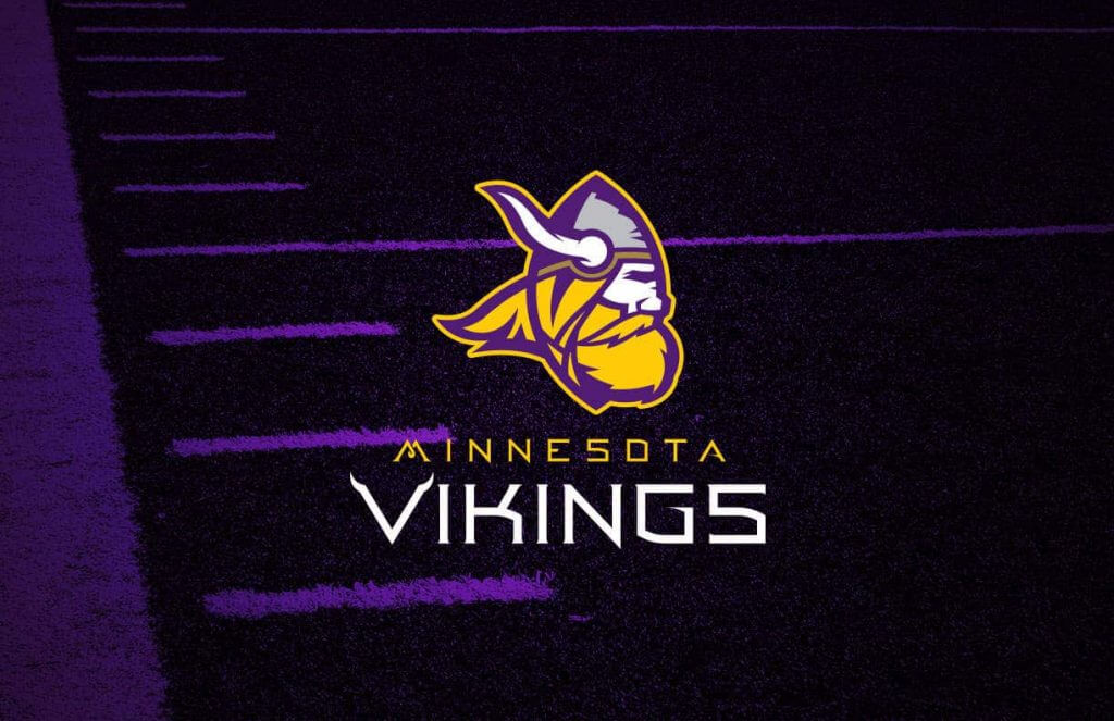
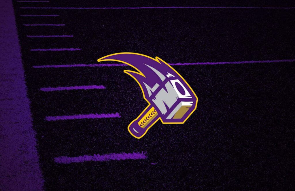
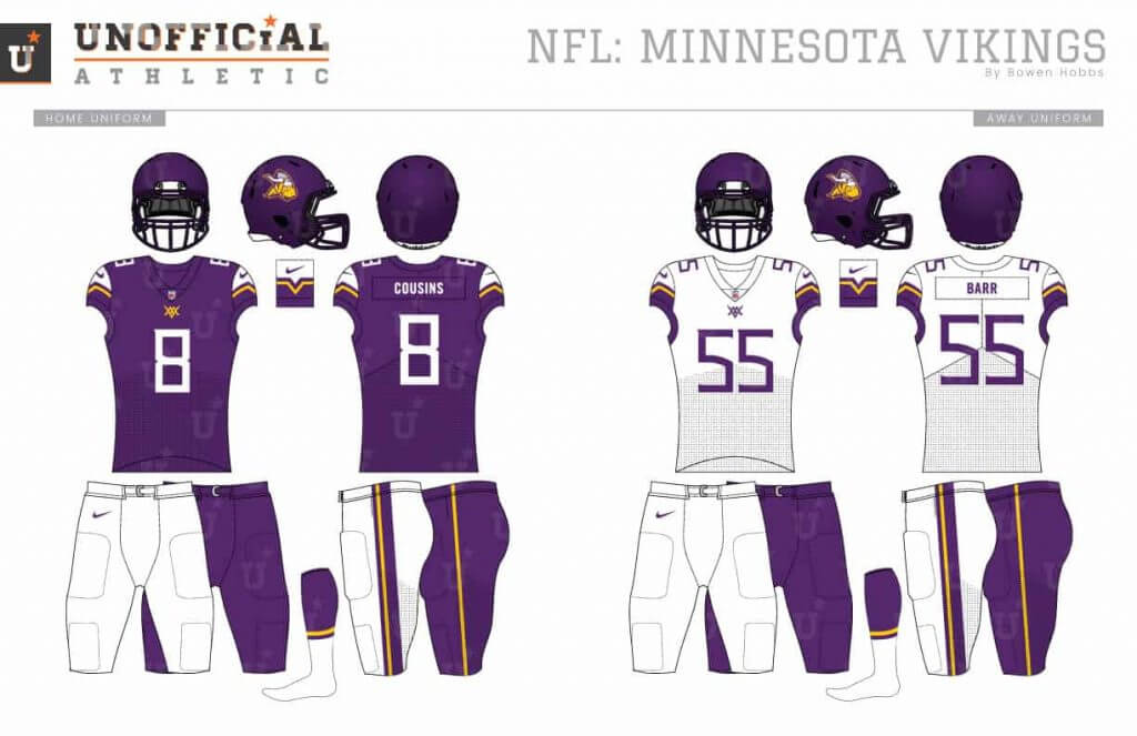
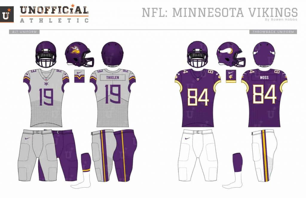
I confess: I genuinely like the Vikings current uniforms. My Vikings concept updates the viking mascot logo using a steel helmet and new horns. A swinging Thor hammer is used for the secondary mark. The font is a mono-weight serif with a knot in the M. The helmets are satin purple with the viking head on each side. The uniforms bring back the V-sleeve design from early concepts for the team when they were born, with the alternate in grey.
NFC South
Atlanta Falcons
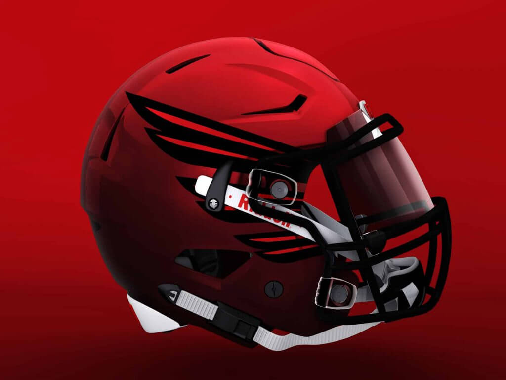
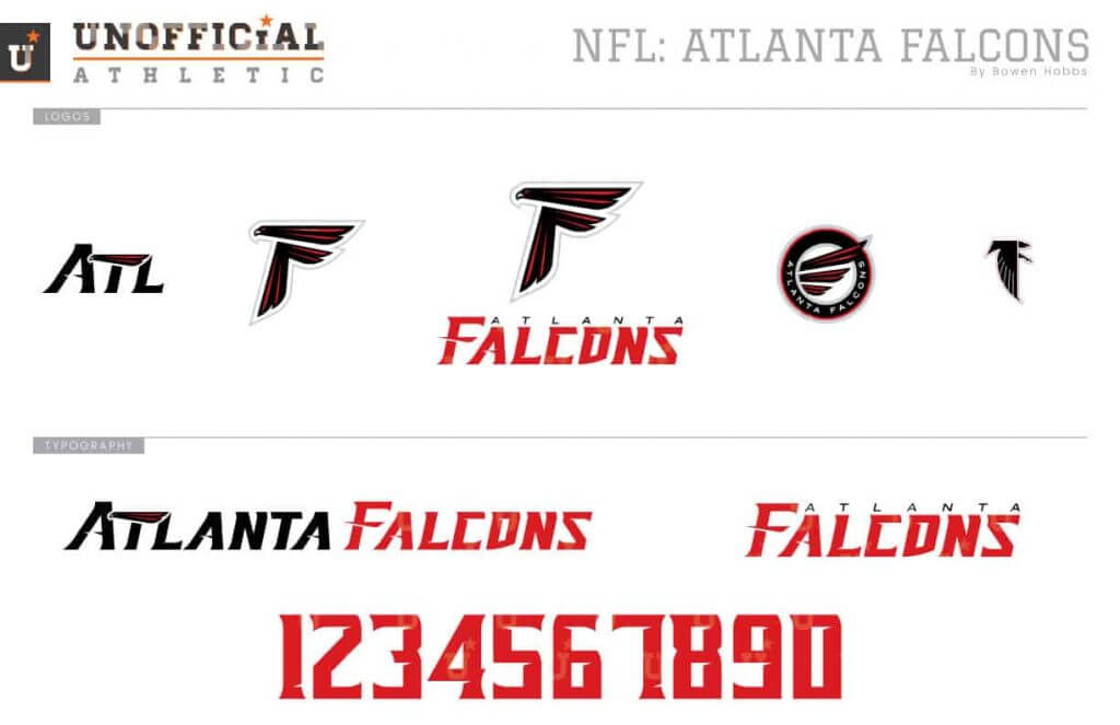
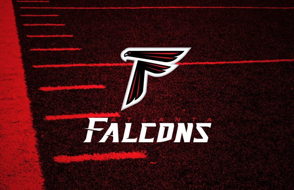
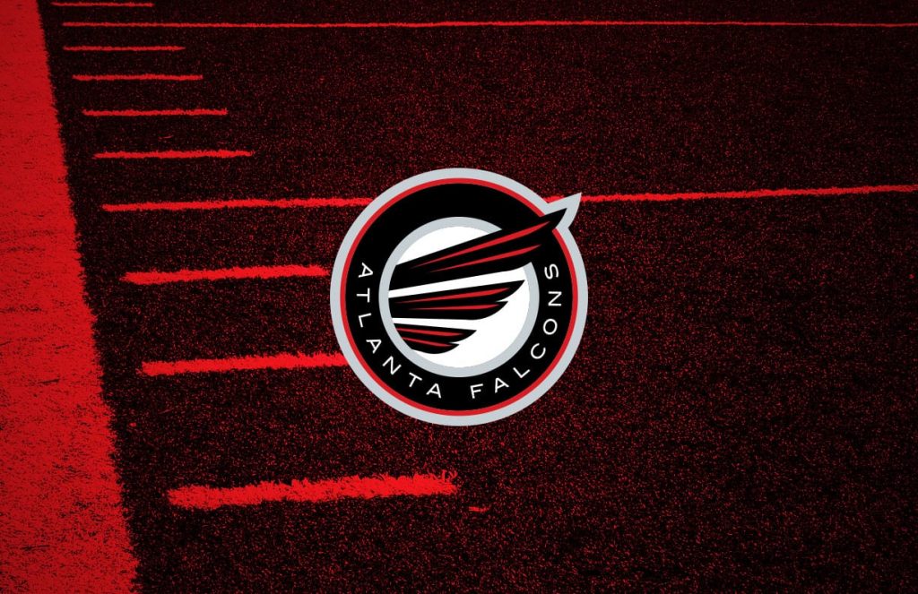
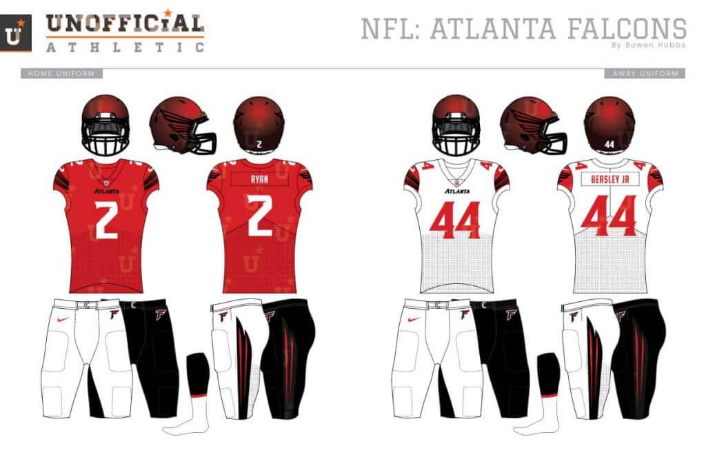
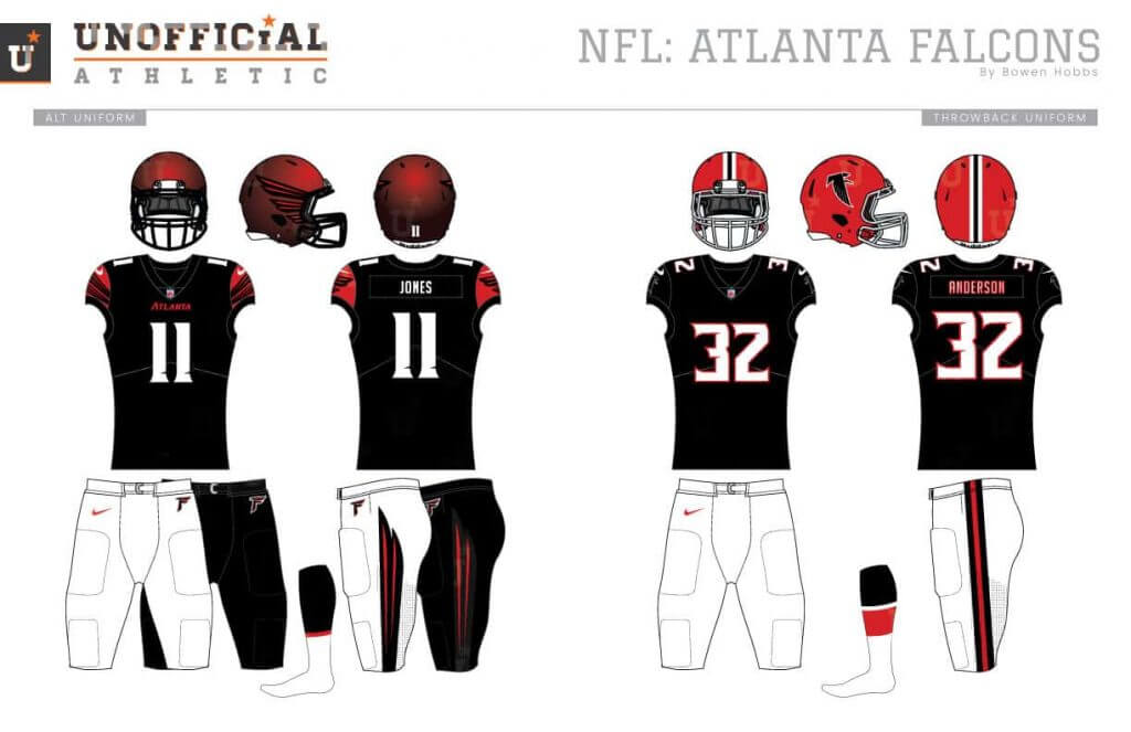
While I like how the current Falcons logo is a bird and an F, its placement on the helmet has always been troublesome since the F is backward on the left side of every helmet. My redesign makes the F letterform in the logo more overt. A stylized wing inside a circular badge is the secondary logo. The font uses flair serifs and notches to communicate the speed and talons of their namesake. The helmets start with a red-to-black fade on the shell, with the stylized wing used in place of the F-bird logo. The wing theme is continued throughout the design on the sleeves and pants.
Carolina Panthers
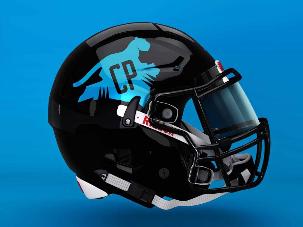
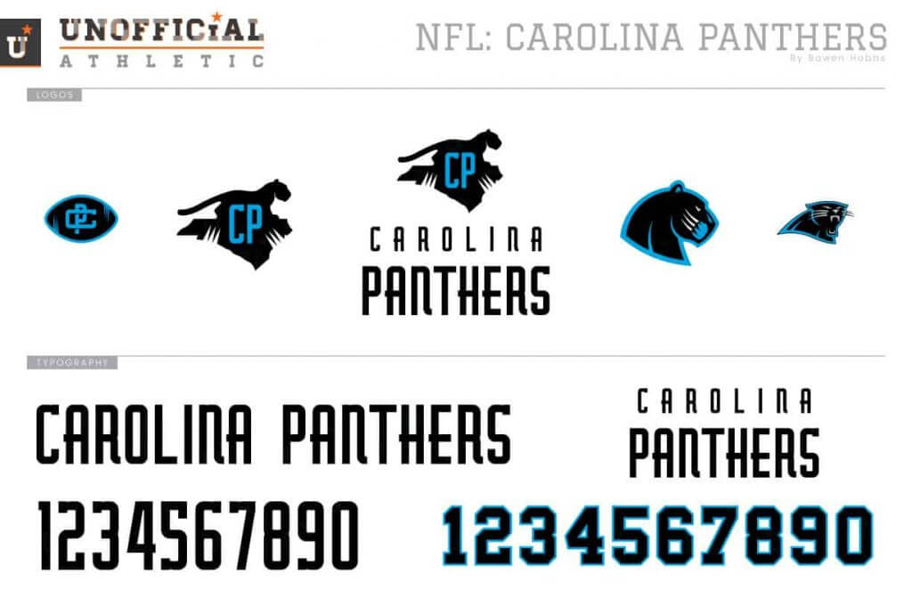
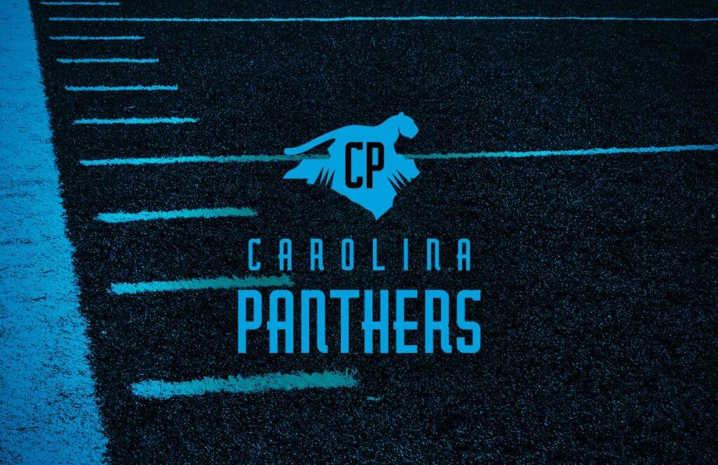
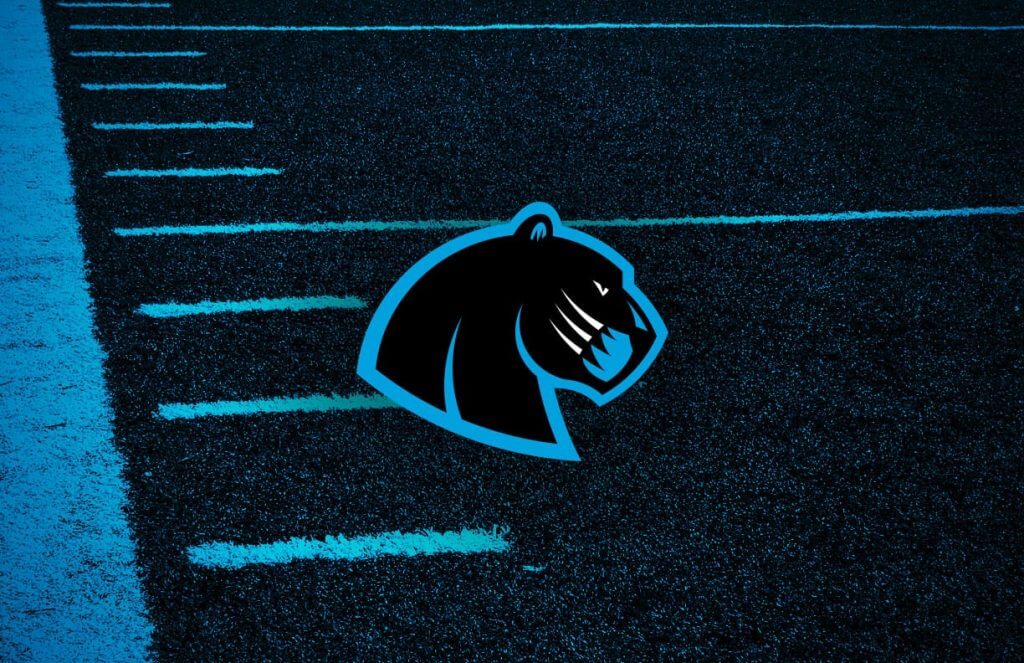
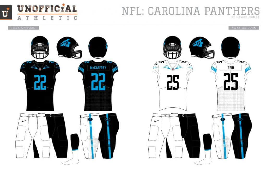
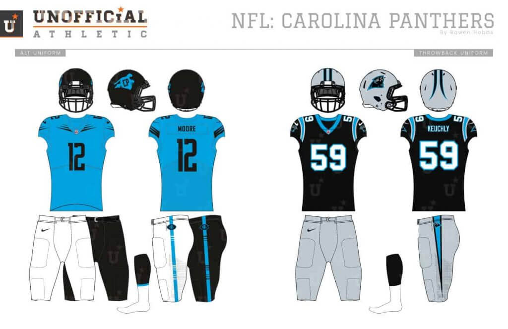
The Panthers branding has looked dated since it came out, using too many outlines and cluttering the jerseys with numbers, striping, and redundant team logos. My Panthers concept goes for a more minimal approach, removing the superfluous silver and focusing on black and blue. The primary icon features a panther standing on the state of North Carolina with a CP, while the secondary mark is a revised panther head. The font is tall and strong with a low x-height. The uniforms use a claw mark design on the sleeves and collarbone area, while the pants feature a single stripe containing claw marks.
New Orleans Saints
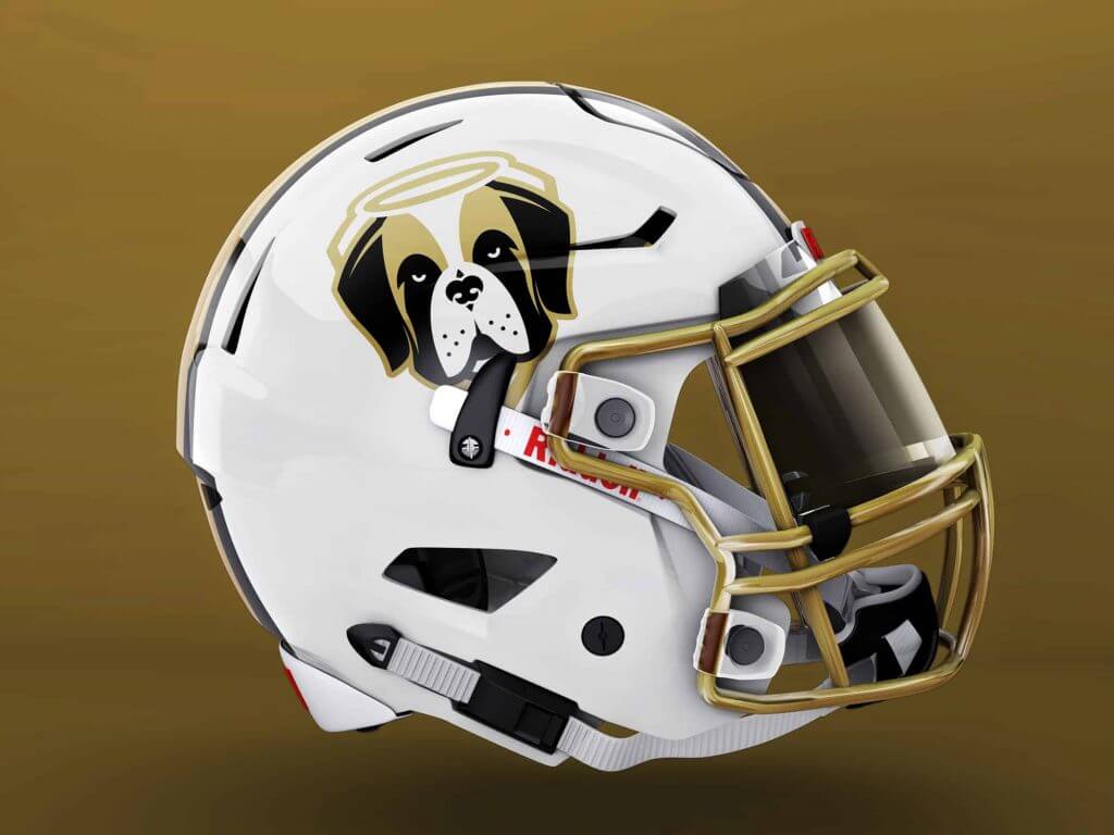
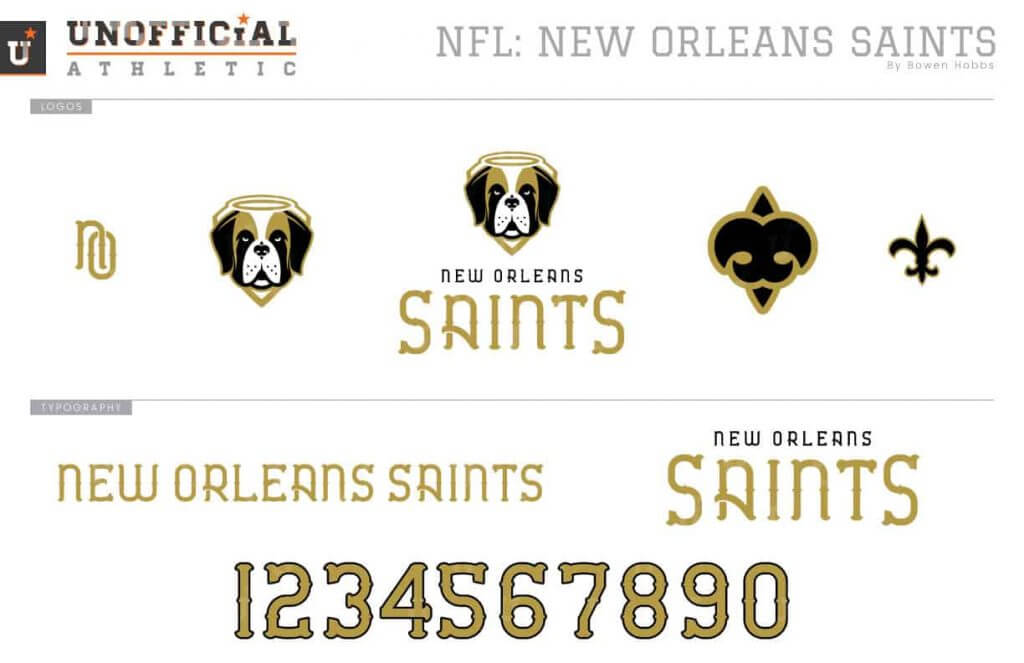
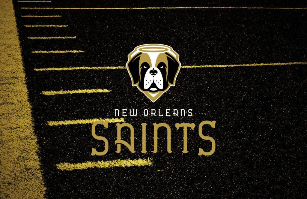
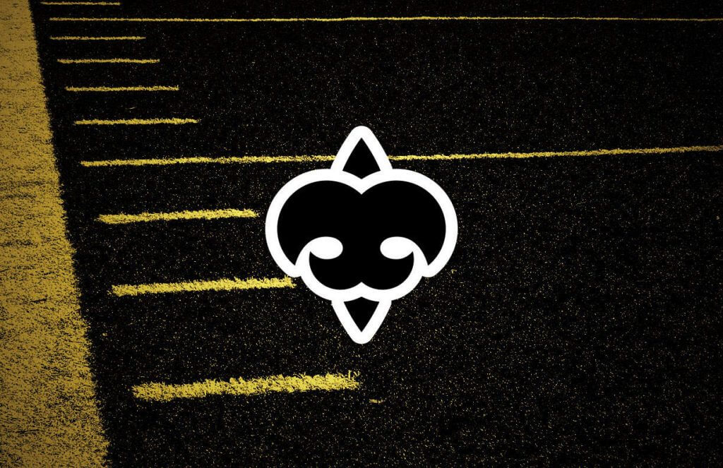
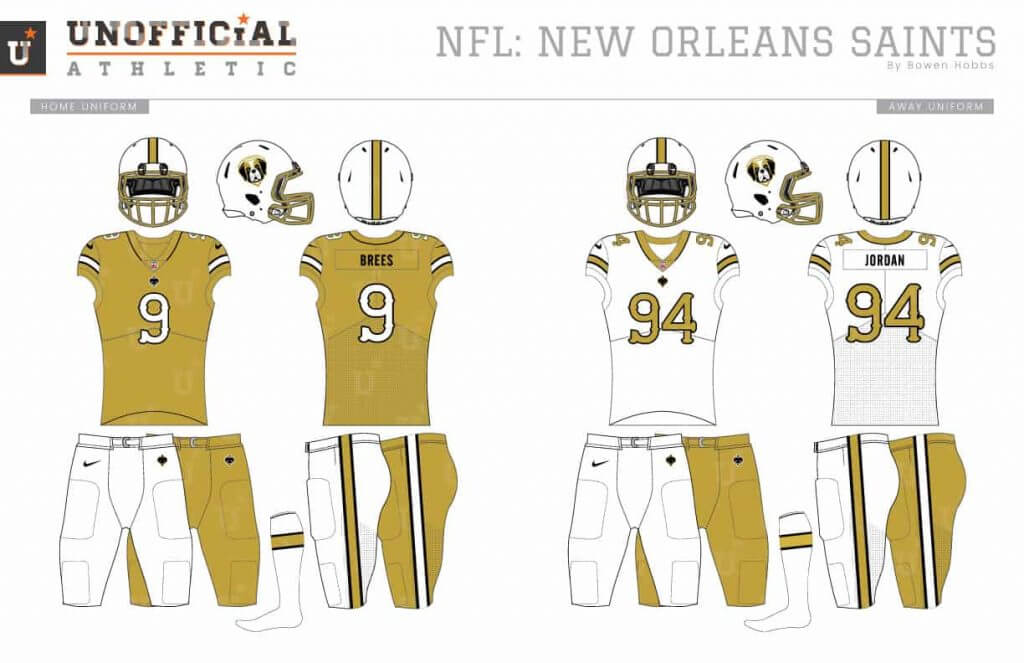
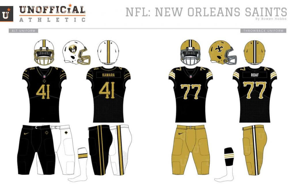
Coming up with a new logo for the Saints seemed daunting at first, until I remembered their lovable mascot Gumbo the Saint Bernard. I placed Gumbo inside a shield that makes room for his halo. The secondary logo is the fleur-de-lis from his nose. The font embraces New Orleans history with a look that complements the wrought iron fences in the Big Easy. I opted for white helmets with an outlined broad stripe down the middle. The outlined broad stripe is also used on the sleeves and pants. The home uniforms are gold with white numbers, while the white aways use gold numbers. The alternate are black with gold type.
Tampa Bay Buccaneers
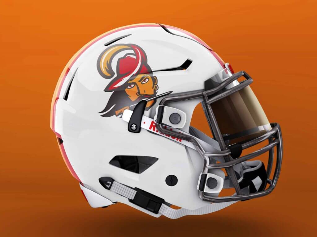
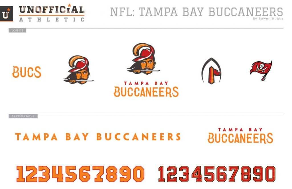
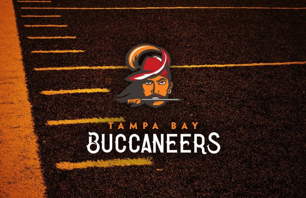
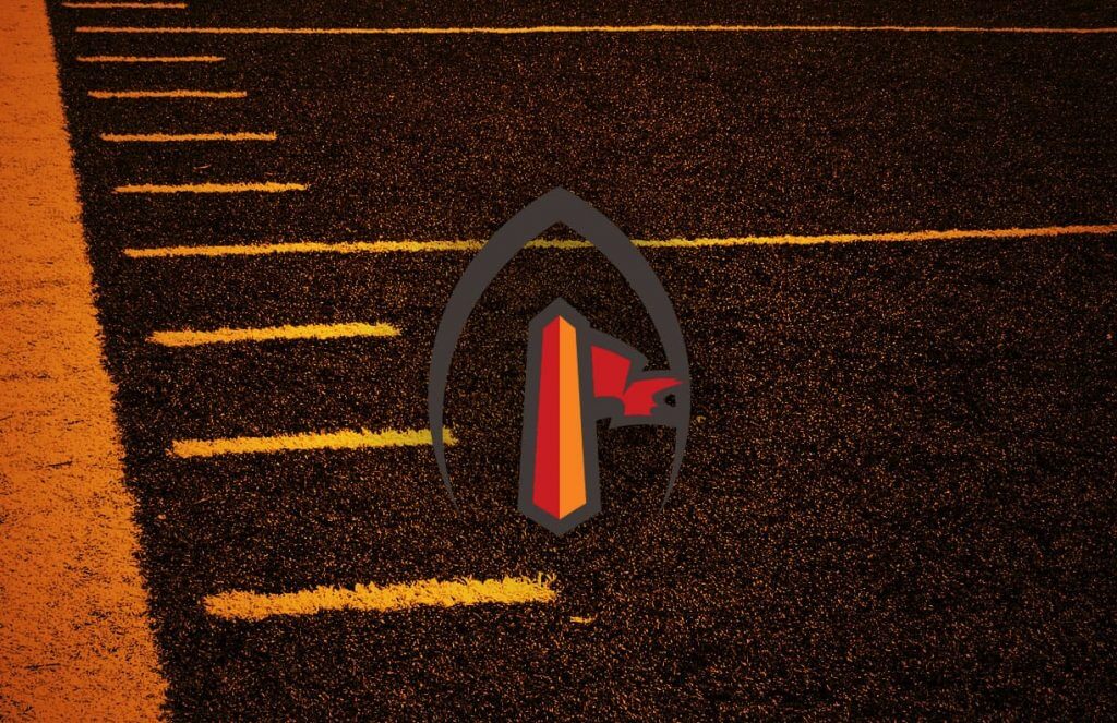
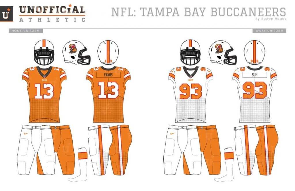
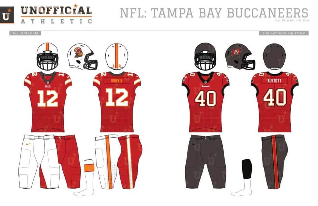
My goal with the Bucs was to blend their rich chromatic history into one scheme. I started with the Creamsicle Era and added pewter, using it as a key line for a reimagined Bucco Bruce. The secondary features a pylon with a tattered pirate’s flag. The wordmark uses a custom curvy serifed typeface that recalls the pirate history of the Gulf, while the number use a modified block font for legibility. The uniforms mostly follow the throwbacks, but with a pewter collar and facemask.
NFC West
Arizona Cardinals
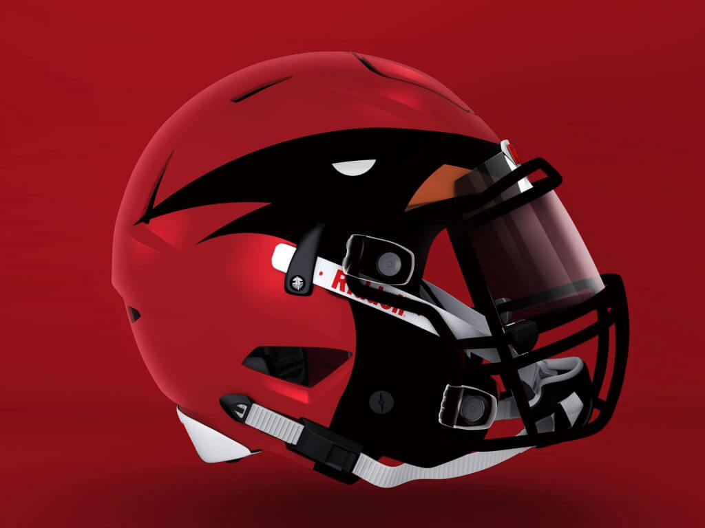
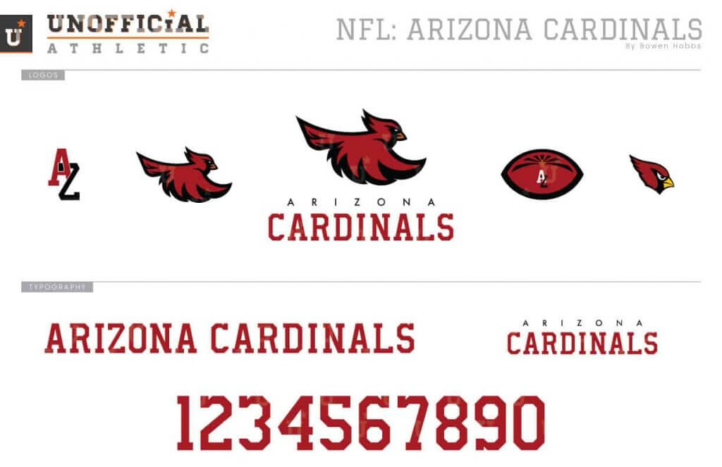
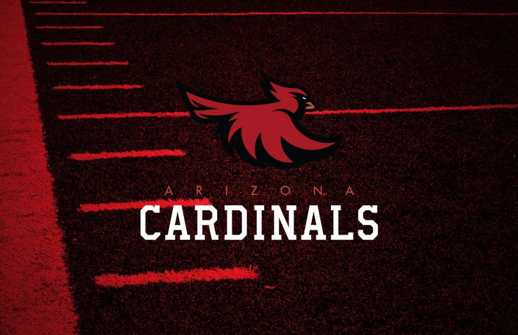
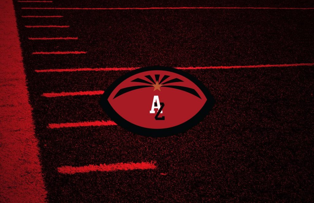
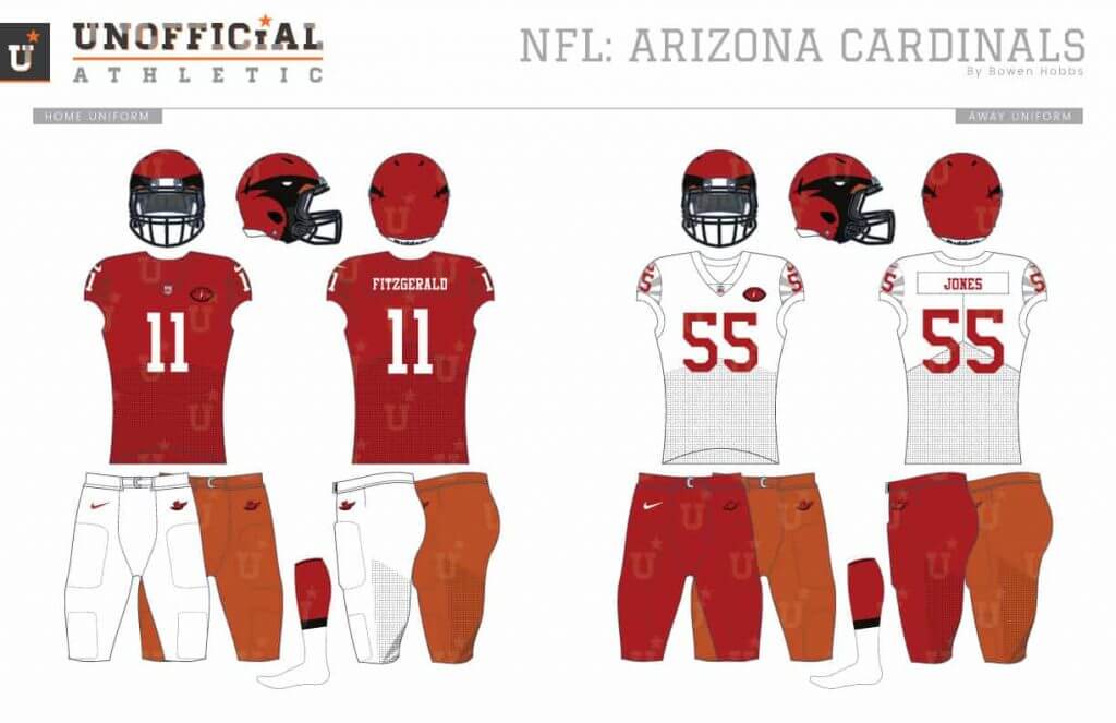
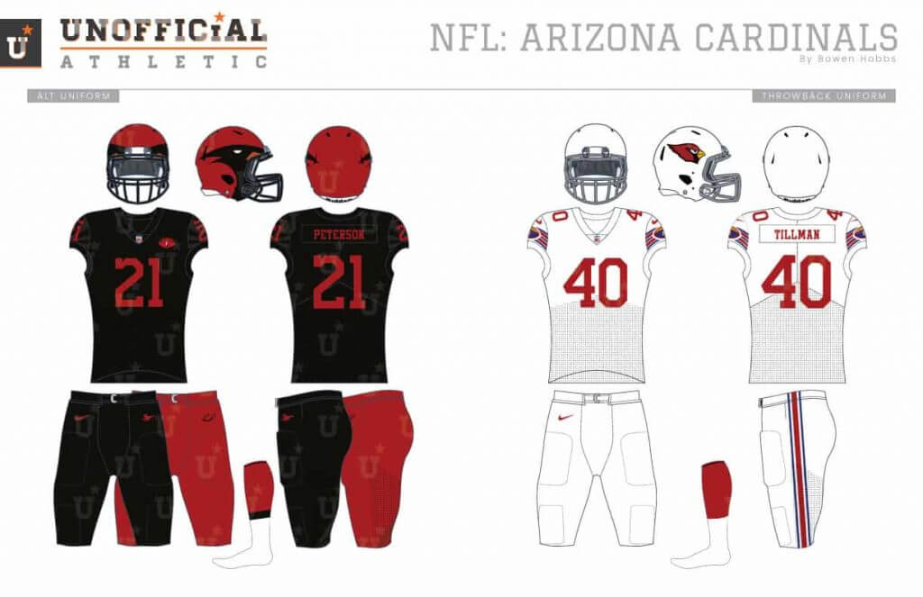
While the Cardinals have always used a cardinal head as their logo, I wanted to try out using the full bird. I updated the team’s color scheme to cardinal red, white, black, and copper (to reference the state’s mining history). The secondary logo places AZ inside a football with sun rays that resembles the state flag. The font is a custom block serif that takes many cues from styles of the past. The helmets apply the cardinal head as an all-over treatment instead of a sticker on each side. Sublimated sun rays are used on the cap sleeves and pants of a relatively restrained uniform set.
Los Angeles Rams
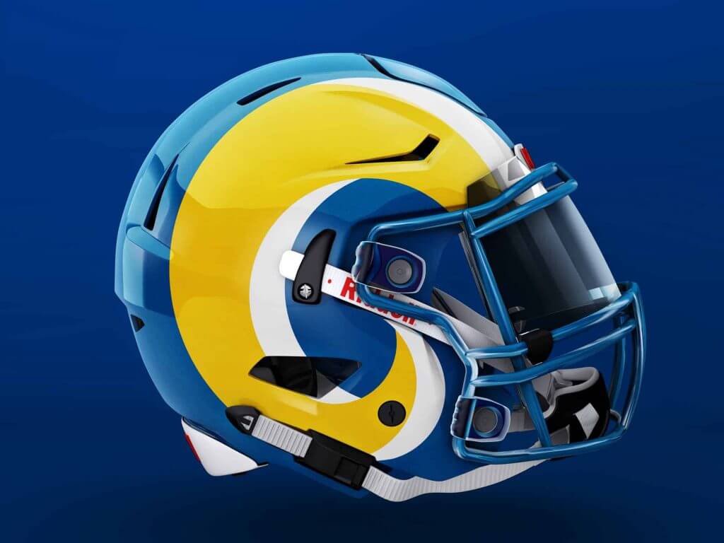
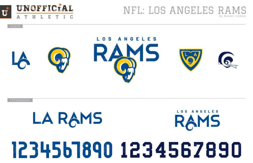
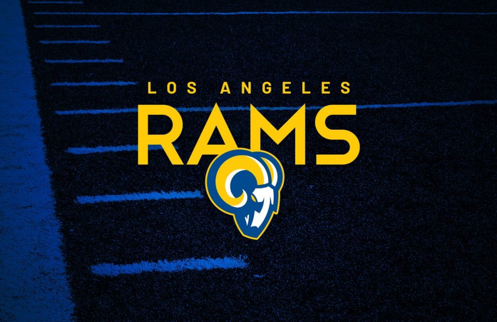
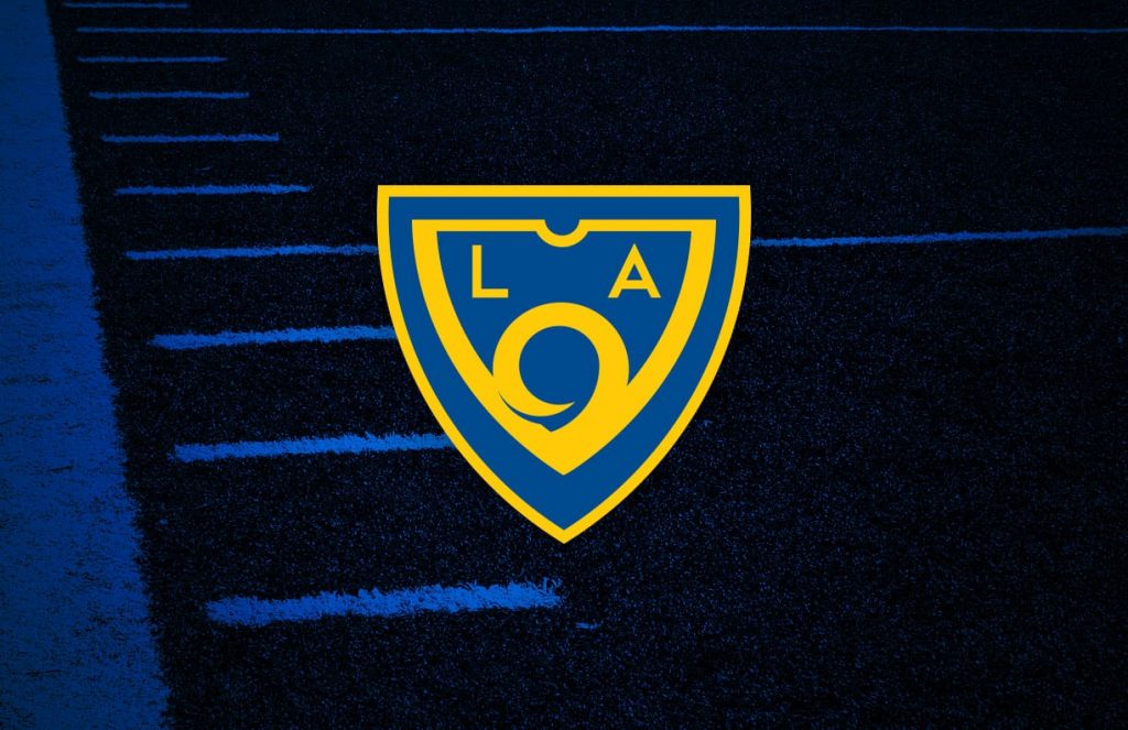
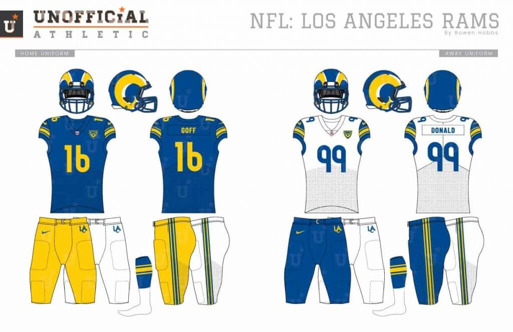
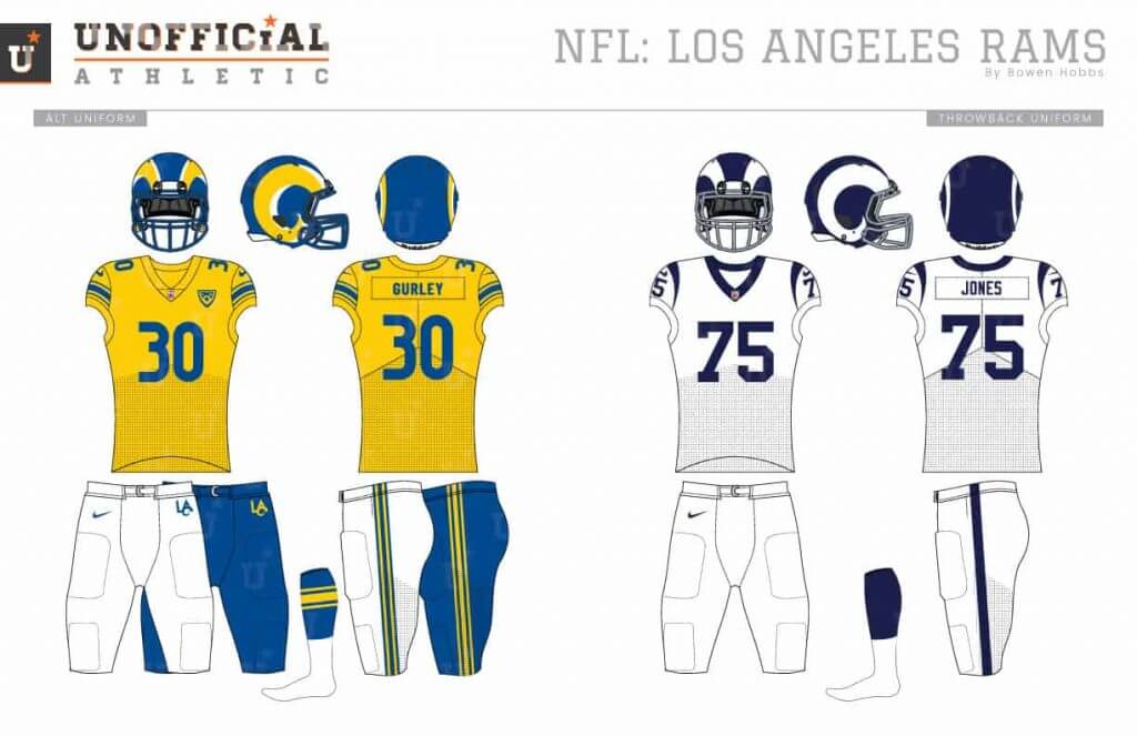
Full disclosure: I made this concept before the Rams unveiled their current uniforms. This Rams concept combines the classic ram head logo with a style more similar to their Greatest Show on Turf logo. The secondary combines the horn with the shield shape of Beverly Hills signage. The font plays on old LA with sleek lines and an art deco feel. The helmets use the updated ram horn from the primary logo, while the uniforms use the Northwestern stripe of the Norm Van Brocklin era. The white away jerseys use royal blue cap sleeves with yellow stripes.
San Francisco 49ers
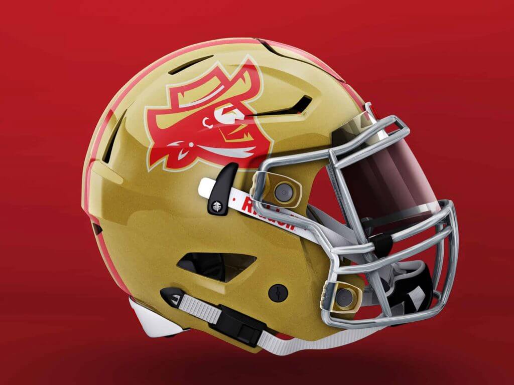
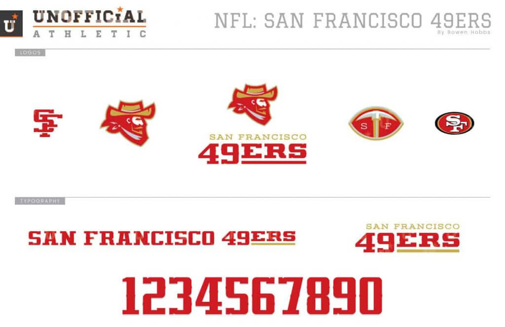
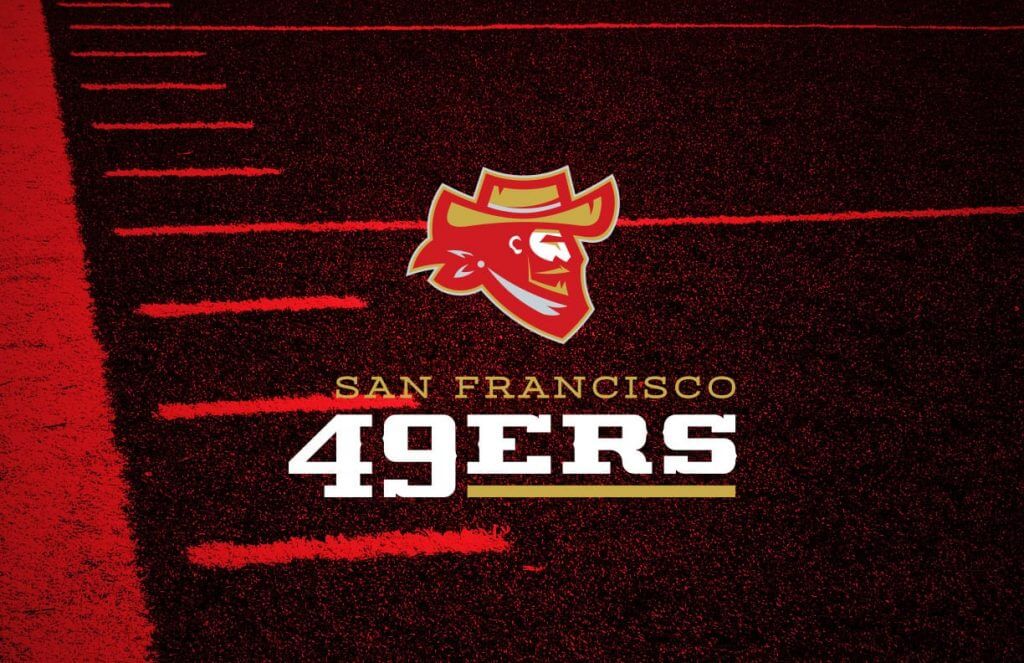
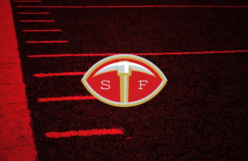
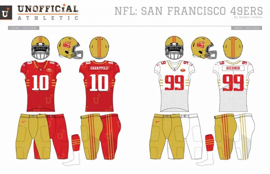
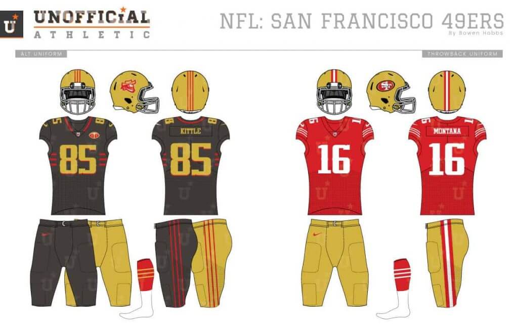
The 49ers haven’t used a logo of an actual 49er since the 1960s. I thought that would be a good place to start with this redesign. To play on the mining theme and acknowledge the team’s early years, I also added silver to the color scheme. In addition to the miner primary logo, I developed a secondary mark of a football and pickaxe. The uniforms take the next logical step from their armpit stripes of the 2010s and lower the striping to the ribs, similar to Northwestern University.
Seattle Seahawks
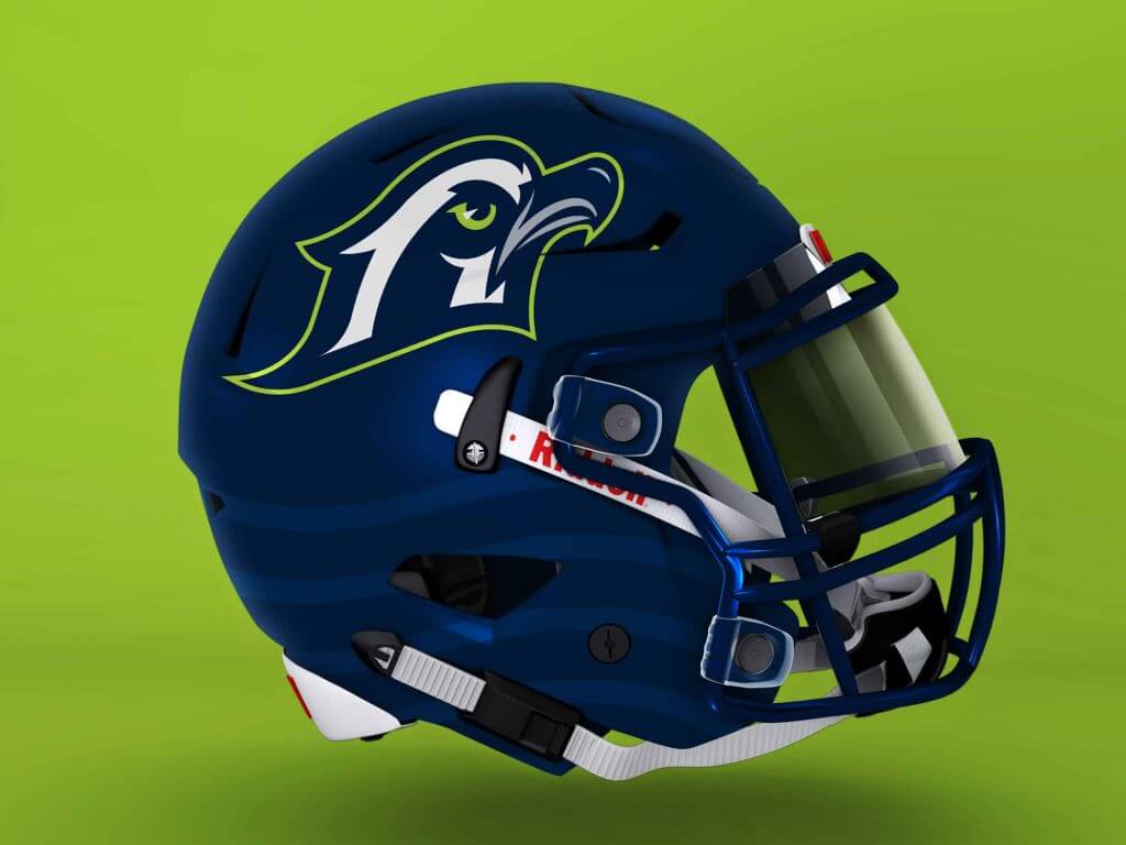
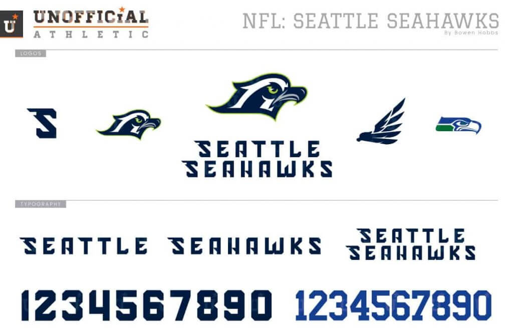
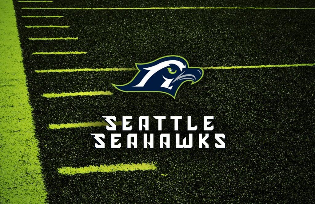
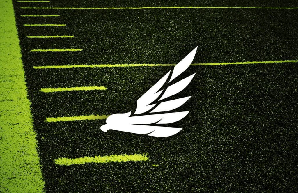
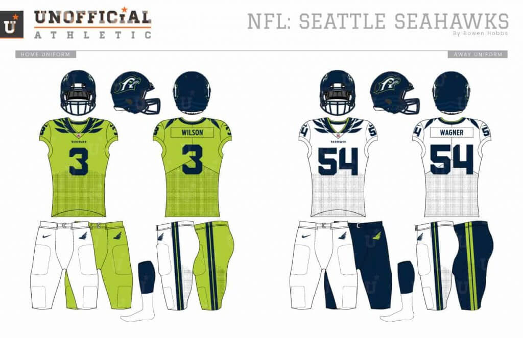
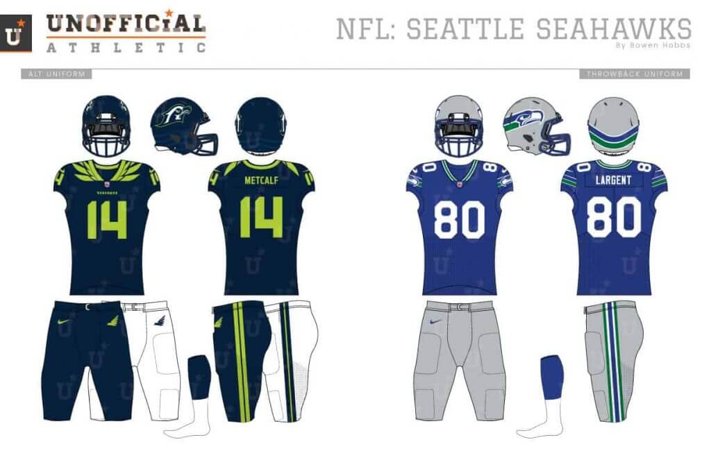
What is a seahawk? Turns out it’s an osprey. My redesign brings the primary logo closer to an osprey than the current mark. The secondary is a one-color silhouette of the full-bodied bird. The font is a modern block with wing accents on the S’s. The uniforms feature feathers around the collars. I decided to make the primary home uniform lime green, as it is the team’s unique signature color, with the aways in white and the alternates in navy. The throwbacks are a modernized update on the 80s uniforms.
Thanks, Bowen! If you missed the original post, please note that one of Bowen’s goals with the redesigns is just that — every team gets a new treatment (even if every team, as he readily acknowledges, doesn’t need it). So when judging his designs, please bear that in mind.
Love to hear what you guys think of these in the comments below!


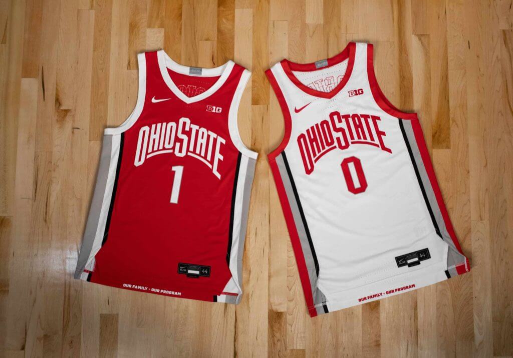
OSU Men’s & Women’s Hoops Unveil New Unis
Yesterday, the Ohio State Buckeyes unveiled new uniforms for both the men’s and women’s basketball teams. A couple notes:
• For the first time Ohio State men’s and women’s basketball will don identical primary home and away uniforms for the 2020-21 season.
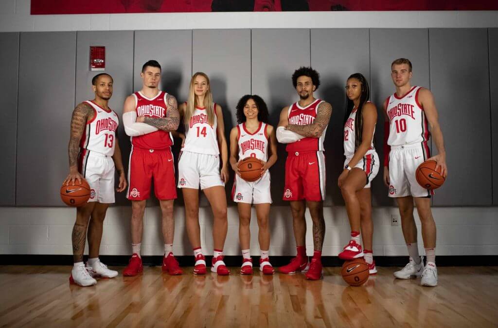
• For the first time in program history, the women’s team will have names stitched on the back of the uniforms.
Here’s a few looks at the new unis (click any photos to enlarge):
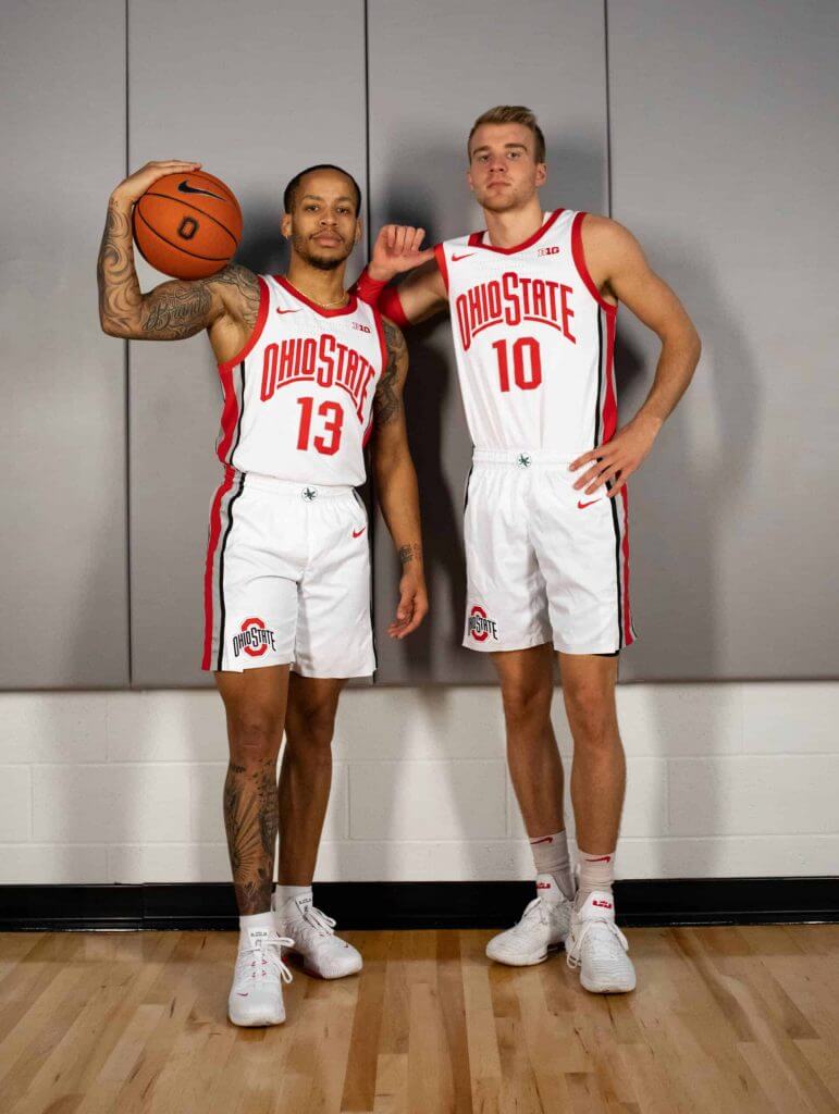
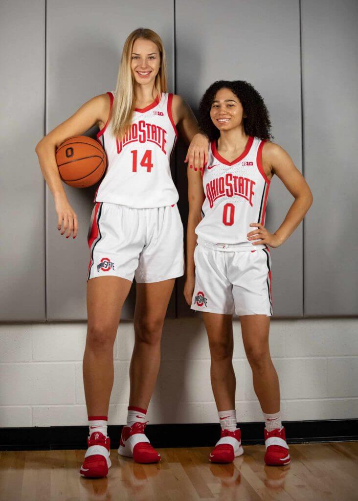
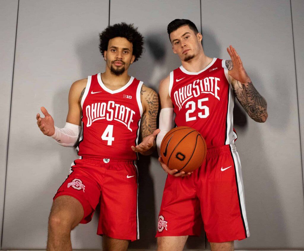
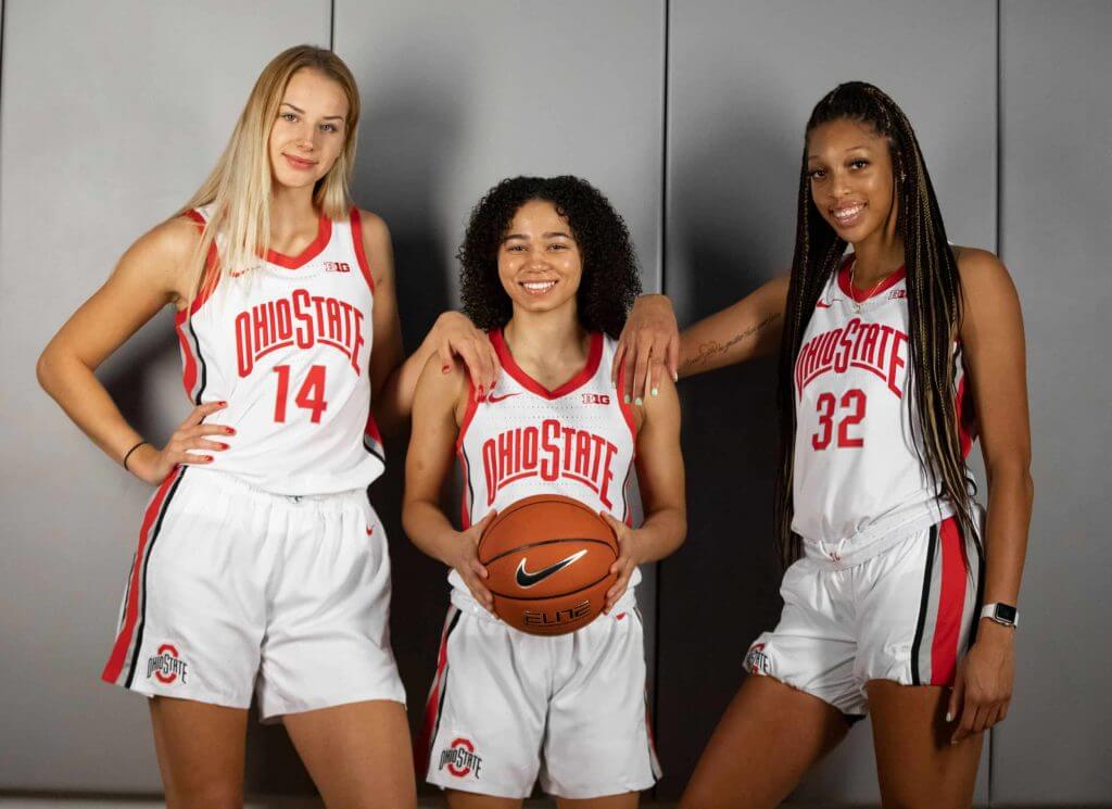
The men’s team now will boast six possible uniform combinations:
• Primary home and away (shown above)
• Scarlet “Clark Kellogg” era uniform worn each of the last two season
• Gray “Jim Jackson” era throwbacks from the last several years
• Two alternates (still yet to be released)


MLB Playoff Uni Tracking
We’re more than halfway through the playoffs, and almost to the World Series, and over the past couple weekends Alex Rocklein has been tracking the jerseys of all the teams involved in the MLB Post Season. Here’s the full Wild Card round jersey matchups (click to enlarge):
And here is the updated tracking with the Division Series and Championship Series in both leagues added in. Unfortunately, last night’s Dodgers/Braves game ended after Alex had sent in his tracking, so that score is not reflected, but everything else is up to date (the Dodgers won, 7-3, if you didn’t yet know, so that series is now 3-2 in favor of the Braves).
After winning the last three games, the Astros took a 3-0 Rays lead and tied it up, forcing a game 7 today. If you’ll notice, the Rays have worn their blue softball tops in every game except one (when they wore their powder blue tops). Will they change it up again today? This also would set up an interesting World Series if they make it, against the Braves (if they make it), who have worn their blue softball tops for every road game. Would Tampa Bay wear their navy tops at “home” (as they have done in almost every game so far)? Would that “force” the Braves to wear gray tops? Or would we possibly see a blue jersey vs. blue jersey matchup in the big dance? It’s still a bit to early to predict that as we don’t yet know our World Series opponents. But it’s food for thought…
Also, Alex points out that only 11 of 44 games played have featured a traditional white vs. gray matchup.
Alex will continue to add to this graphic through the World Series’.


Guess The Game…
from the scoreboard
Today’s scoreboard comes from Billy Sundae.
The premise of the game (GTGFTS) is simple: I’ll post a scoreboard and you guys simply identify the game depicted. In the past, I don’t know if I’ve ever completely stumped you (some are easier than others).
Here’s the Scoreboard. In the comments below, try to identify the game (date & location, as well as final score). If anything noteworthy occurred during the game, please add that in (and if you were AT the game, well bonus points for you!):
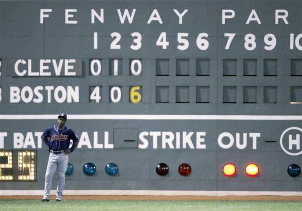
Please continue sending these in! You’re welcome to send me any scoreboard photos (with answers please), and I’ll keep running them.


So THAT’S What You Did With That Patch…
Got an email earlier this week from my pal Jimmy Corcoran who wanted to share a great “DIY” (photoshop) project with the readership. This one is fantastic.
Here’s Jimmy:
Hey Phil,
I saw this jersey on ebay, if it was a size XXL I would have bought it and made one for myself. If Uni Watch had a softball team that played an annual game every July 4th I believe this could have been the jersey the team wore from 1991-97. With a green Uni Watch hat, white pants and Oakland A’s style stirrup socks, this is a uniform anyone would be proud to wear. And win or lose, after the game when team Uni Watch are eating hot dogs and sharing some cold beers with the team they just played, if you spill some mustard on the jersey no problem.
Play Ball!
Jimmy Corcoran
Here’s what Jimmy created…
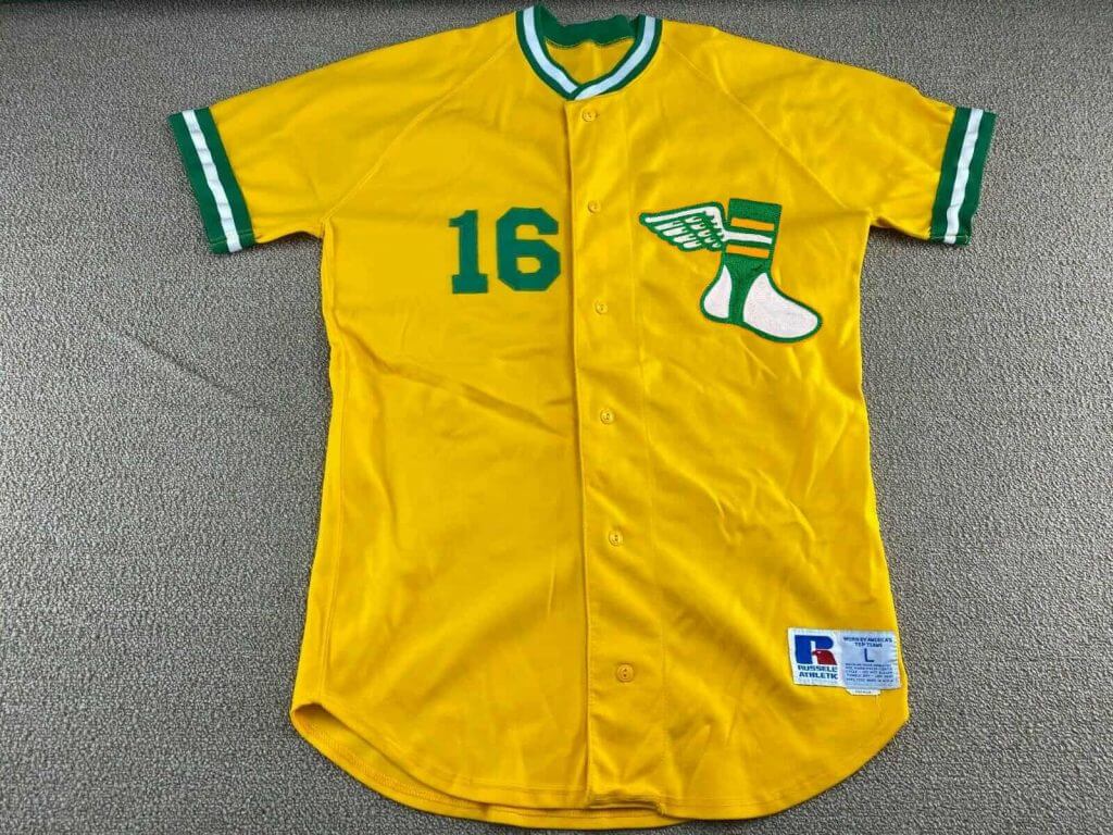
That’s great! And I think we need to look into forming a UW softball team, even if it’s just for the unis!


Click to enlarge
And now a quick word from Paul:
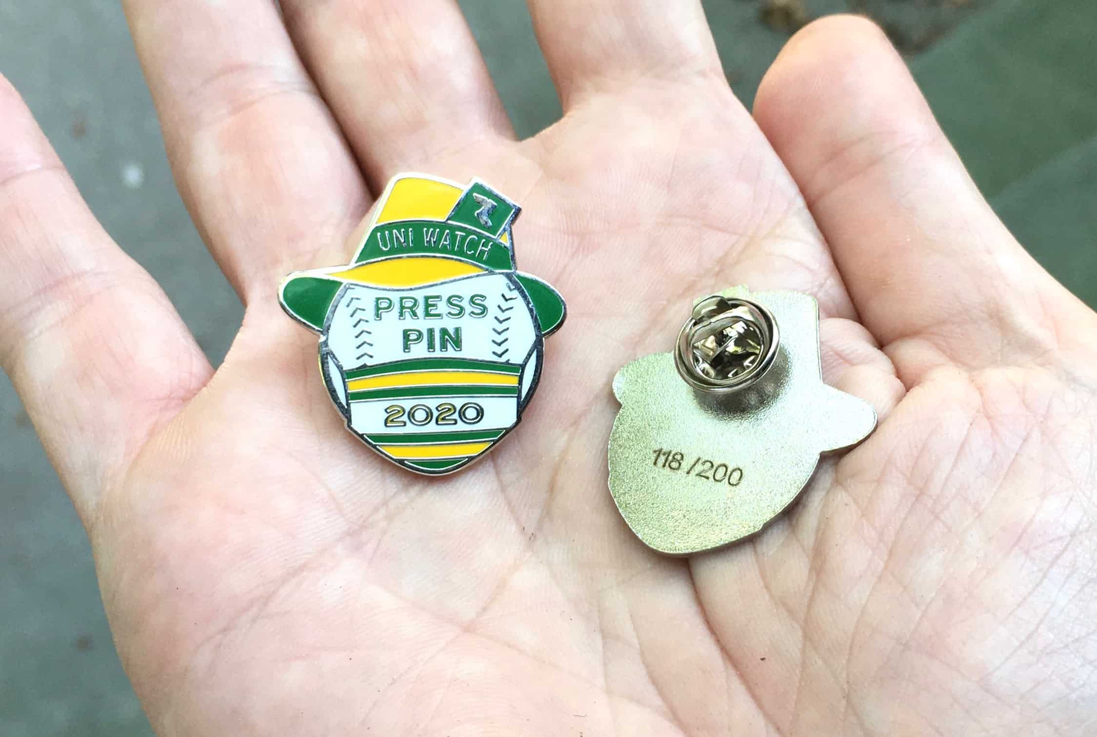
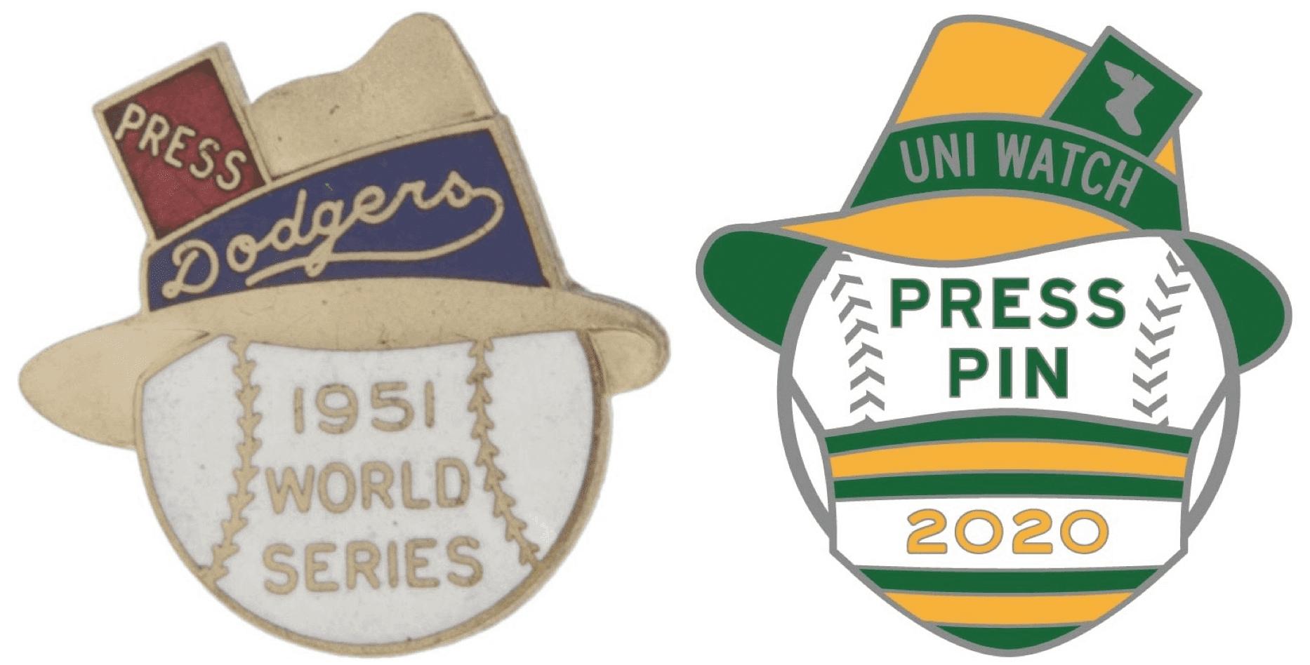
In case you missed it earlier this week, the Uni Watch 2020 Press Pin is now available. And it’s going fast — as of Friday evening, there were only about 40 of them remaining from our numbered edition of 200. As you probably know by now, this year’s design is a riff on the 1951 Dodgers World Series press pin, with a mask thrown in to capture the spirit of this crazy year (click to enlarge):
While we’re at it: If you missed the launch of the press pin, you may also have missed the announcement of the latest addition to the theoretical T-shirt menu (click to enlarge):
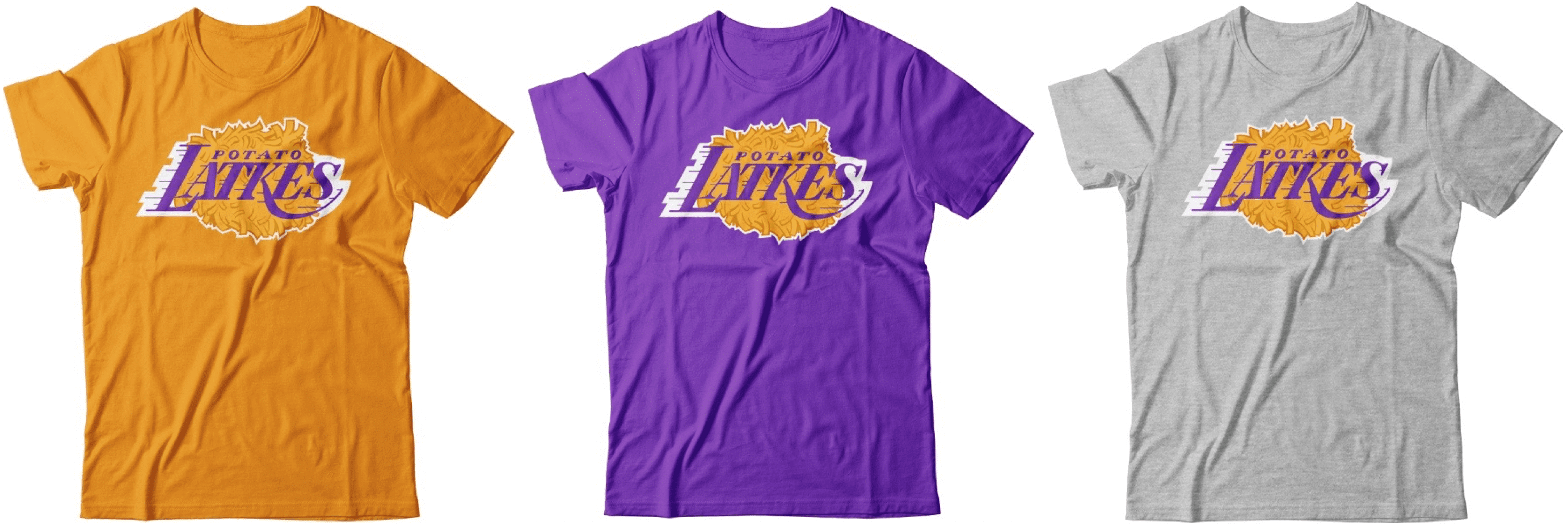
Wouldn’t it be fun — you know, just hypothetically — if these shirts were actually available? If you’d like to talk about that — or about any of the other menu items — shoot me a note and we can discuss that lamentable state of affairs.


The “BEST OF” Kreindler’s Korner
Hey guys & gals. You’ve enjoyed Kreindler’s Korner for several years now, mostly on the weekends, on Uni Watch, but with the recent coronavirus outbreak, Graig’s time is just too precious and he needs to tend to other things besides coming up with a new writeup each weekend.
So, going forward, for as long as the COVID-19 situation is bad in New York, I’m going to run a few “Best of’s” until Graig returns.
Here’s today’s offering:
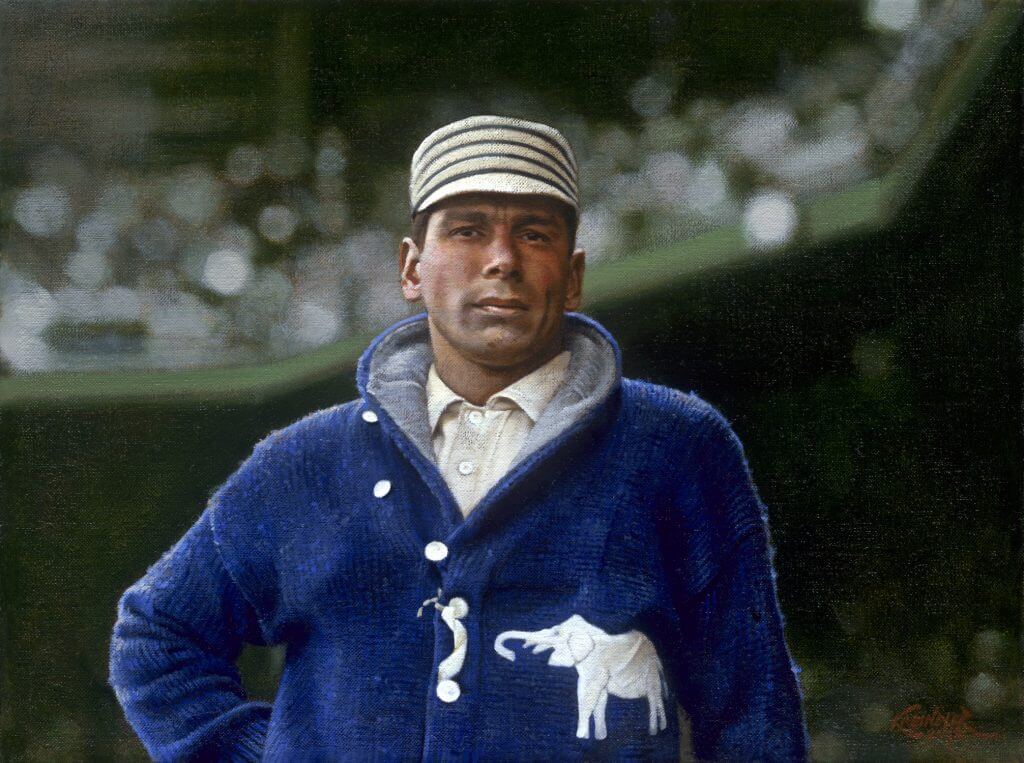
Title: “A Giant Killer”
Subject: Chief Bender, October 24, 1911
Medium: Oil on linen
Size: 12″ x 16″The client who commissioned this painting is a big Chief Bender fan. He went after this particular image probably because it’s one of the more iconic shots of the Hall of Famer. But also, and perhaps more importantly, that sweater. It was a challenge to make it actually feel like a sweater, and at the same time, bend and fold in space effectively. It had to feel hand-sewn, and noticeably different from the Athletics uniforms, which had to feel different from Bender’s skin. It’s all a game of relativity that starts with that sweater. I don’t think I’m alone in saying that I wish those things would make a comeback.
Thanks, Graig! You can (and should!) follow Graig on Twitter.


The Ticker
By Anthony Emerson

Baseball News: The family of the late Pete Frates, a baseball player diagnosed with ALS who started the ice bucket challenge, is auctioning off memorabilia to help victims of ALS (from Joe Giza).
.

NFL News: Does anyone recognize this logo Colts head coach Frank Reich is wearing on his sweatshirt in this pic? (from Brian M. Spiess). … The Browns have revealed their uniforms for tomorrow’s game against the Steelers (thanks, Brinke). … The Packers will wear their green home unis in Tampa (thanks, Phil).
College/High School Football News: This year, Notre Dame’s practice helmets include shamrock merit stickers, like the buckeye stickers on Ohio State’s helmets (from @Atxprogress). … New unis for North Dakota (from Greg Enkers and Tim Purdon). … New unis for Missouri S&T (from Patrick J. Murphy). … Miami is going white-orange-white today (from Josh Lefkowitz). … The following are all from Phil: Virginia Tech is going white-maroon-white against Boston College. … West Virginia is going blue-blue-gold today. … South Carolina is going black-red-red. … The LA Times speculates that UCLA coach Chip Kelly’s connections with Phil Knight from his Oregon days might lead UCLA to Nike once their Under Armour deal is up. … The head coach of St. Albans (W.V.) High wears a suit to school and wears a tie on the sideline because, as he explains it, “When you dress up for things that are important to you, it is a necktie mentality.” (from Brice Wallace). …

Hockey News: Kings first round pick Quinton Byfield will wear No. 55 (from Jakob Fox).
.
.

Pro Hoops News: The Nets’ ad patch deal has expired. Here’s hoping no one pays up to replace the old company (thanks, Phil). … People who vote at Atlanta’s State Farm Arena get a special basketball-themed “I Voted” sticker. I would vote just for that sticker! (from @Bulldog_Darryl). … Looks like Italian team Olimpia Milano took a little inspiration from some NBA teams with their logo.

College/High School Hoops News: Arkansas men have new practice jerseys (from Matt Snyder).
.

Soccer News: Burnley have finally gotten around to releasing their new third kit for this season (from Jim Howicz). … Here’s a great — albeit brief — video on Nike’s first ever soccer kit, for the NASL version of the Portland Timbers back in 1979 — and that the kits were actually produced by an English company, who sewed Nike’s logo onto them (from @texastrevor). … Did you know Chilean side O’Higgins has advertised McDonald’s on their kits by using French fries as their uni number font? They even have a little dab of ketchup (from Ryan Bush). … After scoring during Paris Saint-Germain’s win against Nîmes Olympique, PSG striker Kylian Mbappé revealed a shirt with a message of support for a young PSG supporter with cancer. More information here, en français.

Grab Bag: Gmail is getting a new logo, as Google is replacing its iconic envelope with a multicolored M (from Kary Klismet). … Ever wonder why passports look the way they do? This BBC article has your answer (from Wolfie Browender). … FC Porto’s handball team was forced to change kits at halftime during their Champions League match against Pick Szeged due to a kit clash. Since Porto was the home team, I imagine Szeged didn’t bring a non-clashing kit (from Julian Orlando). … I have no idea how Payne Stewart golfed comfortably at the 1987 Masters, but damn did he look good! (from Matt Rashford). … Coca-Cola is discontinuing Tab after almost 60 years (from @walbergLines).


And finally… Big thanks to everyone who contributed today, especially Bowen! Great stuff everyone.
Here’s where I’d normally post a sunset pic, but as I intimated last weekend, the summer place is now closed for the season and I’m back at home base — so, no more sunset pics for a while (perhaps I’ll throw a “best of” in now and then). Gonna be curling tonight — or at least what will amount to curling during COVID — lots of new rules and regulations designed to keep everyone safe (or as safe as possible), but at least we’re attempting to get things back to *normal*. Nothing will be normal in the truest sense of the word, of course, but normal-er.
Everyone have a good Saturday and I’ll catch you guys tomorrow!
Peace,
PH
I was today years old when I learned the Falcons logo is also an F.
That Frank Reich sweatshirt looks like a design from a local t-shirt shop in Indy called, well,The Shop. They make their own designs I believe, but don’t have any professional licenses hence the generic “INDY”, which the website lists as part of their “horseshoe collection”. Some of their designs are really nice, and have a particularly nice selection of vintage Indianapolis t-shirts.
Here’s a link to a onesie with the same logo
link
Those Bears unis are awesome. Great work! Love the grey pants and the font. Logo is excellent!
What? Tab cola still exists? I have not seen it in stores since the 80s. At least it has not been readily available in the cities where I have lived in Western Canada since then.
“Are you gonna order something, kid?”
“Yeah, gimme a Tab.”
“Tab? I can’t give you a tab unless you order something.”
‘Right, gimme a Pepsi Free.”
“You wanna a Pepsi, pal, you’re gonna pay for it.”
Fun fact:
Tab’s original colors were green and white. Only towards the mid-60s did they go to pink and white.
Though several of these logos and uniforms are creative and good-looking (even the Falcons), if a team were to unveil most of these designs in real life, I’m afraid for the most part they would be greatly hated on by today’s social media.
So far, baseball teams in playoffs have worn white 30 times, gray 19 times, dark blue 18 times, orange 7 times, green 4 times, black 4 times, red 3 times, light blue twice, and brown once.
Are the Braves and Rays shades of dark blue distinct enough to allow them to both wear those softball tops in the World Series? The Cubs-Indians did play a game 7 with both wearing blue four years ago.
I think they’re pretty much the same shade of blue. And it may end up being moot (if either the Astros or Dodgers win their series), but it does bring up an interesting sitch when the Braves are the road team. I don’t think there is a *rule* prohibiting both from wearing blue tops at the same time in any event. Cubs tops were royal and Cleveland’s almost midnight navy in 2016, so they were different, but link. Braves/Rays would be basically identical shades of blue. link … link
In the 2007 NLCS, Arizona as the home team in Game 2 chose to wear black jerseys, which this write-up says forced the Rockies to don gray pinstripe jerseys instead of their “lucky” black tops:
link
MLB may not have a written rule against wearing jerseys of the same color, but it seems to be strongly discouraged, especially in the postseason. Here’s a story on the topic:
link
Yep. I’m aware of that one. It’s just that 2020 is so freewheeling I don’t know if either team (esp. if the Braves are the road team) would be “discouraged” from wearing the blue tops. But it’s also possible neither (or one) team will make it, so the point could be moot before it even needs to matter.
No clunkers among Bowen’s work this week, and a few are excellent. The Bears and Packers stand out for me as designs that can stand alongside two of the best real uniforms in the NFL. Good work this week!
I appreciate the effort and the artistic mindset, but the Saints concept is 100% a clunker.
I noticed the Lions still have the William Clay Ford initials, so why no GSH for the Bears?
I really don’t like perma-memorials, but I can understand keeping it for George Halas and Lamar Hunt, because Halas was arguably THE driving force in building the NFL up from a loose association of franchises into a properly organized and structured league – a huge step toward becoming the league we know today – and Hunt, of course, founded the AFL, which in turn had a game-changing impact on the NFL.
Ford, on the other hand, as Lions owner, is REVILED by the fan base, and the only reason his initials remain on the uniform is because his widow who inherited control of the team insisted.
Ford may have been one of the nicest guys around (that’s what I’ve heard from time to time about him), but in terms of his time as an NFL owner and his impact on the league, he’s not even close to Halas or Hunt. To put it in players’ terms, it’d be like comparing Dave Krieg’s career to those of the likes of Joe Montana and Tom Brady.
So much this. Absolutely no reason to keep the WCF vanity project. Under his ownership, the Lions have won exactly 1 playoff game way back in 1991. The second-worst thing to happen to this country on November 22, 1963 was him taking complete ownership of the team.
From a Chicago suburb and never rooted for the Bears. I like the new helmet C with the football inside of it. However, Hobbs’ mentioning thatmany teams use the wishbone C and maybe the Bears should change it. I am pretty sure the Bears used it before the Reds and definitely before the Twins, who did not come into existence until like 40 years after the Bears. I am also pretty sure the Bears borrowed the wishbone C from the southside University of Chicago Maroons…. 3 peat winners of Big Ten Football in the 1920s and also the team the southside Chicago Cardinals bought their uniforms from and how they got their name. Most of his uni concepts are alright. I realize how hard it is to redesign whole teams, but some of these are just silly. The cheese G for Green Bay looks like a grade school concept design. The GB he made would be wayyyy better, though it looks like a players personal logo… the separated B looks like a 3 to me. I still don’t understand his obsession with serif numbers. And he used the redesigned number fonts on a number of his throwbacks. Not sure if that was a mistake or on purpose. If deliberate, then they are fauxbacks. Lastly, the changing of the saints, religious reference, to a sain bernaard dog would like piss alot of people off. The rest of the uni is nice, but they dog would not go over well in my estimation.
2007 ALCS GM 6 10/20/2007
Fenway Park
BOS: 12 CLE: 2
glad I wasn’t at this one… woof
The $14 million grand slam by JD Drew.
THe Volume II link doesn’t work because it’s a preview link.
Here’s the correct link: link
Gah! Sorry – my mistake. Now fixed.
Nice effort on the redesign. Again a complete miss.
The redesigns showcased on the site are always fun, provocative…food for thought, or object-lessons in over-doing it. Keeps the conversation on design going. Please never stop posting them.
Side note: That Chicago Bears set is a gem.
That Falcons redesign is legit fire. I love the helmet color.
agreed. That’s the first one that I’ve actually liked better than actual designs.
Both the Buffalo and Tampa Bay logos appear to be smoking a pipe.
These new helmets don’t help designers at all.