By Phil Hecken and the SMUW Crew
Follow @PhilHecken
The world of College Football soldiers on these days, with a bunch of players out due to COVID-19 and a couple games cancelled, but overall, it seems as though the season is progressing better than many of us expected. In fact, as I’m sure you’ve heard, the B1G made the decision to play in 2020, and they expect to start their season on October 24th, with an 8-game schedule. The PAC-12 has also hopes to give the season a go, although that hit a hiccup yesterday, with games tentatively scheduled now to begin October 31 or November 7. Nothing is set there, as “the league announced that it is not ready to vote on whether to return to play this fall and will instead meet next Thursday with the goal of making a decision.” But we seem to be moving forward as opposed to shutting things down completely. Obviously the season won’t resemble anything we’ve ever seen, and who knows how it will all shake out in the end, but for now, we may have all Power-5 conferences playing football in November.
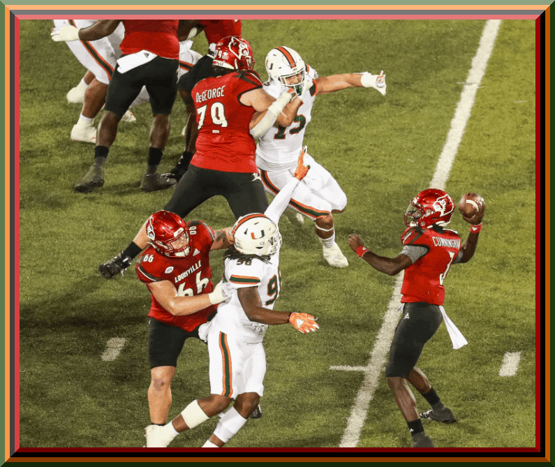
For now though, without three of the big five (SEC, B1G and PAC-12) conferences playing, the ACC and non-Power-5 schools are in the spotlight. The biggest game of the weekend took place yesterday evening between Louisville and Miami (pictured above), as this was the only matchup involving two ranked teams. It wasn’t a terrible looking game either (I don’t normally like shiny helmets, but I have always liked the ‘ville’s shiny red dome), and it was an interesting decision to pair that with a red jersey and black pants. They’ll never look good with this uni template, but overall it was much better than it could have been. Of course, Miami always looks great in all white.
Anyhoo, that’s enough from me. I shall now turn it over to the best uni-coverage team on the webs, the SMUW crew, beginning with TJ Duroncelet and your…
Sunday Morning Uni Watch
by Terry Duroncelet, Jr.
Now that the New Shoe Blues are over with (I totally didn’t just buy a new pair of Johnston & Murphy Lancasters earlier in the week just so I can find an excuse to say that, what do you mean?), let’s comfortably walk into Week 3.
From Friday:
• Excellent color-vs-color matchup between the Coastal Carolina Chanticleers and the Campbell Camels. No, this isn’t a ploy to point out the splendid alliteration of those two names when read consecutively, nor is this a flimsy excuse draped in a coy ploy to type (and even say out loud) Coastal Carolina’s rad team name, nor is this a ploy to note that we have a school that calls their athletic teams the CAMELS (INB4 “their actually the Fighting Camels“). I honestly have no idea what any of you are talking about. Anywho, I know what Campbell wore goes against what I like in a uniform (I dislike the dollop-of-cream look, no matter the team, no matter how well-designed the uni is otherwise), but nonetheless, I’m just happy to see a color-vs-color game that ISN’T YELLOW/GREY vs WHATEVER.
From Saturday:
• The University of North Texas North Texas State Mean Green wore kinda-throwbacks (to complement their, uh… kinda-throwback look from last week) against SMU. Simple, but effective. I dig. The helmet is an inverse version of the “Flying Worm” helmets worn during the Hayden Fry-era, and were worn in his honor (Fry passed last December at the age of 90). Fry was also the very reason that Iowa has the Tigerhawk logo.
• In a similar light: I normally don’t use this term, but Georgia Tech’s look against UCF was clean! Like, this is easily one of my more favorite all-white looks in recent years (and the not-chromed-out facemasks are a nice touch).
• UTSA’s unis look… I don’t know. “Unfinished” is the word (especially in comparison to the white-clad Stephen F Austin squad). I just wanna throw this in GIMP or MS Paint, and just add a stripe, or something.
• Duke wore Black ‘D’ decals again this week, this time on white helmets. LOVE the message, but I will say that strictly speaking on aesthetics, the white helmet version looks LEAGUES better than the blue helmet version that they wore against Notre Dame last week. Also, Boston College wore their throwbacks in this game as well.
• Sweet-looking helmets from Oklahoma State, in an equally sweet-looking game against Tulsa. [As my pal Jason Bernard would say, OSU looked “predictably gorgeous” — PH]
• Contrast Matters: “Eh, I’ll take it” Edition.
• Contrast Matters: “AYYYY, I’ll take it!!” Edition. By far, the best-looking game of Week 3 (here’s last year’s edition, also a looker).
And… huh, that’s… it, I guess, for Week 3?? Not much news, BUT! The SEC begins play next week, so expect to see many more looks, and many more shenanigans. Until then, hope you are well, hope you are safe, and I’ll see you next week!
Thanks, TJ — now for the rest of your SMUW!


Memal’s 5 & 1
Following in the footsteps of the original “5 & 1,” Jim Vilk, Catherine Ryan after him, and finally Joe Ringham, in 2019 we introduced a new “5 & 1” (five good looking and one stinker) uni-vs-uni matchups — Michael “Memal” Malinowski. Like Joe, Catherine & Jim, Memal will pick HIS 5 best looking/1 awful matchup, and occasionally have some honorable mentions (both good and bad). You may agree and you may disagree — these are, after all, just opinions and everyone has one. Feel free to let him know what you think in the comments section.
Here’s Memal
I was surprised last week with how quickly I was able to get my eyes on every game played and get to the meat of the piece, sorting out and saying why this list of games looked the best. Then there were 5 games either cancelled or postponed today and it actually made this piece a little harder, as there were several fine looking games going on and almost none that stood out for either a good or bad reason. A list still had to be made, so here is this week’s 5&1!
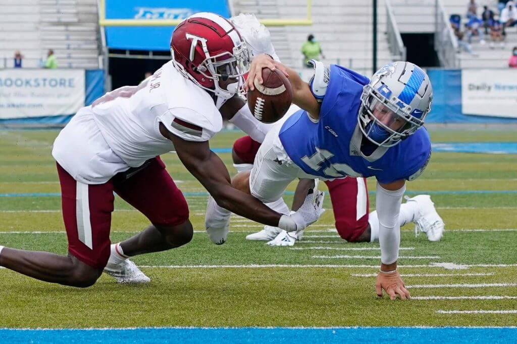
5. Troy @ Middle Tennessee State
The cardinal and silver of the Trojans looked exceptionally sharp against the Blue Raiders home silver/blue/silver combination. A few extra points for Middle Tennessee for trying to hide their nickname on the pants by making the words silver too, a uni fad I hope dies soon.
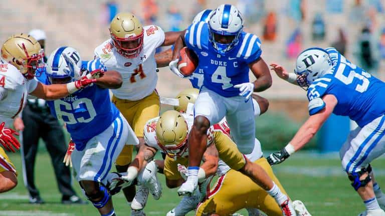
4. Boston College vs Duke
This game had a little bit of an old school feel to it that I attribute to the large shoulder logos on BC’s jerseys and the throwback pants. If the Blue Devils didn’t have such a simple uni set maybe this would have been higher, but a good looking matchup nonetheless.
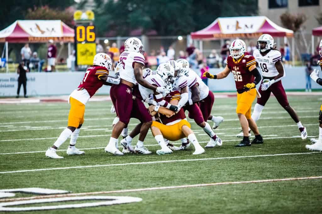
3. Texas State @ UL-Monroe
There were just enough differences between the War Hawks white/maroon/gold combo and the Bobcat’s white/white/maroon uniforms and the shades of maroon and gold those schools sport to keep this nice looking matchup from looking like an inter-squad scrimmage! A good looking game in Monroe!
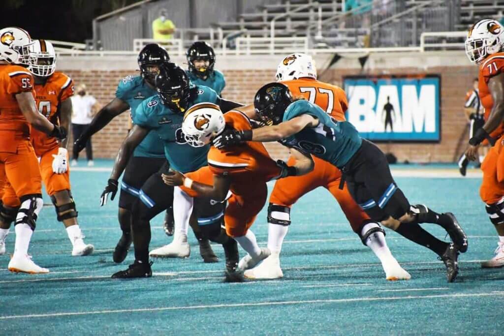
2. Campbell @ Coastal Carolina
I saw a glimpse of this game Friday night on Twitter and thought, “Wow! The &1 selection is set early this week!” I wasn’t familiar with either team’s uni set and as I started pulling pictures from this game I struggled to find a reason to criticize either set and how they looked on the field. The Chanticleers had the leotard effect going on, but I don’t hate it as much as other dreaded uni trends and their stripes work well. And the Campbell…(*looks up their nickname*) Fighting Camels… (*double checks to make sure that’s really their name…it is!*) use orange and black to great effect with simple, narrow shoulder stripes on their jerseys over pants with the school’s initials as the only feature. Then I watched the highlights of the game on YouTube and add in the fact it was a color on color matchup and I was sold that this was a bold looking game that this night all the uniform choices lead to it earning a spot in the top five of the week.
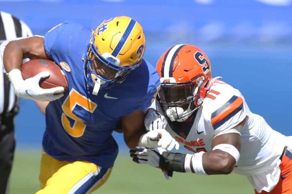
1. Syracuse @ Pitt
Just two sharp looking standard uniform sets meeting on a perfect fall afternoon. My only gripe is I can do without the pattern on Pitt’s helmet stripe. I get what Nike was going for, but you can hardly see it during the game and anytime I do see it I just wish it wasn’t there.
And since somebody has to be the sacrificial lamb…
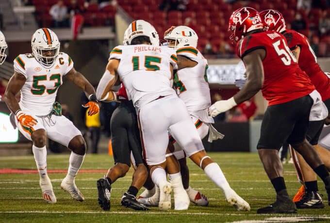
&1 Miami @ Louisville
I carried over the “…sacrificial lamb…” statement from the fine folks who provided the 5&1 previously, but it seems to really apply this week as there weren’t any (*IMHO*) awful looking games. Miami looked alright, though their all white look exceptionally whiter than the storm trooper look from other teams. I’m not sure what that Cardinals think their look is anymore, but it’s a hit or a big miss anymore and the red/red/black tells me they’re desperately trying to look cool.
Thanks, Memal! OK readers? What say you? Agree or disagree with Memal’s selections? Let him know in the comments below.


NCAA Uni Tracking
Uni Watch will again track the uniform combinations worn by the “Power 5” conferences. All of the 2019 trackers are back! Unfortunately, not all of the conferences are back. Here’s how the trackers would track, if all the schools were playing:
We’ve got Rex Henry (tracking the ACC), Dennis Bolt (tracking the PAC-12), Kyle Acker (tracking the Big XII), and Ethan Dimitroff (tracking the B1G AND the SEC). Rex, Dennis, and Kyle and are all returning from 2015, and Ethan is back after joining the NCAA Uni Tracking a couple seasons ago. Ethan continues his dual role of tracking both the B1G and the SEC.
But this year the B1G and PAC-12 aren’t playing at all. So we won’t have tracking for them this season. UPDATE: Both the B1G and PAC now will try to play in the 2020 season.
Here are the Uni Trackers for the Power 5 Conferences (I’ve left all the previous tracker info in their usual slots, even if the conferences aren’t playing. In case you want to click on any of the links):
Rex is up first today (ACC):
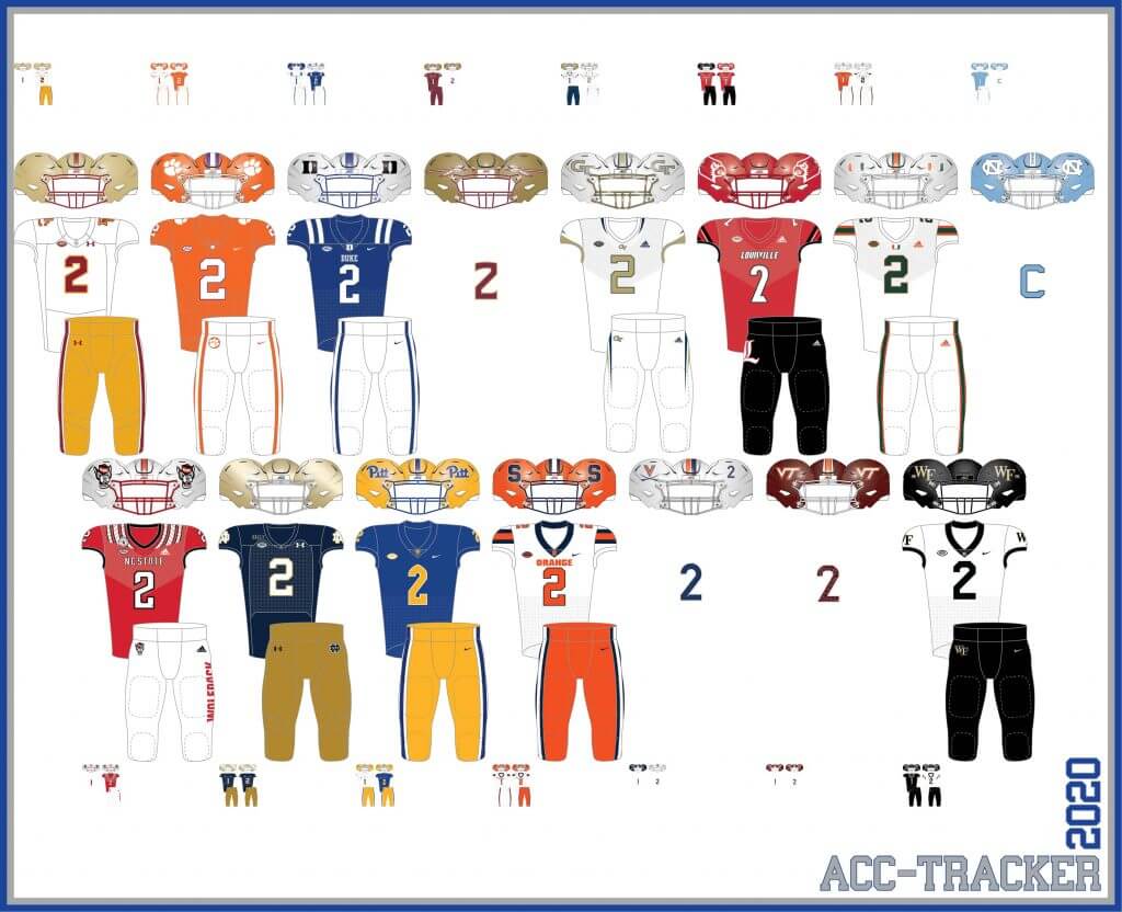
ACC
More Here.
Follow Rex on Twitter here.
And now, here’s Dennis with the PAC-12:
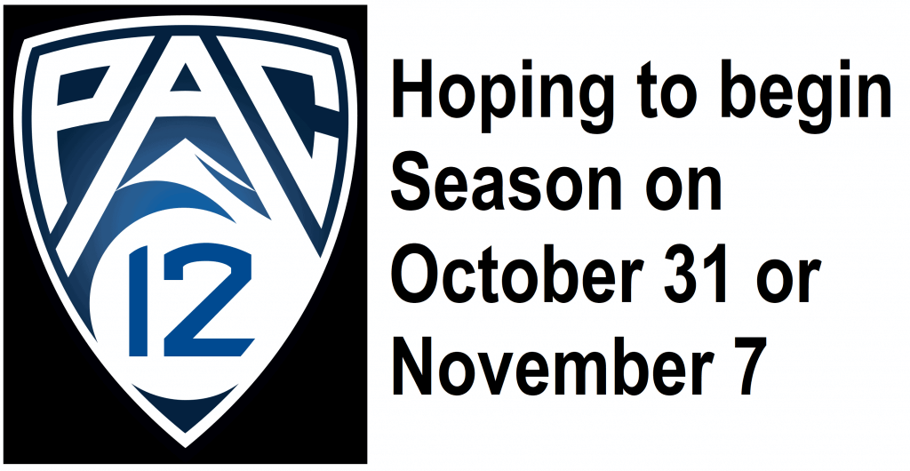
PAC-12
More here.
Follow Dennis on Twitter here.
And here is Ethan, with the SEC:
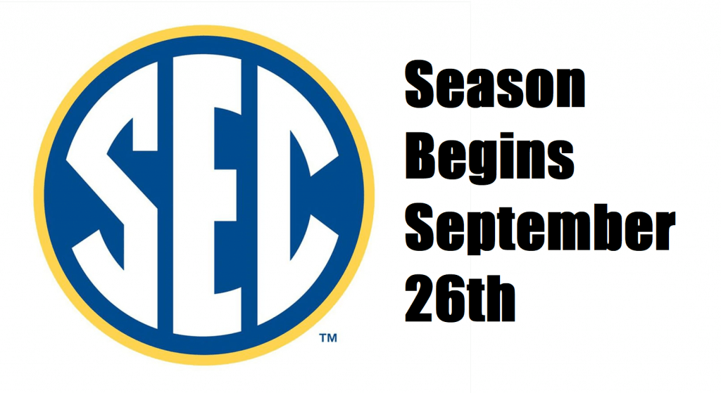
SEC
And be sure to check out Ethan’s WVU Mountaineer Tracker.
Follow Ethan on Twitter here.
And here is Kyle with the Big XII:
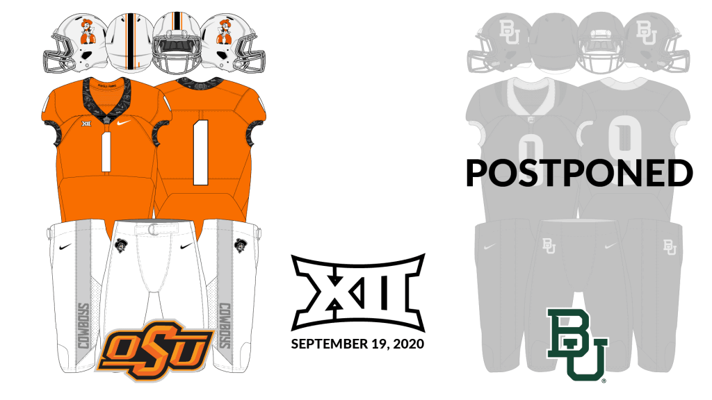
Big XII
Follow Kyle on Twitter here.
And here’s Ethan with the B1G:
B1G


What They Should Have Worn
I’m pleased to present you a new feature on SMUW. Each week Logan Patterson will pick a Saturday game where the teams don’t necessarily look nearly as good as they could. Logan fixes that. Sometimes he simply delves into a team’s past for inspiration, other times he creates entirely new looks for a team. Sometimes he tweaks a previous look. But in the end, he comes up with a combo for both teams — “What They Should Have Worn” or “WTSHW” for short.
Here’s Logan
WTSHW – Louisiana Tech at Southern Miss (Sept. 19, 2020)
By Logan Patterson
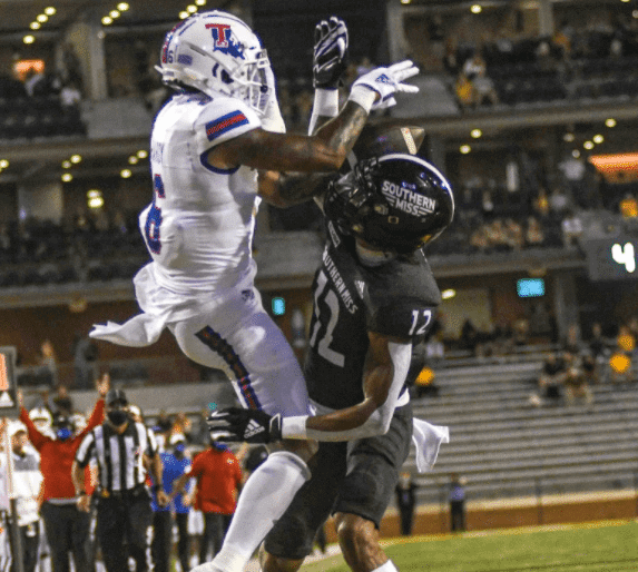
For the second installment of What They Should Have worn for this wacky season, we’re taking a trip to C-USA country for Louisiana Tech at Southern Miss. As will probably be a pattern, I’m looking to the past to give both programs a classic but modern look.
Both of these programs have a history of mid-major success and have had some iconic looks, but have regressed to wearing fairly generic Adidas patterns in recent years. Louisiana Tech dropped their beautiful shoulder stripes last year for truncated sleeve stripes.
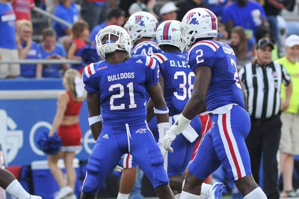
The Bulldogs have also pivoted to mostly wearing a white helmet, a departure from the red lids they’ve worn for most of their history. I think that’s a bit of a tragedy, as their home red/blue/white combo was one of the more unique looks for a conventional palette.
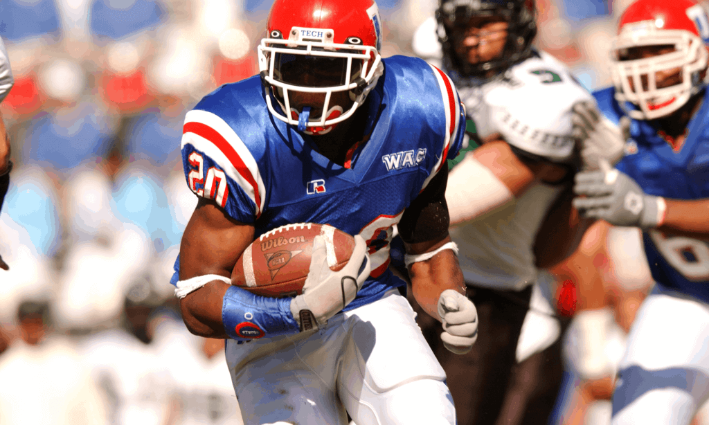
I’d love to see Tech wearing something a bit more traditional, so I basically turned back the clock. Brought back the shoulder stripes, kept the nickname on the chest they’ve been using lately, and ditched the red outline on the numbers.
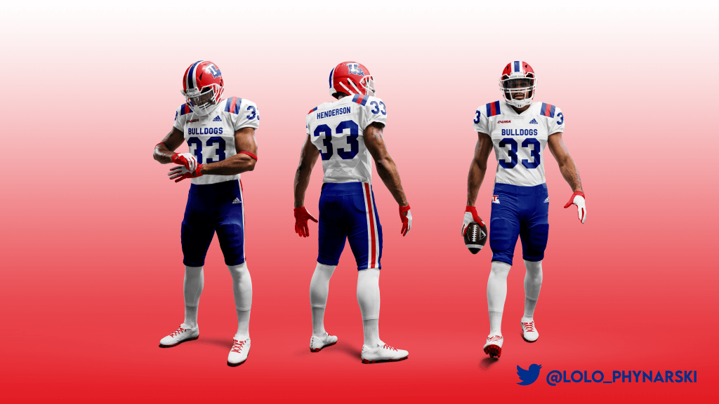
For the home team, I’ve updated and created a home version of the killer 1970 throwbacks they wore back in 2012.
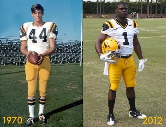
A modern logo adorns the helmet, and the twin stripes on the pants and helmet are a nod the helmet stripes worn during much of the 2000s, including their program best 11 win campaign in 2011. Plus I think they look good.
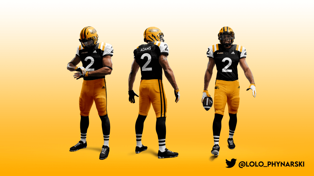
Rather than the drab unis these two got dressed up in last night, here’s what they should have worn.
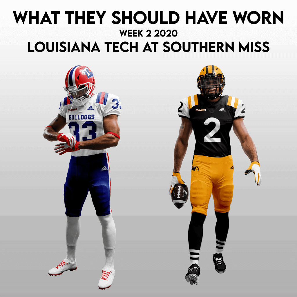
Thanks, Logan. You can follow Logan on twitter @lylo_phynarski.


Meet The SMUW Crew!
I can’t believe I haven’t done this before, because the entire crew has been doing this for a number of years (some longer than others), and I never really gave them their proper due. Last weekend we “met” my Duck Tracker and PAC-12 Tracker, Dennis Bolt (and it now looks like he may end up being busy this season after all).
Today, we’re going to meet one of the newest members of the SMUW Crew, the man who brings you the 5 & 1 every weekend, Michael “Memal” Malinowski. As you know from the 5 & 1 intro (above), Memal follows a number of those who’ve been the arbiters of good (and bad) taste in uni matchups on the College Football Level.
So please everyone, here’s your official introduction to Memal, along with his photo and bio:
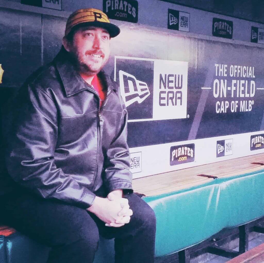
I’m a father of 3 from Pittsburgh, Pennsylvania. I’ve been interested in the uni-verse ever since 1992 when the Penguins switched to the robo-Penguin logo and changed what I considered to be an already stellar uniform.
College football is by far my favorite sport. From the pageantry to the drama on the field to unique histories each program has, there is so much for a fan of athletic aesthetics to take in and judge on any given Saturday in the fall. As hard as it was at times to make sure to find photos and judge the visual appeal of every game last season, I loved having an excuse to take in as much college football as I could, something I was already doing for free.
If you’re on Twitter and want to draw my attention to or make a case for a match up this season, my handle is @Michael519 and am always in front of the computer Saturday evenings.
Thanks, Memal.
In the coming weeks, we’ll meet all the SMUW contributors!


French Open Preview
By Brinke Guthrie
Follow @brinkeguthrie
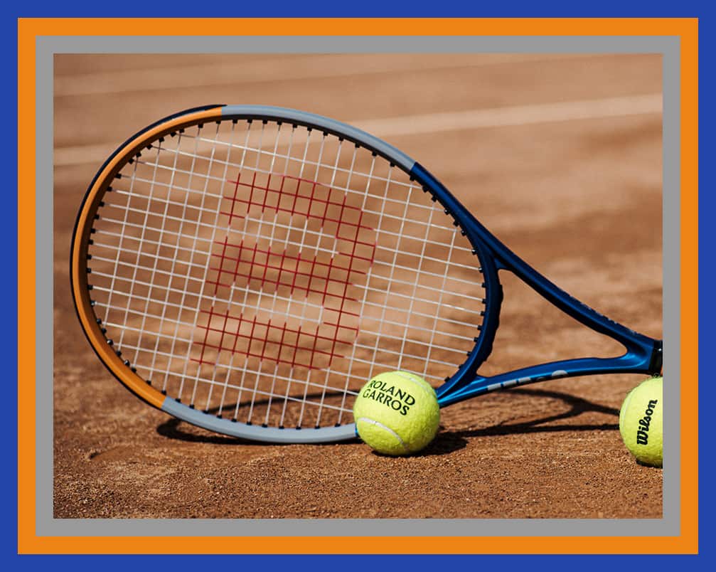
Tomorrow marks the start of the 2020 French Open AKA Roland Garros in Paris. It’s usually in the middle of May to the first of June; (springtime in Paris, you know) but this year due to the global disaster we all find ourselves in, the French tennis federation decided to jam it right after the US Open, without, uh, asking for anyone’s opinion. Let’s see what new stuff we can look forward to seeing:
• In a surprising move, Chicago based Wilson Sporting Goods grabbed the tennis racquet sponsor slot away from major French tennis brand Babolat. Quelle surprise! Co-branded Wilson/RG racquets and balls and more are here, including really sleek looking RG cosmetics on their new Clash 100 RG and Blade 98 (16×19) v7.0 RG. That’s Maritime Navy and Slate Gray BTW if you’re keepin’ score, fella.
• Lacoste, as always, is well represented with a ton of clothing and accessories. Novak Djokovic exited the USO under a cloud of controversy, but he’ll be in Paris, wearing his signature polo with a geometric kinda print, along with the shorts and jacket.
• Roger Federer taking a pass on the clay, heck Nadal will win it anyway, but Uniqlo will be represented by Kei Nishikori.
• Fila’s French Open line will be available tomorrow morning- you can see it here.


Uni Watch News Ticker
By Phil

Baseball News: The USS Salem is a heavy cruiser that is a museum ship now, docked in Quincy MA where it was built. Here are some photos from the “Memory Room”. USS Salem Fleet Champs, 1952; the Newport News baseball team, which was worn in the 1950’s, and seen in this team portrait (great find from Joe Giza). … The Cincinnati Reds Trevor Bauer continued to troll the Houston Astros, wearing a pair of trash can cleats during game (thanks, Brinke). … Reader Patrick O’Donnell was watching the 1999 ALCS and noticed the B logo on Nomar’s helmet looked particularly skinny and out of line with the logos on the hat at the time. “Comparing it to the modern helmet/hat logo it really is a stark difference. Any idea if this was an anomaly or were the helmet logos different in the 1990s?” he asks. Anyone? … Speaking of questions, Bryan Beban asks, “What does Cardinals pitcher Kwang-Hyun Kim have on his hat below the New Era logo? Possibly a self made memorial patch?” … Of course no one could have predicted the Amazin’ run the Mets would go on in late 1969, but this SI cover of Ron Santo (autographed, too!) of the Cubs when it looked like they’d have a good shot at winning the NL East (from AUTOGRAPH1). … Looks like the A’s Jordan Weems has cut a hole in his BP hat so he can wear his hair in a ponytail (from Jakob Fox).

NFL News: To the complete surprise of exactly no one, the Seahawks revealed they will wear mono blue vs. the Patriots today. … On the opposite side of the uni-spectrum, in case you missed it, the Saints will wear their beautiful throwback unis today (they’re “color rash” but they’re spectacular). … We all have our favorite NFL uni, but one writer makes the case for the Raidah’s silver and black. (I still think Green Bay is best, but Las Vegas is certainly top 3). … The Bills will go blue/white while the Dolphins will be in mono white today. … Have we ever seen a field mowed horizontally? (from Gregg Elkin).
College/High School Football News: When the SEC season starts next weekend, JaCoby Stevens has the honor of wearing the coveted Number 7 jersey (he’d previously worn #3). … “Interesting photo from 8-man football (Friday) night. Player for Cyril (OK) High School wearing 17 but 5 on helmet. What are we calling this, UniWatch? WNOH?” asks Glen Brockenbush. … Looks like Pitt is unveiling a new uniform next week (from Alexander Ganias).

Hockey News: The Stanley Cup Final began last night between the Tampa Bay Lightning and Dallas Stars, and Wade Heidt noticed new tarps over the seats specific for Stanley Cup Final.
.

NBA News: Here’s a question probably not many of us have been asking: Why do some NBA players have the phrase “Group Economics” as their NOB? This article has the answer.

Soccer News: Even though Everton now has Hummel as kit provider, branding from their former one (Umbro) can still be seen on Goodison Park stands (from Germán Cabrejo).
.

Grab Bag: If you read the first item in the baseball ticker, you know there were some baseball memorabilia found in the USS Salem’s “Memory Room.” But it wasn’t just baseball — check out this boxing robe, worn by shipmates representing Newport News for fleet matches. Here’s a close up of the back of the robe (from Joe Giza). … Some pretty cool Goldy Gopher wall art (mostly hoops, but some football and hockey too). From Kevin Cearfoss. … French Volleyball Cup (Coupe de France de Volley) is using the Tricolor on the court (from Jeremy Brahm). … Also from Jeremy: “check out the complete sarif on the 2 in this set score(0:2). I have only seen that on Japanese yen notes.”


And finally… big thanks to all the SMUW contributors and to Brinke for the French Open preview.
Yesterday was a (relatively) chilly day out on the east end of Long Island, although it warmed up a bit in the afternoon, and the cloudless sky allowed for a full sunset. Unfortunately the photos I took don’t do it justice (and I didn’t realize the glare on the lens until much later). Still, it was a nice way to end the last weekend of summer.

Everyone have a good week and I’ll see you back here next Saturday.
Peace,
PH
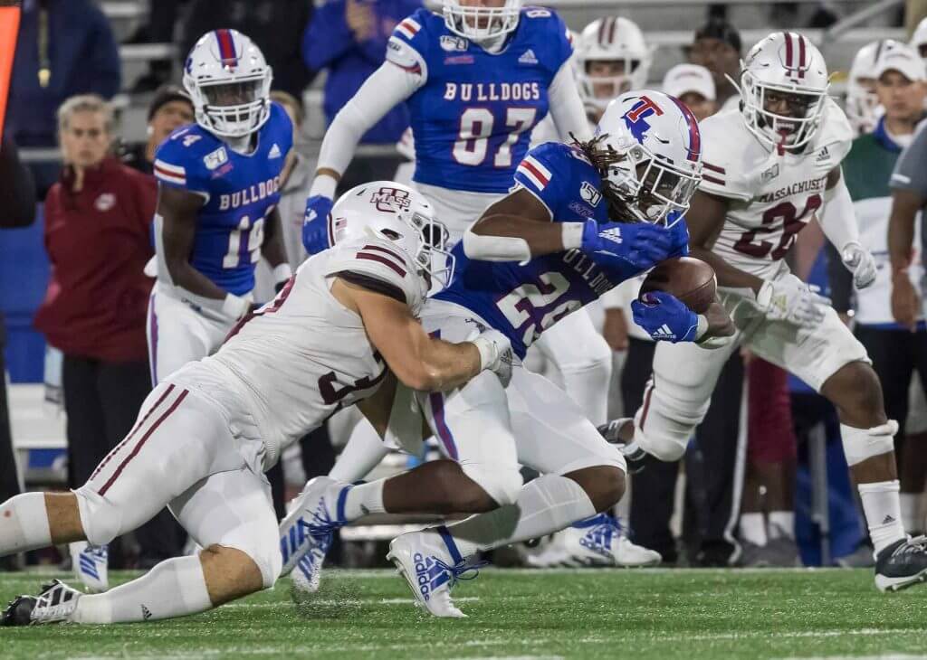
Agree with the idea that the black D Duke logo looks better on a white helmet than their royal one. Black and royal blue never look good together, no matter how hard people have been trying. It is the definition of BFBS. I disagree with the idea that Duke’s uniforms’ simplicity makes them less appealing. It’s Indy Colts Light, but this is a textbook case of “less is more”. 2 school colors (one of which is white), UCLA stripes and matching pants stripes. What would you add that isn’t blatant gimmickry that would improve that look?
Look at the Chargers for comparison. The dark blue uniform numbers on the helmet look 1000% better than the powder blue ones’
Something else unique about the Stanley Cup Final in the empty arena. The Stanley Cup was perched rinkside, on display if the players looked up into the stands.
link
Thinking Syracuse at Pitt is an easy number one to pick this week.
Miami Hurricanes look odd in all white. That look is great for many teams but Miami needs the orange pants. Just does not look right.
Not a fan of the Louisville uniform. Having a really large L logo on the pants and really small TV numbers on the shoulder do not really help the look.
Many readers of this site on Sundays know I love to post “College Football Uni Tracking – Canadian Rules Style!” in the comments. That will not be happening this year because of the pandemic. All four conferences in U Sports not playing this year. Cannot sub in junior football with the CJFL instead as that league has cancelled the season as well due to COVID-19.
Think how garish Syracuse v Pitt would have been even a couple of years ago. Nice to see teams get back to what is working.
Fully agree about Miami and orange pants. Ditto Louisville’s overall look. My high school colors were black and red and it doesn’t have to look like this.
Georgia Tech should have received ‘minus-points’ for those jerseys. Old gold trim on the sleeves but light beige numbers made them look like late 90s Saints jerseys. Bush League.
Correction: U of M’s mascot is named Goldy Gopher, not Goldy the Gopher. Kind of a Smokey Bear situation.
dammit Scotty!
Thanks, now fixed.
The 5&1 is a massive apostrophe catastrophe today. Fortunately there’s still time to edit.
OK, I went in there and fixed (I think) all of them.
The Red Sox helmet “B” of the 90’s was different from the cap version. Nomar’s helmet was not an anomaly. They all looked like that.
The cap “B” has gone through several iterations since the 1940’s.
@teenchy — Couldn’t agree more. It’s jarring to see that many misplaced apostrophes in one section of text.
PROOFREADING: In the college/HS football ticker, the note about 8-man is missing the link,
Thanks. Link now added (mah bad)
Coastal Carolina, with its leotard look, stupid stripes on the thigh and even more ridiculous jersey side panels has no place in any best dressed list, even if it was the only game played this weekend.
Yeah, I was kinda shocked when both TJ & Memal liked it. I even shot an e-mail to Memal before I got his 5 & 1 noting that if it were up to me, that was easily my &1. I don’t mind color vs. color, but that was a hot mess.
“I wasn’t familiar with either team’s uni set and as I started pulling pictures from this game I struggled to find a reason to criticize either set and how they looked on the field.”
You did pull pictures from the correct game, right? Cuz no WAY either “uniform” that I see in images from this contest gets away without a litany of negative statements.
The tab on the side of Kwang-Hyun Kim’s cap is part of a protective liner.
link
link
Wade – Thanks for the Canadian collegiate football update. Meant to ask last weekend. I’m going to miss the Far North uni-styling, especially the Manitoba Bison.
Glen – MNOH (mismatched number on helmet)?
Thanks tosaman! We will look forward to next year.
Best thing for the Manitoba Bisons to do in the season off is get some gold pants. Brown over gold will look better than brown over brown.
link
Yep – golden britches would be an upgrade
The brown trou would look fine with a white (or dare I say it, gold) jersey, but when paired with the brown top, they look like shit.
Pun intended.
For an example, look at Wyoming.