By Phil Hecken, with Matt Esterich
Follow @PhilHecken
Hey guys! Hope everyone is doing well and staying safe as we pass the mid-point of the month of September in the Year From Hell.
As you will recall, back in July/August, I put out the call for readers to share articles with the readership as we were facing somewhat of a dearth of uni-news…and you guys responded in spades! Today I want to share a piece with you by a (sort of) neighbor, who is also a Uni Watch reader, Matt Esterich (who, like me, resides on Long Island). At the time Matt made his pitch, I told him I probably had enough content to run out the month, but I’d love to run his piece in September if he wanted to still send it in to me — and he did, about a week and a half ago. Since last weekend featured the opening of the Premier League and the first Sunday Morning Uni Watch of the season, I am running his piece today.
In his initial e-mail, Matt wrote,
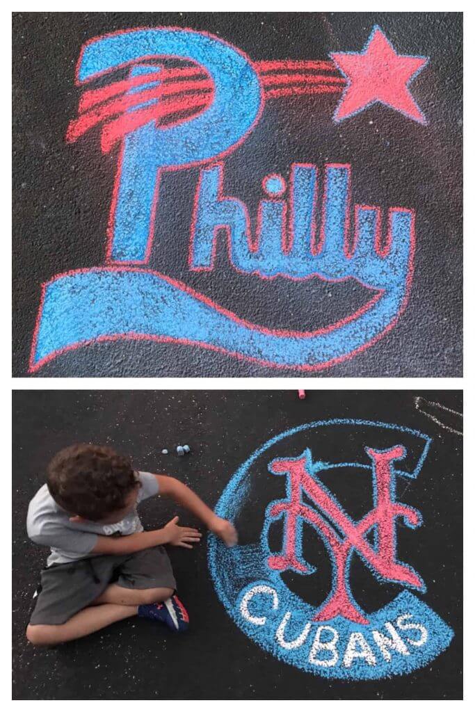
I have an idea for some content in the upcoming Dog Days. First, a little background on myself: I live in Plainview, NY (I think we’re neighbors, sort of). I was a TV sports anchor in Virginia from 2010-2017 and I’m currently the TV color analyst for the Long Island Nets of the NBA G League. I’m also in charge of keeping my two boys (six and three) entertained during quarantine. To that end, we spend a lot of time in the driveway doing chalk drawings. And most of our subjects are sports logos. I draw the outlines and my six year old helps to color them in (though lately he has ventured into doing his own work). It’s been a great way to pass the time, get outdoors, learn about art and, most importantly, classic sports logos. Below is a look at some of our work. I know there are plenty of guys out there that are professional artists that could probably do better stuff, but I think it comes out pretty cool and our story isn’t too bad, either. Father/son bonding, with nothing more than an iPhone for reference and a 64 box of Crayola chalk.
I know we’ve had some chalk art before, but these are pretty special. So, here’s Matt with the promised article (click any photos below to enlarge):
Chalk Driveway Art with my Sons
By Matthew Esterich
Having finally sent my boys off to school this week, it feels like a good time to reflect on how we spent (all 182 days of) our summer vacation*. First a little background – I was a TV sports anchor for eight years and I’m currently the TV color analyst for the Long Island Nets of the NBA G League. My boys have grown up surrounded by all sports, so when the G League season went on hiatus in March and I needed to keep them occupied, we resorted to what I called #DrivewayArtClass.
Like many in the Uni-verse, I grew up doodling sports logos. From March through June, virtual school was only an hour. I figured I could provide some art education if I schlepped our sidewalk chalk and my iPhone to the driveway. My oldest son Max, who is five, immediately gravitated toward my sports drawings. Soon we became a team. I would sketch the main designs, and he would color them in. Our earliest work centered on vintage NBA logos:
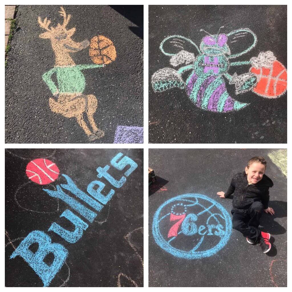
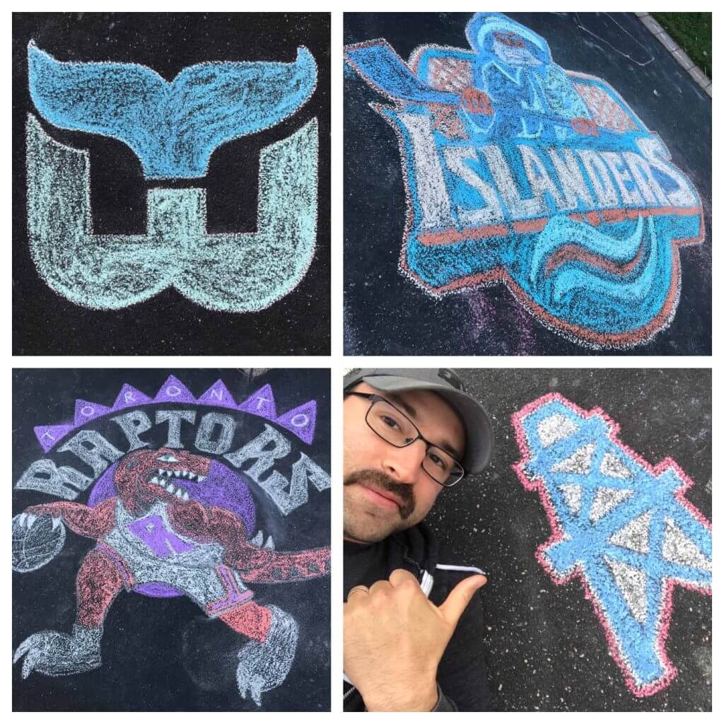
I quickly realized that not only were we creating art, but I could use our driveway time to teach about teams and players. Max has long been able to recognize current sports logos, but defunct teams and old logos facsinated him (specifically my all-time favorite team, the Hartford Whalers, and our local hockey club’s ill-fated flirtation with a Fisherman).
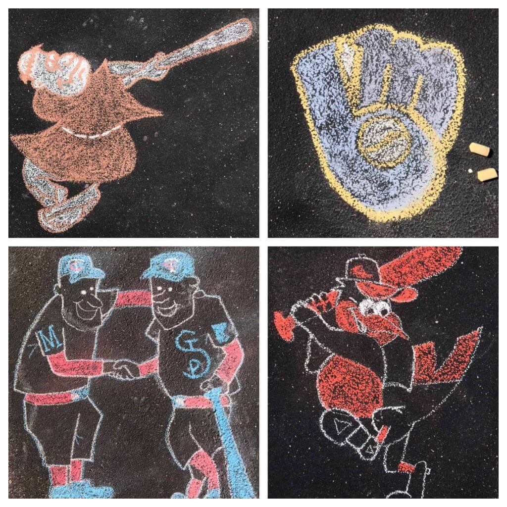
I taught my son about the proliferation of cartoon logos in 1970’s and 80’s MLB and the hidden messages found inside others:
And we had a particularly poignant conversation a few weeks ago when Major League Baseball honored the 100th anniversary of the Negro Leagues. We talked about Jackie Robinson and the bravery of those who helped integrate the game. It turns out talking about difficult subjects like these with kids is a lot easier when you’re sketching baseball logos in the driveway.
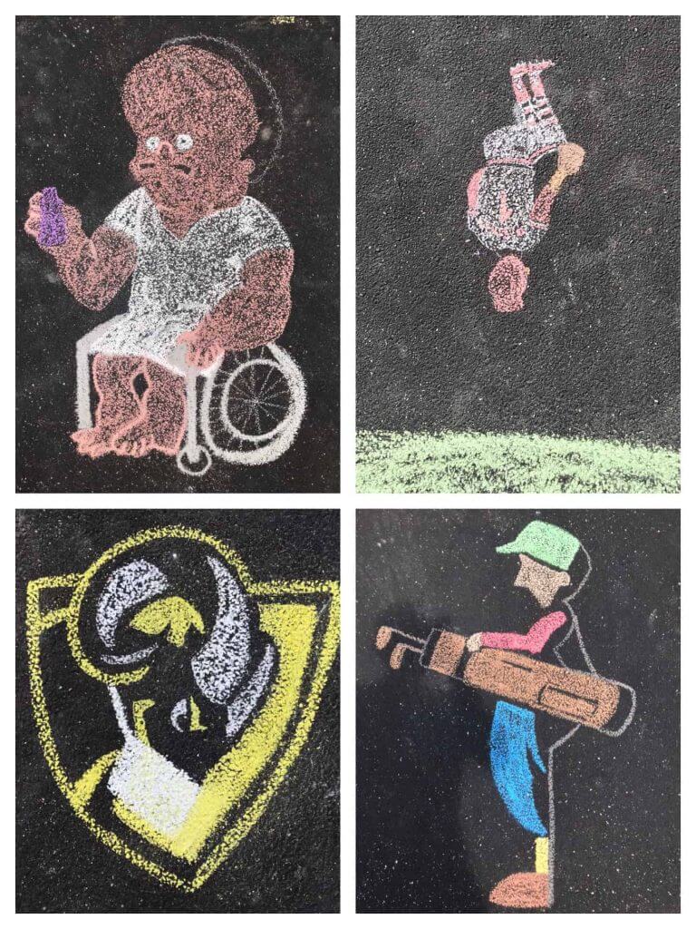
Then there were times where we just wanted to have some fun. After watching the iconic Simpsons episode “Homer at the Bat” together, Max and I ran outside to draw Ken Griffey Jr., nerve tonic in hand. We’re VCU basketball fans, but when I messed up and made the Ram’s nose too short, I slapped a mask on it to cover the error. Also in the collage below you’ll see the logo for Bethpage Black Golf Course (we live down the street) and Ozzie Smith flipping on his way to short (I always loved that).
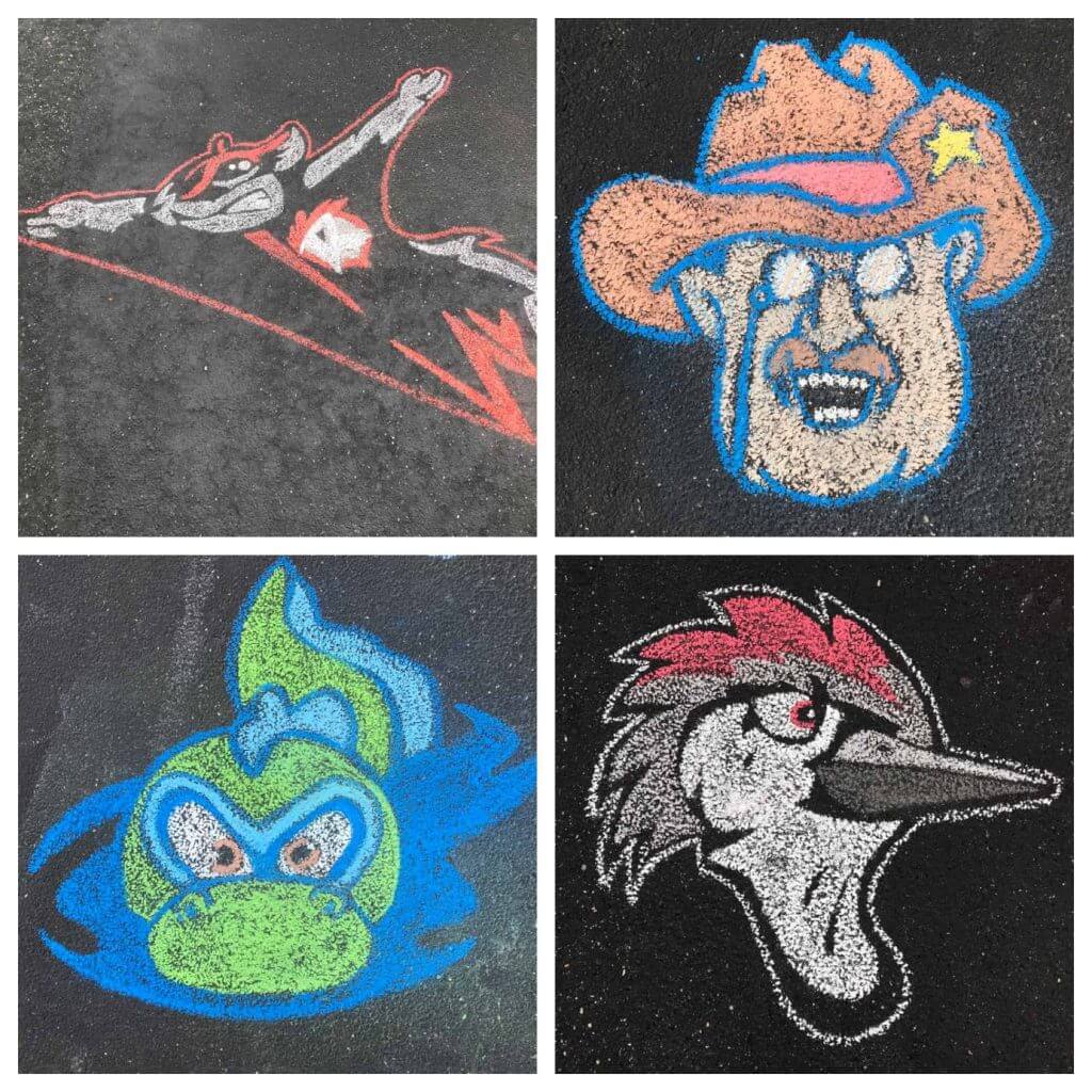
My younger son – who is three – particularly enjoyed our Minor League Baseball logo phase. It’s not hard to see why they might appeal to a youngster:
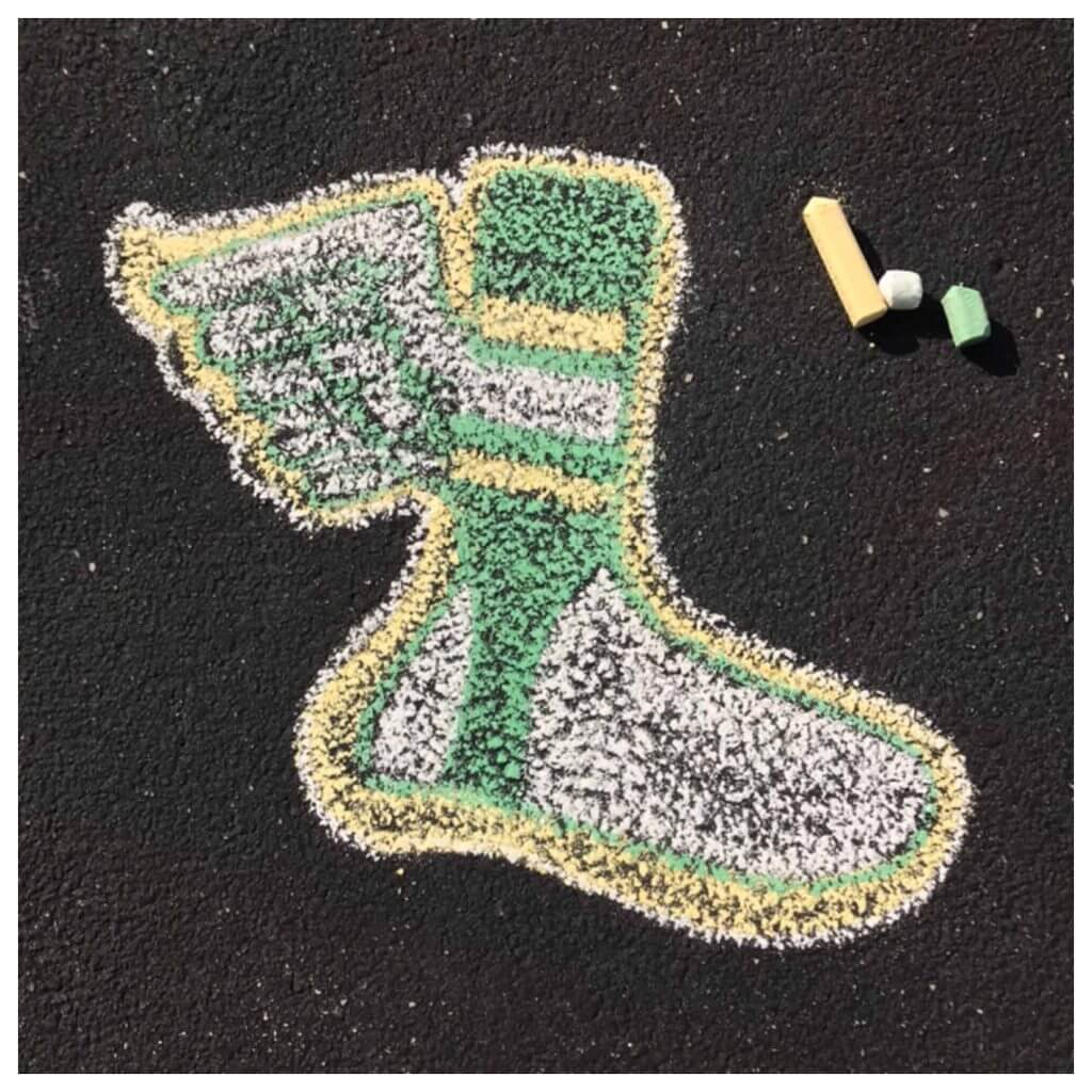
We also touched on the time-honored practice of ‘brownie points.’
I hope you enjoyed reading about one small way my kids and I kept our sanity these past six months. I encourage anyone who is interested to buy a box of chalk (it’s like $5 for a 24 pack at any office suppy store) and try for yourself. My only artistic training was doodling my way through high school and college. I’m sure you can do it, too — and who knows — somebody might learning something along the way.
OMG, Matt — that’s fantastic! And what a tremendous bonding experience for you and the boys! Seems like a few people have spend their COVID-19-induced “free time” in really special ways, and it looks like you and your sons certainly had a terrific experience. I literally wiped a tear from my eye as I was preparing this piece.
Thanks for sharing. Readers? What say you? Did any of you have any special sports/uni moments with your kids during the pandemic? Love to hear your stories!


Stanley Cup Uni P/review
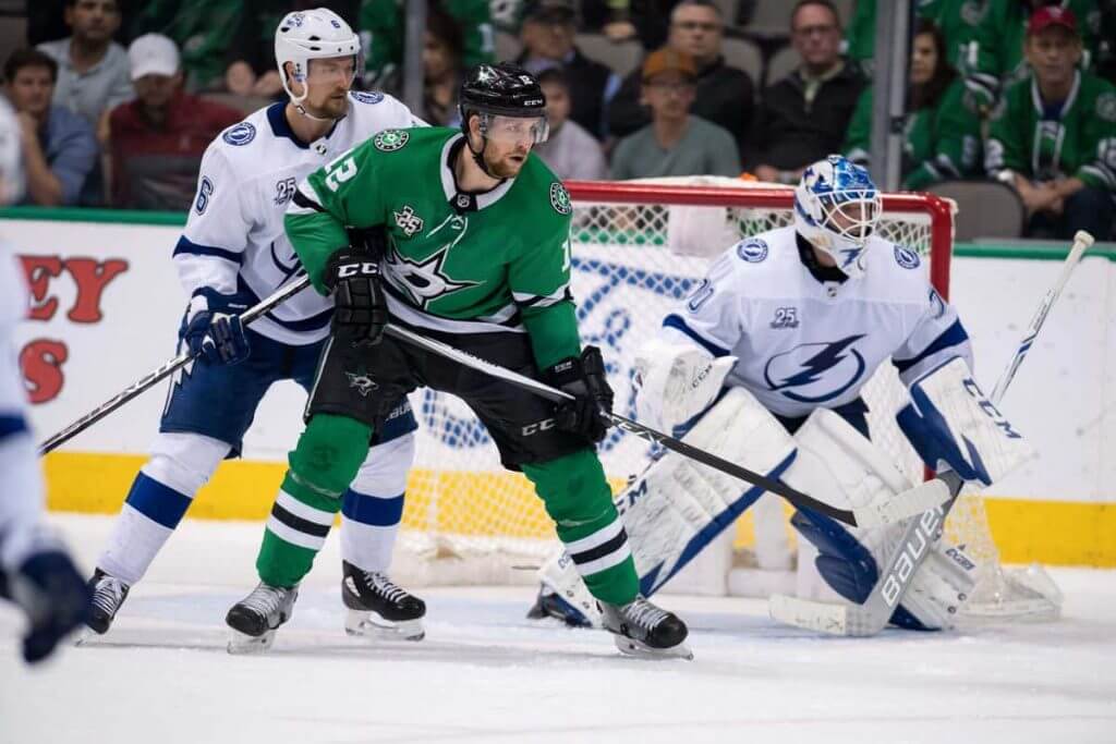
Longtime reader Mike Engle has prepared a *bit* of a uniform p/review for the Stanley Cup Final, which features the Tampa Bay Lightning vs. the Dallas Stars and begins today. Here’s Mike:
Stanley Cup Preview
by Mike Engle
If yes, the first thing that comes to mind about the Dallas Stars and Tampa Bay Lightning together is: They actually have a lot in common based on what they don’t look like anymore!
1. First up, upon cursory nhluniforms.com research, it looks like we will have the first ever Stanley Cup winning uniform with round shoulder patches. Plenty of teams have had shoulder patches of a logo, but I haven’t seen a *circular* one in the Final since the last Tampa Bay Lightning…they still have that logo and the Stars have their own roundel. So history will be made!
2. Another weird coincidence: both the Lightning and the Stars changed to what is their current look upon hiring a Detroit Red Wings executive as general manager. Steve Yzerman (who since went back to Detroit) for Tampa Bay, and Jim Nill for Dallas. Yzerman worked for the Lightning in the last year of their previous look, but Nill did not. Based on how long it takes to get new jerseys through, Jim Nill’s coincidental timing should be proof he didn’t bring any Detroit design with him per se. But no matter what happens, the winning team will have a signature moment of glory in a uniform that doesn’t quite look “second nature” to them…as compared to a team like the Red Wings, where if you, your dad, and your grandpa all close your eyes, you imagine the same look. Tampa and Dallas have gone through a lot of looks, and some from the past might be more memorable than what they wear currently.
3. Now, what they used to look like. Both teams used to have primary black jerseys…and also wore black since the beginning of their times in their cities. (Yes, Minnesota, I see you.) Not anymore. In your Tampa/Chicago preview of the 2015 Final, you questioned the wisdom of Tampa abandoning a black jersey (stormy weather!)…frankly, the same might be said for Dallas! You can’t see stars without a black sky!
4. Also, both teams abandoned a text-heavy logo up front and now have a more traditional (for lack of a better term) graphic. Tampa Bay went from having “Tampa Bay” and “Lightning” on their logo, to having a bolt logo on the blue but still having “Tampa Bay” up top on the whites…to now just having, well, a logo. Similarly, the Dallas Stars went from a logo that incorporates their name in the logo, to literally just a wordmark, to now a star with a D in it.
5. Speaking of a home and road mismatch like that, the Stars had that too in 2007! A white jersey that had their logo for away, but a black jersey that just had “Dallas” at home. (Cue the “wear white at home” and the “don’t wear your city at home…everybody knows you’re home and where they live” music.) Stars eventually release a white alternate jersey that also says Dallas to echo the black jerseys, and then the old white jersey with the proper logo gets decommissioned for 2011.
6. Both teams abandoned front numbers. Good riddance. Everybody has a number on the back, sleeves, and on the helmet since 2011.
7. Both teams have dabbled in truncated names on the front. The Lightning once had an infamous “Bolts” jersey. Meanwhile, the then-Minnesota North Stars ended their Minnesota tenure with jerseys that carried over as the original Dallas Stars jersey, that just said “Stars” without “North.” I’m calling that a truncation.
8. Both teams used to incorporate a state map in the shoulder patch. Too bad they’re gone, I like state shapes and those were fine logos. The Stars still have one, it’s just on the pants.
9. Both teams have thankfully abandoned a really embarrassing alternate jersey. Would you rather play with a rainstorm on your jersey with numbers that are supposed to be electric but just look shivering, or the Mooterus?
10. Finally, both teams used to have a cute uniform quirk that each appear to have been lost to modern templates. The Lightning used to have victory stripes in their axillae (you only see the stripes in celebrating goals and raising the Cup). Adidas jerseys don’t have those gussets anymore. The Stars also used an All Star Game template as their own, wearing a star logo on a star jersey. Sadly they don’t really make jerseys like those anymore.
11. PS: Walter White (Bryan Cranston’s character) in Breaking Bad says “No half measures.” The Lightning, by contrast, are the kings of half-measures.
• From 1992 to 2007, the fronts of the core black and white jerseys were consistent, but had four different looks on the back. Original custom font, italicized custom font, the air-brush-y number font with VAL NOB’s, and finally the block font. The equivalent of changing the couch but refusing to change the wall color!
• 2007: Lightning plan to have front right upper chest numbers on the away whites only. They backtrack and get permission to add them to the home blacks too, just in time for the season.
• 2011: Lightning make new uniforms with literally no black at all. Fans revolt because they don’t want to look like the Red Wings in almost-Maple Leaf blue. So the bolts go back on the pants, and the jersey numbers get a black middle layer. To this day, there is no other black in the stripes or anywhere else. Black looks like the afterthought it is here.
o But in the epitome of half-measure, in 2011, the Lightning hang on to the previous “Bolts” alternate that has some black but also has the old logo…
o The old logo gets updated to the new logo on the old jerseys for 2012…
o Finally, the old blue Bolts jersey finally gets replaced by a black Bolts jersey in 2014. Holy shit.
Thanks, Mike! I’m disappointed my Isles couldn’t make it past the Bolts (that series could have easily gone the other way) — but great p/review of the Lightning and Stars’ unis!


Hoop Dreams
Occasionally I will not only feature reader “Concepts and Tweaks,” but I do also occasionally have some beautiful artwork shared with me for your pleasure. That’s the case today, as you’ll see below.
If you enjoy the NBA, and some classic stars and uniforms, then you’re going to love this. These come from Arjun Ramesh. I’ll let him take it from here:
Hello!
My name is Arjun Ramesh, Artist from Baltimore MD, I’m a longtime Uni Watch reader, big NBA fan. NBA jerseys and player portraits are a passion of mine, I can spend hours talking to my friends about a specific logo or terrible adpatch. Most often my friends and family question why I spend this much time thinking about logos but you guys are the few people that get it! Below is a series of digital illustrations of NBA Icons. Each I tried to capture their signature style, their playing style, all of their accolades, and the number of championships with stars.
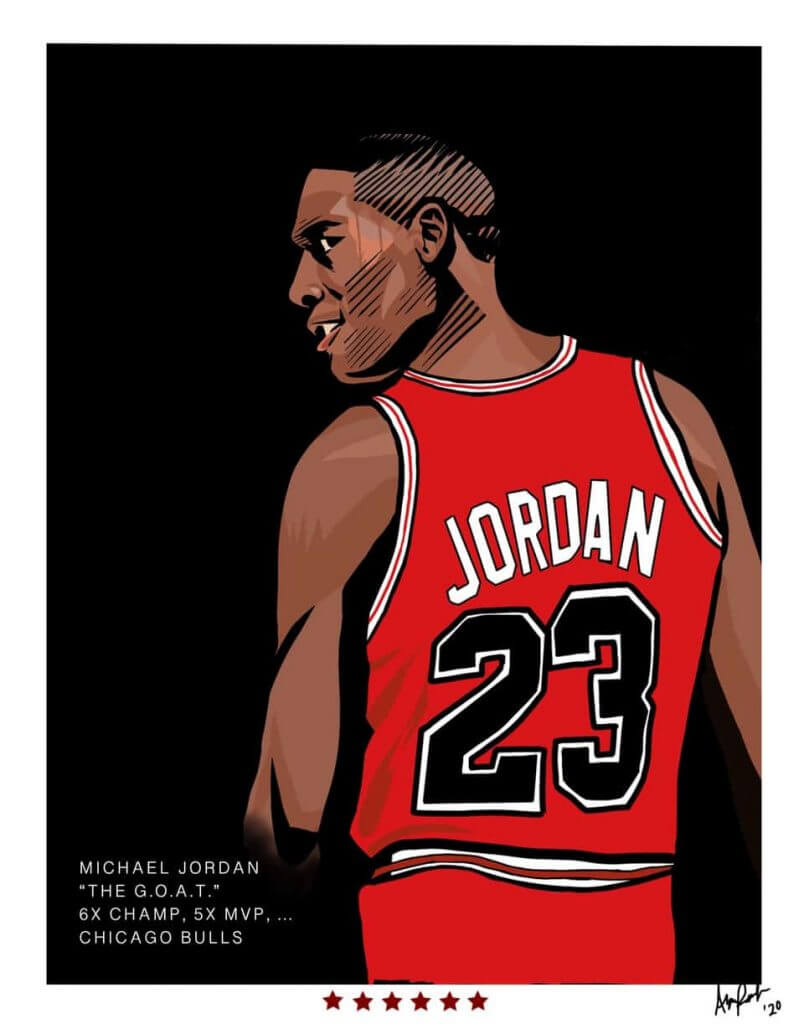
The G.O.A.T.
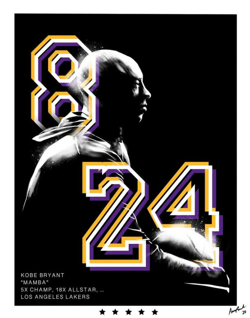
Mamba
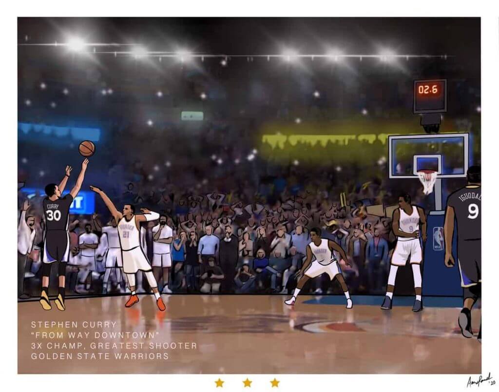
Curry v OKC
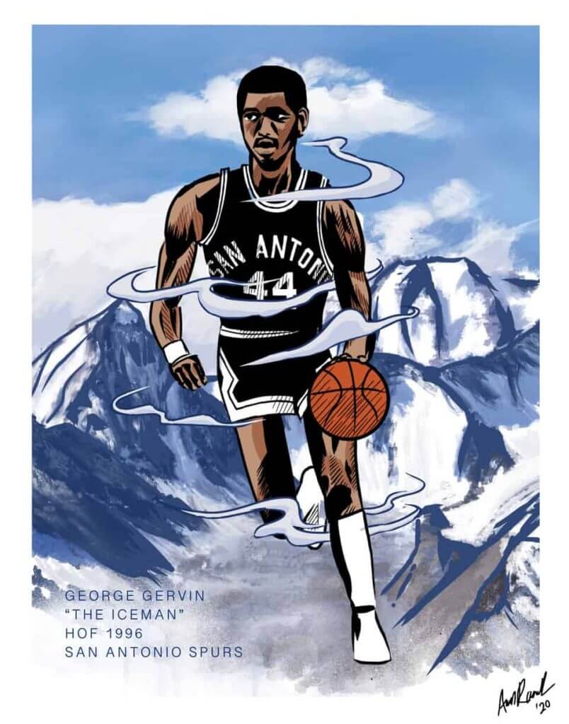
The Iceman
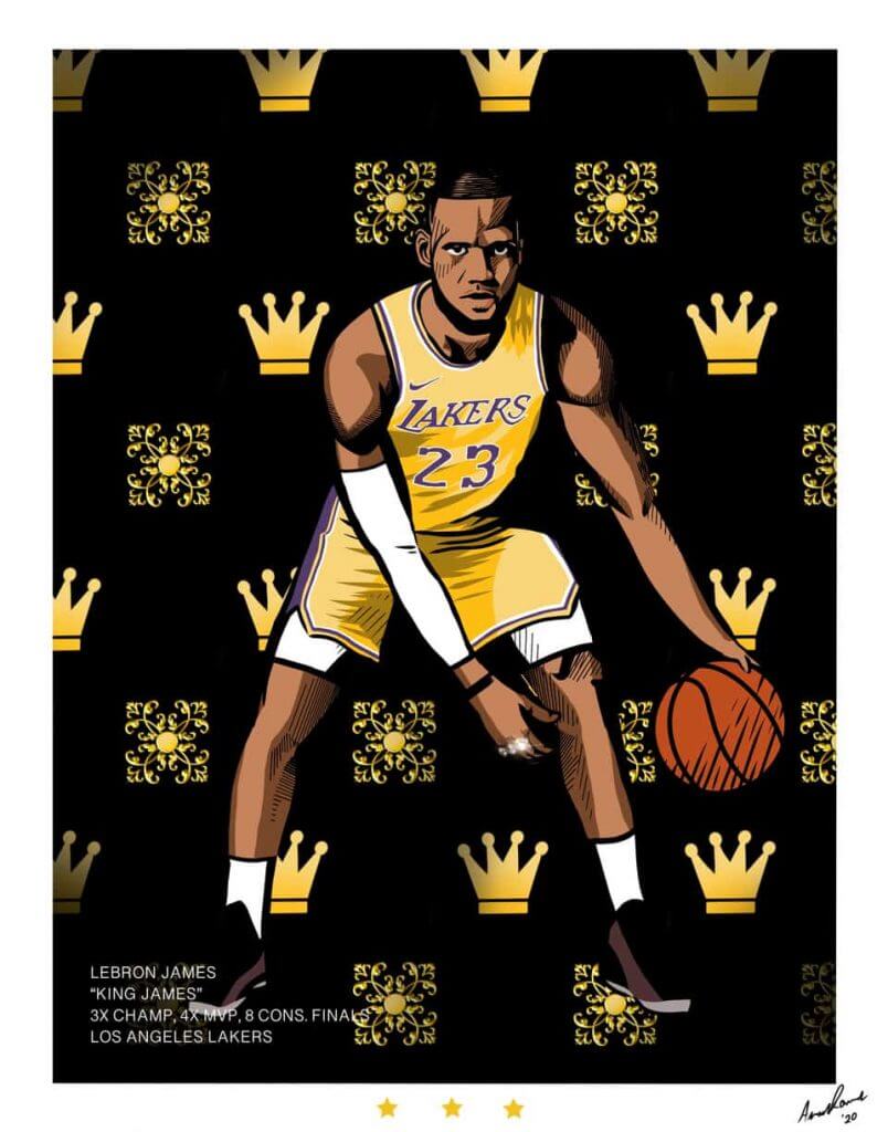
The King
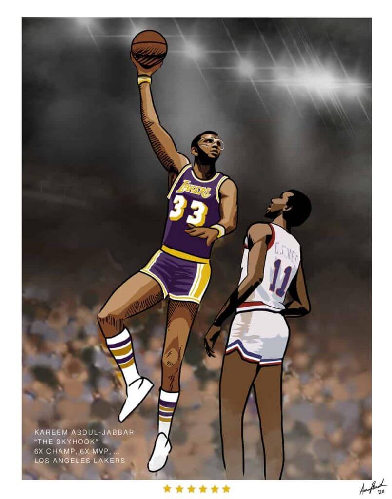
The Skyhook
I would love to share these, and you guys in particular get why basketball and art make sense together! Love you guys and keep up the great work. All are available at my website www.arjunrameshdesign.com/basketball. Thank you guys and stay safe.
Arjun Ramesh
Are those great or what? Thanks for sharing Arjun.


Guess The Game…
from the scoreboard
Today’s scoreboard comes from Robert Andrews.
The premise of the game (GTGFTS) is simple: I’ll post a scoreboard and you guys simply identify the game depicted. In the past, I don’t know if I’ve ever completely stumped you (some are easier than others).
Here’s the Scoreboard. In the comments below, try to identify the game (date & location, as well as final score). If anything noteworthy occurred during the game, please add that in (and if you were AT the game, well bonus points for you!):
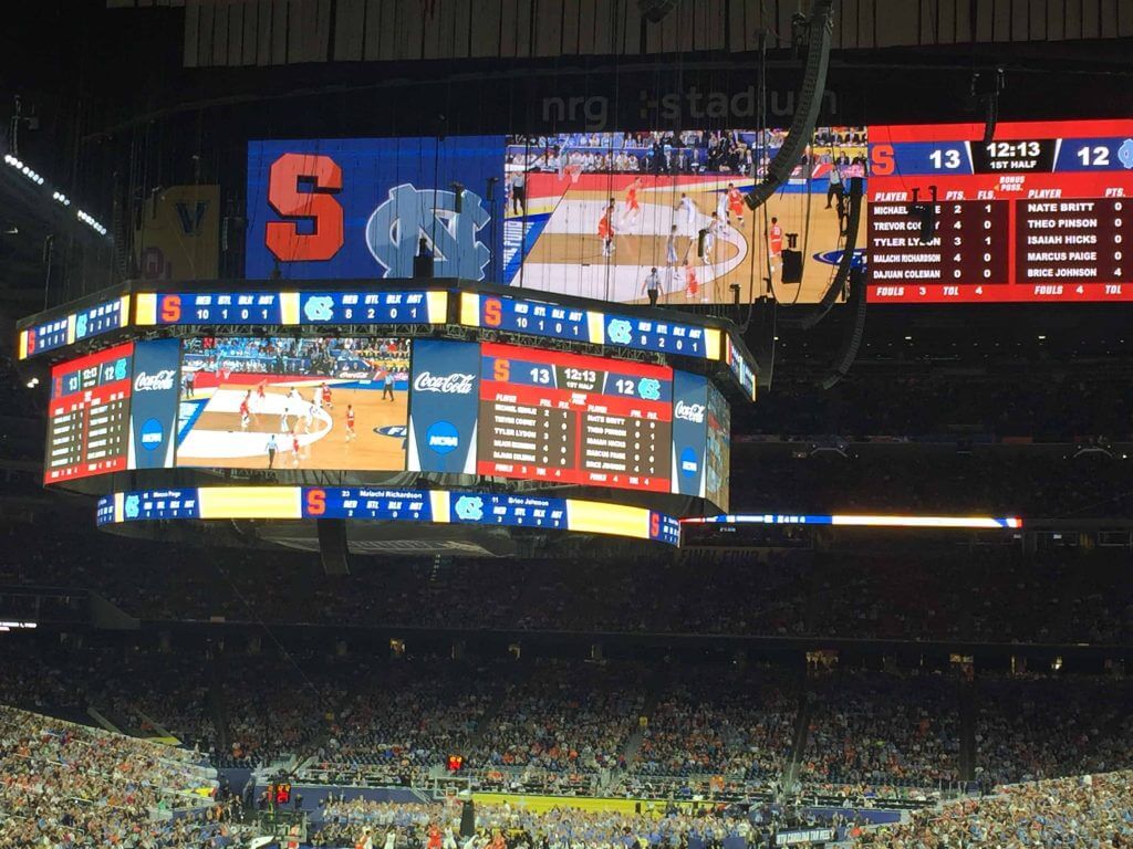
Please continue sending these in! You’re welcome to send me any scoreboard photos (with answers please), and I’ll keep running them.


Too Good For The Ticker…
Got an e-mail from Scott Wilkinson earlier this week which is simply Too Good For The Ticker:
Routinely some of the best unis in highs school football reside in Massillon, Ohio. I thought this was pretty neat, though. I don’t recall seeing a logo right in the dead center of the front of the helmet. That’s normally area reserved for stripes. Check it out. (Sorry for black and white. The front logo looks like the second picture. The unis are orange on orange with white lettering/numbers)-
Scott Wilkinson
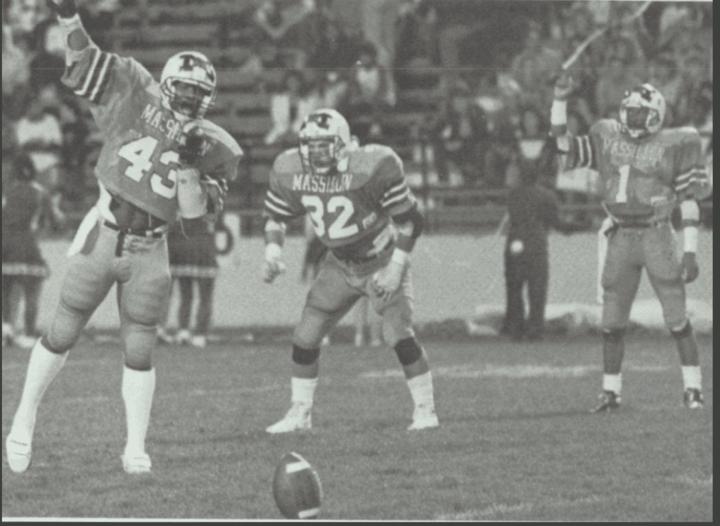

Very cool Scott! I’m not real big on high school football, but that certainly seems unique, or at least very rare. Anyone else know of any high schools (or college/pro) who have logos located in the front/center of the helmet?


The Ticker
By Anthony Emerson

Baseball News: White Sox P Garrett Crochet made his MLB debut last night wearing a glove with his grandfather’s name on it (from Kodie Egenof). … The Chiba Lotte Marines will wear these jerseys for the rest of the weekend (from Jeremy Brahm).

NFL News: The Eagles are going midnight green tomorrow. … We’ll get our first look at Washington’s new white jerseys in Arizona. … The Saints are wearing their white Color Rush jerseys in Vegas.
.
College/High School Football News: Marshall is adding banners in honor of the 75 people who died in the 1970 air disaster (from Brice Wallace). … Black-gray-gray for Southern Miss today. … Middle Tennessee is going silver-blue-white against Troy today. … Campbell/Coastal Carolina looked extra-awful last night (from multiple readers). … Arkansas will wear “equality patches” this season. … Georgia will wear their new jerseys next week.

Hockey News: Some new Canadiens have their uni numbers (from Michael Engle). … Everything old is new again in Ottawa, as the Senators have formally unveiled their new (old) logo (from many, many readers). … CCM is releasing a facemask specifically for use on the ice (from Wade Heidt).

Soccer News: The USL Championship’s Orange County SC are wearing these special one-off kits for Childhood Cancer Awareness. … SL Benfica has unveiled their new third kit. Black and gold have really taken off over the last 12-ish months in European soccer (from @MikeDfromCT). … New away shirt for Italian club Udinese (from Ed Żelaski).

Grab Bag: A Tennessee high school volleyball player was disqualified from a match because she wore her hijab on court (from Jason Hillyer). … Historian Michael Beschloss tweeted a 1928 image comparing the styles of that year’s major presidential candidates, Republican Herbert Hoover and Democrat Al Smith (from Jeff Gdula).


And Finally… Thanks to Matt for the spectacular chalk art, Mike for the Final P/review and Arjun for those hoops portraits! Great stuff from you guys today!
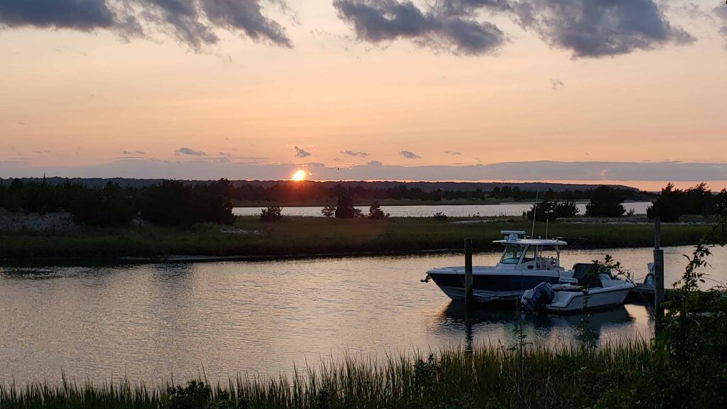
Hit a spate of not-so-nice weather at the summer place the past few days (no sunsets Wednesday or Thursday) and last night’s was less-than-spectacular, due to the low cloud cover and we’re actually still feeling some of the haze that has drifted east from the west coast fires. I actually wasn’t sure we’d even get a sunset, but at the last minute the sun slid below the cloud cover as it sank below the horizon. So, it’s not the finest but here we go:
RIP, RBG
Peace,
PH
Matthew, those are incredible. Fayetteville Woodpeckers huh?
1. Scoreboard: 2 April 2016. NRG Stadium, Houston. UNC 83, Syracuse 66. GO HEELS!! My heart would break 2 nights later.
2. Chalk art: better than amazing. You have a gift.
3. Stanley Cup Final: the Stars are wearing their best look since moving south. No Mooterus, minimal BFBS, simple and effective with a distinctive and bright green base to the palette. I did like the old ASG template but it was too dark with the black and dark green, and double-digit numbers didn’t fit within the star. The rationale of the sky being black to see stars is cute but irrelevant. And the Lightning nailed it this time around, after decades of unfortunate mishaps. Good looking series all the way around.
True on good looking Stanley Cup Final. Think about if these teams were meeting in the Final in 2008. We’ve come a long way since some of the Reebek Edge debacles were saw during that season.
Seeing the picture Phil found of the Stars and Lightning, we see they’re both wearing 25th year patches. I did not even realize that the Stars’ first year in Dallas was the Lightning’s first also! No wonder their uniform journeys are quite similar! To explain that oversight from my analysis, I admit I fired off my commentary after the Lightning clinched before going to bed, not quite knowing how/when/where it would run.
Stars: I agree with MJ…I miss the big star template, but I like the brighter green enough to say it’s a fine look.
Lightning: I don’t quite agree. I think the Lightning are a black and blue team. No great preference as to primarily black or blue jerseys, but the current blues don’t have enough black for me, and it isn’t incorporated well enough for me. So I prefer the old blacks, but not just for the preference of black.
All in all, yeah the Final is gonna look great. Good contrast, blue vs. green. Thanks for reading…and Paul and Phil, thanks for publishing!
Great artwork all the way around today!
Matt, those are absolutely amazing free-hands! As someone who drew logos throughout my entire childhood and adolescence, I’m always impressed by anyone who gets all the proportions and angles correct. I never seemed to get those quite right.
Arjun, great work! That Kareem picture is so cool!
Very visually appealing morning at Uni Watch this morning. Much appreciated!
Matt,
Nice to have that gift with that artistry…..
Great choices..
Nice Assist from Phil to feature them on His Day !.
Wow, great chalk art!
If you don’t have amazing chalk art skills, you can chalk draw race tracks on your driveway:
link
In regards to the Massilon Ohio high school helmets… Wisconsin Badgers had an early 1960s helmet with a BIg W on the front and back of the helmet and have occasionally busted out that design as a throwback. link
Those chalk logos are amazing. I’m looking forward to doing something similar when my own kids get a little older.
That color array is impressive. Not your dollar store sidewalk chalk.
Also a big fan of Arjun’s stuff. Reminds me of something out of the Spiderverse. Inspiring to see something so different.
Montreal Alouettes of the CFL had their logo front/centre back in 1974
link
The Alouettes doing that just for just 1974 season if I recall.
Also 2001 XFL Birmingham Thunderbolts:
link
1974 Grey Cup with Montreal vs Edmonton
link
I really miss the CFL this year, and can’t believe that the NFL and NCAA are going forward.
Even though I’m a Saskatchewan fan, this video will scratch my itch nicely. Thanks much.
That’s Steve Cishek, not Garret Crochet in the first baseball ticker item.
Matt, very inspiring and something your boys will never forget! T
Excellent feature story today! Dad of the year!
Great feature! Even more impressive chalk work!
Cool artwork!
Front and Center Helmet logo…The XFL’s Birmingham Bolts:
link
Great chalk-art piece. As an Oriole fan I thought the ‘fiesty bird’ was done perfectly.
Front and Center Logo…Iowa Barnstormers
link
The green on the Tulane helmet is a joke. Pitt’s numbers are an even bigger joke.
Wisconsin had its logo on the front of its helmet — and numbers on the sides — in the early 1960s.
link
“That series could have easily gone the other way”
That phrase always irks me, of course you “play the games for a reason”. It’s especially hollow here, because it was amazing the scores were as close as they were, Tampa Bay was far and away the better team on the ice.
It could’ve gone the other way… if the Islanders were better at hockey.
+1 for the Ken Griffey Jr artwork! Any day can be improved by a Simpsons reference.
Its like there’s a party in my mouth, and everyone’s invited!
Football helmets with logo on the front: WFL San Antonio Wings, XFL Birmingham Thunderbolts, NCAA Dartmouth Big Green. CFL Alouettes have an “allover” design like the NFL Bengals, but an “M” hidden in the bird’s outline is positioned front and center.
After the court designs, ice/stadium/field logos, and officials’ uniforms, I’ve been critiquing a new part of sports in the modern era:
Fan social distancing. I’m not kidding.
The attendees at the Clemson game appear to be doing this right. Some others, not so much.
No links to pictures in the descriptions of past uniforms in the Stanley Cup Preview? Why bother?