
For all photos, click to enlarge
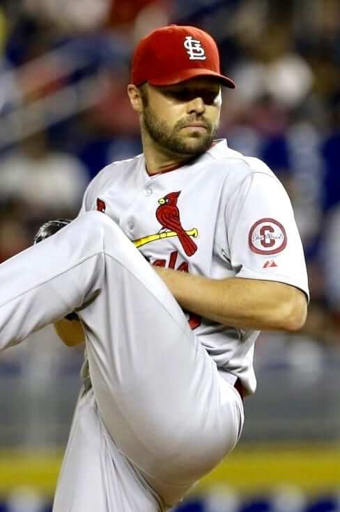
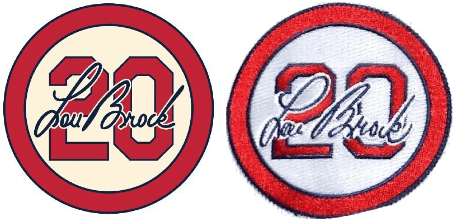
Last Friday the Cardinals began wearing their memorial patch for Lou Brock, who died on Sept. 6. The patch features Brock’s uniform number and signature in a red circle, matching the style of the team’s earlier patches for Stan Musial and Red Schoendienst, so this template is now definitely a “Cardinals thing.” I want to talk about that today.
Some quick background: The Cards wore the Musial patch in 2013 and the Schoendienst patch in 2018. In between those two patches, they wore one other memorial patch, for outfielder Oscar Tavares in 2015. That one simply had Tavares’s initials — no uni number, no signature. Obviously, Tavares wasn’t a Hall of Famer or longtime Cardinals favorite like Musial, Schoendienst, and Brock, so it appears that the Cardinals are employing a sort of memorial patch hierarchy, with more “legendary” figures getting the number/signature treatment and mere mortals getting the more conventional patch.
I wanted to know more, so I contacted team president Bill DeWitt III (who, as longtime readers may recall, cares a lot about uniforms) and had a quick email back-and-forth with him, as follows:
Uni Watch: When the Musial patch was created in 2013, was it your intention from the start that it would serve as the design template for future patches? Or did that decision develop organically, perhaps when you were considering the best route to take for a Schoendienst patch?
Bill DeWitt: Originally I thought it would be just for Stan. But with Red being the next Cardinals HOFer to pass, we felt his immense contributions to the organization (60 years in uniform!) warranted a similar approach. Of course, Lou is in that same category, having been a great contributor not just on the field but also in the broadcast booth, as a coach, and as a member of the St. Louis community for so many years.
UW: You had the “OT” patch for Oscar Taveras in 2015. Is there a particular status that a person must have in order to qualify for the signature/number patch design? For example, must the person have had his number retired, or be a Hall of Famer, or something along those lines?
BD: We don’t have an official policy for these going forward, but you can probably guess who might warrant this sort of tribute (Ozzie, Gibson, etc.) vs. something a little more understated and typical, such as initials on a black circle or something like that for most others. It will be a case-by-case thing. The Cardinals are blessed to have so many of these iconic players who have had great careers and also continued to represent the organization long after they retire.
UW: Is there designer who deserves credit for this patch concept? I realize these things sometimes develop sort of “by committee,” but if there’s a particular designer who came up with the idea, I’d love to credit him or her.
BD: Tyler Munie (Manager of Creative Services with the Cardinals) and I collaborated on the original Musial patch design as well as the subsequent versions.
———
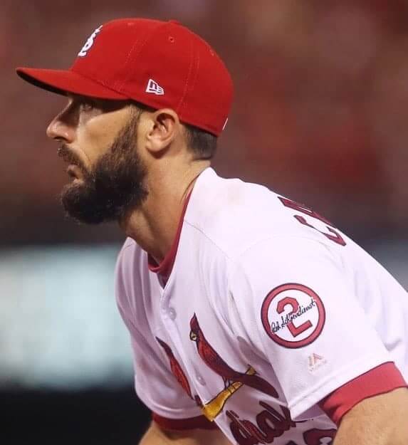
Interesting stuff. So the Cardinals now essentially have a two-tier protocol for memorial patches, sort of like first-class and coach. I can think of only one other team, in any sport, that does anything similar: the Yankees. Although there have been a few exceptions, in general their policy over the past 45 years or so has been to wear a black sleeve number for people whose numbers have been retired by the team (Billy Martin, Joe DiMaggio, Mickey Mantle, Yogi Berra, Phil Rizzuto), and a black armband for everyone else (well, unless your last name is Steinbrenner, but those are special cases).
The Yankees’ top-tier treatment is so simple — black numerals — that it works well as a one-size-fits-all approach. But the Cardinals’ number/signature design strikes me as a trickier proposition, and I can see arguments both for and against it. For example:
Points in favor
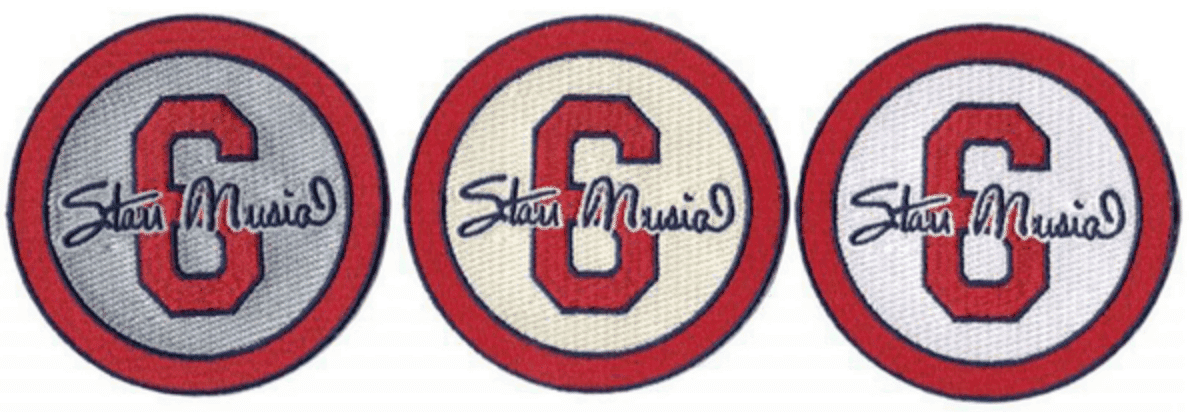
• It makes sense that the team with the most handsome, classy-looking uniform would also have such a handsome, classy-looking memorial patch design. And the Cardinals have done this with their typical attention to detail, producing separate versions of each patch for their different jersey colors:
• There’s something satisfying about team-specific rules and protocols. It’s sort of like looking through a style guide.
• This is sort of like when a family has a cemetery plot and everyone’s gravestone has the same basic design. It reinforces the sense of family, the sense of connection, and so on.
• Gotta like a team that establishes uniformity for any part of the uniform!
• Something about this feels very Cardinals-like — it just fits with their feel, their brand.
Points against
• Ah geez, does everything have to be branded, standardized, templated? Can’t some things just develop in whatever direction seems appropriate at the time?
• If you want a simple, stately design format that you can use for multiple honorees, that’s what retired number placards are for. But shoehorning so many people into the same patch template eliminates the chance for creativity. Wouldn’t it have been nice, for example, if Musial’s patch had included the words “The Man”? Or if Brock’s had some reference to a stolen base?
• Since DeWitt said the patch decisions will be made on a case-by-case basis, it’s a safe bet that fans will start getting into idiotic arguments about which treatment should be given to players who are somewhat borderline: “He should get the number/signature patch!” “No, he should just get his initials!” I can already see myself closing the Twitter tab on that one.
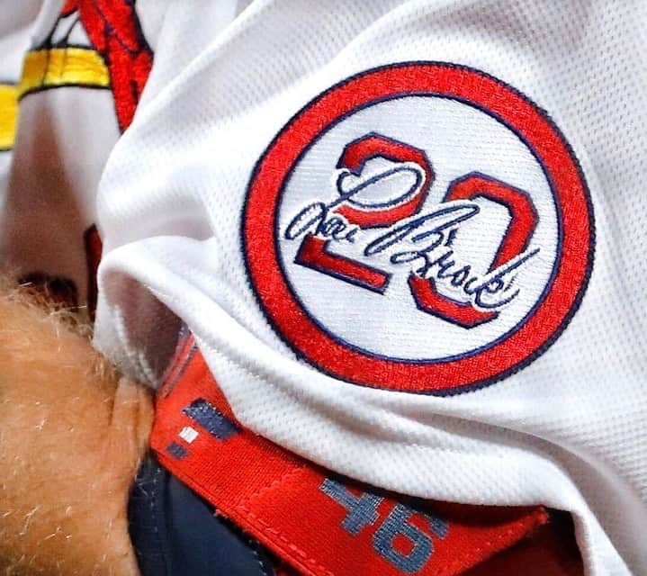
• While the design concept may be handsome, it’s not ideal. Musial’s signature, for example, obscures part of the “6,” and the Brock patch makes it clear that the number/signature format looks a lot clunkier with two-digit numbers. In fact, if you compare the digital version of the Brock design, which the Cardinals began using as their social media avatar several days before the physical patch debuted, you can see that there are some differences in Brock’s signature and how the signature overlaps the numbers (presumably due to the logistical limitations of the embroidery process), with the real-world version looking significantly worse than the digital version:
So: Which side to come down on? I confess that I’m conflicted — I see the pros and the cons.
Meanwhile: There’s been some background chatter about how long it took the Cardinals to start wearing the Brock patch. Most teams tend to get memorial patches on the field within a day or two of someone’s death, but Brock’s patch didn’t appear until five days after he died. I initially figured this must have something to do with the pandemic, and I considered asking DeWitt about it, but I ultimately decided against it because it seemed like a potentially tasteless question (like, “Yo, what’s taking you so long to honor this dead man?”). But then I was doing some research about the Schoendienst patch in 2018 and discovered that I had written this at the time:
The most surprising thing about this new [Schoendienst] patch is how long it took for the Cards to start wearing it. Schoendienst died on June 6, but the patch didn’t debut until June 11 — a near-eternity in the world of modern uniform memorials, where teams often add patches within a day or two. (Just to be clear, I am not criticizing the Cardinals for taking too long, and I fully understand that they may have wanted to wait until they finished their road trip so the patch could make its debut at home. I’m just expressing surprise, not outrage.)
I hadn’t remembered that. So it turns out that there’s recent precedent for a five-day gap prior to a Cardinals memorial patch’s on-field debut. Not sure if that’s by plan or coincidence, but it’s interesting. (The situation with Musial was different, because he died during the offseason, not during a season, so the Cards began wearing his patch on Opening Day of 2013.)
Anyway: All good food for thought. That’s a lot of mileage out of a very small circle of cloth!
Collector’s Corner
By Brinke Guthrie
Follow @brinkeguthrie
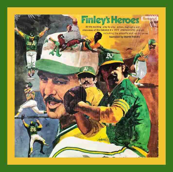
Hard to believe the 1972 A’s/Reds World Series was almost 50 years ago! You can get reacquainted with it via Finley’s Heroes, a record album commemorating the first of three straight Series wins by owner Charles O. Finley’s band of mustachioed misfits. What terrific artwork on the album cover! Can’t make out the artist’s name, though. (Side note: There’s Joe Rudi at lower-left on the cover, stealing a home run from Denis Menke of the Reds in Game Two. I was just above him in the left field stands. Some things you cannot forget.)
Now for the rest of this week’s picks:
• Someone went and made a pair of custom 1970s AFC/NFC Pro Bowl gumball helmets.
• Here’s a 1970s orange (of course) Cleveland Browns stadium megaphone. Sponsored by WHK 1420, “the radio home of the Browns.”
• Wow, look at this! A complete set of Nick Volpe portraits for the 1982 Los Angeles Dodgers. Twenty-six in all, including Vin Scully.
• Check out the artwork on this 1962 Houston Colt .45s booklet. I never realized the team’s logo mimicked the gun brand’s logo.)
• How about a 1990s jar of Jaromir Jagr Peanut Butter? Or maybe that should’ve been called “Peanut Buttr?”
• Pretty sure that’s not Yogi Berra on the cover of his 1962 book Behind The Plate. I’ll bet co-author Til Ferdenzi did the majority of the writing, too.
• This 2005 Strikeout Kings figurine features Nolan Ryan and Roger Clemens, sponsored by Citgo.
• This 1954 New York baseball Giants beer stein is in perfect shape. That was the year of The Catch, as the Giants swept Cleveland to win their final title in New York.
• Speaking of Series wins, nice artwork on this 1980 Philadelphia Phllies poster.
• Annnnnd one more World Series item: a pair of Milwaukee Brewer Bar wrappers. That candy bar was sold back in 1982 to commemorate their title.
Click to enlarge
Coasters reminder: As of this morning, I have only four remaining sets of Uni Watch Coasters. Who wants ’em?
The Ticker
By Alex Hider

Baseball News: Cardinals manager Mike Shildt wore the team’s BP cap for yesterday’s game (thanks to all who shared). … Postseason play will reportedly not feature any champagne-related celebrations or alcohol in locker rooms. … On Sunday night, the Brewers digitally superimposed an ad on the mound, but at one point the ad was covering up a team logo stenciled on the mound (from Brice Wallace). … Also from Brice: The Marlins appear to have darkened the back of their mound to allow better contrast for ads. … Typically, glovemakers give their glove models a series of letters and numbers. But Jimmy Lonetti notes that this Brooks Robinson Rawlings glove is Model No. 5, presumably after Robinson’s uniform number. Jimmy says he’s never seen another glove where the model number matched a player’s uni number. … What a display: 22 years of Hank Aaron baseball cards, arranged by date (from @texastrevor). … The batting helmet Padres 1B Eric Hosmer was wearing when he hit the team’s fourth grand slam in as many games earlier this season — an MLB record — has been sent to the Hall of Fame (from @Greg1MB). … A columnist for The Fresno Bee is calling for Fresno City College to rename its baseball stadium, which is named after a man who has been identified as a former KKK leader (from David Wishinsky). … If a foul ball is hit near a cardboard cutout at the Astros’ ballpark, the team will box up the ball and send it to the season ticket holder who would typically sit there (soft paywall) (from @bryant_rf).

Pro Football News: The NFL sent a memo advising coaches that they could face disciplinary action if they’re spotted without a mask or face covering while on the sideline. Rams coach Sean McVay says the memo was targeted at him. … Most Steelers players will wear Antwon Rose Jr.’s name on the back of their helmets in 2020. Rose was shot and killed by an East Pittsburgh Police Officer in 2018 (from Mike Chamernik). … At least one Steeler, however, was wearing a different name last night (from Jerry Wolper). … The NFL’s fantasy app curiously has updated the Rams logos, but has yet to update the Titans logos (from Marshall Grant Jones). … Interesting end zone design last night for the Broncos, who paired their throwback helmet logo with their primary wordmark (from many readers).
College/High School Football News: Charlotte opened their season on Saturday at Appalachian State. But their uniforms weren’t delivered until Friday morning — meaning the team’s equipment staff had just 26 hours to sew NOBs on the jerseys for every player on the roster (from Joel Mathwig). … Ole Miss was slated to retire No. 10 for Eli Manning this season. However, due to the pandemic, they’re delaying the ceremony until 2021, so fans can be present (from Griffin T. Smith). … The ACC Tracker has been updated through week 1. … SI’s Pat Forde has ranked his favorite and least favorite football statues on college campuses. … It appears Pitt will be wearing a soon-to-be-released alternate jersey on Sept. 26 (thanks to all who shared). … In 1991, Michigan G Matt Elliott was forced to go FNOB because there was also a Marc Elliott on the roster (from Justin Essa Zayid). … Air Force will unveil an alternate uniform that honors the Tuskegee Airmen on Sept. 21. They’ll wear the uniforms on Oct. 3 against Navy (from Phil). … Milton-Union High School (Ohio) Bulldogs wear pants with a spiked dog collar on their left pant leg (from Doc Ginn).

Hockey News: If you’ve ever wondered what the Lightning’s logo looks like rendered in coffee beans, today is your lucky day (from Mike Nessen). … Hey, look who won the NHL’s Western Conference championship — a convenience store chain! (From @ogkd13.) … The Hershey Bears of the AHL are selling a clever “chocolate-dipped” sweater on their website. I’m not sure if they’ve confirmed whether they will be wearing these on the ice next season (from Steve Forni).

Soccer News: EPL club Wolves have a new sleeve advertiser (from Josh Hinton). … The third jersey for Portugese top-flight club Benfica has reportedly leaked (from Mike D.). … Japan’s J-League has followed the lead of other leagues around the world by adopting a standardized typeface for numbers and NOBs (from Jeremy Brahm).

Grab Bag: Super Netball, the sport’s top pro league in Australia, has a new ball design for the 2020 “Indigenous Round” (from Jamie Rathjen). … The Washington Post (soft paywall) has a backstory on how Dr. Anthony Fauci ended up with his own bobblehead (from Tommy Turner). … Scouts in the United Kingdom can now earn a new badge for spotting fake news (from Timmy Donahue). … It appears that golf’s U.S. Open is going the way of the Super Bowl by using a cookie-cutter logo template for every event (from Mike Kinchla). … Emails show that UConn is considering several uniform-related tributes to the Black Lives Matter movement when their teams resume play later this year (from Timmy Donahue). … Whoops! Vinnie Donati found a “Led Zeppelin” T-shirt featuring the band members from KISS.

Our latest raffle winners are Jason Hillyer and Jacob Draper, who’ve each won a Uni Watch Tequila Sunrise Mask. Congrats to them, and big thanks to reader Jeff Link for sponsoring this one.
I will be away from Uni Watch HQ for most of today. Play nice while I’m away, okay? Thanks. — Paul
Netball is not volleyball, it is a women’s sport in Commonwealth countries.
Fixed.
Yah, they play Net Ball in St Croix, it looks like a lot of fun!
The Yankees did have a special memorial patch for former public address announcer Bob Sheppard in 2010, although this (and the Steinbrenner patch) came after the all star game, when the Yankees’ representative players wore a black armband. In 2010 they added a black armband for former manager Ralph Houk, giving the 2010 jerseys three different memorials.
No disrespect intended, but the profusion of memorials on that uniform put me in mind of a roadside shrine with soggy stuffed animals and wilted flowers. In matters of tragedy and solemnity, less is more.
The Joe Rudi/Dennis Menke catch links to the gum ball helmets
Fixed.
Remember when athletes had legible signatures instead of just scribbles?
I think a lot of that is because they’re asked to sign a *lot* more autographs these days, often in rapid-fire, high-volume situations, so the scribble becomes a matter of efficiency.
The Cardinals gave Brock a much better tribute than this site, which chose to show him in an Expos jersey. Shameful stuff.
Actually, the point of showing him in an Expos uniform (not jersey) was that it was unexpected and surprising. Did you even know he ever wore an Expos uniform? I didn’t! I also showed him in a Twins uniform, for the same reason.
I’m not sure why that bothers you, but I hope you feel better soon.
Hershey Bears chocolate-drip sweater was worn on the ice earlier this year. Feb. 1.
link
link
I was at that game and they got shut out. A fun time otherwise
That Kiss/Led Zeppelin shirt is from T Shirt Hell: link
One of their many designs of deliberately confused brands:
link
link
And a uni-related one for good measure: link
One of my all-time favorite National Lampoon True Facts photos showed an “Abraham Lincoln University” sweatshirt bearing a picture of George Washington. I about split my sides. Knowing that you can now simply mash up two cultural icons, on purpose, spoils the goofy immediacy and lunacy of the honest mistake.
Re: the Astros and baseballs. The Mariners do the same.
link
What if my fan cutout(s) “catches” a foul ball or home run?
If your fan cutout(s) “catches” a foul ball by any player (on the Mariners or opposing team), we will mail you the baseball. If your fan cutout(s) “catches” a home run by a Mariners player, we will send you the baseball. If your fan cutout(s) “catches” an opposing players home run, the ball will not be mailed out.
I like the idea of sitting around with friends and discussing which players will get a special memorial and which ones will get a default memorial. We do this all of the time.
With Steve Cohen buying the Mets you should have a Mets Redesign new uniforms home away for the Steve Cohen ownership
Dear god, no. With the exception of the completely unnecessary royal softball tops, their unis are perfect now. Or as close to perfect as they’re ever going to be. Cohen can, and should, change a lot of things, but the unis should be off limits.
Raises an interesting potential uni project: Tracking the history of ownership changes leading to uniform/logo changes within n years, with the changes rated to produce an average. My sense is that new-owner uniform changes tend to be terrible, but this is based on a thin impression of anecdotal memory, not any kind of data. Like, the Pohlad-pushed Twins uni change of 1986 was a terrific upgrade, but the terrible Loria and then Jeter ownership changes in Miami stick more strongly in my memory.
Even George Steinbrenner was going to change the road uniforms. a radical change was proposed in 1974. Marty Appel, in his book Now Pitching for the Yankees, describes the proposed uniforms:[8]
In 1974 I walked into (then-General Manager) Gabe Paul’s office to find samples of new Yankee road uniforms draped across his sofa. They were the opposite of the home pinstripes – they were navy with white pinstripes. The NY logo was in white. Gabe liked them. I nearly fainted. Although the drab gray road uniforms were not exciting, with the plain NEW YORK across the chest, they were just as much the Yankees’ look as were the home uniforms. I think my dramatic disdain helped saved [sic] the day and saved the Yankees from wearing those awful pajamas on the field.
Also late 90s Angels.
The “Finley’s Heroes” album cover art is by Dick Hamilton who signed his work “Ham”. Additional album covers by Ham are shown here: link
Because I haven’t taken the time to look, I wonder if the Cardinals will be making the three memorial patches available to the public. I think they are fabulous. Something tells me they won’t, because it would be wrong to profit from death, but maybe if the money raised was donated….
The previous such memorial patches were/are available at retail. I see the Musial patch still available in all three color schemes.
The “Finley’s Heroes” record album cover art is by Dick Hamilton who signed his work “Ham”.
WRT the length of time between Lou Brock’s death and the patch debut, I had assumed it was because Roberto Clemente day was a day or two after Brock died, and they didn’t want to mix the two tributes.
If you are disappointed that the digital art image for Lou Brock’s memorial patch is better-looking than the embroidered result, then the natural next question is, Do we think the difference in quality justifies a wish for a digitally-printed patch instead of an embroidered one? Or does a printed patch look and/or feel so cold and sterile that we decline that and live with the embroidery?
Very disappointed by the J-League making every team use the same number font with no regard for what the teams might individually want.
My link used to have a nice calligraphy-like number font and now they’re going to get something generic that looks exactly like all the other teams.
I’m suspect Sean McVay is quite full of himself and thinking everyone is after him, but during the 1:00 game earlier in the day, it was not possible to find a Washington Football Team coach in camera range who WAS wearing a mask properly.
Well, “I suspect”. Sorry.
Paul – loved the Cardinals article. Regarding the two-tier protocol on the patches, I think there’s a huge difference in the scenarios. Oscar Tavares’ was an active player whose death was a complete shock. I view his patch treatment as “in mourning of” rather than a “celebration of” with Brock and Musials. Less subjective and more objective. Keep up the good work!
I don’t know if this played into the Cardinals’ patch design approach at all, but when I see the Musial/Schoendienst/Brock patches, they feel like a celebration of a storied career and a life well lived. The Oscar Taveras patch has a more subdued and mournful tone, which seems a more appropriate memorial for such a tragic accident and life cut so short. Again, I have no idea if that had any impact on the decision, but that’s what I see looking at these uniform memorials.
Not sure if it had anything to do with it, but I remember the Oscar Tavares Death and the Cardinals memorializing it had some hot water since he died and killed his passenger while driving under the influence. So maybe they purposely made it a bit more subdued?
So nice to see the yellow pants by the Chargers with lightning strike on the side, their new uniforms are near perfection.
I really like the shade of blue the Rams are using and that jersey should be paired with blue pants.
Did anyone see how bad Atlanta Falcons turf looks? What in the world is with that..yikes!
I’m wondering if it just looks like shit on television and not in real life, anyone know??
It looks pretty bad in real life too. I went to the Falcons-Seahawks game last year (couldn’t go see my Seahawks this year sadly), and while the stadium itself is immaculate, has great amenities, and great food pricing, the actual football-watching is a little drab. The field is pretty gross looking, and the angles seem to be off a little bit. The camera angle on the Falcons home broadcasts is placed SUPER high up, so while you can usually see the entire field, it’s too far away to see the real action.
NO BLUE PANTS!!!
UGH, so cliche!
Ditch the “bone” for bright whites and it’s PERFECTION.
Speaking of uniform tributes, I noticed the Tigers tribute to Al Kaline has a home and road version. Home version is trimmed in white and the road unis have an orange outline. link
The White Sox also use a memorial template for their patches – albeit very basic – a small black diamond with a name or uniform number inside. Works well for numbers, not so much with longer names. This years’ ‘Farmio’ for longtime radio play-by-play man and former pitcher Ed Farmer is a bit hard to read, would have loved to have seen a departure with a radio mike icon or something in that realm. But they’ve been consistent over the years – this probably started in some sorts in 1992 with a tinier blank diamond memorial on all jersey sleeves in memory of Jerry Reinsdorf assistant Sherri Berto – also memorialized on the1992 Bulls jerseys with the black shoulder stripe (see Michael Jordan shrug game 1992 Finals Game 1 for reference).
In college I was friends with a Reds fan who would talk about the “Big Red Machine” – His claim was they were the best team of the 1970s and I (an Oakland A’s fan) of course disagreed.
He’d rattle off all the stud players on those Reds teams and I’d hit him with 5 straight western division titles, 3 straight World Series Championships (the most of the decade) including a game 7 win, IN CINCINNATI, against those very Reds.
Of course he’d end the conversation with “Well, we swept you guys in 1990!” and I’d say, well the argument wasn’t about 1990 now was it? It was about the decade of the 1970s. LOL