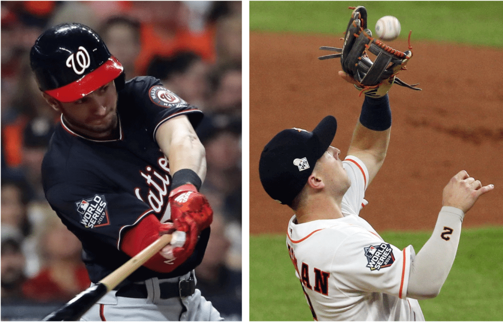
Surprising development at last night’s World Series opener, as the Nats and ’Stros both went without the MLB 150 patch on their right sleeves. Yes, I realize the World Series patch was added to that sleeve, but so what? The 150 patch shared space with lots of right-sleeve patches this season, so why not include it for the Series? Or to put it another way, why would you scrap the celebration of your big anniversary from your season-capping showcase event?
Interestingly, SportsLogos.net’s Chris Creamer said way back in February, when the 150 patch was unveiled, that it wouldn’t be worn in the postseason. But that turned out not to be true — most teams did wear it in the playoffs (although teams with a memorial patch did not). It’s not like I have any great love for this patch design, but it feels really weird to omit it from the World Series. Makes no sense!
In case you’re wondering, the MLB centennial patch was indeed worn during the 1969 World Series. As for 1994’s 125th-anniversary patch, there was no World Series that year, so we’ll never know.
In other news from last night’s game:
• Here’s a good look at the “EC” memorial patch that the umpires added for ump Eric Cooper, who died over the weekend. Interesting that MLB couldn’t manage (or didn’t bother) to match the specs of the “JM” patch that the umps have been wearing all season for Jim McKean:
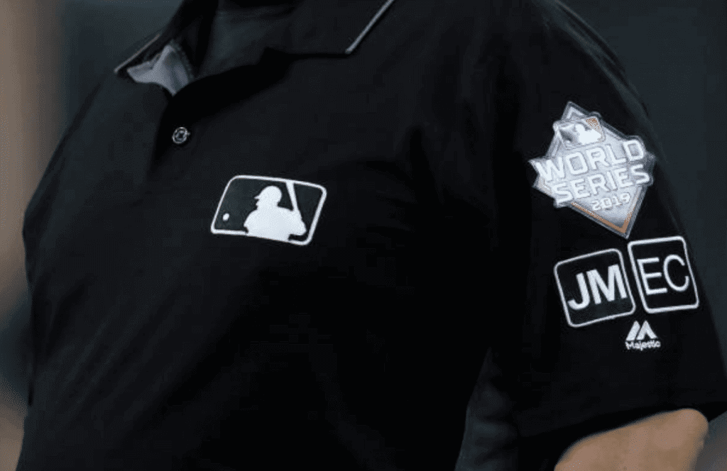
Nothing matches — the white border, the type weight, even the patch size! It’s like they got a cheap Chinese knockoff patch. Come on, people — this shouldn’t be that hard.
• Speaking of the umps’ patches, take a look at this photo and see if you notice anything (click to enlarge):
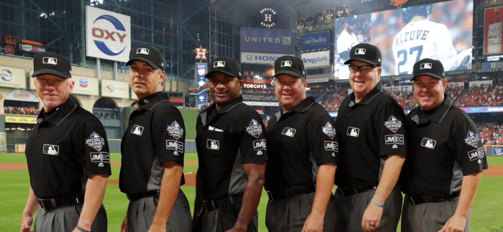
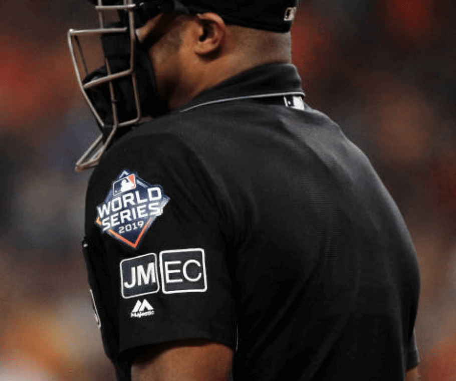
As you can see there, all of the umps had their patches nicely centered on their sleeves, except for one. The exception was plate ump Alan Porter (third from left), whose sleeve looked like the Cooper memorial patch had been added to it at the last minute. Here’s a better view of his patch arrangement:
• Fox made an early-game color readjustment to their score bug:
@UniWatch @sportslogosnet @506sports Fox broadcast updates colors in score bug after top of the first to better represent uniform choices pic.twitter.com/mGaGzNVUT2
— Oliver Crown Williams (@ocw5000) October 23, 2019
• The Nationals’ navy alternate jerseys are now on an eight-game postseason winning streak. Impressive!
I think that’s it. Pretty uni-uneventful game, really.
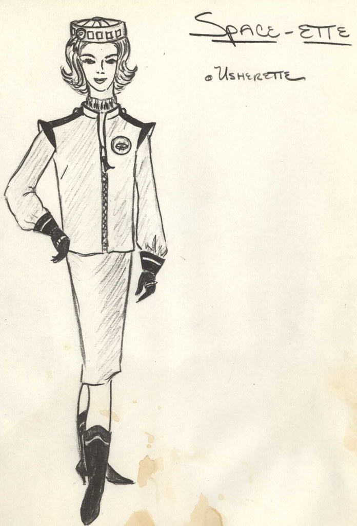
’Stros memories: Speaking of the Astros, from their early-1960s inception through the 1980s, they were one of the most visually innovative teams in sports history (as evidenced by, among many other things, the “Spacette” usher’s uniform drawing shown at right; click to enlarge).
I’ve written a fair amount about the Astros over the years. If you want to brush up on their uni-related history, here are some good places to start:
• This article includes lots of info on the uniforms worn by the team’s staff — the Spacettes, the spacesuit-clad groundskeepers (known as the “Earthmen”), and a lot more — with links to dozens of original drawings. Great, great stuff.
• This article is a good primer on the basics of the Astros’ tequila sunrise uniforms.
• After you read that piece, this article has the previously untold story of how the tequila sunrise design was created, as told by the designers who created it. Definitely one of the best Uni Watch articles ever!
(My thanks to Tom O’Grady for reminding me about the first article on this list, which I had forgotten about.)
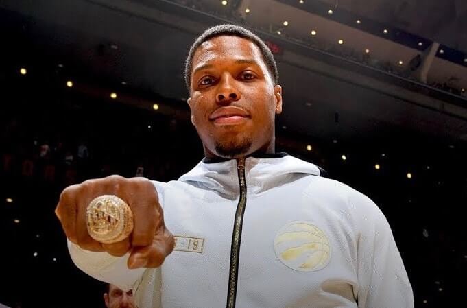
Bling thing: The Raptors received what the team is claiming to be the largest championship rings in NBA history prior to last night’s season opener. Here’s a closer look:
A historic ring for a historic accomplishment. #WeTheNorth pic.twitter.com/IZdkXQTj4B
— Toronto Raptors (@Raptors) October 22, 2019
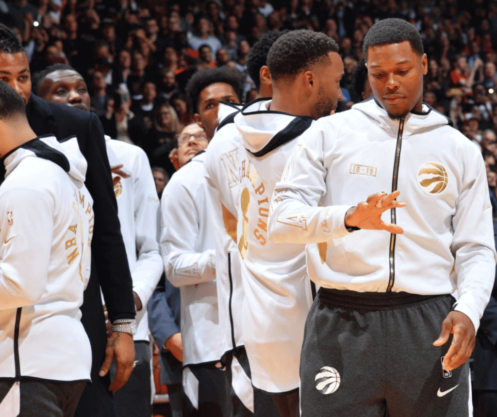
And here’s a better look at the Raptors’ gold-trimmed courtside gear (click to enlarge):
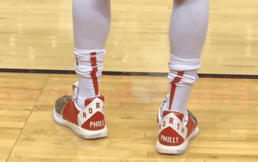
Another note from that game: Raptors point guard Kyle Lowry, who grew up in North Philadelphia, wore sneakers emblazoned with “North Philly,” in the style of the Raptors’ “We the North” alternate jerseys:
Meanwhile, if you haven’t yet checked out my NBA Season Preview with all the new looks for the new season, it’s available here.
(Thanks to Michael Barakan for the Lowry sneaker item.)

Click to enlarge
Brown tees now available: In the end, I decided to go with the white-wing and the yellow-wing versions of the logo on the brown shirt, because why not? Here’s where you can order them — white-wing logo and yellow-wing logo.
There will also be a sublimated version. It will have the yellow-wing logo, contrasting collar and sleeve cuffs, and a sleeve patch. I need another day to get that one launched. Thanks for your patience!
Thanks also to Scott M.X. Turner for his great work on this design.
Click to enlarge

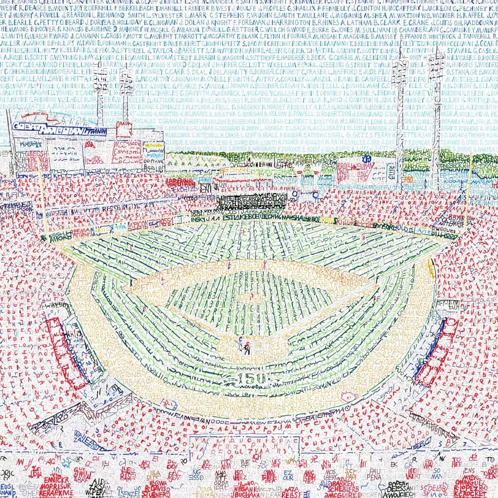
LAST CALL for the Art of Words raffle: Today is the final day to enter the raffle for an Art of Words print (like the one of the Reds ballpark shown above). The winner will get to choose any print from the Art of Words website. To enter, send an email to the raffle address by 8pm Eastern today. One entry per person. I’ll announce the winner tomorrow.
The Ticker
By Lloyd Alaban

NFL News: The 49ers confirmed that they’ll wear their all-white throwbacks on Sunday against the Panthers, something they had hinted at earlier in the week (from multiple readers). … As for the Panthers, according to Panthers Uni Tracker, they will wear their silver pants with their black jerseys for the first time since 2017. … Colts owner Jim Irsay tweeted that the team will wear their Color Rash uniforms on Sunday (from Scott Johnston).
College Football News: TCU will wear black alternates against Texas on Saturday (from multiple readers). … Utah is also going mono-black (from Nicole Pena). … Pitt is giving away a Mt. Rushmore-themed figurine at Saturday’s game (from @AlRega727). … Helmet history days roll on with Blaise D’Sylva. Here’s his Rice collection. … Oklahoma’s Sooner Schooner is being sidelined for the rest of the season after it overturned during Saturday’s game against West Virginia (from Kary Klismet).

Hockey News: A great-looking mask worn by former Blues G Ed Staniowski is up for auction (from @mrmichael21). … Here are the sweaters and goalie mask to be worn by the Regina Pats of the WHL in the league’s Prairie Classic on Sunday (from Wade Heidt).

NBA News: A few Pelicans players were seen using Raptors towels at last night’s game (from Johnny Rockford). … The condiment dispensers at the Blazers’ home arena have a very artistic Portlander feel to them (from James Gilbert). … For the latest in NBA uniform assignments, head over to Etienne Catalan’s Twitter feed. … NBA on TNT made a slight change to their score bug for opening night last night. The font is sharper and the TNT logo is smaller. Old version on the left, new version on the right (from Josh Hinton). … Clippers owner Steve Ballmer tore the elbow of his dress shirt last night.

Soccer News: From Josh Hinton: The Belgium Euro 2020 primary kit has leaked. … The second leg of the Copa Libertadores semifinal between River Plate and Boca Juniors last night was delayed due to confetti on the pitch. … Gross: River Plate will have a 70th anniversary shirt this season — not because it’s the club’s birthday, but because it’s the 70th birthday of their kit supplier, Adidas. … Atletico Madrid is continuing to wear a Save the Children’s charity ad on the back of their shirts in Champions League competition. However, they do not wear it in La Liga matches, even though La Liga permits back of shirt ads. … Braga of Portugal will wear a one-off Pinktober ad for their Europa League match on Thursday against Turkish club Besiktas since their current gambling-related ad is banned in Turkey. … Brazilian club EC Bahia have added black oil-like blotches to their kit to raise awareness for the recent oil spills in the region. … New primary, secondary, and goalkeeper shirts for Botafogo. … New winter ball for La Liga. … As usual, you can check out Josh‘s Twitter feed for more kit-related news. … “German team Borussia Dortmund usually has two yellow shirts: one for use in league games and a ‘third shirt’ used in place of the first shirt everywhere else,” says our own Jamie Rathjen. “However, this year the third shirt is black on the shoulders and sleeves, so it can’t be worn for Dortmund’s Champions League game tonight against Inter Milan and the first shirt is making an appearance instead.” … Tris Wykes spotted a New Hampshire high school soccer player wearing a soft arm cast covered in duct tape, of all things.

Grab Bag: Argentine men’s club volleyball team Bolivar Volley has added two stars to their logo for their two championships (one silver, one gold) last year (from Jeremy Brahm). … Also from Jeremy: New uniforms for the Polish men’s volleyball club team Asseco Resovia Rzeszow. … Golfer Jason Day wore a Tiger Woods-branded Nike vest during the Japan Skins game (from Robert Gorman). … Knitters around the world are recreating a sweater worn by a girl who survived the Holocaust by living in a sewer (from @walbergLines). … Pizza Hut is testing a meatless sausage pizza that comes in a round pizza box with a green logo.
For those really into the ‘stros, the University of Houston has an excellent digital collection (link) documenting the Astrodome with photos, publications, tickets, etc.
Here is the goalie mask Max Paddock of the Regina Pats will wear this Sunday in the outdoor game. Appears it is not in the Ticker item.
link
With regards to the jersey the Pats will wear for the game, I am disappointed in the effort. Seems like they mailed it in with a generic vintage look that looks nothing like their past uniforms.
Would have been better if they went with a throwback dark jersey from over half a century ago, like this one back in the days when they were a feeder team to the Montreal Canadiens. Without the ghost numbers though of course:
link
link
Maybe they didn’t wear the MLB 150 anniversary patch because the first World Series wasn’t until 1903?
The patch doesn’t say WS150; it says MLB150.
You suppose someone realized there are too many commemorations/memorials on uniforms and they’re getting out of hand?
never mind that neither league is yet 150 years old. i wonder if there will be an nl sesquicentennial patch in seven years or if by then the concept of the leagues as actual things will be too dissipated for anyone to notice
Regarding umpire Alan Porter’s shirt, it appears as though his is the only one with a front pocket and the front MLB patch is lower compared than the other umpires’ shirts. That’s what I got out of that exercise. :)
Not only was there a dress shirt mishap for Clippers owner Steve Ballmer last night, but there was a court design mishap as well.
Not really a fan of the court being painted mostly in black with the home team Clippers wearing blue and red.
Slightly uniform notable from last night’s WS game was somewhere around the top of the 8th, the radio announcers got into a brief diversion about hosiery, commenting on how socks like those the Nationals were wearing were fancier that the socks that the color announcer wore.
Do umpires have a different home plate shirt to fit over protective gear? And when did that start?
I think that’s been pretty standard for decades, no?
I believe it’s a matter of personal preference. Although this is the first time I’ve seen what DarenL noted above, that only the plate guy had a pocket on his shirt. Hey, somebody has to hold the lineup cards. I believe they started using polo shirts in the 1980’s?
SCORE BUG ISSUE:
Take a look at the Fox score bug above. One says “0 Out” and the “2 Outs.” Isn’t this inconsistent?
We say either “no men out; two men out” or “no outs; two outs.” So shouldn’t they both be singular or both be plural?
This has bugged me for a while, but the graphic above gives a perfect opportunity to point it out.
Well, “one outs” is out of the question, and that seems to be the dividing point.
Wanted to mention that I watched last night’s episode of This Is Us, and there’s a sequence where some characters attend a minor league hockey game in Pennsylvania. I don’t think they used a real team, but what was most interesting from a Uni Watch perspective is that the game was color-vs.-color! The home team (I want to say the city was given as “Brighton”) was wearing red uniforms very similar to the Devils’ unis other than the logo, with the visitors in blue.
I find that Hollywood frequently depicts color vs color match ups in sports.
“It’s like they got a cheap Chinese knockoff patch.”
Or, more likely, “Quick, let’s find someone in Houston to make the patch. Send them a picture of the existing one and tell them to replicate it best as possible so we can have something in time for the game.”
Sometime, it is the thought that counts…not everything has to be perfect.
Except there’s no way the new patch would qualify as replicating the first one “as best as possible.” Type is wrong, border is wrong, size is wrong. What’s so hard about taking the measurements and matching them??
I agree that the thought is more important than the execution. But that’s not to say that the execution doesn’t matter at all.
In today’s digital age, with a billion dollar organization… there is no excuse for this. Someone has the digital files for the first patch. Send them to the second patch designer/fabricator.
“Sometime, it is the thought that counts…not everything has to be perfect”.
You took a wrong turn, sir. The common sense message board is down the hall.
What I do not understand is why not incorporate the anniversary into the world series logo. Is it crazy to suggest having a unique special patch instead the generic every year junk that is the current offering?
A Houston TV Reporter named Stefania Okolie was wearing what appeared to be a World Series ring with her Astros jersey (and high boots) last night. Any idea on why had the ring? Is it fake? link
Think that site needs more CAPS in 900 SIZE FONT?
On another note, it’s cool/weird to see a few of my reporter friends on there lol
What I noticed different about plate ump Alan Porter is that he has a chest pocket with the MLB logo lower on his chest. Do all umpires wear a different shirt when behind the plate? Why not just have the pocket all the time, even if they only use it when behind the plate?
Johnny Rockford? There’s another John from Rockford on here? Small world.
Here’s the source of the mustard with the “artistic Portlander feel”: link
Who says that MLB makes the patches for the umps? Is that common practice? Below is MLB’s statement on Eric Cooper’s passing, mentioning the patch, but nothing about them making it.
“Throughout the 2019 World Series, the umpires will wear a uniform patch in memory of 21-year Major League Umpire Eric Cooper, who passed away in recent days at the age of 52. “Coop,” who worked the 2014 World Series among his many career Postseason assignments, was active in programs with UMPS CARE Charities, the official philanthropy of MLB Umpires, including visits to pediatric hospitals and bringing underserved youth for behind-the-scenes ballpark visits.”
Well, who do *you* think arranges the patches for MLB umpires? I mean, it’s not like the NFL made them!
But whatever. Whoever made them, they didn’t match the specs of the earlier patch. Sloppy work.
that’s the point, I think they are sloppy because the umps handle them. They have their own union separate from MLB, so I think it’s fair to say they handle this stuff in house.
Actually, it’s not fair to say that at all. In case you hadn’t noticed, the players have a union too, and you don’t see them designing their own patches.
Trust me — MLB doesn’t give the umps carte blanche regarding what goes on their uniforms. *Nothing* appears on-field without MLB’s approval and involvement.
In any case, as I’ve already stated, the larger point remains: Whoever did it, it was sloppy work.
Steve Ballmer tearing a dress shirt is ticker worthy?
Yes.
Glad we cleared that up.
Me too, thanks. :-)
The North Pole High School Patriots hockey team in North Pole, Alaska (a real place!) uses a weird Frankenstein logo mixing the New England Patriots and Columbus Blue Jackets logos. I’m actually a fan: link
Wow…I couldn’t imagine how that would look good until I saw it. It works.
Yeah, but one star too many.
Glad to see the Panthers break the silver britches back out. I was afraid they’d been mothballed for good. I like the Panthers uni’s and think they’d be fine with tweaking and not an overhaul, but the constant game of pants roulette they’ve been playing the last couple years is painful to watch. They’ve looked like an XFL or Arena League team the last couple years. The Black or Blue Jersey over Silver is by far their best look.
I literally just spent 3 hours down the Astros Colt .45s worm hole. I must have missed that when it was first available, but the amount of sketches, invoices, notes, etc. that was uncovered is amazing. And Paul, I think you’re right, there probably has never been another sports organization so uni-focused. Great write up!
Glad you enjoyed it, Keith. Great stuff!
“TCU will wear black alternates against Texas on Saturday (from multiple readers)”
I’m pretty sure TCU’s new alternate uniforms are not black, but rather dark grey. Check out this photo:
link
…where you can see the contrast between the black trim around the numbers and the grey jersey.
Additionally, what’s notable about the uniforms is not the color black or grey – both of which TCU uses as part of their standard color palette – but the inclusion of red – around the helmet logo, on the face masks, on the numbers, etc. This is a color Nike has incorporated into special uniforms for TCU for several years now – ostensibly because the horned lizard that is the school’s mascot namesake shoots a stream of blood out of its eye as a defense mechanism to ward off threats.
More info here:
link
Surprised to see no comments on the sheer ugliness of the material for the MLB patch. I’m not sure when exactly in the last couple of years they switched to glue on thermoplastic, but the end result is horrible compared to even the cheapest embroidered patch.
These monstrosities have no flex, causing every player to look like they have a piece of cardboard shoved inside the sleeve. And the peculiar plastic sheen just looks wrong next to fabric.
Not to mention that every other patch of any nature is embroidered.
I can’t understand why MLB, with all their millions, can’t do better than this.