Sometimes people get in touch with me and propose good topics to write about. If I’m busy, those topics sometimes get back-burnered — and then I sometimes forget about them.
That’s what happened with a great topic that was suggested nearly three years ago by reader Tony Bruno. Here’s the email he sent to me in the fall of 2016:
I have tried to explain this to several people, but no one understands. Hopefully, you can relate.
I have been printing uniforms [via a sublimation business] for about 10 years now, and I’ve recently tried to come up with the perfect last name to create the perfect NOB. For example:
• The perfect NOB would have to be the right length, which I think is seven letters. That seems to fill up the nameplate or area above the number perfectly.
• It should have symmetry. If vertically arched, it should have square letters at both ends or rounded letters at both ends. For example, my own last name, BRUNO, is an example of a square letter on the left (B) and a round letter on the right (O). This makes the lower-left corner sit below the lower-right corner, which ruins the symmetry.
• It should be comprised of letters with no negative spaces. That means no A, F, J, L, P, T, V or Y. [Note: I don’t think “negative spaces” is really the proper term for what Tony means here, since almost every letterform has some sort of negative space. I think he means it should fill its width fully from top to bottom instead of tapering. — PL]
• It shouldn’t have any letters that are unusually wide (M or W) or unusually narrow (I), since that throws off the spacing.
• It should look good in the main fonts used for NOBs.
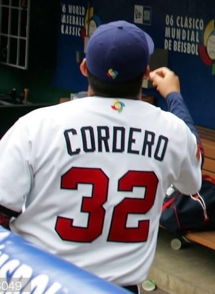
With all that being said, the only name I can come up with is CORDERO. Seven letters, all pretty much the same width, round letters on both ends,
This may or may not interest you, but you are the only person I can vent to about this!
I’m going to go out on a limb here and say that I bet most Uni Watch readers have had some thoughts, or at least some intuitive notions, about the Platonic ideal of NOBs. It’s definitely something I’ve thought about a lot as we’ve produced more than 2,000 Uni Watch membership cards over the years. I can’t say I’ve come up with a list of rules and standards like Tony has, but some NOBs are definitely more pleasing than others.
On some of our membership cards, for example, the NOBs look Just Right:


While others look a bit, well, unsatisfying, at least to me:
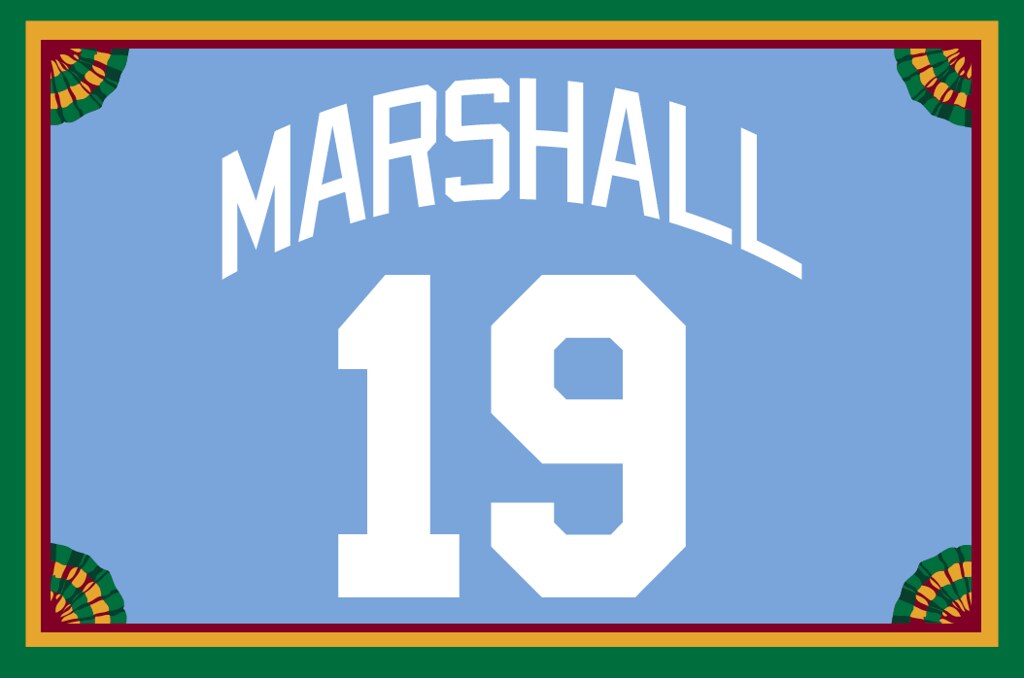

In those two cases, the open, empty space around the J (in the first card) and the L (second card) throw off the balance, at least to my eye. Having those letters at the beginning or end of a name can result in a less satisfying NOB. (I want to make it clear that I’m not critiquing anyone’s name. I’m just saying that some names feel more balanced and centered than others when rendered as NOBs.)
Anyway: When Tony first got in touch with me about this — again, that was nearly three years ago — I showed his email to membership card designer Scott M.X. Turner to get his take. Here’s the response that he sent to me at the time:
Intriguing! I do indeed think about this — every time I create a membership card, in fact.
Tony makes good points. Seven letters sounds about right, and I agree that CORDERO is a good-looking NOB. But Tony’s idea of perfection is a Brutalist construct — all clean lines, squared, and even-steven (although).
There are a couple of other ways to approach perfection, or at least satisfaction. Certain symmetrical letters look good in the middle, for example, particularly with an arc or vertical arch: A, W, O, I, X. Names that begin and end with the same letter are good, too.
I’m sure Tony, with his experience, has taken these other issues into account:
Font: The specific font can change the look, weight, and feel of certain letters. A rounded, modern font can give Ws the same width as other letters, for example.
Arching: Sometimes the arching is so subtle that it might as well be straight. And sometimes it’s so severe that the kerning looks off even when it’s correct.
Colors: Yes, colors. It makes a difference.
Layers, outlining, drop-shadows, etc.: An “I” with a two-layer treatment gains enough weight to not weaken the overall layout. Yes, I know that proportionately the other letters gain weight too, but a two-layer “I” crosses the line from being a 98-lb. weakling at the beach to at least having a shot at kicking sand in someone else’s face. (If that Charles Atlas reference is too dated, so be it.)
One final thought: Two letters that are always challenging are Q and Z. No offense to anyone whose name includes either of those letters, but they often make the NOB look awkward.
Good stuff. Shortly after Scott weighed in, I heard again from Tony, who had this to say:
After our last email, I told my daughter about our exchange. She told me that the perfect last name had to be objective, not subjective (college girl).
So here is the “NOB Scale”: 10 points is the perfect NOB. Every name starts with 10 points, then points are deducted in four categories.
1. Names lose points for every letter that is more or less than seven. (Example: LUKAS, minus a point for each letter less than seven, minus two points total.)
2. Names lose a point for each letter with negative space — A, F, J, L, P, T, V, and Y. (LUKAS, minus a point for the L and another point for the A.)
3. Names lose a point for each letter too wide, narrow, or tall — I,M,Q,W. (LUKAS, no points deducted.)
4. For arched NOBs, names lose a point for not having symmetrical end letters. (LUKAS, minus one point for L and S, because the L is square on the left side and the S is rounded on the right side, which throws off symmetry when name is arched.)
So LUKAS gets five points on the 10-point NOB Scale.
I wasn’t so sure that this could be boiled down to a formula or a numerical point system (so many variables!), but I liked that Tony was thinking so hard about all of this.
I was busy at the time, so I saved the email discussions and planned to write about them later. But at some point I forgot, and I apparently forgot to list this topic on my blog “to do” list, so the whole thing sort of languished in a murky corner of my brain until I recently resurrected it, and here we are.
My own two cents:
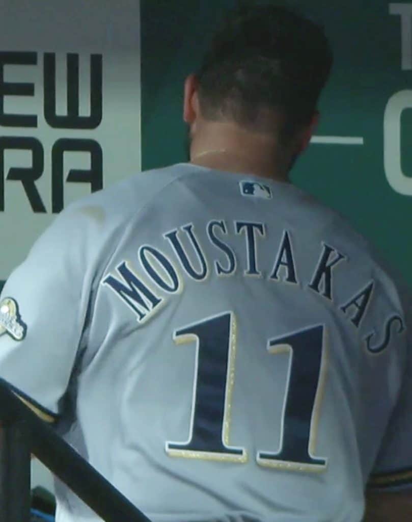
• Let me echo what Scott said about fonts — they matter a lot. NOBs look particularly bad when rendered in serif fonts, as any Brewers fan can probably tell you:
• Some letters look particularly pleasing when placed next to one another. Look at this membership card, for example:
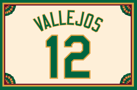
V and A almost always look good next to each other (in either sequence) because the letterforms nest into each other. (The same goes for A and W.) By contrast, look at the E followed by the J — ugh. Very clunky!
I should add that while the VA combo is excellent, having the V as the first letter doesn’t pair very well with the S as the final letter — feels asymmetrical, because the V is tapered while the S is not.
• The numbers matter, too. The numeral 4 often feels particularly problematic on a membership card, even if the NOB looks fine on its own terms. The 4 makes the whole design feel out of balance, especially if there are no other numerals:

Even as part of a double-digit number, a 4 can make things feel out of whack and make the NOB seem uncentered, even though it is properly centered:

I could go on, but I have a strong suspicion that many of you are going to want to comment on this topic, so I’ll stop here and encourage everyone to chime in. My thanks to Tony Bruno for getting the ball rolling, and my apologies for the ridiculously long delay at my end. Hope it was worth the wait!
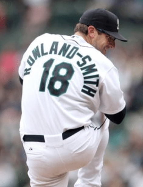
And speaking of NOBs: Remember when the only athlete with a hyphenated NOB was Kareem Abdul-Jabbar? Nowadays, as we’ve noted several times here at Uni Watch, hyphenated NOBs are on the rise, mirroring the trend in our larger society — and resulting in some very awkward-looking NOBs.
A writer/designer named Jan Diehm has created a really excellent piece for The Pudding (a site that specializes in “visual essays”) about the rise of hyphenated surnames in pro sports. It features lots of research, lots of data, and entertaining graphics. I can pretty well guarantee that you will enjoy it. Highly, highly recommended.
(Big thanks to John Kuhl for this one.)
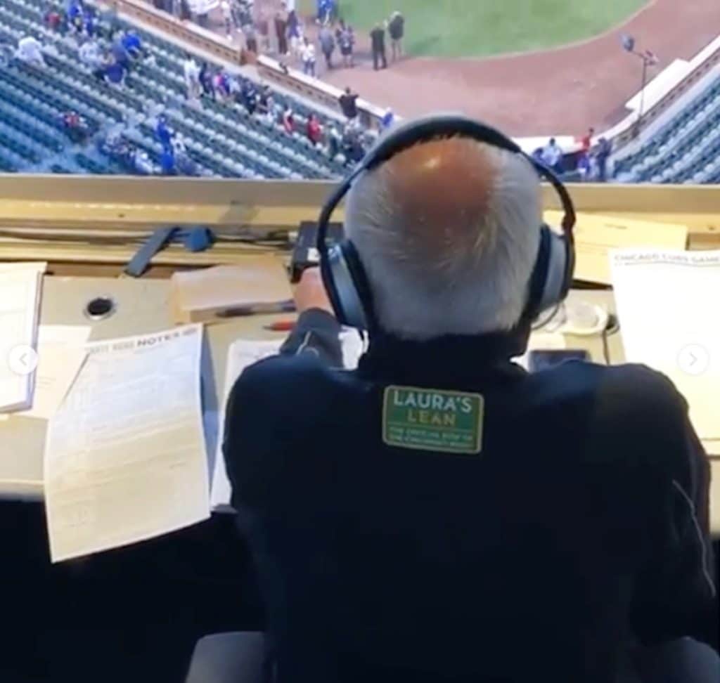
Oh, for fuck’s sake: Longtime Reds radio broadcaster Marty Brennaman is retiring after this season, so he’s been on something of a farewell tour. Last night’s game in Chicago was his final game at Wrigley, so there were lots of photos and video clips of him floating around — including the one shown above, which just happened to show an ad patch plastered on his back. What a heartwarming way to send a legendary broadcaster off into the sunset!
Got some free time this weekend? Watch Idiocracy. Only $3.99 on YouTube.
(Thanks to Michael Kinney for bringing this depressing development to my attention.)
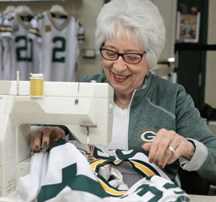
You reap what you sew: Marge Switzer, who has been the Packers’ seamstress for decades, is the subject of an in-depth article in Women magazine (“The most trusted local magazine for women in Northeast Wisconsin”).
The article includes all sorts of interesting stories and details, including Switzer’s record-keeping system for each player, the one time she misspelled a player’s nameplate (only on a practice jersey, fortunately), the time she had to create a jersey just before gametime for referee Ed Hochuli, how she watches games on TV with a very critical eye, and a lot more. Highly recommended!
(Big thanks to longtime Uni Watch reader/pal Jeff Ash, who also happens to be Switzer’s former next-door neighbor.)

Click to enlarge
Gumball update: In case you missed it on Thursday, I made a bunch of Uni Watch gumball helmets and are offering them for purchase. Full details on how I made them and how you can order them are available here.
If you want one of these, move fast — yesterday’s orders ate up about 30% of my original inventory. Here’s an update on how many are left as of this morning:
• Green shell with old-school mask: 29
• Green shell with linebacker mask: 1
• White shell with old-school mask: 1
• White shell with linebacker mask: SOLD OUT
The green shells have been more popular so far, but I had very few of the white shells to begin with, which is why they’re already nearly gone. I may have a line on a new supply of white shells, however, so that supply may be replenished soon. Stay tuned.
Also, a signal flare: Thomas Tell, I received your payment (thank you!), but you didn’t email me to say which color you want, your shipping address, etc. Please let me know. Thanks.

ITEM! Final closeout price drop: The price of the Uni Watch 20th-anniversary patch, which was originally $9.99, and then $6.99, has now been reduced to a final closeout price of $3.99 plus $1 for shipping (or $2 for shipping for non-USA orders).
The patch was made for us by Stitches, the same shop that does all the sewing for the Mets, Yankees, and Islanders. It measures four inches across and is suitable for sewing onto a jersey or jacket, or just for displaying.
To order, send payment via Venmo (use @Paul-Lukas-2 as the payee), Zelle (plukas64@gmail.com), or Cash App (plukas64@gmail.com). If you want to use Apple Pay or a paper check, or if you’re outside the USA and can only use PayPal, shoot me a note and I’ll fill you in.
Once you send payment, be sure to send me your shipping address. Thanks!

Click to enlarge
Cap update/reminder: Remember, we now have two different caps with different designs, different fabrics, different price points. That’s our Classic Cap on the left (wool, fitted or strapback, $42.99, available here) and our new Gold Circle Cap on the right (cotton, strapback, $24.99, available here).
My thanks, as always, for your consideration.
The Ticker
By Anthony Emerson

Baseball News: @squatcheeontop got a pack of 1989 Donruss cards that featured a couple of Blue Jays players in royal blue jerseys and powder blue pants. Was this just a Spring Training look or did they wear this for a regular season game? … The Pirates are saluting Steve Blass’s retirement after 60 years of being connected to the team next weekend, and the baseball will have a commemorative logo (from Stephen Burns). … @BSmile posted some amazing footage of the 1920 silent film Headin’ Home, starring Babe Ruth. “Note the memorial armbands on the Yankees uniforms for Cleveland’s Ray Chapman,” he writes. … Fox Sports South and Southeast have created an “Ñ” logo to flash on screen whenever Braves OF Ronald Acuña Jr. hits a home run (from @DFRSH757). … All Braves relief pitchers have personalized bathrobes, complete with uni-accurate uni numbers and NOBs (from E.I. Pérez). … Did Manny Ramirez really bat one time with his jersey fully untucked? Sure looks that way. … The Dodgers once had warmup jackets with jersey-style numbers and NOBs.

NFL News: Derek and J.J. Watt’s parents are wearing Chargers/Texans crossover apparel to support both of their sons when they face off this Sunday (from Ignacio Salazar). … Arrowhead Stadium in KC will have throwback end zones and a throwback midfield logo for Sunday’s home opener (from Terrance Carter and @incognito95123). … Former heavyweight boxing champ Mike Tyson attended last night’s Titans/Jaguars game in Jacksonville and wore a Jags jersey, but not this year’s model.
College Football News: Iowa State is going white-red-red tomorrow (from Chad Lehman). … NC State is going mono-black tomorrow (from @ACC_Tracker). … UNC is going blue-blue-white against Appalachian State, while Appalachian State is going black-white-black (from Thad McKinnon and James Gilbert). … The Lobos are going white-red-red tomorrow for the intra-state contest against New Mexico State (from Frank Mercogliano). … According to @ASU_Uniformity, these weird lines in ASU’s endzones are actually topographical maps of the Tempe Buttes. This is so cool! … Here’s a nice graphic giving a visual history of BYU’s helmets (from Jacob Gibb).

Hockey News: Good catch by Roland S., who noticed something about the Canucks’ “flying skate” jersey. In the original version that was worn in the late 1980s and early ’90s, the space above the “S” in the chest wordmark was white. A recent Reebok-era throwback also had the white space. But in the new throwbacks that will worn this season, that space is black. “I know I’m nitpicking, but isn’t that what we do?” he says. …New Canucks G Zane McIntyre’s mask pays tribute to his grandmother. When McIntyre was in the Bruins’ organization, he had a similar design but with his grandmother in a Bruins jersey (from Wade Heidt). … Carolina has released its preseason uni schedule, and debuted its new white sweater at home (from Scott M. Trembly). … Gorgeous new unis for the University of Pittsburgh’s club team (from Alan Saunders). … New unis for Maryville University. … An old hockey arena in Canada’s Northwest Territories has been repurposed into a commercial greenhouse (from @walbergLines).

Pro Basketball News: It appears the NOB font on the Pacers’ ‘Statement’ unis has been updated (from Etienne Catalan and Mackenzie Henderson). … Also from Etienne, Raptors G Isaiah Taylor will wear No. 4. … The inaugural unis for the D League’s College Park Skyhawks, formerly the Erie BayHawks, have been released. … As a season ticket renewal gift, the Mavs are giving away replica versions of the key to the city awarded to Dirk Nowitzki during his retirement ceremony (from Sam McKinley). … A c. 1935 team of all-stars from Oshkosh, Wis., refused to carry any corporate or manufacturer’s logo, despite several offers. Oshkosh All-Stars Get It™ (from Jeff Ash). … New uniforms for the Croatian team K.K. Split (from Ed Zelaski).

College Hoops News: Lots of talk yesterday about how similar UConn’s “The Pack” logo looks to NC State’s “Wolfpack” logo, leading to UConn admitting to the crime (from multiple readers). … Absolutely gorgeous new unis for St. John’s (from James Ballow). … New uniforms for Auburn.

Soccer News: “Given how much else changes in the modern game a club’s colours are sometimes the only constant. Football’s continued embrace of extreme capitalism threatens to take them too,” writes The Independent‘s Miguel Delaney (thanks, Jamie). … Manchester United wore white socks at home instead of their normal black for their UEFA Europa League match against FC Astana (from Josh Hinton). … Also from Josh, there were third kit debuts for Borussia Mönchengladbach, AS Roma, and Getafe. … One more from Josh: Wolverhampton Wanderers’ cup font features the “wolf’s eyes” from their crest at the bottom of their numbers. Nice!

Grab Bag: English cricketer Ben Stokes had custom-made Harden Vol. 3 cricket spikes (from Joe Hicks). … New bag design for Lay’s potato chips (from Mike Chamernik). … Mark Miller‘s 11-year-old son made him a birthday card featuring various uni patches. Well done! … Here are the liveries for the final race of the IndyCar season at Laguna Seca (from Tim Dunn).
Click to enlarge

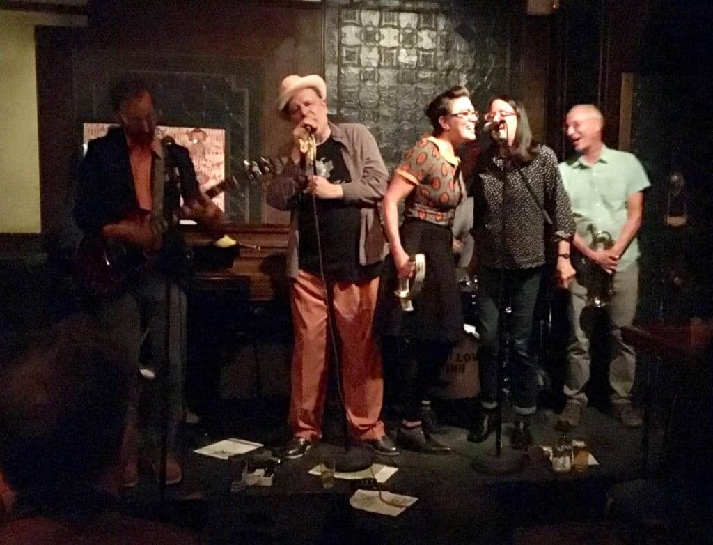
What Paul did last night: The Tugboat Captain had a class last night, so I hopped in the car by myself, drove to Queens while listening to a podcast, and saw The Scene Is Now, a band I’ve loved since I mail-ordered their first LP in 1985.
Had a few beers, saw and chatted with lots of friends, felt the beginnings of autumn in the air. Nothing remarkable — just a good night, the way life should be. Nice.
Raffle results: If you go to the gallery of stirrups that we were raffling off this week and hover your cursor over each photo (or just click through the 10 photos), you’ll see that each of the 10 pairs now has a person’s name added to its file name. Those are our 10 winners. Congrats to them, and big thanks to the anonymous reader who donated this fine hosiery!
Re: Cordero
Chad > Will
Wil > Will. FTFY.
For some reason, Victor Martinez always achieved a nice name/number balance on the back of whatever team’s jersey he wore. MARTINEZ always fit well over 41, which for some reason has always been one of my favorite uniform numbers from an aesthetics standpoint.
My name fails on so many counts – even number of letters, an I to throw off spacing, a pair of Ls at the end. Oh well. If it had been fashionable to be Irish when my family came over, the “O’” out front would give me an odd number AND an apostrophe.
I seem to rememner that in 1971, When Kareem Abdul-Jabbar changed his name, his NOB just said JABBAR
You’re correct. I just googled a bunch of images of him.
But I did find one of him, still with Milwaukee, with the full ABDUL-JABBAR on his back.
Re the 88 (if the card is 89) Blue Jay’s appropriation Argonauts, the shirts sleeves say early regular season but the attire and age of the crowd say Spring Training. Does anyone know if they and the ‘Expos would play any in-season or right-before-opening day exh iij notion games like the 1-game Cubs-Sox would play in late April/early May.
Yes, there used to be the Pearson Cup:
link
“Does anyone know if they (Blue Jays) and the (‘)Expos would play any in-season or right-before-opening day exh iij notion (exhibition) games like the 1-game Cubs-Sox would play in late April/early May
link
link
I have a feeling that was a photo from a spring training game.
I don’t think this was regular season. I think the White Sox were the first to wear softball tops?
Someone has to say it: I’m a rabid anti-NOB fanatic who doesn’t want to see anything but a number on a player’s back!
I don’t mind NOB, but I will say baseball jerseys look much cleaner and less cluttered without the NOB. The Yankees got it right.
not usually fond of football teams going monochrome, but link looked great last night – well as great as can be with cap sleeves and a nascar-esque jersey front. conference logos need to shrink and move. who really cares if the team plays in the aac, the acc, the sun belt, or the rust belt?
No truth to the rumor that pitchers using the Steve Blass ball will be unable to throw it over the plate.
Be funny if the side of a barn was etched into it.
I always thought my last name looks good as a NOB: DINIS
Despite only being five letters long and having two I’s, it has always looked symmetrical in jerseys I’ve had with my NOB.
The Brewers, Rangers, and Mariners have terrible NOB letters. The Mariners used to be fine, but since they added those extra layers a few years ago it looks horrible now
unpopular opinion: Chicago Bears have the best NOB letters.
I like what Scott said about symmetrical letters in the middle of odd-numbered names. It sort of anchors the word with the other letters “hanging” off the side. Stewart, Braxton, James, Nixon, etc.
To me the ideal NOB would have alternating vowels and consonants, but I think I have that bias for all words and not just names/NOBs.
For anyone wondering, I counted 28 hyphenated NOBs in the Premier League this season, which is a concentration probably between 4% and 5%, if not higher. Even without figuring it out, they are noticeably more common in the PL than in any American league (besides the WNBA).
Conversely, I only counted four in the Women’s Super League, two of which are on Liverpool.
My favorite NOB in soccer has and always will be Vennegorn of Hesselink. I wonder if that the longest NOB in of all-time.
It’s no where near aesthetically pleasing but i sure is fun to say.
link
That’s the longest one I’m aware of.
There has to be a better CORDERO example than Wil. One that isn’t a wife-beater.
link
Fair point. Chad Cordero photo now swapped in.
I’ve always loved the way DENISON looked on a jersey. Regardless of the arching the “I” in the center was always perfectly straight in relation to the jersey.
Additionally, I think the number comes into play a bit. A shorter name link with a double digit number.
RE: new Lays logo (etc.)….
There ought to be a law! That whenever anyone publishes a story about a New Logo for anything, they MUST show the old and the new side by side.
Agreed! Those articles almost NEVER do, so I end up googling it.
The most OCD topic in recent memory, which is saying something.
I’ll take that as a compliment!
Hey – I got named in a Uni Watch column! Even if it was only because Paul needed my info for the Gumball Helmet order, I’ll take that!
I think my last name, RESNICK, would work *pretty* well according to those rules. Obviously not as good as CORDERO (due to the “I”) but I think it’s still up there.
Is this limited just to baseball?
As many NOB’s in hockey look much better than baseball.
Not at all limited to baseball.
Seeing the retro images from Arrowhead reminded me of when the Chiefs would paint their helmet and the opposing team’s facing each other on the field. Thought they might’ve done that this time, too.
Those were the Blue Jays spring training jerseys. Back in those days, when I collected baseball cards, most of the pictures were taken during spring training. I believe I actually have that card.
Manchester United wearing white socks in European games is a long-standing tradition, like Tottenham going mono-white in Europe.
I’m impressed with my name earning 8 points on the Bruno Name Scale. If only it were a little longer.
link
I like that you called it the “Bruno Scale”!
Pretty perfect that the name CORDERO includes the word ORDER….which is what this whole dialogue is essentially about.
+1
Is this Tony Bruno the sports talk show host Tony Bruno? Just curious. Thanks!
No, I’m just some guy from Pittsburgh.
Numbers in the teens (except 11) tend to bug me because they always look badly off-center. You can’t center it between the numbers, and if you center the entire number, it just looks off balance. The Ryan Rowland-Smith photo in today’s entry is a good example. His 18 actually isn’t too bad, but 17 always looks particularly egregious because of the blank space in-between.
Then again, I always wore 4 (also problematic for reasons discussed today) or 12 whenever I could. I guess this stuff isn’t always rational!
Rowland-Smith does the occasional studio bit for the Mariners telecasts. They call him “The Hyphen”, with a twitter handle of @Hyphen18
I always liked that my last name is 4 letters because it meant I had a unique nameplate won my hockey jersey. There was one other guy with a 3-letter last name, but his jersey number was a single numeral where mine was double-digits, so my NOB always looked different from everyone else’s.
I don’t think that’s a Carolina Hurricanes uniform schedule, just a regular schedule with different colors for home/away. They wore white on the road vs. Tampa, as teams usually do
Yep, and the very next night the Lightning wore their white road uniforms at Carolina (‘Canes wore red, btw).
You can’t do better than OTTO 00… not only were the the number and name palindromes, but in a basic block font, they were virtually symmetrical. And “00” can be pronounces “Aught-Oh”. Oh, and he played center, right in the middle.
Was he ambidextrous by any chance?
And he wore a two-bar facemask and a neck roll. Badass!
re: Manchester United’s white socks
United always wear white socks for Continental competitions. I don’t recall the reason, but I think it goes back to 1998/99 (the treble season).
In mid-90s traditional black socks were worn at home: link
In 1998/99 they introduced a Champions League-only kit with white socks: link
Since then they have worn white socks as first choice for Champions League games. I definitely associate that look with big midweek games under the lights at Old Trafford.
Mike Tyson IS wearing the new Jags jersey.
No he’s not. This year’s has the anniversary patch instead of the chest logo.
Not that this hasn’t been said a zillion times already, but the look they sported last night with the black pants really drives home just how necessary it is for the Jags to make the teal jerseys their primary home look. The black-teal-black combo being clearly their best possible look.
What, not doing the helmets of the Chiefs AND the visiting team at midfield?
They could also do a NOB off-centered way to the right like they did with Willie Lanier.
Not only that, they should have the yardline numbers every five yards as they did in the day.
I was wondering about names like mine, that have a 2nd capital letter? Typically, I spell my name with a space between the small “a” and the big “F”. That could be offsetting as well. You could connect them, but I don’t know if that would work better, in terms of the symmetry. I think it looks better if you could connect them with all other letters capitalized and the small “a” included, rather than all the letters being capitalized and having a space between the big “A” and the big “F”.
Has anyone received their Uni Watch sticker? I still have not and it says that it is out for delivery on August 16th. I’ve been jonesing for it forever and was wondering if anyone else was having any issues.
I’d like to see a feature on lower-case NOBs. Not just a single letter like LaFON above, but capital letter followed by all lower case.
I think the Washington Bullets did that for a time.
What about a Z at the beginning and end? With D and C helping to bookend as well?
ZD CZ
ZDANCEWICZ
The length and WI probably hurt it from Tony’s perspective.
Anyways, I’ve always thought it looked good as an NOB (as objectively as I can look at it)
great name for a lineman in football!
could also work for a catcher in baseball or a defenseman in hockey
The College Park home uni reminds me of something EA Sports would use if they couldn’t get the licensing rights from University of Maryland for NCAA basketball game.
While I have never seen my last named rendered in a radially or vertically arched manner, I think it would look pretty good: STOKES.
The only thing that throws it off at all (besides being only 6 letters long) is the K, otherwise all strokes are vertical or horizontal.
Lee
Based on Tony’s point system, STOKES gets an 8!
-1 for being less than seven letters and -1 for the L’s negative space.
Lee
The T, not L.
Lee
I have never given this topic much thought but I don’t think my four letter last name, HORN, looks very good on a jersey. The only possible redeeming quality might be the vertical beginning and end lines of the H and N.
Font and medium are definitely important for good looking NOB’s. In hockey, I’d say it’s a pretty boring exercise most of the time, because straight bars are cut to frame the name just right, without too much slack on the ends. But let me nominate Chris Osgood on the Red Wings.
link
All six letters in the name are “boxy” without too much wasted negative space, and it frames and complements a similarly “boxy” #30 quite well. And the Red Wings VAL looks subtle and classy with that name…couldn’t say that about Robitaille or Abdelkader or Konstantinov.
I can’t stand when people misspell my name and the most typical misspelling is Hersch instead of Hersh. But with the Bruno scale now I know they’re just giving me an extra point to get me up to a score of nine.
link
On a side note, this reminds me of how I named my kids based on how it looked. Both my kids have 5 letter first names (and 2 syllables) to make a nice balance with the five letter one syllable last name. And both have names that are not typically shortened into a nickname.
RENNER is balanced and looks pretty close to perfect IMO.
link
I read an article a while ago about the problem of hyphenated people marrying other hyphenated people and having children. It referenced a Scandinavian country, sorry don’t remember which, that this is becoming a problem. They are deciding to come up with made-up new last names.
And the American “trend” in hyhpenated last names is on a dowanward spiral. While we my see it last a few more years as kids born in the 1990s come into sports leagues, it’s not going to increase over the long term.
Oh boy, what about John Hannah’s NOB? A literal palindrome and almost a mirror image!
When Jose Contreras was pitching for the White Sox I always thought his NOB looked really nice.
I bet Joe West was the home plate ump when Manny hit with his shirt untucked. Fucking ridiculous. He should have been sent off the field and fixed it. What do I know. This is a guy who was stepping on his uniform pants by the time his career was over.
Does your gumball helmet project mean that ice cream sundae helmets are next?
link
Really neat article about Marge Switzer, thank you.
Given link from so many years ago, the 4 definitely does throw off the balance a bit. My last name, though, has an odd bit of symmetry with the two “IE” pairs. It would definitely work better with my original number, 96.
(Yes, I actually did get a personalized Red Wings jersey when I was much younger, and replaced my original 96 with a 74 when an actual Red Wing – Tomas Holmstrom – started wearing 96. And I was so checked out on the Wings last year because of the rebuild that I missed them finally adding a 74 to the roster last spring with the acquisition of Madison Bowey from the Caps! But then again, I don’t really wear my old personalized jerseys anymore.)
Will there be a Rugby World Cup Uniform Preview or did I miss it?
Sept 14th.
Meant to chime in earlier but just remembered now. My brother has a friend with the last name Orofino. That would have a score of 8. Had it been Orofono, it would’ve scored a 9. I wonder whether a single zero or a double-zero would go better with the name Orofino/Orofono…