[Editor’s Note: Paul is on his annual August break from site. Deputy editor Phil Hecken is in charge from now through the end of the month, although Paul may be popping up here occasionally.]
GRIFFINS VOTING ROUND 2 IS TODAY. PLEASE SCROLL DOWN FOR THE NEXT SET OF DESIGNS AND TO VOTE!

By Phil Hecken
Follow @PhilHecken
The US Open (tennis, not golf) starts this coming Monday just a few miles away from my home base (as a kid and into my early adult years, I probably went to the US Open three or four times each year, and I’ve seen three men’s finals and a ton of men’s and women’s semi-finals over the years; But with the cost of tickets these days, I haven’t been in a decade. Still, I watch every day — and some of those night time matches are really incredible) and am once again looking forward to two weeks of great entertainment. But my doubles partner, Brinke Guthrie, is an even bigger fan than I, particularly when it comes to the outfits worn by the players, so he joins me today to bring us his …

US Open Fashion Preview
By Brinke Guthrie
Follow @brinkeguthrie
It’s up to you, New York, New York. The tennis U.S. Open is upon us, with the first round kicking off Monday the 26th at the National Tennis Center. This is the last big uni-showcase (if I may borrow and adapt that term) for the tennis makers; we won’t see anything new until Melbourne in January. We’ll start off with Uniqlo because I’m biased- I’m a Fed Fan. I admit it.
Uniqlo
BFBS takes a backseat to BFRS (Black For Roger’s sake.) From Roger himself, as posted on the Tennis Warehouse forum: “I wanted a full body black style for the design of this US Open, I received a proposal from the design team for a wonderful and sophisticated outfit. The details and concept of the design are based on a vision that goes beyond sports based on LifeWear’s philosophy.”
Got that? Philosophy.
So, notice he’s wearing white socks and white sneakers here. This is similar to the popular full-on 2007 US Open Darth Federer look.
This is the style for the night matches; I would think it’s the reverse for day sessions, if he ever plays one. When you’re The GOAT, you get showcased as the featured night match on the main court more often than not. This line went on sale this past Tuesday- the socks were gone instantly. I was able to snag a T-shirt; just don’t get me started on how poorly they market this guy.


And here’s a Uniqlo Q&A with the Fed if you’re interested.
His Uniqlo buddy Kei Nishikori will be outfitted thusly;

Nike 1.0
New York is where Nike is free to unleash their inner child, and go wild(er) with the designs. Tell us about it, Nike PR: “Inspired by New York City, oil-slicked streets at night, a lone graffiti strip on a wall, the pronounced embroidery on a basketball jacket decal — these quiet details give the fall 2019 NikeCourt collection an introspective flavor.”
Nike athlete (and 2017 US Open winner) Sloane Stephens, who will be wearing a special player edition of the Nike Zoom Zero HC Jordan 8 at the Open this year, says of playing under the bright lights in the Big Apple, “it’s hard to put into words but there really is nothing like it. The people in New York have this zest for life unlike anywhere else I’ve been. It’s contagious. So when you’re out there on the court, you can’t help but feel motivated by it.” Maybe SS will win it all again; and maybe she’ll exit in in the first round. She’s like that.


Purple is the key color for this collection. We all know how someone feels about that color. Why didn’t they check with him first? He just lives a few blocks away, you know.


Nike 2.0: As The Kyrgios Turns
Million dollar talent, ten cent head. Aussie Nick Kyrgios has as much pure talent as anyone in the game. Absolutely stunning shots at times. Unfortunately, too many times he blows up and then crashes into oblivion. With predictable results. (Wanna see him lose $113K just..like..that? Glad to help. He does have a special shoe for the Open, though. The NikeCourt Air Zoom Vapor X Kyrie 5 is a shoe Nike cooked up for Nick and basketball star Kyrie Irving, since Kyrgios would rather play hoops than tennis. I think he’d rather do anything besides tennis. Nick, if tennis is so bad, there’s a Mickey D’s near you that needs help on the night shift. Grow up or stop wasting our time.


Adidas
Neon green is the theme for Adidas.This is the “NY Collection” for the final Grand Slam of the season. “Designed in collaboration with the Adidas Brooklyn Creator Farm, the ‘NY Collection’ is inspired by the streets of New York City and urban tennis culture.”
Kinda sounds like what Nike did, eh? Angelique Kerber, Garbine Muguruza, Caroline Wozniacki, Alexander Zverev, and Stefanos Tsitsipas will sport this look, which is made from recycled polyester. Zverev is wearing the NY Printed Tee, “a stand-out glitch style print inspired by the streets of NYC,” and Thiem will wear the NY Polo.


Kerber is shown here wearing the NY Women’s Tee, and Muguruza in the black dress:


Fila
Fila’s lead women’s player, the world #2 and current French champion Ash Barty, will sport the “Awning Collection.” Colors include Fuchsia Purple, Hot Pink and Orange Peel that are joined by Fila’s traditional Navy. No, I don’t know why it’s called that.

Fila is also releasing the US Open edition (“Installment No. 4”) of their vibrant Pierluigi Rolando collection . He was their original creative director and designed the original Borg pinstripe look (based on the New York Yankees!) Karolina Pliskova and Marin Cilic will wear this line.


Lacoste
Novak Djokovic will wear this shirt from Lacoste. This isn’t a US Open debut; he wore this one at the Western & Southern in Mason Ohio last week.


Thanks, Brinke! Nice job with the preview. Definitely looking forward to watching the tennis — the fashion? Well, let’s see how these look on court.


GRIFFINS DESIGN CONTEST GROUP B VOTING

Today we begin vote on the second group of contestants for the fourth annual Grand Rapids Griffins design contest. In case you missed it, the contest parameters and rules were laid out here.
The TOP THREE contestants receiving votes in each group will move on to the final group (for a total of 12 finalists — three from each group), from which the Griffins will make a decision and declare the winner who I will announce on Friday, August 30.
I again want to give my great thanks to Larry Torrez, who worked with me to come up with the poll you’ll see below in an aesthetically pleasing format as well! Great work ElTee (of DC)!
REMINDER: While some of the submissions you see below may include gloves, helmet, pants, etc., you are ONLY voting on the jersey design. Please keep that in mind when casting your vote(s).
The Griffins gave the following parameters for the jersey contest, so please keep these in mind when voting:
“The details are that this jersey is going to be worn on our 90’s Night on Saturday, February 22 (with either red or black pants and red gloves/helmets). We’d like the contest to be for a 90’s inspired jersey. We don’t want to set any other regulations, as we’re not looking for the submissions to be any of our old logos or colors. We’d like something that is created fully by the designers.”
OK? That’s about it. First I’ll display all the submissions for today, which will be followed by the new (sharp-looking and hopefully cheat-proof) poll. Click to enlarge any image below.
My thanks to all who submitted and best of luck.

A. RYAN BRANDT

B. ROSS CLITES

C. JACY COLTER

D. LUCAS DAITCHMAN

E. KURT GORECKI

F. JACK HUDEC

G. ROSS IVANAC

H. BRANDON LAMARCHE

I. KARI MADSEN

J. GEORGE MILLER

K. JACKSON MOREHOUSE

L. DOUGLAS O’LEARY

M. GREG OSBORN

N. PAM POTTER

O. KURT ROUBAL

P. DAVE ROYCE

Q. NATHAN SHELNICK

R. JOE UDVARI

S. PATRICK WALTERS

T. KIERAN WEBSTER

U. ERIC WESTOVER

V. ZACHARY WOOLDRIDGE
And there you have it. Your second 22 submissions. And now, to vote, here’s the poll — to start, click “START”; once you start the poll, the reader design will appear above the name, and you may select as many designs as you like. Once you have finished voting, be sure to scroll to the bottom and hit “SUBMIT” to make sure your vote(s) are counted! That’s it!).
VOTING WILL TAKE PLACE FROM 7:00 AM TO 11:00 PM EASTERN


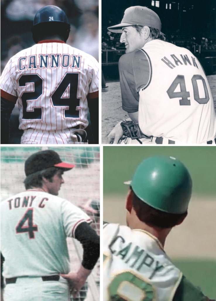
And now a few words from Paul: Hey there. With MLB’s nickNOB-clad Players’ Weekend uniforms making their annual appearance starting tonight, my latest piece for Sports Illustrated takes a look back at previous examples of MLB players wearing nickNOBs (including, clockwise from top left above, Jimmy “Cannon” Wynn, Ken “Hawk” Harrelson, Bert “Campy” Campanaris, and Tony “Tony C” Conigliaro). You can check it out here.
While I have you here:
• Season previews upcoming: Speaking of SI, the annual Uni Watch College Football Season Preview will be appearing there next week — either Aug. 28 or 29 (I’ll let you know when the date has been finalized). The NFL Preview will follow on Sept. 3.
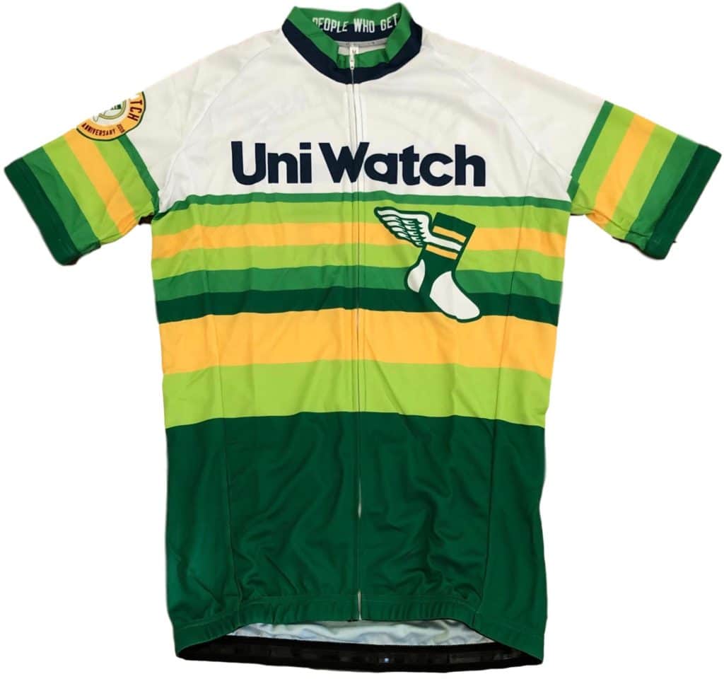
• Cycling jersey reminder: I’ve been very pleasantly surprised by how many pre-orders we’ve gotten for the Uni Watch cycling jersey. I figured we’d sell may 10, tops, but we’ve already received orders for nearly three times that many. Good to see so many uni-cyclists out there! You can customize your jersey with your choice of number and NOB, but you have to move fast, because we’re only taking pre-orders through next Wednesday, Aug. 28. Full details here.

• ITEM! Another Teespring sale: Teespring is running another weekend sale. From midnight tonight through the end of Monday, you can get 10% off of anything in the Uni Watch shop or the Naming Wrongs shop by using the checkout code AUGUSTSALE.
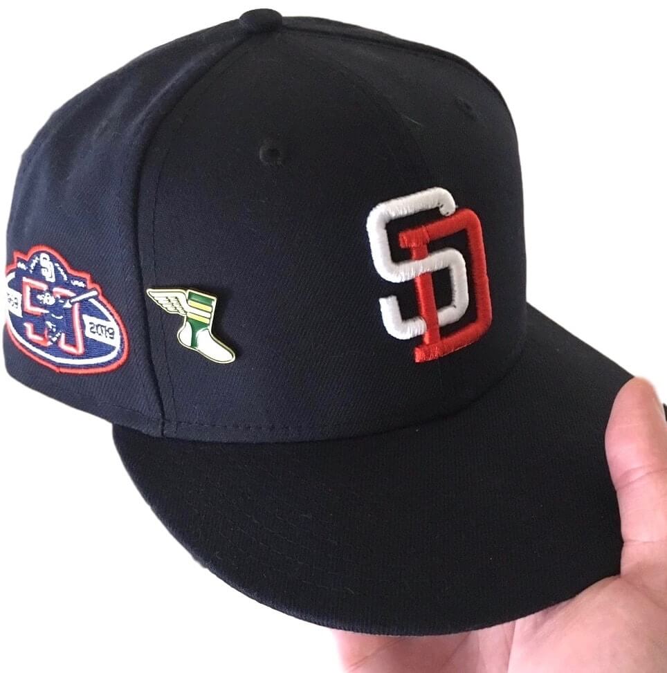
• Lapel pin photo request: The Uni Watch lapel pin has been a big success, and it’s been fun to see photos of how some people are wearing them. If you’ve purchased one, please feel free to share a photo with me, either via Twitter (you can tag me at @uniwatch) or by email. Thanks.
That’s it for today. Again, I’m not reading the comments this month, so if you have a question about any of this, feel free to email me.
Now back to Phil with the rest of today’s content.


Guess The Game…
from the scoreboard
The game has returned! At least for a trial basis, but I got a lot of positive response to its return, so we’ll see how long we keep this one going.
Today’s scoreboard comes from reader “ojai67”.
The premise of the game (GTGFTS) is simple: I’ll post a scoreboard and you guys simply identify the game depicted. In the past, I don’t know if I’ve ever completely stumped you (some are easier than others).
Ah, the classic Abe Stark “Hit Sign Win Suit” sign — that’s going to make it easy to ID the location, but what about the date and final score? I know you guys won’t fail me now.
Here’s the Scoreboard. In the comments below, try to identify the game (date & location, as well as final score). If anything noteworthy occurred during the game, please add that in (and if you were AT the game, well bonus points for you!):

If you guys like this, please continue sending these in! You’re welcome to send me any scoreboard photos (with answers please), and I’ll keep running them.


The Ticker
By Anthony Matthew Emerson

Baseball News: We may have covered this before, but just in case: on June 12, 1977, the Royals had their unis stolen in Milwaukee, and were forced to play a game in the Brewers road unis (from Stephen Hayes). … Storm Byrd noticed that Tigers C John Hicks’ uni was sans-MLB150 patch on Wednesday night. … Reds P Michael Lorenzen received an official warning from the league over a pair of cleats he wore a few weeks ago, and posted the full letter on his Instagram (thanks, Alex). … CBS Sports has an article to get you all caught up on who’s wearing what this Players’ Weekend (thanks, Phil). … Wednesday night’s New York-Penn League All-Star Game featured “Red” vs “Blue”, with players wearing their team’s caps (from Robert Brashear). … Kings County Baseball didn’t even try to hide their logo-thievery. That’s literally a Royals logo with no alterations (from Ferdinand Cesarano). … The Orioles have created special food options for Players Weekend (from Andrew Cosentino). … The Reds latest roadtrip began with the players all wearing sports jerseys for teams other than their own (from Patrick O’Neill).

NFL News: Lots of stuff from the Raiders/Packers game up in Winnipeg last night: the teams played on an 80-yard field due to a hole in the endzone and the CFL’s goalline-mounted goalposts, Radiers WR Rico Gafford had a jersey malfunction during the game, and Raiders K AJ Cole arrived in Winnipeg wearing a “Winnipeg, Alberta” T-shirt. Winnipeg is, of course, in Manitoba (the last one from Wade Heidt). … A Browns fan has gotten “Cleveland Browns Superbowl LIV Champs” tattooed on himself, with “Super Bowl” as one word and the old Browns logo (thanks, Alex). … Yesterday morning’s Patriots Now email was trying to promote Thursday night’s Pats/Panthers pre-season game, but instead included an image of an Iowa player rather than a Panthers player (from Andrew A. Kling). … Speaking of the Panthers, the ’25’ in the team’s 25th anniversary patch should be the same color as the uni numbers and, well, it isn’t (from Chris Schwartz). … Last night’s Jags/Phins game featured an “indiscernable” scorebug with both teams rendered in a teal/aqua (from John Muir).
College/High School Football News: Memphis players who achieve a 3.0 or better GPA will wear a patch signifying that accomplishment on their unis (from Jordan Carpenter). … It appears the 50 yard line will be the “150 yard line” for this season (from Mike Lefko). … New unis for Bowling Green (from @Mr_Jeremy). … Arizona will have unis honoring the USS Arizona that was sunk during the attack on Pearl Harbor this season (from Myles Gallagher). … The SoonerTracker Twitter account posted a thread with all of the minor changes to the Sooners’ unis for this season (from Sam McKinley). … There’s a question as to whether UCF QB Brandon Wimbush will wear the Vicis helmet he wore at Notre Dame and in the spring or the older Riddell Revolution Speed he’s been wearing for fall camp (from John Carton). … All mentions of the “Carrier Dome” have been replaced with “Dome” in Syracuse’s media guide (from Jeremy Reeder). … Rutgers is giving away two historic helmet magnets a game to celebrate their 150th anniversary (from Tim Davis). … New helmets for the University of British Columbia. “Appears the team is transitioning from royal blue with yellow trim to navy blue with gold trim” writes Wade Heidt. … The following are all from Phil: Here’s a rundown of all the new college football unis, in case you lost track. … Yahoo has some opinions on which CFB unis need to return as throwbacks. … DeSoto (Tx.) High is moving to Air Jordan football unis.

Hockey News: Panthers G Sergei Bobrovsky’s personalized gear spells his name as “Bobrovski”, as it’s a more accurate romanization from “Бобровский” (from Mike Engle). … NHL Seattle will announce the franchise’s name in “early 2020” (from Jack Wade). … Here are the first ever hockey sweaters for Purdue Northwest (from @tasty_magic). … New logo for the Northwest Warriors. As if this writing, the old logo is still visible as the Facebook page’s profile pic. More info on the switch here (from Joel Horn).


NBA/Other Hoops news News: This is what I call a relationship goal: shopping for groceries in matching “Lola” and “Bugs” Space Jam jerseys. … Celtics C Tacko Fall will wear no. 99 (from Etienne Catalan). … Astronomer Neil deGrasse Tyson thinks the NBA logo “needs some updating” (from @verbDC). … New court design for Marshall (from M. Brinston Berry).
Soccer News: Scottish side Rangers were sans advertisements when they traveled to Warsaw for their UEFA Europa League match against Legia Warszawa. Rangers’ primary shirt advertiser is betting company 32Red, and advertising gambling is illegal in Poland (from Ed Żelaski). … On a similar note, Wolverhampton Wanderers played a Europa League match in Italy against Torino yesterday, and like Poland, gambling advertisements are banned in Italy. Instead of their usual ManBetX ad, Wolves wore the logo of their foundation on their kits (from Josh Hinton and @TRiCKETTengland). … Tennis player Dominic Thiem played a match at the US Open in a New York Red Bulls jersey (from Joel Rosenberg).

Grab Bag: While traditionalists blanch, Indian cricketer KL Rahul likes the addition of NOBs to test uniforms, saying “There are complaints from my own family and friends that once we’re on the field, nobody knows who’s who, because all of us have beards.” (from Jerry Pemberton). … New field hockey unis for Bryant and Penn (thanks, Jamie). … Someone posted a Twitter thread featuring screenshots of all the college sweatshirts Ted Knight wore in Too Close for Comfort (from Mike Haughey and JayJay Dean).


Here’s a question that’s been lurking in my mind for years:
Did you have to hit the Abe Stark sign on the fly to win a suit?
Maybe they just gave you the slacks for hitting it on the bounce?
You had to hit the sign on the fly to win the suit. And it was indeed hit several times (though not that often) throughout its run in that location. Apparently Stark didn’t just hand out the suits; when a player did hit it, he had to come to the store to get fitted, and Stark would ask the player to autograph items (what, where they gonna say, “NO”?). I don’t know if he charged for alterations, but that wouldn’t surprise me. There were also TWO signs — the first one was erected in the 1920s and apparently covered the entire right field wall. The smaller (like 3′ high) sign that everyone knows was moved there in the early 1930s and that one wasn’t hit very often, so Stark didn’t have to dole out too many free suits. I’m sure the buzz (and later exposure from TV) and the cost of the ad (only a couple hundred bucks, going up to about $1,000 per year in the 50s) generated more than enough business for him.
Simpler times, when ballpark ads were usually reflective of local businesses, not some giant beer or soda sign for a corporation based thousands of miles away.
Yes, the player had to hit the sign on the fly. My guess this was a rare occurrence given the great Dodger outfielders of this era. I recall the billboard was originally located higher on the outfield wall making it a much easier target for hitters. Moving to field level likely saved Abe a lot of suits.
Thanks so much for the replies. Really had been wondering for decades!
The Iowa player in the Patriots item looks like T.J. Hockenson, which is doubly interesting because he was drafted by the Lions.
Scoreboard was from Sunday, September 22, 1957 at Ebbets Field. The Brooklyn Dodgers would only play one more home game after this.
September 22, 1957. The next to last home game in Brooklyn. Ironic that they left Brooklyn due to the increased poverty that was taking over the borough for the promised land of the west coast. 62 years later Brooklyn is the promised land and LA is having urban decay problems. On top of that, the list of movie actors that live in Park Slope and the Heights grows yearly.
Those bums will be back.
Not to start a whole thing, but Бобровский most correctly transliterates into Bobrovskiy. Neither “Bobrovski” nor “Bobrovsky” are correct (if there is such a thing when discussing transliteration), though some conventions simplify “-iy” into “-y”. “Bobrovski” looks Polish spelled that way.
I submitted that ticker piece but I didn’t elaborate on the Cyrillic spelling because I know nothing about that. That must have been done by whoever edited the ticker. So based on what you’re saying, that makes it even weirder! Andrei Vasilevskiy has his jersey spelled just like that on the Tampa Bay Lightning. So, between Bobrovsky’s jersey and personalized protective accessories…the most correct spelling/transcription is neither?
About the field in Winnipeg last night for the NFL exhibition game, the areas where the turf was installed over where the Canadian field goalposts are were really small. It did not really look that bad, considering one of the teams that played in this game plays on a baseball dirt infield and this league used to allow games to be played on the “Field of Seams” at Veterans Stadium.
However, I can understand the decision if the glue was not holding.
link
Today’s SI column is up:
link
Whoa, how can any nickNOB piece neglect to mention link?
Or does that not count as a “nickname”?
[Great piece, BTW. ;)]
I like the Jurassic Park jersey treatments, but wouldn’t they have to get permission from Universal Pictures to use it?
My favorite nickNOB was the Atlanta Braves Andy Messersmith, #17. Ted Turner decided his nickname was CHANNEL, to promote his TV station, WTCG, Channel 17. (I think that particular stunt only lasted one game?)
link
Oh my. That Brandon Larmarche concept is absolutely spectacular! Hoping to see that one go all the way.
Regarding yesterday’s Guess The Game From the Scoreboard, which we all established was July 30, 1967, at Crosley Field — I WAS AT THAT GAME!
I was thinking about it when I was at home late last night – my dad used to take me on one baseball trip to Cincinnati each season, always a Sunday doubleheader, since our SE Ohio town was about 3 hours away and for that long a trip we wanted to maximize the baseball we got to see.
I didn’t remember anything about that particular doubleheader, (I was 12), but I did remember once getting a scorecard autographed by an obscure Cub pitcher named Rich Nye, and hey, the Cubs were the other team in that scoreboard game so maybe…. So I dug out my small collection of scorecards and sure enough, it was from that day!
Rich Nye isn’t that obscure here in Chicago! As an aside, he just retired not to recently from his Veterinary practice. He specialized in birds!
*too recently
My favorite is Brandon Lamarche’s concept. He grasps what the game is all about. Classy & classic!
My favorite is Brandon Lamarche’s concept. He grasps what the game is all about. Classy & classic!
Next to last Brooklyn home game Sunday 9/22/1957. Why doesn’t scoreboard say next game Tuesday September 24 ?
In 1975 and 1976 Vida Blue with the A’s had “VIDA” as his NOB
Lamarche got 1 of my vote. fantastic!
“Kings County Baseball didn’t even try to hide their logo-thievery”
I don’t understand this comment. Why would they try and hide it? How can they hide it? Put it on the uniform then cover it up with black tape? I’m so confused.
Wow, two people wore a Space Jam uniform. I see people wearing matching uniforms at every sporting event.
Ticket repeats. Seen a lot of them lately (today: Syracuse/Carrier thing)
Yeah, I’m grumpy for a Friday.
Sunday, September 22, 1957–Phillies 3, Dodgers 7
link
So Rangers weren’t allowed to wear jerseys with 32Red due to gambling being illegal in Poland. How ironic since Legia’s sponsor is Fortuna Entertainment Group, which is one of the biggest online betting operators in central Europe. It has morphed into a holding company (“entertainment”) but still started out in Slovakia, Czech Republic and Poland.
Mets in white helmets is reminiscent of the famous Good Humor caps. Overall this game looks even worse than I feared, if that is possible. The blue undershirts are just ridiculous.
When the batting helmets are on, it’s the Cricket Players’ Weekend!
The black uniforms aren’t terrible…at least they’re legible. The whites are absolutely awful. Mets TV announcers are raking them over the coals right now—comparing them to Good Humor outfits, pointing out that it defeats the purpose of nicknames if you can’t read them, and suggesting that for an ostensible “Players’ Weekend”, the players probably hate these. (Apparently the Cubs wore their regular caps today, which the announcers seem to think was because they didn’t like the special caps.) Gary Cohen pointed out that it’s all to sell merch, leading Ron Darling to ask, “Would YOU buy these.”
Absolute clusterf*\k by MLB. There is a reason the batter’s eye in CF is green. Oh wait, let’s have the pitcher(s) wear contrasting caps. At least MLB didn’t shorten the base paths by 20 feet.
These players’ weekend jerseys are just astonishingly bad, especially now that we can see them on the field. It’s impossible to tell which team you’re watching on a highlight without stadium cues. Might be my worst uni promotion I’ve ever seen.
This really does feel like some sort of final straw to me. I absolutely detest the other gimmick weekends like everyone else, but this is by far the most egregious display ever. It’s actively difficult to watch and they have to know it. This goes beyond my usual complaints about severing fans’ emotional connection to their team by eschewing usual color schemes or seeming pandering or whatever. It actually hurts my eyes to watch the game. Such a shame too, since last year’s jerseys were actually kind of cool and the notion of rendering each team’s visual identity in little league style was inventive and fresh.
I hate saying this because I never like to advocate for anyone losing their job, but someone (or perhaps many people) should actually be fired for this.
DeGrom, with his white shirt where you can’t see any graphics, black cap where logo is not visible and blue undershirt, looks like a bad ad from the 80s where they did not get permission to use MLB logos and airbrushed them out.
Whoever thought that making MLB games look like a Brooklyn Nets intersquad scrimmage needs to be shot.
Watching the Twins-Tigers game and I noticed that Minnesota is not wearing the white caps but rather their standard TC logo cap. I thought they were supposed to wear the white caps this weekend. What gives? Also, any team wearing the black uni pants look like they’re wearing skinny jeans.
The White Players Weekend batting helmet slathered in pine tar: NOT a good look
link
Well, at least it provides some kind of contrast.