One thing you may have missed over Memorial Day weekend — I initially missed it myself — is a report from Padres beat reporter Kevin Acee, who said the team has finalized its new uni designs and will be unveiling them this fall. We already knew they’d be going back to yellow and brown, of course, but Acee’s recent article included this tidbit that you might not be aware of: “[The] away uniforms are sand, not baseball’s traditional gray. However, the sand is based in a brown palette, which will make it [darker than] the sand color the Padres wore on the road from 2004-10.”
Like any team planning a uni redesign these days, the Padres conducted lots of focus groups. As it happens, a Uni Watch reader participated in one of them. Today he’s going to tell us what he saw. Without further ado, I’ll hand the mic to him.
What I Saw in a Padres Focus Group
By Anonymous
I should begin by saying the team conducted several focus groups besides mine, and I have no idea what the feedback back was from the other groups, so what I’m about to tell you is just a snapshot of a larger process.
There was no debate or discussion. Instead, we voted on these little remote gadgets. So while they went and asked each of us for comment, it was one comment for caps, one for the home set, and one for road sets.
They showed us multiple design options for each uniform element. Here’s what we saw:
The caps: The caps were brown. There was one with a gold SD logo and the other with white S and gold D. The all-gold version looked best in my opinion, but it was about 50/50 with the group.
Home uniform: They showed us three different designs:
1. Pinstripes with current chest mark and SD logo on sleeve. Current logo/wordmark. Nice and clean. Rated as my top choice.
2. All-white with same wordmark (they seem to be staying with that). Gold/brown trim on sleeves, color and brown stripe down pant leg. Also SD logo on sleeve. A slight improvement over the current home whites but not by a lot.
3. Remember 2016 home uniform? Picture that, except with brown/gold instead of of blue/gold. Exactly. Kind of lazy if you ask me.
Road uniform: Again, there were three designs:
1. Picture the current blue alternate jersey, except in brown with gold piping and logo. Again, kind of lazy. Pants were a shade of sand — a bit darker — with pinstripes.
2. More laziness: the current Friday night home top with dark-sand pants.
3. All-sand with Padres wordmark. No trim and the wordmark looked flat. This was the worst — it reminded me of what the Diamondbacks wear. This is apparently what they’re going with, based on Kevin Acee’s report. Man, I hope they added some detail.
We were also asked about use of “San Diego” instead of “Padres” on the away unis and saw two swinging friar logos, one on a background and one without.
One thing that’s interesting is that the various fan concepts that have been floating around seem to have been very influential on the team’s thinking. Take this one, for example [click to enlarge]:
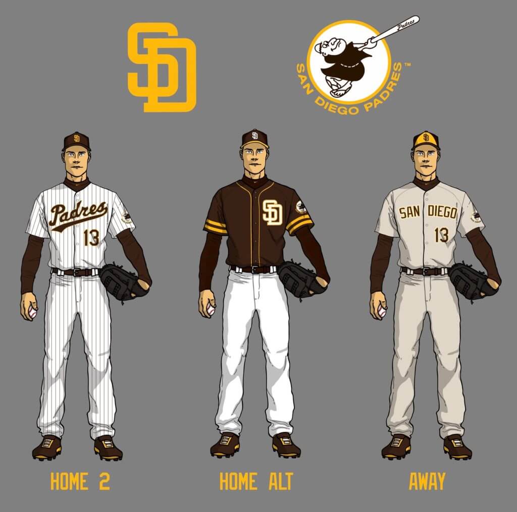
Pinstripes with the current wordmark — just like what we were shown. The brown alternate is also similar, except the one we saw had a gold SD, not white. [For reference, those concept renderings were done by a guy named John Brubaker and appeared on the SportsLogos.net forums more than five years ago, so the Padres certainly could have gone to school on them. — PL]
———
Paul here. Good stuff from our anonymous contributor. To be sure, he’s not the only one who’s provided a peek behind the focus group curtain. Acee, the Padres beat reporter, was permitted to sit in on a focus group last year (a very progressive move by the team) and wrote an article about it. And a lengthy Twitter thread appeared back in March that showed concept renderings based on information that had seeped out from some of the focus groups:
:::2020 PADRES UNIFORM MEGA THREAD:::
All designs are based on the description of jerseys shown to focus groups including:
– white home jerseys, one of which had pinstripes
– rich dark brown away jerseys
– dark tan and brown away jerseys pic.twitter.com/Lz85cy2Gm0— BIG BROWN MACHINE (@b19brownmachine) March 1, 2019
If you click on that tweet, there’s a whole thread of renderings to see.
The dark tan (or light brown, but please, there’s no such color as “sand”) sounds brutal, and I wish they were going to a new wordmark. But I’m still excited to see the return of the brown.
Click to enlarge
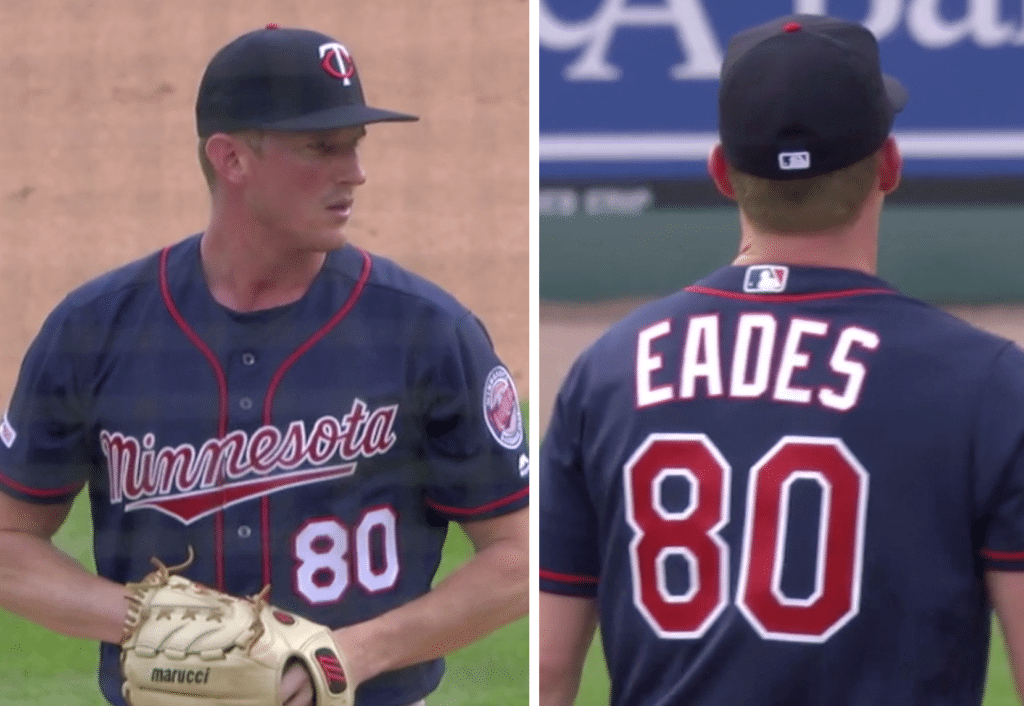
MLB history made: Check out that No. 80 on Twins pitcher Ryan Eades’s jersey. Does that number look a bit weird to you? It should — Eades, who made his MLB debut on Saturday night, is the first player ever to have worn that number in an MLB game, which I find kind of surprising!
According to research by the authoritative @NumbersMLB, which broke the news of Eades’s uni-numerical distinction, there are still three numbers that have never appeared in a big league game: 86, 89, and 92. (The one caveat there is that there could have been players who wore these numbers while on the active roster but did not appear in a game.) Of course, you could also say that numbers like 02, 03, and so on have not appeared in a game, and you could say the same about three-digit numbers, but let’s not get too pedantic here.
As turns out, Saturday was a big night for No. 80: In addition to the number making its MLB debut, it was also worn by Vanderbilt pitcher Kumar Rocker, who tossed a no-hitter.
Click to enlarge
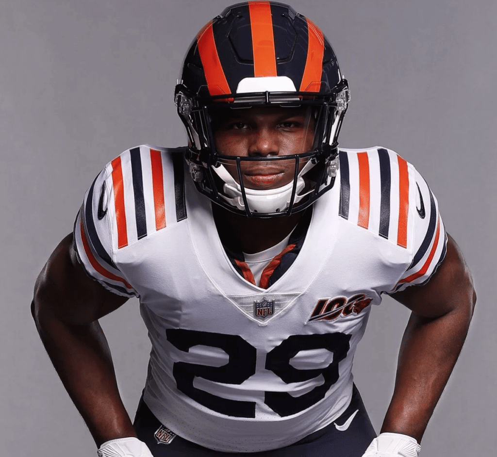
In case you missed it: The Bears unveiled their long-awaited throwback late on Friday night. As expected, it’s the 1936 Nagurski design. We had full coverage on Saturday, which you can see here.
Click to enlarge
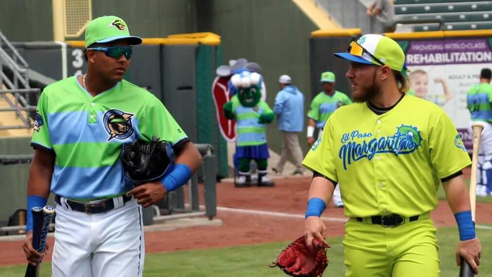
Yikes: Okay, so we all know minor league games can be a bit wacky-looking, but the Omaha Cazadores de Tormentas (né Storm Chasers) and the El Paso Margaritas (né Chihuahuas) took things to new extremes for their painfully colorful matchup yesterday. I repeat: Yikes!
Click to enlarge
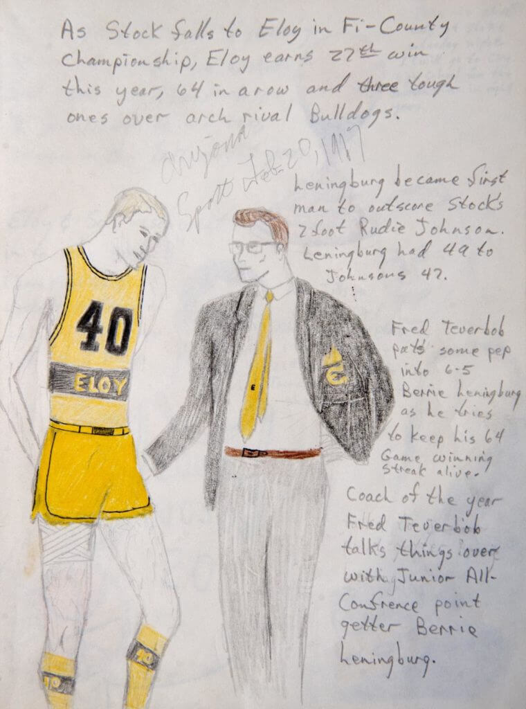
From young minds: University of Nebraska athletic director Bill Moos apparently Got It™ from an early age. When he was 10 years old, he dreamed up a fictitious high school athletics program called the Eloy Broncos. The drawing shown above (note the uni-numbered socks!) is one of many that he created for the team. The drawings, which feature football and basketball teams, coaches, cheerleaders, and a lot more, are really, really wonderful. I love this kind of stuff! You can see more of Moos’s childhood renderings here.
(Big thanks to Greg Mays for this one.)

Click to enlarge
ITEM! Purp Walk shirt makes the scene at Fenway: A new chapter in Uni Watch’s unlikely 2019 TV tour was written on Friday night, as several people watching the Rays/Bosox game noticed a guy in a Purple Amnesty Day shirt sitting in the 10th row! You can see him in the upper-left quadrant of the photo shown above.
Here’s a closer look at the gent in question (click to enlarge):

We sold 98 of those, shirts, so that’s more than 1% of the total production run right there on TV — not bad!
If the purple-clad fan is reading this, please feel free to identify yourself in today’s comments, and thanks for representing Uni Watch at the ballpark!
(My thanks to Tim Martin and Matt Bessette for the screen shots.)
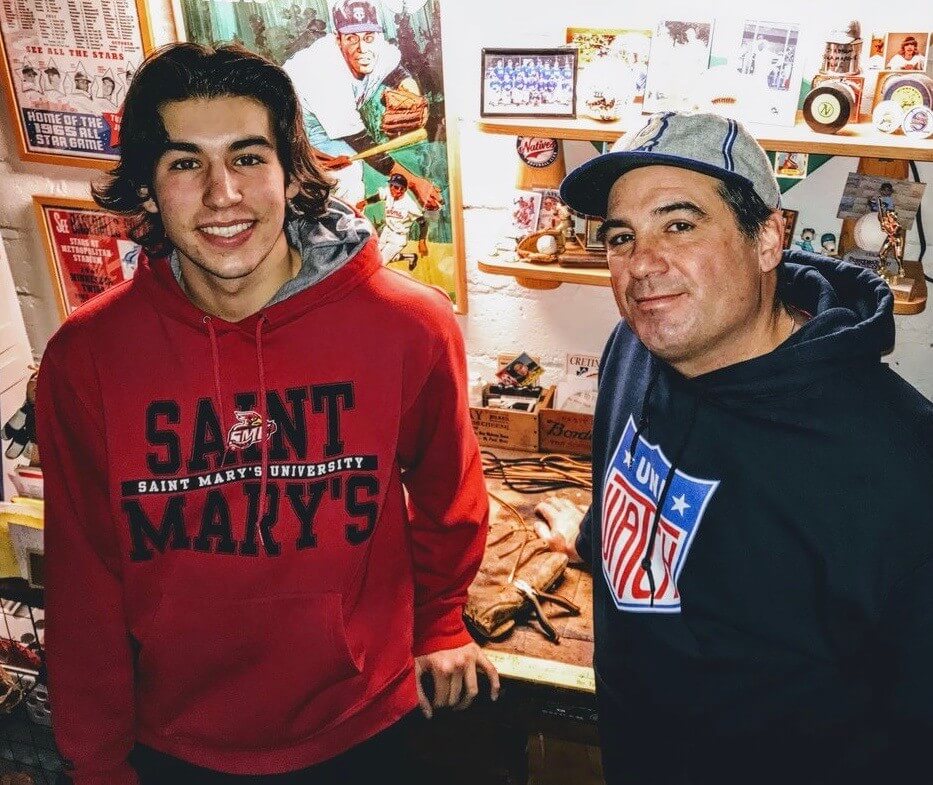
ITEM! Father’s Day glove-repair auction: Longtime Uni Watch reader/contributor Jimmy Lonetti and his son Dom (that’s above — Dom on the left, Jimmy on the right) run D&J’s Glove Repair, which offers expert baseball glove re-lacing, reconditioning, and related services. D&J also offers a nice line of wallets made from glove leather.
Now Jimmy (who, as longtime readers may recall, guest-wrote a Uni Watch entry back in 2013) has generously offered to auction off his services for one complete glove re-lacing and reconditioning, plus the auction winner’s choice of any glove-leather wallet currently shown on the D&J website, with the auction proceeds going to Uni Watch.
This could be a nice Father’s Day present, or just a nice treat for yourself. You can get a sense of the quality of D&J’s work by scrolling through the before-and-after photos on this page, and there are similar photos shown on D&J’s Facebook and Twitter pages.
We’re going to start the bidding at $75 — a pretty low price point, because Jimmy usually charges $75-$100 for a glove job, and then the wallets cost another $75. As we’ve done in the past, this will be a blind auction — to participate, email your bid to me by 7pm Eastern this Thursday, June 13. (The winning bidder will have to cover the cost of shipping his or glove to Jimmy; Jimmy will handle the return shipping.)
That’s it. Big thanks to Jimmy for donating his services!
Speaking of Father’s Day, Here Are a Few Words from Phil

Phil here. Sunday is Father’s Day, and I’ll once again be posting photos of Uni Watch readers’ “Dads In Uniform,” a tradition that began in 2013 (and has continued in 2014, 2015, 2016, 2017, and last year). This is always a very special day, and I’d love for as many readers as possible to participate — especially those of you who haven’t done so before.
To take part in this annual tradition, select one photo of your father in uniform (it can be sports, military, work — as long as it’s a uniform) along with a short description of 100 words or less (refer to our prior years’ entries to get a feel for the style of the descriptions). Then email the photo — again, only one, please — and text to me with the subject line “Uni Watch Father’s Day 2019” by this Thursday, June 13, midnight Eastern. I’ll run all of the submissions this Sunday. Thanks!

ITEM! Yet another one-day raffle: Reader Pete Garofalo ordered his first Uni Watch membership card in 2014. He recently ordered another one on Purple Amnesty Day and also generously purchased an additional membership for me to raffle off, which we’re going to do today.
To enter, send an email to the raffle address by 8pm Eastern tonight. One entry per person. I’ll announce the winner tomorrow. Big thanks to Pete for sponsoring this raffle!
The Ticker
By Paul, pinch-hitting for birthday boy Jamie Rathjen

Baseball News: Yankees OF Brett Gardner ended up with six stitches and a badly swollen lip on Saturday when he threw his helmet in frustration and it bounced back and hit him in the mouth. Additional info here. … The trend of uni-numbered belts has spread to the umpiring corps. … The Rangers’ number retirement ceremonies for Adrian Beltre on Saturday featured the team’s characteristic color confusion. They also put Beltre’s number on the back of the mound (from Josh Claywell). … Here’s a Sox-in-shorts photo that I hadn’t seen before. The Sox player is Jack Brohamer, from a game on Aug. 21, 1976 (from Kenn Tomasch). … Duke SS Ethan Murray, who was recently beaned in the face, is wearing two different protective masks — one while fielding and one while batting. … There’s been a rash of missing batting helmet decals lately. The latest victim: Reds P Sonny Gray (from Kyle Sutton). … Speaking of the Reds, 2B Derek Dietrich tore his pants yesterday (from Joe Owen). … Here’s an amusing article suggesting that the Braves’ ballpark be renamed as the Waffle House. … I know progressive parenting is all the rage now, but what kind of people dress their kid in a Giants/Dodgers Franken-jersey with a BFBS Dodgers cap? (From many readers.) … We’ve known for a while now that the Yankes and Red Sox will both wear their home unis when they play in London on June 29-30. But according to this article, the Sox will actually wear their red alternate jerseys — presumably with white pants — for the second game. That jersey is usually worn for Friday home games, but in this case they’ll be wearing it on a Sunday. Guess they wanted to max out sales of both jerseys (from @brianspeaksnow).

Football News: Here’s a listing of NFL helmet designs by longevity (from Chris Mayor). … Missouri has been posting photos of a new white helmet. Not clear if it’ll actually be worn on the field (from Jacob Bogage). … The Kansas Shrine Bowl — that’s an annual game for high school seniors — had some crazy officials’ unis this year (from Christian Berumen). … Hmmm: A photo tweeted by the Pitt equipment staff appears to show some black helmet shells amidst the more familiar yellow ones. Perhaps a throwback in the works? (Good spot by @akose26.)

Hockey News: Message definitely received: The color guard for last night’s Stanley Cup Final(s) game in St. Louis did not have the Blues or Enterprise Rent-A-Car flags. … Here are next year’s All-Star jerseys for the AHL (from Jack Wade). … Blues C Ryan O’Reilly’s grandmother has a cardboard cutout of him from his time with the Sabres, so she’s covered up all the Sabres logos with Blues logos (from Cam Rellim). … The Blues mistakenly ran an ad celebrating a Stanley Cup win in Sunday’s newspaper.

NBA/WNBA News: Game Four of the NBA Finals on Friday night was apparently the first time that neither team wore its team name or city name in a Finals game (from many readers). … The Minnesota Lynx retired Lindsay Whalen’s No. 13 the other night. “The Lynx logo on the banner is the current one, which Whalen played under for only one year,” notes Chris Rucinski. … Nets PG Spencer Dinwiddie has said that his favorite color is purple, so someone joked about him demanding a trade to the Suns, Kings, Hornets, or Lakers (from Alexander Ganias). … Speaking of purple, here’s an in-depth look at the creation of the Raptors’ original logo. … Players on the Chicago Sky told the stories behind their tattoos. “I always love these sorts of pieces,” says Mike Chamernik. … Pretty unusual AAU officials’ uniforms here (from Rich Fronheiser). … After pro golfer Rory McIlroy won the Canadian Open yesterday, he held up a Raptors jersey to the crowd (from Mike Chamernik).

Soccer News: Our own Jamie Rathjen has noticed something unusual about Thailand’s men’s and women’s jerseys: The on-field shirts have a small gold symbol above the crest. “This is the Football Association of Thailand’s logo, which is very similar to the heraldic version of the Thai king’s crown,” explains Jamie. The thing is, this symbol doesn’t appear on retail shirts or promo photos, which show either a Thai flag in that spot or nothing at all. “Since most kit reporting is done off of those kinds of photos, nobody’s picked up on the logo/crown yet that I can find,” says Jamie. … The daily download from Josh Hinton: New leaks for Atlético Madrid, Porto (third and away), Bayern Munich, and Arsenal; legit releases for Paris Saint-Germain, Poland, and Tunisia; Adidas is suing the Spanish Football Federation; special keeper’s gloves in the works for Iker Casillas; new kit deal in the offing for Colón; and Morocco is changing outfitters, from Adidas to Puma.

Grab Bag: Gross: UFC fighter Cowboy Cerrone managed to turn his 11-month-old son into an advertising billboard. … The International Cricket Council has decreed that Indian star Mahendra Singh Dhoni cannot wear a military logo on his gloves during the Cricket World Cup. Dhoni complied with the ruling. … New name and logo for the International Association of Athletics Federations. … Former Uni Watch associate editor Mike Chamernik wrote a piece for The Chicago Sun-Times in which he picked the best uniform for Chicago’s sports teams. … Speaking of the Sun-Times, they use red, six-pointed stars, like the ones on the Chicago city flag, for their movie-review ratings. … Here’s another article arguing that the tradition of retiring numbers should be discontinued. … Cross-listed from the NBA section: After pro golfer Rory McIlroy won the Canadian Open yesterday, he held up a Toronto Raptors jersey to the crowd (from Mike Chamernik). … Here’s a video showing how an F1 racing suit is made (from Jeremy Brahm).

Click to enlarge

What Paul did last night on Saturday: What’s better than a wiener dog? A wiener dog named Murray! He belongs to my friends Nate (who took the photo) and Heather, who were two of the many people the Tugboat Captain and I hung out with at our friend Carrie’s awesome picnic party on Saturday. It was an ideal day for it — sun-splashed, temperatures in the upper 70s, everyone in a good mood. Perfect!
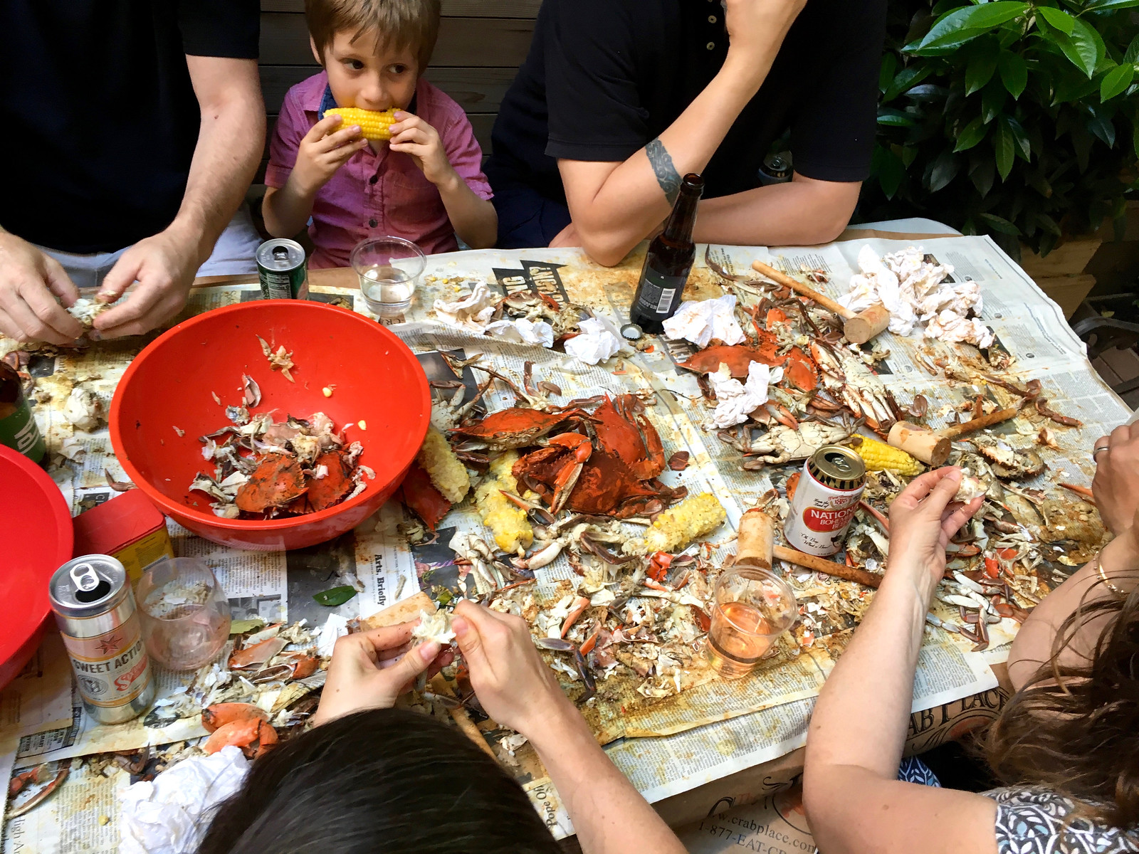
But that was just the start of our amazing Saturday. After about three hours at the picnic, the Captain and I biked over to Mac Premo’s house (the guy who did the double play machine and the catch around the block), because Mac was having his annual all-you-can-(over)eat crab-fest. It was a pretty epic scene — these shots should give you a sense of the crustacean carnage:



Between the picnic and the crab-fest, we were pretty spent on Sunday, which was more of a low-energy detox day that I spent mostly on the front porch (which is where I’m writing this right now, in fact). However your weekend unfolded, hope it was a good one.
second sentence of last item “winder dog named Murray”
Thanks, Gregg. Fixed.
I’m confused. Do we or don’t we want a return of dark monochrome baseball uniforms? We seem to hate the dark grey D’backs and the new dark tan Padres are “brutal”.
Tell you what I liked: the gold numbers on the dark road unis. Hope that’s part of the final package.
What R Scott said and a little more.
No demerits to Arizona for trying dark gray. Demerits for all the splotchy skin grafts on the uniforms. Also, demerits for chasing trends and trying too damn hard to be unique. Purple and teal might have been a fashionable pair 25 years ago, but hot damn it actually looked snappy. It’s a breath of fresh air when the Diamondbacks throw back to the beginnings.
San Diego should be applauded (maybe with a slightly sarcastic undertone) for getting dragged back to brown. Unique colors that respect team heritage? Hell yeah! I remember those Adrian Gonzalez and Khalil Greene sand roadies. Fun idea, certainly unique, but it seemed so light, you’d think the TV was busted and couldn’t show gray. If these next roadies lean in on being brown, I’d give them a chance.
Mike Engle: How does a team simultaneously “chase trends” and “try too hard to be unique”?
Sure. After purple and teal “got stale,” the Diamondbacks went with a “Sedona red” because MLB denied them a chance to have a random red jersey with purple and teal uniforms otherwise. Red was a trendy color back then. They threw out their whole wardrobe just to wear red. This is about when Atlanta picked up a red alternate top, and concurrent with Houston in Drayton McLain red.
Then came the dark grey and the snakeskin grafts. It’s a dark grey that came after literally every NCAA team in literally every NCAA varsity sport decided to sell anthracite gray uniforms in the bookstores. If the snakeskin crap isn’t a bad attempt to look “unique” in the face of chasing trends, then I’m out of arguments. But this is what I see, and that’s what I don’t like about what I see.
I love those tan unis, especially the one with the yellow numbers and logo. They really pop against that background.
That Frankenjersey went with GIAdgers, but it honestly should have said DoNTS.
The Yankees manager is Brett’s brother, Aaron. Also the tweet seems to have disappeared.
Re: Pitt helmets
Pitt shares a training facility with the Steelers, so they may have just borrowed a helmet to play around with some looks too.
I like the collection of visiting team helmet decals on the cabinets.
Fascinating piece on the Padres focus groups. The prototype units look pretty good. If they go with something like the white ones on the bottom for home, the tan with the gold SD for the roads, and the brown with San Diego written out as alts (which I think could be used at home as well as on the road), they’d look good. Hopefully not too many variations.
The article on the age of the NFL helmets is almost a year old, and therefore out of date (the Jets have new lids now).
That helmet article also has a ton of missing info, like the Saints shrinking their fleur-de-lis and adding a thicker outline, and the Niners’ late ‘90s thru ‘00s modern take on their helmet design. Also, the Jets’ change in ‘98 wasn’t to change from a football shape to an oval, it was a complete overhaul from the Sack Exchange-era green (and black, by the ‘90s) Helmer’s and unis.
Helmets, not Helmer’s. Stupid autocorrect.
To me it feels like the Padres haven’t looked good since they changed everything in 2004. Every tweak since then has been moving the needle incrementally, but they need this re-brand badly
I’m quite pleased on behalf of the Padres by everything in today’s report from the focus group, except for the fact that the team is holding focus groups. It’s a sign of less than ideal institutional confidence to subject this picayune level of detail to focus group. If the execs involved got to this stage of the process without having established a clear enough idea of what they want the design to achieve to choose among three very similar options themselves, then they really ought not be involved in making decisions at all.
Which is in part why I’m so enthused by the uni-content of the report. Given what we’ve seen and heard from the team, the fact that they’re minimizing the variables in their redesign is very good news. Are the current cap and jersey marks great? No, but they’re adequate. So it’s fine if the team holds them steady and focuses on the color switch. One less thing for the suits to get wrong. And I’m positively giddy to learn that the Padres may be going back to sand. The sand roads were the best uniform the Padres have worn since the early 1980s; their only fault was being a touch too light. So “sand, but darker” sounds perfect. Even the comparison to the D-Backs doesn’t phase me. Of all the crimes against taste going on in the D-Backs uniforms, the dark gray color of the road uniform isn’t one of them. Baseball road uniforms should have more contrast with home whites than they do, whether that means colors like powder blue or sand or darker gray.
If the Padres do unveil uniforms in line with today’s focus group report, they won’t be as good as they could be, but they’ll be heaps better than we have any business expecting from the folks who run this franchise. Uniforms like those described today would be good enough to tip the balance for me to adopt the Padres as my first-choice team in the NL West.
Although both would look great because I am so happy they will wear brown again, I would prefer the white S and yellow D on the hat rather than just the yellow SD.
The one-color monogram looks best; it matches up with classic caps like the Yankees, Dodgers, Giants, Tigers, White Sox, etc. A two-color monogram would only look all right if you have three team colors, or if there was some past history (I recall that the Padres AAA hat was navy with a red and white SD. If you’re going back to brown and gold, the SD was always hold on a brown background or vice versa.
Really valid point DJ about the one-colour monogram. Matches the classic caps and would be similar to the original 1969 Padres hat.
Padres do have a past history with the two-colour monogram. However, not with the brown.
The navy and orange Padres:
link
The one year in 2017 when the Padres went navy with yellow:
link
Part of me agrees with you (on the idea that teams should have confidence and not hold focus groups). But a big part of me also wonders what disasters over the years might have been averted if an organization had checked with someone outside the design process first.
“institutional confidence” is no substitute for actual competence.
Nothing was mentioned about the current Friday night “Taco Bell” caps. Here’s hoping they don’t ditch them. They are by far my favorite current cap in baseball that has a very retro feel. Can’t go back to the brown without those beauties!
Would be a good idea to keep that hat around as an alternate when they wear brown jerseys.
Proofreading/debugging:
Link to 2017 “Dads in Uniform” is broken. It appears the URL is missing from the tag…
Fixed.
I was never a fan of the Pads’ brown, and I was pleased when they switched to navy and orange. However, the unis themselves were dull as dishwater. I’m bummed that they never did anything interesting with those colors like the Astros have done in recent years. The sad fact is, the Padres haven’t done anything worthwhile uni-wise in decades. The brown roads, at least for me, are a step in the right direction. This former brown hater says bring on the brown!
There are several glaring errors in the NFL helmet chronology.
It’s also outdated, being nearly a year old.
I actually like the brown grays, and I know it sounds like corporate speak but I think sand does nice job of describing its color. I like the unique take on the standard road unis. It’s why we all like the powder blues, and this adds something unique for the Padres.
As long as the Padres PERMANENTLY retire blue, I’m happy.
There actually IS a color called sand… Been around for years, since at least 2005, in shirts. Gildan, Hanes, all the big names have it. It’s a little lighter than this Padres color of sand though.
Shirt manufacturers use all sorts of nonsense color names — frost, silver fern, blah-blah-blah. Doesn’t make it any less bullshit.
In this case, the article quoted at the top of today’s lede makes it clear that the “sand” the Padres are using this time around is different/darker than the “sand” they previously used. In other words, there’s no such thing as “sand,” because “sand” can be whatever you want it to be.
This is just branding nonsense (like “Victory Green” and “Wolf Grey” and similar nonsense). Just call it tan, or light-tan, or light-brown, or whatever. It’s not that hard.
Yeah I can see where you’re coming from, just thought I’d mention because I’m around them all day long… But yeah, tons of nonsense names of shirt colors out there, that make the high school kids say “oooh, we gotta get ‘raspberry’ colored shirts for our volleyball team”, even though that’s not a color even remotely in their school color scheme.
“Rave Green” for the teams here in the PNW. That awful shade of neon green. I hope the neon trend dies soon.
The “I Still Call It The LA Coliseum” shirt was mentioned in the LA Times Sports section – The Morning Briefing – that briefly mentioned the United Airlines compromise of just naming the field. It mentions Teespring as the site to buy it, but no reference to Uni Watch.
Don’t have a picture but saw it clearly on TV: Sonny Gray’s helmet logo was missing only the white “C”. The black adhesive panel that adheres the white 3-D insignia to the helmet was still on the helmet and the upper part of that “C” was crinkled. The Phillies’ broadcasters commented on it and cameras gave it a close up of some duration.
That Crabfest looks delicious!!! You’d feel right at home in Baltimore!
O’s, Stroh’s and Natty Boh’s Hon!!
Not a fan of pinstripes except for the Yankees. Also I’ll wait until seeing the darker tan/brown road uniforms before passing judgement. The DBacks dark gray has grown on me. However I don’t like them with their black jerseys because they look like umpires. Glad there will be another team to join the A’s where their primary color, and primary cap, isn’t black, red, or blue. I guess you could argue that the Rockies primary color is purple, but their caps are black.
Pins only for the Yanks? You don’t think the Cubs and Phillies would look strange without pins on their home jerseys?
And others like the Reds, White Sox, and Rockies have used them for long enough, or enough throughout their respective histories, that they are not just wearing them to wear them.
Add to that the Mets, who I’d argue look way better in their original pinstripes than their non-pins eras.
I know and all valid, but I’m just not a fan. I love a crisp white home uniform.
I long for the day when the Phillies come to their senses and drop the pin(k)stripes, then designate the day-game alts as their primary home uniform.
I liked the Padres home and road pinstripes of the late ’80s; I’d applaud their reappearance (with gold accents).
Hi Paul,
Pete Garofalo here. Check the spelling on my last name when you get a moment.
Glad to support the site. Keep up the good work.
Ugh — sorry, Pete. Will fix right now!
No worries! I’ve seen A LOT worse!!!
Re: M Chamernik Sun-Times piece. Like the Sox beach blanket uni. Who doesn’t? But, writing it is their all time best ever uni?
White Sox low-key have several great uniforms. Which would you say is best?
Hi Mike. I like all the off the wall styles the Sox have presented over the years. But, we’re all slaves to our youthful past. When I think White Sox, I see red. So I’ll go with the 1972 Dick Allen era red pinstripe with red Sox cap.
Hafta say I never liked the “beach blankets”. It was a 1975 design that came 7 years late. Belts and buttons and classic insignias were the hot ‘new’ trend by ’82.
My choice for most underrated would be the ones that followed: the “Campbell’s C” era unis. Very interesting that they initially carried over the ‘numbers on the thigh’ from the beach blankets.
Those uniforms were…just not right. They were more appropriate for Jerry Reinsdorf’s boyhood team, the Dodgers. It’s no wonder that following them, they went to a uniform that had an authentic White Sox history behind it (pinstripes and the Old English script), combined with classic black and modern silver, and created a winning design.
I am sad that only 98 people had the great taste to order the 2019 Purp Walk shirt but I am also delighted that I am one of those 98. It looks great. Haven’t had anyone ask me about it….yet.
Steve
Well, it was only a one-day sale. I think 98 is pretty good!
Yeah, I guess you are right. It is one sale about every 15 minutes over a day. Looking forward to the day when I run into someone else wearing it at the same time. :-)
That crab feast complete with Natty Boh – along with the fact that it’s 104 degrees here in LA – has me super homesick for Maryland.
I’m having a crab feast at the end of the month! Bohs will be on deck! I may get some Steady Eddies from Union Craft Brewing as well :-) I’ll take some pics and post them to twitter :-)
Proud father moment: my daughter played in basketball tournament this weekend, for the first game both teams showed up wearing black. Refs decided my daughter’s team had to change to white. They only had time to change jerseys, not the shorts. After the game she says, “my heart hurt having to play with a mismatched uniform.” I loved it!!!
I used D&J about 6 months ago for my dad’s old childhood baseball glove as a Christmas gift to him, they did phenomenal work. I don’t know that I saw pics of it scrolling thru their photos on Facebook just now, but if I had my own photos I’d link to show just how good a job they did. Highly recommended to whoever ends up winning that auction!
What a coincidence that I was watching the NBA Finals on Friday and talking to my wife about how confusing the jerseys might be for someone who turned on the NBA for the first time.
Who is North? Who is The City? I don’t believe that it was the best practice to grow a game (not that it really needs that much help) on its biggest stage.
Re: Ryan Eades #80
Does anyone know how his last name is pronounced? Does it sounds like “eighties” or rhyme with Deeds? If it’s the former, then there’s an even deeper layer to why he chose #80!
Found a video clip of an announcer pronouncing it “eeds” so that’s a bummer.
link
Unfortunate! Thanks for researching @Ryan M.
I gotta say — I’m pretty excited for the return of sand
Me too! ;-)
Having also participated in the Padres focus group, I’m shocked that the club went with the cappuccino (they’re darker than the “sand” that’s being tossed around) color. My group, approximately 25 of us, were unanimous in our contempt of them. In addition, I hope they corrected the gold SD on the cap, which didn’t match the yellow on the jersey. And lastly, I found it that odd and ultimately sad, that none of the modeled uniforms included a look at the socks. All models wore their pants “slacks” style.
The Rangers could solve their identity crisis by making their red caps primary home, and red alt their home alt. Then wear blue caps on the road, and blue alt as their road alt. No more blue caps with white jerseys and no more blue jerseys at home. Boston and Cleveland are both “red at home, blue on the road” teams and I think it would work well for Texas.