Reader Chris Alvarez (@chrisinleaucadia) recently stumbled across an old TV commercial that totally delivers the uni-driven goods. It’s embedded above — go ahead and take 60 seconds to watch it.
Lots of things worth noting here: Let’s take one thing at a time:
• First and foremost, it’s so awesome to see have up-close views of those awesome Chargers uniforms. Total eye candy!
• Cars are usually released in the fall before their model year. So a commercial for a 1968 car would presumably have been filmed in the summer or fall of 1967. According to the mighty Gridiron Uniform Database, the Chargers only wore the powder blues during the 1967 preseason and then switched to darker blues for the regular season, which means this spot was probably shot during the preseason or training camp.
• Judging by the columns in the background, the commerial was shot at Balboa Stadium in San Diego. Interestingly, the Chargers’ last season playing there was 1966 (in ’67 they moved to the new San Diego Stadium, which was later renamed Jack Murphy Stadium and has had several other names since then), so they shot the commercial there even though it was no longer the team’s home building. Maybe they still practiced or trained there..?
• Did you notice that the left guard had a blue lightning bolt on his helmet, instead of yellow like everyone else? Look:
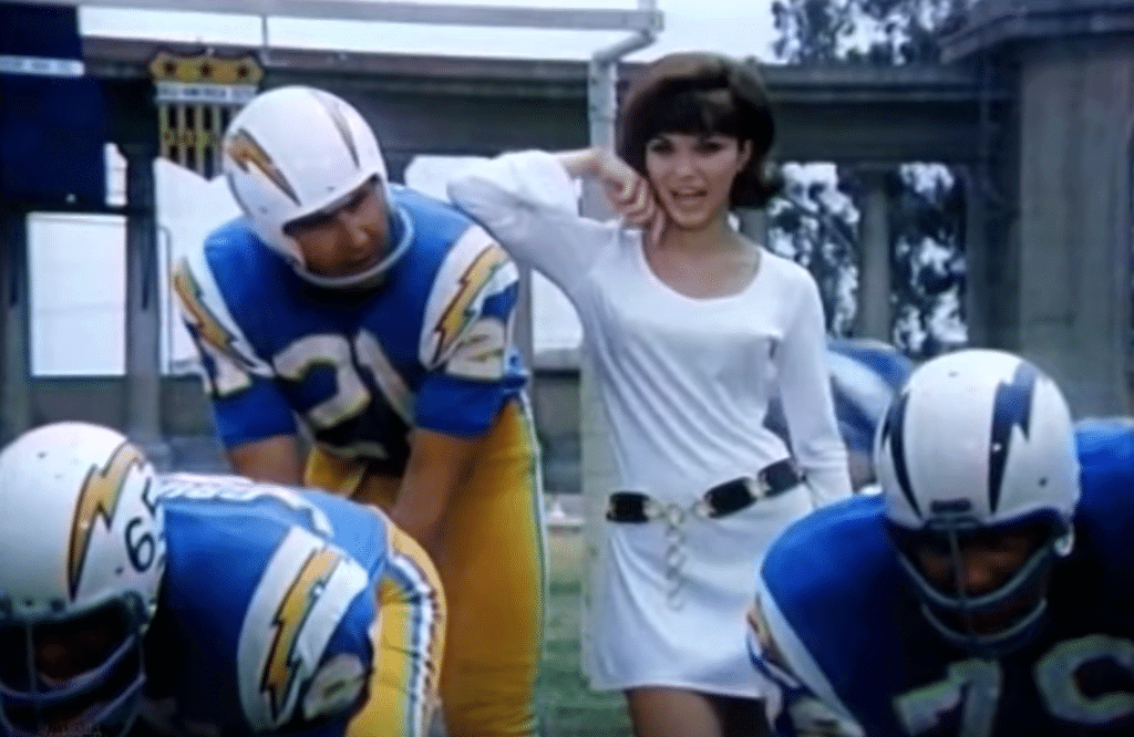
The Chargers wore the blue bolts in only one season — 1966 — which is further evidence that this spot was shot prior to the start of the ’67 regular season.
• Also, in that same screen shot, look at the pants — piping instead of lightning bolts! Odd that they got the jerseys right but not the pants. Were the Chargers thinking of scrapping the pants bolts and then thought better of it?
• And in that same screen shot, you can also see a shield-shaped sign behind the quarterback’s head. That’s for the “All-America City” award that San Diego won in 1962. The Chargers wore that shield on their helmets in 1963.
• Another aberration: They used a football with stripes:
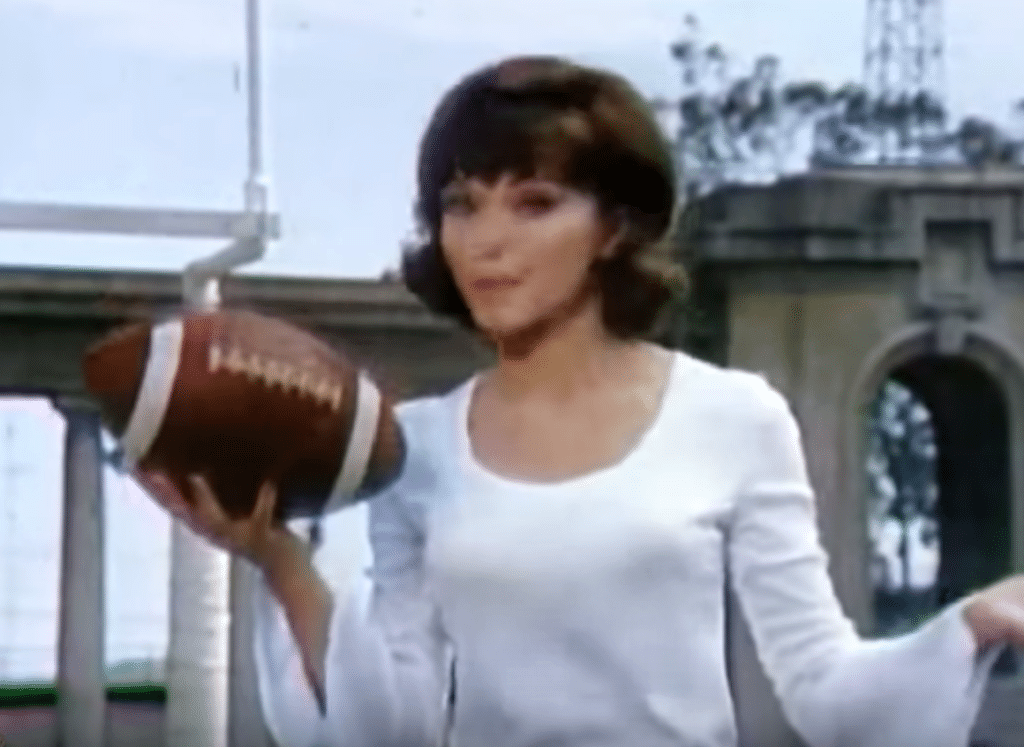
That’s a glitch, because the official AFL ball did not have stripes.
• Interestingly, the quarterback didn’t have a chinstrap:
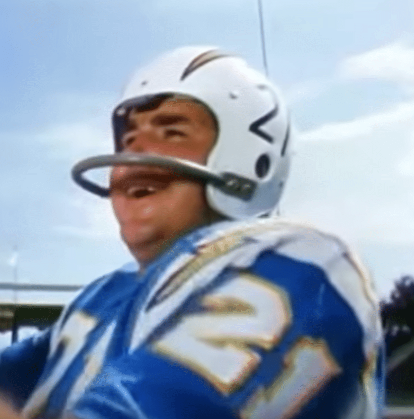
• Speaking of the quarterback: Is that really John Hadl, who was the Chargers’ signal-caller at the time, or did they just use No. 21 to make it look like him? We never get a clear shot of his NOB (and even if we did, someone wearing a Hadl jersey could still be an actor). Here’s a wire photo of Hadl (left), side-by-side with a screen shot from the commercial (click to enlarge):
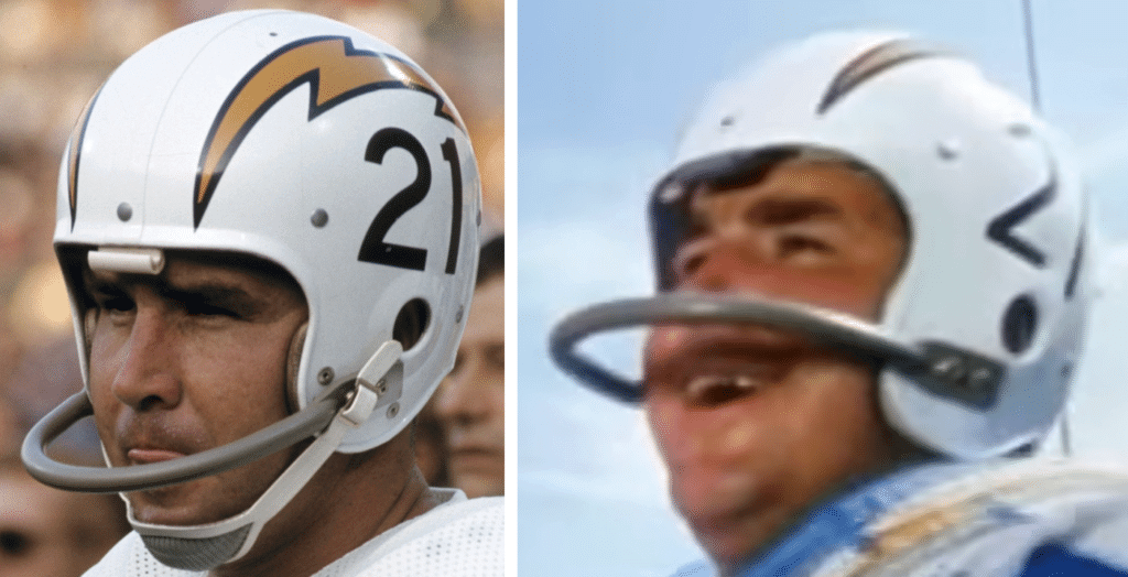
Tough to say, but I’m thinking yes. (Also of note: The number fonts on the helmets don’t match. But the Chargers were inconsistent about this over the years. Here’s a game photo showing Hadl wearing the same font shown in the commercial.)
• As for the other players in the ad, the only NOB that’s visible is the center’s:
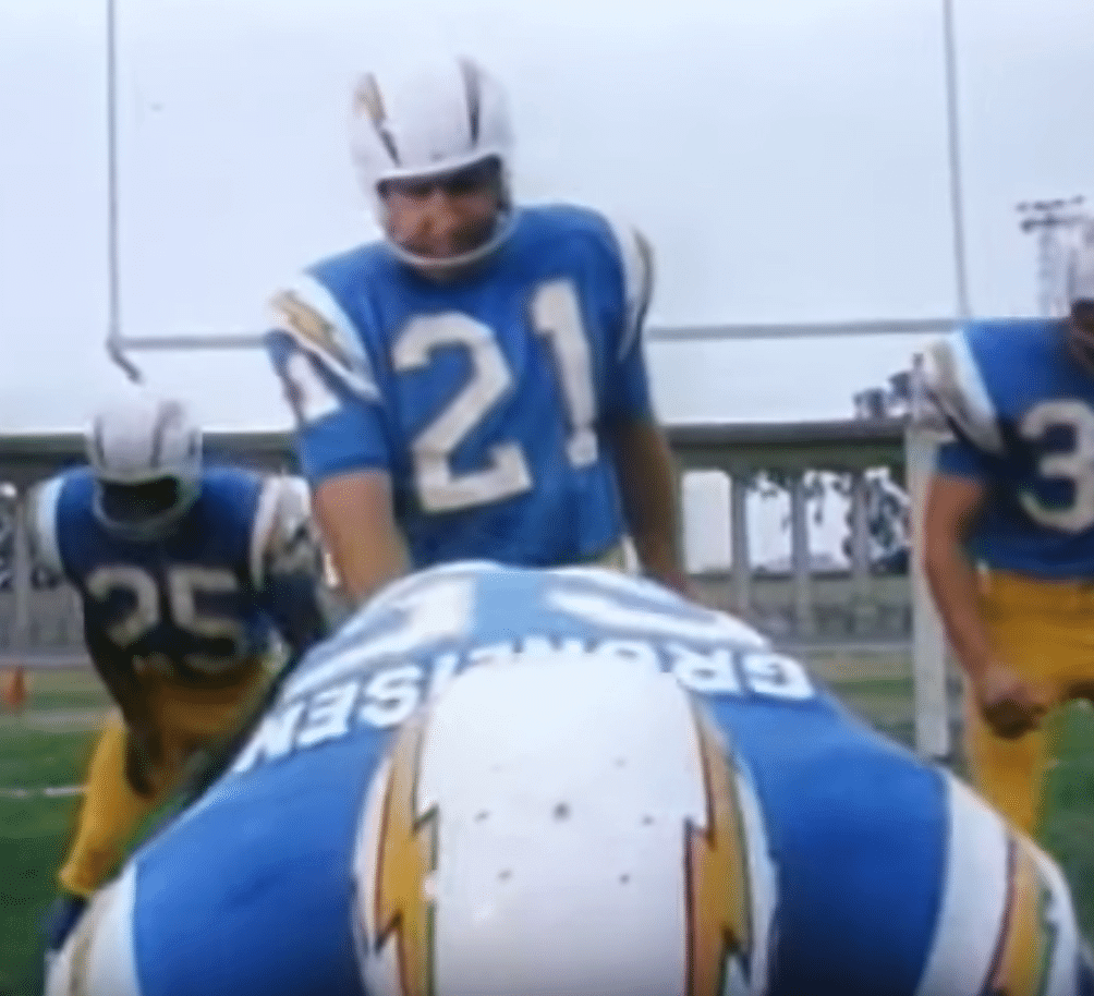
That would be Sam Gruneisen (or an actor playing him), who was indeed the Chargers’ center at the time.
• My favorite part of the commercial, by far, is when Hadl, or whoever the guy is, gets into the car and drives off in full uniform and pads — including his helmet. The glimpses of him driving in the helmet are just too good. (This could be a whole uni sub-genre — photos of guys driving in a full football uni. Are there any other examples?)
• Finally, there’s the elephant in the room: a Charger ad featuring a bunch of Chargers. They never explicitly make that connection, but I’m sure they knew they didn’t have to.
Not bad for one one-minute spot, right? Now if they just had the car in powder blue.
(Big thanks to Chris Alvarez for bringing this one to my attention.)

Click to enlarge
ITEM! Behold the Uni Watch race car: Reader Matt Tomelleri has been recovering from a broken collarbone. “With all the down time I have now, I recently jumped back on the PlayStation and fired up a racing game I used to play,” he says. “The game allows for custom imagery to be put on cars and I thought, ‘A green tequila sunrise race car would look pretty sharp!'” Indeed it does (even with the Purp Walk sticker).
Here’s a look at the car “in action” (click to enlarge):

You can see several additional views here.
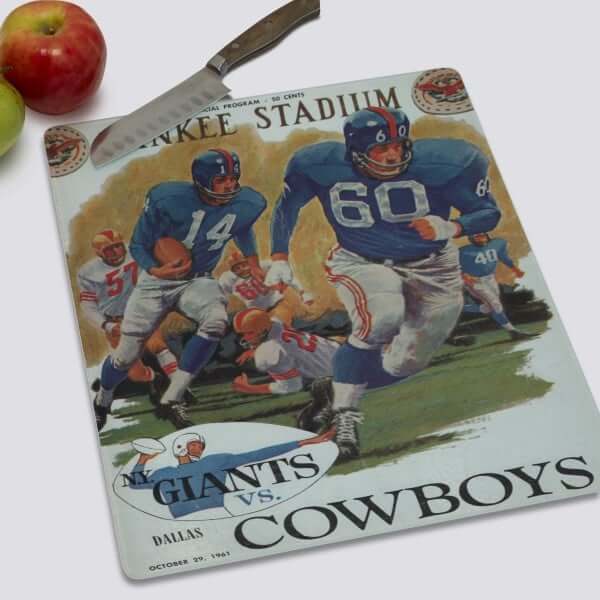

Raffle reminder: In case you missed it earlier this week, our longtime advertiser Vintage Brand is running another raffle. The lucky winner will be able to choose any item from the Vintage Brand website (like the groovy Giants cutting board shown above).
To enter, send an email to the raffle address by this Thursday, June 6, 7pm Eastern. One entry per person. I’ll announce the winner on Friday.
In addition, Vintage Brand is currently running a site-wide 20% sale. No need to enter any discount code — when you get to the checkout page, you’ll automatically get 20% off. Not bad!

Click to enlarge
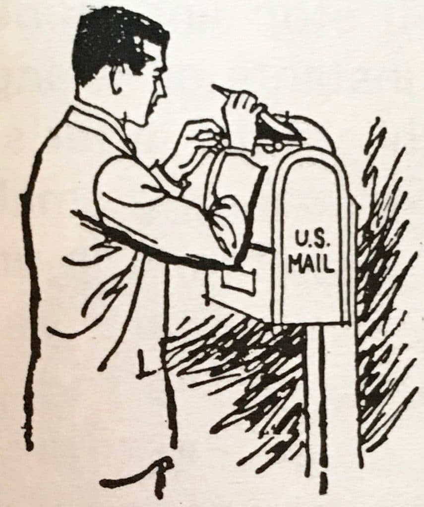
Post(al) service: Post-mounted mailboxes, like the one shown in the little illustration at right, have mostly vanished from our landscape (I’m referring here to collection boxes, where you mail a letter — not the kind of mailbox where you receive your mail). But echoes of them still remain in the form of the pebbled concrete posts on which they were mounted. The four shown above are all in my neighborhood. Three of them still have the now-rusted brackets on which the mailboxes were mounted.
I’ll have more to say about mailboxes in an article I just wrote for a design website. Stay tuned.

Click to enlarge
Stump speech: Like many people, I tend not to like most photos of myself. But I really like this shot that the Tugboat Captain took when I hopped up on a tree stump in our neighborhood the other day, so I thought I’d share it.
And why did I hop up on a tree stump? I can’t fully explain it, but it’s an oddly satisfying thing to do, even when dealing with a really low stump like this one. Goats often do it, and I think they’re onto something (besides a stump, that is). I recommend it!
Uni-versary reminders: In case you haven’t seen it already, here’s the spreadsheet showing all the Uni Watch 20th-anniversary gatherings that have been set up so far, along with a list of cities where readers have expressed interest in attending a gathering, although no organizer has yet stepped up. If you want to host or attend such a gather, contact party coordinator JohnMark Fisher.
Meanwhile, I hope by now most of you are aware of our awesome “Turn Ahead the Clock Shirt,” which celebrates the dual 20th anniversaries of Uni Watch and MLB’s infamous 1999 TATC program. You can order it here.
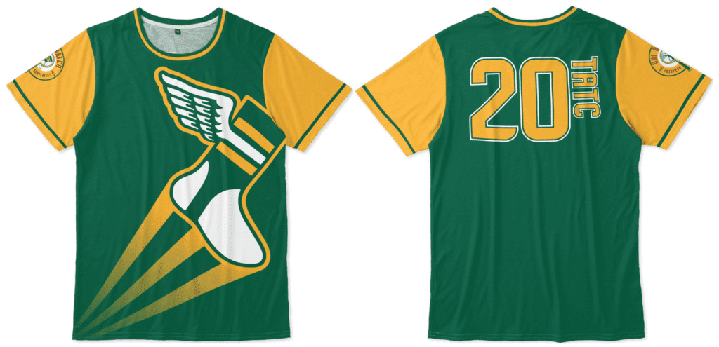
We have other anniversary items — and, of course, non-anniversary items — in the Uni Watch Teespring shop. My thanks, as always, for considering our products.
The Ticker
By Lloyd Alaban

Baseball News: The umpires at last night’s White Sox/Nationals game determined White Sox P Jose Ruiz was wearing a grey glove too close in shade to his uniform, so they made him change it to a black glove (from Max Weintraub). … Rangers 2B Rougned Odor confirms that the “shorts” and high socks combo worn by the team on Sunday were because of RF Hunter Pence. Odor said everyone thought his were higher “because I’m short, it looked higher” but that no one gave 1B Ronald Guzmán any grief (from Chad Johnson). … Bit of a mix-up from ESPN roundtable talk show Pardon the Interruption: The show’s panel was discussing the four-game suspension of University of Louisville P Mike McAvene, but the show’s graphics displayed shots of players from the Louisville Bats, the Triple-A affiliate of the Reds (from multiple readers). … A fan in Chicago wore a customized Anthony Rizzo White Sox jersey. Rizzo plays for the Cubs (from Michael Brighton). … This podcast has a theory as to why MLB started wearing throwback uniforms. Starts at around the 35-minute mark (from Jay Wright). … The Clearwater Threshers, Single-A affiliate of the Phillies, will wear patches honoring the late chairman and president of the Phillies, David Montgomery (from multiple readers). … The Corpus Christi Hooks, Double-A affiliate of the Astros, will wear uniforms in honor of Coastal Bend Conservation Weekend from June 20-22. The uniforms feature a speckled trout, which, according to the team, is “the most frequently caught game fish in the bays of the Coastal Bend” (from Ignacio Salazar). … We’ve run a few items in the Ticker about the Buffalo Bisons, Triple-A affiliate of the Blue Jays, renaming themselves the Wings for a few games this season. Here’s a more in-depth look behind the temporary rename and the general trend of naming minor league teams after food (from Matt Wilcott). … A Connecticut Brewery-sponsored team uses a tequila sunrise template and a spin on the Brewers’ ball-in-glove logo (from Jeff Wojcicki). … UCLA softball wore throwbacks for the national championship last night (from Bill Roman). … MLB commish Rob Manfred says it’s unlikely that teams will be required to extend their stadium netting in the middle of the season, although a stricter requirement is possible after this season ends. … With Philllies OF Adam Haseley making his MLB debut last night, NBC Sports Philly showed his name in all-lowercase letters for some reason (from @PhillyPartTwo).

Football News: Dolphins WR Kenny Stills has started an unofficial retweet campaign to make the Dolphins throwback uniforms their primaries (from @ohiophinfan1037). … Jets RB Le’Veon Bell came to practice in custom Air Jordan I cleats (from Bronson Black). … Packers LB Za’Darius Smith wore a National Cheese Day-themed helmet visor yesterday. … Blackout/military appreciation uniforms for the Philadelphia Soul of the AFL (from Robert Caplette). … Reader Mike Monaghan has a collection of every helmet ever worn in the NFL since 1960, plus some from as far back as the 1920s. Also in the collection are several concept helmets that never made it to the field. … The 701 Center for Contemporary Art in Columbia, S.C., is running a football-related art exhibit that focuses on “identity construction, masculinity, violence in sports and conditional self-worth” (from Jason Rapp).

Hockey News: A South African security company is poaching the Jets logo. … NAHL team Brookings Blizzard will relocate to St. Cloud, Minn. Here’s their new logo (from John Cerone).
.

Basketball News: A Canadian website gave Raptors and Warriors players ’70s makeovers in the form of trading cards (from Jon Crain). … Nike released a Kevin Durant shirt that might give some insight into which team Durant is heading to next (from our own Brinke Guthrie). … More Warriors-related news from Brinke: Here are the shoes Warriors PG Stephen Curry will be wearing for tonight’s NBA Finals Game Three. … Check out this collection of vintage Bucks playoff ticket stubs, plus one from the old WPBA’s Milwaukee Does (from @HardwoodBucks).

Soccer News: New training shirt advertisers for the England national team (from our own Jamie Rathjen). … Also from Jamie: “I still call it Orlando City Stadium.” … Clothing manufacturer Legea has copied Nike’s Nigeria Design for their “Girona” teamwear (from Josh Hinton).

Grab Bag: Here are some shots of the polos that the head coaches of the Premier Lacrosse League wore over the weekend (from @KNsportsgroup). … Good-looking matchup between Afghanistan and Sri Lanka in the Cricket World Cup (from Jim Vilk). … New personal logo for golfer Justin Thomas (from Drew Ward). … Burnaby Lakers G Eric Penney has been playing the summer Western Lacrosse Association season wearing the gear of his winter National Lacrosse League team. He has been wearing his mask and pads of the Vancouver Warriors, who he also tends goal for (fr0m Wade Heidt). … The football, soccer, lacrosse, and track and field programs Lincoln High School in Michigan all use grey turf (from Seth Kinker). … This Esquire writer wonders why the president’s khakis are so ill-fitting (from Tom Turner).
Happy birthday to our own Jamie Rathjen, who produces the Tickers that appear on Mondays. Looking forward to finally meeting you in person at the Brooklyn uni-versary party on June 29, Jamie!
Great lede!
first sentence has a few extra drops of Chris’ twitter handle
Re: People driving in full football uniforms: There was that Kia commercial from a couple years ago where Bo Jackson ran out of the stadium and jumped into a Kia and picked up Brian Bosworth right before he ran him over (again). But, I think Bo took his helmet off first, so that is probably just shy of the mark.
San Diego’s blue & white striped pants were worn in 1966 and the 1967 preseason. The Chargers went back to lightning bolts for the 1967 regular season.
Ah, good call.
Can anyone ID the actress in the spot?
Le’Veon Bell’s Air Jordan 1 cleats are actually general releases. He may well break out some player exclusives at some point (along with all of the other Jordan-endorsing players, as that’s the model they’ve chosen to feature this season), but the black and white pair in that photo is available at retailers.
really digging the sunrise tequila car design
Re: Uni Watch Car
Matt, terrific job! Would look great as a Hot Wheels.
It would also look great on a real race car.
There’s a number of un/under-sponsored race teams (including the #15 in both NASCAR Cup and the ‘I Still Call It The Busch’ Series) who would improve their visual program with that scheme…for the right price of course!
Here it is as a Hot Wheels. It’s the General Lee!!! The General was a 1969 Charger.
link
wonder how old that toy is. they stopped putting the Confederate Flag off the Dukes of Hazzard merch 4 years ago.
link
also that orange is off
Those pebble post box posts, is that a NE thing? I’ve never seen them in Michigan. I’ll be hunting for that article.
Not aware of them being regional, but it’s possible.
Metal posts were also sometimes used. We had one of those in our neighborhood as well, but it recently disappeared.
In one of those pictures it looks like there is fairly new concrete. Seems weird that they left the post there and poured around it, unless there is some significance to that particular post.
big ups to Matt T. making liveries on games like GT and Forza is pretty hard with the tools they give you.. i am always impressed with what people can do on those games.
also now that the NFL training camp merch is trickling out,they have two styles.. white and grey for all the different hats..it interesting that the white hats have the 100 year logo, but the grey ones have a grey NFL shield logo
link got to love they couldn’t even post a hat with a straight logo on it
link
that might be one of the greatest TV spots I have ever seen. The dissolve effect alone puts it in a class by itself.
The 1968 Dodge Charger and the Powder Blues… Two of my all time favorites!
Re: Extending netting.
To the MLB and team owners.
What prevents the individual teams from taking the initiative and extending the netting in their parks when their teams are on the road or during the All-Star break? Come on, MLB, don’t wait. It’s not brain surgery.
the stadium it happened at already has some of the longest netting in MLB.
maybe they shouldn’t let little children sit so close to the field or only in areas protected by the net.
…or the elderly, or the blind, or really, anyone without major-league reflexes, huh?
This isn’t something that happens to children (or people looking at their phones) only. Someone in front of you ducks at the last second, the sun’s in your eyes, you name it…accidents – bad ones – can and will happen. Yes, some can be avoided by using common sense but some can’t.
Either stop building ballparks with very little foul territory, or if people insist on sitting close to the action, Extend. The. Nets.
This. With bigger, stronger players swinging harder bats and facing faster pitching, don’t allow the fans to encroach on the field. Put in some foul territory, save some lives.
“Post-mounted mailboxes, like the one shown in the little illustration at right, have mostly vanished from our landscape.”
Depends on where you live. In south Louisiana where I live, post-mounted mailboxes are common. My box and all of those in my one-street neighborhood are attached to a post and are at the end of the driveway, though not to the height shown in your photos. Lots of mail delivery folks here don’t have to get out of the car unless they have to deliver an oversized package
I’m referring to collection boxes — where you mail a letter, not where you receive a letter.
Wait, so these posts held “drop your outgoing mail here” boxes? What a foreign concept! I’ve only known of branded blue boxes bolted to the ground.
Forgotten New York has a solid post (no pun intented) on lamppost mounted small slot mailboxes.
link
Yes, that’s the point.
Like this: link
Wow. They’re cute!
Right? I loved them and miss them.
“Now if they just had the car in powder blue.”
I’d like it in Petty Blue (although that was not a factory option):
link
I think King Richard wanted to drive a Charger in ’68 instead of a Plymouth, but Chrysler refused (douchebags!); Petty Enterprises switched to Ford for the next season.
Do suggest that it is normally a football fashion faux pas to wear white helmets with yellow pants.
Would never recommend a new team wear this, but there are a couple of teams that can pull it off. I give a pass to Wyoming Cowboys. It is their signature look and would not look right if they just started wearing yellow helmets to match. I like their look. Also, the LA Chargers can pull this off beautifully.
With the Chargers’ recent uniform update, I would be all for them ditching the navy pants (if they have not done so for the upcoming season). Would be for them bringing back some yellow pants as an alternate pant option. Modern rendition of white/powder blue/yellow combination that they have not worn for years.
Sorry. My son, when he was little, referred to the Wyoming white-brown-yellow as the “poopy pee team.” And the white helmet/yellow cage doesn’t work for the Chargers, or anyone for that matter.
I’ve always thought that was a terrible look. If you have white helmets, you’re stuck with white pants at home. It’s interesting because each element of that uniform is pristine when viewed on it’s own.
“We’ve ran a few items in the Ticker about the Buffalo Bisons,….”
Shouldn’t this be “We’ve run a few….”
Yes. Fixed.
Seems pretty clear they lift him in full gear so that they could put a helmet on anyone for the driving around b-roll.
That and Hadl had begun losing his hair. Doesn’t portray “youthful exuberance” very well.
The town I grew up in over in NJ had those posts they used for the street signs and they still do to this day. Some were the pebbled variety, some I think were just cast concrete. The older signs had the street name in tiles. The newer ones just used a plate. I always thought it was a classy way to mark the street name.
link
We have similar posts for street names at intersections (also in NJ) but they have no connection to the mail.
This might be a stupid question but what kind of mailboxes are used in your neighborhood? All the mailboxes where I live are essentially post-mounted (some are a mailbox in a brick column).
i would bet either porch mounted or they went to apartment complex style, where its a giant metal box for multiple units.
I’m referring to *collection* boxes, where you *mail* a letter — not where you receive a letter.
but what about your traditional mailboxes? what style are those?
also are you not allowed to put outgoing postage in your own box?
Traditional four-legged collection boxes are called “traditional four-legged collection boxes.” The USPS sometimes simply calls them “blue boxes.”
I liked them better when they were red on top. Also, I’m old.
Might just be my family, but we put outgoing mail in our mailboxes mounted to our houses. Mail deliverers always take it and the bills or letters get delivered. My wife did not understand me when I first told her to just put it in our box. I live outside of Chicago. Some suburbs have the pillar street name posts. I thought the mail box posts were interesting. I believe all I have ever seen are blue metal boxes bolted to concrete.
I’ve seen posts like that around my hometown but for the life of me can’t recall where. I didn’t think it was for mailbox posts but now I’m curious.
My brother lives in Colonia NJ and on their street names are posted on little concrete columns just like the mailbox posts you mentioned. It makes navigating the town difficult at night if you don’t use gps or are familiar with town .
That poached Jets logo looks very similar to their 2011-12 inaugural season patch to boot.
Chargers unis? Whatever. By all means, carry on. I am checking out that sweet muscle car and the Dodge Fever girl. For the record, Joan Parker was the Dodge Fever girl in this commercial.
link
I’m a total MOPAR guy, so I’m with you on this one, Jeff.
There’s actually a great backstory to this second generation Charger model when it debuted in ’68. The story goes that the designer almost didn’t get this car design approved. He had to “call an audible” and “bootlegged” it to the Dodge division at Chrysler after it was shot down by, I believe, the brass from Plymouth.
Oh, and if we’re really being picky, Paul, that Dodge color would be “Light Blue Poly,” not Charger Blue. ;)
Great piece. You don’t see 60-minute ads anymore, let alone minute spots this glorious.
-C.
*Make that 60-SECOND. d’oh! -C.
No 60 minute ads, but a plethora of 15 second ads…
Two of my great loves, old uniforms and classic Mopar muscle. Interesting that they advertised the base model with the 318ci, when in ‘68 they ranged all the way up to the mighty 426 Hemi. Based on the presumed timing of the commercial, perhaps they wanted to keep a few cards up their sleeves.
I would love to see the Dolphins take it step further and ditch the 1966 pants with the narrow aqua/orange/aqua striping for the ones they wore from 1967 to 1985 with the wider orange/aqua/orange striping.
I’m with you on this. I like the orange/aqua/orange pant striping.
Greetings from Alaska Paul! Thought the actor playing Hadl looks an awful lot like a young Beau Bridges! Maybe it’s just me!
Has it been discussed here before that the Chargers helmet font does not match the jersey font?
just wondering.
I think that’s always been so obvious as to not merit much discussion. One of those “that’s just how it is” things.
Can’t wait to see the Purple Amnesty day version of that racecar.
That’s definitely Hadl in the commercial. Thanks for posting it. The Chargers’ powder blues, a hot car and an even hotter girl…it was definitely 60 well spent seconds.
Great job on that Gran Turismo Uni Watch car (Huracan LP610-4 judging from the wing and the louvers, although I can be wayyyyyy off?)! I used to always try to do something as complicated as that on GT and Forza, but I always gave up because it was so hard for me haha
Re: Uni Watch Car
What game was that car made in? It’s not listed in the piece nor the Flickr folder.
pretty sure it’s Gran Turismo Sport
Matt didn’t say. Just said PlayStation.
Judging from the “GT” watermark in one of the pictures, the cars, and the graphics, pretty sure it’s Gran Turismo Sport
The left guard with the solid blue bolts also appears to be missing the numerals from his helmet. Wonder if he was a camp body or a stand-in?
Very interesting!
On a side note, are you going to write about MLB’s Stars and Stripes? Take a look: link{wt-static_graphic1}{pt-Home}{al-AspotSleeper}{ct-StarsAndStripes}
It looks very interesting…they have retro cap in stars and stripes! I don’t know if you have already done a piece on this, I’ve been away from Uni-watch for a while
Wrote about them back in April: link
Chargers related
In the cover of their November 26, 1964 game program the Chargers used an artwork by Dick Thompson in which Lance Alworth is confronted by a defender in a Bills uniform. The artwork is inspired by an October 13, 1963 photo in which Alworth is about to run past Jets’ Tony Stricker
link
’69 Chargers Charger!!
link
Oh, man — that’s awesome!
Re Chargers: Those were the days, before the team told its city and all of its fans to go die.
We had a drop box in my neighborhood in Westchester County, but it was attached to a phone pole. The box was taken down probably in the 1990s or early 2000s. I have seen those concrete posts too, but never with the box. Didn’t know what they were for until now!
Regarding the football with stripes in the ad: It could be an official AFL Football for night games which did have stripes from 1966-69:
link
In all, there were at least 11 and maybe 12 different versions of the AFL Game Ball produced over the 10 years of the AFL.
(1960-1962) Joe Foss signature: J6-V First logo design brand, No stripe
(1960-1962) Joe Foss signature: J6-V First logo design brand, White stripe
(1962-1965) Joe Foss signature: J6-V Second logo design brand, No stripe
(1962-1965) Joe Foss signature: J6-V Second logo design brand, White stripe
(1965-1966) Joe Foss signature: J5-V Second logo design brand, No stripe
(1965-1966) Joe Foss signature: J5-V Second logo design brand, White stripe (?)
(no photo found at this date)
(1966) Al Davis signature: J5-V Second logo design brand, No stripe
(1966) Al Davis signature: J5-V Second logo design brand, White stripe
(1966-1969) Milt Woodard signature: J5-V Second logo design brand, No stripe
(1966-1969) Milt Woodard signature: J5-V Second logo design brand, White stripe
(1966-1969) pete rozelle signature: J5-V Second logo design brand, No stripe
(1966-1969) pete rozelle signature: J5-V Second logo design brand, White stripe
Spectacularly good info, Mark — thanks!