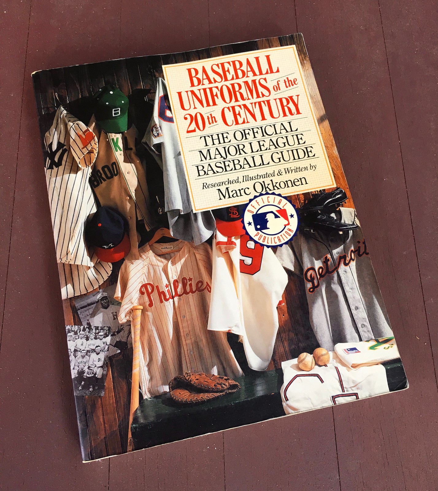
I woke up this morning to an email from Phil, who informed me that Marc Okkonen died on Monday. He was the author of several books, most notably Baseball Uniforms of the 20th Century, whose uniform mock-ups later became the basis for the Baseball Hall of Fame’s “Dressed to the Nines” uniform database. According to this SABR page, he was born in 1933, so he was either 85 or 86.
It is no exaggeration to say that Uni Watch, and the whole notion of athletics aesthetics, would be very different, and might not exist at all, if not for Marc Okkonen. We largely take for granted now that we have access to historical uniform databases like the one he created — databases that let us see, at a glance, what a team wore in 1937, or how accurate a team’s throwback is compared to the original design. It’s hard to fathom how much research went into creating that first database of his, particularly because he was creating it in the pre-internet era. Moreover, much of the history he was documenting took place before the advent of color photography, so he had to figure out uniform colors based largely on written descriptions.
The first edition of Baseball Uniforms of the 20th Century was published in 1991; a revised edition, which is what I have a copy of, came out in 1993. In addition to the year-by-year mock-ups that were later used to create the “Dressed to the Nines” database, it also includes team-by-team entries with lots of text and photos.
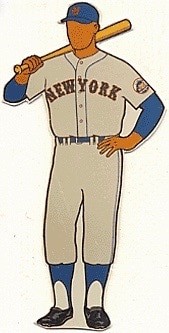
Okkonen was working in what was still an analog world, so his now-familiar mock-ups were paper cutouts, a method that now seems endearingly quaint. (I’d love to know how big the originals were, and what happened to them.) It wasn’t a perfect format — no rear view, cap logos are indecipherably small, the right sleeve is obscured — but it was a good template that allowed him to track everything from stirrup height to undershirt color to shoe design. Even the faceless player himself changed along with the timeline, as Okkonen gave his model darker skin tones to reflect baseball’s post-Jackie racial diversity.
Here’s a bit more about Okkonen, how he got into uniforms, and how he created his seminal book, from that SABR page I linked to earlier:
Born and raised in Muskegon, Michigan, Okkonen graduated from Muskegon High school in 1951. Over the years he maintained a strong connection to his hometown, publishing several booklets on its history. A publications consultant, freelance artist, and writer professionally, Okkonen waited until later in life to get his college degree, graduating from the University of Michigan–Dearborn in 1970.
[…]
In 1984, when his Tigers won a World Championship, seeing Bernard Malamud’s novel The Natural get turned into a movie helped catalyze Okkonen’s interest in investigating baseball uniforms. “I knew some of them [in the movie] were wrong. I think that was the spark that sent me on my research,” Okkonen told Marty Appel.
Okkonen’s investigations took him to a sports library in Los Angeles, the Baseball Hall of Fame in Cooperstown, New York, and the Library of Congress in Washington, DC. To facilitate his work, he moved to upstate New York for a time to be closer to the Hall. Okkonen’s artistic ability vividly enhanced his findings. He envisioned a two-dimensional faceless manikin on which to illustrate each uniform: standing, left hand on hip, right hand holding the bat a couple inches above the knob and slung over the shoulder. This pose allowed the entire uniform to be highlighted and compared to others, from the cap to the socks.
Because of the high cost of production for a book with numerous color photos and images, it took longer than he hoped to find a publisher. While Okkonen searched for a publisher, he worked with several teams on anniversary-type projects that included his uniform research. Finally, in 1991, the fruits of his efforts were rewarded, and Okkonen’s masterpiece was released by the Sterling Publishing company. Two years later he published a revised, paperback edition.
Okkonen’s research was not perfect. The uni-verse’s hive mind has found lots of small mistakes and omissions in his database over the years. This ultimately says less about his errors than it does about the enthusiasm for uniforms that his work inspired. That enthusiasm has taken many forms. The throwback craze would probably never have developed the way it has if not for Okkonen, for example. And it almost goes without saying that the other great uniform databases — the Gridiron Uniform Database, NHLuniforms.com, The Game Worn Guide to MLB Jerseys, and Threads of Our Game — are all descended from Okkonen’s original work.
I received my copy of Baseball Uniforms of the 20th Century in 1995, four years before Uni Watch was born, as a gift from my friend Liz Clayton, who had stumbled across the book at a Borders in Michigan and, knowing of my interest in uniforms, bought a copy and mailed it to me. It literally changed my life. I spent endless hours poring over it. When I began writing Uni Watch, I made countless historical references (“The White Sox wore such-and-such in 1937,” or whatever) based on the book’s content.
I wrote to Okkonen several times over the years, both by regular mail and by email. I wanted him to know how important his work was to me, both as a fan and as an influence on — hell, as the basis for — Uni Watch. Unfortunately, he never responded. I’ve always worried that maybe he somehow resented me for building Uni Watch on his research or something like that. I hope not, but I still wonder. Now that he’s gone, I really regret that I never got to shake his hand and thank him for creating something that’s enriched all of our lives. Please join me in donning a black armband for him today. R.I.P.
(If you don’t already have a copy of Okkonen’s book, you can get one here.)
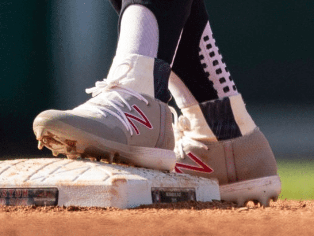
Lindor update: Yesterday I wrote about how Cleveland shortstop Francisco Lindor has been wearing weird little partial socks over his stirrups. As some readers immediately speculated yesterday, these socks are actually sewn into his shoes — a custom job by New Balance.
And why is he doing this? Lindor suffered a left ankle injury earlier this year, and a team spokesman tells me that the custom footwear is designed to provide an added layer of ankle support. They apparently did it on both shoes, not just the left one, for the sake of symmetry.
So now you know!
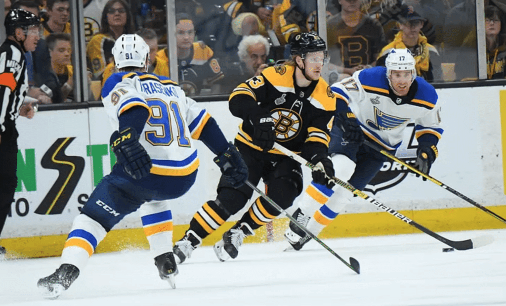
Obligatory Stanley Cup item: Several readers have asked why I haven’t done a Stanley Cup Final(s) preview this year. Honestly, I don’t think I’ve done one in most previous years (have I?), but in any case I’ve been stretched super-thin by Uni Watch’s anniversary, the holiday weekend, and a bunch of other stuff, so I just haven’t had time to do a comprehensive rundown of the Stanley Cup uni pairing.
I’ll say this, though: It’s a very good-looking matchup, with two of the league’s best-dressed teams. Very easy on the eyes.
Meanwhile: You all know how I love striped socks, and that definitely includes striped hockey socks. So I urge everyone to go over to SportsLogos.net, where Chris Creamer has put together a graphic showing every sock matchup in Stanley Cup history — a brilliantly obsessive thing to track. You can check it out here.
Giving us the finger(s): The Reds will be wearing their 1919 throwbacks this Sunday. That got Twitter-er @DDberry looking at some old pics of the 1919 Reds, and he noticed something odd in three separate team portraits of the squad (for all of these, you can click to enlarge):
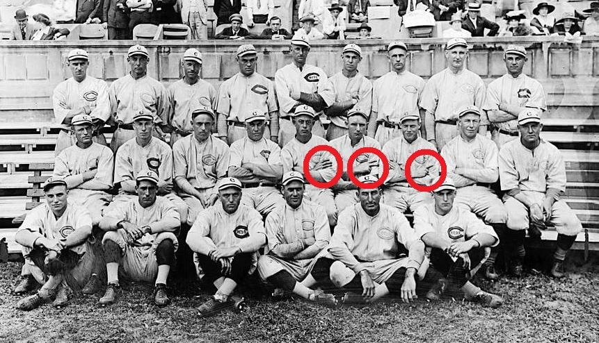
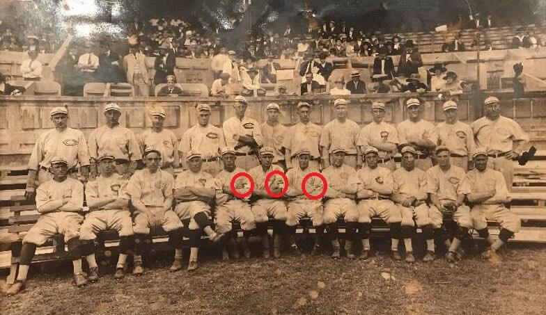
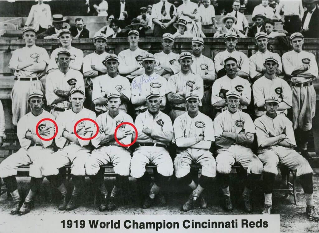
As you can see, in all three portraits there are three players sitting next to each other and sticking out one or more of their fingers. Those three players are Ivey Wingo, Bill Rariden, and Nick Allen — all of whom, interestingly, were catchers. So maybe it was some sort of inside joke about giving signals..?
Now we just need the 2019 Reds to pose for a similar photo in their throwbacks with their three catchers — Tucker Barnhart, Curt Casali, and Kyle Farmer — doing the same thing.
Collector’s Corner
By Brinke Guthrie
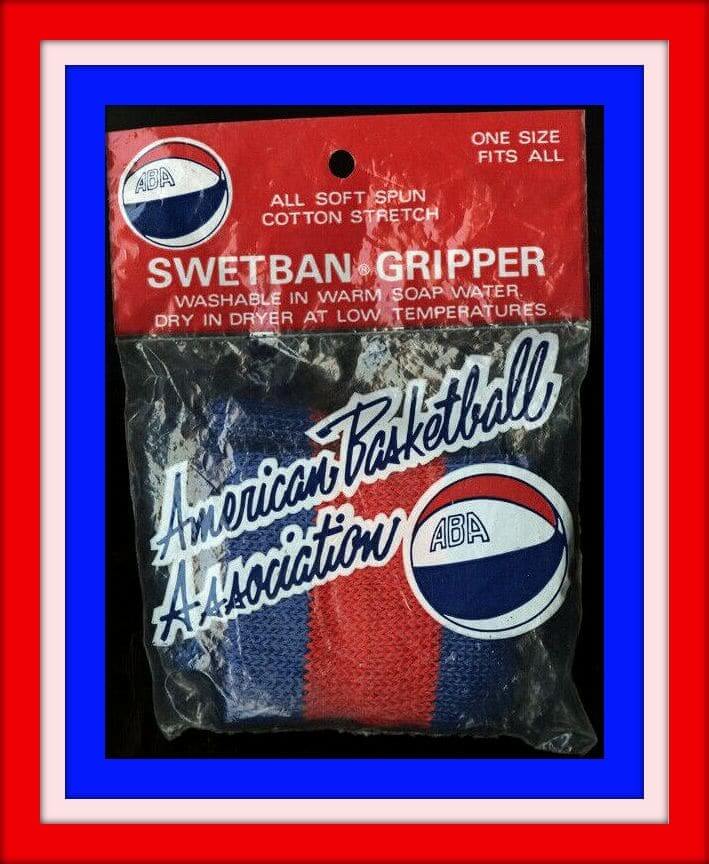
The ABA existed in a time before sports merchandising/marketing truly kicked in, but here we have a pair of 1970s ABA “Swetban®Gripper” wristbands, still in the package. (All soft spun! Cotton stretch! One size fits all.) The back of the package says “Another Preferred Product, Louisville Ky,” and the seller says they were from a company called JML. Maybe there was a Colonels connection?
Now for the rest of this week’s stuff:
• One more for the ABA: this 1970s serving tray with all the ABA team logos from that time. Weren’t the Floridians the first pro team to have just a team name, with no city or state? First they were the Minnesota Muskies (1967-1968), then the Miami Floridians (1968-1970), then just “The Floridians,” (1970-1972.) It was a regional thing — they played all over the state. The Dallas Chaparrals did the same thing, changing to Texas Chaparrals for a time (they’re now the San Antonio Spurs), and the Kentucky Colonels played some games in Cincinnati during their final season in 1975-1976.
• This 1960s Dodgers pennant includes the words “Chavez Ravine” at top left. And since I’ve never known what “Chavez Ravine” meant — honest — I asked the Google Assistant on my desk, and she quoted Wikipedia: “Chavez Ravine was named for Julian Chavez, a Los Angeles councilman in the 19th century.” [Anyone interested in learning more about Chavez Ravine, and what happened to the people who lived there when Dodger Stadium was built, should check out this superb podcast. — PL]
• Luv Ya Blue! Nothing says 1970s/Sears/NFL quite like this Oilers knit ski cap with a big ol’ pom thing on the top. And this got me thinking: Where do poms (or pom-poms) come from? So I found this on Google: “Sailors used to wear these hats and they put these pom-poms on there, so when the sailors were out at sea and the waters were rough, they wouldn’t bash their heads. It gave them extra protection, just by putting that little pom-pom on their hat.”
• The Bengals have an orange helmet shell with black stripes, but here’s a mini-helmet that has it the other way around. That’s not bad — but a black version for the Niners…..is.
• Here’s a 1970s NFL football bank with some nice decals around the base. Memo to seller: To maximize sale possibilities, how ’bout takin’ a little cleaner to that, huh?
• The Cubs logo decal has seen better days, but otherwise this 1960s Cubbies bobble looks great.
• Someone decided to go DIY on the 1970s NFL helmet buggies and came up with a Broncos “bucking horse” orange helmet version. (Also available in blue.)
• Here’s a promo poster of Catfish Hunter wearing Puma. Incidentally, “Beconta” was the Puma U.S. distributor from 1964-1979.
• Sand-Knit of Berlin, Wis., was the maker for this 1970s youth-size Astros tequlia sunrise jersey.
• Spanjian was the maker for this 1970s Toronto Blue Jays polo shirt. No logos, just “Blue Jays” across the front.
Seen an item on eBay that would be good for Collector’s Corner? Send any submissions here.

ITEM! Yet another one-day raffle: Today we’re going to raffle off another membership card, this one generously paid for by reader Marc Cavalli.
To enter this raffle, send an email to the raffle address by 10pm Eastern tonight. One entry per person. I’ll announce the winner tomorrow.
Big thanks to Marc for sponsoring this raffle!
ITEM! Anniversary merch update: As promised yesterday, the Uni Watch 20th-anniversary logo is now available as a high-quality die-cut sticker. You can order it here. I did my best to keep the price low (my take on each sale will be 99 cents).
T-shirts are taking a bit longer. I hope to have them available in another day or two. And we’ll have embroidered patches in early June.
Click to enlarge
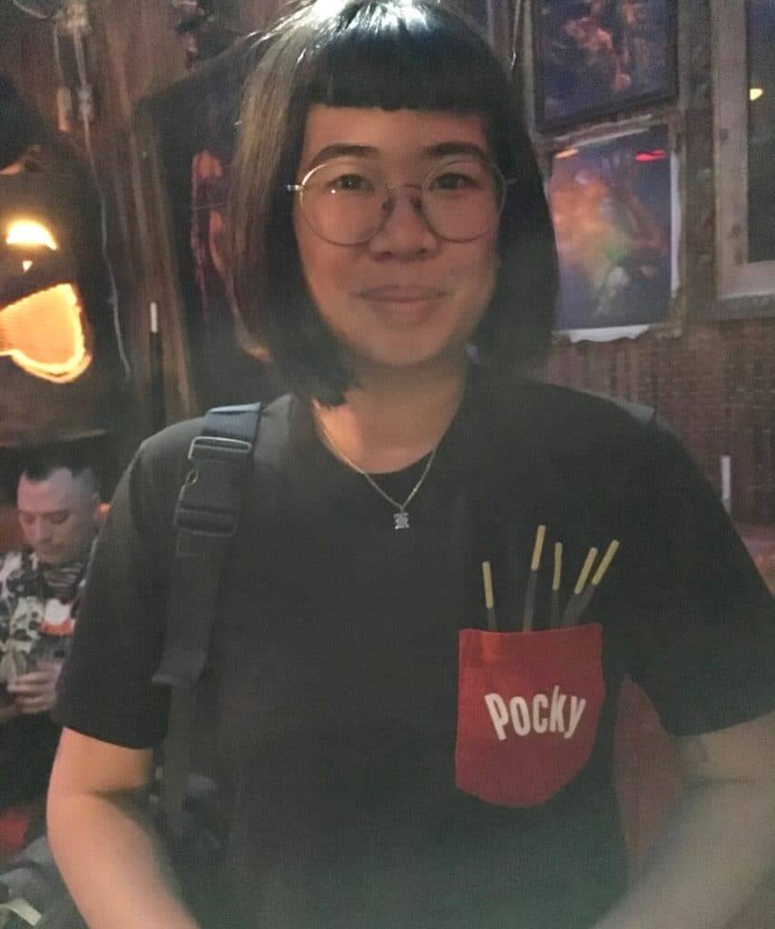
Clever design: I was out seeing some music a few nights ago and spotted this woman wearing a T-shirt with a Pocky pocket — brilliant! If the pocky sticks look pretty real (at least in the dim lighting), but they’re actually printed on. This shirt was apparently launched by Uniqlo a year ago.
(If you’re not famililar with pocky, look here.)
The Ticker
By Lloyd Alaban

Baseball News: Reds RF Yasiel Puig, who wore a stars/stripes belt on Memorial Day, wore it again yesterday (from our own Alex Hider). … Twins P Devin Smeltzer made his major league debut wearing beautiful “TC”-emblazoned stirrups (from multiple readers). … Fellow Twins P Matt Magill stuffed a cheat sheet inside his cap (from @BrewersMagicNum). … Orioles OF DJ Stewart will wear No. 24 going forward with the club. He previously wore No. 62 (from Andrew Cosentino). … The Yankees used the Padres’ old primary mark for their lineup sheet yesterday (from multiple readers). … Padres P Robbie Erlin was still wearing this year’s Memorial Day poppy patch when he took the mound yesterday (from multiple readers). … Also from that game: The YES Network, the Yankees’ official broadcaster, did a spotlight on the Padres’ uniform history (from @DaveGH2P). … The Astros have new Colt .45s merch in their team store (from Ignacio Salazar). … The Fresno Grizzlies, Triple-A affiliate of the Nationals, apologized for playing a video at their Memorial Day game that listed Congresswoman Alexandria Ocasio-Cortez as an “enemy of freedom.” She can be seen at the 3:07 mark in the embedded video (from multiple readers). … We think this sportswriter has hit the nail on the head with his MLB-Memorial Day merch dump opinion piece (from our own Phil Hecken). … Canada Post has come out with a new stamp honoring the Vancouver Asahi, a Japanese-Canadian baseball team (from Will Scheibler). … Johnston High School baseball in Johnston, Iowa, is poaching the Expos logo (from Jay Wright). … Here’s how costume designer Julian Day recreated some of Elton John’s flamboyant outfits, including the one based on the Dodgers’ uniform, for the upcoming biopic Rocketman (from James Gilbert).

Football News: The Browns wore their Color Rash uniforms for this photo shoot. The photos here will be used for their stadium’s scoreboard (from our own Alex Hider). … Northwestern will play home games at Wrigley Field in 2022, 2024 and 2026. The team previously played a game there in 2010, but safety concerns forced players to use only one end zone due to its proximity to Wrigley’s brick wall (from Mike Chamernik). … The CFL’s new retail jerseys don’t match the on-field product (from Mike Boyd). … Bill Kellick sent in this 1934 photo of players from the St. Louis Gunners of the NFL. … Patriots QB Tom Brady brought his helmet and pads with him to his beach vacation (from Scott, who didn’t give his last name).

Hockey News: The Canucks’ new uniforms have leaked. Chris Creamer says in that piece that the leak is legit. … The former home of Flyers Hall of Fame C Bobby Clarke is up for sale. It includes a pool shaped like the Flyers’ logo (from James Gilbert).

Basketball News: How did the Raptors become the Raptors? Here’s a Twitter thread explaining the name’s origin (from Andrew Cosentino). … Ballin’ 4 Peace, a celebrity charity, is giving away a jersey ahead of its annual celebrity basketball game. … Joliet Junior College in Illinois has unveiled its new uniforms and court design (from Alex McCluskey).

Soccer News: New shirt advertiser for Republic of Georgia club FC Dinamo Tbilisi (from Ed Zelaski). … The following three items are from Josh Hinton and our own Jamie Rathjen: New kits for Brighton & Hove Albion. … New kits for Middlesbrough. … Scotland women’s changed to pink at home against Jamaica, so it was pink vs. yellow. Scotland has actually worn pink and yellow hoops in the far distant past and the several pink or pink and yellow shirts from recent times are supposed to be a tribute to that color scheme. … A team of migrant soccer players in Spain played their last match of this season wearing NOBs with the slurs shouted at them to protest racism in the sport (from our own Phil Hecken).

Grab Bag: Yesterday Paul ran an item about tennis player Serena Williams’s French Open outfit. Here’s an interesting New York Times article on what her outfit means. … The Pittsburgh Curling Club broke ground on the area’s first rink made exclusively for curling (from our own Phil Hecken). … Here’s how brands get their names (from Joel Mathwig). … The U.S. Navy is reviewing whether some sailors violated uniform regulations by wearing patches supporting President Trump on their uniforms. American military personnel are supposed to refrain from overt political displays (from our own Brinke Guthrie). … New Rugby World Cup uniforms for Australia, plus they also have a new indigenous-themed kit (from Jeremy Brahm and our own Jamie Rathjen, respectively). … Speaking of indigenous uniforms, you can vote on your favorite Aussie football indigenous design here. “Each uniform is designed by an indigenous player from that team or a family member of a player or an interested artist,” explains Duncan Richards.
I’m not sure if this was noticed before, or if my eyes are deceiving me, but is “REDS” missing from inside of the “C” on some of the jerseys from the 1919 Reds pics???
Also, the Logo sticker link isn’t clickable
Sticker link is broken.
You’ve had Stanley Cup Final rundowns in the past…I certainly recall Chicago/Tampa 2015 on ESPN, and maybe just on the blog for Pittsburgh 2017. Certainly understand and would be sad if it’s not possible this year, but yes you’ve done it before.
I received my copy of “Baseball Uniforms of the 20th Century” sometime around my ninth or tenth birthday and just fell in love with it (it sits on a shelf above the desk in my garage now.) I finally had access to loads of pictures of uniforms the way they “should be” worn, and got to see many that I was unaware of until then. Most of the images cataloged in that book are, and will forever be, how I think all baseball uniforms should be worn. Great book.
I was in my early Twenties when the book was published, but when I received my copy as a Christmas gift from my wife, I might as well have been nine or ten. I spent hours with that book, studying every drawing. It was a delight. That copy, battered and well-worn, sits in a bookcase in our living room, next to a similar volume, documenting the history of uniforms in the Japanese leagues. Mr. Okkonen gave the world a wonderful gift.
I will just say I was out of college when I spotted Okkonen’s book in the library (in the pre-internet days) and gobbled it up.
The Venn diagram of Uni-Watchers and readers of this book must be amazing.
I’m not totally sold on the matte black, but I wouldn’t hate if the Bengals updated their helmet to the black with orange stripes.
And that has got to be the least flattering picture of Catfish Hunter I’ve ever seen, at least in the thumbnail. He looks like Ron Jeremy!
Oh man, sad to hear about Okkonen, i got the paperback version in 1993 when i was 12 years old and poured over that thing for years. I have read it countless times and even bought a original hardcover so i would have one that held up. It made me fall in love with uniforms and i always think of it when i see a game and wish they kept coming out with new editions cause it just missed the Angels and Mariners redesigns to name a couple. I will forever be grateful for his work.
Like so many others in this community, I got “Baseball Uniforms of the 20th Century” as a teenager. That, and Bill Henderson’s guide, are my 2 sports uniform bibles in dead tree form, although the old Red and Green Books from the NL and AL always had a quick page on uniforms. RIP Marc, and thank you for sparking a love in uniform research in so many of us, and for nailing most of the details nobody else cared about.
In Collector’s Corner, it says the Astros youth size jersey is from the 1970s. Sand Knit made replica retail jerseys from 1980-1986. That’s from Bill Henderson’s book previously referenced in the main story.
It COULD be from the 70s if Medalist/Gold Medal Sporting Goods had special ordering.
Ticker item: Tom Brady’s banned helmet was the Riddell VSR-4, not the Speed. The one in the photo is not banned.
Fixed.
This was the book that really got me started on uniforms. I still have it; the paperback edition that goes up to 1993. R.I.P. Marc Okkonen.
The ABA had a few “regional” franchises that officially had multiple home cities. The first was the Carolina Cougars, who moved from Houston in 1969. In 1970, the Washington Capitols became the Virginia Squires, as well as the Floridians and Texas Chaparrals that Brinke mentioned.
Kentucky, Indiana and Utah were named for their states, but each had one official home court.
The Indiana Pacers are the “Indiana” Pacers and not the Indianapolis Pacers because their intent was to play throughout the entire state… and I know they did play games in Bloomington as well as the Fair Grounds Coliseum and later Market Square Arena.
Doing some quick research at basketball-reference.com:
The 1969-70 Cougars played 20 home games in Greensboro, 14 in Charlotte, and 8 in Raleigh. That season’s Pacers played 3 games in Anderson. The 67-68 Pacers played 6 games in 5 non-Indianapolis towns, none in 68-69, one in Anderson in 70-71, one in Fort Wayne in 71-72, two in Fort Wayne in 72-73, one each in Fort Wayne and Terre Haute in 73-74, two in Terre Haute in 74-75, and one in Terre Haute in 75-76. When they got to the NBA, it was all Indianapolis.
So the Pacers may have intended to play around the state, and brought the odd game here and there, but it’s much different than the regional teams with multiple regular home courts.
Bobby Clarke is not the current owner of the house being referenced.
link
Text now adjusted. Thanks.
In addition to my uniform interests, i tend to take note of numbers. I wonder if there is any special reason behind the number (0202401) on the Uni Watch raffle ticket image.
I didn’t create that graphic — a reader named Ben Thoma did, many years ago. I honestly have no idea about the numbers!
Sad to hear of Marc Okkonen’s passing. I first heard about him when I visited the Baseball Hall of Fame Library in June 1989. They had the proofs of his book prior to publication. I was thrilled to see that someone had done all of that research and hoped he would find a publisher. I still have my copy of the 1991 hardcover edition of his book, the Bible of uniform research. Rest in Peace.
I’ve received many amazing gifts from my fourth graders over the years. The Bestie Boy book, a signed (and drawn on) copy of Mark Mothersbaugh’s book, gift certificates to Ebbets Field Flannels and my favorite record store, etc. But I have to say, receiving a copy of Okkonen’s masterpiece still takes the cake.
RIP
“knit ski cap with a big ol’ pom thing on the top”
link
I can help but think if any Reds players tried making “secret” hand gestures, 1. The team would be on the lookout and not allow as the picture is being taken (or find a way to alter the photo after the fact), and 2. Certain people would automatically assume a negative connotation (gang sign, “white supremacy” gesture, depending on the ethnicity of the player/players involved), and immediately go ballistic on the internet.
Speaking of striped socks Paul, did you mention a few months back that you were going to do a “Best Of” batch of StripeRite socks? I missed the Chicago socks the first time around and remember getting excited when I saw that post but haven’t heard anything since.
Yes, that’s the plan — although American Trench (which makes the socks) has been busy with other projects and has been slow to move on this one. I’ll give them a poke. Thanks for the reminder!
Been a Toronto Basketball fan since the team’s inception – Can’t stand the name, never could, lol. #callthemthehuskies
Paul, this is fine writing:
“Okkonen’s research was not perfect. The uni-verse’s hive mind has found lots of small mistakes and omissions in his database over the years. This ultimately says less about his errors than it does about the enthusiasm for uniforms that his work inspired.”
Your third & final sentence is properly respectful, and accurately reflects the situation.
Well done.
Lee
Thanks, Lee. Honestly, it wasn’t easy to wake up at 6:45am, see that Marc had passed away (thanks for letting me know, Phil!), and decide to write an obit on the spot. I can already see a few things I wish I’d said differently. But I am indeed happy with that sentence, and I’m glad it resonated with you.
Reading the opening paragraph I said to myself “Damn, how did he write this on the fly and totally nail it?”.
I’m in constant awe of those who can articulate ideas and feelings in such a grounded and relatable way.
I join in the thanks for the work of Mark Okkonen….I was 42 when his book came out. I felt like I had been waiting for it my whole life. And it made me feel my passion for design was nit so strange after all…SOOO RIP and THANKS.
The inclusion of AOC in that Fresno video is far from its only problem.. the whole “enemies of freedom” section is highly problematic and aggressively ideological. At only 3:30 minutes or so, there was more than enough time to check. Simply no place for this is in a ballpark….
On the Australia ‘Indigenous Jerseys’ for the World Cup, I’m not sure what to think. It’s evidently a result of the fact that Australia have no actual need for an alternate at this year’s tournament due to the absence of any other team featuring colours that could clash with Australia’s gold primary. Perhaps it’s even the most elegant way of dealing with such a situation where they are GOING TO HAVE AN ALTERNATE whether they need it or not, because everyone else has them and nobody wants to miss out on the merch sales.
More significantly, I just don’t think it’s particularly appropriate in a World Cup. For one, I always prefer when a nation has coordination across its uniforms at a big tournament like this – when the alternate and primary play off each other. Maybe I’d feel better if there was an indigenous motif across both kits, but this alternate obviously has a completely different aesthetic from the primary. Secondly, this is fundamentally a ‘special occasion’ shirt which is fine for one off tests, but the World Cup is itself the special occasion and turning a contest against Uruguay (probably one of the biggest games Uruguay will play in a while) into a self congratulatory gesture seems at the very least disrespectful to the Uruguayans. A bit like scheduling a throwback game for the World Series or something like that – Just seems a bit arrogant and out of touch with the idea of a tournament that is bigger than any one nation participating.
In looking at the Gridiron Uniform Database link from the Marc Okkonen section, I had a look at the Referee uniforms for the NFL. How about we petition the NFL in this NFL 100 season for Referee Uniform Throwbacks to the 1941 to 1946 era, where Referee uniforms had color based upon their position on the field.
link
This, and with color-coded stirrups.
RIP Marc Okkonen. (Another one with the paperback version.)
In the Stanley Cup Sock link (that one’s really cool by the way), interesting to note the change in Bruins/Blues Socks in the 49 years since they last played in the Cup Final against each other in 1970.
I interviewed Marc Okkonen in 1992 when I had a sports collectibles corner in my local paper. Okkonen did a lot of work in this field and helped a lot of collectors when it came to authentication and the elimination of obvious fakes in the hobby.
The regretful thing is that it also provided a pretty good set of templates for those looking to counterfeit game-used items.
I wanted to share my Marc Okkonen story.
In 2008 I was just discharged from the Marines but was sent back to Iraq as a contractor. I found a copy of his book online and that was my prized possession the rest of the time I was over there. Once I returned home I decided I would attempt to continue that work. I reached out to Mr. Okkonen and he was a real pleasure to speak with. He was not going to continue the drawings and he said all the alternates would have drove him up the wall. This was in 2009 and alternates would get even worse. His only request is that I do not use his template. In the dozen or so e-mails and two phone calls I had with him, he was completely supportive and even helped me with a contact to get some research done when I visited Cooperstown later that year. I am forever grateful for his generosity towards me when I first started my project.
Fast forward to 2013, I need a paperback version of his book to write notes in. Once I get it in the mail I notice it was a signed copy! There were also post-it notes in the book going over errors. I reached out to him again and he told me it was for a Chicago-area man who helped him with his research, more specifically the colors of some uniform elements. He passed away years before and his family had no interest in the subject. So I ended up with it. I later bought another copy so I could write in it.
It was an honor to speak to Mr. Okkonen and I hope this story gives you an idea of how kind and generous he was. I know a lot of people who are into uniforms feel the same way but I am doing what I am doing because he did what he did. He was also the best at it.
Great story, Jay. Thanks so much for sharing.