The NBA draft will take place on June 20. Sixty days prior to that date is April 21. And that gave the Charleston RiverDogs an idea.
Tomorrow night the RiverDogs — the Yankees’ Single-A affiliate — will hold NBA Draft Night. The team will wear themed uniforms for the occasion, which I’ll get to in a minute, but first let’s talk about why they’re doing this promotion in April, instead of closer to the actual draft date in June.
Here’s the deal: Article X, Section 1(b)(ii)(F) of the NBA’s current collective bargaining agreement states that anyone who meets the basic eligibility requirements (i.e., at least 19 years old, at least one year removed from high school, etc.) can declare his or her eligibility for the draft by notifying the NBA in writing at least 60 days before the draft takes place. Obviously, only serious people hoping for an NBA career would do that.
But what if just anyone did it?
Tomorrow night, the RiverDogs will invite all eligible fans to fill out this form:
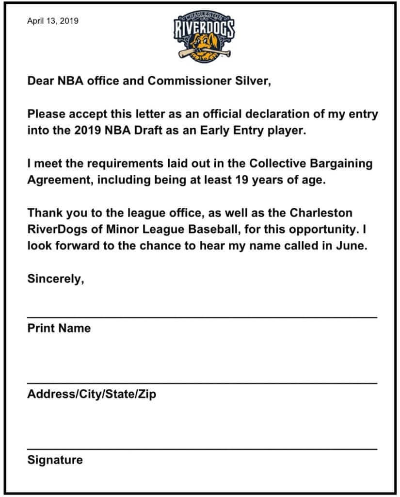
After the game, the RiverDogs plan to mail all the draft declarations to the NBA league office. “Feel free to have your readers do it too,” RiverDogs promotions director Nate Kurant told me yesterday. “If they send it to @chasriverdogs on Twitter, we can print them out and include them.”
A fun stunt. I might submit one of the forms myself — I always wanted to be part of the NBA draft! (Actually, I never wanted to be part of the NBA draft, but it still seems like fun.)
As for the uniforms, the jersey has a fairly conventional tuxedo format (click to enlarge):

But here’s the kicker: See how you can see some RiverDogs logos showing through the white part of the design? That’s because the inside of the jersey has been set up to look like a custom-designed jacket lining, just like the ones the draftees wear (click to enlarge):

That’s a pretty good gimmick. It’s apparently the first MiLB jersey ever to have an inner design, at least according to OT Sports, which makes almost all of MiLB’s specialty uniforms.
The RiverDogs offered to send me a jersey, but I asked if we could simply raffle one off instead, so we’ll be doing that next week. Stay tuned!

Click to enlarge
Two of my worlds colliding: Remember that King of the Hill bit where Bobby gets recruited to join the local junior college meat judging team? You might not realize this, but collegiate meat judging is an actual thing. Even better, some of the participants style their hard hats to look like their schools’ football helmets! That’s an Illinois participant at the center of the group in the photo shown above, and you can just barely see Texas A&M’s aTm logo on the front of the helmet of the guy at far-right.
Here’s another photo with an Ohio State lid (click to enlarge):

Not sure what the logo is on the white helmet. Anyone..?
As an aside: Obviously, the subject of meat has been a long-running theme on Uni Watch, from my various cooking endeavors to theoretical T-shirts and more. I realize some of our readers are vegetarians/vegans and may find this content upsetting. To those readers: I want you to know that I respect your positions, I understand that meat is problematic on several levels, and I appreciate that you continue to read Uni Watch despite my periodic meat cheerleading. Thanks for listening.
(My thanks to Devid Petroff for this one.)

ITEM! Yet another one-day raffle: Reader Jeff Drumheller has an extra copy of Todd Radom’s excellent book, Winning Ugly and has generously offered to raffle it off to the Uni Watch readership.
To enter, send an email with your mailing address to the raffle in-box by 10pm Eastern tonight. I’ll announce the winner on Monday.
Click to enlarge
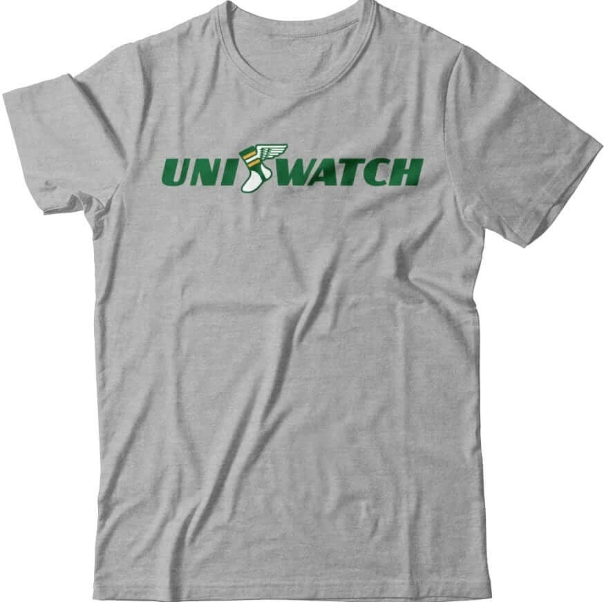
T-shirt reminders: In case you missed it on Monday, we have a new pair of T-shirts, rendered in the classic Goodyear type font called Wingfoot Sans, and featuring our own winged stirrup instead of Goodyear’s winged foot.
These have turned out to be pretty popular. Here’s where you can order the green one and the grey one. My thanks, as always, for considering our products.
The Ticker
By Yianni Varonis

Baseball News: Not sure why, but Orioles 3B Renato Núñez changed from high-cuffed to pajama-pantsed in the middle of yesterday’s game (from Bryan Farris). … Speaking of the Orioles, the team will hold Game of Thrones night during which it appears they will give away a figurine of the team mascot sitting on the Iron Throne (from Andrew Cosentino). … Yesterday, Reds SS José Iglesias suffered a broken belt in the ninth inning and had to play belt-free for the final out. … Reader Kurt Rozek has a fact-a-day calendar that inaccurately claims that the former Seattle Pilots are today’s Seattle Mariners. In fact, the Pilots moved to Milwaukee in 1970 and became the Brewers. … The Royals are giving away Wichita State-themed sun hats during an upcoming game (from @PhillyPartTwo). … The MLB website explains five hidden meanings in team logos you might not be aware of (from Tim Dunn). … In 1967, the Kansas City A’s sent shockwaves through the baseball world by sporting white uniform cleats for the first time (from @VerbDC). … Reader Mario Garcia found this coffee ad featuring Dodgers P Walker Beuhler in a generic white and blue uniform, including piping, which the team hasn’t worn since 1931. … A drone pilot used a black-and-white aerial photograph and an old Indianapolis street map to recreate the minor league stadium where Babe Ruth and Lou Gehrig played in (from @jdborneman). … Someone took the liberty to redesign every MLB club’s logo (from Mike Chamerik). … Navy is taking fan appreciation day literally by handing out mini-fans to the first 100 fans in attendance at a game later this month and asking fans to make their own fans at a fan-crafting station at the stadium. Got that? … The Connecticut Tigers want fans to help the team pick a new name. You can submit your ideas here (from Noah Safari). … When three minor league teams with seafood-inspired names decide to play each other in a round-robin tournament, the competition is naturally set to be called “the seafood buffet rivalry” (from multiple readers). … Diamondbacks SS Nick Ahmed’s team logo was missing from his batting helmet last night. … Looking to buy stirrups? This looks like a good source (from Al Gruwell).

Pro Football News: The Arizona Hotshots of the now-defunct AAF chose their name to honor fallen firefighters—without input from the firefighters’ families (from Philip Ely). … Here’s one way to try to impress a prospective employer: QB Dwayne Haskins wore a John Elway jersey to his pre-draft meeting with Elway (from Mike Chamernik). … Here’s one writer’s opinion of the best and worst uniform changes in NFL history. … Former Saskatchewan Roughriders great Ray Elgaard is not happy about Geroy Simon wearing his number (from Wade Heidt).
College Football News: Ohio State unveiled its championship rings from last season’s Big Ten title winning season. … Remember how Air Force was holding a bracket-style tournament to determine its most iconic football helmet? Well, this is the winner (from @flst8). … Oklahoma has 125th-anniversary logo that it will wear on its helmets and field next season (from Devon Kuckenbecker and Matthew Whitney). … Missouri is wearing throwback-themed helmets for its spring game, and at least the helmet stripe is staying (from multiple readers). … New paint job for North Carolina’s field ahead of its spring game (from James Gilbert). … This is pretty cool: outside of Iowa’s practice facility is the school’s Tigerhawk logo in light-colored woodchips, mimicking yellow, against a backdrop of dark-colored woodchips, mimicking black (from Kary Klismet). … Utah will raise awareness of pediatric cancer by adding a gold ribbon to their helmet logo for this year’s spring game (from @FILIKU).

Hockey News: Reader Jon Solomonson was lucky enough to enjoy lunch at Disney World recently when he came across the marquee outside of the ESPN club and noticed that it badly misspelled Hurricanes as “Hurracines.”

NBA News: To commemorate the beginning of the NBA playoffs, the 76ers have new Air Jordan 1s that G Ben Simmons is giving to select celebrity friends (from @PhillyPartTwo). … One reader has redesigned the WNBA’s uniforms.

Soccer News: We mentioned earlier that Brazil will wear a white shirt for the first time since 1950. To understand how remarkable that is, watch this video about the last time Brazil wore white (from Karl Sikkenga). … A local columnist offered his thoughts on rumors that the Chicago Fire will change their name and crest. … Like last year, MLS clubs will wear eco-friendly shirts as part of a larger effort to promote environmentalism. Each team’s version can be viewed here (from multiple readers). … German club Borussia Dortmund is switching the order of the team name and NOB on the back of the jersey (from Josh Hinton). … Staying in Germany, FC Schalke 04 and 1. FC Nürnberg will wear commemorative shirts celebrating the friendship between their two fan bases that their players will swap before their upcoming match (from Gregory Phillips). … Reader Denis Hurley shared a little bit of history from 1996: English clubs Stockport County and Blackburn Rovers were set to play each other, but both teams’ uniforms were blue and white. In response, Adidas provided Stockport a yellow shirt from the Romanian national team’s template, even though it featured the country’s crest imbedded in the fabric. … Here’s the symbolism behind the logo of Forward Madison FC. … New jerseys for the NWSL’s Houston Dash and Reign FC (from our own Jamie Rathjen).

Grab Bag: Someone used the Uni Watch Glossary to create a Uni Watch Quiz on Sporcle. “I got all 25 right with time to spare,” says Nick Kaston. … Pro cyclist Mathieu van der Poel chose white shorts over traditional black ones so his managers could more easily spot him and give him tactical advice during the Tour of Flanders (from Alan Solot). … The Grand Prix of Long Beach has a new title advertiser (from Tim Dunn). … Also from Tim: Pro open-wheel racing driver Colton Herta has a new advertiser. … Pro golfer Rickie Fowler’s cap has an odd design. Is that the Masters course layout? Some sort of camouflage? Something else? (From Griffin Smith). … In this video, Nike designers explain the inspiration behind the “cathedral stripe” it incorporated into Pitt’s new uniforms (from Scott Durham). … Speaking of which, new track uniforms for Pitt, though there’s no royal blue, which kind of defeats the purpose of the school-wide redesign (from Todd Covington). … The Confederation of European Volleyball Champions League has a new visual identity (from Jeremy Brahm). … These are the symbols that India is using in its parliamentarian elections (WaPo link) (from Mike Rosenberg). … A Virginia Tech museum is crowd-funding to raise the $10,000 needed to restore a 120-year-old uniform it recently found that belonged to the school’s Commandant of Cadets. … In advance of new restrictions on openly transgendered people in the armed forces, the Navy clarified that it will allow sailors to dress in accordance with their gender identity when not in uniform. … The Canadian military will now allow female soldiers to wear ponytails while on duty, among other reforms, to improve morale and attract more women into the armed forces. … A pizza shop is offering free pizza for life if you’re willing to get a tattoo of the company’s logo. … F1 driver Daniel Ricciardo’s new helmet is a retro-style tribute to former Australian F1 champ Jack Brabham (from Jeremy Brahm). … Ay yi yi: The latest advertising frontier is digital screens in cars, which may soon be flooded with ads (from Drew, who didn’t give a last name).
The maroon logo on the white hard hat is a west Texas a&m buffaloes decal
link
I think it’s high time that I be able to purchase merchandise that reads, “Uni Watch: Periodic Meat Cheerleading.”
That is all.
The story about Dortmund has the details mixed up; the team currently has player name, number, and team name on the bottom, in that order. They will switch the order to team name, number, player name, top to bottom.
The episode of King of the Hill referenced is “To Sirloin with Love”. I’m fairly sure it was the last of the original series on FOX. Additionally, the episode has one of the best quotes of the whole series – Hank (speaking to Bobby): “A boy who has a unicorn ranch in his bedroom shouldn’t call people weird; that’s right – we all know about Rancho Unicorno”.
link
This weekend is the 1000th F1 race, so many drivers have unique helmet designs for the occasion.
link
As a fake vegan, I am fake outraged by the meat judging coverage. I demand equal coverage for Fruit and Vegetable Judging. link
Those WNBA redesigns are nice! One small change I would make – flip the NOB and the ad, so that the player’s hair covers the ad instead of the name ;-)
Also, I know SNOB means “School Name On Back”, but I almost used SNOB to mean “Sponsor Name On Back” LOL
I once worked at a steel mill in Central Indiana as a summer job during college. Everyone was required to wear a hard hat at all times and I remember some people had hardhats that resembled the Purdue football helmet. Like this one: link:
I never took any pictures, but now I am wondering how prevalent this is in industries that require hardhats.
My house is surrounded by major construction projects here in south-central Wisconsin; building sites, utility repair, road construction, road repair, more road construction, and that other big road project. About one-quarter of the hardhats I see on a daily basis are decorated with sports symbols. Mainly to look like Packes or Badgers football helmets, but I’ve seen other NFL teams represented, as well as a smattering of other NCAA teams and even a couple of ball-in-glove Brewers hardhats.
More than once I’ve though to myself while driving past a construction site, “It takes a brave man to wear a Bears hardhat in these parts.”
Uni-Quiz Score
25/25 with 6:59 to spare
25/25, 8:38 left on the clock.
Those MLB team redesigns are terrible. The Phillies one has an oval (?) baseball, and that isn’t even Philadelphia’s skyline. And don’t get me started on reintroducing the racist Cleveland imagery.
While you’re right about the Indians logo, I thought a lot of them were pretty cool. Especially the White Sox logo where the two socks form the seams of a baseball.
I’m not sure what the Philadelphia skyline looks like, but the baseball is oval because of perspective – it’s the bottom of the bell, which is tilted at an angle.
I also thought a lot were pretty good and interesting.
-Jet
The Rockies logo looks a lot like Heat Miser’s head from “The Year Without a Santa Claus” to me.
Some good. Some not so good (what is with that Blue Jays one?).
Good ones could work as an option for a club’s minor league team.
If the minor league team shared the same name as the parent club. Rather than the current trend of ridiculous names such as Rumble Ponies and Sod Poodles.
Yeah, some are decent—the A’s and Cardinals, for example. I meant, the Cardinals certainly don’t need a new logo, but it would make a solid alternate or something. But the Indians one is awful, and the Yankees one is way too Mets-like.
The quiz reminded me of the variations in pronunciation of the word “decal”. I pronounce it “DEE-CAL”, which is pretty much how I’ve only ever heard it in the US. I understand that Canadians (and perhaps USans from the upper midwest) pronounce it “DECK-ul”.
For example:
link
ed
Back in 2001, I decided to declare myself eligible for the NBA Draft. After 4 years of intramural basketball at Ohio State’s branch campus in Marion, Ohio, I felt I was ready. I called the league office, asked them for their fax number (which they bewilderedly gave me,) then I faxed in my letter of intent. I emailed every team to let them know I would be holding an open workout at a local park. (None showed.) I also emailed every shoe company I could think of to ask if they would sponsor me if I was drafted. (Converse told me they reserved sponsorship for “real athletes.” I’ve never worn Converse since. And I never will.) Eventually the NBA sent me an official letter saying that I had been eligible for a previous draft (since I graduated from OSU in 1999) and they declared me an unrestricted free agent. I still have the letter hanging on my wall. This comment is already WAY too long so I’ll skip the part about how the Utah Jazz gave me an honorary, one-day contract over Twitter when I decided it was time to retire.
Ha! That’s awesome!
Love it.
I occasionally refer to myself as an NFL Free Agent. But not as official as you are!
Lee
For the “5 hidden meanings” of MLB team logos, I hope nobody didn’t already know the obvious “mb” in the glove.
Meat judging. It’s high steaks!
Further to my ticker submission, I and I’m sure many other fans would like the Saskatchewan Roughriders to retire Elgaard’s #81 or at least take it out of circulation.
I’m willing to give Geroy Simon a pass wearing it considering the unique situation. That 2013 season, his only with the Roughriders, he was on his way to becoming the CFL’s all-time career leader in receiving yards. A special player who had worn #81 thoughout his career, including 12 seasons with the BC Lions who have retired his #81.
Not willing to give as much of a pass to players since then who have worn the number. Bakari Grant has been a serviceable CFL receiver, but the Riders should be keeping #81 away from journeyman receivers.
link
crushed the quiz: link
thanks a ton to whoever created it
also, how tone deaf is that Cleveland MLB logo concept?!
QB Dwayne Haskins wore a John Elway jersey to his pre-draft meeting with Elway.
It’s tradition in musical theater that one does not audition for a show with a song written by the songwriters there. Does that hold for athletics?
I’m proud to say I got 25/25 in the Uni Watch Quiz, and I did it in less than 3 minutes!
That white meat judge helmet looks like K-State Wildcats.
I have been looking everywhere as to where to buy my Texas Tech National Champions meat judging locker room tshirt…
This is fairly tedious, and probably a bit petty, but I feel like it adds a bit of information.
Soccer ticker: “”Like last year, MLS clubs will wear …”
Technically speaking, this is correct, but a tad ambiguous. *Some* MLS clubs have worn these Parley kits the past two seasons. (Yes, it was the two MLS games that resulted in one of the most idiotic and totally avoidable kit clashes in soccer history.) However, last year was the first year that *all* MLS clubs partook in this.
Just wanted to clarify this. Cheers!
I, for one, look forward to describing every MLS match that weekend as blue vs. blue.
Also, re: my Ticker item, the NWSL teams to have new kits so far (the season starts tomorrow) only have one new one, except
Nike’s favoritesPortland. Some of the others may spontaneously appear when they’re first needed and some may end up not changing at all. The entire thing is oddly haphazard of Nike.“…a fact-a-day calendar that inaccurately claims that the former Seattle Pilots are today’s Seattle Mariners.”
OFFS!
Next thing you know the Mariners will throw back to their time as the Pilots!
Oh, wait…
Sigh.
Paul, for my own curiosity, how do you feel about products like Beyond Meat and Impossible Meat? As someone who has mostly stopped eating meat for ethical reasons, I’m impressed by the flavor and texture of these products. Have you tried either? Have you answered this question before?
I have not tried them yet, but I’m certainly open to them.
I get the Beyond Meat burgers from Whole Foods from time to time, as they’re a little too pricey to buy on a regular basis. I also get a breakfast sandwich on occasion that features Impossible Sausage. Again, a little pricey, but bot are quite delicious.
Why do the Ohio State rings have two championship trophies represented?
The hidden meaning behind the Padres logo is weak, what’s even weaker is their actual logo.
That supposedly hidden “P” is bullshit. Not an intentional thing. Just a visual coincidence.
I always thought that the supposed F in the Falcons’ logo was weak as well, especially given if it is there, it’s backward on the other side of the helmet.
Still not as bad as those who claim that the shape of the Panthers logo is supposed to look like the combined map of North and South Carolina.
Fun quiz! I got 24/25. I knew the answer and picked the wrong one!
The pop up ads on this page have rendered it unreadable. Love the site but this has to be fixed
Sad piece of trivia coming out of the epic 18-inning Rockies-Giants game yesterday for those of us who like traditional jersey numbers: among the ten (!) pitchers used by Colorado, there was a string of eight of them in which every decade from the teens to the seventies was represented: 30s, 20s, 10s, 40s, 50s, 60s, 70s.
With more jersey numbers in the 60s than ever before, and seemingly every team now having at least one, expect to see more of these coincidences in the future.
I’m sure nobody care, but I was actually on my county meat judging team back in the 70’s!