[Today we have a guest entry from Matthew Ciccone, who’s going to tell about his adult baseball league’s uniforms. Enjoy. — PL]
By Matthew Ciccone
Adult sports leagues don’t get much coverage here on Uni Watch, but I feel like they comprise the deepest and most opaque vein of uniform culture. It’s always really interesting to see how adults choose to uniform themselves, taking into account style, budgets, various preferences, issues with sourcing, etc.
Case in point: For over 15 years I’ve played in an adult baseball league in Pittsburgh. The players on our team, the Hebrew Oilers, have a range of ages and attitudes. We order uniforms every few years, and we’ve had some gems and made some really terrible decisions
Here are some examples of our team’s uniform history [for all photos, you can click to enlarge]:
Early Days
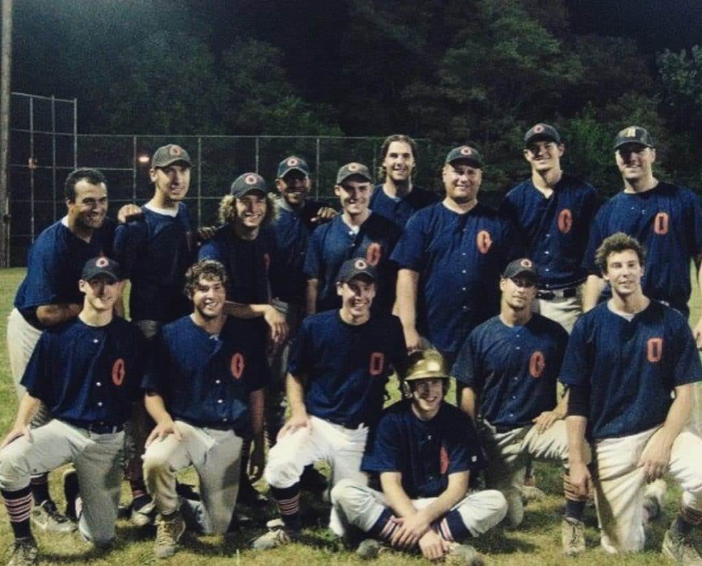
Our team was founded in 2004 (I think), and for many years we wore some version of these navy shirts, hats, and stirrups. Our local supplier changed twill vendors on us at one point, necessitating our chest letter changing from block to cursive, which hit some players and not others. Also of note is our team’s tradition of painting batting helmets gold for the playoffs.
Modern Day
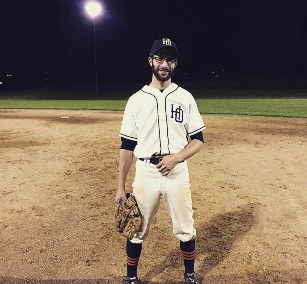
We finally changed our unis around 2015. We got lucky with Majestic phasing out their stock in anticipation of MLB switching to Under Armor (which has had a real ripple through adult baseball uniform ordering, in our experience). Our lucky break — which i still don’t totally understand — was that they differentiated between the base color “cream” vs some other version of cream. Whichever cream we ended up with was on clearance, thus these beauties (MLB stock) on discount. Also note the new stirrups.
Less lucky: While the new hats were great, New Era doesn’t let you order without their side logo.
Sleeve Logo
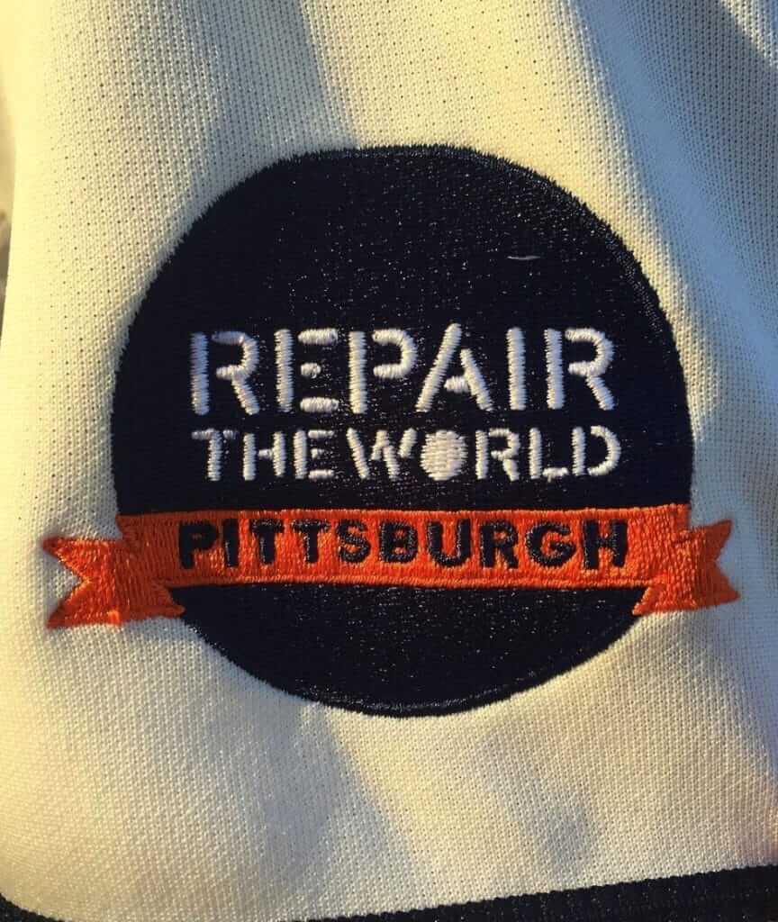
We partnered with a local nonprofit for this sleeve logo and found a vendor to stitch it directly into the jersey (it’s not a separate patch).
Mismatched Stirrups
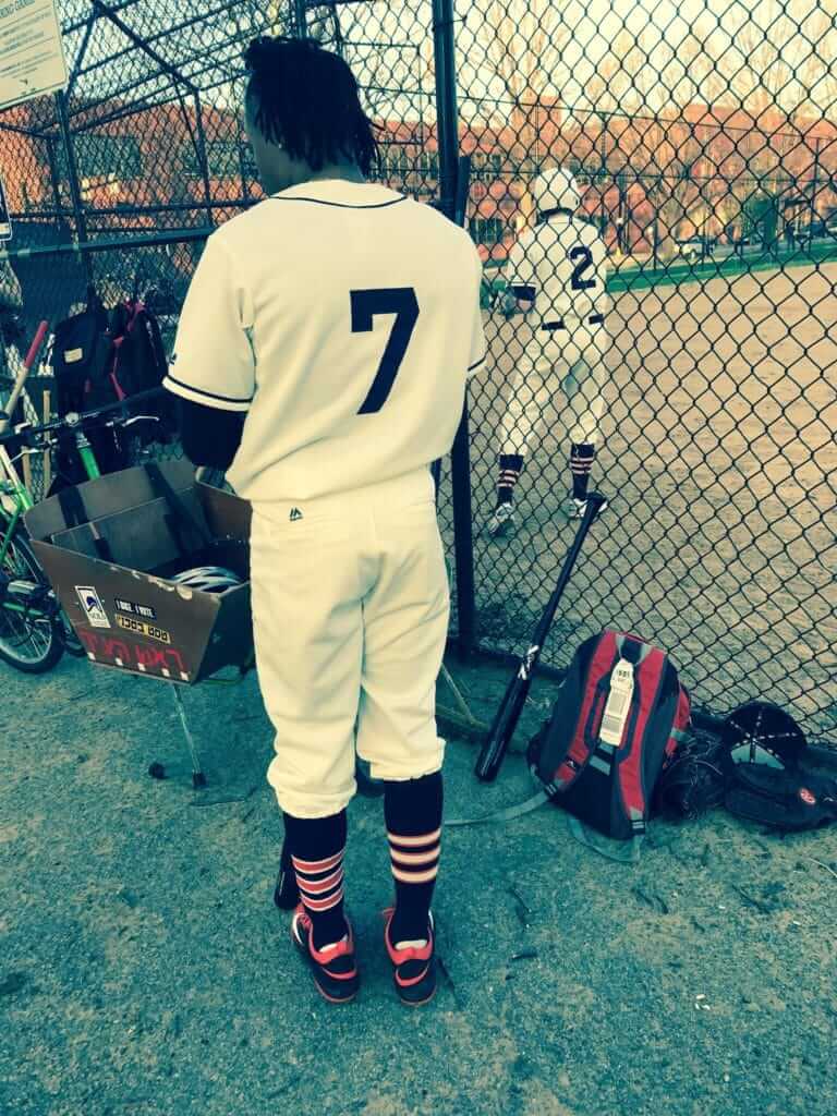
As we’ve added new stirrup designs over the years, players have occasionally chosen to mix and match, which is interesting. The guy shown above is “one of the most important baseball players of all time,” Witer Jimenez. The stirrup on his right leg is a design we added in 2017 and features cream, not white — we really had to search for that one.
2018 — Concept
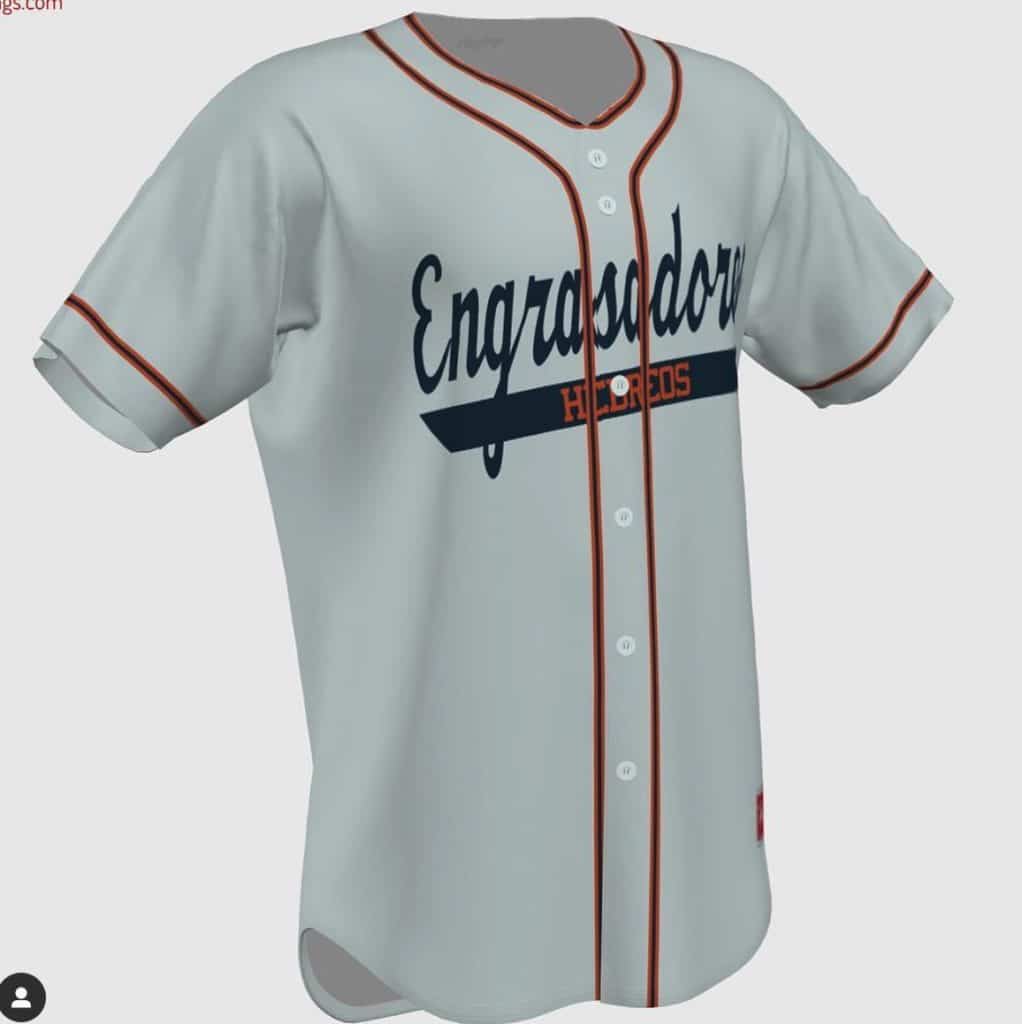
As new players cycle in each season, they need new uniforms. One of the ripples of Majestic phasing out was that our excellent 2015 uniforms were replaced with a 2017 Majestic product that looked the same, but the material was not as good — more mesh than the knit we liked. Plus the cream was getting hard to maintain. When we decided to change up in 2018, Majestic wasn’t available at all. Based on a supplier recommendation, we went with a Rawlings product and came up with this ambitious design.
2018 — Actual
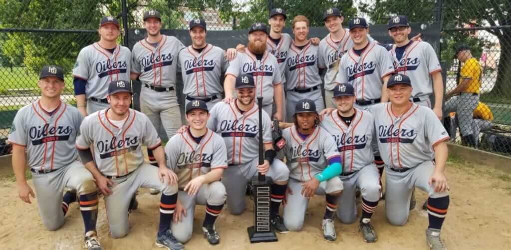
It didn’t really work out as planned (plus we went conservative on the naming). You can’t really tell from this image, but the jerseys are like a kitchen sink of jersey of design, with everything going on except a zipper. The button-front is complimented by a weird Velcro tab under the “e” in the team name. [MLB teams have also done this. — PL] The “Oilers” script is tackle twill, but the “Hebrew” is sublimated. Rather than the beautiful direct-embroidered sleeve logo, we had to cut the budget and ended up with these iron-on sleeve patches printed on some sort of weird shiny material.
We went totally overboard on piping, which might have worked on flannel (or our old jerseys) but was totally ridiculous on the very soft, silky material Rawlings used for these jerseys. The redeeming quality was that they looked okay from a distance.
On the plus side, the 2018 stirrups were a big success. Interestingly, this model was double-ply, which made a huge difference in quality and durability compared to the typical single-layer material. Still, some players still insisted on wearing older versions. Can’t please everyone.
South Oakland Ducks of the North Side
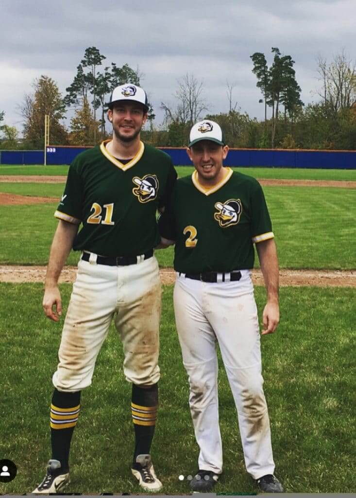
A few Hebrew Oilers suited up for our rival, the Pittsburgh South Oakland Ducks of the North Side, for a summer tournament game. The Ducks also have a good uniform history, and a good logo.
One other point: Often the most cost-effective jersey method is to buy stock jerseys and have the lettering, numbering, and so on added locally, rather than as a packaged order. The sticking point for us is the only tackle twill provider we could find in Pittsburgh is also the Pittsburgh Penguins’ vendor (I question whether they’re really the city’s only tackle twill provider, but that’s what our equipment guy says). On a few occasions our jersey order has conflicted with their timing to provide playoff jerseys for the Penguins, creating a semi-absurd situation in which our blown-out adult baseball team is somehow waiting on a professional hockey team to get an extra handful of jerseys. Such are the complexities of adult league uniforms.
———
Paul here. First and foremost, big thanks to Matthew for sharing all of this with us.
Also, he’s opened up a window on adult league uniforms, which are a subculture that doesn’t get much coverage here on Uni Watch. If any of you out there play in an adult sports league and would like to tell the story of your uniforms like Matthew has done here, I’m open to considering more entries like this one in the future.

ITEM! One-day membership raffle: When a generous reader recently raffled off a Uni Watch membership, the winner was Brent Light. Brent has now done two very cool things. First, he had an ingenious request for his card design, which he wanted to be based on the Cowboys’ early-’80s hip numbers. It’s the first time anyone has asked for that, and I love how it turned out:

Speaking of raffle winners, the two winners of the Homefield Apparel raffle are Timothy Holdener and Arin Mitchell. Congrats to them, and thanks to all who entered.
We’ll have yet another new raffle beginning on Monday.

Click to enlarge
Sock reminder: In case you missed it yesterday, I now have a big carton of Uni Watch socks from Rock ’Em Socks. In case you’ve forgotten, here’s a better view of how they look (click to enlarge):
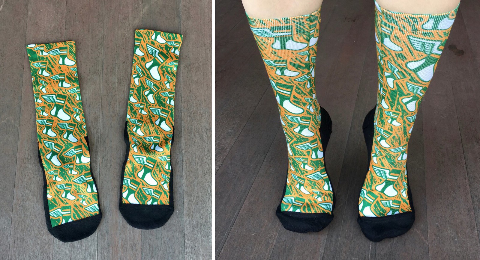
I love that they’re hosiery with a depiction of hosiery. Very meta!
If you want a pair, the price is $13.99 plus $3 shipping, so the total is $16.99.
If you want two pairs, the shipping is $4, for a total of $31.98.
If you want more than two pairs, get in touch and I’ll quote you a price.
Here’s how to order:
1. Send the appropriate payment to me. I accept Venmo (use @Paul-Lukas-2 as the payee), Zelle (use plukas64@gmail.com; if you’re not familiar with Zelle, your bank’s website probably offers it under “Payments” and/or “Transfers”), and the Cash App (plukas64@gmail.com).
Sorry, no PayPal (a long, annoying story). If you prefer to send a paper check, get in touch and I’ll tell you where to send it.
2. After sending payment, please email me with your shipping address.
Kudos to Harrison Hall and Brad Stafford at Rock ’Em Socks for making this happen, and my thanks to everyone, as always, for considering our products.

Here’s where you can order the white shirt, as well as the green one with gold letters and the green one with white letters. My thanks, as always, for considering our products.
By Lloyd Alaban

Baseball News: On Wednesday Paul mentioned that the Opening Series bat boys were not wearing jerseys of the A’s or Mariners. Here’s a shot of what they wore instead: Tokyo Dome jerseys (from Douglas Whichard). … Reds 1B Nick Longhi wore his club’s 2018 batting practice jersey during their game yesterday (from Sonny Lee Smith). … The Phillies have moved the Liberty Bell sign that once stood in Veteran’s Stadium to their current home stadium (from Blake Fox). … We’ve all heard of bobbleheads, but how about a bobblefork? The Rochester Red Wings, Triple-A affiliate of the Twins, will be giving them away (from @ddddwhite9). … The Lansing Lugnuts, Class-A affiliate of the Blue Jays, are investigating a Louisiana high school baseball team for allegedly poaching their logo (from Jason Hillyer). … Check out the uniforms in this 1915 Opening Day photo. Managers Fielder Jones (St. Louis Terriers) and Joe Tinker (Chicago Whales) receive floral arrangements during pregame festivities for the Federal League’s opener (from Alex Cheremeteff). … Here’s an article detailing all the new food items (WaPo link) at Nationals Park (from Tom Turner).

NFL/College Football News: The Eagles have signed DE Vinny Curry, who formerly played for the Buccaneers. However, the Eagles didn’t bother to Photoshop him in Eagles green, tweeting a photo wearing his Bucs uniform instead (from Jeff Taylor). … The Dallas Stars of the National Hockey League posed with an NHL-branded football for the 2020 Winter Classic media day. The game will take place at the Cotton Bowl in Dallas (from Michael Alper). … Check out these Florida Gators-themed hard hats (from Dom Ingram).

Hockey News: Cross-listed from the football section: The Stars posed with an NHL-branded football for the 2020 Winter Classic media day. The game will take place at the Cotton Bowl in Dallas (from Michael Alper).

NBA News: The Bulls gave away an infinite regression bobblehead of their mascot Wednesday (from Jay Mazzone). … PG Scott Machado will wear No. 10 with the Lakers (from Etienne Catalan). … Mavericks SF Justin Jackson wore these custom Nike Hyper Dunks last night. He signed them and will be auctioning them off with 100 percent of the proceeds going towards GiGi’s Playhouse, a Down Syndrome charity (from Taylor Vippolis).

College Hoops News: Here’s a breakdown of all 64 men’s tourney teams by uniform manufacturer (from @BrandBracket). … Buffalo’s men’s and women’s programs have both made the Big Dance, so The Buffalo News ran a feature with some of the players’ shoes as the lead photo (from @HaskesCage). … Duke PG Tre Jones wore shoes with pink ribbons on them to support his mother, who was recently diagnosed with breast cancer (from Jeff Gravley). … Unusual placement for the three stripes on this Adidas Nevada polo (from Andrew Mire).

Soccer News: New shirts for Limerick FC of the League of Ireland (from Ed Zelaski). … Also from Ed: Toulouse FC of Ligue 1 has released throwback shirts to celebrate their 82nd anniversary. … DC Comics is not happy with FC Valencia’s 100th-anniversary logo (from James Gilbert).

Grab Bag: Cross-listed from the soccer section: DC Comics is not happy with FC Valencia’s 100th anniversary logo (from James Gilbert). … Here are the singlets UNC will be wearing at the NCAA D1 Wrestling Championships (from James Gilbert). … A volleyball court from the 2016 Summer Olympics is up for sale (from Jeremy Brahm). … East Catholic High School in Manchester, Conn., is poaching the BC logo (from Bill Abley).
Great lede today! Some fun uni elements too. especially fond of the most common stirrups in the 2018 set.
Might just be me, but an explanation of the team name’s origins would be of interest
Wasn’t that a reference to Roy Hobbs’ minor league baseball team in the Natural? I was listening to the rewatchable podcast about the movie and they mentioned that.
Thanks
I found it interesting that the Oilers’ socks (at least the original ones) resemble the Chicago Bears, while their rivals sport socks with the classic Green Bay Packers striping pattern.
Re: Vinny Curry – an especially weird decision since he played for the Eagles for years and they could have used any number of images with him in midnight green.
I don’t find that weird, or even a ticker-worthy entry.
That’s just me I guess.
Exactly
I follow the Carolina Panthers Instagram feed, and for several years now they’ve made it a habit to post a welcome message to new players they’ve signed during free agency.
They always include a shot of the player in his former team’s uniform.
link
This seems like a much better way of doing things than photoshopping the player in a Panthers uni. More intellectually honest and informs fans who might not be familiar with the player who he last played for.
I believe “Hebrew Oilers” was the name of the semi-pro team that Roy Hobbs (Robert Redford) tells Pop Fisher (Wilford Brimley) he previously played for, in the film The Natural.
In Bernard Malamud’s source novel, IIRC, it’s the “Oomoo Oilers.”
You’re right! I just listened to The Rewatchables podcast about this movie, and they joke about how a team name like that requires more explanation.
In the film, Hobbs played for the “Heber Oilers”.
Heber is a little town in Utah’s Cache Valley. It sits just northeast of Sundance, Robert Redford’s private compound/ski resort/artists’ community in the Uinta Mountains.
Redford is a big Utah booster. The name change from Oomoo was an homage to his adopted home state.
“Hebrew Oilers” is either a clever alteration (paying tribute to “The Natural” and sectarian-sponsored barnstorming clubs, like House of David), or they just weren’t listening carefully.
Based on context clues from the lead, I’m guessing clever alliteration. Though “Hebrew Oilers” is a perfectly reasonable team name in the context of late-1930s unaffiliated baseball.
Maybe “Hebrew Oilers” was how Pop (Brimley) mispronounced it in response. Or just what that sounded like.
This is, of course, the very least of the discrepancies between the novel and the film….
So I played on this team briefly and know Matt and can clarify
It is a reference to The Natural, the line I always heard was Hebrew Oilers, others hear Heber.
Some of the comments here seem to indicate that the intent of the filmmakers was “Heber”. I’ve always read it referred to as Hebrew.
Young Mr. Lukas of Uni-Watch fame is now a good deal older than Wilford Brimley was during filming of The Natural.
Great lede today Paul! This is the kind of story that keeps me coming back every day. I have to say, my softball team jerseys are not nearly as nice, but I get the same feeling putting it on that I did when I played Little League.
There’s an amateur club in Austin, called the Texas Playboys. They blend baseball and music. Many of the players are musicians and artists. (The name honors Bob Wills, the iconic master of Texas Swing.)
Their uniforms are magnificent:
link
Bob Wills is still the King!
Thought today’s lede waa great as well. Cool idea.
DC has huffed and puffed several times in the past about Valencia’s various bat logos (link) but they never really have a case because Valencia’s bat is much older.
I looooove the Hebrew Oilers! When a whole team “gets it,” it’s magic! Those are some killer uniforms. I play in a Saturday mens league in ATL, and almost the whole league is named the Braves. Red Braves, Navy Braves, Gwinnett Braves, etc. I tried to liven things up a few years ago, and wanted to change our team name, give it some flair. “But we’d have to buy new jerseys,” they said. Yep. “Well, we don’t want to do that,” they said. So we’re still the Braves. And I’m one of only three guys in the league that wears stirrups. So sad…
Very pedantic pedantry here, but in the NBA News section, it’s actually just Down Syndrome, not Down’s Syndrome.
Also, loved the story about the men’s league uniforms. Those are some sharp-lookin’ fellas.
Fixed. Thanks! I had no idea. Always thought it was Down’s because it was named after John Down, but I guess it makes sense since Down only discovered it and didn’t actually have it.
The British generally use the Down’s syndrome nomenclature, while it’s Down syndrome in the US.
The federal league pic is cooler since its a very early pic of Weegum Park before the cubs moved in.
I emailed you my info!
Got it. Thanks!
Wow. My card looks pretty awesome and unique. I love it Paul!
Should mail out tomorrow or Monday, Brent!
Cool story today, not sure how many cyclists are on uni-watch, but there’s definitely a whole uni element to the sport as far as kit we wear for our respective clubs. My club actually has several designs available, one for the road discipline, another for the cyclocross team, and yet another for the mountain bike race team. There’s some good (and some really bad) designs out there!