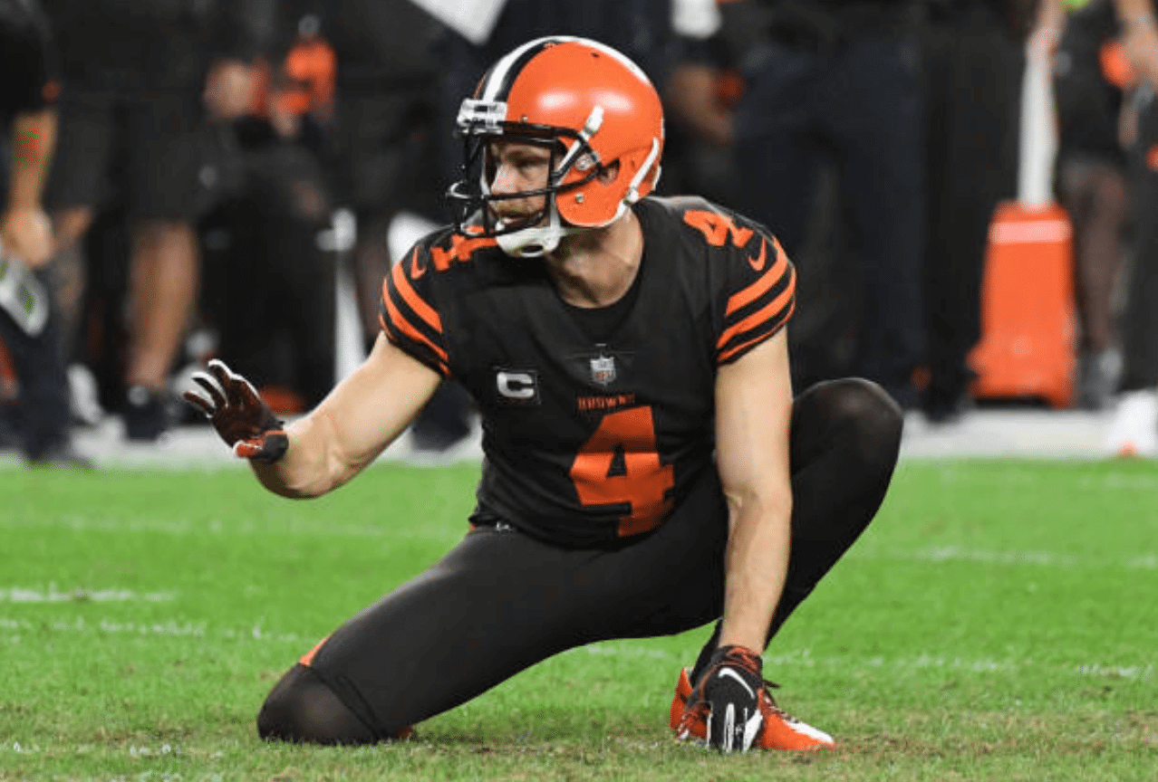
It all started two days ago, when our own Alex Hider noticed Browns punter Britton Colquitt (shown above, in a game from earlier this year) wearing gloves while holding for a placekick in Sunday’s game against the Raiders. “Looks odd to me,” he said on Twitter. “Is it common for holders to wear gloves?”
Good question! Seeing a gloved holder did look odd once Alex pointed it out, so I decided to find out just how common — or uncommon — it actually is.
First, I wanted to know more about Colquitt — were his gloves just a one-game aberration? I did some quick photo research and found that he usually (but not always) goes gloved while holding but always goes barehanded while punting.
Then I started researching other 31 teams’ holders (almost all of whom, like Colquitt, are punters). I decided to limit myself to this season, just to keep things manageable. Here’s what I found:
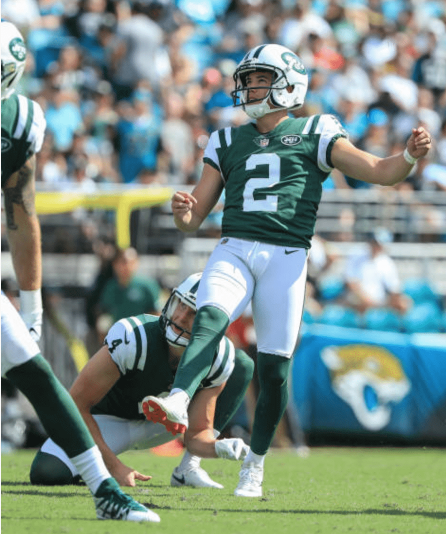
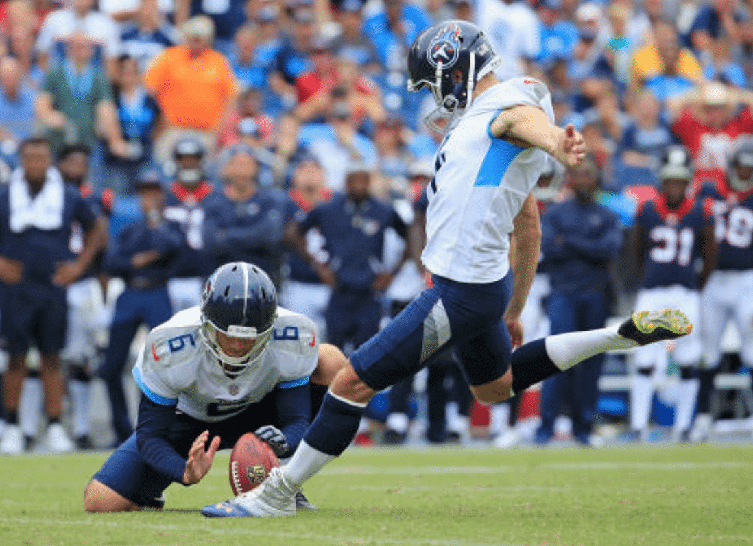
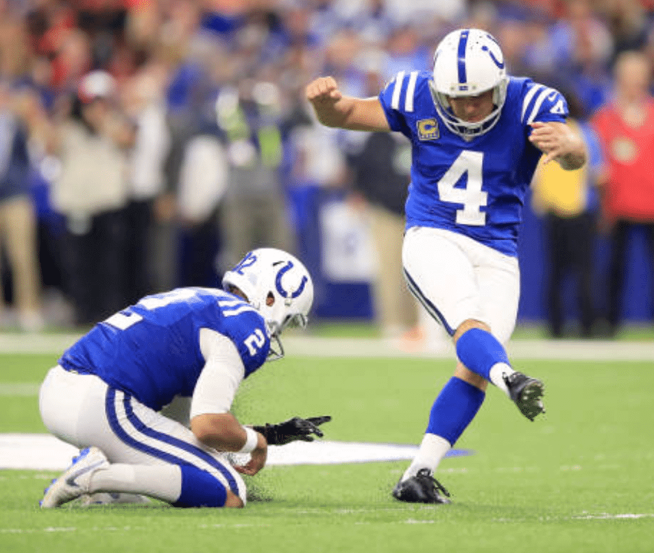
1. There are at least five current NFL holders who wear a glove on their left hand — that’s the hand whose index finger holds the ball in place as a right-footed kicker kicks it. Those five holders are the Jets’ Lachlan Edwards, Tennessee’s Brett Kern, Indianapolis’s Rigoberto Sanchez, Detroit’s Sam Martin, and New Orleans’s Thomas Morstead:
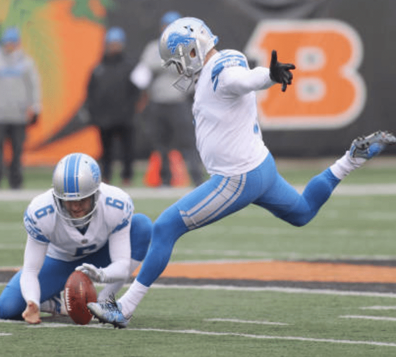
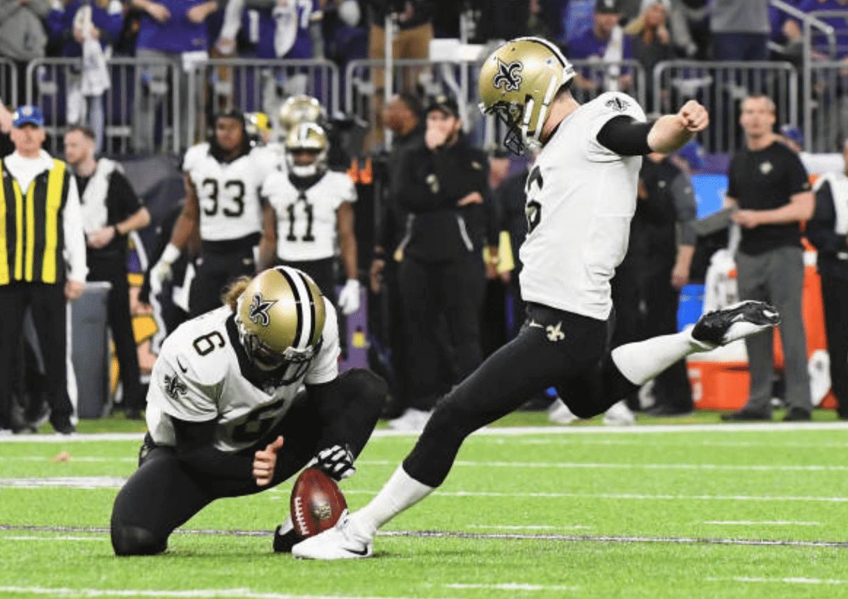
2. I also found two holders who wear a glove on their right hand — the hand that reaches out to receive the ball as it arrives from the center. Those two holders are Denver’s Marquette King and Buffalo’s Corey Bojorquez:
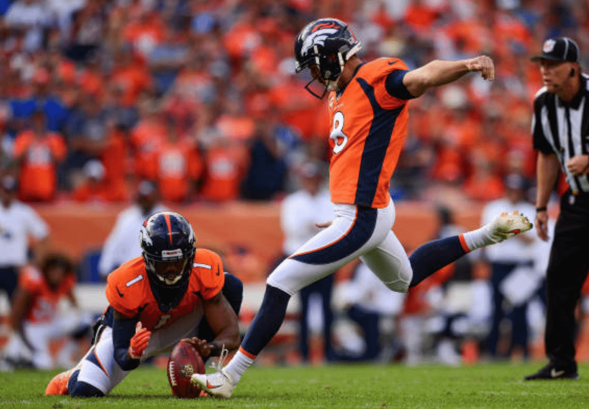
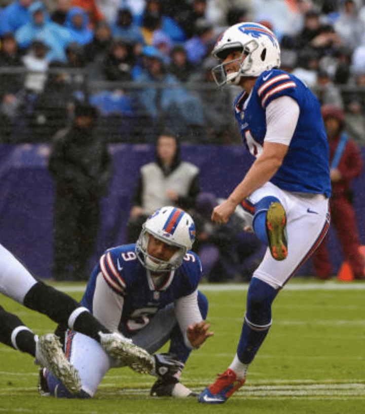
3. Aside from Britton Colquitt, who got us started on this topic, I found only one other holder who wears two gloves. Can you guess who it is? Here’s a photo of the player in question:
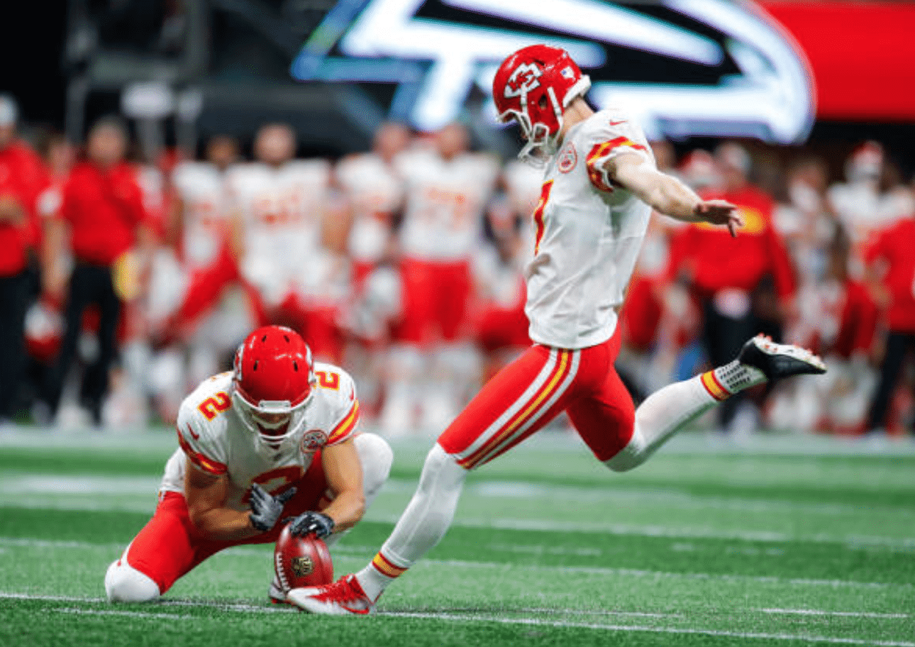
In case you don’t know who wears No. 2 for the Chiefs, that’s Dustin Colquitt — Britton’s brother. So based on my research, it appears that there are only two players in the NFL who wear two gloves while holding for placekicks, and they happen to be siblings. Crazy!
That got me thinking: Who copied whom? Which Colquitt was the first to wear gloves while holding?
I began with Dustin, who entered the league in 2005 and has spent his entire career with the Chiefs. He began his rookie season holding barehanded, but within a few weeks he had started wearing one glove. By Dec. 4 of that year, he’d begun wearing two gloves, and as far as I can tell he’s continued doing so since then.
Britton is three years younger than Dustin and didn’t enter the NFL until 2009. I couldn’t find any 2009 photos of him holding for placekicks, but he was definitely wearing two gloves in 2010.
But wait — there’s more! Dustin and Britton are the sons of former NFL punter Craig Colquitt, who played for the Steelers from 1978-84 and also had a cup of coffee with the Colts in ’87. Is there any chance that Dustin and Britton picked up the gloved holding style from Craig? Did Craig Colquitt even hold for kicks? (Back when Craig played, it was more common for the backup quarterback, rather than the punter, to serve as the holder.)
As it turns out, Craig Colquitt did hold for kicks back in the day. But he seems to have gone barehanded, as seen in this 1983 shot:
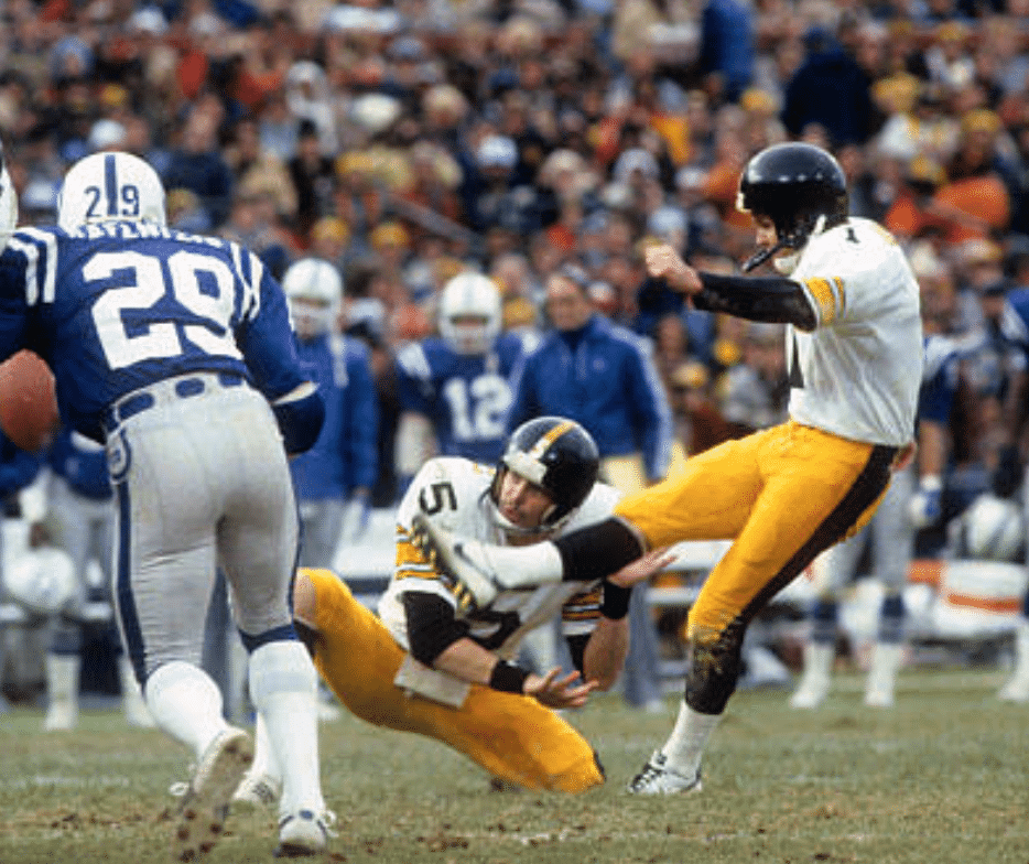
This isn’t so surprising. Back in 1983, gloves were pretty rare on NFL gridirons. Even skill-position players were playing barehanded in those days.
Anyway, getting back to our original question: Yes, it is uncommon for NFL holders to wear gloves, and extremely uncommon for holders to wear two gloves — especially if they’re not part of the Colquitt clan.
(Big thanks to Alex Hider, whose sharp-eyed observation ended up costing me two hours of my Sunday evening sent me down this very interesting rabbit hole.)
Click to enlarge
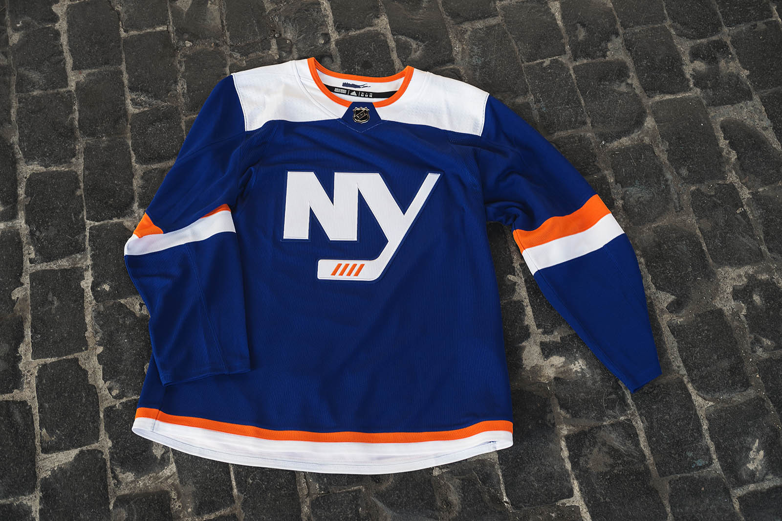
You know the drill by now: Another day, another NHL alternate, this time the long-rumored Islanders alt. Anyone else think the constant leveraging of the four championship stripes comes off as “We won four Stanley Cups once upon a time, and you know as well as we do that we’re never going to win another one”? It’s almost like a jinx now — they’re so committed to the four stripes that they better not win another Cup, because it’d mess up all of their, uh, branding.
NHL pants, socks, and helmets aren’t available for retail sale, so of course they felt no need to provide any photos of the full uni. Remember, it’s not an alternate uniform — it’s just a third jersey, and the rest of the uniform is irrelevant, wheee!
Season begins tomorrow.
Click to enlarge
Collector’s Corner
By Brinke Guthrie
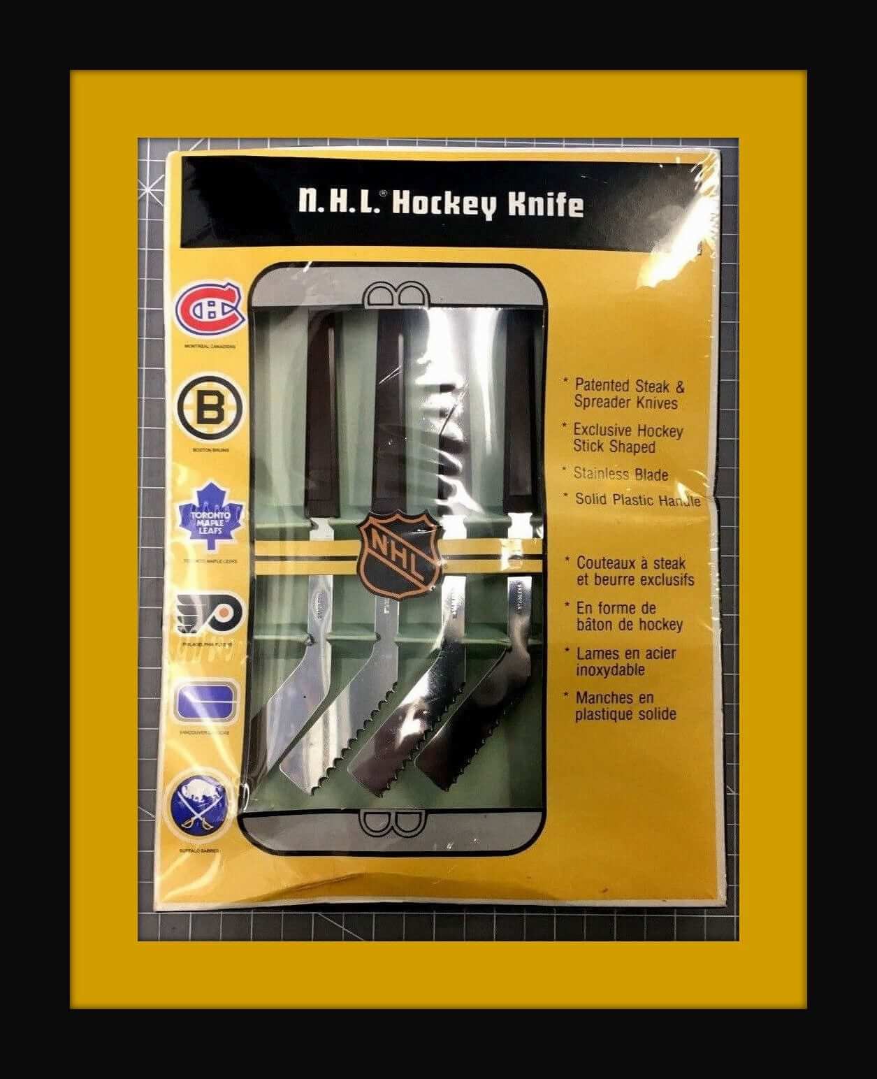
This is the ninth year for Collector’s Corner (my, how time flies) and I have never seen this before: a 1970s NHL dinnerware knife set, made by Maple Leaf Cutlery. Since Paul is a grilling kinda guy, he’d no doubt appreciate a hockey stick-shaped steak knife! [Indeed. — PL]
Now for the rest of this week’s picks:
• Dolphins fans will love this vintage 1970s helmet buggy, from Orange Products of Chatham, N.J. And here’s a seller that has the Packers, Chargers, Bears, Raiders, and Vikes, too. (Still hunting for a Niners model, but no luck so far.)
• Cowboys fans! Here’s a fun-looking radio from way back. This AM transistor radio has the Cowboys’ original “Cowboy Joe” logo. The seller helpfully adds this note: “I put in a fresh 9 volt battery and can clearly hear static but no radio signal.” Well, as long as you can pull in some static, you’re set.
• Another one for Cowboys fans: They started using this “modern” helmet logo back then at some point, and it made it onto this copper Acrometal plaque.
• This 1960s kids-size button-front shirt includes a patch on the pocket that says “Mantle – Maris” (of the Yankees, natch.)
• Check out this vintage Seattle SuperSonics Starter team jacket. Wouldn’t it be great if Seattle gets a new team and names them the Sonics (again)? While you’re wearing the jacket, tote along this Sonics 1978-1979 World Champs gear bag.
• They didn’t get the (football) Giants uniforms and helmet striping quite right with this 1970s pennant.
• This 1975 NFL glass includes the Giants’ “double NY” logo.
• Guy Lafleur of the Montreal Canadiens is featured on this 1970s York Peanut Butter glass. (And his jersey says, “York.”)
• Have you ever seen this 1968 NFL teams poster from The Master (Dave Boss)? Simply a classic.
This 1960s Oakland A’s bobblehead is in great shape.
Seen an item on eBay that would be good for Collector’s Corner? Send any submissions here.
Click to enlarge
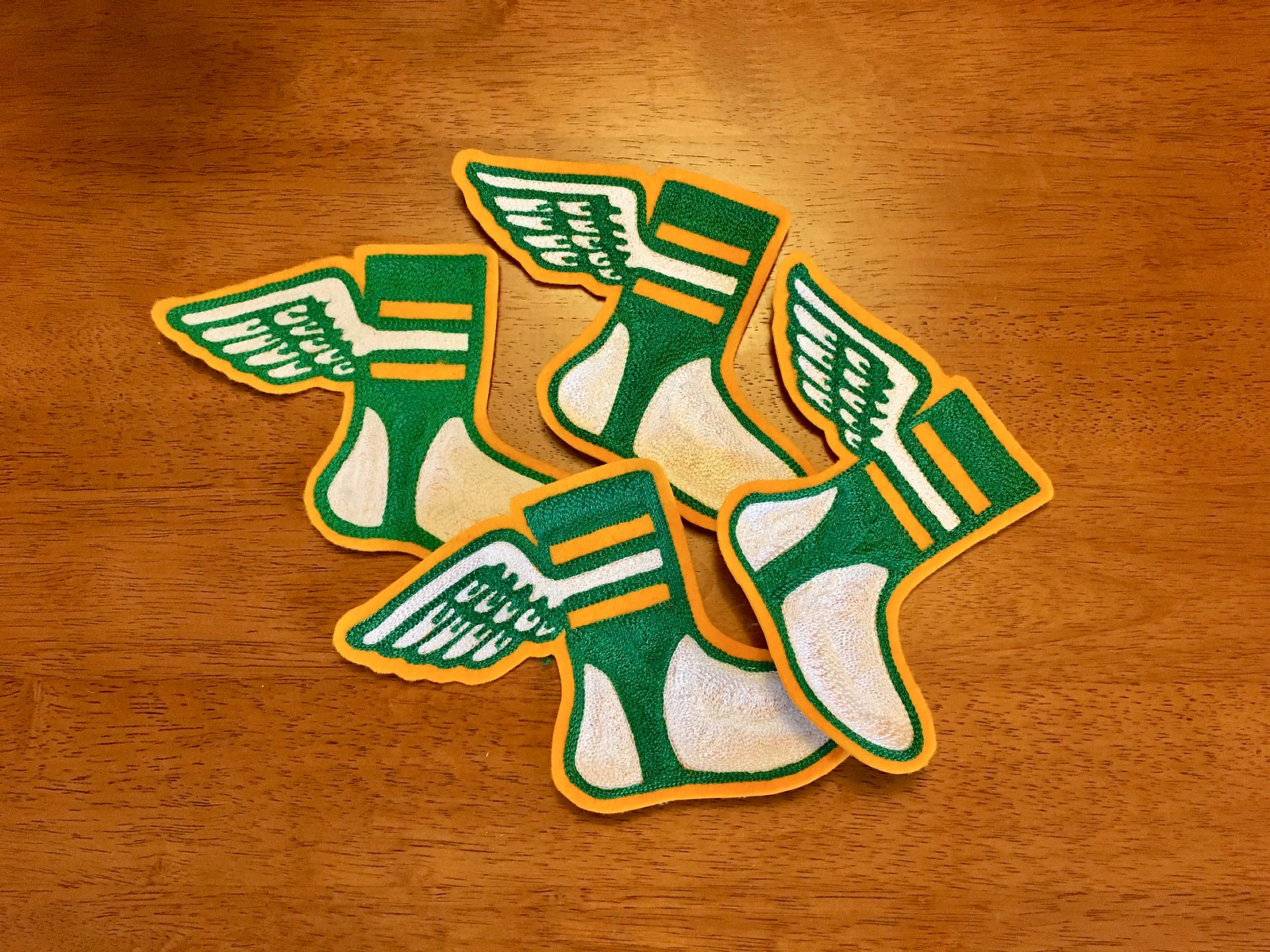
Chain gang: When I interviewed Ebbets Fiels Flannels chain-stitcher Amy Bengtson last month, several readers asked if they could get a chain-stitched Uni Watch logo patch like the one that Amy made for me.
Amy happily obliged and made a few more patches, as shown above, and I mailed them out yesterday to the readers who ordered them. Due to the hand-stitched nature of Amy’s work, no two are quite the same, and I love that.
If you’re curious about possibly getting a patch for yourself, here’s a photo showing the patch’s dimensions. They’re not cheap — $35 a pop, which includes shipping — but I’d say Amy’s work is worth it. If you’re interested, drop me a line and I’ll make the arrangements.
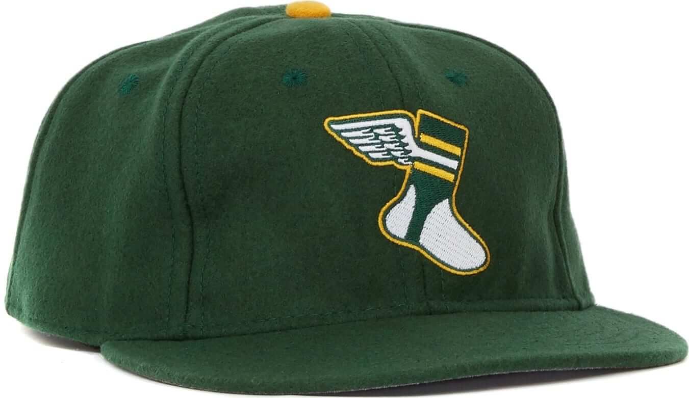
Just give me all your money already: In case you missed it last week — or was it the week before? — all fitted sizes of the Uni Watch classic cap (shown at right) are back in stock. So if you have a tiny head, a gigantic head, or anything in between, we’ve got you covered. And with chillier fall weather now upon us, this wool cap is just the thing. Get yours here.
While we’re at it:
• Our flex-fit alternate cap is also available. People keep telling me, “I’ve been meaning to get that one, but then I don’t get around to it and I forget.” So consider this a reminder!
• Sales of our stickers and magnets have flatlined. Should we stop offering them? If you haven’t checked them out, take a look — they’re pretty cool!
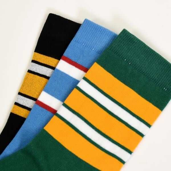
• Everyone loves our latest round of StripeRite socks (shown at left). Well, okay, maybe not everyone, but I’ve definitely gotten lots of very positive feedback. Order yours here.
• I have three slots open on the current sheet of membership cards, which I’ll be sending to the printer in two days. So if you order your own custom-designed card right now you’ll get it quickly, with almost no wait time.
• Uni Watch T-shirts and coffee mugs, blah-blah-blah, Naming Wrongs shirts, blah-blah, etc.
Okay, that’s enough of that. My thanks, as always, for your consideration.
The Ticker
By Alex Hider

Baseball News: MLB made a logo for yesterday’s tiebreaker games, because of course they did (from Phil). … Speaking of postseason logos, the Brewers added white to the “webbing” of their ball-and-glove logo for their NL Central Champs logo. Their current ball-and-glove caps don’t have that white element (from Ryan Mackman). … Here’s a list of all the players in the postseason who will be wearing the C-Flap. … In a related item, Mets 3B David Wright went C-Flapped during his minor league rehab assignment in late August but did not wear the flap for his final career plate appearances last weekend. … Twins 1B/DH Joe Mauer likely played his final game for Minnesota on Sunday. Despite not having caught since 2013, he lined up behind the plate for one pitch in the ninth and still had his own gear — note the personal logo on the chest protector (from Mike Chamernik and Patrick Lenertz). … The fall issue of Memories and Dreams — the magazine published by the Baseball Hall of Fame — is uni-themed (from Joel Horn).

NFL News: Broncos DE Derek Wolfe was wearing an extra large, extra bright orange undershirt last night (from Russell Goutierez). … The NFL has released this month’s “Crucial Catch” caps to support cancer awareness. For some reason, the logos on the Raiders and Chiefs caps aren’t outlined by bands of color like all the other teams’ caps (thanks to all who shared). … The Packers gave Washington quite a welcome during a Monday Night Football game in 1983: One of the Lambeau end zones was blank outside of a plain maroon helmet, and a band even played Washington’s fight song after a touchdown (from Scott Mason). … Staying in Green Bay, some Packers fans are upset that a large red, white, and blue banner — rather than an American flag — was unfurled on the field before Sunday’s game. The outrage prompted an apology from the Packers and a promise not to use the banner again (from Brian Kerhin). … This “House Blend Coffee” logo looks suspiciously like the Cowboys’ star (from Gregg). … Has anyone seen this Rams logo before? Zack Foust saw it on his coworker’s sweatshirt. … This has already been ticked, but for those unaware, the Browns are wearing their Color Rash jerseys again this Sunday (from Phil).
College and High School Football News: Pitt’s football team — along with every other Pitt athletic team — will wear retro uniforms this weekend (from Noah Kastroll). … Rutgers is going BFBS this weekend with New Jersey helmets (from Phil). … I love that Nike works with West Point’s Department of History to come up with the elements that are used in Army’s one-off uniforms for the Navy game (from Nick Allen). … Adrian College (NCAA D-III) will have sweet retro programs at their homecoming game this weekend. Only issue — why not sell it for 5¢? (From Evan Gehlert.) … Lexington Christian Academy (Kentucky) has new checkerboard end zones (from Josh Hinton). … Tris Wykes, who often photographs Ivy League games for Dartmouth, says this is the first time he’s ever seen logo creep extend to press passes.

Hockey News: We finally have a look at the Capitals’ championship rings (from Phil). … Penguins players wore green laces in their skates yesterday in support of Dick’s “Sports Matter” charity (from Mark Coale). … New mask for Nebraska-Omaha goalie Matej Tomek (from @OlegKvasha).

NBA News: Cavs G JR Smith has a logo for “Supreme” — a lifestyle wear company — tattooed on his leg. Now, the NBA is saying they will fine him if he doesn’t cover the tattoo during games (from @HandstandChamp0 and Andrew Cosentino). … GE’s CEO was unceremoniously sacked yesterday after a disastrous 14-month term — which coincides almost exactly with when the Celtics began wearing the GE advertising patch. Coincidence? … If you thought Adidas’s sleeved NBA jerseys looked weird, check out the Brazilian team Guanabara, which wore long-sleeved (!) polo shirts as jerseys back in the day (from @HitTheGlass). … This listicle ranks the 10 best “City” edition jerseys (from Phil).

Soccer News: England’s away kits for the 2019 Women’s World Cup have reportedly leaked (from Josh Hinton). … Manchester City Defender Vincent Kompany is signing an endorsement deal with Puma (also from Josh Hinton). … Brazilian club Corinthians are paying homage to racing Brazilian legend Ayrton Senna — a lifelong Corinthians fan — with their third kit for the 30th anniversary of Senna’s first world title. The colors are modeled after Senna’s John Player Special car, and the 41 stripes represent his 41 Formula One wins. Senna died in a crash in 1994 (from @Fritesenmayo). … Orange County SC, a USL soccer club, is launching an eSports team that will play the FIFA video competitively, and unveiled jerseys the gamers will wear during competition.

Grab Bag: Cross-listed from the college football section: Cool move by Pitt, which is dressing all of its teams in retro colors this weekend for homecoming (from Noah Kastroll). … Two NASCAR drivers — Chris Buescher and J.J. Yeley — ended up with ads stuck to their cars after running into signs at the Charlotte Roval race on Sunday (from Chris H.). … Did anyone else know that Oscar the Grouch from Sesame Street was originally orange? (From David Firestone.)
For a team that’s had such an extensive history of terrible uniforms, I feel like the Isles finally got one right. It’s new and interesting without being ridiculous. I do agree that they’re really starting to overplay the four-stripes thing, but at this point I’ll count anything from the Islanders that doesn’t look like a clown suit as a win.
Regarding the rest of the uniform… I understand the cynicism about retail, but I don’t think that’s the whole story. From an aesthetic perspective, there’s no question that the jersey is the focal point of the uniform (at least in hockey – maybe not so much in other sports), so it makes some sense to give it a place of prominence in the unveiling process. Plus, in the Isles’ case, I see no reason why the team would be wearing different pants/socks with this jersey. It’s a blue jersey with orange and white highlights just like their primary home, so I’d guess the rest of the uniform is going to be the same as what they wear with the primary jersey.
the jersey is the focal point of the uniform (at least in hockey – maybe not so much in other sports), so it makes some sense to give it a place of prominence in the unveiling process.
It is not being given “a place of prominence.” It is literally the only uniform element being shown. That’s not prominence; that’s exclusivity. And while it’s great that “you’d guess” what the rest of the uniform will look like, it’s absurd that you have to guess. They should show the whole uniform.
But we all know why they don’t bother with that — because the only reason this uniform even exists is so they can sell the jersey. The end.
I know I certainly do want to see a full uniform reveal… when there are things to be revealed, to be sure. With the Isles, I wouldn’t expect them to change their helmets, gloves, or pants, but they *should* have new socks at the very least, to match the stripes on the sleeves. Or they could take the lazy way out and just wear their regular blue socks.
I would’ve also like to have seen by now how the Ducks will match their gloves and socks to their third jerseys, and how the Jets will match the rest of their equipment. Given that the Jets’ unis are an homage of sorts to the 1990s Jets, they could have a set of navy pants with Aviator Blue rings at the bottom to mimic the red pants with royal blue rings, and Aviator Blue helmets to match the jersey. Or they could just wear their plain navy helmets and pants. These are questions I’d like to have had answered by now.
Props to the Hurricanes and Sharks for actually having full uni reveals for their thirds. And New Jersey at least showed us gloves with their jersey (but not a full uni, though being a throwback, and having worn the red throwback at least once a year for eight years, the only “new” element is the throwback socks). As for the other eight teams, we last saw these jerseys on the ice in 2017, so the only real changes are with the jersey template switching from Edge to Adizero.
Still, it would be nice if every team showed off the full uni with these reveals. And for the all-new designs, it should absolutely be mandatory.
Or to put it another way: What possible reason would there be for *not* showing the full uniform? Like, why not just go ahead and do it?
Jeez.
Exactly!
Jets have worn the full uniform on ice. Just can’t find link right now. Regular navy pants and gloves.
See, that’s disappointing. I’d have put that little extra effort in, at least with the pants. Guessing the helmets were just the stock navy ones too?
Yep – forgot to mention – navy helmets for Jets too.
Another thoughtless no effort third jersey by the Isles.
I’m just glad it’s not black again.
Of course, if this jersey were black instead of blue, and you took off the orange stripes, they’d look like Pilgrims.
I guess I haven’t seen any Titans games this year or haven’t been paying much attention, but what is with the light blue armpit stain on their new jersey? Awful. And that picture also confirmed what I suspected when they were first unveiled. Bight red nike logo on an otherwise blue and white jersey is the element that stands out the most. Confirming that nike designs merchandise, not uniforms.
I just saw that, too. It seems to me that, on the field, anyway, the newer Nike uniforms (titans, lions, browns, bucs, etc) seem to be major downgrades…
Great digging onholders wearing gloves. I thought the most notable uni-related aspect from the photos was how short the Detroit kickers pants are
I thought how all those teams with dark colored pants would look a lot better with nice, clean, crisp, white pants.
Not the Chiefs. The red/white/red uni is the best in the league. Some teams look good in dark pants, some don’t.
Was nice seeing lots of photos of the only thing I miss about not watching football: the kicking game. I didn’t realize gloves were a thing now for holders, but I guess they’ve improved tremendously from the days when Jim McMahon was considered a maverick for throwing indoors with a glove.
Also, the Lions KICKER is wearing gloves!!
But I think that photo is from December of last year, so maybe it was a bit chilly.
I really, really, REALLY wanted the Browns Stripe Rite socks and was excited when they were among the original leaders in the sock voting you had. Then, for some reason, the vote was opened back up and they were left out. If you get the Browns socks for the next round, count me as a buyer.
Yes, they will definitely be included in the next round.
You forgot to use the phrase “of the kicking Colquitts” in your story.
;^)
Paul I agree with you 100% that they only show the jersey because it is what the sell but i don’t think that is the whole story. I also feel like the jersey is the only part of the uniform that is made my Adidas. The other elements are made by Bauer, CCM, Warrior, etc.
I also never understood why hockey shorts are allowed to be made by another company from the jersey, and they are allowed to show their logo. I understand equipment because different players have different preferences in gloves, sticks, etc., but why are the shorts allowed to be different per player.
I also never understood why any company is allowed to show its logo on any part of the uniform.
The hockey pants are protective equipment like gloves, shin pads, shoulder pads, etc. Just always been like that. Sometimes you can purchase just the shell. Have always been made by equipment manufacturers, so the pants may differ from the uniform manufacturer (jerseys and socks). If a player has an equipment deal, possible it will be the same brand helmets, pants and gloves that he is wearing.
Are we assuming that Rams logo is the NFL Rams?
Maybe a school??
Reminds me of the 1970’s crunchy granola period of graphic design where people were smoking way too much weed and not putting enough effort in design. Someone should do a Googly search on this era of horrible-scope artwork.
That 70’s polyester period of fashion also was not a good look for general day wear either. For sporting wear we donned “Sandknit” made Unis. Sandknit or better unis through chemistry – Everyone wore cuz, we didn’t know any better, and we had a no choice.
Speaking of Weed:
A baseball coach back then told me that smoking weed would slow down one’s ability to see a baseball coming out of a pitchers hand, which totally terrified me. I had enough trouble trying to see the spin of a baseball stone cold sober, so I could not imagine what it would be like playing a game “Herbed up”.
Then again I could not imagine what it would be like to bat against Doc Ellis on acid.
It’s a little weird to me that instead of a wide tape job that shows four stripes, the crest on the Islanders alt is four frankly incomplete and unrealistic strips of tape on the blade. Reminds me of the original San Jose Sharks logo.
It wouldn’t surprise me if that was done to represent their four Stanley Cups.
A “transistor radio” is is such a retro-riffic thing.
You yungins will never know such joy as listening to a ballgame on one.
…or to top-40 pop music while they should be sleeping.
The article about the Caps’ Stanley Cup rings contains a common misconception about the three stars on the DC flag, namely that they represent Maryland, the District and Virginia. Rather, they are taken from George Washington’s family coat of arms (as are the two stripes on the flag). Still cool that they incorporated the stars from the flag on the rings, though.
That’s interesting and I assumed they were flag based, but on the Sports Junkies, a DC radio show this morning a team exec said the stars represent their 2 conference championships and 1 Stanley Cup win. I wonder which one is true?
Counterpoint on the Isles’ four stripe thing:
It’s a subtle nod to, what one could argue is, the greatest sports dynasty in modern times, if not all time. Four straight Cups, 19 consecutive playoff series wins. I don’t think that streak will ever be broken. So even if/when they win a 5th, they don’t necessary have to change it (though I’m sure they would to sell more merch), because it symbolizes a time in Islanders history where they were the gold standard of not just hockey, but sports. As a fan, I appreciate it.
“if not all time”
I think the folks down by where the Ottawa River meets the St. Lawrence would argue that point a bit.
Weird Question, but with the NBA preseason about to start, does anyone remember the name of the official NBA website that had all the uniform matchups that would be worn for games?
Not weird at all!
link
Dear Mr. Bojangles!
This has probably been addressed before, but what was the inspiration behind the “wing” on the uni-watch sock?
The NY Athletic Club logo:
link
Wow, you guys really hate manufacturer logos on hats and jerseys… but are league logos okay? I remember when MLB caps started getting the Harmon Killebrew logo on the back and I then had a [formerly] authentic cap that didn’t have that. When that happened I actually liked it and wanted a new cap with the logo… The NFL jerseys now have the shield on the collar when they once didn’t and the NBA has had the Jerry West logo on their jerseys for the longest time. If you’ve addressed this before, sorry I missed it. But I was curious because it feels like there is a lot of disdain on this site for such things as a small swoosh or a dime size New Era logo on a cap.
Personally, I would prefer that league logos not appear on uniforms, because they tend to add clutter and increase the sense of systemic identity rather than team identity, but I don’t *hate* league logos on uniforms. The uniform represents the team first and foremost, but the uniform also represents the league.
A maker’s mark, on the other hand, simply *competes* with the team and league logos, and is part of the encroachment of corporate culture into every nook and cranny of our lives. It has no place on a uniform and should never be there. Ever.
Thanks for your response. I guess it just doesn’t bother me that much. If they were glaringly large, It might bother me, but they’re generally not, so it doesn’t. I do not like sponsorship logos on jerseys (like the NBA is doing) and never understood why it’s accepted as the norm in Soccer. The “league” logos I think add a feel of professionalism/status to the uniforms.
“Glaringly large” is in the eye of the beholder. To me, they *are* glaringly large.
And remember, the NBA has advertising patches, not “sponsorship logos.” ;)
About this:
The “league” logos I think add a feel of professionalism/status to the uniforms.
At the risk of putting words in your mouth, I think what you’re saying is that the league logos make the uniforms look more official to you. I understand that connection. Indeed, I think that’s a big part of why the logos are there — to establish and reinforce that connection in the fan’s mind. Having grown up in an era when the league logos were not used in most sports, I find them unnecessary. But as I already said, I don’t *hate* them.
What do you mean by the asterisks?
I mean emphasis.
Not sure when the NBA started adding their logo onto the unis, but the NHL added their shield in 1990, and the NFL added theirs in 1991.
Was adding the NFL shield / NBA logo to the uniforms a way of unifying the brands at the time since teams had their uniforms made by different companies (i.e. Some teams were Puma / Nike / etc. and the League logo was the official mark?)
NBA started in 1986.
To me, it’s about where they fit aesthetically on the jersey. I grew up with most sports boasting league logos, but I like some more than others.
I loved the NBA logo on the front of the jerseys and think it filled up some empty space. The rectangular logo also worked well with the vertical orientation of shoulder straps. I can’t stand it on the back of the jersey because the opposite is true.
I like the MLB logo on the back of the hats, but have never liked it on the back of the jerseys and certainly don’t like it on the back of the pants.
The NFL logo is definitely my favorite. It looks really sharp at the lowest point of the collar and sort of anchors everything together. I didn’t like the Reebok era equipment logos, but the normal NFL logo has always looked great to me. I actually find older, pre-logo jerseys unappealing visually because the logo isn’t there. I wonder if people will eventually feel that way about the New Era cap logos, which I loathe more than almost anything.
I would imagine the number of holders wearing gloves will go up as the weather gets colder, but if they’re punters and end up keeping them on for punting, I’m not sure if that satisfies your criteria for this search you went on.
Probably the best third jersey the Islanders have ever come up with. I’ll call it a win, if only because it’s not an embarrassment like they usually trot out.
Regarding the Cowboys logo on that box, I mean, if you want plausible deniability, their logo is a star. No one owns the shape of a star. Putting an inner stroke of white in it does give it some more visual flair, but a star is still a star. There’s nothing particularly unique or distinct about it. This could be my anti-Cowboys bias showing, of course.
Yet more navy-and-yellow logos from the Brewers. I hope this signals a wider move toward that color scheme. The Crew keep teasing a switch away from metallic-gold to yellow-gold on just about everything the team does, other than their regular home and road jerseys.
But boy howdy the white webbing thing sure does illustrate why the ball-in-glove logo is an overrated relic that needs to be dustbinned. You can make a coherent case for why the webbing should match the M and B, or why it should match the outline, or why it should match the background behind the logo. But there is no rational case to be made for the webbing matching the baseball. The Brewers have been inconsistent about the webbing color from day one, and white was and is the worst possible choice for that particular element of the logo.
Is there any chance American Trench can produce a few more of the Packers-style strip rite socks? I would love to get a second pair myself.
Not sure what you mean by “a few more” — the green ones aren’t sold out. Just click on “green.”
Another oddity in the holder pictures – Colquitt the elder had a holding “stance” (for lack of a better word) opposite that of every modern holder shown. Current holders have the knee closest to the snapper on the ground, while Craig had that knee up. Wonder if there has been a change in holding technique over the last 30 years or if that was simply Craig’s thing.
Also, not uni related but the whole field goal process is pretty amazing for being something so taken for granted – perfect 7 yard bullet snap, holder always catches it (no drops like a WR), puts it in the right spot, spins laces, and all this happens while the kicker is already in motion trusting that it’ll work. And when something goes awry everyone is amazed and like “how could that happen?”
Totally agree. I’m always amazed that it’s executed so flawlessly and consistently.
Yep.
link
When I was a kid I seem to remember being taught that the knee closest to the kicker should be on the ground, so that your body is open towards the kicker and they have better access to the ball, because otherwise you’re having to reach over/around your left knee to hold the ball. But I always did it the other way because, obviously, I didn’t want to get kicked in the junk.
Practice…we talkin’ ’bout Practice…
The Colquitt/Andersen picture from the Steelers might be one of the last times we saw a single bar holder and single bar kicker???
The other one I can remember from 1983 would have been Joe Theismann holding for Mark Moseley.
Single bar holder and single bar kicker lasted well beyond 1983 with the Winnipeg Blue Bombers in the CFL. Kind of a tradition for them. Punter Bob Cameron was a holder. Placekicker Trevor Kennerd Played with the single bar until his retirement after the 1991 season:
link
Kennerd’s replacement, Troy Westwood, wood sport the single bar. This photo is as late as 1997 the two single bars, with Bob Cameron holding. Sorry, not the best photo as Cameron’s back is to the camera:
link
Apologies – this is the 1997 Westwood photo:
link
That college’s retro program is horrendous—bad pixelated photo, terrible Photoshop job, and the icing on the cake is the Under Armour logo that they actually felt the need to slap on the player’s pants. So dumb.
I’ve never seen that Rams logo before, but it reminds me of the logo the Mankato State University (MN) Mavericks used during the 80s (see link). Always liked it. It’s actual a lot better than the Rams version in today’s ticker.
Link: link
Is the tail supposed to be an S?
“The outrage prompted an apology from the Packers and a promise not to use the banner again“
Unless there was additional content you did not include in your reprint of their statement, the Packers offered no apology.