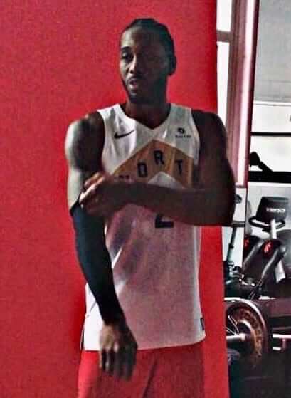
Yesterday was NBA Media Day, and there was a decent amount of uni-related news, most notably a leaked photo of newly acquired Raptors forward Kawhi Leonard wearing what appears to be the team’s latest alternate uniform — basically a white version of last year’s black alternate.
Other NBA uni tidbits from yesterday included the following:
• Celtics forward Marcus Morris is going with SrOB this season:
@UniWatch Small change for Marcus Morris.
He has added SR. to his uni due to his newborn son pic.twitter.com/ELlOFE6M6P— CT4 {0-1-1} (@CT4_LV) September 24, 2018
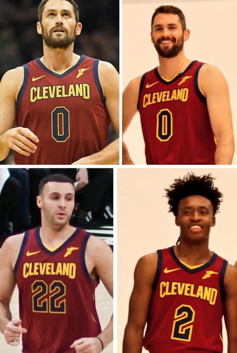
• We got our best look yet at how the Cavs have thickened the gold border on their uni numbers. Old versions on left, new on right:
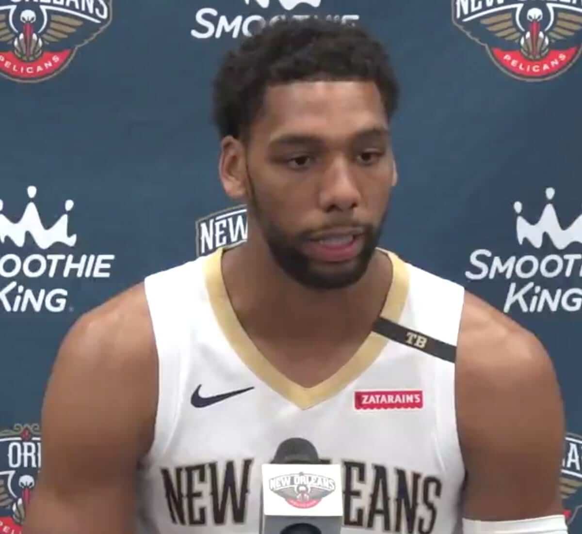
• The Pelicans’ memorial patch for former owner Tom Benson, which was added following Benson’s death back in March, is apparently being retained for this season:
• Speaking of memorial bands, the Magic are adding one for former team senior chairman Rich DeVos:
A look at the lapel commemoration the Magic will wear on their uniform this season to honor late team senior chairman Rich DeVos: pic.twitter.com/SyRYREJvkW
— Josh Robbins (@JoshuaBRobbins) September 24, 2018
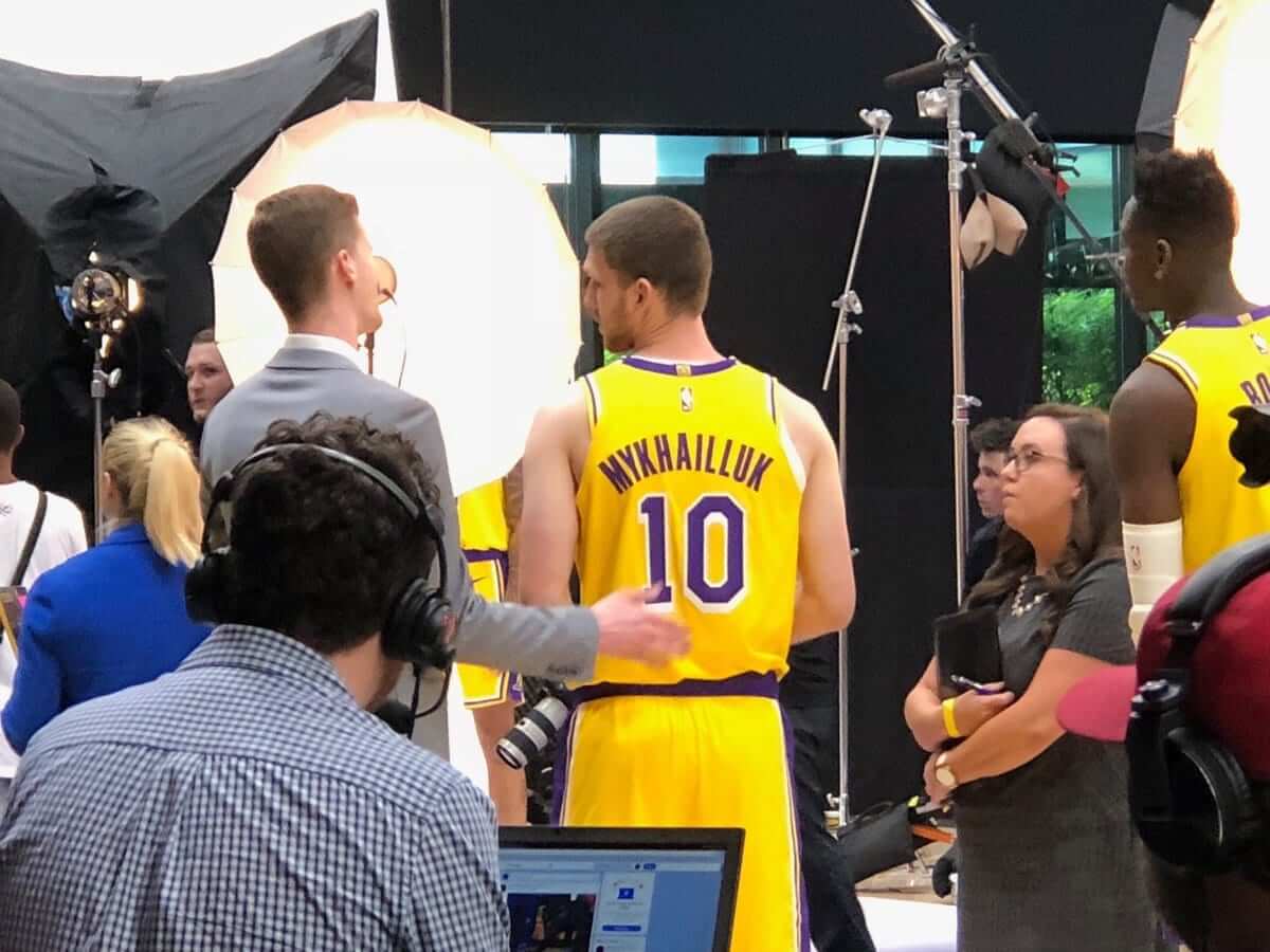
• It was an interesting day for Los Angeles-based rookies’ NOBs. First, Lakers rookie Sviatoslav Mykhailiuk had his name misspelled on his jersey (click to enlarge):
And the Clippers took an interesting approach to fitting rookie Shai Gilgeous-Alexander’s NOB on his jersey:
Shai Gilgeous-Alexander’s Clippers jersey is a work of art (📷 by @CWallaceLAC) pic.twitter.com/Kjs2FqicJY
— Darren Rovell (@darrenrovell) September 24, 2018
• Finally, there’s this passage from this article about the Trail Blazers’ Media Day activities:
There will be at least one new Blazers uniform unveiled this season as part of Nike’s revolving door of NBA jerseys.
The popular “Rip City” black alternate uniforms, which featured plaid in a nod to legendary coach Ramsay, will be receiving a facelift. One of two alternate uniforms, dubbed the “City” edition by Nike, will change every year as the company and the league look to add variety — and revenue — to their brands. The new iteration is expected to be unveiled in November.
(My thanks to Mike Chamernik, @keepthe_chief, @sheriffwoody12, and Phil for their contributions to this section.)
Click to enlarge
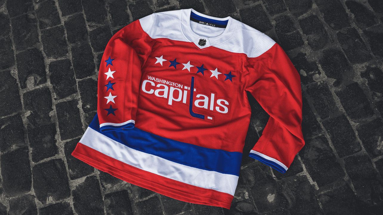
Another day, another NHL alternate: The Capitals yesterday became the latest NHL team to unveil an alternate uniform. It’s their throwback alt, which they had worn for two seasons prior to the one-year hiatus caused by the Reebok-to-Adidas changeover. They’ll wear it for a dozen games, which are listed here.
I like this throwback, but I like the white version, which they wore as a throwback from 2011 through 2015, even more. I’m also a bit disappointed that Adidas is continuing Reebok’s practice of formatting the crest as a single patch, instead of sewing each letter individually.
By my count, there are now 13 NHL teams that have announced alternate uniforms for the coming season, and I suspect we’ll have a few more added to that list this week. My annual NHL season preview will run on ESPN this Friday.

Click to enlarge
Too good for the Ticker: We’ve seen soccer teams reimagined as hockey teams, NFL teams reimagined as soccer teams, and so on. Have we seen European soccer teams reimagined at baseball teams? Honestly, I’m not sure, but designer Phil Slattery has worked on that concept, and the results are really fun. Check it out here.

Click to enlarge
Collector’s Corner
By Brinke Guthrie
Cardinals football fans, past and present, will love this 1970s zip-front sweater. With the ever-present zipper pull ring, this is classic Sears NFL Shop at its best. Well, this one says “Put On Shop,” but close enough. In 100% “virgin acrylic,” whatever that means.
Now for the rest of this week’s picks:
• These 1970s-1980s “old stock” Steelers gloves look to be in excellent shape. I like those stripes at the cuff. And let’s face it, the Steelers of today look like the Steelers of the 1970s, so they’re not out of date!
• Also from the Steel City, check out this vintage 1970s Pittsburgh Pirates coffee mug, featuring their classic smilin’ buccaneer logo. (Is he related to Bucco Bruce?)
• Speaking of Bruce, show your Bucs spirit by waving this 1970s Bucs “fandana” from The Tampa Tribune.
• Here’s a 1970s Jets watch made by Lafayette.
• One more for Jets fans: This 1970s Jets helmet bank looks pristine! Note, they’ve got the facemask on upside-down, but it’s easy enough to gently pry it off and place it back on there correctly.
• The seller calls this a 1970s NFL pillow, but we’ll put it in the 1980s due to the Bengals’ helmet stripes. Interesting in that it shows a Niners QB getting ready to pass while wearing No. 85.
• Here’s another seller making a Bengals mistake: He calls this a one-of-a-kind 1970s handmade NFL tie by “Veronica Original.” But it can’t be 1970s because, once again, there’s the Bengals pumpkin helmet!
• And as long as we’re mentioning the Bengals, this seller has a nice-looking helmet buggy and gumball helmet combo up for auction.
• Pop this 1970s Mets beanie on your head and you’re sure to get a smile on your face.
• This 1970s San Diego Chargers hoodie by Russell Athletic includes the slogan “Frightening Lightning” on the front.
• From reader Will Scheibler, here’s something you won’t often see: a 1970 CFL cloth wall calendar.
Seen an item on eBay that would be good for Collector’s Corner? Send any submissions here.

Uni Watch roster update: We’ve had some personnel changes here at Uni Watch that I’d like to tell you about.
For the past year or so, the Tickers that appear on the site on Tuesdays and Wednesdays have been produced by Alex Hider. But as of this week, Alex is cutting back to one day per week — Tuesday. Beginning tomorrow, the Wednesday Tickers will be done by Lloyd Alaban (that’s him at right). Lloyd is a longtime Uni Watch reader, and this past spring he earned a master’s degree in journalism and mass communications from San Jose State University. His final project at SJSU was to create this website for the San Francisco chapter of the Asian American Journalists Association, of which he is a proud member.
Lloyd’s favorite sports are basketball and soccer. Please join me in welcoming him to Uni Watch.

Also: Kris Gross, who’s been producing the Friday Tickers for the past year, recently left Uni Watch because he’s expecting an addition to his family (congrats!). “Collector’s Corner” columnist Brinke Guthrie pinch-Tickered last week, but starting this week the Friday Tickers will be produced by Yianni Varonis (that’s him at left). Yianni, who lives in DC, has a master’s in applied politics from the University of Akron and has extensive experience working in political communications, but he’s also a serious sports fan. I’m very happy that he’ll be pursuing that interest as part of Uni Watch.
Yanni’s favorite sports are college football and soccer, and he already has some ideas about lede articles that he wants to write for the site after he gets settled into Tickering. Please welcome him aboard as well.
With Lloyd and Yianni now on the active roster, our Ticker schedule now looks like this
– Mondays: Jamie Rathjen
– Tuesdays: Alex Hider
– Wednesdays: Lloyd Alaban
– Thursdays: Me
– Fridays: Yianni Varonis
– Saturdays: Anthony Emerson
– Sundays: Phil
I’m lucky to have such a great team working with me. Big thanks to all of them, and an even bigger welcome to Lloyd and Yianni.
The Ticker
By Alex Hider

Baseball News: If the retail version is any indication, this year’s MLB postseason patches will once again be plastic, not embroidered (from Carmelo Kuffel). … MLB published a video that shows how a jersey goes from production to locker for the league’s “Ponle Acento” campaign for Hispanic Heritage Month (from Phil). … Rodney Flores has a project where he draws robots into real-life environments and made a sketch at Minute Maid Park this weekend. See more of his drawings on his Instagram. … Trophy games are common in college football, but you don’t see them much in baseball. However, Houston and Rice are adding a Silver Glove trophy to their baseball rivalry this season (from Ignacio Salazar). … Wax Ecstatic found this 1955 Kansas City A’s baseball card that shows P Charlie Bishop wearing a “KC” cap logo that never actually appeared on the field. Phil points out that the entire Topps set used the wrong logo. The A’s wore an “A” logo that season, similar to what they had worn in Philadelphia. … The new college summer league team in Baton Rouge, La., will be called the Rougarou. According to that article, a rougarou is “is often described as a creature with a human body and the head of a wolf or dog, similar to a werewolf” (from Ernie Ballard).

NFL News: Steelers WR JuJu Smith-Schuster wore cleats with his French bulldog, Boujee, on them during warmups last night (from Dell Michaels). … Jags RB T.J. Yeldon was wearing teal-topped socks during Sunday’s game, while the rest of the team wore black-topped socks (from Eric Wright). … Reports indicate Browns will wear their Color Rash jerseys again on Oct. 7 against the Ravens (from Phil). … This may ruin future football games at Ford Field for some, but Michael Driscoll points out that the vertical stroke on the “4” of the stadium’s 40-year-line marker is inconsistent — note that the bottom of the vertical stroke is much wider than the top. Can’t unsee it! … The Seahawks’ new president has a camouflage version of the team’s current helmet in his office (from @EW406). … Hall of Fame receiver Tommy McDonald — the last non-kicker or -holder in NFL history to play without a facemask — has died (from Jerry Wolper and Blake Fox). … Looks like the Packers will be wearing throwbacks this weekend. … It’s always fun to see photos of former Bucs QB Doug Williams’s “shark tank” facemask. Here’s a wire photo that shows him wearing it for the first time, at a practice (and also wearing a No. 83 shirt, for some reason), along with the original newspaper caption (from Brinke).
College/High School Football News: Ohio will wear a throwback helmet decal this weekend to honor the 50th anniversary of the 1968 MAC Championship team (from @superfluousP). … Virginia LB Charles Snowden had flip-flopped striping on his helmet this week — his navy stripe was on the left, but all of his teammates had their navy stripe on the right (from Wesley Walser). … East Carolina’s helmet logos this weekend will use the “One Carolina” outline shape. They often use a similar logo that only includes North Carolina (from ACC Tracker). … The Penn State logo ESPN is using in a game promo shows the ear on the lion’s head filled in, which is inaccurate (from JJ). … Ayersville High School (Ohio) is wearing some pretty bright uniforms this year. … Utah is now using little mortarboard decals for players who have graduated (from Clint Herrera).

Hockey News: Pretty crazy story — Stars RW Alexander Radulov was having issues with his jersey during a preseason game a few days ago, so he borrowed a fan’s replica jersey and wore it during the game! (From Alan Kreit and Andrew Greenstein.) … The Kings and Canucks played a preseason game in Salt Lake City last night, and the Kings warmed up in Utah Jazz-themed uniforms (from Jack Wade). … The Flyers have a new mascot, Gritty. He kind of has a Youppi! vibe, no? (From Mike Chamernik and Robin C. Hood.) … Blues players wear a mix of variously colored sweaters during practice. Grey is for defensemen, while the other colors represent different offensive line pairings. Apparently, this is common practice in hockey (from Rob Krosley). … Here’s a good history on the Jets’ logos through the years (from Phil). … New uniforms for Canisius College.

NBA News: Cross-listed from the hockey section: The Los Angeles Kings and Vancouver Canucks played an NHL preseason game in Salt Lake City last night, and the Kings paid tribute to their hosts by warming up in Jazz-themed jerseys (from Jack Wade).

Grab Bag: Under Armour has released a red, white, and blue colorway of golfer Jordan Speith’s signature shoe ahead of the Ryder Cup (from Phil). … Boston’s Major League Rugby team will be known as the New England Free Jacks (from Andrew M.). … Taco Bell has new packaging designs (from Alex Dewitt).
So many ad patches shown on those NBA jerseys. :)
On that Flyers mascot, Craig over at Hardball Talk ran a little story comparing it to Dodgers 3rd baseman Justin Truner.
link
Can we talk about how wretched the Pittsburgh Pirates’ 7 is? It needs to be straight, not rounded.
YES.
It’s like they took a 2 and lopped the bottom off. It looks soo terrible yet they have kept it for over a decade now.
Browns game is 10/7
They will also be wearing the alts one other time this year as reported by one of their beat writers
link
Date fixed.
Welcome aboard Lloyd and Yianni!
I’m not seeing a link to the silver version of the Seahawks helmet.
It’s actually camouflage, not silver. Text and link now fixed. Here’s the link:
link
Actually, I was link from which this item comes, and I think Alex link, not silver.
We’ve seen what happens when DC teams sew letters onto jerseys individually. Hockey fans would end up having to cheer for the Capitls. Best to keep it on a single patch.
I don’t know if the Flyers are better than last season, but they are certainly better than this. What did the Canadiens get in exchange for Youppi, though?
Either way it’s the CapiLals. It’s not like a sewing error would make it worse.
Maybe the NFL pillow on ebay was from 1985, because all of the players appear to be wearing “85.” Just an observstion! :)
Beat me to it. I guess the question it, what year did the Bills change their helmets from white to red in the 80’s? I can’t remember if it was pre-85 or not.
It was link. You need to bookmark the GUD, Dan.
I just wanted to see who here knew. ;-)
Nothing wrong with the Capitals bringing back the red throwback as alternates. Uniforms with stars on it always great. I think I like the white version better as well, because of the red pants.
However, the throwback is red like the primary jersey. I was kind of hoping for something new compared to this.
A really good option may have been them lifting an idea from the jersey of a Saskatchewan midget AAA team, who essentially borrowed Washington’s uniform anyway. The Moose Jaw Generals navy jersey features are a hybrid between the Capitals recent outdoor jersey and the throwback design. Maybe the weagle on the front?
link
Ideal Cap Co sells a version of that KC A’s cap from the 1955 Topps set.
link
Just curious..how many fans of the Kansas City Athletics are out there? They left KC in 1967 never finishing better than 6th and last or next to last 10 out of their 13 seasons. I’m thinking Oakland doesn’t throwback much to those KC years. Most comparable would be the St Louis Browns. The Browns had a year or two that a fan could nostalgically look back on.
. . . and the A’s had quite a run of success after leaving metropolitan Kansas
I have to say I love the early 60’s Athletics… because they changed uniforms three years in a row! I don’t know if I’m a “fan” but I know a hell of a lot of A’s uniform minutia from those years.
The A’s threw back (inaccurately, BTW) to their Kansas City days once in 2015:
link
I”m guessing this has already been discussed but how horrible does the LA Kings twitter logo look with the golden arches in it? link
“Presented by,” I see. Imagine that — without McD’s, the Kings’ Twitter account wouldn’t even exist. How nice of McD’s to “present” us to it!
Remember, “presented by” is just another bullshit way for advertisers to avoid calling themselves advertisers. And why do they avoid it? Because they understand — and they understand that YOU understand — that the encroachment of advertising into every nook and cranny of FUCKING EVERYTHING is fundamentally gross, and a symptom of a large sickness in our culture.
Douchebags.
How do you really feel? ;)
Sickness in our culture being that everything is for sale, and that we monetize everything without hesitation? I assume this?
It is gross.
It is amazing how some of the companies that buy ad space on the uniforms know how important branding is that they wont let the teams render the ads in team colors, but must keep the company’s colors. Yet the teams don’t understand how the uniform, and selling it out with ad space reflects their brand!
the two worst trends these days: (1) entities that try to insert a commercial aspect into nearly every human interaction or additional commercial “synergies” into existing commercial transactions; (2) entities that try to politicize every human interaction. Commerce and politics are the sleaziest things that exist today.
I’ve checked through all of the other 30 NHL teams’ Twitter accounts, and the only other team that has an advertiser in both their userpic and banner is Anaheim. New Jersey has an advertiser in their banner, but way up in the top left, and their userpic is just the team’s logo.
Not counting Ticketmaster being mentioned in Buffalo’s banner because the banner itself is advertising selling Sabres game tickets, and that’s the licensed ticket vendor.
The Jaguars socks are all teal topped, as showcased when they released the uniforms.
Speaking of socks, and I forgot to comment on this Monday when it was mentioned in the Ticker, but now that it appears that the Panthers will be wearing black socks with the all-white uniforms (instead of blue as they had always done previously), does anybody else agree with me that making that relatively minor change has improved the uniforms tremendously?
To compare: blue socks: link
black socks: link
Something about the black at the bottom of the uniform just brings about more balance I think.
It looks good. Remember the blue socks with the dark uniforms that first season? That was fixed promptly as the black socks definitely had to go with the black jerseys.
link
Yeah, now if the Panthers would only get rid of the totally unnecessary logo on the side of the pants…
As a rule I would say the socks should always match the jersey color with dark jerseys. And then if you are going to have white (or contrasting pants like the Packers, Steelers, Saints, 49ers) you keep those colored socks with the white jersey too. If you are going away from the primary color on the socks it should only be if it is because you are matching the the white jersey with primary colored pants (Bears, Eagles, etc) then you could go with secondary colored socks, or white socks with stripes.
Based on this the Panthers should always have black socks (unless wearing their blue alternate jersey).
The black socks really do balance it out nicely.
Agree 100%. Black makes this mediocre set much better.
Welcome Lloyd!
…and Yanni!
The Alliance of American Football has already released their four remaining logos this morning.
Salt Lake Stallions
Arizona Hot Shots
San Antonio Commanders
San Diego Fleet
Thoughts about the soccer teams designed as baseball teams:
-“Glasgow Celtics” and “Tottenham Spurs” will never not look weird. (I actually have seen some ’50s and ’60s American newspaper articles that call Celtic “the Glasgow Celtics.”)
However, hooped or striped baseball jerseys look amazing.
-A perhaps better Scottish team to do would have been Heart of Midlothian, because they could have been “Edinburgh Hearts,” as they already have a common plural nickname, plus maroon is not really represented in the teams chosen, while blue and red are.
-Rangers’ roundel logo is used on their caps; however, that has never appeared on their shirt. Only the “RFC” monogram has, which here is relegated to a sleeve patch, but should appear on the cap to be consistent with the other teams.
-“Arsenal” is not a place name, which also is inconsistent with the other teams.
-“The Dortmund BVB”? Also, that one shows it’s hard to make three combos out of two colors.
-PSG’s fourth combo (at the far right) is a reference to a template they wore for most of the ’90s, while Man U’s yellow/green outfit is a reference to their original colors and Liverpool’s grey is a reference to a kit from the ’80s.
Overall, I like the designs (if not all the team names) from a soccer point of view, but as baseball uniforms I would bet they’re too brightly colored and busy to be satisfying.
there’s a lot to like in this project, but for the excessively dark pants all over the place
This is a beautiful project and I love the lack of gray, plus the heavy use of colored pants. (I would wonder why the jersey numbers are all so ridiculous, but I’ll excuse it because these are supposed to be samples.)
As a Chicago Cubs fan, I can’t help but like Kyiv Dynamo’s design. And the third Tottenham uniform looks like our circa-1910 road design.
Monaco’s two-toned pants are particularly inspired!
The tie is from the 90s as the Falcons have a black helmet.
Also, the Patriots have a Flying Elvis, so it is definitely the 1990s.
Welcome aboard, Lloyd and Yianni! Excited to see a Zip added to the Uni-Watch staff. I grew up in Cuyahoga Falls.
Those UEFA baseball concepts are AWESOME. Some of those fonts need work and I’m not sure about the inclusion of “The” on some (is that a Euro thing?) but the overall looks are really cool. I’d absolutely trade money for a pinstriped Munich jersey or a white one for Liverpool.
From another Zip and Black Tiger, yes, welcome aboard to both of you!
Do you mean like “The Parisians” and “The Bavarians,” etc. on the fronts of the jerseys?
Not a European thing, not sure why they’re there. Obviously real teams that wear their team name, baseball or otherwise, don’t have a “the.”
@Jamie: Yes, exactly. Like the way “El” or “Los” looks out of place on Hispanic Heritage night jerseys. Drop the definite article!
The Flyers mascot must be based around Flyers fan Trey Anastasio from Phish.
link
Note on the multi-color Blues jerseys in the ticker. Text refers to offensive pairings, but there are actually three of each color. I suggest offensive groupings or lines.
“Have we seen European soccer teams reimagined at baseball teams? … Phil Slattery has worked on that concept, ”
.
THEY ALL LOOK LIKE JOCKEYS!!!!
and ne’ry a white sani to be seen (except on those with white *mini* stirrups)!
Hyphenated names has some inherent problems. I read that one of the Scandinavian countries that this was popular now has hyphenated named people marrying each other. Their children would have 4 names. The generation afternoon this could have 8 last names. Many are coming up with entirely new last names. I have 3 daughters and get that a man’s last name shouldn’t take precedence, but having some family tradition and continuity is nice.
I had that Cardinals sweater when I was a kid. Wore it to school quite often.
All the players in the “1970’s” er, [actually] 1980’s NFL pillow are wearing number 85. Safe bet the pillow is from 1985.
That hypothesis was posed a couple hours ago.
Pretty cool to see Kike Hernández putting on his jersey as a pullover in that video. Guess they skipped the step in the manufacturing process where he has the placket sewn shut.
“I’m also a bit disappointed that Adidas is continuing Reebok’s practice of formatting the crest as a single patch, instead of sewing each letter”
So you’re saying that in the good old days that each letter including the stick was created via stitch and sewn directly on to the jersey?
Yes.
link
Those soccer kits re-imagined as baseball uniforms looked more like horse jockey silks/uniforms to me
Sorry for the after lawyer work day, Pacific time, comment that will likely never be read by anyone, but –
Am I the only person who thinks it would be better to split long hyphen names, like Gilgeous-Alexander, into two rows, instead of trying to wrap it into circles around the guys back?
( also sorry for my crimes against commas, hyphens, spacing, and dashes perpetuated throughout this comment. I am trying to dictate, my iPad is not cooperating, and I’m just too lazy and tired to fix.)
I guess as a hockey player and coach my whole life I never even thought about non hockey people not knowing about the various colored jerseys for lines and defenseman….but yes basically every team at any competitive age practices like this. Two colors for some skates.