
By John Ekdahl
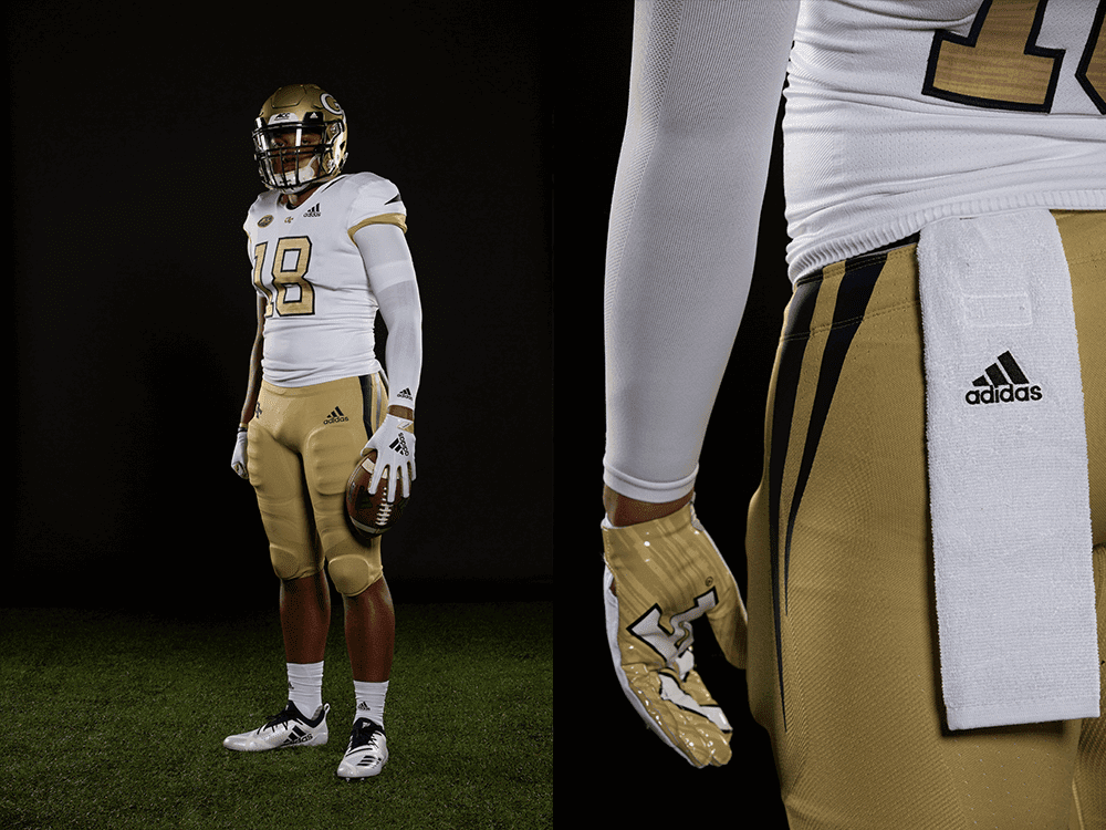
Georgia Tech unveiled their new football uniforms last night, which will feature not one, but two white jerseys. The “primary” white jersey is an updated look to their standard jersey (with “Tech Gold” numbers instead of navy), while the “whiteout” jerseys will invert the colors on both the numbers and shoulder stripes.
The Yellow Jackets will be pairing the Whiteout jersey with white pants and a new white helmet to create the “whiteout” effect against Miami on November 10th.
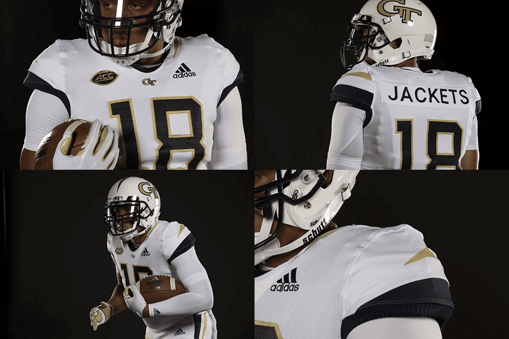
Georgia Tech and adidas revealed the Yellow Jackets’ 2018 football uniforms on Friday evening. The uniforms are the first to be unveiled as part of Georgia Tech’s new partnership with adidas, which officially began on July 1.
The Yellow Jackets’ new adidas uniforms feature two different white jerseys – a primary home jersey and a Whiteout jersey.
The primary home jersey is a modern take on Georgia Tech’s traditional uniform. It features Tech Gold numerals outlined in navy blue, gold and navy blue stripes on the sleeves, navy blue stripes on either side of the collar and a gold interlocking GT logo above the front numerals.
The Whiteout jersey is a bold new look for a bold tradition on The Flats. Its style mirrors the primary home jersey but with navy blue numerals, reversed navy blue and gold sleeve stripes and gold stripes on either side of the collar. It will be worn for the Yellow Jackets’ Nov. 10 Whiteout game versus Atlantic Coast Conference Coastal Division rival Miami (Fla.) and road games.
HOME UNIFORM

WHITEOUT UNIFORM
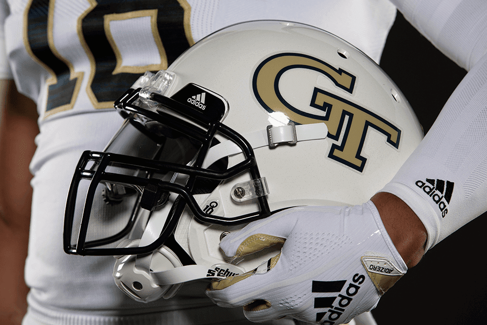
WHITE HELMET
Additional information about some of the design features and performance/material enhancements can be found here and larger images of the new unis can be seen here.
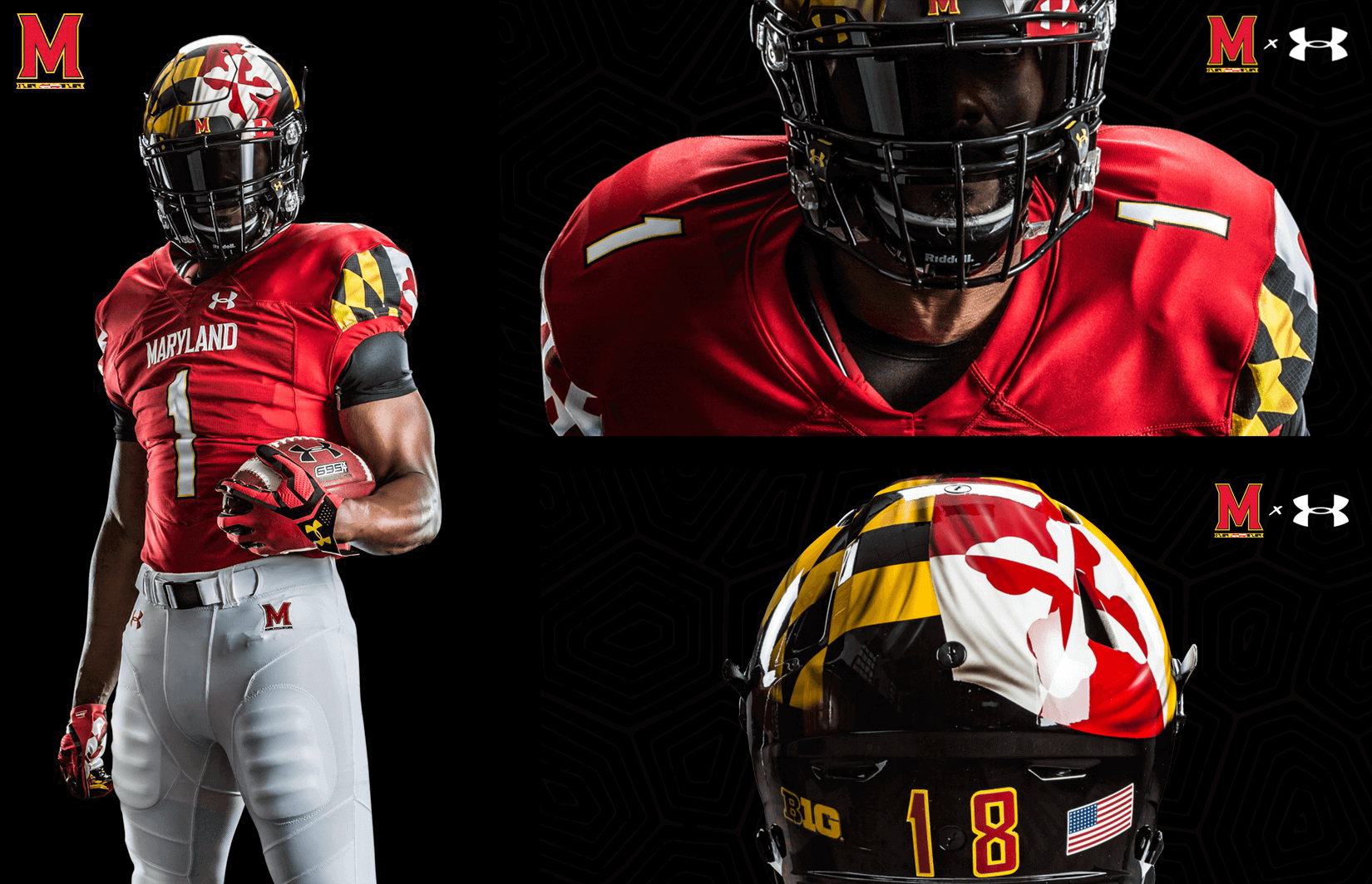
The University of Maryland unveiled their Under Armour home uniforms yesterday, which feature the Maryland state flag prominently.
Maryland’s helmets featuring the Calvert and Crosslands coat of arms are hand-painted, making the Terrapins the only school to wear hand-painted helmets as part of their standard uniform.
“Designing the uniforms for Maryland football has been an incredibly rewarding experience. Especially with such an iconic and important design focal point like the Maryland flag. We want to make sure that we’re making a statement about not only UMD football and the UA brand, but that the entire state of Maryland is represented in the best way possible,” Nick Billiris, Senior Design Director of Team Sports at Under Armour, said in a statement.
According to the press release, Maryland’s helmet featuring the flag is hand-painted. They are the only school to have a hand-painted helmet as part of their standard uniform. Maryland will wear this new home set throughout the season, and it will debut in their season-opener against Texas on September 1st.
A video of the new unis is available in the tweet below.
Fresh NEW look. Same BOLD style.
Always Maryland. #FTT | #TeamUA pic.twitter.com/v5u7lxyz12
— Maryland Football (@TerpsFootball) August 3, 2018
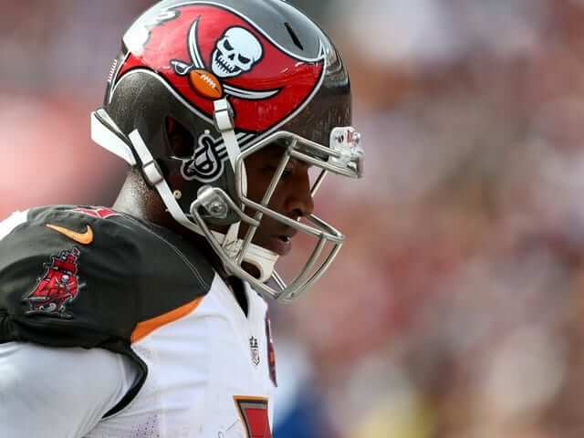
Nike has decided not to renew Jameis Winston’s contract, which undoubtedly had to do with his off-the-field issues. Winston will be sitting out the first three games of the season, though his deal with Nike expired before the NFL announced his suspension.
A Nike official told ESPN on Friday that Winston’s deal expired and the company elected not to renew the former No. 1 overall draft pick.
Sources say Winston’s contract expired before the NFL announced he would be suspended for the first three games of the regular season for violating the league’s personal conduct policy. The violation relates to a 2016 incident in which Winston was accused of groping a female Uber driver.”
The Bucs open the season against the Saints in New Orleans on September 9th.
#Vikings safety Andrew Sendejo has made a name for himself as a hart-hitting safety. He has a message for the league….. pic.twitter.com/HLibdfeRdL
— NFL Update (@MySportsUpdate) August 3, 2018
Andrew Sendejo wore a MAGA-inspired “Make Football Violent Again” to Vikings practice in response to the NFL’s new rules on leading with the helmet.
“It fits good and it’s black and I like it,” Sendejo said. “It’s got a good message.”
Although Sendejo said he has been wearing the hat for a while, its message “applies more now” because of an already controversial new rule installed by the league aimed at making the game safer.
He later joked about making changes to his helmet that would allow him to stay within the league’s new rules.
Made helmet alterations so I’m always “leading with the facemask”. Simplifying calls for league office and playing within new @NFL rule changes.
Next. pic.twitter.com/xYeaWYllPr
— Andrew Sendejo (@Asendejo) August 3, 2018
The Charlotte Hornets have launched a website to celebrate their 30th Anniversary.
The team unveiled a 30th anniversary logo — a circular emblem featuring the logo of the original Hornets with the familiar pinstripes found on the uniforms the team made famous. Merchandise featuring the logo, including T-shirts and hats, is available now at the Hornets Fan Shop.
The Hornets have also launched Hornets30.com, a special website that hosts fan voting for the 30th Anniversary Team, a “This Week in Hornets History” series, features and photo galleries, stories on the team’s history and more.
Now through Oct. 1. fans can visit the site to vote for the 30th Anniversary Team. Fans can cast a vote for up to 10 players from Charlotte’s NBA history, with the top 10 overall vote-getters being named as members of the 30th Anniversary Team. All fans who vote will automatically be entered for a chance to win a 30th Anniversary Prize Pack that includes a pair of Jordan 4 Retros, a classic Hornets “Grandmama” jersey and a Hornets 30th Anniversary hat.
The team will have a “classic edition” uniform and a 30th Anniversary logo. The logo can be seen in the video above.
[Editor’s Note: Paul is on his annual August break from site. Deputy editor Phil Hecken is in charge from now through the end of the month, although Paul is still on the clock over at ESPN and may be popping up here occasionally.]
No ticker?
Welcome to August weekends.
As a Charlotte native (and long-suffering Hornets fan), let me be the first to note that while the Hornets are celebrating their 30th Anniversary, this upcoming season will only be the 17th (by my count) that a team known as the Charlotte Hornets has existed.
Consider your mind blown.
So Charlotte is glossing over the 2 years without a team, and the decade spent as the “Bobcats” – Mkay.
Nope. They’re celebrating the 30th anniversary of the start of the original Hornets franchise. It makes no comment about the number of seasons.
I still say it makes no sense. It would be like the current Winnipeg Jets celebrating the anniversary of the original Jets.
Or perhaps celebrating the Thrashers.
Sendejo is clueless. There won’t be a NFL for the next generation if there aren’t changes. I give no credence to the fans, since they aren’t much different than the Romans back in the Coliseum, but players wanting to continue leading with their head is like a gladiator not wanting lions banned. The thing that was supposed to protect the head is actually the problem. If players weren’t wearing a hard helmet with a facemask there is no way they would lead with their head. Check out this video on how the Seahawks coach tackling.
link
I’m surprised the No Fun League hasn’t fined Sendejo yet.
this Sendejo guy sounds like a right pendejo.
Alouettes late-1970s logo on helmets last night huge disappointment.
Disappointed only 1 colour. Would have been better in the blue and red like the original. The original from 1974 to 1981 was reintroduced for 1 season in 1986, as seen here:
link
Still, all 3 past logos this year may be better on the helmet than their current primary. The vintage red wings was the best and really should return full time as part of a redesigned Als uni.
GT unis are a HUGE downgrade. Their traditional unis are among the best in college football. They should have never tweaked them with honeycomb patterned helmets, ugly shades of gold, etc. All GT needs is gold helmets, white shirts, gold britches.
GT doesn’t even have a traditional uniform. They’ve changed styles, shades of gold, piping, and everything else tons of times over the years. I do agree the gold, white, gold is a good look, but since GT rarely wears colored jerseys now they get pretty stale. I do think they should stay away from a navy jersey for the time being, but a gold jersey with this style would be nice.
As a GT alum I’ve hated the unis for years. I knew adidas would add something weird, in the case being the odd stinger stripes on the collar and sleeves. At least they’re small. The pants are a major downgrade. Knowing Tech they’ll mix and match the white pants and helmet. The plain white helmet is MUCH better than the honeycomb, which looked ok up close, but from a distance just looked tan or off-white. Overall the unis are about what I expected…I learned long ago not to get my hopes up.
Georgia Tech alum and Vince McMahon’s other son Roman Reigns modeled in them.
link
Vince’s other son! Bravo, my friend. Bravo.
The nob font on the GT jerseys……WTF???????? Who the think that looks good?
At least they got rid of those awful striped collars they’ve had forever, that no other team would be caught dead in. That was worth the change right there. I agree about the NOB font, but will wait to see it for real before passing judgement. Not crazy about the number font but it could be worse.
The Hornets actually debuted their anniversary logo several months ago. They’ve just taken off the vertical stripes and added the corporate arena naming rights holder’s mark (read: ADVERTISEMENT) onto it.
is Georgia Tech going to release a navy or gold uniform? I know they always try and wear white, but shouldn’t they have a color nursery?
jersey