By John Ekdahl
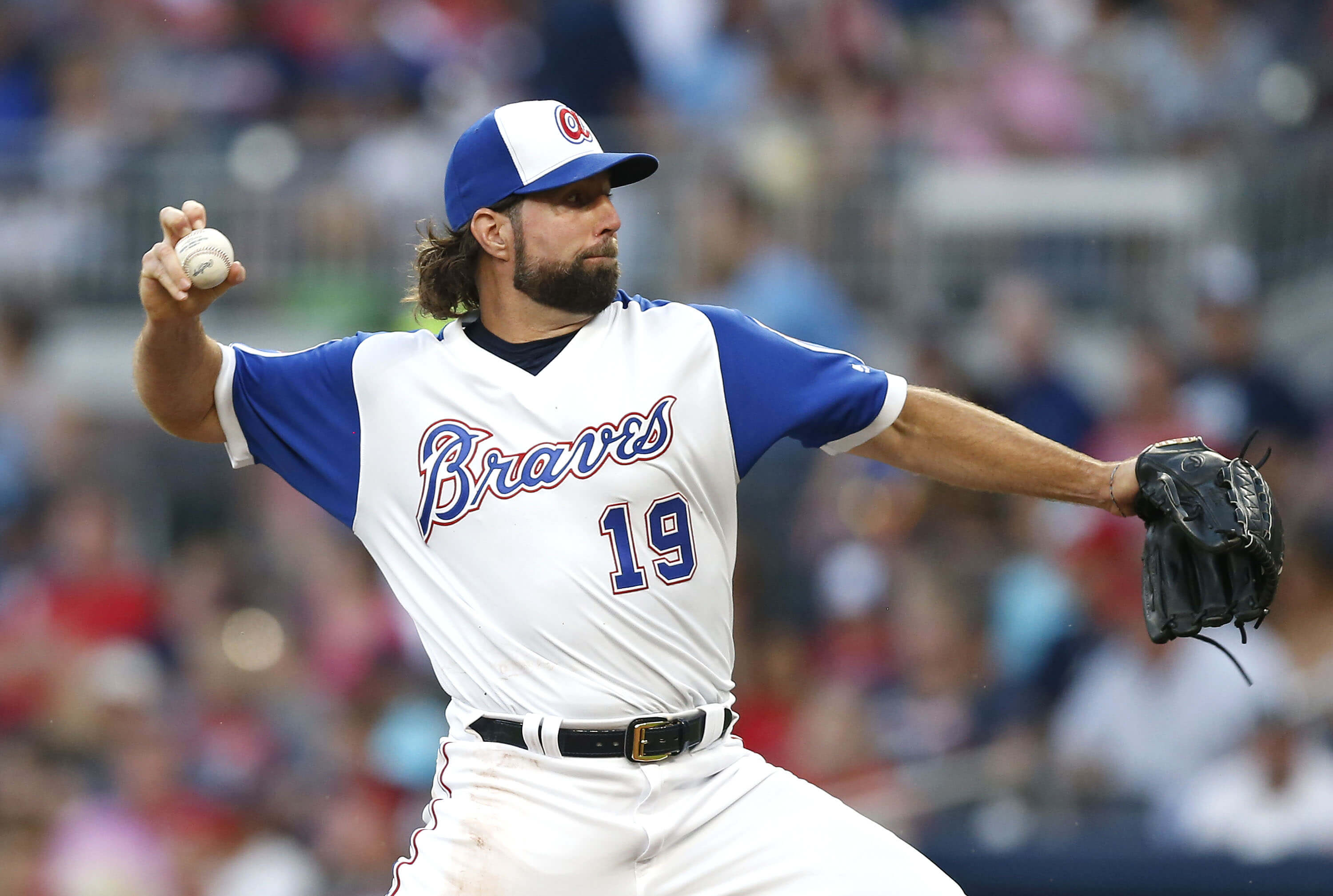
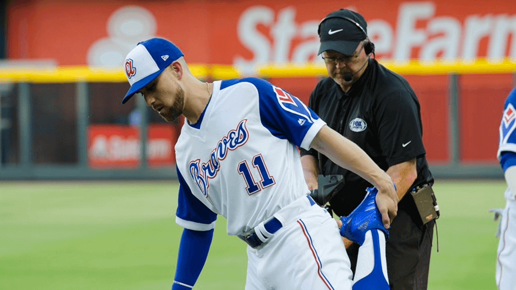
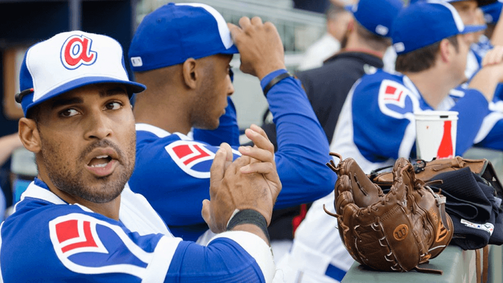
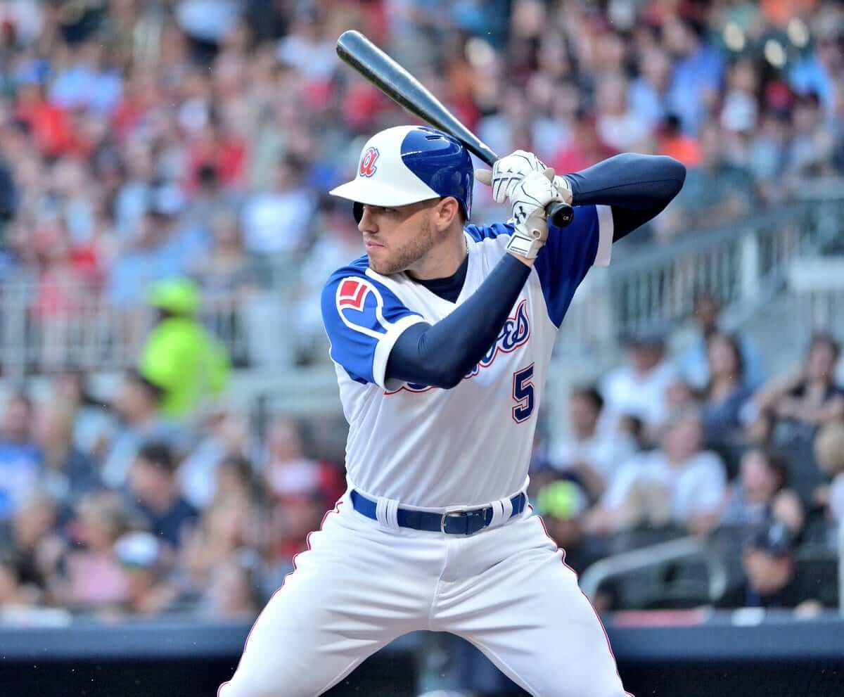
This weekend, the Atlanta Braves are honoring Hall of Famer Hank Aaron by wearing their 1974 uniforms for ”˜Hank Aaron Heritage Weekend’. Today’s attendees will receive a commemorative ticket and mini-bat, along with a donation to the Hank Aaron Chasing the Dream Foundation.
From the Braves:
For many Hank Aaron is just known as ‘Hammerin Hank’, the homerun king, but many don’t know Henry Aaron the man.
Whether it is through continuous philanthropic efforts, working as a front office baseball executive, or being a successful entrepreneur and businessman, Henry Aaron measures each step to ensure he impacts his community, country and the world for the betterment of social change.
Each year during Hank Aaron Heritage Weekend, the Atlanta Braves honor the on-and off-field accomplishments of Henry Aaron, while saluting individuals that have positively affected the advancement of social and human rights within their communities.
This weekend, we suit up to honor The King. pic.twitter.com/oUWR3kMUqL
— Atlanta Braves (@Braves) August 18, 2017
Tonight's uniforms are Hank Aaron approved! pic.twitter.com/MDEoNCNuut
— Atlanta Braves (@Braves) August 18, 2017
Additional shots below:
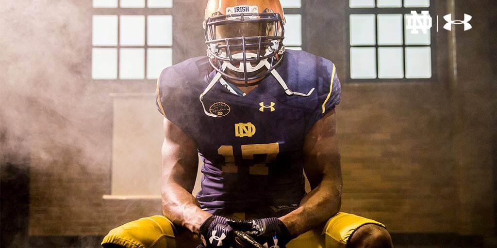
Yesterday Notre Dame unveiled uniforms that will honor Knute Rockne for their November 18th game against Navy. The Notre Dame Twitter account teased it yesterday with the quote “What do you say men?”, which wasn’t a subtle hint.
"What do you say men."
The reveal.
Noon Friday | #GoIrish pic.twitter.com/fojbkBO50Y
— Notre Dame Football (@NDFootball) August 17, 2017
Reveal video:
On November 18th, we come together to honor the man who built it all.
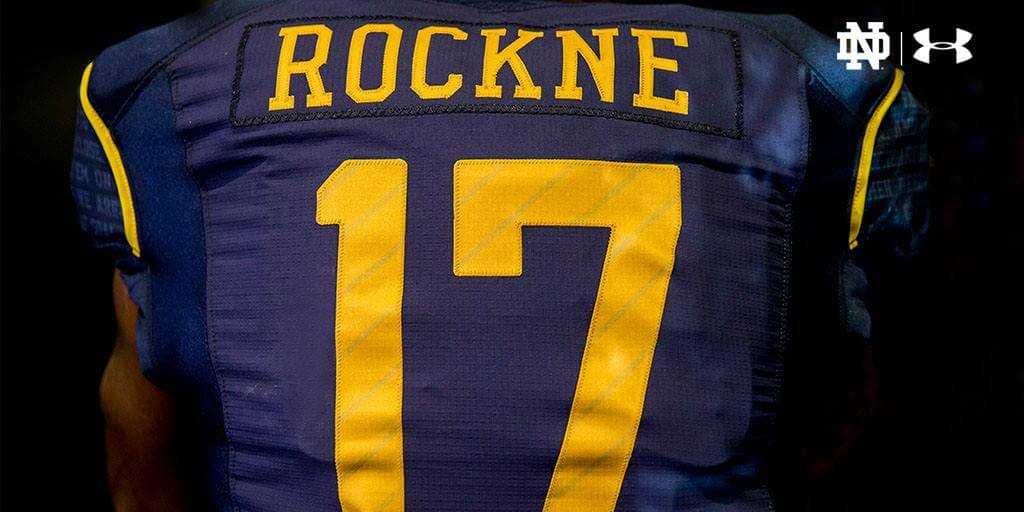
Introducing our ROCKNE Heritage Uniform. pic.twitter.com/7jmysrepFM
— Notre Dame Football (@NDFootball) August 18, 2017
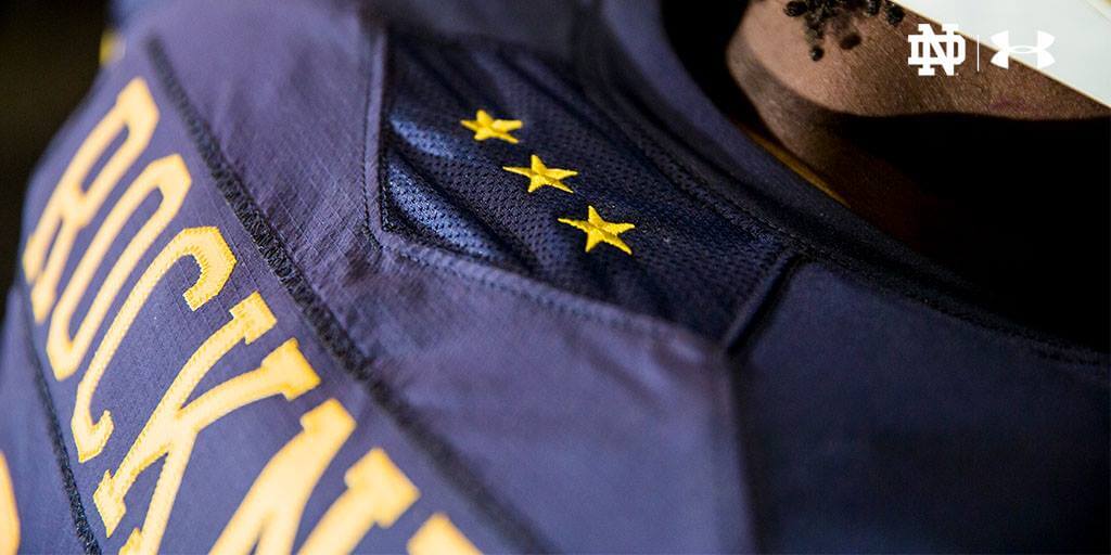
Although Notre Dame Stadium has a new face, at its core it maintains the same heart: Rockne. As the Fighting Irish move forward in a new age of technological advancement, Notre Dame stands by the importance of respecting their traditions by donning jerseys that pay homage to the forefather of Notre Dame football.
Under Armour Design Director Nick Billiris shared his take on what makes this game and these new uniforms so significant as Notre Dame starts a new era.
“I think it is a unique opportunity with this uniform to celebrate the past while creating the future,” Billiris says. “That’s why we incorporated some of these elements that harken back to the 1920s and 1930s when Knute Rockne was there, but we did it with cutting edge fabrics and technology. The whole idea is that this uniform is a time capsule of Notre Dame football from when Rockne first grew the football program into the national power it has become today.”
Additional photos:
Be on the lookout for these today.
Quick pause in the action to show off these beauties the team will don tomorrow. 😠pic.twitter.com/4A55GlztOU
— Houston Astros (@astros) August 19, 2017
Paul highlighted some changes to TCU’s uniforms yesterday:
TCU going with raised lettering on nose and neck bumpers this year. pic.twitter.com/w0hV8nXF4C
— Paul Lukas (@UniWatch) August 18, 2017
Collar on TCU's black jersey now has purple frog skin. pic.twitter.com/MGfzfzr22l
— Paul Lukas (@UniWatch) August 18, 2017
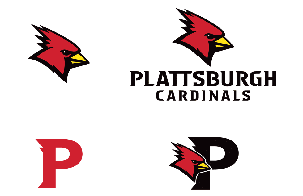
SUNY Plattsburgh unveiled new logos yesterday.
Cardinal Country got a new look on Friday, Aug. 18, with SUNY Plattsburgh’s Department of Intercollegiate Athletics unveiling a new visual identity for “Burghy” that will be seen across all teams and the campus as a whole beginning this fall.
“These updated marks create a consistent approach we can easily use across all of our branding channels ”“ from uniforms and playing surfaces to social media,” said director of athletics Mike Howard. “We worked to preserve the historical aspects even as we added new set of tools that will serve us well in the years ahead.”
Im glad either navy or noted dame decided to use an alternate for their game this year. If you’ve never seen them play before, picture an intersquad scrimmage. just like when Nebraska plays Wisconsin. There is retro nostalgia when they look similar and refuse to change for their opponent but I prefer variance to a certain degree. This is also a notorious trap game for Notre Dame. Maybe they r looking for a little extra motivation.
The shoes are the best part of those notre dame unis.
I love the new cardinal illustration for SUNY Plattsburgh. Not a fan of how it locks up ontop of the “P” though. And not a fan at all of the “P” or the typography.
Texas CHRISTIAN University has “Give ’em HELL” written in their collar?
GTFO
Proud Plattsburgh Alum happy to see a bad ass Cardinal and something that came out of my alma mater that isn’t Anthony Weiner.
Cardinal alum here as well. Totally agree!
Feel old that I can remember when the Astros introduced those throwbacks as *new* uniforms. Didn’t like them back then either.
True that; blah and colorless. The flashy lettering could have used a gold outline, and it contradicted the placket and buttons. Not a good look.
I grew up in New Orleans as an Astros’ fan in the 90’s. Used to complain that the “Star Trek” jerseys were too blah (aside from the hat), particularly when I’d see highlights from the 70’s and 80’s with the Rainbow Guts and the later racing stripes look. I was pretty pleased when they switched to the brick red in 2000–more so when they switched back to the proper navy and orange. But I have to say, seeing the throwback Star Trek unis gives me a wonderful sense of nostalgia.
Mad love for the ’70s-era Braves uniforms. The quality control is better, too; the originals usually looked badly-stitched and shoddy. As a throwback, though, they couldn’t be nicer!
Agreed. The royal blue and red looks such much better than the current navy. I think navy and red has just been overdone.
I wish the Braves would make the ’74 unis the permanent Sunday home game uniform.
They currently wear the ’66 cream-color (sans tomahawk) unis on Sat & Sun at home.