
Click to enlarge
[Editor’s Note: Paul is on his annual August break from site. Deputy editor Phil Hecken is in charge from now through Aug. 25, although Paul is still on the clock over at ESPN and may be popping up here occasionally.]
By Phil Hecken
Follow @PhilHecken
Without too much fanfare, the Chicago Bulls revealed their new 2017-2018 uniforms yesterday. Well, they revealed two of their new uniforms — the “Icon” and “Association” sets. As has been the practice with these NBA/Nike rollouts, teams are only revealing a white and primary color uniform for now; they’ll reveal their “alternate” uniforms at a later date. As was the case with several teams so far, there is not much difference between these uniforms and the red and white set the Bulls had worn previously.
Let’s look at the new white uniform first, which the Bulls are dubbing the “Association” jersey.
FIRST LOOK: Say hello to the Chicago Bulls @Nike Association jersey, which will serve as our primary road uniform this upcoming season. pic.twitter.com/Q2c0bqDNcj
— Chicago Bulls (@chicagobulls) August 2, 2017
Here are some closeups (click to enlarge):


For comparison, here’s how the previous jerseys looked:


As you can see there aren’t many changes. The front of the jersey (save for the addition of the swoosh) remains virtually identical, right down to the red/black/white/black/red striping. “BULLS” is still in red with a black outline. The back is slightly changed: NOB has now gone from red letters/black outline to a solid black font. Also, and for some strange reason, the shoulder striping truncates midway down the shoulder. This looks awful at first glance, and I don’t imagine it will look any better over time. The other (minor) change is the new “Titles” patch on the collar, which (in the Bulls case) lists the #6.
But scroll back up to that tweet for a second — note the verbiage: Say hello to the Chicago Bulls @Nike Association jersey, which will serve as our primary road uniform this upcoming season. (emphasis mine). To my knowledge, the Bulls are 1) the first team to actually declare a primary home or road uniform, and 2) the WHITE jersey will be their PRIMARY ROAD jersey. Does that mean the Bulls are aware that other teams will be declaring a color uniform to be their “primary” home? Since (I believe) home teams get to choose the jersey color they will wear, it sounds like the Bulls are planning on bringing their white uniforms on the road a lot — meaning either they know (or think they know) most home teams will choose to wear color uniforms this season.
Moving on to the red uniform, as with the white, they’ve designated a status (“primary home”) and are dubbing this their “Icon” jersey:
FIRST LOOK: Introducing the official Chicago Bulls @Nike Icon jersey, which will serve as our primary home uniform this season. pic.twitter.com/OtMRZww8Mu
— Chicago Bulls (@chicagobulls) August 2, 2017
Like the white jersey, this one has relatively minor changes from the prior uni set. Here’s some closeups:


And for comparison, the prior set:


Not too many changes with the red uniform as well — the front is nearly identical, save for the swoosh. The back has the same minor differences as did the white: different championship neck tag, truncated sleeve striping, and the NOB goes from black lettering with a white outline, to a solid white lettering.
As with the Hornets earlier this week, one glaring omission (thankfully) is the lack of an advertiser patch. This does not mean, of course, that the Bulls will go through the entire season without one — just that they do not (as yet) have an agreement in place with an advertiser. Whether they will by the time the season starts still remains to be seen.
Conrad Burry (who has been on top of all of the NBA uni changes, and has made some fairly accurate predictions based on supreme sleuthing/insider[?] information) tweeted out these additional factoids:
JUST IN: From the Bulls, more (small) detail images of the full uniform. I like the "4 Stars" on the waistband. pic.twitter.com/OYqFlRDkUn
— Conrad Burry 🔴ðŸðŸŽ¨ (@conradburry) August 2, 2017
So the waistband has four stars (one assumes to mimic the flag of Chicago), but other than that, it looks like the pants have remained unchanged as well.

Here’s a closeup on that “fact” sheet:
One final note: the Bulls put the new “home” (red) jersey on the iconic statue of Michael Jordan earlier yesterday:
Both new uniforms will be on sale to the public beginning September 29 ”“ stay tuned right here for more. pic.twitter.com/QkROOeOxK0
— Chicago Bulls (@chicagobulls) August 2, 2017
After all these years, Michael Jordan — perhaps the greatest spokesperson/pitchman the world (certainly Nike) has ever seen — is finally wearing a Bulls jersey adorned with his beloved swoosh. Funny though, with that statue basically serving as the basis for the “Jumpman” (Jordan) logo, the Bulls would end up wearing Nike (as opposed to the Hornets, who do have the Jumpman — of course, MJ owns the Hornets, so that makes sense).
The Bulls had solid red and white unis before the uniform manufacturer switch, so it’s good to see them basically unchanged. Of course, there are still (at least) two more uniforms yet to be unveiled, so we don’t know what’s coming. I don’t mind the non-outlined NOB, but the truncated shoulder striping on the back looks like shit unfinished. I’m sure Nike will say the “cut of the jersey” precludes the striping from going fully around the arm holes, but to me this reeks of them wanting to add a “signature” element (like the Nikelace on the old-style football jersey) that didn’t need to be done.
Your thoughts?
The unveiling parade continues, as today the Wizards are next up. I’ll have coverage of that on Friday. And it appears as though the Cavs are up to something soon. Guess time will tell on that one. Here’s all the new releases so far.
Meanwhile — the guy who’s supposed to be on vacation has been somewhat busy. Here’s Paul with just a couple words:
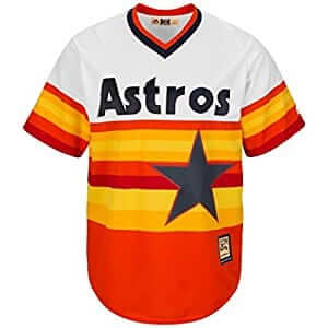
And now an important word from Paul: In late June I did an ESPN piece delving into some little-known facts about the Astros’ famous rainbow uniforms. At one point in the piece, I lamented that we don’t know who actually created the design, or if those people are even still alive.
The good news is that most of them are still alive. The better news is that I recently interviewed a bunch of them and pieced together an oral history of how this uniform — still every bit as radical today as when it debuted more than 40 years ago — was created. It’s up now on ESPN.
It’s a fascinating story — one that’s never been told before. I loved working on it, I’m totally geeked out now that it’s been published, and I think you’ll really enjoy reading it. Again, you can check it out here.
Another important word from Paul: As you’ve probably heard by now, Titans owner Amy Adams Strunk has announced that the team will have new uniforms in 2018.
That means it’s time for our latest Uni Watch design challenge over at ESPN. The official contest announcement is here, so you can bookmark that if you want, but I’ll repeat the ground rules here:
• Your entry must include a primary logo, full home and road uniforms (helmet, jersey, pants, socks), and a solid-colored uniform for Thursday-night games. If you like, you can also include secondary logos and a throwback or alternate uniform, but those aren’t required.
• You can maintain some of the team’s current elements (the helmet logo, say, or the color scheme) or change everything. Up to you.
• Your designs can be created in any digital or analog medium (Illustrator, Photoshop, crayon, whatever) and can be submitted in any standard digital format (JPG, PDF, TIFF, etc.). You can also create a video presentation, upload it to YouTube, and submit the YouTube link as your entry.
• The files you submit should be named after yourself (PaulLukas.jpg, for example). If you’re submitting multiple files, please either number them (PaulLukas1.jpg, PaulLukas2.jpg, etc.) or use some other designation (PaulLukas-homeuni.jpg, PaulLukas-logo.jpg, etc.). Files that don’t follow this format will not be considered.
• In keeping with longstanding Uni Watch chromatic policy, entries with even a hint of purple will not be considered.)
• Email your entry to Uni Watch HQ (please note that this is a new email address created specifically for my design contests; please do not use the usual Uni Watch contact adsress). If you have more than one concept, feel free to enter as many times as you like.
Deadline: Tuesday, Aug. 15, 7pm Eastern.
The best entries will be showcased in one of my upcoming ESPN columns. Good luck!
And yet another word from Paul: I’m happy to announce that our latest limited-edition T-shirt in the Uni Watch Artist’s Series is now available. It was designed by the awesome Rob Ullman, whose illustration work has been featured here on the site many times over the years.
Here’s the base design, followed by some of the many color options we’re offering (for all of these, you can click to enlarge):
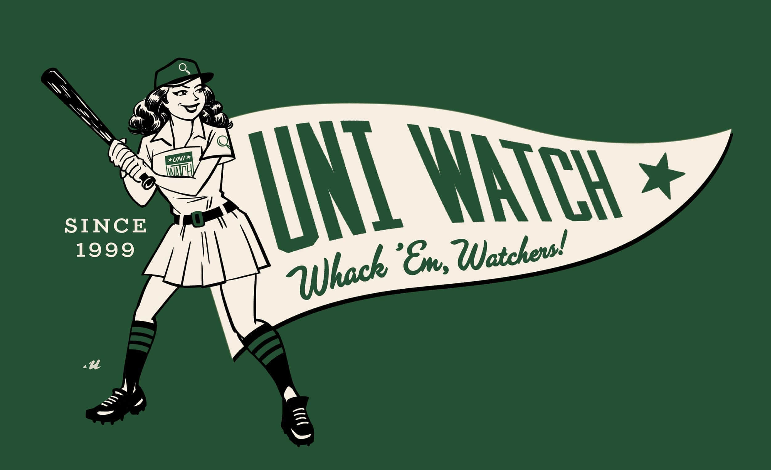
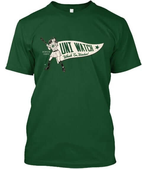
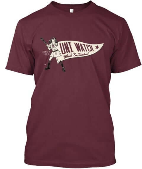
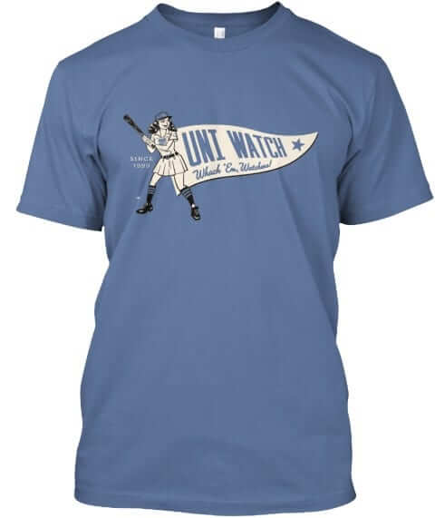
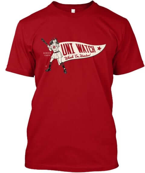
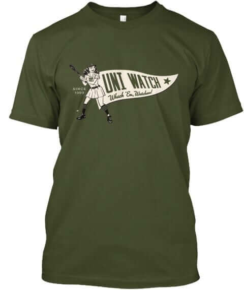
Nice, right? There are a few other colors available as well. I love the retro style and the old-school “Whack ’Em, Watchers!” slogan, which is the kind of thing that passed for marketing back in the day. “I wanted to do something that was both expected and unexpected,” says Rob. “It encapsulates many of my favorite things, from concise, simple graphics, to baseball stirrups, to A League of Their Own.”
My favorite element of the design is a small detail that’s easy to overlook. Check out the chest logo:
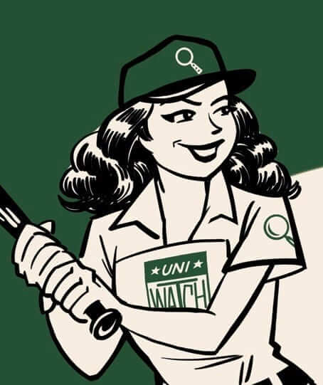
That, of course, is a riff on the old All-American Girls Professional Baseball League logo, which did indeed appear on the league’s uniforms — usually as a sleeve patch but sometimes on the chest. And of course that logo was itself a riff on the various Hale America patches. I’m pretty pumped to see the words “Uni Watch” in that format, even if it’s only a small part of Rob’s design. Might have to have that made into a real patch!
The shirt is available here until the end of next week, plus I’ve created a separate link for women’s tees. Card-carrying Uni Watch members can get 15% off; if you don’t already have the discount code, get in touch and I’ll hook you up. My thanks, as always, for your consideration.
And still more stuff from Paul: We’ve been getting some Naming Wrongs requests from Seattle fans. As it turns out, Scott Turner, who designs all the shirts (and also designs all of our membership cards), lives in Seattle, so he was excited to tackle this one. Seattleites, these are for you (click to enlarge:
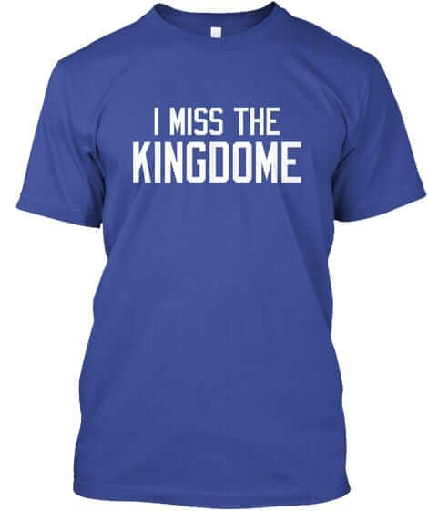
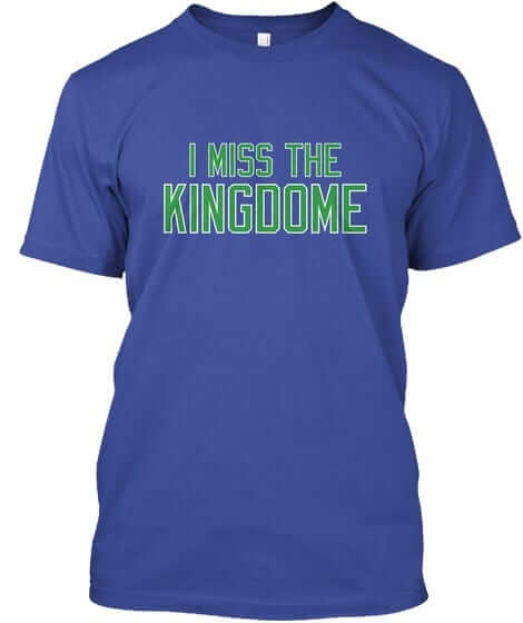
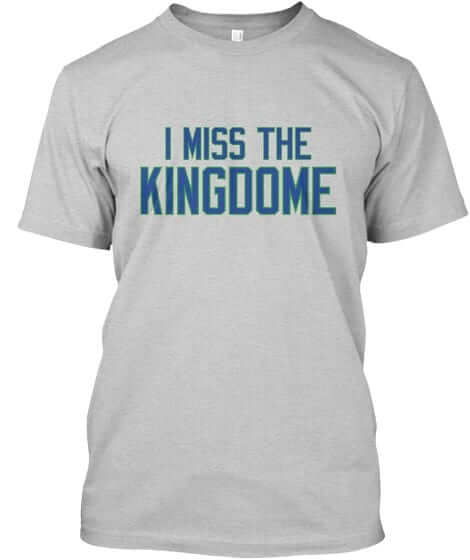

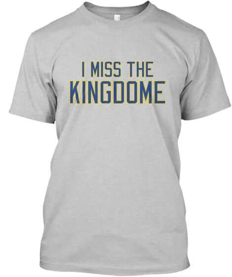
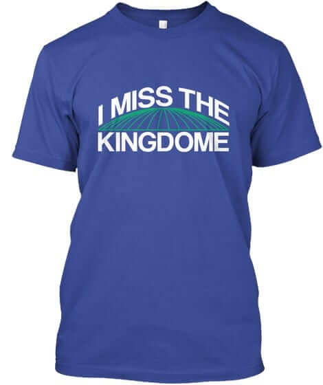
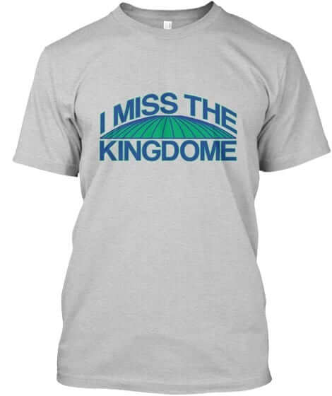
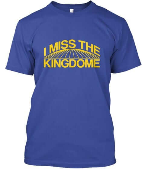
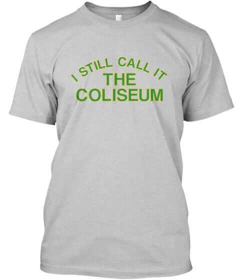
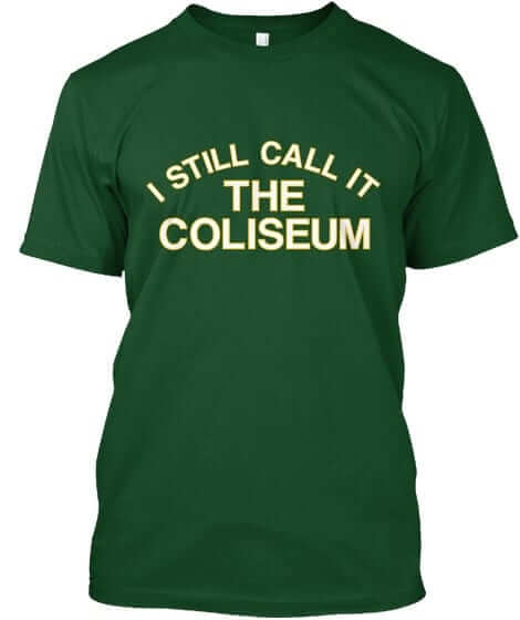
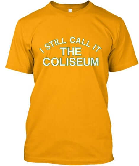
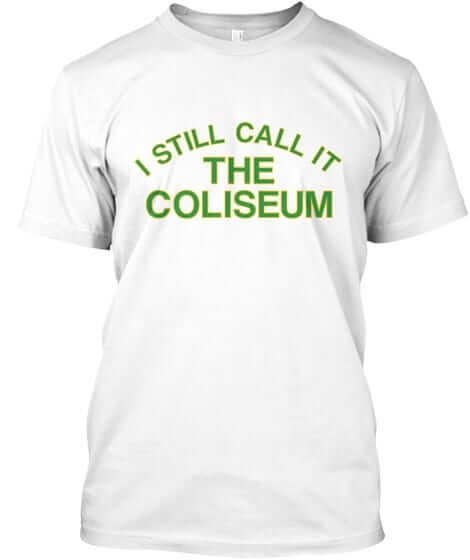
All of these designs are now available in the Naming Wrongs shop. They’re also cross-listed in the Uni Watch shop, where card-carrying members can get 15% off. (If you’re a member and need the discount code, send me a note and I’ll hook you up.)
Paul really needs to shut up already: Yes, I’m still here, with one last note: I was interviewed yesterday by the guys who do the Locked on Hornets podcast. We discussed the team’s new uniforms, the new Nike rollout, how the Hornets basically created the purple/teal craze of the 1990s, and more. It was a really good discussion. I’m told that an edited version of it will be available here at 8am Eastern, with the full unedited version available an hour or two after that here. One of those versions — I’m not sure which one — should also show up at some point in the morning at the top of this list.
There was at least one bit of news that I hadn’t been aware of: The podcasters said the Hornets plan to reveal their two alternate uniforms “by the end of the summer,” which is earlier than I had expected. We shall see.
Okay, that’s (finally) it for me today. One last time: Check out the Astros story! Thanks.
Griffins Jersey Contest Reminder

Phil here.
In case you missed it, I’m again hosting a jersey design contest in conjunction with the Grand Rapids Griffins (an AHL affiliate of the Detroit Red Wings). All the details are contained in this post.
The deadline for getting your submission in to me is August 15 (at 6:00 pm Eastern Time), and we’ll have reader voting on the concept jerseys beginning on August 17th! Last year we had 85 entries and I’d expect we’ll equal or surpass that this year. Prizes include a custom jersey based on your design and tickets to the game that the Griffins will be playing in the jerseys you designed!
The Ticker
By Mike Chamernik

Baseball News: The Padres wore their 1990s throwbacks yesterday. Their caps don’t have the New Era logo, unlike other teams (from Phil and Danny Forrest). … After getting hit by a pitch in his first at-bat last night, Mariners SS Jean Segura wore teammate Guermillo Heredias’s elbow guard (from @SafecoAtHome). … Cardinals catcher Yadier Molina put his mother’s name, Gladys, on his elbow guard strap (from @sportshuman). … Puerto Rico has long been a popular winter ball destination for MLB players, including three hall of famers back in the 1970s (from Douglas Ford). … Cody Walker was watching a Braves-Phillies game from August 1981 and he noticed that Braves batters had bow ties on their helmets, next to the “A” decal. Does anyone know the significance behind that? … This is from Brinke: “Longtime San Jose Mercury News sportswriter (and a friend of mine) Mark Purdy is retiring, and the Giants presented him with a jersey (last) nite.” Brinke adds that he was given #44 since he was the person who coined the phrase “McCovey Cove,” outside AT&T Park.

NFL News: Dennis Ryan, a Vikings equipment manager, created the first helmet visor in 1984 for a player who had recently suffered a fractured orbital socket. Ryan was inspired by the design of motorcycle helmet visors (from Taylor Nicolaisen). … Giants WR Odell Beckham Jr. is wearing a Joker-themed visor for OTAs. I bet Dennis Ryan didn’t envision that 33 years ago (from Phil).
College Football News: Ara Parseghian, the coach who won two national championships at Notre Dame, died yesterday. According to this video clip, Notre Dame will have nose bumpers that read “Ara” this season. Last year, the team had “Irish” on the bumpers (from @CBusIrish). … Minnesota will wear its anthracite uniform this year for the first time since 2015. … New teal jerseys for Coastal Carolina (from CoastalCSN). … New unis for Northern Colorado. … Georgia State has transformed Turner Field into a football stadium. The school bought the stadium from the Atlanta Braves last year for $30 million. … Georgia Southern switched to matte-finish helmets this year. Numbers will be added once season starts. … Michigan’s phone wallpaper shows a white uniform paired with yellow socks, while last year they wore white socks (from @bh5773). … Oklahoma coach Lincoln Riley hinted that the Sooners will have new alternate uniforms (from Phil).

Hockey News: The Devils will retire No. 26 for Patrik Elias. … The Iowa Wild revealed a new logo to commemorate five seasons in Des Moines. … During their inaugural season in 1967-68, the Penguins had adopted a living penguin mascot named Pete.

Soccer News: For last night’s MLS All-Star Game against Real Madrid, Tim Howard wore a goalkeeper jersey that was based on what former US men’s team keeper Tony Meola used to wear (from Josh Kail). … New home and away kits for Sheffield Wednesday (from Josh Hinton). … The Seattle Sounders are looking for a new jersey advertiser for after the 2018 season (from @Qazmonavt). … Last November, a plane crash in Colombia killed 71 people, including players, coaches, and guests of Brazil’s Chapecoense soccer team. The club will have 71 stars on their jerseys this season in memory of the victims (from Jason Hicks). … MLS and Adidas extended their partnership through 2024. Adidas has been involved with the MLS since the league launched in 1996, and has been the official outfitter of every MLS team since 2004 (from Phil). … New kits for Ireland (from Phil).

Grab Bag: New court for Drexel basketball. … UCLA teased its new women’s volleyball unis (from Phil). … New secondary logo for Texas State. … New logo for the city of Woodstock, Ga.
I realize there probably isn’t a lot of money to be had from fans in central Indiana, but I’d buy a “I miss Market Square” T-shirt. To learn more about the arena, go here:
link
That would be fun. Though, it’d need to say ‘market square arena’ because, of course, market square itself is still there.
Of course… Conseco/bankers life fieldhouse is easily among the top 2-3 hoops venues nation-wide. So few truly ‘miss’ MSA, even though it was also nice.
Maybe ‘I remember…’ (Ha, though that’s pretty flat)
If it had some reference to the WHA Indy Racers, I’d go for it!
-Jet
I think your Jordan statue comment is backwards. The statue might be based on the logo, which is based on a photograph (lawsuit outcome notwithstanding).
Typo: New home and away kits for Sheffield WEDNESDAY.
Fixed.
Looks like some text is missing from the retiring San Jose reporter item in the baseball section.
Name is Mark Purdy. Now added.
The “bow ties” on the Braves’ helmets were meant to recognize the missing and murdered children in Atlanta during 1981. It wasn’t just a Braves thing, Atlantans wore the ribbons too.
“Let’s look at the new white uniform first, which the Bills are dubbing the “Association” jersey. ”
Hate to be that guy, but I don’t think the Bills have completely given up on football, yet.
Fixed
I imagine the reasoning behind the truncated striping thing is to reduce rubbing around the underarms. However, that’s poppycock. Why not improve the trim fabric with new technology rather than just eliminate the design. Lazy. Looks awful and unfinished.
Of course, Nike could have some other excuse… Just like the nikelace in football.
I’m pretty sure the truncated sleeve striping is present on every uniform that has been unveiled so far. There’s a funky intersection of fabric where two pieces overlap at different angles (I assume to increase range of motion) and the striping is consistently cutting off at that point.
Sure, but there’s no real reason the striping couldn’t be sewn over the top…other than Nike is Nike.
Just like adidas did for years in football with UCLA stripes.
Nike certainly likes to blur the line between form and function.
I would absolutely think this is a Nike being Nike thing. Yes, there are overlapping pieces of fabric here, and yes, creating a design to allow for greater range of motion makes sense, but this is NIKE. If they wanted, they could accomplish all three things without much issue. Just let the striping be sewn across the edge of the armhole – there would be a offshooting fabric line where the fabric overlaps itself from the bottom of the armhole to the top of the collar, but that wouldn’t be very noticeable, especially compared to what they’ve decided to do.
Like Phil said, I think this is absolutely comparable to the Nickelace decision. Design element for design element’s sake, i.e. Nike being Nike. (eyeroll)
Truncated stripes a signature element on new Nike unis? Nah… Nike found a way to save 57 cents on a $200 jersey! Greedy douchebags!
I agree that the unfinished stripes on the back of the armholes looks awful. Also, the addition of the oversized swoosh looks bad. I’ll grant that the change to simplify the NOB lettering makes them more legible. I’m not crazy about the addition of the stars on the waistband. I know Chicagoans love the city flag (for good reason), but I don’t think they fit with the Bulls. Interesting that while all of the NBA teams have added a logo to the waistband, they’ve usually been a team logo. The four six-sided stars are not and never have been a Bulls logo. It’s just an element from the city flag. Have any of the other teams added a logo to their uniforms that isn’t a team logo? Fortunately, you won’t see them all that much since the jersey usually blouses out enough that it covers the waistband. Overall, while the changes are minor, this is a definite downgrade in my book.
The “bow ties” on the Braves helmets were green ribbons — a response to the serial killings of over two dozen African American children in Atlanta from 1979 to 1981.
In the 1981 All-Star Game, Mets outfielder Joel Youngblood ended up wearing Braves catcher Bruce Benedict’s helmet (one of many such ASG helmet mix-ups over the years, which I’ve written about several time), complete with the ribbon:
link
I’m not sure how one would define or describe the concept of “those who get it” but (a) “was watching a Braves-Phillies game from August 1981” and (b) not for one second thinking that is in any way weird, has got to be part of it.
How does one suggest a naming wrongs tee shirt? Thanks.
Posting a suggestion here in the comments is usually a good way to run it up the flagpole.
I’m not following the comments very closely in August (this particular moment notwithstanding). Emailing me directly is better. Thanks.
Good point.
Doug: Email me. link
Great job tracking down the story of the Astros’ jersey, Paul! To this day that is still one of my top-5 MLB jerseys.
Why does this article read like the Bulls are the only team with the bizarre shoulders and oddly named uniforms? Every team will have both.
Sorry if I gave that impression — yes, every team will have that jersey cut, but not every team will have truncated striping. And the name thing was more of a poke at Nike/NBA for making up names for the “white” and “color” (also [formerly] known as “home” and “road”) unis. Or “classic” which we used to call “throwback.”
Maybe we need a “I’M STILL CALLING IT A HOME UNIFORM” t-shirt
Or maybe a “WHITE AT HOME, AS GOD INTENDED” shirt? ;)
With the Bulls announcing they intend to make their white uniform their primary road uniform it made me think most teams are planning on wearing their colored jersey at home. Fine with me….however… Most teams colored jerseys have the CITY listed on the front (Bulls are one of the few teams that have “Bulls” on both unis) of their jerseys which to me will look weird at home.
I always felt that it works best to have teams wear their city’s name on their jersey on the road, and the team nickname at home.
I have a feeling this detail is going to bother me if most teams do end up employing their colored jersey at home.
I really hate the idea of teams wearing their colored uniforms at home. I think it works for football but for some reason for hoops it just seems natural for the home team to wear white.
I just like the fact that the home fans are always treated to a new color uniform coming in, instead of say for instance ALWAYS red for the Bulls vs. White for whomever….at least you’d get white for the Bulls and Purple (Paul’s on vac, right? He won’t see this? lol) for the Lakers, or Blue for the Knicks, etc.
Not *all* color vs. color games are aesthetically pleasing. The white uni serves a purpose other than just for making black & white tv viewers happy back in the 1950s. A gold (for example) vs navy can look great, but black vs. purple (or blue) or red vs. orange (which could happen, in theory) might be very difficult to watch, even with hi-def tv’s. Even a navy vs red isn’t always a great matchup.
I’m far from being averse to color vs. color, but the more often they happen, the less ‘special’ they are and doing them “because we can” isn’t always the best reason to have them.
I agree, and I still hate that the NHL switched from white-at-home to colors-at-home several years ago. As Rich P said, it’s nice to see a variety of colors in the visiting uniforms.
Oddly, the Sacramento Kings did just that (city name on the whites, team name on the purples) in one of their more recent redesigns. But it seemed more misguided than prescient.
I thought the same thing about the city name on the colored jerseys. I don’t think it’s determined that teams will wear colored jerseys at home, and it’s possible that some teams will mix it up and wear both white and colored at home. Also I believe the road team can wear a colored jersey even if the home team is also wearing colored, as long as it’s contrasting. Not sure how they determine what is contrasting enough? Some seem obvious as bad combos, like black & navy or red & orange.
Didn’t the Hornets’ recent uniform reveal include having both jerseys read “Hornets”, instead of one of them reading “Charlotte”? That would seem to fit in with the idea that teams are going away from traditional home or road uniforms, with more mixing it up with both white and colored worn both on the road and at home as RickAZ says.
Paul, GREAT read on the Astros unis. Really enjoyed it!
Now I’m really curious to see what an orange version of that suit would look like. And it surprised me to hear the alterations which were disparaged by the suit’s designer. Obviously, his original had a purity in his mental image that we never got to see; the “cocked-up” version is the “original”, to we casual onlookers. I liked the multicolored stripes running up the pant leg. I wish Houston could work it into its current uniform.
Indeed. I’d always just assumed someone had an epiphany while staring at a bowl of Trix.
I am having major hang ups with the backside arm holes on the NBA jerseys. Why the fold over covering what should be the arm hole trim? I don’t get it.
That new uni-watch t-shirt is the best one yet.
I love it too but the girl should be left-handed. :)
Agreed – just ordered my first Uni-Watch apparel!
Thanks, y’all!
Hopefully it doesn’t get associated with domestic abuse
I look forward to seeing new Tennessee Titans uniforms in 2018. I would not mind seeing their redesign use the present logos, but I would like to see them give a subtle nod to the old Oilers uniforms.
A full Columbia blue jersey with more red in the trim as primary dark jersey. Keep navy in the trim too.
I’d really like to see them get rid of the contrasting panel across the top; and maybe have the whole ensemble bear a closer resemblance to the Oilers.
I like the panel; it sets the NOB off from the number and looks balanced. Compare that with many hockey sweaters where the shoulder yoke has nothing on it except a balance-destroying manufacturer logo, with the name and number both shoved downward.
As a lifelong Astros fan, I sincerely thank you Paul for both stories on the Tequila Sunrise unis. I still remember wearing my replica jersey during the 1980 NLCS and nearly crying when they lost to the Phillies. Seeing my heroes (especially Jose Cruz) wearing that gear in the Astrodome is one of my greatest memories.
Me, too. I became a fan of the Astros in ’79-80 BECAUSE of the uniforms (and JR Richard)… moving along from my fandom of the Cincy Reds. Loved Jose Cruz and the rest of the gang.
This was one of the best articles ever on UniWatch/ESPN. I’m very pleased that the parties involved are still around, and that it all came together kind of serendipitously. Sounds like a good promo opportunity is on the horizon… those involved deserve the recognition for creating one of the most iconic in all of sports history. The design was also a little league sensation in the mid-80s… and it’s come full circle 30 years later.
I thought the NBA was gearing up for many more color-on-color games.
They are! But there’s nothing wrong with wearing a white uni (put me in the curmudgeon camp of preferring white unis at home — in every sport but football)
My sentiments exactly. Also agree with you that color vs. color is overdone. It should be more of a novelty. I think it’s much easier to follow a game when there is more of a contrast in uniform colors and there is no better contrast than white vs. dark. (Now get off of my lawn!)
I believe they are. With regards to the Bulls announcement there are two thoughts behind it. Either they actually intend to wear white on the road every game (unless the home team is wearing white) or they are saying that white is their secondary uniform, so they’ll be wearing red at home and also on the road, only going with white whenever they need a contrast against a red team while on the road.
This is why I think it is just better to designate it league wide whether you want to make white the home or road uniform, and just stick to it.
Anyone else wish the Bulls would bring back the script Chicago for their red uni?
I still want to know why Jumpman is wearing long pants.
I mean, I know why, but *why*??
“She has Man Hands!”
Can we just call the NBA uniforms by their colors? The marketing terms are just downright stupid and they won’t necessarily be home or away anymore. I actually wish more sports with go the soccer route – a “primary” uniform (that you wear all the time unless you clash with the home team), a “secondary/change” uniform in the event of a clash on the road, and a “3rd/clash” set in case BOTH of your other ones are deemed to be in conflict.
I actually wish more sports would go the baseball route. White at home and gray on the road. Simple and classic.
Glad to see that the backstop area will be preserved from when Georgia State’s new football stadium was Turner Field. Remember that Atlanta’s Olympic Stadium was built with that “bulge” as a reminder that it would converted for baseball after the Games. I’m also amused by the right field seats that will be useless because of the new seats installed for football.
Why couldn’t they keep either previous name for the place?
“Georgia State Stadium – the facility’s temporary moniker until a naming-rights agreement is done”.
We already know why.
I feel sorry for the poor students who have to fund this nonsense. Georgia State University has a president who is hell-bent on building a big-time FBS program. To date, $90 million in student fees have gone into the football program, and 85% of the athletic budget is paid for by students who are primarily getting by on Pell Grants and student loans. The Chronicle of Higher Education and the Atlanta Journal-Constitution have exposed GSU’s thievery of student resources.
Georgia State did not purchase the stadium from the Braves. The Braves never owned it…a big reason whey they moved to Cobb County.
Truncated stripes a signature element on new Nike unis? Nah… Nike found a way to save 57 cents on a $200 jersey! Greedy douchebags!
If only ex-Met Jon Niese had been able to pitch better for the Pirates last year while wearing number 18; we would have had the possibility of link, including Mike Leake’s single digit.
It looks like this was link, and by then Niese had been sent to the Mets and number 18 had been given to infielder Pedro Florimon.
All of the applicable Nike NBA jerseys have had the truncated arm-hole stripes on the back of the jersey, this seems to be the new norm. See: Pacers, Thunder, Sixers, etc.
Paul – in the Astros article (great read), typo in section where Rollins is discussing typefaces on back of uniform. His name reads “Collins:”
In regards to the new secondary logo for “Texas State”; I still call it South West Texas State.Go Bobcats.
I’m not expecting a shirt, but how many other schools have changed their name lately?
If I were in charge of the Pistons right now…
… well, if I were in charge of the Pistons, I would’ve opted out of the ad patch, and we’d be getting ready to celebrate the 30th (and probably final) season at the Palace instead of immediately horning in on the Red Wings’ inaugural season in their barn while jacking up ticket prices at ridiculous rates, but none of that is relevant to the point I’m about to make.
… if I were in charge of the Pistons right now, I’d make sure to point out we’re wearing white at home against Chicago.
Photos of Marc-Andre Fleury’s new mask, and posing in full Vegas Golden Knights uniform.
link
The overall uniform is growing on me. I think I’m up to regarding it as a C-plus at this point. But that primary logo, ugh. Gets worse every time I see it.
Anybody know when the new style NBA jersey go on sale to the general public?
Cool to see that Turner Field has found a new use.
Makes me wonder…has any modern stadium ever been totally refitted, not once but twice?
ha. nah that statue didn’t inspire the air jordan logo haah its already wearing air jordans how could something retro-actively inspire something that’s wearing what it inspired lol
the statue itself is based of the jumpman logo which was based off a photograph that the photographer is still trying to get some money from jordan/nike
also, this statue was erected sometime after jordans retirement. nike actually manufactured the Bulls jerseys in the late 90’s and this statue definitely wore the old nike jersey at times. sometimes even wearing the special 72-10 nike jordan authentics that came out like 2000-2001
the statue was erected sometime after jordans FIRST retirement is what i meant