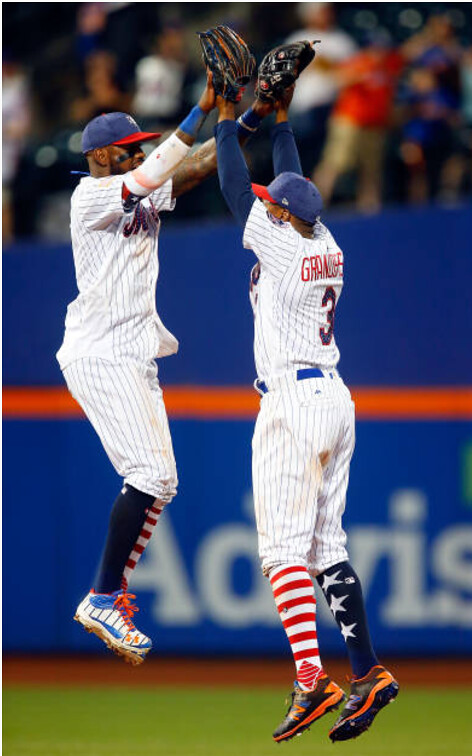
MLB teams are currently in the midst of a four-day run of wearing stars/stripes uniforms. This is the latest development in a progression that began in the wake of the terrorist attacks of Sept. 11, 2001, when MLB teams wore American flag patches over the MLB logo for the last few weeks of the season. (The Mets went further by wearing flag embroidery on their sleeves.)
Up until then, it was fairly rare for the American flag or flag-based imagery to appear on an MLB uniform (more on that in a sec). But since then, it has become increasingly common. Beginning in 2002, teams wore American flag cap patches on Independence Day for several seasons (a ritual that often went awry and occasionally sent unintentionally prophetic messages). The cap patches eventually gave way to caps with stars/stripes team logos, which in turn gave way to the stars/stripes jerseys that we now see every year around this time. Flag patches have also become routine on various camouflage jerseys, and the Nats have had several stars/stripes alternate jerseys.
Prior to the Sept. 11 attacks, it was uncommon for the flag or flag-based imagery to appear on MLB uniforms. The primary examples are as follows:
• In 1917 and ’18, many teams wore flags and/or red-white-blue stripes to support America’s entry into World War I.
• There was a similar show of support for the war effort during World War II, as teams wore the Hale America “Health” patch and other flag-derived patches.
• The Reds and A’s wore American flag patches during the 1990 World Series as a gesture of support for the first Gulf War.
(I suppose you could argue that the baseball centennial patch, worn in 1939, is flag-based, and maybe ditto for the National League centennial patch, worn in 1976, although I don’t think either of those quite fits the bill.)
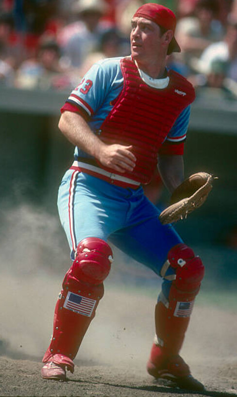
But there’s at least one other use of the flag on an MLB uniform that I hadn’t been aware of until reader Jeff Scott recently pointed it out to me. It involves former Cardinals catcher Ted Simmons, who for much of the 1980 season wore American flag decals on his shinguards:

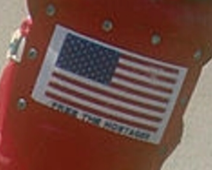
If you look closely, you can see that there was a phrase printed beneath the flag: “Free the Hostages,” a reference to the Americans who were being held captive in Iran at the time:

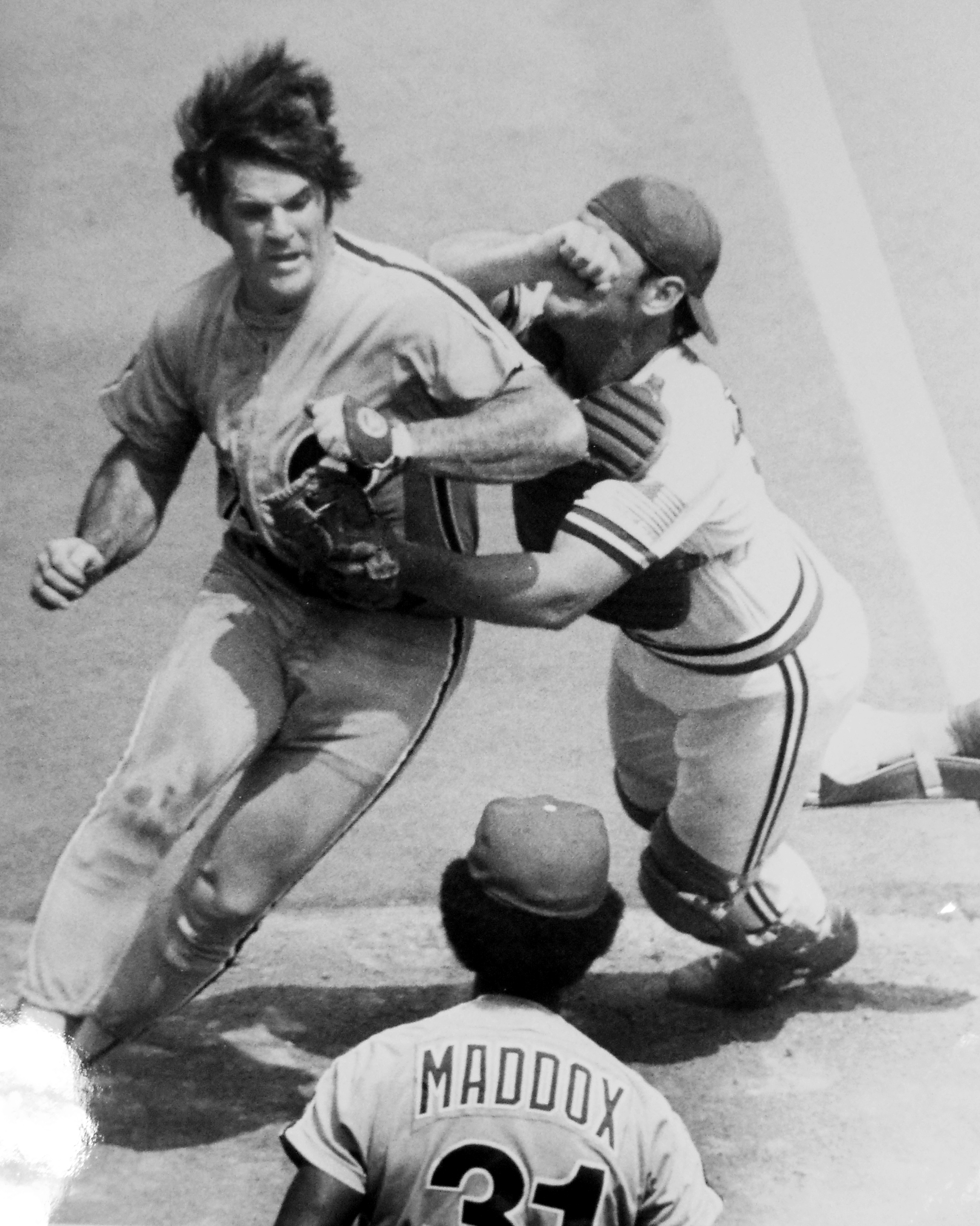
Simmons took an additional step on July 4 of that season, when he covered his sleeve numbers with American flags (click to enlarge):

This was all new to me (or else I once knew and just forgot — always a possibility). Big thanks to Jeff for letting me know about unusual chapter in flag-based uniform history.
The Ticker
By Alex Hider

Baseball News: Our own Phil Hecken had a good recap of the MLB’s Independence Days unis in yesterday’s post, but we have a few odds and ends to tie up: Umpires wore caps with a stars and stripes batterman logo. … The Fox Sports scorebugs dressed up as well. … The Reds painted an “Old English” C on the mound on Independence Day weekend (from Jonathan Cain). … Hanley Ramirez of the Red Sox cut the ends of his sleeves (from TWF). …. Yunel Escobar of the Angels wore his American flag socks as sleeves, and his teammate Jesse Chavez took the field wearing two “stars” socks — no stripes (from Nathan Larsen). … Mets C Rene Rivera had stars/stripes catcher’s gear yesterday (from Ryan Feuerstein. … The Indians tweeted a photo of Terry Francona’s All-Star Game jersey, which he’ll wear while skippering the AL team next week. … The Brooklyn Cyclones wore Captain America jerseys yesterday (from Crazy Tex).

NFL News: A man convicted of double murder in Las Vegas showed up to his sentencing wearing a brand-new Tony Romo jersey last week. When asked if he wanted to take the tag off his jersey, the man declined and said it would “depreciate the value” of the shirt (from Chris Flinn). … Check out this old shot of the Lions wearing navy jerseys with Honolulu blue socks. According to the Gridiron Uniform Database, the Lions wore the darker jerseys in 1964, the 1967 preseason, 1968, 1969, and the 1970 preseason (from NFL Journal).
College Football News: UCLA teased their new uniforms yesterday, and it appears the script on the helmet is going from navy back to powder blue (from Matthew Henderson). … Here are Toledo’s new uniforms, which sees them go from a stock Under Armour template to a stock Nike template (from Jordan Strack). … Ohio has officially severed ties with Russell Athletic, as their contract with Adidas began Saturday. The football team will unveil new unis later this month (from Noah Wolf). … The Boise State Gators? … The Gerald Ford Museum and Library in Grand Rapids, Michigan has a replica of the 38th President’s University of Michigan football jersey and the original uniform he wore as part of the 1935 College Football All-Star Game (from Andrew Beckman).

NBA News: The refs for the NBA Summer League are sporting some new threads. It would be interesting if they were in fact wearing new Nike shirts, considering Adidas is still making the Summer League jerseys (from Josh Edney and Ryan Fishoff).

Soccer News: Sport Recife and Atlético-PR of Série A in Brazil went red-on-red yesterday (from Andre Noruega). … Mexican League teams Cruz Azul and Monterrey played a game in Houston yesterday, and Issam Konsul” noticed a bunch of players with three digit numbers. The teams were playing as part of the SocioMX Cup and not in league play, so these players could be young prospects not typically on the roster. Does anyone have any other theories?

Grab Bag: The Choctaw Nation has updated its official seal (from Chance). … The Wisconsin State Journal is running a contest to redesign the flag for the city of Madison (from Sleep Without Cotton). … New hockey sweaters for NCAA DIII’s Elmira College (from The Goal Net).
Not sure if it’s just my computer, but three of your images for today’s post are broken. The only one I see is the Pete Rose/Ted Simmons photo. The lead photo isn’t showing up, and the two photos before the Rose/Simmons photo isn’t showing up, either.
It’s not just you. I can’t see them either.
Weird. I’ll see what I can do, but please (a) tell me which browsers you’re using and (b) see if the problem also occurs in other browsers. Thanks.
Try it now.
Try it now.
Thanks, Paul, I can see them now. I’m sorry I couldn’t tell you the browsers before I left — had to go run a quick errand. I had tested it on Chrome and Firefox. When I grabbed the URL for those photos, I got a “Page could not be found” error. Just letting you know for future reference.
Proofreading – conservation of “the”s
“a photo of the Terry Francona’s All-Star Game jersey”
“a replica of 38th President’s”
Also, like Rich, I’m not seeing the first three images on a couple of platforms.
Typos fixed. Try images now.
They’re now visible. Thanks.
They were visible to me all along. But I wondered if changing the images from being hosted at uni-watch.com to Flickr would help. Apparently that did the trick for you. But I don’t know why you couldn’t see them to begin with, as I did. Hmmmmm.
Typo in the grab bag.
It’s “Choctaw” not Chocktaw
Fixed.
“UCLA teased their new uniforms yesterday, and it appears the script on the helmet is going from navy back to powder blue (from Matthew Henderson)”
Actually the script has been royal blue, which never matched the jersey. And not “going…back to powder blue”, since it never was powder blue.
No, the script has always been navy blue, not royal. But you are right, it’s not “going back” to powder blue; this is new.
Typo in college football news – “The Gerald Ford Meseum”
Fixed.
What really impressed me about the Ted Simmons/Pete Rose photo is how Simmons stood up (literally) to Pete Rose at home plate (looks like they may have exchanged forearms). “Simba” never backed down from anybody.
Sport Recife and Atlético-PR of Série A in Brazil went red-on-red yesterday (from Andre Noruega).
Not really. Follow the responses to Mr. Noruega’s original tweet and you’ll see the matchup was red/black vertical stripes vs a sort of orange shade.
link
As to the three-digit numbers for Cruz Azul and Monterrey, other posters on this site have noted that every player on a Mexican club — from the senior squad on down to the youth teams — as a unique squad number that they are registered with for the season. The senior squad get the more conventional numbers; the youth teams will often have players in triple digits. If a youth player gets called up to the senior team, he must wear his original number.
Yeah. And they can’t receive a new number until the next season. Also, some Mexican teams are missing several starters due to Confed. Cup and Gold Cup leaving space for youth players
The primary shade of blue that UCLA Athletic uses is called True Blue. It’s darker than powder blue is.
link
It was True Blue. On July 1, UCLA released their new athletic brand standards, which name their colors as “Powderkeg Blue” and “Westwood Gold,” along with designating Pantone, CMYK, RGB, and Hex values for these colors.
link
That definitely coincided with the official switch to Under Armour. I guess True Blue was an adidas thing, which explains the name changes. The Westwood Gold name makes sense for obvious reasons.
I saw this, and I wonder if they are any different. Seemed like the Adidas True Blue was getting darker and darker, becoming almost royal blue. I believe Powerkeg Blue was what it was originally called when Red Sanders changed the navy to light blue for the football team. I know in the 1960s and 70s their jerseys were light blue, and the basketball uniforms were closer to royal blue. At some point they tried to get a common blue that was a darker shade of light blue.
I lived in LA in the 50s, 60s, and 70s. I know it’s anecdotal, but UCLA’s unis were definitely a powder blue then, for all teams. Now they are what I would call a light royal. I wish they hadn’t changed, and I wish people would not use “powder blue” to describe their current color.
Even though I’m a graduate of USC, I grew up being a huge UCLA basketball fan. I went to many games. Their home white uniforms had a darker shade of blue, more like royal blue lettering and numbers. And their away uniforms were light blue, but darker than “powder blue” or “baby blue”. The fans got very upset with Larry Brown when he changed the uniforms to a lighter shade like his beloved North Carolina.
UCLA switched to a darker blue (not quite royal but closer) in the early 2000s and called it “true blue.” “Powderkeg blue” was what Red Sanders called UCLA powder blue when he switched from the original navy. So calling the current shade “powderkeg blue” is a bit misleading as it’s not the same color that Sanders used (and was worn by the likes of Beban, Easley, Aikman, McNown, etc.).
In any case UCLA ditching navy as an accent color is a big mistake. They tried using “true blue” on the away FB unis for a couple of years in the Karl Dorrell era and they looked bad. Being in close proximity to gold made the blue look turquoise, and the whole thing appeared washed-out. Navy is much sharper and clean looking, and it is traditional as it was UCLA’s original color (Jackie Robinson never wore powder or true blue at UCLA) and had been used on the away unis and helmets for literally decades. Oh well.
Actually the turquoise look on the road uniforms was only recently before switching to navy. They had light blue for many years on their road uniforms and they look great. I think it was an Adidas thing where they just didn’t do a good job with it.
Rick, when did UCLA have light blue on the away FB uniforms (prior to the KD era)? I have never seen any photos of such uniforms. Beban, Easley, Aikman… all had navy trim on the white FB uni.
link
link
link
On the black-and-white photo of Simmons and Rose, the flag on Simmons’ shoulder appears to have a broken line below the bottom stripe of the flag. Which makes me suspect he used the same stickers on his sleeves that he used on his shin guards, with the “Free the Hostages” text.
Good rememberance of the simple post-9/11 tributes to our country. I can’t imagine MLB removing its logo from the back of the jersey in 2017, no matter how horrible the tragedy. The Yanks went with a black armband and the Mets wore a simple mishmash of NY-area first responder caps, most of which were snap backs. No doubt garish memorial patches and “official” New Era first responder caps (only $38 at MLB.com!) would be rushed out if, God forbid, something like that happened again.
Speaking of the US flag on sports uniforms, I have always been intrigued by major junior hockey’s Spokane Chiefs of the WHL. For well over a decade, they have sported the US flag permanently as their left shoulder patch:
link
I have not seen an explanation as to the reason why. May have to do with the Chiefs being one of the few American teams in the CHL. This is their way to represent.
It is an intriguing uniform detail considering it is combined with the Chiefs’ indigenous themed logo and on a template borrowed from the Montreal Canadiens.