A few weeks ago I did an ESPN column about NBA team captains who’ve worn a “C” on their jerseys. Today I want to turn our attention from the hardcourt to the diamond.
”¨MLB, like the NBA, does not maintain an official database of players who’ve worn a captaincy designation. My own mental database includes the following players (for many of these photos, you can click to enlarge:
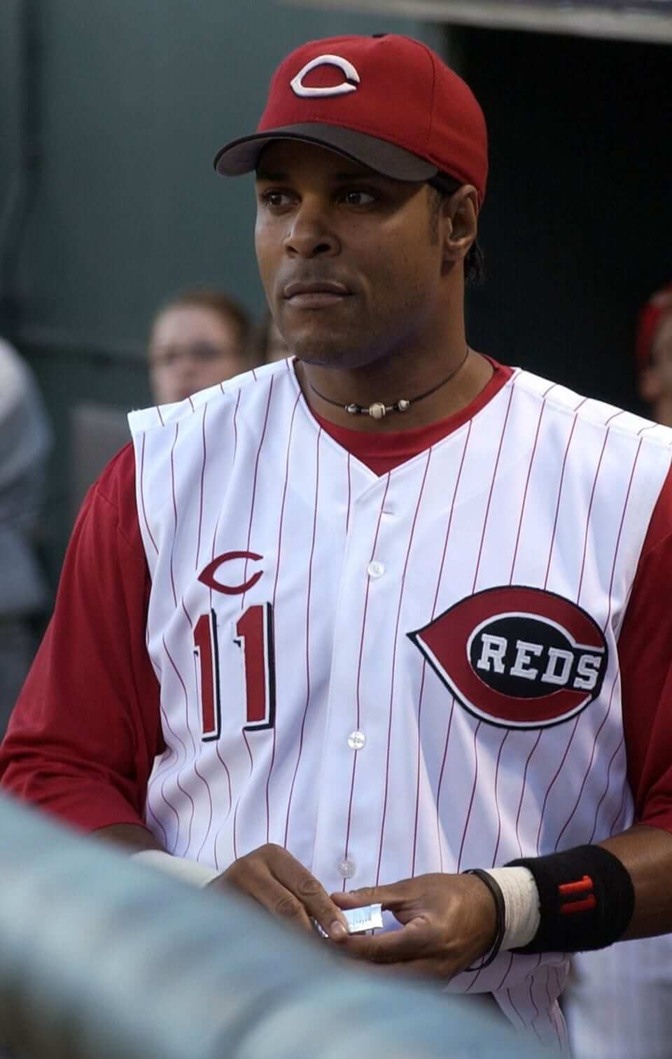
1. Barry Larkin, Reds. I always liked how the Reds gave Larkin a wishbone-C.
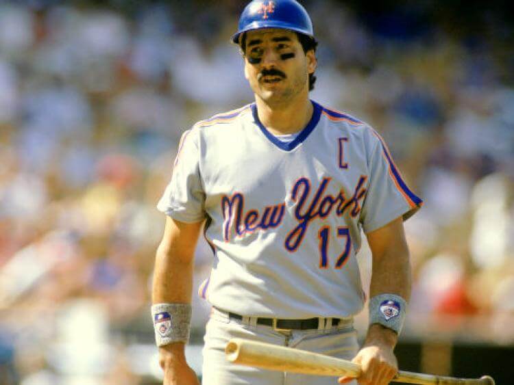
2. Keith Hernandez, Mets. Hernandez wore the C in 1987. But when Gary Carter was named co-captain the following year, Hernandez removed the C. (Carter himself never wore the C, perhaps because it might be confusing to have a catcher named Carter wearing a C on his chest.)
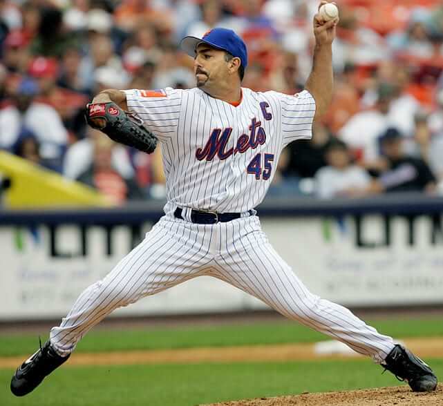
3. John Franco, Mets. It’s unusual to see a reliever serving as a captain, and even more unusual for a reliever to wear the C, but Franco checked both of those boxes for the Mets.
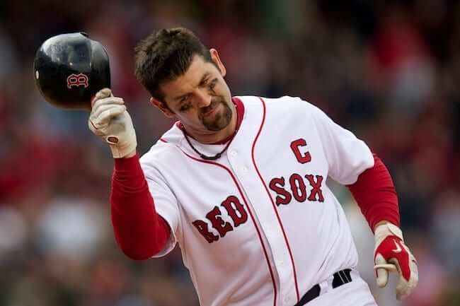
4. Jason Varitek, Red Sox. The Sox gave Tek a C after re-signing him to a new contract prior to the 2005 season.
5. Mike Sweeney, Royals. During a period when the Royals didn’t have a whole lot to feel good about, they did their best to promote Sweeney, who put the “C” in KC for many years.

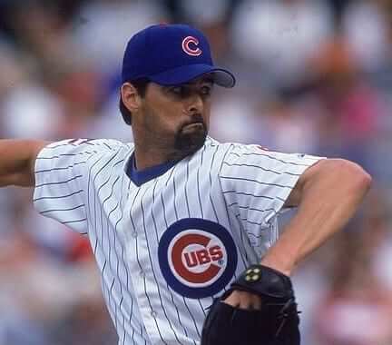
6. through 9. Sammy Sosa, Mark Grace, Kevin Tapani, and Rick Aguilera, Cubs. In 2000, Cubs manager Don Baylor decided to name four captains — one apiece from the infield, the outfield, the starting rotation, and the bullpen. The weird thing is that they wore the C on the right sleeve, and many fans no doubt mistakenly thought it stood for either “Chicago” or “Cubs.” (I had trouble finding good C-inclusive photos of Tapani and Aguilera, but you can just barely see their Cs in the pics that follow.)

———
And that’s it. It’s a surprisingly short list, no? Until I started spelling it out, I didn’t realize how short it was, and now I’m kind of stunned that there have been so few C-clad MLBers. Also, this list spans a relatively short period of time, from 1987 (Hernandez) through 2007 (Sweeney). Was Hernandez really the first MLB captain to wear a C? That seems absurd, but I can’t think of an earlier example.
Did I miss anyone? I feel like I must have. If so, let me know. (Of course, there have been plenty of team captains who didn’t wear the C — Derek Jeter, David Wright, and Paul Konerko are three recent examples — but that’s a whole different category and not uni-relevant.)

Purp Walk wrap-up: Big thanks to everyone who made our annual Purple Amnesty Day so much fun. I processed lots of purple-centric membership card requests (Scott Turner will get working on these pronto, and I’ll start showcasing them on the site soon), and we sold — get this — 134 shirts, which is 50% more than we sold in the last two years combined. An amazing total for a one-day sale. I’m really happy for our shirt designer, the great Bryan Molloy, who put so much work into this one and got to see it pay off in spades. Take a bow, Bry — you deserve it.
I also appreciate all the kind words that so many of you offered regarding the site’s 11th anniversary. Shall we go for 12? Only 364 days until Purp Walk 2018!

LAST CALL for the movie contest: In case you missed it over the weekend, Phil is running a new contest to create an updated design for a jersey featured in a movie. All the details are in this post.
The winning designer will get a custom-sized version of his or her jersey, produced by our friends at Garb Athletic. The deadline is tonight at midnight Eastern, so get crackin’!
The Ticker
By Mike Chamernik

Baseball News: Astros INF Jose Altuve wore teammate Carlos Correa’s arm guard yesterday (from @SteveinLC). … Rays 2B Brad Miller used his Mother’s Day weekend bat on Monday and got three hits. MLB promptly told him that pink bats were no longer allowed. … The Giants will unveil a plaque for Barry Bonds on the team’s wall of fame in July. … Single-digit pitcher alert! That’s Jo Jo Romero of the Class A Lakewood BlueClaws (from Kevin Clark). … In 1970, Richie Hebner of the Pirates changed his number from 20 to 10 when Three Rivers Stadium opened during the season. He knew the team wanted to retire No. 20 in honor of hall of famer Pie Traynor, who spent his entire career in Pittsburgh. After a slump, though, Hebner changed his number back to 20 before the season ended. Then, when the club officially retired Traynor’s number after his death in 1972, Hebner switched to No. 3 (from Jerry Wolper). … Indians P Johnny Allen wore an enormous overcoat in the dugout to keep warm back in the 1930s (from Ed Hughes). … Matthew Rogier plays on a baseball team in Paris called the Patriots. The team has filed a lawsuit over intellectual property against a new far-right political group called “Les Patriotes.” Here’s a news clipping, and rough translation from Matthew, on the suit. … Jarrod Saltalamacchia is back down in the minors, with the Buffalo Bisons. He still has the super-long NOB, of course, but it is no longer arched (from Phil Walck). … The St. Paul Saints of the American Association named their new live pig mascot Alternative Fats (from Andrew Hoenig). … The 1973 American League Red Book contains a section on team uniforms and insignias. Judging by the length of those blurbs, a picture really does say a thousand words. As for the book itself, each year MLB produced Red (AL) and Green (NL) Book media guides that contained stats and historical information. They were discontinued in 2016 (from Kevin Vautour). … As you can see at certain parts of this video, the New Britain Bees use umpire cams during their home game streams (from Scott Markiewicz). … The Kane County Cougars and Beloit Snappers went green vs. green yesterday (from Melissa Lockard). … Interesting hyphenated NOB for new Rangers P Austin Bibens-Dirkx. … It’s standard for the visiting team’s logo to appear atop the visiting dugout at PNC Park, but they’re using an outdated Nats logo. … Willie Stargell’s widow is selling off his memorabilia, including his 1979 MLP award and World Series ring (from Mike McLaughlin).

![]()
Pro & College Football News: The Houston Gamblers of the USFL had oddly-shaped 8s on their jerseys (from Gene Sanny). … Broncos WR Rick Upchurch wore a plain blue helmet during a 1975 game against the Chiefs. “Pat Summerall explains on the video that the helmet was plain because Upchurch had split his regular helmet ‘wide open’ on an earlier kickoff,” explains Jon Michael Smith. He got a new helmet with a decal for the second half. … Former Browns WR Michael Jackson died last week. During his first two years in the league in 1991 and 1992, Jackson wore No. 1 because numbers 80 through 89 were unavailable (No. 82 was unused, though not officially retired, for Ozzie Newsome). Eventually, No. 81 opened up, and the league forced him to switch for the 1993 season. The NFL eventually allowed receivers to wear Nos. 10 through 19. … New uniforms for UAB (from Phil). … Check this out: Marcus Allen wore a Raiders helmet with a black facemask in the 1983 Pro Bowl (great find by Gene Sanny).

Hockey News: The numbers on Erik Karlsson’s helmet didn’t match the font or placement of the numbers on the rest of his Senators teammates’ helmets (From Chris Ramirez). … The Senators gave fans these rally towels for last night’s game.

NBA News: What is this? Brett Knowles spotted a new Suns logo. … The artist Asur continued her tradition and drew illustrations depicting the essence of the conference finals matchups. … At one point in the mid-1980s, the “K” in Ralph Sampson’s “Rockets” chest insignia didn’t match the size of the rest of the letters (from Andy Silvester). … What’s your favorite Detroit Pistons logo? Unfortunately the dribbling piston man they used in Fort Wayne was not an option. … Kinda looks like one of the letters on LeBron James’s jersey was out of alignment last night.

Soccer News: New logo for Sydney FC (from Ed Å»elaski). … FC Cincinnati, whose colors are orange and blue, wore black during last night’s U.S. Open Cup game against AFC Cleveland, who wore blue (from Brian Henke). … Nicolas Lombaerts was presented with a hybrid jersey based on the many jersey designs he’s worn during his 10-year stint playing for Zenit (from The Boot Room). … New kit for Borussia Dortmund.

Grab Bag: New uniforms for Great Britain’s track and field team (from Jonathan Bean). … One observer thinks that uniform ads are “inevitable” for other major sports such as MLB and the NFL (from Phil). … New volleyball uniforms for the national teams of Belgium, Germany, Iran, Qatar, and the Netherlands (from Jeremy Brahm). … Very clever (and delightful): a yellow “wet floor” hazard sign shaped like a banana peel (from @generationink). … Here’s the 2017 style guide for the US Formula 4 series (from Dane Drutis). … Some of the biggest music stars of today, including Kanye West and Justin Bieber, have made concert merch cool again. … Scott Rogers says his local supermarket in Madison, Wis., sells “Home” shirts featuring the colors of the four major teams in the state: the Packers, Brewers, Bucks, and Badgers. I’m just happy the Bucks were included, because they usually get the shaft in these types of things. … Police officers in Western Australia will wear uniforms and drive cars that feature Aboriginal art motifs for National Aboriginal and Islander Day Observance Committee Week (from Gary Chanko). … New logo for the city of Beloit, Wis. … New uniforms for the Washington State Patrol (from Paul Deaver).
Holy crap the Broncos player with the all-blue helmet…some other Denver receiver gets his facemask whacked in half clean off the helmet a minute or so later in the video.
Screen Grabs…
The hit:
link
The maskless remains:
link
’twas Haven Moses who had his facemask blown up.
That was a fun little video. Probably the only game where Jack Dolbin had two touchdowns.
The Nicolas Lombaerts thing is a collage of all the jerseys he wore during his 10-year period at Zenit, not of all the clubs he has played for in his career. He’s only played for two clubs, so he’s not particularly well-traveled in the professional sense.
Fixed.
Odd thing about the entry for the A’s in that Red Book page from 1973 – it says their “home and road shirts have OAKLAND across front in Old English style.” However, the A’s jerseys throughout the seventies had only the Old English “A’s” on the front. According to the Dressed to the Nines website, the A’s did have “Oakland” across the front in an Old English font in 1968, their first year in town, but switched to “A’s” the following year. It looks like for some reason they forgot to revise the whole entry after 1968, even though it had been changed to reflect the A’s switch to doubleknits in 1972.
I was thinking the same thing, especially since it was the 1973 Red Book and the A’s debuted their new green, gold, and white jerseys (with the Old English A) the year before. A proposed uniform change perhaps? Very interesting…
Dave Concepcion wore the “C” for the Reds, circa 1983. I’ll post a photo when I find one.
link
Good one! I found this shot, but I’m not sure of the date:
link
Actually, it appears that Concepcion may have set the record for the most different styles/locations for the C. Look:
link
link
link
No dates on any of those pics, alas. If anyone can help narrow down exactly when Concepcion wore the C, I’m all ears.
Reds yearbook item about Concepcion adding the C:
link
The story in the last link Paul posted (the Reds yearbook item) says it’s Bench’s last season, so that makes it 1983.
According to Bill Henderson’s guide, the Reds went from embroidery on the C-Reds logo to layered twill in 1985, so the photo is probably pre-1985.
The original picture you posted shows an embroidered C-Reds crest, which puts it as 1984 or older. The third picture shows the All-Star Game logo on the sleeve, which puts that one at 1988.
Concepcion was named captain in 1983 and retired after the 1988 season, so he may have worn the “C” throughout his entire captaincy. Judging from the pictures you posted, it can be assumed he wore it from 1984-88 at the least.
As I stated recently, I’m not a fan of players wearing the “C” on their uniforms, but at least with Jason Varitek, it’s less visible when he puts on the chest protector. I like to think if I were ever at the plate, and he started giving me lip, I’d tell him to “shut up before I crash you into the boards!”
Then he’d start a fight with you while still wearing his mask.
He’d have to take off his mask and all his other equipment, and I’d have to toss aside my bat and helmet; then we’d throw down!
Piston Man looks more like motor oil can man to me.
(Yes, kids, motor oil used to come in cans. Just ask Navin Johnson)
Some advice for the Detroit Pistons. Piston Man would make a great 2nd mascot for the team.
They hate these cans!
Die Milkface!
A captain’s letter on a jersey is a good example of how what we’re used to affects our aesthetic preferences. The “C” or “A” on a hockey jersey somehow just looks right, because it’s always been there and has become a part of the sport’s tradition, but I find that it looks clunky and out of place in any other sport.
Hockey is the only sport (I know of) where a player’s captaincy affects the rules. So it’s important the captain be clearly indicated. In other sports I think of it as a vanity thing, and therefore inappropriate. That being said, I liked the “C” on John Franco’s uniform, because it was plain block on the home jersey, but fancy block (to match the “New York”) on the visiting shirt.
I like the purple stirrup still hanging by the header!
Not sure what you’re referring to, but the stirrup on the header is, and has always been, maroon.
Ah, quick look and poor resolution on my phone. Thought it was a purple vestige.
That right there is the one complaint about purple that I agree with. You could ask every (non-colorblnd) person to circle colors like red or blue or green on a spectrum, and if you put them all together, you’d have large areas of universal overlap. Everyone would agree that a stop sign, a drop of blood, and Darth Vader’s lightsaber are all red, despite the huge variations in hue and brightness between them. Or that the sky on a sunny day, the canton of an American flag, and the flashing light of a police care are all blue. Run the same experiment for purple with a hundred people, and you’re liable to wind up with almost no space on the spectrum where all of the answers overlap. This has certainly been true over time: The “purple” robes of Roman elites were brick red. If Quintus Horatius Flaccus read Uni Watch, he too would wonder why the stirrup is purple. Many people see darker or bluer hues of red as purple; many see a fair bit of the blue family as purple. Others see little other than either bright lilac or dark plum as purple and regard the rest of the purple family as belonging to either the red or the blue clans. Makes it a very difficult color to use effectively and with clarity.
I think comparing purple to red or blue is a bit of an unfair fight, or maybe even a case of apples/oranges, because red and blue are primary colors while purple is a secondary color and is therefore, by definition, the product of two primaries, which means there are all sorts of additive and subtractive games you can play to create a purple “range.” And purple’s range, again by definition, ranges from things that are blue-ish to things that are more red-ish.
There are ranges within the primary colors as well, of course, but they tend to be more self-contained. In other words, the range of reds is still very red-ish throughout. That’s the nature of a primary color.
All of that said, purple still sucks. I just think you’ve set it up for an unfair fight.
So a more appropriate comparison would be between purple, orange, and green. There are oranges that are almost yellow (think athletic gold?) and those that are almost red. Same could be said of yellow- greens and blue-greens. Does purple have any more difficulty defining the edges than the other secondary colors do? It is all a spectrum.
Yes, comparing purples, oranges, and greens would be more of an apples-to-apples comparison. And I think the ranges are similar.
Yeah, blue is blue.
link
Hernandez was the first to wear a C b/c my friends & I were laughing at this at the time b/c it strictly NHL & we were Yankee fans the C looked so out of place & still does on a MLB uni.
the C looked so out of place & still does on a MLB uni
It really does. The traditions of one sport don’t necessarily translate to others. The C works well in hockey, but seems so wrong in baseball and football.
As much as I love link, I don’t want other sports to adopt armbands either. Each sport should develop its own aesthetics.
Proofreading:
“In 1970, the Richie Hebner of the Pirates”
– Is “the” Richie Hebner related to The Jeff?
“The NFL eventually allowed receiver to wear Nos. 10 through 19”
– receivers
Fixed.
Re: Browns WR Michael Jackson and the number rules.
CFL rules are less strict. A number of receivers in the Canadian game wear single digits these days.
A player is not restricted from wearing the number “0” as well.
Happy 80th Birthday Brooks Robinson!
link
I don’t think Brooks EVER stood like that.
Proofreading…MVP for Stargell
Fixed.
C is for cookie. That’s good enough for me.
The Houston Gamblers of the USFL had oddly-shaped 8s on their jerseys (from Gene Sanny)
That problem afflicted the Oilers, too. I have a feeling the uniforms were numbered by a local supplier who allowed a couple of dodgy-looking silkscreen frames to infiltrate his collection of eights.
Hmmm… both teams had white numbers with red outlines on their home jerseys…. interesting if the same number screens were used across 2 enemy leagues like that…. well, interesting only to us uniform geeks I guess :)
I was thinking the same thing and realized I’d forgotten the white jerseys, so cans of the Oilers’ Columbia Blue ink and the Gamblers’ Basic Black would have been put to use in that shop, too.
Those NBA Playoff drawings by Asur are PHENOMENAL.
What’s your favorite Detroit Pistons logo?
The flaming horse with the tailpipes, the blue and red version. Because if you just mail it in with words on a basketball, you better have the world’s best handwriting! And really, how hard is it to make a “P” that looks like a piston?
Regarding the Captain’s C…
The Captain’s C belongs in hockey, where it is traditional and has a specific purpose under the rules of the sport. It has no place in baseball. If you’re the captain, every player on both sides of the field, the umpires, and fans know it. Sewing a C on the captain’s jersey is completely unnecessary and pretentious.
The captaincy patch in baseball has struck me as an odd addition to the uniform in comparison to than of hockey. In hockey, the letter is functional, as the Captain or Alternate are supposed to be the only players on the ice that can hold discussions with the referees on rule interpretations. Other that saying “I’m the team leader” is there a purpose for the sleeve/chest letter in baseball?
Nope – in baseball “captain” is just an honorary title. There’s no special responsibility that comes with it.
In soccer, the captain is the leader on the field. Managers don’t have the same sort of in-game role that they do in other sports, so the captain is the one players look to. Refs can also use captains as representatives of their teams. That’s why I think having link is a good idea. But in baseball? Nope.
Is Marcus Allen not wearing the regular silver Raider pants in that picture either? Gridiron uniforms has them in silver pants with a black stripe in 1982 and 1983 – those don’t look like silver – they are darker. Unless the angle is just really weird, and those aren’t Allen’s legs.
link
link
I think the pic is from a Pro Bowl game so Allen would be wearing the AFC uniform and not Raiders.
D’oh – yep – forgot that the Pro Bowl has different uniforms than the regular uniforms.
Guess that’s because I never watch it, because it doesn’t matter!
Thanks for setting me straight!
Nicolas Lombaerts getting flowers at the end of his final match for Zenit: Salvador Sobral did not get that when he won the Eurovision Song Contest this past Saturday.
Yesterday’s post on physical logos: I did not know the old Eurovision “strings” logo originated with the French. Faaascinating, indeed.
Enos Cabell wore the captain’s C with the Astros in 1985
link
Good one!
I’ve so far been unable to turn up a photo showing Cabell *wearing* that jersey. Not casting doubt on it, just saying it’s always better to see the player wearing the jersey instead of just seeing the jersey by itself.
Over on Twitter, someone just pointed me toward another C-clad Cubs captain: Joe Girardi.
Here’s how the C looked on his various jerseys:
link
link
link
That’s a “C” on Keith Hernandez’s jersey??
Looks more the the “left bracket” symbol on a typewriter/keyboard…
-Jet
[[[
-this symbol is what I’m referring to in the above post…
-Jet
Is there a more iconic fictional jersey than the Charlestown Chiefs? I’ve never seen a fan in a New York Knights baseball jersey or Hickory High basketball jersey, but you can pretty much bank on seeing someone in a Chiefs jersey at any hockey rink in North America.
I don’t have a jersey, but I own a Knights jacket and cap. I’ve never worn the jacket to a ballgame though.
This is a bad take and I know it: I really like the look of Royals’ vest during the blackened Royals era. I think I liked the blue-black look in its entirety.
Like everyone else, I cheered when they dropped the black, but still… I kinda like it. At least it set them apart from the Dodgers? Plus, it’s a surprisingly unique color combination across professional sports.
I like it too! Reminds me of the 1960’s Cincinnati Reds vests that also introduced black. I really do hate BFBS, and I hated all the different iterations of NY Mets unis with black, but somehow the Royals and Reds work for me.
-Jet
That’s funny as I was just scrolling theu the comments to see if anyone mentioned how awful those things were. I’m not a fan at all. They combine everything I dislike in uni elements… vests that appear to be ‘cut off’ sleeves, BFBS and drop shadow lettering.
Baseball and I were going through a legal separation during that early 2000s timeframe and I had not recollection of those vest unis. That picture really stopped me in my tracks.
To Bob A: yeah, I agree the vests could have been done better and not made to look like cut off sleeves.
And that drop shadow violates a design principle – a drop shadow should not be in the same tonal range as the letter, i.e. dark blue letter with black shadow, because two dark colors can tend to blend together to the eye. That’s Sign Design 101 and when I see that on a sign, I go berserk (been in the business 40 years)… but somehow it doesn’t bother me in the case of the Royals uni… go figure…
-Jet
I would like that look for another team. It didn’t really suit the Royals.
I’ll say this for it: at least the blue was royal blue.
Here’s a good one from reader Kevin Mann: “Matt Kemp was the captain of the 2012 NL all star team in Kansas City. He had the C patch on his batting practice/home run derby jersey only. The retail version of this jersey had the C patch as well. I don’t recall seeing this in any previous or post all star games.”
Photo:
link
2013 also. Both David Wright and Robinson Cano had the C on their HR Derby jerseys.
link
Good one! Thanks.
So excited to receive my Purp Walk shirt and sticker. I literally set an alarm for 11:55pm (I had to get in bed at 8:30 to wake up early) and then woke up and ran to my computer to order the shirt because I for some reason thought there were only gonna be 48 of them.
Anyway, I love purple and I love raglan baseball tees. So this was a no brainer for me. Excited to put the Purp Walk sticker on my car :P
Thanks!
We originally planned to do only 48, because Bryan had only ordered 50 hang tags and 50 stickers (minus one for him and one for me). Seemed like a reasonable number, because we sold 42 shirts in 2016 and I think 46 in 2016. Also, the price point was higher this year, which we thought might keep the sales number lower.
We sold two dozen in the first hour, from midnight to 1am. When we both woke up, around 7:30am, we were at 45, and Bry was kinda panicking. I told him I was happy to let it ride all day, but that was easy for me to say. For him, it would mean a lot more work, because he’d have to order more hang tags and attach them all by hand with baker’s twine and little safety pins. Extra packing/addressing work for him, too.
He agreed to do it, so we let it ride. The first 48 orders will ship out in about a week. The rest of the orders will take an additional week or so, because Bry will have to wait for the extra hang tags and stickers to arrive.
RE: Red Book
Interesting that only Cleveland has the city name on the bottom and name on the top
Just like the Cavaliers insignia of that vintage.
I found some 2 pictures of David Wright clad in a C patch and first I thought how could you forget about him, then I later found out the images were photoshopped,I know the adage don’t believe everything you read on the Internet but it pains me that even if you have a photo nowadays you can’t be sure
The opening of the Rams (and Chargers) new stadium in Inglewood has been delayed until 2020.
Paul, does this impact the Rams new uniform release? I hope they won’t push it back another year to coincide with the stadium? If anything, I hope they say “screw it” and are able to move it up one year.
link
Well, that really sucks. Big time.
MLB is such a joke, to tell a player he can’t use his pink bat now because it was only allowed over Mother’s Day weekend and that’s now over. I also want an overcoat like Johnny Allen’s.
Looking at the Larkin photo – I somehow like The Reds uniforms of that era so much better now. They seem to be married to this current set – but I’d love to see them go back to the stripes..
One if the Society for American Baseball Research’s blogs has a nice piece today looking at some of the more garish minor league unis circa 1970. link
As a resident of the city of Beloit, I’m embarrassed by that logo. I’ve seen it dubbed “Toothpaste under a clip art bridge” and I couldn’t agree more. The city spent $20,000 on just the logo itself, not to mention the countless things it’s going to player that tuts of a design onto. It’s just so sad…
Probably so few C uniforms in baseball because there is no place or need for it but whatever.
Larger version of Concepcion yearbook item:
link
Man, I would love to order a custom uni of my OOTP team from Garb. Those are so cool.