
By Phil Hecken
It’s that time of year when we’re going to begin to see some of the *smaller* (in stature) schools begin to release new uniforms for the 2017 — and yesterday’s reveal of the new Nevada Wolf Pack uniforms practically flew under the radar. The team held off releasing anything until yesterday’s spring game.
For now (and I’m not sure if the team will add to these — but if history is any guide, it’s likely they’ll add more combos down the road), the team revealed a new home blue jersey, a new road (white) jersey, and two pairs of pants: white and gray. They also unveiled a new blue helmet, which has a matte finish. Let’s take a look at what they revealed yesterday (you can click to enlarge any image):
Home:

Blue jersey with “WOLF PACK” in white lettering across the chest. The jerseys themselves are VERY plain (but that’s a good thing, as you’ll see), with a new number font (looks to be your standard university block — they had used a *custom* font previously). No piping or stripes on the jersey at all.

You can see that jersey can be paired with either the gray pants or the white pants. The white pants are basically plain as well — the gray (they call them silver) pants contain the state flag’s Battle Born insignia with BATTLE BORN written across the side of both legs. The white jersey has “NEVADA” in big blue letters. For the first time in four years, according to the Pack, player names will be splashed across the backs of the jerseys.
Road & Gray Pants:


Helmet:
The helmet is blue — a navy blue matte with silver flake — and the facemask, which had been silver is now navy blue as well. As in the prior iteration, it still includes the Wolf Pack logo on one side and “Pack script” on the other. The front bumper reads “NEVADA” and the back features the player number and a “hang loose” symbol, plus the Mountain West logo, a shiny silver outline of the state of Nevada, and an American Flag. The neck bumper reads “WOLF PACK”.


Not bad, right? Here’s the set (sorta):

Here’s a short video which includes the reveal, followed by the obligatory “player reaction to the new uni” video. There’s also a more detailed look at the helmet.
Behind the scenes of the jersey reveal earlier today with @NevadaFootball pic.twitter.com/Awvzf7S9pO
— NevadaWolfPackTV (@WolfPack_TV) April 29, 2017
A quick look at the player's reactions to @NevadaFootball's new uniforms for 2017! @Uniformswag #BattleBorn pic.twitter.com/vnRX8a7sI1
— NevadaWolfPackTV (@WolfPack_TV) April 29, 2017
Here is a.close up of the new helmet color. @NevadaFootball #BattleBorn #NevadaGrit pic.twitter.com/GgELcsPfXx
— Nevada Equipment (@NevadaEquip) April 29, 2017
For those of you were aren’t familiar with Nevada Wolf Pack football — and weren’t aware of what uniforms they’re leaving behind — you’ll see why this was addition by subtraction. Unfortunately, the Wolf Pack have been stuck with stripey/templatey uniforms for a number of years, often looking dated as soon as they were worn. Their most recent set DID include a metallic silver helmet (which I liked), but for the most part, the mix-and-match gray/white/blue was never particularly attractive. Prior uni sets were…worse.


Most recently the team wore three “regular” helmets (white, blue & gray), and on special occasions broke out the metallic silver helmet (which I did like):


Normally, I wouldn’t want any more teams to go with a Penn State/Georgia Southern vibe, but in the case of the Wolf Pack, less is more. Sure, they’ll look a bit more boring, but they’ll look a lot better then they have. In this case, addition subtraction. And hey, they still have SDL (slogan down leg) on the gray pants to remind you they’re not *quite* there yet.


In Search of…
…the “Perfect” Baseball Card
Earlier this year, I ran a post in which reader Ray Hund described his quest — and “rules” — for a “Perfect” baseball card. I had asked readers to submit their own submissions for what they considered to be their own version of the perfect card. I’ll run these periodically. If you have a submission for your own “Perfect” baseball card, shoot me an email with a short(ish) writeup and of course, an image (or images) of your own perfect card.
We begin today with Alan Tompas:
When I was a kid baseball cards were always just a really nice set of portraits. Once in a while maybe even more than one player would be part of the same shot. This Thurman Munson card made my entire universe..have you ever seen a card that defined a player in one great photograph. This one does..and the rookie trophy and autograph just makes it extra special. Its one of Topps most basic designs but it works so beautifully with an action shot.
Alan Tompas

And we conclude today with Will Scheibler (who included 2 cards PLUS backs):
Not perfect but I have a soft spot for the 1979-80 O-Pee-Chee set of hockey cards.
Not enough action shots in the set but you have to love all the information in a skate on the back along with the cartoon. This makes up for the lack of year by year stats. Front has an interesting layout with the team logo in a circle.The Tony Esposito is one of the better ones with an actual action shot.


This particular one is a little unconventional and I wouldn’t want all cards based on this but on its own I like it. As a bonus you get a shot of the old hockey clock in the background of the picture:


Will Scheibler
I am now running out (if I haven’t already) of submissions, so if you guys want to keep this little show & tell going, please send me your “perfect” card, my e-mail address is above.

Uniform Tracking – April 2017

Got a note yesterday from reader Edward D. Kendrick who has been tracking three teams this season: the Diamondbacks (and there is a LOT to track there), as well as the Red Sox and Nationals:
Since we are coming down to the end of the first month of the season, I figured I could once again share my own specific Arizona Diamondbacks Uni Tracking with you and the rest of the Uni Watch community. I also have tracked the Red Sox and the Nationals but it is not as in depth as the tracking for the Diamondbacks.
Ed Kendrick
To see the tracking Ed has done for each of the teams, click on the links below:
Great stuff Ed. Thanks!
If there are any other uni trackers out there, please let me know and I’ll be happy to share your compilations with the readers!


In Case You Missed It…Paul’s Latest ESPN Piece
In case you missed it on Friday, Paul’s latest ESPN column looks at the MLB uniform protocol of teams wearing their team name on their home whites and their city/state name on their road greys. Has that always been the rule? And which teams don’t follow it? Which teams should follow it?
If you didn’t read Paul’s latest piece, here ya go.
Good stuff there!

New T-shirt reminder: Paul here. In case you missed it earlier this week, our latest T-shirt in the Uni Watch Artist’s Series, designed by the great Scott M.X. Turner, is now available, and it’s a doozy.
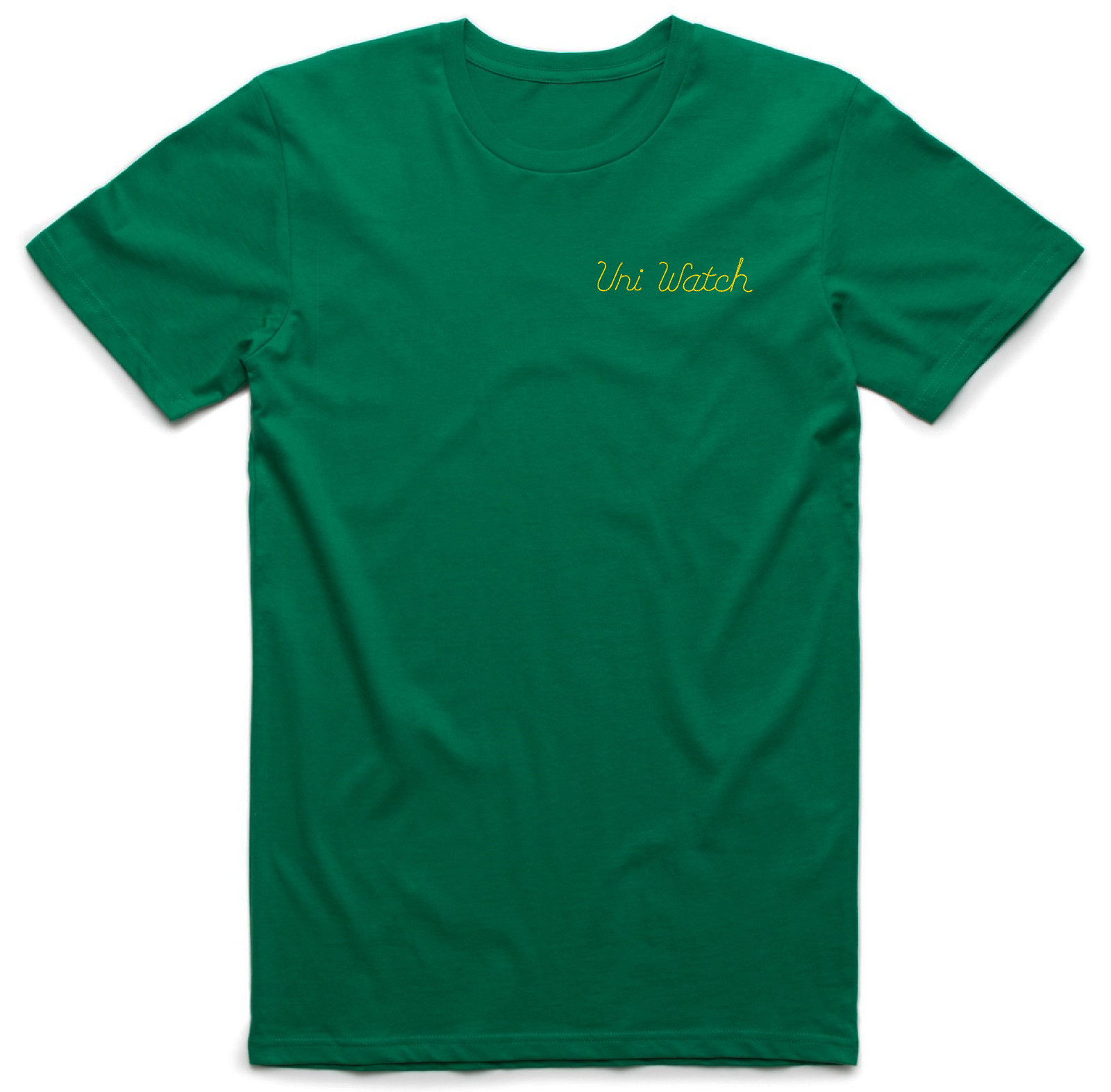
Here’s the concept: If Uni Watch had a bowling team, what would the team be called? The Athletic Aesthetics, of course! And what would the team wear? A classic bowling shirt with chain-stitched embroidery, of course!
Scott’s T-shirt is based on that idea, with a simple “Uni Watch” insignia faux-chain-stitched on the front-left chest and a spectacular design faux-chain-stitched on the back (for all of these images, you can click to enlarge):

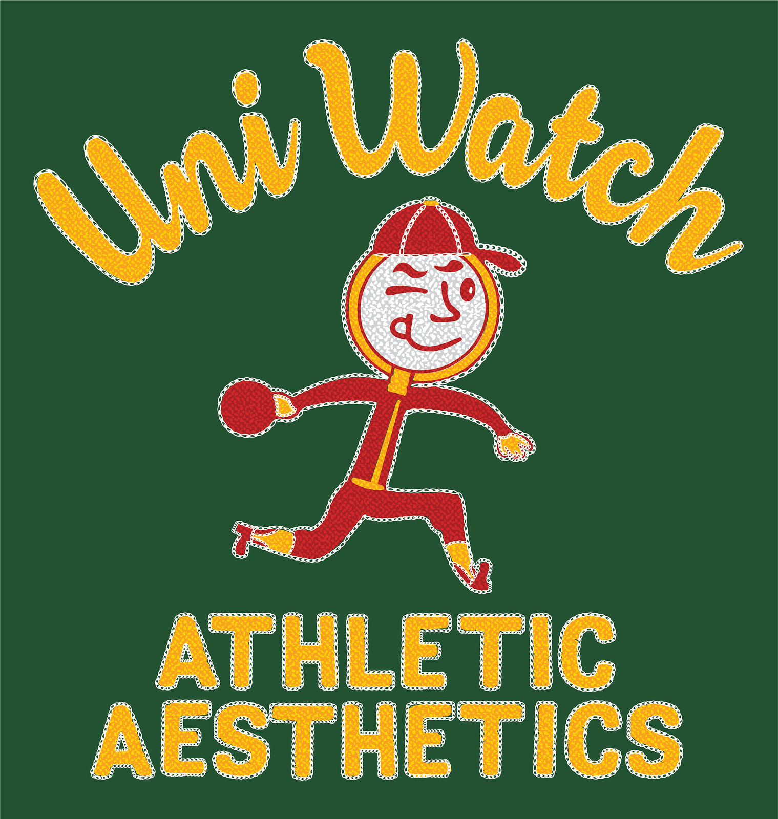
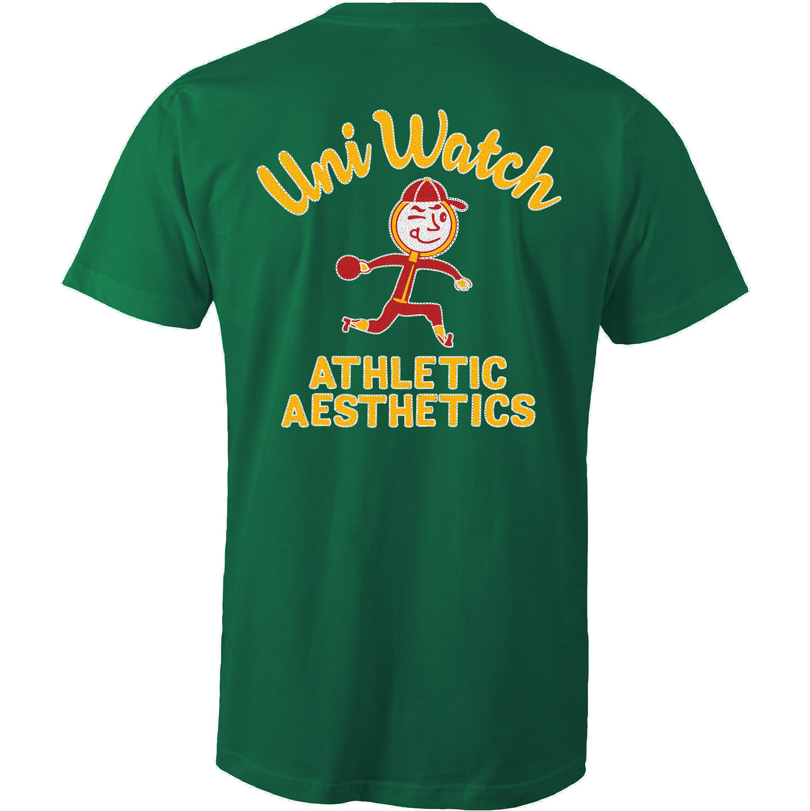
How great is that?! An anthropomorphized magnifying glass wearing a ballcap and stirrups — tremendous! The graphics really capture that old-school bowling shirt style, too. Even better, the design works well in a wide variety of shirt colors. Here are some of the ones we’re offering (there are several more on the sales listing page), just to show how flexible the design is:
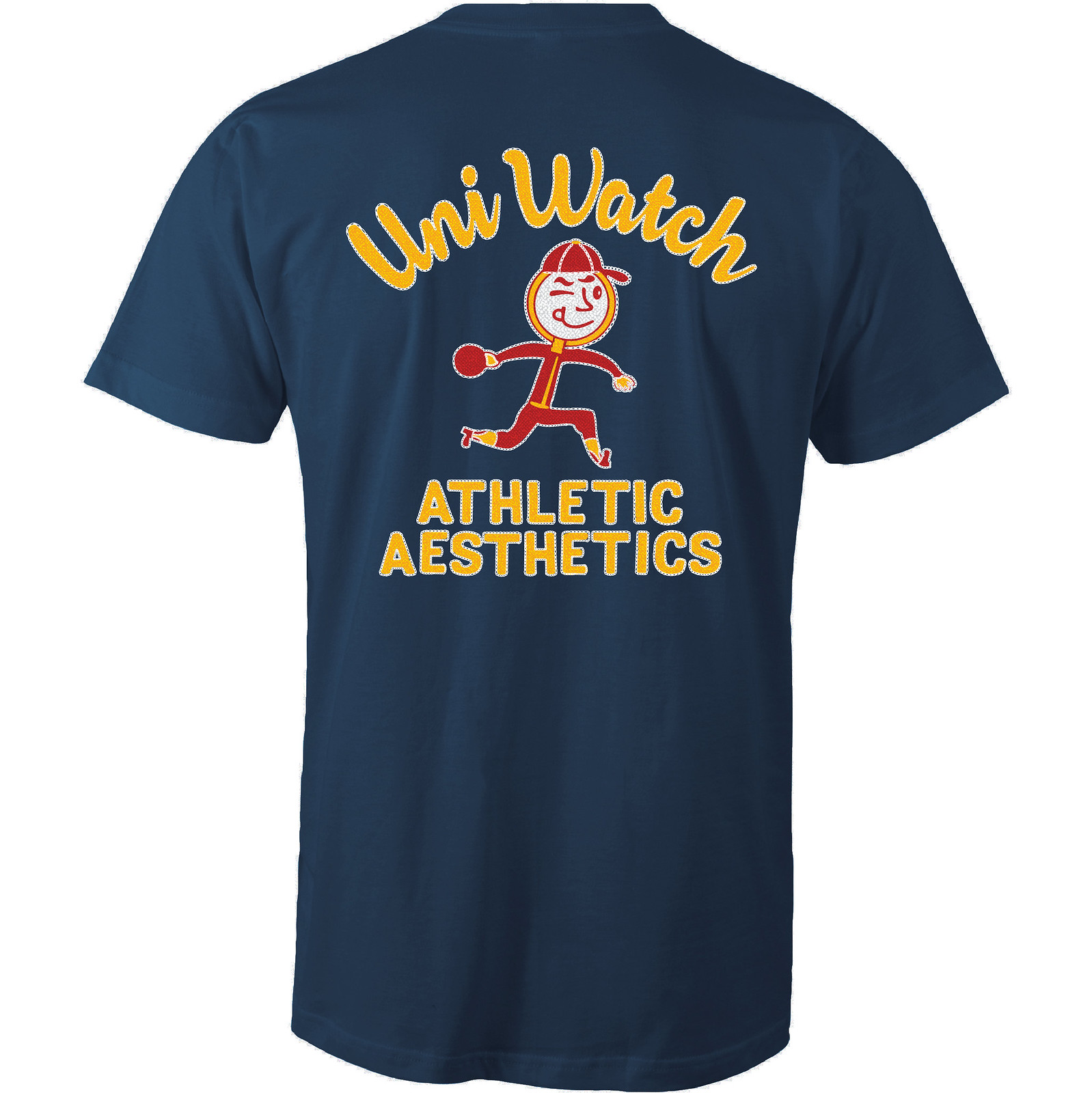
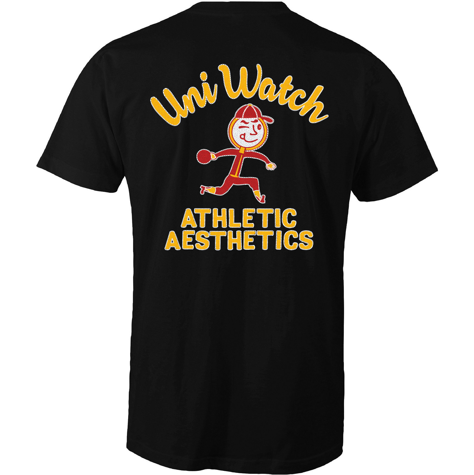
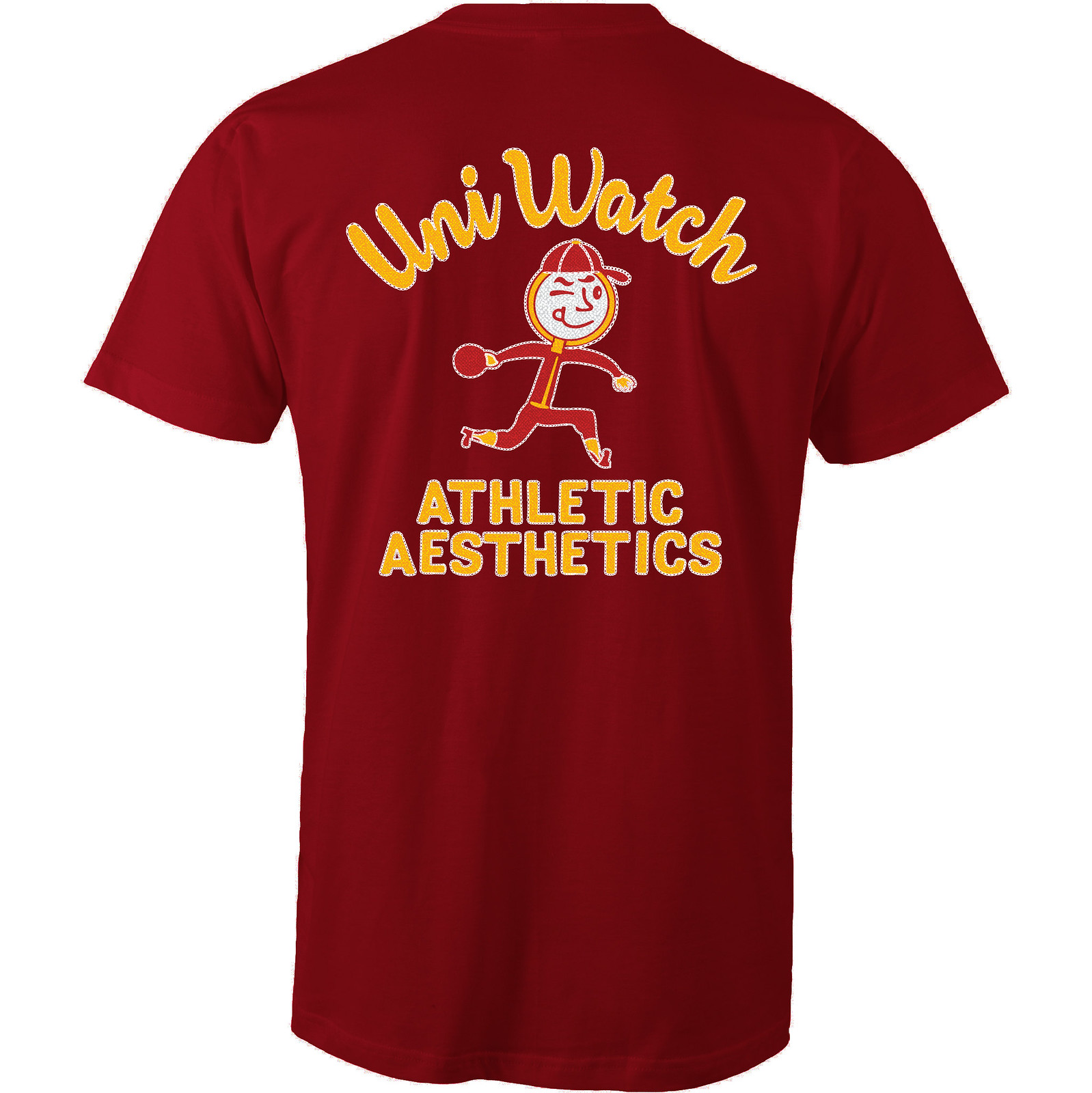
Like all of our Artist’s Series shirts, this one is a limited edition, available through next Friday. You can order it here. My thanks, as always, for your consideration.

Uni Watch News Ticker
By Phil

Baseball News: Tweeter Matt McCutcheon took this photo of a broadcast and says “Very misaligned left handed batters box (yester)day in Annapolis.” … Remember about a week ago when the Fresno Grizzlies wore those “backwards” (ode to Kris Kross) jerseys? Well, here’s a close up (from OT Sports). … Not sure how many teams do this (wouldn’t surprise me if many do), but here’s a nice closeup of a base used by the Tigers, which features their Twitter handle on the plate (good spot by Beau Parsons). … A fashion editor reviewed the 1969 Philadelphia Phillies uniforms (via Paul, from Matthew Algeo). … Nice writeup of a Uni problem 104 years ago yesterday: Wearing the uniforms of the Chicago White Sox, the Cincinnati Reds lose to the Chicago Cubs — Cincinnati forgot to pack uniforms and had to don those of their opponents’ crosstown rivals (from Will Shoken). … Yesterday the Hanshin Tigers rocked their yellow striped uniforms, striped cap included (from Graveyard Baseball). … The Yankees gave away a Pinstriped *jersey* tote bag yesterday (from Andrew Cosentino). … Speaking of merch, for sale at Macy’s, a Chicago “Cules” t-shirt (from Ken Traisman). … The Kane County Cougars, a Single-A affiliate of the D-bax, have a uni combo that includes green sanis with blue stirrups (from MiLB Promos). … This one’s, um, interesting: In 1985, Bob’s Big Boy featured a unique take on Chief Wahoo, which was featured on the backs of the tickets (from Andrew Jenkins). … Villanova and DePaul went pink vs. pink yesterday in softball (from Brad Ahern). … The Nats wore their patriotic curly W jersey & red cap yesterday (from James Beattie). … Add the St. Lucie Mets to teams with a raised helmet logo (fromA.J. Frey). … We *may* need to ask Frank McGuigan to turn in his membership card (assuming he has one — and if he doesn’t he needs to get one so he can turn it in) after tweets like this (just kidding, Frank). … The Toledo Mud Hens wore “egg” jerseys yesterday for “Bacon & Eggs” series v. Lehigh Valley. … Check out this string of tweets (3 in all). After a cultural education course with the Salt River Pima-Maricopa Indian Community, “Ian Desmond was compelled to honor our relationship,” and will wear this mitt in games (from Michael Starbuck). … LSU Softball had special base markings for senior day (from LSU Quinlan Duhon).

![]()
NFL/College Football News: As a follow up to yesterday’s ticker item, Robert Hayes says the Pats ALWAYS sell the red jerseys, even with the SB 51 patch. … Did you ever wonder what the lining looks like inside an NFL HOF jacket? Wonder no more (nice spot by Don Schauf). … Derek Barnett will wear #96 for the Philadelphia Eagles. … The Colts have handed out jersey numbers to their first three draft picks — safety Malik Hooker, cornerback Quincy Wilson, and edge rusher Tarell Basham. … When you win the College Football Playoff, even if you’re a band member, you can get a ring. Here’s a look at the Clemson University Tigers band bling (from James Gilbert). … I’m not sure we’ve seen this yet, though it should come as no surprise, given the template the NFL has employed the past several years: Here’s the Supe LII logo (on a Minnesota Vikings football). From Ryan Pecka. … Tweeter Andrew S. reports FNOB potential for next year as the Cardinals get another D. Johnson on the roster. … Are the Carolina Panthers going to be using their blue jersey as their primary this season? That question was asked by Chris Dougherty after seeing the Panthers pick holding up the blue top. … Eagle-eyed reader Michael Driscoll noticed the exhibit at the NFL Draft shows last year’s Lions uniform and the Bears jersey has a Nikelace. … “Two pictures from the Colorado football twitter account, two players signed with teams (yester)day, one player, Kenneth Olugbode, has the current Colorado uniform set with the PAC-12 logo visible, and the other player, Josh Tupou has the 2014 uniform set with the logo blacked out,” writes Tanner Liby. “Both signed this year. Interesting that they used two different uniforms for their graphics pictures.”

Hockey News: Bunch of Punjabi Hockey news from Joe Makowiec: “Nice piece on today’s edition of NPR’s “Only A Game” about Harnarayan Singh, Hockey Night in Canada’s Punjabi-language play-by-play guy. There’s more images of Singh at the https://www.icesingh.com/ website, including a picture of the Punjabi broadcast crew in some very nice Hockey Night in Canada jerseys.” Joe adds, “What I learned: Punjabi is the third-most-spoken language in Canada.” … NBC is still using the Penguins’ former “Vegas gold” color on graphics. The logo features new color, though (from Alex Gerwitz).


NBA/College/Basketball News: OOOooohhh: check out this “Very cool vintage Buffalo Braves mug in my buddy’s basement,” (from Jordan M.).

Soccer News: Phoenix Rising FC were apparently shooting a commercial and Chase Hite asks if the “Mad Decent” on the kit top is “a shirt sponsor? A slogan? Just for kicks and giggles?” Here’s the tweet to which he is referring. … OOps (and again, apologies if this has already been in the ticker): Juventus’ Juan Cuadrado accidentally revealed new club jersey. … “BeIN Sports sponsors a team it covers,” says Charlie Eldred. “BeIN Sports sponsors Valencia in La Liga, the Spanish soccer league. It also broadcasts La Liga in America.” … It’s 50 years since the Lisbon Lions won the European Cup by defeating Inter Milan 2-1 in 1967, and the club had confirmed that next season’s jersey would be a nod to that great side. … “With the North London Derby Sunday,” reports James Beattie, “here’s what Tottenham will reportedly wear in 2017/18 dumping UA for Nike.” … The New York Red Bulls with light blue names/numbers on back for Autism Awareness Night yesterday evening (from Nick Khan).

Grab Bag: Some fan cars are better than others. Check out this cool LA Lakers BMW Isetta (more here). From Shawn Hairston. Here’s a pretty nice Steelers fan bus, from Ben Ford. … Looks like some decal damage to a St. John’s lax helmet (from 412 Lax). … “Checking out eBay, and I saw this challenge coin and thought of you,” writes Scott Cummings. “Challenge coins are commonly traded in the armed forces and safety forces. This is a Navy one that looks a LOT like a logo we all know. There are 2 for sale…pretty interesting. The photos show the front and back of the coin.”

And that’s it for today. If you guys have your “Perfect” Baseball cards or Uni Tracking you do…let me know!
Everyone have a good week and I’ll catch you next weekend, but until then…
Follow me on Twitter @PhilHecken.
Peace.
“(W)hen you’re stinking the place up like Oregon did last year, you just look like a bunch of clowns and people will start to think that the uniform gimmick is a distraction. Joe Paterno used to say that his teams were there to play football, not to worry about looking fashionable. He might have been onto something.”
— Dan Tarrant

Any idea when box scores started putting the home team on bottom? The Reds-Cubs-Sox line score has the home Cubs on top, like the rest of the world/soccer. I always assumed other American sports copied baseball in the away-home order, though I have no idea if that’s true or not.
That is strange. It doesn’t really make sense to have the line score in baseball listed any other way given it is supposed to tell the chronological story of the game. Now, 104 years ago, the Reds could still have batted last despite being the visiting team, but it doesn’t look like that happened. I wonder if it was just a mistake, a harder one to correct in preparing the box score for publication back over a century ago.
I also noticed that weird bit of minutia in the box score, and it’s something that’s always annoyed me. The home team is not listed below the visitors in the line score. Since only the Reds batted in the ninth, having the TOP half of the ninth blank makes no sense. I wonder when listing the home team below the visitors became the default format in box scores?
Then there are other sports. Soccer is the worst offender, with MLS listing game scores that give no indication of who the home team was. Other major sports generally conform to the ‘top:visitor/bottom:home team’ line score precedent. Not doing so is almost as annoying as when someone is asked the score of a game and they reply, “3 to 5.” What?
It’s because in baseball the Away team always bats first and the Home team bats last. The only time a team can score is when they are batting. The Away team only bats in the top half of the inning meaning that they only score in the top half, that’s why they are on top. Same thing with home team on bottom.
Bwahahaaha! From the link on the ’69 Phillies in the Baseball News section, it is good to see the uniform marketing hacks were using the same slimy terminology we are still being fed in 2017.
“PRIME IDENTIFICATION SYMBOL”… “VISUAL IDENTIFICATION DEVICE”…give us a break.
GET OVER YOURSELVES, MARKETING ASSHATS.
-Good-looking improvement for the Nevada Wolf Pack. Less is more is a good idea to clean up their uniforms. Hopefully other college teams do the same and we can see an improvement in the overall collection of US college football uniforms.
I’m not a fan of the wordmark-down-the-leg design on football pants, but I think we will stuck with this for some time. So, I have learned to accept it and move forward it as I cannot change the fact that it exists.
-An off-topic note. I watched the NHL Draft Lottery yesterday. Noticed the Vegas Golden Knights will be using “VGK” as their 3-letter name for sports scoreboards and tickers. Definitely works better than another possible option of “VEG”.
Nevada looks like it could also be the football team of Winterfell. Lord Commander Snow approves the new look. The best looking uniforms in all of Westeros.It’s what a football team should look like.
I think they need at least a little bit of striping. Even Penn State has a helmet stripe. Not really a fan of having two completely different logos on each side of the helmet, and Battleborn wasn’t even that good of a game.
Battleborn appears on the Nevada state flag. It’s in reference to Nevada becoming a state during the civil war.
That isn’t a good reason to put it on the uniform.
Custom number fonts are currently the greatest scourge on the uni-world. It warms my heart to see a team move back to block numbers. I’d love for this to become a trend.
Why? As long as they’re readable, what’s so terrible about custom fonts? Everyone wearing the exact same thing only color-swapped is kinda lame, ya know.
For the most part, custom number fonts “fix” a thing that isn’t broken. Among my complaints: the “gotta be unique” urge drives ugly designs, too many are tough to read, and they tend to age poorly. To me, most often the poorest fitting element of a uniform is the number fonts.
Can anyone name an example of a non-custom unit number font that isn’t highly legible? I think that’s the point of the general complaint against custom fonts. Legible custom fonts are terrific, but the only hard-to-read fonts that have ever appeared on a jersey are custom fonts. The half-dozen or so standard “generic” number fonts are all highly readable. Whereas of the many dozens of custom fonts out there, about half are highly legible, and about half are complete crap. So if we’re keeping score at home, 100 percent of crappy, hard-to-read uni numbers are custom fonts.
That’s the downside. On the upside, how many custom fonts would anyone regard as more legible or better designed than the half-dozen or so “generic” fonts? I can think of two, ever, that are sufficiently well designed that I would rather see a team wear numbers in that font than in a standard non-custom font.
So custom fonts give us a high potential for crap numbers, and essentially zero likelihood of really good numbers. It’s all downside, no upside. So it’s perfectly reasonable for people who value legibility and/or quality of design to oppose custom fonts in general. Not the conclusion I reach – I regard a fair bit of the middle ground of legible, but not particularly compelling, custom fonts as interesting enough to be worth the effort. But a general opposition to custom fonts is not irrational.
Can anyone name an example of a non-custom unit number font that isn’t highly legible?
Bellotti Bold. If you’re even the slightest bit dyslexic, the 2s & 5s are interchangeable
The Phillies uniforms shown in that picture were brought out for the 1970 season, It was to have coincided with the opening of Veterans Stadium, but construction delays pushed back the opening to 1971. So they changed over anyway. Also, the uniform tops shown were much different than what was used. The numbers were moved up parallel to the P, and there is no striping on the shirt that is shown.
That Yankee jersey tote bag is very nice. Too bad it’s unusable. It is white, which means that it is going to get dirty and dingy very quickly.
A more useful bag would be blue with a white NY logo. It shoukd be modelled on the warm-up, so that it uses the jersey NY rather than the ugly print NY.
The Yankees should just freakin standardize their damn logos and use one NY instead of 4 variations.
I think there are three variations: the jersey version, the cap version, and the print version. Unfortunately, the print version is used on the helmet. This was link, as the helmet logo used to resemble the cap logo.
The jersey logo should be the main one; it works great in print. The cap logo is a reasonable adaptation of that logo to embroidery; this is different to the case of the two Tigers D logos, which are designed to very different specifications.
If the Yankees got rid of the misshapen print logo and restored the helmet to how it used to be, no one would complain about the differences between the jersey logo and the cap logo.
This.
Mad Decent is an EDM record label owned by Diplo and, according to some cursory googling, does indeed appear to be the official sponsor/advertiser for Phoenix Rising FC.
Many thanks for the Wolf Pack coverage, Phil. It’s nice to remind people that there’s more to Nevada than Vegas and nuclear waste.
Re the soccer section. The Lisbon Lions aren’t a real team. Rather it’s the nickname given to the 1967 Glasgow Celtic side that won the European Cup. They’re called that as Lisbon was where the final was held.