Photos courtesy of Rawlings; click to enlarge
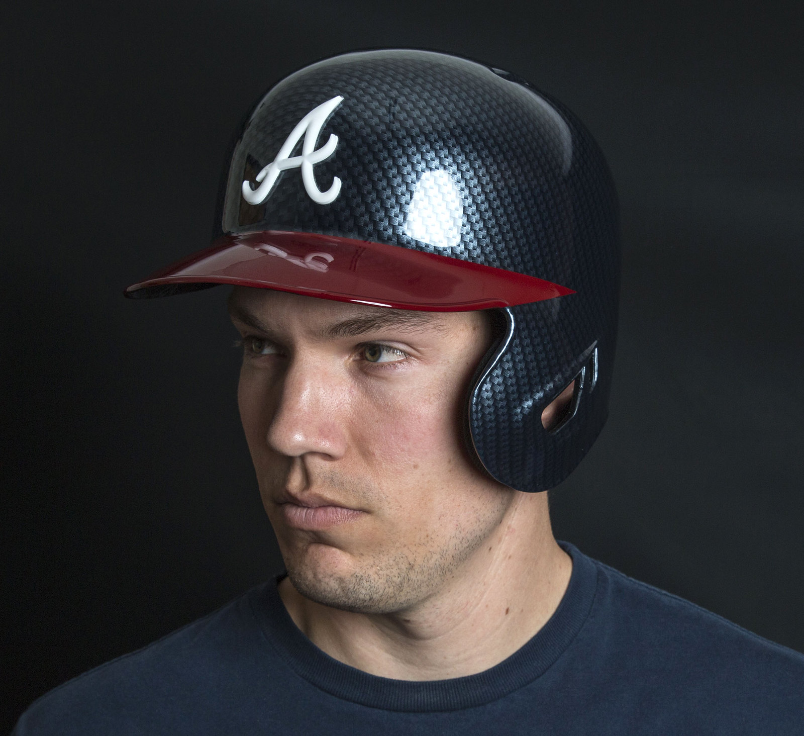
What you see above is a new Braves batting helmet with a hydro dipped carbon fiber pattern, similar to the ones we’ve seen several college football teams wearing in recent years. I have the full story behind it in an exclusive ESPN story today. Check it out here.
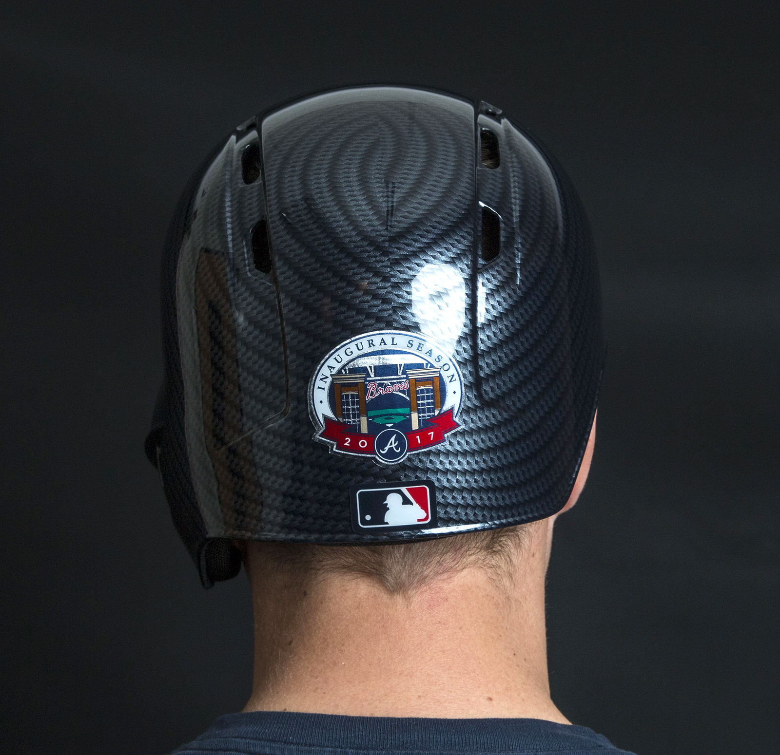
Personally, I really like it (although I fear it may lead to other hydro dipped designs that are less attractive than this one). Here’s a rear view:
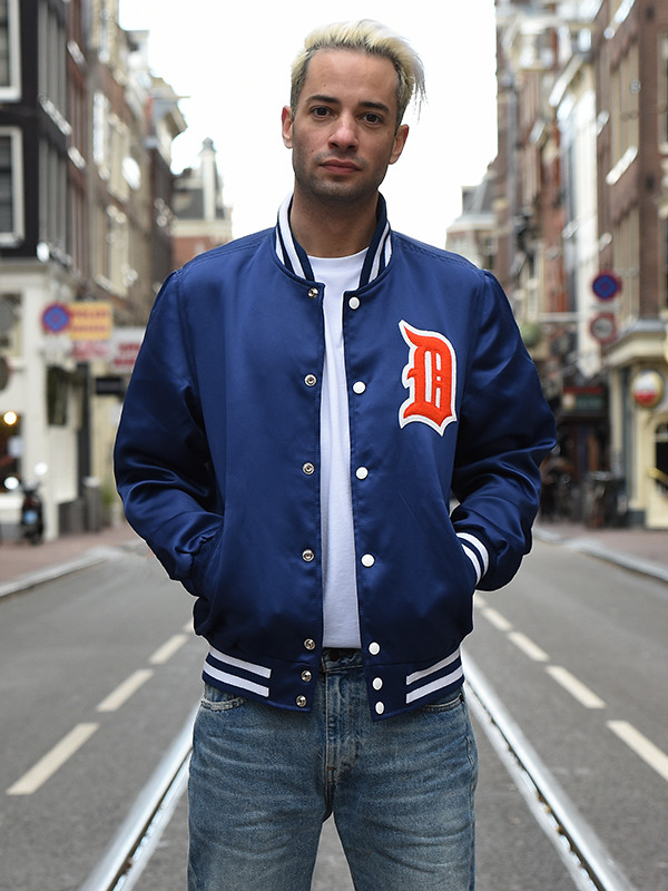
ITEM! New raffle: Stewart & Strauss has been specializing in custom-designed varsity jackets for years (they even made me a Uni Watch jacket a few years back). Now they have a new product line: satin jackets.These aren’t Starter-style vinyl jackets ”” they’re high-quality satin, silky smooth to the touch. And now we’re raffling one of them off to a Uni Watch reader.
The lucky winner will be able to use S&S’s jacket builder interface (there’s a link to that on the satin jackets page) to design a custom satin jacket, which will be produced and shipped for free.
To enter, send an email to the giveaway address by this Friday, April 14, 7pm Eastern. One entry per person. The winner will be announced on April 17. Good luck!
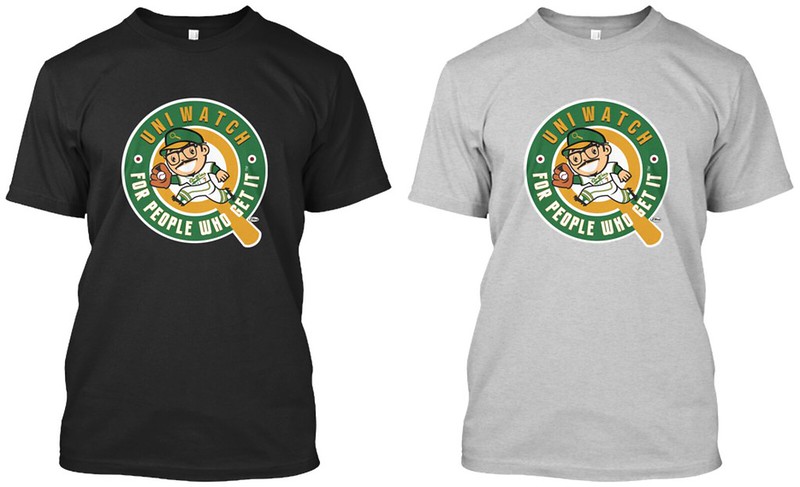
ITEM! T-shirt news: My thanks to everyone who purchased our latest limited-edition Uni Watch Artist’s Series shirt, designed by Larry Torrez. Although that shirt is no longer available, several of you asked about the shirt Larry did about a year ago, featuring the same design I now use as the avatar for the Uni Watch social media accounts (shown at right; click to enlarge).
I’ve decided to bring this shirt back. And unlike our other shirts, this one will not be a limited edition — it will stay in print indefinitely and will be the “default” Uni Watch shirt. Although the sales listing page currently says “Available until Thursday,” the campaign will auto-renew every three days. This also means you won’t have to wait as long to receive your shirts — they’ll print every three days.
I’ve made the design available in black and gray, and in a wide range of styles: short- and long-sleeved, sweatshirt, hoodie, and women’s. You can also order coffee mugs (lots of colors), tote bags (“natural”), and stickers. Click to enlarge:

All of this is available here. Meanwhile, our next design in the Artist’s Series will be coming soon. Stay tuned.
If you can’t see the slideshow above, click here
XCIII: Yesterday was my mother’s 93rd birthday, so my brother, my girlfriend, and I took her out to her favorite lunch spot and then went for a walk on the beach. I’m embarrassed to say that my brother and I bickered about a few things, which soured the mood at one point (we don’t always bring out the best in each other, which is how families sometimes are), but overall it was a very good day.
Mom is in remarkably good shape. It seems highly likely that we’ll be repeating this routine (hopefully without the sibling bickering) next year.
The Ticker
By Alex Hider

Baseball News: Yesterday the Pirates broke out their “We Are Family” throwbacks for the first time this season. … Since the Pirates’ throwback pants don’t have belt loops, the MLB logo appears centered on the back of the waistband (from Jerry Wolper). … We had two blue-on-blue games Sunday: Brewers/Cubs and Jays/Rays (from Andrew Carrigan and Derek Marusyk). … Some Astros players wore rainbow-striped socks yesterday ”” the first time the ’Stros have worn tequila sunrise-inspired socks since the 1970s (from Mike Acosta). … The White Sox wore their own Sunday throwbacks yesterday, and some players had “Sox” on their socks (from Mike Schindler). … A few Brewers wore “Ball-in-Glove” socks yesterday (from Sam Sears). … C Alex Avila wore No. 13 when he played for the Tigers from 2009-2015. Now, he’s back in Detroit and wearing No. 31 (from School). … Twins bat boys now have “BB” on the front and back of their jerseys. Also note the accent mark on Miguel Sanó’s NOB (from F.K. Yaaj). … The Albuquerque Isotopes wore red jerseys over black pants yesterday (from Scott Kaplanides). … Orange (with camo caps)-vs.-charcoal matchup for Florida and Tennessee yesterday (from Reid Cure). … This site tracks what equipment some of the best MLB players use (from Mike Weston). … The umpires’ caps have the New Era logo creep this year, just like the players’ caps. But some umps are apparently wearing older caps without the logo.

NFL News: This is apparently the 2017 Draft Day cap for the Lions. Note the new wordmark. The team will be unveiling its new uniforms this Thursday (from Erik Kissel). … Update from Sunday’s post: Upon further research, reader Bill Moss now believes that it was not Bruiser Kinard who was wearing No. 0 in that Dodgers/Lions clip from 1939. Bill now believes that the player in question may have been kicker Bill Reissig, who wore the number in 1938-39 for the Dodgers.

Hockey News: Strange move by the Red Wings, who did not wear the “Farewell to the Joe” patch in the final game at the Joe (from Erik Kissel). … Here’s a great video that shows how the Maple Leafs’ logo and team name were derived from a World War I battle (from Will Leslie). … The Oilers’ Connor McDavid had his shirt tucked in for a least part of Saturday’s game ”” which is technically against the rules (form Univers). … Check out the sensor on the back of Jonathan Quick’s goalie gear. According to The Goal Net, that’a a “catapult device,” which measures the force of impact from collisions. … Spectacular Soviet-era sweaters for hockey club Izhstal Izhevsk. Wild, right? (From Slava Malamud”).

Basketball News: Steph Curry has a new pair of sneakers for sale, and just like last year, the internet does not approve. … Super-bright color-on-color game between the Nuggets and Thunder last night (from Ethan Javage). … The Cavs wore white on the road yesterday against the Hawks, who wore their red alts. … Here’s a snapshot of UNC coach Roy Williams’s championship ring collection, which includes everything from National Championships to conference championships (from Dan Tarrant).

Soccer News: Real Salt Lake had to use an orange ball for visibility during a snowy match against Vancouver on Saturday. More awesome blizzard pictures here (from Wade Heidt). … Louisville City FC of the USL will unveil a new third kit tomorrow (from Josh Hinton). … Per Ian Gerig, at least two members of the Seattle Sounders were missing their championship stars last night. … Yesterday marked the 20th anniversary of Chelsea wearing Coventry’s away kits because of color clashing (from Jay Kenney). … Great find by Ray Hunt, who sends along this photo of WWI soldiers playing soccer in 1915.

Grab Bag: Interesting graphic: No Masters winner has worn red on Sunday since Tiger Woods won his last green jacket in 2005 (from Museum of Jerseys). … North Carolina lacrosse went BFBS yesterday (from James Gilbert). … A columnist for the Minneapolis Star-Tribune says jersey changes are one of the “greatest scams in pro sports.” Or, you could just not buy a jersey (from Jimmy Lonetti). … I’m sure we’ve seen it before, but it’s always a good to remind everyone that “Keggy the Keg” is an unofficial mascot at Dartmouth (from Douglas Ford).
Happy Passover to all who are celebrating tonight.
Proofreading:
“rainbow-striped socks socks”
And, of course, while the White Sox’ socks may say “Sox,” they’re not white.
Fixed.
Assuming the patterned helmet is blue, and is being debuted by a team that has not yet played a home game, it could be the Cubs, Braves, Yankees, Blue Jays, Indians, Royals, or Mariners. Miami also hasn’t yet played at home, and they should wear blue on their caps.
Color seems too dark for Cubs or Royals. Really doesn’t seem like a Yankees move. I’d suggest Braves makes most sense from that list.
I included all blue-wearing teams because equipment manufacturers have a habit of making their promotional photos very dark. Probably not the Cubs or Royals, I agree, but if it were the Cubs or Royals, we’d likely see “dramatic” photos darkened to look like navy, just like the teaser photo here. It’s the same trend that lately dictates that every superhero in every movie should wear black leather instead of colorful costumes, and any TV show or movie claiming to be “dramatic” should barely be lit at all.
I’m going with Braves or Nationals. Mostly because those 2 teams told Paul about the 3D helmet logo but he wasn’t able to tell until opening day.
I guess one of the 2 gave this exclusive story in exchange.
For the record: Those teams did NOT tell me about their 3D helmet logos. I learned about those logos from a different source separate from the teams.
Sorry, I assumed it was embargoed information. Given that, I have no idea who this might be for.
It *was* embargoed — just not from the teams.
Has to be that Seattle team, a geographic location that appears to specialize in absurd sports uniforms.
I hope the numerals in the background of the Lions’ hat shot aren’t what they plan on wearing on field. Way too cartoonish and some digits could be hard to read.
Yeah, me too. But…it’s the Lions.
Doubtful that means anything. That sign also uses the old Lions wordmark.
Background sign also has the old wordmark- I wouldn’t get too worried
If I’m reading that price point on that sign correctly ($40)…retail or not, prices are getting way out of hand for all merchandise (and it’s not even that good looking or of good quality)
The numbers are also in the same font as the “(DR)AFT DAY HAT” text above it. So it’s just a sign, nothing to really worry about.
I think it is the Yankees
Congrats to Mom! It’s wonderful to have those special times that make for great memories.
Were the Astros wearing their batting practice jerseys in a game, or do they have a new alt with the rainbow side panels?
Alex Avila made the number switch when he went to the White Sox last year, which seems odd on the surface as the ChiSox haven’t had a #13 since Ozzie Guillen was let go in 2011. I’m guessing it was a case of “I just want to do something different”, and he decided to stick with it upon his return to Detroit.
Omar Vizquel wears #13 as the Tigers first base coach, which also could explain Avila wearing #31.
I didn’t realize Vizquel switched from #15 last year.
Many happy returns for Mom.
In watching the Masters yesterday I was sickened at the amount of Adidas ads he wore on his person and add to that his bag. I counted at least 13 on his person and at least one on his bag. I could not make out if his belt had some as well or not.
link of some of the Red Wings on stage for last night’s post-game ceremony at the Joe. Current player Justin Abdelkader had his game jersey which still had the 9 patch on it, while the retired players (Darren McCarty, Tomas Holmstrom, and Mike Vernon) had the Farewell patch. All the retired players (and representative family members for those players no longer with us) had the Farewell patch in addition to the Mr.I patch.
Also of note from the game – I can’t find a clear shot of it (and didn’t have the foresight to get any screencaps from the broadcast last night), but Scotty Bowman had a Mr.I pin on his jacket lapel.
In addition, not uni-related, but Gary Bettman, who was in attendance last night but opted to remain in the owner’s box for the ceremonies (probably for the best), waived the prohibition on arena personnel twirling octopi on the ice for last night.
Could it be the Rockies? They’ve had two-tone helmets in the past, and this has a vaguely purplish cast to it (according to my weakening eyes).
I can’t tell what color the carbon fiber is – looks blue under the lighting but could be black – but based on the pattern I’d guess the Diamondbacks. Given the foolishness of their recent uniforms I wouldn’t put it past them.
The way it’s lighted reminds me of link. (Of course, it’s natural I’d remember that seeing as how I did a color correction for it…)
I’ll say that’s the Mariners’ new helmet. It kind of matches the Seahawks helmet stripe.
Everyone is guessing blue. Looks a little purple to me. This seems like something the Rockies would do. If it is blue, I think the Rays would take this chance.
Always thought it would make sense to wear a color that wouldn’t clash with the green jacket on Sunday at the Masters. Always thought Jack’s yellow shirt worked well. Obvious exception is Tiger and his tradition of wearing red on Sunday.
The ESPN piece on the carbon fiber helmet is up:
link
I am a Pirate fan who grew up in the 70s, so I live the fam-a-lee throwbacks. The New Era cap logo looked especially out of place on the striped caps.
Nothing like throwbacks paired with sublimated sock designs.
That is a cool looking helmet, nevertheless, Pandora’s helmet box has been opened.
I get your larger point, but just for the record: Those sock designs are knit, not sublimated.
good to know
Re: First Patterned Helmet Debut:
“Take me home to moma and put me in bed. I have seen enough to know I have seen too much.”
Nice.
Someone oughta take you out for a steak dinner after that one!
I know Rawlings didn’t discuss the process, but is there a reason as to why the helmet is divided in 2?
I don’t understand why would someone make a design that doesn’t meet correctly in the middle. Just looks weird.
I wonder if maybe that’s a typical by-product of the process, but with all the college football helmets the “seam” is hidden by a center stripe.
Can’t say I like the carbon-fiber batting-helmet look. I mean, I like matte batting helmets, because they look more like the soft caps, but this reminds me more of link.
I like the look of it, it that like matte helmets it creates a feeling of texture. But I hate hate hate the specific idea of a fake hydro-dipped “carbon fiber” pattern. Carbon fiber is not an abstract concept like “navy blue.” It’s an actual material, and one out of which a helmet might be made. Want your helmet to look like carbon fiber? Make it out of carbon fiber. Want your non-carbon-fiber helmet to have a cool pattern? Hydro-dip it in a cool pattern. If you’re the Yankees or, I don’t know, Giants, use a houndstooth check. If you’re the Mariners, use ripples or herringbone. If you’re the Braves, use a subtle feathery pattern.
I’m all for skeuomorphism. But I absolutely hate faux-skeuomorphism.
You just wanted to say “skeuomorphism”! (And I don’t blame you.)
Skeuomorphism has been on my mind a lot lately. I think it’s terrific, generally, in the digital realm – really, any two-dimensional medium – but more often than not, I dislike it when it’s applied to three-dimensional objects and mediums. The “principles” that would seem to inform my approval of skeuomorphs in 2D applications would generally support the use of skeuomorphism in 3D applications, so the gap between my aesthetic preferences and any principles of quality is an irritant. Anyway, the thing that has always really bugged me is when things are gratuitously made to look like things they could be but are not. Like, back in the ’80s, the plastic and fiberglass panels car makers would put on station wagons to make them look like old-style woodies. If you want to put wood panels on the side of the car, use freakin’ wood. If you want to mount decorative plastic or fiberglass panels, great, but show us what you can do with plastic and fiberglass other than pretending it’s something else.
And yeah, I am calling the new Braves casque the ’81 Mercury Lynx wagon of baseball helmets.
Faux wood paneling on station wagons (which is pretty much the classic example of skeuomorphism) far predates the 1980s. We had that on our wagon when I was growing up in the early 1970s, and I’m pretty sure the care was purchased in the late 1960s.
About this:
And yeah, I am calling the new Braves casque the ’81 Mercury Lynx wagon of baseball helmets.
The difference — and I think it’s a significant one — is that the faux paneling on the station wagons was an attempt to create an old-school look, while the carbon fiber pattern is an attempt to create a more futuristic look. (Yes, I know carbon fiber isn’t really futuristic, but it’s perceived that way by sports fans.)
If we’re going with old car comparisons, the carbon fibre look reminds me more of the old ‘3-d’ silver coloured diamond look (that reflected rainbow colours in the sun) that my brother’s friend had in the dash of his old AMC Gremlin. Can’t find an online pic, closest seems to be of an AMC Javelin – might not be exactly right:
link
Was there a name back at that time for this stuff?
Names I’m currently finding are silver prism mosaic; sometimes mentioning holographic.
link
So the Braves aren’t staying with these new helmets? This is just for a couple of games?
Like it says in the ESPN story: This Friday and Sunday.
OK, what I meant was, why are they just doing it for two games? Why not keep using them?
Because they want it to be a special thing just for the opening of the new stadium.
I wonder why Coventry didn’t just wear their own change strip as a gesture of sportsmanship, rather than have Chelsea wear it.
The comment section and post header are kinda confusing me. Was the text of the post changed at some point? Did the text and picture not always make it clear that the Braves were getting a new helmet?
Correct. The header photo was originally a teaser, and the text was different. I adjusted the image and text when the ESPN piece went live.
Ugh Atlanta! Why?
First they get those blue jerseys, then get rid of the red ones, now they never wear the gray jerseys on the road it seems. Now this.
You say that like getting rid of the red jerseys was bad.
Those red jerseys sucked ass
Nothing says authentic like making a helmet look like carbon fiber when it’s not. This seem so far off the Braves’ personality, and I can feel slope getting slippery with baseball. The sport has made a LOT of small changes to its look in a short amount of time. I know they have a problem attracting young people, but if the kids can tell you’re trying too hard, they’re not going to give you the time of day.
Here’s a link to a good video on the water transfer printing process. I would image that Rawlings process is similar.
link
I wouldn’t call jersey changed a “scam”. Yeah, most teams/leagues charge ridiculous prices but no one is going to get angry because you show up to a game in a dated jersey or even a team colored shirt, and unlike most stadiums these days we aren’t being forced to pay for it.
They do not get angry, but it becomes peer pressure to have the latest.
I have a great example in soccer. The american sports don’t change that often their jerseys, but a way of dating them is by adding the players names and numbers. You may have the current jersey but the player is gone. Think of Manning and the jersey he first wore with the colts is pretty much the same (to any no uni watcher) than the last he wore.
In soccer, retail is mostly sold without the player’s name. It is becoming more of a practice, but the constant jersey changes and advertisers are enough to date any jersey and keep the machine going.
This is what will happen to the NBA, you could buy a Boston Celtics jersey and use it for several years (think of a constant player like Rondo) and wear it, with the advertisers, even if the player and the design stay for long, the advertiser might be changing every 3 or 4 years, dating your jersey.
It might be considered a scam because both the teams and sporting brands are pushing with new designs and ways of making sure people know you are wearing last year’s jersey.
With the NBA, my understanding is that the ads will not be on the retail jerseys, right? Would only be an issue if you ever got a hold of a game-worn NBA jersey.
Paul, if you don’t mind me asking, what are the dishes you and your mom were (hopefully) enjoying? They look good!
We both ordered the pan-seared branzino, which came with a very crispy skin. The fish was perched on a series of clams, each of which was stuffed with couscous, swiss chard, and chorizo. It was a truly spectacular meal.
Hockey jerseys tend to bunch up in the back of the pants like that….especially if you don’t wear your fight strap. Now I’m pretty sure it’s against the rules to not have your fight strap on.
Had a moment of (for lack of better term) moment of reverse uni-industrial construct yesterday. I went to the Islanders season finale at Barclays center, and every jersey in the pro shop was on sale for $30 (at a game last week, all jerseys were half-off). Obviously the team/store/arena wanted to move through inventory at the end of the season prior to next year’s Adidas launch and they really posed everything they had lying around anywhere to the floor. Home, away, all-stars, practice, cancer awareness, St. Patrick’s Day. You name it, and it was out and $100 cheaper than it’s obscene normal retail price. Not before anyone thinks I’m moralizing, I did purchase jerseys each during these sales (a blank black alternate last week, and a blank Isles white with first season in Brooklyn patch yesterday which I then put in to be embroidered with Bryan Trottier’a name/number/A which I have to pick up at the arena later this week as their shipping charges were outrageous) just pointing out how admittedly absurd the construct is.
Very absurd. Obviously Paul or others might know better (I’m sure it’s been brought up on here before), but all that’s probably really going to change is the maker’s mark, right? Adidas owns Reebok and has for over a decade now, so, speaking for myself, there’s not as much trepidation as there was leading up to Nike taking over the NFL a few years back (which proved to be largely unfounded that first season anyway).
I’m going to assume same thing happened whenever Reebok changed from the vector logo to the wordmark. Gotta get rid of that hideous outdated logo ASAP!!!!
“…but all that’s probably really going to change is the maker’s mark, right?”
Judging from seeing Adidas jerseys in the World Cup of Hockey and other leagues, I anticipate one improvement. We will probably see the scoop-flapped hemline disappear (aka the diaper effect). This was introduced with the Reebok Edge uniforms and did not look as attractive compared to a more straight hemline, especially if the bottom of the jersey featured stripes along the hem.
I also anticipate some of striping designs born as part of the Reebok Edge template may disappear. I hope that a team like the Senators would not stick with that template forced upon them as part of the Reebok Edge look.
I am sorry but those Braves helmets are putrid. I wonder how long it will take a for a pitcher to complaint that they are too distracting and to be banned from use. Hopefully after 1 inning. ugh.
Anyone have any idea what the icons on this UNC shooting shirt are? Been wondering for years…
link
UNC grad here…the designs on those shirts, worn by the team during the 70’s and 80’s were sometimes referred to as “tombstones” but I have never heard that they were supposed to represent anything. I guess somebody back then just thought they looked cool.
From a uni-perspective, it’d be interesting if the gold World Series champ jerseys were treated similar to World Championship rings: exclusive to players from last year’s team. Rookies and new arrivals would be issued the regular jersey to wear in “gold” celebration games. Not the best idea for team unity, but it’d make the home openers even more fun to watch.
I kinda like the new Braves helmet, but, like the new Stance socks, I think it’s too bad they couldn’t get the pattern to line up across what appears to be a center seam. While it’s not terribly obvious on the front because the logo breaks up that visual line, it’s all I can see on the back from the crown line on down.