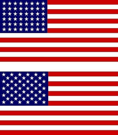
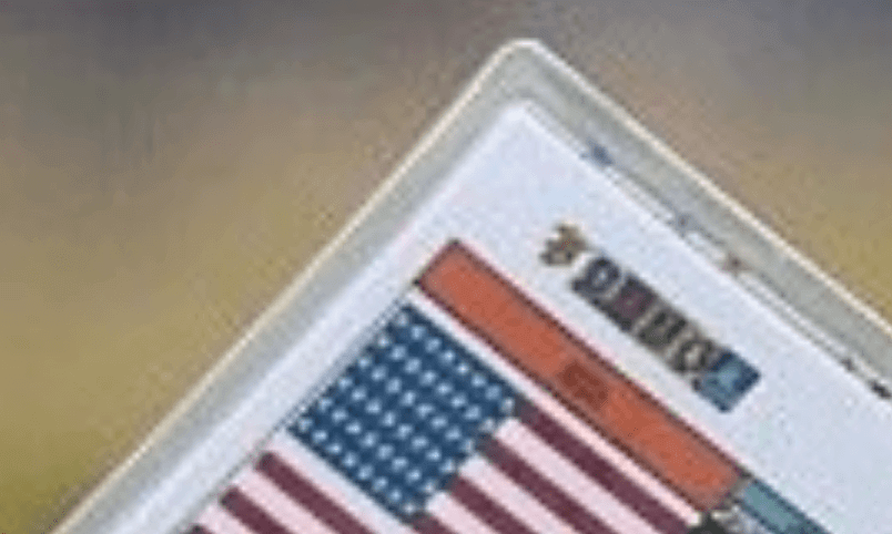
At right are two American flags. The top one is a 48-star flag, which was used from 1912 through 1959; beneath it is the more familiar 50-star flag, which was adopted after Alaska and Hawaii joined the union.
It’s hard to tell the difference between 48 of something and 50 of something, but it’s easy to tell the difference between these two flags because of the difference in the way their respective stars are arranged. The stars on the 48-star flag are aligned in six identical rows, while the stars in the 50-star flag are sequenced nine rows of alternating lengths — a six-star row followed by a five-star row. You don’t have to count the stars in order to tell which flag is which.
All of which leads us to a back-and-forth I had during the third quarter of the Super Bowl with longtime Uni Watch reader Marty Buccafusco (who’s from Georgia and was, obviously, rooting for the Falcons). Here’s how our exchange went:
.
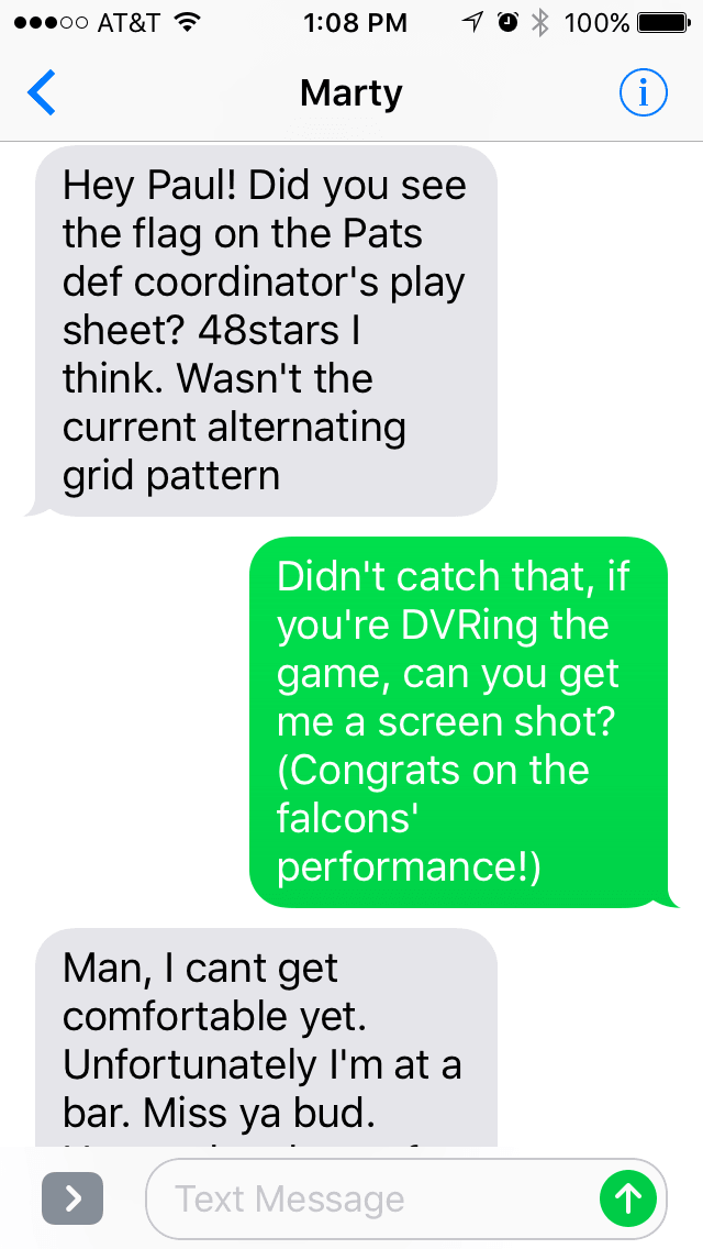
The Pats defensive coordinator Marty was referring to is Matt Patricia. But Marty wasn’t in a position to get a screen shot, and neither was I, and the end of the game got pretty intense, so the issue of Patricia possibly having a 48-star flag on his play-calling card got lost in the shuffle. I had already forgotten about it by yesterday afternoon, when reader Bryan Duklewski posted the following item in yesterday’s comments:
I didn’t pause the game to get a screen shot, but sometime in the third quarter the camera zoomed in on Patriots defensive coordinator Matt Patricia. Patricia held his play card up to cover his mouth, as most coordinators do, and I noticed that he had a 48-star American flag on his play card. This is instantly noticeable because the stars on the 48-star flag are aligned, instead of offset like on the 50-star flag. It looks like this has been the case all year.
That was the kick in the pants I needed to investigate further. I couldn’t find any photos of Patricia from Sunday’s game that provide a glimpse at his play-calling card. But here’s a shot from New England’s Dec. 12 game against the Ravens, along with a close-up of the flag:
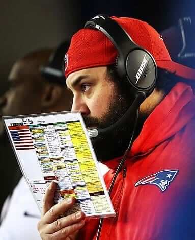
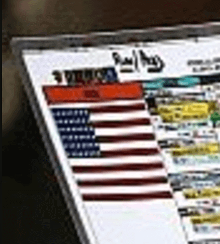
Yup, that’s a 48-star flag. Want to see another example? Here’s a shot of Patricia from New England’s Oct. 23 game against the Steelers, along with another close-up:
Faaaaascinating. I tried to find out if anyone has ever written about this but came up empty — apparently nobody has ever noticed before. I already know from past experience that I won’t get an answer from the Patriots about this one, at least not now. They’re too busy planning their victory parade and all that. Maybe I can get an answer about this (and also about Bill Belichick’s pullover with the Pats logo removed) at some point in the spring. Stay tuned.
One other note about Patricia: When the Pats arrived back in Boston yesterday, he was wearing a T-shirt that depicted NFL commish Roger Goodell as a clown.
Meanwhile, I’m very pleased to see that at least two Uni Watch readers are attuned to the nuances of American flag design. Nice work, Marty and Bryan!
Collector’s Corner
By Brinke Guthrie
If you read the NFL section in Saturday’s Ticker, you may have seen that there’s a seller on eBay who has a big selection of Technigraph helmet plaques, including this small 3-by-3.5-inch size Boston Patriots plaque. (That seller also has a rare black Saints helmet plaque.) Another eBay seller also has a Atlanta Falcons plaque for sale.
Now for the rest of this week’s picks:
• One more Pats item: this classic 1960s poster.
• Here’s an interesting-looking thermal mug for “Super Bowl ’73.” No league branding, no Roman numeral. And the QB is wearing No. 29!
• Check out this 1960s Boston Red Sox lunch box!
• Yes, friends, the merch-verse used to include shorts, as was the case with this 1970s-80s pair of 49ers shorts, made by Champion.
• I remember seeing these Vikings sweatshirts! I recall thinking that the large “M” and the large “V” looked rather dorky, and here they are. This is another item made by Champion, which did quality NFL work back in the day.
• One more Vikings/Champion item for you. Do you think those jersey numbers need to be a bit bigger?
• Have we ever seen a NFL helmet decal — in this case for the New York Football Giants — with the chinstrap featured so prominently? [That’s definitely a new one to me. ”” PL]
• One more Giants item — a vintage mug with “art like Dave Boss.”
• Staying with New York football, here’s a vintage 1960s Jets pennant, and the player is wearing pink or red. Note the plane that looks like a fighter jet, shooting footballs. And New York’s “picture newspaper,” The Daily News, loved those Jets and said so on this 1970 button.
• This 1970s MLB edition Lionel train car included logos for all then-current teams.
• Always wondered about the font they used on this late-1960s Cincinnati Bengals gumball helmet. Just didn’t get it right.
• When you’re making an NFL glass for the Steelers and you’ve only got red and black to work with for colors, the trio of hypocycloids in the Steelers logo are gonna be red!
Zach’s NBA Report
By Zach Loesl
Two of last night’s games were color-on-color: Suns vs. Pelicans in New Orleans and Wizards vs. Cavaliers in Washington. I am a huge fan of color-on-color when there is one very light color and one dark color. This way, there is noticeable contrast between the colors, and the matchup looks great on television.
The Grizzlies once again wore their Martin Luther King-themed uniforms, forcing the San Antonio Spurs to wear white on the road.
I’m not a big sneaker-head, but when a player’s shoes feature a unique design, I’m definitely a fan. Case in point: Dwight Howard of the Hawks wore shoes honoring MLK during last night’s game against the Jazz. (Getty Images always does a fantastic job of getting zoomed-in shots of of the players’ footwear.)
The Kings have an advertisement for DraftKings on their backboard post. Hmmm, Draft Kings and the Kings — seems like a natural pairing. (Also: In that same photo, look at Ben McLemore with those Northwestern-striped socks!)
Finally, I’ve noticed that the Knicks are the latest team to feature advertising on top of the scorer’s table.
Zach’s NBA Report will be appearing periodically on the site after busy days on the NBA schedule.
Chargers-redesign update: I’m now told that the results of our “Redesign the Chargers” contest will run on ESPN either tomorrow or Thursday. Sorry about the delay, but it’s out of my hands. The ESPN football editors want to focus on the Pats’ parade, the new 49ers coach, etc. Lesson learned: In the future, I should avoid running NFL-related contests around the time of the Supe.
You can still see all of the redesigns that were submitted here. Thanks for your patience.
The Ticker
By Mike Chamernik

Baseball News: The Marlins will wear a black and white No. 16 chest patch for Jose Fernandez this season (from Phil). … The A’s will hold a ceremony on Opening Night to rename their field “Rickey Henderson Field.” … Last week it was announced that new Twins pitcher Matt Belisle will wear No. 9, becoming a rare single-digit pitcher. Kenny Kaplan has known Belisle since the early 1990s, so he asked about the switch. Belisle responded: “Simply just liked the number and there were not many choices. I didn’t realize people would make such a big deal over it. It’s just a number.” … New grass is being laid down at Minute Maid Park. … A Cleveland Spiders entry was named the winner of Cleveland Scene’s Redesign the Tribe contest (from Ben Peters, the winning designer). … “The 1970 Reds spring training program artwork of Riverfront Stadium in Saturday’s Ticker shows a field orientation that was different from the real thing,” says Brice Wallace. “The baseball diamond ‘pointed’ downstream, not toward the city. The drawing likely was based on early renderings and models.” … Mimicking the pros can get expensive. An unnamed reader says that his son’s youth team has practice uniforms, along with home, road, and alternate game unis. “Throw in the mandatory matching custom embroidered gear bag and we have nearly $1,000 invested in an 11-year-old’s baseball season,” he says.

NFL News: Here’s an early look at next year’s Super Bowl logo (from @r_vela01). … Some stores in Georgia had Super Bowl title merch ready on Sunday night (from Charlie Richards). … A design studio imagined how football helmets might evolve by 2030 (from Dan Kennedy). … Much like the Golden State Warriors, the Falcons blew a big lead with a championship at stake, leading to this logo concept (from Matt Dudreck). … Here’s a cool animated graphic that shows the history of Super Bowl halftime shows (from Andrew Hoenig). … The Connecticut company that makes Super Bowl championship apparel for the Patriots has a phantom “perfect season” shirt on display.

Hockey News: The studio that redesigned HC CSKA Moscow’s logo and uniforms gave a deep dive into the design process (from YinFeng Shao). … Arizona Cardinals WR Larry Fitzgerald wore skates for the first time during a practice with the Coyotes. … The Panthers’ equipment manager did a Q&A on Reddit. … Here’s a rare shot of a mask that Penguins G Tom Barasso wore for only one game in 1992.

Basketball News: The D-League’s Delaware 87ers will wear stars and stripes uniforms this Friday for First Responders Night. … Kansas and Kansas State went blue-vs.-grey last night. Since K-State has bluish-purple accents, it was a little tough to tell the teams apart when I was watching. … Nevada will wear black “Battle Born” unis on Wednesday against rival UNLV (from @micahsoga). … Holy Cross and Bucknell went purple-vs.-orange last night (from @_cap22).

Soccer News: New secondary jersey for the Chicago Fire (from @bdh_photos). … New third jersey, it seems, for USA Soccer (from Paul Lewis Jr.). … New uniforms for the Vancouver Whitecaps. That “rain” jersey is really something (from Vancouver resident Wafflebored).

Grab Bag: The Rutgers athletic program will switch from Nike to Adidas this summer (from Phil). … Air Jordan 1 golf shoes with a Michael Jordan Bulls color scheme are coming out this Friday (from Phil). … A self-taught graphic artist designed a new logo for a village in Florida. … New logo for the TV network Bravo.
Proofreading the NFL ticker – typo in the linking text on the Falcons-Warriors logo mashup (concept).
Fixed.
It would have been nice if they could have incorporated chief wahoo or a block C in that falcons/warriors logo.
what are you talking about… the world series never happened..
Proofreading:
No Collector’s Corner header
“Wizards vs. Cavaliers in Cleveland” in Washington
Fixed.
That BoSox lunchbox in Collector’s Corner got me to thinking about how MLB didn’t seem to be nearly as visible marketing-wise (at least in Cleveland) as the NFL when I was a kid in the ’70s. I had NFL lunchboxes, bedding, electric football and those wonderful Sears NFL-branded clothes. The stuff seemed to be everywhere while MLB was practically non-existent. I don’t know if that was related to the sad state of Cleveland baseball in the ’70s or what, but it seems like MLB really missed a great opportunity.
Recall that Pete Rozelle was the Rams’ PR director before becoming NFL commissioner. When the boss has such a background, it’s reasonable to assume the league will have a heightened sense of marketing and public relations. Plus, the centralization of resources that took place when the league created NFL Properties enabled the league to create nationwide deals and campaigns more readily.
Could not agree more. Go back to ’70’s and you were lucky if you found Manny’s Baseball Land. MLB just didn’t get on the train until NFL and even NBA marketing took over.
Paul, thanks for letting us know about the Chargers redesign piece delay (again).
Also, whatever happened to the Baseball Hall of Fame jersey redesign contest? That one just seemed to disappear.
Thanks for the poke. Coming soon!
Animated SB halftime item:
two words: Savion Glover! awesome!
Is the color of the Super Bowl 52 logo blue? I was expecting purple to match the Vikings stadium. I figured the league would start going with the host team color, as it appeared they did with Houston’s logo.
I’m glad that they are at least incorporating more color into the logos. Variety is needed so that each game can be considered its own entity. 45-49 blend together.
Your flag exchange begs a question that has surfaced for me in the last decade: why do people find it necessary to make DVR a verb? Isn’t it easier to just say “recording” instead of DVRing?
Because a decade ago (give or take), there was an actual difference between “recording” something, and “DVRing” it.
Now I am sure that nearly no one “records” something, but the nomenclature has stuck.
I don’t know about other people, but more or less when me or the people I know talk about recording something, we actually say “I’m going to DVR that” or “Yeah, I’m going to watch later, I DVRed it last night”.
Lee
I’d guess that ‘DVR’ became the dominant way to express that you’ve taped something because it carries the additional information that it’s the most technologically current method and, relatedly, that it isn’t in some obsolete taping method that few people still have.
It seems superfluous to me. The R in DVR stands for recorder, so we are still recording shows. It is now assumed you are using a DVR to record. Back in the day, we didn’t say I’m going to VCR or Beta it. We said record or tape. Now with no tape involved we should simply say record.
Using “DVRing” saves you 3 keystrokes. Means a lot to an old geezer like me that has trouble texting anyway.
When spoken it’s one more syllable.
Related, I still have a VCR and once in a while still make hard copy recordings of some singular game or event or other notable broadcast. If I need blank tape I’ll often pick up a blank tape at the local store on my way home. The most recent time I wanted to tape something, I think it might’ve been the recent World Series Game 7, I went to three different Walgreens/CVS’s and, for the first time ever, none of them had blank VHS tapes in stock.
Still have a VCR in with the bedroom television. Mainly use it to watch some movies on VHS that I didn’t bother getting on DVD or are too old/obscure for that format. A few years back I recorded a documentary (Hunting the Last Hamilton Tiger) on a blank VHS tape for someone and shipped it to them.
Still have a betamax with a carton of blank tapes stored in the basement – it may even still work.
I’m sure, if nowhere else, you could find VHS tapes online. Maybe certain dollar stores or lower end department stores may still have them. If I was looking to get some cheap I’d scour the local thrift stores first – might even find some new still shrink wrapped in package.
My go-to verb is still “tape”. I’m taping the game.
I also dial the phone, hang up the phone, roll down the windows, and carbon copy many of my emails.
I’m a man out of time.
A surprise to me that the Vancouver Whitecaps redesigned their white kit this year. Would have thought this would be the year that a new 3rd kit was introduced instead.
There has not been a Whitecaps 3rd kit since since the arbutus brown kit was retired a few years back. I would be all for a “bring back the brown” movement for the 3rd kit. I thought the look was unique with the brown base and powder blue trim – good for a 3rd kit.
However, I am sure me and only a few others would be lonely in this movement. The NASL throwback is a more popular choice. I think I am in the minority of the fan base who loved the brown kit. It wasn’t really that bad, was it?
link
I just like the word Arbutus. It doesn’t sound like anything unless you know Vancouver, in which case it sounds like money.
I was happy to see that they were finally removing Tal’s Hill, the outfield speed bump in MinuteMaid park formerly Enron Field (greed, arrogance and baseball all in one place!) then I realized that the images were “twitted” by Mike Acosta – “Manager – Authentication” which threw me at first.
The Astros have a new manager? WTF? Oh, a manager of authentication. What the hell is an authentication manager? All I could think of was someone who made sure all the hologram tags on the swag were indeed “official Emmel Bee merch.”
Wow, back in the days before pretentious job titles took over ‘Murica we used to call people like this… team historians. Which must be a very busy job what with making sure all those world series victories the Astros have won are all properly documented, er wait. Actually, documenting the teams “colorful” uniform histories sounds like a pretty cool gig.
Paul has been a longtime chronicler of things uniform… a new job title in his future?
Perhaps a few suggestions….
“Uniformerlord of the Uni Verse – so there”
“Vizeer of Uni Visions – Seer of things Uni Watchable”
“Sultan of Stitch – Uni Verse ain’t gonna review itself”
“Shah of Squatchee – Uni Versal arbitrage”.
Sultan of Stitch is pure gold. Imagine his twitter avatar sitting on a cushion, surrounded by a harem of seamstresses. Seamstresses on the left are using seam rippers to remove ad patches from jerseys while seamstresses on the right are putting vertically arched Ns On Bs.
During the game I noticed the 48 star flag too! I mentioned it and everyone looked at me like I was nuts.
Another outdated flag occasionally used mistakenly is the British “King’s Colours” Union flag aka the Union Jack without the red X. link.svg
I concur with Brinke; the M and V on that Vikings sweatshirt are comically large.
Though, I’ve never cared much for that wordmark as it is. The M and V just seem to be excessively curved in contrast to the rest of the letters. Then again, I grew up in their Futura Black era, so that’s the wordmark I think of first when I think of the Vikings.
If it makes unnamed reader feel better, less than a grand for all that (assuming it includes league fees, etc.) is a pretty good price! Here on Long Island, there are organizations that charge $2,500-$3,000 for a single summer season and don’t have that much gear come along with it.
The New York Daily News button declares the Jets “Our Champs”, so the item is probably from 1969 coming off the Super Bowl III triumph as opposed to the 1970s as the dealer claims.
Don’t forget, for a short time there was a 49-star flag as well.
New flags are updated on July 4 following a states ratification. So for a year or so we had a 49-starrer.
I happen to have one. It was a burial flag for a relative who served in the Marines.
Funny thing is that there was only a single month when we had both 49 states in the union and 49 stars on the flag. A month after President Eisenhower made the 49-star flag official, Hawaii was admitted as the 50th state. Which is why 49-star flags are so rare: Hawaii’s admission was never in doubt, so it didn’t make financial sense for pretty much anyone, including most government agencies, to purchase and display a 49-star flag. Makes any surviving 49-star flag a wonderful piece of history!
I’m calling it “The Rickey”.
oof. That USA Soccer logo is LAME.
…so Super Bowl 53 will have the easiest design ever?
*Re: the 52 design can easily be 53 w/the Lombardi trophy as the third “I”
Re: the “chinstrap” on the Giants helmet decal that’s on eBay – is it possible that’s not intended to be a chinstrap, but rather a microphone from an announcer’s headset? Their games aired on WNEW radio for many years.
“The Connecticut company that makes Super Bowl championship apparel for the Patriots has a phantom “perfect season” shirt on display.”
There’s also a Pats 2006 AFC Champions shirt, complete with Super Bowl XLI logo, hanging to the right of the 19-0 shirt. Seems like the factory holds on at least one sample of designs that don’t get mass-produced due to a loss (New England lost the 06 AFC Title game to the Colts)
Down here in Georgia lots of us Falcons fans just figured the Patriots defensive coordinator was using a Waffle House menu to hide his calls. The menu has a flag next to the All-American breakfast.
Hey, I still say I taped a show, even though it’s a DVR.
Thanks for publishing my picture, but you added an extra p to my twitter handle
Which item was that, Cole?
Holy cross vs bucknell color vs color
@_cap22 not capp22
Fixed.
On the Super Bowl ’73 mug, the quarterback is wearing 23, not 29. Look at his sleeve. The 4th picture shows it best.
Makes me wonder what numbers quarterbacks were wearing prior to the NFL formalizing the number sequence in 1973.
The Patriots, of all teams, not using the current flag of the United States of America.
Doesn’t sound very patriotic to me (not implying we start a list of scandals).
@Brinke:
The reason for that font on the Bengals gumball helmets in the 1960s was the same reason for the Chargers straight bolt design: OPI dealt with NFL Properties for the NFL teams but each AFL team individually. The Bengals and Chargers apparently wouldn’t give the rights to OPI to use their helmet designs, so OPI came up with their own “logo” for each team. The Bengals design is taken from the wordmark used on their AFL logo.
link
Will probably write a Leo’s World article on the OPI anomalies some day soon. :)
Re Ricky Henderson Field: How much did he pay for the naming rights? And for how long?
The big question that no one is asking is why there is an American flag on the play calling sheet to begin with? Surely this is an important piece of laminated paper containing a lot of very important information and also a random American Flag? I don’t get it. If he has a big thing for flags why not have an extra one on the sleeve or something?
We’ve talked all day about Matt Patricia having an anachronistic American flag on his playcard.
Can I ask a question: Why does he have a flag on his playcard at all?
I don’t know enough about playcards. Is there just room left over after all the plays are printed and he’s just being patriotic? Or is there some meaning to it?
I’m not being sarcastic – if it were a 50 star flag I’d be asking the same question.
Depending how the coach has his card organized there can be some empty space. I’ve worked with coaches who will just put the team’s logo or a conference logo to fill the space other’s have left it blank.
Rob Ryan’s been known to put different pictures on his play cards over the years.
link
Laminated play cards make the coaches look like they’re playing some kind of tabletop football game from the sidelines; the old Sports Illustrated games come to mind (Bowl Bound for college football, Paydirt for the pros).
Lightning wearing white at home vs. the Kings.
This must mean that the Kings brought their black unis on this Eastern trip, probably at the Flyers’ request, and the other teams they visit are willing to wear white.