The second Super Bowl I ever watched was SB VII in 1973 — Miami vs. Washington. I was only eight years old at the time, so maybe I can be forgiven for not noticing one of the game’s more uni-notable aspects: Washington quarterback Billy Kilmer played the entire game without a chinstrap! (You can see a larger version of the photo above here, and there are lots of additional photos of Kilmer from that game here.)
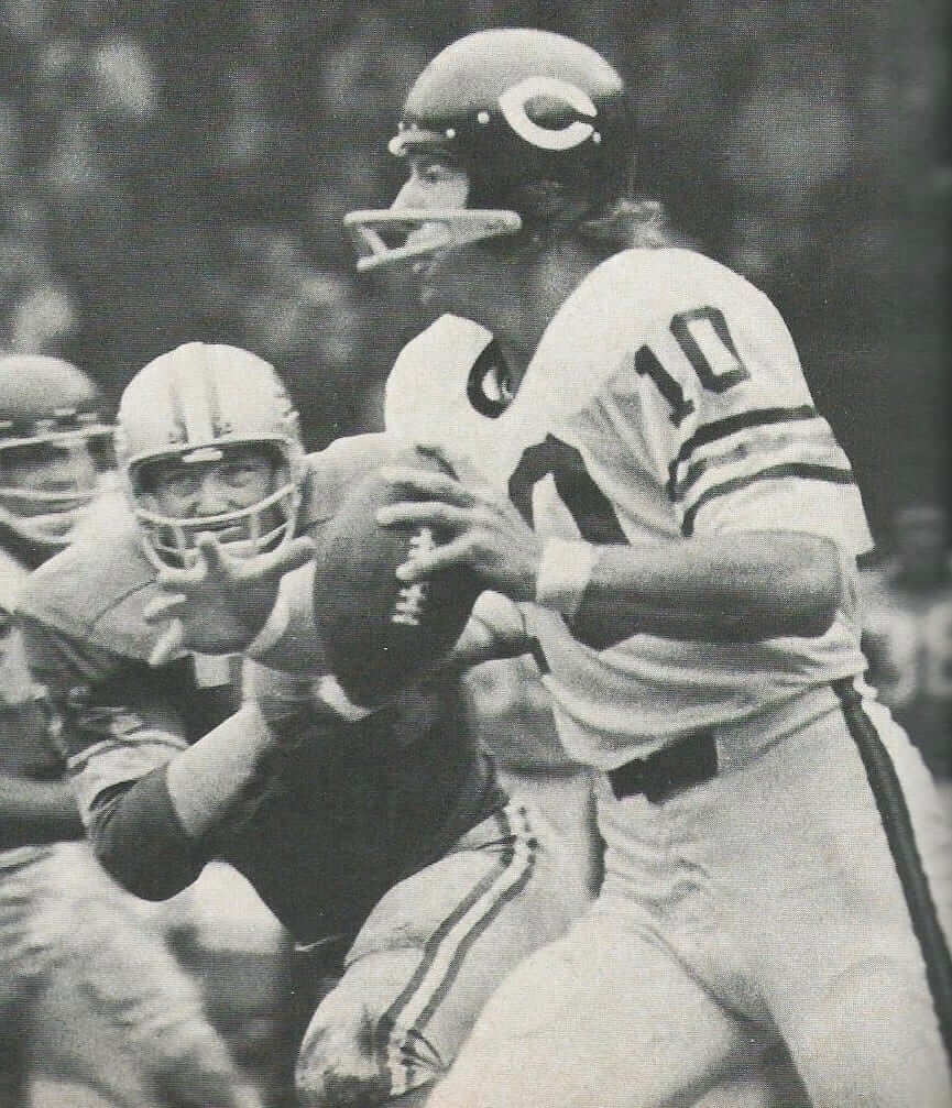
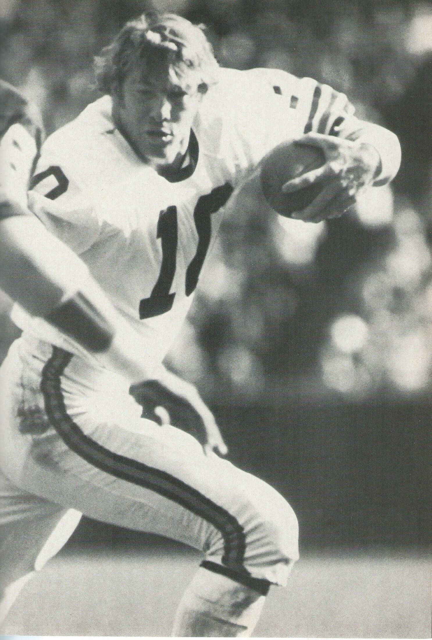
Kilmer was one of several players, including several quarterbacks, who routinely went strapless back in the early 1970s. Another was Bears quarterback Bobby Douglass, who rushed for a QB-record 968 yards in 1972 without a chinstrap — which sometimes left him without a helmet:
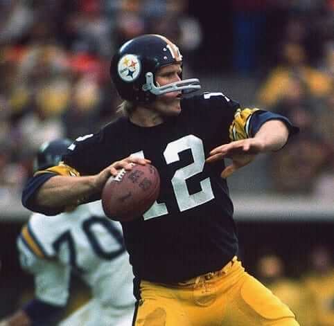
Steelers quarterback Terry Bradshaw also played without a chinstrap in 1972. In fact, he was strapless when throwing the pass that resulted in the famed “Immaculate Reception” play in December of that year. It’s a little hard to see that in video of the play, but you can see Bradshaw wearing his strapless helmet while consulting with coach Chuck Noll during a timeout just prior the play (if the video doesn’t start at the right spot, skip ahead to the 3:24 mark).
(As an aside, I specifically remember that Bradshaw’s teammate Joe Gilliam would sometimes line up under center with his chinstrap unbuckled and just dangling on one side, but I’ve been unable to find photographic evidence of this. Anyone..?)
But going strapless wasn’t limited to quarterbacks. The most famous example is probably Hall of Famer Don Maynard, who eschewed chinstraps but kept his headgear secured to his noggin by having special cheekbone-level inserts added to his helmet, as seen here (click to enlarge):
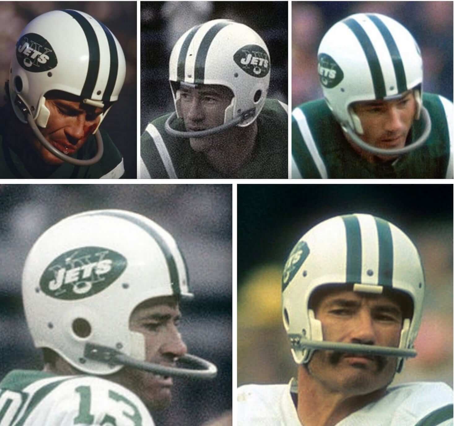
The folks at Schutt have told me that Maynard’s inserts were the inspiration for the little stabilizer tabs on several of their helmets. (Of course, Schutt helmets also have chinstraps, but it’s interesting to hear that a modification from half a century ago could influence a contemporary helmet design.)
I’m sure there have been lots of other players who didn’t wear chinstraps. Feel free to list them in today’s comments.
(Big thanks to reader Ray Hund for suggesting this topic, and for supplying some of the photos.)
NFL color shifts, continued: Yesterday I reported that the Lions will be updating their shade of blue and promised that I’d have more news soon regarding NFL color updates. Today I’m making good on that promise.
The Saints are changing their shade of gold, from Pantone 7501 to Pantone 467. Old version on the left, new on the right:

In addition, Washington is updating its shade of burgundy, from Pantone 195 to Pantone 7421. Old version on the left, new on the right:

Some of you may be saying (as several people said yesterday regarding the Lions’ color shift), “That old color doesn’t even look like what they’ve been wearing!” To which I reply, look, I’m just telling you what the changes are to the official color specs. If they haven’t been matching the old spec particularly well, maybe that’s why they’re changing the spec.
Meanwhile, a document began circulating on Twitter yesterday indicating that the Rams are eliminating gold from their logo:
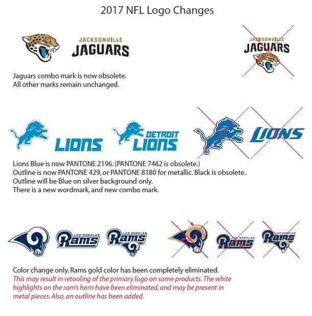
I can confirm that the document is legitimate (as you can see, it confirms the Lions info I provided yesterday). What I have not confirmed is whether this means the Rams will have new uniforms in 2017. It seems like they would — like, if you eliminate a color from your logo, you’re probably going to eliminate it from your wardrobe as well — but I want to stress that I do not have confirmation on that. So let’s not go all crazy about that just yet.
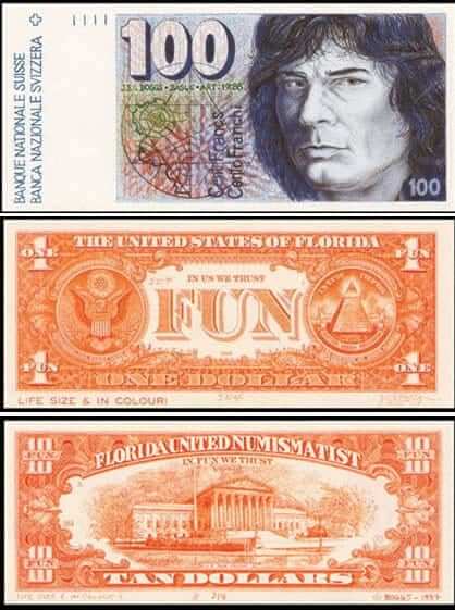
Boggs update: Earlier this week I wrote about the recent death of one of my heroes, the artist J.S.G. Boggs, who specialized in creating clever facsimiles of currency and then “spending” them via a form of barter that doubled as performance art.
As I mentioned in that spiel, I first learned about Boggs via a 1992 documentary film called Money Man. I couldn’t find any sign of the film on YouTube, but someone in Tuesday’s comments section pointed out that the entire movie is available on demand on Vimeo.
I watched it last night — first time I’d seen it since it came out — and was blown away, again, by how good it is. Thought-provoking, entertaining, and fascinating. It’s an hour long, costs $2.99, and is totally worth it. Uni Watch’s highest rating. Don’t miss.
The Ticker
By Paul

’Skins Watch: Here’s one I missed from last week: A bill introduced in the Massachusetts state legislature would effectively ban Native American team names and mascots from public schools (from Ilana Hardesty). … It takes a special kind of chutzpah to combine the worst team name with the worst team logo.

Baseball News: If you read yesterday’s post prior to 2:45pm Eastern, you may have missed this update: I initially said that the new BP jerseys did not have a zippered collar, but it turns that that they do. The zipper is cleverly hidden, like on a pair of jeans (big thanks to Seth Bernstein for setting me straight). … Gross: a bunch of MLB caps lined up to show off their new New Era logo creep. … Blue Jays P Ryan Tepera explained why he wears No. 52 (thanks, Mike). … The latest ingenious DIY design from Wafflebored is this jersey for a fictitious team called the Toothed Whales. Look how the zipper becomes the “teeth” for the Whale logo — brilliant! … The letters and numbers on this year’s spring training jerseys are full of sublimated gewgaws (from Shaun Meulmans). … Here’s a Mets item I hadn’t seen before: a Shea Stadium-shaped ashtray, present in 1964 to President Johnson from stadium namesake Bill Shea (from BSmile). … Yesterday we showed the Lowell Spinners’ new logos. Today we have their new caps (from Steve in Florida). … Here’s some inside info on the Memphis Redbirds’ recent redesign (from Kyle Martin). … Home improvement jerseys upcoming this summer for the Frederick Keys (from John Cannon). … Lots to like in this shot from the 1964 MLB All-Star Game. First, there’s the Reds’ drop-down NOB, as modeled by then-skipper Fred Hutchinson. Small number plus lengthy surname equals seriously jarring look! Also, look at Ken Boyer’s red helmet — it has the blue logo, a topic we recently explored in depth (from Erik Spoonmore).

NFL News: The Lions had previously announced that they’d be unveiling new uniforms on April 13. Now they’re saying that the new set will include four uniforms. That presumably means home, road, throwback, and Color Rash. … The Massachusetts State Police have Patriots patches for the Super Bowl (from Steve in Florida). … Here’s a long article about how NFL fan jerseys are made. … This article about the Raiders’ potential Las Vegas lease includes the following: “The lease makes clear that the Raiders would be considered the primary user of the stadium. This would allow the franchise to accept or reject any potential UNLV football game times and dates, or other collegiate bowl games or showcase neutral-site contests. The terms also stipulate that ‘under no circumstances shall field markings for the (Raiders) games be diminished or compromised in any way by the presence of collegiate football games of any kind.’ It recalls the unintentional comedy of the field-sharing arrangement at Sun Devil Stadium between host Arizona State University and the Arizona Cardinals. On weekends when Arizona State played at home on Saturday and the Cardinals came in the next day, the image of Sun Devil mascot Sparky often could be seen at midfield sticking his trademark pitchfork through the head of the painted-over Cardinals logo” (from Jerry Wolper). … Little-noted fact that I hadn’t thought about in a while until Eric Wright reminded me: The Bengals didn’t have TV numbers up through 1979. … Felipe Carranza has a Pat Patriot bike helmet. … This year’s Super Bowl jersey patch is the first one in five years that doesn’t depict the host stadium. … Here’s a piece on the evolution of NFL cheerleader uniforms (thanks, Phil). … Arthur Savonikas has this cool NFL pencil set. Note that the Steelers helmet faces the opposite way from all the others, so they could show the helmet logo on the proper side — a nice touch. … Blast from the AFL past: Love this shot of Texans owner Lamar Hunt and Oilers owner Bud Adams wearing team logo blazers (from Pro Football Journal). … Here’s an infographic on what happens to Super Bowl winners the year after they win the championship. … The movie Invincible supposedly takes place in 1976 — so how did the Eagles’ current logo sneak in there? That logo debuted in 1996. … Similarly, a player in the movie Friday Night Lights, which is set in 1988, was wearing a base layer with the Under Armour logo, which didn’t yet exist in ’88.

Hockey News: The Penguins have unveiled their Stadium Series uniform (from Jay Polzer). … And here’s Pens G Matt Murray’s Stadium Series mask and pads (from @zrich529). His fellow netminder Marc-Andre Fleury has a new mask as well (from Patrick Gallagher). … The Blues retired Bob Plager’s No. 5 last night. As has become standard in such instances, the team wore his name and number during pregame warm-ups. Then they wore their Winter Classic throwbacks for their game against Toronto (from Brendan Mongey).

NBA News: Here are this season’s 10 best-selling NBA jerseys. … The Wizards and Lakers went color vs. color, with the Wiz wearing their Chinese New Year uniforms. Similarly, the Rockets and Hawks went color vs. color, with Houston honoring Chinese New Year (from Zach Loesl, whose new NBA column will return next week).

College Hoops News: Here are one observer’s picks for the best college basketball uniforms. … Cleveland Cavaliers coach Tyronn Lue, who played college ball at Nebraska, had his Cornhuskers jersey retired last night.

Soccer News: All 10 teams of the National Women’s Soccer League will wear a Lifetime channel logo patch on their right sleeve. That move comes as part of the league’s new equity deal with A+E Networks, which runs Lifetime (from Saurel Jean). … Really interesting article about how the Tulsa Athletics — a team in the low-level National Premier Soccer League — ended up in a trademark spat with the Oakland Athletics. Recommended reading (big thanks to Christopher Walters).

Grab Bag: New logo for the British newspaper The Sun. … New logo for the Ohio amusement park Cedar Point. … And so it has come to this: “How to Wear a Sports Jersey Without Looking Like an Idiot.” Oddly enough, the article does not simply consist of the sentence, “Don’t wear the jersey to begin with.” … Here’s a deconstruction of what the Tesla logo means. … Here’s a preview of the helmets and firesuits for the 2017 NASCAR season (from David Firestone). … New license plate design for the state of Illinois. … Cheerleading could become an Olympic sport.
Okay, that’s a wrap. Enjoy the Supe on Sunday, and don’t forget to watch the Puppy Bowl during halftime. Lady Gaga says she won’t be wearing a meat dress, so it’s not like you’ll be missing anything.
“nice pencil sete” (should it be “set”?)
Fixed.
gewgaw = word of the day
Gewgaws and Flubdubs…
Great article from the Boston Globe about the timely use of… timely phrases.
link
sounds like something from Rick & Morty
link
HA!
I hope the Saints color change is just a matter of bringing the style sheet into alignment with the actual uniforms; the darker hue of gold would not be an upgrade in a color scheme with so much black.
I hope the Skins color change does indicate a change to the uniforms. Washington has always looked better when its uniforms use a deeper, more saturated burgundy. Their non-throwback unis right now are too red, and their normal burgundy appears a bit washed out.
I do believe that’s basically what’s happening here, though I actually think a darker gold would benefit their look. Something that contrasts equally well with white and black. The old gold on their throwbacks and Thursday night uniforms is beautiful.
The Saints need to go back to the darker gold. They look like they’ve been wearing khaki. Their original gold was great and just seems to have eroded over time until Nike completely screwed it up by moving them to khaki.
I always loved the Arrowhead helmet decals. Yes, it’s similar to florida state, but I just like it better.
I wonder if all these tweaks in shades have to do with TV.
To explain, Ferrari changed in 96 the Rosso Corsa they traditionally used into a brighter shade of red because the original color looked darker on TVs. Then in 2007 they started painting their cars in Rosso Corsa again when HDTV were more abundant.
I would say minimally…
Mostly is has to do with… Rhymes with Funny.
You could be on to something. Keeping it in the realm of auto racing, I was a big fan of the CART/Champ Car series until its untimely demise. In 2001, I had a chance to attend a couple races, and had paddock passes to both events. One thing I noticed was that up close, the colors on many of the cars (particularly the red in Penske’s Marlboro scheme) looked different in real life than on TV (and the photographs that I had to wait to have developed back in those days). I asked a friend who was a color scientist at Kodak at the time about this, and his simple answer (I forgot most of the technical details that he shared) was that colors do render differently on TV than in real life, and that the paint colors on the cars were optimized for TV.
I’m so thankful the Lions announced their color change this week, because it’s the most press they’ve gotten during a Super Bowl week in their 77 years of existence.
Those Saints colors are beige, not gold.
Im 42 and still enjoy wearing my teams jersey.
My new rule for wearing a sports jersey is, If you read that Daily News article and agree with any of it, or find anything in it amusing, then you should not wear a jersey, and will look like an idiot if you do.
Previously, I had three rules for jersey wearing:
1) Wear whatever you want, in whatever way feels comfortable to you.
2) Never criticize someone else for what jersey they’re wearing or how they’re wearing it.
3) Unless it’s a Yankees fan with a NOB jersey. They deserve some ridicule.
So that smarmy, bro-ish Daily News article greatly simplifies things for me.
I’ve got three rules for jersey wearing:
1) NEVER tuck your jersey in
2) Don’t wear counterfeit jerseys – especially Seahawks fans
3) If you wear something underneath your jersey, make sure it at least somewhat matches – like don’t wear a red shirt underneath a Vikings jersey
I have a soccer jersey with a NOB of a player who played when they didn’t have NOBs. I just wanted to clarify I wasn’t supporting whoever was no. 9 on the current roster.
2) Don’t wear counterfeit jerseys — especially Seahawks fans
Why?
I have a number of “rules” for the wearing of jerseys myself. What I object to is anyone asserting general rules that others should follow, and calling anyone names for not following them.
Me, I don’t tuck in a jersey. But I would never insult anyone else for doing so, and I would – indeed, I have, once on a Metro platform in DC – defend a jersey-tucker from hecklers. Personally, I find the idea of wearing another man’s name on my back distasteful, so I only wear un-numbered or numbers-only jerseys. But I would never criticize anyone else for wearing a NOB. (With the notable exception of anyone wearing a “JETER 2” jersey, because come on.) I also take care never to match a baseball jersey with a cap from the same uniform set, which is too close to dressing up in player costume for my comfort. But I would never call anyone else out for that.
figured the Rams would make this change, their website has been using the blue and white ram for a while now.. thats why i thought it was strange when the Chargers had a blue and white logo as well
Loved the Tulsa Athletics article. I suggested they create a t-shirt on which all the letters of the team name are in Olde English, except the As.
That’s really good, Andrew!
Thank God. Hopefully this is a sign of the LA Rams changing uniforms. I just think it is so incredibly ridiculous that the Rams didn’t change uniforms for the 2016 season. Yes, I know that the NFL has rules on uniforms changes. But the Rams have known for years that they were going to move, so they should have gotten all the approvals necessary for 2016. Then, even if they didn’t end up moving to LA, new uniforms would have been welcome anyway. I think it kind of hurt their brand, honestly. I think LA fans, with the Rams having 50 years of history in that city, wanted the team to wear LA Rams colors. It was a missed opportunity to make a big splash. I don’t think that whenever a team moves it should change uniforms. But for this team moving to this city, it made sense. And there was plenty of time to get the changes in the pipeline before it happened.
Also, I prefer the royal blue and yellow of the Rams from the 70s through 90s. But I think blue and white is a great look too, so I look forward to the changes.
I just think it is so incredibly ridiculous that the Rams didn’t change uniforms for the 2016 season. Yes, I know that the NFL has rules on uniforms changes. But the Rams have known for years that they were going to move, so they should have gotten all the approvals necessary for 2016. Then, even if they didn’t end up moving to LA, new uniforms would have been welcome anyway.
It doesn’t work that way. Sure, they could have had their on-field uniform set ready for the 50-some players who’d be on the field, but the supply-chain implications for all the licensed merchandise affected by such a maneuver could not have been executed so quickly.
What I’m trying to say is that upper team management of the franchise, who knew in 2013 or 2014 that the team was likely to move, could have had new uniforms ready for 2016. They could have decided “we’re changing uniforms for 2016 no matter what happens” and gone ahead with all of the work behind that, supply chain and all. If they moved to Los Angeles, then everything would be set. If they stayed in St. Louis, fine, they still have nice-looking new uniforms and merchandise (which was necessary anyway).
I can understand some supply chain issues regarding merchandise which specifically calls out the team as either the “St. Louis Rams” or “Los Angeles Rams.” So perhaps that would be a dilemma. But otherwise I think it seems like it could have been completely attainable from a colors/logo/uniform re-branding standpoint.
They could have decided “we’re changing uniforms for 2016 no matter what happens” and gone ahead with all of the work behind that, supply chain and all.
But what if they HADN’T moved in 2016? What if something had gone wrong with that plan? Franchise relocations are tricky and involve a lot of brinksmanship. We see it all the time: Sometimes they play out according to plan, sometimes they don’t. You’re assuming that they knew for certain in 2014 that they’d be moving in 2016, and that simply is not the case.
So instead they wait a year or two until changing their uniforms. Or they wait until their stadium opens. Big deal. It’ll happen when it happens. Makes a lot more sense than putting something that big in motion while running the risk of having it blow up in your face.
I believe we may be more aligned on this than you perceive. My point is that in 2013 the St. Louis Rams could have decided, and told everyone in the retail pipeline (however the notification process works), “we will have new uniforms/merchandise for 2016, prepare yourselves accordingly.” Then those retail licensees could have made sure to wean off the old inventory. In other words, the Rams could have approached this like any other team that changes its uniform. Tell the appropriate parties a few years ahead of time “we’re getting new uniforms for 2016.” In the Rams case, however, they would have known that the 2016 change would coincide with their (seemingly) inevitable move to LA. And if they didn’t end up moving to LA, the new uniforms would still work fine for St. Louis.
The only caveat to me would seem to be the production of new merchandise with wordmarks. I’m not sure how far ahead of time that sort of thing has to be produced. But I can see how using “St. Louis Rams” vs. “Los Angeles Rams” could pose a problem. That said, they faced it anyway when they moved cities last year with their current merchandise, so I wouldn’t think (though admittedly I’m not sure) that would be a big issue.
I believe we may be more aligned on this than you perceive. My point is that in 2013 the St. Louis Rams could have decided, and told everyone in the retail pipeline (however the notification process works), “we will have new uniforms/merchandise for 2016, prepare yourselves accordingly.”
But they had no particular reason to do that UNLESS THEY WERE MOVING. There’s no indication that team ownership was unhappy with the St. Louis uni set. And if they changed while still in St. Louis and then moved to LA a year or two later, everyone would be clamoring for them to change unis AGAIN.
They way they handled it is perfectly fine. It’ll happen when it happens. Life will go on and the world will keep on spinning.
You’re basically criticizing them for being prudent, and I’m defending them for being prudent. Let’s agree to disagree and move on. Thanks.
It is true that the Rams didn’t know for sure that they’d be moving to LA in 2016 (although for a long time that seemed like the likely date of exodus). Maybe you’re right that they should have waited. But I do know that their current uniforms have been panned and loathed by fans in LA and it hasn’t helped the team get fans as excited as they could be about the Rams return to LA. Rams LA fans seem to talk about this issue non-stop.
Would there *really* be a supply line issue if the team had simply worn the already in production for mass consumption throwback uniforms as a primary? Somehow I think Nike could’ve managed. A new design is one thing, but one that’s already being used? Ugh.
Yes, another good point.
Also, team president Kevin Demoff had a much-publicized chat with fans sometime in 2012 or 2013 about changing the uniforms back to the royal blue and yellow colors, with the blue and white uniforms as a throwback. The fans in St. Louis wanted that. The fans in LA would have liked that. So it would have worked for all parties had it been executed.
Many times in the last few years in St. Louis, as well as when they moved to LA, Kevin Demoff and management expressed displeasure with the team’s current uni set. So the movement had been building both inside and outside the building. That’s why I say “why not have this done already?”
The Titans did it when they made their light blues their primaries instead of navy – then again when they switch back to navy
Eagles receiver Ben Hawkins played with an unfastened chin strap in the late 60’s, early 70’s. I think there were others who did this.
link
Good one! Man, that looks *really* weird, no? Even weirder than having no strap at all.
New Nebraska license plates get mixed reviews, blue and gold to match state flag.
link
Sturdy but plain and ultimately forgettable license plates. A solid work of design, if the point is to reinforce precisely the rest of the nation’s stereotype of Nebraska as a state.
Nebraska, with a small population, changes its plates every five years. (Indiana also, I believe.) It must be nice to see new designs regularly (even though they’re FLAT – arrgh!) but we’re a nation of critics these days. Each new design is met with a flood of criticism – and Nebraskan’s only have to live with it five years.
That photo from the 1964 MLB All-Star Game is gorgeous indeed! Would love to see more from that game, as I love that era of baseball.
Funny enough, that same photo was used on this site way back in 2010:
“On Friday I ran this photo of Red Schoendienst wearing a reverse-field Cards cap logo. Now someone on the Chris Creamer boards has come up with an example of that same logo appearing on a batting helmet. That shot is from the 1964 All-Star Game. I forwarded both photos to Brian Finch, who runs the Cardinals Hall of Fame. His reponse [sic]: “I honestly don’t know. I’ve noticed that before but have never found the time to look a little deeper. It’s on my list.”
As Paul said, it was recently fully explored!
Also…Fred Hutchinson left the Reds three weeks after the ’64 All-Star Game and was dead from cancer within six months.
nice logos on the “Giants” and “Broncos” helmets on the info-graphic.
Jim O’Brien, Baltimore Colts, kicked the winning field goal in Super Bowl V with his chin strap unfastened. link
Sports movie anachronisms: no big deal; I had fantasies of receiving flowers at Olympic medal ceremonies long before they actually started doing it (in 1984, first in Sarajevo, then in Los Angeles). I was bummed out when they didn’t give flowers at in Rio last year. The renederings of the Rio logo were described as medal display stands, but I never saw them used for that purpose.
If cheerleading ever becomes a sport, Olympic or otherwise, it would be the first one where its athletes wear their uniforms on the sidelines of another sport.
If cheerleading became a sport, would they have cheerleaders, and would that become a sport as well? It could be sports first infinite regression.
Growing up in the DC area back in the SB VII days, i never really noticed that Billy Kilmer didn’t have a chin strap. I guess it was normaler then.
I bet you noticed his beer belly… giving hope to middle aged men who still choose to wear jerseys and look like they are ready to go into the game.
To be fair Mr. Kilmer was actually known as a quite mobile QB at the start of his career.
link
Billy Kilmer was on the field for one of the most infamous plays in NFL history, but not as a quarterback.
link
I forgot about Don Maynard not using a chinstrap. Didn’t he use an old pair of small shoulder pads his entire career?
Bobby Douglass in block font numbers, 1971 on late-October cloudy day in Detroit.
I know. I think the block numbered jerseys were made of that mesh material for hot weather and they used iron-on numbers.
Kilmer and Jurgenson went no chinstrap.
The Commonwealth of Massachusetts banning American indigen names is hilariously ironic.
I’d be happy with it, no reason why my town, where it’s mostly wealthy whites, should have use Sachems as a mascot, or one of my prior towns with a high school called King Philip and the mascot Warriors (for those unaware, there was a war between Native Americans and Europeans, and King Philip was killed and his head was mounted on a spike for two decades while his wife and son were sold as slaves). I personally find the use of mascot names like this to be a slap in the face to the people who were here before Europeans.
My point is that Massachusetts itself is named for an indigenous tribe.
I live in Connecticut, which is an Algonquin word, meaning, if I’m not mistaken, “Road Work Ahead”.
Funny, I thought that Michigan was Ottawa for “road work ahead”?
Damn, and here I thought I made up that joke myself. Maybe it’s like the Inuit having 40 different words for “snow”.
PaulS
(Insert lame joke about 4 seasons of Canada: almost winter, winter, still winter, road construction)
Ottawa is derived from an Algonquin work meaning ‘to trade’. I think we may be willing ‘to trade’ the city of Ottawa – what do you have to offer? (warning: we’re including the federal politicians and a football team called REDBLACKS)
I’m no Mets fan, and I certainly have no affection for Shea Stadium, but that ashtray is way bitchin’.
RE: The Midland Reds***s
Besides Chief Wahoo, their current logo also incorporates an obscenity (at least one in certain parts of THE State of Ohio). See link
A few fun facts–Ken Griffey, Jr., Barry Larkin, Mike Matheny and the immortal Karl “Tuffy” Rhodes played for this team. Also, team founder Joe Hayden Jr. named the team in honor of the insurance company of which he was CEO–The Midland Co. (now American Modern). Appropriately (as I look down my nose at people who like Chief Wahoo and the name Reds****s), it used to specialize in insuring (and at one point manufactured) mobile homes. See link
Appropriately (as I look down my nose at people who like Chief Wahoo and the name Reds****s), it used to specialize in insuring (and at one point manufactured) mobile homes.
*Really?*
I used to work there. They still have Ken Griffey, Jr.’s old jersey on display inside. Was cool to see that and walk around the baseball fields on the property and think about Junior hitting a homer or making a great catch.
On weekends when Arizona State played at home on Saturday and the Cardinals came in the next day, the image of Sun Devil mascot Sparky often could be seen at midfield sticking his trademark pitchfork through the head of the painted-over Cardinals logo
That could’ve been avoided if they *actually* shared the field, instead of “We get the whole field today and you get the whole field tomorrow.” The Superdome used to have one Saints end zone and one Tulane end zone. Would’ve been even better if they had both helmets at midfield instead of just the Saints’.
Now if you’ll excuse me, I’m heading back to the drawing board to work on a shared Lakers/Clippers Staples Center court.
I’ll get my one complaint out of the way regarding the Penguins’ Stadium Series uniform: The keystone patch is too big, and it’s positioned awkwardly (should be above the stripe, not centered on it). But other than that, it’s a great uniform. I was really hoping the Pens would go with some kind of “fauxback” for their new home and away jerseys, rather than just bringing back a straight throwback. So that was kind of disappointing. And this new Stadium Series jersey kinda makes up for it. Here’s hoping they can be convinced to make it part of the permanent rotation at some point.
Now that I look at it again, I guess moving that patch up would put the numbers in an awkward place. So maybe that was a lose-lose.
Interesting in looking through the SB VII photos, you see #83 of the Dolphins, Vern Den Herder, with an NOB showing “DenHERDER”, with the “en” being smaller caps.
If you look closely at that logo patch on Lamar Hunt’s blazer, it appears to be a spur over the state of Texas outline instead of a cowboy. I’ve never seen it before.
link
link
Quarterback Tim Van Galder of the 1972 St. Louis Cardinals did not wear a chin strap.
Van Galder picture link:
link
With the Lions dropping their alternate color, I can’t imagine what an alternate jersey would be besides a throwback.
It could be a silver jersey. It probably won’t be, but it could be.
“As has become standard in such instances, the team wore his name and number during pregame warm-ups. Then they wore their Winter Classic throwbacks for their game against Toronto”
Please, PLEASE make these you regular uniforms!
That photo listed as Joe Gilliam with the Bills is actually of James Harris.
Ugh. Insert “they all look alike” groaner here. I’ll remove it from the text.
The Redskins seemed to have a rash of no-chinstrap players as kicker Curt Knight also went sans strap link
Hopefully this link works. Curt Knight and the holder were both strapless. The holder is #18 but can’t find a #18 on the Redskins roster at that time.
link
#18 is Sam Wyche.
Another clue that the Rams were going to drop the gold was all the team signage around the field at LA Coliseum being blue and white.
Any more info coming tomorrow from your site on the cultural institution know as the Super Bowl?
My annual Super Bowl column ran on ESPN earlier this week:
link
I love the old Roman Gabriel + Fearsome Foursome uniforms of royal blue and white. But regardless if they go white or yellow, I hope they go back to the royal blue over navy. Another great look is to go with yellow jerseys. This would create a uniform they could wear for both home and away games.
Question: Do you find it funny that while players went strapless in the NFL in other years, it seems everyone’s pics are from 72? Was there something up with the style of helmet that year? Maybe real tight fitting? Just thinking out load, maybe you guys have some thoughts….
Don’t think that’s a new logo for The Sun – the article reads like it is just a one off for Friday.