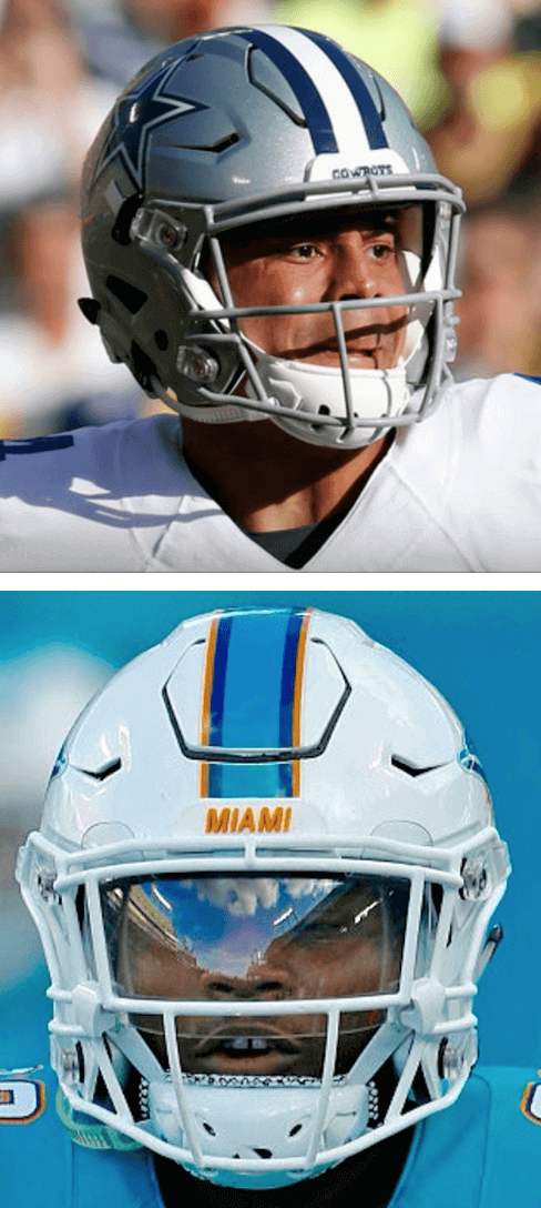
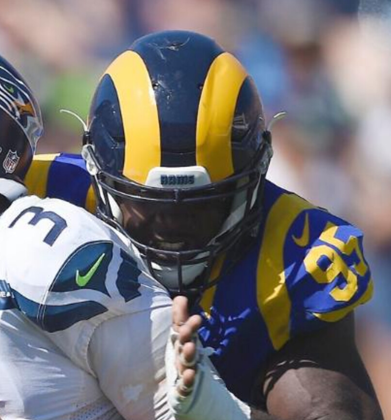
The Riddell SpeedFlex helmet presents a challenge for NFL equipment managers, because its shell includes a cutout on the crown, right where striping tape would normally be passing through. Several readers have commented in recent weeks that the Cowboys run their striping tape across that cutout, while most other teams take the trouble to cut their stripes as they cross the gap (see examples of both styles at right).
Reader Omar Jalife has done some heroic photo research to determine how each stripe-helmeted NFL team handles this (a trickier task than you might think, because some teams only have one or two SpeedFlex-clad players). Let’s see how the numbers stack up, shall we? One thing at a time:
1. Of the 32 NFL teams, 19 of them have center striping on their helmets. In addition, the Bengals’ tiger stripes and the Rams’ horns extend over the SpeedFlex gap. So that gives us a total of 21 teams to assess. (The 11 remaining teams with no helmet striping or other graphics extending into the SpeedFlex gap are the Bears, Buccaneers, Cardinals, Chargers, Chiefs, Eagles, Falcons, Jaguars, Patriots, Texans, and Vikings.)
2. Of those 21 teams, 13 of them cut their striping tape as it crosses the gap — the Bengals, Bills, Colts, Dolphins, 49ers, Jets, Lions, Packers, Raiders, Ravens, Seahawks, Titans, and Washington (if you can’t see the slideshow below, click here):
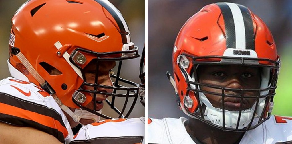
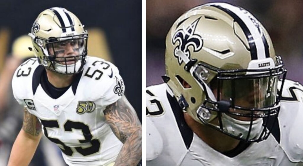
3. Three additional teams — the Browns, Panthers, and Saints — have been inconsistent, sometimes cutting their striping tape and sometimes not (click to enlarge):

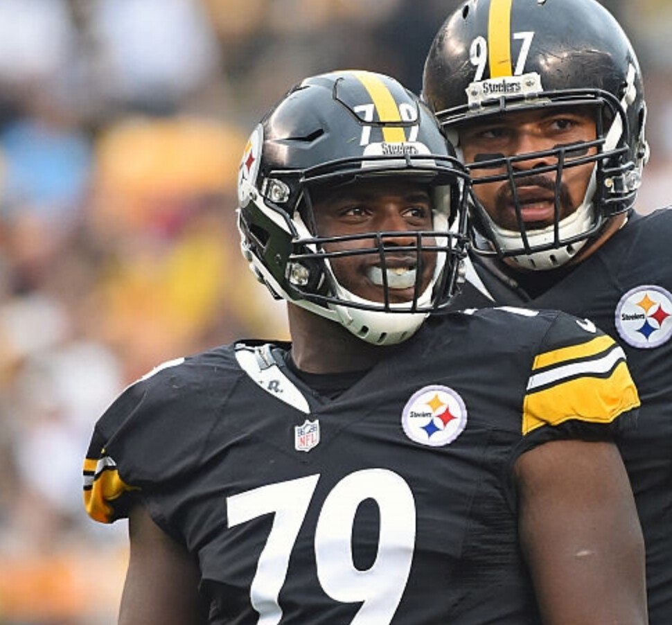
4. There are two teams — the Giants and Steelers — that, in addition to center striping, have uniform numbers on the front of their helmets, and these numbers also extend into the SpeedFlex gap. Both teams cut their stripes, but they take different approaches to their helmet numbers: The Steelers cut theirs, while the Giants leave theirs intact across the gap (click to enlarge).
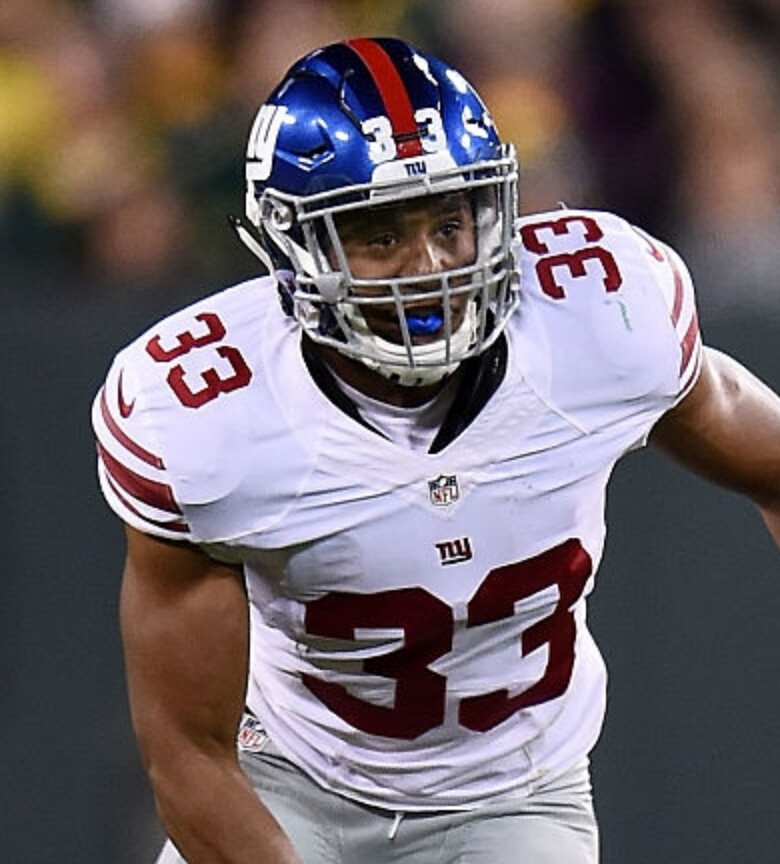
5. The Broncos are an interesting case. Their center stripe doesn’t extend all the way down to the nose bumper — it stops a few inches short, right around the spot where the SpeedFlex gap would be. It looks like their equipment staff may actually have shortened the stripe just a bit on the SpeedFlex shells, to keep the stripe from reaching the gap (click to enlarge):
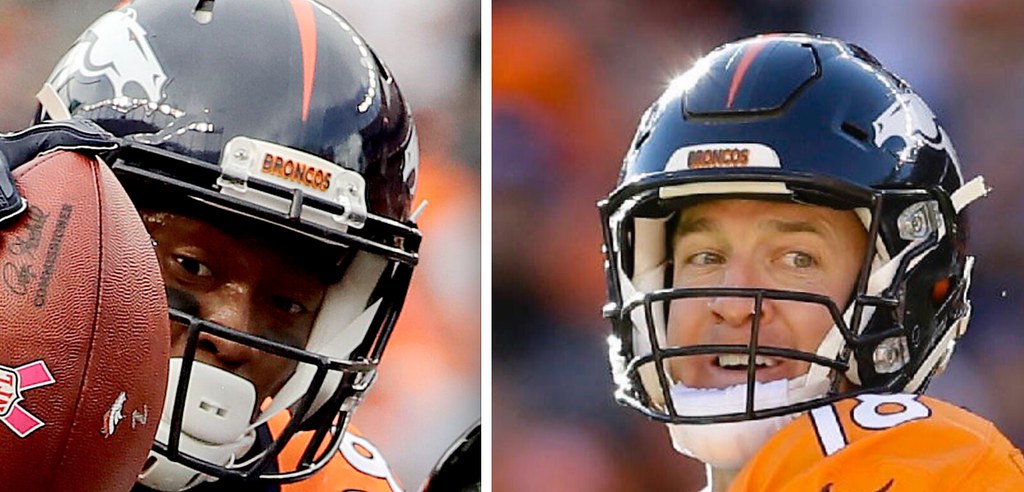
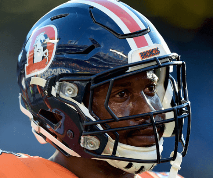
The Broncos did cut their striping, however, on their recent Thursday-night helmet design:
6. That leaves us with two teams that let their helmet ornamentation extend across the gap without cutting it — the Cowboys and Rams:
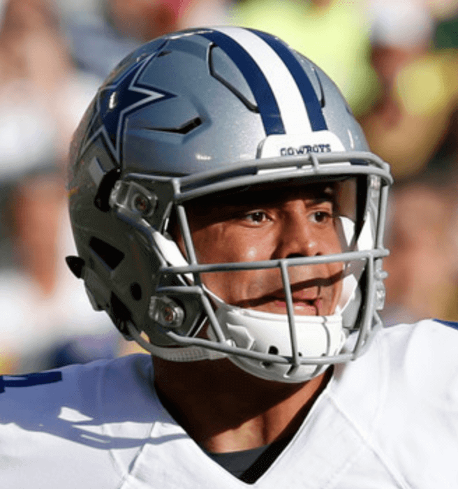
Personally, I think the cut stripes look much better. I even think the Steelers’ cut numbers look better than the Giants’ intact numbers, which I wouldn’t have guessed would be the case until I actually saw them side by side.
(Huge thanks to Omar Jalife for laying the groundwork for this entry.)
T-Shirt Club Update: The fifth of our six 2016 designs is finally ready to go. It’s our football shirt — check it out (click to enlarge):
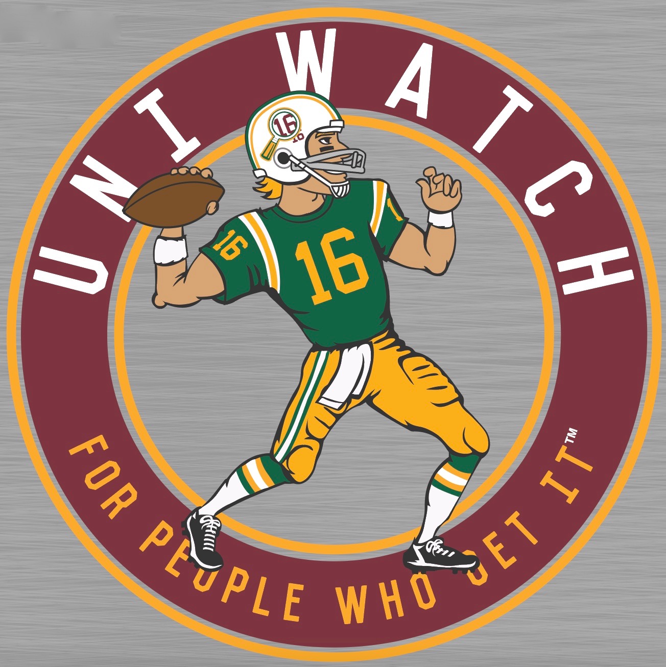
Not bad, right? I can already hear a bunch of you complaining that the various stripe patterns don’t match, but that doesn’t bother me. Big thanks to my creative partner, Bryan Molloy, for his hard work on this one.
This shirt comes in three color options — grey, black, and green — and is available here until Nov. 10. My thanks, as always, for your consideration.
The Ticker
By Paul

’Skins Watch: MLB commish Rob Manfred appeared on ESPN Radio’s Mike & Mike show earlier this week and was asked about Chief Wahoo. His response: “I understand that that particular logo is offensive to some people, and I understand why. On the other side of the coin, you have a lot of fans who have history and are invested in the symbols of the Indians. After the World Series, at an appropriate point in time, Mr. Dolan [team owner Larry Dolan] and I have agreed that we’ll have a conversation about what should happen with that particular logo going forward.” That sounds like Manfred clearing his throat before basically telling Dolan that it’s time for Wahoo to be mothballed, although I once thought the same thing regarding comments by Roger Goodell and nothing happened on that front, so we’ll see. … Meanwhile, a Cleveland hospital encouraged its employees to wear Indians apparel to work for “Spirit Day” but asked them not to wear anything with Wahoo. According to that article, the hospital said refraining from wearing Wahoo is “part of complying with the hospital’s core values, which include respect, inclusion and diversity” (from Jim Vilk). … The Mississauga Chiefs — that’s a girls’ hockey team in Ontario — are keeping their team name with the blessing of local First Nations groups (from Mike Logue). … A graphic on yesterday’s episode of ESPN’s SportsNation program referred to the ’Skins as “Washington’s Professional Team” (from Jeff Stark). … In case you missed it yesterday: Last month I took part in a panel discussion at Baruch College on the use of Native American imagery in sports. The event was videotaped, and the video is now available for viewing. You can view it here, or below:

Baseball News: Former Astros star Craig Biggio is opening a sports bar, with ’Stros-style promotional jerseys (from @jookyhc). … Here’s an article on the Minnesota company that produces a lot of the World Series merch (from Mark Medinger). … Unfuckingbelievable: The giant Cubs caps on the lions outside of the Art Institute of Chicago have been updated to include New Era logo creep. … The dirt paths from the dugout to home plate at PNC Park are not included in the new field layout that’s currently being installed. … Chicago Blackhawks players showed their support for the Cubs by wearing Cubs jerseys on their latest road trip (from Phillip Santos). … New logo for the Lynchburg Hillcats. … Cleveland DH Carlos Santana has a Dominican Republic-themed bat knob decal (from Cody the Chicken). … Here’s a look at the making of World Series jersey (from Robert Hayes).

NFL News: The Jags and Titans looked pretty godawful doing mustard vs. powder blue last season, so someone had the brilliant idea of having them do it again last night, with predictably miserable results. Additional photos here, if you dare. … Interesting piece on the NFL’s attempts — mostly failed — to eliminate the word “nigger” from the field of play.
College and High School Football News: Westwood High School in Texas has NOBs on the helmets instead of the jerseys (from Ken Singer). … Military appreciation uniforms tonight for USF (from John Sobol). … Here’s a look at Colorado State’s record as broken down by uniform (thanks, Phil). … Here’s a ranking of college field designs (from Jason Hillyer). … UNC coach Larry Fedora had his own throwback coaching attire for pre-Halloween (from James Gilbert). … How can these guys look so dejected when they’re wearing such awesome socks? (Big thanks to Marc Swanson.) … Pitt’s sideline mascot wore pink last night (from Andrew Cosentino). … Speaking of Pitt, as we’ve noted before, DE Ejuan Price is taking biker shorts to new extremes. Additional pics here, here, and here. … St. Francis High in Maryland uses the San Francisco Giants’ interlocking “SF” logo. … Down toward the bottom of this page is a video that shows Oregon State’s orange uniforms from the 1941 Rose Bowl (from Jeremy Brahm).

Hockey News: The latest team to go pink in the rink is the Bellingham Blazers. … I put this in the baseball section, but it’s worth repeating here: Blackhawks players showed their support for the Chicago Cubs by wearing Cubs jerseys on their latest road trip (from Phillip Santos).

NBA News: Man, league licensing restrictions sure can result in some seriously odd-looking ads. … The Pistons may be moving to the Red Wings’ new arena (from Dan Kennedy). … The Hawks plan to continue mixing and matching their jerseys and shorts this season, which if nothing else should at least make for good comic relief (thanks, Phil). … Jared Wheeler was looking through some old NBA team yearbooks and found some good stuff. First, a 1993 piece about how the Bucks’ logo was developed. Second, 76ers uni timeline up through 1993 (look here, here, and here). And third, a look at the Spurs’ all-time roster as broken down by uni number, as of 1993 (look here and here). … The Kings opened their new arena last night by wearing purple at home with an opening-night patch. Sorry, couldn’t find a closer view of the patch. If anyone has a better shot, I’ll gladly swap it in. … That new Kings arena also has a team jersey timeline display (from Paul Simpson).

College Hoops News: Here are some more photos of Marquette’s new set. I like (thanks, Phil). … New uniforms for Mississippi. … Whoa, look how they used to set up the Kingdome in Seattle for basketball! (From Josh Sandin.)

Grab Bag: The New Zealand All Blacks rugby team has a new jersey for next week’s game in Chicago (from Josh Gardner). … New logo and livery for Qantas Airlines. … New retro-style logo for Kodak.
Click to enlarge

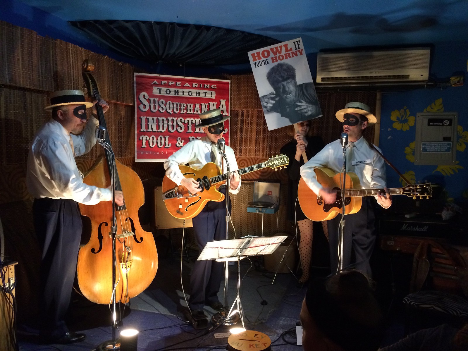
What Paul did last night: I’m not even going to explain what’s happening in the photo shown above. Let’s just say it was a lot more fun than watching the Jaguars and Titans. Hope you had a fun night, too. Enjoy the World Series this weekend and I’ll see you all on Monday.
Was swapping last night between the beautiful Red Wings v Blues game and the god-awful Jags v Titans game. What a world of difference (even between sports)
I’m confused – isn’t the whole point of the SpeedFlex helmet the flexible panel at the top, which will move when impacted? Doesn’t taping the panel closed defeat the purpose?
Helmet decals, striping in particular, have a small amount of elasticity to them. Either way, if the function of the panel is to move or “flex”, the striping will give way. The decals are not particularly strong.
The panel will still flex even if the sticker is stuck to it. Either, as Damn pointed out, the decal will stretch (it’s probably a heavy vinyl or something similar), or the stripe would come unstuck from the panel as it compresses down.
They always remind me of helmet phones from the 1990s.
Glad I’m not the only one.
How about the Eagles and Rams, and maybe Chargers? Do they cut the side vents to accommodate their logos?
Virginia Tech played last night against Pitt.
Pitt’s helmets looked great with the matte finish. The numbers on Pitt’s unis just seem a little odd to me. Something about the curves of the numbers. Too bad because they could have a nice look with better numbers-or just use the throwbacks.
VT looked great with the maroon/white/maroon combo. Much better than the white jersey/white pants combo.
Go Hokies!
my dad owned a camera store, so that “new” Kodak logo takes me back. Hell, my dog growing up was named Kodak.
I like the “old” old Kodak logo better. I don’t like the vertical.
I think the vertical letters bring to mind the perforations on film stock. Perfect association for me. Everyone knows the symbol, so the wordmark isn’t that important to the logo anyway.
I actually didn’t know Kodak had gotten out of bankruptcy. Good for them.
I’d wonder if the tape across that gap interferes with the ability of the helmet to “flex?”
I wonder if you read above?
I re-read it and didn’t see any comment about functionality, just appearance.
Cut striping and numbers is a much better, cleaner look.
If Wahoo gets the old heave-ho, the Tribe ought to replace him with Jobu.
Seriously, though, love Wahoo or hate him, I think we can all agree that the block C is the most dull and generic logo in all of MLB. Cleveland fans deserve something better than that.
I tend to favor the dull and generic when faced with the other extreme, such as the Diamondbacks.
Of course, I’m the guy who thinks Penn State looks great, and Oregon looks silly.
Yeah, well, anything looks good compared to any D-backs uni, ever. Oregon does look silly. And Penn State does look great. In a lot of cases, dull and generic + time = classic. There’s nothing special about the Yankees unis from a design standpoint. What makes them special is the fact that the Yankees have worn them through decades of success.
I would love a return to the Spiders name. Just leave the controversy behind once and for all. I’m from Cleveland and they are my favorite baseball team, but even to me, the Indians don’t have the kind of history and brand that the Yankees, Dodgers, or Giants do. Of course there would be dissenters, but I think they could change their name, especially given the circumstances.
I don’t have a problem with Spiders per se, but I shudder to think of a scowling, skewed cap wearing spider holding a bat logo.
I know it’s douchey to reply to your own comment, but I have another rant, er, I mean thought. Why do all anthropomorphic logos have to be angry? Say what you will about Wahoo, but, jeez, at least he looks like he’s having fun.
I completely agree that the *spirit* of Wahoo is excellent. It’s from an illustration era when mascot characters look fun and smart, not ferocious. I’ve always liked that aspect of Wahoo.
But that’s not enough to justify him.
Now you’ve got me wanting to see a “happy fun” Cleveland Spiders logo design contest.
No, we can’t agree on that. The block C is plain, yes, but in a way that makes it look solid, workmanlike, and straightforward. Which is to say, it nicely expresses the civic identity that Cleveland and Clevelanders like to project. There’s a reason the plain Browns helmet works for a team in Cleveland but wouldn’t work for, say, a team in San Francisco.
I know two native Clevelanders who aren’t huge baseball fans or anything, and whom I’ve never seen wearing stuff decorated with Chief Wahoo, and both started wearing block C Indians caps within a year of their introduction by the Indians. The block C seems to say “Cleveland” to them in way Chief Wahoo does not.
I think the red block C on the navy cap is a great look…understated and classy. I have one and I’m not a big fan of the team. I think it looks much better than the Cubs’ royal blue caps.
It’s not often that I agree with Jon Rose or disagree with R. Scott Rogers, but both of those are true in this case.
While I’m anti-Wahoo, I think the team and its fans deserve better than the block-C. In fact, I think the block-C is such a weak mark that it has become an impediment to Wahoo’s removal, because it’s such a crummy alternative (sort of like how Congress was initially reluctant to impeach Richard Nixon because that would have resulted in Spiro Agnew becoming president).
I agree with Scott that a firm, solid-looking letter could nicely embody Cleveland’s blue collar heritage. But I don’t think the current “C” achieves that. It’s utterly characterless. They can (and should) do better.
Hell, I’d rather see the caveman C make a comeback. It’s not great, but at least it’s unique.
Speaking with a co-worker of mine who is an Indians fan, we both agreed that the Frank Robinson-era “C” — sans the white stroke — would be a quality compromise for the hats. Easily identifiable as Cleveland’s own. And, not to get political, but every time I see the block “C” I can’t help but see former President Clinton throwing out a first pitch. -C.
Funny thing is that I like the block C despite my own general preferences. For just about any city other than Cleveland, I’d hold its plainness massively against it. And in almost all other circumstances, I strongly dislike un-outlined dark-on-dark marks, such as the C in the Minnesota Twins cap. By those and a few other general aesthetic standards/preferences, I ought to hate the block C caps. And I’ve played around a bit for kicks with trying to modify it to conform to my usual expectations, but things like adding a white outline or making the C white weaken the mark for me. Interior decoration like beveling or whatever contradict the civic-identity-reflecting nature of the C for me.
Still, the block-lettering Indians unis are only my second-favorite Tribe uniforms. Bring back the Caveman era unis and I’d be even happier. They could even link for added continuity and I’d be fine with that.
Why not go back to the red “Wishbone-C” of the 30s-50s?
Or would that be seen as too Reds-like?
Yes. Yes it would be.
“If Wahoo gets the old heave-ho, the Tribe ought to replace him with Jobu.”
QOTD material if you ask me.
Didn’t have time to watch the entire panel discussion, but would like to know if the Native American CNN advocate was asked about Native American schools. If studies show cultural imagery damages Native American youth, why is this imagery represented at Native American schools?
I wouldn’t mind a cursive capital “C,” similar to the ones on the recent road jerseys. Red C, with white edge, on a dark-blue cap. Give the lower right finishing stroke a square-nibbed flourish sort of like the first “C” in the Coca-Cola logo, and it’d look pretty snazzy.
Wahoo is a little much, but I also respect the sincere affection and tradition behind him at this point. I’d recommend taking him off the cap and reserving him for the jersey sleeve, as opposed to cold turkey. Retire him in stages, if retire him they must.
Proofreading:
“The dirt paths fromt the dugout”
“Here’s a look at the making of World Series jersey”
Virginia Tech wore this weekend’s uni combo against Pitt last night.
Fixed.
Easily the best T shirt club design to date. Football unis that go white/dark/gold really do it for me (see: classic Wyoming.) Mismatched striping is the icing on the cake.
…and then there’s the gray facemask, which is like raisins when you thought the cookie was chocolate chip.
I’m just surprised you didn’t have something silly to say about gold/yellow.
You call it what you want to, we all know what color it really is.
Am I the only one who sees Bob Avellini?
I’ve read before (possibly on this site), that the Bengals stripes are actually painted on — as opposed to being decals. If true, Bengals painted stripes would always be cut out on the speed flex helmets.
I was a bit taken aback when I saw that you wrote out the n-word, especially since you avoid using the Washington football team’s name.
I don’t think a name or word should be omitted or censored in journalism, no matter how bad it is or is perceived to be by readers. In this case, though, journalists who don’t use the name “Redskins” seem to be doing it as a boycott to influence them to change the name.
If they were to change the name, I would expect journalists to use “Redskins” when referring to them pre-name change, in order to avoid cleansing history of the issue. From an educational standpoint, I would never want people to forget the past or pretend they were never called the Redskins.
Right on. There’s such a thing as context.
I frequently use the word “Redskins” when referring to it directly (like I just did in that sentence).
For example, I have frequently written sentences like the following: “A high school in California will vote on whether to change the name of its teams, which are currently called the Redskins.”
Nice job on the photo research, Omar! Thanks!
I prefer the uncut helmet stripes (and, in the Giants’ case, numbers). Doing it that way helps the eye ignore the gaps in the helmet.
Omar’s slideshow is presented with the teams in (almost) alphabetical order.
Seems Omar chooses not to refer to Washington’s team by its current name.
btw, I always look at how teams are arranged on things (I just can’t help it).
I prepared the slideshow, not Omar.
Sorry for mis-credit.
Burgundy in the helmet logo, but nowhere else on the uniform, eh? Hmmmm…
Maroon, not burgundy. But yeah. Like on the Dodgers’ jersey!
Beat me to it.
-Jet
The tshirt is a perfect throwback… stripe inconsistencies were the norm back from this era look you’ve gone for… and the grey 2 bar mask is phenomenal… this was the first design that has turned my head, and those are the reasons… perfect job :)
Coming from you, Gene, that’s high praise — thank you!
I know there’s been discussion about the Cubs incorporating the TM trademark notation. I just noticed that the Kansas Jayhawk logo as the ® Restricted symbol.
Is this common to other college helmets? Is there one hidden on the wings of Michigan helmets?
Those ‘marks’ would have to be on Princeton’s helmet, not Michigan’s
With SpeedFlex helmets in the CFL, 6 of the 9 teams have helmets with centre stripes. 4 of 9 teams wear them for each game.
2 of those teams wear the centre stripes occasionally. Toronto Argonauts have them only on white road helmets and no stripes on their navy blue helmets. Saskatchewan Roughriders wear centre stripes only with their fauxback 3rd uniform.
From my observations, only 2 teams do not cut the centre stripe. The Winnipeg Blue Bombers and the Riders when their wear their 3rd fauxback.
link
link
Wow, that dejected high school football pic was taken at the old Freeport Municipal Stadium (on Long Island). Spent many a night there as a lad watching stock car racing and the demolition derby, as well as semi-pro football with the L.I. Chiefs of which my cousin was a member…
-Jet
Two separate thoughts here:
First, do the Chicago Art Institute lions have the World Series patch on the other side of the hat? I would be less offended by the logo if they were simply trying to match the on-field caps. I am not saying I would actually like it in that case, just would dislike it less.
Strangely, With the mustard yellow color rush uniforms, Jacksonville seems to have found the one uniform that their two-tone helmet actually looks good with. Overall not a good look, but the helmet seems to go with these uniforms better than the normal ones.
I agree with your helmet comment. Looks much better with the (bad) mustard unis.
Did New Era pay for that advertising, or are we so accustomed to the logo creep that they added to the caps for the hell of it?
My assumption is that New Era holds a trademark on the NE flag logo when used on a major league baseball cap, so any portrayal must have the logo.
Does it appear to anyone else that even the teams that cut the stripe at the front do not do so for the rear gap?
It bothers me that there are inconsistencies on the same helmet but have not had a great photo to see for sure if this is the case.
Paging Omar…
Omar comin!
“part of complying with the hospital’s core values, which include respect, inclusion and diversity”
inclusion and diversity- as long as you don’t include things we don’t like.
Inclusion and diversity in the workplace doesn’t mean including *everything.* There’s all sorts of inappropriate messaging (sexually charged language, bigoted language, etc.) that has no place in a work environment. If you show up for work in a T-shirt that says, “Go Fuck Yourself” and they tell you to change your shirt, that doesn’t mean they’re betraying their core values of inclusion and diversity. On the contrary, it’s part of how they’re *preserving* those values, by avoiding a hostile work environment.
People can reasonably disagree as to whether Wahoo falls into that category. But you can’t pretend that the category itself doesn’t exist, or that its existence somehow runs counter to the notions of inclusion and diversity. It doesn’t work that way.
Did that 1993 NBA yearbook also predict a 2016 Cubs World Series win? ;)
link
Paul, one thing I’ve always liked about the Uni Watch shirts is that they usually depict left-handed athletes, something that very few professional logos do (presumably because of the long chain of marketing wonks which will at some point contain a right-hander who will feel that any proposed lefty logo would look somehow wrong).
So what’s with a member of the evil oppressors getting to play quarterback this time?
Ha! You know, I didn’t even think about that for this one. Probably should have!
Our action shots have all shown the action flowing from left to right, I guess because our culture reads from left to right. If we had a lefty QB facing in that direction, we’d only be able to show his back. So a righty QB fits the bill better here.
Actually, wait a minute — the basketball shirt showed the player going right to left! So forget everything I just said.
I guess we could have had a lefty QB. It just wasn’t on my mind.
M in S beat me to it on the lefty/righty comment!
Also, his non-trowing hand is in an odd position (fingers not spread out). Prithee, who was the model for this one?
Shane Falco.
David Gibson.
Except Falco threw left…
What Paul did last night…should read more fun than, not that.
By the way, I really enjoy the sections on what Paul did last night, Culinary Corner and other personal stories you put on the site. I come for the uni related news and discussion but really enjoy the other stuff as well. Great job!
Typo fixed — thanks for the catch, and also for the kind words!
Just a note that today (10/28) Ohio Governor John Kasich on the Dan Patrick Show was asked “What are your views on the Cleveland Indians logo?” and responded that “We’re not changing it, no way..”
short version, but they only commented for a minute or so about it.
Not sure if anyone else caught that.
When did John Kasich become owner of the Cleveland club?
Exactly. No one cares what the mayor/governor/president/alien overlord thinks. They aren’t the one making the decision.
Part of a high public official’s job is weighing in on matters of public interest and choosing to put the moral authority of his/her office behind a given position. You don’t have to care what he thinks, but I see nothing wrong with him giving his opinion.
Now, if Kasich really said, “We’re not changing it, no way,” that’s absurd, because he diesn’t get to make that decision. But he can have — and voice — his point of view on the matter.
Question on the giant Cubs caps? Do we know if they were actually put up by New Era and the company added the logo, or if it’a a third party who added it to further “authenticate” the caps? Both options suck, as does he fact that the logo is there in the first place, but I’m curious if it was a case of corporate BS or one of “branding” seeping so far into culture that an unaffiliated party added he company’s brand.
I don’t have a clue, but I hope it was New Era that put them up in the first place. The thought of someone seeing them and saying “Hey! They don’t have the New Era flag! That’s wrong!” makes me want to hurt kittens.
Don’t know if it’s intentional, but I appreciate how the band has matching blonde instruments.
The purpose of the Speed Flex cutout is to allow the shell of the helmet to bend and compress to dissipate impact energy. Never mind stripes or aesthetic considerations. If you don’t cut the stripes/numbers/whatever it’s like you’re trying to tape the panel in place and that defeats the entire purpose of the cutout. I’d be interested in knowing if Riddell or the propellorheads at Virginia Tech tested the Speed Flex with vs. without striping or other decorations.
I can’t find any testing footage OR any photo on the Riddell site OR any Riddell ad that shows a SpeedFlex with center stripes.
Plain shell or side logos only.
I think that in the Rams case shown above it wouldn’t interfere as much as the other uncut center stripes–unless the glue is super strong or something.
Thanks for posting the Spurs’ all-time roster (as of 1993) by uni-number.
Interesting to read the names from so long ago. Found one of my favorites, Uwe Blab.
Uwe Blab’s brother Uni worked at Spacely Sprockets with George Jetson.
That’s the second Uniblab reference I’ve seen in an online forum in the last three days.
I studied German in high school and used to collect cards of German-born athletes. I still have one of my Uwe Blab cards (and Detlef Schrempf, and Kiki Vandeweghe).
As is usually the case, Sacramento Kings first unis in 1985 the best.
The football player is indeed a quarterback, woo! Name should still be Chuck Pigskin. I’m a sucker for in-jokes and punny names.
That video. Wow. I’m sure the logistics could be painful, but I wanted more of this. I am on the side of progress with the whole native american naming conventions, however this was excellent and somehow short. Thank you Paul for being in this panel, and thank the college for posting the video. It was enlightening and shed some interesting perspectives that highlight the necessity to change, but suggestions on taking a negative and working it towards a positive as an outcome.
Thank you! I’ve received so much positive response on the video — not so much regarding my role, but about the whole event. Glad you enjoyed.
I coach High School football. We let our kids choose whether they want their stripe all the way down or cut on speed flex helmets. Most choose to cut it because that’s what they see on TV. The stripe going all the way down does nothing to impede the flex part.
The 1993 76ers article on that team’s uniform history had some key errors — the one that leaped out at me was its description of the road uniforms of the first championship season in 1966-67 as being red — they were, of course, blue, with red numbers and letters outlined in white. I believe it was for the 1968-69 season that they switched to red, but initially with white numbers and letters outlined in blue, before I think it was 1970-71 that they finally went to red with the blue numbers and letters outlined in white, the scheme the yearbook incorrectly says started in 1966-67 (the accompanying paintings even depict Wilt in a red road uniform with blue numbers, though he left the team years before the 76ers switched to that particular scheme).
USA Rugby is playing the Maori All Blacks [the NZ B side team] this weekend, not the All Blacks [the A side team who are plaing Ireland in Chicago this weekend].
Below is pic of Maori kit from Addidas.
link
If you were inclined to do a Name The Player on the T-Shirt contest like you did with the basketball shirt, my submission would be: Marvin “Boomer” McMann