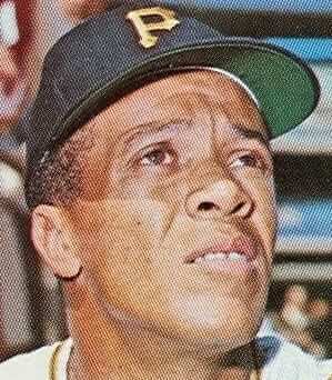
Jerry Wolper, our resident newspaper historian, recently turned up another uni-related story from journalism’s digital archives. This one dates back to 1967 and involves Maury Wills, who at the time was playing for the Pirates. He was no longer MLB’s preeminent base stealer (that status had passed to Lou Brock), but he was still a threat on the bases.
The story begins on April 4 of that year — the tail end of spring training, one week before Opening Day. On that date, an AP wire story about Wills appeared in many newspapers. The gist is that he had switched to a new style of spikes and that National League president Warren Giles had ruled them to be illegal. There are a few other nuances to the story, so I strongly recommend that you read the entire AP article here (click to enlarge):
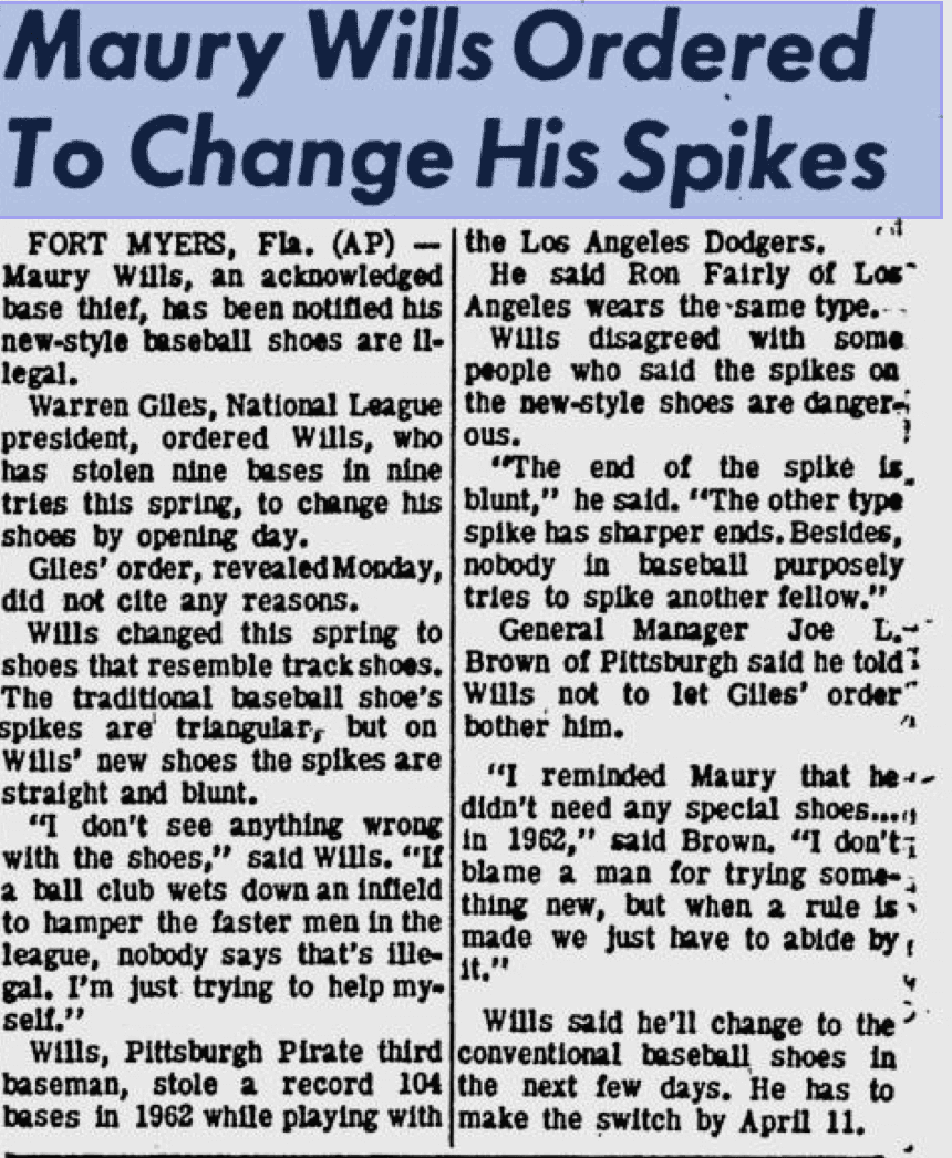
It’s frustrating that there’s no photo, and especially since I’m puzzled by this line: “The traditional baseball shoe’s spikes are triangular, but on Wills’ new shoes the spikes are straight and blunt.” I thought old spikes were always straight and blunt, like this. I’ve tried to find photos of an old pair with “triangular” spikes and have come up empty. I’m also confused by the line about the new shoes “resembl[ing] track shoes,” because track shoes in those days had much spikier spikes — they weren’t blunt-tipped. Hmmmm.
I was intrigued by this story, so I did a little digging and found that four days later, on April 8, a follow-up AP article appeared, indicating that Wills planned to wear the shoes in violation of the league ruling (this one, unfortunately, is a bit blurry, but I still recommend that you read the whole thing):
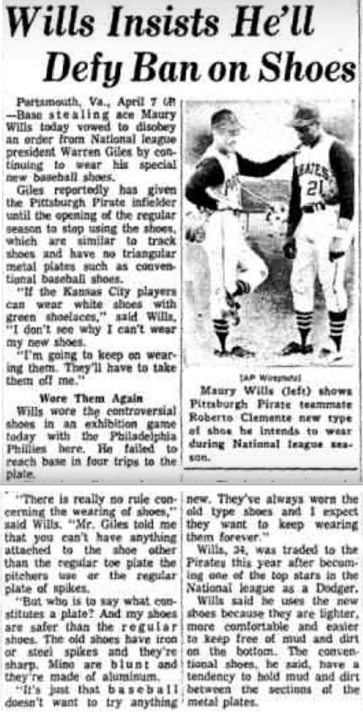
So this time there’s a photo, but unfortunately it’s too small and blurry to be of any use (and I’ve been unable to find a clean version of it anywhere else). But the text in this article provides a clue regarding the spike design — it refers to “triangular metal plates” (emphasis mine), rather than triangular spikes. So I think the old-style shoes were like this, with the roughly triangular arrangement of the front and back spikes:

And I think what Wills wanted to wear was probably something like this:
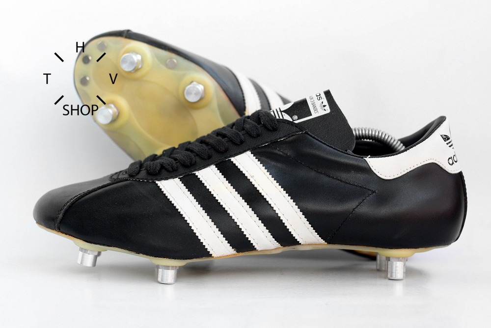
As you can see, the spikes on the lower pair are truly blunt-tipped when compared to the upper pair. I’m not sure why this would have been deemed to be a rules violation, except that, as Wills put it in the article, “[B]aseball doesn’t want to try anything new. They’ve always worn the old type shoes and I expect they want to keep wearing them forever.”
Also, gotta love Maury’s line about the A’s: “If the Kansas City players can wear white shoes with green shoelaces, I don’t see why I can’t wear my new shoes.”
Two days later, on April 10 — one day before the season opener — The Pittsburgh Post-Gazette ran the latest update to the story, indicating that Wills would follow the league edict after all, but that Pirates GM Joe Brown, who was also a member of the rules committee at the time, was lobbying to have the rule changed (click to enlarge):

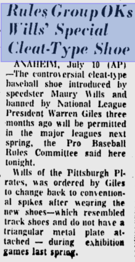
I couldn’t find anything to indicate how the issue was ultimately resolved, but Jerry Wolper — the one who got this whole story rolling — turned up this item from the July 11, 1967, edition of The Pittsburgh Post-Gazette:
And there you have it.
One thing that’s absolutely stunning about this progression of articles, at least from our contemporary vantage point, is that there isn’t a single mention of who manufactured the shoes, nor any attempt to contact the manufacturer. Corporate theater had not yet hit the uni-verse.
This episode wasn’t Wills’s only brush with rules violations. In 1981, when he was managing the Mariners, he was suspended for two games for instructing the team’s groundskeeper to enlarge the right-handed batter’s box in order to provide an advantage for M’s player Tom Paciorek. No word on what kind of spikes Paciorek was wearing.
Update: Thanks to some good photo research by reader/commenter Mark Guttag, it appears that the spikes in question may have been these:
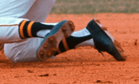
Hard to believe that that was so controversial, right?
(Massive thanks to Jerry Wolper, whose archival newspaper research continues to yield tremendous dividends.)
The Ticker
By Mike Chamernik

Baseball News: Add this to the list of angry mascots and logos: an aggressive railroad spike! That’s the Cleburne Railroaders, a new team in the American Association (from Yancy Yeater). … As we know, the Astros are removing Tal’s Hill, the sloped grass in center field. Doug Brei remembers that Engel Stadium in Chattanooga had a similar setup back in the day. “When I attended a Chattanooga Lookouts game in August of 1987, the centerfield fence was 475 feet from home plate,” he says. “The ballpark had a centerfield hill similar to Tal’s Hill. The hill was in play for most of its history, but at various times throughout the years a chain link fence was placed in front of it. When the stadium was renovated for the 1989 season, the hill was removed.” … A new book chronicles the Cardinals’ logo and uniform history (from Erik Spoonmore). … Pittsburgh Dad was mentioned in the NFL section of yesterday’s Ticker. Joe Werner tells us the character also played a Little League coach in two videos, one for the Monongahela Monsters, and the other for the Century III Maulers. “The Monongahela Monsters uniform was also featured on a special baseball card, modeled after the 1987 Topps set, that Pittsburgh Dad made up a few years ago and gave out with orders of his merchandise. I got mine when my wife bought me a set of Pittsburgh Dad pint glasses for Christmas a few years ago. The logo on the glasses is a parody of the old Mr. Yuk stickers that were given out back in the ’70s and ’80s to mark containers of substances hazardous to kids.” … Here’s a 1979 shot of Bill Madlock, then with the Giants, wearing jacket with a nickNOB (from David Traub).

NFL News: The Packers will wear blue-and-gold throwbacks this Sunday. … The Browns have a logo to honor the 1986 team that went 12-4 and reached the AFC title game (from Robert Hayes). … Republican presidential candidate Donald Trump mocked the NFL’s concussion rules at a campaign rally yesterday. No word on what he thinks about the one-shell rule. … Redskins WR DeSean Jackson was fined six grand for wearing caution tape cleats against the Ravens last weekend. He said he wore the cleats to bring attention to police brutality and violence within communities. … A character in last night’s episode of The Goldbergs wore this nifty helmet shirt. The show has a loose timeline but takes place sometime in the 1980s (from Chris Flinn). … Former 49ers RBs Tom Rathman and Roger Craig, both Nebraska alums, wore “Huskers” on their nose bumpers until the NFL made them stop (from Phillip Schmidt).
College Football News: Kansas revealed a new “Limestone” alternate uniform, which will be worn next Saturday. Rock Chalk, Jayhawk indeed. … Utah will wear white-over-white and black helmets this weekend (from @UtesEquipment, via Phil). … This Saturday, UCF will wear helmets with chrome “reflective” decals. … Here’s a day in the life of Illinois’ equipment manager (from Erik Spoonmore). … “Innovative” jersey designs can sometimes have unintended consequences, like a player looking like he’s wearing a bra (from Ben Whitehead).

Hockey News: With the NHL regular season getting underway last night, the Oilers gave away T-shirts for their season opener and arranged the shirts in a pattern that resembled the team’s primary logo (from Steven Schapansky). … Tatiana Rafter was a late acquisition by the New York Riveters (NWHL) and they didn’t have a jersey with her name and number, so she wore a blank jersey with the number added with hockey tape (from Zach Pearce). … Check out the great blob-shaped jersey crest used by the old Edmonton Flyers.

NBA and College Basketball News: Two worlds collided when the Cavs took the Larry O’Brien trophy to the Pro Football Hall of Fame (from Aaron Husul). … New home jersey for Creighton (from @omahattan). … New uniforms for Ohio. Here’s what the Bobcats wore at home last year (from Kyle Arnott). … Iowa State revealed updated gold uniforms with the I-State logo. Last year, the jerseys just had “Cyclones” across the chest (from Phillip Santos). … New court for Michigan State (from Joey Zurek). … New unis for Ole Miss. The lettering and numbers were blue last year (from Matt Barnthouse).

Soccer News: Liverpool will wear a “Seeing Is Believing” jersey against Manchester United on Monday to promote World Sight Day (from Moe Kahn). … A special coin will be flipped to determine the first pick in the MLS priority draft between the two newest expansion teams, Atlanta and Minnesota (from @saulzbury). … YouTube FC vs. Spotify United? A site called Graphic UNTD created kits for the top apps in the AppStore. … New uniforms for Virginia Tech (from Andrew Cosentino).

Grab Bag: New logo and packaging for Turner Dairy Farms. I like the updated script logo. More info and images here (from Nicholas Yon, who was the lead on the redesign project). … An old Gray Matters comic poked fun at how brand-unconscious weekend warriors are (from Kevin Weir). … An Italian company made a jacket that changes color based on the ambient temperature (from Jason Hillyer). … “Scientists have proposed a space nation named Asgardia,” writes Michael Bonfanti. “The goal is to create an area of space beyond the control of individual nations. The uni/design aspect of this endeavor is they are taking design suggestions for both the Asgardia flag and insignia.” … New outfits for countries participating in the Audi FIS Ski World Cup (from @mike_d1980). … Pinktober has spread to cricket Check that, the pink cricket ball is being used for greater visibility, not for breast cancer awareness (from @TheLupineOne).
It’s interesting to me that Maury Wills ‘only’ stole 29 bases in 1967, his 2nd LOWEST total of his career (in a full season). His lowest came in his last full season of 1971. He would steal 52 in 1968.
I was amused by Wills’ use of the word “fellow”. It struck me how odd that would sound coming out of one of today’s athletes.
I too noticed it but that’s because it’s a word I use in futile hope that it becomes mainstream again!
Winter,
So was I. Caught my eye immediately when I read it.
How times have changed.
-C.
I’ve never heard Maury Wills speak, but I wonder if that was a reporter’s cleaning up of his language. Perhaps the original utterance was more like “fella.”
That shirt from The Goldberg’s is exactly why I can’t make it through an episode. Too many historical inaccuracies! The Titans helmet is clearly visible. It can’t be that hard to get stuff like that right.
I noticed that too, but I noticed a Panthers helmet.
I believe the Madlock image was from his time with the Giants opposed to the Pirates as he wore #18 in SF and #5 while in Pittsburgh.
Doug is correct, Madlock wore #5 with the Bucs. Plus that pic shows orange numbering/lettering with black, which matches SF colors.
Good point. Fixed.
“Here’s a 1979 shot of Bill Madlock, then with the Pirates, wearing jacket with a nickNOB (from David Traub).”
The colors, and lack of stripes on the cap, make me think that’s from his Giants days, which extended to June 1979. (We’ve also seen a Pirate version.)
… like Doug said.
Asgardia. And they wonder why great swaths of the general public poo-poo science and real issues regarding the planet.
I’m not sure I see the issue. After all, one of the first space shuttles was named Enterprise, after good ol’ NCC-1701.
If things like this impact how seriously people take the issue, I’m not sure I’d take the people seriously anyway.
I’d have gone with Caelum, but really, any name one gives a project like this will seem silly and trivial. I mean, the continent upon which I reside is basically named North Henry. (The Italian Amerigo and the English Henry share a probable Germanic origin.) “Asgardia” is no less silly than “America.”
My recollection is that the Goldbergs is set in a non-specific year in the’80s. Consequently, the shirt has at least 5 historical inaccuracies: (a) it has a Panthers helmet (the team didn’t exist until ’95); (b) it has a Titans helmet (the team was the Oilers until ’99); (c) it has a blue facemask on the Colts helmet (they had white facemasks in the ’80s); (d) it has a black Falcons helmet (they had red helmets until 1990); and (e) it has a white Jets helmet (they wore green helmets from ’78 to ’97). It can’t be that hard.
If it was funnier, I could forgive it. But it’s not.
I remember a similar sort of thing in an episode of The Wonder Years. There was a scene where Kevin & Paul were trading baseball cards. Although the card fronts were not shown, the backs were, and they were clearly 1989 Topps cards. This episode aired during the height of the baseball card boom of the 80s-90s, so the number of contemporary viewers who would have spotted this inaccuracy would have been high. I know that 14 year-old me picked up on it right away.
McCovey is off the table!
Well, at least one other person saw that episode! ;-)
I hate shows like the Goldbergs that are set in the past that just throw in random references from different years that don’t make any sense or have any connection but they’re supposed to be funny because they’re from the 80s: “I’m playing with my Rubik’s Cube (1980) while wearing my Ghostbusters (1984)t-shirt, listening to Poison(1986),and there’s a Batman movie poster (1989) on the wall.”
The show is intentionally set in “Nineteen-eightysomething”, to reflect the unreliability of memory, where you don’t get all the dates right. (Last week’s episode put the Live Aid concert in October when it actually took place in July.) They should have called it “Eightysomething”, to play off the title of a series that was also set in Philadelphia, in the latter half of the decade. And also to avoid conflict with the title of another well-known series from the Fifties.
(f) I see a Broncos helmet with the current design, did not exist until the late Nineties; it’s not far from the Panthers helmet.
Pittsburgh Dad and The Goldbergs! About the only two shows I follow avidly anymore.
(f) I see a Broncos helmet with the current design; did not exist until the late Nineties; it’s not far from the Panthers helmet.
Pittsburgh Dad and The Goldbergs! About the only two shows I follow avidly anymore.
My favorite part from the Maury Wills spikes controversy is near the end of the third article. It mentions that Harry Walker was “burning” due to perceived interference from the American League. It shows that even though the National and American Leagues were under the banner of Major League Baseball, some kept to the old ways of keeping the leagues separate until the all star game and the World Series. With interleague play and free agency, both leagues feel more like conferences these days.
The differences between the leagues were real. Most notably, they had separate umpiring crews, and for many years A.L. plate umps continued to use the bulky “outside” chest protector, while their N.L. counterparts had switched to the more compact “inside” protector. This allowed N.L. umps to crouch down lower, which in turn gave the N.L. a lower strike zone. Players who were traded from one league to another often had a hard time adjusting.
The only real difference between the leagues today is the DH.
Its still a weird idea if you stand back and think about it. Imagine if the NFL had different convert rules in the AFC and the NFC. And for interconference games, the rules of the home stadium applied.
Or maybe I’m the only one who thinks about these things.
I don’t think the producers of the Goldbergs had Uni-Watchers in mind when they created the show. To 99.5% of the viewers, the kid’s wearing a shirt with NFL helmets on it: “how cute”. I wouldn’t go all Zapruder on it unless they’re wearing team jerseys which are totally out of sync, then yeah.
I think you miss the entire point of UNI-watch’s existence.
I desperately hope that the point of Uni-Watch’s existence isn’t that I should find a minor uniform-related problem in a half hour sitcom and decide that I can never again enjoy the show.
The pink ball being used in cricket has NOTHING to do with Pinktober. It’s to increase visibility during day/night test matches, since a dark red ball is pretty tough to see at night. You wrote about it back in 2010.
link
Thanks for the info. I’ll adjust the text accordingly.
The player on the Kansas web page appears to be yawning.
Here’s what may be a pictures of Maury Wills’ non-standard cleats:
link
If you enlarge the image it appears that cleats are not arranged in the standard front and back triangular arrangement
Last night’s App State/Lafayette game was pretty easy on the eyes, though in a perfect world there would have been some stripage on the Mountaineers pants.
Found an even better picture of Maury Wills’ nonstandard cleats:
link
No plates. Four cleats arranged in a rectangle or trapezoid at the back. Five cleats in the front arranged around the border of sole of his shoe.
Link doesn’t work (at least for me), but I was able to reverse-engineer it. Here are the cleats:
link
Link on my last post does not appear to work, let’s try again:
link
I know that there are a number of ballparks that had a sloped outfield at one time or another, but wanted to add another to the list: Bugle Field in Baltimore. This was the home of the Baltimore Black Sox and later the Elite Giants, and local semi=pro teams also played there.
Albuquerque still has an in-play hill in centerfield, I believe.
For Maury Wills’ cleats, see this page, 3rd row, far right:
link
Did the Packers finally swap out the green facemask for blue to wear with their throwbacks?!?!!?!?
Tough to say from that Ticker-linked video — looks more green than blue to me, frankly, but it’s difficult to tell from the lighting.
Here’s another photo they posted yesterday. Again, difficult to be sure, but I think it’s still green:
link
If the Packers are going to wear throwbacks, I would really like to see them wear the uniforms they wore in Super Bowl 1 instead of the navy blue ones. I think fans would like that.
Similar uniform, but would have:
-the stripes on the socks.
-the thinner stripes on the pants
-full set of stripes on the sleeves
-the grey facemask
The mid-60’s uni would be a sweet look. I think they did a road version in a Thanksgiving game at Detroit back in the Farve era.
Jumping ahead a week, I’m not happy with the Pack wearing white pants. I understand they have to “participate” like everyone else, but teams with classic looks should be exempt. Green Bay should never wear white pants – ever! I just hope it doesn’t occur on for any other game.
Similar issue between Rugby and Soccer. While Rugby cleats will work in Soccer, Soccer cleats won’t work in Rugby. A little tidbit I found:
Cleats
The number of cleats on the bottom is one of the biggest differences between soccer and rugby cleats. Regulation rugby cleats have 10 spikes on the bottom and soccer cleats usually have 16. Both rugby and soccer shoes feature removable screw cleats so you can adjust your shoes to any playing surface. Choose flatter cleats for shorter grass and soft ground, and longer cleats for longer grass and hard ground.
When I played Rugby long ago, the entire team would have to go to the middle of the pitch and have their cleats inspected by the match referee.
WR regulations have changed… boot laws are much more lax than they used to be
soccer boots are now fine
the only problem boots now are baseball cleats and american football cleats that have studs made of more than one material
The biggest concern was the presence of a toe cleat, which is/was prevalent on cleats made for American Football. I saw refs who would make guys unscrew the toe cleat or (if molded) cut it off. The toe cleat gave an advantage if you were in a scrum, ruck or maul.
It’s hard to imagine a whole coffee table book dedicated to just the St. Louis Cardinals uniforms! I don’t think that the many White Sox uniforms could fill a whole book. (I’ll bet it’s great fun!) I hope the Cardinal book covers this link It was Ken Boyer on the 59 Home Run Derby show vs link As you can see his Cardinals jersey includes a headspoon and sleeve piping – neither of which the Cardinals wore in the late 50’s. Their uni included those elements until 55, but it was a zipper front and used the old ‘Cardinals on the bat’ logo. This is the modern, post-57 script and cardinals, though seemingly on a Red Sox blank jersey – but the Red Sox had double striping on their sleeves during this period. Also, Boyer is wearing link when his number was always 14.
So it appears they sewed the Cardinals bat and birds script logo on to a jersey that fit Boyer for some reason. Or, the Cards were planning a uniform change that never happened. Anyone have more info? It’s a minor thing, but I’ve always wondered about it.
The Broncos need to change their helmet to the one they are wearing tonight. Such an improvement.
And change from navy to blue.
No Pink tower for Color rash games?
i have to say, the Chargers Color Rash unis look great. Smartest looking of the bunch so far.
Hard not to sniff some racial overtones in thst piece of Maury Wills. I know Ron Fairley as the former M’s color guy, and he’s a white man’s white man.
I’m thinking Ron fairly did not steal many bases. As a white man of course.