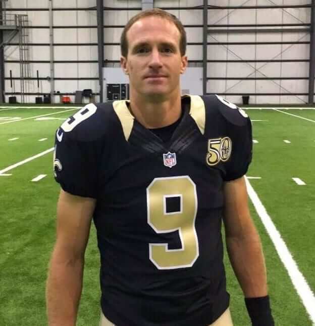
Hello there. Hope everyone had a good holiday weekend. With Laborious Day now behind us, we move toward all the markers of the oncoming autumn season, including kids going back to school, the start of the pro football season, and the annual Uni Watch NFL Season Preview, which will be up today on ESPN (and will feature, among other things, the Saints’ 50th-anniversary patch, shown above, which was not worn during the preseason but will be added for Week 1). Check it out here.
Color Rash unis to be unveiled soon: We all know by now that any item beginning with “Someone on Reddit” should be viewed with a healthy sense of skepticism. With that caveat in mind, here’s a note I received yesterday from reader Tim Forster:
Someone on Reddit says there will be a teaser for the new Color Rush uniforms this Thursday night, with the unveiling next Tuesday. He/she is posting a simple description of each team’s design in their respective Subreddit. He/she is also answering follow-up questions with more info.
For example, my beloved Bengals will supposedly have two different Color Rush designs — one for their Thursday-night game against Miami (that one will be orange, and based on the team’s current primary design) and another for Christmas Eve against the Texans (which will be black and retro-themed).
Don’t know if this is the same person who leaked those color sheets a few months ago.
The notion that the uniforms will be teased during Thursday night’s Broncos/Panthers season opener and then finally revealed next Tuesday, two days before the first Color Rash game of the year, makes sense. They’re running out of time to reveal these things, so that schedule is very plausible.
As for the individual designs, who knows? Some of the info that’s floated on Reddit turns out to be legit and some turns out to be nonsense. And just to make things more confusing, I received an email last night from someone who said these are the Color Rash jerseys being ordered by a Lids store in Indiana:
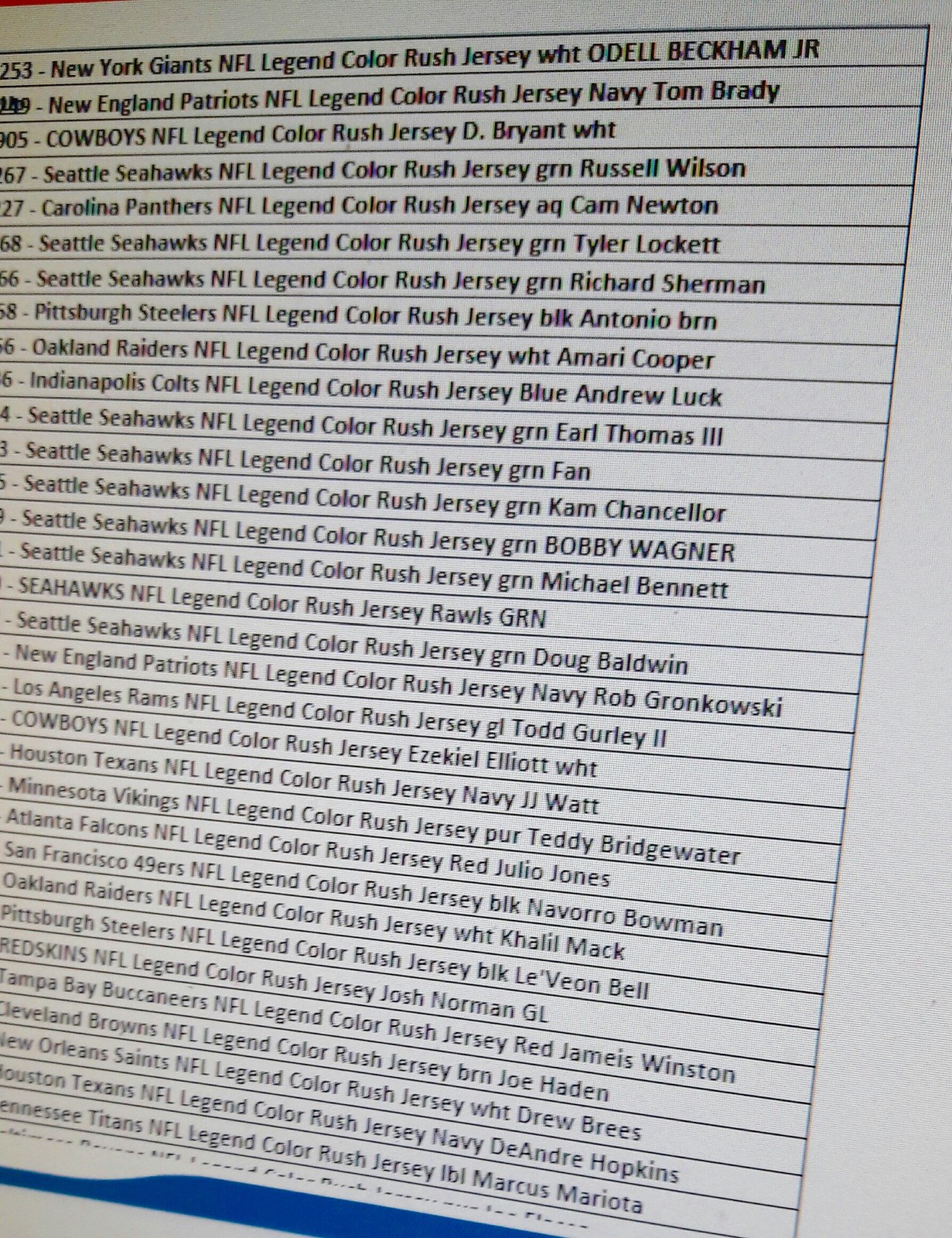
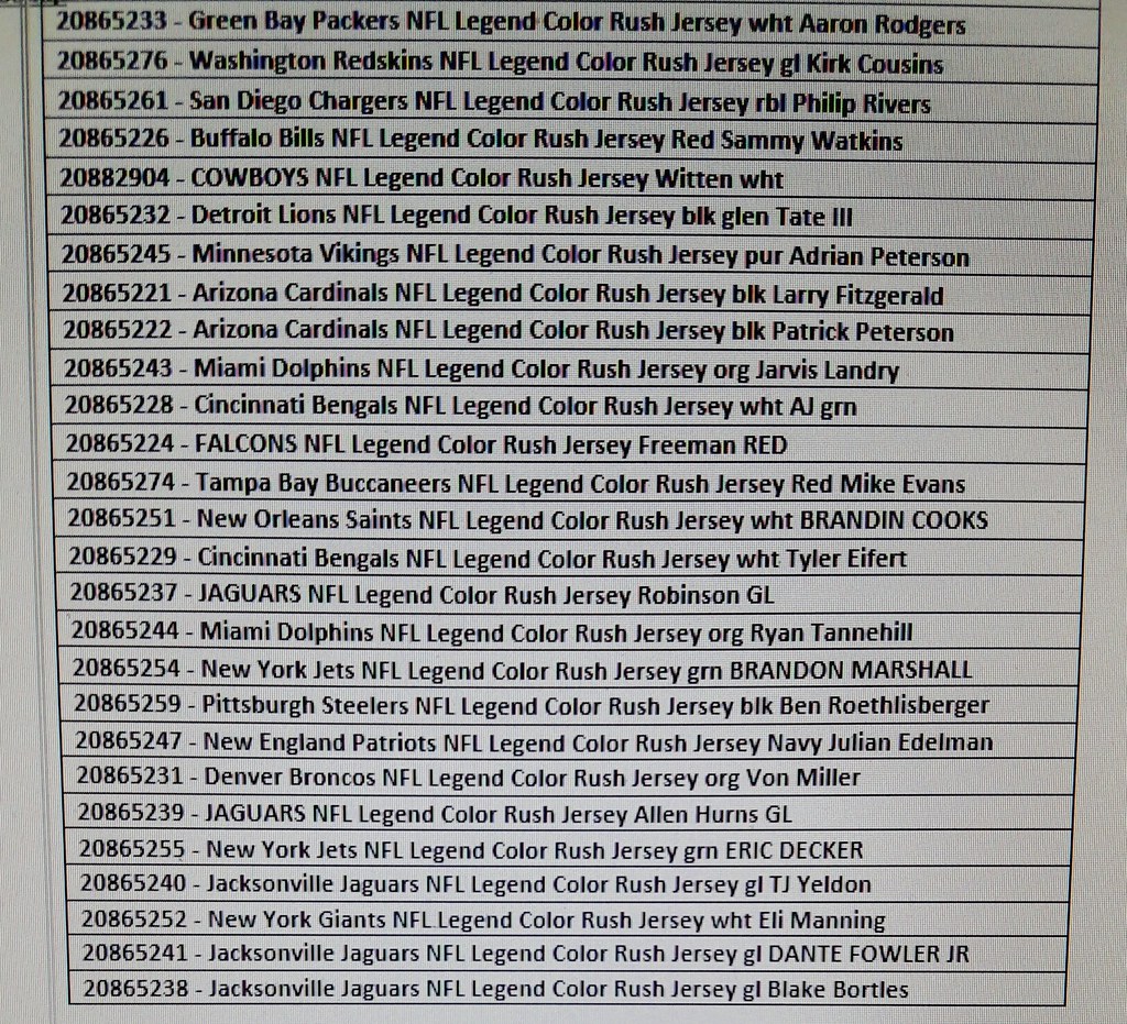
Do the colors match up with what the Reddit guy is saying? Nope! For starters, the Bengals jerseys that the store is ordering aren’t orange orange or black — they’re white! Lots of other discrepancies from the Reddit info, too.
So which one of these leaks is bullshit? I’m figuring probably both. And even if some of the info is solid, it doesn’t mean much without the accompanying photos or mock-ups. Wake me when we have confirmed info and/or visuals. But for those of you who want to get all excited about it now, have at it. By this point there’s so much info floating around out there (your favorite team is wearing black! Or orange! Or white!) that there’s pretty much something for everyone.
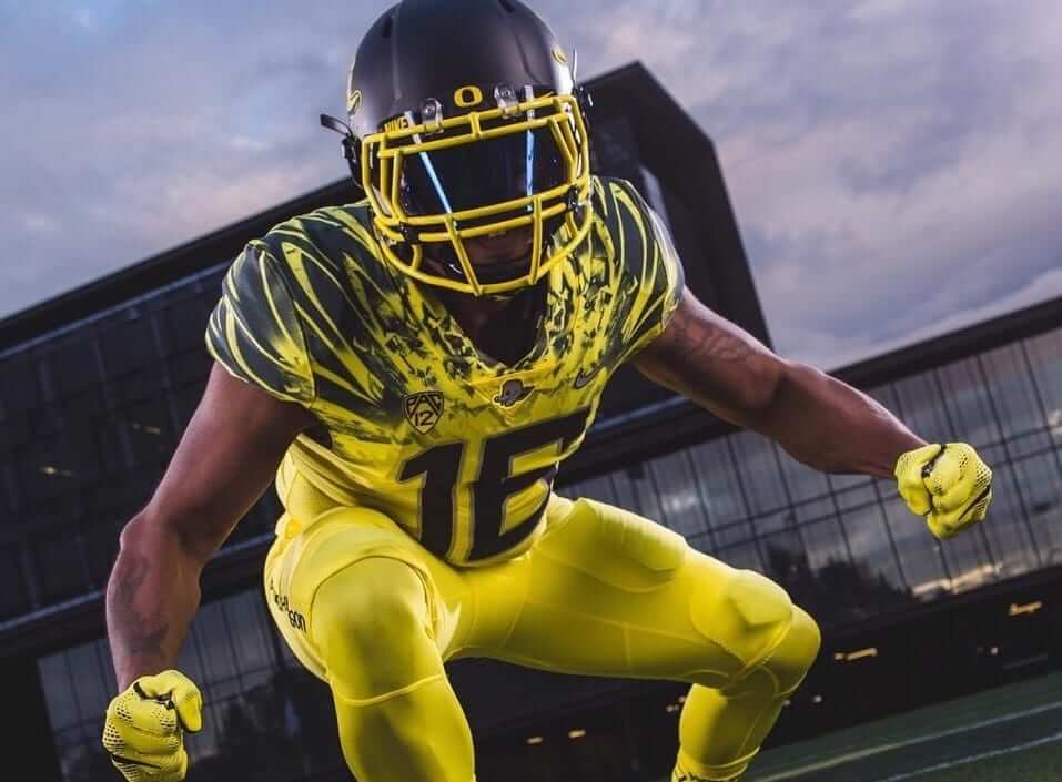
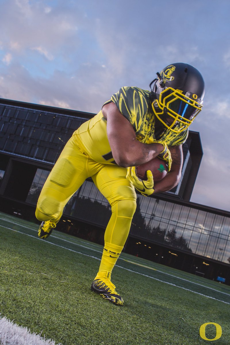
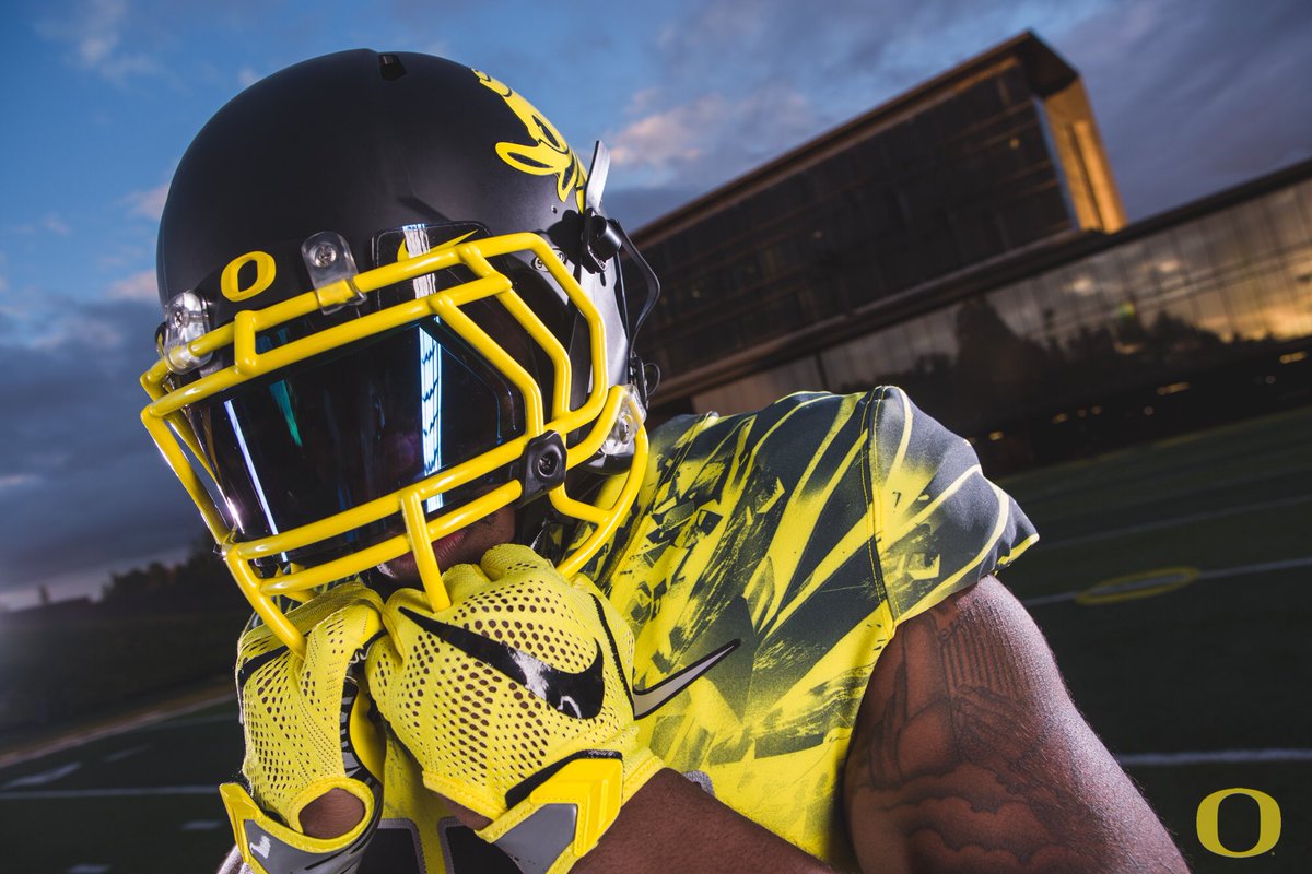
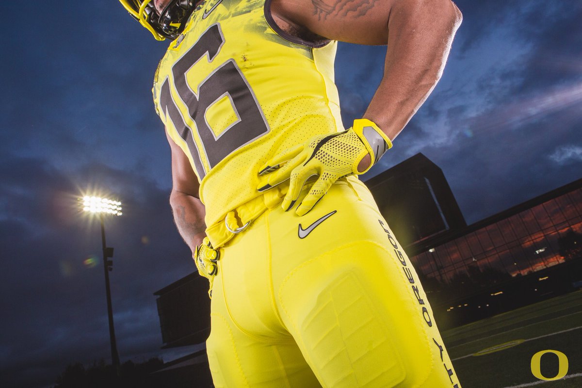
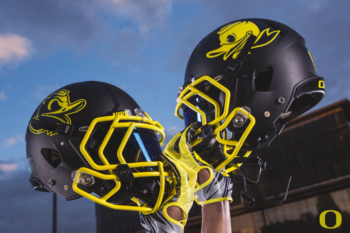
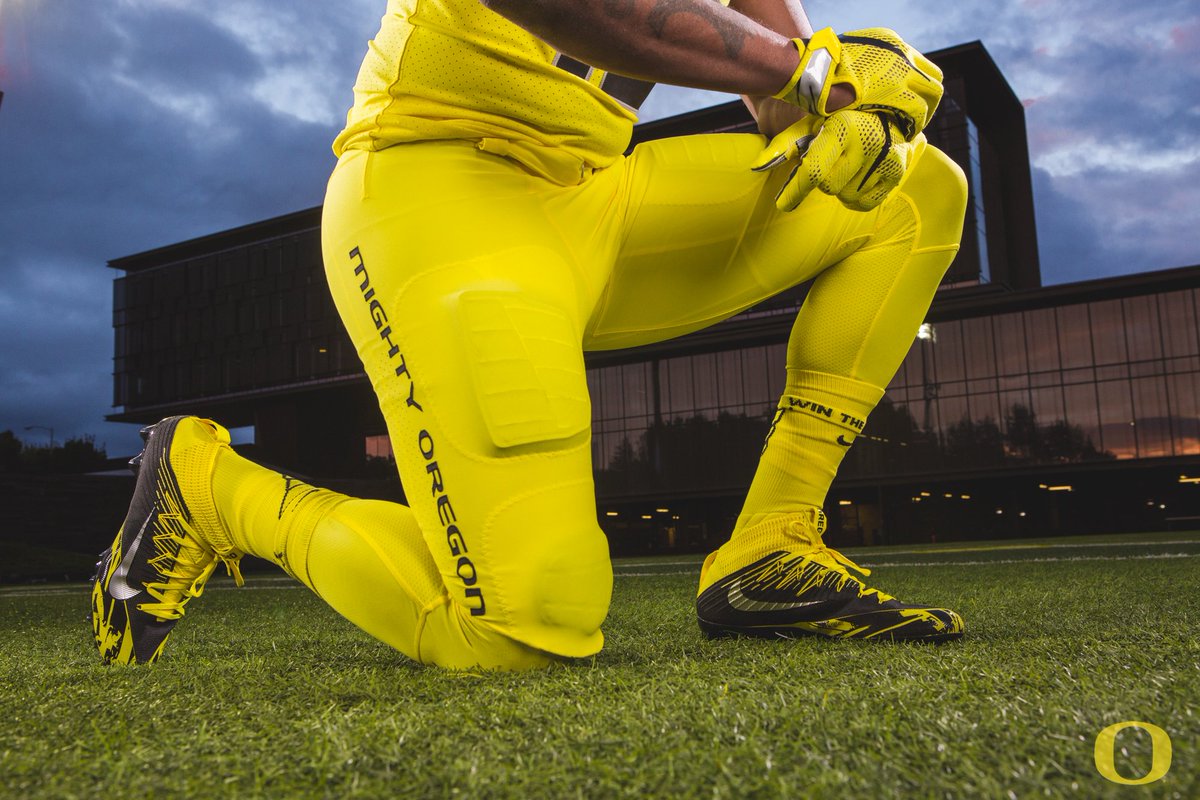
Sorry, I was distracted by something else, were you saying something?: Oregon football, something-something, “electric lightning yellow,” something, matte helmet like everyone else, something-something, the usual slop, whatever:

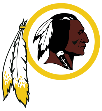
Panel discussion reminder: This Thursday afternoon, Sept. 8, I’m going to participating in a panel discussion at Baruch College in Manhattan regarding the use of Native American imagery in sports.
The event will run from 12:45-2:15pm (yes, I realize that’s an awkward time frame for anyone with a regular job) and is open to the public, although attendees are supposed to register/RSVP in advance. You can do that, and see additional information about the event, here.
T-Shirt Club reminder: In case you missed last week, we’ve launched our latest Uni Watch T-Shirt Club design.
My creative partner on the T-Shirt Club project, Bryan Molloy, no longer works at Teespring, so we’re doing this shirt with his new employer, Represent, which operates almost exactly like Teespring does. From your standpoint, the customer experience should be virtually identical.
Now then: Our latest shirt is devoted to soccer. Here’s the design (for all of these images, you can click to enlarge):
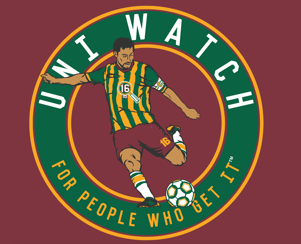
We’re offering this design in four different shirt colors — maroon, black, dark green, and heather grey:
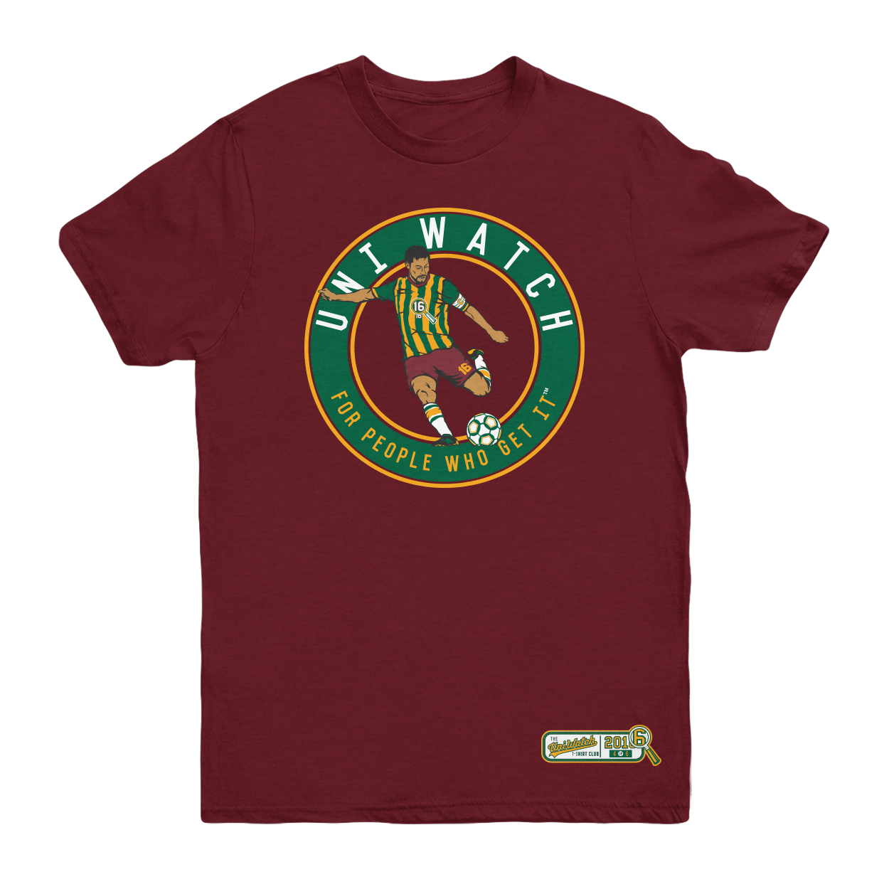
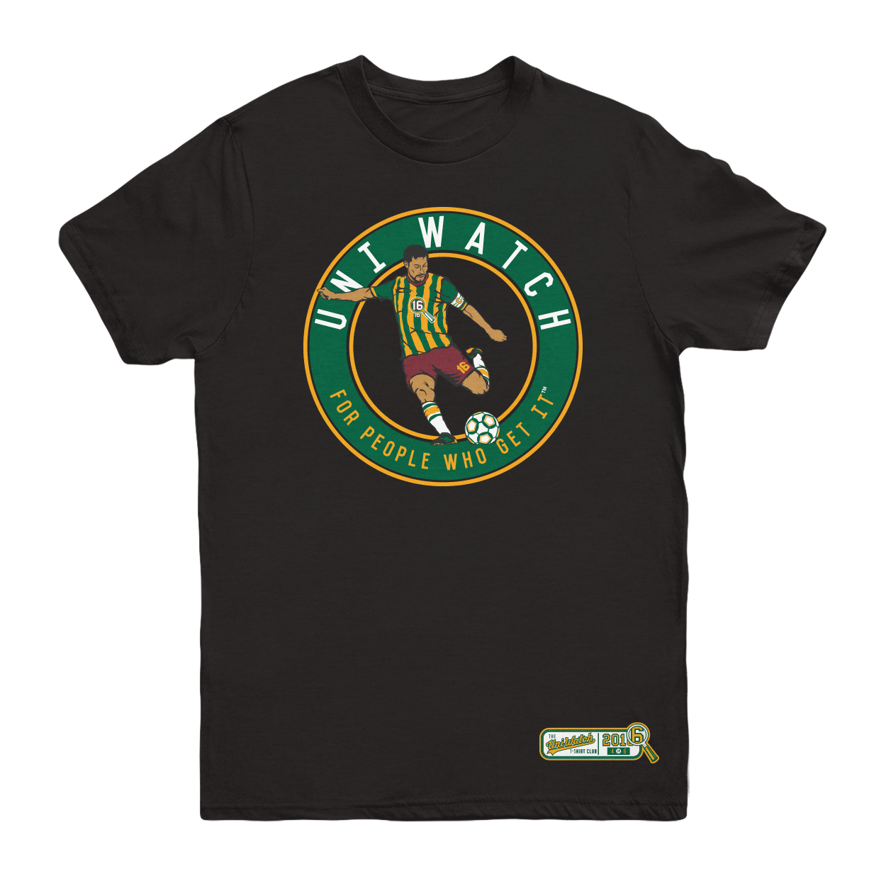
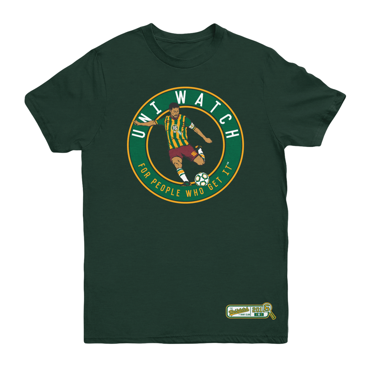
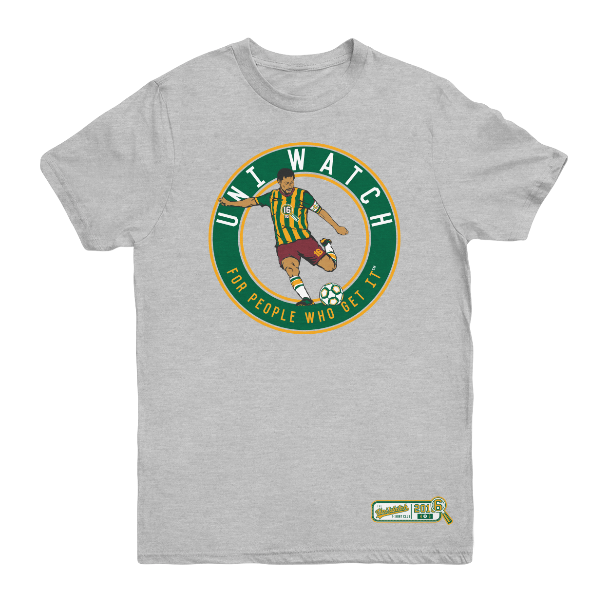
The shirt is available here. It’s available for a slightly longer period than most of our previous shirts, in part because I want to build in some extra time because of the Labor Day weekend, and also because traffic here on the site is a bit lower during my August break. Basically, I just want to make sure everyone has a chance to see and order the shirt.
One more time, the soccer shirt is available here. My thanks, as always, for your consideration.
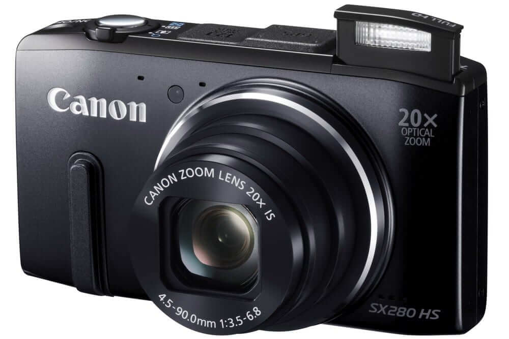
Camera for sale: Like a lot of people, I take most of my photos these days with my phone. So I’ve decided to sell my point-and-shoot camera — a Canon PowerShot SX280 HS, in black. I could put it up on eBay or Amazon, where the going price for used models appears to be in the $130-$140-ish range, but I’d rather see it end up with a Uni Watch reader, so I’ll let it go for $115 plus shipping (or you can avoid the shipping charges by picking it up in person at Uni Watch HQ).
The camera is three years old in very good working order. It has several advantages over a phone camera, including an optical zoom (the phone only has a digital zoom). You can see all the specs here, and reviews of it are here and here. The one I’m selling comes with a battery charger, upload cable, and an 8gb memory card, plus an additional 1gb memory card (which you can swap in if you max out the 8gb card). Unfortunately, I no longer have the instruction manual, but that’s available online here.
The camera has no scuffs, dents, or other defects. For what it’s worth, it was used to create many, many photos that have appeared here on Uni Watch (and virtually all the Gromm•It photos!). Here’s how it looks, fore and aft (click to enlarge):
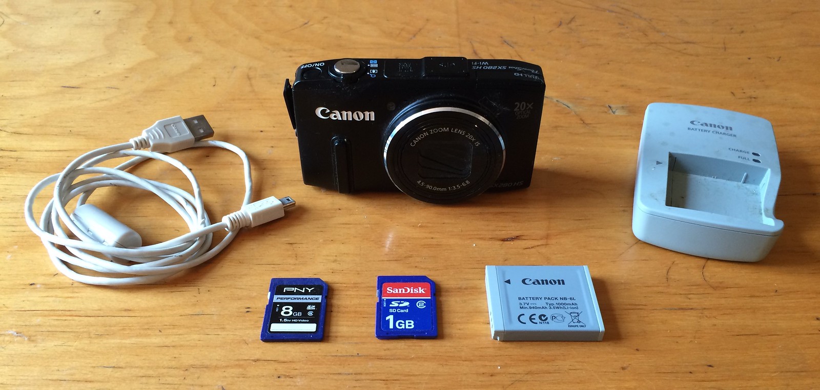
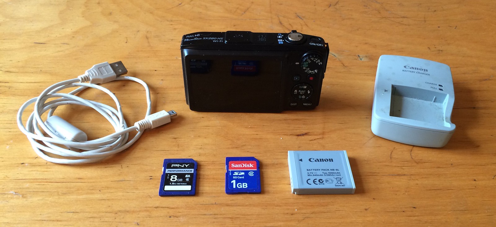
In short: A very capable point/shooot. It’d make a good starter camera for a kid, or a good option for anyone who wants something a bit better than a phone camera. Interested? Let me know. Thanks.
The Ticker
By Paul

Baseball News: Interesting news item about the American Association — a minor league — making batting helmets available in 1948 (from Jerry Wolper). … On Saturday the Mariners helped mark Hispanic Heritage month by wearing “#PonLeAcento” T-shirts during BP. “The phrase means ‘put the accent,'” explains our own Mike Chamernik. … Speaking of the M’s, they wore Los Marineros jerseys on Sunday and wore their road blues at home yesterday. … Saturday was International Bacon Day, so I ate a shitload of bacon former Royals player Mike Sweeney wore a bacon-themed jersey while throwing out the first pitch in KC (from Brian McDavitt). … You have to squint a bit to see it, but the 8 on Twins P Andrew Albers’s jersey is upside-down. … Orioles OF Adam Jones was looking good in classic O’s stirrups the other night (from John Falardeau). … Addison Russell has been wearing Cubs logo eye-black stickers (from Richard Grossman). … With the World Baseball Classic qualifiers upcoming, Great Britain has new uniforms. … A Brooklyn Cyclones player had badly torn pants yesterday — in the top of the 1st! … Here’s a new Twitter account for colorized baseball pics (from Will Scheibler).

NFL News: Uni-numerical oddity: The Falcons have six WRs on the roster, and none of them have numbers in the 80s, and ditto for the Cardinals (from Josh Gibson and J. Goede, respectively). … Tom Brady reportedly had no idea that the NFL logo was missing from his helmet during the preseason. If you missed this little storyline over the weekend, look here. As I wrote on Saturday, I have my doubts about whether this was an intentional move on Brady’s part, but we’ll almost certainly never know, because he wouldn’t admit it even if it were true. … You know those vintage “base ball” games, played with old-fashioned gear and rule? Turns out there’s a football version of that, complete with leatherhead helmets (from Brian Brissman). … Seahawks CB Jeremy Lane, who followed 49ers QB Colin Kaepernick’s lead by kneeling during the national anthem prior to a preseason game last week, says he’s going to keep doing it during the regular season.
College Football News: Penn State had an outdated 76ers logo on the sideline on Saturday (thanks, Mike). … Two Virginia Tech players are wearing inconsistent McNOB styles (good spot by Jonathan Sluss). … LSU is going with raised nose bumper lettering this season, and so is Ohio State. … Speaking of Ohio State, they have new warm-up tops. … Uni typo alert: Kansas OL Hakeem Adeniji’s surname was misspelled on his NOB the other day (good spot by Kyle Martin). … ECU QB Gardner Minshew has RNOB (from @HPPDodgers). … Georgia Southern wore new alternate unis for the season opener. … By now you’ve probably seen this great photo of the world’s most invisible uniform. … Pretty gross to see that Michigan’s marching band sformed the Jordan logo the other day. Yeah, nothing says school spirit like corporate shilling. … Can’t say I’m a fan of Wisconsin’s new NOB font. Too clunky. … New helmet for Hope College (from proud alum Joe Hollomon). … Here’s the field design for the Battle at Bristol. Virginia Tech fans are being advised to wear maroon for that game (both from Andrew Costentino). … Florida State K Ricky Aguayo wore red soccer boots last night (from @RNs_Funhouse).

Hockey News: Team Europe’s jerseys for the World Hockey Classic have eight different national flag patches (from Aaron Scholder). … Whoa, check this out: The Moscow Dynamo team wore jerseys with shirt-style collars the other day. … New goalie pads for St. Lawrence University (from John Muir).

Grab Bag: Women’s soccer player Megan Rapinoe is the latest athlete to kneel during the national anthem. … Here’s a look at the rugby shirts of the Aviva Premiership. … The UK food-delivery service Deliveroo has undergone a rebranding redesign. … Hillary Clinton has a new campaign plane with her own livery. … Here’s your latest chance to vote for the NASCAR paint scheme of the week.
Click to enlarge

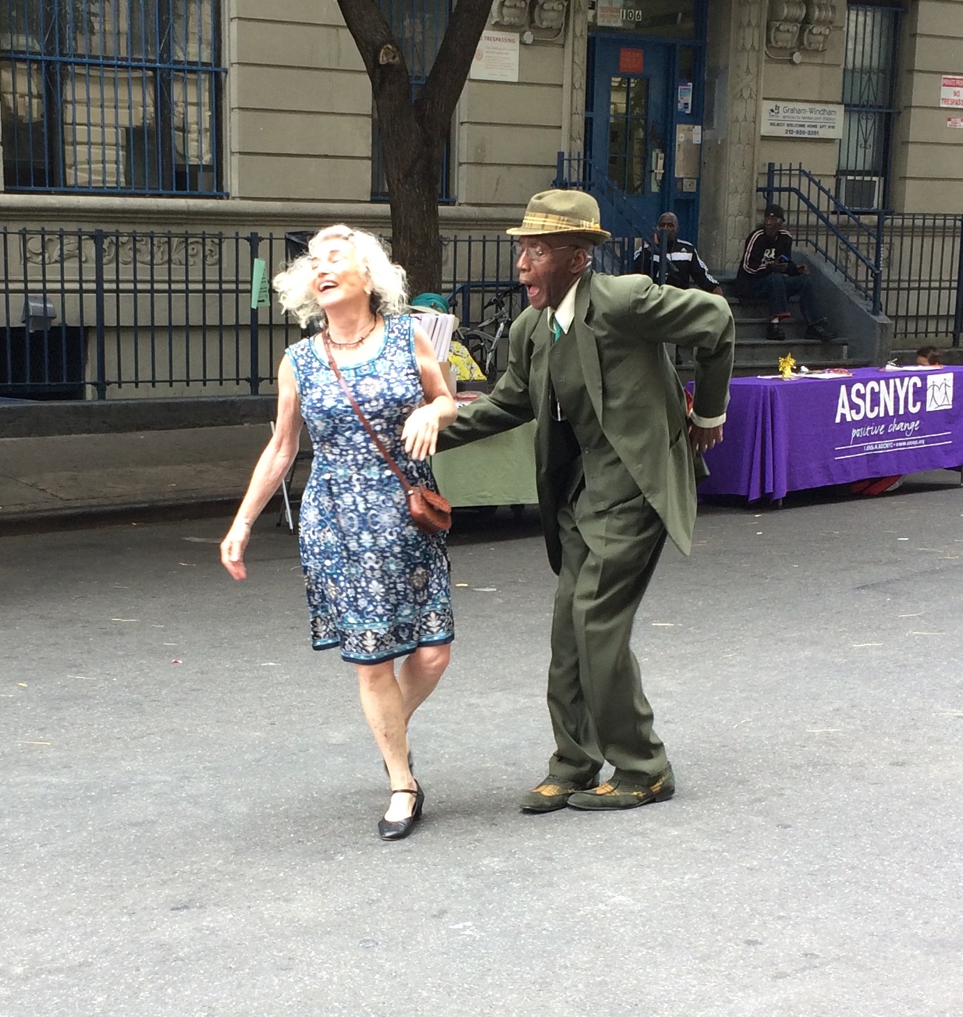
What Paul did last night on Saturday: On Saturday I was checking out some stuff in Harlem and stumbled upon a block party. There was a live jazz band, and I was particularly smitten with this one couple that was dancing up a storm. Elderly, beautifully dressed, and clearly having the times of their lives, they looked like a perfect couple. Maybe they hadn’t been together forever, but they were clearly going to be together forever. Then, eventually, the song ended and they thanked each other and went off to find new dance partners for the next tune. That happens all the time at dance events, but it always catches me by surprise, because a good dance couple looks so much like a good life couple. I fall for it every time.
Also: The couple did most of their dancing under the watchful eye of this one dude in a windbreaker and ballcap, whose presence stuck an interesting contrast to the nattily attired dancers. He’s not shown in the photo above, but you can see him in most of these other shots I took (if you can’t see the slideshow below, click here):
Man, sometimes New York is just the best.
Proofreading:
“The Falcons have six WRs on the roster, and one of them have numbers in the 80s” None, right?
“The Russian Dynamo team” Moscow Dynamo, or Dynamo Moscow if you prefer
Correct. Thanks, Jerry.
As far as Oregon Uniforms go, if that “electric yellow” was switched to a more traditional “Kelly Green” I’d be 100% ok with those. I love their alternate duck logo and the splash pattern black is interesting enough.
Just a question. Are you intentionally spelling Color Rush “Color Rash” as some sort of sarcasm? Or are those just typos? I would assume it’s intentional because it’s used every time the phrase is mentioned, but just wanted to check.
We’ve been calling it Color Rash here on Uni Watch since the program’s inception last fall. I actually held a contest to come up with the best substitute name, because there’s no fucking way I’m gonna parrot Nike’s latest marketing newspeak week after week. Color Rash was the best submission among several other very good entries.
I still liked Cash Rush
Color Rash Cash Rush!
Given that the color rush uniforms have also included new pants… which aren’t a big retail item… I really don’t think they’re a cash grab.
The, you’re not thinking big enough. Color Rash is clearly not a cash grab in terms of selling retail replicas of the Color Rash unis themselves. But the entire NFL suddenly dressing conspicuously like mannequins at a Nike store? That’s all about the grabbing of the cash. Nike, that is, grabbing after all the cash it can by reminding people as forcefully as possible that the NFL wears Nike and you, the active-lifestyle-having-or-pretending-to-have consumer, should too.
It doesn’t do a company like Nike any good if NFL teams just look like NFL teams all the time. But thanks to Color Rash, now the whole league from time to time dresses like the models in Nike’s TV and magazine ads for general athletic gear. Nobody is doing this promotion for the fun of it; it’s about ROI. And the “return” part of ROI isn’t measured in hugs, it’s measured in dollars. If Color Rash were not, ultimately, a cash grab, it would never have happened, and it would not be repeated.
In the vintage football item, shouldn’t that just be “leather helmets”? I’m pretty sure “leatherhead” just refers to the players of that era, not the helmets themselves.
I couldn’t help but notice from the pictures of that game the complete absence of chin straps, which seems rather odd to me.
Those Great British baseball uniforms don’t look very. . . British to me.
Yeah, very off-the-rack. They could learn a thing or two from the Moscow Dynamo.
I would mind the poor design much less if the colors were at least traditional UK sporting colors. Makes it look like Great Britain is wearing hand-me-downs from Canada.
The dancing couple from Harlem are beautiful!
The NFL preview is up:
link
RIP the hoodie.
You can tell they came there with the intention of dancing by the shoes they wore. Thanks for sharing those pics
Why should the Virginia Tech fans wear maroon if the football team won’t be?
Paul,
Since your ESPN NFL preview included the Superdome’s new video boards but not those at Raymond James Stadium, here’s the new display for the Bucs link
You missed a stadium name in the Dolphins NFL Preview section. They were officially calling it “New Miami Stadium” during the time between when the Sun Life deal ran out and the Hard Rock deal was announced. So it’s actually NINE different names since it opened in 1987. Also for about two weeks in January 2010, it officially reverted to “Dolphins Stadium” after the LandShark deal ended and before Sun Life took effect, for Super Bowl XLIV.
I’ve generally been somewhat of an Oregon uniform apologist, but they’ve lost me over the last few years. Mixing and matching colors, some of which are not even school colors, and having a new combo every week is one thing. But can Nike really not be bothered to stick with the same design template for a full season?
My complaint about Nikegon is just the opposite: I don’t mind mixing up templates and uniform patterns and whatnot, but for goodness sake a team uniform ought to have stable and consistent colors, and those colors should be the team’s actual team colors. If a team’s colors are yellow and green, then for me by definition any uniform consisting of chartreuse and gray is a bad uniform design, no matter how interesting or pretty it looks, even if it follows the same template as the team’s normal uni.
Adding an even more stark contrast to the nattily dressed dancing couple is guy with cargo shorts, sandals with white socks projecting the most slovenly look possible for a man.
Just in the last few weeks, a drumbeat against cargo shorts seems to have swept the nation. Similar in suddenness and ubiquity to the turn against pleated pants circa 2003. Except pleated pants obviously serve no purpose unless you’re a fat man who wears a high waist. Whereas cargo shorts are useful and functional. We now live in a world where most men carry around one, sometimes two, delicate little computing devices all the time, but other than cargo shorts and suit coats, men’s clothing has not adapted to provide a place safely to store those fragile little computers. So if a man is not wearing a suit coat, either cargo pants or cargo shorts are entirely appropriate. Contrary to the sudden fad of anti-cargo-shortism, cargo shorts aren’t slovenly, they’re casual and utilitarian. Especially when worn with a collared shirt rather than a tee.
White socks with sandals, though? Dude should be ashamed.
link be about the stupidest thing Nike has done for Oregon. And that’s saying something. Bad enough giving Puddles the Jack Skellington treatment, but only on one side?
Maybe it’s more of a Two Face thing?
From the NFL Preview: “Kudos to the Texans, who have always posted their week-by-week uniform schedule on their website.”
Yes, but they do it in the most insufferable way possible with their cringe-inducing color names- “Deep Steel Blue,” “Liberty White,” “Battle Red.”
Lest we confuse them for regular old blue, white, and red.
Agreed. But at least they post their uniform schedule. Why can’t every team do that?
Paul, do you know if every team confirms their schedules for the entire season this far in advance? Are they required to do so? Or are they allowed to take it week-to-week? I would imagine they have to have some sort of lead time for visiting teams to pack accordingly.
Teams must declare what they’ll wear for their home games (color or white) by the end of July. Road teams wear opposite.
Such a bullshit rule. They really should be able to just give like a 2 week notice. For that matter, the road team should be able to wear basically whatever the hell they want. Home team is wearing red… just wear not-red. If that means white, fine. If it means blue, also fine.
As long as it’s not green. Then we get the Bills/Jets color blindness debacle from last year.
That color blindness crap can eff off. If you can’t tell kelly green from cherry red, then you can’t tell the freakin Chiefs apart from the grass, and maybe you just shouldn’t be watching the sport.
So your idiosyncratic preferences take precedence over other people’s actual problems? In that case, you can eff off and not watch if you choose not to.
The Rams did this by saying they will go back to the old LA Rams Tradition of wearing white at home for all games.
No blue throwback like their last few years in St. Louis?
Which isn’t really a tradition at all. The Rams wore all-white at home for, what, 8 years in their history? I’m pretty sure they wore yellow jerseys both home and away longer than they wore white at home. Nevermind that the most iconic uniform they’ve had is the royal blue & yellow that they currently use as a throwback.
Well, those 8 years were during the formative time of my youth watching the LA Rams so I personally remember them in the Whites at home. I do remember in ’73 when they went to the Blue and Yellow, which is now considered the “throwback”. Also of note was that when in Blue/White, the horns on the helmet were white, not yellow.
And yes, the history of the Rams’ uniforms were very well covered by Paul, back when the Rams announced the move to LA.
link
Texas really should wear the red jerseys with the blue pants, at least once.
I’m not seeing the W in Russel Wilson’s personal logo. I can see a 3 and an R, but no W.
Also, aren’t personal logos really just monograms or cyphers? Or maybe eponymograms?
Turn the logo 90 degrees to the right (or your head to the left) and you should see it.
I think we should set a minimum standard of sporting excellence before an athlete can have a personal logo. Tiger Woods and Michael Jordan were all time greats, I can deal with their logos. Tom Brady is probably there. I don’t think Russell Wilson has earned one yet.
I don’t care how long it takes for an athlete to get a logo, but why are they always angular monograms? The best one of all time is a simple silhouette.
I like the collar on the Moscow Dynamo throwback(?). Very different and it doesn’t look bad.
I despise most of the Nikegon uniforms, and a majority of the one seen above is no exeption. However I must admit I actually like the helmet. I can’t put a finger on why, but the colors and dueling logos really work for me.
When will the Jaguars change away from the “we only had enough paint for 1/2 the helmet” design? Still looks hideous.
When did the Bears start wearing white shoes? They look like sh*t. I realize they won their Super Bowl in white cleats, but if ever a team could be classified as “black shoes”, it’s the Bears. I think all the other NFC Central teams are black shod. Of course, with Nike in the mix, I understand all sorts of shoe mischief in terms of colors and so forth can occur.
Here, you can look that up yourself:
link
Thanks. I had that link once and lost it so I appreciate it.
Dumb question…where was Brinke this week? Always look forward to the Tuesday Ebay rundowns of cool stuff.
When we’re coming off a holiday weekend, I often make the decision to move Collector’s Corner back a day. It will will run tomorrow.
Just a hypothetical question:
How long do you think it will be before other aspects of the uniform become more 3-dimensional? Recently, baseball teams have made their logos on the helmets 3-D and football teams have made the nose bumper on the helmets 3-D. What about 3-D stripes on the helmet? or a logo on the chest of a jersey that noticeably stands out from the rest of the uniform?
Is this a rabbit hole that uniform designers will explore?
Baseball is a non-contact sport. In most other sports, a raised surface (aside from something reallyreallyreally small, like a nose bumper) is just another handhold for an opponent to grab. Doubt we’ll be seeing much of it.
Plus even though the nose bumper logos are raised they are not higher than the face mask mounting clips – at least on helmets that still have the face mask mounted at the bumper.
The Wisconsin Badgers’ new letter and number font was designed by Under Armour and is based off of the Motion W logo (though it’s quite similar to what the basketball team has been using for a while now). That letter & number style will be used by all UW teams, as part of UA’s pitch to the school was making the brand more, well, uniform across the athletic department; as well as making it more distinct from Big Ten programs with similar color schemes (notably Nebraska and Indiana – both Adidas schools).
Anyone know what was going on with Colorado’s uniform numbers? The QB had, what appeared to be, black marker drawn through the middle of the white number. I tweeted this to Paul the night of the game if you want a picture of it. Other players, but not all, had the same thing going on.
I’m sure the 17 people in attendance during Megan Rapinoe’s protest were outraged.
Thank you Paul – appreciate the detailed NFL preview.
Saw the Bruce Smith photo. Would you not say those are the best Bills uniforms?
Nothing wrong with present Bills look, but too many AFC East teams wear white helmets.
Miss those Super Bowl era Bills uniforms with the red helmets.
Sorry, but no, I would not agree. Never liked the Bills in red helmets. Much prefer white. The fact that other teams in the division also wear white is not the Bills’ problem.
I’m so sick of NCAA football’s obsession with ridiculous uniforms. It’s become a pissing contest of who can come up with the most dreadful threads.
That soccer uniform on the t-shirt is hideous, particularly the socks, look like 70’s gym socks.
You say that like it’s a bad thing. I happen to LOVE 70s gym socks.
Stumbling on to a block party complete with live jazz and dancers in vintage attire seems perfect for the last weekend of the Best Summer Ever.
I’ve tried to stay in a BSE mindset ever since you posted about it in late June. I honestly don’t know how many things I did this summer that I wouldn’t have done otherwise, but I do think I was more social and more conscious of the moment than I might have been in any other year. Between attending MLB games on both coasts, enjoying fresh Maryland crabs, seeing a Rams pre-season game, and having a fair amount of good food and good drinks with family and friends, it was a pretty damn good summer.
Thanks for posting about BSE. I hope you had the Best Summer Ever. Until next year, of course.
Thanks, Judy. Glad my BSE post inspired you! Sometimes it’s just about maintaining the right frame of mind, right?
That Oregon uniform genuinely made me feel a bit queasy. Terribad.