Click to enlarge
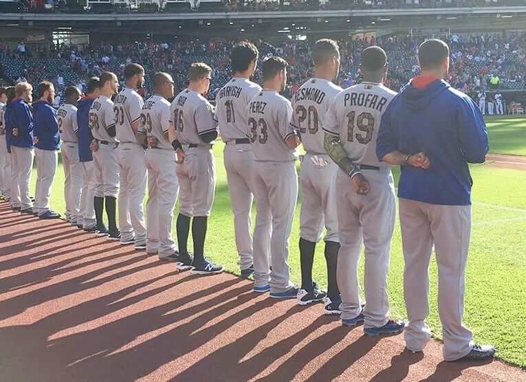
Good morning! Yesterday was Memorial Day. Amidst all the camouflage (which as you know I consider to be a toxic mix of bad design and bad civics, but we’ve already been through that enough times and don’t need to go over it again today), a handful of players showed that they Get Itâ„¢. Three of them were in Texas, where outfielder Ian Desmond, outfielder Ryan Rua, and pitcher Alex Claudio went high cuffed with black socks.
Not camouflage, not stars and stripes, not some “bold” design from Stance — just black. A simple and effective memorial gesture, perfect for Memorial Day, and it really highlights how ridiculous the camouflage is. Imagine if every player went with the black socks — it would say so much more, and have so much more dignity, than MLB’s current approach to this holiday. Good for those Rangers players, and also for Phillies infielders Freddy Galvis and Cesar Hernandez and outfielder Peter Bourjos, who did the same thing:

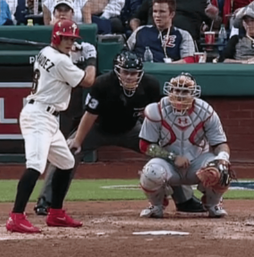
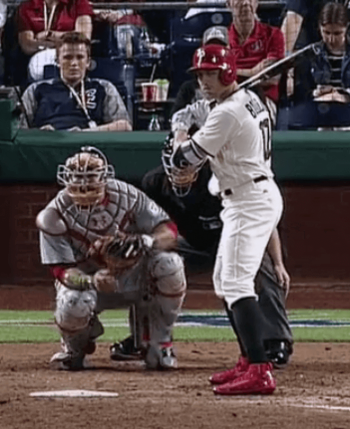
A few other notes from around MLB (for a few of these, you can click to enlarge):
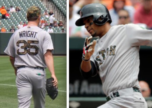
• The Red Sox were, to my knowledge, the only team that went the extra mile by wearing camouflage belts:
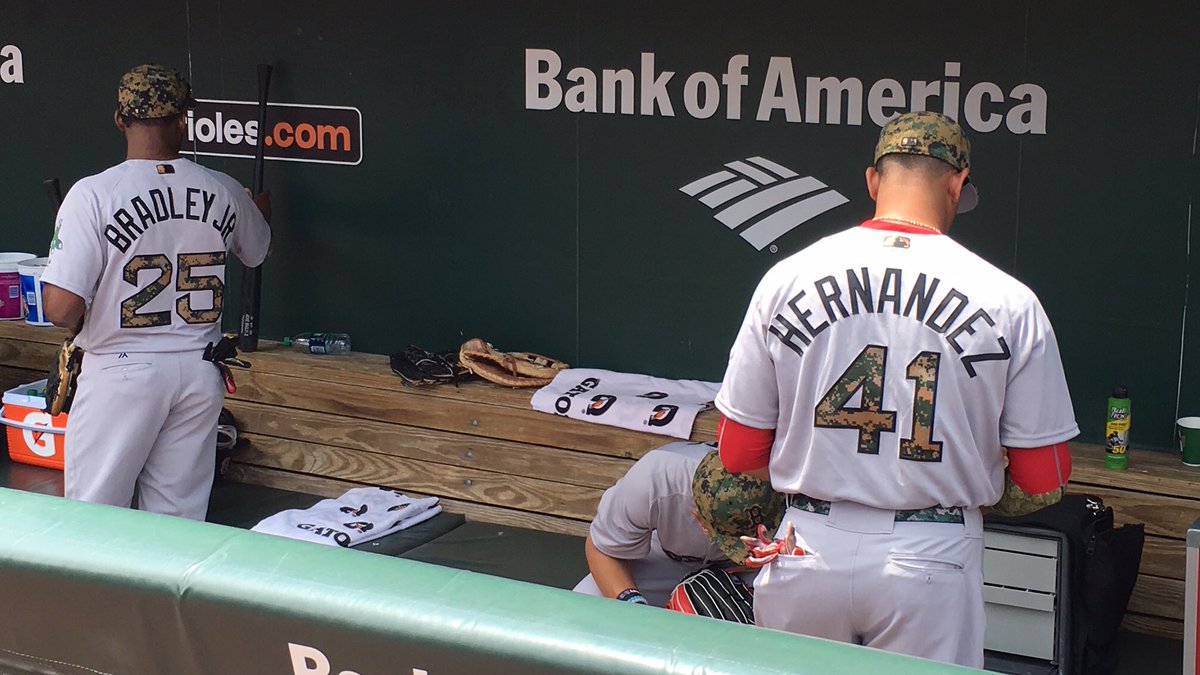
• The Brewers were, to my knowledge, the only team to go with a camouflage batting helmet logo:
Brewers batting helmet has camo look for Memorial Day… pic.twitter.com/DWZCzd0bEH
— Kurt Crowley (@kacsportsblog) May 30, 2016
• The Cubs’ jersey logo didn’t have the circle-R trademark symbol (which was also the case on Mother’s Day):

• Rare sight: The Yankees’ jerseys had Majestic logo creep (which was not the case on Mother’s Day):
@UniWatch @PhilHecken Yankees have Majestic logo under Yogi Patch pic.twitter.com/7o8njScLC2
— NYYDJ2 – Cole (@NYYDJ2) May 30, 2016
• Just like on Mother’s Day, pants piping was removed. But Blue Jays skipper John Gibbons didn’t get the memo:
Gibby wearing the wrong pants tonight @sportslogosnet pic.twitter.com/DQm9pKzGjl
— Aidan Robertson (@AidanRoberston) May 31, 2016
• Speaking of pants, some teams wore the MLB logo on the rear belt loop and others didn’t:


• Sleeve patches, like other jersey graphics were rendered in camouflage — except for Chief Wahoo, for obvious reasons:
@PhilHecken Indians logo isn’t camo like every other team pic.twitter.com/YjQaSAinPZ
— Corey Zajicek (@GreenTailShiner) May 30, 2016
(Big thanks to Brady James for bringing the Rangers’ black socks to my attention, and to Jeff Stumm for doing likewise with the Phillies’ black socks.)
Click to enlarge
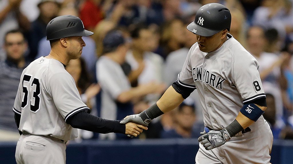
Yanks go matte: In case you missed it over the holiday weekend, the big news was that the Yankees are now wearing matte-finish batting helmets on the road — an earthshaking move, by Yankees standards.
The short version is that Rawlings gave equipment manager Rob Cucuzza some matte samples back during spring training. It took him a while before he showed the samples to some of the players, who liked them. Cucuzza then requested and received permission from GM Brian Cashman, ordered a full set from Rawlings, and here we are. There’s additional info here and here. (There are some quotes from me in that second one, if you care about that kind of thing.)
When you think about it, Cucuzza has one of the cushier equipment manager gigs in the bigs. He has only one set of caps to keep track of, one set of home jerseys, one set of road jerseys, and so on. He doesn’t even have to worry about NOBs! But now, for the first time, he’ll have a second set of batting helmets to deal with.
Many of you are probably thinking, “Man, this matte thing has gotten so trendy.” True, but just because something’s trendy doesn’t mean it looks bad. I happen to think most of the matte helmets out there look pretty good, and that includes this new Yankees headgear. I think Cucuzza was right on the money when he said, in one of those stories I linked to earlier, “[The matte helmet] looks good with the grey [road uniforms]. I don’t think it looks good against white. We won’t wear them at home.”
Which team(s) should go matte next? Which team(s) should never go matte? Discuss.
Baseball T-shirt 2nd chance reminder: We had some requests for the Uni Watch T-Shirt Club’s baseball-themed design (shown at right; click to enlarge) after I wore the tee in last week’s Friday Flashback video. So we’ve made it available again, but without the T-Shirt Club’s jock tag graphic.
The good news is that the lack of the jock tag means the shirt is now a bit less expensive, plus we’ve been able to add a hoodie option; the bad news is that this version of the shirt will not count toward the T-Shirt Club’s “Collect ’em all” status.
Again, the shirt is available here up through this Thursday.
Click to enlarge
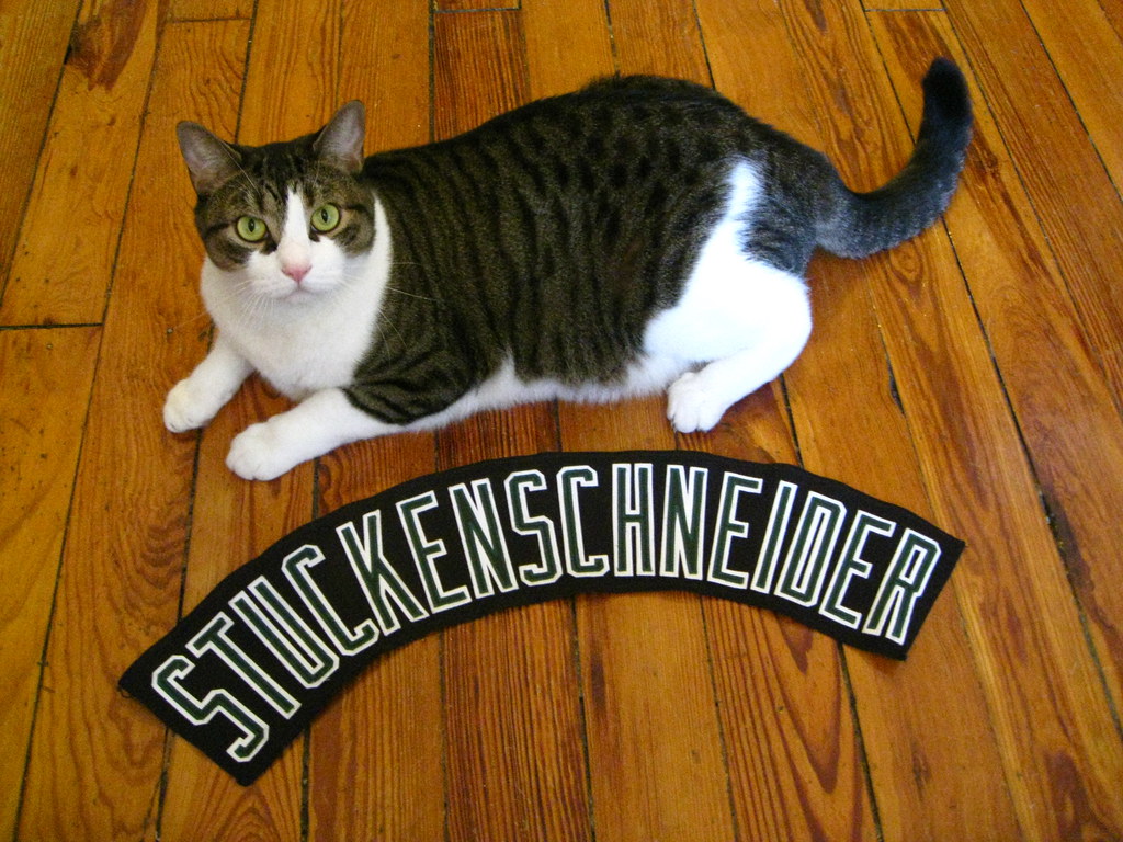
Uni Watch sick bay: It’s been a bit of a stressful time here lately, as Uni Watch boy mascot Tucker has been sick, necessitating several back-and-forths to the vet. After a bunch of tests, the diagnosis is an inflamed pancreas, which could be a temporary thing (relatively easy to treat), a chronic thing (more difficult to treat), or a sign of something much worse (I’d rather not think about that). We’ll know more in a week or so, but for now I’m giving him a pill each day — an ordeal we both hate — and trying not to worry too much when he spends most of his time hiding in his Safe Place under the bed. Poor fella.
Compounding matters, Uni Watch girl mascot Caitlin is hissing at Tucker and is generally on edge because he smells like the vet. (Yes, I know there are certain products and tricks that supposedly help with this. Been through them all. No dice.) So one cat is sick, the other one is pissed off, and the whole household feels out of whack. Sigh.
For those of you who have pets, you know how hard it is when they’re out of sorts. For those who don’t have pets, I appreciate your indulgence. Either way, thanks for listening.
(For the story behind the 16-letter nameplate Tucker’s posing with in the photo shown above, look here. I later gave away the nameplate in the 2011 year-end reader-appreciation raffle, where it was won by reader Nate Saunders. Nate, if you’re reading this, do you still have the nameplate?)
Click to enlarge
Collector’s Corner
By Brinke Guthrie
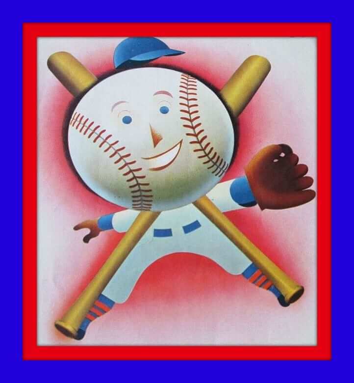
This mildly scary baseball head fellow is from the program cover from a 1950s Giants/Indians exhibition game, played at Wrigley Field in Los Angeles. How’s that for some retro simplicity?
Now for the rest of this week’s picks:
• Here’s another nice game program cover: Boy, look at this cover art — takes you right back to 1950 for the St. Louis Cardinals and Boston Braves.
• Sharp graphics on this 1970s-era Philadelphia Eagles trash can. That same seller also has the Chiefs and Dolphins, but as you look at the photos you can see the insides are, well, pretty much trashed.
• Always wondered why leagues/teams would license things like ashtrays, like this one for the 1970s Chargers. Why would you want someone to cover your logo in ashes?
• Do you think someone just hand-drew the Colts helmet for this 1967 Rams/Colts ticket?
• This TV tray top from the early 1970s features all those great NFL graphics in one spot. No legs for your tray, sorry.
• In honor of the San Jose Sharks’ first-ever trip to the Stanley Cup Finals, here’s a very comfortable 1990s hoody from Starter. (Had one of these for the Bengals and Cowboys — they have a very unique stitching to them. The felt-like logo on the front does tend to pill, though. A lot.)
• Here’s a 1970s Texas Rangers souvenir batting helmet, still in the bag. Max Klinger would be proud! (Yes, I know he followed the Mud Hens.)
• We’ve got a 1970s promotional Atlanta Braves duffle bag right here.
• If you’ve ever wondered why you don’t see any MLB alumni walking around in really bright green jackets, wonder no more.
• How about this 1970s Bobby Orr lunchbox?
• Reds fans, this is the single most comfortable pullover you will ever wear. The quarter-zip 1990s pullover is from DeLong. But by now, you knew that.

Century mark: I hit a milestone of sorts yesterday, as my Twitter account reached 100,000 followers. That sounds vaguely impressive, until you consider a few things that kinda put the whole situation in perspective:
• Nearly a third of those 100K followers came on one day. That was on April 3, 2012, when I covered the Nike/NFL unveiling here in Brooklyn. I was live-tweeting the event, and I went from 12,500 followers to over 44,000 in less than 24 hours.
• Guy Fieri has over 1.88 million followers.
• My car went over 100,000 miles last month, and that’s a century mark I was much more excited about.
After seven-plus years and 20,000 tweets, I remain somewhat suspicious of Twitter. Its micro-format tends to trivialize things, and it brings out the best in exactly nobody. Still, it definitely has its uses. In fact, I’d say people now send about as much stuff to Uni Watch via Twitter as via email, which is pretty remarkable (and sometimes overwhelming). That embed function is pretty handy, too.
So okay, here’s to all 100,000 of you out there who follow @UniWatch — hope you enjoy the stuff I put out there. Also, a hefty percentage of my feed consists of retweets of things that other people tweet at me, so my thanks to all those folks as well (and especially to Phil, who works hard to make sure I’m up to speed on Twitter stuff that I might otherwise have missed).
Tomorrow, incidentally, is shaping up as an epic Twitter day for @UniWatch. Don’t say I didn’t warn you.
The Ticker
By Paul

Baseball News: Here’s a jersey-driven infographic on the College World Series regionals (from @DaveDoop). … Speaking of the CWS, here’s the official baseball. … The Cedar Rapids Kernels desecrated the flag yesterday, instead of wearing camouflage (from Wyatt Beltz). … “A KC artist painted this 2015 World Series mural at 17th and Oak in downtown KC,” says Dave Singleton. “The fans shown in the painting are actually people he lives with in that part of town.” … Ron Roza’s weekend project was to make the brick wall in his backyard look like Wrigley’s outfield wall. “Need my vines to grow more!” he says. … New standards may be imposed to make chest protectors more chest-protective.

Hockey News: DIY genius Wafflebored’s latest hockey jersey is a beehive-themed doozy. … Here’s a video on how goalie pads are made. “The highlight (or lowlight” comes at the 2:10 mark,” says Jeff Wilk, “where the narrator says, ‘The players wear an array of corporate logos on their pants. It’s all part of the commercial nature of the game and the industry.’ Douchebags.” … The triangle format of the Pens’ and Sharks’ logos makes for a good Frankenjersey (from Steven Maker).

NBA News: With Golden State heading back to the NBA Finals, Conrad Burry whipped up this proposed court design for the series against the Cavs. He also came up with a Cavs version, and here’s his NBA postseason circle bracket.

Soccer News: Barcelona’s new kit doesn’t have a jersey sponsor advertiser (from Nile Smith). … Seersucker-esque jersey for Rafters FC (from Stephen Millet). … New away kit for Leicester City (form Tim Cross). … New home jersey for Manchester City. … New jerseys for Cameroon, Ivory Coast, and Ghana.

Grab Bag: SB Nation is conducting a Texas Tech football uniform poll. … New helmet design for MotoGP driver Eugene Laverty. … Tennis players Ana Ivanovic and Jo-Wilfried Tsonga talked about their ugly French Open outfits. … Here’s a look at the evolution of Microsoft’s logo. … It can take a long time to get all the Cheerios logos onto a NASCAR car. … Not uni-, sports-, or design-related, but this article about NYC ice cream truck turf wars was easily the most entertaining thing I read yesterday. (Yes, that probably means I need to read more fiction, but still…)
Great Granddad never wore camo
As a Phillies fan, they were not consistent last night. The only time they were their cream jerseys are for day games. They wore them last night with the camouflage lettering and hat for Memorial Day. Also, they wear the cream jerseys with the blue hats and batting helmets. Last night, they wore the red batting helmets instead of the blue as well.
Another thing that could improve these camouflage uniforms would be to go NNOB.
And I’m just now noticing that the bear on the Cubs’ sleeve looks green! Great touch!
Another thing that could improve these camouflage uniforms would be to go NNOB.
But Mark, then you’d complain that the numbers weren’t properly vertically centered!
;)
Reminds me more of Forbes Field than of Wrigley.
As much as I didn’t care for the Giants going matte, I kinda love the Yankees doing it. Although I do agree with Cucuzza, I don’t think the matte would look right with the home pinstripes.
On behalf of my feline running crew, BJ, Mattingly, and Mooch, I’ll be keeping a good thought for Tucker.
Hey Paul, thanks for the mention in the main article about the Phillies Mention from Twitter, and congrats on the 100,000 followers. I also noticed in the Phillies game last night that Peter Bourjos was displaying the black socks as well.
Jeff Stumm
Thanks, Jeff. I’ll add that to today’s entry.
Tyler Wilson from the Orioles pitched in black stirrups yesterday.
He always wears them.
Several Orioles wore black hosiery yesterday (White Sox and Giants, too) — just like they do every other day.
Because it’s their team color.
I was going to bring that up – seems like Memorial Day black socks couldn’t really be a league-wide solution when there are teams who wear them regularly, right? You’d have to add the Marlins and the Pirates to the ones you mentioned as well.
Lots of teams wore pink socks for Mother’s Day, so I assume they’ll also be wearing blue socks for Father’s Day — even though teams like the Mets and Royals already wear blue socks. If they can do that, why not the black sock idea?
Sorry, also the Rockies.
Based on the Father’s Day jerseys and hats, I think it’s safe to assume the socks that will be worn for it will be of a powder blue shade that is different from what the Mets, Royals, etc. wear.
All the camo and black created some odd looks. Red Sox – Orioles with no red or orange to be seen excelt for the bills on the Orioles’ batting helmets.
Yankees matte helmets look really good. They take me back to the days that helmets were link.
Cats are funny little creatures. Ours is currently wearing the ‘collar of shame’ to prevent her from licking her ‘south end’ where she has been fighting an infection. Her routine is thrown off and she has not been happy. It kills me to see her so distressed. Hope Tucker is better soon.
Would love to see my White Sox add the matte helmets. Oh, winning games again would be nice too.
Speaking of Camo, West Virgina wore a pretty wild Camo hersey thar essentially looked like a Navy/Athletic Gold/White milkshake. Itvwas so bad, it actually was interesting in a Bad Christmas Swearer kinda way …..
For the Matte v No Matte, I think the Cardinals are a team that should never go matte. The bright cherry red is one of their best looks. Same goes for Reds.
Sorry for your cat, hopefully yours recovers. It was a bad pet weekend in my family too. Father in law’s 6 year old German Shorthair had to be put to sleep after an unknown neurological disorder left her unable to move or function within 12 hours of acting normally. A day of testing and observation wasn’t able to pinpoint anything.
That’s horrible — really sorry to hear that, Alex.
I’ve heard of that happening. At least once, the vet found a tick on the animal behind its ear, removed it, and it went back to normal within a few days. It was called tick paralysis.
Andrew: Their best guess was a natural neurological issue that affects German Shorthairs, but it affected her more quickly, and more rapidly, than normal (if it hits it’s usually in 7-9 years and takes 3-6 months to show)
The very sudden escalation of symptoms is what made me think of it. That’s the only thing I’ve ever seen completely shut down an animal that quickly.
I like that the Yankees are using the matt helmets, they look more like the ones that mickey mantle used especially during the 61 season. It looks like a cool nod to that Era.
Kinda funny they didn’t spout the usual junk that teams put out about their new changes about it “respecting the city” and “tying to the past” when it doesn’t. But this time it does!
Hope all works out well and quickly for the felines. It’s horrible to be in such a helpless position with a critter who depends on you.
The Reds should never go matte.
My cats Toola and Lilly send their best wishes to Tucker for a speedy recovery.
Twitter is one social media platform (among others) that I cannot seem to embrace, mostly for the reasons you laid out.
I agree. Reds and Cardinals should keep the gloss.
Nats & Cardinals should always wear glossy helmets. Reds, Phillies, Angels would look fine to me matte red. Indians should already be wearing matte red, if they’re not.
I hope Tucker feels better soon.
That being said, don’t compare yourself to Fieri. To my knowledge you are not a douchebag who has thrown water balloons at my sister’s chest region. (Long story.)
That was sort of the point (not the water balloons part) — Fieri is so awful in so many ways, and is such a perfect symbol of so many things wrong in our culture, and then he has nearly 2 million followers. So having a lot of followers is not necessarily indicative of anything positive, or anything to be proud of, etc.
Hey, look at that. We agree on something, Paul. Guy Fieri is, in fact, a douche. Cheers! ;)
Proofreading: Cedar Rapids Kernels, not Cedar Rapids Kernals.
I’m sorry to hear about Tucker and I hope he gets better soon. It sucks that we can’t explain to our pets why we are doing certain things- in your case, explaining to Caitlin that Tucker isn’t feeling well and that’s why he smells like the vet.
Fixed.
And yeah, the inability to explain is the hardest part! I’m sure parents feel the same way about babies.
Will the FC Barcelona kit have an advertiser on it for in games or is this the real deal?
Their deal with Qatar Airways ends in June. It’s not known whether they’ll renew, find a new sponsor or keep the space blank like they used to.
And they still have the sleeve advertising – it’s just the chest advertising that’s missing.
Regarding the Yankees and the switch to matte on the road… Looks great… nod to the early days of helmets with the “flocked” look… I really like the look with the road greys and wouldn’t mind seeing what they looked like with the home pinstripes.
However… I do take umbrage with all the articles/comments/TV commentary that they Yankees are such sticklers for uni-tradition…. when players are permitted to wear pajama-pants and/or the excessively baggy uniform pants/jerseys (see Sabathia).
As a true Yankee fan I would like to see a team policy where every player must go high-cuffed; if the organization truly wants to boast about the “tradition” and longevity of their style then have players wear the uniform “traditionally”.
For that matter I’d also offer that they should remove the 1973 white outlining on their road greys AND return to the 1930’s MacCauliffe-style numbering on both home and road jerseys.
link
link
Getting rid of the outlines would necessitate doing something with the dreary battleship grey. Having witnessed the 1979 Red Sox road uniforms, I expect MLB uniforms to have at least a little curb appeal. Heather grey crosshatching on the grey fabric would help.
I’m a Yankee fan and I love the matte road helmets. When I saw other teams adopt them I was hoping that the Yanks would as well, as a callback (previously mentioned here) to the old flocked helmets.
The one thing I noticed, though, is that they don’t play well with pine tar. Starlin Castro is one of the guys who wrecks helmets with it, and when it’s cleaned off, that area is glossy.
I like the socks “solution” but unfortunately only us geeks (and a few others who feel this tribute is overdone” see a problem. I’d even tone it down more. Maybe a ribbon patch on the chest or something.
Interesting about Chief Wahoo. As tasteless as a camo Wahoo patch would have been, seeing it as the only element in team colors is also kind of an elephant in the room. It occurs to me that a possible solution would have been to remove it…which some may have seen as a tiny step toward Wahoo’s demise. Instead they left it intact in team colors.
Interesting about Chief Wahoo. As tasteless as a camo Wahoo patch would have been, seeing it as the only element in team colors is also kind of an elephant in the room.
Much like the “Every other team’s fans can paint their faces except us,” this is a good indication of why Wahoo and other Native American mascots have to go. When you repeatedly have to exclude Native-themed teams from various fan behaviors, design programs, etc., that’s symptom of a larger problem.
If they “have to” wear camo, I’d suggest that home teams wear white and road teams wear dark alts (save for any team that does not have one). I think it may provide for better visual differentiation. I love white vs. gray but the team colors that are used for wordmarks, numbers, caps, etc. provide a visual distinction. That’s diminished here. Solid colored jerseys for the road team may help.
All helmets should be matte. All things should be matte. Death to all shiny objects. Shiny objects are easier to consume, and looking at them gives us a warm blanket-like effect. We become lazy and ensconced in our own bubble apart from reality. Matte helmets show us reality how it is. It is tangible, humbling, yet can still be beautiful.
Or something. Idk, whatever, yo.
My pet cockatiel disagrees vehemently.
Found it interesting that San Diego already had a camo jersey, but got “forced” into the same digital camo all the other teams wore.
Yes, I’ve made this point in previous years. The Pirates and Reds still have camouflage alternate jerseys as well. Why can’t these teams wear their regular awful camouflage designs on Memorial Day, instead of having to wear NEW awful camouflage designs? For that matter, why can’t the other teams wear the awful camouflage designs from last year, instead of having to wear NEW awful camouflage designs?
Oh, wait — let me guess.
As an aside, I couldn’t help but compare American Memorial Day uni-based observations (dressing like deer hunters) versus UK Remembrance Day uni-based observations (the poppy patch). Needless to say, they are doing it much more tastefully in the UK.
It actually seems to mean a heck of a lot in the UK too. There is one footballer over there, James McClean, who won’t wear the poppy patch on account of he’s Northern Irish and regards it as an affront to those the UK military killed in the The Troubles.
Not sure I disagree with him, there’s a fine line between respecting your hosts and honoring your heritage; if I was playing in, say, Vietnam, I wouldn’t wear an “Uncle Ho’s Birthday” patch, but I wouldn’t wear a POW-MIA patch over there, either.
I knew I’d get that response from you, Paul. Just trying to poke the animal in the cage with a stick. :-P
By the way, on the Mariners broadcast yesterday, they kept showing Russell Wilson and Ciara both wearing the Digital Camo hats made for yesterday.
Guy Fieri: 1.88M followers, “donkey sauce”
Paul Lukas: 100K followers, hates purple
Which of these “gets it?”
Matte vs. No Matte
Basically, I believe teams with darker colored helmets would look great matte. Ones who haven’t gone over already like the Rays, Astros, Red Sox, Braves would give it a nice look.
Lighter colors should stay glossy. Cards, Cubs, Mets shouldn’t change, and the Dodgers shouldn’t have changed, IMO.
Red Sox players that go high cuffed wore black socks as well. (With stars on the heels)
link
Two quick points –
1. While I agree with Paul about the “camouflage problem”, the new trend of players unilaterally wearing black socks still has a certain “look at me” aspect to it. If the team as a whole decided to wear them, that would be an improvement over the camo, definitely.
2. Sorry, but the “matte” finish on baseball helmets simply looks like the helmets have been sitting in a basement for years and are covered with dust.
I have this weird thing about matte finish battering helmets. The look is nice, but I can imagine them feeling odd in your hand while putting them on. I get kind of a “nails on a chalk board” feeling thinking about it. It’s not that I am not used to the look, I remember the original matte finish ones as a kid in the early 70’s and it bugged me even then.
They don’t feel much different. Certainly not nails-on-chalkboard different.
Black socks is a very fitting statement, completely agree with what you’ve written. MLB tried to show it is sensitive to Canada, by having the Blue Jays wear a camouflage more indicative of the Canadian military (note the bright green in “Gibby’s” hat. A simple poppy on the jersey with black sock I think would have been better.
I do too, and the poppy is indicative of Canadian sensibilities. That is our way of showing respect to the fallen, garish displays of patriotism is not our cup of Tim Hortons.
If MLB continues to insist on special Memorial Day unis (and we all know they will), my two preferences would be as follows:
1. Standard unis, w/ addition of single black armband (like Yankees & other teams used to do to memorialize someone affiliated with the team).
2. Home teams in white, visitors in grey, all elements (team names, logos, player names, digits, etc.) in black.
Amen on the sick pets, Paul. I have an Old English Sheepdog named Bob who has epilepsy; he gets two medications twice a day. Thankfully, he takes his pills pretty well – although wrapping them in a slice of cheese helps.
Matte batting helmets – the Orioles’ Jonathan Schoop wore a matte helmet in spring training, and I am embarrassed to admit I have not noticed if he is wearing it now. I thought it looked really good, too – and my opinion of matte helmets has changed, thanks to seeing more and more of them in college football (WVU and Mississippi State are two recent converts, I believe).
Sending positive vibes to you and your cat. The wife and I have only fur babies (a dog and two cats); they’re our kids.
Thanks, Matt (and to everyone else who’s had kind things to say about Tucker today) — means a lot, really.
Hope Tucker is back to 100% soon, Paul!
Small typo; nothing to write home about:
“Cucuzza then requested and received permission from GM Brian Cashman, ordered a full set from Rawlings, and here we are. There’s additional info here abnd here.”
Fixed.
Barca didn’t have a sponsor on their jerseys for many years after other European teams did.
Red Sox wore black socks yesterday as well. Thought it might already be a league-wide thing.
link
So the Braves didn’t have the MLB logo on their rear belt loop yesterday. Maybe it’s because this year’s team doesn’t really qualify as a major league team?
(from a long-time, now disgruntled Braves fan)
I don’t mind the Yankees matte road helmets, but in general, I am not a fan. I totally do not enjoy matte red on any team, but especially hope my Cardinals never do. It’s because I’m biased and think their unis are beautiful, but like the Yankees homes, I believe the unis NEED that glossy, classy shine. It completes the look. I hate the Cubs (again, I’m a Cards fan) but I feel like they need glossy helmets too. As for the outline on the Yankees greys that someone commented on, the white breaks it up, gives it a bit of brightness and energy, unlike say, the D-backs (non-teal trim) road unis.
Hey Paul, sorry about Tucker, it always sucks when we have sick pets. You mentioned that it’s an ordeal at pill-taking time. Have you ever tried “Pill Pockets” for cats? I used to use the ones they have for dogs and it made giving my pup his pill extremely easy. I can’t give them to him now because of the fat content, but now I just wrap up his daily pill in a ball of soft food and let him lick it from my hand. Good luck!