
By Phil Hecken
Follow @PhilHecken
After the past several years of turning most parts of the baseball field pink for Mother’s Day, from the plates on the bases to the printing on the balls to the shoes the players wear to the bats they swing, MLB has ratcheted things up this year. In years’ past, the uniforms had remained mostly pink-free, save for slight player-specific modifications like pink sleeves.

No more. Starting today (and since the ratchet only goes one way) and for the foreseeable future, all MLB teams will wear uniforms that have been specifically modified to include pink logos and wordmarks. How long will it be before one team (of the two playing) has a pink jersey (and the other has a pink hat)? I give it one or two seasons. But I digress.
Of course, the jerseys and caps worn today will be auctioned off and “proceeds will go” to charity. I’m NOT going to get into how much is going to go to said charity (I’m not sure we’ll ever know) or to which charity the money is going. We’ve been through that before, and it doesn’t bear rehashing. Of course, MLB is gladly selling replica/authentic jerseys and caps, and I’m not sure where the profits from those are going. But even if 100% of all profits went towards breast cancer research, it wouldn’t matter. They’ve added one more “special” uniform (yes, they’ll do this for Father’s Day, only with blue, plus the usual Memorial Day and 4th of July special unis) to the mix. And every team has to play along.
But let’s dismiss with all that. And let’s dispel with this fiction that MLB gives a crap about the tatas — this is yet another “Look At Me” move (following in the footsteps of other leagues who’ve already been pinkwashed) to show how much they care. Even if they do, now they’ve affected the uniforms.
The only question now, is how good (or bad) will these look on the field?
First of all, I want to go on the record that I think pink is a perfectly fine color (although it depends on the shade) — and it’s actually a shame that no professional team in any of the major sports wears it as a color. I happen not only to like pink, but I think fuchsia would be an outstanding accent color for a uniform. How do today’s unis stack up (and what specifically are teams wearing)?
OK — I’m not going to run through every team. You can click here to see your favorite team’s jersey and click here to see the caps.
Basically, all the caps are the same — they are a graphite-ish color with the team logo rendered in pink, along with pink grommets and a pink squatchee.

Not so bad, right? I mean, if you’re going to screw with the uniform, that is at the very least a good looking combo.
Now, not all jerseys will get the same treatment. They break down into a couple of categories (you can click on any image below to enlarge):
Teams with outlined wordmarks:

The Orioles won’t actually look much different, since they already have a black outline (MLB is using black/dark gray outlines for all teams this year), with the pink wordmark. Any striping/piping is also rendered in dark gray.
Teams whose main color is red won’t look all that much different. It’s a shame the Indians are sticking with the design that includes the Chief Wahoo patch.

Teams with headspoons will also get the black/gray treatment:

I think teams with normal red wordmarks won’t look too bad — or different.
It’s going to take a bit of adjustment for teams for whom pink will be a radical departure:

That’s…different. I have to admit — the Marlins’ jersey kinda looks pretty damn good. It would be great if they could ditch all the black from their uniform. Look at how that pops — and doesn’t that kinda say “South Beach” to you?
Teams with logos:
Squads like the Cubs, who use a logo rather than a wordmark (and also have pinstripes), will have the logo rendered in pink and graphite. The pins look like they will be rendered in the normal color (so at least the pants will still somewhat match — it’s hard to tell from that graphic; if the pins are in charcoal/gray, then the pants will be a terrible mismatch):

Road uniforms:
These will follow a similar treatment to the homes. Outlined teams will have the dark outlines and wordmarks will be rendered in pink:

Interesting — did you know the Mets were originally supposed to be black and pink? It’s true. It was a mystery the Great Todd Radom solved a couple years back. Now we get a chance to see what they “might” have looked like.
The teams who are on the road will wear their “normal” shade of gray. Of course, that means Arizona is an outlier:

They’ll have the “darker” gray shade they wear on one of their roads. But look! Unless that graphic is wrong, it doesn’t have all the sublimated snakeskin shit on it! How sad is it that this will be (aside from their throwbacks) the best looking uniform they’ll wear all year? Gotta say, I really like the way that pink pops against the dark gray!
Teams without black outlines:
Several teams will simply have their jersey rendered in white (or gray) with their primary color swapped out for pink:


Aside from the fact that seeing the Olde English “D” and script “Los Angeles” rendered in pink is jarring, I’m not as big a fan of these as I am of the outlined teams. I can’t really put my finger on it, but it just seems more “off” than the others.
There’s Always One:
Of course, leave it to the Padres, who do wear blue camo tops on home Sundays — to incorporate that look into the Mother’s Day jersey:

Nothing says “I Love You Mom” more than that.
Pants?
I haven’t seen these jerseys paired with pants yet. I’m assuming the teams will wear their normal home/road pants — which means that some teams are probably going to look awful, especially if they have mis-matched pinstripes or normal striping that clashes with the pink/black-gray of the jersey and cap. But that hasn’t stopped teams before. Yes, I’m sure the Mother’s Day unis won’t include new helmets, so we’ll certainly have plenty of color-clashes on the field today. But it’s all for a good cause, right?
As a uni watcher, I’m kind of excited to see how these new uniforms look on the field. As a human, I plan to spend most of tomorrow AWAY from the television, enjoying Mother’s Day with my mom. She is still recovering from major knee surgery, so I’ll be over at her house tomorrow, doing up a bar-be-que, and showering her with love chocolates. But I’m pretty sure at some point in the late afternoon, I’m gonna say, “you mind if I just check the Mets’ score?” (the Mets just happen to be playing the Padres). Like all good trainwrecks, I simply won’t be able to look away.
So there you have it. I’m not sure how much coverage Paul is going to give these on Monday, but unless you’re REALLY dying to see the Pinkening, do yourself a favor and spend some time with Mom tomorrow (if you can). These unis aren’t going anywhere.
The ratchet only goes one direction.
They Say The Neon Lights Are Bright On Broadway
Mets doing Cespedes neon compression sleeve giveaway (which I guess means he'll be wearing it a LOT this season). pic.twitter.com/NTDKOZqK8Z
— Paul Lukas (@UniWatch) January 28, 2016
As most of you readers are likely aware, I attended last Sunday’s Mets/Giants tilt with Paul (and James Huening), and while we didn’t actually sit in our seats for more than about four innings (it was raw, freezing cold and raining, and very windy), we did make it a point to notice several uni-significant things (a couple of which Paul covered during the week, including the “Mr. Met” wordmark on the original Mr. Met, and Paul also discussed the “actual” attendance versus the “announced” attendance figures). One thing we also discussed was Mets slugger Yoenis Cespedes.
In the game we watched, the Mets sported their 1986 throwbacks, and we quickly noticed Yo did not wear his ‘trademark’ neon arm sleeve. If you’re not familiar with it, I direct you to the first several grafs of this ESPN article by Paul, penned last year. Supposedly, he wears the neon sleeve to honor a parakeet (I shit you not), but that’s purely coincidental (right?). Right.
Anyway, while discussing Cespedes, we noted he wasn’t wearing the bright color at the game we were watching. After some chatter, I’m pretty sure Paul said something to the effect of “I don’t think he wears the neon when he goes high cuffed” (which he was doing that game). I honestly wasn’t sure if that was the case…in fact, I wasn’t sure if there was any rhyme or reason to Cespedes’ wearing of the bright garment. So, I looked at a few (actually a lot) photos and discovered something I thought odd — there is literally no rhyme or reason to the wearing of the sleeve. There is no uni he won’t wear it with, he wears it both high cuffed and pajama pantsed…AND…(I can’t believe I didn’t notice this before)…he wears it on both arms (but never at the same time). It’s crazy!

He wears it…
with the pins


on the left and right arms…

with high cuffs…


with the blue alternates…

with the road grays…


Even last year, he wore it when team wore the camopander tops.
In an age when many ballplayers are superstitious, Cespedes appears to be just the opposite — he’ll wear the neon sleeve anytime on any arm. And it’s not like he keeps it if he gets hot. He clearly doesn’t attribute any good streaks to the sleeve (or else he’d have worn it for most of August and September last year — and he’s off to a good start this year…still, it’s a mystery when it will be worn or not worn).
If there is anyone out there who’d like to do a bit of photo research, I’d LOVE to know the Mets record in games when Cespedes wears the sleeve, but also his own stats — and if that could be broken down by left/right, uniform, and high cuffs/pajamas. I’m sure that’s more work than even the most devoted uni watcher would want to do…but I’d love to know if there is any correlation.
Crazy, right?
T-Shirt Club reminder: The Uni Watch T-Shirt Club’s second release of 2016 — the hockey design — is now available. Here’s the base design (which you can click to enlarge), followed by the three shirt color offerings:
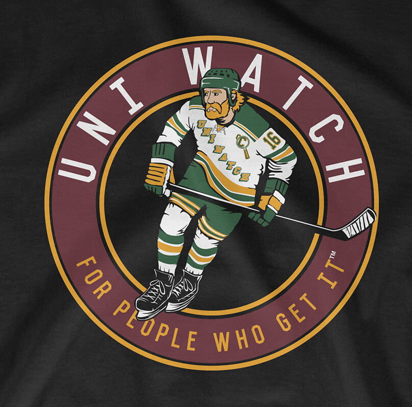
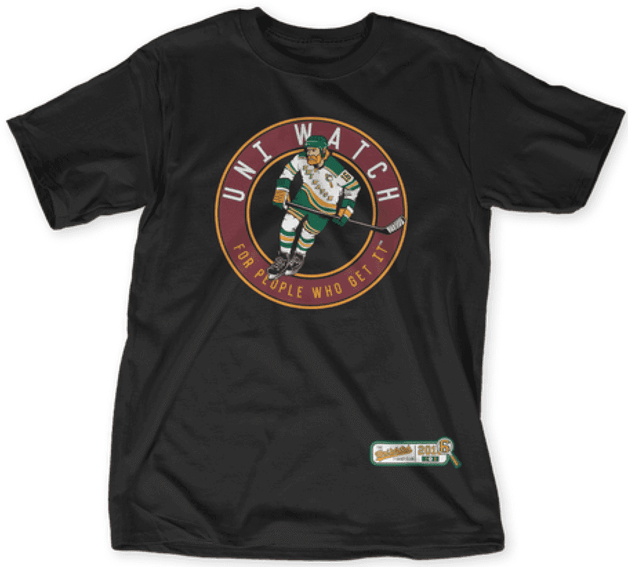
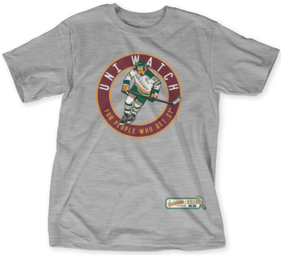
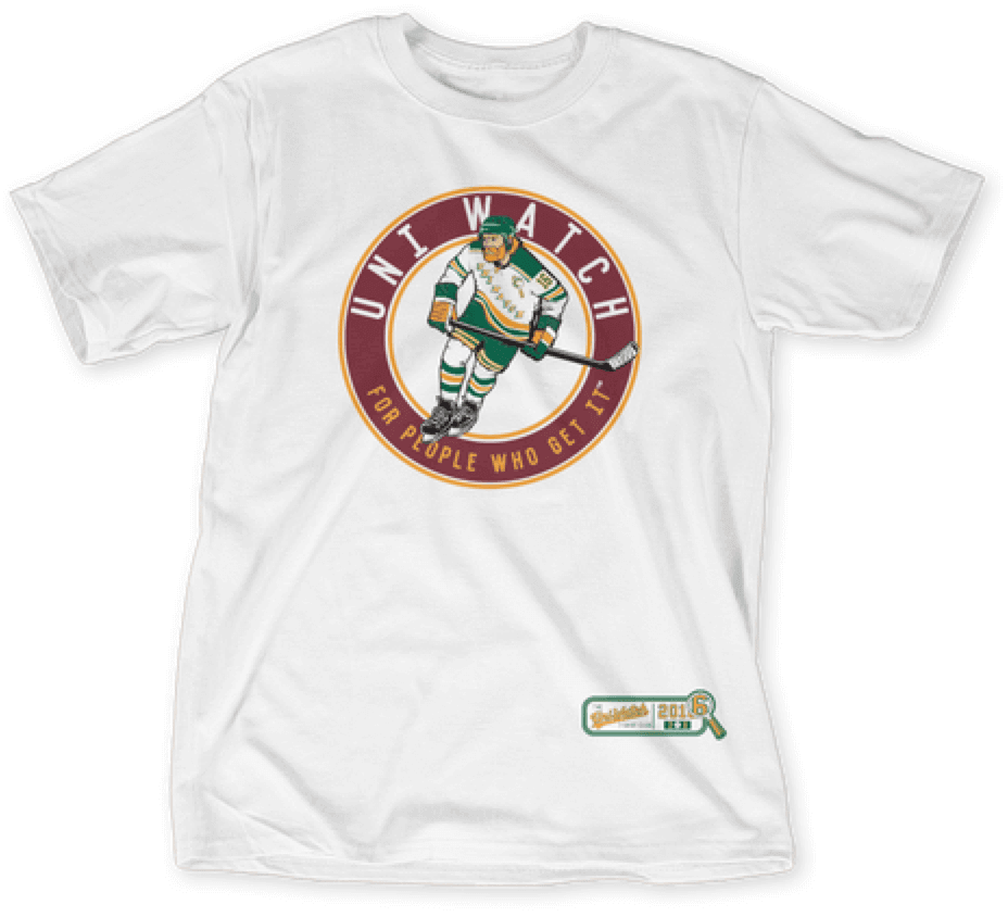
The shirt is available here from now through next Tuesday.
We also have a goalie design that’s available for sale as a bonus shirt. Here’s the base design, and the three color options:
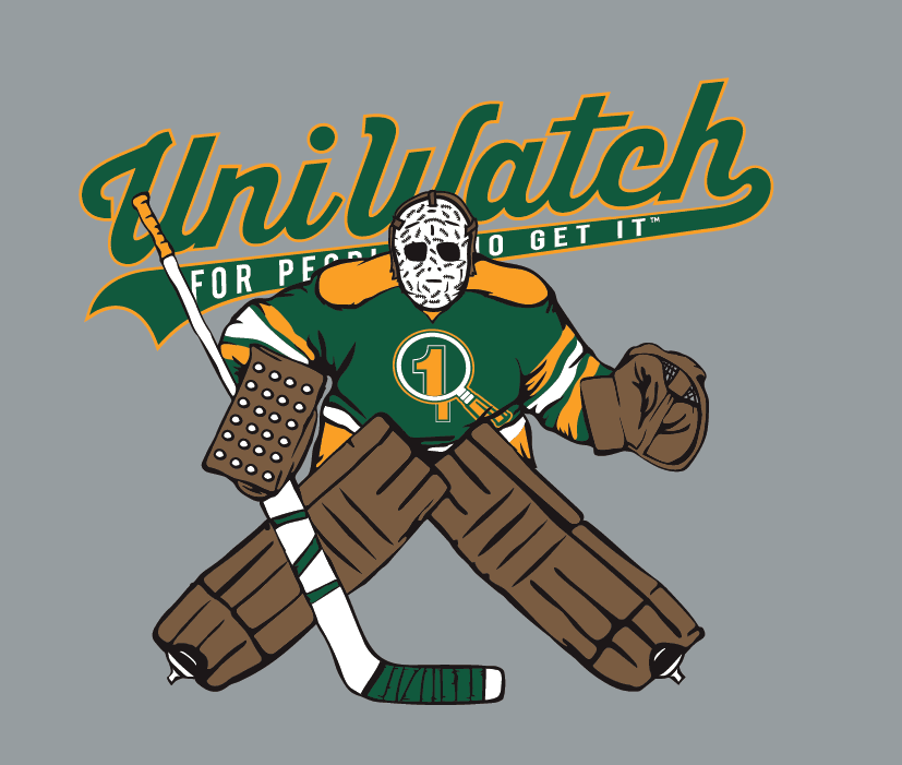
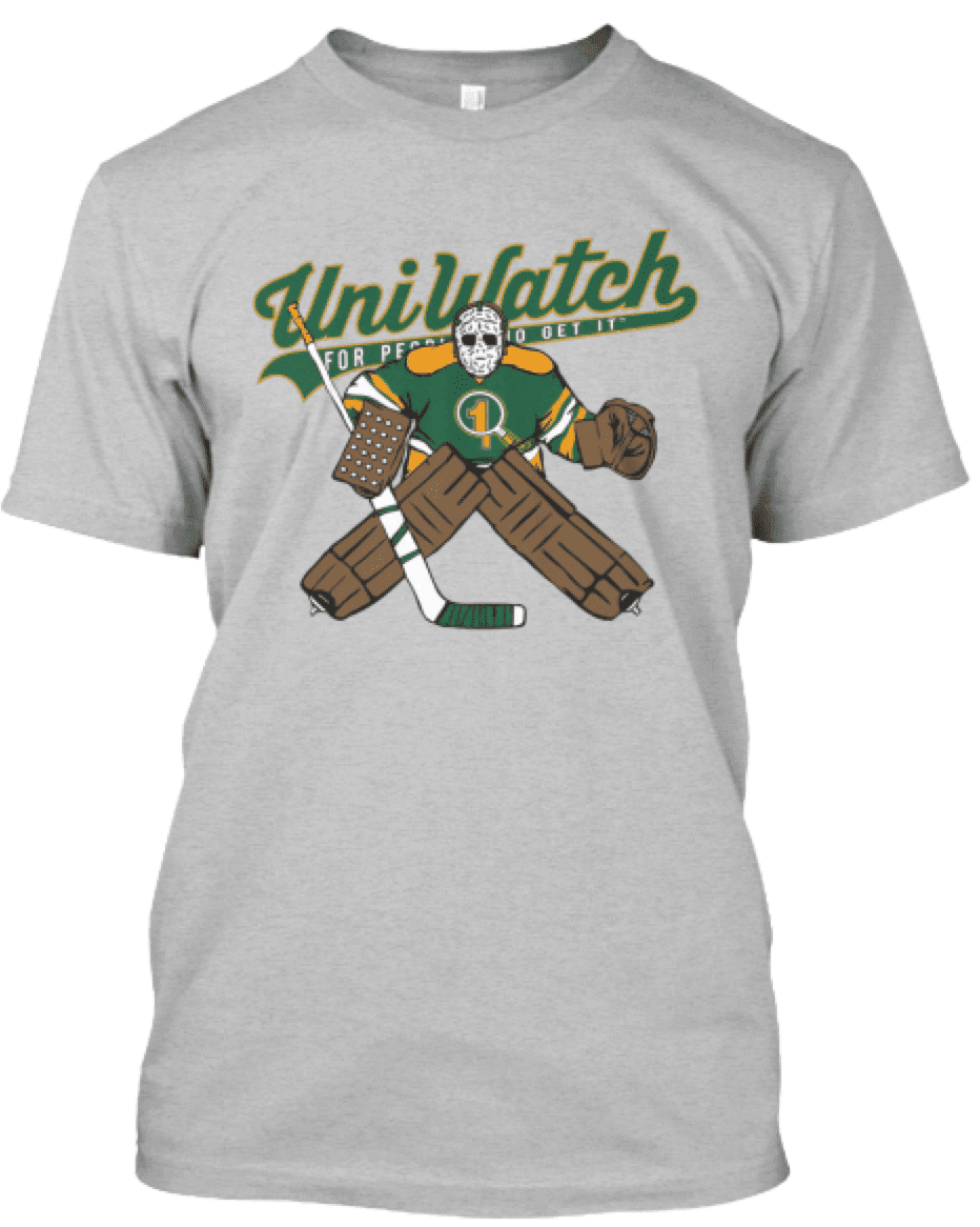
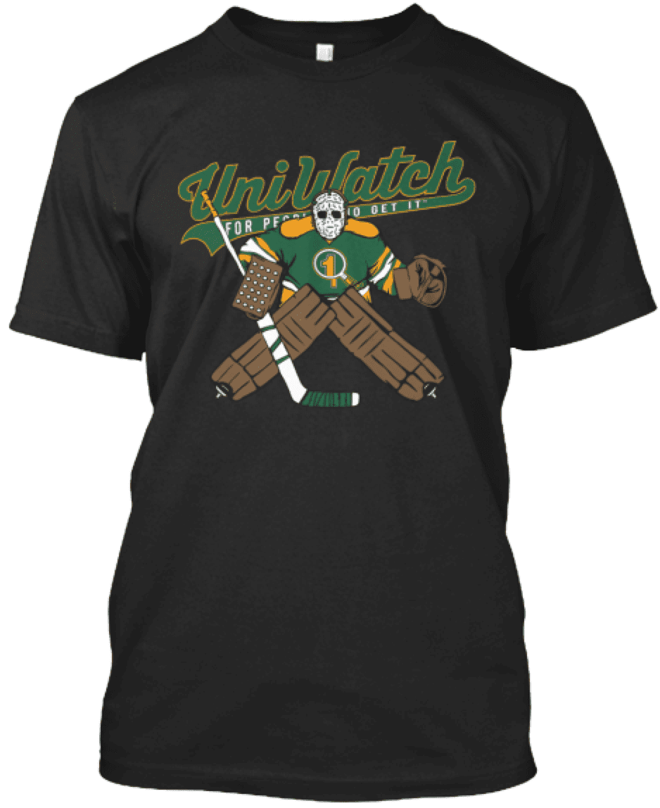
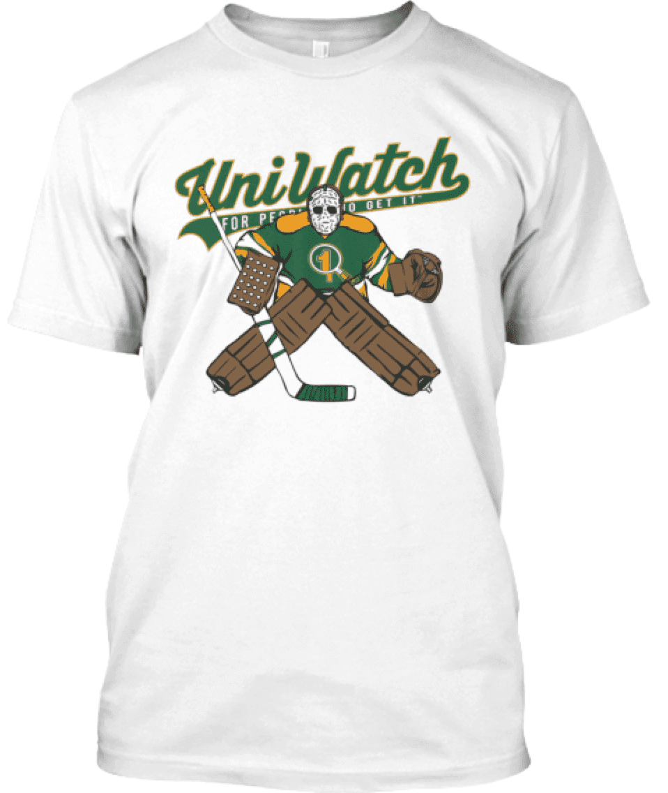
This shirt is not part of the T-Shirt Club, does not have Club’s jock tag graphic, and neither counts toward nor is required for 2016 “Collect ’Em All” eligibility. It’s just a bonus design that we’re offering for those who want it. You can get it here.

Too Good…
for the Ticker
(And it’s NOT from Leo Strawn, Jr.)
Got a note yesterday from Frank Mercogliano — short and sweet, but the photos are what make it. You can click on each one to enlarge
Here’s Frank:
Knew you’d love this
Am in Boise and helping my brother in law get a treadmill from a friends house and they have a working print shop in their garage. Snapped a few pics but all of those letters are individual!
Frank


Thanks, Frank! Great stuff! I’m sure we’ll have Leo back for an episode of TGFTT soon!
OK. Now, onto the ticker…
Uni Watch News Ticker

Baseball News: Mets pitcher Noah Syndergaard has his “own custom Mets sippie-cup” (from Ryan Feuerstein). … “You have to go down a couple paragraphs but here’s an article from the Cincinnati Enquirer talking about Billy Hamilton switching to wearing his pants up instead of ‘pajama style’,” says Patrick O’Neill. “Interestingly he is doing it, in part, to better show off his adidas cleats!” … OK — this is tremendous: It’s like someone envisioned stirrups stripes on bats! (great spot by Country of Baseball). … The Lexington Legends will be wearing this new take on camopander/flag desecration on June 25th (via OT Sports). … Not a great pic, but UGA softball looks as if they’ve got stirrups over pajamas. Says submitter John Mayblum, “Just brutal.” — Here’s a “slightly better angle” (from Brennan Scott). … The Tennessee Smokies sported Donate Life jerseys last night. … Hmmm. No one thought both teams wearing white could be problematic? … The El Paso Chihuahuas wore some awesome ’78 Padres-inspired unis last night (pic via Minor League Promos). Also from MLP, it was Halfway to Dia de los Muertos last night, so the Sacramento RiverCats celebrated in these jerseys. … The Durham Bulls shot first last night (via Durham Bulls). Here’s a close up (h/t Peter Romano). … Here’s a look at the jerseys Sparty wore for their camopander apprecation day (h/t Tomboy Chick). … Pushing Mother’s Day a bit early, the Nashville Sounds wore these pink jerseys last evening (h/t Jason Yellin). … Not to be outdone, the Frisco RoughRiders joined the pink party (h/t Chris Mykoskie). … “Bad Scalping Experience” (great tweet from Gregg Inkpen). … Whoops — Seattle reliever Joel Peralta was warming up in Seattle’s bullpen wearing the wrong jersey last evening (h/t Eric and Brian Pace respectively).

NFL/College Football News: Looks like the Steelers have doled out their rookie uni numbers (via Steelers). … Here’s another look at Virginia Tech’s new football uniform (from Andrew Cosentino). Dammit that Nikelace is really annoying.

NBA News: Oh, those tie-dye Nets: Tweeter Brandon H. said he “found this pic in a book from my childhood.” He asks, “How great was this uni matchup?” … “Seems like the Kings enjoy the soccer aesthetic with the rampant lion logo, so why not embrace it with an alt uni?” says Conrad Burry. … Trolli has a new line of James Harden gummy beards (thanks to Mike Chamernik).

Soccer News: Leicester City F.C. (they of the 5,000-1 odds) got their “own” chip flavor with custom bag for winning the EPL title (h/t Griffen Smith). … Apparently Norwich City had a change of jersey sponsors advertisers in the 2nd to last game of season. From Aviva to #ERapp (from Colin Dilworth). … The Queens Park Rangers (QPR) have unveiled a new crest after extensive consultation (from Ted Arnold). … New Premier League Champions badge for Leicester City. For comparison sake, the outgoing badge on Chelsea’s kits (from ThaChadwick). … Wow. Yesterday, The Leicester groundsman surpassed himself with the King Power pitch design. … Here’s a look at the St. Louis FC 3rd kit (h/t Tom Florent).

Grab Bag: West Point is investigating if black female cadets violated regulations against political activities while in uniform by posing for photo with raised fists (thanks, Paul). … There were lots and lots of photos of pre-race favorite (and winner — still undefeated) Nyquist with the Stanley Cup (for those who may not be aware, Nyquist is owned by a die-hard Red Wings fan, and is named after the player). And here were the silks for yesterday’s race. … Here’s a look at the new unis for Men’s USA Volleyball for 2016 (from Jeremy Brahm). … An Olympian sold $22k of ad space on his body. Why? “as a campaign to be annoying” — not sure if this guy falls into the category of hero or of total douchebag. … Johnny Weir did not disappoint at yesterday’s Kentucky Derby (h/t FTW). … Andy Laungani, a tailor based in Lexington, Ky., is a fixture in jockeys’ rooms across the country where he ensures that the riders are as colorfully dressed off the racetrack as they are on it (thanks, Paul). … Also from Paul: A number of men, including a presidential candidate, have abandoned the tradition of wearing wedding rings. Some women, too. … Check out this 1976 Kentucky Derby Ticket, with a design nod to the 1776-1976 American Bicentennial (thanks to Bruce Menard, with a rare non-baseball submission/tweet). … Oops. This is almost as funny as those I is a college graduate posters, only it’s real (I think). Tweeted by Jim Weber. … THE Ohio State University won the Men’s NCAA Volleyball title yesterday, and they did it wearing an outdated wordmark (thanks to Andrew Lind).
And that’s all for this week.
Enjoy your Mother’s Day today and I’ll catch you next weekend…but until that time…
Follow me on Twitter @PhilHecken.
Peace.
“People actually wanted the name that’s only a letter away from Tampons? Why would you pick a team name so easy for opposing fans to mock?”
— THE Jeff Provo
A comment on the Pads Mother’s Day Uniforms. As a sailor in the World’s Greatest Navy, it’s nice to see a team use our camo pattern rather than the usual dessert scheme. And you have to remember their are Mother’s of sailors currently with sons and daughters deployed, so their is your Mother’s Day connection to that. Just my 2 cents.
Typo: “Also from MLP, it was Halfway to Dia de los Muertos last night …”
OK…What’s wrong? I simply cut and pasted his tweet.
First football now baseball. Love the idea of honoring both breast cancer awareness and Mother’s Day but the line needs to be drawn. Baseball turned the classic Cubs look into garbage ….. Don’t even get me started on Arizona .
Shouldn’t the Memphis Sounds pink jerseys be placed with the basketball items? It’s the Nashville Sounds.
Gah! Yes, it’s Nashville Sounds. My bad. Now fixed.
All I can think of is the old George Carlin bit about the Minnesota Mice. Let’s win for the piiiiiink and white!
Unlike football, the pink is just for one day, rather than a full month. I can live with that. And even with the teams incorporating pink into MLB uniforms today, it’s still far more tastefully done than minor league teams.
Not a fan of league-wide forced uni desecrations, but I agree with Phil that somebody out to bust out a pink uniform for good. I’m a fan of the Palermo soccer team’s look, got one of those jerseys for myself after a trip over there.
link
I don’t like the “uniform” usage of pink by all the teams. There are so many other creative ways to honor Mother’s Day. I would especially would love to see a team like the Cardinals replace the male birds on the bat with a female cardinal bird on the bat for a game. The red and brown would be a great look. I know it’s not easy for all teams to do something like that, but it would be cool for say the Reds or the Mets to have the female version of their mascots as a sleeve patch, etc.
Just throwing pink on everything is just lazy in my opinion. It also just continues the stereotype that pink is a feminine color in our culture. There has to be a better way.
At least the UGA softball team wears stirrups. This pink thing in MLB is not a money maker for breast awareness. MLB should be pushing a good deeds campaign, you know, call you mom, type of deal. MLBers just used to wear a pink sweatband. Awful. Just awful.
I’m a bit disappointed that Chief Wahoo wasn’t rendered in pink & gray.
It doesn’t appear that he will be rendered in the father’s day colors either, while, as far as I can tell, every other sleeve patch is getting the treatment. Does anyone know why?
… because somehow that would be even racist-er.
Ah. An insult to Smurf-Americans. And the last time I heard “pinkskin” used as a slur, it was spoken by an Andorian.
Surely soccer qualifies as a major sport? Italian Serie A team Palermo have worn pink since 1907. Or are you only thinking of US teams?
I was thinking of US sports, but point well taken (and yes, I know there are some teams not in the US who do use pink).
That Arizona pink jersey seems to have the wrong number font, also.
Those Tiger pinks are baaaaaaad. So are JVs cleats.
Does anyone else have an inexplicable craving for Good & Plenty?
The umpires at Wrigley are wearing either short-sleeved black windbreakers (on the bases) or a light blue polo (plate). Ten miles to the south, at the Cell, all four umpires are wearing black polos. I assume each crew chooses what to wear on a particular day.
Just turned on the Dodger/Blue Jay game and HP Ump is wearing a pink mask. Gaaah!
It appears that it is plain pants all around today. Other than pinstripes, I haven’t seen any stripes, piping snakeskin ankles, etc.
You keep saying the new VT unis have Nikelace aka Flywire but they clearly don’t. Its the same template though just without it as many teams do. What I don’t understand is why they finally “updated” the unis but didnt even go for the newest template, which actually has a narrower collar and is a lot cleaner. Fail all around
First off, I put this comment on yesterday’s entry, but I wanted to add it today as it really is a heartfelt thanks:
“Late in this, but I was the person who tweeted about the NYY catcher logo. Thank you so much for the info Clarybird, and thanks for having it in the Ticker Phil. Was a favorite of my late father’s, and I’ve been trying to track it down for a bit.”
On to Mother’s Day pink, uggh. Honestly, I wouldn’t the caps as a retail product (I actually think a few including the Yankees look nice) but on the field it’s all a big mess. I will say, I agree that the Marlins would look great and much more Miami if they used that color scheme full time.
Miami’s set actually does look good. Almost like it should be their normal set.
I was at the Orioles/Athletics game and except when the A’s were up to bat, I kept thinking they were the Indians with my bad eye sight and upper deck seats.
Also, why no pink on the batting helmets? Didn’t MLB think they could auction off pink batting helmets along with the all the other pink game day uniforms.
The change in Norwich sponsor/advertiser was for one game for a charitable cause. Which is slightly better than the usual corporate reasons
What’s next, green Earth Day jersey? (Sure, it’s BFBS, but I would expect nothing less than neon green from Miami.)
link
Anyone know what was up with Wilson Ramos’s sleeve today? Bryce Harper had a similar one too. link
(Apologies if this has been covered before. My Uni Watching has been very limited as of late.)
Without captions or sound, Pirates-Cardinals looked like a St. Louis intrasquad game. :(
Umpires with pink masks, not sure if it was league wide or just the TV games, but it looked awful.
The uniforms overall looked awful. For some reason it seems worse this year.