
By Phil Hecken, with Jim Vilk
Follow @PhilHecken
Back again with another addition of “What’s Your Sign(ature),” (you can see previous entries for the Indians, Pirates, Astros and Mets), but this time — with a twist.
A couple weeks ago, I was speaking to Jimmer Vilk about the series and somehow the conversation turned to Tampa Bay. I figured they were too *young* a team to have a signature uni, but maybe it was the green period they went through from 2001-2007. “No way” Jim said, “that’s not it.” Curious, I wondered what he could possibly think was their “signature” uni. I was about to find out.
After Jim convinced me of the team’s signature uniform, I said, “Well, if you want to write about it, I’ll find all the historical pictures for the article.” And our grand bargain was struck. So, in a somewhat farcical twist on the “WYS” series, here’s Jimmer with…
What’s Your Sign(ature) – Tampa Bay Rays
By Jim Vilk

Rare is the team that can come out with a signature uniform on its very first attempt. Today’s team almost did it, if not for some changes they’ve made over the years. As a result the Tampa Bay Rays would have to wait a while for theirs. [Click on any images below to enlarge — PH]

Starting out as the Devil Rays, Tampa Bay wore some very VERY 90s uniforms. Had they kept this name, I think the unis would still work. Sure, heavy emphasis on black and purple with gradient colors has gone the way of grunge music, but the black was taken from the team’s mascot, and the gradient colors bring to mind shimmering gulf waters. I don’t miss the road grays, though. They were the first of many Tampa Bay jerseys that don’t Respect the Rubicon, unlike the home and black alternates.


Before officially changing the name, Tampa Bay changed unis at the dawn of the millennium, ditching the purple for green, relegating black to a secondary color and shortening the nickname on the jersey to “Rays.”


They also had the option of wearing sleeved jerseys or vests.
I’ll be honest…I had forgotten about that green alternate. That may be my favorite jersey of theirs. Had they kept this look (as long as they fixed the lettering on the whites and grays), I think they would have had a keeper.

Anyway, the 2008 season brought about a real change. Now the Devil Rays are simply the Rays. The name can evoke either the mascot, or the rays of the sun (which you don’t see inside Tropicana Field, but they do play in the Sunshine State).

Green and black are gone now. Normally I’d complain about there being yet another blue team in MLB, but the Villanova fan in me loves the double blue…

…especially with the powder blue alts.

Not a fan of the “RAAYS” on any of the jerseys, though.
You’re probably saying to yourself, “This has to be the signature look, right? He wouldn’t dare suggest…”

Oh, yes I would.

 <
<
Now hear me out first. It’s true that both the “1979” and the “1988” alternates were rarely used, and that they were inspired by the 70s Padres.


Also it’s true the Rays have had their most successful era in the “crisp and classic” double blues. However, during that era they were managed by Joe Maddon, who was known for his out-of-the-box style and his wacky fun-loving way of doing things with his players. Well, these fauxbacks are wacky and fun, plus they’re a perfect fit for Tropicana Field. It may have opened in 1990 but it was designed in the 80s, becoming almost “obsolete” by the time Tampa Bay got a team.
Had they kept the Devil Rays name, Tampa Bay would have had their signature from the get-go. If the Rays get a new park in the area, then the regular double blues would be THE look. As long as they call the Trop home, though, I have to go with the fauxbacks. Hey, at least I didn’t say their signature is a Montreal Expos uniform, since that’s where they’re going to end up…
Thanks, Jimmer. I knew I could count on you to both make light and keep serious the “Sign(ature)” series. Well played, sir.
Well readers? What say you?


Classic Ballpark Scoreboards
I’m pleased to continue with a favorite weekend feature here at Uni Watch, “Classic Ballpark Scoreboards,” — now in Series III — which are created by Gary Chanko. This segment will appear every Saturday on Uni Watch.
Here’s Gary (click on image to enlarge):
Classic Ballpark Scoreboards – Series III
by Gary Chanko
Classic Ballpark Scoreboards travels to the City of Brotherly Love (or as Bob Uecker, many years ago, labeled “the East Germany of America”) for a retro visit to one of last cookie-cutter stadiums of the era – Veterans Stadium.

Veterans Stadium
Baseball Home of: Philadelphia Phillies (MLB) (1971”“2003)
Football Home of: Philadelphia Eagles (NFL) (1971”“2002);
Philadelphia Stars (USFL) (1983”“1984); Temple Owls (NCAA) (1978”“2002)
Opened: April 10, 1971 Closed: September 28, 2003
Demolished: March 21, 2004. Watch the implosion.
“You’d be kind to say they had the charm of a parking garage.”
–Mike Schmidt commenting on cookie-cutter stadiums (Storied Stadiums: Baseball’s History Through Its Ballparks, by Curt Smith p.302)
Like all the other cookie-cutter stadiums, Veterans Stadium (The Vet) is widely vilified today. After three decades of service to the Phillies and Eagles nations the facility’s rating among sports venues fell to the bottom 10.
But when the Vet opened for business the fans (I was among them) applauded for the design, modern features, animated scoreboard, astro turf and multi-colored seating. Who cared if the 700 level in center field required binoculars to see the action.
Compared to the Phillies previous home (the dilapidated Connie Mack Stadium) the Vet was a gem. The April 19, 1971 issue of Sports Illustrated covered the opening in amusing detail. You might also enjoy this short video covering the stadium construction.
Original Scoreboards
The Vet featured two 30 x 285 ft. state-of-the art graphic displays manufactured by Stewart-Warner. The scoreboards, hung from the upper deck levels in left and right center, were identical to those installed in Three Rivers Stadium the previous year.
At the time, the $3 million scoreboard complex was the most expensive ever installed. The graphic animations included a home run spectacular and assorted baseball theme cartoons. It was all pretty wild at the time – remember the arcade video game PONG was still a year away.
In the mid1980s the original scoreboards were now out dated and replaced with a new $4 million “Phanavision” video board in the 700 level above center field. Here’s an interesting article covering the “Phanavision” operator and the start of the video replay/umpire conflict. In 1986 a second video scoreboard was added.
The illustration depicts the right field display board during the April 7, 1974 game with the New York Mets. Note that Mike Schmidt is batting 8th – it’s the start of his second season in the majors after struggling during his rookie year.
A Few Things to Know
• Veterans Stadium was one of two multi-purpose facilities based on the architectural design variant termed octorad. Qualcomm Stadium in San Diego is the other. For geek interest, the octorad style is explained here.
• Located between the two scoreboards in center field was a water fountain feature that spouted green water for unpredictable reasons. The concept was shamelessly copied in Kauffman Stadium!
• The Vet’s inaugural Opening Day in 1971 featured this bizarre event: Phils catcher Mike Ryan actually caught a ball dropped from a helicopter 150 ft above the field. This video captured the moment at the 1:17 mark.
If anyone is interested in purchasing a digital copy of these posters, Gary is working on an online purchase option. In the interim you can contact him directly at Classicscoreboards@gmail.com.

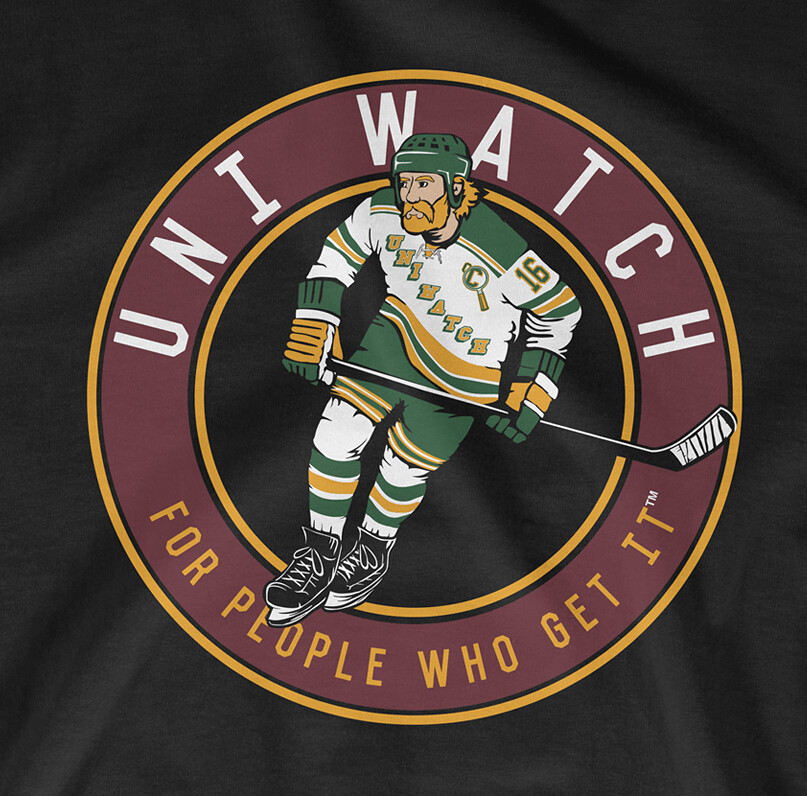
T-Shirt Club reminder: The Uni Watch T-Shirt Club’s second release of 2016 — the hockey design — is now available. Here’s the base design (which you can click to enlarge), followed by the three shirt color offerings:
The shirt is available here from now through next Tuesday.
We also have a goalie design that’s available for sale as a bonus shirt. Here’s the base design, and the three color options:
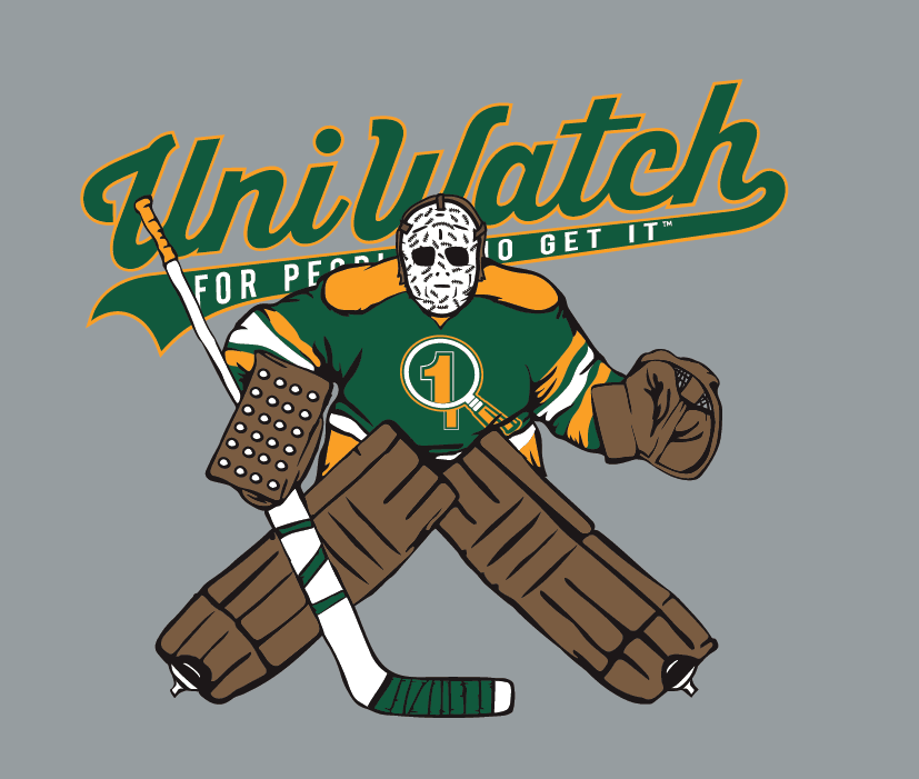
This shirt is not part of the T-Shirt Club, does not have Club’s jock tag graphic, and neither counts toward nor is required for 2016 “Collect ’Em All” eligibility. It’s just a bonus design that we’re offering for those who want it. You can get it here.

Uni Watch News Ticker

Baseball News: Corona del Sol HS in Arizona have tequila sunrise unis, and White Sox style cap (from Mr. Nursfen). … Anyone know more about this Yankee logo on a catcher’s chest protector? … Which team has the best jersey in baseball? You can vote on that. … The Shore Attitude out of Maryland have incorporated their state flag into their sublimated designs. … Because when you think of Ted Williams and Joe DiMaggio, your first thought of them is always going to be in Senators and A’s unis, right? (h/t Bruce Menard). … “I don’t know if you’ve heard of Bobble House,” writes Jason Mott. “It’s a thing a fellow Nats Fan started up. I believe he makes them in his garage. They’re display cases for bobble heads designed like baseball dugouts (and hockey benches). He’s also been customizing them for certain teams. Such as putting all the Cardinals pennants on the top. I thought you might be interested.” … Stripes are almost always a good thing. But sometimes there is too much of a good thing — that’s Hofstra (tequila sunrise plus pinstirped pants plus [some guys with] striped stirrups = stripe overload). … Adidas Baseball athletes will wear this special adizero afterburner 2.0 cleat for Mother’s Day. … Did you ever wonder what a baseball cut in half looks like? Wonder no more. … We’ve seen this picture of Hammerin’ Hank and the Say Hey Kid (in a 1976 Mets pillbox cap, no less!) before, but once more can’t hurt (h/t Dan Epstein). … Whoa — the original plans for PNC Park in Pittsburgh once called for a Forbes Field-esque wall (from MLB Cathedrals). … “My friend who works with the Omaha Storm Chasers, a KC Royals affiliate, posted pictures of these (Star Wars) jerseys and I thought they were rad,” said Andrew Atterbury. … Former SF Giants pitcher Tim Lincecum was trying to showcase his skills for clubs in Nike cleats and a Team USA soccer shirt (via Jim Adair and Sons of Johnnie LeMaster, respectively). Here’s a bit more on that. Oh, and it looks like he was wearing camo socks (and cargo pants). … The Colorado Sky Sox wore these flag desecration unis last night. … New Era selling this cap. Trillhouse asks, “Braves wearing Black Crackers unis soon?” Twitter answered his question rather quickly. They’ll be wearing them next weekend, when they play Kansas City, who will be wearing these beauties. … The Inland Empire 66ers will wear these Zombie Apocalypse jerseys on June 2nd (from Kristopher Sharpe). … This never would have happened if the flip flops were brown (h/t Ramon Scott). … The San Diego Padres wore their brown alts and taco caps last night against the Mets. Anyone else think the Padres need to Bring Back The Brown? I mean, wouldn’t it be great to Make The Padres Brown Again? Only (minor) complaint: Combining blue undersleeves with brown tops is no bueno (h/t Dick Holbrook). Almost as bad is the blue catchers gear (also from Dick). … John Jay was wearing Tony Gwynn Stance socks (from Brady Phelps). … The San Jose Giants and Lake Elsinore Storm will wear these, um, jerseys today (h/t Minor League Promos).

NFL News: – New England Patriots rookie cornerback Cyrus Jones, the team’s top overall draft pick, will wear No. 24. Why? “He understands the significance of the number in New England, with Patriots Hall of Famer Ty Law donning it from 1995 to 2004 and then Darrelle Revis sporting it in 2014.” (Thanks to Andrew Cosentino). … Speaking of rookies selecting uniform numbers, the Lions’ rooks have picked theirs (from Brinke). … More on rookie numbers: Giants rookie jersey numbers: Who wears what, and who was the best to wear it (from Alex Sinclair). … Also from Andrew Cosentino, a rundown of the Ravens Rookie numbers. … And the Eagles rookie numbers (from Thom Pucks). Here’s more on that. … The Seattle Seahawks have released their rookie draft picks’ numbers (from Tim Dunn). … And, the Tennessee Titans’ rookie numbers (h/t Eric Wright). … Tweeter Tom Ferrer thinks the seams on the jerseys in this new Dolphins’ numbers graphic look like those on the mach speed template. … Here’s an article on the banned uniforms of american football (from Patrick Thomas). … Are there changes coming to the unis of the Washington football club? … “Paul’s ticker this week contained a possible leak of a Broncos 1965 throwback in current colors,” writes Leo Strawn, Jr. “With NFL helmet rules that would mean a navy helmet. I did a quick mock up of what that could look like (right side is a photo of a ’65 game between the Broncos and Chargers).”

Hockey News: We’ve probably had this (or something similar) before, but Rob Yasinsac writes, “For the hockey ticker, check out this Pearl’diques jersey that Pearl Jam sold at their recent Quebec concert. The puck is a reference to their Lightning Bolt album, which also used similar “flame” imagery copied here in place of the fleur-de-lis.” At least it’s not Menudo. … “Is this someone helmet number 5 on the NY Lottery logo behind the @NYIslanders bench?,” asks CJ Sodergren. … Scot Rossillo lives in Massapequa but grew up in Brooklyn, making him an ideal candidate to have designed a crossover product for this crossover Islanders season (from John Muir).


NBA/NCAA Hoops News: On Thursday night, Goran Dragić bloodied up his jersey, and the backup didn’t have the accent over the C (from Ty). … Here’s a look at the NBA Draft Combine jersey (via Brian Limper). Looks like the NOB is under the number this year. … Mitchell & Ness is now the on court provider for the NBL (from Cody). … Is KU thinking about wearing black unis? It’s possible, if Frank Mason III posted a pic of one on Instagram.

Soccer News: On Sunday, Ajax will play in a new 2016-17 away kit (h/t Seth Winnie, via Paul). … Queens Park Rangers FC (a.k.a. QPR), who were relegated from the Premier League last year, have revealed a new club crest. (from Michael Mrozinski. He continues, “This handy graphic from the club summarizes QPR’s history of crests and illustrates how the new design is a throwback to the one they used from 1982 to 2008. It’s good to see a club called the Hoops get an entirely round crest.” … Dunga announced Brazil’s Copa America squad Thursday. Submitter Igor Mello asks, “Is he wearing a Nike/Brazil blazer.” … Here’s your first look at the Orange kits for FC Cincinnati. They are being worn next Saturday vs Pittsburgh (h/t Aesthetic SB). … Stoke City’s 2016-17 kits have been released. … How do you know soccer is really making a dent in America? When you have a Coke-themed soccer display (via Shane Bua). … The Ipswich Town 2016-17 kits have been released. … Here’s a potential look at Liverpool’s new third kit (h/t Tim Cross).

Grab Bag: New uniforms for the umpires and ball boys/girls at Wimbledon this year. … “In the ACC lacrosse tournament (Thurs)day Marquette’s Andy DeMichiei wore his teammate Kyle Whitlow’s #6 jersey,” writes Kevin Mueller. “Whitlow is out for the year with an ACL year.” … Here’s a look at High Jumper Erik Kynard’s Jordan kit and spikes for the 2016 track season (from Steve Wagner). … Setting their sights on world domination: “How Under Armour plans to become the world’s biggest sports brand.” … Yesterday Paul made *his* famous “Derby Pie”. I’m going to use his reply to a commenter as today’s QOTD.

And that’s all for today. Thanks to Jimmer for his help with the lede, Gary for his wonderful Scoreboards piece, and anyone who sent in for the ticker.
Enjoy the Derby today and I’ll catch you tomorrow…but until that time…
Follow me on Twitter @PhilHecken.
Peace.
“Fuck that. Derby Pie belongs to the people.”
— Paul Lukas (as quoted on Twitter)

I agree, the Rays’ signature uni is their original “1979” fauxback.
You missed the fact that on top of the Tequila Sunrise jerseys and White Sox-ripoff caps, Corona del Sol has also apparently appropriated the Chicago Bears wishbone C on their BP pullovers.
I like the fact that the cap says “SOL” rather than “SOX.”
I went to their website. They also have the Sox beach blanket uni’s too. Sox style hats, beach blanket jerseys, tequila sunrise jerseys, wishbone c, how many elements can they incorporate?
Great work again on what’s your signature. Presently this is my favorite part of my Uniwatch week.
As a Rays fan and also a fan of the signature look series, I would like to say great job today. Picking a signature look for the Rays is not easy considering they shouldn’t have been the Devil Rays from the start. I am glad they have kept their current look since 2008, but I feel it is time for some updating. I would like to see them move the Navy to be a secondary color and make the columbia blue their main color and also add Tampa bay to their road jerseys.
I’ve enjoyed the series so far too, and this is the fist one where I agree with the conclusions 100%. I have a sentimental soft spot for the inaugural Rays unis, since I coached a Rays team in little league that year. I liked the gradient; my only problem with those unis are too much black, and the double-stack jersey lettering is just too big. Ditch the black and apply the gradient to the later green-and-blue Rays unis and they’d have been perfect.
Still, the Rays at their best are a quirky, even at times corny team, and their real signature is the surprising one-off. Like the fauxbacks, or the plaid, or suddenly wearing sox with good stripes, and so forth.
“this is the fist one where I agree with the conclusions 100%.”
~~~
*shakes first*
Of course you did — because I didn’t write it ;-)
You’re really gonna love my Brewers, Twins and Natinals ones..
Can’t go wrong with the Nats, who have only two real choices. Though obviously it has to be this: link. Twins and Brewers, I bet I know what unis you’re going to pick for each. If I’m right, they’ll be my second-least-favorite unis for each, but I’ll agree with you nonetheless in terms of “signature” look. Signature doesn’t necessarily mean best-looking.
Anyway, I’ve enjoyed the series immensely so far! I’d probably be enjoying it less if I was just nodding my head in agreement with every entry.
Wait, why shouldn’t they have been the Devil Rays? Would you have preferred Manta Rays or Stingrays?
I like the East Bay Rays
I see what you did there.
Stingrays would’ve worked for me.
They should have been the Tarpons, which was the fan choice when they did the fan voting. Devil Rays came in last but the majority owner wanted the name so they went with it. The problem is devil rays are not common in the gulf or Tampa bay.
People actually wanted the name that’s only a letter away from Tampons? Why would you pick a team name so easy for opposing fans to mock? Also, there’s a ton of Tigers in Detroit.
Marquette doesn’t play ACC lacrosse.
Big East (as mentioned in the photo)
Another conference realignment?!
You heard it on Uniwatch first!
I can see where the mistake was made. The current Big East is the AAC conference (Almost All Catholic).
And a player suffered an “ACL year (sic)”?
the Rays will never be in Montreal, just sayin’…
Fauxbacks make my hair hurt.
Can’t forget about the plaid Rays…link
Already paying dividends!
How often did the plaid-brimmed caps get worn in actual games? Was it just during the 2010 season? The last time I went to the Trop in 2011, the between-innings emcee was wearing such a cap.
not positive, but they did not wear them too often, maybe 4-5 times
Thanks Phil for sharing the “Pearl’diques” jersey. This one is brand new for them but a couple years ago Pearl Jam sold a Red Wings-style jersey.
From a while ago there was this purple kings Tragically Hip jersey (sorry if image small but only image I could find – image in a 2006 posting)
link
not positive, but they did not wear them too often, maybe 4-5 times
Tampa has changed looks too many times to be less than 20 years old.They went from ’90’s dumb to a better green look to another dark blue team. There aren’t enough green teams. I’d say drop the navy and switch back to green. Keep the baby blue. It works for Tulane.
The green and black Rays unis were their best look. Unique.
I think you’re being too harsh on Shibe Park (Connie Mack Stadium). Yeah, it was a wreck by its final days. But in its prime, I still think Shibe at its best surpassed the Vet at its “best”. You wanna talk dilapidated…let’s get into some Baker Bowl conversations. Now THAT was dilapidated.
Probably right about the harshness, at least during the period I remember the most (mid to 50’s to early 60s). But by the 70s both the ballpark and the neighborhood areas were getting a bit rough.
That best jersey voting thing is straight booty o’s. The Padres as a #29 seed? They belong in the top half. Clean, crisp, and without the accursed color I hate. And sorry Phil but #DontBringBackTheBrown.
#NeverBrown – is sort of agree with both sides on the brown debate. On the one hand, brown is an underused color in sports generally, MLB in particular. A tough color to use well, like purple, but also like purple a terrific color of you get it right. And the Padres are one of two teams in MLB history with a record of using brown well. The Friars should own the shit out of brown as a team color.
That said, I spent two years in little league wearing dark brown polyester shirts thanks to the Padres. On a sunny day, it was like playing baseball in a brick pizza oven. It probably violates the Geneva Conventions to make baseball players wear dark brown in the summer sun.
Thing is, the Padres never used brown all that well. Certainly nothing like as well as the St. Louis Brownd did at their aesthetic best. Nothing wrong with pairing brown with yellow or orange, but the bright colors were always used too coequally with brown. If I owned the team, they’d be dark brown and white with just a few accents of sky blue. Brown and yellow or brown and orange would work too, but the bright color would have to be a sparingly used accent, not a full-on primary color.
“And the Padres are one of two teams in MLB history with a record of using brown well. The Friars should own the shit out of brown as a team color.
That said, I spent two years in little league wearing dark brown polyester shirts thanks to the Padres. On a sunny day, it was like playing baseball in a brick pizza oven. It probably violates the Geneva Conventions to make baseball players wear dark brown in the summer sun.
Thing is, the Padres never used brown all that well.”
~~~
Scotty, baby — are you running for office or something? Like, on the GOP ticket?
#BuildTheBrown – yeah, brainfart. First instance, I meant to say something like “distinctively,” but clearly was already “thinking” a couple of sentences ahead. Padres in brown were never bad, but never better than OK or OK-plus, if that’s a thing. The Browns were often excellent.
Speaking of, “los” is the burrito bowl of jersey design.
With baby blue is the only way I accept brown. That makes for a nice combo. As I’ve said on here countless times, with orange and yellow it just screams 70’s or Caldor. I’m not judging those who like it and I realize I’m well in the minority but hey, I gotta be me.
Atilla, if the St Louis Browns were still in existence, would you at least let them be brown? Or would you find a way to justify assimilating them into the blue/red collective?
#MakeBaseballBrownAgain
Well, based on the name alone it would at least make sense. Same as Cleveland does in the NFL. I’m just simply not a fan of brown unless it’s with baby/Carolina blue. I actually really like that combo.
And hey, I NEVER said I wanted everyone to be blue/red.
Fair enough.
My point with the Padres, though, is that any color other than brown doesn’t make sense, given the fact that they’re named after the brown-robed Franciscans who came to San Diego. If you want a different color you really need to change the name.
It would be like outfitting Bowling Green in anything other than green. Wait…
No love for the Rays’ plaid hat look?
Gotta admit that one slipped my mind. But I did like it.
That Yankees logo has been around since the early seventies – I remember seeing it on decals at the F.R. Woods store in Cooperstown many years ago. Here’s a copy of the decal on ebay:
link
Late in this, but I was the person who tweeted about the NYY catcher logo. Thank you so much for the info Clarybird, and thanks for having it in the Ticker Phil. Was a favorite of my late father’s, and I’ve been trying to track it down for a bit.
The logo may even have been around in the sixties. I’ve got b&w copies of all 24 teams that were around at the time, and it includes the Milwaukee Brewers, so I figured the set was from the early 70’s. But after I posted my comment, I looked through set, and it also has the L.A. Angels and the Houston Colt .45’s. Anyway, glad I could help, Brian, and if you’d like me to send you a jpeg of the logo, shoot me a quick email.
link
#Brown4Padres4Life!
I always liked the green Tampa Bay period. Despite making tweaks to the lettering they really needed to drop the second outline/dropshadow. One outline in light blue would have been perfect.
The pic of the origional uniforms shows the road in a light green and a prototype cap. The light green would have been pretty cool, but they scrapped it for common grey. Too bad.
As a sidenote, the 2001-04 and 2005-07 Devil Rays sets were slightly different, but neither is close to the team’s signature.
The Rays haven’t exhausted possibilities for other raglan-sleeved fauxbacks. I’m looking forward to a gold+white “home” uniform.
MLB has done its best to sabotage the franchise here is Tampa Bay. From passing us over in favor of the Marlins in 1993 because of Bill White’s prejudice to putting us in the American League (even though the area had hosted numerous NL spring training teams as well as their minor league affiliates for over 50 yrs), MLB has done their best to paint us as not ready for prime time. Add in the fact that our first owner, Vince Naimoli, was tragically inept and put together a horrible front office who consistently made wrong decisions and you have a recipe for disaster. Throw in the egregious cost of buying into MLB (the most expensive expansion fees ever, no TV revenue for years, the poor timing of their present TV contract and renewal) and the hyper inflation costs for fans for attending the 81 home games (which contrary to perception the Rays do NOT have a majority of cheap seats), it’s a wonder that we have survived. But if you ever did come to see a game at the Trop, you would find a great ballpark where we have no rain outs and a comfortable 72 degrees (it’s generally 90+ with 90% humidity & a constant threat rain between May to Sept). You would see how much the stadium has provided a positive impact on the quality of life to downtown St Pete. You would find how poorly the Rays market themselves to the 14th largest TV market as the new owners immediately came in poor mouthing the stadium and demanding the area pay for a new one to move into rent free. So pick whatever you think should be their signature uni but stop picking on the area. We didn’t choose the Rays but they are our team & we are doing our best to support it.
BTW- the Rays were initially named after Vince Naimoli’s dying brother Ray Naimoli. The new Marlins retractable roof is open only about 10 games during the season because of the unbearable heat and rain storms. Even with their new stadium, the Marlins continue to draw poorly. The Trops location to St Petes vibrant downtown and world class museums is so much better than Atlanta’s, Seattle’s and so many other stadiums in MLB. In fact with MLB getting more inclusive with wanting to monopolize and monetize the entire premium stadium experience, don’t be surprised to see even smaller venues surrounded by much larger team branded housing and shopping developments coming to a MLB city near you.
Did you actually read the entry? There was nothing there ragging on TB/St. Pete.
Sure did. The last paragraph, if not the final sentence about the potential move to Montreal, is the sleight that needs some attitude re-adjustment. Also, tried to add some local background to a franchise that most don’t understand.
Unlike most people, I’ve said in the past I have no problem with the Trop. That’s why I put “obsolete” in quotation marks. And I don’t necessarilly want the Rays to move to Montreal…just making a prediction. Hopefully I’m wrong. There was no picking on the area here.
No problem. Probably just overly sensitive about the subject. After solving stadium issues in Tampa Bay and Oakland, MLB’s latest chatter is a possible expansion to San Antonio & Montreal in order to round out the leagues to 16 teams each and eliminate the need to play interleague games every day. Depending on how things play out here concerning the kind of deal Stu can extort from the area, and the economy in general in the next 4 years, I’ve always felt their play was a move to Charlotte. Their AAA club is in Durham so they own the territory and there are plenty of deep pocket corporations to pony up for premium luxury boxes. But if any relocation occurs, it will be a shame and reaffirm MLB as a ruthless business.
BTW- I really liked the green and black uniforms. 2nd choice is the faux back. My least favs are the inaugural purple haze. Thanks for the column.