
The Pirates debuted their new bumblebee Sunday throwbacks yesterday, and it was a lot of fun. Naturally, there were plenty of things to nitpick about, so let’s get those out of the way first, beginning with the fact that several players were wearing striped socks that the Pirates never wore back in the late 1970s (see above). The striping actually looked pretty good, but it’s not period-accurate and shouldn’t have been worn.
Even worse, many players went pajama-pantsed, which looked dreadful:
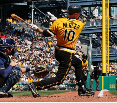
Also, the pillbox caps weren’t true pillboxes. The top panels were rounded (or at least had a lot of give), not flat. We’ve known for a while that this would be the case, but it still looked a bit weird:
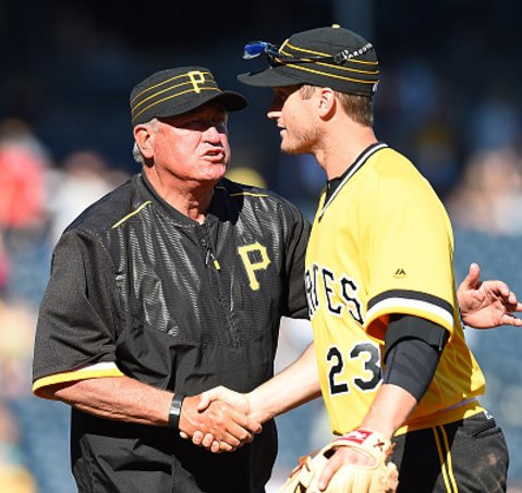
There was one genuine-seeming pillbox cap on the field, however. It was worn by the team’s mascot, Pirate Parrot, who had his own throwback uni for the day (click to enlarge):
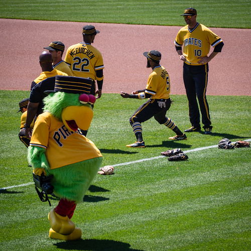
Also: No Stargell stars. MLB supposedly won’t allow them. Dang.
And here’s something I hadn’t thought of: Since the throwback pants don’t have belts, there was no rear belt tunnel for the MLB logo to appear on. So instead they just slapped it on the back of the waistband, which didn’t look so hot:
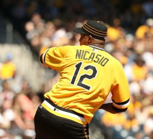
On the plus side, it was great to see the gold jersey and the black pants again. And the Pirates’ broadcast team got into the act with throwback attire of their own (click to enlarge):
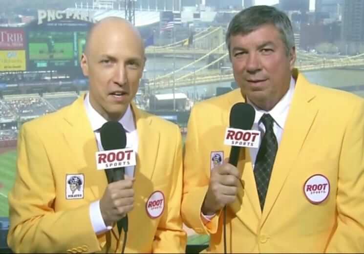
They later added throwback hair and facial hair to the mix (click to enlarge):

There are some additional photos here, and you can see the uniforms in action in the following video segments:
All in all, a good time. But here’s a thought: One of the most interesting things about the bumblebees was that there were so many mix-and-match variations, because the jerseys and pants came in three separate iterations (black, gold, and white with gold pinstripes), plus there were two different cap colors (black and gold) and two different stirrup colors (black and gold). Using just one throwback configuration all year long — black cap, gold jersey, black pants — short-changes a big part of what made this uni set special. Obviously, it would be more work to have all of the different components on hand, but I still wish they’d offer more than one look from the bumblebee era.
Speaking of which: In the bottom of the 1st, Pirates broadcaster Bob Walk, who pitched for the Pirates in 1984 — the last year of the bumblebee era — mentioned something interesting about the original bumblebee uniforms:
Those uniforms — they all didn’t fit the same. Nowadays, no matter what team you play for, the uniform’s made by the same company, everything always fits the same. The Pirates, they had all those different uniforms, and they weren’t all made by the same company, either. So, you know, the black pants and the white pants, they would fit and feel totally different.
This surprised me, because I thought the bumblebee unis were famously made by the Japanese company Descente (which was a big deal at the time, because no MLB uniform had ever been made by a Japanese company before). But according to Bill Henderson’s guide, Descente only made the pinstriped and black unis. The gold ones were made by Rawlings in 1977 and then by Wilson for the rest of the bumblebee era. Interesting!
I was aware of a few teams that had their uniforms made by multiple manufacturers in a given season back in the day, but I wasn’t sure how common that was. So I asked Bill Henderson. Here’s his response:
It was actually not unusual at all for teams to spread the wealth in the ’70s and ’80s. Often they would have identical sets made in Set 1 and Set 2 by different manufacturers. Sometimes the grays were made by McAuliffe, the Yellows by Wilson and the Whites by Rawlings! This goes back to the ’60s (at least), when teams had different manufacturers make homes and roads. They got more free stuff that way.
Besides the “Mix and Match” Pirates, the White Sox, Braves, and others often had full sets of home/road/alternate uniforms made by Wilson, Russell and/or Rawlings. The A’s also had a hodgepodge of manufacturers from style to style, year to year.
It’s always interesting to me when I see old photos of teams on the field with different players wearing jerseys from different manufacturers. Often the fonts would not all match, because each manufacturer had its own “house” version of the fonts. The mid-’80s Astros were a classic example. I guess everyone lived with it because that’s the way it was then. There were no vector graphics files to exchange.
Great info from Bill. Anyway: An imperfect bumblebee showcase is still a lot better than none at all. The Buccos’ next Sunday home date is May 1 — looking forward to it.
(My thanks to Joe Sewash for letting me know about the Bob Walk commentary, to Bill Henderson for sharing his expertise, and to everyone who submitted photos, especially Phil.)

Click to enlarge
Everyone calm down: Yesterday Phil Ticker-linked, with very appropriate skepticism, to a Color Rash cheat sheet (shown above). That photo is circulating all over the place, and people are getting all worked up into a lather over it, so here’s a quick reality check:
1. The photo came from a Twitter account called NFL Leaks. I have no idea who’s behind that account or how trustworthy that person is. I’m not saying the person isn’t trustworthy, mind you; I’m saying we’re dealing with an unknown quantity here. That means the legitimacy of this cheat sheet is open to question.
2. Even if it is legitimate, the sheet specifically says (a) “All designs subject to change” and (b) “Same color matchups will result in color change for one club.”
In short: Everyone relax. We’ll see the real Color Rash designs soon enough. Given how awful they’re likely to be, I for one am in no hurry.
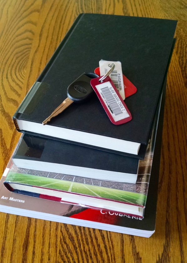
KRC update: The latest installment of Key Ring Chronicles, the column I edit over at McSweeney’s, is now up. It involves a key ring with a library card. Check it out here.

How is this soda different from all other sodas?: Passover begins this Friday, which means lots of products normally made with high-fructose corn syrup are currently available with cane sugar. That includes Coca-Cola, whose Passover-approved version is easy to find by virtue of its yellow cap. Further info here.
The Ticker
By Paul

Baseball News: Phil had this in yesterday’s Ticker, but just in case you missed it: Remember MLB’s recent move to ban personalized bat knob decals? I’m now told that the commissioner’s office issued a memo last Thursday to GMs and clubhouse managers, stating that after further consideration, personalized decals will now be permitted after all. However, trademarked characters or anything else that might have intellectual property implications, like Matt Duffy’s Duffman decal from last year, are still off-limits. ”¦ Rickie Weeks Jr. of the D-backs has JrOB this season. ”¦ David Wright has been wearing an orange undershirt for years, but he’s been wearing blue this season. That’s one of several 2016 Mets uni observations that Shannon Shark has cobbled together in this post. ”¦ Yesterday was the Phillie Phanatic’s birthday, an occasion that was noted on the base jewels for yesterday’s Phils/Nats game (from @cg072014). ”¦ The Richmond Flying Squirrels debuted their waffle-themed uni yesterday. .. Brewers INF Colin Walsh wore Utah jazz socks during pregame warm-ups yesterday (from Clinton Dybul). ”¦ Marlins 2B Dee Gordon wore some nasty-looking two-in-ones yesterday. ”¦ Giants pitching coach Dave Righetti was wearing the wrong jersey prior to last night’s game. Here’s another pregame shot. Not sure if he changed into the proper jersey once the game started. ”¦ Cubs P Jason Hammel wore Miami Dolphins gloves for a pregame football toss. … There’s a thoroughbred horse out there called Geaux Mets — and he won the second race at Aqueduct yesterday.

Hockey News: It had previously been reported that Anthony Zych, who designed those awesome Blue Jackets posters this season, was no longer with the team. I’m happy to report that he’s joined the staff of the Devils, where I’m sure his considerably talents will be put to good use. I’m going to meet him in person later this week, which I’m very much looking forward to. ”¦ Interesting WHA note from Jeff Kruger: “In the WHA’s third season (1974-75), the Chicago Cougars initially wore gold breezers for with their white home uniforms ”” a very nice look! Coach Pat Stapleton changed to green pants in an effort to break their early-season losing streak.” ”¦ The Red Wings have a new center-ice logo for the playoffs (from @jeffreybigmoney). ”¦ Nice article on how Minnesota hockey fans still love the North Stars.

Soccer News: FC Kansas City’s championship rings have a typo (from James Gilbert). ”¦ Dortmund’s new kit may have leaked. ”¦ Ditto for Celtic.

Grab Bag: NASCAR fans will want to read David Firestone’s assessment of the Stewart-Haas announcement. ”¦ “I have no idea what this is all about,” says James Huening, but a vodka bottle wearing a jersey screams ‘Uni Watch!’ to me.” Indeed. ”¦ Thermal camera footage appears to show that a bunch of pro cyclists had illegal motors on their bikes. ”¦ Here’s your latest chance to vote for the NASCAR paint scheme of the week. … A museum in London has a new exhibit on the history of underwear.

What Paul did last night over the weekend: Living in NYC can be a pain in the ass in all sorts of ways, but sometimes the city really delivers the goods, and that was the case for me this past weekend, as I checked out all sorts of cool stuff.
The festivities began on Friday night, when the Tugboat Captain and I joined our friends Jon and Karen at the American Folk Art Museum, which has a great exhibit on Masonic and Odd Fellows artifacts. I was struck by how team- and uni-like a lot of the stuff was — the Masons and Odd Fellows both use ceremonial aprons for members who achieve various levels of status, and the repeated visual motifs (all-seeing eye, heart in hand, beehive, representational axes, etc.) began feeling like team logos.
Here are some photos I took (if you can’t see the slideshow below, click here):
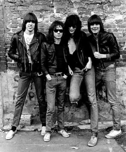
The Tugboat Captain and I spent most of Saturday in Queens, beginning with a visit to the Queens Museum to see their new Ramones show. I had big misgivings about this one, because punk rock usually isn’t the kind of thing that translates to a museum context, but the show acquits itself pretty well. And once again, it was impossible not to think about uniforms, because the Ramones had a pretty strict dress code throughout their career — motorcycle jacket, T-shirt, torn jeans, sneakers. They also had a rule about not smiling in press photos, but the show includes a rare shot of them breaking that rule, from the same photo shoot that produced the front-cover image for their first album. It’s nice to see them breaking character and enjoying themselves (there’s an entire article about this photo here):
After the museum, we sunned ourselves at the Unisphere, visited the Candela Structures, made friends at a local watering hole, and then had dinner at Cheburechnaya, a wonderful Kosher Uzbek kebab house in Rego Park that’s been a favorite of mine for years. One of the many things I love about the place is that they cook the kebabs over a long, narrow pit of charcoal, which they stoke with a old, beat-up hair dryer (click to enlarge):


As for Sunday: Longtime readers may recall that someone close to me runs a blog devoted to the $2 bill. She’s featured in a new documentary about the $2 bill, which made its NYC debut yesterday at a local film festival, so we went to check it out. It’s really good — definitely worth seeing if it shows up in your town. Here’s the trailer:
That, my friends, is one sensational NYC weekend. Hope your weekend, wherever and however you spent it, was even better.
In the soccer section of the ticker, the Chelsea link goes to a tweet about the Celtic jersey.
Should have written “Celtic.” Now fixed.
Typos:
– McSweeney’s link
– Geaux Mets link
– Dortmund’s new ket.
All fixed.
I am so happy that Anthony Zych got scooped up by my beloved Devils! I loved his Blue Jackets posters and I can’t wait to see what he is going to do with the Devs!
Enjoyed seeing his refreshing take on promotions – harkens back to the old design themes. Look forward to his work.
“Giants pitching coach Dave Righetti was wearing the wrong jersey prior to last night’s game.”
Speaks to the stupidity of having two sets of uniforms that are the same color. The Giants should mothball the “SF” jerseys.
Keep the SF one. Ditch the SAN FR ANCISCO jersey
ðŸ‘
I agree with Jim. The full city name, radially arched, just looks clunky to me.
One of the pleasures of this site is dealing with “dilemmas” such as the San Francisco Giants. Good team, good colors, good uniforms. Which ones do you choose? I have never disliked any of the looks nor one of the many jerseys they have worn. Part of the “problem” is that “San Francisco” is such a mouthful whereas “Giants” is pretty economical, so they can’t be rendered in the same style. My solution? Adopt the “SF” jerseys, since I haven’t seen them in a while.
It actually speaks to the stupidity of Righetti. Honestly, how difficult is it to put on the correct uniform? Why doesn’t someone in the clubhouse bring this to his attention?
This seems to be happening more frequently, makes you wonder if some of these guys are mentally prepared for the game.
Maybe.
Or: Maybe he did it intentionally so he’d be easier to pick out in the dugout. I don’t know if he calls pitches or gives other signals (some pitching coaches do), but it might be advantageous for him to be easier to locate for a player glancing at the dugout.
This isn’t necessarily an acceptable excuse, but it might be an explanation.
Hold on, Mild Bill!
The stupidity and lack of mental preparedness of Righetti? Step back and take a deep breath.
This is the same Dave Righetti who played a big part in the Giants success taking them to the World Series the last few years. Unless you’ve been a professional pitching coach, you have no idea of what it’s like to walk in his shoes.
I was a minor league pitching coach for five years and there was maybe a half dozen times I walked out before a game wearing the wrong top. Reasons why? Try these on for size.
Starting pitcher comes down with injury. Notify manager, pitching coordinator and the Director of Player Development. If I reach one of them by phone, they take the opportunity to ask about another situation. Also, talk to relief pitchers scheduled to pitch that night about their workload.
Major League GM wants to know about my pitchers because of a potential deal. He gets all of my attention.
Pitcher has a personal problem that needs immediate attention or there’s a family emergency. Believe it or not, there is a life beyond the ballpark.
After dealing with these situations, video, scouting reports and computer problems on a daily basis, I would look at the clock and say, “WTF, I gotta get out there.” So, I threw on my jacket and rushed to the bullpen to be there for my starting pitcher. What top I was wearing never entered my mind.
I don’t claim to know what happened to Righetti, but I do know this…s**t happens. Wrong uniform top…big deal…cut the man some slack!
Love the McSweeney’s bit. A friend who happens to be an academic librarian came to mind as I could see him doing the same.
The Mets used Rawlings for their home jerseys and Wilson for their road jerseys in the early days. That’s why the roads used the link and the home jersey used a standard block number. Today they use block numbers home and road. It would be cool to go back to the varsity font on the road, which ensures they will never do it. The font is still used today by the Yankees, Braves and others. The Mets have never worn a different font than block at home for all their 55 seasons.
They actually used Spalding for the homes before switching to Rawlings in 1972…checked Bill Henderson’s guide for that one.
A little late to the party as far as NBA uniform ads (not a fan). Think about this. The next time an NBA franchise is pushing for a new arena, do you think they’ll volunteer any of this added revenue stream to the building of said arena? Of course not. The taxpayers will again be on the hook and in the on deck circle for that extortion. (I secretly hope Roto-Rooter sponsors the 76ers, by the way.)
I’m late as well. I am curious how the new BA ads may affect players’ personal endorsements. If Player A has an endorsement deal with Coke/Sprite will it include a clause that states he cannot sign with a team that wears a Pepsi patch? Will team sponsors attempt to prevent players on said team from endorsing a competing product? Either of these situations could result in revenue paid to teams and owners) that was previously paid directly to players.
This is precisely the kind of tedious corporate theater I’m dreading. It has nothing to do with sports per se, but we’re going to be hearing more and more of it. It hasn’t even started yet, and I’m already begging to Make. It. Stop.
This coming from one who regularly adverts socks, hats, cured meats etc… would you be amenable to ads on jerseys so long as they were products you use? Can’t have it both ways dude.
Perhaps you’ve missed the last, oh, 10 years or so of my writing on this topic….
For the gazillionth time: I am not opposed to advertising per se. But I am very opposed to advertising WHERE IT DOES NOT BELONG. I happen to think that a sports uniform falls into the latter category. Perhaps you disagree — that’s your prerogative. But I am not trying to “have it both ways.” I have been consistent on this issue for many years, and the printed/published record is out there for your perusal.
Liking the new mobile version of Uni Watch Paul ðŸ‘
I can’t take any credit for it, but glad you like!
Agreed. I’ve been meaning to say something. It’s a definite improvement.
Another reason the Color Rush leak seems skeptical is the Titans and Redskins aren’t even shown.
There was a follow-up tweet from that account that said those two teams were on page 2 (no picture), stating that Tennessee’s color was red and Washington’s was black.
“Washington’s was black”
More evidence of its illegitimacy?
Titans Red? I know this is all speculation, but it color rash will be even worse if team change the rash colored each year.
Bears play Packers on Thursday night – Bears color rash orange and Packers gold, won’t happen. At worst Bears wear white.
Packers all green or gold top/green bottom, I might like to see – once. Little bit of a North Dakota State look.
That game might hurt our eyes. I could see yellow vs. orange happening, frighteningly.
I’m hopeful the Packers will be fairly insistent their color rush actually be a throwback, like this: link. Hopeful, but not optimistic.
The Bears have already crossed the orange threshold with their alts a few years ago, so that bridge isn’t sacrosanct. But the Packers seem above such shenanigans without a nod to history.
A few years ago? The Bears crossed the orange threshold link.
And I could live with mono orange as a throwback. But not if they’re wearing it against the Packers in mono gold.
Eh, I only concern myself with the histories of teams with at least 13 NFL championships. ;)
Regarding the Chicago Cougars item, the linked article states that their opponent for the game where they changed to green pants was the Indianapolis Racers. The Racers’ first season in the WHA was 1974-75, which was also the Cougars’ last.
Yup, you’re right. Text now fixed.
Though it does raise the question of exactly how long the Cougars wore yellow pants at home. If they wore them for the first six home games of 1974-75, did they wear them at all in the previous two seasons?
I went to a Cougars game in their first season (Bobby Hull’s return to Chicago, with the Jets, at the International Ampitheater). The Cougars wore green pants.
IIRC, the goal posts were green (not red) with yellow netting.
Pirates went with the ‘Game 6 and Game 7’ jerseys from the World Series.
Hopefully they try black tops and gold pants next year.
I’m a fan of the home pinstriped uniforms, but I’m mindful of the poor job Majestic did, replicating the Descente fabric. If the throwbacks were handled by the original Japanese manufacturer, I could totally get behind that.
Another difference from ’79: the batting helmets.
I also like the new mobile site. Does this mean the desktop version will be improved soon?
Am I correct in thinking that the helmets were gold with black brims regardless of the cap worn that day?
I believe so, yes.
Yes. Always gold with black brim.
As it always should be.
Passover starts Friday night or Saturday as most possible would say but th Seder is Friday night. Can’t wait for a week of matzah.
Well, my first attempt at posting a comment on the new mobile site went to moderation, so I’m not too thrilled about that.
But other than that, I like it.
But it got released quickly.
So there’s that.
Bumblebees – No Stargell Stars? Meh.
No Stargell. Unfortunately.
Francisco Cervelli’s celestial bodies of hot gases that radiate energy derived from thermonuclear reactions in the interior.
Fixed
I would guess we’ve linked to the site many times before, but that WHA uniform database is wonderful! God bless the internet. I take it for granted.
Yesterday I stopped by a Chicago used bookstore, one of those beautiful messes of a shop. One of the slots in the tray in the cash register was reserved for $2 bills.
Paul-
Bought a bottle of Coke Zero the other day that had a yellow cap. No high fructose corn syrup in that version of Coke. Do you know why it would have the Passover yellow cap?
Yeah, same with Diet Coke. Here’s the deal: Being “Kosher for Passover” doesn’t just mean the product doesn’t have corn syrup, though. It means the product has been subjected to a higher level of rabbinical inspection and certification. That level of scrutiny includes a ban on corn syrup but also involves lots of other things.
No manufacturer is required to have its products certified as “Kosher for Passover,” of course. But Coke chooses to.
I’m curious if Pepsi would be able to have any of its products certified, especially since they’ve made their “Pepsi-Cola Made With Real Sugar” a regular part of their lineup.
Pepsi products, at least in Israel, are without question certified Kosher for Passover. I would be shocked if these products did not have the same designation in the NY, LA, and Chicago land areas. Going off corn syrup for even a week shows one just how addictive, literally, the stuff is…lchaim to all enjoying the Pesach Coke!
I work for a soda manufacturing company in Upstate NY. It was just over a month ago we had our rabbi come in to bless our products. Anything we make that ends up being Kosher for Passover all have the same White cap with Hebrew writing on them. We don’t really make any of our regular sodas KOP but we do this for all our seltzers.
Boston Strong jersey for Red Sox and blue softball tops for Toronto in Patriots’ Day Game (officially Patriots’ Day in Massachusetts and Wisconsin and Patriot’s Day in Maine).
Paul, sounds like a nice outing. It’s good the thing the Tugboat Captain didn’t say “I Don’t Want to Walk Around With You”.
With the Mets wearing the racing-stripe uniforms on Sunday home games, some observers remarked on the unsightly look of the broad nameplate used, especially when Latin American players had accents over their names. The thing is, in 1986, accents were not widely used in American sports. Tildes, yes; but I don’t remember a Mets’ player having one during that period. Written accents over players’ names came into use in the late 1990s, IIRC, on ESPN. Yes, they always belonged there, but North American sports and uniforms were late to the party. If you mean to be a stickler about it, Bartolo Colon’s and Yoenis Cespedes’ jerseys would’ve been accent-free in 1986. Thoughts?
I raised this exact point in last Monday’s entry.
Yikes! Just goes to show I read what I want to read:(
Diacriticals cause agita to American typesetters, the tilde notwithstanding. I think the first one to appear on an American sports uniform was Pierre Garçon’s cedilla. Which begs the question: Why was the tilde easier to digest?
I think that tildes are an easier sell because their function is the most evident to Joey Bagodonuts who hasn’t studied orthography extensively.
I have to admit, I like the incorrectly striped socks better. It just works for me.
Paul, those interested in the bumblebees may wonder how the Pirates decided on which combo would be worn on which day. One of the 79 Pirates told me the GM’s secretary used to decide (!). One hot day at Wrigley she called to say the unis would be black and black, and the relievers (who had to sit in the sun all afternoon) revolted. A different combo was worn that day.
Ha!
Fun Fact: Something that most people don’t know about large-scale grocery stores is that their parent company employ at least one rabbi to oversee in-store kosher butchering operations.
If the alleged Bengals color rush proves to be accurate, they’re either going to look like old-timey prisoners or walking Rorschach tests.
Seattle will look like Shrek.
I look forward to seeing the NFL Color Rush look. Now we just need colored hats!
So the red jersey vs. red jersey game in Minneapolis Friday was caused, in part, by the Jackie Robinson tribute:
link