The Rams-related hits keep on coming. Reader Andrew Kupka was watching the Rams’ 1972 year-in-review video (which is awesome — check it out above) and has found something cool.
Toward the end of the video — at the 25:46 mark, specifically — the video announces that the Rams will have new uniforms for 1973. Here’s what the narrator says:
Next year there’ll be new players, a new coach, and a new look in uniforms for Carroll Rosenbloom’s Rams.
Because a team’s uniform is its outward symbol, the Rams have changed to one with more color, sparkle, and glamour, but with a rich tradition reminiscent of the early Ram years. The new look will prevail in both home and away uniforms, and will symbolize a team that has changed much in one short year.
The interesting thing is that the uniforms shown in the video aren’t quite what the Rams ended up wearing in 1973:
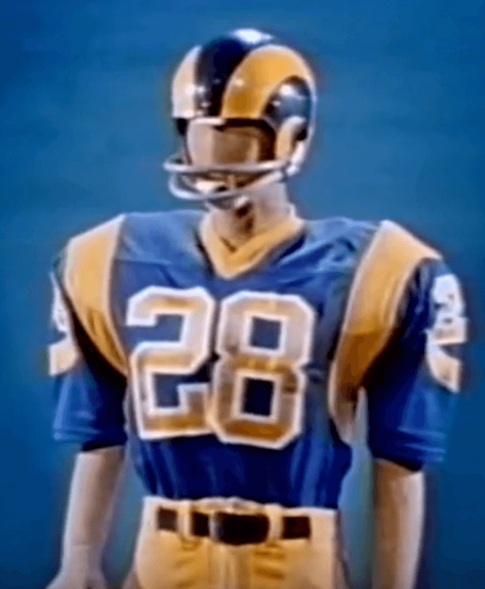
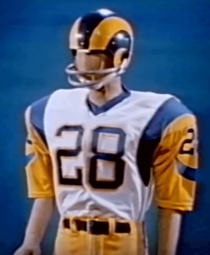
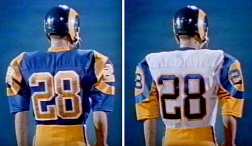
As you can see, the front, back, and TV numbers on the blue jersey have white outlining, and the front and back numbers on the white jersey have yellow outlining (but the TV numbers do not). All of that outlining had been scrapped by the time the Rams took the field for the start of the 1973 regular season.
But here’s an important asterisk: A version of the blue jersey with the white-outlined numbers was worn during the 1973 preseason, as shown in the Gridiron Uniform Database’s entry for the ’73 Rams (click to enlarge):
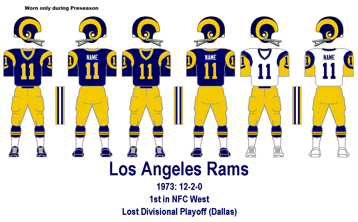
I hadn’t seen a photo of that preseason uniform until about a month ago, when the following item showed up in a weekend Ticker (click to enlarge):

That screen shot is from this short video clip about former Rams great Tom Mack. But if you compare the prototype shown at at the end of the ’72 highlight film with the preseason jersey Mack is wearing, there’s a difference: The early prototype included white outlining on the TV numbers, while Mack’s preseason jersey did not. (The GUD graphic properly shows the preseason TV numbers without any outlining.) So they had already made one change between the proto and the preseason, and they made another between the preseason and regular season.
Meanwhile, what about the white jersey with the yellow-outlined numbers? Was it worn during the 1973 preseason as well? The white jersey isn’t shown in the Gridiron Uniform Database, but is that because the GUD guys are certain it was never worn, or do they simply not have any evidence one way or the other? So I checked with the GUD guys, who checked their photo files. Their conclusion: The white jersey with the yellow-outlined numbers — the one shown at the conclusion of the 1972 highlight video — was never worn on the field. Not in the preseason, not in the regular season, not ever.
Hmmm, so what happened to the prototype jerseys shown in the ’72 highlight video? There’s a holy grail for all you jersey collectors out there.
One footnote to all of this: At various points in the ’72 highlight video, you can see the Rams’ midfield logo — a single-bar helmet graphic. The thing is, it shows the helmet with yellow horns, even though the Rams were still wearing white horns in 1972:
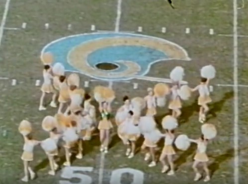
Maybe we’ve covered this before and I just don’t remember, but I find it odd that the midfield graphic showed a blue/gold helmet, even though the team was still wearing a blue/white helmet. Does anyone know more about this?
Update: I wrote this entry late last week and had kept it in reserve. Last night, as I was preparing it for today’s post, I learned that another site, Pro Football Journal, had just done a post on the exact same topic. If you want to see their take, look here. (And as an aside, the guy who runs that site, John Turney, has also done some very nice colorizations.)
LAST CALL: Today is the final day to order the first Uni Watch T-Shirt Club design of 2016, which is available here. If you still haven’t seen it, here’s the design, including a close-up of the jock tag graphic (for all of these, you can click to enlarge):
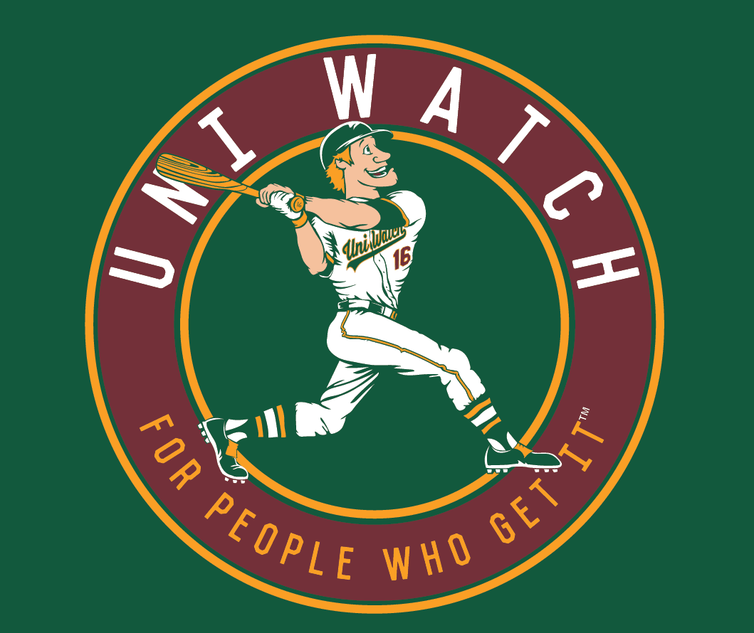
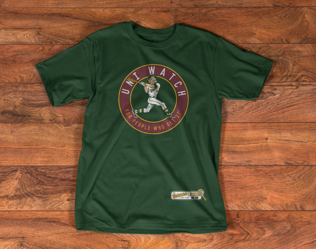
The Uni Watch ballplayer shown on the shirt is intended to evoke a time when sports graphics and mascots were built around fun, not ferocity. And as you can see, he totally Gets Itâ„¢ when it comes to wearing his uniform, with lots of old-school details like a flapless batting helmet, one batting glove, picture-perfect stirrups, and more.
The shirt is available here until 11pm Eastern tonight. For further info on how the T-Shirt Club will work this year, click here. Thanks for your consideration.
The Ticker
By Paul

Baseball News: Here’s more of our own Phil Hecken and Jim VIlk talking uniforms on Sully’s Baseball Podcast. ”¦ New jerseys for East Carolina (from Michael Grubb). ”¦ The Eugene Emeralds have some sort of cartoon jersey (thanks, Phil). ”¦ GOP presidential candidate Marco Rubio apparently perspires a lot, which reminded me of one of my favorite MLB factoids: Yankees great Whitey Ford could only sweat on one side of his body toward the end of his career. It’s true! Here, see for yourself. Additional citations here. ”¦ No surprise, but this item confirms that the Red Sox will wear green jerseys for St. Paddy’s Day. ”¦ New shoes for Southern Mississippi (from Connor McElhenney). ”¦ New uniforms for the New Britain Bees (from Kevin Fleming). ”¦ I think we might have to break out the Uni Watch magnifying glass to see the teeny-tiny chest lettering on Virginia Tech’s new grey jerseys (from Andrew Cosentino). ”¦ Here’s a fairly detailed look at Auburn’s new softball uniforms.

NFL News: Anyone who breaks the Scouting Combine’s 40-yard-dash record will get a $1 million bonus — if he’s wearing Adidas shoes (thanks, Brinke). ”¦ Great video of former Rams RB Eric Dickerson suffering a seriously torn jersey. Also, note the Adidas stripes drawn onto his spatting tape (from @RNs_Funhouse). ”¦ Here’s a look at the Vikings’ new stadium under construction (thanks, Brinke). ”¦ The Patriots’ website has posted a story on the evolution of the team’s logos and uniforms (thanks, Phil).
College Football News: Here’s a slideshow of 10 proposed alternate uniforms for Tennessee. “None is exceptionally garish, and most are based on historic uniforms the Vols have worn, some of which I didn’t even know existed!” says Adam Spangler. ”¦ Big feature story on Oregon’s equipment manager. Haven’t had a chance to give it more than a quick skim, but it looks promising (thanks, Phil).

Hockey News: I was doing some North Stars research yesterday and came across this page, which among other things indicates that the team wore NOBs from 1972 through 1975, but only for televised games. Is that accurate? Have we ever discussed it before? I did some quick photo research and couldn’t turn up anything showing the team wearing NOBs during this period (although that doesn’t prove anything), and NHLuniforms.com shows the team going NNOB during those years (ditto), although this page does show two NOB’d jerseys purported to be 1974-75 gamers. Anyone know more? Did any other team use TV-only NOBs? On the one hand it makes sense, because NOBs are useless in a non-televised game. But it also means having an extra set of jerseys. Hmmmm. ”¦ We’ve run several photos of Dion Phaneuf’s gloves Leafs-turned-Sens gloves in recent days. Here’s a whole article on that subject (from Jeff Bryniarski). ”¦Denver’s “Battle on Blake” uni looks as good as we’d been led to believe. ”¦ Sabres C Jack Eichel was missing the “1” on his helmet last night. ”¦ Cleveland Barons throwbacks this weekend for the Lake Erie Monsters (thanks, Phil). ”¦ The Devils wore their green-trimmed throwbacks last night, and goalie Cory Schneider had green accents on his mask and pads (from Wade Heidt).

NBA News: Cavs beat reporter Chris Haynes is reporting that most teams at last Sunday’s owners meeting were in favor of ads on jersey. Disappointing. ”¦ Here’s a look at the Mavs’ record and stats as broken down by uniform (from Drew Solka). ”¦ The Hornets are already selling merch for next season’s All-Star Game.

College Hoops News: Very nice retro-style Black History Month uniforms for Kansas. ”¦ Speaking of BHM designs, Nebraska will once again wear these awesome throwbacks tonight (from Pat Norris). ”¦ Grey throwbacks last night for Ohio State. Or at least that’s what the tweet says. Did OSU really wear grey in the past? ”¦ Man, in 1979 — not really that long ago — there was a college women’s team that wore skirts and polo shirts! (From @mjpull47.) ”¦ The 1983 Connersville (Ind.) Spartans captured the state championship while wearing these very Marquette-ish untucked uniforms (from Marc Viquez).

Soccer News: The Fort Worth Vaqueros are the latest team to conduct a jersey design contest (thanks, Phil). ”¦ New second kit for the Houston Dynamo.

Grab Bag: Awesome, bordering on heroic: an entire website devoted to spotting upside-down Ns (big thanks to Eric Bangeman). ”¦ Check this out: a wooden bike helmet. ”¦ Three F1 drivers have new helmets. ”¦ New logo for the South Dakota State Lottery. ”¦ The U. of Tulsa is leaving Nike and has inked an eight-year deal with Adidas (from Steve Braun). ”¦ There’s been a lot of buzz of a photo that Adidas posted to Instagram on Valentine’s Day, which appeared to show — or at least imply — two women kissing (from the Tugboat Captain). ”¦ Here’s the logo for L.A.’s 2024 Olympic bid (from @OMGaPolarBear).
Click to enlarge

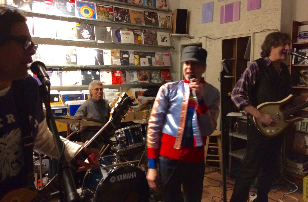
What Paul did last night yesterday: The completely awesome 1970s Long Island power pop band Milk ’N’ Cookies have been enjoying an unlikely career renaissance in recent years. Circumstance has kept me from seeing their NYC shows in recent years (one time I was out of town, another time I couldn’t get to the club because of a blizzard, blah-blah-blah), but last night they played a free in-store set at Other Music to promote their new box set retrospective, and there was no way I was gonna miss that.
Milk ‘N’ Cookies still play their 1970s material, which shouldn’t really work, because the band members are now middle-aged and the songs are all about teenage suburban angst (girls, high school, parents, girls, making out on the sofa, did I mention girls?). If the band had been playing these for 40 years straight, it might seem pathetic. But they had been broken up for about 25 years before recently reuniting, and they’re visibly psyched to be playing again. But not as psyched as I was to see them last night.
Here are a few of their best tunes:
Typo in the “What Paul Did” section: “one time I WAS out of town”
Fixed.
STILL like the blue and white Rams the best…
Agreed. Those unis would really pop on the glitzy, overly busy TV screens of today, imho.
NHL NOB’s for tv was indeed a thing. That’s how the Philly Flyers got their quirk! They had white name bars on their white jerseys and no names on the orange, but at the last minute, they were on tv, so they ripped off the name bars off the whites and slapped them on the oranges.
Was just about to write about this. Completely reasonable to think that the North Stars also had TV-only NOBs.
Yes, I agree it’s “reasonable to think” that. But I’m not asking if it’s reasonable; I’m asking if anyone can confirm that it actually happened.
Mike Engle, about the Flyers: I’m aware of that example, but I thought it was just in the 1974 playoffs. Am I mistaken about that?
This site states it was for the entire season during ‘NBC Game of the week’ telecasts.
link
This picture shows that it was not just a ’74 playoffs thing.
Good info — thank you!
It was definitely an NBC game of the week thing, I remember living in Montreal at the time, there was some rumblings in the local press that a US network could have the audacity to make the Canadiens have NOB’s, keep in mind the Habs were, and more or less still are, considered the equivalent of the Yankees, would an Network make the Yankees have NOB’s?
Even more corroboration, from Jeff Barak:
The Cleveland Barons initially resisted NOB’s for fear of sabotaging program sales, but for national television, they had NOB’s for that one game only at the network’s insistence.
link
(T)here was some rumblings in the local press that a US network could have the audacity to make the Canadiens have NOB’s…would an Network make the Yankees have NOB’s?
An exercise in the balance of power, if you ask me. If hockey is king in Canada, it’s had to fight for its legitimacy in America. The Yankees might have more leverage to strongarm a television network, given baseball’s standing in its native country. I’m pretty sure the Yanks would have laughed had it been a Canadian network. It would boil down to how anxious the league was for exposure in a new territory.
Not only the Flyers, but there was a quirk for the Toronto Maple Leafs. The GM didn’t want to lose money on program sales, so for the NBC games, he instructed the uniform people to put white letters on the white home uniform.
It fit the contractual obligation to NBC to have name on back. Just didn’t say that it had to be of a contrasting color. (Or “colour” if you’re from Ontario.)
Not the GM, but the president, the late Harold Ballard.
Memories, I had forgotten that.
I was thinking a little bit more about this. Two thoughts, back then, NOB’s was a cool new uni trend, at the same time I mention media grumblings in Montreal, I remember among my friends, we were excited to see the Habs with NOB’s
I’m not completely convinced NBC asked for it from the start of their contract, something makes me think it was a few years into their contract, I could easily be wrong.
link
The narrator sure sounds like Dick Enberg.
Oh My!
The narrator was Dick Enberg. He was the Rams radio PBP announcer and narrated the Rams highlight films until he started doing PBP for NBC on NFL games in 1977. John Facenda took over the Rams highlight film in ’77.
That Milk ‘N’ Cookies pic: The guitarist on the left appears to be wearing an awesome retro Detroit Lions t-shirt! Did you get any more pics that show more of that shirt?
You know, I was standing right next to him for the entire set and that didn’t even register with me. Unfortunately, he was poorly lit and his guitar obscured most of the shirt — I didn’t get any better shots of him.
Ohio State wore gray unis in the early 90s when Jim Jackson was there.
link
Yep. That’s the uniform (and player) that immediately comes to mind when I think of Ohio State basketball.
And c’mon, whoever designed those throwbacks, why did you have to fuck with the shorts and go with the block O on the side, rather than the Buckeyes wordmark?
Paul…the Rams’ owner was ‘Carroll Rosenbloom’. As a Baltimore Colt fan I’m all too aware of him. He ‘swapped’ them for the Rams who were owned by that drunk bastard Robert Irsay. And the rest is well, tragedy.
Fixed.
Paul- Typo in the Milk ‘N’ Cookies piece: reads “If the band had been playing these for 40 years straight, it might seem pathetic.”
Should read: “If the band had been playing these for 40 years straight, it might seem AWESOME.”
Well, I did say “might.”
That’s a pretty high-end reveal for new uniforms for the early 70s! As a Rams fan I like the blue/yellow more than the blue/white but like both more than the navy/gold.
Much more than you were looking for about the North Stars:
First, looking at nhluniforms.com for 1972-73, six teams wore NOB at home, while none did on the road. Same in 73-74; the expansion Capitals also wore home NOBs in 74-75.
Second, all teams wore NOB for nationally televised games. (Beyond whatever documentation is cited above, I remember this.)
Third, if teams left room to pop a name on top, they wouldn’t need another set of sweaters. As others said, the Flyers would just use home nameplates on the road for national games, hence the white on the orange sweaters.
Looking at what the North Stars wore against the Penguins in the Pittsburgh Press and Post-Gazette:
11/15/72(Pgh) No NOB.
2/3/73(Pgh) No NOB.
2/4/73(Min) Can’t tell. (photo without good look at back)
3/4/73(Pgh) Can’t tell.
3/7/73(Min) No photo.
10/17/73(Min) No photo.
11/13/73(Pgh) No NOB.
1/2/74(Min) No photo.
3/23/74(Min) No photo.
3/27/74(Pgh) No NOB.
10/9/74(Min) Can’t tell.
12/21/74(Min) No photo.
1/2/75(Pgh) No NOB.
3/30/75(Pgh) Can’t tell.
That fits what I remember from watching the Blues when I lived in St. Louis in the mid- to late 70s. I hadn’t lived in an NHL market before and had seen almost no games, so I don’t know what they did before, but when I was there from ’75-’78 the Blues wore NOB at home, NNOB on the road. I recall that was a league-wide standard but that’s just from memory, I could be wrong.
I assumed it was to maximize program sales; fans knew who the home players were anyway but would be more likely to buy a program if the road team was NNOB.
If you look really hard around the 0:35 second mark of that Mack video where he is pass blocking in warm-ups, it looks like he is wearing one of those prototype jerseys. I wonder if that shot was taken from a preseason game.
“Or at least that’s what the tweet says. Did OSU really wear grey in the past?”
Yes, I remember Ohio State wearing gray uniforms late ’80s and/or early ’90s. Here is Chris Jent against Juwan Howard and Michigan.
link
While I can’t speak to the North Stars’ use (or lack thereof) of NOBs in the 1970s, I do have some more general thoughts – opinions, really – about their uniform history.
1. I feel that the 1975-78 uniform set doesn’t get enough love. The stripe pattern is fairly unique; the only other NHL team to use stripes like that is the current Winnipeg Jets.
2. I’ve always liked that the black outlines on the logos and numbers on the 1981-91 uniforms were done entirely with stitching, and not as a separate layer of twill. It’s a nice little quirk.
3. I’ve always liked Minnesota’s link. Although the “1967-1991” part bugs me (should’ve been 1967-1992), I do like that it depicts a face-off between Bill Goldsworthy and Mike Modano. Pretty sure it’s the only case in NHL history, if not of all the majors, of an active player wearing a depiction of himself somewhere on his uniform.
4. I just find it odd that the 1991-92 white jersey had thin green trim separating the black shoulder/sleeve stripe from the white body, while the 1992-93 version had a thick stripe that carried over to the Dallas version.
Didn’t the 1991 uniforms start out with the numerals in that Crillee font, matching the players’ names, only to be hastily replaced when nobody could read them?
Also, (pedantic) italicizing the “N” in their insignia unwittingly made it point northeast. (/pedantic)
Correct on the font. Though, the double-outline could also have been a contributing factor.
I never really cared much for three-color or double-outline NOBs, as they generally don’t look as good (or as legible) as plain single-color NOBs, or two-color (single-outline) NOBs for that matter.
Agreed. Three-color numbers fall into the category of something you ought not to do simply because you can.
Agree on the 76 – 79 uni set. Very under-rated, and when Winnipeg came up with their unis, I was thinking finally someone is copying it (I doubt it had any real influence, but nice to think). It probably suffered from it being associated with a very bleak period in North Star history.
I can see why the Rams demurred on the two-color numbers; there was too much crowding around the ram’s horn. But I wonder why they went away from the tackle twill.
Probably as a cost-cutting measure.
Interesting that the 49ers had no sleeve stripes in the first game vs. the Rams in 1972, but had them for the second game. The gold horn helmet was painted at the 50 for the last game of the season only, probably because that’s when they announced the new unis.
Whitey Ford sure was sweating on both sides of his body in link with Jon Matlack from spring training of 1973.
Hi Paul, random question: have the Mets ditched the camo jerseys?
Yes.
Carroll Rosenbloom…not Rosenblum.
Ugh — fixed.
Am I missing something? Because I’m really not seeing any correlation between Black History Month and breaking out throwback uniforms. Except, sad to say, as a crass marketing ploy.
I was surprised to find out, sometime in the internet age, that the Rams went from blue/yellow back to blue/white. I grew up after the switch back to blue/yellow, which I always saw them wear on TV.
STudy question: Has that been a thing with many other NFL or NBA teams going into the “color TV” era, getting fewer colors and details rather than more?
I’m not a huge NBA fan, but the Brooklyn Nets come to mind …
Yeah, given the incredible assortment of looks the Nets have gone thru, the back to basics B&W does something good on them.
Do you maniacs really edit each line of this blog and point out typos and minor errors? Paul – how could you put up with this nonsense every day? People should just be happy there is a fun uniform blog out there. ugh.
I don’t think anyone is looking to “edit” the site. They simply read the site and spot errors. And I’m fine with people pointing out those errors — I really appreciate it, in fact — because I want the content to be as clean and accurate as possible.
The blog is often about rather small details in athletics aesthetics, for example the use of the gold ram horns on the midfield graphic while the home team wore the same element in white. To ignore details in writing about those details would be hypocritical to the point of reducing Mr. Lukas’ credibility. /maniacmode
I agree, that gets irritating pretty quick
That midfield painting is such a mystery. Plus the colors aren’t really the same as what the helmet would eventually look like. The painting has a very light blue. This may sound crazy, but is there any chance they painted the midfield logo like that after a game or in the offseason and shot the cheerleaders around it for the sake of the promo video?
I saw the blue-/yellow helmet pained on the field in a clip against the Lions. That was the last game of the season, after USC and UCLA finished their seasons. Possibly the new colors were revealed before the end of the season and they used it as promotion for the new era.
I didn’t know that the yellow numbers had to have a dark edge. The one thing that jumped out at me was how close the Rams with outlined numbers looked like the Chargers. The single-colored numbers made them more unique.
“If the band had been playing these for 40 years straight, it might seem pathetic.”
Seems to work for the Stones. Oh wait, they ARE pathetic.
As I’ve written here before, the Stones are an oldies act. So are Milk ’N’ Cookies. There’s absolutely nothing wrong with being an oldies act.
There’s also nothing wrong with grown adults writing/playing/singing songs about teen-agers (that’s pretty much Chuck Berry’s entire career), but it takes a certain panache to do it in your mid- to late 50s. Milk ’N’ Cookies pulled it off last night.
The Stones are not pathetic – in fact, they still sound great and still manage to attract huge crowds.
What is pathetic is the idea that a musician suddenly sucks when he or she reaches a certain age. Often times, in fact, they improve with age – they may lose some youthful energy but play with more nuance and soul.
The Stones are not pathetic — in fact, they still sound great and still manage to attract huge crowds.
Attracting huge crowds is barometer of popularity and celebrity, not quality. Lots of really awful performers attract huge crowds.
I’m not saying the Stones are pathetic. But I’m saying their popularity as a touring act has no bearing on that question.
Well, “quality” is strictly a matter of opinion, but their popularity as both a touring and recording act does indicate that a ton of people enjoy their music – and have for decades.
“Did OSU really wear grey in the past?”
As others have pointed out, yes they did. But never GFGS — grey is a school color for OSU.
Well, it’s actually link, but whatever.
Feel free to disagree (after all, I am not the arbiter of taste) but I dislike the blue+white Rams’ uniforms. Not so much for the lack of color, but that the graphics are too close to the Minnesota Vikings’ suits from that era. The use of cuff stripes on the dark jerseys vs. shoulder stripes on the white ones is disconcerting, though I don’t know who came first. If any team can claim a right to wear the UCLA stripes home & away (well, apart from UCLA) it’s the Rams. They match the helmet.
I agree completely. The blue/white Rams uniforms do nothing for me, as opposed to the blue/gold which I feel like are one of the best looks the NFL has ever had.
I’m glad we had a discussion of the North Stars today. Their loss and the move of the Seattle Supersonics deprived us of a pair of green & gold teams. I’m cautiously hopeful if the NHL expands to Seattle, they’ll use that color scheme.
Re: ODU vs. Edinboro.
Because many colleges failed to fund women’s sports programs at the same level as men, basketball teams like those at Edinboro had to use their field hockey uniforms for all three sports — kilts, polo shirts, the lot.
And if you watch the Mighty Macs movie, you’d see the same thing: the white dress shirts and blue pinafores that Immaculata College wore for hoops was the same uniform worn for field hockey and lacrosse at the school.
I’m gonna just go ahead and guess that the new St Patrick’s Day jerseys for the Red Sox,and whoever else joins them in wearing green,will be getting updated to the FlexBase style?
If I remember correctly, for games on national tv for the NHL in that time frame the players name was on the back of jerseys…..a league wide requirement
I love Milk ‘N’ Cookies. Really under appreciated band.
That Eugene Emeralds “cartoon” jersey appears to be a reference to The Simpsons with the Springfield sign done up like the famous Hollywood sign. Plus, the #1 on the back is done with pink doughnut frosting and sprinkles a la Homer’s favorite work-time snack.
Worst band name ever? Milk ‘n’ Cookies. Hands down.