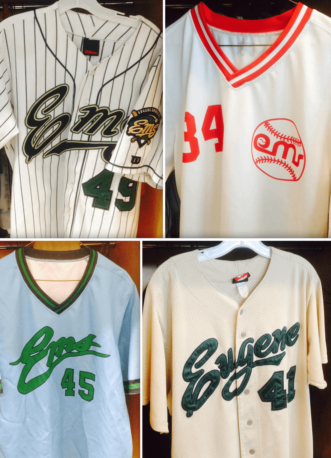
Click to enlarge
As noted in yesterday’s Ticker, Civic Stadium in Eugene, Oregon, former home of the Eugene Emeralds, burned to the ground on Monday. The Emeralds — a short-season Class A team, currently affiliated with the Cubs — had called Civic Stadium home from 1969 through 2009, and they chose an interesting way to salute their old ballpark: They mixed and matched six different throwback jerseys from the Civic Stadium era for last night’s home game against the Tri-City Dust Devils. Four of those jerseys are shown above.
It made for an odd scene, as you can see from this video clip shot during the playing of the national anthem (if the video doesn’t embed properly for you, click here):
Tonight the @EugeneEmeralds honor Civic Stadium by wearing throwback uniforms from past Ems teams. @UniWatch @MiLB pic.twitter.com/Nij9StvRYE
— Jeff (@mindforsports) July 1, 2015
We’ve all seen players wearing non-matching attire in various all-star games and promotional exhibitions, but I’m not sure I’ve ever seen a team decked out in non-uniform uniforms for a regular season game. Can anyone come up with other examples?
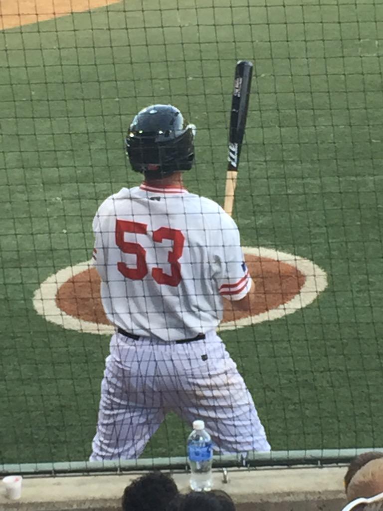
And there were other oddities. The Emeralds wore their regular white pinstriped pants, for example, which looked okay (if not great) with most of the throwback jerseys but looks pretty weird with this white one:

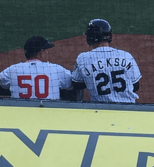
Even weirder, outfielder Ian Happ ended up wearing a jersey with a poorly executed “Jackson” NOB:

It’s not clear how the Emeralds managed to get so many throwback jerseys together for their players on such short notice. My hunch is that most of these were available for retail sale and that the team just scooped them up from their on-site pro shop. I’ll try to confirm that today.
I imagine some of you think that non-matching outfits make a mockery of the term “uniform,” but I love how the Emeralds handled this. A very nice nod to their history, and visually interesting to boot. Kudos to all involved.
(Big thanks to Angelo Di Liberto, who was at last night’s game and provided several of the photos used in this entry.)
Attention Boston readers: I’m looking for good butcher shops run by cool people in the Boston region. If you know of any, please get in touch. Thanks.

Baseball News: The Blue Jays will be wearing their annual Canada Day uniforms for this afternoon’s game against the Red Sox. ”¦ Some folks on Twitter, including the people running the Astros’ social media feed, have been tracking high-cuffed players with the hashtag #HighSocksNews. That’s a misnomer, of course, since it’s really the pants that are high, but whatever — good to have this phenomenon being tracked. ”¦ This might be the best rip-off of Jerry Dior’s MLB logo ever. ”¦ The Brewers and Pirates will both wear Negro League throwbacks on July 18 (thanks, Phil). ”¦ Angels P Hector Santiago has a massive jersey collection (from Jon Silber). ”¦ “Hump Day” uniforms today, with a camel on the jersey, for the Lehigh Valley IronPigs (from David Thomas). ”¦ My bad for not noting this earlier, but Mets OF Darrell Ceciliani, who was called up about a month ago, bats bare-handed. ”¦ @floatypunk was watching Game Five of the 1976 ALCS and noticed Yankees 3B Graig Nettles wearing an improvised shin guard. ”¦ Michigan football coach Jim Harbaugh threw out the first pitch at last night’s Tigers game. He wore a Mark Fidrych jersey and tucked it into his signature khakis (from Kyle Kruger and Jordan Mayblum, respectively). ”¦ The excellent photographer Brad Mangin has put together an excellent post on the Athletics’ excellent throwback game from last weekend. ”¦ Pirates 2B Sean Rodriguez wore a team-logo headband last night. ”¦ The Nationals are adding Calvin Coolidge as their latest racing president (from Tommy Turner).

NFL News: Looks like a retailer has leaked the Dolphins’ new throwbacks, which were scheduled to be unveiled later this month. Looks pretty good, right? (From Preston Feiler.) ”¦ Here’s a guide to which Eagles jerseys you should buy, but I’ll give you a much simpler guide: Just don’t waste your money on overpriced polyester shirts. ”¦ Here’s something I don’t recall seeing before: a Dick Butkus candy bar (from Jon Solomonson). ”¦ From a 1972 issue of Pro! magazine, here’s a good shot of kids wearing NFL uniforms. “They even nailed the mismatched purples of the Vikings’ helmet and jersey,” says Ronnie Poore. “Aside from the lame execution of the Eagles helmet wings and every outfit having white pants, it’s pretty cool.” Agreed. ”¦ The cover photo of the new issue of SI has Brett Favre in a Reebok-made Packers jersey. ”¦ “My wife and I found this great edition of Packers checkers at a thrift store,” says Luke McCarnan. “Got it home and found the Bears helmets as the opponents. Excellent find!”

College Football News: Here’s a look at the artwork that’s being installed at Virginia Tech’s new indoor practice facility (from Andrew Cosentino). ”¦ I think we may have already seen this, but here’s what appears to be a sneak peek at Miami’s new uniforms. ”¦ New uniforms for Dayton. Kind of amazing to see unveiling photos that don’t show the player howling at the moon like some sort of rabid beast, no? (From Tom Hirt.) ”¦ New gloves for Notre Dame.

NBA News: A lot of Warriors championship merch was counterfeit (thanks, Brinke). ”¦ Speaking of the Warriors, Stephen Curry now has the best-selling NBA jersey (thanks, Phil). ”¦ Stance Socks category director Tzvi Twersky (now there’s a name!) mentions me in this interview with my ESPN.com colleague Scoop Jackson. He was apparently referring to this piece that I wrote two months ago (thanks to Leon Frager for letting me know).

Soccer News: Good article on how MLS teams choose their names. ”¦ Here are the 2015 MLS All-Star jerseys (from Conrad Burry). ”¦ Beautiful new away kit for AS Roma (from Rick Olivieri). ”¦ If you buy a season ticket for Kentucky’s soccer team, you’ll get a scarf that will serve as your ticket (from Michael Owens). ”¦ When Stoke City goes on tour in Asia next month, they’ll advertise a charity rather than their usual online bookie sponsor, because gambling is banned in Singapore (from Yusuke Toyoda). ”¦ Also from Yusuke: Ajax’s new shirts have the Amsterdam city flag on the left sleeve. ”¦ Vice President Joe Biden saluted the USWNT by posing with a jersey featuring his Twitter handle (from Brian McL). ”¦ Bit of a typo at last night’s Orlando City game. ”¦ New home kit for Norwich City. Gee, ya think that ad panel is big enough? (From Richard Nethercott.)

Grab Bag: Someone out there just bought my favorite-named piece of merch, the Uni Watch Watch. That makes three whole people who’ve ordered it, wheeee! ”¦ Kudos to Nike chairman Phil Knight, who’s stepping down before he can do even more damage than he’s already done. ”¦ Absurd situation yesterday at Wimbledon, as Eugenie Bouchard was scrutinized by tournament officials for wearing a barely-visible black bra (from Bernie Langer). ”¦ Scotland has new uniforms for the Rugby World Cup (thanks, Phil). ”¦ And so does for New Zealand (from Shaun Sullivan). ”¦ NASCAR driver Jeff Gordon, who’s retiring at the end of this season, is bringing back his old rainbow paint scheme for his last race at the Bristol Motor Speedway on Aug. 22. “Gordon captured three of his four Winston Cup titles and 52 of his 92 career victories running in that paint scheme,” notes Kary Klismet. ”¦ I love cycling and I love toast, so of course I’m intrigued by this story about a pedal-powered toaster. ”¦ The next Star Trek movie will have a new Starfleet logo. ”¦ Here are some comments from players who played against high school teams that used Confederate imagery. ”¦ UFC’s long-promised (or long-threatened) Reebok outfits made their debut yesterday, and were roundly ridiculed.

Happy Canada Day to all of our Canadian readers. My friend Liz, who lives in Brooklyn but used to live in Toronto and has dual American/Canadian citizenship, will be throwing a party this evening, and I’ll be attending. If I have time, I might even make and bring a batch of butter tarts — huzzah!
A couple of typos: “Pirates 2B season Rodriguez” is actually Sean. And the tagging in the Brett Favre item is messed up.
Fixed.
That Genie Bouchard story in the ticker has been updated – she was not, in fact, penalized. The chair ump called the head referee to inquire, but they decided that it wasn’t a violation.
I’m loving that the commentators on the Norwich City Twitter unveiling are uniformly (heh) negative, all citing the giant yellow ad space block. Maybe they go back to the drawing board?
Also, I think you mean Sean Rodriguez, not season Rodriguez!
Fixed.
But why would someone wear a black bra under a white top anyway??
For attention.
It was a black bra under a white bra under a white top. It might be that she didn’t give it any thought. It could also be that, like many athletes, she’s superstitious and it has some sort of magical power.
Or her other bra was in the wash?
That Starfleet patch looks kinda sloppy for the time period it’s supposed to be from.
Soon to be directed by Kaboomination director of Fast and Furious. Because plot and storyline are useless when you blow things up… in spaaaace.
To be fair, Star Trek movies, while usually entertaining, haven’t really been too great with plot since they found a way to put Kirk and Picard in the same film, maybe even longer. I mean… what does God need with a spaceship?
The antepenultimate link in the football section is wonky.
Fixed.
The Nationals blew a perfect opportunity to go totally meta:
link
I don’t even know what “meta” means.
I fail to see the relevance here.
A decade or so ago the Vermont Expos played a Negro Leagues tribute game in which both the home team and visitors, possibly the Oneonta Tigers, both wore a variety of Negro League uniforms. The Brockton Rox used to have players wear both “Rox” and “Rocks” uniforms in the same game, though the uniforms were otherwise identical.
And in the photo with the kids in uniform, only the defending AFC championship Dolphins aren’t represented.
yeah they are. bottom row between the Cowboys and Colts.
The Dolphins are there, front row, second from the right.
Thanks for the Canada Day nod. As someone who is also a dual citizen,there will be a party in the Hudson Valley as well….for both holidays, Canadians don’t mind sharing ;)
Regarding the Emeralds uniforms, it’s minor league baseball. No one should be seriously upset about them having non-uniform uniforms. This is the kind of stuff we expect from minor league baseball. I agree. It’s a great way to tip their cap to the old stadium.
I’s probabaly more likley and acceptable at the “A” level.
“AAA”, perhaps not so much.
I like their thought on this one though.
I’m a bit surprised Harbaugh’s hat didn’t get mentioned, considering it’s a Tigers hat in Michigan colors with a block M logo on the side.
It’s actually part of a Tigers cross-promotion with link, including Michigan State, Eastern Michigan, Central Michigan, and Wayne State. Oddly enough, Michigan’s promotion night is actually the last one of the five, scheduled for link.
Yeah, but no love for the Yooper schools. A Yooper T-shirt just won’t cut it for me, eh.
No love for the west-side schools either.
you forgot my alma mater Oakland University, so I guess it’s 6. because that’s definitely included in this promotion.
strike that, it’s 5, you included Wayne St., but they don’t have one on the link you provided. Just the Golden Grizzlies, Wolverines and 3 other shrubs.
Second-to-last ad on the left crashes my browser. Help!
On it.
Didn’t the Tigers do the same thing for the last game played in Tigers stadium?
link
They didn’t wear different uniform designs. They wore numbers honoring former Tigers greats (including Gabe Kapler wearing no number, for Ty Cobb). But the jersey designs were all the same.
Not being a big NASCAR fan I figured I’d google Jeff Gordan’s paint schemes over the years. HOLY FRIJOLES!!! There are a million different ones!!
I guess maybe I shouldn’t have been surprised. I guess all drivers have a bunch.
I did notice that the font of his number never changed. Is that an important thing in NASCAR (or to its fans)– that the driver’s number and font remain constant? Just wondering. Thanks.
So long as a driver remains with the same team, the numbers tend to remain consistent even as sponsors change. It maintains a sense of continuity.
It’s not a hard rule, mind you, and sometimes a driver can change a number style while still having the same number and sponsor. A good example is link during his Valvoline sponsorship with Roush Racing. Sometime in the mid-1990s he switched from a back-swept block 6 to a forward-swept version, which was replaced with a sort of brushstroke-style 6 when they switched from the Thunderbird to the Taurus in 1998.
It used to be that one company would sponsor a car, and that car would look the same way for the whole season.
Anymore, most cars have several major sponsors from race to race, who obviously want their own colors on the car. And even a car with one sponsor (like Jimmie Johnson) will have that sponsor wanting to promote different products and whatnot throughout the season. So a consistent number font helps maintain a constant identity for the car.
Also, NASCAR owns and assigns numbers to teams each year. Generally teams keep/get the same numbers year after year. So if a driver switches teams, he gets a new number. Gordon’s entire Cup career has been with Hendricks, so he’s been able to keep the same 24.
I’m glad Heath opted to call their candy bar “Super Crunch.” I wouldn’t eat a “Butkus.”
I haven’t followed the link yet, but I wonder what colour New Zealand’s new uniforms will be. 😜😱
Dark midnight raven ebony smoky jet onyx?
Since we’re talking about rugby jerseys, doesn’t the tartan on the Scotland one look like the Campbell tartan? And aren’t the Campbells kinda disliked in Scotland?
In the highlands and with the uber-nationalists,most just see them as another clan.
Perhaps I’m biased based on my age, but that photo from PRO! of kids in NFL unis has me thinking that 1972 is the zenith of football uni design. So much greatness on display.
Sure, if you like every team using the same number font and one of 4 sleeve stripe patterns.
Better than the crap fonts (Exhibit A: Buccaneers) and the stupid “sleeve” stripes we have now.
Ok, I’ll give you the lack of sleeves today being rather annoying, but the Bucs are really the only bad font in the league. At the very least, you gotta move it up to 1984 or so to include the Bengals’ original tiger stripes and the Seahawks’ wrapping the logo around the sleeves.
“…the Bucs are really the only bad font in the league.”
o_O
Uh…sure, the Buccaneers may currently have the worst, but consider Seattle (easily runner-up), Detroit, Arizona, Miami’s new one (check out the 1s and 7s); Jacksonville’s isn’t great, and Minnesota has some strangeness. Also, New England’s is a bit lacking, but I think that it may just be due to inadequate outlining or something.
The Ravens’ current number font isn’t bad, but it’s still quite a downgrade from the awesomeness of 1996.
link
link
As for the Seahawks’ old wrap-around bird head sleeves…yeah, those were actually pretty cool.
So the dolphins are actually going to look like the dolphins. weird.
“… This might be the best rip-off of Jerry Dior’s MLB logo ever. …”
Yep.
Ehh, I wonder if it was really necessary to include the details inside the silhouette. Charlie Brown does have a bit of a distinct profile, even without the tell-tale shirt zigzag.
Without the shirt design, he could be mistaken for Bonk the caveman from the TurboGraphix 16 games. Maybe.
On Russell Martin’s Canada Day jersey the top slit for the button is in a different direction, is there a reason why?..does it hold the button tighter if so why aren’t all the slits the same way.
What’s up with button up dress shirts, why are there two buttons on each collar?..to hold them down in case of a wind storm?
Personally I avoid buying collared shirts with those unnecessary collar buttons.
American soccer fans, how could artlessly copying European naming conventions with little to no appreciation for the cultural and sociological origins of those conventions possibly make MLS more “authentic”? I’m struggling to reconcile what my brain (and dictionary) knows to be the definition of that word with this weird bastardized usage.
Can we just acknowledge that what you really mean when you say you want more European team names in MLS is that you want your shallow fetishization of an esoteric cultural import pandered to, thus vindicating your delusions of self-importance?
OK.
Lee
Do you use such condescension when describing Japanese soccer teams using Italian, Spanish, and Portuguese (for Brazil) names for their teams? Or Japanese baseball teams using exclusively English lettering on their team uniforms?
Yes.
All righty then. :-)
Fake is the new Authentic.
I can’t think of a pro team wearing non-matching SHIRTS for a game that counts, but if we consider other uniform elements, there’s a famous example. After 9/11, the Mets took to wearing caps honoring the various first responders who had served and in some cases given their lives on that fateful day. So you had some players wearing police (NYPD) caps, others fire department, EMT services, and Port Authority police.
I think they’ve sometimes returned to this on the anniversary of 9/11.
What is the meaning behind the comment, “Just don’t waste your money on overpriced polyester shirts”?
Paul’s not a polyester fan. Or a fan of wearing jerseys. Or the societal changes that have come about since buying and wearing jerseys has been a thing. And let’s face it, they can be expensive.
Yeah, Paul prefers buying vintage sweatshirts/jackets from obscure high schools in Idaho or Vermont on ebay instead of paying for a modern jersey for a sports team that he actually supports. Just ignore his advice on the topic. Buy what you freakin want to. If you want to wear a new Eagles jersey, then wear a new Eagles jersey.
They can be expensive though. I’d recommend buying the $50 counterfeit version that’s 98% accurate instead of the authentic.
They can be expensive though. I’d recommend buying the $50 counterfeit version that’s 98% accurate instead of the authentic.
In other words, The Jeff agrees with me that people shouldn’t buy overpriced polyester shirts.
To a point, yeah. There’s no real reason a glorified t-shirt with numbers on it should cost $300. But, you seem to oppose jerseys being sold at all, while I simply think they should cost less.
Even $50 seems overpriced, especially when replica gear is partly meant for fans to serve as walking billboards for teams.
/says the guy who spends $65+ on soccer jerseys with sponsor ads
He’s clearly shilling for Mitchell & Ness and their overpriced flannel shirts.
What do you mean what does he mean?
Lee
The meaning, as I’ve stated many times over many years, is that I think jersey retailing is bad for the uni-verse on multiple levels, and that we’d all be better off if jerseys weren’t available for sale, and if fans didn’t buy them.
The powder blue uniforms the Emeralds wore from their tenure as a Royals affiliate had a sponsor’s logo on the right sleeve, my guess is these were promotional uniforms that just weren’t claimed. Judging by the format of the red-trimmed uniforms (no interior tags, screen-printed logo/numbers) from their Reds affiliation, I would take a guess that these were promotional uniforms as well.
To pick a small nit, only *online* gambling is banned in Singapore. The country does have two legal casinos.
Tennessee Football unis
link
So… not that different really. They could have done so much more with the checkerboard pattern.
the alternate helmet is interesting with the rocky top design on it..
Smoky Mountain design. Rocky Top is a particular point atop one of the mountains.
I like them. Nike continues to display its new “less is more” design ethic. I just hope the Vols don’t wear the monochrome orange as their standard base look. The white pants would look so much better with the orange jersey.
They’re acceptable. The Vols have remained largely the same for decades, so no one should be surprised. I’m not a fan of the number font, nor do I care for the alternate jersey. However, while I don’t like the alts, they could have been so much worse.
What I find interesting is the basketball shorts, where the waistband and the side stripe form a T when viewed from the side.
Rayo Vallecano’s change kit. Some of the proceeds will go to various charities; the design supports seven causes for the price of one:
link
Furthering the ongoing theme this week of Northern schools using Confederate names and imagery to identify their sports teams, I found the following reference link about the influence of Neo-Confederate culture on America:
“If [the Confederacy’s] appeal were just harmless atavism, then . . . [n]o one would care when high schools, even in Northern states, name their athletic teams ‘Rebels’ and ‘Colonels’ and wave Confederate flags at football games.”
Obviously, the book and its assertions come loaded with all kinds of points for political debate, which isn’t my point here. But I do find it interesting that another author, some five years back, was contemplating the very issue that we’ve been discussing here this week.
Beware of Coolidge in the races – he maybe silent but he’s DEADLY!
Also, Like the TV Patches for Dayton from this angle (nice use of a single stripe at the bottom. I just wish they would have placed their numbers in the Patch or possibly Dayton’s Flying D there.
Well that Wisconsin Timber Rattlers is only Single-A play so it’s not like 90% of the population even knows they exist (hint: they play with the Dodgers affiliate Great Lakes Loons in the town over from me who have some wacky uniforms/combos). As for Tennessee’s set I actually like the GFGS on the basketball uni, not the football one.