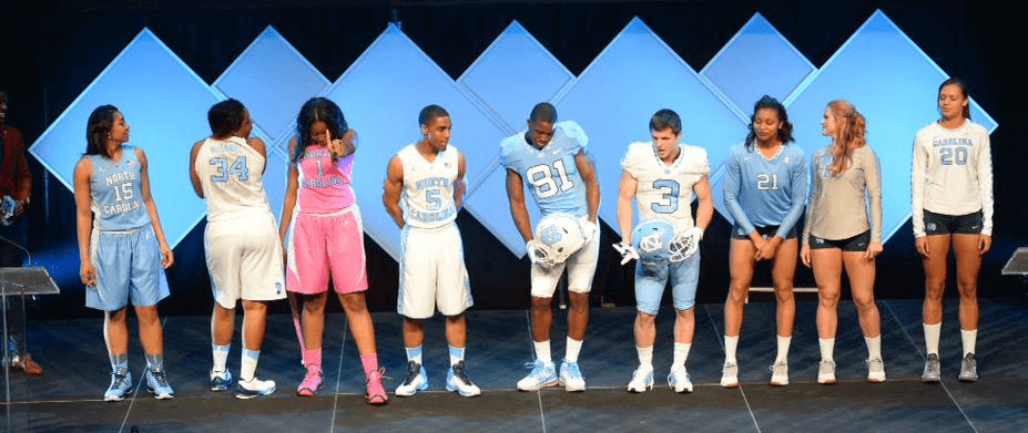
Click to enlarge
UNC debuted new uniforms last night for all 28 of its teams, with two overriding themes: argyle and Carolina blue.
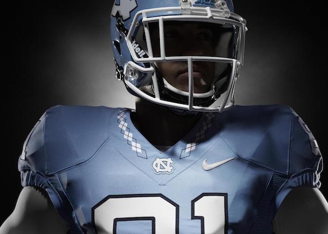
Let’s start with the football team. The good news is that the argyle looks really good on most of the jersey, pant, and helmet applications:

The bad news is that they’re sticking with the BFBS option, which feels like a huge mistake. If you’re trying so hard to honor your heritage, why go with a non-school color? Navy would’ve been better, but instead they’ll have this:
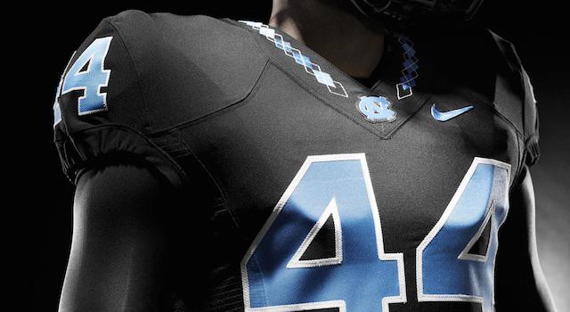

Also worth noting: No custom number font here — just traditional block numerals. Refreshing.
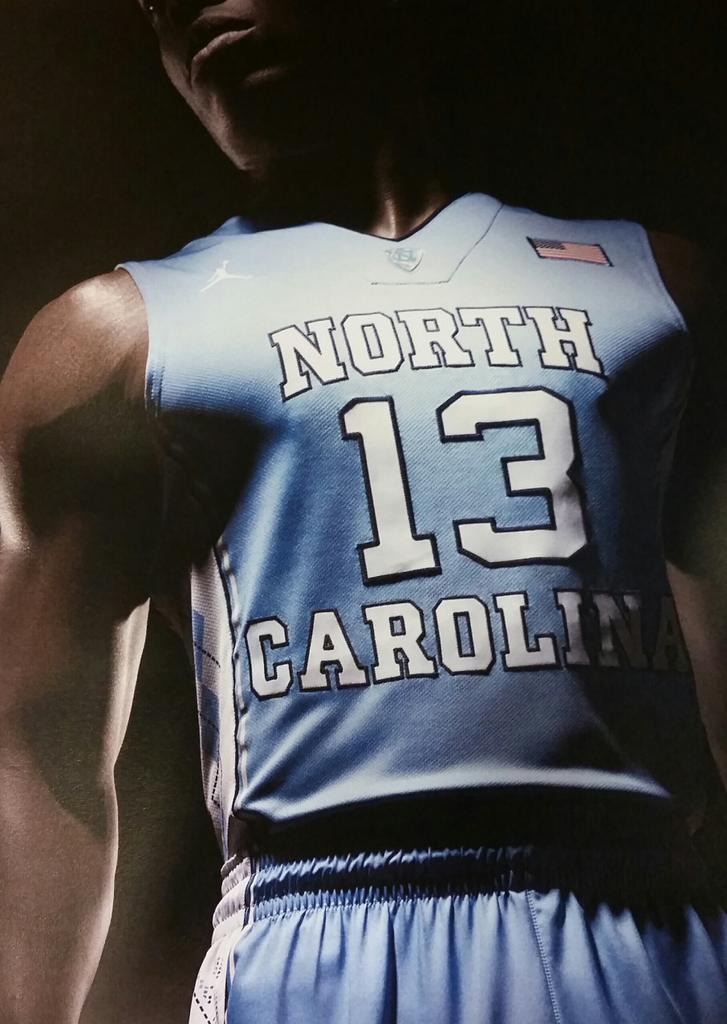
The basketball uniforms look largely unchanged, and therefore fine:
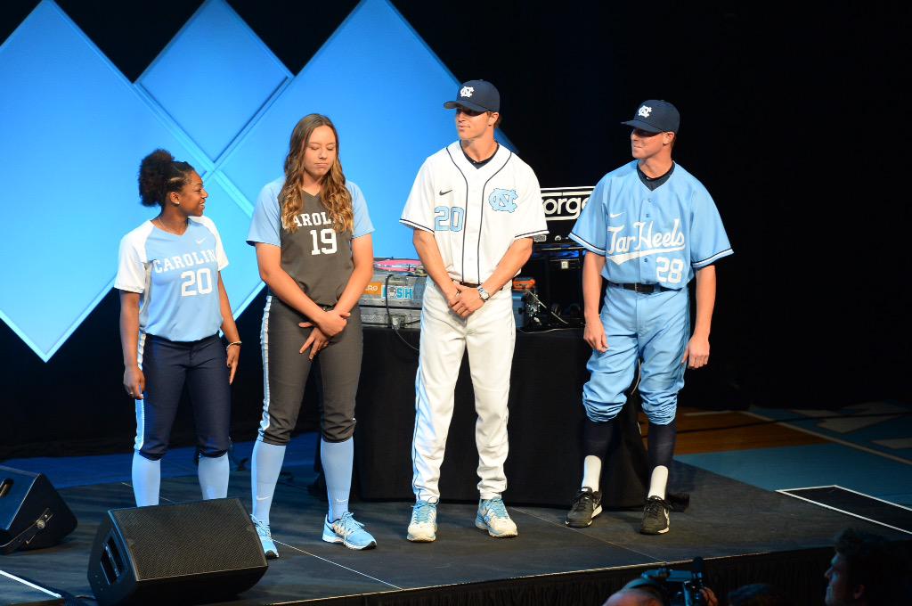
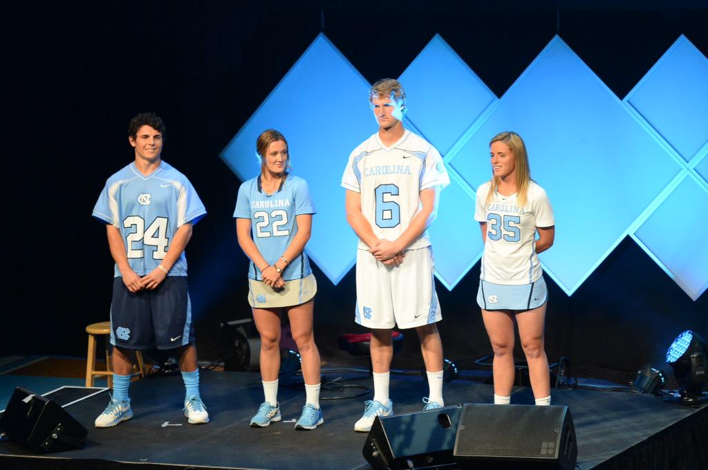
As for the teams nobody cares about the school’s other 26 teams, you can see some of their new uniforms here (click to enlarge):
<
Bonus points for the stirrups on that one ballplayer, but someone needs to teach that boy how to blouse.
Overall: Very nice job. That one BFBS football uni is the turd in the punch bowl but hey, ya can’t have everything.
Wanna see more? Here’s the athletics department’s new logo sheet and style guide (kudos to them for making those materials available), along with some additional photos.
Click to enlarge
Collector’s Corner
By Brinke Guthrie
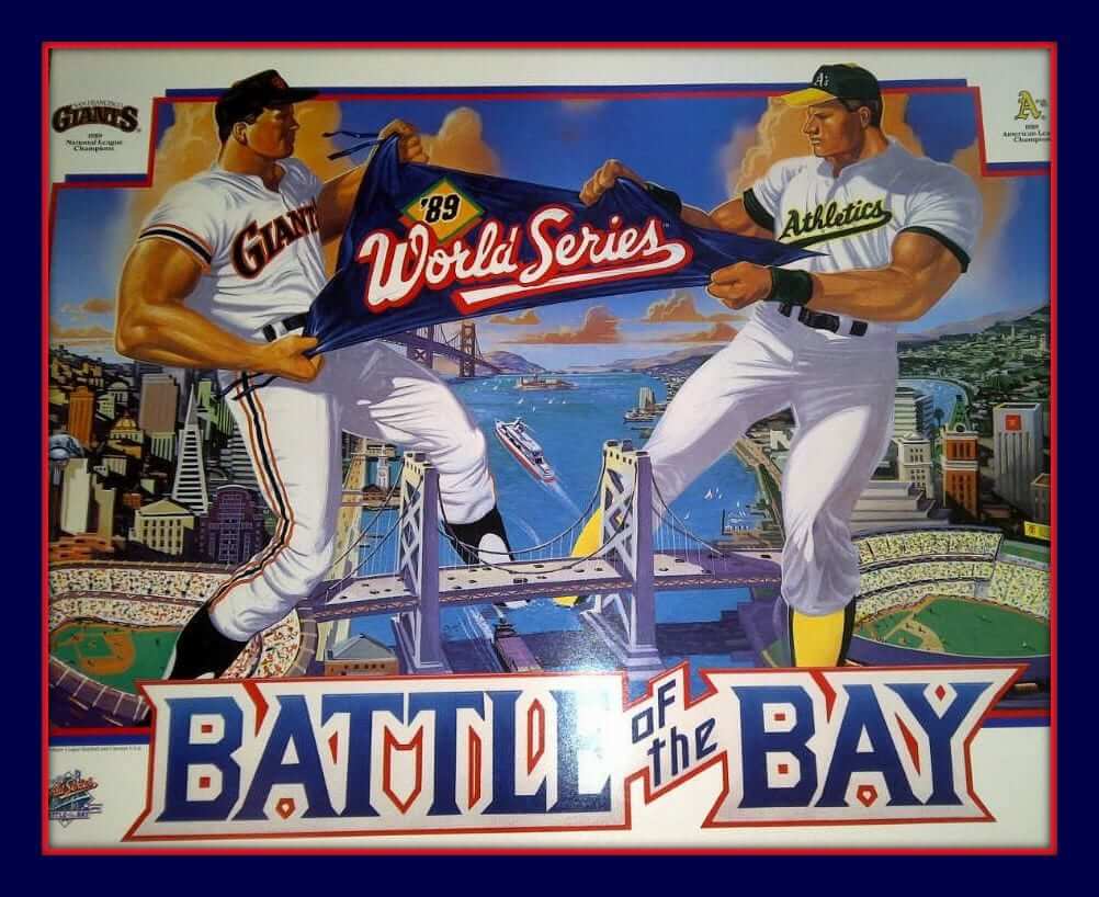
Remember the 1989 Battle of the Bay? That was the World Series with the huge earthquake. I remember exactly where I was when that happened — Reds reliever Rob Dibble and I had just finished an appearance at a “DARE” (Drug Abuse Resistance Education) event in Cincinnati’s suburban Anderson Township. We got in the station van just after 8pm Eastern, I pulled out my Sony Watchman (how quaint) to turn on the game, and it was right at that moment — “Whoa, looks like a quake!” If you want to bid on this poster, it’s up tonight.
Here are the rest of this week’s eBay picks:
• I don’t think these are Sears items, but interesting nonetheless: Notice the Vikings helmet pointed to the left on this ski cap and scarf set.
• Need a card locker to store your NHL trading cards? Here’s a 1970s version that should do the trick, from O-Pee-Chee.
• Check out this 1960s patch/pin/coin set from the Ted Williams Baseball Camp!
• Here’s a pair of 1970s WHA puzzles: Eastern Division and Western Division.
• Here’s a 1960s Cincinnati Reds pin from Crane Potato Chips. Ever seen the team’s C logo look like that?
• Obviously, this isn’t close to being an authentic Bears jersey. But what do you think about the numerals? Should they go to these? (Seems like they used them once in preseason or something.) Definitely gives the jersey a different look.
• Here’s a 1960s Original Six hockey crest to sew on your jacket.
• Dave Boss alert! Here’s a 1960s painting of the Philadelphia Eagles.
Camping out back in the day was more fun with an NHL pup tent!
• Reader TJ Zimina sent in this nameplate from a Richie Zisk jersey. One of the great surnames in MLB history, right?
Follow Brinke on Twitter: @brinkeguthrie
Uni Watch News Ticker
By Garrett McGrath

Baseball News: The Red Sox, as per their new tradition, wore their “Boston” whites and a Boston Strong patch for yesterday’s Patriots Day game (from Joe Kuras). … Here’s short profile on Washington Nationals player Clint Robinson, who’s a bat hoarder (from Tommy Turner). … Seattle Mariners player Brad Miller wore some sweet stirrups with the team’s throwback uniform. … Astros pitcher Pat Neshek wore his throwback stirrups over dark blue sannies on Sunday (from Jordan Fleck). ”¦ The Holy Cross softball team has some awesome purple uniforms (thanks, Purple Paul). … “My mother-in-law made this Brewers cake and cookies for my sister-in-law over the weekend,” says Marc-Louis Paprzyca. “She made Bernie, Hank and the fondant herself.” ”¦ Astros infielder Luis Valbuena wore some odd socks last night. Tough to be sure if the outer socks were patterned or if the pattern was showing through from an interior layer. Either way, not a good look (from Nicholas Roznovsky). ”¦ Speaking of the ’Stros, several reader noticed that Evan Gattis’s belt last night appeared to have a lot of wear and tear, which is odd considering this is his first year with the team.

NFL News: As the coach of the 49ers, Jim Harbaugh wore black on black cleats (from Michael Korczynski). ”¦ Niners OL Alex Boone, who called Harbaugh “clinically insane” yesterday, actually mentioned the cleats last September, when he had a more positive opinion of Harbaugh: “He’s a great guy. How can you not want to win for a guy that wears cleats during the game?”

College Football News: Michigan State will wear this patch for their spring game on Saturday. … Here’s a slideshow of some of the more interesting items that were available at Oregon’s surplus equipment sale (from Scott Cummings). … It appears that Virginia Tech may go color vs color for their spring game on Saturday (from Andrew Cosentino).

Hockey News: A shot of the penalty box during last night’s Penguins/Rangers game led Alan Kreit to ask, “Where do the non-Gatorade towels go? I guess they can have other kinds of bottles but only one towel brand.” … A Calgary Zoo gorilla wrapped itself in a Canucks jersey, as you can see in this cute video (from John Muir). ”¦ Last night marked the first NHL playoff game in Winnipeg since 1996, and Jets fans in revived their playoff whiteout tradition. But it made a lot more sense when teams wore white at home.

Soccer News: A semi-pro soccer player in the UK was removed from the team after he was caught having sex in the dugout while in uniform (thanks, Paul).

NBA News: The Houston Rockets are giving out red and silver T-shirts for everyone at tonight’s playoff game (from Shaymes Harden). … Someon on Reddit created an NBA playoff bracket the NBA Playoff bracket with 8-bit characters for each team (thanks, Mike). ”¦ Also from Mike: Another Redditor created some illustrations showing the NBA’s first-round playoff match-ups, and they’re pretty good! Illustrating the Nets was a challenge, though. ”¦ One more from Mike: “The NBA on TNT gang received personalized Harlem Globetrotters jerseys last night — except for Charles Barkley, who got a Washington Generals jersey.”

Grab Bag: The Japanese men’s national volleyball team has a new look (from Jeremy Brahm). … Doug Flutie was being interviewed prior to his charity run in the Boston Marathon while wearing a cap with a logo that combines the Boston’s four major pro sports franchises (from Dave Garabedian). … Under Armour is expanding their presence in Portland, Oregon, location of Nike and Adidas’ North American headquarters (thanks, Brinke). … New logo for Saint Vincent College athletics (from Jim Iovino).
Besides the by-line, how do we know that Paul did not do the ticker today?…
“…awesome purple uniforms.”
The “clinically insane” link actually gives us a picture of Astros pitcher Pat Neshek.
Yep, Rob’s right. Neshek looks pretty good, though.
I also find only modest tension between “clinically insane” and “a great guy.”
Fixed.
The black uniforms aren’t that bad to me. They almost look like business suits with argyle stylings.
the problem is they are clearly still using a dark blue across all sports including football. The black accented unis they unveiled a few years ago didn’t have staying power (they look cool to the younger generation but don’t sit well with the alumni and donors) so they are getting rid of them and going back to their actual colors. This makes it especially odd that they would stick with the BFBS for the alternate football uniforms.
In a vacuum the BFBS jersey don’t look bad per se, but when an actual color of theirs is dark blue/navy they should be using that for any alternates. BFBS is for teams that don’t have a dark color to alternate with, teams with Navy in their scheme have no business going this route.
Carolina’s baseball set isn’t half bad: link
Agreed. I like the way the Carolina blue uniforms with the script “Tar Heels” across the front have an old-school Kansas City Royals feel to them:
link
They already had uniforms with the Dodger style script “Tar Heels” [I never thought of it as Royals-style]. The blue jersey linked on twitter isn’t a real uniform, according to their press release, just an example of the new script style.
“…this isn’t close to being an authentic Bears jersey. ”
Nevermind authentic, it’s not a Bears jersey at all. It’s just a jersey.
I thought that it was just the light, but the striping actually looks red, not orange.
I have an authentic Wilson Mike Singletary jersey from the mid-80s. The orange has a distinct red tint to it (and the blue is very dark; almost black).
Ok. Yeah, I knew that the shades had varied a bit over the years, but I didn’t recall the orange ever being quite that red. The navy blue has, admittedly, been near-black in the past.
But what do you think about the numerals? Should [the Bears] go to these?
No.
I’m not a Bears fan or hater. My disinterested eye remembers when every NFL team had block numbers, except for Chicago.
That’s unique, and they own it. And having rounded numbers certainly didn’t hurt their toughness.
(I don’t know CFB from my childhood enough to say, but how widespread were block numbers in the 60s and 70s?)
I tend to agree that the Bears should stick with a rounded font, but I prefer their TV numbers. They’re not just smaller; they’re slightly different in shape:
link
link
I’ve often thought that if the TV numbers could be properly scaled up for the body of the jersey, it would make for a really nice look.
definitely an improvement from the old UNC set. Wish they would go with the All Navy uniforms instead of black.
The black on black is so beautiful. I love it!!!!
As a UNC fan I’m very pleased overall with the updates to the uniforms. I don’t care for the black either, but given all the other design elements it’s a definite improvement.
An additional bonus, the ’90s logo elements that were put out by UNC, that never became popular, are now gone.
The Rabid Ram? I don’t know of a single person who liked that.
Interlocking NC or Strutting Ramses, that’s it.
To be technical, according to the stylesheet, the UNC block font is the custom “Carolina Bold,” to give them something proprietary.
Glad to see UNC changing the number font on their basketball jerseys – I HATED the old font. The new font is a bit big for the jersey IMO, but I’ll look past it for now.
Definite upgrade. But I sure hope they got rid of the sweatback artwork. Those are just legal vandalism.
The links to the bat hoarder article and the Seattle stirrups seem to be connected. I’d like to see the stirrups.
Fixed.
UNC really didn’t put argyle on those stirrups/socks….really?!!
I’ve always thought it was a missed opportunity that argyle was never added to their hosiery. Seems like a no-brainer
UVA went color-on-color for their spring game:
link
I’m..uh…I’m gonna need some high res photos of the volleyball uniforms….for inspection purposes.
And, congratulations, you’ve just gotten yourself blocked from the site for being a dick-for-brains. Well done.
Weird text….”The Houston Rockets are putting giving out…”
Thanks. Fixed.
I had a thought about the Edmonton Oilers’ Rexall Place final season logo from yesterday. The logo contains the logo (an outdated one) of Rexall the pharmacy chain that owns the team, and obviously sponsors their arena. If it’s worn as a patch on their uniforms (which it might not be, I couldn’t find confirmation either way), is it not a backdoor way of getting advertising on to their uniforms? Even if it isn’t worn on their uniforms I’m not sure how I feel about Rexall using a special occasion logo to promote their brand.
If it’s worn as a patch on their uniforms (which it might not be, I couldn’t find confirmation either way), is it not a backdoor way of getting advertising on to their uniforms?
Yes, absolutely.
It’s happened before:
link
Wow, I wasn’t aware of that one. The Devils only did it for one night though, I wonder if the Oilers will try to get away with it for the entire season. Especially since a lot more of their games figure to be on national TV next year given whom they will be drafting in June.
Rexall isn’t just the arena name sponsor. Daryl Katz owns both the Oilers and Rexall Drugstores, so its not much of a stretch to think this might happen.
How do you put argyle on every uniform surface across two dozen sports, but not the baseball and softball socks? Yeesh.
Oh come on now Arr, that would be just too much argyle. They had to draw the line somewhere.
They need at least a stripe across the top of argyle for the beisbol and softballers. I, for one, would get a pair though I pull for ECU over UNC and NC State.
re: UNC “our blue” launch:
Minor observation: it’s interesting how both basketball and football unis (plus soccer, not shown) have gotten more form-fitting since the 90s, but lacrosse and baseball unis are still baggy.
Minor Observation part deaux:
The script on the baseball uniform “Tar Heels” looks like it was drawn with a chisel. I know that some heel will say that it is “memorable” or “traditional” but damn, ugly script is ugly script.
I would rather they use the Uni-Watch font… er the Oakland A’s font than this pre-school effort.
Secondly – Wife is an alumnus and refers to UNC now as the “Cheeters”. Suggests they wear a shame patch on their unis that states something along the lines of “20+ years of Institutional Fraud” & “Still Lousy in Football”
re: cheating scandal
As embarrassing as it was (and not to downplay the problem too much, because it is a serious problem), the 3,300 students who took the no-show classes over 18 years make up less than a percent of the entire student body (if my calculation is right). Of course, it’s not unreasonable to think they’re undercounting or that there aren’t other departments involved in cheating, but the raw number can be misleading.
Also, I’d be surprised if something similar wasn’t happening at every big time college. UNC was just sloppier than other schools, I think. The athletes aren’t there to learn – they’re there to generate revenue (the non-revenue athletes are essentially beards/red herrings that allow universities to talk about the magic of amateurism).
And like your wife, I’m partly ashamed by how little the cheating did to help the on-field product.
Also:
alumna, not alumnus
/pedant
One thing that always bothered me was the similarity of the World Series logo used from 1987-1991 to the White Sox logo of the same timeframe:
link
I do not like how the black uniforms look, but I will give them a slight pass for including them because they are the Tar Heels. Granted they are playing up the Tar theme but at least it makes a little bit of sense as opposed to stripes representing the horizon yadda yadda.
My assumptions on the Evan Gattis belt situation is that it is a belt from his days with the Braves.
My American Trench socks arrived by US Mail yesterday. They’re as comfy as they are snazzy. Highly recommended! (Now if only they’d issue them in kelly green . . . )
I went to Ted Williams baseball camp 84ish, that decal was a give away when you went home.
In 1973, the Bears wore slab serifed number fonts on their home and road jerseys.
link
I’m guessing Paul is a fan of edict 4 on page 50 of the UNC style guide: no pink (or other color) logos.
Has UNC always used that tan color I see on some of the women’s uniforms (volleyball and I think lacrosse)? Also, no comment on the pink hoops uni? Are we just accepting that every women’s program will do a pink set once or twice a season?
The link is more gray than tan. I’m guessing you need to have a contrasting jersey for the libero, though they should’ve gone with navy in that case.
The link in the promo photo and it could be the lighting, but that doesn’t explain why the jersey and the men’s shorts look white (and link in the past).
Better images of Bears 1973 jersey numerals with the block serif design. One season only.
link
UNC unis look good, but this might be one of those situations where a really nice colour scheme does most of the heavy lifting. Imagine the same look in different colours – might not work so well.
Having said that of course it’s all fair, as the design has to be assessed as a whole anyway. But I still think some colour schemes are less screwup-able than others.
this might be one of those situations where a really nice colour scheme does most of the heavy lifting. Imagine the same look in different colours — might not work so well.
This is sort of like saying, “Chocolate wouldn’t be so awesome if it didn’t taste so good,” or “The Beatles wouldn’t have been so great if they hadn’t written such good songs.”
Overall, I like North Carolina’s new uniform sets. Clean, classic designs. Considering Nike showed similar restraint in their recent Army rebrand, are we seeing a new trend from the Sultans of Swoosh?
My biggest complaint is that I feel a little hoodwinked by the “new” color palette. It seemed like Carolina was promising a return to consistency that would consolidate the program’s color scheme identity after years of haphazard use of various blues, black, and silver/grey. So what do we get with the rebrand? Various blues, black, and silvery/grey.
I appreciate the renewed emphasis on Carolina blue, but there’s still plenty of color confusion in these designs – as seen in the
anthracitecharcoaldark silvergrey softball uniforms, the black football alts, and lots of navy accessories. Would it really have been so hard to ditch the grey altogether and make a choice between navy and black and stick with it? That would have actually provided the strong brand identity it sounds like they were going for in the first place.Re: Brad Miller’s stirrups: the Mariners uniform isn’t a throwback but a new Sunday alternate with throwback colors. And yeah, it’s glorious.
I really like the UNC football jerseys. A single colour jersey with block numbers is the best compliment to Nike’s modern template and matte fabrics. They could make the NFL look old school and modern at the same time, while also making a wearable retail product. Man, do they overcomplicate things… I hope this is the start of the toning down of all teams.
UNC grad here. A few thoughts:
– A fellow fan floated the theory that the Heels’ godawful football uniforms of the past might have been a plot to make the future release of the argyle uniforms seem better when it did happen. A bit farfetched, but when you look at the Heels’ recent uniforms, can anybody say they looked good?
– The argyle has always been a point of contention among UNC fans – most liked it on the basketball unis at least, but many have said it should not be associated with the football program at all – too “wimpy” since argyle has long been associated with dandy/preppy types. Will be interesting to see if the argyle is still on the football unis in five years.
– Another case where I halfway agree with Paul is that we really could have lived without the black uniform set. On the other hand, if you’re viewing the black unis on aesthetic instead of philosophical concerns, it’s hard to deny that Carolina blue is one color that looks really good against a black background. Also, since argyle is not usually seen against black, it almost looks like a totally new pattern.
– Overall, this Tar Heel gives the new package an A-. While I like the idea of a constant look across teams, the basketball jersey doesn’t look quite in proportion even though I do prefer the block font over the previous custom. They have time to tweak that, however.
In 1973, the Bears wore slab serifed number fonts on their home and road jerseys.
Only on the road. Not at home.
I think what Luis Valbuena was wearing was the Jordan All Season Compression VII just in a team colour.
link
I’m not sure I’d call the black uni “BFBS” in this case. No idea if black is an official UNC color, but they’ve had that black circle on the heel logo for a long time and have used black trim before. Kinda makes it a school color in my eyes. I also agree that the black jersey with a blue helmet and pants would look pretty good (assuming they have a blue set of pants).
Your logic isn’t necessarily invalid, but if the consensus here is that even the Chicago Bulls’ black alternate is BFBS, then the Tar Heels’ black-on-black is *definitely* BFBS.
When the black trim uniforms came out last year, Coach Fedora said it was to draw upon the “tar” in Tar Heels and that the football student section was called the “Tar Pit”.
Also, there are supposedly navy and grey football uniforms in the works as well.
Another UNC alum here and I agree with the A- grade.
LOVE: the return of Carolina blue and white as the main colors; eliminating the Rabis Ram and bringing back the Strutting Ram; the argyle on everything; no over-the-top proprietary Nike fonts or wordmarks.
DON’T LOVE: the BFBS (would prefer navy) but the tar on the heel is black so I can live with it.
I’m a bit behind in my uni-watch reading, sadly, so quick question… any word on why the Washington Capitals are wearing their throwback alternates for their playoff away games? Seems odd…
They announced the other day that they’d be doing it throughout the playoffs. No specific reason given (although I’d say “It’s our best-looking uniform” would be a good one).
Agreed, thanks for the 411… obvs not my team, but it kept popping up in highlights and had me curious.
Brewers are so terrible they’re wearing their spring training unis tonight
Awful, as if the Brewers needed another jersey to wear. The BP/ spring training jerseys really have no place in a regular season game.
As a Carolina alumnus & lifelong Heels fan, I’m just glad that we are getting back to “classic” looks & logos. This whole episode was so overhyped by the athletic department. I am wondering if the administration at the school told Nike to tone down some of what they had been doing. I don’t believe Nike was responsible for the Rabid Ram or the terrible font that showed up 15 years or so ago, but we have had an oddly designed interlocking NC logo on football helmets & some baseball gear (Nike designed) for the last few years. The deformed foot with a Star of David tar splotch was hanging around for a while & it actually made it onto the chrome football helmets. Time to clean things up… & they did.
OK–coming late to this discussion, but…
I still miss the way the argyle was originally deployed. When the argyle basketball uniforms were new, the strip with the pattern was a white background with blue diamonds/lines on BOTH the home (white) and road (blue) uniforms. That made the whites more completely white.
At some point in the mid to late 1990s they switched to having the argyle strip always be the reverse of the uniform–blue background with the white uniforms, white background with the blue uniforms.
I think a lot of the new uniforms would look better with that principle–if the blue FB jersey had a white collar with blue argyle on it, or if the FB helmet stripe was white with blue argyle.
The link to the hockey card locker states that the item is a “1960s-1970s OPC Card Locker Box NHL” and in the “Era” category in Item Specifics lists “Vintage (Pre-1970).” I was just wondering how this could be true when the “inside” of the locker has individual team names printed on it (supposedly to divide the cards by team) and the Washington Capitals, Atlanta Flames, New York Islanders, Colorado Rockies and Vancouver Canucks are listed. None of these teams were in existence in the ’60s. Not to mention the California Golden Seals, who were in existence in the late ’60s, were omitted. After a little research, I think I pinpointed the intended season to use this particular locker to be 1978-79 as all the teams printed on the locker match up with all the teams the NHL had in that season only. No more, no less. The seller seems to be misrepresenting his product a bit…I’m guessing unintentionally? He should lower his price for it…lol.