On Friday I posted some Clippers leaks. That prompted a new source to come forward with some additional materials connected to the team’s upcoming redesign.
As you’ll recall, the images I posted on Friday appeared to be from a rebranding proposal prepared by a design firm. I’ve now acquired that entire proposal. Here it is (for all of today’s images, you can click to enlarge):


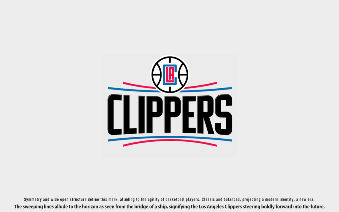
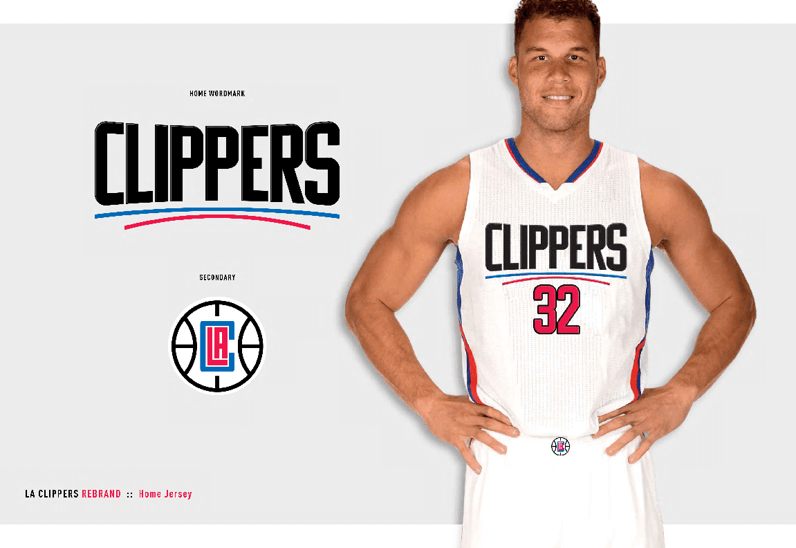
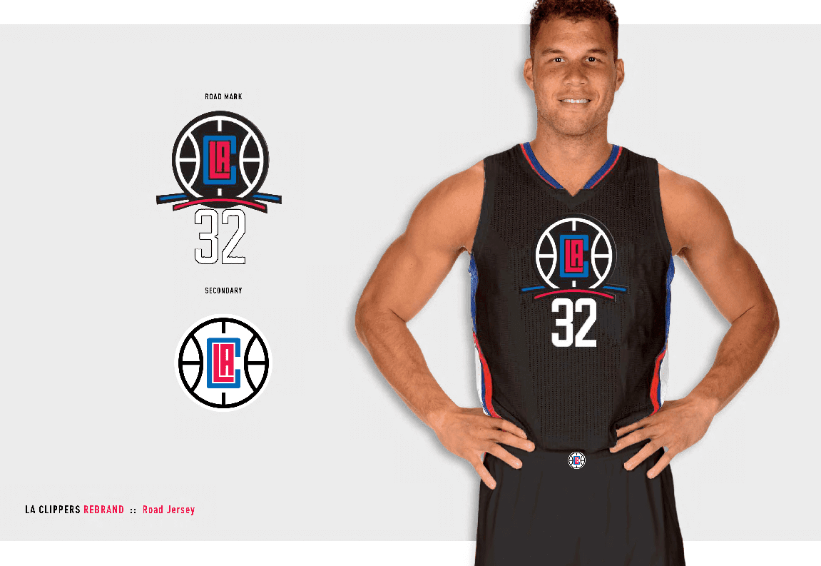
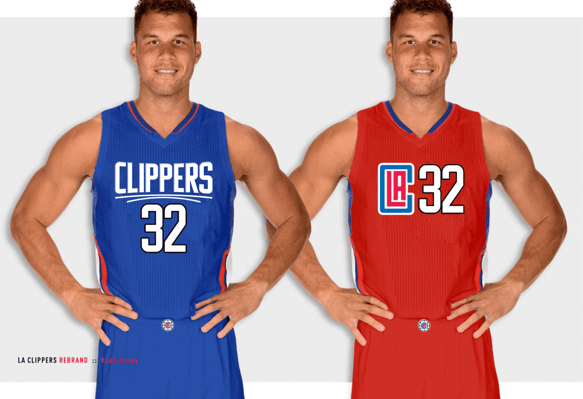
Now, you might be saying, “Okay, so somebody proposed this design. But are the Clippers really using it?” Several different sources have confirmed to me that they are. And one of those sources came up with something more official than the design proposal: the team’s new logo style sheet. Take a look:
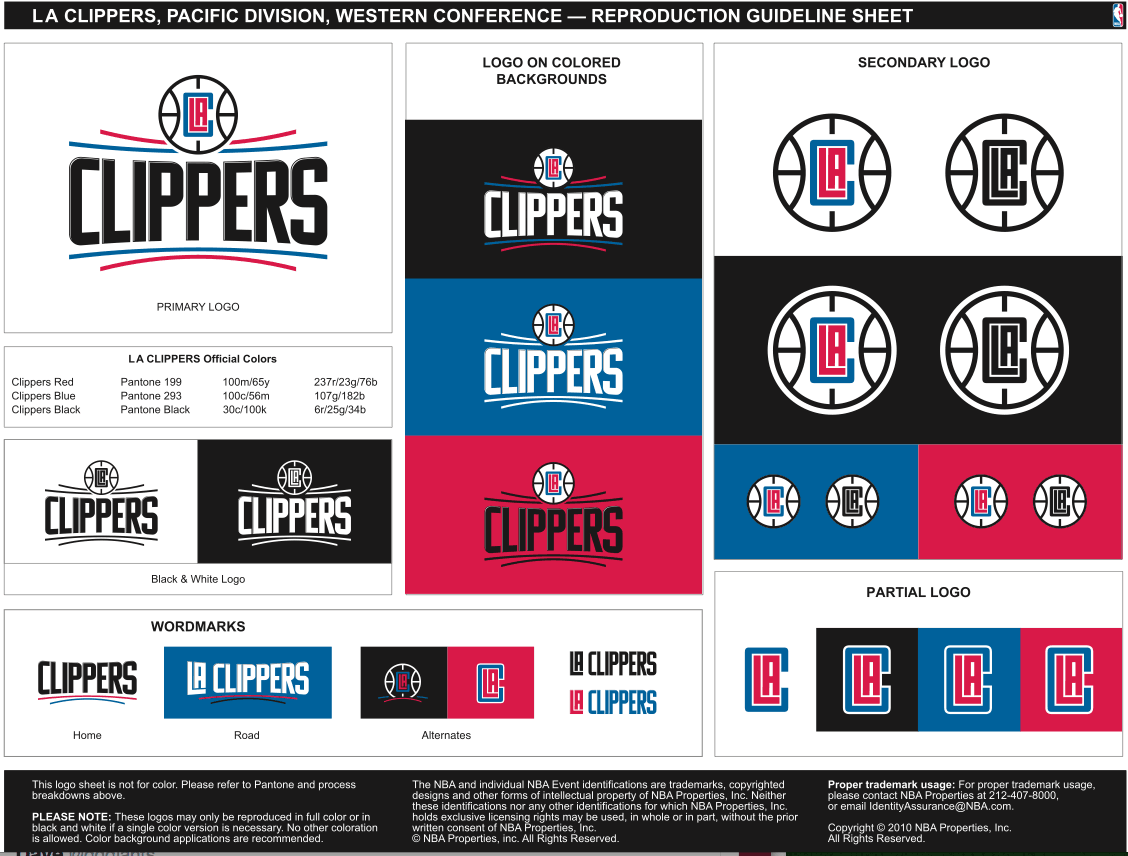
There’s a lot to process here. Let’s go one thing at a time:
1. This is our first look at the white home uni.
2. The note about the “sweeping lines” on the logo pertaining to “the horizon as seen from the bridge of a ship, signifying the Los Angeles Clippers steering boldly into the future” has got to be history’s lamest, most pathetically willful attempt to inject “story” into a team design. Enough already with the bogus “story” nonsense — just say you used the curved lines because you think they provide the design with balance and graphic interest (which they don’t, but we’ll worry about that later).
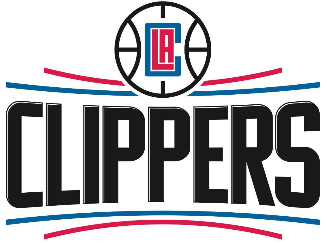
3. It’s hard to see in that first run of images, but there’s some subtle (and really amateurish) edging on the wordmark. It’s more apparent in this close-up:
4. The design proposal lists the black uniform and the blue and red uniforms as “road jerseys” (which, obviously, can’t all be true). The style sheet clarifies things, indicating that blue will be used on the road, with the red and black designs used as alternates.
5. The style sheet also shows a road wordmark that doesn’t appear in the design proposal and was presumably developed as part of the revision process.
I think that covers it, at least until someone comes along with the style sheet that shows the final versions of the uniforms (which I figure should happen any day now). As for the design itself, it’s clearly a train wreck, but you no doubt figured that out for yourself already. Can’t wait for the unveiling!
[Insert obligatory “Yo, NBA people, you could inoculate yourselves against these types of leaks and stop playing a losing game of Whac-a-Mole if you worked with me like you used to” notice here.]

And speaking of the NBA”¦: I’ve been impressed by how many people — at least a dozen — have been in touch to ask why the NBA’s “Playoffs” logo didn’t appear on the court during this past weekend’s games. I have no idea, although can think of several good answers to that question (they figured the whole damn world already realizes that these are playoff games; it’s embarrassing to hype your postseason when three of the teams that qualified for it didn’t even have winning records; the courts are cluttered with enough graphics as it is; etc.).
The real surprise was that most of the people getting in touch with me were pretty upset about the logo’s omission, with many of them saying that “the atmosphere doesn’t feel right” without it, or something along those lines. Granted, I’m not a big NBA fan, but it seems to me that if you need a logo on the court to get yourself psyched up for a playoff game, something’s wrong, no?
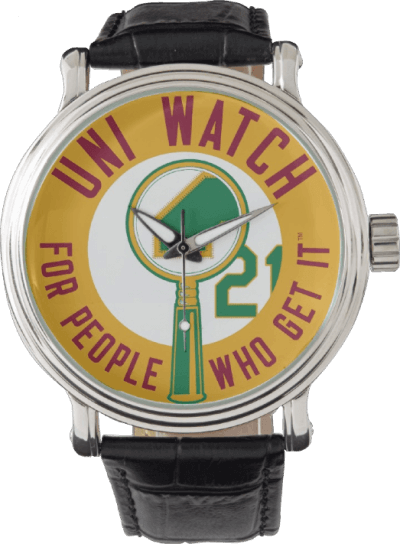
Can’t believe I never thought of this before: Phil and I were talking the other day about how it would be funny to have a Uni Watch watch. I know that the folks at Zazzle, who will happily slap your logo on a T-shirt, coffee mug, tote bag, or whatever, are always expanding their range of product offerings, so I checked to see if they now offer wristwatches. And sure enough, they do! So behold: the Uni Watch watch, available in dozens of different styles.
Of course, cell phones have pretty much made watches obsolete, so I don’t really expect many people to buy these. But it’s fun to know they’re available.
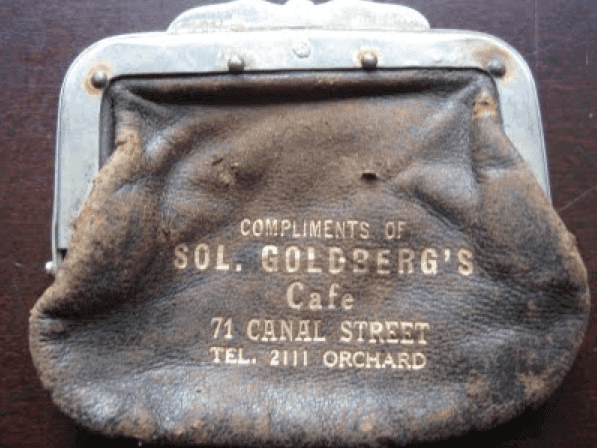
PermaRec update: I’ve recently been introduced to the work of a writer who enjoys sleuthing out the stories behind found objects (including the promotional change purse shown at right) just as much as I do. Learn more over on Permanent Record.

Baseball News: Today is Patriots’ Day in Massachusetts, so the Red Sox will once again be wearing their white “Boston” jerseys. ”¦ Memorial Day is approaching, which means it’s time for MLB’s annual mix of pandering, misrepresenting the holiday’s meaning, and bad design. This year’s version features camouflage brims. What, no matching camo squatchee? An insult to the troops, I tells ya! ”¦ We’ve all seen batting helmets gunked up with pine tar, but Alex Rodriguez is using rosin. I don’t recall him (or anyone else) doing that in the past. ”¦ Speaking of A-Rod, he’s one of several Yankees who appear to be wearing Cool Base jerseys, at least on the road — something the Yanks have never worn before (good spot by Mark Barnett). ”¦ I like this: a cap with a logo that shows another cap. ”¦ Tigers P David Price has some personalized socks (from Jerry Nitzh). ”¦ A bizarre Tigers logo in the window of a Detroit barber shop has become a hit on T-shirts (From Dan Kennedy). ”¦ Attention DIYers! Here’s something you don’t often see: a bunch of blank tequila sunrise jerseys. You know what to do. ”¦ Mets P Matt Harvey’s embarrassing bat knobs have now been covered up by embarrassing bat knob decals (from Mike Engle). ”¦ The Nashville Sounds did the G.I. Joe thing yesterday (from Jerry Lawless). ”¦ Kerning looks a bit off on Giants OF Justin Maxwell’s NOB. ”¦ Very nice Sunday creams with striped stirrups yesterday for UConn. ”¦ The Las Vegas 51s and Fresno Grizzlies are both wearing Jerry Tarkanian tribute jerseys. ”¦ The Nats have this odd display promoting their customized jerseys. Why would they use white letters/numbers on a white jersey? (From John Muir.) ”¦ Braves P Cody Martin has the finger protector on the middle finger of his glove, instead of the index finger (from William Clark). ”¦ The Mariners debuted their very nice cream/royal/gold Sunday alts yesterday. ”¦ Several Pirates wore two-in-ones in yesterday’s game (from Curtis Galvin). ”¦ Cubs P Jon Lester caught a comebacker in the yesterday and couldn’t get the ball out of the webbing of his glove, so he tossed the whole glove to first base to get the out. Reminds me of several players who’ve done the same thing, including Jose Abreu of the White Sox last year and Orlando Hernandez of the Yankees in 1999. ”¦ Royals pitchers Yordano Ventura and Edinson Volquez traded jerseys for a pregame autograph session yesterday.

NFL News: Powder blue Monday: Some great looks at old Chargers uniforms not to mention some 1960s and ’70s hairstyles — in this photo essay on former Chargers player Sam Gruneisen (nice one from Douglas Ford).

College Football News: Some players in Auburn’s spring game were wearing jerseys from 2008. ”¦ Speaking of spring games, Pitt’s had inconsistent number fonts (from Michael Korczynski). ”¦ UNC’s new helmets have an argyle stripe down the middle.

Hockey News: The Capitals will be wearing their throwbacks for all road games throughout the playoffs (from Brendan Bailey). ”¦ About 50 Flames fans had their jerseys blessed by a Calgary minister prior to yesterday’s playoff game against the Canucks. ”¦ Speaking of the Flames, their organist has a musical note for a jersey number. ”¦ Ditto for the Flames’ anthem singer (from Mike Engle). ”¦ Example No. 723 of how life would simpler and better if people didn’t buy overpriced polyester shirts: Canadiens management has attempted to contact and make amends to two Senators fans who were harassed during one of the Sens/Habs playoff games in Montreal beause they were wearing Ottawa jerseys. Further details here. ”¦ New “arena’s final season” logo for the Oilers. ”¦ Blackhawks G Scott Darling talks about his new mask in this article.

NBA News: LeBron James had to remove the label from his water bottle after yesterday’s playoff game, presumably due to corporate sponsors’ requirements. Douchebags.

Soccer News: Aston Villa forward Gabriel Agbonlahor was wearing a San Jose Sharks hat during the FA Cup semifinal yesterday. “He was not in the game due to injury but was sitting on the bench along with all of the reserves,” says Joe Pitzonka.

Grab Bag: Here’s a good summary of the reactions to Hillary Clinton’s campaign logo. ”¦ A bat and two jerseys that belonged to Phil Hughes, the Australian cricket player who was killed after being hit by a pitch last fall, will be carried by a sherpa to the summit of Mt. Everest. ”¦ A police force in England mistakenly had the word “Police” printed upside-down on their uniforms. ”¦ 250th-anniversary jerseys this past Saturday for Brown lacrosse. ”¦ Answer to the question posed in this headline: Y-E-S!
Lebron water bottle tweet is “protected”
Fixed. Here’s photo link:
link
I thought I was finished with wearing watches until last year when I started working on a grounds crew. I couldn’t always have my cell phone with me and the battery would run out, so it made sense to me to go back to wearing a watch again.
…Obviously, Apple and Samsung are trying to breathe life into watch-wearing, too
Call me anachronistic but I always wear a watch. Except when I’m on vacation. Much quicker than digging around for my mobile.
Love watches – I own two myself, and gave watches away as gifts at my wedding. Hate digging out my cell phone just to check the time.
Lots of teachers wear watches, too.
Jose Abreu isn’t a pitcher…
Poor wording on my part. Will change to “players.”
The Clippers design thing shows why the home team should wear colored jerseys. They’re proposing having three colored jerseys but won’t show any of them at home??? …Sounds lame. It should make laundry duties easier for the team staff, though, if they just wear red one night, blue the next, and black a third night on a long road trip.
Oh, I’m sure they will be worn at home. The NBA seems like it has really gone away from mandatory white at home in recent years. You’re seeing either more color-on-color or white on the road (when the home team wants to show off an alternate). I’d like Paul or someone to do a feature on that. It seems like it’s just exploded recently.
I don’t mind the Harvey “Dark Knight” stuff.
Would Tom Seaver have done it? Probably not. (Though there’s a classic Daily News cartoon of Tom Terrific wearing a Superman crest under his uniform.)
If Harvey had come up with it himself, that would be one thing. But since it came from the Sports Illustrated cover story and he’s just kind of running with it, I don’t have a problem with it. it’s kind of fun, and goodness knows the Mets need some fun once in a while.
(Looking it up, the Seaver crest actually said “Mr. Wonderful,” but was shaped like the Superman crest and had the same shape and same colors.)
The difference is that the sports world wasn’t awash in gratuitous comic book/superhero imagery in Seaver’s day. It is now. A very tired cliché.
I’m just trying to figure out how that’s Harvey’s fault. I get the super hero imagery, from the “costumes” to the allusions in marketing material, is overdone. But the Dark Knight thing actually seems to fit both where he plays and his personality (and it’s not a dumb abbreviation name, like “Han Ram” or “Man Ram” or “Whatever-letter-Rod”, etc.) I don’t get the stance against it.
Just my humble opinion.
It’s his fault because he’s the one who eagerly embraced being a comic book superhero. He could have just let it be a line on a magazine cover and that would have been the end of it. “Dark Knight”? I don’t even know what the fuck that’s supposed to mean. Like, does he not pitch in day games or something?
Come on, man, have some dignity out there.
Dark Knight = Batman. Everyone wants to be Batman. You can’t fault him for that.
I find the whole thing a bit silly, especially regarding a pitcher and his bats. But whatever.
Gotta respect Matt Harvey, though, for his performance yesterday despite being sick.
Frank Robinson had some fun with the Yanks wearing a Superman shirt (possibly home-made) under his uniform.
link
If those are indeed the Clippers new uniforms, its definitely an upgrade. They need something new.
Yeah, those are fine. I don’t get the acrimony. I would have been proud to come up with those, myself. First order of business is to chuck their primary logo, which cribs too heavily from the Lakers.
When Paul first started reporting about the new Clippers stuff, I thought it sucked. But it has grown on me, especially as we’ve been seeing it more and seeing more details. But you’re absolutely right. The Clippers current stuff has been lame and boring for forever.
Agreed. The logo is nothing special, but it’s the NBA, so “not bad” is well above average. The LAC mark is excellent and the uniforms appear to be relatively simple and elegant, which puts them in the near-excellent category among NBA peers. So far the strongest valid criticisms of the redesign seem to be that the marketing language is full of BS (well, duh) and the bevel thing on the wordmark is poorly executed. Which is it, but one element of the poor execution is that the bevel is so small that it’s nearly invisible. Which also minimizes its negative effect on the larger logo and identity.
The new Clippers identity would be an upgrade for most teams in the NBA right now. I don’t love it, and I’m especially not a fan of the major infusion of black, but by the standards of its league, it’s quite good.
But one question: With all the emphasis on LA instead of “Los Angeles,” I’m left wondering, has anybody actually been calling them the “Los Angeles Clippers” all this time? Doesn’t everybody call them the “LA Clippers” already?
You could say that about all the Los Angeles teams, given the ubiquity of the LA initialism. LA Kings, LA Lakers, LA Galaxy, LA Dodgers… okay, the Los Angeles Angels of Anaheim kind of screw that up a bit due to their identity issues (“we want to call ourselves Los Angeles, but are contractually obligated to use Anaheim”).
Aren’t they just the Los Angeles Angels now (er, again)? I thought they formally got rid of the Anaheim bit a while back. Either way, the name is completely ridiculous.
I despise this concept for one reason: the inclusion of BFBS. The black looks forced and out of place in this design. I’m also not a fan of the simplistic wordmark, but I think it would probably look a loot better if it was rendered in red or blue on the home uniform instead of black.
Ditch the black, and it might actually be an upgrade. As it is, it makes me want to punch my monitor.
On the Clippers: between the circle around the blue and red letters and the shape created by the red lines, every time I see it I think it’s the cover of an EA sports game.
link
the Clippers unis do look like an unauthorised video game of themselves from the 1990’s. Kinda like the new Dolphins refresh. My problem with the Clippers is, you share a building with one of the most famous franchises in the league. A franchise known for glitz. You have to come up with something that doesn’t look like (sorry) but Microsoft Clip Art.
clip art. exactly. the whole design feels generic and uninspired. what has it to do with clippers? with LA? with the teams design heritage? it barely has anything to do with basketball, other than the blatant inclusion of a minimalist basketball in one logo, which is something that the NBA seems to be racing for. who will be the last team to adopt a minimalist basketball logo? it’s anybody’s guess! it’s a word mark (and not a particularly exciting or unique one at that) with some very simplistic under- and over-score lines. the font is another thing the NBA seems to love these days. just grab a basic font from Word or Photoshop and call it a design. sure, a lot – or even most – baseball teams use initials in established fonts as a hat logo or secondary logo, and that’s where the LAC logo succeeds: it’s simple but well composed, and will be recognizable, if not fun to look at, but take it out of the basketball, already. we get it, they are a basketball team. if people are that oblivious to what basketball is, an outline of a basketball isn’t going to seal the deal for them. the inclusion of black gives the whole thing an art-deco miami night life vibe that bothers me, as well. the lakers dabble in the BFBS “LA nights” or “lake show” or whatever uni, and i can’t say i hate them, if only because the lakers have that hollywood show biz glitz and glam sort of feel about them (or at least they do when they can win more than a few games). so for the clips to make a similar look a part of their identity feels a bit derivative, in a sad little brother sort of way.
ironically, this uni quasi-fail sort of pays homage to the clips uni history in that – like their uniforms of the past – they are not interesting enough, bold enough, or classic enough for anyone to really care one way or another about them. no one can ever accuse the clips of looking bad, or looking good. they’re just there, and they’re dressed.
you can’t fault them, though. this kind of design is bleeding through the NBA, who seem to be getting quite good at turning specific brands like the thunder, the pelicans, the nets, and the warriors, into bland unis, or generic logos. even the oakland athletics, whose name is so generic that it doesn’t even clarify what sport they play, but simply that they are a group of physically fit people, have three logos that are interesting or at the very least will always read as their brand.
yawn, clippers, and boo NBA design houses.
Yeah, I agree.
First thing i saw was the old NBA Live logos
link
I thought of the same exact thing!
Looks like I’m not the only one who saw the same! Good catch.
It’s in the game.
“The note about the ‘sweeping lines’ on the logo pertaining to ‘the horizon as seen from the bridge of a ship, signifying the Los Angeles Clippers steering boldly into the future’ has got to be history’s lamest, most pathetically willful attempt to inject ‘story’ into a team design.” -PL
1. I disagree. “Symmetry and wide open structure define this mark, alluding to the agility of basketball players” is much lamer and nonsensical.
2. Pathetically, it only took them one slide to break their rule about the team being now known as LA and not Los Angeles.
I kinda like the LAC logo. The rest of it though … woof.
I find the Clippers’ proposed jerseys very bland. Clip art level ( no pun intended). The logo is fine, but the wordmark just has no personality whatsoever. I wish there was some way they could go with a nautical them, but not in a Skipper and Gilligan kind of way.
them*e*
Like this? ;)
link
If your team is called the Clippers, and this isn’t your logo, you’re doing it wrong:
link
I’d love it if a basketball team used a logo featuring a baseball.
Details, details. Easily changed. Nobody has done a ship theme better. Including several crappy redesigns from the Columbus Clippers since that logo.
Actually, I think I’m one of the few people that like that. I didn’t like the teal waves, but the fisherman himself I was cool with.
The logo is kinda clunky, but almost endearingly so. The jerseys with CLIPPERS look good. B+.
Whoa….I actually kind of like the black and red versions of the Clippers uniforms.
I honestly kinda dig that UNC helmet stripe.
I’m OK with it too.
But what is going on with the UNC logo on that page???
Some of the Yankees have been wearing cool base road jerseys since last season. I think it started with Ellsbury, then Gardner and several others followed suit. This season, it feels like even more Yankees players are wearing them on the road.
Ah, interesting. Thanks for that!
Cool Base jerseys are the tools of Satan.
The lines around the CLIPPERS wordmark, intentionally or not, seem to harken to the NBA Playoffs logo they have been using for a while now.
Regarding the obligatory basketball on the Clips new logo: I know the stitch lines are differently patterned, but the white ball makes me think volleyball. Just me?
I don’t have a problem with the lines on the Clippers jersey being about the horizon. Many times design elements have some deeper hidden meaning behind them, and that’s absolutely fine.
The problem arises though when you start to tweak what the element actually is. Do the clipper captains see two curved lines? or 4? Are they actually curved or straight? Once you tweak the element to make it work with the design you only have a design element, no longer a notational representation.
Secondly, the BS about it guiding them into the future, etc is comeplete BS. I’d love to hear someone say after 4 or 5 losing seasons at a press conference something like, “years ago you said the lines on the jersey represent the horizon and guiding us into the future, was “the future” then losing season after losing season?” I’d love to hear any of those execs have to answer to that after abysmal seasons. Browns: A hard working look for a hard working team for a hard working town…what happens when they blow the second half of the season again, can the execs be held accountable, or the hard working folks of Cleveland?
So yes, I cringe every time too when I hear that crap.
Yeah the grandiose narratives about design elements are always cringe worthy. They can never just go “Hey stripes are cool.”
Which stinks because as a lot of folks have said, aside from the BFBS the designs are pretty nice on their own. Make a good look and you don’t need to add gimmicks.
Can we just agree now that graphic arts boilerplate as it pertains to professional/varsity sports comes from the lowest level of Hell?
Gosh those Mariners uniforms look amazing. I would love to see them made permanent.
They’re decent enough for once and a while wear.
The trident should have made a return appearance somewhere.
Who has the problem with LeBron’s water bottle? Is it the NBA or LeBron himself?
My guess would be one of his sponsors (whichever ‘ade’ that might be) objecting to his drinking water instead of their ‘ade’.
Oh, LeBron will gladly do the label removal himself.
Gah! Why are the Clippers using a black wordmark on their new home jerseys? Just looks ridiculous.
I don’t have a problem with that. It makes the team’s name the first thing you see.
Thoughts on the “Playoffs”logo issue from an NBA fan. I grew up in Miami and was 9 years old when the Heat was awarded to the city by the NBA, and 10 when they began play. Although it seems odd to say now, I watched a lot of awful basketball by the home team in those early years, and remember how much I hoped they’d one day make the Playoffs. When they finally did make the Playoffs in their fourth season (ultimately swept by the Bulls), I attended that first home playoff game and was so excited to see that “Playoff” stamp on the home court. It meant that we had finally accomplished something. Granted as the years went on and postseason appearances were quite frequent I didn’t care so much about that logo (although the first time I saw the NBA Finals logo on the court I was also excited), I can understand why some fans would still want to see it, particularly for teams who do not make it as frequently. I realize it is just a decal, but to some people, it means a little more.
What’s with all the promo-speak nonsense in the Clippers redesign materials about how “the kids love the color black these days,” and “the kids call it ‘LA’ now, not ‘Los Angeles'”? Did someone just dust off an old design proposal from 1988? On second thought, don’t answer that…
On the topic of sports-related website design, I’m very disappointed with what has resulted from ESPN.com’s mobile-preferred redesign: namely, the loss of the playoffs landing pages.
Under the old website format, when going to the Playoffs link for each of the majors, you’d get a front page that provided a quick, at-a-glance overview of each round in its totality. Much like what’s currently up on NBA.com’s and NHL.com’s regular homepages, you could take one look and see exactly where each series is at. It was a nice and efficient method of communicating that information. But, apparently, it wasn’t mobile-friendly.
So now, with the mobile-centric new ESPN.com, we get link… and only this. This plain-jane article that just provides a straight line of text giving the series’ status and relevant links, having completely dispensed with the old at-a-glance format. And we get that just for the NBA. The NHL? Nope, they couldn’t be bothered to do even that much.
I don’t know about the rest of you, but around playoff time, the first thing I always look for is where the respective series are at. The old ESPN.com made that easy; the new ESPN.com has apparently decided that’s not important anymore.
Agree 100%. I don’t follow every series or every game (I follow the NHL not NBA) but I do want a quick overview of where each series is.
Why does the new Clippers logo sheet have a copyright date of 2010?
Look down in the bottom right corner. 2010.
Old template. Don’t worry, it’s legit – I’ve confirmed it.
Are we collecting instances of throwing a glove with a stuck ball for the out? Here’s one with the SF Giants.
link
Today’s lede makes me wonder if there has ever been a truly great basketball jersey? Perhaps due to the limited amount of material and space to work with, I can’t think of an example.
Only one that comes to mind is the classic Lakers look with the block shadow numbers, and even in that case it think it’s just the numbers I like. And the colours, I do like purple and yellow.
Come on!
link
link
Looks like The Jeff got bit by this site’s multiplication bug, so here’s the fixed link.
The LAC secondary logo is not terrible (you’ll probably see that on the court, the warm ups, your TV screen). The rest of it is terrible. If true, I suspect the public ridicule will inspire one of the quickest re-dos in NBA history.
Well… at least this logo doesn’t look like a rip-off of the Lakers (not-quite-Times-New-Roman-text on top of a basketball), so it has that going for it, I guess.
But if they’re going to ignore the nautical roots of their name, they could at least switch to a pair of scissors or Microsoft’s Clippy or something… anything is better than just text and a ball.
I do agree that they should have some sort of nautical nod – at least one that’s obvious and not “so subtle we have to explain it to you”. They could even bring back a textless version of link as a secondary or tertiary logo.
Love that idea!
As bad as I dislike the baby blue t-shirt uni’s, I really dig the nautical flag design on the shorts. This proposed re-branding is just boring, unimaginative shit. It’s an NBA uniform for the USFL.
Don’t be so hard on the Clippers. They’re now owned by Steve Ballmer. I’m sure their art was done in MS Paint using clip art.
Surprised that this isn’t the graphic on their blue alternate:
link
WCCO ran a story about J.R. Graham, his mom, and his stirrups.
link
Looks like the CLippers to several design cues from the late 00’s EA Sports NBA Live Logos
link
Mildly uniform related: playoff hockey returns to Winnipeg tonight for the first time since 1996. Which means the return of the white-out
link
Which is somewhat amusing when you consider the home team will be wearing blue now, due to the NHL’s 2003 uniform rule change.
Auburn has used old uniforms for the spring A-Day game for years. It’s interesting to see jerseys with two or three different SEC patches on the field at the same time.
1. I like the NBA Playoffs wordmark on the courts of playoff games. It’s one of the little things the league has been doing for years, so I like the continuity. The logo makes the playoffs official, to me.
2. For the Braves pitcher that has a finger sleeve on his middle finger slot of his glove, it’s certain that he still puts his index finger in there and moves the rest of his fingers over inside the glove (his ring and pinky are in the pinky slot).
3. I wouldn’t want to smell BBQ all the time. It would bum me out that I wouldn’t be eating BBQ 24/7.
4. I was listening to the Bucksketball Podcast and they were discussing the new logo and uniform. The host said that he wasn’t too excited about everything, in part because of all the rebranding speak. He said all the buzzwords made the Bucks feel like less of a sports team and more of a corporation, one that is making these changes just to make more money. I thought it was an interesting point. All the storytelling and rebranding and backstory that goes into new logos and uniforms (like with the Clippers, too) might subconsciously turn fans off.
3. I wouldn’t want to smell BBQ all the time. It would bum me out that I wouldn’t be eating BBQ 24/7.
I wish I could smell BBQ all the time. It would certainly be an improvement over most random smells I encounter.
I thought it’d be great smelling donuts all the time till i worked one day in a donut shop. by the end of my shift, i thought i was gonna barf. couldn’t go back.
Thanks for the photo essay on Sam Gruneisen. I can never get enough of old AFL photographs.
Clippers logo made from clip art
link
Dear infantile Paul Lukas, who can’t imagine why “playoffs” are/were on the courts: It is to differentiate playoff games from regular season games in highlight clips. Has nothing to do with “exciting” the players. Idiocy.
I never said it was about “exciting” the players. I was referring to the fans.
Somehow I was able to realize that these were playoff games even without the logo on the court. And if an “infantile” person like me can do it, I suspect everyone else can as well.
They didn’t need a playoff logo on the court for this to become iconic. link
Didn’t need extra uniform patches either…
So, the Clippers just went with the NBA Live 06 logo, I guess?
link
Auburn typically has a mishmash of previous years jerseys for A-Day. But the big uniform news coming out of A-Day is that there’s a good chance the two worst aspects of the unis are getting fixed this year. Before the game, the team uploaded a official video to their Youtube channel that featured an upgraded AU uniform in the same tailoring template that Texas Tech and Maryland used last year. The video very prominently points out the that the sleeve stripes are less tapered than they have been in recent years and the pants have FINALLY returned to form with stripes running all the way down the leg. The team also wore the tapered striped pants Saturday where as in the years since the 2011 switch to the weird UA template they always wore old pants from 2006-2010, hopefully meaning that they are finally being phased out. Link to the video is below.
link
The new “LAC” Clippers design is very bland, which is most likely on purpose. This opens up plenty of space for ads and the simplicity of the uniforms will allow for said ads to “pop” and not get lost in the overall design.
As much as certain people insist on NBA ads being inevitable… I really don’t think this design is part of any larger conspiracy to bring advertisements to the league. If it’s going to happen, they won’t need any sort of major redesign across the league, they’ll just slap the ads on top of whatever jerseys the teams are already wearing.
When you say “an insult to the troops,” does that include MLB’s “insult” of donating, in their words, “100% of its net proceeds from sales of the caps to Welcome Back Veterans as part of its contribution to the program”? They’ve given $30 million to WBV since the program launched. Have you or is this just a stone cast from a glass house?
Always nice to have a new reader.
And you know what? MLB could donate 100 percent of the sales of anything and everything else to WBV without resorting to gimmick caps to do so.
i find it intersting that the clippers dont have any “Los Angles” wordmarks in that package. they have “LA” logos. reminds me of the Jets…how the jets dont capitalize on being in the new york market. all their stuff is nyj, ect… just an amateur observation
sorry about spelling. im not very good at it lol
The Clippers identity is another huge missed opportunity as was the Milwaukee Bucks and Cleveland Browns. There’s an amazing dearth of really strong sports branding work being created in professional sports. While I understand the owners are the ultimate decision makers for new team identities, it’s a shame that we continue to see one horrible rebrand after another roll out to the chagrin of fans everywhere.
Ah, plenty of folks bitched in the past about stuff like MLB adopting pullover and non-grey away jerseys, the NBA outfitting players with shorts that weren’t nut-huggers and the NFL letting players wear white shoes. Most rebrands from years ago weren’t viewed at the time as all that great either. The two constants have been that younger generations like change and time makes beautiful what was once unusual.
I agree with Paul totally that the trend of new uniform elements or color requiring a “story” or justification behind them has become ridiculous.
On the other hand, I think he’s a little overboard himself with his trend of calling people “douchebags” for protecting their brands when it comes to endorsement deals. If Paul paid me to exclusively wear a UniWatch shirt every day and then I was spotted wearing a Chris Creamer shirt, I would expect him to have a word about it…
You’re assuming that all business deals self-justifying, which is false.
Yes, someone paid a lot of money to be the only brand of water that can appear at an NBA press conference, so of course they’re going to enforce their rights. But that’s the problem — being the exclusive brand of water (or having branded water to begin with) is just corporate bullshit, and reinforces the culturally unhealthy notion that anything and everything is for sale.
Or to put it another way, I would never pay you (or anyone) to wear a Uni Watch T-shirt, because that’s fucking insane.
Douchebags.
You might decide as a matter of principle that you wouldn’t ever pay somebody to endorse your blog, but certainly the idea isn’t “insane”. If LeBron James offered to wear a Uni Watch shirt during one public appearance per week if you paid him $1, you’d probably want to jump on that offer.
(One might actually argue that it’s “insane” for people to pay you to promote your blog by buying your t-shirts but I’d not blame you for agreeing to that.)
Dan, you seem to believe in a world where all business practices are tautologically self-justifying, where any transaction between any two parties is kosher, and where all that matters are market forces. I think the world is a little more complicated than that.
We can agree to disagree, but I feel sorry for you — it’s a very bleak, reductionist way of viewing the world.
(And for the record: No, I would not pay LeBron James — or anyone — even $1 to wear a Uni Watch T-shirt.)
Actually, Paul, I tend to agree with your basic point of view here. For example, I think it sucks that in addition to paying the ticket price to attend a sporting event, you are bombarded with advertisements all over the stadium. It’s like your literally paying twice to see the game. Life would be better if we weren’t always being “sold” something.
On the other hand, it seems like celebrity endorsements are a fairly harmless form of commercialism. It’s your choice, but I have no idea exactly why you’d refuse a chance to promote Uni Watch if a celebrity came to you with a fair proposal. (Unless you strictly consider Uni Watch to be a hobby instead of a source of income, which doesn’t seem to be the case since you sell t-shirts, memberships, and ad space.
I’m not trying to change your mind on this, it’s more a curiosity as to your reasoning.
Uni Watch is not a hobby. It’s a creative project that I monetize a bit.
Celebrity culture bores me, and I’m not interested in being on either end of a paid endorsement transaction. If LeBron James (or whomever) wants to wear a Uni Watch T-shirt, he’s welcome to do so (just as I’m welcome to wear his jersey if I want to). But paying someone to do that simply isn’t something I’m interested in — I’m not looking to buy anyone’s love. Similarly, I have zero interest in being paid to endorse anything. If I really like something, I’m happy to advocate for it simply because I like it.
EA Sports NBA Live needs to check out the wordmark for copyright infringement, geeze
Re: Astros anniversary uni’s
Why in the world are the Houston Astros not wearing those uniforms from Sunday as their current everyday, NICE!
Agreed. And they should continue to use the “astrodome” logo as their primary.
Granted it’s hard to make a basketball look different because there’s only so much you can do with them but I still say the ball in the Clippers logo looks an awful lot like the basketball in the old Sonics logo.
Forgot to add it in:
link
Change the colors to Clippers colors, remove the skyline, and make it a full ball instead of ¾ and if looks like an almost exact match.
Not trying to be snarky or a troll by pointing this out, but I recall the other day the comments about the bleeding red lines at the bottom of the Wizards’ new logo. This image Zazzle has for the watch’s face seems to be suffering from a similar problem–white between the yellow and black in the lower right quadrant.
link
I know there’s a big difference between official NBA logo & that of a blog, so I’m hoping pointing this out doesn’t get me banninated.
I know there’s a big difference between official NBA logo & that of a blog, so I’m hoping pointing this out doesn’t get me banninated.
The proper comparison is not between an NBA team logo and a blog logo; the proper comparison is between a finished logo and digital mock-up created by Zazzle’s computer interface.
The actual Uni Watch logo has no color-bleed problems like the ones in the Wizards logo. The watch won’t have any such problems either. The mock-up is just a facsimile image, not an actual Uni Watch watch.
What a shame, the clippers script is so iconic, and the current uniforms are simple and classy. The “rebrand” is awful. Just awful
Is anyone else dismayed to see that the Clippers re-design uses two completely different shades of red, for no apparent reason?
Look at the red jersey, as well as the red side-striping on the other three. It has a noticeable amount of orange in it, while the red on the logos is slightly pinkish.
Why?
Precisely what caused the Uni Troll to briefly become “Uni Watch” is a bit of a mystery.
Remind me not to post here when I’m distracted.
I first assumed that the lines on the bottom of the wordmark and logo were scraps of hair, and they were finally making use of the Clippers nickname in the haircut sense. Alas…
PS-I nominate “Clip-Art Logo” as the Uni-Watch name referencing the logo. Very clever, kudos gentlemen.
Those 1960s-early 1970s San Diego Chargers uniforms look so much better than the over-detailed mess that they wear today. Just CHANGE them already.
For some reason that partial Clippers logo makes me think of the ABA and I love it. If they could figure out a way to incorporate that logo or a similar design into the uniforms I think it would be great. The rest of that proposed redesign should be scrapped immediately especially the wordmarks.
Clippers new outfits look horrible. The logo looks more appropriate for a practice jersey or uniform set – certainly not game jerseys. A “third Logo” at best.
I like the interlocking LAC” with the basketball silhouette, but again a third logo at best.
No pictures available, but back in the 1970s the Clippers had a great set of fonts and logos, especially the “Sail” logo with the sharp font “Clippers” going with it. Immensely better than anything worn for 30-40 years by this snake bit mess of a franchise ….
Who are these people that keep getting these designs past the first rejection?
In the Lester play throwing his glove to the first baseman, the quickest thinker was the first baseman who tossed down his own glove to make it easier to catch Lester’s. In the other two examples, no receiver of the glove did that.
The new brand standards for North Carolina:
link
A tweaked shade of Carolina Blue, black, navy, gray, and silver as (sparingly used) accent colors, and a tweaked NC logo
The new UNC football uniforms are out…I can’t wait to read Paul’s review of them.
My prediction: he gives them an overall thumbs up.
I think the new design is fine. What is lame is the Uni Watch (that is Fugly) If that is what you think looks good–no wonder you don’t like the Clippers designs. Obviously, you also used Laker colors. I’ll take Red White and Blue over pimp-style Purple and Gold any day. Go Clippers–Go USA.