About a month ago someone sent me some graphics that he claimed to be from the Clippers’ upcoming redesign. I wrote back to this person — let’s call him Source One — and asked him all the things I usually ask when someone claims to be sending me a leak: Who are you? How did you gain access to these materials? How do I know that this content is legit? He didn’t respond, so I asked him again a few days later. Again, no response.
The graphics appeared Photoshopped and looked like something that would be included in a design proposal, not in a final design package. That, along with Source One’s failure to respond to my queries, made me pretty sure the whole thing was bogus.
Yesterday, however, I heard from someone else — let’s call him Source Two — who said he had seen the Clippers’ new logo. I asked the same questions (who are you, how did you get to see the logo, etc.), and Source Two responded in a way that satisfied me as to his legitimacy. So I pulled one of the logos that Source One had sent me a month earlier, sent it to Source Two, and said, “Is this what you saw?”
His response: “Yes.”
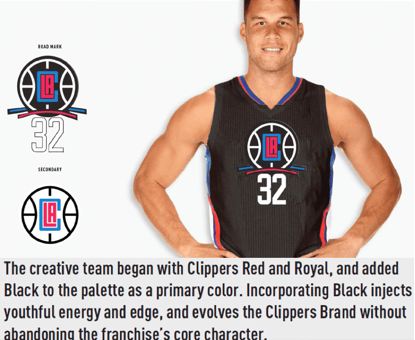
Now, this doesn’t necessarily mean that the Clippers are definitely going with the entire graphics package that was shown to me by Source One. But it probably means that they’re going with something pretty close to it. With that caveat in mind, here’s what Source One originally sent to me (you can click the first one to enlarge):
.
.
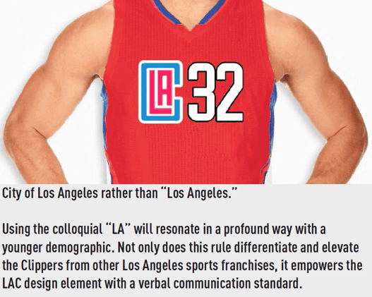
The logo tagged as “Secondary” is the one that Source Two says he’s seen. The captions are similar to what you’d find in a branding proposal from a design firm, and I suspect that’s where these were taken from. I expect some details will be different in the finished design. And just to be clear, I do not have any independent confirmation on any of these elements except for that one secondary logo. But if that logo is being used, it seems like a fair bet that the rest of the package, or something similar to it, is also in the works.
Update: Another source has confirmed that these Clippers designs are legit.
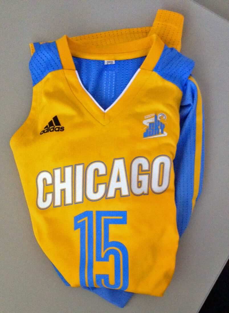
Meanwhile, in a related item, yet another reader — we’ll call him Source Three — has provided an early look at a new uniform and style sheet that the WNBA’s Chicago Sky will be using in 2016 (click to enlarge):
.
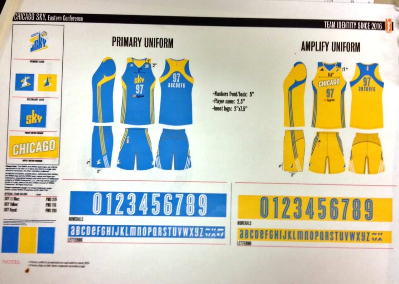
“At first I thought they were getting rid of the white home jerseys all together,” says Source Three, “but now I think the ‘Ampilfy’ set must be an alternate series like ‘Heritage’ in the NBA. Maybe something to tie in with the WNBA’s 20th anniversary in 2016..? Just my educated guesswork at this point.”
I’m sure there’s going to be a lot of gnashing of teeth in the NBA offices over this post, which means it’s time for me to trot out my usual reminder: Teams and leagues could easily inoculate themselves against these types of leaks (at least from me) by working with me and showing me stuff in advance on an embargoed basis. If the NBA had done that with the Clippers and Sky designs, I wouldn’t have been able to post these items today, because I’ve never revealed embargoed content and I never will. But if you don’t work with me, then everything’s fair game. Think about it, people.
Finally, it’s worth noting that some leaks don’t come from anonymous sources — they come from the teams themselves. That may be the case in Minnesota, where two Timberwolves execs tweeted photos of the team’s new practice facility and, in the process, appear to have given a sneak peek at some changes that are afoot. Since these photos came from high-ranking team execs, I’m assuming they intended the tweets to be teasers for the team’s upcoming changes, but I took the liberty of saving the photos, just in case they have a change of heart and delete the tweets (click to enlarge):
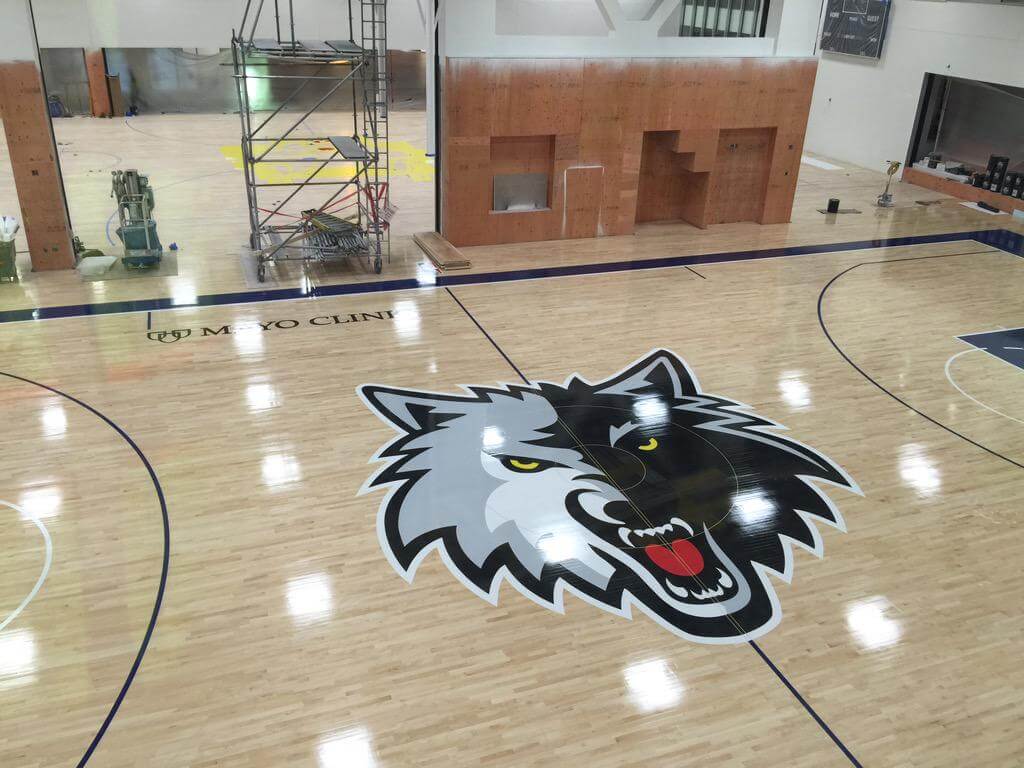
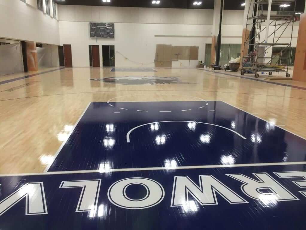
As reader Josh VanKlompenburg points out, there are at least three changes evident in these photos: (1) A deeper shade of blue; (2) a new wordmark; and (3) the trim on the upper-right portion of the logo has changed from blue to grey.
Update: Just got a note from Timberwolves marketing exec Ted Johnson, as follows:
Want to correct a couple of items regarding our new facility and the design on the courts that just appeared on your site. Short answer is that we are not changing our uniforms. The Navy blue and Benton Sans font that you see on the court is a “facility” font and color for our new training complex that houses the Wolves, Lynx, Team Pro Shop and a Mayo Clinic Sports Medicine Center. We’ll be unveiling the name of the facility and logo soon but that is why you see these on the court design. The Lynx court is being painted this week and will have the same border coloration and font usage. You will also note the practice courts do not carry the same stain coloration as our performance courts and the naming partner is different (Target Center for performance court and Mayo Clinic for the new practice facility). The idea is that we would have a simplified design for everything in the facility that will work for multiple teams/tenants/brands and not be subject to as much change as our courts/uniforms over the lifespan of this facility ”“which should be 20 years or so.
And there you have it.
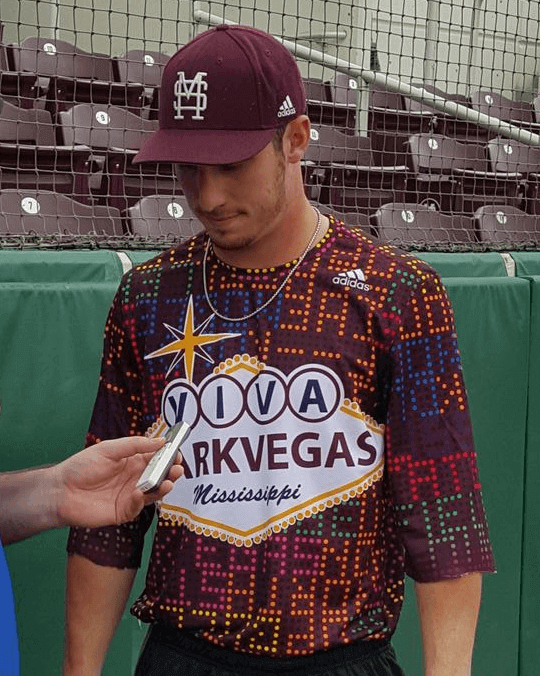
Boys with toys, part 713: Major idiocy last night from the Mississippi State baseball team, which wore these “Viva Starkvegas” BP jerseys — a play on the school’s location in Starkville, Mississippi. The design is bad enough, but the jerseys also had some hidden digs at the Bulldogs’ rival, the University of Mississippi. In at least two spots, the pattern spells out “F–k the school up north”:
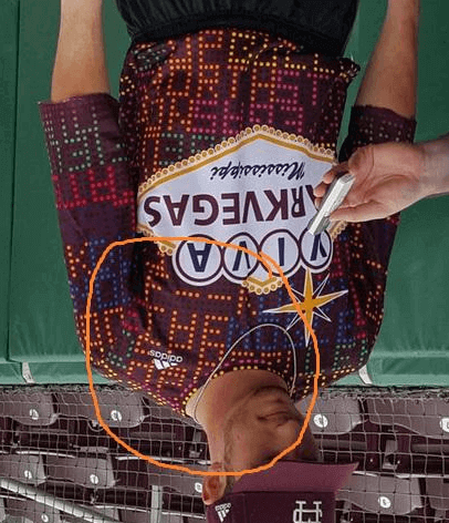
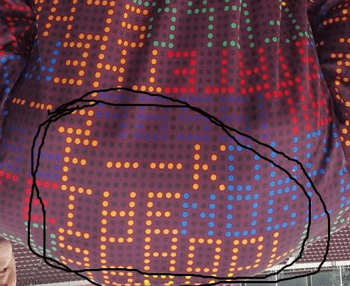
The school’s athletic director quickly apologized. So did Adidas, whose spokesman issued the following attempt at damage control:
“The Bulldogs’ base-layer graphic today featured old artwork that was never presented to the university. This graphic does not reflect our brand values nor those of Mississippi State. We take full responsibility for this error and wish Mississippi State the best of luck during Super Bulldog Weekend.
I don’t really care who’s more at fault here, because these clowns all deserve each other. A pox on all their houses.

’Skins Watch: Machinations over a new stadium for the ’Skins have been complicated by the team’s name (from Tommy Turner). ”¦ Here’s video of some of the protests and confrontations that took place at the Indians’ home opener (thanks, Phil). ”¦ Native American tribal leaders in Maine are meeting with a local high school to discuss changing the school’s team name from “Indians” to something else (from Paul Dillon). ”¦ Kenn Tomasch’s girlfriend got a credit card offer from Bank of America in the mail the other day. “They used Chief Wahoo on the envelope, but he appears nowhere else in the enclosed offer,” he says. ”¦ Some students at VCU have developed some concepts to rebrand the ’Skins (from @SeanPLastName). ”¦ The bad news is that Montville High School in Connecticut calls its teams the Indians. The worse news, as you can just barely see in this photo, is that they also use Chief Wahoo (from Matthew Edwards).

Baseball News: Lots of great visuals in this illustrated history of Toronto baseball, dating back to the 1850s (from Ted Arnold). ”¦ Great early shot of Babe Ruth with future U.S. president George H.W. Bush, with the latter in his Yale baseball uni (from Gordon Blau). ”¦ Dodgers P Hyun-jin Ryu wore a yellow ribbon pinned to his jersey two nights ago, presumably to mark the anniversary of last year’s South Korean ferry disaster. There were lots of ribbons in the Korean sports world as well (from Matt Ryburn and Allen Kim). ”¦ “My son received his first-ever Little League uniform Wednesday,” writes Andrew Hoenig. “They handed out the T-shirts (dark blue with Columbia blue printing), caps (Columbia blue), grey pants, and dark blue socks. My first two thoughts were (1) there are no stripes on the socks and (2) I’m going to have to teach him how to blouse his pants properly. Man, you really get inside a guy’s head.” ”¦ Father Judge High School in Philly wore “42” jerseys for warm-ups on Jackie Day (from Chris Hickey). ”¦ Nats 1B Ryan Zimmerman’s cleats have the logo of his charitable foundation on the tongue. ”¦ Kudos to Mets reliever Sean Gilmartin, who says he’s proud to wear real stirrups, not two-in-ones (from Alex Giobbi). ”¦ Good piece on the origins of the Tigers’ old English D (thanks, Phil). ”¦ Here’s a video on the making of the Pawtucket Red Sox’s championship rings (from Brian Codagnone). ”¦ “Strike Out Ovarian Cancer” helmets tomorrow for LSU softball. ”¦ Here’s the UCLA squad in their Jackie Robinson throwbacks (from Brian Porreca). ”¦ “OKC” alternate jerseys last night for the Oklahoma City Dodgers. ”¦ Mr. Met showed up on The Odd Couple last night. ”¦ One thing that has annoyed Mets fans in recent years is that the team’s retired numbers had black drop shadows, even though (a) the team’s uniform no longer have the shadow and (b) none of the retirees ever wore the shadow. They have fixed that this year.

NFL News: Saints CB Keenan Lewis is considering a new uni number and says he’ll buy fans new jerseys if he makes the switcheroo (thanks, Phil). ”¦ The release of the new Star Wars trailer means, of course, a bunch of lame-o Star Wars-themed NFL helmet concepts.

College Football News: “A few days a go I was able to see in Mike Sensibaugh’s 1969 Ohio State game helmet in person,” writes Mike Knapp. “Consistent with what I’ve seen in old videos and pictures from that time frame, it has a yellow back helmet number, which I find almost sacrilegious. I’m told the reason was because of some rule that helmet numbers had to be easily seen in contrast to the helmet. While that makes sense, I would find it hard to believe that most teams back then even had back helmet numbers to begin with.” Anyone know more?

Hockey News: Blackhawks goalie Scott Darling has a new mask for the playoffs (from Steve Johnston). ”¦ The Blues gave away David Backes jersey rally towels for their playoff opener (from Elena Elms). ”¦ “Finland just hosted Russia in European Hockey Tour play,” writes Mira Katriina. “To celebrate the 50-year anniversary of the Tampere Arena, as well as the World Championship home team from the same year, Finland and Russia donned replicas from their 1965 contest for the first period, before changing to their regular uniforms for the rest of the game.” ”¦ The Red Wings logo on goalie Petr Mrazek’s pads doesn’t have spokes (from Michael Hersch).

NBA News: Nike is reportedly closing in on a deal to become the NBA’s next uniform outfitter beginning in 2017-18. ”¦ Here’s a very cool time-lapse video of a wall-sized version of the Hawks’ Pac-Man logo being created with nothing but Post-its (from Andre Torres). ”¦ I really like Conrad Burry’s circular NBA playoff bracket.

Soccer News: Arsenal’s new away kit has leaked. ”¦ What if Irish advertising agencies were soccer teams? (From Charlie Kranz.) ”¦ New uniforms for Detroit City FC. ”¦ New jerseys for Real Madrid (thanks, Phil).

Grab Bag: Wearing a mascot head is hard work (from Jason Hillyer). ”¦ Speaking of mascots, the American Sports Network, a new national network devoted to TV and online coverage of college sports, is conducting a mascot design contest, with a top prize of $1,500. ”¦ The State of Missouri’s official airplane has a pretty gonzo livery (from Andrew Hoenig). ”¦ New airline uniforms in the works for Qantas. ”¦ New higlighter-toned alternate kit for the rugby union club Sale Sharks (from Eric Bangeman). ”¦ Whoa, check out these early primitive bike helmets (from David Firestone).

What Paul did last night: My friend Rob Walker (a great, great writer with lots of very wonderful projects) teaches a graduate-level class at the School of Visual Arts called “Products of Design,” and last night he asked me to sit in and help critique a bunch of projects that his students were presenting.
As Rob introduced me to the class, I noticed that the student sitting to my left began sketching me in his notebook. As the class went on for the next three hours, he continued sketching, based on what each of his classmates was presenting. Rob later told me that the guy has a long history as a graffiti artist and that this is how he takes notes.
After the class was over, I asked the guy if I could take a photo of his sketches (click to enlarge):

Turns out he had mis-heard (and therefore misspelled) my surname when Rob introduced me. I also think his rendering looks nothing like me, but hey, artistic license and all. Anyway, I can’t draw for shit, so it’s always impressive to see someone who can produce artwork like this on the fly. An interesting aspect of an interesting evening.
What a trainwreck those Clippers jerseys are, especially the logo.
I agree. It looks like something a kid would design.
I like the logo. Looks like something a kid would design.
that’s not exactly a glowing recommendation
The logos are fantastic. The jerseys, not so much, though I like the logo and number approach on the red one. But goodness gracious, that is the most bullshitty marketing text I’ve ever read. And what idiot frames his approach to a major sports team in terms of “injecting” things?
Unfortunately, redesign/rebranding proposals all have this type of text, using precisely this type of language. It’s always really, really depressing.
I’ll try to keep in mind the next time I read a Nike-style press release that the internal communication was even worse. As if I needed more justification for misanthropy.
The Clippers at one time actually had a pretty good looking and cutting edge logo and graphics going back to the 1970s (no screen grab or copy available). The Clippers’ “Sail” logo and fonts were pretty good and would hold up well today. These current templates look more and more like corporate logos or branding, and not team names or mascots or symbols. The proposed Clippers rebranding mess depicted above is horrible.
You mean link
Yeah, it is a nice logo, and certainly better than what was leaked.
Thats a cool website Rob, thanks for that link.
It’s funny isn’t..the best logo in the NBA is still Bostons and the reason is because it HASNT been changed since forever.
RE: Yellow number on back of OSU helmet….
I asked the guys at Helmet Hut about the yellow stripe on this 60s/70s Cowboy helmet. They told me it was simply the white stripe yellowing. That’s a LOT of yellowing in my opinion. Perhaps the USU number was made of the same “space-age polymer” as the Cowboys striping. ?????
link
I guess its plausible.
I’m not buying it. That is an awful consistent, saturated yellow to be aging.
I totally agree with you!!
But why on earth would ANYBODY put a yellow stripe on a C’Boys helmet–for ANY reason??
Sensibaugh had a single digit number. I just looked at some other pics of the late 60s helmet. Guys with 2 digits had one number on left side of helmet stripe and other number on right side. Meaning not in the stripe but outside it.
I do not know why they chose yellow??
Colleges polish helmets after each game. How could that helmet have that many colors?
Would that Clippers design qualify as BFBS?
I was given to understand that any team adding a significant quantity of black to a color scheme of which black had not previously been a component would be classified as BFBS.
/bow
I would say no, if it really is a primary color. If they wear that for 75% of their road games, I’d call it good. Of course, if we really are talking about a uni used only the NBA Summer League, that’s a bit of a different idea.
Adopting black as a primary color can be BFBS, particularly if it’s clearly being done for the sake of marketing products to the public, as opposed go making internal sense as a part of the team’s identity. See for example the text in the Clippers leak describing the purpose of the black. It’s plainly being added not because anyone thinks it makes sense as a complement to royal and red or to the team’s nickname or whatever. It’s about appealing to (ie selling things to) “youth.”
Pretty much the same for the Mets, for whom black was all about selling jerseys and hats.
Uni Troll is right. Per the link:
“BFBS: Stands for “black for black’s sake,” a reference to teams that gratuitously add black to their uniform design even though black was never one of their team colors.”
Just because the new black uniform is worn for a long period of time doesn’t mean it’s not BFBS. The Mets wore their BFBS jerseys for several years. Some might say the Los Angeles Kings went BFBS in 1988 and are still BFBS. So yes, the Clippers uniforms would be BFBS, even if the change is supposedly permanent.
The bad news is that Montville High School in Connecticut calls its teams the Indians. The worse news, as you can just barely see in this photo, is that they also use Chief Wahoo (from Matthew Edwards)
And to make things even worse, that chest mark has a TM next to it!
Montville is the town that contains Uncasville, which is where the native american owned Mohegan Sun Casino is located. not saying its right, but could be a reason why they are called the Indians? probably not though.
Correct.
Here’s some background on the relationship between the school & Mohegan Tribe:
link
Puzzling, then, that they opted to put a caricature as contentious as Wahoo on their hats.
I’ve met people who honestly believed that if you retained the TM mark, that made it OK to use a logo. Intellectual property law: Not well understood by the public.
Yes, yes, a statement that I agree with every time I speak to a potential client.
Re: the skins redesign, the first one is “rebels”. Doesn’t that also have a negative connotation in the states, especially one so close to Mason-Dixon?
Yeah, kinda missing the point, right? Why bother getting rid of misappropriation if you’re going to replace it with a term that glorifies ante-bellum South?
Also not a good uniform set. But the Navigators project is a very interesting approach, and offers interesting, if possibly too modern for the franchise, uniforms.
Yeah, I like the Navigators a lot (though I’m not digging the addition of navy to the palette), and the subtle Indian motif actually isn’t bad.
The one thing I do like about the Rebels is incorporating the DC flag (which unfortunately wouldn’t work for a team that plays in PG County and may soon move to Loundon County).
Who says it’s glorifying the Confederacy? In the Revolutionary War, America was the rebels. In Star Wars, the rebels were the good guys. Rebel is a generic term and the identity presented doesn’t feature any Confederate imagery.
Context. When a large chunk of your fanbase is to the south of the Beltway, you are a Southern team. And without other context cues (i.e. lightsabers or tricorn hats), the most obvious association is with the Confederacy.
I have a hard time believing that Mississippi State had absolutely nothing to do with that jersey. adidas is clearly falling on the sword for them. “Old artwork that was never presented” to the university?? What apparel company even thinks of making a phrase like that without any sort of input from the team? …apparently, adidas, if they’re telling the truth.
That’s why Adidas gets paid the big bucks, to take the PR hit. Wait, Adidas is paying MSU…
Adidas isn’t going to independently come up with a phrase like “f–k the school up north” without input from Mississippi State. I’m sure the players came up with the idea and got it in front of Adidas without running it past university officials first.
Keenan Lewis is a cornerback, not a running back. I know, he used to play for the Steelers.
Fixed.
Once again, an institution of higher learning has allowed some design hacks at (insert major apparel manufacturer here) to horse with the institution’s integrity/brand identity.
A follow-up to the “reveal” a couple days ago that Nike designers are ‘now’ fawning over the importance of Carolina Blue (after spending the better part of a decade foisting navy, and black on the school).
Can you imagine how foolish it is that an administrator has to respond/apologize for the embarrassment of profanity embedded in a uniform design? Grounds for firing the apparel company.
This is what happens when you lie down with dogs — you get fleas. Like I said, they all deserve each other.
Grounds for firing the school people who thought this was ok, if you ask me.
Was watching the WNBA draft last nite and guessing at whether or not they’d keep the “everyone gets the racerbacks” thing.
Too bad. There’s just something low-rent about the way all the templates look the same. They’d never do that in the NBA.
PS The Real Madrid jersey has that three-across thing at the top, for (what I think is) the first time. Seems a fly in the ointment to their clean white look. then again I root for Barca, so I’d like to know what Los Galacticos fans think.
(Oops. The above re the racerbacks is only if, as it seems, the same racerback template is kept and for every team. It seemed so with todays posting, and from the front view of the draft-day “15” jerseys last night. Of course I rescind this if it’s not the case. Can I has edit button?)
By “three across”, you mean the Adidas logo, CWC winners patch and the club crest? That’s standard for any team that’s holding the Club World Cup. Bayern link for the first half of the season, as did link after winning the CWC.
Well, I take that back then. The Club World Cup trophy is not just any bit of trim.
Maybe I’m thinking of the link with the crest, maker’s mark, and team logo.
Maybe if the Mississippi State/Vegas jersey
wasn’t so sh!tty to begin with, they would have noticed the “error”.
Last night in the Nationals v Phillies game, Bryce Harper went 80s stretched stirrups look. This is significant for several reasons.
One, well, no one really does that nowadays.
Two, Harper usually has the stirrups low on the rare occasion that he wears them.
Three, it was a night game. Harper usually has a Sun’s Out Socks Out thing, meaning he goes high cuffed for day games.
Four, while he does wear stirrups on occasion, he’s usually wearing red socks when he goes high cuffed.
link
Harper has the most lower-leg diversity of any player in the bigs. He sometimes goes low-cuffed, sometimes high-cuffed with socks, and sometimes high-cuffed with various styles of stirrups. I can’t think of another player who mixes it up as much as he does.
Khris Davis of the Brewers likes to change it up a bit at times.
link
link
link
I get that the Redskins name has been the catalyst for the controversy around Native names and imagery, but considering there are plenty of other teams involved, and that most of the ‘Skins Watch posts now involve the Indians (it’s baseball season, I get it), why not give it a caption that encompasses all of it? There were 7 posts under ‘Skins Watch today… 2 for Redskins
“’Skins Watch” is a rubric, not a literal description. It speaks to the larger issue of Native American imagery in sports, and will continue to do so, at least on this website.
Hey Paul, ctrl+F “phtoos” (sic), you definitely misspelled “photos” today.
Thanks. Fixed.
I’m pretty sure that the “State of Missouri’s official airplane” isn’t that but just one of Southwest’s fleet. Correct me if I’m wrong…
I came to the comments for the same comment. It’s the airline version of a “pride” jersey. It does not belong to the state of Missouri.
You are correct. Southwest has done a lot of specialty planes, and they like to do them for the states into which they fly (he said, trying not to end a sentence with a preposition).
There’s also Maryland, Colorado, Illinois, etc. Here are a few of them: link
They have also done sports: Sports Illustrated swimsuit, link Eagles, link etc. Not what Braniff used to be, but far more than any other airline.
As a design professional in my mid 40’s, I am going to take a page out of the Clippers book and inject a lot more black into my wardrobe, as well as designs to display that “youthful energy and edge”. Wish me luck.
“I am going to take a page out of the Clippers book and inject a lot more black into my wardrobe…”
No big deal. It’s reasonable to assume that everyday clothing will sometimes include a fair amount of black, simply because it’s versatile and tends to look decent on most people.
“…as well as designs to display that “youthful energy and edge”. Wish me luck.”
Edge? No.
The Mississippi State jersey thing seems kind of harmless, really.
Wow, so they don’t like their in-state rivals? And let’s face it, the message was designed to be hidden, kind of an in-joke for the MSU players.
Much ado about nothing…
It’s harmless if you’re not offended by profanity. If it wasn’t so bad, then why didn’t they spell it all the way out?
I’m offended, but ultimately, I’m not the intended audience. I haven’t got skin in the game, so I guess I have to be okay with it.
I don’t think it’s “offensive”; I think it’s undignified and childish, part of the all-purpose race to the bottom that we see throughout an increasing amount of sports culture.
Fans already take this “rivalry” nonsense to idiotic lengths. We don’t need teams joining and reaffirming that behavior.
Exactly. It’s not that it’s offensive, and if anyone is offended I don’t care one bit about their feelings. But it is the very definition of bad sportsmanship. What I regard as most shameful is not that the manufacturer did it, or that the school accepted the product. It’s that any player was willing to take the field wearing that message. These young men have somehow reached adulthood having missed the entire point of participating in youth sports. Remember this episode the next time some coach or AD tells the lie that collegiate athletics is about “building character” or “shaping men” or whatever Joe Paterno’s excuse was. The character these athletes displayed in not refusing to wear the jerseys is despicable.
Not sure how new this news is, but looks like Kris Bryant will get #17 instead of a silly Spring Training number.
link
Chicago Sky unis look Euro League
I was thinking more professional teams should wear gold/orange with light blue. But then, in women’s basketball, that combo seems too strongly associated with Tennessee.
The Lady Vols’ orange is pretty unique. I don’t know if there’s anything with light blue in sports like it.
To my eye the Sky gold isn’t close at all.
But while we’re on the subject, I’ve always thought that Atlanta and Chicago wore almost the same blue. Considering all WNBA unis are on the same template, it could look better.
What if Irish advertising agencies were soccer teams?
I was hoping someone would answer that question.
I believe that is the last question in the world that had never been answered. The internet is now complete.
Wondering what is the bigger thrill for “41”; being President or meeting Babe Ruth face to face?
Great photo!
Splendid story about Rob Walker’s student. I think you remember how drawn I am to people who are nifty with the pen and pencil.
Also, great stuff in Skins Watch; reliably my favorite part of the website. What always surprises me are the subtle facets of the cases for/against the various Indian-themed teams, both pro and varsity. Never has the “shades of grey” argument applied so aptly. But here’s something I never see addressed: FSU often uses over-the-top stunts related to its Seminole iconography. I’m thinking of the flaming spear tradition that precedes their home games. Has any tribe given a blessing to a school/team and then regretted the decision?
missed the end “)” in the baseball news section “(From Ted Arnold”
great Toronto baseball link – lots of great photos some I had never seen before.
Fixed.
Machinations over a new stadium for the ’Skins have been complicated by the team’s name
Eh, I’m sure it’s just posturing for a better offer. The team simply leaked the “We got a great offer from Virginia and they don’t care about the name!” news last weekend so folks in DC and Maryland would see it. If Virginia gets the new Skins stadium, it’ll be because:
1) That’s where the season ticket holders live
2) Virginia is less squeamish about stadium funding than DC and Maryland
3) Federal control of DC budget and the fact that they just agreed to DC United’s stadium makes building there difficult.
The name matters to an extent, but only as a bargaining chip. The stadium will get built where it’s most profitable for Dan Snyder, his stated longing for RFK notwithstanding.
Yep. There’s no NFL stadium coming to DC in the foreseeable future. (Man, I wish the federal powers-that-be had taken up the proposal to move the Surpreme Court to the RFK site and extend the Mall all the way to it.) Frankly, Virginia seems a stretch to me too. The rural conservatives who dominate the state GOP won’t let Northern Virginia jurisdictions raise their own taxes to fix potholes, yet they’re going to authorize a massive public subsidy and special local taxes for a NoVA stadium? No way. Plus the geniuses in the Prince William County GOP forgot to file the paperwork to hold a primary this year, so there’s a decent shot of a Tea Party takeover of a seat or two in PWC, which would rule Prince William out of any stadium location. Arlington and Alexandria aren’t realistic due to geography and land prices, Fairfax county government seems unlikely to go in for this kind of project, so that realistically leaves Loudoun County or building the stadium in Fredericksburg. Either would be practically the equivalent of putting a New York team in Rhode Island. All of which reduces the leverage on Maryland to near zero. Snyder’s only real option for a new stadium in the next decade is to buy the land and build the thing himself, which would have the benefit to him of removing any potential government leverage regarding the name. But the entire economic model of NFL team ownership is based on getting someone else to build one’s stadium.
Watching the Jackie Robinson Day festivities I noticed that there were special graphics on the bags. This got me thinking, has there been an expose on the bags ever? A quick search of the site yielded little. When did bags go from the floppy 30’s to the hardtop 90’s? Why don’t the pros use that extra domino style bag at first like I saw in little league? Is there any method to the madness on the base design on top? Just my ramblings for the day.
Did no one else catch that key quote in the Nike/NBA contract article?
“The deal will include the rights to put a manufacture’s logo on NBA jerseys.”
I think most people have been assuming all along that the league’s next uniform contract would allow for maker’s marks (I certainly have). The only reason the league hasn’t had them until now was that David Stern was dead-set against them, but he’s no longer running the show.
Is there really any difference between a “maker’s mark” and an advertisement on jerseys?
We often talk about how we dread the day when ads appear on major league uniforms but I’d argue with the exception of the NBA, they’ve been there for some time.
Maker’s marks are definitely a form of advertising (which is why I’ve always opposed them).
But at least they’re related to the garment, instead of being a third-party ad completely unrelated to the team, the uniform, etc.
“…… Good piece on the origins of the Tigers’ old English D (thanks, Phil). …”
Thank you, Phil.
You’re most welcome, Conn. You probably remember it well when it debuted!
Re: Clippers
Wait until you see the whole package. It’s a hoot.
Waiting is exactly what I’m doing. I don’t pay attention to uniform leaks, no matter their origin. Sometimes I’ll look at the pictures, but I don’t form an opinion until the official release.
In fact, since I’ve been dealing with plumbing issues all week, I don’t even want to see the word “leak.”
There is no way those Clips unis make it onto the floor. Can’t happen. What a disaster.
To me, it looks like a WNBA jersey, or a jersey from some scrimmage or Las Vegas show, not an NBA jersey at all
Those Clips “jerseys” are a complete shit show. One of my favorite things about the Clippers is that post-San Diego, they’ve maintained roughly the same foundations in their simple, red, white, and blue script design, when it would’ve been so easy to re-brand a dozen times to try to make people forget the team sucks. Especially in the 90’s when the Rockets, Pistons, etc., rolled out some truly hideous creations.
Would be a shame to abandon the classic Clips look now that they’re actually a good and stable franchise.
The Clippers should just adopt link.
And while Steve Ballmer is an improvement from Donald Sterling, keep in mind that he’s responsible for the Microsoft Zune and said, “There’s no chance that the iPhone is going to get any significant market share.”
It’s a perfect time to abandon the “classic” Clips look. Post-San Diego, they’ve been known for 1) sucking, 2) Donald Sterlling and 3) being just another of many red/blue teams. Just do a complete rebrand and save the Clippers name for if San Diego ever gets another team.
If the NBA had done that with the Clippers and Sky designs, I wouldn’t have been able to post these items today, because I’ve never revealed embargoed content and I never will. But if you don’t work with me, then everything’s fair game. Think about it, people.
Wow. That’s a truly pompous remark that I’m sure all the NBA attorneys and CA and SLa are going to be thrilled reading? The NBA Global Merchandising Group has to share designs ahead of time with a Blogger? Hmmm. Doubt it.
On this website, we live in Paul’s world.
Wow. That’s a truly pompous remark that I’m sure all the NBA attorneys and CA and SLa are going to be thrilled reading? The NBA Global Merchandising Group has to share designs ahead of time with a Blogger? Hmmm. Doubt it.
It’s not pompous at all. It’s simply suggesting a way of doing business that would be easier for everyone. They don’t “have to share” anything, of course (and I never said they had to), but there are different ways to approach things, and those different ways have different implications and outcomes.
As it happens, the NBA *used* to share everything with me in advance on embargo, but they stopped doing that when I started encouraging people to email Adam Silver to protest the plan to add advertising patches to uniforms. That’s certainly their prerogative, but I don’t think it’s worked to their advantage, and I think they’d be wise to reconsider it.
Look at the Bucks: They showed me all their new stuff ahead of time, gave me access to their designers, etc. This allowed me to write several good stories ahead of time (good for them, good for me, good for their fans and my readers), and I could simply ignore all the leaks that were circulating ahead of the unveiling. Much better for everyone.
Scott Darling’s playoff mask also has red straps. I don’t know how often goalies use something other than white or black, but I thought the red looked great with the mask. Here’s an article with a picture you can enlarge that shows it.
link
Well, it’s been a big week. Now the NFL AND the NBA are tracking you.
Well done.
I really hope those Clippers uniforms and logos are from very early in a redesign process and it has been severely refined since these were grabbed. Otherwise the Clippers will look like an 80’s or 90’s generic video game team. Horrific.
I’ve seen mention of comparisons to what Golden State has been using. I can sort of see that. But even though I like the current Golden State uniforms I hate the logo on the chest. I never did like that look. Of course I much prefer the 97/98 logo and uniforms for the team to anything else they’ve used.
As for the Timberwolves stuff? Since I’m one of 3 Wolves fans left (yes we do still exist) I guess I’ll throw my opinion out there. I like the darker blue on the practice court but the tweaked logos and wordmarks are terrible. The current and previous green trimmed version of the team uniforms are my favorite they have worn so I’m happy those won’t be changing.
I really like the secondary logos they have, especially the howling wolf in the basketball. I wish that would be used much more, but not as a primary logo. But I wish they would go back to the original version of the current logo and wordmark along with bringing that version and font back for the uniforms. And can we PLEASE go back to the parquet court or at least get rid of that horrendous 2 shade stained court? It has to be the ugliest court in the league and should’ve been changed many seasons ago. It’s sad when an ugly practice court is nicer than your game court.
That Chicago Sky logo always looks like it’s giving me the finger…
The Clippers current uniforms are very generic in a bad way, so it’s nice to see them thinking outside the box. But wow those are bad — look like practice jerseys. And who knows, they may actually be practice jerseys. Like someone already said, no need to get excited till you see the actual final product.
Just stumbled across some excellent sports photos in the Leslie Jones Collection of the Digital Commonwealth (Massachusetts Collections Online)
link
I went to the Tribe’s opener in Cleveland last week…I had my eye out for demonstrators, but I didn’t really encounter any…though I must admit, I was there with pals I almost never get to see and having fun, so I didn’t go out of my way to find and chat with any!
Also, if I may, I’d like to extend an invite you all to check out my Stanley Cup playoffs contest…Thanks to that aforementioned trip to Ohio, it took me forever to complete the art… so you’ve got a few hours yet to enter your picks!
link
It pleases me to report on my experience with AMERICAN TRENCH. Their product is of unquestioned quality, the socks fit well and get me many positive comments. (I’m insecure, so that matters.)
Delivery was prompt. I’ve placed two orders with these folks and I whole-heartedly encourage others to take advantage of a quality shopping experience. I’m glad they advertise. Let’s patronize them.
P.S. There are no logos on the items
every comment has been tracked tonight and all day.
Sincerely,
CLEVELAND MGMT
Clippers leak. Actually like the logo. Looks like something that could have come out of the ABA. But I don’t love the black, and I wouldn’t like the logo on the jersey instead of a script.
Jerry Meals still wearing ’42’ decal over his number 41 on jacket in Boston tonight (17 April)- could not get pic
The SF Giants have finally matched their orange brimmed cap (only worn on Sundays since they brought it back in 2010) with their orange Friday jerseys. It’s a much better look than when they wore the all-black cap with those jerseys.
The Clippers colors are pretty unoriginal and boring. Considering that the team is called the clippers, why don’t they choice some nautical colors instead. Also I might add that the newly proposed uniforms are ugly. The current one is just fine.
link
Re: Retired numbers black dropshadows on Mets wall:
Does this mean if Piazza’s number is retired it will have the dropshow since that’s what Piazza wore almost exclusively?