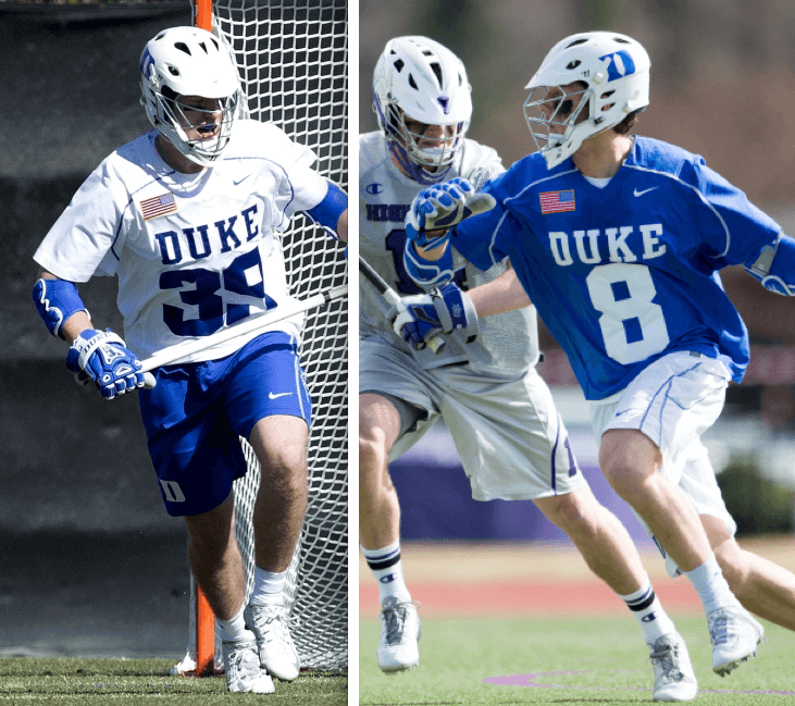
We all know by now that if an American flag patch or decal applied to the right sleeve or the right side of an object should always have the blue field facing forward, even if it makes the flag look “backwards,” because that’s how the flag would look from that side when advancing forward. This applies to sleeve patches, helmet decals, military uniforms, buses, the space shuttle, Air Force One, and so on.
But as you can see above, the Duke lacrosse team is taking this idea a step further. They’re wearing the “backwards”-oriented flag on the upper-right chest area of their jerseys. They didn’t have that there last season; it’s something new they’ve added this year. I get the idea, but I don’t really agree with it. To me, those flag patches aren’t on the right side; they’re on the front.
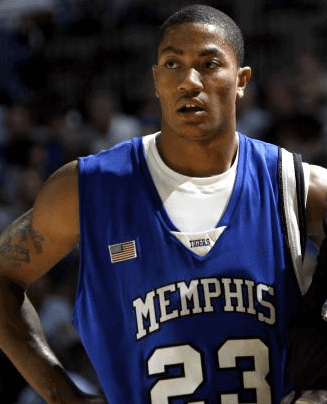
How have other teams handled flag patches in this same region of the jersey? Lots of college basketball teams have worn a flag patch there, and I’m pretty sure they’ve all been oriented the “normal” way, like so:
Also, the Reds wore a flag patch on the upper-right chest during the 1990 World Series (this was for the first Gulf War), and it too was oriented the “normal” way (click to enlarge):

It’s also worth noting that the back of each NFL helmet has a flag decal on the right side. If they went with the Duke approach, that flag would have the “backwards” orientation, but that’s not how they do it:
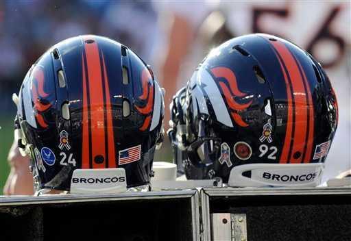
Obviously, the NFL doesn’t view that decal as being on the left or right side; it simply views it as being on the back. I think that’s the correct interpretation, and I think Duke’s is wrong.
Incidentally, I’ve been putting “backwards” and “normal” in quotes because those are completely subjective assessments. Every single real flag on a real pole appears in both configurations, and we never say that one of them is backwards, do we? Or at least I don’t. (It’s important to remember that things like patches and decals are not flags; rather, they are representations of flags.)
Of course, there’s a simple way to resolve all these issues: Teams could stop pandering to cheap “U! S! A!” jingoism and just skip all the flag patches and decals. But I’m not holding my breath on that one.
(Thanks to Mike Alper for bringing the Duke situation to my attention.)
T-Shirt Club LAST CALL: Today is the last day to order the Uni Watch T-Shirt Club design for April, which was inspired by Jackie Robinson Day and is available in home white and road grey versions. 100% of my profits from this design will be donated to the Jackie Robinson Foundation, which builds on Jackie’s legacy by providing college scholarships to disadvantaged students of color. ESPN will match my donation (that’s their policy for charitable contributions), and Teespring may donate something as well. Full details here, or just go straight to the ordering page.
As of this morning, we’ve sold 264 of these, making it our biggest seller so far. Can we hit 300? I’d love to see that — let’s make it happen.
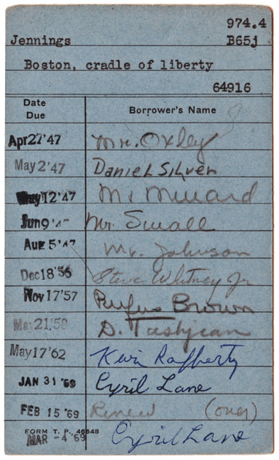
PermaRec update: Two new entries on Permanent Record: One is about a bunch of old library cards (like the one shown at right), and the other is about a long-lost letter from John Lennon that has inspired a new Hollywood movie.

Baseball News: Whoa, look at the jacket worn back in the day by Senators manager Clark Griffith! ”¦ Interesting new look for Oklahoma. … I like the contrasting sleeves and dislike the side panels, but what’s with the positioning on that script? It’s sitting way too low. ”¦ Who’s the kid in the Expos cap? “It’s from a comic about a transgender male-to-female child,” says Sara Schieve. “As you can guess, the artist is from Montreal.” ”¦ Cool story about three brothers who snuck into the abandoned Astrodome in 2012 (from Chris Flinn). ”¦ I’m on record as a big Joe Maddon fan, but this is not a good look, for multiple reasons (from @1010XLBeef). ”¦ Jason Heyward, now with the Cardinals, has been sticking with his plastic faceguard attachment this spring. ”¦ Adam LaRoche, now with the White Sox wore a G.I. Joe compression sleeve the other day. ”¦ Really nice road greys for Tulane. Pelicans on the bat! ”¦ “The Yomiuri Giants and Tokyo Yakult Swallows will play in the ‘Tokyo Series,’ which consists of six games in April — three in the Tokyo Dome (Giants home) and three in Meiji Jingu (Swallows home),” reports Jeremy Brahm. “The Swallows will wear this uniform for four of those games. It is called the Tokyo Enpower uniform (Chinese reading of Swallows in Japanese is En, and combining empower from English).” ”¦ Keith Friedman spotted this 1972 Tigers schedule/calendar. Note the odd colors on the sleeves and waistband, plus the Tigers have never worn stirrups like those, plus-plus the orange headwear logo and the old English “D” were never worn together in the same uni.

NFL News: “I noticed that the new renderings for Rams owner Stan Kroenke’s Inglewood stadium do not contain any gold in the end zone paint,” says Sean Mitchell. “Could this indicate a Rams return to the Deacon Jones-era blue and white color scheme when they come back to Los Angeles?”

College Football News: New Penn State recruit Sterling Jenkins, who’s competing for a spot on the offensive line, has such a big head that they had to order him a special helmet “from some Russian company in the middle of nowhere.”

Hockey News: If you go to this page and click to the last four shots in the photo gallery, you’ll see pics of Bell Telephone hockey teams with really cool jerseys (nice find by Will Scheibler, who also sent along this old shot of an Ontario Wind Engine and Pump Company hockey team, with a windmill on the chest). ”¦ Lightning captain Steven Stamkos was wearing a Nike undershirt with the MLB-style logo creep on the collar. “Haven’t seen many NHL guys wearing that,” says Garrett Heller.

Basketball News: The Clippers and Pelicans went color vs. color last night. … Good article on the trend toward colored tights on the court. ”¦ Douglas Ford was watching the 30 for 30 movie about Christian Laettner and spotted Larry Johnson of UNLV wearing a University of Texas cap. Although Johnson played for UNLV, his hometown is Tyler, Texas, which is also Earl Campbell’s hometown. ”¦ Throwbacks last night for Oregon, with a fir tree sweatback pattern. Interesting shooting shirts, too. ”¦ Players sitting on Maryland’s bench last night wore black-shouldered shooting shirts — except for one guy, whose shoulders were red (from Gus Soteriades). ”¦ Speaking of Mayrland, F Jon Graham had a tear in his shorts last night (from Fergie, who didn’t give his full name). ”¦ This is sort of ironic: In the semifinals of the Red Sarachek tournament, which is the most prestigious tourney for Jewish high school basketball teams, two schools went color vs. color with Christmas hues — red vs. green (from Yosef Coleman).

Soccer News: Nike now has a coaching school that’s producing high-level soccer prospects. “This puts Nike in direct competition with their clients,” notes Yusuke Toydoa. ”¦ Also from Yusuke: “Each time Chelsea coach Jose Mourinho wins a trophy, he retires his watch and keeps it in a safe deposit box. He now has 21 watches.”

Grab Bag: When Tennessee decided to stop using the “Lady Vols” moniker for most of its women’s sports teams, a few readers suggested to me that Nike, which is about to take over as the school’s new outfitter, must have been involved in the decision somehow. I was skeptical of that, but it turns out they were right (from JD Hunter). ”¦ Doesn’t it seem like boxing promoters Bob Arum (who’s promoting the upcoming Mayweather/Pacquiao superfight on May 2) and Don King (whose role in the sport is diminished but not extinguished) have been around forever? I was curious to know how old they are, so I looked it up: They’re both 83! Interesting that they’re the same age, and that they’ve both stuck around in the fight game for so long. Wouldn’t you think they’d wanna kick back and enjoy their remaining years? ”¦ Hmmmm, is this a sweatshirt, or sweatpants, or both? (Bizarre find by David Firestone.) ”¦ Good overview of how the Walt Disney logo has looked in movies since 1985 (from Trevor Wilson Patton). ”¦ Speaking of Disney movies, Toy Story may have a 20th-anniversary logo. ”¦ “While competing in the 1988 British Touring Car Championship in his BMW 635,” says Graham Clayton, “Peter Buxtorf adopted different color schemes for each round by putting different decals on his black car: pink circles, yellow diamonds, and orange triangles.” Sounds like a Lucky Charms commercial, no? ”¦The Supreme Court will hear arguments today in a case involving the Sons of Confederate Veterans, who were told by the state of Texas that they could not put their logo, which includes the Confederate flag, on a novelty license plate. The group has appealed that decision on First Amendment grounds.
Regarding the Tigers calendar. Because it was an ad for listening to the Tigers on the radio, presented by Stroh’s they weren’t allowed to use the Tigers actual colors, is my guess.
My guess is that it’s the same thing as the Rams stadium renderings – as long as the art looks enough like what it’s supposed to represent, minor details are unimportant.
Not to cavil, but when I think of “faking it” advertising, I think of (in my state) a New York Giant or New England Patriot player (or retired player) in something closer to the proper colors, but without really any logo.
The linked poster, with the red/royal stripe, is odd, but what’s odder to my eye is the use of an olde English D, akin to the authentic one.
[Ugh. I hit “submit comment” by accident.]
Interested in any granular unpacking of this, as it was before my time: Were they “the official beer” or could just any company print up a calendar and slap the team on it? Was this owing to being an alcohol sponsor v., say, a hot dog sponsor?
Stroh’s was, at the time, the largest local brewer in Detroit. However, in the early 70s, teams hadn’t yet learned how to squeeze every penny from the corporate sponsors, and I doubt that they had established an ‘official’ (read: they pay the most) beer.
Likely as not, it was someone’s stock art of a couple baseball players, and Stroh’s advertising company just stuck the Ds in the proper place.
The top of the batter and the bottom don’t go together. It appears to be a left handed hitter, but the top image seems reversed.
There are two links running together at the beginning of the baseball section, the Oklahoma baseball link and something about the Expos.
When Tennessee decided to stop using the “Lady Vols” moniker for most of its women’s sports teams, a few readers suggested to me that Nike, which is about to take over as the school’s new outfitter, must have been involved in the decision somehow. I was skeptical of that, but it turns out they were right
That article is only available to subscribers, the rest of us only get a single sentence.
Odd — I got the whole story yesterday.
Anyway: Here’s an AP version, which I’ll swap in:
link
Tangent: I missed this bit about the name. The name “Lady Vols” needs “fixing”?
As a fan of womens’ hoop*, a never-ending source of amusement is the defacto “Lady Mannames”: Lady Knights, Lady Bulls, Lady Friars, Lady Stags, Lady Rams, Lady Spartans, Lady Pirates, etc.
In a world where we’re wrestling with the NFL’s Washington Washingtons, part of me wonders if these collegiate names are just a cute, ignorable anachronism, or they ought to be looked at with a more critical eye.
And I count a few places have done it up right, by my (confessedly male) reckoning, such as the Ladys of Troy (So Cal) and Cowgirls (Okla St). Plus I’m always rooting for the Delaware Blue Hens and Marist Red Foxes.
(* I’m a UConn fan, and can’t pretend to love Tennessee, but their success is unarguable.)
It’s the “Women of Troy.”
Oops. But I like either one more than “Lady Trojans”.
Have no idea if Troy (nee Troy State) uses it, or if various Spartans (Mich St, San Jose St) do either.
Don’t forget the Northern Arizona Lumberjacks and Lumberjills!
Did not know that. Great add!
The OU and Expos links seem to be running into each other.
Fixed.
the link with “from some Russian company in the middle of nowhere.” goes back to Uni Watch.
Fixed. Here’s the proper link:
link
“We all know by now that if an American flag patch or decal applied to the right sleeve or the right side of an object should always have the blue field facing forward,”
No, we don’t all know that. Because it is not true. It is the custom in aviation, because it simulates the appearance of an actual physical flag flying with the motion of the vehicle, such as on the hood of a diplomatic car. And it is, as of recently, the rule for the U.S. Army. But traditional American flag etiquette holds that the union – the blue bit with stars – should always be displayed in the upper left, from the viewer’s perspective. Always, and without exception. To embrace the Army’s recent policy of violating traditional flag etiquette as a universal rule for civilians is to buy into the militarization of our national life that produces camo sports uniforms. If one embraces the Army’s unilateral rewriting of traditional flag etiquette, one has no grounds on which to object to camo troop-tribute jerseys.
Patches and stickers are not “representations of flags.” They are flags. A flag is a symbol. To say that a jersey patch of the flag is not a flag makes exactly as much sense as saying that the “D” on the front of a Tigers home jersey is not really the letter D but a representation of the letter D. Both the letter D printed in a book and the letter D on a Tigers uniform are symbols referring to the concept of the sound at the start of words like Dog or Detroit. Whether it’s a piece of cloth on a pole or a bit of stitching on a shirt, a flag stands for the idea it represents. When a person sees a flag patch on a baseball jersey, he doesn’t think, “Oh, that stands for the idea of a piece of cloth on a pole.” He thinks, “That stands for America.”
Flag etiquette really isn’t as hard as people, especially sports executives, want to make it out in order to justify their own boorish behavior. There are like three basic principles at work, and they easily cover all situations.
1) A flag is a flag.
2) Don’t deface the flag, or place it where it is likely to be defaced.
3) Upper-left is the place of honor.
Just remember those principles and you’ll never go wrong. Even Paul’s non sequiter about flags on poles flying in the wind is easily addressed if one doesn’t overthink it looking to excuse boorishness. The wind will do what it will do. But is the Amercan flag to the left, or above, any other flags in the same location? If so, it is in the place of honor, and problem solved. A flag patch doesn’t wave in the wind, so one can choose where the union of the flag appears: in the place of honor, the upper left.
Three excellent pieces of advice by arrScott.
And FWIW, I’ve always thought that the use of “backwards” flag patches/stickers/whatever is, on Paul’s scale of Good to Stupid, a resounding stupid.
Flags flutter. Patches don’t. Problem solved.
I’m glad to read the exchanges about how best to display the US flag. Proper respect for the flag is important, as our flag is a symbol of our Republic.
Of course, sports executives need to keep in mind the words of John Prine, Your flag decal won’t get you into heaven anymore: link
“The Supreme Court will hear arguments today in a case involving the Sons of Confederate Veterans, who were told by the state of Texas that they could not put their logo, which includes the Confederate flag, on a novelty license plate.”
Shouldn’t that read: “. . . which includes a representation of the Confederate flag, on . . .”
Great post, arrScott.
During the flag boom of the 2000’s there was a story about a Chinese company that were making American flags, except they had the wrong number of stars on the flag, in the neighborhood of 60 or so. When asked about it, the company responded that they were not flags, but rather representations of American flags.
“No part of the flag should ever be used as a costume or athletic uniform. However, a flag patch may be affixed to the uniform of military personnel, firemen, policemen, and members of patriotic organizations. The flag represents a living country and is itself considered a living thing. Therefore, the lapel flag pin being a replica, should be worn on the left lapel near the heart.”
U.S. Code, Title 4, Chapter 1, Section 8(j)
I agree about the Duke flag issue. It’s on the “front,” in which case the blue should be in the upper left corner of the flag.
I love Ghosts of DC, but that Griffith coat is not plaid. It’s a sort of sophisticated check. Not sure if checks made up of tiny stripes has a particular name as a pattern, and if so I hope someone here will identify it, but it’s not plaid.
“Could this indicate a Rams return to the Deacon Jones-era blue and white color scheme when they come back to Los Angeles?”
I really hope not. We already have the Colts as the NFL’s “blue & white” team, and the Rams blue & white era was only 9 seasons. The Rams going back to just blue & white would be almost as dumb as the Eagles going back to kelly green and wearing white helmets.
I concur with The Jeff on this one…
As a kid, the Dodger Blue and white Rams were the first pro unis I ever saw in person. They home versions looked great, the road not so much. In the 9 years they wore them, though they had some very good teams, they never won a championship. (prolly why the Steeleers never wear the batcape throwback -looks good but titles.)
Kinda like rewarding nostalgia for nostalgia’s sake, throwbacks maybe, but full time?
I mean you have the most iconic helmet design of all time, it’s not hard even for the Nike-cons to conjure up something un heinous.-
With the exception of the games in which the Rams wore the blue and yellow throwbacks the last 3 seasons, they have been using the blue and white St. Louis wording in the endzone. I suspect it’s not a sign of change but the designer of the new stadium looked to the current endzone for inspiration.
That was my interpretation too. Here’s what their current field looks like: link
I don’t know…the “blue” in that end zone seems dark enough to be almost black…the generic “Los Angeles” lettering, combined with the dark blue/black and white scheme would seem ambiguous enough to accommodate the Rams, Raiders, and/or Chargers….
For the Lady Vols story, all I get is:
In an evaluation of the University of Tennessee brand last April, Nike said it believed “The continued use of Lady Volunteers further segments an athletic institution that is striving to be united as ‘One Tennessee.’ ”
Full story available to subscribers only.
I see The reported this above and got a response.
Screw Nike. But we knew that.
Permanent Record “A bunch of old library cards” link gets a “Sorry, the page you were looking for in this blog does not exist”
Fixed. Here’s the proper link:
link
Interesting story on the (relatively) short shelf-life of certain sneakers and the implications for collectors:
link
ed
In Scouting, the American flag patch is worn the “traditional” way on the right sleeve. It is already sewn on prior to purchase so that is the way BSA wants it on there.
See link for more information.
According to the US flag code:
1. Flags flown on a pole should be mounted on the side of the blue field.
2. Flags mounted on the wall (vertically or horizontally) should be displayed with the blue field in the upper left corner.
So, actually, a flag mounted against a wall, or in rafters, etc, with the blue field in the upper right would be, by definition, backwards, as would a flag mounted on a pole by the side opposed the star field.
“Doesn’t it seem like boxing promoters Bob Arum (the latter of whom is promoting the upcoming Mayweather/Pacquiao superfight on May 2) and Don King (whose role in the sport is diminished but not extinguished) have been around forever?”
Who is the latter? There is only one name before the parenthesis.
I’ll always love the look of Yeshiva basketball teams
As for the Reds wearing the flag patch in 1990. I think the events of 9/11 and the flag reaction of that time is what really got people thinking about the correct way the flag should be shown on the side of busses, etc. Prior to 2001, flags weren’t plastered everywhere. Once they started appearing on the sides of busses, police cars and the like I think that’s when flag etiquette folks chimed in.
I would think Nike could see the Tennessee Lady Vols/ Vols situation as an opportunity to market more UT gear to women. Why force this on them? Just Don’t do it.
Marketing showed us a long time ago that ladies will use men’s products, but men won’t be caught dead with a product designed for women.
Nike probably figured (re: researched) that you can sell way more sports garb to men than women, and a man would buy a women’s outfit that’s generic (perhaps thinking it’s an alt uni?) but wouldn’t be inclined to wear one that actually said “Lady Vols” on it.
RSB
I’d say it’s just a case of Nike trying to streamline what they have to produce for the school. Both men & women will buy “Tennessee” gear, but only women will buy “Lady Vols” stuff. So they can theoretically sell just as many shirts if everything is just Tennessee and they don’t have the extra cost of making the Lady Vols stuff.
DId you guys know about them arches tournament or did you look it up and the yeshiva league schools do indeed have some sick uniforms.
I didn’t know about the tournament. But when you sent me that tweet, I looked up the tourney to see what it was about.
Looking at the photos, two thoughts came to mind:
– the blue field of stars (known as the union) is always in the upper left corner; vertically as well, but especially horizontally in a situation like this. Who in the US wouldn’t see that and automatically realize it’s wrong?
– Were the Reds the last team to abandon the pullover jerseys and Sansabelt pants? (Don’t answer that: Okkonen says yes, in 1993; St. Louis was the second last, in 92.)
“Bend Your Knees” is a favorite saying of Oregon coach Dana Altman.
So is this change to the Lady Vols going to impact the color palette at all? I was under the impression that only the female teams at Tennessee used the blue trim. I imagine “One Tennessee,” if taken to its logical conclusion, would either phase that out, or introduce it into the men’s teams.
Or are there male teams at Tennessee that wear the blue?
Back in the day, the sky blue was used by the men’s teams too albeit sparingly and in basketball primarily. The women’s teams picked up the sky blue as their own at UT when the men’s team started incorporated the ubiquitous black that’s been present since the late 90s. I know the Lady Vols were PROUD to be called Lady Vols. Gave them their own identity and basically their own color scheme. UT admin sold the women down the river for money from Nike.
Flag stuff: The side of the flag on which the blue field is aligned is called the “hoist side,” or the one nearest the flagpole or standard. The only stipulation to which is forward or backward is that hoist side should be up. Some flags have a front (“obverse”) and back (“reverse”) – link for a complete list. Flying a U.S. flag with the blue field down is a distress signal and is sometimes used in protests as a sign of dissatisfaction.
My neighbor hasn’t taken in his flag in three years. He has young kids, who usually tend to be sticklers on flag code (I know I was). I’m surprised his son hasn’t asked him to take it in at night or during a rainstorm.
It’s a standing joke to tell newcomers to get “the rubber flag for rainy days.” You keep it next to the striped paint and left-handed wrenches.
D
And when you’re done with that, bring me back a bucket of steam.
Don’t forget the left-handed smoke shifter and the bacon stretcher!
Flag etiquette says you don’t put the flag up when it is raining, but if it starts raining AFTER the flag is already up, then you leave it up. It the flag is always flying, reason is it stays up during rain. Hopefully it has an appropriate light shining on it at night, per code.
“These colors don’t run.”
That has to be an old picture because Obama had the flag removed from Air Force One.
The script on the Oklahoma jersey is the victim of the placket. The team name could only go up .5″-1″ higher.
Nah, Maddon makes that look good.
The Yomiuiri Giants will go back to wearing “Tokyo” in block letters on their road jerseys this season for the first time in 13 years. That is a great classic look IMO.
Yo – is this a shameless rip-off, an earnest rip-off, or trolling:
link
(it’s the Blazers promo tee for the upcoming game against Golden State…)
That’s hilarious!
Im finding myself annoyed by 1) lazy font matching; 2) red-text on dark background, ouch, and 3) link link link link Portland link?
No clue if this is accurate but a recent tweet purported to be next years Pro Bowl uniforms is up. Nonsense about the NFL “going gold” for Super Bowl 50 aside, these uniform are using a completely different template from the current NFL. No Nikelace, no sweatbox, no divided chest panels like we saw in the BCS this year.
link
The Duke patches are doubly wrong. They should be on the left side with the blue in the top facing the center of the chest. Of course, the Swoosh is in the way, and we all know that showing allegiance to Nike is better than showing allegiance to America.