You know the drlll
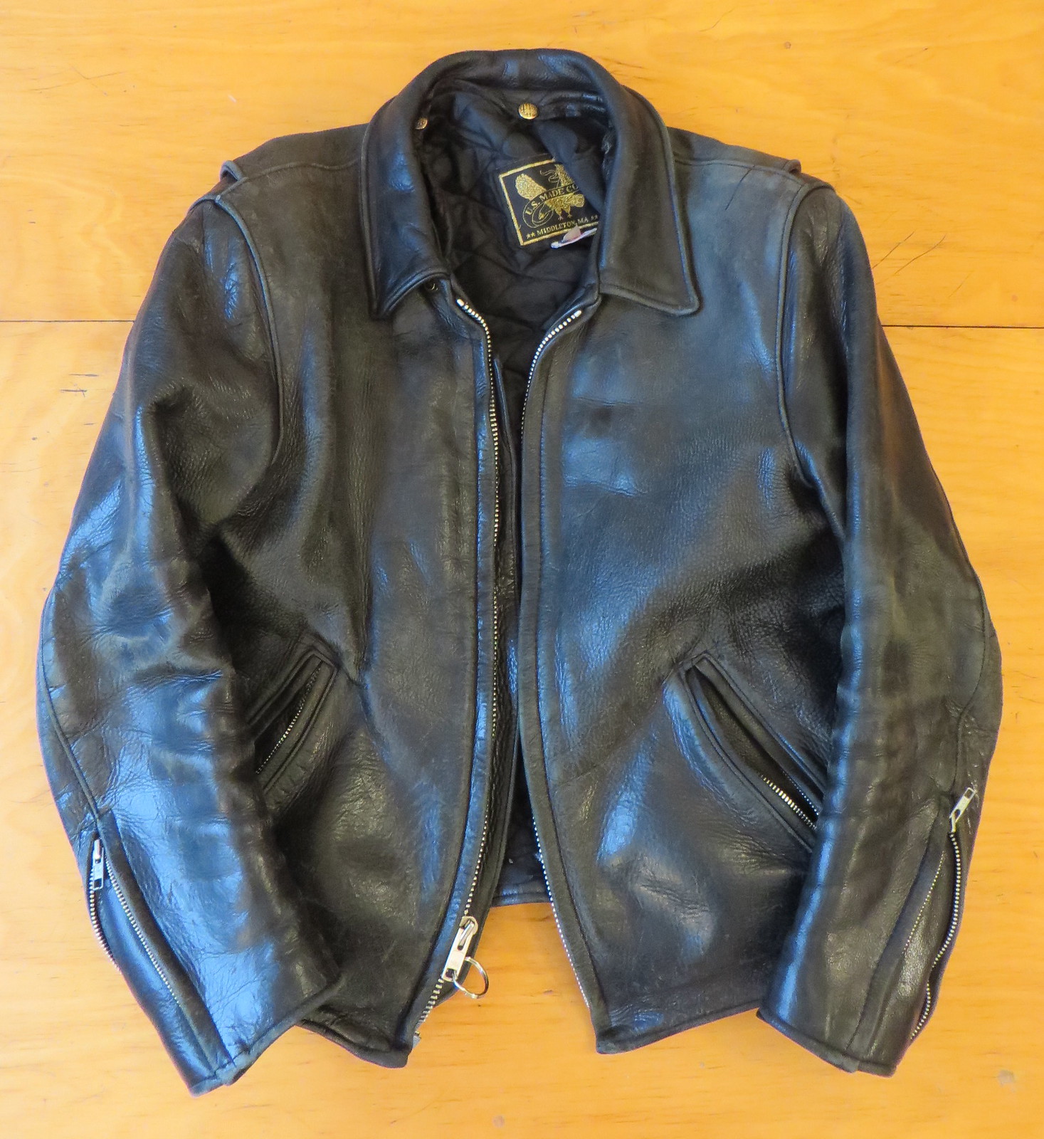
I want to go slightly off-uni today to talk about a design-related experience I recently had. The story begins about 19 years ago, when I bought the heavy black leather jacket you see above. It was, and still is, damn near perfect. From the moment I got it, I knew it would be the last leather jacket I’d ever need to buy. It’s my go-to winter coat, and I expect that to be the case for the rest of my life. (Oddly enough, I don’t seem to have any good photos of myself wearing it, although there’s this sort of goofy shot of me wearing it while posing next to a Lego version of Kevin Garnett at the NBA offices. Those were in the happy days before the NBA shit-listed me for encouraging people to send anti-uni-advertising emails to Adam Silver. But I digress.)
After seven or eight years, the jacket’s zipper got chewed up in an accident and had to be replaced. It was a pretty heavy-duty zipper, and it had to be sewn through thick layers of leather, so it was an expensive repair, at least by zipper-replacement standards — something like $60, as I recall, and it took more than a week. Afterward, the shop that did the repair made it clear that the job had been a pain in the ass. The unspoken message I got was, “If you need another zipper, go somewhere else.”
The replacement zipper worked fine until last winter, when it started misbehaving. I’d pull up the slider and the teeth would initially mesh together, but then they’d sometimes start coming unmeshed. I’d have to drag the slider back down through the unmeshed teeth, which is difficult and frustrating, and start over. Sometimes the same thing would happen repeatedly. I figured out a few tricks to help avoid this problem, but by the end of last winter it was clear that it was time for a new zipper. Naturally, I didn’t want to deal with that hassle, so I put the jacket in a closet and forgot about it.
Fast forward to a month or so ago, the first really cold day of the year. I pull the jacket out of the closet, put it on, zip it up, and suddenly realize, “Oh, right — that fucking zipper.” Grrrrrr. Okay, no more procrastinating. Time to fix the damn thing. (Well, actually, I procrastinated another 10 days or so because it suddenly got warmer and I was able to put the jacket back in the closet, but I had mentally shifted into “Just fix the damn zipper already” mode by then.)
I didn’t want to take it back to the place that had fixed it last time, so I went to a shoe and leather repair shop. You know the place: totally ramshackle, smells like shoe polish and leather, a battered sewing machine in the corner, piles of shoes and other crap all over the place.
I brought in the jacket and explained the problem. The guy took one look and said, “I don’t think you need a new zipper. Probably just a new slider.”
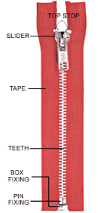
Then he took a pair of pliers and removed the top stop from the the right side of the zipper. That allowed him to remove the slider, which he then replaced with a new one. Then put the top stop back on.
Sure enough, the zipper was suddenly good as new. Total time invested: 10 minutes. Total cost: $12.
I had no idea that sliders could wear out, or that they could have such an effect on a zipper’s functionality. I figured that if the teeth weren’t meshing, it was because the teeth themselves were worn out.

This experience reinforced something I’ve thought for years, namely that zippers are completely amazing pieces of industrial design. They’re inexpensive, they’re efficient, and they work like magic. Definitely one of the best and most unsung technological developments of the past century. There’s a good book about them, which I have a copy of, although I’ve only read bits and pieces of it — never the whole thing. Maybe it’s time to pull it back off the shelf and remedy that.
Just to bring this back to Uni Watch, there used to be a zipper factory in Queens, called Serval Zippers. Its sign was plainly visible beyond the left field wall at Shea Stadium, so I grew up seeing it when I went to Mets games:
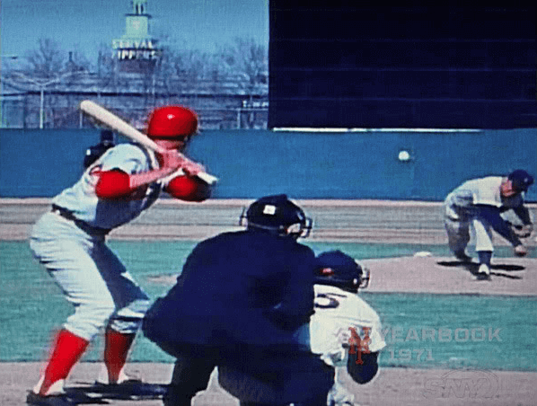
During night games, the sign would illuminate one letter at a time — S-E-R-V-A-L Z-I-P-P-E-R-S. Then it would go blank and start over. It was sort of mesmerizing. Alas, Serval Zippers no longer exists (the building is now a U-Haul outlet), although its name lives on on countless garments.
So, yeah: Zippers. They’re really cool. Thanks for listening.
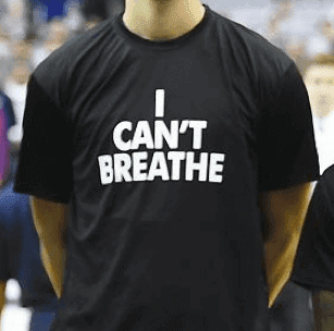
Protest T-shirt roundup: To my knowledge, there were no new sightings of “I Can’t Breathe” T-shirts in the sports world yesterday. But there were still some developments on that front, as follows:
• Attorney General Eric Holder applauded Derrick Rose of the Bulls for being the first athlete to wear the shirt, and also voiced his support for other players who’ve followed Rose’s lead.
• Georgetown basketball coach John Thompson III talked about his team’s recent wearing of the shirts.
• After the entire Hornets roster wore the T-shirts on Saturday, guard Gerald Henderson discussed the team’s intended messaging.
• A Connecticut high school’s basketball team plans to wear “I Can’t Breathe” tees during pregame warm-ups for at least the first few games of its season.
• The Washington Post reported that some of the NBA shirts were produced by a company that has long been cited for unfair labor practices, and that the activist who helped organize the production of those shirts now regrets it.
Meanwhile, Browns wide receiver Andrew Hawkins spoke yesterday about the “Justice for Tamir Rice and John Crawford” T-shirt that he wore prior to Sunday’s Browns/Bengals game. Hawkins began crying while telling reporters that he wore the shirt because he fears for his two-year-old son’s safety. The Cleveland police union has demanded that he apologize.
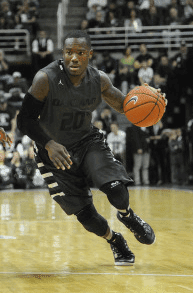
Decoding the swooshspeak: In yesterday’s Ticker I mentioned that Oakland had worn black-on-black uniforms and said, “Naturally, the one contrasting element was the Jumpman logo because, as you know, it’s all about Nike. Douchebags.”
That prompted a lengthy but fascinating note from Ben Hayden, as follows:
I work as an equipment manager for Michigan State football and Olympic sports, and I just wanted to add reference to the comments made about Oakland’s basketball uniforms. Oakland is not a Nike Elite program, nor a Jordan program (such as UNC or Georgetown basketball). Although Oakland is indeed affiliated with Nike, they do not have the design options such as a program like Georgetown (or even us at Michigan State, for that matter). A Nike Elite program, for one, will meet with Nike years prior to changing its uniform designs, except in the case of the “Disrupter” line, which is incorrectly referred to as “HyperElite” or “ProCombat” uniforms (in terms of basketball ONLY). The Disrupter line is determined the year prior to release. For example, the bronze uniforms our basketball team wore last season (2013-14) were designed in the early stages of the 2012-13 basketball season. A program such as Oakland does not have the option to do this, and if you look closely at the uniforms, you can tell the twill lettering/numbering was an after-the-fact option chosen by Oakland after choosing the uniform template Nike offered through the Jordan Team line.
Indeed, the uniforms come from and are designed by Nike, but the uniform design offered to Oakland could be chosen by any Nike school and designed to fit a team’s color scheme with any lettering/numbering/coloring decided after choosing the template. This is not the case for certain Nike schools, such as Georgetown (a Jordan-Nike program), whose current uniform design is not offered to anyone except the Hoyas. This is a very common practice for large Nike programs (Florida, Syracuse, Illinois, even smaller basketball programs such as USC).
In all, the white Jordan logo appearing on Oakland’s uniforms would be white across the board no matter who chose that jersey template, even if the twill color option was yellow, gold, white, blue, pink, tie-dye, rainbow or camouflage. Oakland does not have the option of choosing the color of its Swoosh/Jumpan design, and same thing would hold true for any Adidas or Under Armour program as well. It is not a branding decision so much as it is a convenience for Nike/Jordan to mass-produce uniforms after they’ve been given a standard template (and teams can choose to add specific designs after the fact). Check out NikeTeam.com and design some uniforms ”” you’ll see what I’m talking about.
I get Ben’s point about the Jumpman logo and genuinely appreciate his expertise regarding all the other stuff. But seriously: “Elite,” “HyperElite,” “Disrupter,” wheee! Look, up in the sky, it’s DisrupterMan! Ben’s an equipment manager, so it’s his job to deal with this nonsense, but anyone else who can keep a straight face in the presence of this newspeak is way ahead of me. And by any nomenclature, Nike’s whole caste system for its client schools, where some programs are in First Class and others are clearly in steerage, is bullshit. My initial assessment still stands: Douchebags.
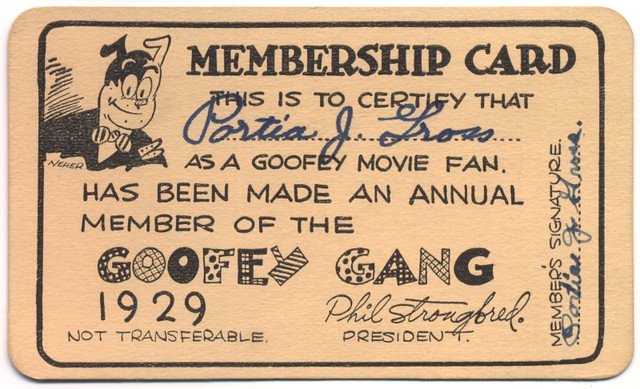
Membership has its privileges: A few weeks ago I mentioned that I might be writing an article on the subject of membership cards cultural totems and objects of design. That article (which includes some references to the Uni Watch membership program) has now been published on the design website re:form. Enjoy.
Collector’s Corner
By Brinke Guthrie
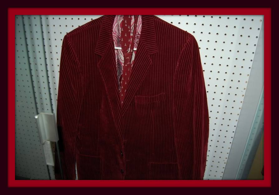
Okay, so this isn’t exactly your typical 1970s Big Red Machine eBay item, but still. Here we have what looks to be a red or corduroy suit worn by Pete Rose himself, tailored by a fellow named Pepe Ramundo. Costs a lot, but hey, you also get a “Pete Rose” tie!
Alright, here are some items that are more in the standard Uni Watch wheelhouse:
• Folks, two gems right here. We’ve featured these 1970s NFL goalpost helmet kits several times before, but I don’t think I’ve ever seen a set where they never even applied the helmet decals! Two different sets to choose from, here and here. Hurry — these listings end tonight.
• Back in the day, bet you could pick up a Mickey Mantle ashtray at his Holiday Inn in Joplin, Missouri, for next to nothing. A bit pricier now!
• How about this DIY Packers sweater?
• If you live in New England, this sticker will leave little doubt where your sports allegiance lies.
• If you’ve never seen or played this 1970s NFL Strategy game, I’d highly recommend it.
• Check it out! A game-worn Chicago White Sox leisure suit jersey top, and with a doozy of an NOB!
• Here’s a rather T-shirt sponsored by GTE, Offiical Telecommunications Consultant to the NFL.
• Nice-looking 1970s California Angels varsity-style jacket.
• Here’s a Packers jersey by Sand-Knit with the rarely seen logo-inclusive sleeve striping.
• NFL helmet plaques usually have a neutral or gray background. But this 1970s LA Rams plaque has some in-your-face yellow, eh?
Uni Watch News Ticker
By Garrett McGrath

Baseball News: Happy Holidays from the Mets, courtesy of this vintage Christmas card with Mr. Met dressed as Santa (from Bruce Menard). … New Chicago Cub Jon Lester chose former teammate’s Big Papi’s No. 34. … The folks at Hardball Talk think it’s time for the Padres to bring back the brown (thanks, Brinke). … this jersey was listed on MLB shop as “SF Giants 2015 Alt. jersey” but was changed to “Fashion” after SportsLogos.net honcho Chris Creamer contacted team for comment (thanks, Phil).

NFL News: The Seattle Seahawks 12th man jersey was retired 30 years ago yesterday (from Kyle Hanks). … Former Bears DT Steve McMichael’s McNOB = a base-aligned “c” and a raised “c” at different points in his career (from Cork Gaines).

College Football News: Asked and answered: Yesterday reader Joanna Zwiep wanted to know which school this helmet was from. As many readers helpfully explained, it’s from the University of Saint Francis in Indiana, an NAIA

Hockey News: “No pic, but there is a note in this article about Jesse Winchester of the Avalanche experimenting with glasses on the ice,” says Ryan Dowgin. “He has missed the entire year with concussion symptoms. He is okay at the team’s practice facility with a white background, but has issues in full arenas where the background is multicolored. Can’t recall many hockey players wearing glasses, aside from the Hanson brothers.” [Paul here. Glasses on the ice have been rare but not unheard of. Examples include Al Arbour, Hal Laycoe, Charles Shannon, and Clint Albright.]

Soccer News: Here is a leaked picture of Mexico’s Copa America black home kit (thanks, Phil). … Norway has a new federation crest. … The rest from Yusuke Toyoda: 2015 Asia Cup kicks off in January, and defending champions Japan will wear jerseys with gold numbers and winner’s patches. … South Africa unveils new unis from Nike. … Cardiff City supporters are threatening not to renew their season tickets if the team does not return to its traditional blue shirts.

Grab Bag: The Canadian Olympic Committee has indicated in court documents obtained by TSN that it is pursuing its watershed lawsuit against clothing maker The North Face (from Dr. Peter Baltutis). … Reader David Firestone ranked all 55 NASCAR Sprint Cup teams ranked from first to last on how their paint schemes appearance. … Congresswoman Loretta Sanchez’s holiday card is uni-related (from Andrew Hoenig).
Happy Hanukkah to all who are celebrating tonight. And here’s something to look forward to: Tomorrow we’ll have the annual year-end reader-appreciation raffle. Good stuff this year!

This entry reminds me of one of my jackets that I recently had taken in for a zipper repair (and that I’m excited to be getting it back soon because it’s a heavy jacket and winter is coming!)
And I’m really going to have to buy that zipper book now aren’t I?!
I’d read that.
And since my alma mater’s oiginal nickname was the Zippers, perhaps I should.
Extra! Extra!! Zipper news!!
link
Anyone? Anyone? Bueller?
I believe Paul had a post or ticker-link related to Under Armour using these zippers.
Yep, I think I remember.
Living in Florida now, and owning 2 jackets (each of which gets worn about twice a year!) I am not in the market for a new fleece or parka or whatever.
Anybody have a coat with one of these??
Awesome.
You were close with the information about the Pete Rose jacket. Pepe Ramundo has a store on the west side of Cincinnati on Glenway Avenue. Close to Pete’s alma mater, Western Hills High School. The shop on the east side of Cincinnati in Madeira is Romualdo’s, who is quite the character. He doesn’t own the store any more, but is there almost all the time.
There used to be a Ramundo’s Tailoring in Mt. Lookout Square on the east side of Cincinnati. I once ran into Johnny Bench there in the late 80’s. I used to have all my suits tailored there. It closed a couple of years ago. I imagine all the Ramundos are related some way or another.
Zippers aren’t just ingenious, nearly perfect industrial design. They’re also still relatively new tech: Introduced at the 1893 Columbian Exposition in Chicago, the zipper is just ten years older than the airplane.
Americans had telephones and electric lights in their homes and elevators in their offices before they had zippers on their coats.
Too modern for the Amish.
…And the Phillies, apparently.
while I understand the whole contrasting jumpman logo/ marketing ploy, it still doesn’t change the fact that it’s an ugly uniform. I’ve seen practice gear that looks better than that.
Today would have been the 148th birthday of my Very Favorite Artist, Wassily Kandinsky. He’s being honored with today’s Google Doodle:
link
Well chosen. I’m a Sandy Calder guy, myself.
For the modern category, I’m with you on Kandinsky. El Greco for the all-time list.
Loved the piece on zippers, I didn’t know about the Serval Zippers sign across from Shea Stadium. I’ll try to find some vintage footage of it lit up during a night game!
That would be great, Bruce. I’d love to be able to see it again!
Blurry, but if you go to the 6:25 mark in the YouTube clip, you can see something flashing on/off for 7-8 seconds. As I never went to a ballgame in Shea, I can’t vouch that this is it, though.
link
Also some neon lighting in the third picture on this linked page, although the length of the lower word seems too short (lots of other amazing photos as well). Suppose some of the neon could’ve been out for some reason.
link
The best time to see the sign would be footage from the 1970s. They used the camera from behind home plate a lot and there were no bleachers or Diamond Vision to block the sign. I can’t see youtube at work, but try to find footage from the 1973 World Series, which played 3 night games at Shea. I recall watching almost a full game on youtube.
Interesting read about your leather jacket. Good to know that there are still offbeat repair shops with knowledgeble (and apparently honest) people.
Probably of little interest to anyone else:
If you look at that first mini helmet kit in Collector’s Corner, you’ll see it has the Seattle Seahawks pictured and listed on the box as being in the NFC, but when you look at the contents of the kit, it includes the Tampa Bay Buccaneers helmet, instead; that would mean that this helmet kit is most likely from 1977, the year the Seahawks and Buccaneers switched conferences.
link
Collecting all 28 teams back then must’ve been a real chore, given how seemingly random the team selection is.
I spent a whole lot of quarters on those helmets from the bubblegum machines in my day.
We’ve featured these 1970s NFL goalpost helmet kits several times before
That’s putting it mildly…
That White Sox jersey was a doozy of a find, though. The name and number add to softballishness of it.
If scroll through photos here you can see a picture of the hockey team of the Lightning Fastener Co. in St. Catharines, Ontario.
link
Norway tried to introduce a new crest in 2008, with a link. Problem is that the team had worn the flag on its shirts link, and fans didn’t care for removing it.
There was an outcry, and Umbro quickly went from link back to link. I’m not sure they even played a single match with the new crest.
So link seems to have been designed to avoid the criticism they faced last time. I love it. Timeless, incorporating both the flag and the federation’s imagery. Why can’t the USA come up with something like this?
They’re also link as well as the shirt crest. I think I like this one better as well; the flat design is striking and very modern.
This is the USA. We can’t have nice things anymore.
The new Norge federation logo transcends the contemporary flat aesthetic; it looks almost more like something from the early 20th century. Very current, but also classic. Easily one of the best federation logos in FIFA today.
I’d take the crest from the centennial jersey.
Yes.
Worked for GTE back in the day, never got offered anything THAT nifty!
I really enjoyed your piece on membership cards on re:form, Paul. Interesting stuff!
Thank you!
I’m curious to know what you wrote that prompted the irate Uni Watch member to cut up his card and mail it back to you, but I have a feeling I know what the issue was…
I’m guessing Redskins fan. Either that or someone who *really* likes camouflage uniforms.
One too many reiterations of the tiresome anti-purple agenda?
Feel bad for the guy that came up with the “I Can’t Breathe” idea only to have them made by a douchebag company apparently. I am sure the guy had no idea about the reputation of this company. Just goes to show there are douches around every corner. This shouldn’t diminsh from the message though.
I think the Suns wore the I can’t breathe shirts for the first time last night. And also, I don’t know if it was mentioned a few weeks ago when the initial deal was first getting talked about, but ASU is finalizing a deal to switch from Nike to Adidas. As a fan/student, I’m not happy about it, I generally like Nike uniforms more than Adidas, but we shall see.
Ah, I missed that regarding the Suns. Sure enough:
link
And yes, we had the ASU news in the Ticker last week.
“ASU is finalizing a deal to switch from Nike to Adidas. As a fan/student, I’m not happy about it, I generally like Nike uniforms more than Adidas, but we shall see.”
If it means Sparky will be more prominently featured on the uniforms once again, I might be in favor of it.
Is there any indication that they will? Because it seems like Adidas goes out of their way to push their branding over the school’s identity (that misguided “Sic Em Bears” basketball jersey notwithstanding), moreso than Nike.
Pure speculation on my part. It was based on my assumption that Nike might make some claim of proprietary ownership to the pitchfork logo because it debuted as part of Nike’s redesign of the ASU athletic department’s visual identity back in 2011. That would have opened the door for Sparky to resume a more prominent role on the Sun Devils’ uniforms. But that assumption looks like it’s incorrect. According to Chris Creamer’s website, ASU will keep the pitchfork even after the transition to Adidas:
link
Regarding the color of the logo from the Oakland story. That’s not entirely true as it pertains to Under Armour. I coach at an UA sponsored school (D3 level) and I can choose the color of the UA logo on our uniforms and in fact did so this summer when we were due for new ones. So I can definitely prevent any kind of logo creep on any of our UA gear.
Not all custom uniforms allow that though. Many come with “stock” logo coloring.
This is why Nike’s douchebaggery (other than being the driving force behind logo creep in general) and the white Jumpman logo on the stupid all-black uniform are independent developments. Great insight from Ben at MSU.
Not everyone is on board with the “I can’t breathe” t-shirts. In fact, these folks are just the opposite.
link
Whitesplaining is the worst.
I wonder how many have been sold.
Great re:form article – well worth reading to the end.
In the physical form, membership cards have been replaced by loyalty cards, and “cards” are now keyring fobs or smartphone apps.
Another thing that (probably) doesn’t exist any more are official fan clubs. Nowadays, it’s a matter of following on Twitter or liking on Facebook.
Where’s my Uni-Watch decoder ring??!! I’ve been checking my mailbox everyday for a year!!
I got yer decoder ring right here… ;)
Bands/musicians still have official fan clubs with limited edition merch, access to tickets, etc.
Here’s a better look at link and the link.
It’s nice in theory, but clashes with the white stripes and they’re not putting gold number on the shorts?
Tangential to that Pete Rose jacket, Pepe Ramundo made the tuxes for my wedding.
I heard of this guy in Cincinnati- there was also a “Ramauldo,” in Madeira. Less famous.
I like “You know the drill” replacing the “Click to enlarge” today. Is that new or have I been missing it?
Today was the first time.
Don’t know how long it’s been up, but the CotD is absolutely priceless. Two of the pictures show the very model of TV my family had when I was a kid in the 1970s. And the pennants! The woman wrapping herself in the France pennant and the dude standing in front of the Welcome Home General MacArthur pennant are kind of profound monuments to their eras.
Went up just a few hours ago!
Interesting zipper story.
I recently had a run in with the zipper picking out a flannel jacket whether or not to go with a snap button or zipper.
Here’s something for you. A 1992 Mummers string band in baseball uniforms and all.
link
Good shoe and leather repairmen are indispensible! It’s a lost art of craftsmanship. I knew one who has since passed, and he could fix just about anything.
A flashing Serval Zippers sign. Straight out of Julius Knipl!
LA Kings stadium series costume to feature white pants.
A word is missing in the middle of the membership-card piece: “Although I had no money speak of” — no money *to* speak of?
Thanks. Now fixed.
I love those ’84-88 Packers uniforms with the floating “G” logo on the sleeve stripes. So pretty. Especially since they still had the 5 stripes back then. The pants back then also had a floating number on both hips..and a yellow stripe in between the traditional green-white-green stripe on the pants. Really such a great looking uniform set.