
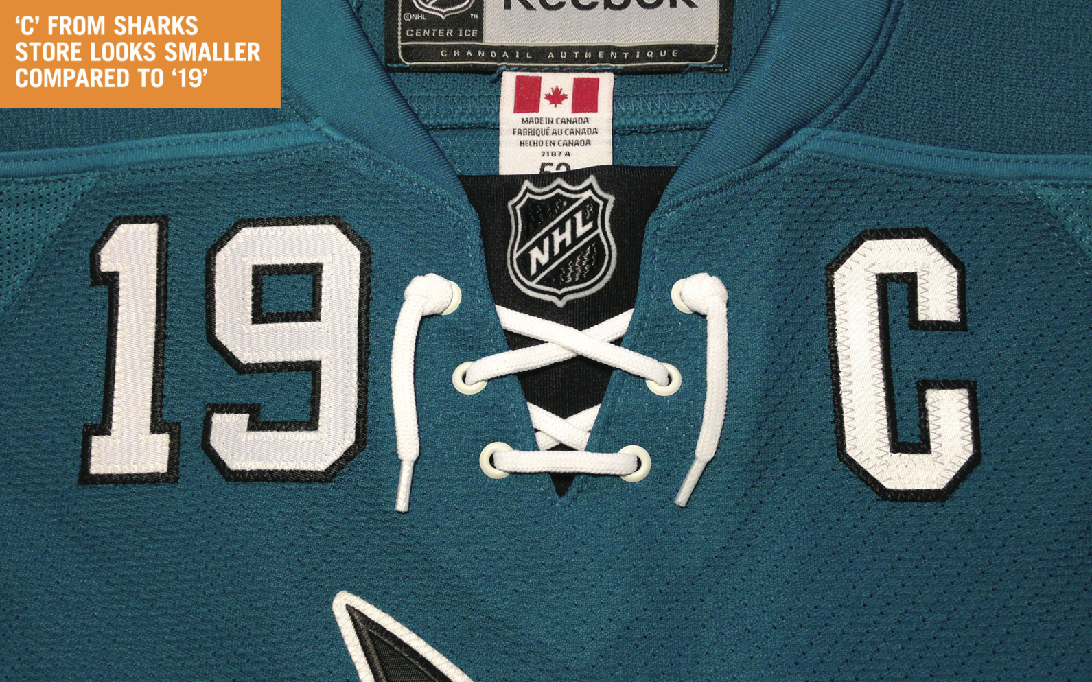
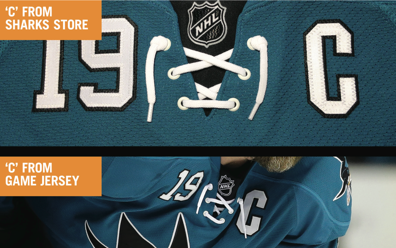
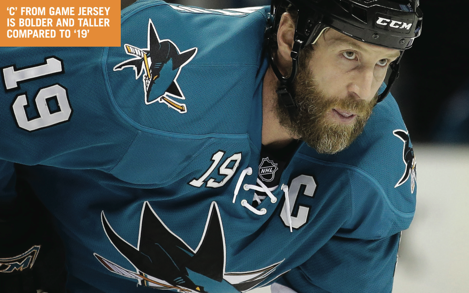
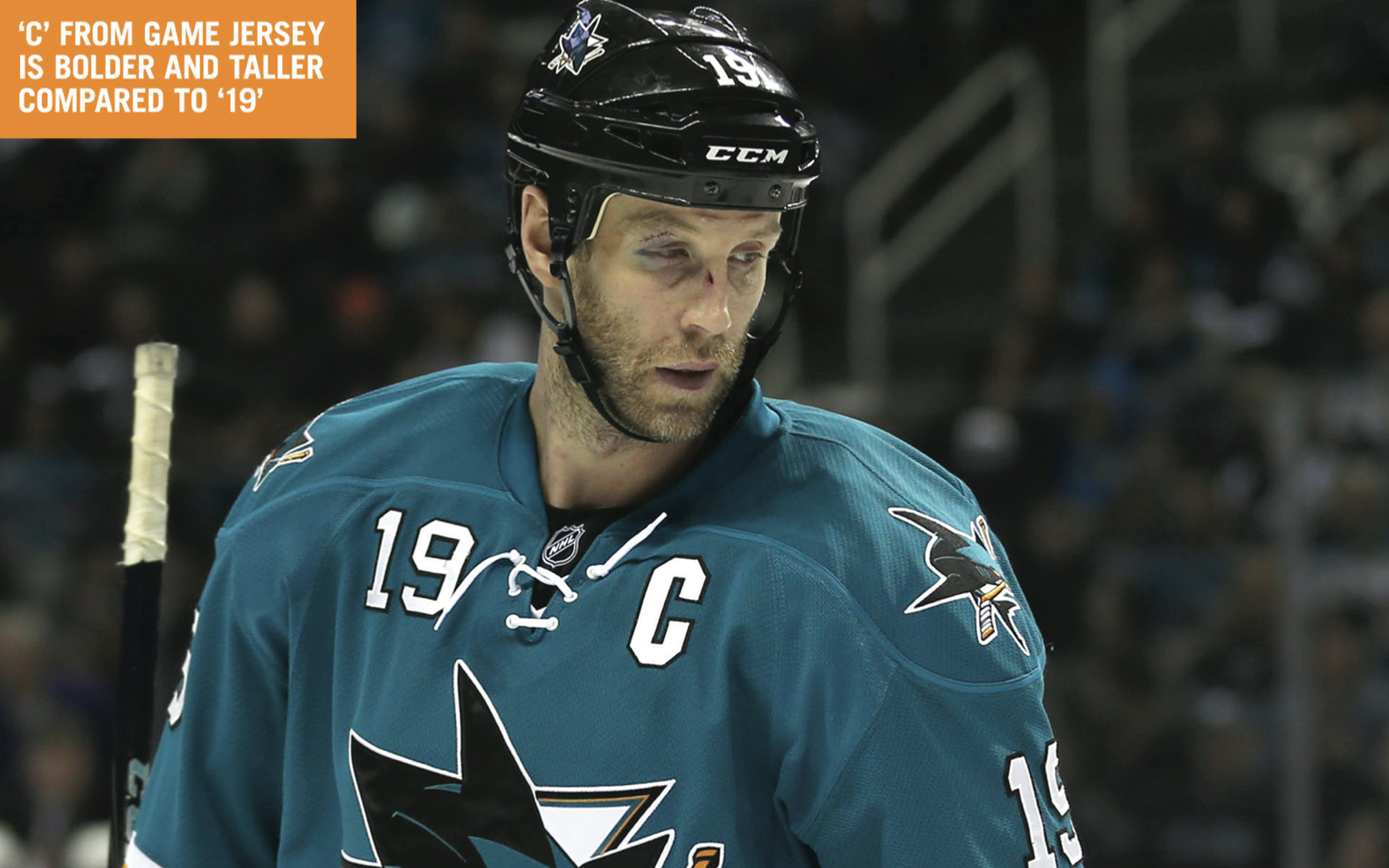
By day I’m an art director, designer, and typography nerd. By night I’m a huge hockey fan ”” the San Jose Sharks are my team. But I have an issue with jersey customizations done by the team store: The captain’s “C” they’re using doesn’t match the one used on the team’s game jerseys.
As a designer, I find the wimpy-looking “C” stitched to my jersey hurts my brain. It’s especially upsetting because it costs close to $100 for these customizations. The Sharks Store said they can’t use the ones the team’s equipment manager uses and are contractually obligated to use another vendor. They added that the letters cut are up to NHL-defined specs.
I just don’t buy this. As a loyal fan, I’m looking for the best products available from my team. What gets me riled up is they’re pulling a fast one over all the fans here in the Bay Area. Most people don’t look at type the way I do, but that doesn’t mean they should be walking around with the wrong font weight.
The Sharks Store asked me to verify the measurement of the “C” on my jersey. They said the NHL guidelines recommend the letter be 3″ tall. That is indeed the measurement of my “C,” but I also measured some other jerseys I own. The Avalanche’s “C” is 4″, the Penguins’ is 4″; the old Nordiques’ is 4″; and the Blackhawks’ is 4.25″.
I’ve created some comparison graphics detailing the differences from the “C” on his recently purchased jersey to the ones used on the ice. (I realize Joe Thornton is no longer the captain, but he still is in my eyes.)
Here are Travis’s graphics — for each of them, you can click to enlarge:
Now, a certain wiseass might say the best way to avoid problems with an overpriced polyester shirt is to not buy one in the first place. That said, it is odd that the Sharks Store doesn’t use the proper “C.” Have any other Sharks fans noticed this problem on their overpriced polyester shirts? What about other teams?

Don’tcha Gimme No Lip(syte): Outgoing ESPN ombudsman Robert Lipsyte (shown at right) has reached the end of his 18-month tenure and posted his final blog entry on Wednesday evening. It included what might be considered a bit of a potshot at Uni Watch:
The prodigious work by the Fainaru brothers (Mark and Steve) on NFL concussions and the league’s presumed cover-up has created a standard for sports journalism. But ESPN’s subsequent coverage of the topic has been spotty. A news organization that can run a continuing feature on the changing fashions of athletic uniforms (UniWatch) on ESPN.com can at the least run a continuing feature on NFL and maybe even college concussions: who gets them, how long before they are cleared for return and follow-ups. Call it Conc-Watch.
Okay, so Lipsyte obviously Doesn’t Get Itâ„¢. He’s also apparently unaware that I’ve done some concussion-related journalism myself (examples here and here), but whatever. I’d be the first to agree that the Fainaru brothers’ recent work has been groundbreaking, award-caliber stuff, but I’d like to think their work and mine can co-exist without somebody praising one at the implied expense of the other. It’s disappointing to see Uni Watch — and, by extension, the uni-verse, which includes me and all of you — used as a punchline, as the lightweight example held up to contrast with a “serious” topic. Heh-heh, look, they cover “fashion” (a word I’ve done my best to distance Uni Watch from). Goes to show that while our corner of the sports world has come a long way in terms of gaining respect and credibility, we still have a long way to go.
I was thinking about all this when I saw that Lipsyte had done an interview yesterday with the Big Lead. It included this exchange:
Big Lead: You got your start as a sportswriter on a pretty unconventional path that could not especially be replicated today. What advice would you give a college student looking to break into sports media?
Lipsyte: Same old. Work your ass off until you’re noticed. Gather clips and credits. Be persistent (most people quit). Learn something ”“- a sport, a language, a technology ”“- that will make you useful.
Hmmm, that’s exactly what I did. And once I did it, Robert Lipsyte basically made fun of it. Whaddaya gonna do.
I grew up reading Lipsyte’s stuff in the Times. He’s a major talent, a genuinely Important Guy, and my career will never even sniff the levels that his has reached — which is precisely why I find his offhand comment about Uni Watch so disappointing. Also disappointing: I sent a tweet to him, asking him to email me back, but he didn’t respond. Maybe his successor will be more uni-friendly — or at least learn that “Uni Watch” is two words with a space in between.
(Big thanks to Todd Radom for bringing Lipsyte’s mention of Uni Watch to my attention.)
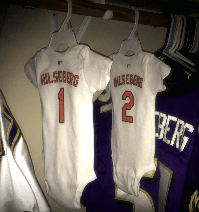
Good things come in pairs: Big congrats to longtime Uni Watch contributor/pal Joe Hilseberg and his wfe, who are expecting their first children — a two-bagger! As you can see above, Joe’s already making room in his jersey closet for the new arrivals. I like the Orioles theme (Joe is from Baltimore), but promise me you won’t dress the kids in Ravens purple, Joe!
Today’s Uni Watch Birthday
By Douglas Ford
[Each day this month, Douglas Ford is selecting an athlete who’s celebrating his or her birthday and presenting some uni-notable photos of that athlete. Here’s today’s installment.]
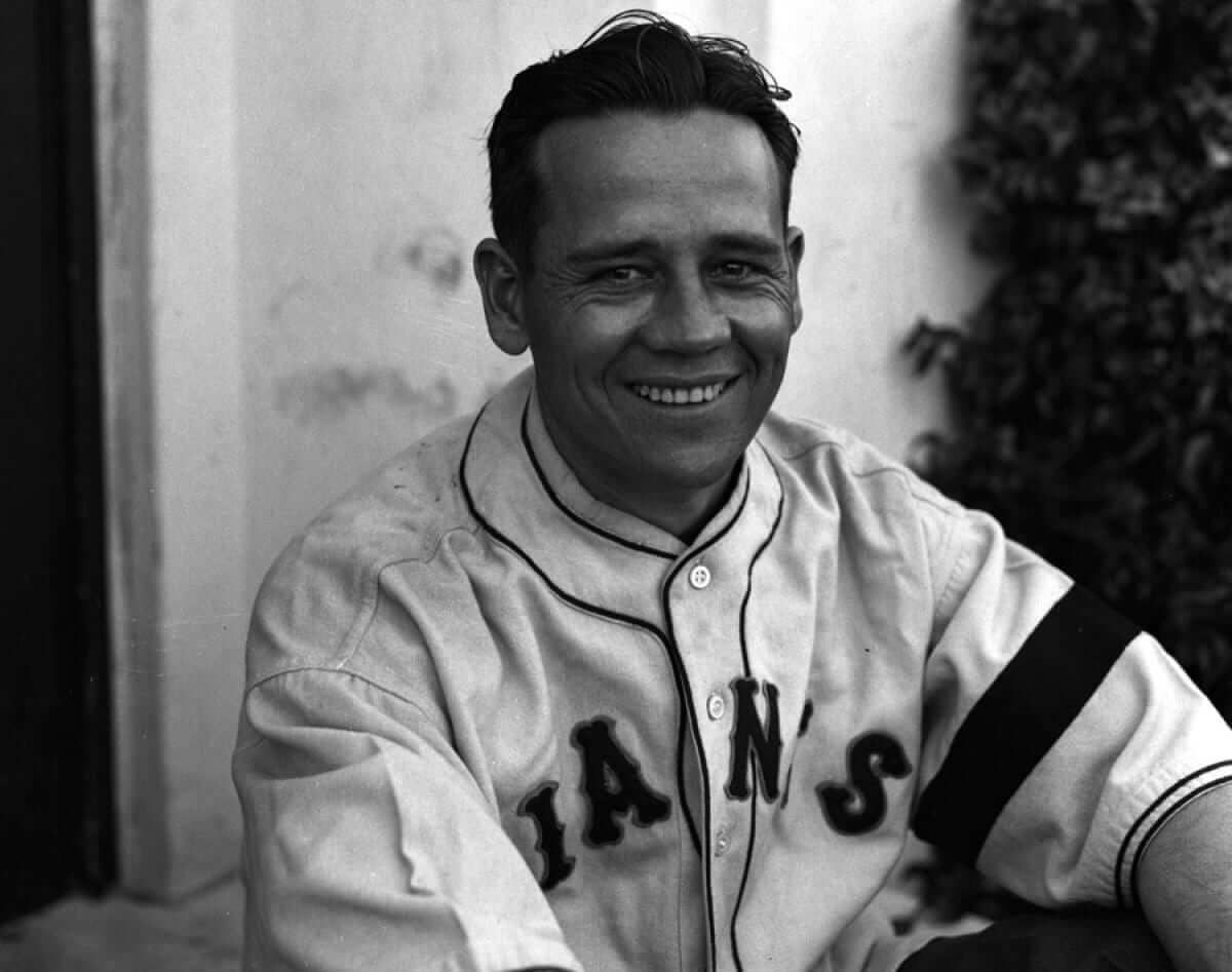
Today’s birthday honoree was, according to Wikipedia, “known for his capable handling of pitching staffs and for his on-field leadership abilities.” He was a member of five National League pennant-winning teams and was the catcher for five pitchers who were eventually inducted into the Baseball Hall of Fame. More importantly, look how sweet he looked in a 1934 Giants uniform (complete with a black armband for former Giants skipper John McGraw) — happy birthday, Gus Mancuso!

Mike’s Question of the Week
By Mike Chamernik
Uni Watch (or at least its founder) stands by many principles: Purple uniforms are bad, stirrups are good, most new jerseys are created for merchandising, meat is delicious, and advertising on uniforms is wrong, and so on.
Maybe you agree with all of those tenets — but maybe you don’t. Is there anything uni-related that you enjoy or that you’ve done, but that you aren’t proud of? Or maybe there’s something uni-related that you’re fine with, but you think it would be an unpopular sentiment on this site?
For me, I bought an “El Heat” Noche Latina LeBron shirt-jersey this summer, and I wore long pants when I played baseball in high school.
Leave your Uni Watch confessions in the comments.
Uni Watch News Ticker
By Mike Chamernik

Baseball News: New alternate logo and cap for the Rome Braves. … After changing Major League affiliates, the Daytona Cubs will become the Tortugas. … The South Bend Cubs have a cool new Studebaker-inspired logo. … The White Sox are selling dirt from Paul Konerko’s last game for $20 a jar. … The University of North Carolina will have new black gloves with blue lacing next year. Always liked the black-baby blue color scheme. … Here’s a look at Reds jerseys with the 2015 All-Star Game patch on them (from Anthony Burch). … Phil Vermette bought a cool hat of the Quebec Carnavals, the Expos’ Double-A team from 1971-1975. “It has Bonhomme Carnaval on it,” he says. “He has been the mascot of the Carnaval in Quebec City since 1955.” … Mets P Matt Harvey has a personalized Batman logo, based on that Sports Illustrated cover line from last year (from Patrick Sesty). … New Mariners OF/DH Nelson Cruz will keep his No. 23; manager Lloyd McClendon says he gave up the number for a few cigars. Love this quote from McClendon, on whether he’s picked a new number: “I don’t give a (flip) I’ll figure out something” (thanks, Tim Dunn).
NFL News: Cowboys RB Demarco Murray had some logo and stripe issues during last night’s game against the Bears — although that was probably the least of his worries (screen shots by Bryson Bunger and Chris Perrenot). ”¦ Two guys on the Bears sideline last night had yellow hats with the NFL logo. Anyone know the significance of that? (From Andrew Horne.) Here’s a compilation of some very sad ’Skins jerseys (from Cary O’Reilly). … Speaking of the ’Skins, Hall of Famer Art Monk would remove the NFL shield from his jersey collar. It was because he felt he represented the team, not the league. “It’s on Facebook, so take it with a grain of salt, but I did a little image search and it seems somewhat accurate,” says John Mahaffey. … Fitting that a new line of pierogies come in Steelers’ black and gold (from Dane Drutis).
College Football News: For last Friday’s Missouri/Arkansas game, Mizzou was projected to wear a black helmet with a chrome facemask and decals. But, the Tigers instead wore black decals with a black facemask. “I am pretty sure the videos for the uniform announcements were made before the season,” says Bob Nolte. … North Dakota State will wear green jerseys this weekend, for the first time since 2011. ”¦ Nebraska’s new coach, Mike Riley, showed up in Lincoln carrying a Nike bag. Someone better tell him Nebraska’s an Adidas school.
Hockey News: The Kings will unveil their Stadium Series uniforms on Dec. 16. … The Hamilton Bulldogs will wear jerseys with military insignia on Friday to honor a slain soldier. … “My favorite uni angle is when a number actually means something to a player,” says Mike Engle. “Cool story here about No. 53, Bo Horvat, who took his number for the London Knights of the OHL and has kept it ever since.” … Here’s a look at University of Ohio goalie Ryan Heltion’s mask (from Jon Dies).

NBA News: Yesterday I went to see my grandma out in the Chicago suburbs. She’s a big Bulls fan, so one of her friends made her a cool Bulls teddy bear! She also has a very similar Cubs one that I forgot to snap a photo of. … Here are the best 404 error pages on NBA team websites (from Jeff Ash). … The Hawks’ updated Pac-Man logo this year has resulted in increased merchandise sales (from Britton Thomas). … Sneakerheads obsess over the entire aesthetic experience with basketball shoes. ”¦ Cavs F Mike Miller continues to roll up his waistband.
College Hoops News: Utah wore gray unis with a script “Utah” and side striping Wednesday night. … UNC coach Roy Williams changed from a green tie to a blue tie at halftime of Wednesday’s game. The green ties were to promote recycling. Key quote, from Williams: “I don’t like to get involved in all these things, uniforms and shoes,” he said. “But it’s the world we live in. College athletics, every day you’ve got to do something to make 13 cents. And I despise it from the bottom of my soul.”

Grab Bag: Real Madrid’s three new kit tops for 2015-16 have been leaked. … NASCAR’s Kyle Busch will have a new paint scheme next year (from John Ekdahl). … Here’s a look at the UFC-Reebok uniform deal.

What Paul did last night: I was all stoked to go out last night, because the awesome 1970s art-punk band X__X was playing at the Cake Shop. So I hopped in my car and headed toward Manhattan.
Dumb move on my part. As you may have heard, protestors have been out in force here in NYC (among other places) since the Eric Garner decision came down, and last night they shut down the Manhattan Bridge (among other places) right around the time I was looking to cross it. So I was stuck in dead-standstill traffic for the better part of an hour, until I finally managed to turn around and go home, by which time it was too late for me to catch a subway because I wouldn’t have made it in time for X__X’s set.
I knew the protests were happening. But living in my work-at-home bubble, it hadn’t occurred to me that the unrest could, you know, affect me. Which was really stupid and naïve of me. I should’ve been street-smart enough to have taken the train.
It’s been more than 20 years since I last participated in a protest or rally. Part of it is that I find the groupthink sloganeering to be tedious and sometimes embarrassing, but the bigger part, frankly, is that I’m lazy. I try to rationalize it by telling myself I make a difference on issues I care about via my work, by donating money, by voting, and so on, but deep down I know that’s bullshit. Lazy is lazy. So maybe it served me right to get caught up in the protests last night. Maybe it was my laziness catching up with me.
Was it frustrating to be stuck in traffic and to miss the show? Definitely (although at least I had a very good radio show to keep me company). But that’s part of the point of protests, rallies, strikes, sit-ins, and civil disobedience — to spread the frustration around, to remind everyone that we’re all in this together. Yeah, I was inconvenienced, but my convenience is not as important as a person dying, or the dysfunctional state of police/community relations in much of my city, or a criminal justice system that seems similarly dysfunctional (or at least questionable).
So, all things considered, it was an interesting and instructive night. Just not in the way I had expected.

While I symphatize with Roy Williams’s sentiments on money-grubbing via uniforms, his comments might have been ill-timed in this particular case. I doubt UNC is making any money off of promoting a recycling initiative (I assume it’s a campus project). Even if they’re selling the ties in question, I’d bet the proceeds are going to fund said initiative.
Recycling is a worthy cause. So is breast cancer research. As is support for our soldier brethren. And awareness of cruelty to animals. And recognition of America’s racial divide. You see, most causes are good. But the accrued weight of all this do-gooding can be crushing. Each cause exacts its price from the task at hand, which is attempting to win basketball games.
Oh yeah, it’s such a strain on Roy to change ties before the game. However does he cope?
Here’s a shot of Art Monk at Super Bowl 26 Media Day. Looks like he must have gotten a new game jersey for Super Bowl week and then managed to take off the logo between media day and gameday.
link
Those look like “photo jerseys” or “walkin’ around” jerseys. Doesn’t look like pads would fit under them.
Yeah, but Art looks like he may have had those sleeves shortened a bit; his game-day jersey sleeves were usually split at the seams or were ordered ‘extra floppy'(?).
Here’s a couple of shots (game action?)with Monk’s NFL shield in place during his Redskins days:
link
link
I bought an “Ann Arbor is still a whore” t-shirt from a guy selling them door to door the night before Penn State vs. Michigan. An 11 year losing streak to Michigan began the next day. first and last troll t-shirt.
The photo of Mike Riley brings up a question that has plagued me for years. What does a coach or long-time player do with all his gear when he switches teams? If you coach or play somewhere for any length of time, you must accumulate quite a collection of polo shirts, sweatshirts, shorts, hats, etc. What happens to them if you get cut, fired or simply move on? Not that there’s one answer, but I’ve always wondered what they do with all that stuff.
When Rich Rodriguez was fired by Michigan he gave his to the Salvation Army.
Thanks for the shout out Paul! I’ll try to keep their Ravens gear to white jerseys only, but I make no promises!
Will Mets P Matt Harvey get a strongly worded letter from DC Comics?
Interesting Paul, I took the Lipsyte remark as a potshot at ESPN rather than Uni Watch.
I agree. I didn’t think Lipsyte was putting down Uni Watch, but rather ESPN for not maintaining a similar standard for concussion reporting.
Was just reading an appreciation of Lipsyte by his son yesterday (in the “Jewish Jocks” anthology, which I must recommend). It’s clear he does NOT suffer fools or fashion. If he read UW kinda often, maybe he’d reconsider his wording, but it’s hard to say.
To MQOTW, I have to admit I am a fan of the leotard effect when dark (particularly black) against a white or bright colored jersey (i.e. Ravens away).
QOTW:
Stupid middle school me thought the Mets’ BFBS hat was cool looking and begged my parents for one.
The black & gold pierogies have been on the market for a few months, actually. Its just the dye they used, they don’t taste any different. Like the now-discontinued Volcano Tacos from Taco Bell with their red shell.
Did anyone else notice that the ad looks like they are wearing generic football jerseys with Steeler logos slapped on?
I’m pretty sure Lipsyte’s point was that Espn has proven that they will comprehensively cover every angle of the sports world (using uni watch of the extreme example), yet have been lacking on the concussion issue. I dont think it was meant as a slight, just an example. If anything, it is a shout out to Uni Watch and Espn for devoting such extensive time and resources to something that I am sure you will agree appeals to a very small portion of sports fans.
If he had wrote something to the effect of ” A news organization that can run a continuing feature on the changing fashions of SOMETHING SO SILLY AND MUNDANE AS athletic uniforms (UniWatch)”, or something similar, then I would take offense. As is, I think you missed the point and are a little over sensitive.
The rhetorical device Lipsyte used is about contrasting the lesser importance or value of one thing against the greater importance or value of the other thing. Try the exercise of reversing the trope. If Lipsyte has said instead, “If ESPN can devote occasional coverage to player headaches, then surely it can provide dedicated beat reporting on uniforms.” It would make no sense, because we know when we encounter that rhetorical device that the implied importance or value of the items is reversed.
What Scott says.
That’s kind of how I took it as well. Look, I love Uni Watch and I think it’s fantastic that it appears on ESPN. But people have died from concussion-related injuries. People have committed suicide after getting brain damage. In the big picture grand scheme of things, uniforms (and for that matter scores and stats) are somewhat minor. So should ESPN take a little more time to talk about something that could literally be a life-and-death matter?
Paul & Travis, it’s not uncommon that the team store, or even the NHL store in NYC has jerseys that are customized to what is supposed to be ‘spec’ even if a given team’s own on-ice game jersey customizer (very often not who the team store uses, and definitely not who the NHL store uses) may have a slight tweak to the font package or flat out different customization. A good example of that is the team customizer who does the sweaters for the Bruins on-ice game jerseys. They sublimate the white/gold/black layers on the B’s numbers and letters (see this detailed image from MeiGray link there is no black stitching and it looks like one piece of material) but the replica or even ‘authentic’ versions sold in the pro shop/nhl website often have triple stacked layers of twill (link or link). Long story short, if you want the on-ice spec, you generally have to go to the customizer that did the on-ice jerseys.
The really ball breaker is that even if you can get to a team’s customizer some of them (like for the Ottawa Senators) won’t sell the ‘on-ice’ version of what that they do for the team’s game sweaters.
Here’s lots of info on NHL jersey customization: link
I’ve used Exclusive Pro Sports for jersey customization. In my hands-on comparison with MeiGray authentics, their work on my jersey seemed exactly the same.
The Bruins also use different/smaller typography on their replica jerseys. Unless you buy one from the team’s pro shop at TD Garden, I believe.
Here’s a couple of examples:
Replica:
link
On ice:
link
QOTW:
I have always been a fan of the long pants that touch the top of the shoes (not the pajama, super baggy style) and the alt colored jerseys in baseball. Two of my favorite jerseys of all time are the Devil Rays Green alt and the Pirates Black Alt.
Seems Interesting how at least 2 Minor League teams have chosen to change their mascot/nickname to reflect the big league team ie Oklahoma City Dodgers and South Bend Cubs. Its a contrast to a time 10-20 years ago when it was a contest of how wild and almost cartoonish you could draw up a mascot/nickname/logo that had nothing to do with the big league team. I’m wondering if their is this now agreed upon marketing mindset where the big league teams want the merch to be different but still resemble the look of the MLB team.
That’s an interesting question. Given how often minor league clubs shift affiliation, it’s hard for the casual fan to figure out what a major league’s farm clubs are. Maybe there’s a market for farm club merchandise from the major league fans.
I remember I wanted an Elizabethton Twins shirt at one point just because it seemed more obscure than the higher level clubs. Not sure I’d be as interested if they were the Elizabethton Miners or something.
Always thought that Kissimmee was missing out when they went with Cobras instead of their parent club the Astros. Kissimmee Astros had a nice ring to it.
Unless they could somehow wrangle an affiliation with Brevard County, Kissimmee Astros would be incredibly relevant as the 2nd closest of the clubs to Cape Canaveral.
The minor league clubs could also be the venues for “test driving” logo and uniform changes. Note the ivy in the Sourh Bend Cubs logo and the newer Cub secondary logos. Ivy isn’t really associated with South Bend or Studebakers. That might find its way to the North Side logo set in a year or two.
Similarly, back in 1990, the Sarasota White Sox changed their logo to include the Old English “Sox” script. White Sox fans suspected a logo/uniform change was coming for 1991 (the first season at the new ballpark), and their suspicions were confirmed in July, when the current black, silver, and white set was unveiled.
Yeah, Roy despises the financial part of college athletics the same way he didn’t “give a shit” about the North Carolina job. He’s a fraud and a phony. If he truly despises it, he should quit. Otherwise, shut up.
Agreed, he should be more concerned with losing to Iowa.
I just want him to be show-caused ASAP.
The Penguins sell replica jerseys that use a different style ‘C’ than what Crosby wears. The interesting thing though, is that the style ‘C’ on the replicas has been worn before.
Current Replicas (Note the ‘C’ is fat) –> link
Style on the 90s alt/roads –> link
Current (Thinner ‘C’) –> link
I know I remember at least one game where Crosby had the replica 90s ‘C’, but I can’t seem to be able to dig up a picture of it.
I think they switched, sometime around 2007 or 2008. Either way, the inconsistency with the “C” (and the “A”s as well) drives me nuts.
Found an image of Sid from 2007/2008 with the fat ‘C’. –> link
And here’s Lemieux wearing the thinner ‘C’ that Sid wears now back around 2003. –> link
But! Here’s Mario again with the fat ‘C’, also around 2003. link
We’re all over the place here, PGH.
The funny thing is that that C (and its matching A) are relics of what was supposed to be the number font on the 1996 thirds.
Unfortunately, I’ve yet to find any online evidence to confirm my memories from nearly 19 years ago. I can’t even seem to find any clips from the inaugural third-jersey game (from January 27, 1996, against the Flyers).
Dude, I still have the whole thing on VHS. Got some screen-caps around here somewheres…
And yeah, they DEFINITELY used the modern, but fatter captain’s letters in that game.
QotW: Well, I’m cool with purple. Think the Vikings uniforms were great before they started messing with them. I expect there are a fair number of people who don’t understand the purple hate.
More controversial is I like the shirt ads on English football unis. Not particularly happy with the current batch of sponsors, but I associate different eras with different shirt sponsors. I still like some of the sponsors of the lower level clubs which tend not to be huge corporations, online betting sites, or payday loan companies.
It’s hard to take Lipsyte seriously after he took management’s side in the “Bill Simmons says what everyone else is thinking about Roger Goodell” fiasco.
I’ll always think of Lipsyte as a hacky corporate stooge after that.
He didn’t “take management’s side”. He pointed out that Simmons had erred in his journalistic responsibilities and that therefore ESPN was justified in his suspension. All Simmons needed was a qualifier (“Goodell is a liar in my opinion” e.g.) and he likely would have been fine. Lipsyte has called out ESPN management more often than he has agreed with them. It seems more likely that you are allowing your personal feelings (anti-Goodell or pro-Simmons, whichever) to influence your objectivity.
And not only that: you don’t challenge your bosses to suspend you.
QOTW: I kinda like the ads on European hockey jerseys:
link
link
The photo of the middle team on the bottom row (or the 2nd from right on the top line of crests) in the image of the Finnish ice hockey teams has a logo thats clearly based on the Bruins B logo
I don’t like the ads on Euro hockey uniforms but I admit I like some of the euro leagues nontraditional uniform quirks, like having a special color helmet for a team’s leading scorer (kinda like cycling).
Here’s a look at University of Ohio goalie Ryan Heltion’s mask
It’s “Ohio University.”
Caps and uni’s for the Tortugas here.
link
I don’t mind getting creative for A ball teams, so I think it’s a pretty cool look.
I agree. And I love the name “Tortugas.”
I don’t, however, love your misuse of an apostrophe.
Actually, James, the apostrophe is used correctly; try reading the sentence with “it is” instead of “it’s” and you’ll see…
I really like the logo. It seems to strike a balance between the goofy/silly minor league mascot and the tired trope of snarling mascots. It has bit of a sly, mischievous smile, like the Tortuga hitter knows something the pitcher doesn’t.
If they were REALLY adventurous they use this as their logo:
link
The Tortugas would be a welcome addition to the big leagues, and with only minor changes to the caps would easily be in the first division, in terms of uni quality.
QOTW:
I own a half-dozen jerseys ALL customized with MY NAME on the back. I don’t see paying for a jersey of a player who’s only going to play on a team for a few years and leave. There for, I have a bunch of jerseys with my favorite number (15) and my last name — (except, of course, jerseys that don’t traditionally have a name on the back like the Yankees)
… I only own two jerseys, but yup, personalized to me and my favorite number for the exact same reasoning. It makes for a better Halloween costume, too, when you’ve got your own name on the back.
As for my own response to the QOTW, I like stripes, but only if they’re motivated and in a place where they’re supposed to be, like the NFL stripe on a helmet, stripes on shoulders, stripes on ribbed cuffs, etc. Stripes in general … no thanks.
Also, I’m very OK with softball tops in baseball, as long as they’re a bold, dark color. Navy blue, black, red, royal blue? Fine by me. Light blue or gold like the Royals or Brewers wear? No thanks. Only team a light color softball top kinda works for is the A’s, just because they have a history of wearing crazy stuff. (Light blue, however, works as a full uniform, so I’d like to see the Royals stop half-assing it and just go back to full powder blue with white on the road.)
Just to clarify: You have your actual name, like SMITH or whatever, on the back? Or you have the actual phrase, MY NAME on the back?
Personally, while I don’t judge anyone for whatever they do with a jersey, unless they have JETER 2 on their backs, my strong preference is to put a number but no name on it. Not my name, not a player’s name, just a number that means something to me. A favorite player’s number, a significant year, simply a personal favorite number.
But the only jerseys I have with numbers on them are baseball, and baseball jerseys tend to look good with only a number. I’m not sure a football or hockey jersey with number, no name, would work as well, aesthetically.
I haven’t purchased a current jersey in years – I don’t care for the new materials/cuts, etc, nor the absurdly high prices for replicas compared to what they went for not long ago. For example, I love the CCM mesh and ultrafil jerseys in the 1980s and early 1990s, but can’t stand the current Reebok Edge jerseys. So, if I find on ebay an older jersey that is blank, I’ll have it customized with a player of that time period. I look at it as an historical artifact ;0
Totally with you.
QOTW: I didn’t expect such a soul-searching exercise! I have incidents of buying jerseys I never wore, pretending my wallet was made of lead when Uni Watch offered member goodies, championing the black in the Mets’ uniforms, but none weighs on my conscience more than the support for Indian iconography in sports.
My sticking up for the Redskins and Fighting Sioux of the world began as concern that such efforts lacked an effective advocate. But what I came to realize is that a part of my past was slipping away; a page was being turned and I didn’t want to be part of it. It’s facile and convenient to turn ethnic caricatures into mascots. Who wouldn’t want to be an Indian? Indians are cool! So please, recognize when the Blackhawks, Braves and Chiefs are ultimately rechristened, my metaphorical artifacts are not going to be burned or sacrificed, but are more likely to end up in a velvet-lined box with a key.
I should also add that I really liked the Cincinnati Reds’ black away caps from a couple years ago.
Bugged me even back then that SI chose to make a Batman reference about Matt Harvey and it wasn’t about Harvey Dent.
QOTW: I’m sometimes kind of okay with BFBS and GFGS. I still prefer it when teams where their own official colors, but every once in a while, a team comes up with a look that, at least in a vacuum, actually works for me. Arizona State’s recent “link” unis worked for me (although the name did not), as did Boise State’s link from a couple of years ago (particularly the way the silver horse head logo and its orange eye link).
here’s a story about a 3rd party hockey shop having the same problems with Islanders jerseys.
link
“…Art Monk would remove the NFL shield from his jersey collar.”
Weren’t Monk’s playing days with the Redskins over around the time the NFL collar shield appeared on the scene anyway?
NFL logo began appearing on collar in 1991. Monk’s final season in the league was 1995.
I suppose after Monk and the Redskins parted ways he abandoned the practice; his New York AFC(’94)and Philadelphia(’95) jerseys seem to include the collar shield.
He may have forgotten (or maybe misplaced his thread remover) a couple of times while with the Redskins though:
link
link
I’ve found it interesting how gameday attire cultures differ by region & league. NFL stadiums are full of jerseys/t-shirts/etc, but in college football, at least in the South, it’s often a bit different.
link
That article is obviously SEC-centric, but I can attest this extends into the ACC, and I’m sure other places as well.
I moved to Chicago 2 years ago from New York. It’s an amazing (and bit overwhelming) to see the amount of fans that wear jerseys to Chicago Blackhawks and Bears games. Even in the restaurants and pubs, you’ll see waitstaff decked out in gear.
It’s also pretty cool just how many people wear Blackhawks jerseys to work on the day they play during playoff season. I’ve never witnessed that in Manhattan for the Rangers.
As for the Cubs and White Sox, I see more t-shirts BUT visiting teams fans totally come out to the ballparks wearing their team’s jerseys.
That was a great link. While I love seeing photos of old ballgames with men in suits and kids in breeches and newsboy caps, I would feel weird going to an MLB/NHL game not wearing a jersey. Perhaps the pendulum will swing back, when people get fed up with both 200 dollar replicas and cheap quality 30 dollar knockoffs.
Utes in dark gray against Shockers in black is just brutal. If you’re going to do the dark gray unis, why not wait until a team comes to town wearing yellow or red?
LA Kings is the same way. The team store does a horrific job at lettering. The on-ice decorator, Bobcat Athletic, is the ONLY one who does the LA Kings jerseys properly.
The fact that pro teams readily admit the font discrepancies between tailors is a joke. So a conscious decision was made at team/league level to make the retail versions wrong?
Then you look online and see a dirty disgusting worn shirt sell for thousands. Ah. So how’d “they” convince people in charge that making MY jersey wrong was good for business? Good for the guy who gets his hands on the dirty shirts; not good for the general consumer.
I’d like to think that their brands are more important than what we see, especially due to counterfeiting. When counterfeiting started to grow, retail authentics started to get very sloppy. Getting sloppier doesn’t exactly win back the consumer who says fuck it and buys counterfeit.
The people who obsess over small details are your repeat customers; not the guy who plunks down money for a jersey he wears to the one game he attends, then sells it on eBay. I used to buy NFL jerseys, but haven’t bought anything for 2-3 years now due to the severe inaccuracies. I’m sure they’re selling enough dirty game worn jerseys to offset counterfeiting since they don’t need my money anymore…
The leagues don’t care about repeat customers because they know they’ll still get their money somehow. They’ll still watch the games, they’ll still buy tickets and if they get upset with the quality of a custom uniform, big whoop, then they’ll buy a sweatshirt instead because they’re not going to be going to a game wearing non-branded apparel. They know they’ve got your money, one way or another.
The leagues only care about the middling, on-the-fence customers because they’re the ones who will either not come to a game, or come to a game, like it and spend $200 they wouldn’t have otherwise spent on a whim. And those folks don’t care about details because they don’t know any better. The teams are chasing after those folks because they offset the difference between the big fans spending $900 rather than $1,000 because the captaincy patch didn’t quite look right.
Not saying it’s right. Just saying that’s how marketing works.
That’s not how marketing works…
If that was true, then the NFL wouldn’t be pursuing FBI assistance in their counterfeiting problem. This is happening because NFL people are stupid. They hire non-uni people and they’re paying the price now because their offerings aren’t much better than bootlegs.
If they were maximizing profit I wouldn’t see Michael Irvin telling me on a commercial not to buy bootlegs. They have a big problem. I’ll wear a blank shirt before a buy a branded sweatshirt; that’s a dangerous perception of the customer, and one that is biting them in the ass. I’m not desperate and I’ll wait until they sell me something worth buying.
The NFL has to enforce their copyrights on their products.
I know they have to enforce copyrights. I support that fully. Never bought a bootleg.
What I don’t support is an NFL marketing campaign that shames the consumer, instead of looking at what they’re doing wrong.
The first 2 years of the Nike contract, I’ve seen everything online from using old tackle twill on Elite jerseys, name/number fonts that don’t look anything like what the players wear, and even deleting all negative product reviews and putting obvious bullshit reviews (all on NFLShop). They do that for 2 years then raise the price by $50.00, then shame the consumer for not wanting to pay $100, $150, or $300? Wasn’t the elimination of blank jerseys from retail channels supposed to fix the awful customization?
The retail model of “make junk and push it through the channels of distribution until it is sold (Ross or Marshall’s as one of the last stops) works. They make profit. Do I care? Nope. I want good jerseys and will wait until they’re made, if ever.
Hopefully the higher higher ups realize their employees aren’t taking responsibility; instead they blame the consumer. A massive corporation whines about bootlegging but doesn’t care if the consumer ends up spending $300 on garbage?
Splashdown of Orion! Days like today sure make me wish Houston had brought back the shooting-star when they went retro. For pretty much the first time in my lifetime, the Astros have a relevant, forward-looking nickname again.
Saw a tiny speck of flames through a tiny break in the clouds here in Orlando. They didn’t have the splashdown on the channel in the breakroom at work. :^\
Did they use to splashdown in the Pacific with the Apollo missions? Can’t recall. Thinking out lout.
maybe I will google it.
Check out: link
And: link
I could be mistaken about this, but Yellow Hat Guy is probably one of the NFL/TV crew who helps coordinate TV time outs from the field.
Only if he has giant orange oven mitts on also!!
Might be a coach who gives signals from the sidelines. Yellow hat makes it easier to spot him.
???
QOTW: Sansabelt baseball pants with v-neck pullovers. Worn properly with stirrups, it has always looked sleek and modern to me.
Two things:
1. I don’t trust the in-stadium stores further than I could throw them for custom jerseys. I was debating getting one from the one at Miller Park once, but then I saw one come off their heat press with the number placement and NOB kerning/arch angle all messed up and thought, “Full price? For that? No thanks.”
I’m not a huge hockey guy, but it sounds like the equipment manager does a lot of the stuff like captaincy patches and whatnot, which makes it hard to get it done “exactly” right because it might be unique to that equipment manager. For baseball jerseys, I order online from the MLB Shop because, I believe, it’s coming from the same Majestic plant that puts together the on-field jerseys, so all the details will be done the same way as the on-field product. Sounds like that wouldn’t be possible in hockey, though. Might have to DIY with things like captaincy patches to truly get them right.
2. I’m in agreement with those above who don’t believe the ombudsman was taking a shot at Uni Watch or calling it trivial. I think he’s just trying to use a comparison of consequences with a comparison of coverage.
Let me put it this way: What happens if a team wears a really ugly jersey? We all go “Blech!”, maybe don’t watch the game, come here and debate the theoretical downfall of humanity, then go on with our lives. Meanwhile, if someone gets the wrong kind of blow to the head, he or she could die, and if you connect some of the dots, a lot of guys have already. It’s an unpleasant topic, but one that has to be faced to avoid, or at this point, stop the tragedies that we’re hearing about. ESPN is in a position, as a media organization, to bring the issue to light, and might somewhat have a responsibility to, if you believe that part of the responsibility that goes along with the right to a free press is to hold those in power accountable when they put their interests and finances ahead of others’ safety. But instead, ESPN falls in line with the NFL’s corporate douchebaggery by pulling out of “League of Denial,” also putting its own interests and finances ahead of others’ safety, and doesn’t devote the time or energy to an issue with much more threatening consequences.
I don’t think he’s saying what you do is trivial. It’s clearly of interest to a lot of folks. It’s just that what you do breaks down to details. There’s a big picture piece of concussions ESPN is missing.
I was at the Flyers stadium store as recently as Black Friday, and saw a few jerseys STILL using the wrong NOB font (a font they haven’t used since they switched to their current unis), right next to jerseys that are correct. That stuff drives me crazy. About a decade ago, I was so annoyed with the team store using the wrong font that I actually took my blank jersey to Mitchell & Ness, and explained my issue. The guy behind the counter, Ray, nodded his head, took my jersey and said “I’ll take care of it”. Jersey came back looking perfect. Sadly, once they were swallowed up by Reebok, they stopped doing customizing, but at least I now know the local companies that do the Flyers lettering.
North Dakota State is wearing green for the first time since 2011….in a playoff game. They wear them all the time in the regular season. Your wording seems to make it appear that they have literally not worn it in 3 years.
Ambiguous wording is the bane of English grammar, except when it’s funny.
Good confessions people, I’m enjoying them.
“Here’s a look at University of Ohio goalie Ryan Heltion’s mask…”
Hate to nit-pick (or maybe I don’t, hehe), but there is no “University of Ohio”. It’s “Ohio University”.
link
And, even though the official name of the school still says “University”, the school’s athletics teams are known simply as “Ohio”, as in “Ohio Bobcats”.
link
If they were really strict about enforcing that, you might have people referring to the team as Ohio (University) Bobcats, in a similar way that they do with Miami (OH). Yes, that’s the name, but you almost need the parenthetical to say exactly which team you are talking about. I’d have to think for a while if someone just said Ohio Bobcats, and I would probably assume it’s some kind of minor-league team.
QotQ: Despite my ethical/political problems with camo sports “tributes” to the military, I often find the results aesthetically pleasing, and I own a few ballcaps that include camo elements on account of liking how the caps look.
As far as “would be unpopular on this site,” I think that link and this are perfectly fine baseball uniforms and that we ought to see more of that type today.
Sorry, here are the links I tired but failed to include in the above:
link
link
Terrific uniforms, both.
I own a few ballcaps that include camo elements on account of liking how the caps look.
[Face-palm]
Et tu, arr?
Re: Lipsyte’s comments – Before taking a swipe at the mission of your work he owed it to himself and his readers to inform himself first. It’s not cool. Also, I know you are being respectful and self-deprecating in your response, but I would not underestimate the importance of the journalism you provide on ESPN and this space. It is not simply a niche but concerns on a wide range of the fan, and player, experience.
COTW:
I like that the Reds have a black accent, not necessarily the black drop shadow but the black brim on their away hatshttp://shop.mlb.com/product/index.jsp?productId=2626705&cp=1452348.1452718.708006 and the black spring training hats link. The Reds have a history of incorporating black into their color scheme; link
Re: Lipsyte’s comments – putting aside the Uni Watch slam, I’m sure I even agree with him that ESPN needs to do more reporting on concussions in football. Do any sports fans exist in America who aren’t painfully aware (no pun intended) that concussions have become a big problem for both current and former football players?
One could almost say it’s a subject that’s been beaten to death. (Sorry!)
In response to the question of the week, I really enjoy when college football teams wear white pants with long white songs and white shoes, creating the aptly-named “leotard effect.” Think Rutgers circa 2007. It might be strange, but I only like when teams do this with the color white. Otherwise I think it looks ridiculous.
I’m a lifelong Royals fan, and when they went BFBS I was around 12 and thought it was the coolest thing ever. Luckily, that was merely a phase that both I, and the Royals, grew out of.
Mike’s Question of the Week:
When I was in 3rd grade (1993) I had a Sharks starter jacket and matching fitted cap because I like the colors. Same year when my buddies and I did a fantasy draft and my teams was a purple and teal Texas Tornadoes.
I own a Detroit Tigers alt-jersey (worn only one game).
7th grade I wore a jersey every day of the week. Including Barry Bonds black alt (shame), Joe Montana-Notre Dame was my favorite (super shame) and a Cleveland Indians Home(my god), but my Lou Whitaker Tigers road jersey made up for all of them (triple stitch back letters/number – drool).
In 5th grade I was the worst player in my towns All-Star game. Because everyone had different jerseys I didn’t realize we had a runner on second and I stole second with bases loaded. Most shameful moment of my life… but we still should have gotten a run in when the catcher actually threw it to second. The ol’ pee wee bases loaded sack steal to second (not a real thing).
My shame today… I designed logos and custom uni concepts for my entire fantasy league including home/away/alt/negro league/70s/dead-ballera and obnoxious national holiday unis.
QOTD:
I, for one, like the white, ice-cream man caps that the Mets wore a few years ago that everybody hated. I also liked the Reds pinstriped caps from that era. The Devil Rays wore one in Spring Training too.
If the Reds would wear a cream-colored home jersey and pants with a cream-colored cap with a red bill (ditch the black), I would be screaming at the counter person at the Reds team shop…”HERE, JUST TAKE MY MONEY!!!”.
I’d be OK with the differing C on the Sharks sweater if they concede one thing for me. TAKE THE NUMBERS OFF THE FRONT! Numbers don’t belong on the front of a hockey sweater. They look terrible no matter how they’re done.
What’s Oregon’s fascination with white helmets/pants this season? Seems like they’ve worn one or the other, or both together much more than usual this season. Doesn’t look very good at all IMO. Especially if they have colored numbers on the jerseys they wear them with. I was hoping to see them break out the yellow or light green helmet with the dark green jersey and light green or yellow pants. Enough with the white.