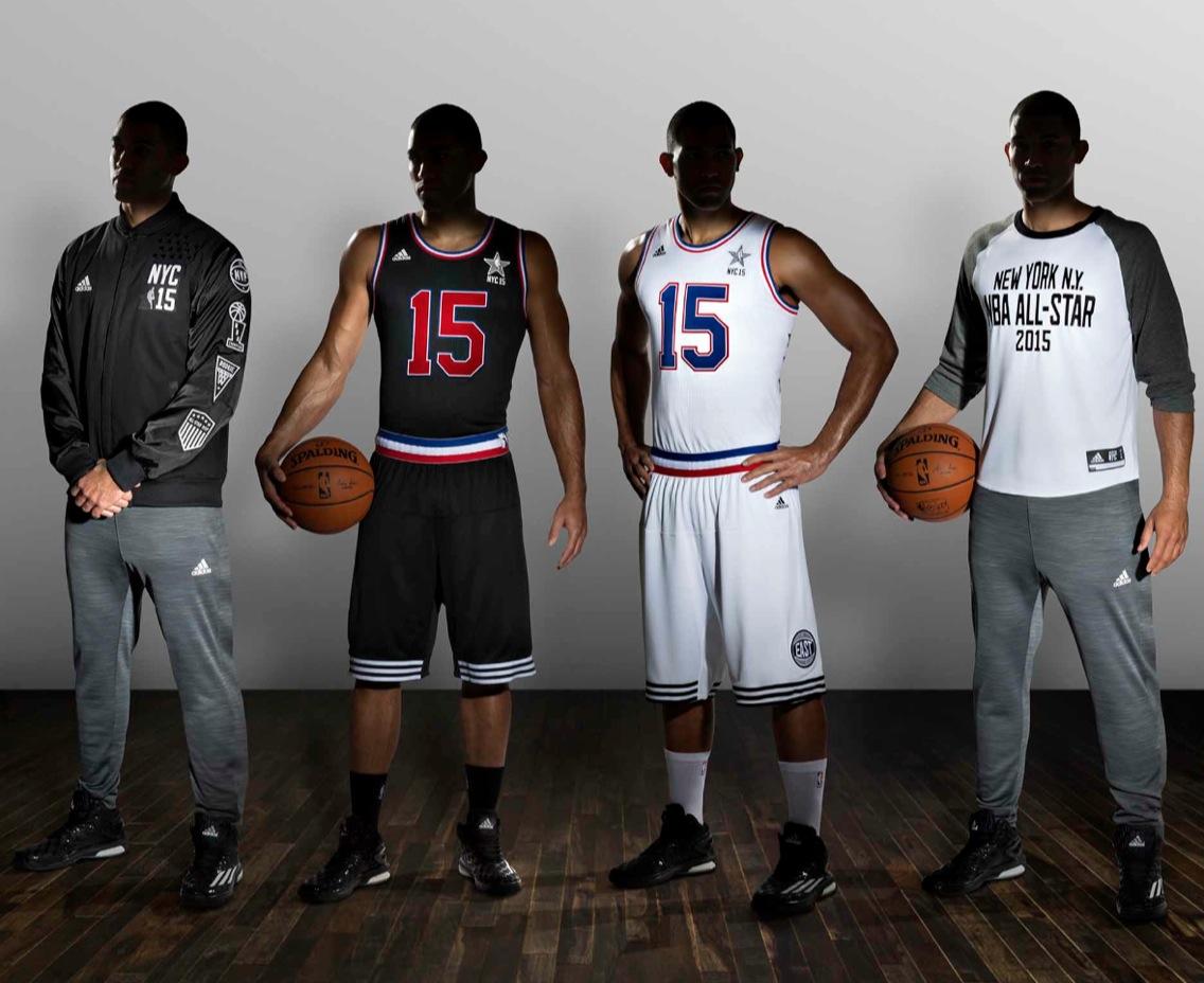
For all photos, click to enlarge
What you see above are this season’s NBA All-Star uniforms, which were released this morning. Personally, I love them; many of you may hate them. Either way, let’s give the NBA credit for going against the grain and confounding expectations. Instead of the usual gaudy, overdesigned approach, they’ve stripped everything down to their bare essentials.
The game will be played at Madison Square Garden here in New York. The East will wear white; the west will wear black. Note that there are no “East” and “West” conference designations on the jerseys — according to this piece by my ESPN.com colleague Darren Rovell, the last time that happened was sometime in the 1960s, but I’m trying to find out exactly when. (Unfortunately, as we’ve noted before, NBA uniform history is notoriously spotty.)
The backs of the jerseys will feature split FNOBs — first names above the number and last names below:
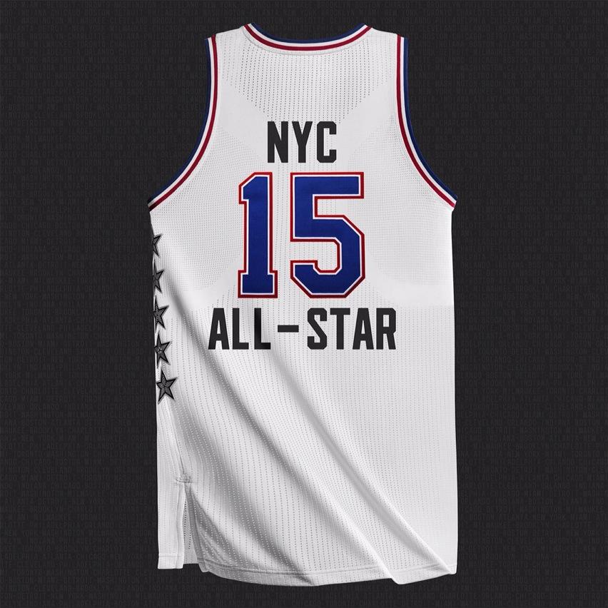
Things get a little silly with the “storytelling” embedded in the five stars appearing on the side of the jersey and shorts. The stars represent NYC’s five boroughs, with a distinct pattern for each one — a checkered taxi pattern for Manhattan (not a great choice, since Checker cabs have been extinct in NYC for 15 years), the Unisphere for Queens (for you non-NYCers, that’s this thing, which was built for the 1964 World’s Fair and is now located outside of the Queens Museum), a vinyl record for the Bronx (apparently a reference to old-school hip-hop), waves for Staten Island (they clearly struggled to find something relevant to use for this one), and brownstone bricks for Brooklyn (wrong, wrong, wrong — true brownstones do not have traditional brick patterns):
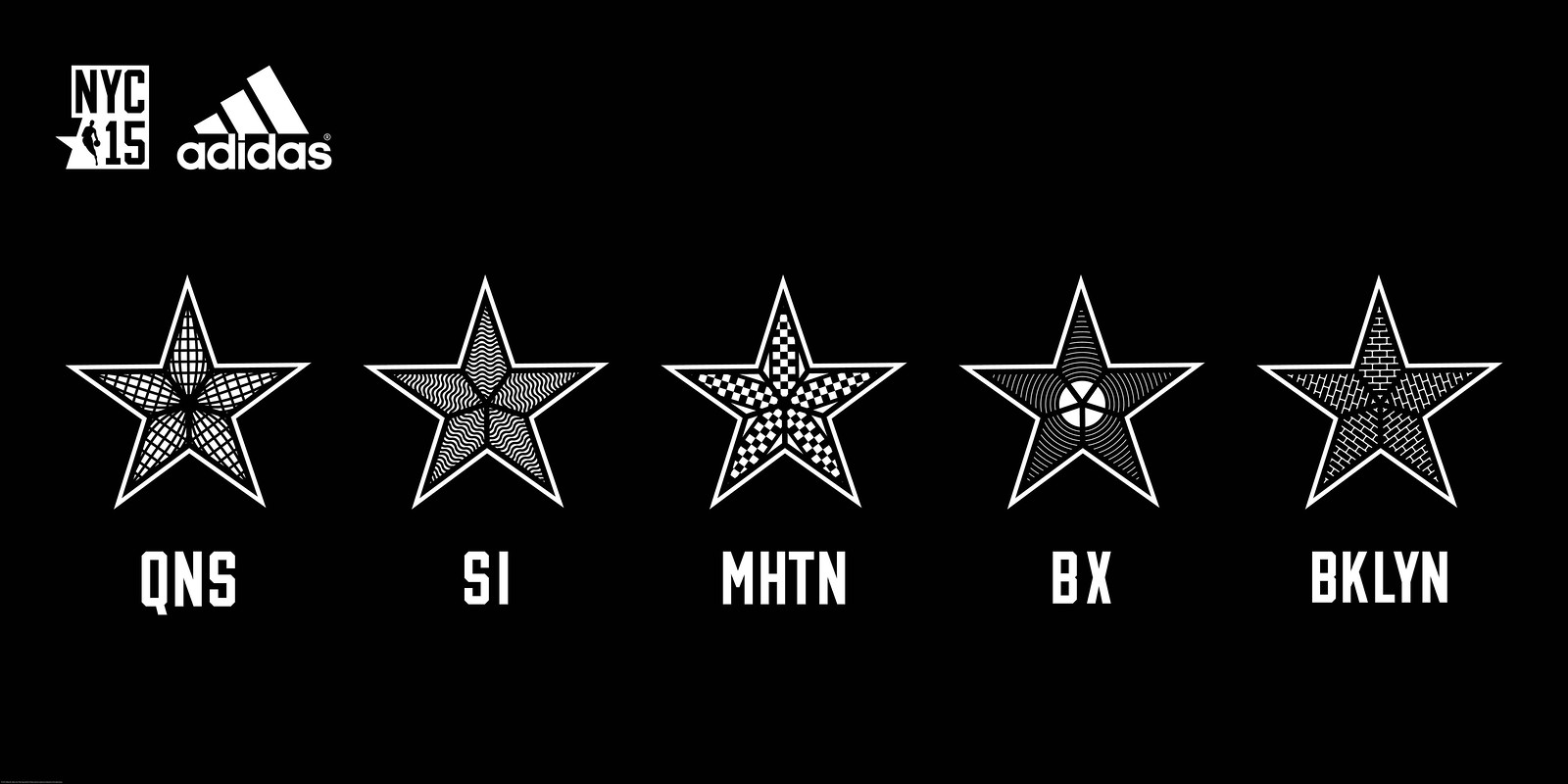
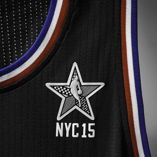
The five stars then form a composite for the version of the NBA logo that appears on the jerseys:
I don’t usually get too worked up one way or the other about shooting shirts, but I sure do like the one they’ve come up with here — it’s essentially a baseball shirt:
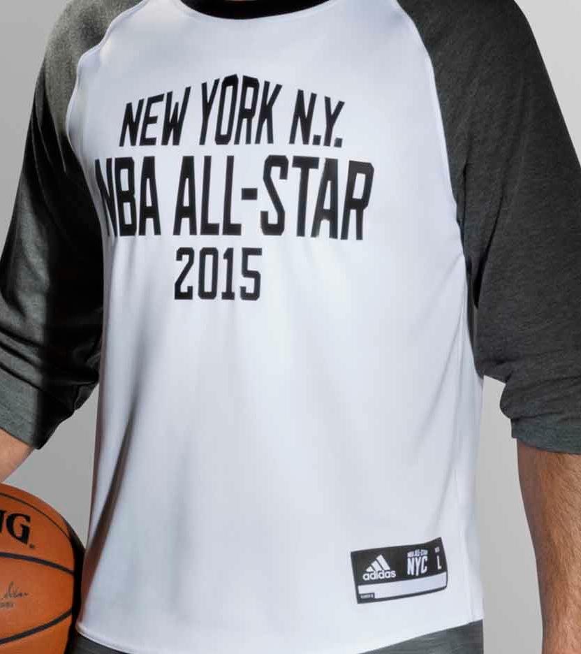
There’s more, but those are the basics. You can see a bunch of additional photos here.
And hey: No sleeves.
EXCLUSIVE! Mostly useless Browns info: Those of us in the journalism biz love to say how “a little birdie” has told us this or that. That way we get to feel all superior because we have a secret little birdie that whispers sweet exclusives in our ear, while you, you poor little pathetic thing, you have no little birdie to make you feel all special and sparkly. See how that works?
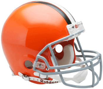
Okay, now that the hierarchy has been established, here we go: Browns owner Jimmy Haslam has been saying all along that the team’s impending uniform makeover, due to be unveiled next spring, won’t include any changes to the helmet. BUT! A little birdie tells me there will be two — TWO! — changes to the helmet, as follows:
1. The stripe will have some sort of “new texture.”
2. There will be a new shade of orange, which will be more like Oklahoma State’s or Oregon State’s color.
In short: The Browns’ helmet will look pretty much the same as before, except in the subtle ways it doesn’t.
Don’t you wish you had a little birdie to tell you things like this?
Grey Cup News and History
By Garrett McGrath
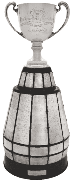
On Sunday, the Calgary Stampeders beat the Hamilton Tiger-Cats 20-16 to win the Grey Cup as the champions of the Canadian Football League. The cup separated from its base during the celebration. This is not the first time the cup has had some problems in its more than century of existence. The Grey Cup has been broken before on several occasions, stolen twice, and once held for ransom in 1969. The trophy remained missing for two months until Toronto police received a tip that led them to a locker at the Royal York Hotel in Toronto. The thieves were never caught. It also survived a 1947 fire that destroyed numerous artifacts housed in the same building.
The original cup was commissioned by Earl Grey, then Canada’s Governor General, in 1909. Ceremonial kickoffs before the start of the game have been a political rite of passage since. A short video clip under the PMs tab on this CBC website documents three Prime Ministers of Canada (Pierre Elliott Trudeau, Lester B. Pearson, and John Diefenbaker) who have performed ceremonial kickoffs and their attempts. It has been a long time since a Prime Minister has done the ceremonial kickoff, but here is a great write up on the Governor General of Canada — David Johnston — doing the ceremonial kickoff for the 100th Grey Cup in 2012. And here is a video of David Johnston practicing for his big day.
(Thanks to reader Will Scheibler, who provided most of the info for this report.)
Collector’s Corner
By Brinke Guthrie
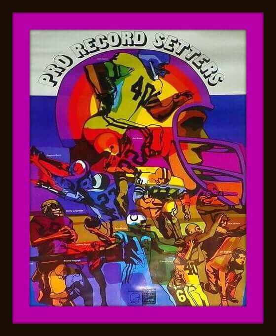
Here we have maybe the grooviest NFL poster in Collector’s Corner history: This psychedelic 1969 NFL Pro Record Setters poster looks like it’s in great shape, save for a little tear at the top. Now all ya need is a mood ring, black light and a lava lamp. Far out, man.
In slightly less groovy (but still worthwhile!) finds:
• From the same seller as the NFL poster above comes this poster of a cartoon Boston Bruin skating off with the 1972 Stanley Cup.
• Looks like someone knocked off the Converse template pretty well with this pair 1970s NBA “Bob Wolf”
hightops.
• Here’s a 1970s Patriots pen. The player on the display card — might that be Russ Francis?
• Same thing for the artwork on this 1970s NFL Mini Helmet Goalpost sets. I’d almost swear it was Walter Payton or Herschel Walker on the box art, but I think these were out well before Walter’s 1975 debut, and Walker didn’t get to the NFL until 1986.
• Nice artwork on this 1970s Prudential Insurance poster of NHL stars Bobby Hull and “Boom Boom” Geoffrion.
• For those of you who miss the original Bengals helmet logo, here it is in one of the 1970s copper wall plaques.
• Check out the font on the side of this 1970s Bobby Orr hockey puzzle. Belongs in the opening sequence of a 1970s sitcom, no?
• As anyone from Cincinnati will tell you, Skyline Chili rules. There’s also a chain called Gold Star — that’s where Charlie Hustle ate, as you can see on this promo glass.
• Another Hit King item: Pete had his own energy bar!
• And we wrap up this week with a 1967 NFL Helmet Bank with the shield on the helmet and a set of team name stickers you can apply to the base.
Today’s Uni Watch Birthday
By Douglas Ford
[Each day this month, Douglas Ford is selecting an athlete who’s celebrating his or her birthday and presenting some uni-notable photos of that athlete. Here’s today’s installment.]
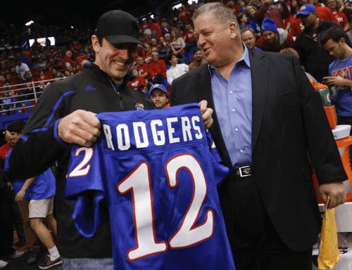
You know him as a Green Bay Packer and Super Bowl champion, but get a load of him in his high school letterman jacket and check out Charlie Weis fantasizing about him being a Jayhawk — happy birthday, Aaron Rodgers!

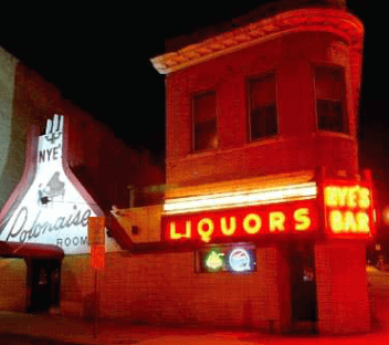
Another one bites the dust: Sad news yesterday out of the Twin Cities, where word came that the exceedingly wonderful Nye’s Polonaise Room in Minneapolis will be closing its doors next year.
Nye’s has hosted two Uni Watch gatherings over the years. The first was in May of 2007, when we held an excellent Uni Watch party there (there’s a teaser here and a full-blown party report here). And then a handful of Uni Watch stalwarts met me at Nye’s in January of 2010, when I was in town for what we called the Uni Watch Deep Freeze.
But my love of Nye’s predates Uni Watch’s existence. My first time there was in 1997, when my then-girlfriend Alleen Barber and I were in the midst of a month-long cross-country road trip. Nye’s had been on our list of Twin City attractions, and it did not disappoint: Spectacular exterior signage, comfy supper-club-ish interior, strong drinks (with hazelnuts bobbing in Alleen’s gimlet!), solid dinner entrées (I had the prime rib), and live polka in the back room. I knew right away that it would become a staple of my subsequent Twin Cities visitations, and that’s exactly what happened.
Nye’s owners say the place won’t be closing until next summer or early fall, so there’s still plenty of time for me to scoot out there one more time. Phil, can you cover the site for, say, the entire month of April?
Uni Watch News Ticker
By Garrett McGrath

NFL News: “While I was watching the Rams/Chargers game in San Diego, I saw there were a lot of L.A. Rams fans in attendance,” says John Elbertson. “I was inspired to create concepts for the Rams if they moved back to California.” … Can’t top this Washington Post lede: ”˜SAVE US!’ pleads Redskins fan in paper bag head (from Tommy Turner). … JD Denson pointed out that this Immaculate Reception ornament has the NFL shield on the collar. ”¦ Things between the Rams and the St. Louis Police Dept. got really silly overnight.

Hockey News: The Dallas Stars unveiled a television feature during the 2nd intermission of Saturday’s game on the rebranding process leading up to the reveal of the new logo, jerseys and colors in June of 2013. The video and stills show a really interesting look at the process (from Seth Horowitz). … The Toronto Maple Leafs will copy the Canucks wear these shamrock decals on their helmets for the rest of the season in honor of Pat Quinn. The Leafs had previous worn a shamrock patch for two games (from Michael Engle).

NBA News: “I’m surprised no one mentioned this, but the Warriors just completed a five-game road trip where they wore their actual ‘road’ uniforms only once,” says Sean Be. “It was the first game of the trip against OKC. After that game, they wore their home whites for the next four games, as each home team wore some type of alternate uniform against them: Miami (red “Miami” alternate), Orlando (gray sleeved alternate), Charlotte (teal alternate), and Detroit (“Motor City” alternate). The Warriors won every game.” … The NBA’s ugly Christmas sweaters are “so bad they’re amazing.”

Grab Bag: Candlestick Park is almost ready to be demolished, and here are some drone photos of the abandoned interior. … Cycling Watch from Sean Clancy: Pro cycling team Tinkoff-Saxo has introduced a camo-themed training kit at its winter camp. … French team FDJ changed their kit and added white shorts. … South African pro cycling team MTN-Qhubeka goes for the Foot Locker look with its new kit.

I don’t think I’ve ever seen TWO letters patched onto a letterman’s jacket before.
Impressive that he has an “Academic” letter, too.
Grooovy poster, man!
I see a couple real logos/people (Jurgy/Skins/9, Unitas/Colts/19) while most of the other folks are just generic.
???
They’re only generic b/c they’re old school players (Hutson, Baugh, Nagurski) or Cleveland Browns (Groza, Brown). Raymond Berry and Jim Taylor are wearing Colts & Packers helmets, and Crazy Legs Hirsch’s helmet is concealed. I’ll be darned if I know who the player at the top is, though.
“I’ll be darned if I know who the player at the top is, though.”
Gale Sayers?
Their names are there in little tiny print, but I can’t make out the one at the top and I don’t recognize him. Looks a little like Gale Sayers but the helmet doesn’t look like the Bears (or any other team, for that matter).
Paul Warfield?
Yeah, must be Sayers. Not a lot of great players wore #40 [insert comment from Paul touting Ken Willard], and the sleeve and pants striping fits the Bears. The helmet was throwing me, I thought it was a poorly-rendered Eagles lid. Warfield wore #42 as I recall.
Another interesting letterman jacket note…
It’s interesting that he has a football and basketball patch sown on.
At my school, we had pins that we pinned on the letter. Then you got a bar for each additional varsity year.
Has a column on letter jackets been done before? Should we all send in pictures of our letter jackets? Mine is in the closet. I just cleaned it up last year for my 20th high school reunion/anniversary. I don’t know where my pins are, though. Might be in my mom’s attic.
Varsity jackets would a very cool idea for a blog entry. At my school, we got those patches for the sport but they were sewn directly onto the letter. No bars for years you letter because we didn’t get our jacket until our senior year.
It’s interesting to hear how jackets are dealt with so differently at other places. We were able to order ours after we lettered, so some people had theirs in school for 2 or 3 years.
That was the same with my high school. You could get one as soon as you lettered, but I want to say that freshmen weren’t allowed to join varsity teams. Either that or my entire class stunk on ice, which was certainly true of me on the tennis team.
At my school, a lot of athletes got letter jackets prior to lettering and wore them sans letter on the chest. For us, sports and academic activities were represented by chenille patches on the sleeves, alongside captaincy patches and a little bar device for multiple years. No distinction on the letter between athletic and academic. So I had a letter on my chest, a chenille gavel on my arm for debate, a C beneath it, and two stripes below that. I think the chenille class year patches went on the opposite sleeve.
The chance of lettering played no small part in my switch from baseball, where I was unlikely ever to crack varsity even though I finally developed a little bit of talent, to debate after freshman year.
yeah, this is a great topic! Mine is still in my mom’s basement on a hanger. She says she still uses it from time to time on cold days for trips out to the store and such!
We had honor letters too, but no one got those on their jackets. There were also National Honor Society patches too, but our school didn’t add those either.
At my school, the letter jacket was pretty much exclusive to the athletes. Although, when I realized that one of the Audio/Video guys had a jacket and a letter (it said something like Audio/Video like Rodgers’ Academic above)… I confess. I was one who mocked it.
hahaha my brother got an actual athletic letter for Forensics… he always jokes that he should have had a jacket made for it!
Jason, some context: My school had terrible teams in most of the classic “jock” sports. Our football team won four games the years I was there. Our golf and tennis teams were state contenders, and our cheerleaders went to nationals most years. So the many academic letterers didn’t face the kind of mockery that was probably more common elsewhere. Not a lot of prestige in playing for the worst football or basketball team in the conference.
My school didn’t use patches or pins, but distinguished sports by different color combinations. Football=black cloth, black leather baseball=purple cloth, black leather, cheer=black cloth, black leather & purple hood, band=purple cloth, gray leather, etc.
Still proud to be the only person in my school to earn the coveted “STATS” pin. Champion scorekeeper.
No letters for non-athletic competitions until after I graduated. I might have sprung for the jacket if they’d had ’em then.
When I was an inner-city HS teacher, one kid got a jacket with his name and the phrase “can’t be beaten”. The faculty all hoped it was never really put to the test as he was a mostly decent, if occasionally dopey, kid (e.g. asking, during a test, “How come his test has questions in different order than mine?”).
High Schools in my city didn’t have any ‘letters’ – wasn’t any ‘lettering’.
Don’t know if lettering is a U.S. only thing or if it just didn’t happen in my region.
There was just a school jacket that anyone could order usually with the team name across the back in letters and the front chest usually had the school’s mascot animal or whatever (Westgate – tiger head, Churchill – Trojan head, Hillcrest – colt, etc.). Jacket was usually the fall/winter nylon one with stripes in school colours or a lined leather one. You could order a name patch for the sleeve and patches for whatever sports you played would be in the same style/size as the name patch and put on a sleeve.
My school doesn’t have a football team since we are in downtown, so we don’t have letter jackets. Although, I did see someone with something that looked like one. In the band program, you can get a “letter”. It doesn’t come with a jacket, but you can also get pins along with the ‘HFA’ patch. One could get the patch by gaining 100 points by doing different things such as midstate.
I don’t think that is Russ Francis on the Patriots pen card. the card is not team specific, so it’s likely just “someone”.
I agree, it looks like Herschel on the goalpost box!
Grey Cup separates, doesn’t shatter like that other football trophy did.
I guess there’s a reason all those wonderful old contact-sport trophies which predate leagues (let’s add Lord Stanley) are made of metal.
PS How soon before someone suggests a track suit as the Staten Island glyph? (But how would it be depicted on the All Star star?)
If only the Grey Cup had been introduced in the early 1920s, it would be the Byng of Vimy Cup.
Maybe the sport of curling needs to “discover” a viceregal grant, like how the Vatican “discovered” the Donation of Constantine, to make the Byng of Vimy Cup its world championship trophy.
How about we just petition then NHL to modify the name of the Lady Byng Trophy to the Byng of Vimy Trophy? No forged ancient documents needed!
“While I was watching the Rams/Chargers game in San Diego, I saw there were a lot of L.A. Rams fans in attendance,” says John Elbertson.
How exactly do you tell the difference between Los Angeles Rams fans and St. Louis Rams fans who just happen to like the throwback uniform that the team won a Super Bowl in?
They arrive late and leave early, like Los Angeles National League baseball team fans do?
Love the Rams’ uniforms, but I’m concerned no sooner would a team reach Los Angeles than it would look for ways to leave again.
Easy – there aren’t many St. Louis Rams fans in Missouri, much less California.
Seriously, though, there is good reason to believe that at least some of the reported 20,000 Rams fans in attendacnce were there link for a move.
A letterman jacket feature, as previously mentioned, might be good. There are different styles and designs can really vary. Of course, I don’t think uni-watch would be a fan of the purple body and light tan sleeves of my high school.
Buying a player-specific jersey is bad enough. I don’t know if I want to commit my holidays to a specific player on an ugly sweater. Unless it’s a big name guy (usually retired) like a Jeter or Elway or Marino, or something. Fortunately, there appear to be plenty of ugly sweater options. …I’m taking a look at them. That might be an ugly sweater I’d be willing to wear.
Great Uni Watch today. I never knew that about brownstones. The “little birdy” intro should be taught in j-school. And none of my Minny friends told me about Nye’s closing. I’m only about 50/50 that I’ll be able to get to the Twin Cities before Nye’s is gone for good. Drat!
In the absence of Nye’s, Psycho Suzi’s Motor Lounge may be a next-best Minneapolis option. I think it’s my favorite currently operating tiki bar in the nation. Great drinks, very good menu, dog friendly, and the place is so intensely committed to the tiki aesthetic that it comes off as wholly earnest, rather than ironic. Plus a river view that almost passes for the tropical lagoon that every tiki bar wants to transport you to.
I guess my best Nye’s story was when I parked a car for the valet who couldn’t drive a stick shift. He didn’t tip me. Great food, service, and a great atmosphere. Come back one more time, Paul. We’re having an El Nino winter. Bring shorts.
Awesome story!
That may not be Bobby Hull in the poster with Boom Boom.
Hull wore #9
I think it is Bobby Hull in the poster. Looks like the poster was taken from the late 50’s/early 60’s, based on Boom Boom’s leather gloves, the very large blue band on the Habs’ sleeves, and the fact that the Golden Jet has a full head of hair. Plus Hull wore #7 and #16 early on with the Hawks.
I really wish that the little birdie would grab a hold of dozens of white facemasks and drop them in the Cleveland NFL team’s equipment room next spring.
Is it a question of where he’d grip them, or is it a simple question of weight ratios?
i’d love to see that too but rumor is that the facemask will be the same color as the helmet.
In order to maintain air-speed velocity, a little birdie needs to beat its wings forty-three times every second, right?
Those all star jerseys are downright wearable.
I also love the All-Star jerseys. Interesting, though, that an all-star game hosted by the Knicks is leaning so heavily on the black-and-white scheme now associated with the Brooklyn Nets.
Aren’t the Nets & Knicks “co-hosts” or some such?
The game itself is at MSG but all the other events that weekend are in Brooklyn.
Oh, you’re right. I forgot about that.
Could definitely be a Walter Payton likeness on that 70s helmet set. The set contains the Seahawks, who debuted in ’76, after Payton. Then again, there are multiple Bills and Falcons helmets in the set, so this item definitely seems like it’s been mixed and matched over the years.
Looks like an exact Herschel photo done over. The set seems to be from the 80’s (at least the late 70’s) for the following reasons…
…green Jets helmet
…Rams gold horns (were white until the late 70’s)
…Chargers blue helmet
…Bills white helmet/new logo
…Redskins most recent helmet
…Oilers white helmet
…Seahawks
Looks like both teams will be wearing the same shooting shirt. Is that correct?
Good point — that does indeed appear to be the case. I like!
Re: Patches on the AS warmup jacket sleeve
Photos have what appear to be merit patches on the left sleeve of the warmup jacket. I assume that players that have won one or more of these awards will have the respective patch?
Anywhere on the jersey/warmup that designates how many previous all star game appearances as has been common lately?
Love the uniforms and might actually watch the game this year simply to see them in action!
I can’t imagine this to be any kind of true, but if your little birdie is that guy on reddit who has a “friend” that works for nike and has leaked multiple uniforms, he has been proven to be a fraud.
Hoping you have a better source, because it sounds like what he said. Sublimated stripes something like the Seahawks, and a “candy orange” color like OK state.
My little birdie is not the Reddit little birdie.
I didn’t think so, not even a little. Just wanted to make absolutely sure.
Looking at the official colors:
link
link
link
Looking at the oranges (and setting aside Oklahoma’s “Light Orange” accent color on the beveling), Oklahoma’s orange is a little lighter than Cleveland’s current shade, while Oregon State’s looks a little darker. Hmm.
To my eye, both Oklahoma and Oregon appear to have “flatter/duller” shades, instead of the traffic cone orange the Browns currently wear. I’m sure the idea is that it works better with brown, will delineate them from the bright orange of Bengals or Broncos, and (of course) will stimulate retail sales.
Or maybe this shade?
link
“Or maybe this shade?”
That’s what I’m thinking. I fully expect the Browns’ new helmet to have a metallic sheen to it. Oklahoma State has used that same finish on some of its helmets, too.
link
I would think that’s a significant enough change that ownership can’t make any claim they aren’t touching it.
Oregon State has the exact same PMS color as the Browns. Oklahoma State is 1 shade lighter.
Fabrics of course are not PMS colors, and paint mixes or stock shells are not always exact either. But they are all trying to achieve basically the same shade of Orange.
I stand corrected about what I mentioned with the Warriors. They actually wore their road blues against Orlando, making it a very subtle color vs color game.
“The original cup was commissioned by Earl Grey, then Canada’s Governor General, in 1909”
Dang! That’s one big tea mug!
I love the idea of ceremonial kickoffs. Talk about kicking it up a notch (literally) over the rather tired American tradition of the ceremonial first pitch. Considering it takes a bit more physical coordination and commitment to the moment to actually kick a football like you know what you’re doing, I wonder if the honorees take it seriously enough to cut down on the number of link we’re accustomed to seeing on the baseball diamond.
Its not American football, but the Indy Eleven (NASL) have ceremonial kicks before their games. Honestly they are tapped about 10 feet away from other players so there isn’t much room for error but vaguely relevant.
The one ceremonial start to a game that has to be the easiest is the face-off. You don’t to worry about how well you throw a baseball or how well you kick a football. All you have to do is stand on a carpet and drop a puck from around 4 feet off the ice from your hand to the ice. Has ANYONE ever messed that up??
Right. I’ve seen that in lots of soccer games. But based on link link, it looks like the CFL’s ceremonial kickers put some real effort into it. I think that’s cool!
I’ll give a +1 to the Varsity/Letterman’s jacket post. But that’s just because I want to show mine off and upset Paul with the purple/gold school colors.
If you want to see another example of trophy abuse, here are the Dallas Sidekicks destroying the MISL trophy after their epic win against Tacoma in 1987 – fast forward to about 3:30… link
I’ll raise you the Calcutta Cup in 1988.
I suppose the ultimate trophy abuse is poor Jules Rimet Trophy which is thought to have been melted down into gold bars.
The stars on the side of the NBA All-Star jerseys are reminscent of the stars on the Nets’ uniforms from the ABA, though there were only three:
link
…and through their first decade in the NBA:
link
The Nets have thrown back to this uniform several times over the years:
link
…most recently in a pre-season game two years ago:
link
This is probably not entirely accidental, as the Nets are kind of co-hosts for the All-Star weekend. The game will be at the Garden; but the slam-dunk contest and other festivities will be at the Nets’ arena.
Best things about the NBA All-Star game jerseys are what are not there. No sleeves, no sublimated pattern, no two-tone front and back, and no goofy font.
There is still logo creep on the cuffs of the shorts, but its comparatively out of the way. I’m not crazy about the BFBS set but its not the worst thing in the world.
I am slightly worried that the presence of a lone patch to indicate the game on an otherwise blank front is testing to see fan reaction to a jersey with a crest but no wordmark like a soccer jersey which coincidentally have ads.
I wouldn’t past the NBA to try to try sneaky ways to acclimate fans to the idea of jersey ads. But I don’t see these All-Star jerseys as an attempt to do that. To me, they evoke classic old basketball uniforms from the 1930s and ’40s – the ones with link and link on the front – as a nod to the the era when Madison Square Garden was in its heyday as the Mecca of basketball. The aesthetic would be completely different with an sponsor logo in place of the big numbers on the front, so I don’t see it would provide much value in gauging fan reactions to jersey ads.
Whoops! Hyperlinking failure! The second link text should have been “no team names.”
(Dang it! HTML fail! Re-posting with corrected text.)
I wouldn’t past the NBA to try to try sneaky ways to acclimate fans to the idea of jersey ads. But I don’t see these All-Star jerseys as an attempt to do that. To me, they evoke classic old basketball uniforms from the 1930s and ’40s — the ones with link and link on the front — as a nod to the the era when Madison Square Garden was in its heyday as the Mecca of basketball. The aesthetic would be completely different with an sponsor logo in place of the big numbers on the front, so I don’t see it would provide much value in gauging fan reactions to jersey ads.
Egads, where to begin with that team picture? The buckled basketball shorts? The center wearing the mismatched jersey/shorts combo (#57 & #62), or the Chrisley Knows Best doppelganger just to his right?
link
The player sporting a pinkie ring (#53), or the imposter at bottom right who snuck into the shot wearing his PE duds?
Naw, for my money the assistant coach at top right who takes the cake. Conked hair, flared shirt collar & double-breasted sportcoat atop a gorgeous pair of tweed slacks – now THAT’s quite a look he’s working!
“…the Chrisley Knows Best doppelganger…”
Are you sure it’s not longtime NFL backup QB Sage Rosenfels?
link
Despite the over designed stars, I think I like those NBA all star jerseys! Now, even though they don’t say East and West, is it East vs West? Or is it a “captains pick” schoolyard style setup?
Still East/West. Conference logos are on the shorts.
Expected the ASG logo to be on the back. Maybe it’ll still happen? I actually like the NYC ALL-STAR font. What is it? Also, I wish it actually had NBA ALL-STAR (or NYC ALL-STAR) writing on the front using the same font they used for the NYC ALL-STAR. (I’m aware it’s just a place holder for FIRST LAST.)
The numbers are WAY TOO BIG. The links that BvK1126 posted shows jerseys sans team names in front, but those numbers are tiny, not huge like these ones.
Maybe it’s the angle, but I didn’t see the WEST conference patch on the shorts, just the EAST one.
The stars down the side sorta evoke the old Nets jersey.
I find it odd though, that all the trim, and the waistband, and the numbers, are red, white, and blue, but the stripes on the legs are black and white.
I’d say it’s to balance Knicks vs Nets, but that would only be true if they were using orange rather than red.
I thought the same thing about the stars reminding me of an old Nets look
The St. Louis Blues just announced the signing of Martin Brodeur in a very uni-centric way. Too cool.
link|NHL|home
(You have to scroll down a bit — the NHL page just added a video.)
The best basketball uniforms have rounded collars. Any basketball uniform can be improved with a rounded collar. If you’re designing a basketball uniform – for the love of God – round those collars. #roundcollars
%100 yes.
And because they know you like it, inevitably, when Under Armour bids and wins the NBA jersey contract, they’re gonna make everything have their ugly square/v-neck hybrid monstrosity and make us wish Adidas had still been the outfitter. But for now, I’ll enjoy these fine round collars. (Wish the logo-creeped shorts hems went all the way around, though.)
UFC signs uniform deal w Reebok
link
Great stuff on the redesign of the Stars sweater. Definitely glad they went back to green, the various blues just didn’t seem to fit well to me and the Texas motif may have worked but was implemented in a terrible way. I wish that there was a little more push for a more classic design for the logo, I always thought the current one was done too modern, to the point where it will seem awful in a decade or two. Obviously hard to recreate a spoked B or any other Original Six design but it would’ve been nice to go down that road.
“…a 1967 NFL Helmet Bank with the shield on the helmet and a set of team name stickers you can apply to the base”
Based on the teams included in sticker assortment and the league shield design, these banks must have gone into production soon after the AFL-NFL merger was announced?
And after looking at the packaging, I am reminded that too many people ‘banked’ their Kennedy half-dollars!
The mild sadness that comes with the Candlestick Park demolition is quickly overcome by anger. The San Francisco Recreation and Parks department, San Francisco 49ers, and San Francisco Giants had the audacity to try selling the seats, rather unsuccessfully, then just junk the remaining seats. They should have initially offered them for free to 49ers season ticket holders, then auction off what remained. What a joke it has been.
Big numbers on the front? This isn’t the Pro Bowl, it’s the All Star Game!
Still, the jerseys look nice. I’d wear them, but I’d prefer they said “East” and “West.”
Wonder if, given how bad the East has been the past couple of years, the players from that conference suggested the change.
I’ve lived in SoCal long enough to not fall for the (insert team name) are moving to LA. rumors any longer. And personally I prefer the current Rams colors to their old L.A. Uniforms. However IF they were to come back to L.A. I would be onboard with the concept you posted. Those would look pretty sweet. Especially if the could go with the blue and white road helmets.
That picture of Trudeau kicking off encapsulates the 1960s in a single image. On the right, the new charismatic prime minister of Canada, on the left, the 1950s personified.
I wonder if that was the same game Trudeau attended dressed as a pimp?
link
God dammit will the Browns put good ol’ Brownie the Elf on the helmet one day?