Phew — that was one busy day for the uni-verse! Let’s go over what happened, in the order that it took place:
1. Okay, so this first item was actually mentioned in yesterday’s Ticker, but I’m going to include it here anyway. On Monday night, Hawks forward Al Horford Instagrammed an image from a team photo shoot, which showed that the team is changing its chest insignia and shorts logo (click to enlarge):
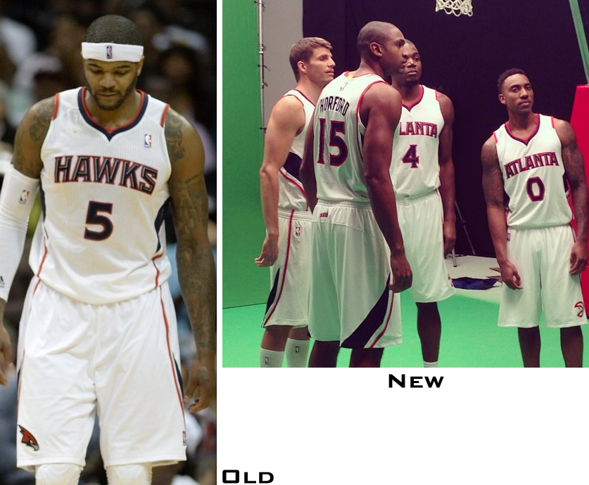
Pretty sure the team wasn’t planning on revealing this news just yet, but hey, that’s what happens sometimes with players and social media. Anyway: I didn’t learn about it until I woke up on Tuesday morning (thanks, Phil), at which point I tossed it into yesterday’s Ticker, but I didn’t really give it much thought until later in the day, so let’s count it as part of yesterday’s news.
My general take on this one is that there’s nothing wrong it, but it doesn’t solve the Hawks’ bigger problems. Further details in this ESPN piece, which I wrote yesterday afternoon.
2. I’ve known for the past week or so that the Pelicans were planning to release a red alternate jersey yesterday, but I wasn’t allowed to talk about it. But my gag order become moot shortly before noon, when the design leaked. A few hours later, the design was revealed for real (click to enlarge):
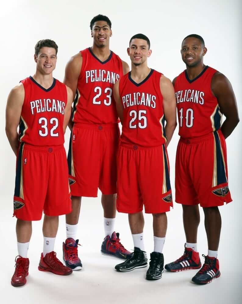
The Pelicans plan to wear this design on Opening Night. Further info here. Again, further details on my response to this design in yesterday’s ESPN piece.
The unveiling, incidentally, took place at a school where Uni Watch reader Richard Hill happens to work. He took a bunch of photos and filed the following report:
The unveiling was followed by a junior “training camp” for middle school students. The four players on hand (Eric Gordon, Jimmer Fredette, Austin Rivers, and Anthony Davis) stuck around for over an hour and interacted with the students as they went through shooting, passing, and agility drills.
The players were great with the students. They participated in every drill, playing and joking around the with the kids at every opportunity. It was impressive to see professional athletes really take an interest in the kids and be an active part of a thing like this. It definitely made a lasting impression on the students I spoke with.
3. A few minutes after I became aware of the Pelicans leak, the Capitals unveiled their Winter Classic uniform:
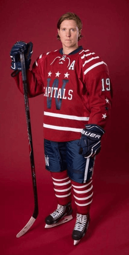
Here are some additional photos and details on the design process. One interesting tidbit: “The numerals on the backs of the sweaters and on the sleeves are somewhat larger than the norm for NHL sweaters. Larger numerals will be useful in a Winter Classic setting where the sightlines aren’t as intimate as they are inside an NHL arena.”
This is, obviously, a fauxback, so its retro elements feel a bit forced. And given my usual enthusiasm for striped deisgns, you’ll probably be surprised to hear me say I don’t much care for the shoulder stripes. I do like the chest insignia, though, and most of the other elements are okay. It’s not a great design and it doesn’t feel organic, but it’ll be pleasant enough to watch for one game.
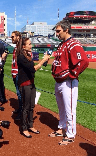
Also: Cross-dressing alert! The unveiling took place at National Park (because that’s where the Classic will be played), so Alex Ovechkin donned a pair of Nats pants for the occasion:
4. The final unveiling of the day came from the Mavericks, who unveiled the winner of their fan uni-design contest:
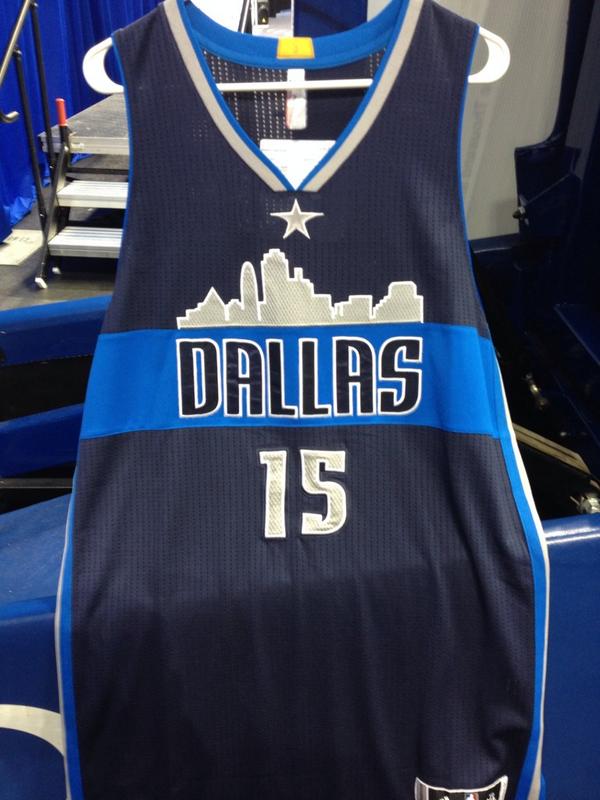
That jersey will be worn as an alternate in 2015-16 (but not this coming season). There are also white and green-accented versions that won’t be worn next season, although they might be added to the mix in 2016-17 or beyond.
But there are some inconsistencies between the mock-up that the team released to the media yesterday and the prototype jersey that was shown at the unveiling:
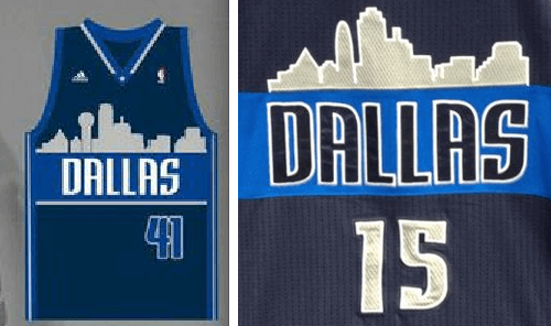
As you can easily see, the color of the “Dallas” type doesn’t match, and neither does the color or positioning of the uni number. Also, the skylines don’t match — the mock-up shows Reunion Tower, while the actual jersey does not. I’ll ask the team to clarify these discrepancies later today.
Meanwhile, a lot of people are grumbling that this design is a rip-off of the Nuggets’ skyline jersey, but I’ve always viewed the Nuggets’ design as being rainbow-centric at least as much as it’s skyline-centric. And why should a skyline design be limited to only one team? I have no problem with it, and I generally like this design.
And there you have it — a somewhat uni-hectic day. My favorite thing about all this is that SportsLogos.net honcho Chris Creamer was covering the proceedings while juggling the demands of fatherhood:
I’d like to thank my kid for scheduling his daily nap during the Pelicans leak and Caps unveiling”¦ Mavs? Let’s get this over with now please
— Chris Creamer (@sportslogosnet) September 23, 2014
And now if you’ll excuse me, I have to take my 16-month-old to the petting zoo #Parenthood
— Chris Creamer (@sportslogosnet) September 23, 2014
One additional note: If you’re wondering what I think about the Penguins’ and Flyers’ recently released alternate jerseys, you can find out in this ESPN piece.
Sticker reminder: High-quality vinyl stickers of the Uni Watch 15th-anniversary logo are now available. Details here.

Baseball News: “I saw this Pirates helmet in an antiques store in Toronto over the weekend,” says Roch Smith. “Turns out it’s a construction hard-hat made of fibreglass from the ’60s. Looks like someone got their craft on back in the day.” … The Padres’ front office had Tony Gwynn-themed cycling jerseys made for a bike race promoting cancer research (from Brady Phelps). ”¦ Anyone stupid enough to buy a really ugly Derek Jeter cap for $100 deserves to wear a really ugly Derek Jeter cap for $100. Good thing Jeter’s such a humble guy who does everything “the right way,” eh? (From Phil.) ”¦ Reprinted from yesterday’s comments: Scroll down a bit on this page to see an MLB logo I’ve never seen before. Anyone..? ”¦ Kolten Wong of the Cardinals has his home state of Hawaii on his bat knobs (thanks, Phil). ”¦ Dave Raglin attended last night’s Nats game and spotted next year’s 10th-anniversary logo in the program. Probably going to be a sleeve patch next year.

NFL News: Remember that pregame shot of 49ers RB Frank Gore that I ran on Monday? Royce Ector notes that Gore change his facemask, removed his visor, and changed his shoe color when the game started. ”¦ Mascot makeover for the Seahawks (from Kyle Hanks). … The Bills and Raiders are tied for having the most black players on their respective rosters; more players come from California than from any other state; running backs are, on average, the shortest players and offensive tackles are the tallest. Those trivia tidbits and a lot more are available in the latest edition of the always-fascinating NFL census. Highly recommended. … Love the decal on this Packers equipment trunk (from Chris Wautel). … Clark Hunt’s suite at Arrowhead Stadium is nicer than your house (from Jonathan Daniel). … Guaranteed argument-starter: a ranking of NFL teams, by team name. ”¦ The Eagles are promoting this Sunday’s game against the 49ers with an outdated Niners helmet (from Chris Long). ”¦ Remember Jonathan Bostic’s different-sized numerals in yesterday’s Tickers? Some of you said that the 5 looked shorted because it was wrinkled. But then Chris Wade showed me this Brandon Marshall T-shirt with similarly mismatched numeral sizes, which in turn got me looking at Brandon Marshall jerseys. My conclusion: The 5 in the Bears’ font is a little short.

College Football News: Yet another Virginia Tech helmet? Sure, why not (thanks, Phil). … Throwback helmets in the works for Virginia. … When Gettysburg College’s new uniforms were unveiled, the pants were solid navy. Now that the season has started, however, the pants have a stray orange stripe (from Eric Wright). ”¦ Purdue will be wearing those fan selfie helmets this weekend. “During Coach Darell Hazell’s Tuesday press conference, he stated that his picture is not on the helmet,” says Eric Johnston. ”¦ I really like New Mexico’s new white jerseys with turquoise trim (thanks, Phil). ”¦ Blackout uni with a flaming helmet for Arizona State this Thursday (thanks, Phil).

Hockey News: In an encouraging move, the Flyers have scrapped their Ice Girls. Somewhat less encouraging is that Flyers fans apparently don’t like that they can’t ogle some free tits and ass during the ice clean-up. Boo-fucking-hoo (from Yusuke Toyoda). ”¦ “I’m generally ‘meh’ about sports-themed weddings, but this Capitals/Flyers wedding is well thought out,” says Yusuke Toyoda. ”¦ Blackhawks goalie Scott Darling is wearing gear festooned with the team’s signature stripe pattern (from Pete Woychick).

Pro and College News: Drawings of the Warriors’ new arena look like a toilet. This comes right on the heels of the Cincinnati Cyclones’ new toilet-flush logo. One more of these will make a bona-fide trend. … Lots of uniform options this season for Duke, including three white jersey options (from Leo Strawn Jr.).

Soccer News: Reprinted from yesterday’s comments: The BBC is making a film about Stoke City’s kit man (from Ian Macphail). … Here’s an in-depth analysis of the new MLS logo (from Yusuke Toyoda). … Meanwhile, MLS fans have made their own team-specific versions of the new logo (from Benton Payne).

Grab Bag: Here’s a video clip of a tour of Brooklyn and Queens signage typography (from Britton Thomas). … Syracuse’s new logo — the city, not the school — is pretty embarrassing, even by tourism bureau standards. Wonder how much they paid some branding consultancy for that one. ”¦ Aussie rules football note from Graham Clayton: “Back in 1990, Hawthorn player Jason Dunstall had his skill fractured during a game. After recovering, he played the remainder of the season wearing a helmet to protect his head.” ”¦ Happy Rosh Hashanah to all who are observing tonight.

What Paul did last night: Yesterday evening I went to the launch party for Jack Carlson’s new book about rowing blazers. Try to imagine a jam-packed space crawling with refugees from an Abercrombie catalog shoot and/or an extras from an early Whit Stillman movie and you’ll get the idea — Ivy/prep/WASP-o-rama. It was so crowded that I never even got to see Jack (sorry, Jack!), although I did manage to take some photos of people wearing rowing blazers (if you can’t see the slideshow below, click here):
I also had a nice time chatting with Uni Watch reader Mathieu Santos, who recognized me and introduced himself. He scored major points by showing me his 1970s-style Bruins shoulder patch tattoo, but then he wussed out when I dared him to yell, “Bitcoin’s a fraud!” while one of the Winklevoss twins was making a speech. Let’s call it a push.
After the party I went downtown and saw a new movie called Art and Craft, which is a documentary about a guy who’s really good at creating forgeries of fine art paintings and this kinda narc-ish art registrar who’s obsessed with stopping him. The interesting thing is that the forger doesn’t sell his fakes — he gives them away to museums, casting himself in the role of a great philanthropist (which may be unethical but is not illegal). He’s very fragile-seeming, both physically and emotionally, and is clearly mentally ill, but he’s a gifted painter and, more importantly, raises excellent questions about how we assign value to things, what’s “real” vs. what’s “fake,” why so many people are so gullible, and so on. I really liked this film — highly recommended. If you live in NYC, it’s at the Angelika. Here’s the trailer:

Hey Paul, the new mexico football jersey link takes you to the duke basketball story. Just a heads up.
Thanks — fixed.
In the basketball section it is the Golden State Warriors’ new arena that looks like a toilet not the Clippers.
That’s the arena for the Golden State Warriors, not the Clippers
hey it’s the Warriors who have the toilet bowl arena not the clippers
Thanks, everyone — now fixed.
The Eagles did the same thing on Facebook when recapping their home opener with Jacksonville. They need to update their graphics apparently.
link
Though I can’t get the image to open on the site, that odd MLB logo appears to be vector stock. I found it via the google search below.
Why THAT was used is still a mystery though.
link
I believe that MBL has some sort of agreement with Stub Hub. Several if not all the teams’ official sites have a link to the secondary marketplace site. Maybe that prevents TicketMaster from using the ‘official’ logo?
Just a guess.
“Though I can’t get the image to open on the site, that odd MLB logo appears to be vector stock. I found it via the google search below.”
I ran a Google search on the image itself. link (scroll down just a little) show that same image being used as unlicensed clip art in all kinds of places around the interwebs.
I actually really like that Pelicans uniform. On most teams I’d give that a solid A. But I just can’t get over my feelings that the navy/red/gold color combination doesn’t work for New Orleans. Maybe it’s cliche, but they should have used Mardi Gras colors like the original Jazz. Oh well.
And why will they wear the “alternate” on opening night? That sounds pretty dumb.
I’m with you on the color scheme.
In the 90s the fad was weird colors, now its red and blue
I’m surprised Paul didn’t mention that the Caps’ uniform is a pretty clear reference to the Washington Senators (the ones that became the Twins). It’s still faux-backy but it at least references a team that used to play in DC.
someone else mentioned that it was a throwback to the New York Americans. I can see it a little. I don’t know their history though.
link
Actually the influences come from the Washington Presidents and Washington Lions hockey teams from the D.C. area prior to their being and NHL team in the district. The Presidents had the shoulder stripes, and the W on the sleeve. The stars above the W is a nod to the D.C. flag which is derived for the family crest of George Washington.
As far as the Dallas uniforms with the skyline inconsistencies, on apparel sometimes you need to get the buildings all cleared by their respective owners to be used and this could be why the original concept looks accurate and the finished piece looks more generic.
Guess every NFL and NBA team should scrap their cheerleaders too. Ice girls aren’t any different. Would it be okay to have girls clean the ice if they came out in parkas and snow pants?
Would it be okay to have girls clean the ice if they came out in parkas and snow pants?
I think the people who clean the ice, which is a custodial function, should be dressed for performing, you know, a custodial function, just like the vendors are dressed like vendors, the ushers are dressed like ushers, and so on. Pretty simple.
I saw this and remembered the discussion previously here on UW.
‘Merica wants their sex–anywhere they can get it!
Maybe you’re right – professional sports teams *should* scrap their eye candy squads since they can’t seem to employ them without systemically running afoul of labor laws (not to mention basic decency).
And I’m sure you saw the part in the article where they were being asked to wear their standard uniforms in non-climate controlled settings, like during the Stadium Series and greeting fans at the arena entrance.
I miss going to Celtics games and not having to watch the ridiculous “Celtics Dancers”. I find cheerleaders to be pointless. I don’t watch them or pay attention to them. Also the inherent sexism of the whole thing is more than a little bothersome.
Agreed entirely. Even more shameful that they waited until right after Red passed to introduce them (Red was notoriously anti-cheerleader).
It strikes me as amateurish at best and sexist at worst.
I think Paul is SPOT ON!
But the whole idea about women dressed with hardly nothing on is weird to me at sporting events as a “cheerleader” or what have you.
But for me it’s lame and stupid.
I mean, if I really wanted to see that stuff, there are so many other options without it being at sporting events.
I mean, there are strip clubs which is, if your into ogling cheerleaders at a sporting event, more satisfying I think. The internet, as it turns out, is just porn 2.0. It drives me nuts when guys just jab me in the ribs and drool overthemselves, “MAN SHE IS HOT!”. Get a grip already. It’s a woman.
Going to a hockey game to get a fix of sexy women is like going to McDonalds to get your car washed.
link
[Genuflects in praise.]
Fundraisers notwithstanding.
So I checked the Bears Style Guide file, and to my surprise, the 5 is so ever slightly smaller than the 1
link
Usually this is an optical illusion because of the curve compared to the flat edge of the 1. This only happens on the chest and back though. The sleeve numbers were fine.
Forget about $100 Jeter hats. You can buy game-used Jeter socks for only $410.
link
As they say, everything about Jeter exudes class.
The memorabilia machine is just out of control.
Of course, if Jeter were on any other team, we would not be getting so inundated. But it’s the Yankees, and they never do anything low-key.
But how much for a Derek Jeter gift basket?
Would said gift basket include the athletic supporter?
Just a bit of your dignity.
I’m not sure I hold Jeter personally responsible for this as much as I hold New Era, Gatorade, the Yankees and anybody else who’s trying to make a buck off his name.
Olbermann get into the whole Jeter thing and mentions the patches last night. He makes some great points.
link
Apparently when Arrowhead was built, Lamar Hunt had that suite built as a place to live while he was in KC, as his permanent residence was still in Dallas.
Sort of like Walt Disney’s apartment above the fire station at Disneyland. He lived there during the week when Disneyland was being built so he wouldn’t have to drive back and forth between Anaheim and Burbank/Hollywood/home.
I was thinking as I clicked through the pictures, if I was an NFL owner and the stadium was in a decent location, I would absolutely build a ‘second home’ at the stadium.
Recently Stan Kroenke – owner of the Avalanche, Rapids, and St. Louis Rams – had an apartment added to Pepsi Center for his Denver area visits.
i love the new Capitals uniforms.
love the washington monument point in the W and the A.
has a classic feel w/out being old and without just rehashing another old uniform.
i’m sort of over teams just trudging out vintage uni’s for the WC. i like the idea of a NEW 1 off uniform that’s brand new!
I think the Caps Winter Classic unis give off a 1920’s-1930’s vibe better than any other WC outfit so far. It makes me think that if the Caps existed in say 1934, this is almost exactly what they would have worn. It’s not outlandish, it’s not pretentious, it’s not vintage for vintage’s sake. It just works.
Correct me if I’m wrong, but shouldn’t the blame for the hat/sock be placed on the Yankees, not Jeter? I hate the Yankees and all the Jeter overkill, but taking shots at his (perceived) class over the actions of the organization seems like a cheap shot.
Correct me if I’m wrong…
OK, I will. New Era can’t create that ugly Derek Jeter cap without Derek Jeter’s participation/approval. As for the game-used stuff, the details of Jeter whoring himself out to Steiner Sports have been reported at length in various articles.
Does he have the right to do all this? Absolutely. He has the right to be (and to appear) as greedy and tasteless as he wants. And boy does he want.
But Jeter’s image remains Teflon. Ken Davidoff wrote a good piece about this yesterday:
link
Not trying to argue, I’m actually curious: Are MLB contracts that different than the NBA’s, where the Promotional Activities and Group License sections (13 & 14 in the link below) give teams the right to use the player’s name/likeness?
link
But that language covers promotions and marketing by the team and league. Doesn’t cover merchandising by a third-party licensee like New Era.
Fair point. I guess I’m just struggling to understand the difference between a New Era hat with a Jeter patch and a Majestic replica or fashion jersey with a 2 sold on any MLB website. I still say as much, if not more, blame should fall on the Yankees and even MLB…the hat includes their logos, too. In the article you posted above, I found it interesting that the two items singled out due to Jeter’s jab at Steiner (the chair and nameplate) are both property of the team, something he wouldn’t control regardless of his contract with Steiner.
What I REALLY can’t understand is why I’m defending Jeter. Maybe because it’s hard to argue that on the field, he was/is classy compared to the flashiness of a Manny or Puig…then again, so are plenty of other players that aren’t basking in the spotlight.
Here’s what it really comes down to: At this point, Derek Jeter can totally tell the Yankees (or New Era, or Steiner, or whomever), “Please don’t do that — it’s undignified, it’s not what I stand for, and it makes us all look bad.” Nobody would dare cross him.
But he hasn’t done that.
Does he *have* to do that? Of course not. But the fact that he hasn’t belies the standard Jeter myth.
Cue Jeter in New York coming out of a nightclub’s VIP entrance. Fans adore him from behind their velvet rope as they wait in line to get in. Jeter is wearing the 59Fifty exclusive edition hat.
“High. I’m Derek Jeter, the classiest player in baseball. That means staying classy not only on the field, but off the field too. That’s why I always make sure to wear my Derek Jeter exclusive collection, New Era 59Fifty hat when I’m not wearing those Yankee stripes. This way when I’m not on the diamond hitting dingers, I’m still shining like one off it.” [close up of hat, Jeter swipes his finger across the brim] – “Sweet, shiny, faux alligator skin class. Go out today and get yours for only $100, because any cheaper would take away the deluge of class this hat gives off.”
Cue super model…
“Wow, nice hat. Why don’t we go somewhere private so I can try it on.”
Close up on Jeter’s face – “Class all the way baby.” – Jeter winks and slaps the super model in the ass as they get in his Ferrari (custom painted with Yankee pinstripes) and drive away.
Unfortunately, the media helps fuel the Jeter mythology. This includes the deceiving stat that Jeter has played only one “meaningless” game in his career. Easy to “accomplish” that if you don’t play in most games during the final week of the 2008 season…
It’s fitting that the $100 New York Yankees/Derek Jeter cap has a vaguely reptilian look to it.
Amazing how a shortstop with alligator arms can win so many Gold Gloves. Who but?
I think Jerry world has a more famous skyline than downtown Dallas, what if the unis had a skyline of six flags, att stadium, the rangers ballpark and Texas pete?
I’m not going to diss the Mavs unis. I want more variety in NBA uniforms. The Blazers get it right.
Not gonna give them a pass. Since when is the city of Dallas famous for its skyline?
when you drive in town on the intersate the skyline is pretty breathtaking
Isn’t this the Nationals 10th season? Wouldn’t next year be their 11th season? Seems to me the logo should have been used this season.
This was indeed the 10th season. Next year will be the 10th anniversary, which is what that logo should really say.
It reminds me of the Sienfeld bit . . .
link
UConn men’s basketball accidentally unveiled some uni changes yesterday… new side piping similar to what they wore in the early 2000s. Here’s a link to the pic link
heres a better pic link
RE- the Virginia Tech helmet. This weekend’s game is their Orange Effect game. I’m almost certain the helmet will be all orange (which they already have), so maybe it’ll be just that, or some new variation with the Hokie tracks, or something else stupid.
I’ll bet they’ll also be wearing orange shirts and pants, since that is the direction they’ve been going with the ‘Effect’ games lately – like the white out game from a couple weeks ago against ECU.
I’ll be at the game, hopefully I can provide some decent pictures.
Signed,
An embarrassed Virginia Tech Alum
“Here are some additional photos and details on the design process. (for the Caps uniforms)”
Did it involve getting drunk or stoned?
Here is the final product of the paint scheme design contest. Thank you Uni-Watchers for all of your votes!
link
Call me a cynic if you will, but why do I think the Seahawks redesigned their link at the behest of Nike to remove some of the remaining vestiges of the link from the team’s visual program? That said, I like the update. It looks more like the helmet logo than the previous Blitz, and it matches the team’s current color scheme better.
As for the new link, the comparison is inevitable, so I might as well be the link. Is it wrong to hope that Boom link?
He could end up in Retired Mascot Heaven next to Boomer, the Blue Jackets’ cannon mascot.
I think Boom would wind up spending time in Retired Mascot Purgatory first.
link
So. Many. Outdated logos.
So. Many. Unsatisfying explanations for why he rated team names as he did.
What a piss-poor read.
No other city can make the Steelers name work…right, Birmingham? And no, Nashville, Athens of the South, you have no business using a mythological name. None at all.
Didn’t a uni-watcher produce a similar alt jersey for Dallas? The skyline motif seems so familiar
I think the Washington Capitals Winter Classic Jersey is a whiff. Its just too bland in design. I like the deep red color and I like the stripes. The block W with overlaid CAPITALS is just kind of meh. If I were designing it I would have kept the Stripes on the sleeves and the Deep red color. I would have incorporated maybe the Screaming Eagle design from the 97 squad or the Capital Dome design from the black third jersey. They could also have done a Red White and blue simplified version of the Presidents Seal. Might be too much like the Ramones logo but Id still like it. Ive been a Caps fan since the late 80’s when my family moved to DC area and I got interested in hockey. The red Jersey with the stars that started out the franchise’s jersey was my favorite.
We’re lurching toward a good compromise. The red sweater with the stars and blue breezers was the best uniform. The swooping eagle with the stars forming a “W” in the wings was the best insignia. Some fusion of the two would make an enduring Capitals identity that wouldn’t require replacing every six years.
I agree about the screaming Eagle logo. They could have made it less 90’s cartoonish and more vintage looking, maybe facing the other way, blue/white feathers on the red background of the jersey with red and white stripes (like the American flag) on the sleeves. Opportunity missed on this one.
Gotta disagree with you on the Caps unis only being okay, Paul. The shoulder stripes don’t look forced to me, and we should be celebrating any uniform design that doesn’t have apron strings, weirdly shaped blocks of colors or black (except for teams that have it as one of their main colors)!
Overall this Pens fan gives it a thumbs way up, as Siskel and Ebert used to say.
Oooooohhhhhh my goodness Scott Darling’s pads. Goalie pads that match the sock striping pattern are my second favorite thing in goalie apparel, easily.
Since you asked, my favorite is goalies wearing the equipment of their former team. Mmmmmm… mismatched equipment…
My only question about Darling’s pads: Does he have a white set for the road?
Actually, though, I have to give him credit for going with pads that aren’t white. It sure seems to me like just about every NHL goalie goes with white pads with minimalist deco these days, and as a result it’s somewhat noteworthy when one goes with full-color pads.
Hey, Atlanta Hawks, I have an idea that will help cure the ongoing issues with your bland visual identity. Instead of just slapping a Pac-Man logo on the shorts of your lame current home uni set, how bout you embrace the best uniforms in your team’s history and link?
Or use the logo on either of the sets worn from 68-72…
Ravens are set to wear their black jerseys on Sunday vs. Panthers
link
RE: The grab bag entry on Jason Dunstall — I, too, had my skill fractured during a sporting competition. It was 1972. I was an offensive guard for the Swiston’s Beef-N-Keg Broncos. A wiry little noseguard ran over me like Hitler rolling through Paris. Broke our quarterback’s collarbone. Left me face down in the mud, contemplating my retirement from football, and realizing that I had no talent for pass blocking. Skill: FRACTURED. Tragically, there’s no headgear that offers protection from humiliation.
You must have felt like a real nickelhead after that.
Well said, sir.
With all the MLB clubhouse champagne celebrations, I’m wondering who the first player was to don goggles. The 2004 Red Sox have been mentioned, but I’m guessing it goes back earlier than that. Last night’s Pirates celebration showed McCutchen wearing ski goggles, and it seems to me that the whole thing has generally become silly and contrived.
-C.
The clubhouse celebrations have been contrived for at least as long as they’ve had sponsor logos on the tarps covering the dressing stalls.
The weird thing is that as the celebrations have become more and more staged, there’s often less and less to celebrate. I mean, how much of an accomplishment is it to win a wild card spot, which is essentially qualifying for a play-in game?
I can see how certain teams would celebrate *anything,* even qualifying for a tiebreaker game — the Royals, say, because they haven’t sniffed the postseason in so long. But for most other teams, save the bubbly until you’ve actually won something substantive.
Exactly.
Knowing full well how curmudgeonly this is gonna sound, a few years ago I was channel-flipping and stumbled across the tail-end of the final game of the 1970 World Series b/w the Orioles and the Reds (i.e., Game 5). Just for the heck of it I stuck around to watch the post-game celebration, and it literally almost moved me to tears. Each player who was interviewed credited everyone but himself for the victory, and several pulled obscure utility players over to be interviewed (Chico Salmon, anyone? Clay Dalrymple?). Followed by losing manager Sparky Anderson showing up to offer the Orioles his congratulations, and saying to the camera “the best team won.” Unfortunately the only video I can find of it is this short clip, in which Anderson appears at the very end:
link
Also worth mentioning: Back in day, players didn’t make much money. So that playoff bonus check actually meant something and definitely contributed to the celebratory air.
But when almost everyone on the roster is already a squillionaire, getting an extra bit of scratch at the end of the year doesn’t really matter. It’s all Monopoly money for these guys anyway.
I’m not saying they don’t deserve to be highly paid. I’m just saying the high pay has an effect on the character of the celebrations.
Even that short clip, all one minute and ten seconds of it, just about moved me to tears. A different era, for sure, but the grace and sportsmanship on display from all-time greats like Brooks Robinson and Sparky Anderson transcends time and place.
There is nothing better than the Mets clubhouse after winning the 69 Series:
link
One of the most interesting things about that Mets celebration is that Donn Clendenon is interviewed by a TV guy and and one point says (I’m paraphrasing here, but this is pretty close to an exact quote), “Yes, I’m under contract for next year. And I will honor my contract.”
When I first heard/saw that, I thought, “Duh, of course he’s gonna honor his contract. Why wouldn’t he? He wants to keep playing, doesn’t he?”
But then I learned that Clendenon had actually NOT honored his contract earlier that year, when the Expos traded him to the Astros and he refused to report to Houston because the ’Stros were managed by Harry Walker, whom Clendenon loathed. So Houston gave him back to the Expos, who eventually traded him to the Mets.
So when Clendenon said, “I will honor my contract,” it was his way of saying, “I won’t do that thing again where I refuse to report.”
Could someone please remind me what the logic is behind the NFL no longer allowing the numbers 0 or 00 a la Jim Otto or Ken Burroughs? There seems little reason now to allow them.
I don’t think they’ve ever stated a reason for it. Just one of those “Because we said so” things.
Wow, that was pretty impressive – the South Park episode swapped out Kirk Cousins for the injured RGIII.
Err, swapped in. In short, Griffin was replaced by Cousins.
Best part about the South Park ep? Totally nailed the multiple shades of Cowboy silver.
link
As of 9:50 PDT on this Wednesday night, the fugly $100 Jeter caps appear to be sold out in smaller sizes (7 through 7-1/4). Small minded, or just small heads?
I gotta disagree with Paul on the Caps WC uni. I love it. I love how the W makes a Washington Monument, I love the colors, I love the stripes, I love it all. They should change their entire identity to this.
I always thought the Creative Arts Center at WVU looked like a toilet.