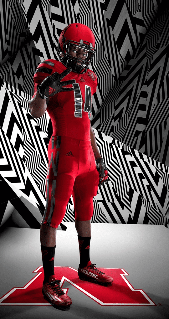
Click to enlarge and see additional views
Paul here, pinch-hitting for Phil this weekend. A few days ago we were told that Nebraska would likely have an alternate uniform this fall. Yesterday that uniform was revealed, and boy is it a mess. It’ll be worn for the homecoming game on Sept. 27 against Illinois (who, if there’s any justice, will wear solid orange).
The standard line, of course, is that this type of design is geared to appeal to 17-year-olds. But it turns out that it’s popular with at least one middle-aged guy.
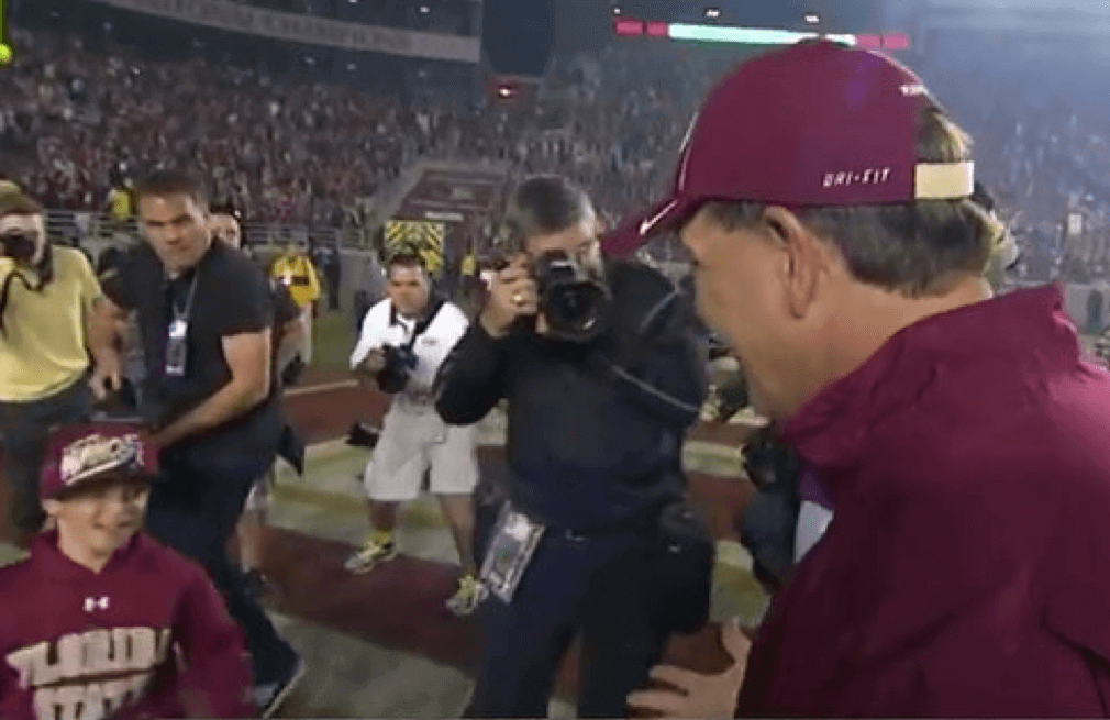
Click to enlarge
What you see above is Florida State coach Jimbo Fisher about to hug his nine-year-old son, Ethan, after the Seminoles’ victory over Miami last Nov. 2. As you can see, young Ethan — did I mention that he was nine years old at the time? — was wearing an Under Armour sweatshirt.
That apparently didn’t sit well with the corporate automatons at Swooshie HQ, one of whom — a guy named Mark Dupes, although we’ll just call him Douchebag of the Year from now on — promptly dashed off the following email to the FSU athletics dept.:
Hey got a text from the USA Director of Sports Marketing last night telling me of how good things look w FSU and our players and sideline staff, exposure for the Brand was exceptional. Then 5 min later I rec a new message…Said ABC cameras were on Jimbo and his Son [at] end of the game…His son was Wearing Under Armour FSU sweatshirt! Ouch. Can we please ask Jimbo to eliminate that from the son’s wardrobe in the future! Let me know if I can help w anything. Thx guys. MD
I happen to remember how nice the sports world was when uniforms and sideline gear didn’t have maker’s marks, so there was no cretin from corporate HQ breathing down everyone’s neck about “exposure for the Brand.” For those of you who are too young to recall that time, I feel sorry for you. But not as sorry as I feel for all the folks who have to deal with “people” like Mark Dupes the Douchebag of the Year, or for young Ethan Fisher, who learned a disgusting corporate lesson at a very early age.
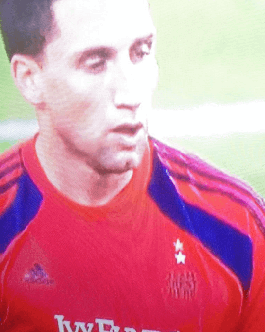
Bizarre scene in last night’s Sporting KC vs. Philadelphia Union game, as KC’s goalkeeper was missing the team’s crest on his jersey, revealing a helpful note that read, “Team Crest Here.” Who knew?
Now we just have to find out if “Corporate Branding Here” is underneath the Adidas logo.
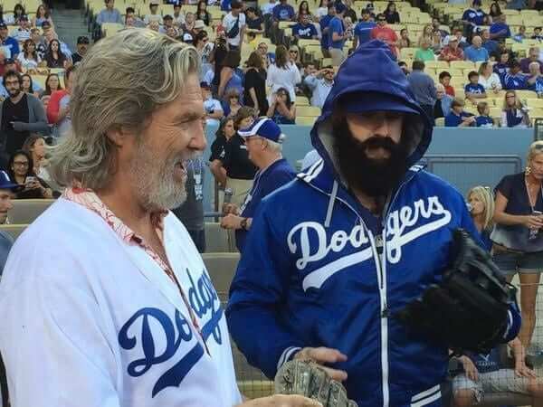
A source who prefers not to be named checked in last night with the following:
Brian Wilson wore a vintage satin Dodgers Starter jacket [instead of a standard Majestic jacket] to catch the first pitch from Jeff Bridges. I think he wore it in the bullpen too, although I’m not positive. Obviously, this violates all the MLB on-field attire rules. I don’t think anyone noticed because, well, it’s a blue and white Dodgers jacket!
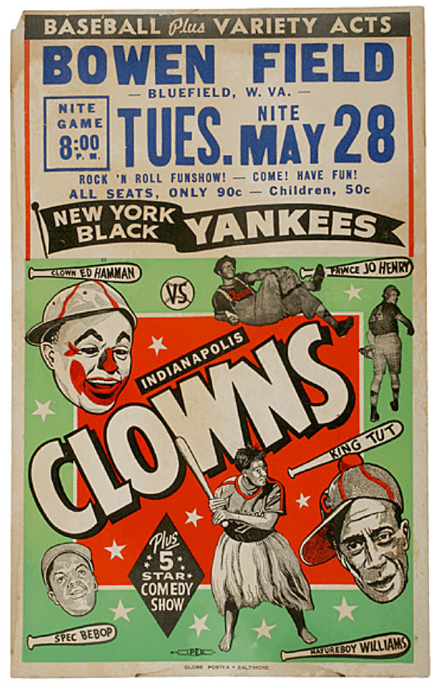
Click to slightly enlarge
Holy moly, look at this amazing Negro Leagues promotional poster that reader Ben Fortney sent my way yesterday. Interestingly, it dates back to 1956 — nearly a decade after Jackie Robinson had broken the color barrier. The Negro Leagues were pretty well running on fumes by then, which is presumably why the bill also included “variety acts.” I love that the festivities included a “rock ’n roll funshow!” Also love that there were players named Spec Bebop and Natureboy Williams (who apparently played in a skirt).
If you can’t see this slideshow, and/or to see in gallery form, click here
Most of you don’t know this, but Phil is an avid photographer — and a damn good one. The reason I’m filling in for him this weekend is that he’s busy selling some of his photos — the five shown in the slideshow above — at the annual Guild Hall Clothesline Art Sale. Great work, buddy — I know you hate selling things, but I have a hunch those are gonna move.

Baseball News: The Twins wore their red BP jerseys for last night’s game against the White Sox. “The only other time I’m aware of the Twins wearing BP jerseys during a game was on July 6, 2005, against the Angels, due to the heat,” says Jeff Barak. “They opted for their lighter-weight navy BP jerseys, which had no red trim around the neck, front placket, or sleeve cuffs. There were no names on back and the numbers were actually three-color, a rarity for the Twins.” … The Brooklyn Cyclones wore Irish Night jerseys on Thursday. … The Bowling Green Hot Rods will be wearing G.I. Joe costumes on Thursday. “That also happens to be the team’s ‘Thirsty Thursday’ promotion,” says Josh Claywell. “Because nothing screams military appreciation like cheap beer.” … Check this out: Dave Kingman taking BP with an Alcoa aluminum bat (from Matt DeLeon). … Post-trade deadline uni number assignments from the A’s, as reported by Richard Paloma: “Jon Lester gets his No. 31 that he wore with the Red Sox. Jonny Gomes, who wore 31 last time he was with the A’s, now has No. 15. With Jeff Samardzija now wearing No. 29, which is what Sam Fuld wore earlier this year, Fuld is going to wear 23.” … Speaking of uni numbers and trades, here’s a great query from Richard Craig, who writes: “On Thursday the Cubs traded Emilio Bonifacio to the Braves. With the Cubs his uniform number was 64; with the Braves he’s wearing No. 1. Is this the largest trade-related numeric drop in baseball history?” Love that question. Anyone know more?

College Football News: New helmet for D3 Westminster College (from Dwight Ternes). … Here’s the patch that LSU and Wisconsin will be wearing for the Texas Kickoff game. Interestingly, the lettering is similar to the Texas Rangers’ chest insignia!

Hockey News: In my recent ESPN column about league logos on uniforms, I said that the NHL had never publicly identified the designer of its shield logo. A league spokesperson has now informed me that the current iteration of the shield was designed by NHL Senior Design Director Paul Conway. … The Grand Rapids Griffins are having an alternate jersey design competition (from P.K. Richardson). … New jerseys and a fun dragon mascot for the ECHL’s Indy Fuel (from Greg Hotopp). … Here’s a series of GIFs showing the uni evolution of each NHL team.

Basketball News: Nike has officially unveiled the USA basketball uni that we all saw leaks of a while back. … “Xavier is down in Brazil right now, doing one of those tune-up/goodwill tours, and they apparently have some new unis for this event,” says Ryan Sheldon. “Also, Xavier finally decided on a new court design that will include the Cincinnati skyline.”

Grab Bag: England’s women’s rugby team knows what I like (thanks, Phil). … I think we’ve seen this before, but just in case: Here’s a cool T-shirt that shows three great No. 34s in Houston history — Earl Campbell, Nolan Ryan, and Hakeem Olajuwon (from Colin Sherrod). … Marvel Comics is outfitting the Australian rugby league this weekend (thanks, Phil). … Two rugby teams are going with bright green alternate kits: Cardiff Blues and Munster. “Looks like it’s a new trend,” says Adam Ingle. … New camouflage pattern for the U.S. Army (thanks, Brinke). … In a related item, here’s a history of military camouflage. … Hawaii Pacific University whose teams were formerly known as the Warriors, will now be known as the Sharks (from Bill Sodeman). … The Manly-Warringah Sea Eagles of the National Rugby League in Australia wore their yellow and blue alternate strip during their victory over the Brisbane Broncos this weekend (from Graham Clayton).
Question: What do you folks think of today’s format — several short items with big photos, instead of one primary article?

Cardiff Blues and Munster are rugby teams, not soccer teams
Oopsie. Will fix.
That Nebraska uniform is godawful.
Also, a pox on Nike’s and Under Armour’s houses.
Right on about those uniforms.
The Manly uniforms from Friday aren’t alternates – they are the ridiculous a Wolverine unis that a referenced in the other rugby league link in today’s post – thankfully it’s a one off.
Marc S,
Thanks for the correction – I didn’t know about the Marvel idea. I saw the Manly uniforms during a news report, and assumed that they were a little used alternate strip.
In terms of baseball jackets, old school Starter > anything by Majestic.
Does Cincinnati have a distinct enough skyline to warrant its depiction on a basketball court? Xavier’s new court looks just like Washington’s new court.
Jimbo Fisher’s son is named Ethan, not Nathan.
Didn’t see this on here so thought I’d post it Ole Miss will be wearing these helmets for the Memphis game next year in honor of Chucky Mullins LINK: link
I would not have noticed anything different about the format unless you’d mentioned it. Even then it was very subtle to me. But maybe it’s because I was more annoyed with the ‘Douchebag of the Year’. What a great contribution to society. I read more on other websites and find it the subsequent damage control laughable. Of course, ‘Douchebag of the Year’ has not provided a comment. Big surprise.
I enjoyed the format. Being a Saturday, there usually isn’t a ton of new stuff and I expected Nebraska’s mess to be the extent of the main entry. But then you kept going with other items. Kind of a pleasant surprise.
Am I the only one who refuses to buy anything Swoosh?
I never say I’ll never buy anything by a particular manufacturer.
Didn’t ever own anything by Nike until I needed a pair of baseball cleats for slo-pitch a couple decades ago and couldn’t find a half decent fitting pair except one pair on clearance; they also had the added bonus of conversion cleats.
Similar problem this year when that pair of shoes came apart – ended up buying a used pair last week because couldn’t find a new pair that fit my feet. The way the retail industry is now if I wanted a Christmas tree I’d better start shopping now. Don’t get me started on the inconsistent sizing not only between brands but between different models or years from the same manufacturer.
Didn’t have a Reebok hockey jersey until I really wanted the Milwaukee Admirals light blue alternate.
I wouldn’t say never, but they’re at the bottom of my list.
Not since “Revolution” ad.
I enjoyed today’s format. Big stories warrant big articles; lesser stories are well presented in this format. Nice work.
I agree.
And kudos to Phil the Photographer. My wall would gladly wear those, especially the boat at sunset.
Great way to put it!
Looking through the NHL uni evolution…I believe the Washington Capitals wore white pants for their first road game then scraped them…I was hoping they would be represented!
I have to bow to Randy’s expertise (or anybody else’s) on NHL uni history , but I sure enjoyed the GIFs. Excellent source for chronology of graphic fads…
Quick search didn’t find anything authoritative but on a few sites it says the Capitals wore white pants for their first month, one place says a few games, one says 8 games.
In any case it seems very likely it was more than one game.
Today’s format left me wanting more. The first story felt like a ticker entry, except I didn’t have to click to see the main image. I wanted to read more or Paul’s critique. And even though it’s more of a Phil thing, being a Saturday, I missed the quote of the day.
1. Mark Dupes needs to learn how to write email like a professional person would.
2. As a marketing guy, the way to solve the problem is not to confront FSU, but instead ship some new sweatshirts over for the kid. Then it’s “Hey, cool, new stuff!”
3. This approach was so ham-handed it led to inevitable comment section jokes: “What do Mark Dupes and Jerry Sandusky have in common? They’re both trying to get 9-year old boys out of their shirts!”
So, well done, Nike, well done. Nice professional approach you took there. Instead, you wanted to be the “fashion police”.
Anyone else want to see one side of the stadium hold up signs that make up a giant Under Armor logo (perhaps with Dupes’ name on it as well)?
My guess is Manny Ramirez’s 24 to 99 number switch after he was traded from the Red Sox to the Dodgers would be up there for largest trade numeric increase.
Don’t forget Manny went from 99 on the White Sox back to 24 on the Rays: link
Awesome quote from the Hawai’i Pacific re-brand article:
“‘I love the new logo. The new mascot embodies a competitive spirit, because the goal is to do the best that you can and win, as a shark would,’ said Cruz.”
Learned more about sharks and what motivates them from that one quote than from an entire week watching the Discovery Channel.
I like this format. Sometimes there’s just slow uni-related news.
Regarding the format: my favourite days are the ones where there’s a long, really interesting article. Of course this depends on the topic and if the length is warranted. Plus, even if I’m not interested in the long format topic there’s always the ticker, recipes, art, cockroach legs, etc.
Having said that I did enjoy today’s format and wouldn’t be disappointed if it became more frequent.
I like today’s format. Less often is more.
I wanna say the Twins also wore their navy BP jerseys on another occasion some time in the last 15 or so years during a game in Baltimore. It may have been in the late 1990s. I could be completely mistaken, but I can see the image of them wearing what I recall was a pullover navy jersey, which at that time was different from any regular button-down navy alternate.
Spec Bebop! So that’s the origin of the song title from Yo La Tengo’s I Can Hear The Heart Beating As One lp….learn something new everyday day!
I like the red BP tops with the blue helmets. I’d like them better if they said Twins instead of Minnesota, or if Minnesota was in printed out the way they were on the old pinstriped road jerseys. That script just looks too crowded.
I want to like everything about the Twins road uniforms, including that “Minnesota” script. I just don’t. I don’t know why but I still like the old pinstripes better. Of course I also despise the “TC” hat and much prefer the underlined “M” so take that for what it’s worth.
Love today’s format! As for the trade-related uni number change, Alfredo Amezaga went from 99 with the Rockies to 6 with the Marlins after a 2011 trade. That’s a change of 93.
Honorable Mentions go to Turk Wendell, who went from 13 with the Cubs to 99 with the Mets; Willie Crawford went from 21 to 99 in his trade from Houston to Oakland in 1977; Manny went from 24 to 99 when he went from the BoSox to LA in ’08.
last time the dodgers were in St. Louis, I was down on the field and Brian Wilson was wearing that satin jacket when he went to and from the bullpen before and after the game. To my knowledge he’s been wearing it all season.
He was a Giant..now he’s a Dodger. That’s pretty much all I can say about Mr. Wilson.
This is why we cheer for teams, not players. The players are just mercenaries, playing for the highest bidder. There is no loyalty.
Ew. I do not like the Twins in red.
The only bright spot in the new Nebraska alternate is the N incorporated in the pants stripe, which I think is cool.
I feel like adidas just does a worse job at alternate uniforms than the Swooshes or UnderWire. They always just look weird.
Also, the NFL Network has been running pieces on the incoming Hall of Fame class. They had a video about link, which had a couple cool nuggets. Like how the gold color is completely unique to the Hall of Fame.
In a vacuum I don’t like the Nebraska look but don’t hate it either. It would be OK for someone like Northern Illinois but looks awful for Nebraska.
I’m also unsure if I like the new Navy unis. In theory I don’t mind them but I guess the chest stripe is going to be UA’s version of tire treads or something? Seems like they want to do it more and more just because they can. When something like that is done once for Northwestern it’s unique and sort of cool. When you start doing it frequently it’s becoming a template.
Also if the “kids like shiny things” thing is still true (which guessing by all the chrome it still is), can they get more shiny & flashy than those numbers combined with that white/black background? Damn! Did I lick a special frog or click on the latest costume unveil? Yikes!
Any weekend post that does not include the “UWFFL” is fine by me. UWFFL takes up too much real estate in weekend posts.
I like today’s format, nice change up.
I thought that Dodgers jacket might have been a link, but the wordmark’s not quite right. Presuming that the online shop graphics are accurate….
I feel sorry for the kid in the Nebraska uniform. Doesn’t he realize that he and his teammates are going to look like fools in those alternate uniforms?
I also feel sorry for the kid in the Under Armor shirt who got harassed. Let everybody wear what they want to wear.
Brian Wilson’s jacket probably is a Mitchell and Ness jacket. That seems more likely than a second hand Starter
I thought the Starters had snaps. I do not recall any that zipped up, but then again, the 80’s are a blur to me! :-)
Enjoyed the format as a nice change of pace. Wouldn’t want that exclusively, and perhaps not even on any schedule, but more when the content available fits that kind of delivery better. Either way, I wouldn’t mind seeing things presented that way every so often.