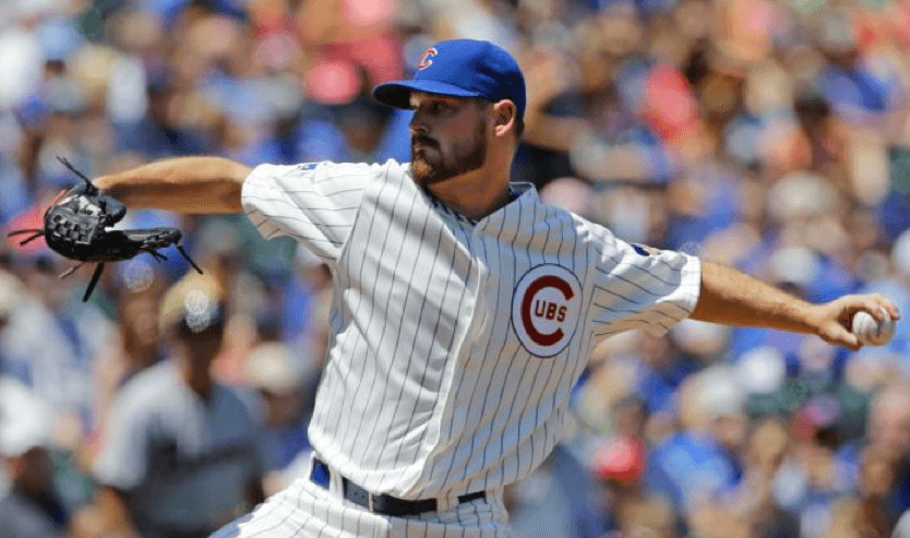

For all of today’s photos, you can click to enlarge
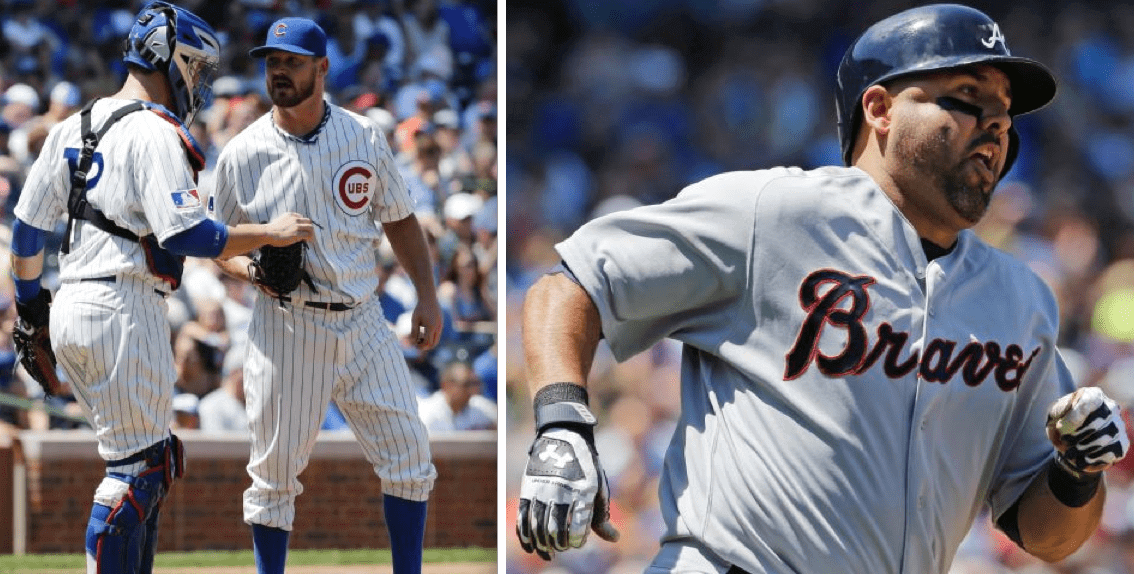
The Cubs held their latest throwback game yesterday, this time turning back the clock to 1969 while hosting the Braves. The basic uni designs are shown above — not bad, right? Now we’ll delve into the nitty-gritty of some of the details.
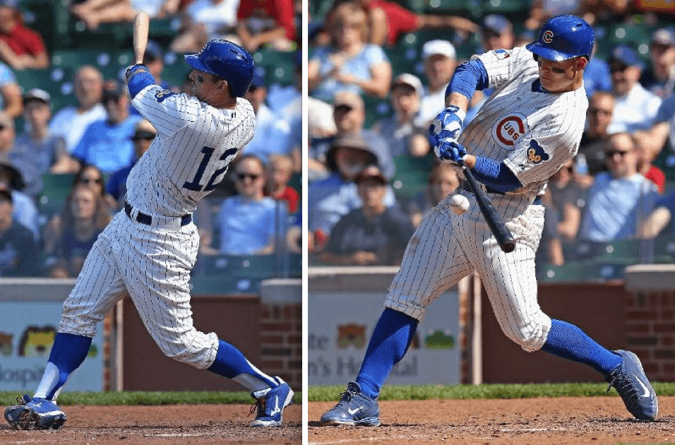
From what I could see, almost all of the Cubs went high-cuffed, but only some of them wore stirrups:
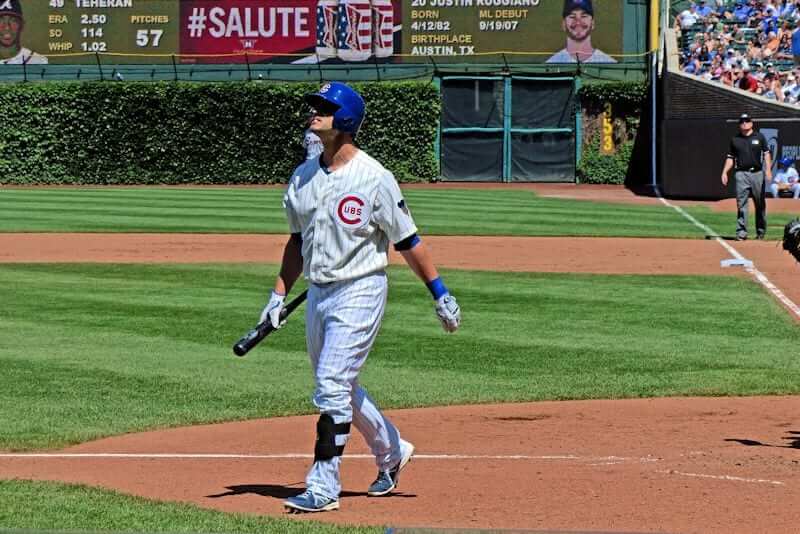
One Cub who didn’t go high-cuffed: outfielder Justin Ruggiano. Even worse, he wore his regular white pants, instead of the cream-colored throwback pants:
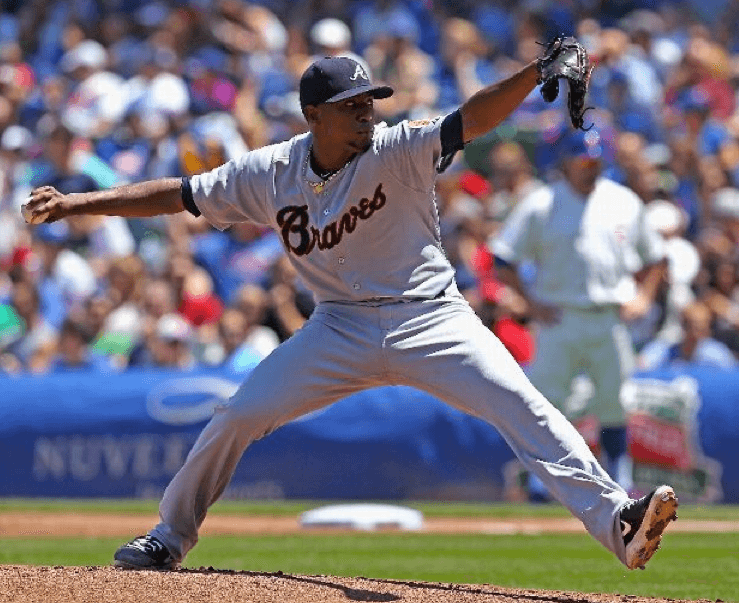
The Braves, meanwhile, didn’t bother with high-cuffery and just went with the pajama look — disappointing:
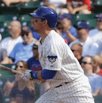
One of my favorite elements of this Cubs uni is the left-sleeve patch:
Speaking of patches: This being 1969, figuratively speaking, the Cubs wore the MLB centennial patch on the right sleeve. But the Braves, surprisingly, did not:
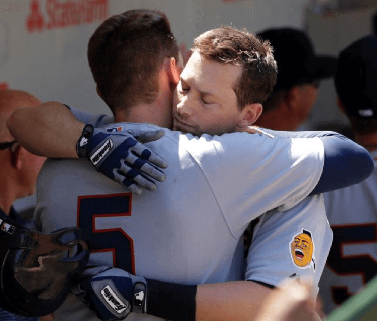
The Braves did, however, wear their Indian head patch on the left sleeve (which I’m fine with, because it’s historically accurate):
The Indian head logo, along with the Cubs’ throwback logo, also appeared on the bases:

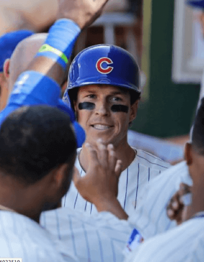
I’d been hoping that the Cubs would include a period-appropriate detail — the handwritten uni numbers that were inscribed inside the team’s batting helmet logos back in 1969:

It’s such a simple thing — would’ve been easy to do. Unfortunately, they didn’t bother with it:
The Cubs’ next throwback game will be on July 27, when they’ll wear the 1978 reverse-pinstriped road blues.
(My thanks to readers Chris Mayberry and Mike Monaghan for their contributions to this section.)
Some uni-watching from the booth: During yesterday’s SNY broadcast of the Marlins/Mets game, there was a social media promotion in which fans were asked to name their favorite Mets uniform. That prompted a bit of uni-centric dialogue between play-by-play man Gary Cohen and color analyst Keith Hernandez, as follows:
Keith Hernandez: What’s your favorite, Gary?
Gary Cohen: I have always been — and this goes back right to the beginning of the franchise — I’ve always been partial to the road grays with the block “New York.” I love that look.
Hernanez: I like the homes that are kind of the cream color. Not the stark white.
Cohen: Not these [that they’re wearing today] — these are the snow whites. You like the cream with the pinstripes.
Hernandez: Yes.
Cohen: That’s the most traditional of the home uniforms.
Hernandez: The San Francisco Giants have that same white [i.e., cream] on their home whites. It’s a nice look.
Cohen: You know, the Giants don’t put names on their home uniforms. The Mets tried that briefly for maybe one or two years, right around 2000 or ’99 [it was for one season, in ’99 ”” PL]. Fans didn’t like it and they put the names back on. I do like the blue jerseys — I think that’s been a nice addition. And I know a lot of people didn’t like the black, but I liked the road black — again, the road with that “New York” on it, I thought that was really a nice look. There’s one uniform change I’d like to see the Mets make: I’d like to see them go back to the all-blue cap, instead of the orange button on the top.
Hernandez: Yes.
Cohen: The orange button — not a fan.
Hernandez: Only the Dodgers can get away with that. The white button on top.
Cohen: You probably don’t remember this, because you weren’t here then, but in the mid-’90s — it might’ve been ’96 — the Mets went to a white cap. They wore ’em for I think a half a dozen games, and it was just such a terrible look that they immediately eliminated it. It was supposed to be something they wore frequently, and it just — they just looked like ice cream men, like Good Humor men. If you look, there’s a great Rey Ordoñez highlight video out there, with some of Rey’s unbelievable defensive plays — they put together a compilation video — and he’s wearing the white cap in a bunch of those.
Hernandez: I don’t remember that.
(My thanks to reader Steve Hom for alerting me to the Cohen/Hernandez dialogue.)
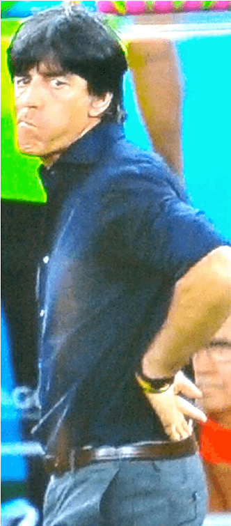
And you thought I wouldn’t have any World Cup coverage: Sure, Joachim Loew coached Germany to World Cup title, but that’s outweighed by the fact that he also missed a belt loop on his pants yesterday (you can click on the photo at right to enlarge). A national disgrace!
(My thanks to a certain anonymous reader for this completely brilliant observation, which is easily my favorite thing about today’s entry.)
Radio days: I talked about college football uniforms on the Phoenix radio station KJZZ the other day — here’s the audio.
I also had a small role (which was mostly drowned out by the audience) in the “Bluff the Listener” segment of this past weekend’s installment of the NPR show Wait Wait Don’t Tell Me. Listen here.

’Skins Watch: If you think the controversy over the ’Skins name is (a) a new or recent thing, or (b) the product of white liberals, here’s a good article showing why neither of those things is true (from Anthony Nuccio).
Baseball News: Mets All-Star representative Daniel Murphy will be using this bat knob decal for his bats at the All-Star Game. The design references the brick pattern at Target Field. ”¦ “What If” Night coming this Thursday for the Kenosha Kingfish (from Kevin Thoms). ”¦ We’ve all seen T-shirts that mimic a jersey, but check out this 1970s photo of a kid wearing a T-shirt that also mimics an undershirt and the top of the pants. I grew up in that era and don’t recall seeing anything like that. Anyone else? ”¦ “On a Fox Sports special, this Rays player (didn’t catch his name) was speaking to a school while wearing his fauxback hat and home whites,” says Austin Gillis. “Interesting look.” ”¦ The Seibu Lions have slits cut in their jersey armpits. Looks like the guy on the right was wearing a sleeveless undershirt (from Steve Vibert). … White Sox pitcher John Danks’s jersey appeared to be darker than his pants yesterday. “Not a shadow or sweat issue,” says Jen Hayden. … Here’s a buncha photos from the Futures Game, which was played yesterday. ”¦ Mets OF Chris Young has gone high-cuffed all year, but yesterday was the first time he wore stirrups. Looks like the one on his left leg was backwards. … Here’s a look at the visual history of the Lehigh Valley IronPigs. ”¦ “Reds rookie Kristopher Negron is wearing a camo elbow pad,” says Joanna Zwiep. “I couldn’t find a picture of him wearing it with the Reds, but it appears he was wearing it in the minors as well.” … Also from Joanna: Reds pitcher Johnny Cueto, who’s usually a pajamist, went high-cuffed yesterday. ”¦ The Dodgers began wearing their red numbers in 1952 (in case you missed it last fall, here’s the story of how they started wearing them), and the Braves began playing in Milwaukee in 1953. So how come there are no red numbers in this photo? “I’m assuming it was a spring training game,” says Bob Gassel ”” a plausible explanation. ”¦ This might be a first: Yasiel Puig has gotten an All-Star Game haircut (thanks, Phil). ”¦ Kyle Shultz and his wife recently adopted a puppy and named him Dodger, so they made him a Dodgers-themed doghouse. Does anyone else out there have a team-themed doghouse? ”¦ Someone at yesterday’s Giants game was wearing a No. 138 jersey. “No idea why,” says Eric Garment.

NFL News: A bunch of ex-49ers and other retired NFLers got together for a flag football game at Candlestick Park on Saturday. The jerseys had a Hewlett Packard ad patch on the right sleeve and a commemorative patch on the left. Lots of additional photos here and here (thanks, Brinke). ”¦ You might know that the Vikings occasionally wore purple pants in the early to mid-1960s. But did you know that the purple pants had white belts?

NBA News: Oh baby, look at Tommy Heinsohn in this old Celtics warm-up suit. ”¦ If you’re a Bucks fan and/or an Atari fan, you’ll like this. It’s available for sale here (thanks, Phil). ”¦ “Here’s what the NBA would look like if all the league’s players played for their hometown teams, as LeBron will once again be doing. “Not an exact science (it goes by both hometowns and birthplaces, which can be contradictory), but a fun way to kill five minutes,” says Mike. ”¦ Derek Hinatsu notes that the Blazers’ summer league unis have a new number font. Hmmm — a sign of things to come, perhaps? ”¦ Glen Rice Jr. has his dad’s old uni number, 41, tattooed on his calves (thanks, Phil).

Soccer News: Adidas has updated its Germany kit to add another star, reflecting yesterday’s World Cup win (thanks, Phil). ”¦ DeAndre Yedlin of the Sounders lost one of the stripes on his Adidas chest logo last night (thanks, Phil). ”¦ Germany’s Mesut Oezil wore his socks with the Adidas logo in the front instead of the back yesterday (from Kenny Ocker). ”¦ Looks like the World Cup’s “Best Keeper” award is Adidas-sponsored, and the winner just happened to be from an Adidas-outfitted team. “Would have been interesting if a non-Adidas team (or a non-Adidas-sponsored player) had won,” says Zack Kurland.

Grab Bag: “After my grandfather passed away, I came to possess some of his old postcards,” writes Joanna Zwiep. “As a Dutchman living in the U.S., he was an avid international radio listener. He would often write in ‘reception reports,’ and then the stations would send a postcard back with confirmation. One station, Deutsche Welle, sent him a couple sports-related postcards — one related to the 1972 Munich Olympics and the other showing Tip and Tap, the mascots for the Weltmeisterschaft (WM), or 1974 World Cup.” ”¦ Unusual shoulder/sleeve striping on this vintage varsity jacket. Don’t think I’ve ever seen that format before.

Break out the black armbands: My favorite artists tend to be equal parts revolutionary and classicist. That description fits the jazz bassist Charlie Haden and the punk drummer/producer Tommy Ramone, both of whom passed away over the weekend.
From his early work with Ornette Coleman’s groundbreaking ensemble and then with Keith Jarrett, to his own Liberation Music Orchestra, Haden was always part of the avant garde, but his playing had a melodic lyricism that always made his work extremely accessible, at least to my ear. As for Tommy, he was the secret brains behind a lot of the Ramones’ best work as they rewrote the book on what rock and roll could sound like and stand for, and it’s no accident that the band’s three perfect records are the three that he played on.
I never met either of these chaps, but I’m a longtime admirer of both and was very sorry to hear of their passing. RIP.

The unknown Rays player is Chris Archer.
I found the Futures Game to be very uniteresting. I think it’s because the players stopped wearing their parent club’s hat, so it was hard to tell who to care about. Those arm logos don’t work for me.
Let’s hope the MLB All-Star Game never goes that route. Awful uniforms, awful caps, etc.
Making the “futures” wear the same jersey is a terrible marketing…
“Hey Houston, here’s the future of your team… No, not that guy. Nope, not him. Yeah, that dude there. Remember his face two years from now.”
As a Mets fan, I want a preview of Syndergaard in my team’s colors – not looking like every other rookie in the NL.
Not exactly a uni-related comment, but after Lionel Messi was presented the Golden Ball as best player in this year’s World Cup, Diego Maradona dismissed the award as a marketing gimmick, orchestrated by Adidas and FIFA. Adidas sponsors the Golden Ball trophy, and Messi is one of their most prominent pitchmen.
Apparently, the Golden Ball winner is traditionally chosen by a vote of the reporters covering the World Cup, but this year, something called the “FIFA Technical Committee” did the choosing, which has spurred Adidas conspiracy talk.
The writers do still vote for the Golden Ball,the “Technical Committee” only chose the shortlist. The shortlist itself only featured two players from non-Adidas teams – Neymar and Robben so perhaps there’s something in that. But then again, two Adidas teams made the final, so naturally most of the finalists were going to come from those teams.
What the real problem is is that the writers have to vote before the final which makes no sense at all really. Messi never would have won if not for a lot of overly romantic writers believing he would finally shine in the final, which he failed to do by a long margin.
Indeed. Watching Messi accept the trophy, it sure appeared that he couldn’t believe it either.
I think it’s more of the case of he didn’t WANT to believe it, because he and his teammates wanted that Other trophy. ;)
And.. to answer the question in the ticker, Gianluigi Buffon won the Golden Glove in 2006 – he’s a long-time Puma guy.
Truth be told, a company like ADIDAS would probably love having a player sponsored by someone else photographed holding an obviously ADIDAS-based product.
SB
Buffon won it back when it was still the Yashin Award and came with this trophy: link
Ooh, I like this conspiracy. No way did Messi deserve to win the award. He didn’t score the most goals–in fact, he scored exactly 0 in the knockout rounds. He was nowhere to be found most of the game, and flubbed every single run into the penalty box he made.
He wasn’t the best player from the best team–any number of the German players could make a claim for that. Müller, Klose, Neuer, Kroos, Lahm, Khedira, Schweinsteiger, and Schürrle all had more of an impact.
Even Arjen Robben has a stronger claim to the award, despite finishing with fewer goals for a lower-finishing team. He was the one guy, it seemed, throughout the tournament you could count on to go all out in the first minute or the 120th, when everyone else was gasping for air.
Argentina’s defense was more responsible for getting the team through to the final on 8 goals over 6 matches (they only allowed 3), and played well enough to keep a German squad who had just embarrassed Brazil a few days prior off the score sheet for 112′. He was essentially the difference in them advancing with 3 one-goal wins out of a pretty weak group.
So, all that to say I’ll do my part to perpetuate the notion that adidas had a hand in deciding the winner.
All I know is that Argentina scored at least one goal in every 2014 World Cup match when the team wore white shorts. When they wore black (only once, during the semis), they went to PKs; when they wore blue (finals; alt. blue kit), they got shut out.
And now I found this. Confirmation bias, for sure; superstition? Definitely.
link
If anyone noticed, Adidas gave Mario Götze the new 4 star shirt for the ceremony at the end of the game, no other player seemed to be given the new shirt. Perhaps its as he scored the goal, he will be the most photographed.
I put it on my Twitter Feed when i saw, so if you want to see i put the link below.
link
Yeah, I didn’t notice the 4th star, but I did notice the winners patch and it looks awesome on the chevron
I was wondering what had happened with his game jersey as there was no name or number on the back of it.
Wow – that’s a great catch!
I thought I remember a few other players wearing them, as well. Didn’t most of Manchester City’s players get similar shirts in time for their own trophy ceremony back in May?
i don’t know about Man City, its likely that it will happen
as for Germany, i didn’t see any other players myself but then it was hard to tell who was a player, and who was a players family when they where all on the pitch,
it was properly a production sample with the new 4 star crest on it, so it could be rushed out should they win, was properly one for Argentina as well in a changing room somewhere.
If I recall correctly, in 2010 the Spanish team members all put on new kit tops with one star before taking their championship photographs.
I wonder if anyone can find a leaked picture of an Argentina jersey with three stars on it, because I’m sure at least one was produced (and now on its way to a third-world country).
Here’s a uni detail the Cubs throwback got wrong. This uni aspect is rarely mentioned here. The original 1969 jersey had link and the throwbacks have raglan sleeves. Usually not a major issue, but it does throw off the pattern of the pinstriping. Incidentally, the Braves also wore raglan sleeves yesterday, which was link
Awesome, awesome point — shame on me for not catching it!
This is confusing. The first item is about the Braves playing the Cubs yesterday and the second is about the Braves playing the Mets yesterday. That’s the strangest double-header ever!
That Cub patch is terrific.
I clearly had Braves on the brain. Now fixed!
Cool giveaway by the Cubs on throw back day. A small version of an Etch-A-Sketch. I’m sure the kids were probably impressed for 56 seconds but mom and dad gladly took it home.
And count me among the haters of the All Star hats. Quit bleeping with the actual All Star game. You can do all you want to the new game additions like HR Derby, Futures Game, and Celebrity Softball Game but the game itself should be presented as it was originally in 1933 at Comiskey Park. To paraphrase Terrance Mann, “The one constant through all the years, Ray, has been the All Star Game”
Well, actually, the first ASG had the National Leaguers wearing a league uni design, not their team designs:
link
Kinda complicates things if you consider yourself an originalist on this issue.
Good point but in general my sentiments remain the same.
And as far as the World Cup is concerned that trophy looks somewhat like a Golden Globe trophy…certainly can’t compare with the Stanley Cup.
I love the original link, back when the Cup was actually a cup.
I’m with you, Chance. The lost original is a proper trophy and quite lovely. The current one looks like it suffered an unfortunate accident.
The Giants fan is wearing 138 because that is the section of the bleachers where he sits. 138 and 139 had a friendly rivalry in the first few years of the park which has since died down.
darn, I was hoping it was a nod to the Misfits song 138.
Man, I was so upset to see the Braves not wearing stirrups yesterday. They have some awesome striped hosiery that they have worn in the past for other throwbacks. Must have been laziness on the last day before the break. Disappointing for sure.
According to Okkonen link — if they wanted to go authentic (and agreed, shame on them for the pajamas).
That simplicity is actually the attraction for me; beautifully basic, and the lack of striping and outlining helps to set off the logos and colors. The late ’60s seemed to be the last era of basic MLB unis, before the candy-coated ’70s set in.
Players not wearing stirrups on throwback games is a huge pet peeve to me! How can these guys be so sour?
Wonderful morning: Loew’s belt loop; Heinsohn’s great look; and the welcome appreciation of Charlie Haden. Haden’s recent stuff, especially re-workings of folk and spirituals (check out “Steal Away” album he made w Bill Jones), is gorgeous work. Thanks, Paul.
*Hank Jones.
Right you are. Sorry!
Dear Paul, that’s Liberation Music Orchestra–at this reading, the words in the band name are reversed. Love LMO…I love program music in general, and the fact that their Vietnam era record had resonance at the time of their Bush-43 era reunion CD Not in Our Name was extra serendipitous.
Shame on me (again). Fixed.
mlb.com shop has the wrong patch on the Brewers road all star jersey. Should be the ‘Milwaukee’ patch.
link
Unless that was deliberate? That would be a huge improvemet to the roads.
Great job as always. I’m excited to see the 1978 reverse pinstripes on the Cubbies!
Miniscule Ticker correction: Glen Rice Jr., instead of “Glenn.”
Minuscule correction to your correction: It’s “minuscule” (not “miniscule”). ;)
Fixed.
TouchÂé, sir.
You can blame the misspelling on me — that’s how I sent it to Paul. My bad.
Perhaps you conflated Rice with another legacy basketballer with the initials G.R., Glenn Robinson III?
And to be fair, there were times in the 90s when I thought Glen Rice’s name was spelled Glenn.
I agree with Gary, the black Mets road jersey was not that bad… the all black cap was too busy and black/blue caps were terrible, but the black jersey with black cap and socks was an alright look.
The black drop-shadow was the worst…took clean home and away jerseys and cluttered them up with a non-traditional team color.
I didn’t hate it as much as others, was a product of the time.
The pins took a backseat to the “snow whites” which weren’t as cluttered. The fact that they wore them with the black/blue cap and black sleeves was brutal though.
The drop shadows looked OK when they first brought them in, when there were no names on the backs. Trying to put drop shadows on NOB letters just looks hideous. link
“the black jersey with black cap and socks was an alright look.”
~~~
You spelled “horrible” wrong.
Nah, it wasn’t a bad look… just bad for the Mets. Kinda like how the Detroit Lions black jerseys would have been great if only they were worn by the Carolina Panthers instead.
(Wow, took me a while to find an image of high cuffs, gray pants.)
I love the blue and orange, but in the grand scheme of Mets unis, they’ve worn plenty of looks much worse than link. Home black just didn’t look right with the link, gray pants, fo sho.
As for Gary’s comment on the orange squatchee, I was finally able to track down a 59/50 circa 1994 with blue squatchee, gray underbrim, and logos directly sewn on – not “bubbled.” One of my favorite caps in the collection, been taking my time to break it in and mold it to my dome.
I hate the gray underbrim, which debuted in the 1986 World Series. has to be green for me.
Here’s the real deal for Met fans who want a throwback cap:
link
And “alright” is not a word.
There’s no doubt the controversy and coverage over the Redskins has been cranked up recently, no one can deny that fact. To many people who understand why some Native Americans dislike the term, this movement doesn’t feel organic at all. As Dan Patrick accurately pointed out on his radio show, there’s no Native American leadership on this issue. We’ll hear briefly from a Native American spokesman, and then they’ll disappear.
Normally, it would be easy to find a spokesperson or leader willing to explain a movement. And that’s what makes people uncomfortable, because there are a number of valid questions about this issue which shouldn’t be difficult to answer. The reluctance of a Native American spokesperson to come forward and articulate a position is troubling. It gives the appearance of someone who is either afraid, or unable to intelligently answer questions.
And when the people directly affected by the issue don’t have representatives available, it does create the unsettling feeling other forces are involved. One of the questions yet to be addressed is why it’s ok for Native American schools to use the Redskins name when we don’t see other racial or ethnic groups using slurs for their schools. And why exactly was Red Mesa High School using or still using the Washington Redskins logo? A Native American should be able to easily these questions and more to help explain their viewpoint.
One of the questions yet to be addressed is why it’s ok for Native American schools to use the Redskins name when we don’t see other racial or ethnic groups using slurs for their schools.
You mean why isn’t a gay school calling its teams the Queers? Yeah, all those gay schools out there….
What a group chooses to do (or not do) with its own cultural imagery is its own business. If a Native school wants to call itself the Redskins, that’s up to them.
What a group chooses to do (or not do) with its own cultural imagery is its own business. If a Native school wants to call itself the Redskins, that’s up to them.
The reason that Native school using the name comes up is because of the claim by certain parties that “Redskin” is disparaging. If a number of people openly refer to themselves as “X”, then how offensive/insulting/ect can calling them “X” actually be? Something about the idea that “We can call ourselves X, but *you* can’t” just doesn’t seem right to me, not if we want to have a society that’s actually based on equality, anyway.
I also don’t believe in the entire concept of “cultural misappropriation”. Culture is an abstract collection of ideas, not something which can or should be be owned by anyone. To try to enforce the claim that only *these* people can use *this* imagery is bordering on segregation. St Patrick’s Day didn’t became a national day of wearing green by only allowing the Irish to use “Irish imagery”.
The reason that Native school using the name comes up is because of the claim by certain parties that “Redskin” is disparaging. If a number of people openly refer to themselves as “X”, then how offensive/insulting/ect can calling them “X” actually be?
Jeff, fuck you. And I say that because you, unlike some people here, are smart enough to know that many, many groups have repurposed demeaning terms for their own use. For you to pretend otherwise, or to willfully ignore things that you’re damn well aware of, is beneath you. It’s not commentary — it’s trolling.
I also don’t believe in the entire concept of “cultural misappropriation”.
You don’t have believe in rain either, but you’ll still get wet in a thunderstorm.
Jeff, I think you are making some pretty good points.
Paul, I think that’s the point. Words can be repurposed and have many different meanings. No one with the Redskins is trying to disparage anybody with the name. You have to look at the way a word is used before you become offended by it.
No one with the Redskins is trying to disparage anybody with the name.
Nobody said they were. That doesn’t make it appropriate.
Simple exercise: If you think the term “Redskins” is fine, then go to an Indian reservation and greet everyone you meet with “Hiya, Redskin!” Do it with a smile, so they’ll know that you don’t mean to offend.
Be sure to come back and let us know how it went.
The Jeff is the only regular commenter here who argues the pro-Redskin side eloquently and with actual logic. He follows Paul’s ridiculous rule of not mentioning the perfectly valid term “PC”. What does this loyal reader get for his trouble ? An eff you from the Comandante himself. Nice. Paul, for being a smart dude you can be very small minded.
“you…[insult to other readers redacted]…are smart enough to know that many, many groups have repurposed demeaning terms for their own use. For you to pretend otherwise…is not commentary – it’s trolling.”
As society grows and evolves through challenging norms and past behaviors, why wouldn’t be perfectly acceptable for The Jeff to challenge the acceptability of groups “repurposing/reclaiming” disparaging terms? I can’t speak to the historic prevalence of such behavior, but I’m in agreement with The in that I think a term is either disparaging or not. If it is, no one should use it. If it isn’t, everyone should be able to use it.
Simple exercise: If you think the term “Redskins” is fine, then go to an Indian reservation and greet everyone you meet with “Hiya, Redskin!” Do it with a smile, so they’ll know that you don’t mean to offend.
I’m sure you’d meet with similar results by using “hey, what’s up Black Guy?” in inner city Detroit, but we don’t all pretend that “black” is a slur.
You mean why isn’t a gay school calling its teams the Queers? Yeah, all those gay schools out there…
Actually I’m fairly certain he didn’t mean that in the slightest. An uncharacteristically flippant, not to mention straw man, remark there.
Probably a better response would be to note that Notre Dame are the Fighting Irish, complete with rather unflattering depictions of diddly-dee Oirishness and the once-upon-a-time incendiary notion that the Irish in America were largely just violent and drunken layabouts. So there’s at least one, fairly high profile example of another ethnic group appropriating its own slurs.
But the whole school issue is largely irrelevant anyway. It’s made by people who try to turn this into an issue of language policing when it’s fundamentally not. It’s about whether or not it’s fair for a major corporation and heavily influential cultural product to depict a heavily marginalised section of society so negatively (ie. as savages and backward and with the implication that these are natural, inherent and defining characteristics of said section of society).
How are the Washington Redskins depicting Native Americans as “savages and backward”? Do you think a competitive team would really think, “Hey, let’s name ourselves after a backward, savage culture!”???
One must remember that the mascot at Notre Dame is not a stereotypical Irish human being, but a leprechaun, a mythical character of Irish folklore. The “Fighting” part of the name does not refer to any perceived stereotype that Irish people are mindless brawlers, but a standard appellation of a never-say-die fighting spirit (recall that LSU’s official nickname is the “Fighting Tigers.”)
Well, you might also like to address that question to the Vikings, the Spartans, the Pirates, the 49ers etc. There’s romantic ideals associated with these names, generally regarding warrior prowess. In the case of native Americans in particular this romanticised image is bound up in the “noble savages” stereotype. So yes, they chose Redskins precisely because it is savage, and by implication, bacwards – as in: Redskins don’t take no shit, they go out and shoot arrows at the whiteman and scalp him with a tomahawk and then return to the tepees for a celebratory powwow.
And DJ, I suggest you Google image search “Thomas Nast Irish” to see where a lot of the imagery which has gone into creating the Fighting Irish mascot came from.
I suggest you Google image search “Thomas Nast Irish” to see where a lot of the imagery which has gone into creating the Fighting Irish mascot came from
My, aren’t we condescending?
I’m quite aware of Nast’s racist series of cartoons. But to best address the origin and intent of Notre Dame’s leprechaun mascot, I go to the direct source: Ted Drake, who also created the Chicago Bulls logo.:
link
Any perceived condescension I assure you was purely accidental and I apologise. I merely intended to show that the Fighting Irish leprechaun has a lot more in common with the often demeaning depictions of Irish in the late 19th century than with Irish folklore. As for the link you provide, I don’t see anything in there to dispute what I’m saying.
A more appropriate comparison would be why don’t we see Historically Black Colleges calling themselves the Fighting Negroes? Or, why don’t we see Jewish schools calling themselves the Kikes?
Those are racially/ethnically centric/dominant schools that actually exist. Unlike Native American schools called the Redskins, I don’t think we would ever see those schools use those nicknames.
“here’s no Native American leadership on this issue. We’ll hear briefly from a Native American spokesman, and then they’ll disappear.
…
The reluctance of a Native American spokesperson to come forward and articulate a position is troubling. It gives the appearance of someone who is either afraid, or unable to intelligently answer questions.”/em>
I’m going to presume that you’re not aware how front-and-center link has been on this issue (and the link they’ve taken as a result. And that you’re unaware of link over the past several decades.
Because the insistence that no one has “come forward” is troubling. It gives the appearance of someone without a coherent argument, who needs to fall back on strawmen.
Damn it. Fixing my HTML:
“here’s no Native American leadership on this issue. We’ll hear briefly from a Native American spokesman, and then they’ll disappear.
…
The reluctance of a Native American spokesperson to come forward and articulate a position is troubling. It gives the appearance of someone who is either afraid, or unable to intelligently answer questions.”
I’m going to presume that you’re not aware how front-and-center link has been on this issue (and the link they’ve taken as a result. And that you’re unaware link over the past several decades.
Because the insistence that no one has “come forward” is troubling. It gives the appearance of someone without a coherent argument, who needs to fall back on strawmen.
Chance Michaels, thank you for strengthening my argument, and I’m sure many people know who Suzen Harjo is. The Oneida Nation also hasn’t been sticking around to be consistent spokespeople on this issue. Why are other movements able to easily provide representation, but not this one?
Coming forward means addressing this issue on various outlets on a consistent basis, I’m not sure why this is such a difficult concept to grasp. Dan Patrick of the NBC Sports Network is right on the money here.
Why not have a Native American address the issue here, and finally answer some questions? In terms of eventually changing the name, coming forward and explaining the point of view should help their cause.
The Oneida Nation also hasn’t been sticking around
Shwo your work, please.
I’m not sure why this is such a difficult concept to grasp.
Condescension is what happens when you run out of straw men?
The Brewers’ Hank the Dog has his own team doghouse…
link
I thought for sure when I saw “…Dodgers-themed doghouse…”, that it was going to be some cutesy “Dodger Dog” structure, and almost didn’t click to see the picture. Kudos to the Shultz family for not going that route.
link
If Chief Wahoo, the Screaming Brave, or any other Indian character is offensive to Native Americans, should I (as a male Caucasian) be offended by Elmer Fudd, Mr Magoo, Fred Flinstone, Homer Simson, etc.
If you want to be offended, that’s completely up to you.
However:
1) White men are not a marginalized group.
2) All the examples you cited were created by white men. They weren’t created by other groups misappropriating your culture.
It’s interesting that three of the examples you chose — Mr. Magoo, the Flintstones, and Elmer Fudd — exist in cartoon worlds where there are pretty much ZERO blacks, Asians, Native Americans, or other non-whites. If anything, it’s those groups who should be offended by these cartoons, because the cartoons depict a world where they don’t even get to exist.
So is the problem with “Redskins” that it is a racist slur, or that it’s a racist slur that white men have misappropiated. If it’s a racist slur, even if a Native America school calls it’s team the Redskins, it’s still a racist slur. Either it’s offensive or it’s not.
And as for white men not being a marginalized group, just give it a few more decades.
“And as for white men not being a marginalized group, just give it a few more decades.”
~~~
Well said. And that is, tacitly or not, their greatest fear. Be interesting to see how much fun things are when the shoe is on the other foot, so to speak.
So is the problem with “Redskins” that it is a racist slur, or that it’s a racist slur that white men have misappropriated.
Actually, it’s both.
And as for white men not being a marginalized group, just give it a few more decades.
Quite possibly the funniest thing ever posted on this website.
To clear up what I meant: Is the problem that it is a racial slur, or that white men have misappropiated it?
If it’s a racial slur, then it shouldn’t be okay for anyone to use it. But if the argument for getting rid of it’s use by the NFL team is based on it being misapropiated by white people then that is a separate argument.
It’s like black men “taking back” the n-word by using it in rap music, if their goal is to reclaim it and strip the power of it from aggressors that would use it, then they are trying to mainstream the word, but at the same time they still want to reserve offense for when others want to use it. Either it’s not okay to use or it is. It shouldn’t be okay for some people to use and not okay for others, based on the color of their skin. That sounds like racism to me.
If Oneida Nation wanted to call their high school mascot the “Redskins”, I doubt that they’d do so because they are trying to similarly take back an offensive term from it’s use by their oppressors. I doubt a black school would call it’s high school team “The N*****s”… maybe the youths would proudly scream “we the n*****s” at a rally, but I doubt the African American hierarchy authority of such a school would officially use it as a mascot. Similarly if ‘Redskins’ was truly a racial slur on the same basis as the n-word, I doubt they’d be using it as a mascot, either.
“And as for white men not being a marginalized group, just give it a few more decades.”
Haha, you scared bro?
Lee
I went to the AAA All-Star Game FanFest this past Saturday in Durham, NC. My 2-year-old daughter LOVES the Bulls mascot, so we took a behind-the-scenes tour of the stadium that included a visit with Wool E. Bull, by way of the Bulls clubhouse and locker room.
I don’t know if this was set up by the Bulls, the International League, or AAA Baseball in general, but there were several jerseys hanging in the Bulls lockers to represent former greats who were AAA All-Stars. The first one I noticed was a (Charlotte) Knights jersey, identified as “Jim Thome, 1993.” I geeked out for a moment and took a picture because I’m a big Thome fan from his Cleveland days, and I assumed I was seeing a curated exhibit of actual memorabilia.
But then I quickly noticed that other jerseys were definitely NOT authentic. Chipper Jones was represented by a Gwinnett Braves jersey. Mike Piazza was represented by an Albuquerque Isotopes jersey, even though they were still the Dukes when Piazza was there in 1992 (and also the ‘Topes jersey seemed to be absurdly small, and there’s no way a grown man could’ve worn it in a game).
I stopped paying attention to other jerseys in the room after Piazza because I was so puzzled by that particular representation but I’m sure those weren’t the only three examples.
It made me wonder about the Thome jersey, and sure enough a quick Google image search showed that the Charlotte Knights wore a totally different jersey in 1993 from what was hanging in the locker room. Alas, I deleted the picture from my phone because I felt like a dupe.
I’m sure actual game-used memorabilia is hard to come by, particularly at the minor-league level where gear gets recycled and re-assigned all the time, but I wonder how many of those jerseys were just loosely associated with the stars they were meant to represent, and how many people left the stadium thinking they saw the real deal?
RE: Braves/Dodgers – That photo may have been from spring training, as I know that Milwaukee County Stadium didn’t look like that, and I don’t believe I’ve seen any phots of Ebbets Field looking like that, either.
However, it looks like that is Henry Aaron on base, and when Aaron first started with the Braves, he wore uniform #5, and the photo starts with a 4. It could be that he was assigned a 40-number in spring training (maybe even #44) and at some point asked for that number instead of #5 or someone else wanted #5. I suppose it might not be Henry Aaron on base, either.
In any case, it adds some fun variables to discussing that photo.
Why the switch, I don’t know, but Henry Aaron did in fact start with #5 for the Milwaukee Braves.
link
Great article, but the last couple paras break my heart:
Older fans will remember a display case of Aaron’s stuff in the main concourse at County Stadium. Among the quirkier items were the slugger’s shower shoes. I asked team spokesman Tyler Barnes what became of those relics. He consulted a former team historian and this was the report:
“When we opened that sealed glass ‘tomb’ for the first time in 15 years, those shower shoes literally disintegrated to the touch. They never made it to the new County Stadium display, let alone Miller Park.”
Ouch. I remember that display.
As far as the Dodgers not having numbers, Dressed to the Nines shows that link. They’d adopt the road numbers in 1959, their second year in Los Angeles; link.
I’d also go along with the assumption that it was probably a spring training game, likely at Braves Field (now McKechnie Field) in Bradenton, Florida. Bleachers would likely be visible if it had been County Stadium, but from what my research can determine, the only thing beyond the outfield in Bradenton in the mid-1950s would’ve been an empty airfield.
I don’t know about the number switch either, but I do remember seeing a photo of Aaron at bat that was published in Sports Illustrated’s The Baseball Book, in which he appears to be wearing No. 52.
But in this image of his 1955 baseball card, he’s No. 5.
Later, of course, he became No. 44.
An interesting oddity about that: In 1963, Aaron and Willie McCovey (another No. 44) tied for the National League lead in home runs. They both hit 44.
I wonder if the source (Aaron himself) would be willing to share any insights on his uniform numerology.
Paul?
You might know that the Vikings occasionally wore purple pants in the early to mid-1960s. But did you know that the purple pants had white belts?
The real question is: “Did the Gridiron Uniform Database know?” The answer is yes.
link
Judging from the Vikings picture, I think your template needs a couple visible belt loops. :)
the best color photo i have ever seen of the Vikings purple pants. and Johnny U in the Colts blue and white (with full shoulder stripes) looks great too.
Yep, love that photo!
Lee
Taken at the Met in 1964. The only year the Vikes wore White At Home.
I grew up with the Cubs wearing that cubbie patch, and even had one stuck on my bedroom wall as a kid. As soon as I saw the photo here the first words that came to mind were “Otis Shepard”–of COURSE he must have designed it!
Justin Ruggiano actually started the game going high-cuffed (but solid-hosed)with what looked like the 1969 pants–not sure why he made the switch.
That Cubs patch is about as close to perfection as a sports logo can get.
It is a great patch. The Cubs should re-adopt it immediately. You could take it straight from the 60s, or tweak it (a red outline, metallic gold instead of yellow, brown instead of blue to make it more “realistic”).
About those Cubs throwback unis yesterday.
Surprised no one (including Paul) mentioned the incorrect stirrups for the Cubs players that wore them. In 1969, the Cubs were one of the few remaining teams that consistently wore low stirrups (I think Cincinnati was the last one, and their low-stirrup look lasted into the late 1970s).
I noticed yesterday that the Cubs players who were wearing stirrups were showing way too much sanny for an authentic look.
The Cubs were also one of the pioneers in the use of “alternate” uniforms, as you can see in this Dressed to the Nines graphic.
link
I’ve kinda given up on players wearing period-appropriate stirrups heights. It’s enough that they wear stirrups.
Similarly, most of yesterday’s high-cuffed players had their pants cuffed *too* high. But again, I’ve given up on that. Those nuances are going to get lost — it’s enough that they went high-cuffed and wore stirrups, at least for me.
I suppose you’re right.
I really miss seeing stripes on socks (Hell, I miss seeing socks at all).
Still see stripes occasionally with the Cardinals, but it seems more teams than not used to have them. And I’m not counting the Rays. I’m not sure what David Price was wearing on Sunday. Looked more like football socks.
But, then, I’m a geezer.
The inconsistency makes me want to be a fly on the wall as the stirrups and socks are distributed/discussed in the club house.
In most uniform settings (high school, little league, workplace), they usually distribute the gear and explain how it is to be worn. On MLB teams, do they just lay stirrups, long blue socks, and some white athletic socks out at each locker with a note that says “Choose your weapon and use it at your discretion.”??
Adam,
Wouldn’t surprise me if your speculation were correct.
If you look closely, it seems a lot of the guys wearing stirrups aren’t even wearing sannies. Instead you can see the ribs of their white crew socks.
I’ve wondered of late — if the teams aren’t going to wear the throwbacks correctly, what’s the point of doing throwbacks?
Never mind…The answer is Merch, Merch, Merch.
Is that Joachim Loew or Moe Howard?
Very Stooge-like, agreed!
Oh baby, look at Tommy Heinsohn in this link.
Look at that texture! Almost like a short-sleeved terrycloth robe. link
Who was the black armband for?
Walter Brown (Celts owner), maybe?
Yes.
Looks like there’s a patch with Brown’s initials on the front of the jacket as well.
My wife and I missed that half of WWDTM, Paul. Great stuff, it’s always my favorite part of the show. And good to hear you on the Big Media (or so) of NPR.
The Philadelphia Flyers commissioned a third jersey back in 1995. They never used it because it was ugly as fuck…
link
The full article on Icethetics is definitely fascinating reading:
link: The Flying Elvis, the Burger King, and the failed Flyers concept
A failed attempt to keep the Whale alive in Carolina, and success with the Blue Jackets (for a while, anyway)
The second link is Page 2. Forgot to format that correctly to match Page 1.
Agreed.
Wonder if the players just flat-out refused to play in something so butt-ugly?
I’m curious now to know the full story with the Blues’ cancelled third. We know the story that Mike Keenan vetoed the plan to wear the “horn” jerseys, but who came up with the design in the first place? Is that a story that’s known?
Someone on acid?
That is in the same tier as the Angels’ late nineties set, the original Anaheim Ducks uniforms, Wild Wing and the Buffaslug. Nearly as bad as the Falcons’ current clown suits. Good for the Flyers to put a kibosh on it.
While I concur on the other ones, I gotta disagree about the link. Yes, the “eggplant and jade” color combo was unusual, but I think they made it work with their original unis. Their alternates just didn’t work out so well.
I did like the unis, but I hated the crest and hated the fact that the NHL allowed a team to be named after a kids movie. Kind of like the North Stars moving and being called the “Debbie Does Dallas Stars”. Now THOSE would be interesting uniforms!
Bright purple and kelly green – like Wimbledon – would have looked great, but the colors they chose weren’t anywhere close.
Saw these custom goalie pads posted on the Facebook page of Brians Custom Sports. As a Virginia Tech alum, I had to pick my jaw up off the floor after seeing them. VT doesn’t have a varsity hockey program but does have a competitive club team, so I’m thinking these are for one of the team’s goalies.
link
More Adidas football (soccer) news – just singed a 10 year deal with Manchester United worth $1.3 billion replacing Nike.
I’m not trying to be snarky or start an argument, just interested. Before baseball season, you blasted Atlanta for putting the “screaming indian” logo on their BP hats. Not too long ago, you blasted SNY for using the same logo in its telecast. Now you’re saying the same logo is ok because it’s “historically accurate”. I get what you’re saying there but couldn’t you make the case that, since SNY used the Mr. Met
logo, it was “historically accurate” that they used the old Braves logo? It’s not ok for the Redskins to use their name and logo but it’s ok for the Braves for one game because it’s historically accurate? Not trying to be a jerk, just was curious as to your rationale behind it.
If you are purporting to wear an Atlanta Braves uniform of the 1960’s, in order for it to be historically accurate it must have the Laughing Brave as a sleeve patch.
If you are using the Laughing Brave as a logo to depict the current Atlanta Braves team — as SNY did — it’s incorrect. The Braves do not include it as part of their current visual identity.
If you are attempting to re-introduce the Laughing Brave as part of the Braves’ visual identity, you open up the discussion as to whether it is appropriate (similar to the Smiling Indian in Cleveland).
it’s also on the bases
Ok, I understand that but couldn’t you make the argument that Mr. Met isn’t a part of New York’s current identity. Maybe that’s changed with the logo appearing on the team’s alternate jersey and BP cap. Didn’t hear SNY getting blasted for that. Or anybody when Mr. Met started appearing more on Mets apparel.
couldn’t you make the argument that Mr. Met isn’t a part of New York’s current identity
Tough argument to make, since he’s used as a sleeve patch on the blue jersey.
Boy, i kept thinking all during the World Cup Final, “Germany’s coach sure looks familiar”. Then it hit me like a poke in the eyes: link
Uhh… link.
Sorry; replied to the wrong thread.
Yep!
Just finally had a chance to read Saturday’s link. Something I thought of as I was reading that the article and the GUD may have missed:
I think, if memory serves me correctly, that the NJ Generals’ original helmet logos (the 5-starred laurel wreath) were metallic gold, and then later changed to “sunflower” yellow either during 1983 or for 1984. I think the original decal also had a more oblate shape than the later one. The difference may be too subtle to notice; take a look at link or link, and link, or link.
Or compare the link with the <a href="linkJim Kelly ’86 SI cover.
Either way it’s an awesome logo.
I never understood why Paul is on the “‘Skins Watch” bandwagon wanting Native American imagery and names changed, but still uses the Redskins logo that is apparently, offensive in his column every day.
It’s actually kinda funny how Paul insists on using the “Skins Watch” section as a catch-all for anything remotely related to Native Americans in sports, when one of the issues that some Native groups complain about is being lumped together as if they were a homogenous people, when in reality there are multiple tribes who don’t all agree with each other on multiple issues.
It’s true that I could have a “Wahoo Watch” and “Braves Watch” and so on, but that would be a bit hyper-specialized, don’t you think?
The fact is, there’s a national discussion taking place about these issues. Are the issues all completely equivalent? No, just as not all MLB or NFL or NHL issues are equivalent. But grouping them into handy categories for ease of presentation is just that — handy.
You’re really reaching now, Jeff.
The fact is that you’ve stuck multiple stories involving Native Americans that have nothing to do with the ongoing mascot issue into the “Skins Watch” section. Some high school is honoring a Native American athlete? Put it in the ‘Skins Watch.
Jeff, let’s say, just for the sake of argument, that you’re right (even though we both know you’re not). So yeah, I’m out of control on this issue, I’m intellectually inconsistent, I’m a hypocrite, I’m an asshole, I’m this, I’m that.
Now that we’ve established that, maybe you’d care to engage with the issue at hand, instead of trying to make it about me?
The message, Jeff, not the messenger.
1) I am not “on a bandwagon.”
2) I do not use the ’Skins logo every day.
3) The logo is the symbol of the current debate about Native American imagery in sports. I could use the logo with a circle-slash, but that wouldn’t make sense for the pro-’Skins items that I post. For better or worse, the logo is the symbol of the national discussion now taking place on this issue.
50 years ago, one could use a photo of separate “Whites Only” and “Blacks Only” water fountains as the symbol for the national discussion on segregation. The use of such a photo would not be an endorsement of segregation — it would simply symbolize the issue. Same thing here.
In any case, perhaps you should focus less on me and more on the larger issue at hand.
Paul. This was not a personal attack, just an observation.
Nobody said it was an attack. I was simply responding to your observation.
The brand new National Championship Trophy for college football (presented by Dr. Pepper… of course) was unveiled today.
Am I the only one that sees a part of the female anatomy within the trophy?
link
Feels more like one of those “Motor Trend Car of the Year”-ish awards to me….
The director called it a “priceless, one-of-a-kind piece of art.”
I call it underwhelming. It looks too bland, too industrial for a trophy.
Will it change its design every year?
“Am I the only one that sees a part of the female anatomy within the trophy?”
~~~
Viewed from that angle? Yeah, probably.
Viewed from almost any other angle, it just looks like a giant phallus.
Either way, mission accomplished.
But it is, as they say, a major award.
Well, I can’t unsee that now.
There’s another external reason why it’s important to note that Native American schools are using the Redskins name(and at one time the identical logo).
If we go with the notion that the name belongs to them, and that makes it ok, that must mean it’s alright for the non-Native American schools which play these schools to use the name in the banners you see at high school sports events. So when white people have designed these banners and using the term Redskins in a public setting, is perfectly fine, just because it’s high school? And so when the relatives of these native school players are sitting in these other gyms, observing the public use and display of this term, no one really cares? And here’s another one: What about someone outside the program receiving and wearing school merchandise who isn’t Native American? High schools routinely sell and distribute merchandise across the country.
So it’s ok for slurs to be uttered and displayed in a high school setting by groups which haven’t been marginalized, and that’s completely different than the pros? Still seems reasonable if you were part of group seeking to eliminate a nickname, said name would have been scrubbed from your own backyard.
It would be great for a Native American representative to stand up and respond, but I’m not holding out hope.
When white people sing along to rap music, are they allowed to say the “n-word”?
Dodgers did not add the red numbers to their road jerseys until their second year in Los Angeles.
Great photo of Tommy Heinsohn. It looks like it was taken at Faneuiel Hall which was a true produce market back in the day. I remember my Dad taking me to a butcher shop in the basement of the building when I was a youngster. Unfortunately, now it is a generic shopping mall like those found anywhere else in America.
Yoenis Céspedes is wearing his green Oakland Athletics belt with his red, white, and blue jersey. (On mobile phone, not sure how to embed link) link
They’ve always worn their own teams’ pants with the league jerseys, so it’s not a big deal.
Rob,
Just watched the highlights. You’re right.
Love the Bucks/Atari shirt. I have this Mario/Mr Redlegs shirt. link