[Editor’s Note: Paul is on vacation, but here’s a piece he left for your enjoyment.]
Back around February, I had a great idea: Since soccer ball designs are constantly being changed and updated, I’d run a ball-redesign contest on ESPN, similar to the uni-redesign contests that I’ve been doing for years. And I’d run the contest to coincide with the World Cup. Genius!
Or so I thought. But it turns out that people don’t like redesigning soccer balls as much as they like redesigning uniforms. I received only six entries. Six! (And three of them were created in the back of a moving car by the children of reader Ben Traxel.) Not enough for an ESPN column.
But it’s enough for an entry here on the blog, so let’s take a look at our five entrants:
1. Cher Yang
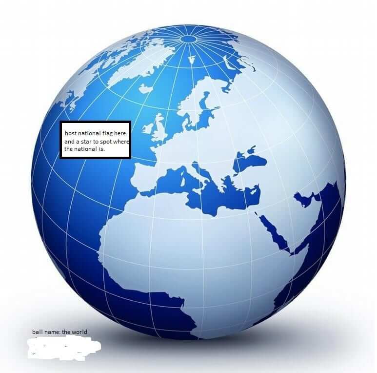
Ball name: The World
Designer’s comments: “Since the World Cup brings the nations together for a month every four years, it’s only fitting to have the ball exterior design to look like the glove. The host nation will have its flag and location mapped on the ball.”
2. Evan Lewis

Ball name: The World
Designer’s comments: “The world’s face deserves to be on the world’s favorite ball.”
3. Anonymous

Ball name: Magic Spray
Designer’s comments:
We’ve all seen soccer players rolling around in what appears to be unbearable pain, only to have the trainer come out, give them a blast of the magic spray from a can, and bingo — the player is back in action like nothing happened.
I thought I would combine the can of magic spray with the ball in an effort to make the game a bit faster. In this case, the can is inside the ball for easy access, so a teammate or even the ref can spray the “injured” player and get the game going again without having to wait for the trainer to come out onto the field. The player saves face and everyone can get on with the game.
There is a retractable nozzle and a button for the spray to keep the ball more or less roll-able.
The name of the ball is kind of boring, but I thought it needed to explain exactly what’s going on here. I chose a standard 32-panel ball, as it seemed to provide the right places to mount the nozzle and button.
About the other logos: I was playing around with some ideas for promotional logos for the design, so I included them as part of the package. As for the mascot, I thought a whale would be the perfect mascot due to the spray. Not sure if he has separate legs or if he managed to get the socks and boots over his tail.
4. Beau Traxel

Ball name: Cyclone
Designer’s comments: “I call this ball Cyclone for all the storms that hit Brazil. There were 92 cyclones that hit Brazil since 1997.”
Hank Traxel

Ball name: The Skyline
Designer’s comments: “I chose to design this ball in different parts, the fun skyline design, because of Brazil’s street art, and of how colorful Brazil is. I put the stars in there because of Brazil’s sky. Brazil’s sky is full of stars and color in the clouds and together they make the Skyline.”
Sam Traxel

Ball name: Color Splash
Designer’s comments: “The cross has fruit on all sides with colors going to the center. There is a pineapple, banana, lime, and orange. I chose this design to depict the fruit of Rio.”
Okay, people — who’s the winner? Vote here:
Magazine reminder: In case you missed it last week, you can now order your favorite magazines from the Uni Watch Magazine Shop. Full details here.
Uni Watch News Ticker:
Today’s ticker was written and compiled by John Ekdahl

Baseball News: Cool San Francisco Giants shoes in the first picture here. (Jonathan Daniel) … From Elena Elms: “I hope I am not the first one to link this nice collection of baseball programs, yearbook covers and other baseball illustrations by the recently deceased St Louis Post Dispatch artist, Amadee Wolschlaeger“. Phil actually covered this same artist back in 2010. … The Mets and Pirates will be in Negro League throwbacks on Saturday. … Tired of those “how the USA can advance” grid graphics? Here’s one for baseball (thanks Mike).

Basketball News: Ryan Hess asks if anyone has seen this version of the Spurs logo that’s being used on the NBA Store’s website. … Oops! There are no Bobcats anymore. (Jeffrey Moulden) … Here’s a shot of the Hornets new court design. … Freshmen Clemson basketball players were given mismatched jerseys (note the collar). … NBA Draft night jackets are a thing now, and #1 pick Andrew Wiggins‘ jacket was…well, was he the worst dressed there? Was he the worst of all time? And the inside of the jacket seems to be getting much attention these days.
Hockey News: Team Canada has released their new 2014/15 hockey jerseys. (Rob Yasinsac.) Many twitter comments asked why Canada continues to use black in its uni-scheme. … The NHL draft is today, and it’s rumored the Ducks will reveal new unis, possibly looking like this (via Icethetics).

Soccer News: Slate: Are Puma’s Mismatched Pink-and-Blue World Cup Cleats Cursed? (Jason Hillyer) … Neymar will be wearing golden boots for the knockout round. (Yusuke Toyoda) … Juan Cazares has a question for Uni Watchers: “I was watching the US Soccer Game vs Germany and noticed the US Soccer Logo/patch/crest is wrong? The Stripes are blue and the background of the stars is red? The Logo is supposed to be reflective of the U.S. Flag. However, the current logo is backwards?” … Each World Cup ball has the specific game, location and date printed on it. … Manchester United’s 2014/15 home kit here, with Chevrolet as the main sponsor. And here’s the away kit. … Not only has team Canada unveiled new puck jerseys, it looks like there are also Canadian futbol jerseys (h/t Luke). … Don’t wanna drop a hundy on a USA home jersey? Well, you could just DIY your own like Clint Richardson’s 15-year old brother did, with a sharpie and an old polo.

Grab Bag: These are some interesting prints of various city buildings. (Gil Neumann). … The tweet reads, “Uhmmm about this…” — That appears to be a “camo” Barnstormers jersey. And yes, it’s awful.

I’ll be at the Pirates game tonight. Yep, I’ll get the chance to “Meet the Mets.” Too bad Paul is off this week.
These are some interesting prints of various city buildings. (Gil Neumann).
The link seems to be bad, as all I get is a “Forbidden.”
worked for me in Opera. BTW they’re all aviation related, airport towers, runway and terminal layouts, sundry data about airports, etc.
Might just be me getting blocked, then. I’ll have to check it out from home.
Canadian military history is full of a tradition of wearing black. Look at the RCMP dress trousers. Most Americans I met when I went to uni in NY didn’t even know our nation’s capital, so I am not shocked at all the questions about our choice of colours.
Is the national hockey team affiliated with the military?
… A little tetchy this morning, friendly neighbor. That most Americans don’t know your capital city puts Canada among the ranks of 198 other nations of which we are comparably ignorant. Besides, big deal Ottawa. Nice parliament building, cute canals, interesting military museum (Lundy’s Lane! Vlimy Ridge!), but hardly a big deal. The Canberra of North America. And the black in the hockey uni? You’re saying that’s a military homage? Please.
Woot! Got the site unblocked at work!
Canada’s uniforms include black because that’s the color scheme of Hockey Canada – red, white, and black. Hockey Canada is Canada’s governing body over the sport, and the uniforms for every competition except the Olympics (where the IOC regulation forbids sport federations from displaying their logos on uniforms including color schemes of said federations) has Canada in Hockey Canada’s colors.
Black is a good accent on Canada’s uniforms, I just don’t like it on the jersey. In the Canada Cup they wore black pants, which looked sharp with their red/white jerseys:
link
They also wore blue pants, which looked good, but not as good as the black:
link
I thought that the dark color was chosen to contrast with the Soviets who also wore red and white, and who frequently matched up with Canada in that tournament.
The pants in the first pic are blue as well. That’s what they wore during that 80’s Canada Cup era. I think black pants showed up later (90’s?).
You might be right on that pic… but I think black was first, and blue came later. here’s a shot from the 1984 Canada Cup:
link
They look darker than USA’s blue jersey, so I’m pretty sure it was black through 1984.
It should be mentioned Canada has increased the amount of black in the uniform, specifically with adding a black helmet in more recent years. I thought the black pants were fine, but I wish we would go back to the red helmet. Also, we look exactly like Switzerland with all of the black, so it’s not a unique look.
As long as we’re talking about Team Canada and dumb colours:
link
link
I’ve never understood the “Hockey Canada” arguments on things. Like before the 2010 Olympics when they raised a stink about not being able to use the Hockey Canada logo on the jersey and acted as if anybody (besides Hockey Canada) cared that the Olympic team didn’t have their corporate logo.
The mismatched colours on the US Soccer Federation’s crest has bothered me since it was introduced.
Yeah, with the blue stripes and the stars on top of red, it looks like it should belong to Cuba instead of the US.
Yeah, the “mismatched colours” (wait a minute, is this another Canadian?) don’t work very well. Neither do any of the other design elements. It’s a stinker. The Cubans do such things better.
Agree. A simply solution would be to take the shield from the US Presidential logo (or even the whole thing…the eagle could be holding a soccer ball…anyone?). A simple, sensible shield and an enduring kit design would go a long way.
As late as link, the US was still wearing a link. The link was the old logo link. So much better than what they have now.
What kills me is not only how ugly our current Cuban crest is, but also how many link there are link. Hell, US Soccer already has a much better crest link just waiting to be let out.
There’s something a little po-faced about those concepts. The twee “Don’t Tread on Me”, the austere eagle and the snake all seem a little hyperbolic. Now, I’m not exactly a huge fan of the current crest, but if there’s one thing that I like about it is the slightly abstract, stylistic approach. It seems the people who most vehemently oppose the current logo though seem intent on doing away with that and replacing it with symbolic bludgeonry.
I’m not sure I understand. What’s abstract about a soccer ball over a shield? Fairly literal. If there’s a larger sense it’s hinting towards, I don’t see it.
I like the DTOM idea precisely because it side-steps the usual contemporary American iconography and touches a far older symbol. That it would involve reclaiming our heritage from the extreme right is a nice side benefit.
Just found a better look at link.
Perhaps abstract isn’t the best word for it. I meant it more in terms of the style, that it is geared towards producing a look that is more about shapes and forms than messages or iconography, particularly relative to the above concepts.
I like the DTOM idea precisely because it side-steps the usual contemporary American iconography and touches a far older symbol.
Why should the fact that it’s older make it better? It seems, if anything, ultimately quite culturally dishonest to insist such romanticized ideals of tradition onto something as new and divergent from American sporting and cultural tradition as soccer. The current wave of interest in soccer in the US is as divorced from anything in 1913 (or 1776 for that matter) as is possible and trying to bodge together some kind of common thread is ultimately just an exercise in historical vanity.
This is why, rather than indulging such histrionic fantasies, I thoroughly believe that any new crest should build on the stylistically modern impetus of the current crest and emphasise how US soccer is young, both demographically and culturally, and is a vibrantly and energetically growing facet of US society. I fail to see how embracing stodgy old ideas, icons and artistic styles of a dead generation, does anything to represent that.
I don’t know, using old symbols and pretending there’s some kind of tradition when there really isn’t seems right on par for US soccer, just look at all of the silly FC team names (hey, we’re just like those European teams, really) in the MLS today.
Padday, your rhetoric seems a bit out of control. “culturally dishonest”? “histrionic fantasies”?
My point was simply that eagles are over-represented in national symbols, and I liked the idea of incorporating another one that still had the same historical weight.
And I still have no idea what you’re getting at with regards to the current logo:
Perhaps abstract isn’t the best word for it. I meant it more in terms of the style, that it is geared towards producing a look that is more about shapes and forms than messages or iconography
How exactly does the soccer ball and shield do that? It’s nothing but literal iconography.
I’ve never been a fan of the DOTM series, but something with the bald eagle would be great either with or without a soccer ball. Or just the simple crest Nike uses on the retro unis.
The centenntial shield isn’t marketable enough.
Not a fan of the current crest, though it isn’t nearly as bad as that dog’s breakfast on the Swiss kit. That being said, the only stars on a jersey should be those that have been earned.
US Soccer should update the old NY Cosmos logo. Replace “Cosmos” with “USA” in white letters in same font, turn the background to flag blue and replace the stripes with two red stripes flanking one white stripe.
I disagree with your point about stars. Stars and Stripes are a part of our Flag, our Anthem, our sports branding, etc.
If we didn’t have 50 of them on our flag I’d agree with you about not including them, but they are a part of our identity, and as such have a place on our crest.
Besides the earned stars are usually placed above the crest just as we do with our WNT.
I actually like our Crest, but would have no issue if they changed it (provided such a change wasn’t a step back). I do like our Centennial Crest and wouldn’t mind sprucing that up a bit and adopting it full time.
Those Traxel kids did some nice, thoughtful design work. And informative: I had no idea Brazil was so cyclone prone. All this from the back seat of a moving car. I’m impressed.
For all the wonderful computer generated designs I’ve seen here over the years, nothing is as satisfying as a handmade drawing rendered in crayon or colored pencil.
That’s just a black and white version of the Spurs logo.
Speaking of Canadian team colors, can anyone tell me where electric lime yellow fits into the Blue Jays color scheme ? Their 3rd baseman had on an arm wrap(?) that color that I just couldn’t grasp how it at could be a legit part of the “uniform” . Or, are these new arm wraps not considered subject to uniform rules ?
I appreciate the work of the kids (especially the research by cyclone boy), but I vote for none of the above.
vote for Evan Lewis
I appreciate all the ball designs, I’m really in no place to complain since I didn’t submit anything. But I’m disappointed no one seemed to consider how the ball looked while spinning, which is how we see it most of the time on TV.
I do like Beau’s blue ball, though and the other two Traxel kids put some nice thought into it. Dad should open a mobile design shop in his car.
Voted for Evan but props to the kids on their fine work!
” The NHL draft is today, and it’s rumored the Ducks will reveal new unis…”
More evidence that NHL teams look much better in white sweaters.
Will Anaheim next tweak drop the gold entirely?
The toned down gold looks kind of weird to me paired with the loud orange, but i think it’s kind of unique too. Hockey uniforms never look good in vertical lines.
The Ducks definitely need to do something…but I am not sure this is the answer.
Wish I was creative enough to offer a suggestion.
Here they are (old third becames new home, road is basically inverse of new home). I think they’re going to unveil a new third tonight (at the draft).
I’m torn because I like the old colors but like these as well so I could go either way as long as it’s the original uni style again. These aren’t bad but it just shows how awful the team logos have been lately. The D is an improvement but should still just be a shoulder logo. The orange shoulder striping works on the road but not on the home (as it should be) black unless they changed the shoulders to another color. Overall it’s a slight improvement but not a great step up.
This is what their jerseys should have been from the start when they changed to the webbed D logo, rather than the “Ducks” wordmark.
Agreed. Easy upgrade.
Legitimate question: does anyone think that the new scheme is better looking than the original eggplant and jade?
I’ve said this before about other teams (like the Blue Jays and Sabres) that were in need of a redesign – when the perfect look is in your past, don’t be ashamed to admit you made a mistake.
link
By a very large amount, yes, but I haz an advanced case of the oldz. Heck, I remember lots of things from the sixties. I’m not in the target market.
Disagree, Gregg. When one team has a particular color scheme so closely associated with it as the Flyers do with orange and black, it makes little sense to ditch one’s own unique color scheme in order to step into someone else’s very long shadow.
To get slightly off uniforms for a moment, that shirt deal between Chevy and Manchester United makes me so mad. I get that Man U is a HUGE brand, but European car sales are down to begin with and GM greatly overpaid. Aon, who Chevy is replacing only paid $32 million per season, where GM will be averaging $80 million through the end of this deal. That’s like paying Corvette prices for a Chevy Cruze and still getting the bad ignition!
What makes that sum even more mind-boggling is that GM is link by the end of 2015.
They must be counting on the club’s popularity in Asia and the United States.
A good deal of the advertising in Premier League games is directed at the Asian market (and I suspect the American market in the future). Why else would Everton — just to mention one club — have Chiang Beer as their shirt sponsor?
Is it just me or is the visual variety of this World Cup somewhat lacking? It really hit me watching the games yesterday as I was getting a little confused as to which white team I wanted to score and which dark red/black I wanted to fuck up as I glanced between laptop monitor and tv screen.
For illustrative purposes, here’s each of yesterday’s four games side by side: link
FIFA’s monochromocracy sucks!
The fact that there only seem to be a few number fonts doesn’t help much, either.
You’re both right. Of course they violate their own tenet when it comes to the refs in yellow jerseys with navy shorts, proving that (like our federal officials) if it weren’t for double standards they’d have no standards at all.
It’s not just you. This World Cup is indeed lacking.
But there are some non monochrome matchups, and a little bit of variety, as you’ll see in this weekend’s 5&1s.
They made another mistake on the Lebron uni picture. He could not wear 6 as a Sixer, since they retired the number for Julius Erving. Even Lebron couldn’t make them un-retire it, I hope!
I remember Ohio State un-retiring Archie Griffin’s number 45 so the great Andy Katzemoyer could wear that number for the Buckeyes.
What ever happened to “The Kaiser”?
Only “Kaiser” I know link.
Katzemoyer’s story did not have a happy ending. Drafted in the first round of the 1999 draft, he lasted only two seasons because of a major neck injury. In 2013, he was arrested for violating a domestic protection order. I have no other updates.
link
Of course, always recognized that Steven Stills liked football jerseys. But didn’t know the rest of the story, if true.
From the piece: “Stephen started wearing football jerseys on stage that year. The jerseys had a practical purpose–they were big and loose and perfect for a guitarist on stage. But they also were a statement. Remember, there were no NFL stores back then. All of those jerseys were originals, given to him by NFL players. I think for Stephen, they symbolized being in a stadium on a great team. There probably was a certain amount of irony there, too–he was a big football fan.”
US Soccer should update the old NY Cosmos logo. Replace “Cosmos” with “USA” in white letters in same font, turn the background to flag blue and replace the stripes with two red stripes flanking one white stripe.
No. A national federation should not co-opt the logo of an individual club. Also, the use of swirling colors would be a bit too close to that of the Costa Rican federation.
And the Gadsen Snake is out as well, at least for me. When two police officers are murdered in cold blood by some…sub-human things who then proceed to drape the bodies in Gadsen Flags…..