
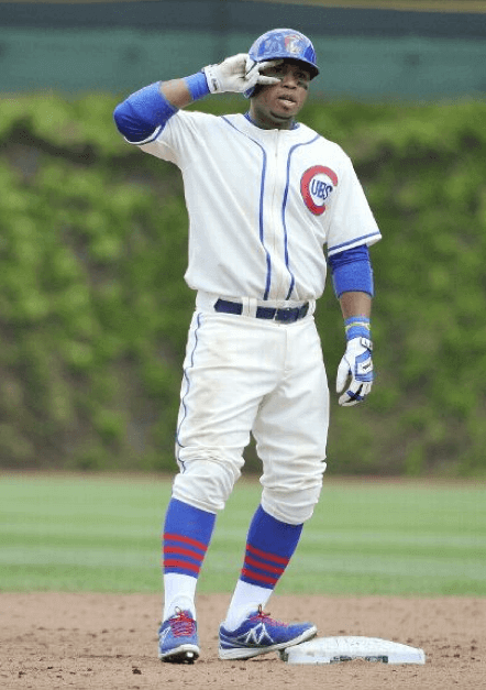
Big MLB throwback day yesterday, as four teams turned back the clock. First up was the Cubs/Brewers game at Wrigley, which found the Cubbies wearing their 1937 unis. As you can see above, that meant zippered jerseys and absolutely spectacular striped hosiery. Here’s another view:
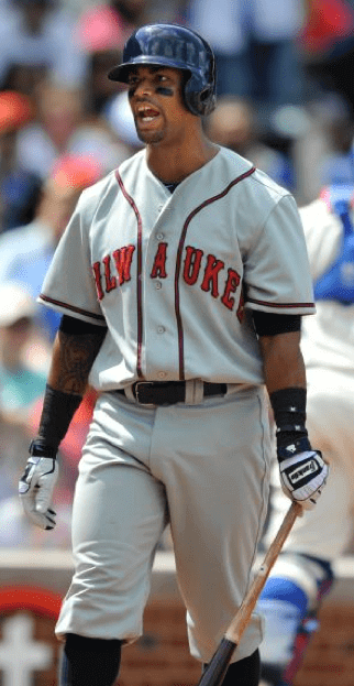
The Brewers didn’t exist in 1937, so they wore uniforms based on a minor league Milwaukee Brewers team. The most interesting thing about this uni was the letterspacing on the chest insignia. The “A” was all by itself in the middle of the placket, which made the chest wordmark look like “MILW A UKEE”:
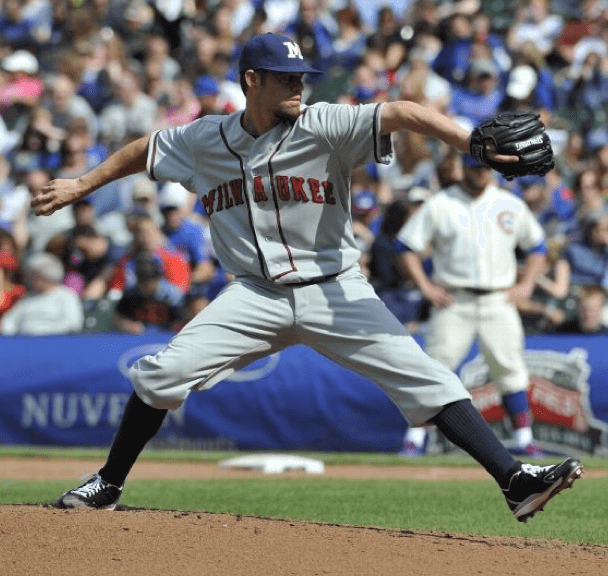
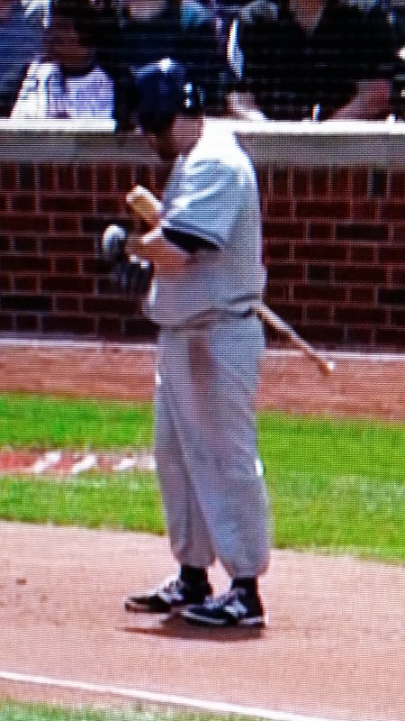
Most players went high-cuffed, with the very conspicuous exception of Brewers shortstop Jeff Bianchi, who really needs to get with the program:
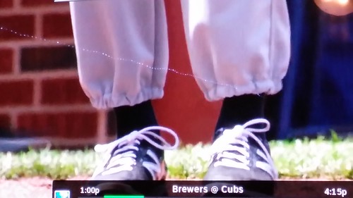
Lots of additional photos here.
Meanwhile, over in Kansas City, the Orioles and Royals wore Negro League throwbacks — Baltimore Black Sox for the O’s and KC Monarchs for the Royals. Interestingly, the Monarchs’ design was blank on the front:

Some KC players wore solid stockings, while others wore stirrups:

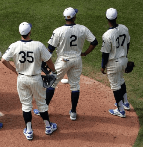
As for the Orioles, their I loved their Black Sox unis — the jersey, the cap, the whole package:
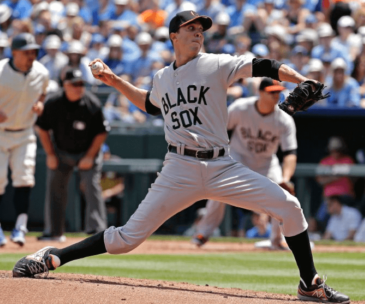


The only bummer is that the Orioles wore their standard non-throwback batting helmets:
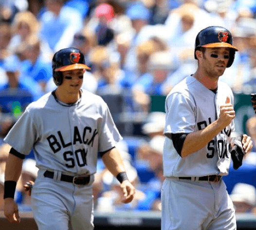
Lots of additional photos here. Meanwhile, in case you missed it, Phil pointed out something interesting in yesterday’s entry: The Orioles will be wearing Negro Leagues throwbacks again on May 30 when they play the annual Civil Rights Game in Houston against the Astros, and then they’ll be wearing 1990s throwbacks against the Cubs when they visit Wrigley on Aug. 24. So they’ll be wearing throwbacks at least three times this season as the visiting team, something I believe is unprecedented.
(Big thanks to Gene Sanny for the Jeff Bianchi screen shots.)
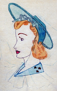
PermaRec update: I recently got to interview a 90-year-old former student from the Manhattan Trade School for Girls and see some pages from her old art portfolio (including the illustration shown at right). The best part is the bit where she told me how pouring milk in her iced tea turned out to be one of the formative aesthetic moments of her life. Get the full scoop over on Permanent Record.

’Skins Watch: Jeopardy! host Alex Trebek, who happens to be a longtime ’Skins fan, thinks the team should keep its name (from Tommy Turner). … Here’s more about those “Siouxper Drunk” T-shirts at the U. of North Dakota from last week (thanks, Phil). … This is fascinating: As you’re no doubt aware, lacrosse has deep Native American roots, and two of the best current collegiate lacrosse players are the brothers Miles and Lyle Thompson, who play for Albany and are Onondaga Indians. Lacrosse Magzine recently ran a photo spread on Miles Thompson, which showed him with a ’Skins blanket on his bed. But check out the accompanying note: “I actually got rid of this blanket after my older brother Jerome Thompson Jr. enlightened me on what the real meaning of a ‘redskin’ is and how it affects our people. I am no longer a Redskins fan, but I still am a fan of RGIII” (big thanks to Kevin Mueller).

Baseball News: The Cubs made a pretty big mistake on one of their Wrigley Field centennial murals (from Gil Neumann). … Good question from Casey B, who wonders if there are any ballparks that still have the old “No Pepper Games” signs. If not, which was the last one to have them? Has anyone ever charted their disappearance? … Last week I mentioned that Babe Ruth used the jersey he wore in Pride of the Yankees for personal appearances later in his life. Now there’s a whole article about that specific jersey — good stuff (from Tom Shieber). … Here’s a great 1979 article on the Pirates’ Stargell Stars (big thanks to Todd Radom). ”¦ Want some vintage striped stirrups? Somebody on eBay is selling a whole box of them. … Check out the jerseys worn by the 1976 Fukuoka Taiheiyo Club Lions — they look more like football jerseys! “Can’t imagine why these didn’t work,” says Keith Olbermann. … The Nats apparently have their own strength and conditioning logo. Does every team have something similar? “That’s Wilson Ramos, holding his own bobblehead,” says Alan Borock. ”¦ Speaking of bobbleheads, the Rangers gave away a bobble with an embarrassing typo yesterday (from Don Silsby). ”¦ Michael Hersch has made a baseball-themed version of the 2048 game. “Instead of numbers, the squares are lettered A-K using cap logos. I had to get creative and find some minor league teams to fill in some of the letters.”

NFL News: Good catch by Dustin Tingue, who notes that the Bills appear to have a new number font for their practice jerseys. Here’s a practice shot from last December, for comparison. … “On last week’s episode of The Middle, the recurring character played by Norm Macdonald came up with a great idea of selling NFL shower curtains,” says Chris Flinn. “His way to get around the NFL licensing rules was to drop a letter on all of the team’s names, so they show Begals, Gants, and Cots shower curtains throughout the episode.” ”¦ A Bills fan has gotten a tattoo of late team owner Ralph Wilson (thanks, Mike).

College Football News: Embarrassing-looking new helmet apparently in the works for N.C. State. “As an alum, not sure how I feel about these,” says Jacob Schuurman. As a non-alum, I’m pretty sure I know exactly how I feel.

Hockey News: If you’re a Blues fan, you really need to bid on this super-wide-lapelled suede jacket. I love how the auction listing describes it as “this cool suede affair” (entertainingly garish find by Mike Powers).

Soccer News: Arsenal wore a specially embroidered shirt for the FA Cup Final (from Yusuke Toyoda). ”¦ Also from Yusuke: “Bayern Munich wore next season’s kit for the season-closing German Cup Final. But this will be the only time they’ll wear this design with the European champions patch, since they failed to defend their Champions League title.” ”¦ The rest of these are from Trevor Williams: Nike has created a commemorative Arsenal jersey that incorporates 20 years’ worth of old designs. ”¦ New USA training jersey. ”¦ New kits for AS Monaco and Atlético Madrid.

Grab Bag: Has crazy has the camo thing become? So crazy that Ralph Lauren now offers a camo sport coat (from Tommy Turner). ”¦ A religion website has posted a slideshow of really ugly vestments (from Jeff Hunter). ”¦ Good article on whether high school softball players should wear facemasks (from Yusuke Toyoda).
Old Tiger Stadium had “No Pepper Games” painted on some infield walls when they closed it in 2000, and still when they tore it down a few years ago.
I remember seeing the pepper signs on tv. I never understood what it meant (until just now as I looked it up online).
The Tigers have a no pepper sign right behind home plate.
Should read MILW A UKEE.
Is it just my imagination, or are the letters very heavily raised, like on the caps of the past 10-15 years?
Looks like two layers of actual felt to me.
I suspect the letters were made by Ebbets Field Flannels, even if the jerseys themselves weren’t (all I know is that they weren’t Majestic).
link what I was talking about. Looks thick, soft, like felt.
Good Lord, that NC State helmet is hideous.
As a NC State grad, I am embarrassed. Another reason I will not be renewing football tickets a 2nd year in a row.
There’s plenty more bad vestments (including most of the ones at the linked item) at badvestments.blogspot.com even though that site hasn’t been updated in a while.
The ticker info about Bayern is not right: The badge they are wearing is for the winner of the FIFA Club World Cup, they will be having it on their jerseys until the new winner is determined, which will be in December.
Since I just happen to have some Pirate throwback games link, I’ll point out they wore gold jerseys and pants for the entire 2003 opening series in Philadelphia, as well in the infamous Sausagegate game in Milwaukee that July. In 2010, the Pirates wore different jerseys with black pants for throwback games in Oakland and San Diego. I don’t remember whether they also wore Grays or Crawfords unis in any road games in either of those years.
And if wearing the same throwbacks for an entire road series counts, the Reds did it for three games in 2004.
RE The Middle: so not only do they take a letter out of the word Bengals, but they a Browns helmet instead
“It’s a proven scientific fact. Your brain will just fill in the missing letters!” – Uncle Rusty
The facemask on the Cincinnati helmet looks black to me.
That NC State helmet wouldn’t be that bad if they took the red painted and would eyes. It’s a football helmet not a biker’s arm sleeve tattoo.
I meant wolf eyes
While I love that Cubs throwback outfit and think it would make a fine regular home uniform, today’s version wasn’t quite perfect.
It looks like the diagonal bar in the 4 is slightly thinner than the other lines, like it would look in many modern computer fonts, and the 2 also feels slightly off. And (as always with Majestic) the number is a little too far down the back, and that useless MLB logo is at the top.
But it still looks really nice. I hope the Cubs take one of this year’s throwbacks and make it a semi-regular home alternate out of it in future years.
It looks like the link in my post got eaten. There’s one photo available in the stories about this game that shows Welington Castillo high-fiving with #24 Luis Valbuena. That’s the only one I can find that shows the number font.
You city slickers must hate the camo. I grew up in West Virginia. Camo pants and shorts were pretty common clothing. It was almost mandated in high school that on football gameday, the players would wear their jersey and camo shorts or pants. I’ve seen weddings where the groom, bride, and wedding party would have something camo on right down to whole camo tuxedos. I feel like it has gotten camo crazy since Duck Dynasty made it cool.
I’m from WV… I hate the camo in sports, and in any other situation that doesn’t include hunting or war.
I’m no city slicker either, from backwoods Ky., but I hate camo on uniforms. It doesn’t belong–what are they trying to camouflage?
Meanwhile, evidence suggests link
In regards to the Strength and Conditioning tees mentioned in the ticker,I have seen other teams wear shirts like this.I believe they also have the weights emerging from the script as well.If memory does serve,the Red Sox are one of the teams.
Yes, that “barbell” shirt is a Nike template. A few minor league teams sell them too.
The Orioles have one of the Bird lifting weights. I can’t find a full picture, but you can see a section of it in this photo
link
Someone just sent me this:
link
That doesn’t look like the result of “conditioning” to me…
I knew (through following Pittsburgh Penguins equipment manager Dana Heinze) that the Penguins have a special Strength logo. Found it:
link
(Paul, I’ll tweet and email this to you.)
It’s disappointing that all they did was rotate the skating penguin and replace his hockey stick with a barbell. Not to mention ridiculous (relatively speaking, in terms of a hockey-playing cartoon penguin) because the skates haven’t been changed.
Is the Nats’ conditioning program branded as a public service, just to let players from other teams know to avoid it? When a team spends ten years near the top of the league in player-days spent on the DL, you’d think maybe it would be a little humble about its training and conditioning regimen.
Was watching the movies Emperor (WWII era flick on Japan’s Hirohito) and The Last Samurai the other day and had a uni-thought:
It’s interesting that no U.S. sports teams use Japanese symbols of strength, courage, etc., for their nicknames.
There are no teams of: Samurai, Shogun, swords, kabuto, Ninja, or, more controversially, Kamikaze.
In thinking about it, there aren’t really m/any Banditos, Outlaws, and other Mexican revolutionaries, either.
Juxtapose that with Redskins, Blackhawks, etc., which are obviously more engrained in America’s historical fascination with cowboys and indians. Interesting to ponder, at the very least.
Maybe we’ll have a Los Angeles NFL franchise called the “Yellowskins”, as a show of respect to the honor, courage and discipline of the samurai way.
Also interesting to note that usually teams from Florida aren’t named after animals native to Alaska. If you want local fans to embrace a team, you name it after something local that they can relate to.
Exactly. Which goes a long way to explain why the Spartans are so beloved in Michigan. And of course, you can’t forget the shocking frequency of bear maulings on the streets of Chicago.
I think it’s more a question of how mainstream American society viewed Japan at a time when ethnic sports nicknames were considered acceptable, even laudable.
There’s a whole stretch of the middle of the last century when Japanese iconography would have been considered inappropriate, in that Japan wasn’t considered worthy of the tribute. Ninjas and samuri didn’t become fashionable until, what, the 1970s? With the introduction of Asian martial-arts films to American pop culture? Far enough removed from WWII, and also at the dawn of a growing awareness that these “tributes” really aren’t.
Native Americans, on the other hand, couldn’t have been viewed as a serious threat to “us” since the 1800s. That makes them “safe” to co-opt and trivialize.
I think that just makes it look like 30-50 years is a long enough time frame to start co-opting cultural imagery. The Indian Wars ended in the 1880’s and the Cleveland Indians got their name in the 1910’s. The biggest reason we didn’t get Samurai/Ninja/Dragons team names in the 70’s or early 80’s is that the leagues were already established and there wasn’t much expansion going on. We didn’t get sports teams, we just got a ridiculous amount of movies instead.
True, link is how the mainstream saw Japan, and “Made in Japan” was a sign of cheapness rather than quality.
Even now, people are just as likely to associate Japan with sneakiness, perversion and effeteness.
Japanese/Chinese characters are ubiquitous in (often hilariously bad) tattoos, though.
Even now, people are just as likely to associate Japan with sneakiness, perversion and effeteness.
Well, they did create tentacle porn.
See, joking or not, this is precisely why the use of ethnicities as mascot makes people uncomfortable.
Does tentacle porn exist? Sure. But it represents a tiny, trace-level percentage of media content that’s produced in Japan. That doesn’t matter though, since Americans have already had an idea of the Japanese as sexually repressed fetishists, and hey, here’s one thing that confirms that narrative! It would be the equivalent of describing America as the nation of piss-drink porn. It’s a thing that exists!
And it works the same way for Indian imagery in sports – it reduces a diverse group of peoples into a simplified analogue for (at best) noble savagery.
Every ethnic group is stereotyped by every other ethnic group. It’s human nature.
Of course. But only a select few experience the honor of being coopted by the mainstream.
I’m surprised someone hasn’t done some kind of Asian version of their uniform. Like when the NBA does Los Lakers or Los Spurs but in Chinese or Japanese. You would think with baseball being so huge in Japan, someone would do a translated jersey. Or China and the NBA. When Yao Ming played I’m surprised the Rockets didn’t do a jersey with Chinese lettering on it. I do know the Brewers have done a couple different language translations. What will be the next ethnicity to be “honored” in the States?
“So put Trebek squarely in the pro-Redskins name camp.”
This is a quote from the Trebek article.
The actual quote from Trebek neither states his position “fer or agin” the “Skins *changing* their name. He states why they were named it. Perhaps there was another unquoted portion of the interview in which he actually states his opinion.
“They weren’t called the Redskins because we thought Redskins were terrible; it’s because we admire their strength, their abilities” reads like a defense of the nickname to me.
In any case, Rob Ford’s a ‘Skins fan too. Small sample size and all, but what’s with Canadians and the ‘Skins?
What this defence by Trebek completely misses is the fact that objectifying Indians is an inherently racist act, even if it is done in way that is ostensibly “positive” or lauditory.
Being Asian, I see this in the “model minority” treatment we get (see: Donald Sterling’s view on Koreans). It’s positive on the face, but in reality, it’s patronizing, creepily exoticist and usually a way for racists to justify their bigotry against other ethnic groups whose immigrants weren’t educated, middle-class and moneyed before they came to the States.
So inherently racist that a Native American lacrosse player knew it was racist the moment his brother told him so.
Adam N., “inherently” doesn’t mean the same thing as “obviously”, even if people misuse the word that way.
“So inherently racist that a Native American lacrosse player knew it was racist the moment his brother told him so.”
Don’t you mean a “redskin lacrosse player”? Since it’s not an inherently racist term or anything, why wouldn’t you use that term to describe Thompson?
“Don’t you mean a “redskin lacrosse player”? Since it’s not an inherently racist term or anything, why wouldn’t you use that term to describe Thompson?”
While ‘redskin’ is sometimes referential to race, does that mean that the term is “inherently racist” in every use?
If Albany Athletics called their teams the Redskins, then it would be OK to refer to him as a “Redskin lacrosse player”, right?
“While ‘redskin’ is sometimes referential to race, does that mean that the term is “inherently racist” in every use?
If Albany Athletics called their teams the Redskins, then it would be OK to refer to him as a ‘Redskin lacrosse player’, right?”
(Sigh…) Isn’t that the whole point of this whole discussion?
Trabek’s quote was from 2012. There has been a lot of movement of opinion on the team name in the last few years. I wonder if Alex’s take has changed in that time.
*Trebek, that is.
Interesting that the new kits from Atletico and Monaco are shown without sponsors.
I’m guessing sponsorships for both teams expired and they hadn’t finalized a new one before their photoshoots, and both will have signed new deals before the seasons starts (especially Monaco, since French teams have multiple jersey ads). But still, they look so clean without the ads on front.
The Monaco kit in particular looks fantastic. Nike may take things way too far with American football uniforms, but they seem to have hit their stride in designing soccer kits.
With Atletico, some fans say the Azerbaijan sponsorship is ending, but the article below says the deal is until 2015.
link
As for Monaco, they have produced sponsorless shirts only to get a sponsor later.
link
link
The most incredible thing about those pics to me is the grip tape on Aoki’s bat. I had no idea anyone in the major’s did that.
That St. Louis Blues suede jacket is a beauty!
“You can do anything, but lay off of my Blues suede jacket!” I’m sorry, it HAD to be said.
I didn’t get back to the comments last week regarding the Washington Nationals link.
I wasn’t sure what Heroes Day was and arrScott and Ben are probably correct in stating that it’s for first responders.
Paul, now that I think about it, the Nationals don’t wear camo uniforms for these games. They wear their blue patriotic jerseys (the ones with the star and stripes Curly W) for these games. So the good news is that they don’t recognize first responders with camo. Whether you prefer the stars and stripes design as a better option… that’s another question.
Small comfort, I guess.
I wish we could go back to wearing local first responder caps for 9/11 (I know, I know, the Nats were still the ‘Spos back then so they never wore first responder caps) instead of turning the day into a New Era commercial.
Also, choosing which police and fire departments to rep is a lot more complicated than for the Mets or Yankees. Their “home” police and fire are MPD and FCFD, but the Pentagon is protected by PFPA and Arlington County Fire, and the highest concentration of fans are in MoCo, but then they’re geographically close to PG County….
“I actually got rid of this blanket after my older brother Jerome Thompson Jr. enlightened me on what the real meaning of a ‘redskin’ is and how it affects our people. I am no longer a Redskins fan”
Interesting. If ‘Redskins’ is so obviously/blatantly racist, why would someone who seems to feel connected to his heritage (the traditional ties to Lacrosse and the Iroquois flag in his dorm) need to be ‘enlightened’ on the meaning?
This feels very different than a kid drawing a swastika on his notebook and needing to be told what it means/represents. The potential hateful/racist/offensive nature of the term Redskins is right there for all to see and weigh.
I agree with Adam N. on this.
It seems the name spells out the issue pretty clear. I don’t know that I would need to be “enlightened” in order to see it as terrible.
If ‘Redskins’ is so obviously/blatantly racist, why would someone who seems to feel connected to his heritage (the traditional ties to Lacrosse and the Iroquois flag in his dorm) need to be ‘enlightened’ on the meaning?
It’s called “learning.” Being connected to one’s heritage doesn’t mean that one is born with an innate understanding of the history, issues, and events that have shaped that heritage.
In my admittedly limited experience, I’ve found that folks who feel most “connected” to their heritage are most likely to invest time in researching the culture, studying its history, learning from those (like, for example, an older brother) who possess greater experience & knowledge.
The Washington nickname, the swastika, the “Stars & Bars” flag of the confederacy – none of these words/objects/ images are inherently evil, but the way they have been used has attached less-than-positive connotations to them. When we learn their history, when we understand their context, then the way we view & react to them (hopefully) changes.
The Washington nickname, the swastika, the “Stars & Bars” flag of the confederacy — none of these words/objects/ images are inherently evil, but the way they have been used has attached less-than-positive connotations to them. When we learn their history, when we understand their context, then the way we view & react to them (hopefully) changes.
Very well put.
Good article on Slate about the atrocious denim-patterned kits the US National Team wore for the 1994 World Cup.
link
And by “atrocious”, you mean “awesome”.
It’s good to see the Detroit Tigers paying tribute to the real American heroes – the link.
I knew about the pants, but the tops? Sweet Celestia, those are insane!
By insane, you mean awesome, right?
Why not? The Tigers are sitting on top of the MLB standings, so they can wear whatever the hell they want off the field if it makes them happy.
Madison (a Belk brand) was selling Camo corduroy sport coats in green and red camo (didn’t have money at the time to buy it, dangit),
Also, what is a good resource on honing sports uniform designs?
So redskins was completely non offensive and therefore powerless against Thompson, until he was told it was offensive. Then he had to get rid of it since he was “supposed” to be offended by it. When will people realize that if you stop choosing to be offended by things those things lose their power and aren’t offensive anymore.
That’s awfully convenient for people who use slurs. You never have to be responsible for what you say!
That’s a handy construct: If someone calls you an asshole, you can just choose not to be insulted; if the KKK burns a cross on your lawn, you can just choose not to be terrorized; and so on.
Yeah, those are equivalent.
Nobody claimed they were equivalent. But if you plug in jd’s suggested standard (“if you stop choosing to be offended by things, those things lose their power and aren’t offensive anymore”), they both work.
Not everyone is aware of the meanings and connotations of all words. I can remember an incident from my life that is similar to the Thompson situation.
When I was a kid, a friend of mine who a black girl was hanging out with several other girls who were, like me, of Italian ethnicity. However, these girls were mocking my friend, calling her by a name that Italians use to insult blacks. My friend was not aware of the meaning of this word; and so she went around using it herself (which the people with whom she was hanging around found hilarious).
I finally had to tell my friend what this word meant. After she understood that, she no longer associated with those people.
An omitted word made a sentence in that last response unintelligible. I meant to write: “When I was a kid, a friend of mine who *was* a black girl was hanging out with several other girls who were, like me, of Italian ethnicity.”
No, they really don’t. Having a cross burned in your yard could likely be taken as “your house is next”, which is something to legitimately be afraid of. Being called a name, no matter how vulgar, is just being called a name, and one can certainly take ownership of that. Whether it’s Asshole, Slut, Redskin, Redneck or the N-word, it’s not hard to find examples of people who self-identify with it or a varient, even if it was originally intended as an insult.
You have it backwards, The. People self-identify as “asshole, Slut, Redskin, Redneck or the N-word” precisely because they’re insulting.
And the targets of those insults taking ownership of the word doesn’t make it any less problematic for other people to use those words. A Native American decide whether they’re offended by “redskin”, but a non-Native using “Redskins” as a mascot and using native imagery is still a dick move, not matter who is or isn’t offended.
Not to mention many of those slurs carry at least a hint of threat with them.
Or, if you think something’s wrong with black people being in a designated railcar, just get over it–it isn’t the government’s prejudice, and any perceived slight is in your head, so get over it.
That’s Plessy v. Ferguson for you. That jurisprudence was overruled a long time ago, and was deemed “wrong since the day it was decided.” Society should be better than that; in the mean time, I’m personally not accepting the “don’t be offended and it goes away” argument. It really doesn’t work.
… well, at least Jeff Bianchi didn’t go full pajama-pants.
Who the hell is Jeff Bianchi, anyway? Never even heard of the guy before. Just tells you how much I follow baseball outside of the Tigers.
They even purposely hemmed the pants short to prevent that hideous look. Bianchi’s a bench guy for the Brewers, been around a couple of years. Says his name like be-YANKEE.
Wait. Does that mean that this Bianchi fellow re-hemmed his pants or somehow messed with them … JUST to jam a finger into the eye of the entire concept? Just so as not to look the way his team was being specifically asked to look?
What … what sort of human being even does that? Even if you think it’s a minor aesthetic issue not worth worrying about, what sort of perversity or spite moves someone to go to that much trouble, just to be on the wrong side of it? I know it’s a very small issue, but the sheer effort required to do the wrong thing here seems to say something about him as a person.
Wait. Does that mean that this Bianchi fellow re-hemmed his pants or somehow messed with them … JUST to jam a finger into the eye of the entire concept? Just so as not to look the way his team was being specifically asked to look?
No – he (and presumably the entire team) was issued a new set of road pants for the game. The Brewers’ regular roads have blue and gold stripes, these were plain.
These new roads were also hemmed shorter than usual. Regular baseball pants are long enough to reach the shoe. These were obviously made to push up to the top of his calf (needing less material), but he left ’em hanging low.
In that case, I’ll take most of that back. Still a douche move to leave them low, however.
How does NC state get a helmet like that approved. That looks like a AFL2 team lid. Seriously, its going to look so dated in 5 years, heck maybe by October
I do think NC State needs a uni overhaul- I was never a fan of their white helmets…but steel graded sticker scheme is not the way. You want to look slick not cheesy. Adidas !
Approved? Have you been watching college football for the last decade? I’m not sure there is such a thing as “approved helmet design”.
As far as the Ruth jersey goes, I question this line:
“What Ruth failed to tell Quinn, however, was that he had worn the jersey and pants at dozens of benefit games and appearances throughout the 1940s. This included an Aug. 26, 1943 game at the Polo Grounds that raised $800 million in war bonds and a July 12, 1943 event at Fenway Park where Ruth met Ted Williams.”
$800 million dollars in one game? Adjusting for inflation, wouldn’t that be something like four or five billion dollars in today’s money?
Yeah, that’s clearly a wrong figure…that seems impossible. I didn’t catch that the first time I read the article over the weekend.
Well…then again, I take that back. The number is correct. As hard as it is to fathom: link
“In front of an audience of over 35 thousand, the War Bond Jubilee Game raised a staggering $800 million dollars in War Bonds, sold as either advertising or tickets for the event; equivalent to nearly 11 billion dollars today.”
Wow. Now *that’s* honoring the troops.
I think someone may look into THAT idea again! Wow!
I wonder how much of that $800 million came from auctioning off the game-worn, camo jerseys and caps . . .
I still think it’s wrong. If they raised the equivalent of $11,000,000,000 in one day it would have made the history books!
I’m guessing Pirates-Orioles throwbacks for Wednesday night?
I haven’t heard anything to that effect, although it’s not like I’m in any loop where I would. The only reason to be at all optimistic is Paul’s note that so many of these events have been unannounced this year.
Mil-A-Waukee is pretty close to it’s actual pronunciation “Mil-eh-wa-keh”, which is Algonquin for “The Good Land”.
We’re not worthy!
Spelling note: there is no capital D in Norm Macdonald’s name.
Fixed.
Great, now I’m going to be playing that 2048 logo game for the rest of the day. That sucker is addictive.
Dan Patrick wearing an Orlando City polo today.
Bianchi looks like Max Patkin in those baggy pants.
Loved the interview with the Manhattan Trade School lady, Paul. Utterly fascinating.
Thanks, Elena.
I just posted a new PermaRec entry an hour ago, by the way. Has nothing to do with the Manhattan Trade School, but I think you’ll still find it interesting:
link
No pic, but Brandan Ryan of the Yankees was wearing stirrups yesterday.
Sign of the Apocalypse #3,823:
I don’t know if other readers are seeing the same ads, but for me, the banner at the top is for link – no, not the jerseys the draft picks will be wearing, but the jerseys the commish presented at the draft.
Not only is the idea ridiculous, they didn’t even get link right.
/*silently shaking fist at my monitor
I still think link is worse. An action figure of your favorite rising NFL star, wearing a suit!
My kid will LOVE the suit wearing rising star “action” figure! He’ll be able to act out contract signings, holdout negotiations, etc.!
Every kid’s dream.
My son and I played the “interminable wait in the green room” game just yesterday!
The worst part is they link even get the link right.
Clowney’s “W” was correct on draft night:
link
The upside-down “M” was on a jersey that that the Texans gave him a day or two later, for a press conference.
Ah, thanks. I was only looking at the presser photos, I guess.
Not uni related, but something I found very interesting. The DiamondBacks gave Randy Johnson a painting yesterday of his perfect game. Shown here: link
The interesting part is in the painting the back wall reads “Braves Country” as in “Welcome to Braves Country”. The problem is that wasn’t a slogan for the Braves until much later. As you can see in this picture: link the Braves had a much different wall in 2004 when Johnson threw his perfect game.
I’m interested to see why the painter chose an image of Johnson and a different one of the stadium.
Interesting.
After doing a quick Google image search (for images of “Randy Johnson Perfect Game”) I came across several images that were *close* to the one the artist chose. None were the same image though.
In the similar images, there is little (to no) detail in the background. The only thing I could make out was the wall.
I’m guessing the artist choose to include the scoreboard to make the painting more connected to the event.
Hull City also wore special embroidery during the FA Cup Final.
link
That’s link for tournament finals. Going back at least to link. Though not usually as nice as Arsenal’s; love the cup silhouette.
The “The FA Cup With Budweiser” part is a bit unfortunate.
Yeah. Glad Arsenal link. Bad enough the stupid logo was on the patch.
I hope you don’t mind me link, Paul. I try to avoid even the appearance most days, but after yesterday…
I’d love to see the research on those “1937-inspired” Brewers jerseys. They look to me like 1936. In ’37 the Brewers dropped red completely from their home uniforms, but I haven’t been able to get a look at the roads. I would have expected just gray and navy.
The caps the Brewers wore yesterday were recycled from link. Those came too late to make the merchandise train, so they’re making up for it now. The block “M” complimented the 1913 jersey perfectly but look silly here.
We also don’t know who made the Brewers’ uniforms; the Cubs had Majestic’s mountain-M but Milwaukee’s were logo-free. And look at link on Estrada’s sleeves!
Interesting that while the 2048 game uses Cap Logos, the Tigers D is the jersey logo.
the C is the Cubs’ walking bear logo. G is the Giants’ script G.
I have no idea what the E is. I didn’t get past H.
Yeah, I don’t know who the E was either. I think the creator should have just stuck with MLB logos and just skipped letters where necessary. For what the game is, he could have easily used both the Cubs and Reds C logos and simply skipped E. I also don’t know what lies beyond the Astros H logo. I hate that game.
The E is the Erie Seawolves
A-Angels
B-Red Sox
C-Cubs
D-Tigers
E-Erie Seawolves
F-Florida Marlins
G-Giants
H-Astros
I-Cleveland Baseball Team
J-Jacksonville Suns
K-Kannapolis Intimidators
The Nats apparently have their own strength and conditioning logo. Does every team have something similar?
Considering the Packers have an link for link….
That is not Norm MacDonald. It’s Neil Flynn.
Cool! I love Split Enz and Crowded House!
Split Enz is one of the most underrated bands of the early 80’s.
link
Norm Macdonald plays Rusty, brother to Neil Flynn’s Mike, on The Middle. The misspelled team name shower curtains were a money making scheme for Rusty (Macdonald’s character). So the ticker item is correct, even if some of the pictures show Flynn’s character.
Those NC State helmets r sick. Damn now let’s see what uniform combo they go with. Maybe all black or even black jersey and red pants.
Story of the Ugliest jerseys in US Soccer history from Slate. link
Would it kill MLB teams/players to wear some simple black shoes with these awesome throwbacks? Most of the players look ridiculous she they pair throwbacks withr multi-hued spikes.
The U.S. training jersey came out with the rest of the range back in March. Though, there is the training jersey in navy as well as a prematch top that’s also navy.