For all of today’s photos, you can click to enlarge
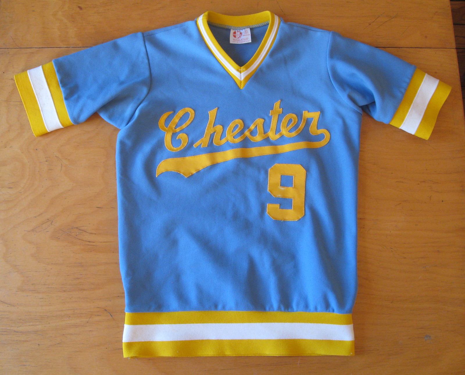
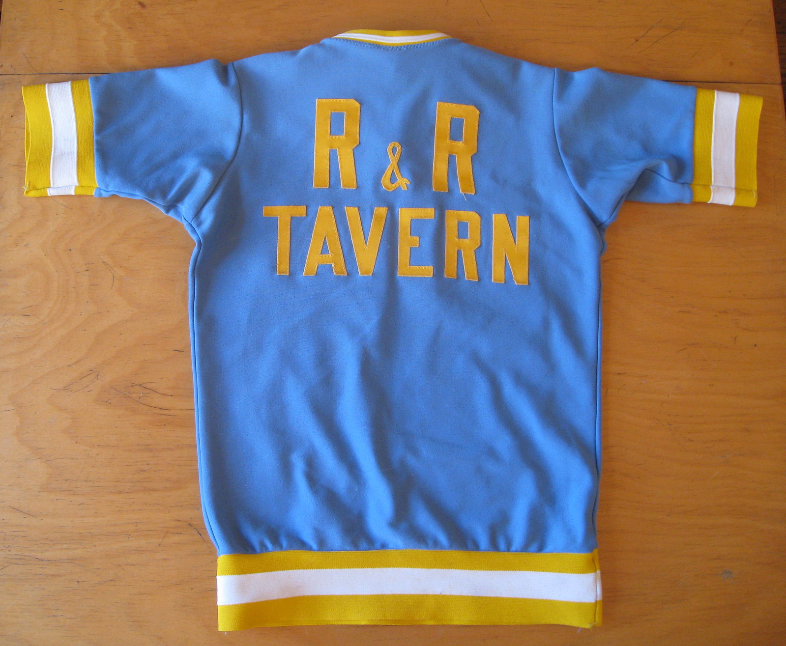
I was poking around on eBay recently and got very excited when I saw a listing for the vintage jersey shown above. Great color combo, gorgeous script on the front (the “C” reminds me of the old Cott Soda logo), excellent sponsorship lettering on the back (love that little ampersand), and a rare design detail (which I’ll get to in a sec). What’s not to love? Well, maybe the fabric — 100% nylon, which is kind of miserable — but I was still eager to add this beauty to the Uni Watch wardrobe.
The seller didn’t list the measurements, so I contacted him and was very disappointed to learn that the jersey was too small for me — dammit! Normally I’d just move on, but in this case I was so bummed that I called over to the New Girl and said, “Look at this great jersey I can’t get ’cause it’s too small.” She took one look and said, “Shit, I’d wear that. Will it fit me?”
We quickly figured out that it was just right for her, so she scored it for a mere $12. Looks great on her, too — I wish I could wear it myself, but getting to see her wear it is the next best thing:
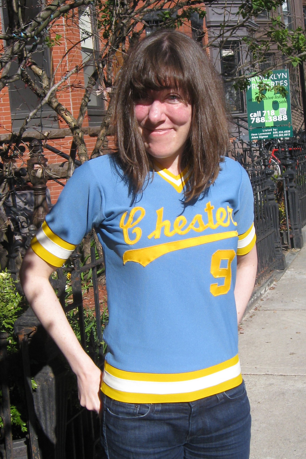
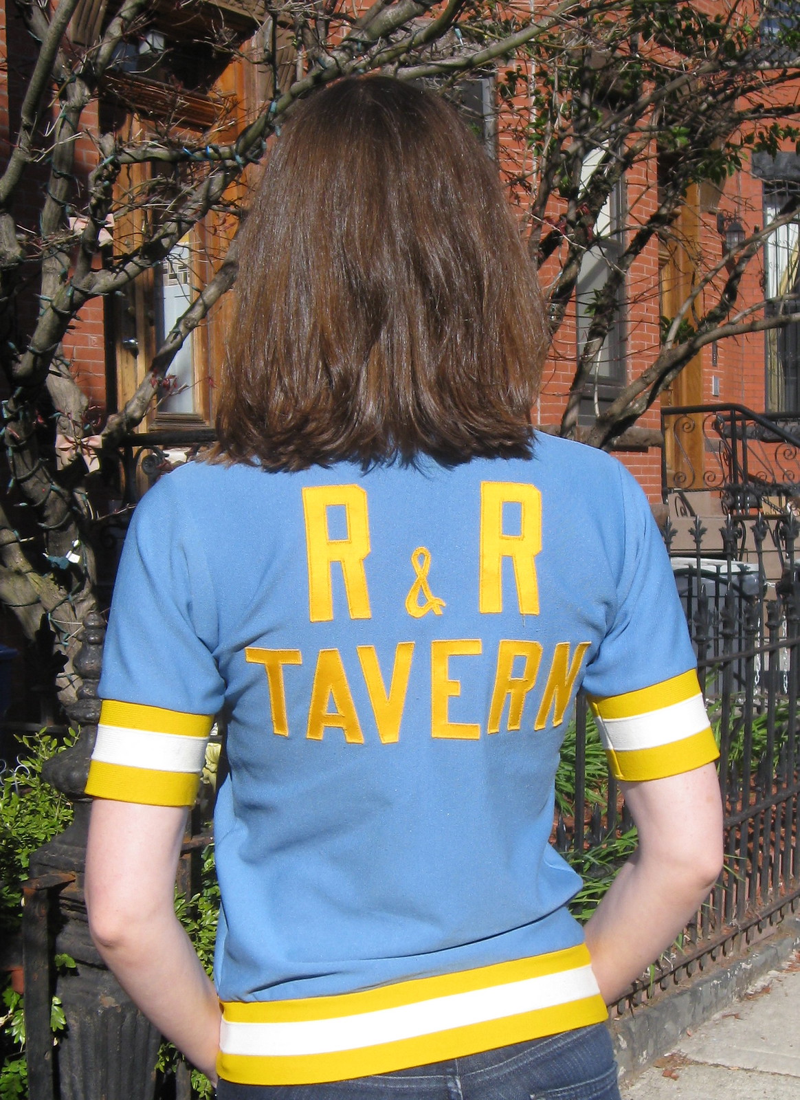
The jersey was manufactured by an Ohio company called Betlin. And the unusual design detail, of course, is the triple-stripe waistband — this jersey was designed to be worn untucked! The waistband mimicked (and removed the need for) the striped waistband on sansabelt pants. I’ve seen this feature before, but only a couple of times — it apparently never caught on.
I asked sporting goods maven Terry Proctor about the manufacturer and the jersey style. He responded:
We sold the Betlin line at Ruby’s [the Rochester sporting goods shop where Terry worked]. The company was named after the owners’ wives, Betty and Linda — Betlin. They were strictly a cut-and-sew operation. They purchased all of their fabric and trim from Yarrington Mills of Hatboro, Pennsylvania. Initially they offered no lettering service, which was fine with us because Rochester was blessed with several screen-printers and twill/embroidery operations. Betlin made the Chicago Hustle WBL uniforms for league sex symbol Janie Fincher. The Hustle uniforms were lettered by the dealer in Chicago.
As to the jersey in question, it’s a softball jersey from the same period as the Marquette “untucked” look. The reasoning was that girls’ jerseys often became untucked, girls didn’t like belts, and a lot of pull-on softball pants and all shorts had just an elastic gym-short narrow waistband with no drawstring. The jersey was made as a convenience feature to present a “neater” look. The style really never caught on in our area but I can’t speak for other regions.
As for the jersey’s backstory, I Googled “Chester R&R Tavern” but came up empty. There are several U.S. states that have towns named Chester, so it’s hard to narrow this one down. If anyone knows more, I’m all ears.
About a week after spotting the Chester jersey, I came across another good-looking jersey on eBay — and this one fits me:
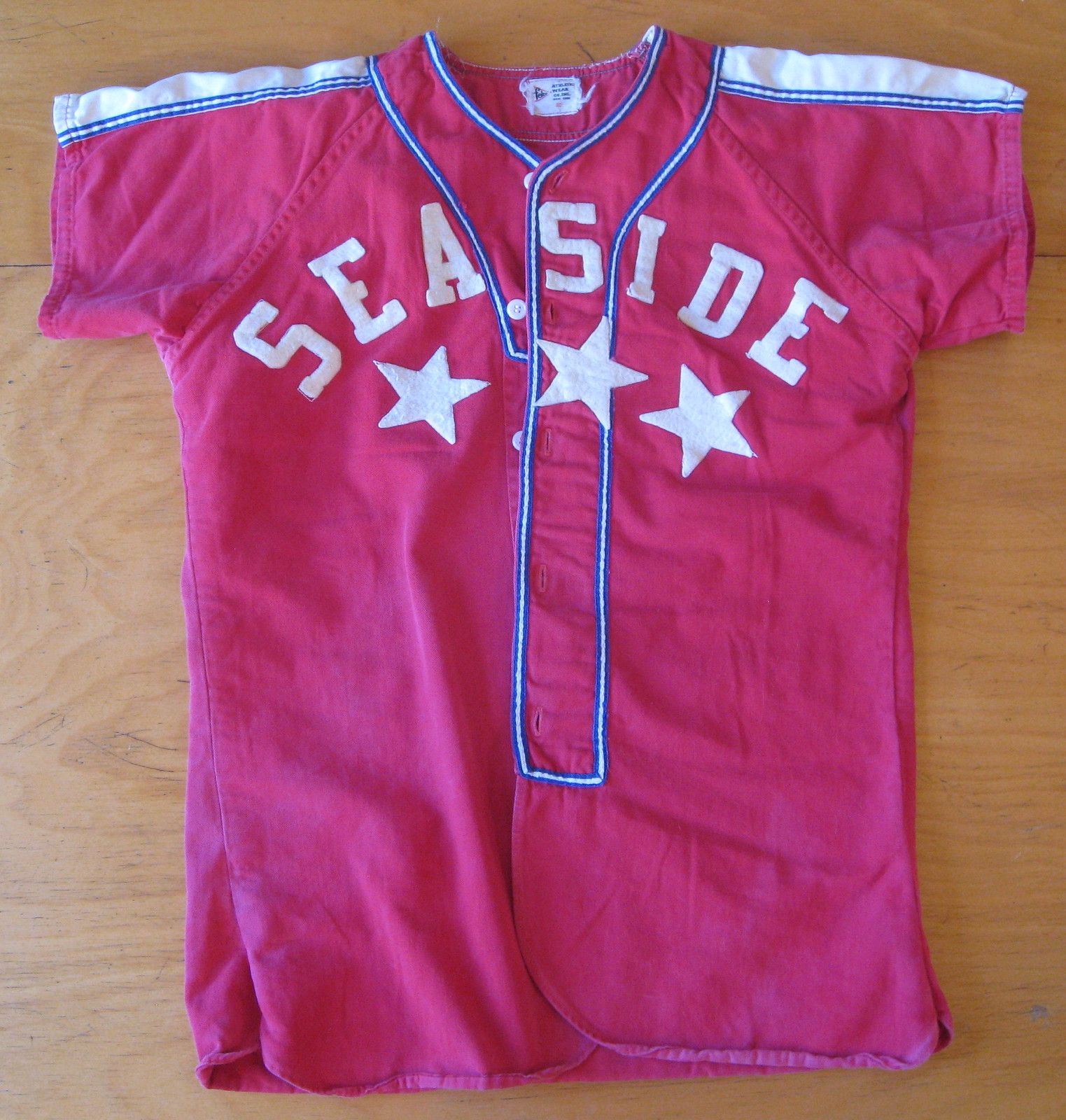
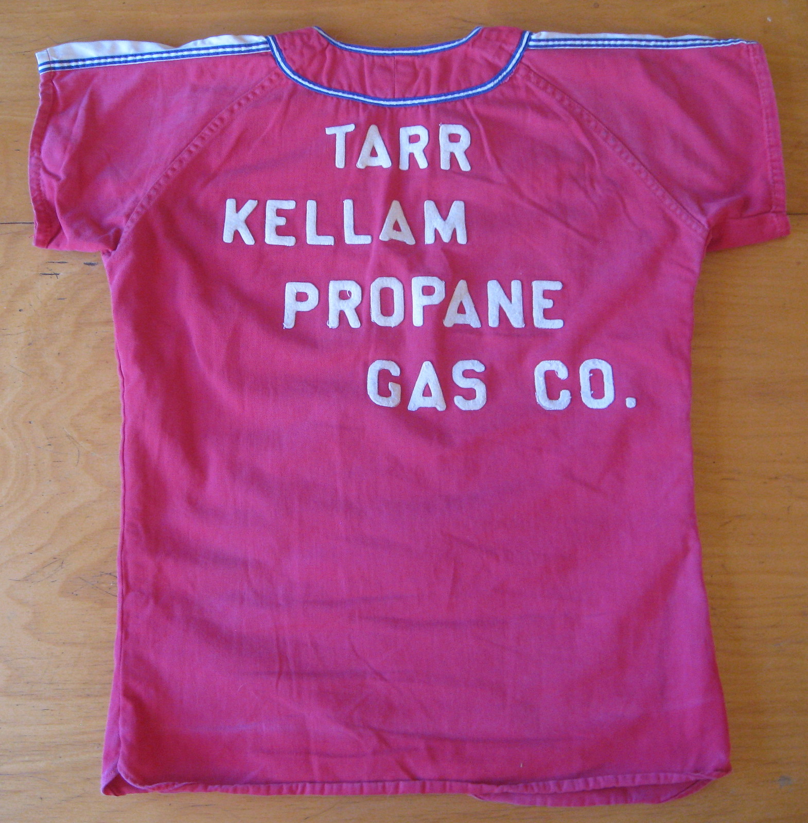
Nice, right? Got it for $50, which is a little more than I usually like to spend but I thought it was worth it in this case. The fabric is cotton twill (an underrated jersey fabric — lighter than wool flannel, more rugged and organic-feeling than Durene) and the lettering and graphics are white felt. Nice Felco tagging, too. The one odd thing is that the buttonholes aren’t centered on the placket — they’re flush against one edge of the piping:
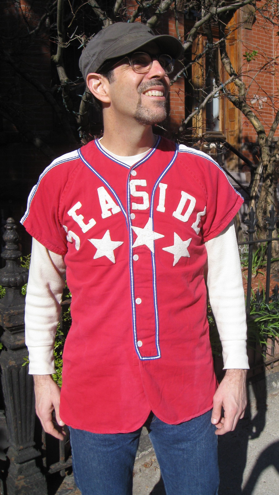
The buttonhole positioning is definitely a flaw, but I find it sort of charming. Same goes for the riotously off-center lettering on the back:
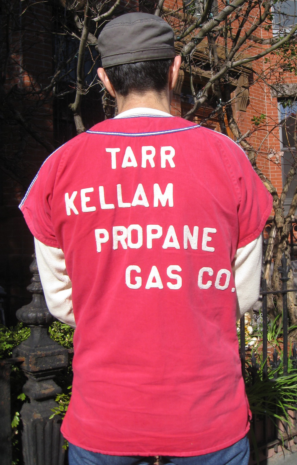
Naturally, I Googled “Tarr Kellam Propane Gas” but didn’t come up with any leads that would tell me more about the jersey’s history. If anyone knows more, please speak up. Thanks. (Update: Reader Ron Ruelle pointed out something I hadn’t thought of, namely that “Tarr” might be the player’s NOB, which means the company name would simply be “Kellam Propane Gas Co.” Once you start Googling that, without the “Tarr,” you quickly hit paydirt. Thanks, Ron!)
One final note: A few of you have asked why the headlines for these posts about vintage jersey finds all start with “Closet Case.” It’s meant to be a twofold play on words (neither very good, admittedly): (1) These uniforms live in my closet, and (2) people often say, “You write about uniforms? You must be gay!” or “You must be a closet case!,” so I’m acknowledging and making fun of that.

PermaRec update: Research into the story behing an 80-year-old snapshot (shown at right) has led to a reunion of two childhood friends. Details in the latest installment of Permanent Record.

Baseball News: Check this out: Mickey Mantle on his high school basketball team (from Jonathan Daniel). … Latest team to go with Star Wars unis: the Brooklyn Cyclones. … Here’s a fascinating interactive map showing MLB rooting interests across America. Spend some time with this one — you won’t regret it (from Dave Rakowski). … Love this Replacements gig poster patterned after the Twins’ logo — complete with an in-joke (big thanks to David Teigland). … Brady Phelps has found some photos of old Padres-themed vehicles. First there’s this pinstriped van, and then scroll down a bit on this next link to see two great Swinging Friar-era vehicles. ”¦ Holy moly, look at all the stuff inscribed on this Korean player’s batting helmet and this other Korean player’s cap! ”¦ Ugh, seriously hideous uniforms for Chesapeake High School in Ohio (from Brice Wallace). ”¦ That Wrigley Field-shaped cake ended up in a Dumpster. ”¦ Just what the world’s been waiting for: Fresh Prince of Bel Air-themed jerseys. … Another team with a teuila “sunset” design: Bryan Station High School in Kentucky (from Josh Claywell). … Spider-Man jerseys on tap for the Asheville Tourists. … What do you get when you combine Oregon State with breast cancer awareness? Pink beavers, of course (thanks, Phil). … Apparently several Baltimore-area breweries use Orioles-themed colors and marketing pitches (from Alan Borock). … Our national fetish for “intimidating” mascots has reached its logical nadir: a snarling canary. Kill me now (Phil again). … Matt Shepardson attended the Wrigley Field centennial game on Wednesday and provided photos of the throwback-attired groundskeepers and the actors in period clothing who roamed through the crowd. … Jamie Uthe was at Wrigley on Tuesday as well. Here are his excellent photos. ”¦ Yet another crazy minor league theme promotion: Zombie Apocalypse Night. Fun idea, but I’m calling bullshit unless the concession stands are selling human brains. … You’ll rarely see a more perfect expression of 1970s baseball aesthetics than this video clip from Alan Kreit’s high school baseball team. “I’m not in the video myself, but check out the awesome baby blues,” says Alan. ”¦ In a related item, Kent State is wearing some solid-gold uniforms that wouldn’t look too out of place in Alan’s high school video (from Nick Shook). ”¦ Here’s a rare sight: a catcher wearing glasses. That’s Kazuya Furuta, a Japanese player (duh) from 1995. Also, note the “Mecha” lettering on baserunner Takahiro Saeki’s helmet brim. Jeremy Brahm explains: “Saeki came into Japanese baseball as the movie Godzilla vs. Mecha-Godzilla came out. With Hideki Matsui already being called Godzilla, he said ‘I go as Mecha-Godzilla.'” So that’s a new kind of nickNOB: nickname on brim. ”¦ A member of a vintage base ball team started a MetaFilter thread about trying to find some heavy-duty wool for the team’s pants. If anyone can help, feel free to join that thread (from Jesse Thorn). … More pine tar antics? Cardinals starter Lance Lynn apparently had a dark spot on his cap during yesterday’s game against the Mets, but the Mets weren’t concerned about it. I watched that game and didn’t notice anything myself.

NFL News: Following up on an item from yesterday’s Ticker, I wrote a short ESPN piece about Rams exec Kevin Demoff hinting at new uniforms. ”¦ The Jags have become the first NFL team, at least that I’m aware of, to tweet a SpeedFlex photo (thanks, Ek). … Not sure what I like most about this old youth football photo: the great uniforms or the mom mowing the lawn in the background. “The guy wearing No. 75 is Chris Renaldo, who played at Maryland with Boomer Esiason and had a cup of coffee with the Lions,” says Andy Hyman. … New uni number assignments for the Broncos (from Ryan Hess). ”¦ A Chicago-area rollerderby team appears to have poached its logo from the Titans (from Sara Schieve). ”¦ As we’ve all learned by now, the handbooks and rules for NFL cheerleaders would be hilarious if not for the fact that, you know, actual living human beings are expected to read and abide by them. The latest news on that front: The Bills tell their cheerleaders how they should be using their tampons. Well, I’m sure Donny Trump will solve that problem simply by firing any menstruating cheerleaders once he buys the team. ”¦ Check out this 1984 Bengals helmet phone. The facemask looks a bit off, no? (From Jay Abbott.)

Hockey News: Whoa, look at this completely awesome 1956 Edmonton Flyers jersey. Click on the thumbnail to see a full-size view in all its glory. Interesting to see a team using a front jersey number in that era, no? (Big thanks to Bruce Menard.) ”¦ Those who’ve been following the Ducks and Stars in the Stanley Cup Playoffs are likely familiar with the presence of this furry duo at the American Airlines Center, but you might not have seen the custom NOB on his Cody Eakin jersey (from Callum Johnson).

NBA News: NBA commish Adam Silver says ads on uniforms are “inevitable,” which is the same thing he’s been saying for several years now. I assume at some point he’ll start putting everyone else’s money where his mouth is, and it’s definitely important for us to stay vigilant, but for now he’s just a broken record. #NoUniAds.

Soccer News: 1914 throwbacks for Burnley. “They’ll wear it in their final home game this season, to commemorate their 1914 FA Cup victory over Liverpool at the Crystal Palace,” says Jonathon Binet. “The club had to receive permission from Buckingham Palace to wear the royal crest used in the 1914 kit.” ”¦ “Indianapolis has created a recreational soccer league by creating logos and teams for the city’s major neighborhoods,” reports Tom Adler. “The teams will even have sponsors.” ”¦ Why did FC Dallas wear its road kit at home the other day? Blame Adidas (thanks, Phil). ”¦ “Brighton & Hove Albion’s 15-year partnership with Italian kit manufacturer Erreà comes to an end this season, with the Seagulls poised to switch to Nike,” says Callum Johnson. “The program for their match against Blackpool on Monday was dedicated to their history with Erreà and featured a kit retrospective.”

Grab Bag: “The Super Rugby team Western Force, from Perth, Australia, have taken a different approach to sponsorship this year,” says Josh Jacobs. “Usually the teams get one major sponsor for the front the of the uniform, but the Force have several different sponsors. More photos here. And in other Super Rugby news, the Brumbies have a special jersey for Anzac Day.” ”¦ New rugby uniform for South Africa (thanks, Phil). ”¦ Here’s a piece on the evolution of the Aston Martin logo (thanks, Brinke). ”¦ Also from Brinke: a new (to me) site about logo design.
PL-The link to the Janie Fincher photo does not work.
Thanks — now fixed. Here’s the proper link:
link
The Wrigley cake in a dumpster. Very “Wilponian”. As a Mets fan, I can relate.
I bet very little of it was actually edible. Enough for a ceremonial slice or two perhaps??
I know some show ckaes are quite edible. Just wondering if this one was more “show” and less “go”.
According to the article, a good portion of the cake contained inedible components, and it was also not considered edible for sitting around exposed to where dirt and dust could get on it.
-Jet
As Jet mentioned, definitely more “show.” Even with being inedible either by design or by display, the plan (according to the released statements, anyway) was to keep the cake on display for some time longer. That said, this is not the first time this sort of thing has happened at Wrigley: link
If I actually believed in curses, I’d say this should add another fifty years to the Cubs’ woes.
What’s the point of a mostly inedible cake, anyway? That’s as bad as those decorative hand towels that you’re not supposed to use when you’re in someone else’s bathroom, or the old comic book that’s sealed in plastic to increase the value. C’mon, people…comics are meant to be read, towels are meant to be used and cakes are meant to be eaten!
Those Chesapeake uniforms are made by Boombah, link. I see them a lot in youth travel baseball. I own several pair of their shoes, which you can get in all variety of color combinations.
We use their bat bags for our boys. They hold up fairly well.
Shit. I read about uniforms every day. I must be really gay.
We all are! Get used to it!
And what’s wrong with that? As long as my wife and kids don’t mind…
Nice use of the vintage definition. We’re certainly all happy here.
Some of us are queer too.
…And enjoy singing, too:)
Blame Adidas? Perhaps. But Toronto FC could have held out for a lighter-colored change kit. Or even gone with an actual black kit.
Yes, the shoe/apparel companies put out some bad stuff, but some teams (say, Alabama football) resist the pressure to wear it.
Right. Adidas isn’t at fault, but there is also no reason that they couldn’t have played red vs dark grey.
I’m still unclear about how this happened – did the league/officials make the call that gray and red weren’t sufficiently contrasting.
Anyway, I’m not a huge fan of the away-kit-for-away-kit’s sake that’s also happened in the Premier League. Fulham’s worn its white/red away for no reason a couple of times, and Newcastle wore its Brazil aways against Manchester United for some reason. Then there seems to be an over-sensitivity to contrasts – Manchester City wears change kits against white-clad teams and red-clad teams change their kits when playing at Hull.
Shortly after I sent that article to Paul, another article (SBNation?) came out that was a bit more in depth.
Doing this from memory, but apparently when perspiration occurs (shockingly), the red kit (and gray one) become darker and when that happens, apparently the contrast between the two is not good. Hence, the situation on Saturday.
This fact was undoubtedly known (that players sweat) before the designs were submitted, but hey, wouldn’t want any potential uni-clashes to get in the way of a new kit, right?
One would hope that the two-year process for developing new uniforms would include testing for stuff like how sweat and light conditions affect the color, especially since Adidas outfits the entire league. Too much to ask for, I guess.
But then there are often matches where change kits should have been used but weren’t.
link.?w=630&h=420&q=75
Argh, that’s supposed to be the image shown here:
link
And this year’s Citeh vs Chelsea was a link, while last week’s Hull City vs Arsenal was link (link at Emirates earlier in the season).
Adidas is partly at fault for having very little in the way of design inspiration going on right now, but so are the teams. Let’s take my club, Sporting KC, as a prime offender:
Primary: Light blue, but with a dark blue left sleeve and panel under the left arm.
Last season, New England had to wear their white secondary jerseys at home because that’s the only thing the referee believed provided enough contrast with anything SKC owned.
Alternate: Dark blue with wide light blue stripes on the front. This is going to be a problem in certain situations.
Third: Solid black. Same problem, again.
I believe the home team should be able to wear whatever they want, within reason. It really disappoints me that my club has made that difficult because style (and the resulting merchandise sales) is driving the bus. I would laugh my ass off if a ref made SKC play a game wearing pinnies sometime.
There’s some bush league stuff in the lower divisions in England where the visiting team has to wear the home side’s alternates, like link, link.
Gotta love that San Diego Padres “Buzzi Buggy” with the helmet on top! It would have been the perfect car for Champ Kind.
link
I just had to do it, here’s Champ Kind behind the wheel of that amazing 70’s Padres car. Whammy!
link
The Replacements poster is very cool. The Hold Steady, a band from the twin cities, has done a variation on this link well. Cool all around.
Link is a bit off. Here’s a retry:
link
The Chicago area roller derby team also took inspiration from the city of Chicago flag (probably what they were actually going for, not the Tennessee Titans tribute).
Here’s a link to what the Chicago city flag looks like: link
It’s actually Atsuya Furuta (not Kazuya).
Pink beavers. Heh heh.
Love that Indy soccer project. I would love to see someone tackle that for other cities. I wish I had the time and software.
There was a Kellam Propane Gas Co. that was incorporated in Somerset County, Maryland. Now Kellam Energy Inc., they’ve moved down the Delmarva Peninsula to Belle Haven, Virginia. At least that’s what I can find via Google.
Also, the colors for the school in Chester, Montana, match that sky blue and yellow exactly….
The best thing about the Brighton & Hove Albion’s uniform retrospective is that about half of them feature Fat Boy Slim’s Skint Records as the shirt sponsor. Their sponsor now is American Express, which I assume is a local indie band or a DJ collective.
Also, the Burnley’s 1914 throwback features a URL of a company that makes fancy kitchen appliances.
Fatboy Slim (Norman Cook) has remained a part of the Brighton football scene even after Brighton switched sponsors.
He was the first person to hold a concert at the Amex:
link
Here is Fatboy Slim with a “Mr Cook” Brighton shirt
link
Any gal that starts her sentences with an expletive is OK in my book!
Thumbs up on the eBay score. Both are excellent and are good fits for each of you.
Headline on ESPN.com: “Warriors seek name-change input”
link
I read that & initially assumed they were ditching the “Warriors” nickname because of its ties to the Native American iconography they used some 50 years ago (as the Philadelphia Warriors, from ’51 to -62, and the San Francisco Warriors until ’69), but it turns out they’re looking to bring back the “San Francisco” (abandoned after the ’70-’71 season) part of it when they move into a new arena in 4+ years
The facemask on that Bengals helmet phone looks a little like the one worn by a Philadelphia Eagles player in Super Bowl XV. His name escapes me.
Anyone see that deadspin article of the Wrigley Field cake in the dumpster?
holy cow, sorry guys. I didnt read above.
My bad
Picking up from a conversation with Mark in Shiga from a couple of days ago, I was surprised to learn his ancestors (possibly) dropped the “van” from their last name when the British took control of New Amsterdam.
NYC is full of references to influential Dutch people – Hoyt-Schermerhorn, Stuyvesant, Knickerbocker, and more relevantly, Vanderbilt and Van Cortlandt.
Maybe the really wealthy Dutch folks felt confident in keeping their “van” prefix while most people felt the need to assimilate to the new colonists?
And for what it’s worth, the Roosevelts were originally Van Rosevelts in the Old World.
I can see where there might be some social pressure to change a surname but not location name. It’s the difference between “See all the charming place names the old people gave this city” and “Hey, aren’t you the people we took it from?
Sure, though all six of the aforementioned families remained prominent in New York society without changing their last names (though “Van Der Bilt” became “Vanderbilt”). Two Van Cortlandts were mayors, in fact.
Some of the place names got Anglicized beyond recognition. My favorite is probably Gramercy, which looks British (or maybe French) but is in fact an English mangling of the very Dutch krom moerasje, which means “crooked swamp”.
Other times, thanks to the similarity of English and Dutch, the meaning stays intact even if the spelling and pronunciation get tweaked. You can probably translate Breukelen (“broken land”) and Vlacht Bos yourself.
And Terriblehuman, post your e-mail here if you don’t mind. I have some New Amsterdam history to ask you about.
Sure, Mark – shorty two four seven (without spaces, in numerals, not spelled out)-at-yahoo-dot-com.
I actually had to Google Vlacht Bos. Zandt Hoek is a new one for me too. The most interesting one is “Dutch Kills”, which combines an English descriptor with the Dutch for “little stream”.
I’ve read/watched some stuff on New Amsterdam before, one thing that has always stuck out to me was the fact that when the British took over they didn’t want to interrupt the thriving Dutch businesses so they kept a lot of the liberal Dutch rules in place. This was very different from almost every other area in the colonies which instituted strict British law, no matter who was living there.
I have link on my wishlist, may purchase it sooner rather than later.
The mom mowing the lawn in the background.
I remember seeing those lawnmowers on old family projector movies. Classic
The “C” on the Chester jersey is a dead ringer for the “C” on the Chicago White Sox caps, circa 1990.
As modeled by HOFer Frank Thomas: link
Ah, good point!
I don’t know why but the picture of Paul reminds me of an old Soviet propaganda poster. No, I’m not saying he’s a communist I guess its just the pose (or the hat). Still a sweet jersey.
“I’m not saying he’s a communist I guess its just the pose (or the hat).”
~~~
Hah! I almost spit coffee on my keyboard…
almost…
Yes! The photoshop is exactly what I was thinking. Forward Comrades! All in good fun.
The fact that the jersey Paul’s wearing is red and has stars on it definitely helps evoke link.
Those link look like the work of link, although I can’t see if they have the excellent Federal League patch.
The groundskeeper jackets seem to be existing Ebbets Field jackets.
link
D’oh! That’s exactly what you were saying. Sorry for echoing what you already said.
Love the vintage baseball jerseys – keep then coming!
I love the photo of the pee wee backyard football crew!
Great colors, great subjects! Looks like a few Giants and Jets colors there, wonder if it was taken in the greater NY area?
As a Padres fan living in NY (back when they wore their CORRECT colors), I never knew about those awesome vehicles nor the contests to win them. HAD I known, I would have entered, and had I won, I would have flown to San Diego and driven the vehicle cross-country back to New York. THAT’S how indescribably awesome those automobiles are. Damn….
-Jet
That Bengals helmet pic is from last night’s “caught in the draft” episode about the 1984 draft. All the other helmets used era appropriate facemask in their mock up of the Draft room, but for some reason they used a modern mask on the bengals helmet…. and it appears to be a youth size mask on a full size helmet, and it looks to be a mask that belongs on one of the newer (safer but uglier) helmets.
Interesting infographic on the baseball rooting interests. I once had a conversation with the mayor of State College, Pennsylvania, which is heavily Pirates. He had been a newspaper editor in his previous life, and somehow we started talking about baseball and how just a bit to the north and east of State College, the allegiances quickly changed to Phillies. He explained that it had to do with the end of the wire service feeds from Pittsburgh and Philly. The Pittsburgh “service area” and feed ended in Altoona/State College, while the Philadelphia feeds ended in Lewistown and Lock Haven. Now you may need to look up theses places on the map, but it matches this map perfectly, and gives reasoning to what seems an abrupt shift. Living here, I can tell you that the shift still exists.
Scoured over that map for some time yesterday, by far my favorite “sub-map” is the break down of Mets/Phillies fans by their usage of hero or hoagie to describe a sub. Fantastic.
The other anomaly I thought interesting was that both the Mets and Athletics are completely overshadowed by their more established/successful neighbors, but the Angels have managed to carve out a sizable market in the shadow of the Dodgers.
I know Artie Moreno has been pumping tons of money into the team but that can’t explain all of it. Any SoCal UWers want to take a stab at a logical explanation for the Angels success in spite of their neighbors?
It should be noted that until about 10-15 years ago, the A’s were the more popular team in the Bay Area over the Giants. (Long-term speaking, the A’s have been the more successful team on the field.) The A’s are still popular over there, just being stuck in a dump of a stadium. Of course, there is link if the Giants allow the A’s to play at Candlestick Park (which isn’t being torn down right away) on a temporary basis.
It would really be fascinating if it were possible to track this over decades. I’d guess that the A’s had a noticeable footprint 40 years ago. Maybe the Mets too for that matter.
Back around 1990 the Denver Post ran a poll to see which MLB team the locals would want to have receive the equivalent of local coverage. It was split several ways, but the Cards pulled it out. That could have simply been due to editorial bias.
Long-term results would yield interesting results.
Just look at my neck of the woods, Pittsburgh, for instance. The Steelers dominated the NFL in the 1970s, yet the Pirates were still the number one team in the city. The Penguins were around, but didn’t even register a dent into the local sports scene link and came close to folding outright twice in less than ten years before, plus an aborted attempt to move the team to Seattle. Heck, there was a time when the link were more popular than the Pens.
Then things changed by the mid-80s. The Steelers remained popular but most of the 70s-era stars had retired. Hockey started becoming relevant in 1984. The Spirit folded (and eventually the rest of the MISL). And the Pirates nearly relocated to Denver after link only six years after winning the World Series. After a resurgence in the late 1980s and early 1990s, we all know what happened next.
Now you look at the rankings: The Steelers are far and away the number one team in Pittsburgh. The Penguins are second. The Pirates have made the biggest drop without folding, dropping to third, though their recent success has started to help close the gap a bit. In a distant fourth? The Pittsburgh Power of the AFL. And I wonder where the Pittsburgh Riverhounds fall on this list.
Not too surprising about Denver – according to the NYT article I linked below, the KMOX signal reached Denver, and until the 1960s, Major League Baseball didn’t exist between the Mississippi River and California (I think).
Could the Dodgers-Angels split be created, at least in part, by the fact that the Dodgers only pre-date the Angels by a few years. The Dodgers didn’t start playing in LA until 1958 with the Angels joining MLB in 1961 (not to be confused with the PCL iteration) and moving to Anaheim in 1966. There’s only a 3-8 year lag time for the Angels, which is very small compared to the Mets and slightly longer than the A’s.
Recent success probably accounts for some of the differences as well. Anaheim won the World Series in 2002 while a whole generation of Dodger fans has been born since the last World Series victory in 1998. Indeed, after 1998 it took 20 years for the Dodgers to even win a postseason series. As we’ve seen in recent articles, success breeds fandom.
And the Cardinals have a huge fanbase in no small parts due to link.
Also, I’m sure WGN’s national reach helped the Cubs grow its fanbase in the last 30 years or so.
Bill Welch?
That’s really interesting how it broke down that way. Football-wise, I always got the feeling that I-81 was more or less the dividing line between Steelers on the west and Eagles on the east with increasing NY Giants fans in NEPA.
Of course Penn State is divided between Pittsburgh and Philly fans which makes for an interesting time during NHL playoffs and 2005 when both NFL teams were really good.
Newark Bears liquidation sale, Sat, Apr 25 (New York Times): link
Items include:
hot dog roller
visitors’ lockers
team bus
“Newark and Essex County will continue to pay the debt for the stadium until October 2029.”
So the numerous groups that have ran the Buffalo Jills regulate what tampons they can wear? Can’t be any worse than the numerous strip clubs that still make strippers dance on their periods by having them cut the string off the tampons so they’re not visible to their marks. (I know a few strippers outside the clubs, they’ve told me they have had to do this instead of being allowed to take a few days off each month.) But apparently, the Jills link
While the private area hygiene is the click-bait, the story is how the huge handbook affects their employment status. The Bills (and all other pro sports teams) argue that cheerleaders are mere independent contractors, the various demands and rules that extend to their private lives say otherwise.
At least strippers get to keep their tips once they’ve paid out a crapload to the support staff.
True, but strippers also don’t get paid an hourly wage. Which, IMO, they should get paid at least minimum wage in addition to making tips.
They should, of course (and the mandatory payouts should be outlawed). Professional sports and gentleman’s clubs are both exploitative, just in different ways.
It’s not just strip clubs that have to tip out at the end of the night. Many sit-down restaurants require their servers to tip out so that they could pay the hostesses, busboys, and foodrunners. Most restaurants pay their entire front-of-house staff the “server” minimum wage, which is often significantly less than state and federal minimum wage. The kitchen staff is often the only non-management staff at a restaurant that is paid at least minimum wage.
My guess is the Jills existence, and perhaps that of other teams’ cheerleaders, will rest on the outcome of the various lawsuits. As long as they could get some pretty girls on the cheap and make some money it was worthwhile, but if the cheerleaders win and the cost goes up, there’s a good chance several, if not all, of these groups get disbanded. Even though the teams can easily afford to pay a reasonable amount, these billionaires didn’t get rich spending money on things they considered unnecessary.
That’s what it looks like is going to happen, even though most if not all NFL teams can clearly afford to pay cheerleaders a lot more than what they are getting paid. Meh, at least my team doesn’t have cheerleaders. Since we got rid of ours, all we’ve done is win six Super Bowls.
Ah, a fellow Steelers fan. I’m glad to be without cheerleaders as well, and I could also do without Steely McBeam. One of the things I always liked was that the Steelers didn’t deal with that nonsense…they were a football team, plain and simple.
…and I could also do without Steely McBeam.
All TRUE Steeler fans can do without Steely McBeam.
Catchers wearing glasses – perhaps that’s a rare thing now, but back in the day? Hardly…
link
link
link
link
link
And of course Lenn Sakata, though that probably shouldn’t count.
Don’t forget Darrell…
link
from link
“Toronto’s away kit, released at the beginning of the season, is a dark grey. It functionally isn’t a contrast from their red kit, or Dallas’ red kit — or for that matter DC’s black home, Colorado’s burgundy or any other number of MLS solid, dark home shirts. TFC doesn’t have an alternate kit that provides a real contrast.”
Interesting. REAL soccer leagues get this right. 3 of the major EPL teams that come to mind (Arsenal, ManU, Liverpool) have red as their predominate color, and this isn’t an issue. US teams tend to want to stick with their team colors for both kits, instead of having a true “change” kit to offset other teams with the same color scheme. Arsenal has worn gold, purple, and sky blue in the past. Barça’s change kit has been neon yellow or orange.
But purple Yankees hats are available. I will now light myself on fire.
link
Also, purple doesn’t offset red, while Barça’s change kit is useless against teams wearing red, and Milan has a history of coming up with change kits that don’t resolve clashing. But you know, they don’t play in real leagues.
I’m late to Intern Mike’s QOTW, but one obvious answer – foreign soccer jerseys.
I have an Atl̩tico Paranaense shirt that was a gift from a Brazilian friend and a link, just because I like the yellow/blue scheme and the players on the team. Right now, I have my eye on the current link Рgreen shirts are relatively rare in soccer and I like the pattern.
My guess is Chester, PA is the origin of New Girl’s ebay score. It’s located between Philly and Wilmington, both of which have blue and yellow color schemes in their flags and is an area that was originally heavily populated by yellow and blue lovin’ Swedes.
A few notes:
1) This blog is my No. 1 read every day. (How am I doing on the suck-up meter?)
2) Rams going back to blue and white? YES!!!….As long as they wear whites at home and use the blue jersey as an alternate, or when they’re playing the Cowboys in JerryWorld. IMO, one of the best all-time classic NFL unis.
3) The 1978 baseball film is priceless. I remember the cheesy jerseys from that era and still have one from my own high school. Why cheesy? Cuz in our case, they took a basic double knit, blue pinstriped pullover and silk screened the school name and number in red. The numbers were basic block font, but for the wordmark on the front, they used that hideous Brush Script font and then compounded it by making it too small to read at any distance. It was like they didn’t want anyone to find out who we were. Which, given our talent level that season, might not have been a bad idea. In short, I have one, but it lives in the guest-room closet.
The New Girl’s jersey reminds me of Clemson’s baseball uniforms from the early ’80s. A few months ago somebody was describing their uniform pants on these very pages.
link
Manchester United just posted this pic to their Twitter feed. Nothing really uni-noteworthy, but it did remind me of a question I was hoping to pose to our friends in Europe:
What’s with the coaches’ initials on their pants/jackets? I’ve seen that pretty regularly now, and it makes no sense to me. You’d think players and most local fans (not necessarily the diehards) would be able to identify their team’s coaches/manager. They certainly can’t have that much difficulty keeping their laundry separate, can they?
*I’m not in Europe
At least at English clubs, the kit man (or kit lady, in some cases) is responsible for doing the team’s laundry, and that includes practice gear and warmup jackets for the bench staff. Numbers for players and initials for coaches and physios make it easier for the kit man/lady to have the gear ready for training and matches.
Of course, they could just as easily have their moms write their names on the inside tag with Sharpies, but it’s probably more tradition than anything.
“I’m calling bullshit unless the concession stands are selling human brains.”
Every now & again, I’ll read a sentence & think to myself, “In all of human history, this may be the first time that anyone put those words in that order before.”
This has been one of those moments.
I like those moments.
Some number changes for the Atlanta Falcons:
link
Don’t they have Facebook in Canada?
(From the last outpost flying the Tricolous in CT.)
I’m not sure how I feel about the Jills and other cheerleading squads. Of course my first reaction to all of the rules – from dictating how a woman should act even when she’s off the clock to having the absolute audacity to tell someone what feminine hygiene products she should use and how – is to mortified and kind of pissed off. I can’t imagine why somebody would think those rules are acceptable, or why any self-respecting woman would submit to them.
And that’s where it gets complicated for me. I’m assuming that the rules were in place BEFORE any of the women in the lawsuit were hired as Jills. I’m also assuming that the women were made aware of the rules BEFORE they consented to being part of the squad. If those assumptions are correct, I have a problem with them turning around and filing suit against the team. If they had objections to what they were signing up for – and I certainly understand why they would – then perhaps they shouldn’t have signed up for it.
That said, I’m not surprised that they filed the suit. I’m only surprised that it took this long for somebody to do it.
Late to this site today, but on that featured jersey starting things off, I believe Clemson University used to wear that style of jersey. The longtime Tigers coach Bill Wilhelm was somewhat known for that style of jersey along with super long baseball pants that came right to the shoe. They basically looked OK, except when an outfielder would reach up to snag a fly, and it would appear his waistband would rise up but his pants wouldn’t.
Im not sure if I should applaud or vomit in reaction to the Fresh Prince jerseys.The Tourists Spidey unis on the other hand get a massive thumbs up in a world saturated with novelty gag jerseys
Although ( dunno if someone else mentioned yet) the webbing is upside down
You know this is the same with everything in life.
You would think history teaches us anything, but alas.
Feel free to disagree but the world changes rapidly, and none of us have no control over it.
E.g., imagine Barack had any balls to put Vladimir to his place, but it seems like it’s not happening, welcome WW3.
Great post, thanks!
Sarah link