[Editor’s Note: Today we have a great DIY project from John Hixon. Enjoy. ”” PL]
By John Hixon
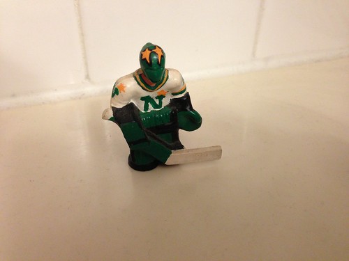
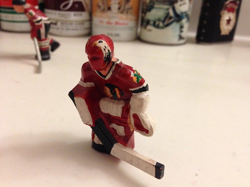
In the ’90s I lived in Chicago, and while I was there I lost my favorite hockey team, the Minnesota North Stars. I also had a table hockey game and did not care for the generic, painted-on red and blue uniforms the players came with. So I decided to do some painting.
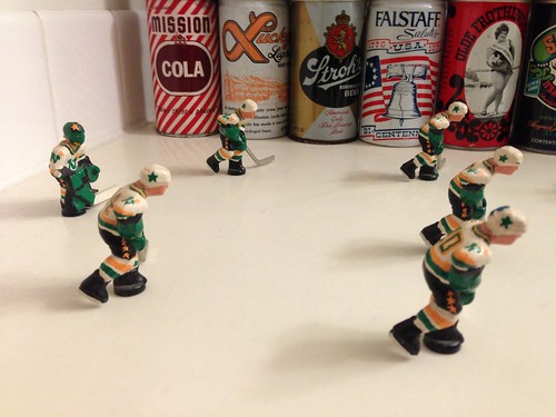
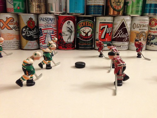
It was a challenge to paint such small detail, especially with no experience other than painting model cars. I made the game Blackhawks vs. North Stars, using then-current Blackhawks (Ed Belfour, Cam Russel, Chris Chelios, Steve Larmer, Jeremy Roenick, Joe Murphy) and what amounts to a Minnesota all-star team from over the years (Jon Casey, Mark Tinordi, Curt Giles, Dino Ciccarelli, Dave Gagner, Mike Modano). And although a professional could probably be constructively critical of the results, I was pretty happy with how it all came out.
The table and its rods eventually fell apart, but I still have all the players and they sit on a long countertop next to my bathroom sink with some old beer and soda cans and a sign that sort of make a little rink area [for all of these, you can click to enlarge]:
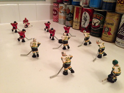
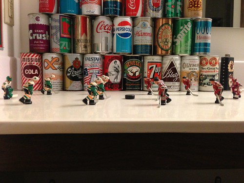
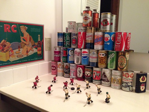
———
Great stuff. Big thanks to John for sharing these images with us.
Collector’s Corner
By Brinke Guthrie
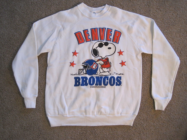
This Thursday, Feb. 13, will make 14 years since the last “Peanuts” strip ran, so we’ll honor that anniversary with two items: This terrific 1970s Snoopy “Joe Cool” Broncos sweatshirt and this California Golden Seals T-shirt. The mascot on that shirt, named Sparky, was drawn by Schulz (a Seals season ticket holder) and was also named after him — Schulz’s nickname was Sparky.
Here are the rest of this week’s vintage finds:
• Great 1970s Damac posters here. We’ve got the Saints, Niners, and Iggles.
• Reader Brad Eck found this pin on Amazon. Man, the NFL plus the Masons — that’s quite a mix!
• As we know, the Red Sox have updated their road jersey. Hopefully, this design will never take the field at home or on the road. (With thanks to reader Stephen Rains.)
• Take a look at this 1960s L.A. Rams bobblehead from Japan. It supposedly depicts Bob Reinhard, who didn’t seem to have have a huge career in the league, but by golly he had himself a bobble!
• You know, this little Expos mini-helmet even bugged me way back when. I thought, “Why is the Expos’ helmet solid blue? That’s not what the hats look like!” (And of course, I had no idea what their logo stood for.)
• This 1970s St. Louis Cardinals long-sleeved baseball shirt looks to be in good shape.
• Remember these? Slim Jim NFL trading cards from the 1970s! Whenever we made the spring break trip down to Florida, our Ford LTD wagon was always packed with Slim Jims.
Seen something on eBay or Etsy that you think would make good Collector’s Corner fodder? Send your submissions here.
Uni design contest reminder: In case you missed it on Sunday, Phil announced a new baseball uni design contest — and this one is for uniforms that will actually get worn on the field, not just featured in an article. Get the full scoop here.
Tick-Tock: Today’s Ticker was compiled and written by Garrett McGrath.

Baseball News: According to the Twitter account of Dave St. Peter — the President of Baseball Operations for the Minnesota Twins — the team is getting rid of the home blue alternate but keeping the away version for the 2014 season (from Luke H.). …Take a look at the logo the Phillies will be using for their ballpark’s tenth anniversary. ”¦ New softball helmets for Marshall (thanks, Phil).

NFL News: Sports Illustrated ran this interesting version of the NFL logo in their article about the league’s marijuana policy (from Coleman Mullins). … At a local Goodwill Douglas Ford spotted this homemade Rams helmet. … Do you speak Harbaugh? If not, here is a guide to the 49ers coach’s way with the English language (thanks, Brinke).

Basketball News: The signage at the newly named Smoothie King Center will include this three-story-high cup. ”¦ The arena is not the only Pelicans-related thing getting a facelift, as Pierre — the team’s mascot — is having reconstructive surgery for a broken beak suffered during a game with other mascots. This is all in attempt to make him less scary-looking. … According to some website on the internet, here are the top 25 college basketball uniforms ever (from Chris Mahr).
Olympics News: The Olympic curling teams from Norway and Russia wear some great pants. … The Guardian suggests that the figure skating trend of wearing tights over skates is for competitive advantage (from David Pealing). … “The Olympic Japanese ski jumper’s flag decal looks like it was applied by a five year old,” Chris Perrenot says. “Step up your game, Japan.” … Oli Jokinen, a hockey player from the Winnipeg Jets, was spotted wearing his native Finnish colors in Sochi but paired it with a counterfeit Miami Marlins cap (from Daren Landers).

Grab Bag: The New Chevrolet Manchester United kits have been leaked. … Lance Smith sent in this cool article on people and their backyard hockey rinks in Minnesota.
As I said on twitter already – I will get this out of the way now, the Phils CBP anniversary logo is correct in saying 2004-2013. 2014 will be the 11th season, so that would not be correct. The whole deal is that the team is going to have a fan vote for the 10 best moments at the park in the first 10 years, and then throughout this season players involved in those 10 plays will make visits to the park, etc.
If it says 2004-2013, it is a 10th Season patch and should have been worn last year. Since it will be worn next year, it is a 10th Anniversary patch and should say 2004-2014. Anything else is incorrect.
No, you’re incorrect. Like I said, the patch is correlating with a year-long look back at the first ten years of the park. Events from 2004-2013 are going to be part of the deal.
2004-2013 is correct. End of story.
Ok, I didn’t really understand what your point was. I just think it is silly to wear a 10th SEASON patch during the 11th season. They could have all the same events and call it a 10th ANNIVERSARY patch labeled 2004-2014…most teams do it that way now.
Oli Jokinen, a hockey player from the Winnipeg Jets, was spotted wearing his native Finnish colors in Sochi but paired it with a counterfeit Miami Marlins cap
How do we have any idea if that’s a counterfeit cap or just a fashion cap? They make the damn things in every color combination imaginable.
…and I fudged the italic tag. Ugh.
Also, bad link for yesterday’s uniform contest post.
The ‘counterfeit’ comment was mine. I just figured a fashion cap should be, you know, fashionable.
Silly me.
Uni contest for L&C league and Marshall softball helmet links are malformed
Nice work John. I paid someone on eBay $120 to customize by Chexx Bubble hockey guys to recreate the 1993 Adams Division Semifinals between the Buffalo Sabres (home whites) and the Boston Bruins (road blacks). The Sabres swept the Bruins 4-0 to advance in the playoffs for the first time in twelve years, as memorialized by this famous call by Sabres’ announcer Rick Jaenerrat.
link
Sadly, I never asked the gentleman who did the work to include the awesome ’93 Stanley Cup playoffs patch.
“As we know, the Red Sox have updated their road jersey. Hopefully, this design will never take the field at home or on the road. (With thanks to reader Stephen Rains.)”
DUDE!!
That’s the never-worn TATC jersey!
If I only had $249 to drop on it!
Possibly the best thing about the ManUre kit is that GM is paying for the privilege to promote a brand they no longer will sell in Western Europe by the time the shirts are available.
If you want to see more table hockey customizations of many different types, check out this forum:
link
Guthrie isn’t the first person that’s mentioned being baffled by the Expos’ logo as a kid. Am I the only one that had no problem immediately recognizing it as an M for Montreal?
The original Expos batting helmet was solid blue, though – I still have my replica blue helmet with a cloth patch.
You might be.
As a kid everyone I knew couldn’t figure out what that blob was on the front of their cap. It wasn’t until 1971 or 1972 when one of my friends figured out that the whole thing was a “M.” I thought it was an “EL”, then “EB” with the open area enclosed. But then, why was there a blue outline over nothing for a portion of the logo.
After he (Joe) told me it was an “M”, I spent days trying to see the M. It took me maybe a couple of weeks to see it.
If your wondering why I didn’t ask my dad about this, he had zero interest in sports, so I didn’t bother.
I always saw it as an “elb” and it never made any sense. It’s rather terrible as an “M”.
Yep, I always saw ‘elb’ as well. If it was two-toned, instead of that red that clearly forms an ‘e’, maybe it would have been more passable as an ‘M’.
I always saw it as ELB, but I believe it means Montreal Expos Baseball.
Yep. The Montreal M is a very fun design. One of my favorite caps in MLB history. But it’s not a very good design.
Aside from the ambiguity of the shapes and the suggestion of letters that may or may not be intended to be seen, one portion of the logo always seems to disappear into the background of the cap itself.
I too could see nothing but “elb”. There’s just no M there no matter how you look at it.
But I forgive the Expos, because Montreal is cool, their number font is extra cool, and their powder blue road uniforms were cool. Especially the lighter shade of blue that they had in the ’70s.
Mark,
I agree with the Expos a free pass on the M logo. Those caps were incredible. For most of 1969, I had seen nothing but black & white pics and our TV was b/w, so I had assumed the caps were red with the white front and a blue visor. Late in the season, I happened to see a game on a neighbor’s color TV and was blown away when I saw that the cap had blue back panels. Wow. Blue backs, red sides, white fronts and a blue visor with a psychedelic logo. Far out!!
Yep. “elb” it seemed to be for many moons. I was happy with myself when I figured out it was also an M. One of those pivotal uni-geek moments of the seventies.
I always saw “elb” also. I was really happy when they moved to DC mostly because it meant my hometown had a team again, but also because that mysterious “elb” was replaced by the beautiful – and legible – curly W.
link
I understand it takes a leap of faith to see the Expos’ blob as an “M”. I sussed it out by drawing the Mets’ “M”, drawing an outline around it, and then drawing another outline around that.
I actually always saw the Expos logo as an M made up of the smaller letters elb.
Another week, another supposed “new Manchester United jersey leak”.
I am pretty sure it is not a counterfeit hat but a legit fashion hat.
Interesting response from the Washington Redskins PR guy to the tax-exempt status piece on ESPN. I didn’t realize that “Oklahoma” means “Red People” in Choctaw.
link
IS it time to change the name of Oklahoma as well?
Nope.
Lee
The state should be called Sequoyah. Because history, because it’s better.
Anyway, that aside, since the name of the state isn’t going to change, here’s why it’s called Oklahoma (per Wikipedia, which has three different citations for what I’m quoting):
“The name Oklahoma comes from the Choctaw phrase okla humma, literally meaning red people. Choctaw Chief Allen Wright suggested the name in 1866 during treaty negotiations with the federal government regarding the use of Indian Territory, in which he envisioned an all-Indian state controlled by the United States Superintendent of Indian Affairs. Equivalent to the English word Indian, okla humma was a phrase in the Choctaw language used to describe the Native American race as a whole.”
The comparison “Redskins” to “Oklahoma” is false; the Oklahoma name is being used appropriately. It’s honoring the suggestion of Chief Wright.
Bonus points to the marketing team at Smoothie King Center for making the ducts a straw.
Why do college basketball teams get new uniforms every other season? IU seems like the only team to have the same unis. Alot of those teams in the college basketball slide should go back to those uniforms
In football you have OSU, Auburn, Alabama, FSU, UGA. there’s a core group of teams that keep their primary uniform
For the Twins retiring the navy home alternate, I’d say that’s addition by subtraction!
And boy, could the Twins stand to do even more of that sort of addition.
My daughters have always worn their skate tights over their boots for years for competitions (they have to wear two sets of tights in that case… one that goes into the boot and a thin one that goes over the boot. They do look better, considering skate boots tend to get scuffed up, plus having a cover over the boot reduces the risk of your skate blade getting caught up in the laces when doing a crossover.
I’m still calling it JELD-WEN:
link
I still call it Civic Stadium.
I still call it Multnomah Field
link
Those players are fantastic! Eddie the eagle’s mask looks like quite an undertaking. But the beer cans are interesting also. Hamm’s & Billy beer… but when is that iron city can from, and who is on it?
Agreed – what a great job John did making those players, and how lucky we all are that he’s held on to them to show us his work! Plus the can-display in the background: Also a treat to see.
I’m so glad to see all these uni-knowledgeable folks confused the Expos hat too. I didnt see an M until I was in my early 20’s.
My earlier comment didn’t go through. But the link I posted is for the work of photographer David Levinthal, whose images of small figurines came to mind when I saw the hockey players. What I didn’t know when I went looking for a link was that Levinthal had already done a baseball set! I love the Mays catch, the DiMaggio back swing, and Rollie Fingers follow through.
I’m impressed with the DIY table hockey, but as someone who had a fairly extensive beer can collection when I was a kid, I got a laugh out of seeing the Olde Frothingslosh can. The pale stale ale with the foam on the bottom!
Curling update:
I mentioned in the Saturday piece that an eight-ender was rare. This is especially true for curlers at this level – Everything has to go wrong to give up 8.
Great Britain dropped seven on the US earlier today (see the clip below). The focus of the clip is obviously on the US skip’s last rock rubbing the guard, but a lot must have gone wrong earlier in the end for the US skip to be forced to draw against six GB rocks at all.
link
Way late to the Broncos uniform history, but since the Snoopy sweatshirt was posted I’m going to ask a question about the Broncos and Mets – did the Mets use the same “red-orange” as the 1962-67 Broncos during the bad Joe Torre/Lee Mazzilli mid 70s to early 80s period? I recall seeing Cub-Met games where I thought the Mets had the exact same color scheme as the Cubs.
I don’t think so…Met blue has varied over the years…kind of purplish in 1969…more royal in the late 80s…”one pantone shade darker”* starting 1993…and a bright royal today. IMO, the orange has never varied much if at all.
* according to the 1993 yearbook
Met blue has varied over the years…kind of purplish in 1969…
I’m gonna pretend you didn’t just say that.
I said the p-word…but check this out.
link
I was speaking more to the orange – especially with the middle orange stripe on their shirt-sleeves on the two-button shirts during the Torre/Mazilli years. Could be that the orange was sewn over a larger blue band, and thus appeared to be a darker shade of orange.
I saw the Expos’ cap logo as a M right away. Then again, I grew up after the tri-color cap, meaning that the road jersey of the time had a Mets-ish capital M on the wordmark. That, and the fact that the logo was on blue and not white, helped me see the M more clearly.
Their logo was surely distinctive, but I’d call it a design failure. With a logo, you should be able to tell immediately what it stands for. With this one, 40+ years after it rolled out…a lot of people still don’t know.
I disagree…I know immediately it stands for the Expos and that’s all it needs to do. If some people can see bonus meanings in it, that’s gravy. It makes you think, like a good work of art.
Having not seen what you wrote 90 minutes prior to my own comment on this point, I fully agree with you.
“Design failure?” I’m going to respectfully disagree. Nothing wrong AT ALL with having a logo that has underlying layers.
Milwaukee Brewers’ ball-in-glove. Took me years to see M in the three fingers, and B with the thumb and palm.
Hartford Whalers. W, water spout out of the blowhole, make a H in the negative space.
The hidden arrow in FedEx.
Logo design doesn’t have to be an exercise in total instant-gratification disclosure ASAP. Sometimes, it’s better when it isn’t so.
Good examples…glad we agree…wonder if that type of graphic design has a formal name? It is surely more common today than in the past. The Expos logo may have been a forerunner of this, making it all the more admirable.
I was 20-something when I realized the Milwaukee ball-in-glove was an M. I am still a 20-something (soon to be 29), so it wasn’t that long ago.
Thought this group would appreciate this video a friend made about the R*dskins name and asking Snyder to change it. He is a lifelong fan and now works for second city. link
The Expos logo always pissed me off, literally.
Now that they are gone and I am that many years older I look at their retro pictures whether it be here or somewhere else and I still find myself studying what the fu** is that logo!!?
I’ve seen it in black and white on a cap before and the M is clear to see.
Literally? You had to run to the bathroom whenever you saw it?
oh yah, it was a scene man.
If there is any voting for the best uniform/costume in Sochi, I know there is a lot more to see, but my vote is link
Norwegian curlers have different pants for Wednesday, this time they’re of the knickerbocker variety, matched withdraws they look straight out of the Payne Stewart collection. The pants can be seen here.
link
With hats* stupid autocorrect