
For all images in today’s entry, you can click to enlarge
Sporting goods maven/historian Terry Proctor got me an early Christmas gift this year — a 1950-51 uniform catalog from Central States Basketball Headquarters, a now-defunct Indiana company I’d never heard of before. If I had seen this catalog on eBay, I probably wouldn’t have bid on it, because the interior pages are all in black-and-white and the cover uses one of those generic stock illustrations more typically found on high school game programs — pretty low-grade. But once I started flipping through the catalog, I spotted lots of interesting stuff. Let’s take a look, beginning with this page:
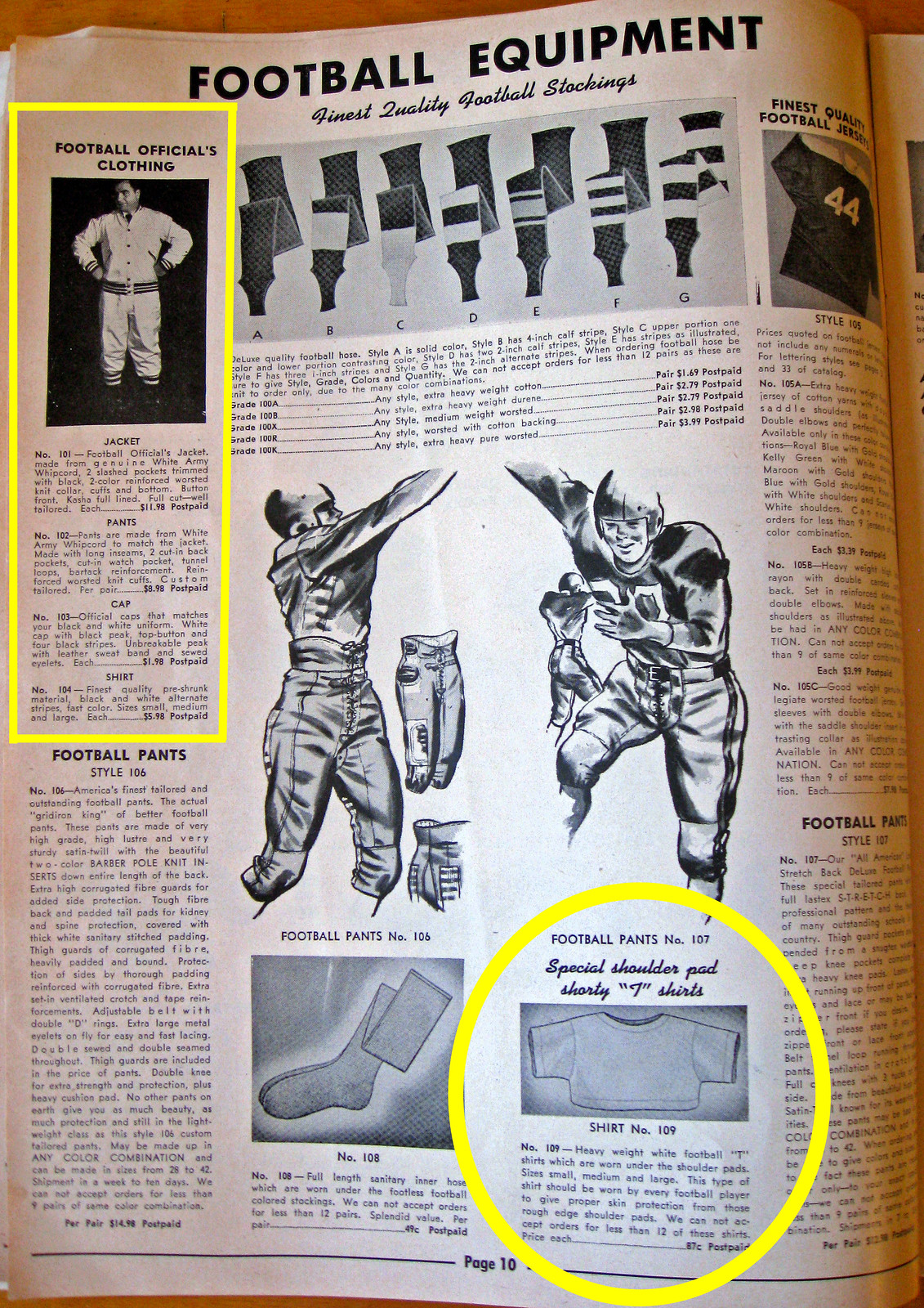
Love that football official’s jacket. If you look at the fine print, you can see that the accompanying shirt was zebra-striped, but what’s the point of wearing zebra stripes if nobody can see them? Meanwhile, down at the bottom of the page, I don’t think I’ve ever seen those “shorty” tees listed before — very cool!
This page has something else I’ve never seen before:
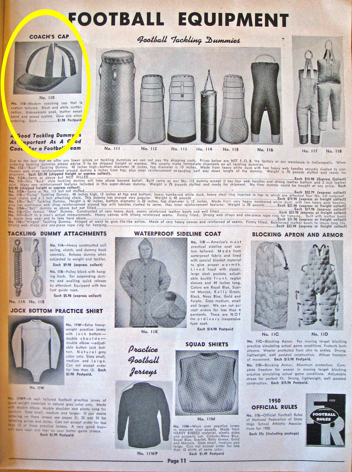
A coach’s cap? That’s a new one on me. I guess the idea was to make the coach easier to spot on the sidelines..? Also: Unbreakable peak!
I’ve written many times about my love of varsity jackets, but this catalog has several styles and templates that are new to me — see the ones I’ve circled here:

Several of those look like they’re highlighting the player’s lungs!
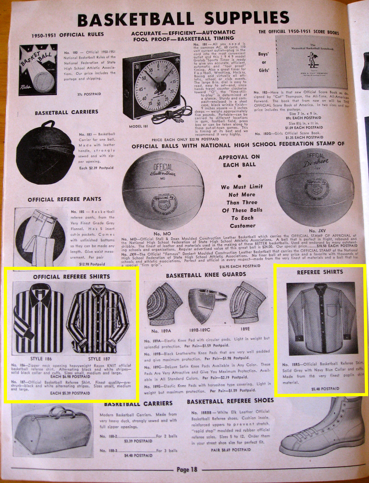
Moving on the world of basketball, it’s interesting to see that the catalog offered two completely different styles of referee jerseys, one of which is new to me:
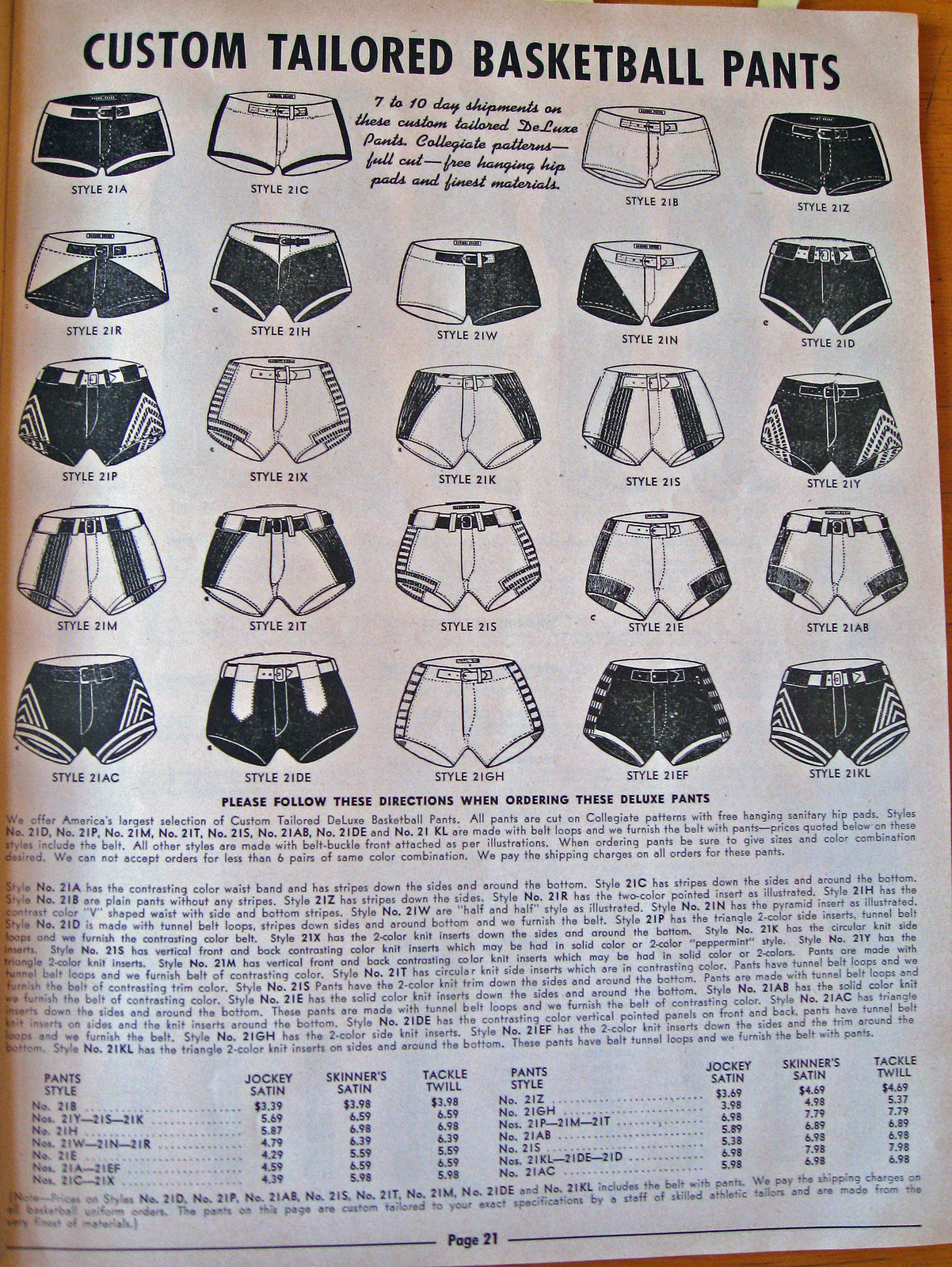
Really wish this next page had been in color. But even in black-and-white, it’s a doozy of a gallery. A few of these styles are new to me, including the one on the bottom row, second from left — I like how the partial stripes extend from the belt loops:
Nothing earthshaking on this next page, but I love how the headline has those quote marks around “On Earth”:
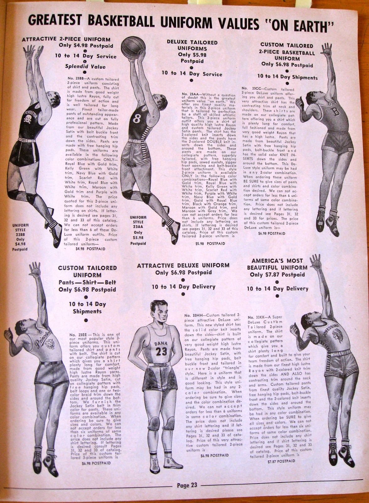
I’m always creeped out by the way these old catalogs tended to depict female athletes with freakishly tiny waists. That was common in most of the fashion illustrations of the day, but it’s still kinda disturbing:
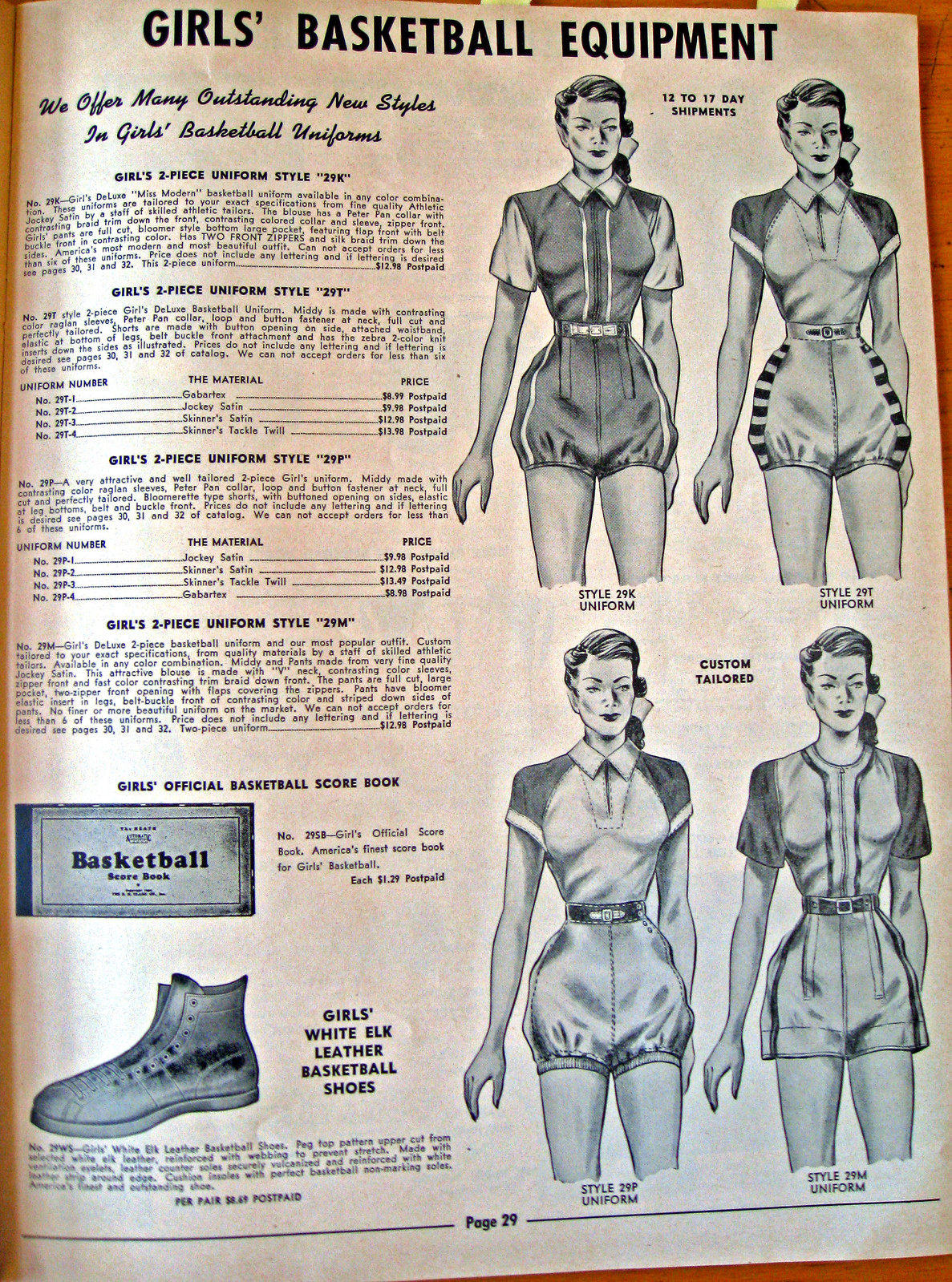
Speaking of women’s athletic attire, I like how the gym suit on the right side of this next page has little bloomers sewn into it:
Remember when I wrote about college beanies? I was surprised to see that style of headwear described in the catalog as “Eton Caps”:
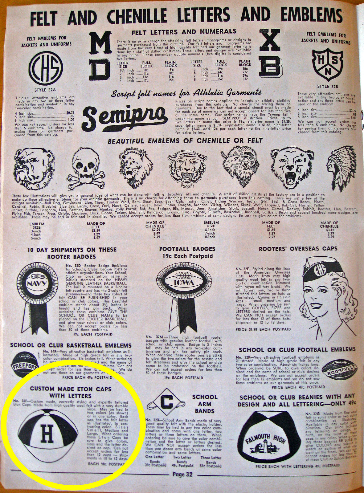
So then I Googled “Eton Caps” and discovered that they’re totally a thing, although I didn’t find the derivation of the name. Anyone know more?
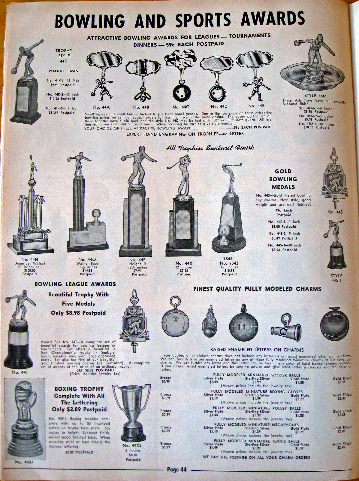
Totally digging the bowling award pendants at the top of this next page:
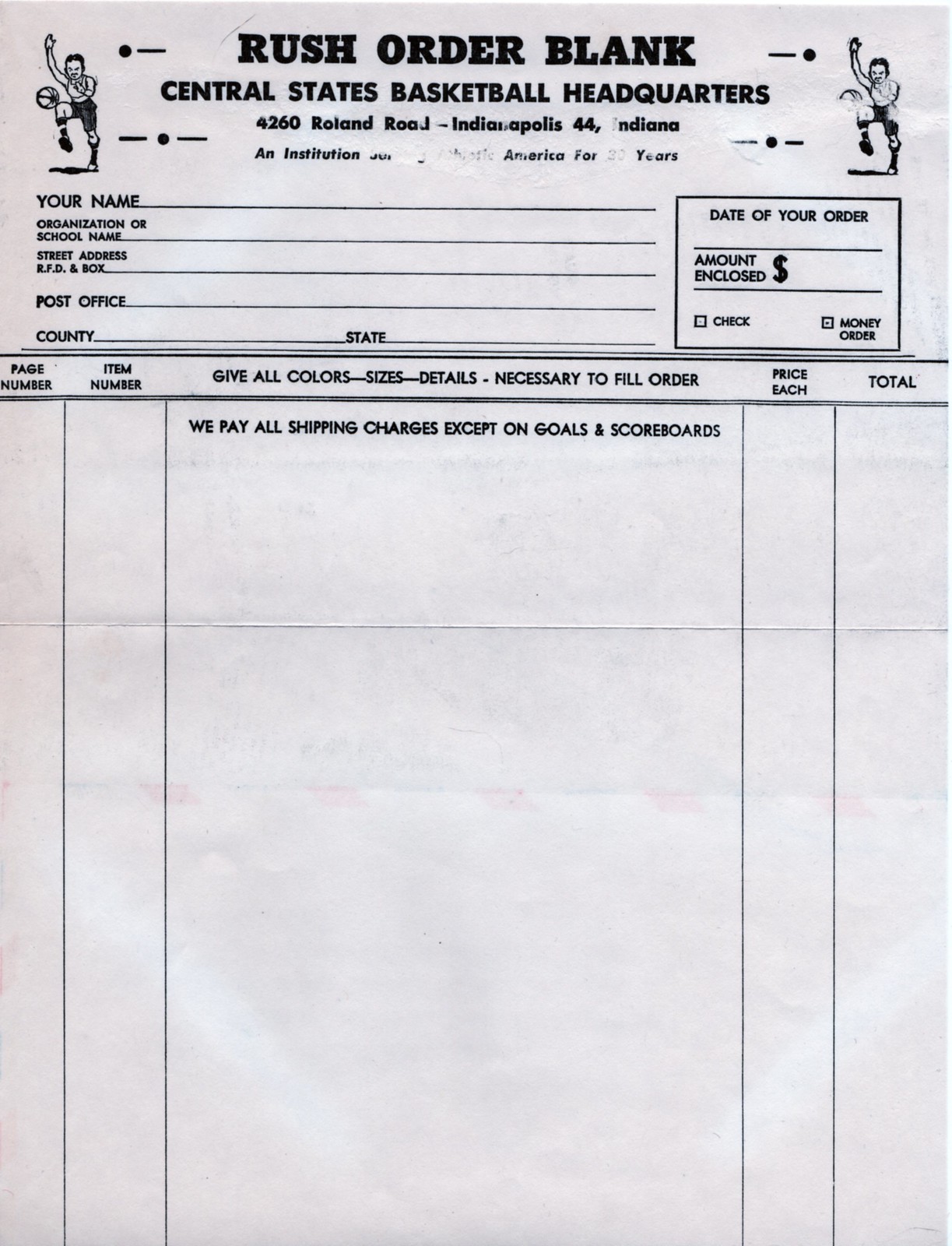
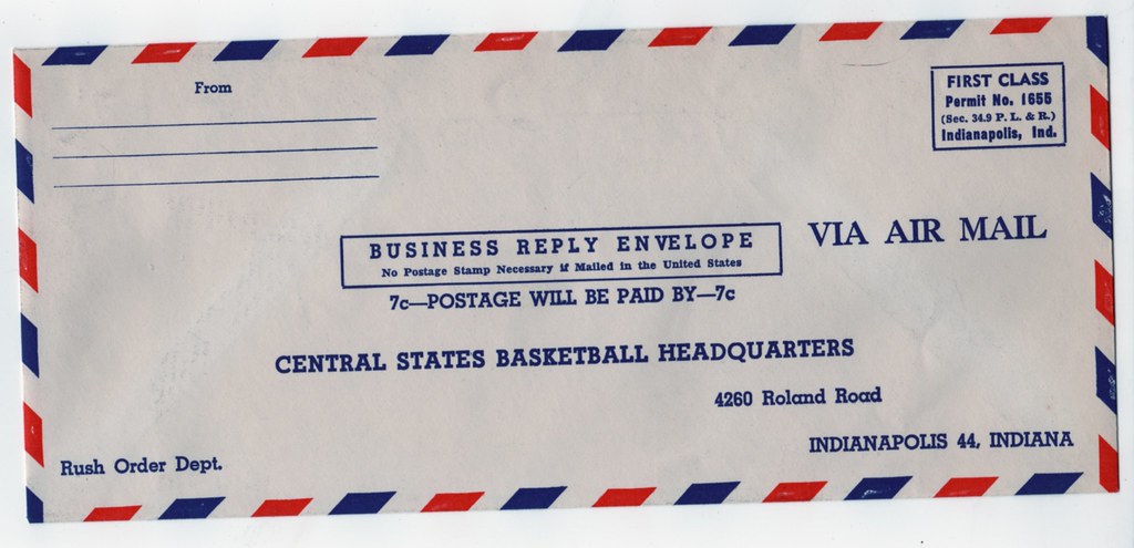
Finally, it’s always more fun when an old catalog still has its original order blank and the envelope in which to mail it:
———
That’s it. Thanks so much to Terry Proctor for this excellent gift, which makes a great addition to the Uni Watch library.

Big Cock Johnson update: As you may recall, back in April I published the transcript of an interview I had conducted with Uni Watch’s most notorious troll, Joe “Big Cock” Johnson. The interview garnered a fair amount of buzz in media circles (although probably not as much as it would have gotten if it hadn’t been published the same day as the Boston Marathon bombings) and was the subject of a segment on the public radio show On the Media.
In late June, for reasons not worth explaining here, I had to take down the Joe Johnson interview entry. As I explained to the many of you who inquired over the ensuing months (“Why I can’t I find the troll interview?”), the entry’s disappearance was necessary but temporary, and I was planning to restore it to the site.
Now it turns out I won’t be restoring it to Uni Watch after all. Instead, I’ve created a new site that will serve as the repository for the Joe Johnson story. It’s called My Pet Troll. Because so much of Joe’s commentary was scabrous and then some, I’ve flagged the new site as having “adult content,” which means you’ll have to click on a buffer page before accessing the site. But don’t worry, there’s no nudity or anything else NSFW on the site ”” just Joe’s over-the-top crudity.
Before I put the new site together a few days ago, I hadn’t looked at any of the Joe Johnson material in about six months. I think it’s held up pretty well. If you saw it the first time around, go ahead and take another look. And if you have no idea what any of this is about, I urge you to check out this odd but compelling chapter in Uni Watch history. Enjoy.
ESPN reminder: In case you missed it yesterday, my latest ESPN column is an assessment of the NBA’s Christmas Day uniforms.

’Skins Watch: As you know, lots of newspapers are boycotting the ’Skins name — and not just in their sports sections. Still, this is new, at least to me: Last week the Virginian Pilot ran an obituary, noting that the deceased “did take on the passion of his new family for the Washington NFL football team.” First obit I’ve seen where the ’Skins boycott has come into play (from Andrew Lockett).

Baseball News: Remember how I reported that MLB caps might be switching to the BP cap fabric next season? JP, who didn’t give his full name, sent me a lengthy diatribe on that subject that would likely be very entertaining if performed onstage. My favorite bit: “While not quite up there with the death of my pet hermit crab ‘Hermie’ back in summer ’89, [the fabric switch] would mark a dark day in the history of the sport and its association with quite possibly the most rich, most beautiful, and most well-respected uniform history in the history of rich, beautiful, and well-respected uniform histories.” Author, author!

NFL News: The NFL Network ran a Vince Lombardi special that included two shots of Bart Starr wearing numbers other than his usual 15 (from Jerry Peterson). … Chris Flinn reports that the tables at his local McDonald’s are adorned with uni-numbered Giants and Jets helmets.

College Football News: How much does it cost to field the U. of Minnesota’s football team? Too much (from Brett Stone). … UNC football has had a different uni combination for every game this year (from Dave Garabedian). … Utah State wore “HydroSkin” helmets, whatever the fuck that means, in last night’s Credit Union Bowl (thanks, Phil). … Cincinnati is adding a “77” memorial to its helmets for the Department Store Bowl, in honor of former offensive lineman Ben Flick, who died back in September (Phil again). ”¦ Here’s a look at the field for the Baseball Cap Bowl.

Hockey News: Reader Mark Gillingham checks in from the UK with the following: “Every year around this time we get the Spengler Cup broadcast across Europe, which is a hockey tournament from Davos in Switzerland, and this year the AHL’s Rochester Americans are one of the teams competing. (It’s usually only European club teams and a team made up of Canadians playing in Europe.) As such, they’re wearing ‘Euro-fied’ jerseys, which are, of course, covered in sponsors. Is this the first time we’ve seen an AHL/NHL team in a jersey like this?” I suspect so. Anyone know more? ”¦ Is anyone else as completely sick of the ugly sweater thing as I am? ”¦ Penguins head coach Dan Bylsma wore his old Bowling Green jersey while delivering the keynote address at the Three Rivers Classic. I’m not quite sure why two-day hockey tournament needs a keynote address, but whatever — cool jersey (from Aaron McHargue).

Soccer News: J-League news from Jeremy Brahm, who reports that there are new kits for the Kashima Antlers, Matsumoto Yamaga, and Avispa Fukuoka (who also have a wall of their uniforms from 1995 to 2013).

NBA News: Yahoo Sports has created a fun, if somewhat limited, NBA uniform timeline (from Nate Rischall). … Mavs owner Mark Cuban didn’t like the Xmas jerseys. Given that he’s been the most vocal proponent of adding advertising to NBA jerseys, you’d think he’d like the idea of putting ad patches on the sleeves, no? (Thanks, Phil.)

Grab Bag: The Keihoku High School basketball team in Tokyo has an unusual chest lettering design (from Jeremy Brahm). … “I love photos at from cycling team camps this time of year because of the mixture of team kits,” says Sean Clancy. “For example, the Radio Shack pro cycling team will cease to be at the end of this year, becoming TrekFactory Racing in 2014. Until then, the team must train in its 2013 kit (and new addition Fumiyuki Beppu is still in his Orica GreenEdge gear).” … “Here’s a ton of pictures of a mockup of Maryland lacrosse’s headwrapz for this year,” says Jared Buccola. “I love the matte and the flag design, but I think the two mohawk stripes should be switched to create that alternate flag design look.” … Neglected to speak out yesterday against something that’s long been troubling me: the war on Boxing Day. Seems like the true meaning of Boxing Day has gotten lost over the years and is now under attack by intolerant fringe elements who simply can’t stand to see anyone else enjoying a traditional holiday. Boxing Day, people: Don’t forget the reason for the season.
Saw this comparison of best-selling NFL jerseys 2008 v. 2013 on Yahoo.
link
“We’re gonna make this a Boxing Day the Prime Minister will never forget!” link
(Video happens to include a uniform)
Paul,
re: the Catalog
Just for fun I google earthed the address.
It comes up in a very VERY swank neighborhood of Indy. I don’t think there was ever an apparel company running out of there. I don’t think this company was a manufacturer or distributor.
I think whoever ran Central States Basketball HQ was a salesperson for a larger company.
So now the question becomes, if he was selling stuff you haven’t seen before, whose stuff was he selling?
I was in high school from 1961-65. Those bloomer-leg gym suits were the standard until the cotton-poly knit suits came out in the early 1970s. But the bloomer insert remained. Even in the micro-skirt/hot pants early ’70s girls in P.E. weren’t supposed to flash to much leg. LOL
According to this newspaper clip from the Rome News Tribune of Rome, GA dated March 25, 1958, Central States Basketball Headquarters was a prime mover and shaker for the Industrial League Tournament link
I am from Indianapolis. I wasn’t alive back in the 50s but I would imagine this neighborhood (which is pretty affluent – I found a site that showed the property listed on the order form is appraised at over $230K) was more of a commercial area than it is now.
RE: Catalog….
3 words: Girls’…Basketball…Uniforms.
Ha-Cha-Cha!!
I assume Eton caps are from the English college. No mention of it in The Jam’s “Eton Rifles” though.
Eton, on the playing fields of which the Battle of Waterloo was won.
About the Christmas day NBA uniforms.
I understand it is about selling more merchandise (and possibly adding more space for ads in the future – arm sleeves), but it just feels like the NBA is reaching.
If you are an NBA fan, your product has got to stand by itself. Instead of relying on the gimmicky nature of these, in my opinion, incredibly lame uniforms, just play the games and put a Happy Holidays logo on the court.
It really drives me nuts. I remember being an NBA fan when it seemed the Bulls always played on Christmas. I remember the Celtics being on quite a bit too.
At some point, the NBA has really got to look at themselves and wonder out loud, “What exactly are we doing here?”.
The Utah State helmet wasn’t anything special. It’s their standard blue helmet they’ve had all year. “HydroSkin” is just what HGI calls the process of applying the design to the helmet, i.e. submerging the helmet in water, which has a thin film-like material on the surface that adheres to the helmet. It’s how they create a lot, if not all of their helmets.
Edit: The only difference is the reflective logo on the helmet. Didn’t notice that until I looked at the game pictures.
Just curious, Paul
You loved the color versus color look of the NBA Christmas games and said the NFL and NHL should do more as well, yet you seem to really dislike color versus color in baseball.
I’m sure there’s a simple reason for this, but what is it?
Different sports have different feels, different histories, different heritages. What feels right (at least to me) in one sport doesn’t necessarily feel right in another. Apples, oranges, etc.
Also, it’s worth noting that in football, basketball, and hockey, all the players are on the field at the same time, guarding each other, etc. So color-on-color in those sports results in a lot of color mixing.
In baseball, the batting team only has between one and four players on the field at any given moment, the fielding team’s players are spread out, and there’s very little interaction between the two teams’ players. So the color-on-color effect is largely lost. Baseball uniforms are *mostly* (not completely) about how the individual players look. Personally, I think they look best in white and gray.
That is a great take on the subject.
I must be somewhat of the odd man out. I very much prefer the white on color aspect of sports with a splash of color on the team name, patches, etc.
I love baseball’s white home uniforms. I particularly enjoy, being from MN, the Twins throwbacks that appear to be a cream color than blank white, but this is for any team in MLB.
I really wish all sports would follow this. I believe NHL has color home and the NFL has color home. I love the crispness of the white with a little color.
It is just me, but I enjoy the guaranteed contrast of white vs any color and it looks good regardless.
In fact, I saw a Wolves game against the Clippers and it was a disaster visually speaking. Both teams had sleeves. Both were color. Wolves black and hints of dark blue against Clippers almost-power-blue. Ugh. Forget that.
Can’t speak for Paul, but you accurately describe my opinion on c-v-c, so I’ll explain my own thinking.
Basketball, football, soccer, and hockey have long traditions of brightly colored major uniform elements (shirt, pants, head covering), so we’re already accustomed to seeing at least one team dressed mainly in team colors. So as long as the team colors contrast sufficiently (and too little systematic attention is paid to the nature of color contrast, especially with regard to colorblindness), c-v-c is only a slight change from what we’re used to. Plus, in many cases c-v-c was the norm in these sports before black-and-white television broadcasting led leagues to require white-vs-color matchups for the benefit of home viewers. There’s no longer any need for teams to dress to accommodate black-and-white viewing. So c-v-c represents a return to heritage and tradition.
Baseball has no such tradition of team-colored uniform elements other than the cap. And while solid-color “alternate” jerseys have become the norm, they’re not fully integrated colored uniforms as in the other major sports. A football team may or may not wear white pants with a color jersey, but if it does, white is a deliberate choice. When a baseball team wears white (or gray) pants with a color jersey, it’s a default carryover from the regular white (or gray) uniform, not a choice to pair white with the color.
The day the Nationals adopt navy pants to go with their red alt jersey and the Mets adopt a monochrome royal jersey/pants combo as their alt set, that’s the day I’ll approve of baseball teams going color-on-color.
“Baseball has no such tradition of team-colored uniform elements other than the cap.”
~~~
Well, and the sleeves and stirrups. Both of which were crucial in team identification. Now, unless it’s very cold, sleeves are (for the most part) vestigial elements of the uniform, and stirrups are basically gone. You might find guys wearing team colored socks (if they show them), but two of the three more distinct uniform elements containing color are gone.
Which is why (IMHO) you’re seeing color being added with multiple softball tops.
Well, that, and you can usually sell a shit-ton of alt tops to your fans. Long-sleeved baselayer shirts & stirrups? Not so much.
Those of us (can’t speak for Paul either, but I’m sure he’d agree) who want to see bright color back to baseball would like it (and stripes, please) on the stirrup (or at least socks) and sleeves.
Totes agree. I’d love to see proper, team-coordinated hosiery back, as well as simpler, team-coordinated undershirts. But that wish seems to me to be about as likely as getting the Whig Party back into Congress. So since MLB has allowed uniforms to be transformed into cap-shirt-pants combos, it’s high time baseball started treating those three elements as a single uniform like the other leagues that have the same configuration. (Though in soccer, substitute socks for cap/helmet.)
“… How much does it cost to field the U. of Minnesota’s football team? Too much (from Brett Stone). …”
$199,000 for the Middle Linebacker, the article reported. Quite reasonable compared to Alabama’s purported average per-player figure of $342,000.
Since the Colts-Giants Greatest Game Ever in the late 1950s, there’s has been an almost steady line upwards in the popularity of professional football. Surely the NFL is our most popular major league, but I would also argue that “professional football”now includes the top tier of NCAA teams, with the main distinction being the lack of compensation to the workers. Good people have argued that the workers indeed should be paid; others would say no, the workers ARE paid later on, when they make NFL or CFL rosters, it’s just that compensation is deferred.
I know it’s not a “reasonable” proposition, but wouldn’t it better if there were no athletic scholarships (but tons of “need-based” scholarships) and if any 18-year-old were free to sign a contract with whomever?
Yes, it would be better. How is that not a reasonable proposition? As propositions go, that one is about as American as it comes. It combines free labor – the notion that a person ought to be able to eat the bread produced by the sweat of his brow – with the concept of education as the great leveler that should be open to all based on ability to learn, not ability to pay. To disagree with Con’s proposition is basically to declare that the American experiment has been a mistake lo these 237 years. If we argue from first principles, that is, rather than arguing from base appetites (“I enjoy watching college football, so anything that might alter or reduce the pleasure I receive from it must be opposed”).
I’ve never heard the argument that college players are paid, just later, by professional contracts. For one thing, that’s a lie – most college players never receive pro contracts. The argument I frequently hear is that the value of the scholarship represents payment in kind – the athletes are just being paid in education, rather than dollars. Which would be a fine argument if and only if two other arguments were simultaneously advanced:
1. All tuition aid should be treated as scholarships, not paid out in per-hour wages, and treated as the equivalent to a salary; and
2. Scholarships should be taxed as income based on the value of the tuition defrayed.
Otherwise, no, in fact, athletic scholarships are not equivalent to being paid a salary.
Those basketball shorts you noted look a lot like lederhosen.
…and they’re available in twill or SATIN!!! Sweet!!
The story behind Bart Starr wearing other numbers: Vince Lombardi liked to have his Packers wear different numbers in practice. Perhaps it was a way of guarding against media or other teams snooping. Perhaps it was a way to have players concentrate.
Bart Starr also wore a different number in his first practice with the Packers in 1956. I don’t have the photo at my fingertips, but can share it when I return to work.
Also, according to the Packers media guide, Bart Starr also wore No. 16 during his rookie season of 1956 before switching to his familiar No. 15.
I remember Bart wearing 51 sometimes during 1960s practices … ridiculous, really, when you consider that (a) everyone knew him by sight and (b) who else would it be taking snaps from the center?
Also, the “half t-shirt” from the catalog is the type I always knew as “shimmels” worn to basically cover the shoulder pads on hot days in camp. Have a Green Bay Packers one I bought at their team store’s “garage sale” but for obvious reasons I don’t wear it much in public. Espcially in December in Green Bay.”
In his biography, Starr states that he wore # 51 in practice in 1964 as a tribute to Jim Ringo who had been traded in the off-season.
Speaking of the Spengler Cup and ads on jerseys, even the officials jerseys are being used as billboards. Mooo…
link
AHL jerseys, and helmets can have small ad patches on them, the Amerks have Toyota patches for example, and most ice surfaces have ads, though nowhere near to the extent that European ice surfaces do. But, I have never seen an AHL jersey that sponsored, and much as any self-respecting Binghamton hockey fan hates Rochester with a passion, those jerseys are the AHL equivalent of the Canadiens, Celtics, Dodgers, Yankees, Red Sox, Cardials, etc… being plastered in ads, and it just looks sad.
Too bad the Amerks could not have gotten a local Rochester advertiser, such as Wegmans….Zweigels…or best – a Garbage Plate jersey from Nick Tahou’s, with little faux mustard and sauce stains on it…
Siemens seems to be a tournament sponsor, so it was probably dictated by the organising group. All of the teams are wearing the same template, but others can include their own sponsors in the design.
Man, I really enjoy this website. Thanks to Paul, Phil, and the countless Uni-watchers in the Uni-verse who deliver this highly entertaining and well-done content. Here’s to a great 2014!
Re: New MLB game hats for 2014
I’m pretty sure it was reported on here that the Quad Cities River Bandits released some new logos for the 2014 MiLB season. If you don’t know, the Bandits are the Class-A Midwest League affiliates of the Houston Astros.
When they introduced those new logos, they also had some merchandise ready to go featuring those logos, including on-field caps. I was in a Christmas rush on Monday because I needed to order a River Bandits shirt that I forgot to order. Since it was Monday, December 23, I knew that I wasn’t going to get it on time so I drove to the stadium, where the team store is located, to purchase it in person. The stadium is a little over an hour from where I live. When I got to the team store, I noticed that they already 2014 on-field caps in stock, featuring the new logos. I made sure to look at each of them because I remembered the Uni Watch post about the material potentially changing for 2014. I also figured that if MLB is going to do it, MiLB will as well, since they usually stick together in things like that. When I looked, the new 2014 caps were the same style, material, etc. as the 2013 models. I don’t know if that means that there won’t be a change for MLB, or not, but I thought I’d pass it along.
When MLB switched from wool to poly in their caps last decade, MiLB followed the next year, not in the same season.
If that’s the case, I could obviously be wrong then. I didn’t realize that.
Seems that baseball caps were different in the 1980s. Anyone know what material this Orioles cap is made from? Doesn’t look like wool and it doesn’t look like the current polyester caps.
link
I have a BlueJays cap of the same material from the same era.
Innovative pizza boxes!
link
Yes, the greatest values “on earth.”
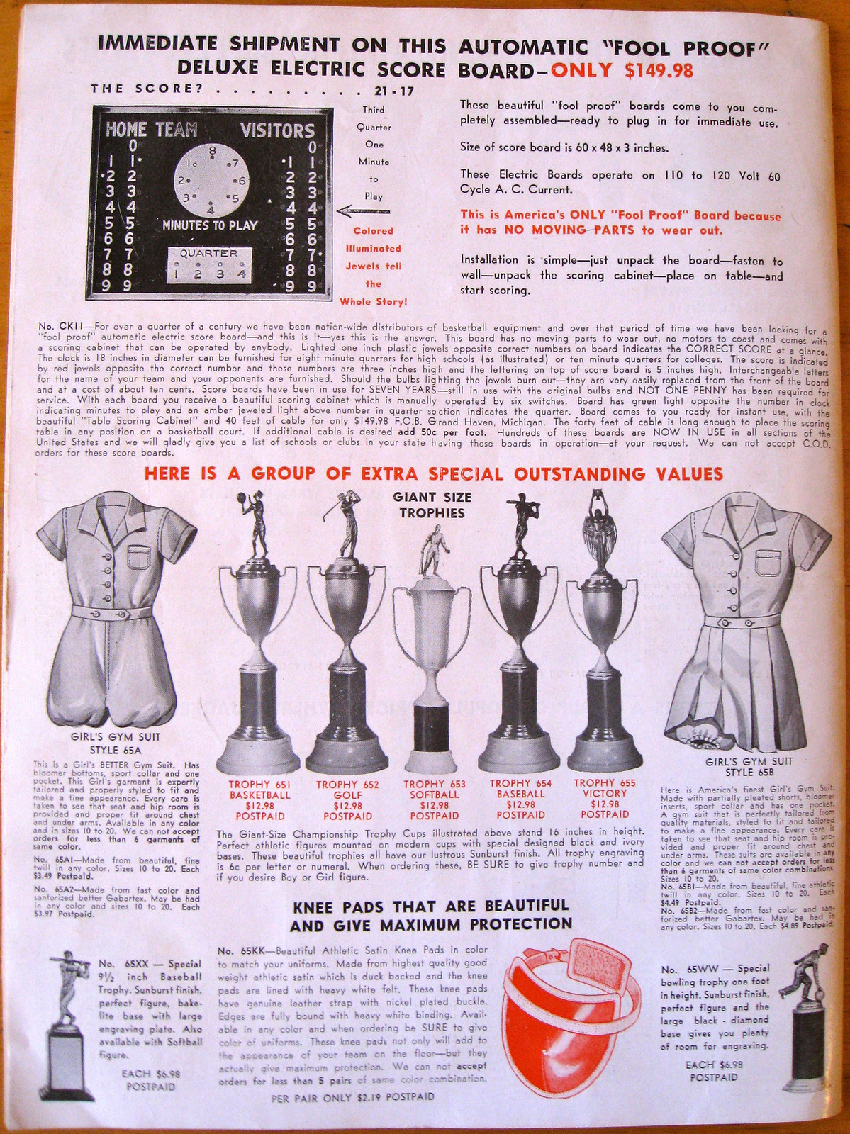
And then, two pages down, the (wink*wink) “fool proof” deluxe electric score board.
Love the “basketball carrier” in the catalog!
Rochester also played in the Spengler Cup in 1996. Not sure if they had the advertising on their jerseys back then. Also I believe that the sponsors of the Spengler Cup have their logos on all six teams.
The scoreboard in that catalog is amazing. I guess how many seconds are left in the game is subjective… kinda like the old courtside scoreboard at Carmichael Auditorium where they would flip the numbers by hand.
Didn’t Carmichael have an electric center-hanging scoreboard with a digital clock?
That O’s cap and your Jays cap are polyester, sometimes listed as “Nylon” (I have no clue if those are the same thing). It’s just not the faux-wool-poly they use today. It was often used on white crowns such as the O’s hat. In the early 90’s, the jays and expos wore hats that were 100% poly (for some reason). I remember a sales guy telling me only the 2 canadian teams did that. I still have my expos one… Somewhere…
Cool, thanks for the reply. I like the look of those caps.
Gotta say the Obituary note really bothers me. Regardless of what side you are on in that debate, this is a memorial for someone, and unless it was written that way by the family, for the newspaper to change it is a horrible thing and possible the worst form of censorship a newspaper can practice. It really is a slippery slope, and something that would lead me to ask for an apology and a reprint.
Several thoughts on the above:
1) You do not understand the meaning of the word “censorship,” which refers to the state restricting public expression.
2) You refer to a “slippery slope” — toward what? Toward a newspaper having control of what’s published in its pages?
3) Unless I’m missing something (always a possibility), the obit appears to be unbylined, so on what basis do you assume or assert that it was written by the family?
4) Let’s say for the sake of argument, that the family did write the obit. Let’s also say, also for the sake of argument, that the family’s original text included the following: “His final words were, ‘Those niggers may not be too bright, but I’ve always loved their music,'” or maybe, “His final words were, ‘Promise me that you’ll do something about that Kenyan in the White House.'” Would you demand “an apology and a reprint” if the newspaper had removed those sentiments? Would you feel similarly about the “slippery slope” you referred to?
5) All of a publication’s content, regardless of who writes it, is subject to the publication’s style rules. In the case of this particular publication, one of their style rules is apparently that they don’t print the name of the Washington football team. So if someone includes that name in their text, they impose that change upon the text, just as they impose grammatical fixes, abbreviations to state names, proper spelling, removal of profanity, and anything else that conforms to their style guidelines.
That’s not a “slippery slope”; that’s standard journalism.
In my experience at least, an obit like that is written by, and paid for, by the family.
I know that’s how it works in smaller newspapers, but Wikipedia (I know, I know) says the Pilot is Virginia’s largest daily metro paper. Do they really not write their own obits?
In any case, the identity of the obit’s author has zero bearing on the fact that anything published in the Pilot is subject to the Pilot’s style rules, including a rule regarding a certain team name.
I recently placed a paid obit in the New York Times. I highly doubt that a minor regional metro paper is less likely than the Times to accept paid obits. And I got no meaningful editorial pushback from the Times, despite drafting the text in a slightly informal version of AP style, no Times house style. Made it to print without all those annoying “Mr.”s and “Ms.”s the Times otherwise scatters across the page.
Still, you can pretty much disregard any argument that follows the word “censorship” that is describing the actions of any person or organization that is not the government. A person who uses that word thusly doesn’t know what he is talking about. Governments censor. People and newspapers exercise editorial judgment. Part of what freedom of the press means is that if you own the press, you get to decide what your paper says, including eliding the names of sports teams in obituaries if you so desire. That’s not censorship, that’s freedom of speech. Doesn’t seem like it should be so difficult to distinguish between oppression and liberty, but yet I encounter Americans confusing the two all the time in this context.
Re: Scott, it’s similar with the Philadelphia papers. You pay the paper to print an obituary you write.
1) Per dictionary.com: censor – “an official who examines books, plays, news reports, motion pictures, radio and television programs, letters, cablegrams, etc., for the purpose of suppressing parts deemed objectionable on moral, political, military, or other grounds.” The verb means “to delete (a word or passage of text) in one’s capacity as a censor.” No mention of the official being elected.
2) A slippery slope of a newspaper deciding to take the words I paid them to print in memorial of a loved one and editing them to fit their own beliefs. If I wrote “he was a devout Muslim” and the newspaper edited it to “he was deeply religious”, wouldn’t there be an outcry?
3)See above.
4) words like “nigger” are deemed to be offensive in that context. If he were black and it ended “peace out to all my niggas” would we be ok with it then? The fact is the word “Redskins” is offensive when you use it towards someone, but there is still an ongoing debate about whether the team name can be considered offensive when used in that context and for a newspaper to edit it in such a manner forces the family into joining the anti-redskin debate which they may or may not support.
5)While I can certainly appreciate the newspaper for cleaning up grammar and spelling issues, and certainly agree that established hate speech should not appear, I believe the term “Redskins” in reference to the Washington DC football team is still in a grey area, and in the context of an obituary should be handled differently.
Put another way, when players from the old Washington Bullets days pass on, should they be listed as a “player on the Washington basketball team that eventually renamed itself the Wizards” because the team changed it’s name because of the violence in DC? Should my eventual obituary in the Philadelphia papers read that I was a fan of the Dallas area football team, simply because I was a fan of the home teams rival?
6) This isn’t a response to anything you wrote, but i did want to thank you for emailing me and allowing me to continue to participate in this discussion.
No mention of the official being elected.
Please — you’re being disingenuous. An “official” is an agent of the state (elected or bureaucratic), and censorship is an action of the state. If you misuse an inflammatory term, you’re going to be called on it.
A slippery slope of a newspaper deciding to take the words I paid them to print in memorial of a loved one and editing them to fit their own beliefs.
You still haven’t explained what this “slippery slope” is leading toward. The whole notion of a “slippery slope” is that it leads, bit by bit, drip by drip, to some horrible results (fascism, totalitarianism, Big Brother, 24/7 reality TV, etc.). But all you’ve described is a “slippery slope” toward a newspaper deciding what can and can’t be printed in its pages. Every single newspaper in America already has that status.
words like “nigger” are deemed to be offensive in that context.
But this newspaper has deemed that the word “Redskins” is offensive, in any context. You don’t have to agree with that assessment, and neither does the family that submitted the obituary, but the newspaper nonetheless gets to set its editorial standards and style.
there is still an ongoing debate about whether the team name can be considered offensive when used in that context
For this newspaper, the question of whether “Redskins” is offensive is no longer a matter of debate — they have decided that it does not belong in their pages. Again, you don’t have to agree with that, but the newspaper still gets to set its editorial standards and style.
for a newspaper to edit it in such a manner forces the family into joining the anti-redskin debate which they may or may not support.
Sigh. Nobody has “force[d]” the family to do anything. Nobody put a gun to the family’s head and required them to submit an obituary to this newspaper. They could have chosen another newspaper, or they could have created their own memorial website, or handed out leaflets, or expressed themselves in any of the countless other ways afforded to them by the First Amendment. But they don’t get to decide what is or isn’t appropriate for a given newspaper — the newspaper does.
when players from the old Washington Bullets days pass on, should they be listed as a “player on the Washington basketball team that eventually renamed itself the Wizards” because the team changed it’s name because of the violence in DC?
If a newspaper has an editorial policy of not printing the Bullets’ name, then yeah, that team name wouldn’t be listed in those players’ obits. (I’m not aware of any newspaper having that policy, by the way.) Would such a policy be foolish? Maybe. But that’s not the point — the point is whether the newspaper gets to exercise its own editorial judgment and set its own editorial standards.
Again: That’s not censorship; that’s journalism.
link
Seriously, selling the naming rights to stations is bad enough, but an entire transit line?
And this isn’t even link
A bit late in the evening, but I just wanted to get my thoughts in on the hockey uniforms worn on the first day of the Great Lakes Invitational, the first major event held on the temporary ice rink on the corner of Montcalm and Witherell.
Michigan Tech Huskies (host team): *sigh* Another team succumbing to the “antique white” trend. The yellow stripes only make them slightly less dingy-looking. Aside from that, pretty decent with simple numbers, “Huskies” in script… but another demerit for the inverted nameplate colors.
Michigan State Spartans: Nice, clean look with “Spartans” in simple block letters diagonally down the front, with the numerals on the upper left chest. The three-stripe pattern is just classy. As much as I’m a Michigan guy, I have to say State has the best-looking set in the tournament.
Michigan Wolverines: I happen to like their mid-70s throwbacks, with the bold stripe up and down the sleeves and the three stripes on the waist. My only complaints are the unnecessary Reebox on the back (especially considering the Reebok logo is beneath the collar on the FRONT side, not the back!), and – like Tech – they went with inverted nameplates, which actually made the NOBs a lot harder to read when not zoomed in on a single player’s back. I would definitely get one of those, though, without an NOB.
Western Michigan Broncos – It seems they borrowed some inspiration from the Ottawa Senators’ third, only with Vegas gold and white stripes instead of red and “antique/vintage white”. All in all, a pretty decent look… except, the black borders on the numbers on back weren’t thick enough, making the white numbers hard to read from a distance because of the stripes. If they’d done the back numbers in black outlined in white and gold, or just used a thicker black outline (instead of thin black and gold), the numbers would’ve stood out more.
Ranking in order: 1. MSU; 2. U-M; 3. WMU; 4. MTU