As you’ve probably noticed, we’ve recently been running a rotating series of ads from JacketShop.com at the top of the right sidebar. I’ve been particularly happy to have them on board because I’ve always loved varsity jackets. I have a bunch of vintage varsity-style jackets myself, and I’m always searching for more of them on eBay.
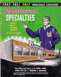
It was during one such search that I recently came across a 1965 catalog for a Winnipeg company called Sportswear Specialties. Picked it up for just $8 and change (including shipping!). Most of the vintage catalogs in my collection have lots of uniforms and maybe a page or two of jackets, but this one is the other way around, with page after page of spectacular varsity jacket designs. Let’s take a little look-see, shall we?
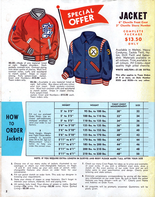
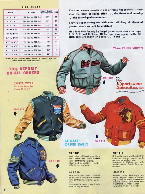
Let’s begin with this page, which has a good sizing chart (for all of these images, including the one shown above, you can click to enlarge):
.
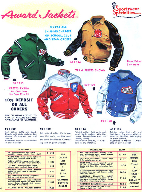
The four jackets on this next page are so beautiful that it’s easy to overlook a small detail: The four jackets have four different pocket styles! Check it out:
.
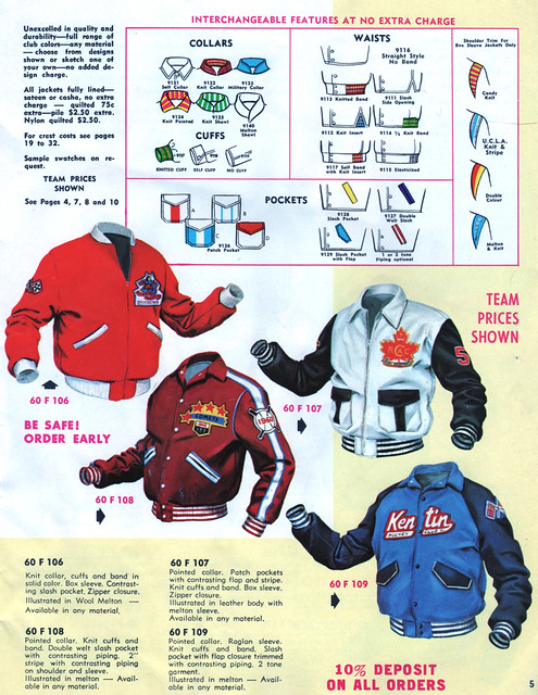
I love the little schematic drawings at the top of these next two pages, showing all the collar, cuff, shoulder, pocket, and waistline style options:
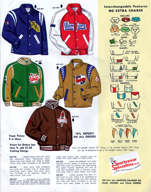
.
Things really kick into high gear with the designs on these next few pages — check out these gorgeous designs:
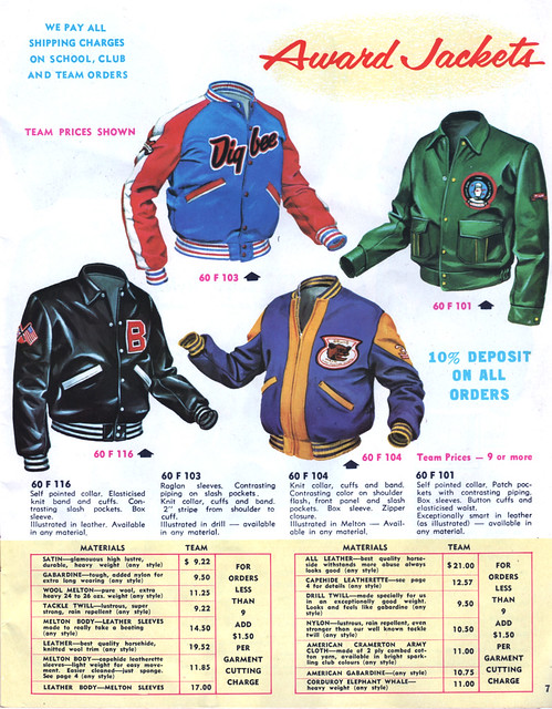
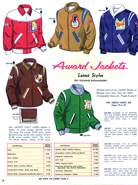
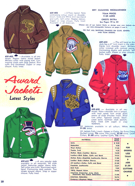
.
One thing I really like about varsity jackets is that they’re designed to hit you at the hips, which is my preferred jacket length. But if you like a slightly longer jacket, you can also order one of these “5/8 Length” designs:
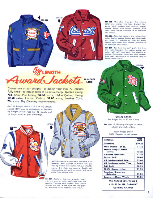
.
Want an even longer jacket? Then maybe you’d like to check out some of these “Bench Coat” models:
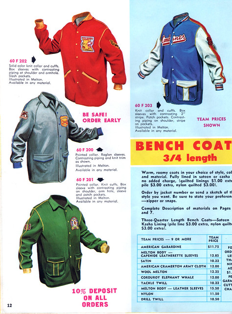
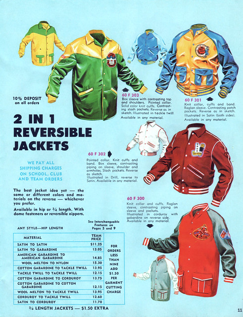
.
That’s the end of the jacket segment of the catalog. Given how many pages in the catalog are devoted to varsity jackets, I’m surprised there’s only one page for varsity sweaters:
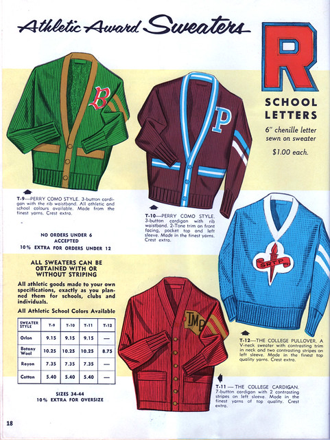
.
And hey, speaking of sweaters, what would a Canadian catalog be without some curling sweaters? Dig:
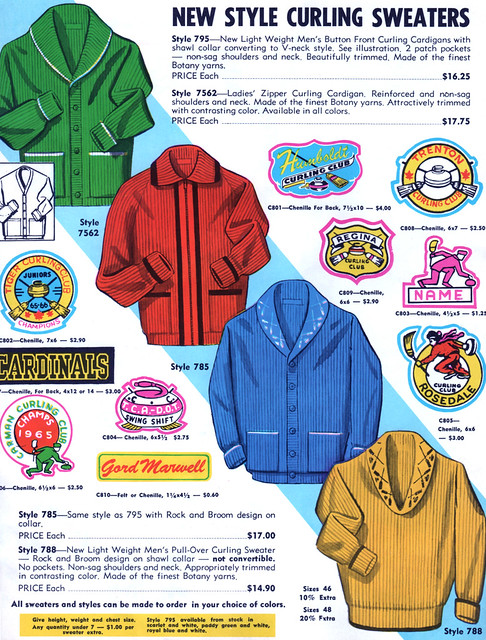
.
There are also three pages relating to hockey jerseys (made of Rayosheen!) and socks. As you’ll see, a couple of the designs on the first page are a bit unusual:
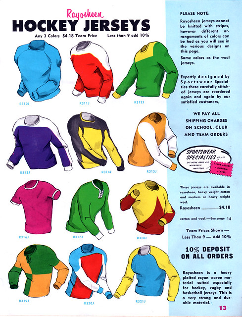

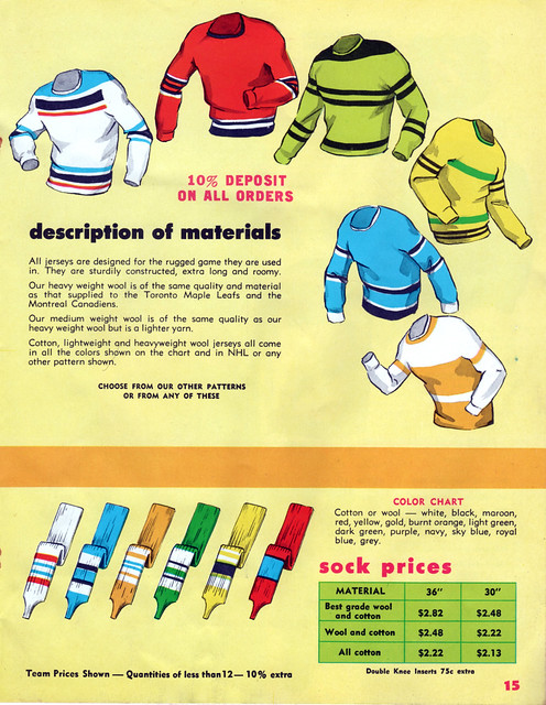
.
I love it when a vintage catalog still has its original order blank. Usually they’ve already been removed, but the one for this catalog was still intact:
.
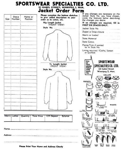
.
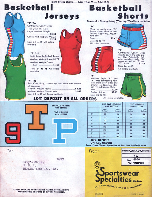
Finally, almost as an afterthought, there are some basketball uniforms listed on the back cover, which also shows us the name and location of the sporting goods shop to which the catalog was originally mailed:
.
Unfortunately, some quick Googling indicates that that sporting goods shop — Gray’s Store of Merlin — no longer exists.
As for Sportswear Specialties — the company whose catalog we just explored — it’s apparently no longer in existence either, but their factory, shown on the cover of the catalog, is still standing.
Anyway: varsity jackets! They’re cool. And if this entry leaves you hankering for one, please consider getting one from our fine sponsor.
ESPN reminder: In case you missed it yesterday, my latest ESPN column is the annual college hoops season preview.
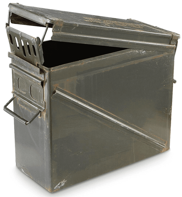
Pandora’s munitions box: Do you know what military ammo boxes look like? Apparently they look like the photo you see at right, with lots of additional examples available here.
I confess that I had no idea what military ammo boxes looked like until last night, when I learned that Adidas had sent some promotional Robert Griffin III cleats to a bunch of journalists. The cleats are the same ones Griffin will be wearing for tonight’s ’Skins/Vikings game in Minnesota, and they were sent to the journalists in boxes like this one (click to enlarge):
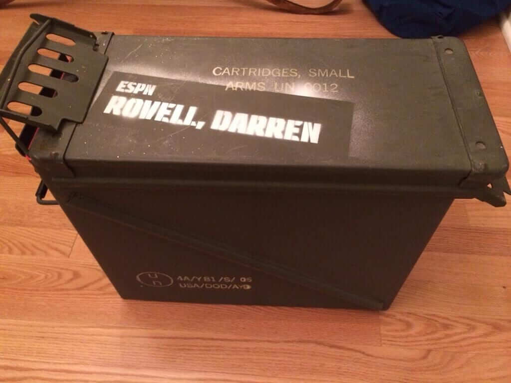
How nauseating is that? We’ve seen this kind of nonsense before, of course, like the Nike flash drive designed to look like military dog tags back in 2010. What I said back then still applies: This stuff is vulgar. It is vulgar for a sportswear company to equate football with armed military conflict. It is vulgar to compare football players to soldiers, especially when we have real soldiers dying in real armed conflicts. It is vulgar to use the trappings of military imagery, including ammo boxes, to promote and sell athleticwear. It is vulgar to invoke one military metaphor after another for a bunch of privileged athletes, the overwhelming majority of whom will never serve in the military.
On the plus side, I’d like to thank Adidas for not including me on the distribution list for this particular promotion.
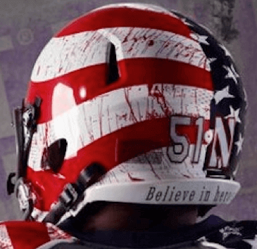
In a related item, the kerfuffle over Northwestern’s flag-desecration costume continued yesterday. I’ll have more to say about this in an ESPN piece, which I hope will be posted this morning. Link coming soon. which is up now. (As always, the best way to keep up with my ESPN work is to follow my Twitter feed, where I post all my ESPN links, and/or to ask to be added to my email list.)
Tick-tock: Today’s Ticker was compiled by intern Mike Chamernik, except for ’Skins Watch, which was compiled by me.

’Skins Watch: Most past and present NFL players who’ve been asked about the ’Skins issue have been too chickenshit to go on the record either way. But former Viking Joey Browner has come out in favor of changing the name. He’ll be participating in a “conscience walk” organized by the American Indian Movement prior to tonight’s ’Skins/Vikes game in Minnesota (from Joshua Kramer). … Despite the objections of 11 Indian tribes, the Wisconsin State Senate passed a bill that will make it harder to make schools change their Native American mascots or logos. The governor has not yet said whether he’ll sign it (thanks, Phil). … What happens when you go to a ’Skins bar and ask fans if they think the team’s name should be changed? Guess (from Barry Brite). … I swear, if it’s not the Injuns looking for a reason to be offended these days, it’s the Arabs, am I right? (Thanks, Phil.)

Baseball News: Grantland has a short documentary on the husband and wife duo that managed the MLB schedule for more than two decades. But a graphic in the video shows outdated Blue Jays and Astros logos (good spot by Matt Harris). ”¦ The NCAA will start juicing their baseballs in 2015. ”¦ Japan’s national baseball team has new uniforms, partially based on their 1931 uniforms when the team played against MLB stars (from Dan Kurtz). ”¦ Big names like George Steinbrenner, Marvin Miller, Billy Martin, Tony LaRussa and Joe Torre are on the Expansion Era ballot for the Baseball Hall of Fame, and Cooperstown loves it (thanks, Tommy Turner). ”¦ A few pairs of Stan Musial’s stirrups and sanitaries from an old-timers game are up for auction. They’re as marvelous as you can imagine (from Anthony Giaccone).

NFL News: Toronto Mayor Rob Ford’s NFL logo tie, featured here on Uni Watch yesterday, reminded Jake Kessler of his own neckwear. “The MLB logo tie is my crack smoking tie, made by Surrey. The baseball tie is a Ralph Marlin my grandparents got me at the Baseball HOF circa ’95.” ”¦ Also in Rob Ford news, Tom Gronek owned the same NFL tie, and wore it for his high school graduation. “Back in the early to mid 90’s, I used to live in Etobicoke which is Rob Ford’s hometown so chances are that we purchased the tie at the same location,” Gronek says. “If I remember correctly, the store it was purchased at was a BiWay, which was a Canadian discount chain.” ”¦ A few readers noted that Tuesday night’s World Series of Poker champion was a guy wearing a Calvin Johnson jersey (and one that might be counterfeit). As Lions fan, I was rooting for him much harder than I should have. ”¦ “This is the Falcons’ Rookie Club,” writes Kevin Poss. “Interesting that most of the jerseys appear to have the NFL shield blanked out, but the player on the right’s is visible.” ”¦ Eagle-eyed Matt Brown noticed that Adrian Peterson must have changed his cleats sometime during the first half of Sunday’s game against Dallas. ”¦ If Richard Sherman was the commissioner of the NFL (and I hope he is someday just for entertainment’s sake), he says he would scrap knee and thigh pads, be lenient on sock lengths and cleat colors, and allow players to promote their own merchandise brands anywhere except on the field (from Kurt Esposito).

College Football News: Nike! Adidas! This is College Football on ABC! ”¦ Eric Johnston noticed that Purdue wore last year’s pants this past Saturday. “As you can tell from this article, Nike altered Purdue’s logo about a year ago. The logo on the collar is the new logo, and the logo on the pants is the old one.” ”¦ Georgia Southern is wearing throwback uniforms and helmets this Saturday against Western Carolina. ”¦ Notre Dame awarded some classy monogram jackets this week (from Warren Junium). ”¦ Next three items are from Phil: Extra Mustard ranked the top-10 college football alternates for this year so far. ”¦ The University of Wyoming is trying hard to escape mediocrity, even down to their uniforms. Key passage: “”˜I don’t think Wyoming can survive being Penn State, and just wearing the same uniform we wore in 1967 when we went to the Sugar Bowl. But I also don’t believe we can discard it completely,’ Burman said. ”˜There has to be a balance.’””¦ Lastly, “It’s not enough that College coaches earn more than the guy who may someday find the cure for cancer or the University President.” Phil writes, “Now they’re picking up some extra scratch by trademarking their names and phrases.”

Soccer News: Some upcoming World Cup kits have been leaked. Here are the looks for Japan, Germany, Russia, Brazil and Spain (with thanks to Trevor Williams). ”¦ Gaelic Football is introducing a black card, which is in-between the red and yellow cards. If issued a black card, the player leaves the field but gets a replacement. The real gem in that link is in the video on the page, where “you’ll be treated to the host (Marty Morrissey) who looks like a creepy Irish doppelganger of Jackie Mason with dyed hair and exquisite eyebrows,” says Michael Clary. ”¦ Madureira, a Brazilian soccer club, is honoring Che Guevara by putting his iconic face on their jerseys. In 1963, the club played five games in Cuba during a tour of the island, and Guevara met with the club. ”¦ Yusuke Toyoda with two soccer items: Wales has new football kits, and The Guardian has a quiz on Manchester United’s official sponsors.

NBA News: “This is weird,” says Paul. “The NBA told Derrick Rose to stop wearing kinesio tape but now says players can wear the tape ‘on an experimental basis.’ The weird part is that several NBA players, mostly on the Celtics, were wearing kinesio tape back in 2009. You can see photos from that season here and here. Did the league ban the stuff at some point between then and now, or did they just forget that players had already worn it?” ”¦ ESPN fantasy basketball is still using the old Nets logo on Brooklyn player cards.

College Hoops News: Two items from Phil: No photos yet, but a few Nike-outfitted schools, including Duke and Ohio State, will be wearing throwbacks this season (from Phil); and, USC has two new mascots, both very cartoonish. ”¦ The George Mason men’s and women’s basketball teams will enter the court by running through a creepy inflated patriot head (from Yusuke Toyoda). ”¦ Oregon will wear camo uniforms for Friday’s Armed Forces Classic against Georgetown.

Grab Bag: “John Marshall School of Law (in Atlanta) is offering $50 (yes, $50) to design its new logo,” says Kevin Mueller. “Logo must include a coat of arms, must ”˜have something to do with Law and Atlanta’ and the name of the school. Prospective designers are helpfully encouraged to ”˜Google University of Pennsylvania Law, or Yale Law or Harvard Law’ for inspiration (the logos for all of which are just a coat of arms next the school name in a very boring font).” ”¦ Finland released their flag-themed Olympic hockey uniforms. ”¦ The Australian Football League’s Adelaide Crows will have new jumpers next season (from Leo Strawn). ”¦ Westhill (CT) High School uses NFL-style captaincy patches on their own jerseys. “I’ve never seen this before on any team not at the professional level,” says Joe Bonaddio. ”¦ A Kentucky high school cross country runner dropped out of a regional race because she was assigned the bib number 666. She felt it went against her religious beliefs, and she and her coach were unsuccessful in getting a number change (from Joseph Gerard). ”¦ How important is color in a logo? Check out a few hypothetical logo color swaps and see for yourself (thanks, Brinke). ”¦ Also about logos: What would some corporate logos look like with a heavy metal design? (Thanks, James Ashby). ”¦ Don Gale stumbled upon Pro Combat tortillas. “No comment,” he says. ”¦ France has a new rugby kit (from Adam Ingle). ”¦ The Astrodome is headed for destruction. ”¦ From Trick Daddy to Hell Rell, here are 1,000 hip-hop monikers on one chart. If Trillville is on there I might pony up the $72 for the poster. ”¦ If you’re a male cyclist, this is probably the second-worst place to have a fabric tear (thanks, Roger Faso). ”¦ Last week, I was talking with my girlfriend about those “Peeing Calvin” decals, the unlicensed take-offs from the cartoon strip “Calvin and Hobbes.” (Yeah, we talk about some pretty high-brow stuff.) My girlfriend didn’t really know what I was talking about, so I did a Google search to find an example. I stumbled upon Calvin peeing on a Utah Jazz logo. It’s really one of my favorite things on the internet, just because I’m so mystified by it. Does anyone out there really dislike the Jazz that much? What could possibly make the Jazz that unlikeable? It’s really, in my estimation, the most random thing Calvin could ever pee on.
Back in the nineties the company I then worked for was bought by a company named Value Health, whose logo was very nearly the Van Halen monogram. They’re long gone, having been consumed by someone much higher up the food chain.
Hate the white shorts for Germany. Argentina will wear white shorts as well (both instead of black), Spain is all-red (instead of red-blue-red).
Next year’s World Cup will look a whole lot different, as FIFA requires most of the teams to feature a one-color look from top to bottom (Brazil is the home team and will wear yellow-blue-white, as always). I never had problems distinguishing the teams up to now…
Brazil won’t necessarily be treated as the home team, or rather, there’s no “home” or “away” except as determined by FIFA’s competition committee (you can read the link, page 81).
In past competitions, the host nations have worn change kits, and Brazil has at times been forced to wear yellow/white/white when link.
But yeah, monochromatization of FIFA competitions is disappointing.
The talk is that FIFA is “requiring” monochromatic looks, but I wouldn’t accept that as truth until they issue the technical manual for the Finals. Moreover, I don’t see how they can write regulations that force most, but not all teams to go monochromatic.
It may just be an unfortunate fashion trend.
Whether it’s “required” or not, FIFA’s always kinda forced the monochromatic look. Like the 2010 Final – Spain could’ve worn its blue-white-white against the Netherlands’ orange-black-orange, but it ended up being all-blue vs all-orange.
The weirdest uni combo, though not monochromatic, was Argentina wearing its change shorts and socks with the home shirt, while Mexico wore its change socks: link
I don’t know if FIFA needs a regulation – they’ve always kinda forced teams to go monochromatic (like the Spain vs Netherlands final, or the above mentioned Brazil vs Japan).
Apologies for the double reply – I thought my first one got lost in the ether.
The white shorts are terrible, but I’m far more concerned that the change kit isn’t green. Hello? The German change kit is green, full stop.
Jeah, you’re right there. But Germany only had one green change kit during the last 14 years, so I guess I got used to all that blackness. The advantage of the black kit: black shorts, that might get combined with the white jerseys.
Japan’s dark-colored jersey would look so much better if it were paired with dark-colored pants.
Highly doubt that electing just managers or executives will bring people to Cooperstown next summer. The shopkeepers in the village better hope for the election of a recent player, Maddux, Glavine, Thomas, etc., or else it will be a ghost town again.
I don’t know, Joe Torre is still (wait for it) beloved in New York. Cox, LaRussa and (if elected) Steinbrenner should bring some traffic too. I get the sense that the average age of the people who make the Cooperstown pilgrimage is getting older, and they might relate more to the managers than the modern baseball player.
That said, Frank Thomas *should* be a first-ballot HOFer. Then again, Mike Piazza shouldn’t been first ballot too, but he got painted with the big Steroid Era brush with the rest of his classmates.
There’s no way Maddux doesn’t get in 1st ballot. Elite at the Seaver level, amongst right handed pitchers.
Looks like that Adelaide jumper is for the Crows’ reserve side (farm team) in the South Australian Football League.
yes, it is…
i sent that in and it should read something like “adeleaide’s reserves” are getting new jumpers…the sanfl wanted the crows to not clash with a couple of sanfl clubs and required adelaide to use a white-based design (all of the choices the supporters voted for were clash jumpers that were predominantly white)…
Re Northwestern’s uniforms, not sure whether you’ve seen this blog piece from Esquire: link
1) From the ‘Skins bar video, I like the suggested name of “Filibusters”. Not as in the political term, but the military one. By jingo, what’s better than a private military expedition to another country to support a revolution?
2) Gaelic football is not the same as soccer–perhaps it should be moved to the grab bag section.
I’ve tried Gaelic football. Ryan is right. It’s not even close. The only similarity is that the ball looks like a soccer ball.
Yeah Mike, I know you’re new to doing the ticker, but if you keep sticking Gaelic Football in with that rabble the prods play it’ll only be a matter of time before de boys come round your place and batter the hood of your car with a couple of hurleys. And maybe steal your hubcaps while they’re at it.
Just watched a video of Gaelic football and you guys are right. That ain’t soccer.
Welcome to Mike Chamernik, descended from the famous O’Chamernik Clan.
Don’t sweat it too much, Mike. Now you’ll know for when the next time we get a Gaelic Football ticker item, which will be… 20 years from now?
It’s amazing that we even got one at all.
Knowing is half the battle.
Oh yeah. There is a goal. But you can also kick it through the uprights.
I happen to still have my high school varsity jacket in my closet – no idea if it still fits, though. Our high school (Mentor High School, Mentor, OH) has the Cardinals as its mascot, and the colors are cardinal and grey. It also has one of those cape-like zip-together hoods.
While we all had the same basic jacket design, we personalized it by placing patches and letters received on the backs and sleeves.
I’ll try and post some pics of it for the ticker sometime.
ed
I just got my letter jacket cleaned up at the cleaners. Maroon and gray are our colors. Maroon jacket, gray B, white leather sleeves.
Someone broke into my house, stole my varsity jacket and replaced it with an identical one several sizes smaller. Mines just navy blue, white letters. Paul, this could be an interesting (to your readers at least) column for a day.
Purple and Gold here, and mine is in the garage, still as vibrant as it was all the way back in 2002 ;)
I agree, a UW Lettermen’s Jacket Day would be amaaaaazing.
Maybe the lack of varsity sweaters in the catalogue is because of the different cultures of the countries. In Canada the term varsity is rarely used among high school teams. link
I could way off but when I was in high school in the 80s never heard of lettering in anything. Some student just wore a school jacket – crest on front, high school sports team name in letter on back sometimes; members of sports teams (mostly football) and cheerleaders if they had a jacket would have their name, number and position. Only other jackets like that seen would be from those wearing hockey jackets from their bantam or midget hockey team.
I suspect sororities/fraternities and the like were/are much bigger in the United States than Canada – especially at the high school level.
I could very well be very wrong – maybe my personal experience isn’t typical. Maybe decades before I was in high school the sweaters were more popular in the region I’m in and in Canada in general.
Anyone here have an idea if I’m way off base?
I also still have my lettermen’s jacket from high school – also Purple and Gold and in a meta twist, from Westhill High School which showed up in the ticker today. I’ll get some photos taken, when I can dig my jacket out of the closet.
I’m in a significant anniversary year for my high school class (20!). I just took a picture of me in mine a couple of weeks ago.
In the Wales uni link, there’s a nice little slideshow of the team’s historical kits. I wish they incorporated more of the green from their national flag.
Oh, and the Northern Ireland kit from yesterday’s ticker looks awfully lot like the Portland Timbers.
If you check that address in Google Maps, the building one back from the jewelry store looks more like the one on the cover of the catalog.
Ah, you’re right! I’ll update that part of the text momentarily.
That jewelry store is called “Independent Jewelers, and they’ve been there since the beginning of time, it seems. A friend’s dad worked there as a jeweler/watch repairman, and he has various stories about people who came through and/or needed work.
I went in Street View, and found it interesting that they went behind the building into the alley.
St. Paul Pioneer-Press columnist and Twin Cities sports talk radio host Joe Soucheray wrote a column in the paper earlier this week titled “On Redskins name, the grandstanding activists are … right”
link
Yeah, I saw that one.
I’m no longer listing every single opinion piece, pro or con, in ’Skins Watch. I’m trying to restrict it to actual news developments or particularly notable opinion pieces.
Although you don’t post every piece you see anymore, I think it is important for people to know this issue is getting widespread coverage in the media. A few weeks ago there was an opinion piece in the Orlando Sentinel print version for changing the name, I didn’t send it in as I couldn’t find it electronically. It’s one thing to read about it every day here, but when you see it popping up in places you wouldn’t expect you realize the foothold it’s gaining.
I know precisely where that building is in Winnipeg. If you like, Paul, I could go poke around there and see what still exists from Sportswear Specialties.
Your call, though.
Yes, definitely!
I’d be very surprised if there are any visible remnants of Sportswear Specialties still on the site, but ya never know. Let us know what you find!
I’ll make a trek this weekend. I’m sure the building has long been cleared, but there might be something cool still kicking around the sides or rear of the building. I’ll do some sleuthing. :o)
Good luck, Teebz.
Leave no stone unturned. And bring a rag to wipe the dust from the windows.
The black card idea from Gaelic football is stupid.
I referee both HS and USSF soccer and the NFHS used to have something similar. They called it a “soft red” and the player was sent off, but his team wasn’t penalized a player. It was used when a player received a second yellow card in the match. As a referee, we showed a player the yellow and red cards fanned simultaneously in one hand. A straight red card saw his team play down a man.
Thank goodness the NFHS listened and scrapped it before the spring 2013 season.
In fact the stupidity goes much further than just how convoluted it is. Basically, gaelic football has been suffering for years from inconsistent interpretation of the rules but every attempt to try and firm them up leads to backlash from certain members of the GAA who cry that it will destroy the game. In fact, the real problem they have is that they don’t like the idea that certain underhanded tactics that they employ will be outlawed outright. The black card is a compromise which makes it look like the GAA is doing something to fix the problem while in reality it is doing nothing to actually outlaw the cheating that goes on.
Everybody (aka, nobody) wins!
The black card indeed sounds silly, but I just love that it’s intended to curb “cynical behavior.” Non-Gaels may not appreciate the threat posed by cynical behavior to a people known for their probity and straightforwardness.
“… The real gem in that link is in the video on the page, where ‘you’ll be treated to the host (Marty Morrissey) who looks like a creepy Irish doppelganger of Jackie Mason with dyed hair and exquisite eyebrows,’ says Michael Clary. …”
Sweet Jesus, is Marty every rockin’ it. The eyebrows! The shirt with two buttons open! The laptop in front of him! Everything is so Up To Date.
Sure, even if someone gets a punch in the back of the head, he more than likely deserved it for being a cute hoor. I mean, no need to go mad with the cards and ruin a perfectly good match over a couple of slaps.
Past and present NFL players are “chickenshit” to take a stand on the issue? Really? They are athletes, not social commentators. Regardless of your position, that’s a bullshit statement. God forbid that someone actually not give a shit about Redskins name. Who said they have to take a side?
They are athletes, not social commentators.
And you are, well, whatever it is you do for a living, not a social commentator. But I bet you have an opinion on the matter, don’t you?
People all over this country have been expressing their opinions on this issue. But the people who work in that industry on which the debate is centered have, when asked, typically declined to voice an opinion. Yes, that is chickenshit.
I have a lot more respect for someone who says, “I think the name is fine just the way it is” than for someone who says, “I don’t really want to get into that” or “I don’t really have an opinion” or “That doesn’t really concern me” (all of which have been expressed by past and present NFLers in recent months).
Most of us, whatever we do for a living, aren’t in the spotlight like these athletes. If I say something on this board or at work, it is an opinion few hear.
If an athlete says “I am pro-Redskins name”, suddenly he has to answer to others and it becomes news-worthy. Paul will mention it. ESPN would mention it. FOXSports 1 will mention it. “Hey, breaking news out of Washington, RGIII backs Redskins name”! Dan Snyder has been vilified for his position by anti-Reskins name supporters. Why would athletes put themselves through that. Why SHOULD they? I certainly wouldn’t. I just want to play the game and get paid.
I fully agree that they have no obligation to voice an opinion (or to lead an engaged life, etc.). They have every right to be chickenshit.
Most of us, whatever we do for a living, aren’t in the spotlight like these athletes.
So you’re saying expectations for public figures are different from us regular folks? Hmmm.
And part of the reason they “get paid” is because they are public figures and part of their job is to answer questions of public concern.
Plus, the “They’re just athletes” ignores the place that sports have in society. Sports aren’t just sports. Like it or not, sports are how we talk about issues at large. Jackie Robinson integrating baseball mattered, because baseball was the national pastime then. Now, football is How We Talk About Things That Matter (the concussion debate is really a proxy for the management vs labor debate in society at large).
I feel like we’re painting people into a Bushesque “you’re either for us or against us” corner.
It’s entirely possible to just not give a shit on the issue. Thankfully I’m not of any public significance or else I’d be on here reading about what a jerk I am because, when asked, I stated “I couldn’t care less about this.”
Not being a Native American or having any rooting interest in the ‘Skins, there are things I think about much more. “Redskins” doesn’t offend me. On the other hand, if they were to become something else, football would still be played and nothing will be harmed.
So how should someone who has these feelings respond in order to not sound “chickenshit?”
I’ll jump on this wagon.
Personally, I have zero care for the NFL. Not one iota. Couldn’t care if this whole Redskins issue causes the team to fold or the league to implode. Wouldn’t bother me one bit.
But I do care about doing the right thing when it comes to being a good person. There’s a major difference between the two, and the athletes should be encouraged to have an opinion. If you want the spotlight, you can’t shy away from it when the poop hits the fan.
In their defence, however, “I have no comment” needs to be qualified with “because I don’t have all the information”. If athletes used that, the “no comment” no longer becomes a cop-out to me.
Honestly, we are talking about professional athletes, particularly those who play football. If they have an opinion and feel like speaking up about it when asked, good for them. If they wish to not a)have an opinion about it or b)wish to not express that opinion, this should be acceptable in a free society.
I honestly don’t get where not expressing an opinion on a subject makes someone chickenshit.
Do they get paid lost of money? Yes. Are some/most practically a celebrity? Yes. Does this require them to express an opinion on anything other than professional football? I don’t think it does and I don’t think it is chickenshit to not answer a question not related to events on the field of play by the media. Then to have someone in the media (Paul) to label anyone who doesn’t live up to his expectations of weighing in on a subject likely not comfortable for them to talk about “chickenshit” is really low-level cheap-ass journalism, to be honest.
I really don’t even know why if any pro athlete that were to express an opinion on this subject even matters? The media seems to think so.
If they wish to not a)have an opinion about it or b)wish to not express that opinion, this should be acceptable in a free society.
Nobody said it wasn’t “acceptable in a free society.”
They have every right to be as chickenshit as they like.
Definition of Chickenshit:
vulgar slang
adjective
adjective: chickenshit; adjective: chicken-shit
1.worthless or contemptible (used as a general term of deprecation)
noun
noun: chickenshit; plural noun: chickenshits; noun: chicken-shit; plural noun: chicken-shits
1.a worthless or contemptible person.
Next time you see a 6’5″ strong defensive lineman who refuses to bow to media pressure to answer an opinionated question, please call them chickenshit to their face.
Well said, Teebz.
And what you said applies as much to the concussion issue as to the Redskins issue. Watching Tony Dorsett’s ESPN interview last night was really unsettling.
Can I be a good person and not demand that the NFL make the changes necessary to adequately protect its players? Yes, “Redskins” is offensive. The brain injury statistics are criminal.
Next time you see a 6’5″ strong defensive lineman who refuses to bow to media pressure to answer an opinionated question, please call them chickenshit to their face.
Hey, that’s a great approach to intellectual debate: When you’re too lazy to engage with a subject, resort to violence (or imply that others will resort to it for you). Genius!
And with that, we’re done here. Let’s move on, people. Thanks.
How could you not root for the link?
A quick Google search turns up link, which appear to recount the mid-60s exploits of a Canadian community/curling club, and mentions a visit from the Knights.
Personally, I think the Adidas ammo box is pretty cool and very creative.
I hate it.
Coaches and commentators have long trotted out the “sports as a metaphor for war” garbage, everything from bullies like Bobby Knight sitting in his office reading von Clausewitz before going out to strangle some kid at practice, to the plainly delusional Mike Leach kitting out in pirate garb to Paul Azinger patterning his Ryder Cup strategy after Marine Corps battle plans. This connection is ancient: I can’t remember who said it — Wellington, maybe? — but some British general claimed England’s wars were won and lost on the playing fields of Eton, and the Greeks clearly saw a connection between games and battlefield preparations. Maybe there is some gossamer link between the lessons learned in sports and the lessons needed to succeed in warfare. My experience in both is pretty much limited to watching on television, so I can’t say.
But this Adidas thing is not about metaphors; it’s about fashion. Think carefully about the message here: it’s “War is a good look. War is cool.” Any awareness of the Hell of war, the horror of it, the risk and danger of it, the risk and sacrifice it demands, is stripped away, in order to market a pair of cleats. In the era of a volunteer army, where the average American is light years removed from any of war’s realities, this appropriation of military imagery is crass.
I highly recommend Ben Fountain’s brilliant “Billy Lynn’s Long Halftime Walk” (which includes an extended, detailed description of the Dallas Cowboys equipment storage room, for the uniwatchers) for a powerful satire on the evils of employing military images (including the soldiers themselves) as marketing tools.
I think the public has voted unanimously in favor or this militaristic “fashion”.
1 billion dollars in 3 days for Call of Duty: Ghosts says that this is where we are.
My point is I don’t think sports is alone or unique in whitewashing the true cost of war. Kids (boys mostly) love wargames… military kids (of the ones I know) even more than average.
I agree with your argument that it can be considered crass, but in a society that is ever more crass and commercial, I’m neither surprised or insulted to see a fashion company want to make a buck off military images.
There’s a HUGE difference between kids playing army, and a billion dollar, multinational corporation using exploitation as a marketing tool.
You’re absolutely right, our culture is rife with war imagery, and it’s arguable that sportswear manufacturers are just riding the crest of popular opinion’s wave. But for at least 20 years, sportswear manufacturers have set popular trends, not reflected them.
It strikes me as an echo of a very old notion, a version of the old Total War philosophy that satraps, strongmen and fascists have used forever. Only now we don’t militarize to support a creed or country; we do it to support our chosen brand of sneakers.
I’m not surprised, either. I am insulted, though.
“There’s a HUGE difference between kids playing army, and a billion dollar, multinational corporation using exploitation as a marketing tool.”
Sorry, but a company making millions off of “kids playing army” is exactly the same. Video games that simulate war are much, much worse than a silly football uniform. In for a penny, in for a pound – if you’re ok with the games, you have to be ok with the uniforms. They’re equally in poor taste.
If you are someone who likes video games you have a huge choice of games which don’t deal with war. Even if you like shooters you can find games which aren’t merely jingoistic war bashers and if you look hard enough you can even find some shooters which are fundamentally anti-war.
But that’s the big difference. If you like video games but don’t care for war, then you can choose to not play war games. If you are a sports fan and the sports you like get overrun by war imagery then you just have to suck it up.
That’s why this kind of activity in sport is so dangerous. People are being told that you can’t be a good fan unless you’re also unquestioningly devoted to the military.
We should go the whole nine yards by wheeling off injured players in stretchers modified to look like flag-draped coffins.
Nah, but all injured players should be taken off the field by helicopter evacuation and flown straight to Germany to be examined. Also, guys sitting on the sidelines should be subject to random mortar attacks, just to keep their attention up. And whatever water, sports drinks, and food they personally carry onto the field, that’s all they have for the duration of the game.
Once, when they were heavily pushing a World War Two marketing theme (including running video of atomic bomb blasts on the jumbotron after every Aeros goal), I wrote Houston Aeros management and suggested they hold an “Internment Fun Days” promotion: at the end of the first period, ushers would herd all the Asian fans into a cordoned area on the concourse, where they would spend the rest of the game. White fans would be free to occupy their seats.
They never wrote back.
In regards to Coachella High School, I was surprised to see that someone named their teams the Arabs. After reading some of the article, I understand the inspiration. I think it’s a silly name, though. They should switch it to the camels, or something.
When I first saw the photos of Coachella H.S., I thought that it had to be a joke. It’s not. The article has a link to their halftime show: link
The large “arab” mascot is horrible. It reminds me of the “Running of the Jew” scene from the Borat movie. While the Borat scene was an attempt to parody racism (how successful it was is another debate), the Coachella mascot is simply offensive.
Geez.
I think the Iron Sheik is available. Do you think they’ve ever had him do an appearance? Maybe he could be their mascot.
If not, perhaps David Winters from “West Side Story” is.
I met the Iron Sheik once, he was a very personable fellow. (Just saying.)
“He insists that the school’s mascot and other “offensive” imagery – including its use of harem girls in marching band parades and a belly dancer half-time show – are classic examples of Orientalism”
Maybe if the cheerleaders wore burquas they’d think differently…
Okay, I appreciate their fascination with the Arab world, but that logo is a notch below Chief Wahoo.
My first thought was link on Sunset Boulevard. I used to drive past that mural every day.
Not quite the same thing – we’re back in “Chiefs v. Indians” territory – and of course, their mascot refers to one particular link of the culture.
Oh man, that’s right, the Sheiks of Hollywood High. I never understood where that came from, but it was LA, so I just went with it. I do like how high schools in So Cal paint their names and mascots across the building. It makes them easy to pick out of the usual drab buildings.
Seems like there are a lot of uncommon ethnic names used by old-time Los Angeles-area high schools. Los Angeles High Romans, Beverly Hills Normans, Torrance Tartars. LA Unified school district did ban Indian mascots a while back.
If only they were the High Romans of Los Angeles. Just imagine the possibilities for fight song, mascot. School colors would be tie-dye, of course.
That old jacket catalogue is very cool. Love the illustrations.
I am looking at getting some custom varsity / letterman sweaters made, if anyone knows of a good source I’d appreciate getting the info. Thanks
About three years ago I saw a “Calvin peeing on the old Hartford Whalers logo” sticker on a truck in Atlanta. That blew my mind for more than a month.
That truck should be scrapped immediately. No one denigrates the Whale. NO ONE.
“Breakfasts come and go, Rene, but Hartford, “the Whale,” they only beat Vancouver once, maybe twice in a lifetime.”
It’s posts like this that make me wish there was a “like” button.
Here are some Astrodome articles that aren’t behind a friggin’ subscriber wall (stupid Dallas Morning News):
link
link
link
link
link
I love the Astrodome. Cool friggin’ building. But if they could put the wrecking ball to Yankee Stadium, there’s nothing standing in Houston’s way.
“The NCAA will start juicing their baseballs” is a pretty significant misrepresentation of what is actually happening.
Or they could just go back to the old bats. Though, that would be admitting fault and we all know how the NCAA feels about that.
My first thought was about the recent change to the bats as well. They shrank the sweet spot and lowered the exit speed (or was it “shrank the sweet spot TO lower the exit speed”?) in an effort to make the game safer. The idea was to make the bats more like wood. Offense dropping to wooden-bat era levels should not have been a huge surprise.
The article says the new balls fly farther. Does that necessarily mean they travel faster? If so, then it will counteract the changes made to the bats and the NCAA deserves to be called out.
Without a propeller and wings, physics would dictate that the distance comes as a result of increased speed.
Yeah it is an overstatement. Sorry. I’ll take a lap.
re: Calvin…I’ve lived in Houston for about 15 years, I can tell you that die-hard Rockets fans would say yes, there is REAL hate for the Malone/Stockton Jazz.
I totally agree.
The hatred engendered by the Malone/Stockton/Sloan era Jazz, particularly in places like Houston, cannot be underestimated.
Add to that the absolutely horrible reputation of Jazz fans. Lots of stuff — chanting “Cancer” at Derek Fisher in 2008, making racist slurs, abusing refs — is mostly urban legend, based on unfair perceptions of Utahans, but having been to my share of sporting events in Utah, the locals can be, um, hard to take.
I know at least a dozen people who would LOVE to have a decal of Calvin peeing on the Jazz logo.
I agree. Sonics fans particularly hated Malone and his slow way of shooting free throws. (Stockton being a Washingtonian didn’t generate quiet as much enmity.)
I’d argue it’s weirder to see Calvin peeing on differing brands of trucks. People care about their trucks as compared to other trucks?
Interesting to see that Japan’s shirt has a rising sun flag sublimated in the front of the shirt considering that for many Asian countries that flag is a symbol of Imperial Japan’s militarism and war atrocities. Did adidas not know that?
link
If that pattern were on a white shirt with red sunbeams, I’d have a problem. But as a sublimated image in blue, and without the rising sun actually visible, I don’t think there’s enough of a connection. Though I can see how someone could see it, of course.
I’ve been wondering for YEARS what those black strips basketball players wear on their skin were called. Thank you Uni Watch, I now know it’s called kinesio tape!
Calvin peeing on a Jazz logo isn’t so random, because Calvin peeing on a sports logo is one of the primary things he pees on (the others being auto logos and NASCAR driver numbers). I have a bootleg t-shirt with Calvin peeing on a Packers logo and on the back it says in huge letters “GREEN BAY SUCKS!” Every sports team has rivals so naturally every team would have haters, including the Jazz.
There are over 1,600 peeing Calvin decals on eBay and the first one that came up was Calvin peeing on the word “leukemia”. Now I think that has to be the most random thing he could possibly pee on.
eBay is a veritable treasure trove peeing Calvins! Here, take a look for yourself:
link
Regarding Under Armor’s spin on Northwestern’s flag uniforms, a tattered or worn out flag would have holes, tears, or stains on it. To represent that effect pictorially, those effects would have to be the color of whatever behind the flag which would be sky blue/white/brown/black. Just because the flag is beat up, does not means that its colors begin to run like in a third rate laundromat.
That did not happen here. Rather than the red and blue portions being punctured with gaps or stains, the white portions are defaced with red and blue. That lends suggests that the effect is intended to mimic a sloppily painted flag. Someone probably thought this was a good idea or cool effect and failed to realize that the striped portions would appear blood spattered. UA is thus thrown into trying to cover up their own incompetence and haste to get their advertising on the field.
A worn out flag should look like this:
link
or this
link
But a rough painted flag would look like this:
link
If they wanted to give the flag texture, they should have gone all link on it.
Purdue has been wearing the old train logo black pants all year. So, technically, it’s just part of the make up of their uniform that they have two different train logos, not an oversight or a preference for one style over another.
Jeff’s right. As I understand it, they intend to use both logos going forward. The new centered version is for things that have a centered placement (hats, the logo badge on the jersey) and the old logo is still used in off-center or side locations (chest logo, side of the pants). Even though I prefer the old, asymmetric version, I agree that it’s impossible to make it look centered.
As a former student equipment manager at (and recent graduate of) Purdue University, I can confirm both Jeff’s & Marc’s statements. When Nike changed the train logo the agreement was that both logos (old & new) would be used for different apparel items. While the logos on the collar of the jerseys changed immediately, those that appear on the pants will change over a 3 year time span. Our equipment staff didn’t feel it was necessary to purchase three new sets of pants to start the 2012 season purely based on the fact the train logo was changing. Likewise, the logo was changed last season on the gold pants only. This year the logo changed on the white pants only, leading Purdue’s current gold and white pants to use the new train logo (see picture for current white pants logo). The final pair of pants to adopt the new train logo will be the black ones, changing over for next season. While certain players my have been wearing black pants that were actually from last year, the style that features the old train logo on the hip is the correct pants for the 2013 season.
White Pants: link
I want one of those gold Bruins sweaters from that catalogue!
I second that. I have been searching the web for years to find an original (or close to) Bruins sweater in that style and material for a decent price. The ones I have found go for $300+. Would love to have one of those. As an avid jersey collector this one however is my holy grail: link
Since the topic of military-themed uniforms is now getting national attention because of the Northwestern case, I found this interesting. An ex-Green Beret who is now long snapper for Texas, has this to say about it. This quote, by the way, is from a great article about the man, Nate Boyer, who by the way is playing college football at 32 years old.
==> Football, of course, is not war. And just as much as football players love declaring that they’re going to war, sportswriters and fans love informing them that their warrior fantasies are offensive and stupid and cliché. But as for Boyer, one of the few football players who have actually seen combat? He doesn’t really care.
“I mean, nobody actually thinks that they’re going to war,” he says. “I can’t be offended by that because of course they know that football and war are two completely different things. And once you say that and you know that you’re actually talking about a game, you can look at it and say, you know, there actually are a lot of similarities. You have guys lining up next to you. You have battle lines. Guys lining up on the other side. It’s Revolutionary War—style in a way. You have guys of different races and cultures and religions, and they come together to make it feel like a brotherhood. And football is violent. It’s really violent.”
Here’s a link to the article. This guy makes “Rudy” look like a whiny jerk.
link
link
Me too. Wish that option had been available at my school.
Chickenshit! Wow. That’s really nice. If someone doesn’t agree with you, or chooses not to state an opinion, you result to name calling and labeling. Hmmm. Tells me all I need to know.
Yup! Author wants to promote a healthy intellectual debate with a controversial topic but resorts to 5th grade name calling when certain people (athletes) do not express an opinion.
Before there was the ‘Skins nickname controversy, there was the ‘Skins segregation controversy, which birthed the most dissonant of cognitive dissonances: American Nazis marching to “KEEP REDSKINS WHITE”.
Bah! Link here: link
Why does Adidas go to so much trouble to showcase Griffin’s shoes? Since they aren’t an NFL sponsor, he has to tape up the stripes, right? So U won’t seem them.
But if they do something noteworthy to the packaging, it will end up on ESPN, and then everyone will know that RGIII wears Adidas… even if you can’t see them on the field.
They do it *because* you can’t see them on TV, with or without the taping.
Go to a used appliance store, or a business that deals in refurbished products, or a metal recycler and you’ll find some of the most compelling, inexpensive sculptures for your wall or mantel.
See COTD!
I really like that Finland “flag” jersey. Then again, I like the Canada ones for this Olympic cycle that look like the Canadian flag as well. If you’re going to have a flag motif, just wear the actual flag. (Admittedly, hockey sweaters lend themselves more to this than football jerseys or helmets.)
Only one problem….Did they have to slap the Nike swoosh right on the nordic cross? Couldn’t move it to the white part? Or the sleeve? Or a hem tag?
There are no words to describe just how much I enjoyed that article with the corporate logos turned metal.
I’d buy a shirt with that Disney logo on it in a heartbeat and wear it all the time.
That made my day much better.
Whoa! A ticker item from my High School – and the football team, toboot! That would be Westhill HS in Stamford, CT. That was a nice surprise today. Funny enough a month or two back, I looked up the team from the local newspaper’s website and noticed the captain’s patches. It didn’t dawn on me to submit it at that point, since I assume it’s common for HS’s to mimic the NFL. I mean, we are the Vikings after all, in all their purple glory.
Boo, Westhill! I went to Rippowam and then Stamford.
But, hmmn, Rippowam’s teams were the Warriors…
Poker champ needs to use his winnings to buy an authentic Calvin Johnson. Looks like he’s wearing a fake to me.
I found it amusing that one of the people responding to the tweet noted why spend that kind of money for something that looks just the same. Because it doesn’t look just the same. I saw a photo of him yesterday, and I knew right away it was a fake. His argument might be better if the quality of fake was closer to the licensed product.
If memory serves, “Ralph Marlin” made the “Fish tie” neckties frequently worn by Milwaukee Bucks’ then coach Don Nelson during the mid-1980s. link
My ESPN piece about the Under Armour Northwestern thing is up:
link
Well done. What still sticks in my craw is UA’s claim that the red streaks “were inspired by images of actual American flags that have been flown around the world in harsh conditions.” That is a lie. Not marketing spin, not a brand narrative, but a lie. Or, if it’s a true statement, UA needs to show us the actual images of which they speak. I’ve seen flags that have flown in harsh conditions, both photographs of them and the actual artifacts, including flags that have survived combat, terrorism, plane crashes, extreme weather, long exposure, and whatnot. And I’ve never – never, not once – seen a flag that looked anything at all like UA’s treatment of the stripes and stars. Not even close. Not just not in the same ballpark, but I’ve never seen a flag that’s playing the same sport, in the same country, as whatever ballpark the NW unis are in.
Though to UA’s partial credit, flags stained with actual blood don’t look like their NW design, either. This, for example, is what President Lincoln’s blood looks like on a flag. Actual blood seeps and absorbs in blots, it doesn’t drip in streaks, on a flag.
Screwed up the link to the blood-stained flag at Ford’s Theater: link
That is a lie. Not marketing spin, not a brand narrative, but a lie.
Bingo. There’s no physical way a tattered, torn, ripped, shredded, burnt or trampled piece of fabric would produce colored streak like that. No way at all.
The most worn flag that I have ever seen is at the Smithsonian:
link
Fine piece, Paul. You called them out firmly and with specificity. Excellent.
But I hope you don’t mind if I join ranks wit those uncomfortable with “chicken shit.” It’s really OK for any of us in any situation short of criminal to not want to weigh on a public issue, and “any of us” would certainly apply to a pro football player asked his opinion about the offensiveness of a nickname. I loathe “Redskins” but sympathize with anyone who doesn’t choose to make it his fight.
I just find it mystifying that someone would try so hard to convince us that these colors do, in fact, run.
There’s still time for UA to slap some of link on the NW jerseys to clear up any confusion.
I have to disagree with the concensus and agree with Paul. I think chickenshit it the correct term here. If even one active player decided to take a stand for or against the change, the movement would garner more attention than the media itself doing the same thing. In my honest opinion, if a player or coach stated that they are not going to play/coach for or against the redskins till something is done, this would reach a conclusion to this argument faster than traditional media coverage. they are acting like chickenshits by ignoring the whole argument and letting it continure to cloud the rest of the NFL season.
I mean, they get paid handsomely to wear a symbol that represents something to people, and they have a weekly platform during the season. To hide behind “I’m just an athlete” isn’t just chickenshit, it’s disingenuous.
I think Paul incorrectly uses “chickenshit” in this particular case. But people need to get a grip. We all say and do things that are less than perfectly upstanding. To describe our failings as such is not to make an existential claim about our true natures, it is merely to describe our actions. I mean, if I act like an asshole, and I do sometimes, it’s OK for someone to say, “What an asshole.” It doesn’t imply a total judgment of my character, it simply states a judgment that right now, this time, I was acting like an asshole. “Chickenshit” is no different. All of us act like chickenshits from time to time, and it’s OK to call such actions out as such. It’s not a mortal insult!
It’s not beyond the bounds of polite society to speak frankly about behavior we feel to be less than upstanding, even if that means calling chickenshit behavior “chickenshit.” On the contrary, polite society depends on the expectation that one will be called out when one fails to uphold standards.
And I think that goes for racism as well.
One reason it’s hard to have an adult conversation about race is because a lot of people take offense at the suggestion of racism, because they think they’re being labeled racist.
Except it’s possible for someone who’s totally tolerant and open-minded to say or do something racist. To label action or words as racist is not necessarily an indictment of one’s character. “I think the words you used were racially insensitive” is not the same thing as “You’re a racist.”
I respect Paul. He is generally well spoken and well informed. I actually do agree with Paul on the Redskins name change. I sincerely do. I do visit this site nearly every day.
But for an author of a site to call out those who don’t have an opinion or to refuse to state one on this issue as “chickenshits” seems over the top.
Athletes are not required to respond to this question and if they do, praise them all you want, I will be there with you. Joey Browner, for example, has expressed his opinion. Great! And he will back up his opinion by his actions tonight at Metrodome.
I just don’t understand for an author of a site, that sincerely wants to encourage intellectual and healthy debates about this subject, would resort to childish name calling to those who do not wish to enter the debate is really hypocritical.
All I ask is why would one, as well spoken as Paul is, resort to this tactic?
The red smear across the back of Japan’s World Cup jersey is preposterous.
Paul, you use the word “vulgar” in reference to UA’s creation. I use the word “obscene”.
With all of the controversy swirling around the Washington Redskins name, I can’t recall hearing anyone calling for a concerted boycott of the team’s sponsors.
Paul, I agree with you about the Adidas munitions box thing; but all the same, thanks for posting the box photos, cause my dad had a few of those things in the garage when I was growing up and I remember them *ahem* fondly.
Also, pardon the mixed-topic post, but I think it’s funny that the NHL replica hockey sweaters cost less in 1965 than the catalog cost in 2013.
Curious, are there other topics that 25 year old players choose to ignore or not publicly engage in that might get them labeled as “”chickenshit”? Or is it only this one?
Minnesota doing a card stunt to thank Veterans tonight. I’m sure it won’t be as bad as the “camo card stunt” I will be a part of at Lambeau on Sunday. *sigh*
link
If Nike & Adidas’ military shenanigans prove anything, it’s that Kellen Winslow, Jr. was ahead of his time.
link That’s great.
Agee Robert. I’ve enjoyed Paul and his work since the VV days, but to imply that someone you don’t know at all doesn’t lead an “engaged life” and is somehow measured by this is sad.
Having finally seen Northwestern’s uniform (was unable to see it yesterday), it reminded me of the Comedian from “Watchmen”.
link
I think we should lighten up a bit on the ammo boxes. They are dime a dozen (or less) military surplus items. We’re not talking about handing out guns here.
I assume the military reuses these boxes until they are too beat up and then they must be disposed of in some way. They can take a lot of punishment.
A few years ago I was part of a group tour of a military base and one of the group asked if he could have an ammo box to take home. They took us into this warehouse-type building where they must have had over 1,000 stacked up. They tour guide told us we could take as many as we wanted, in fact, he all but pleaded with us to take as many as we could. I use one to store small tools in my trunk. I suspect that if my car (and I) were to be destroyed in a massive fireball, the ammo box would be all that remained.
I’m not sure how the fact that military ammo boxes are plentiful and/or cheap has anything to do with the appropriateness (or lack thereof) of repeatedly using military imagery to market football and sportswear.
Having just seen Northwestern’s uniform (was unable to see it yesterday), it reminds me of the Comedian from “Watchmen”.
link
No, no, no, no, no!!!!!
The full result of opening the ammo box:
link
Wow.
And did you read the text of that placard?
Might’ve helped if they’d released that two days before Election Day.
Why in the world have an “outdated” themed product like this? So incredibly stupid.
Speaking of stupid, “Know Your Why” is just that. I actually like the RGIII phrase “No Pressure No Diamonds” and a few others, but this one is really dumb.
Uni Watch exclusive! NBA Xmas uniforms confirmed:
link
And the NBA just keeps getting worse.
Better than last Xmas? (Which is to say, F-plus?)
Those shirts are very, very bad.
With regards to the 30 for 30 Short: The Schedule Makers. Fantastic little documentary, but at the beginning Buster Olney should’ve chosen his words more carefully. He said that “baseball is the most attended sport in the world, 75 million people a year going to games.” That number of 75 million is total attendance for MLB, which does have the highest attendance of any sports league, but soccer is definitely the most attended sport in the world.
I happen to know (or at least used to know) the daughter of those schedule makers. She’d tell me how her parents would do the schedule while watching McGyver. For about a year I begged them to let me do a story about them, but they declined. Glad their story is finally being told.
While watching McGyver – that’s fantastic! I don’t know why, but that seems very fitting. They both seem like very interesting people. I love the fact that it’s still a paper and pencil sort of process and not just left up to the calculations of a computer.
I’m guessing all NBA teams will be wearing this link?
I don’t know if I’m setting my standards low because of over-the-top rah-rah-military gear from other leagues (especially college sports), but this is nice and tasteful.
“You know, for troops.”
But yeah, that’s not bad. Make that logo into a patch, slap it on any jersey, and it’d be one thousand percent better than any flag desecration or camo pretend-soldier uni.
No photo, but Oklahoma’s quarterback, Blake Bell, was just putting what appeared to be either chalk or rosin on his hands on the sidelines. Anyone ever seen this before? There was an assistant of some sort with a school branded bag full of it.
Paul must be digging the Vikings’ purple coaches caps with the camo brims, lol.
Stop being a bunch of fucking pussies about the military imagery. Grow a pair of goddamn balls and get your liberal-ass panties untwisted, Paul. War kicks ass!