Photos above by Heather McCabe
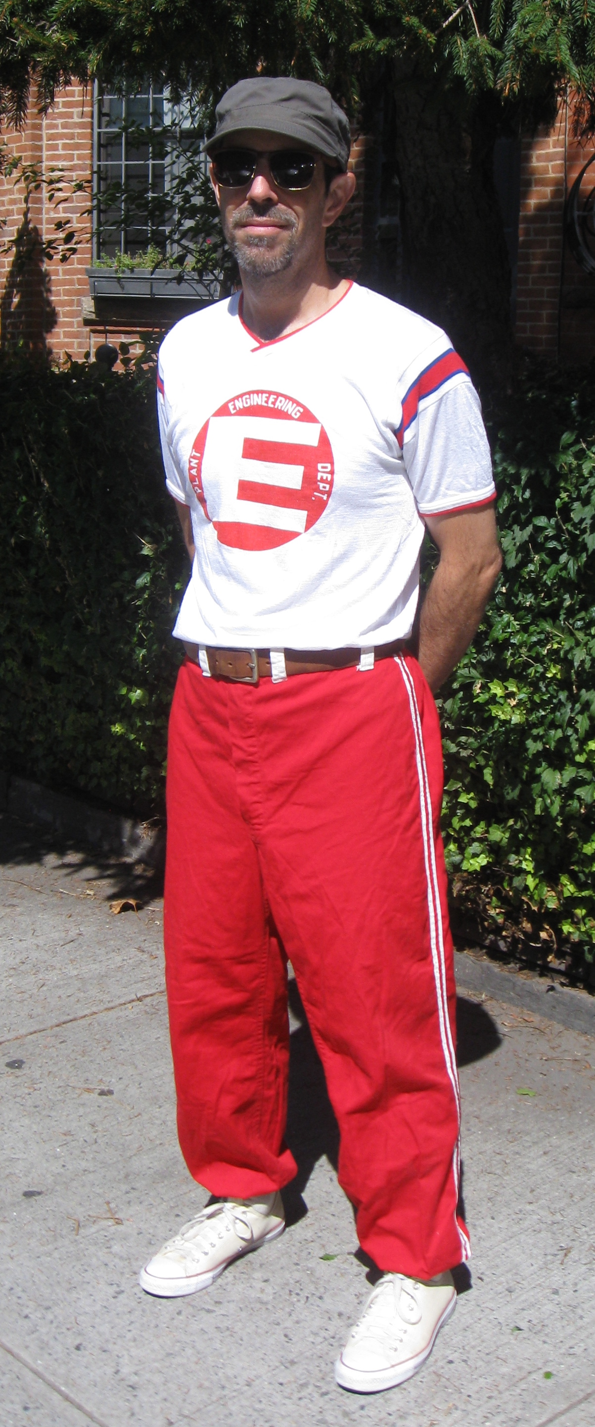
I recently scored this vintage Michigan Bell softball uniform on eBay for a mere $12 (with free shipping!). As you can see, it fits quite well. Let’s take a closer look, starting with the jersey (for all of these photos, you can click to enlarge):
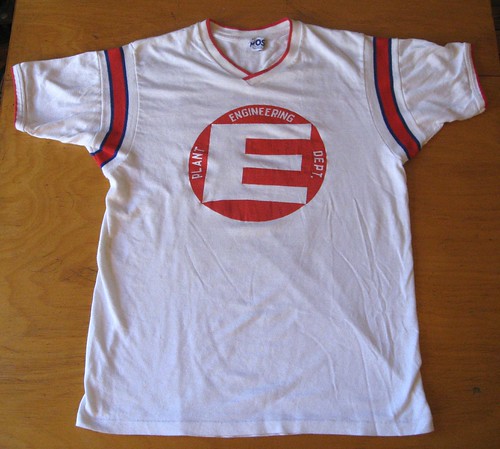
The fabric is Durene, but it feels like it has a higher cotton content than most Durene jerseys I own. Given the jersey’s age — I’m pretty sure it’s from the 1960s or early ’70s — it has stayed unusually white. Naturally, I love the UCLA panels.
This jersey was worn by a member of Michigan Bell’s Plant Engineering Department softball team. I like the screened chest logo, although I’d like it more if the vertical stroke of the “E” were thinner — feels too heavy, like it provides too much of a visual thud:

The label design is disappointingly plain, but the collar format is interesting — it’s one of those crossover collars:
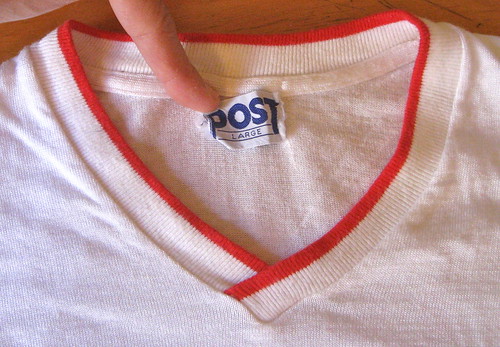
I’ve always been ambivalent about this collar style. The crossover provides visual interest and textural depth, both of which are nice, but it’s also annoying asymmetrical. And which is the proper way to do the crossover — left over right or right over left? When the Knicks wore that collar style, they went left over right. The Cowboys used a variation on the crossover collar, which was also left over right (you can read more about that here). And this Michigan Bell jersey is left over right. So I guess that’s the default format — but why? Why not right over left?
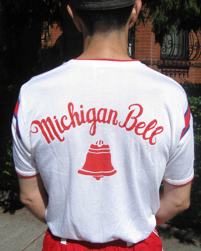
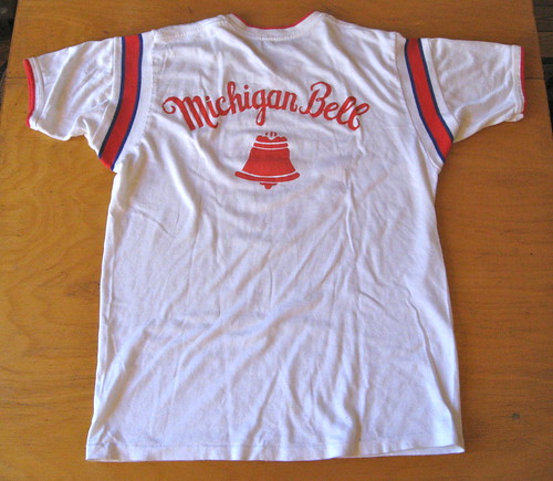
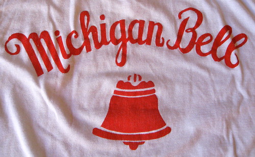
The back of the jersey is pretty straightforward, with a really nice Michigan Bell logo (although it’d be even nicer if it were chain-stitched instead of screen-printed):
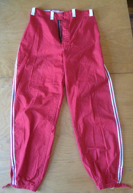
Now let’s take a look at the pants, which are cotton twill. They have two white stripes down each leg and really nice white belt loops:
The most interesting thing about the pants are that the cuffs have been fitted with little buckles:
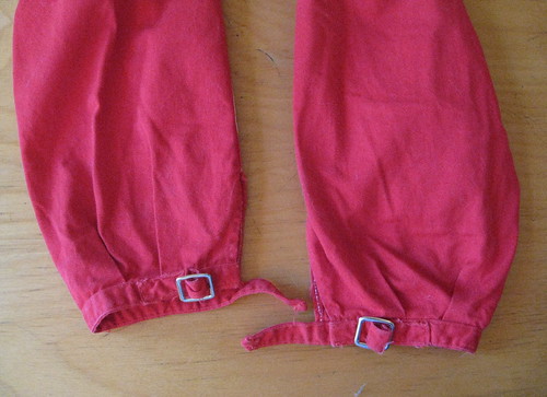
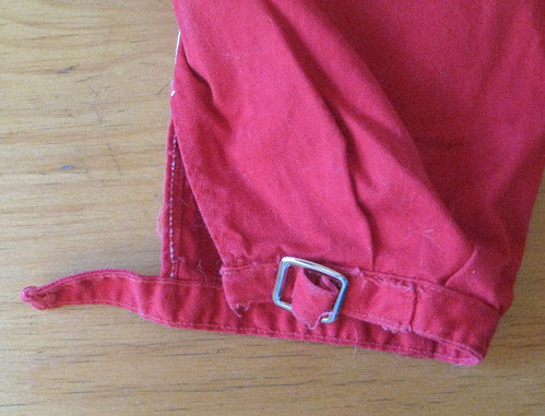
I’ve seen this buckle-cuff style before in old uniform catalogs. It’s always shown for softball uniforms — never for baseball. But this is the first time I’ve seen the buckles in the flesh, so to speak. I was curious to know more, so I consulted sporting goods historian Terry Proctor, who responded with the following:
That style was popular for softball into the early 1970s, when it was killed by the double-knit revolution. The pants you have are made of a cotton twill, right? That cloth and satin were the norm for softball pants, especially for fast-pitch softball. About the only reason I know of for the buckle at the bottom was that softball players generally preferred long pants. A buckle or snaps (which were more popular in the 1950s) allowed players some adjustment to compensate for different heights. Softball players usually just wore white mid-calf athletic socks instead of sannies and stirrups.
When slow pitch softball became more popular around the same time double-knit uniforms came along, it immediately turned the players into Oakland A’s wannabes. Leotard-tight pants with ribbon ’rups became de rigueur for all slow pitch players. The buckle pants and were for the “old-timers” in fast-pitch. So the old uniform you’ve just acquired was thrown onto the trash heap of history along with flannel baseball uniforms.
Fascinating stuff, although I still don’t understand why they needed to use buckles. Why not elastic, or just a standard hem? As always, my thanks to Terry for his insights.
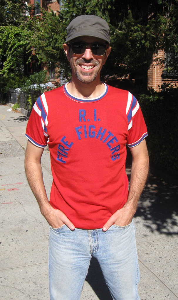
All photos in this section by Heather McCabe; click to enlarge
A week after I acquired the Michigan Bell uni, a new vintage clothing shop opened up around the corner from my house. It had only one uni-related item, but it was a doozy: a gorgeous Durene jersey from a Rhode Island firefighters’ softball team. Got it for $25. Fits great, really nice sewn-on lettering, and I love the ridiculously steep radial arching (which reminds me of Steve Lombardozzi’s NOB). The back is blank, and there’s no tagging, so there are no other details to share, but I’m really happy with it.
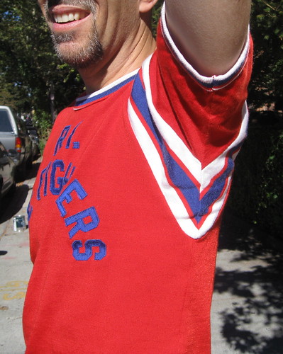
A final thought: One nice thing about both of these jerseys is that they’re from the era when UCLA stripes wrapped all the way around, as you can see in these shots:

Hope on the Padres horizon: Got a note yesterday from reader Drew Celestino, who had an encouraging story to tell about trip he’d recently taken:
I was recently returning from a trip to San Diego, and who should sit next to me on the plane but a high-ranking executive from the San Diego Padres marketing and retail department (or so his business card says). I’m not much into baseball but am into sports, so we struck up a conversation.
I brought up Uni Watch. He said he was well aware of it, and that he felt that the Padres had the worst uniforms in baseball. I was surprised by this admission. I asked if there was something in the works to change that. He said indeed there was.
I asked what he felt was wrong, what he thought they could do about it, and what about the camo nonsense. He said they feel like they’ve overdone the camo thing, even though it’s extremely popular with their fans and sells well. And he said all the fans want the brown back. That led me to ask if we should expect the return of the friar and the brown, etc. He got a tad short on details at this point but said basically to expect something that combines all of their uniform history.
Click to enlarge
Collector’s Corner
By Brinke Guthrie
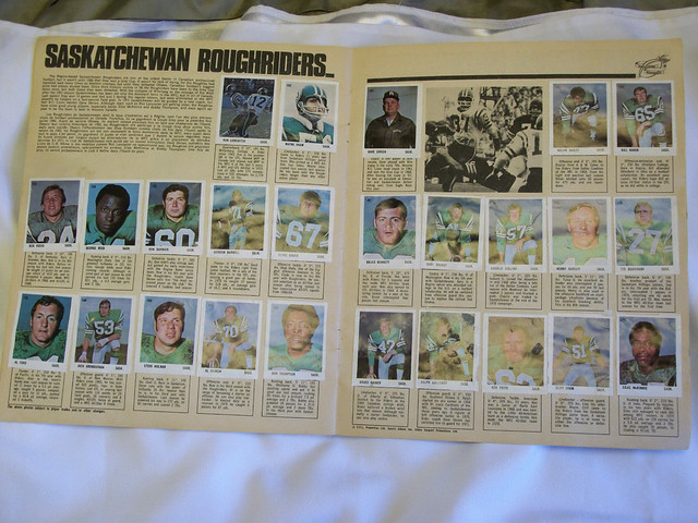
We all know and love the great Sunoco NFL stamp album from 1972. But did you know there’s a Canadian/CFL version? Uni Watch reader Will Scheibler sent that in. Two things struck me right way upon viewing this. First, is it me, or does the Saskatchewan Roughriders helmet logo look like…Safeway from the period? And their unis look to be a direct lift from the Iggles.
[Incidentally, I appreciate the submissions sent my way, as Will did with this one. If you’ve ever sent me something and wondered why I didn’t post it, it’s usually because the auction will have expired by Collector’s Corner’s Tuesday pub date. So if you find something, try to make sure it will still be online and available to bid on, by the time the following Tuesday rolls around.]
Now for the rest of this week’s selections:
• DeLong Alert! Classic look to this 1980s Stillers jacket, plus here’s a nice-looking Vikes pullover.
• Love the 1970s retro vibe of this L.A. Rams T-shirt.
• Here’s a Buffalo Sabres foam sword giveaway from back in the day, sponsored by Frito-Lay. (Fun fact: I once lived down the street from the Lay family in Dallas!)
• Did you know the California Golden Seals had a mascot character named Sparky? Here he is on a swell 1970s T-shirt.
• Here’s a great S.F. Giants gumball-style helmet buggy. (Too ’spensive for me, though. My Christmas budget is already blown.)
• You too can be a Junior Seahawk with this tote bag from Sears Roebuck.
• Great book here, and I should know because I had this one: The Golden Age of Pro Football, by famous sportswriter Mickey Herskowitz.
• Dave Boss Alert! This time around it’s a vintage 1970s Baltimore Colts poster. Is that Raymond Berry?
Seen something on eBay or Etsy that you think would make good Collector’s Corner fodder? Send your submissions here.
How do you read Uni Watch?: I don’t own an iPad and, for a variety of reasons, usually don’t read internet content — including Uni Watch — on my phone. But I know more and more people are consuming web content via tablets and phones. How do you folks typically consume Uni Watch? Please tell me:
Thanks.

’Skins Watch: Sports on Earth blogger Mike Tanier thinks the ’Skins should be renamed after the Sioux chief Red Cloud (from Jerry Wolper). … With all the attention being paid to the ’Skins, Chief Wahoo is also coming under fire, as you can see here, here, and here (all those from Mike Andrews). … A commentator for Fox News Latino says those who protest the ’Skins name “can stuff it” (thanks, Phil). … The National Congress of American Indians — which, last I checked, was not comprised of white people — is calling for an Oklahoma school district to stop calling its teams the Redskins, and also to stop having its players enter the field through a teepee (from Dan Bewley). ”¦ Reprinted from last night’s comments: Latest commentator to come out against the ’Skins name is political columnist Charles Krauthammer.

Baseball News: Did you know Tigers pitcher Max Scherzer’s eyes are two different colors? It’s all explained here. His eyes even have their own Twitter feed (from Todd Boyle). … Here are some good infographics based on Game Two of the Bosox/Tigers series. ”¦ This is pretty cool: color footage of the 1939 World Series (from Mike Ortman). ”¦ As you know, the Tigers have two different “D” logos — one for their jersey and one for the cap. The Detroit Free Press used the wrong one for a cap illustration on their front page yesterday (from Tyler Kepner). … This is amazing: Someone found a pair of Marlins infielder Greg Dobbs’s pants at Goodwill (from Thom Armitage). … Here’s another case of an ump taking a player’s cap during a postseason celebration! When the Mets were celebrating their victory in the 1986 NLCS, one of the umpires — it’s hard to be sure if it’s the second or third base ump — strolled by and helped himself to a cap on the ground (if the video doesn’t auto-forward to the correct spot, skip to the 0:48 mark). Definitely not Augie Donatelli, who stole the Cardinals cap after the ’67 World Series, because he retired in 1973. So maybe this was — or still is? — a thing among umpires (big thanks to Steve Steinsaltz). ”¦ Whatever else you may think of Dodgers reliever Brian Wilson, you have to like that the rubber band on his beard is team-colored. ”¦ Hanley Ramirez was wearing a rosary as a necklace last night. “I distinctly remember being threatened with the ruler for the idea of wearing a rosary as jewelry when I was in grade school,” says Patrick Walsh.

NFL News: Chargers RB Ryan Mathews suffered a doozy of a torn jersey last night, with fellow RB Danny Woodhead having a less dramatic tear (screen shots by Matt Barnett). ”¦ In that same game, Colts coach Chuck Pagano was wearing a windbreaker with the team’s old bucking colt logo. ”¦ Troy Polamalu, who has an endorsement deal with Nike, wears these New Balance cleats. At first he covered up the “NB” logo, and now he’s added swooshes (from Mike Korczynski). … The Bengals wore captaincy patches on Sunday. Mako Mameli says that’s the first time they’ve done that this season, because they’ve been changing captains each week. … Mike Carey, who reffed the Chiefs/Raiders game on Sunday, had a makeshift uni number made from black tape (from Paul Deaver). ”¦ Yesterday I mentioned that the Saints had used pink visor clips on Sunday, but I didn’t have a photo. Now, thanks to Ernie Ballard III, I do.

College Football News: Western Kentucky will wear solid black tonight. … “Kentucky State, a D-II school in Frankfort, still has an old-school mesh jersey,” says Josh Claywell. “You really don’t see jerseys like this anymore.” He’s not wrong, but I’d say the mesh is probably the least interesting aspect of that photo! ”¦ Wyoming is going solid gold with a state flag-themed helmet decal this weekend

Hockey News: Here’s a piece about Kings goalie Ben Srcivens’s mask (from Chris Bisbee). ”¦ New alternate uniform for the Hartford Wolf Pack. “A little bit too much red for a Rangers affiliate,” says Jordan Lazinsk.

Soccer News: Here’s a closer look at Mexico’s new World Cup kit, which they wore on Friday. ”¦ No photo, but Jeremy Brahm was watching Oregon State’s soccer game last night and says their uniforms must have been lost or stolen, because they were wearing T-shirts with no numbers.

College Hoops News: Very nice new uniforms for San Jose State. I think we’ve already seen their bizarro new court design, but here it is again, just in case (from Ahmad Billal Samady).

Grab Bag: Pinktober has spread to corporate coffee cup holder thingies. “Can’t wait until they just dye my coffee pink, too,” says Adam Hainsfurther. … Yesterday I mentioned that it’s almost unheard of for a sports official to have a visible tattoo. But Caleb Borchers says Steve Walsh, a prominent rugby ref, has “He who controls himself controls the game” inked onto his arm. “Many rugby fans notice it because he didn’t have it, got fired for alcoholism, and then had it upon his rehabilitation and return to the international scene,” says Caleb. “It’s also in the about most conspicuous place a rugby ref can have a tattoo.” … Did you know that Indiana license plates in the early 1980s had a tequila sunrise-esque design? I didn’t (until the Hungry Hungry Hipster told me, that is). … Here’s something I’ve never seen before: Racing Metro 92, a rugby team from Paris, wears its NOBs as a tramp stamp. Here’s another view (from James Vetter). … We’ve seen high school football teams with GI Joe helmets and/or jerseys, but it’s unusual to see a team wearing GI Joe pants. Also of note: Unless I’m missing it, there appears to be no maker’s mark on that uni — refreshing (from David Firestone).
Grrrrrrrrrr: I’m having major internet problems at home today (I’m typing this at a coffee shop near my house), so I may not be responding much to emails or comments. Thanks in advance for your patience.
Bad link on the Cowboys’ collar pic. the ‘h’ from ‘http’ is before the hyperlink
Got it — thanks.
Brinke, that Rams shirt is not a “T” shirt. It’s a thermal, long sleeved shirt.
The seller’s use of “T-Shirt” is likely spam tagging in order to get more views.
Has there been a higher quality regular season game for Uniforms than last night’s Charger -Colt game?
Yes. Any game without the pink.
Agreed on pink.
Krauthammer coming out against the ‘Skins is a surprising one, especially since he’s usually the one beating the “Political correctness is the downfall of America” drum.
I wouldn’t call Pagano’s Colts logo “old”. I’d call it a throwback logo.
Speaking of using old logos….
Why do the patriots use their OLD wordmark on their jerseys still???
link
Also speaking of old logos and throwbacks… I was bored last night and decided to do some photoshopping to see what some of the NFL’s recently banned throwback uniforms would look like if they were modified to match the current helmet colors: link
Tampa Bay is still kinda brutal, but I think the others could work as regular alts.
Your concept for the Atlanta NFL team is outstanding!
Whether it’s old or thrown back, that bucking colt is a terrific little guy. And — on the same morning — to see Fray Padre with his sandals and the crazy knock-kneed batting form, it’s too much joy.
Other “cute” logo favorites: saucy Cleveland brownie; Mr & Mrs Met; the Oriole; the happy little Cub; Bernie(?) Brewer….
Love them all. So much character.
For soccer fans only: link. I got 6 out of 10.
Also, no pics, but Arsenal will have a turquoise third kit next year. Woo hoo?
In the 1939 Worls series video, note that the Yankees are using the 3rd base dugout
Larry McPhail, who bought the Yankees, along with Dan Topping and Del Webb, made extensive renovations to Yankee Stadium after the war ended. He put in lights, made the box seat area bigger, put in the first Stadium Club, and redid and switched the clubhouses. The Polo Grounds, Ebbetts and Shea always had 1st base side home dugouts.
And excuse to post link from Flip Flop Fly Ball…
Thank you – was hoping someone would do that! Interesting how the 3rd base dugout home teams are all the California teams – except the Padres, both Chicago teams, and a few strays from the midwest….
First things first …
When I first logged on, I was informed there was “One comment …” (it may have said one comments, I’m not sure). But after one it (I believe) turns to 2, and 3 … This probably isn’t that technologically freaky, but curious to me nonetheless.
Second …
On the survey asking how we view this site … I primarily view it on a computer, but only because reading comments on mobile tends to be a complete pain to me. Comments and replies are not linked to one another in any way I can tell. My phone shows an option to view the original web page, which, when the function works makes it look just like it does on my desktop, but it generally quickly forgets that I’d switched and I either have to deal with it or move on.
Yeah, I read the site on my work computer (which unfortunately filters links to Flickr and Ebay, meaning I usually miss the main image of the day) and my home tablet.
I occasionally use my mobile, but like JimWa says, it messes with the comment section and doesn’t let you respond to specific comments.
Also Paul – have you thought about switching to a system like Disqus?
I have read UW on my BlackBerry for as long as I can remember. Its nice to be able to switch to the PC version of the site and have my phone remember it every time. The biggest downfall for me is no Adobe. The pros outweigh the cons though, because I can view and respond in the comments section just like on a PC. That mobile version is brutal.
I was aware of the mobile inconsistency with nested comments. I’m looking to fix this, among some other things. Paul was just curious how many people actually use the mobile site. I have stats, but we’re interested in the regular readers.
We’re not going to use anything like Disqus. We’re going to stick with native WordPress comments.
Thanks, John.
The only reason I bring up Disqus is because of the notifications for replies and upvotes.
Regarding the Padres, if I had to guess, the guys at Brandiose might have a hand in a new identity. They have made a few posts on their blog that might point in that direction, and they are also doing the design work for the El Paso AAA team, which is a Padres affiliate.
One can only hope that they go back to a brown primary color. I do not like the idea of the red/white/blue PCL Padres colors one bit. If they go that way I predict they will go in a different direction, once again, 3 years later.
They should go back to some form of their original 1969 set. That was by far their best, with the 1985-89 set a close second.
The ’85-89 set was pretty boring compared to what came before, but looked at alongside today’s Padres uniforms, which set a new standard for dullness, they’re downright flashy. I’d love to see those come back, and I love that number font (also used by the Seibu Lions for many years) too.
This whole thing is great news – still my favorite link.
I hope not…Brandiose is getting way too cartoonish for my taste. Not much they’ve done lately, and they are pretty hot, appeals to me.
Costas actually gave a pretty good monologue about why Redskins should be changed. Wasn’t about being PC or anything just being smart enough these days to know it is not right.
Lukas, love the softball uni but you wore pajama pants. Say it ain’t so!
I wore the pants the way they were designed to be worn.
Just was joking with you Paul! The Fire Fighter jersey is simply awesome. What a find that was.
It could be even more awesome: sew a little white number inside that bell. Now it’s awesome.
Having two different colored eyes is called heterochromia. It’s actually pretty common in dogs, but my aunt has it as well.
link
Kate Upton has heterochromia. This was noticed by exactly zero teenage American boys.
I think you mean Kate Bosworth.
Ms. Upton has central heterchromia – two colors in the same iris.
My dad George had one blue eye and one green eye. And the Saskatchewan “S” looks just like the Spalding logo from the ’60s-’70s.
David Bowie is a well known example too
I think the Dave Boss poster is actually of Alex Hawkins (#25). It looks to be based on this photo:
link
Nice!
Those Indiana license plates are the first plates I can remember. I kinda wish we’d never gone away from that design, but I’m pretty sure I’m in a distinct minority there.
I agree you would be in a minority there. They were never my faves and probably one of the worst. Still I miss the novelty of new designs every few years. Worse still, they abandoned the county-based numbers! I am stuck in Maryland with our horrid new Star Spangled Banner plates.
Based on my admittedly unscientific survey, Wyoming & Montana are the only U.S. states that retain the county-based (or more aptly, population-based) numbering system for license plates.
link
Which since I’m unfamiliar with how Indiana’s numbering system worked makes me curious: since Marion County where Indianapolis is located is the most populous county in the State, shouldn’t it have been denoted by a “1” instead of a “99”? Or did Indiana use a different plate numbering system than TN, WY, MT, etc.?
Which while I’m mentioning Wyoming, WTF are they thinking of with that ridiculous State flag/Cowboy Joe mash-up? It not only desecrates a wondrous State flag, but visits indignity upon the noble buffalo silhouetted on it by beheading it and subordinating it to a horse. I mean, I’m pretty laissez-faire about all these college uniform design issues, but this helmet literally besmirches everything it comes into contact with.
link
link
The 94 counties of the state were assigned prefixes in alphabetical order. Marion and a few other counties needed more than 240000 combos so they got 95-99. I was Montgomery (54).
Nebraska used to. No longer?
Don’t know where you’re looking, but there’s still a “29” in the lower right corner of my plates for Hamilton County. They’re just the standard issue plates – maybe the specialty plates don’t have the county designation?
On the subject of old license plates, a guy from my city has a great blog ‘Hot Rods and Jalopies’. One posting has this blotter from 1949 has license plates from U.S. states and Canadian provinces along with info. for each one (passenger cars, commercial cars, populations, etc.)
link
Went back and checked. Those are 99 plates, so Marion county (Indy). Statistically likely, just like all Brits are from London.
New mascot for Fukushima Industries (could be NSFW):
link
link.
I read the site on computer and ipad and phone, dep on time and day.
Read most often on phone, which is not great, since no nested comments.
> this Michigan Bell jersey is left over right. So I guess that’s the default format – but why? Why not right over left?
I’ve always noticed that my button shirts are left over right, but my wife’s are right over left. Maybe there’s some standard where men’s clothes are left over right and women’s are the opposite?
Yes, men’s and women’s shirts button differently (at least in America — Europe has a different system).
Men’s buttons are a carryover from leather and armor, which buckled left over right. Since most people used their right hand for their sword/knife/other blade weapon, a blow would come from left to right and would glance off. If the leather/armor was right over left, the blade would be able to go between the two layers and cause damage.
On the flipside, I’ve read a theory that women’s shirts are right-over-left because women traditionally sat side-saddle on horses, facing left, and the right-over-left prevented the breeze from coming in.
I assume the left-over-right must be for consistency with the way a men’s shirt buttons (as opposed to a women’s shirt being right-over-left). Now why this is so, I know naught.
Here’s an idea: link
In the old days, women didn’t dress themselves, so the buttons were placed so the maid standing in front of the woman could do the buttons.
Who dressed the maid (and so on, and so on…)?
Ha.
Well, they didn’t have buttons. Also, the “maids dressed them” explanation isn’t exactly watertight, since men were dressed by their servants as well.
There are other theories, like how men’s shirts and their left-over-right alignment made them easier to unbutton with the left hand (the right hand presumably held onto a weapon), but that feels a bit nonsensical.
“Everything in the world is designed for the convenience of right-handers” will rarely lead you astray if you’re wondering why some non-symmetric tool, device, or article of clothing is the way it is.
“Everything in the world is designed for the convenience of right-handers”
~~~
Well, yes.
Though unbuttoning a men’s shirt is easier with the left hand.
Though unbuttoning a men’s shirt is easier with the left hand.
Wha??? On the one hand, um, no, not even close. Unless you mean unbuttoning another man’s shirt. It’s one of those things that’s so routine that I cannot even remember how I do it, so I just tried it on my own shirt with either hand, and it’s not just easier with the right hand, it’s downright awkward with the left. You want your thumb below the flap, not above it.
On the other hand, I write, throw, and bat righty, but I do almost everything else as a lefty, so maybe this is just one of those things where I’m wrongidextrous.
Bobby Richardson gave an ump his cap after he caught the last out of the 1962 world series.
link
I thought David Bowie wss the best known person w different colored eyes
Bowie was born with the same color eyes, but one of them became a different color as a result of getting punched.
Jane Seymour, anyone? link
His eyes look pretty similar in color…. his left pupil is just enormous.
Nice that Canadian lads got to experience the pleasure of collecting pro football stamps like their American counterparts in the early ’70’s.
One of my most distinct memories from childhood is gettig on my Schwinn Typhoon and riding the mile or two to my small town’s one Sunoco station to collect that week’s page of stamps. That book was my Bible that summer.
I actually had a copy of that sticker album and yes the ‘Riders logo was very similar to the Safeway logo. It wouldn’t have been Sunoco in Canada but probably some gas station. The ‘Riders of that era had two of the all-time greats in Ron Lancaster and George Reid, great memories!
1/2 phone, 1/2 desktop.
Washington Red Clouds. I actually kind of like it. Plus, assuming he can negotiate a deal with the Oglala nation and the Red Cloud family – which is to say, assuming he can send one of his employees to do it for him, “Dan Snyder is not in the room” being the single most important ingredient to any successful negotiation – it’s the most face-saving way out for Snyder. He can frame it, credibly, not as a retreat but as doubling-down on the “honoring the Natives” line. It can be sold to diehard fans as a thumb in the eye of the PC whiners, as a proving-of-the-point that Redskins was about honor and dignity all along. I kind of hope someone at Redskins HQ sees the article and quietly explores whether the relevant Lakota parties might be amenable.
“Dan Snyder is not in the room” being the single most important ingredient to any successful negotiation …
Excellent!
Much better than Red Tails, Hogs, or Warriors. Maybe the best solution presented yet. I’m on board – but it’s not my opinion that matters…
I still like the layers of using Americans.
Among my favorite layers for Americans:
1. Moves the Redskins from the Wizards category to the Nationals/Capitals/United category of DC team nicknames.
2. Begs for link to be the new logo, allowing some continuity of form with the outgoing identity. Bonus: Despite her feathered headdress, Freedom (the statue that stands atop the Capitol dome) is not a Native American.
3. Makes it hard for diehard Redskins fans to oppose the new name. What, you’re against America?
4. Sticks it to Dallas with their whole “America’s team” baloney.
Paul, will you wear that RI Firefighters top out in public? Just wondering. I would think that nowadays there would be lots of people stopping you to “Thank you for your service”.
The pink on the Starbucks cups actually is advertising for their new line of pastries, not associated with breast cancer (to my knowledge).
I believe you’re correct. I think it’s just the branding for their new partnership with La Boulange.
link
but … but … but … breast cancer owns the colour pink now, doesn’t it???
link
Those Greg Dobbs pants list him as #22, which was his number in Seattle for the 2005-06 season.
The Sparky Seal logo was drawn by none other than Charles M. Schulze, a big hockey/Seals fan!
I’m jazzed about the Padres returning to brown.
That Firefighters shirt is a beaut, probably because it’s so wrong that it’s right – i.e. the insane arch and the primary color faux pas of blue letters on red background.
-Jet
Sparky character was created by Charles M. Schulz.
link
He’s in the U.S. Hockey Hall of Fame as a builder.
link
Charles Schulz was also given the nickname “Sparky” after a character in a newspaper comic.
link
One of the players I play hockey with went down this year and played in the 70+ division of the Snoopy’s Senior World Hockey Tournament that Schulz originally started.
What does Scherzer’s driver’s license list for eye color?
“Yes”
Great question! Gr/Br, maybe?
Umps Coppin’ Card’s Caps: according to this LA Times article from 1987, Donatelli took not one, but two Cardinal caps with his half-hearted explanation. link
Max Scherzer also has goggles to match:
link
Okay, me being a Tigers fan and I never knew that… it just blows my mind!
Then again, I didn’t have cable for several years, so I almost never actually watched games, and if I was looking at pictures online, I was usually more focused on unis…
Nice elbows, Lukas.
Chicks dig elbows? Who knew??!!
Main Huffington Post nameplate is celebrating pinktober today. subsidiary page nameplates are normal color.
Lawrence O’Donnell had something to say about the team name of “Washington’s Football Team” on his show The Last Word last night. Pretty interesting.
link
The more interesting thing is that they used the outdated NFL logo for the graphic behind him!
I’ve seen nmore than a few cases in the ‘Skins name debate where the 1982 ‘Skins logo (tucked feather) was used. Really?? I know, I know, the regular logo is oddly shaped and cumbersome.
A prominent lib broadcaster analogizes Snyder to a notorious segregationist and the best word you can muster is “interesting?” More like “deplorable,” “insane,” “nasty,” or “defamatory.” But hey, that’s the kind of company the name-change cultists keep, so their inconvenient, offensive ramblings have to be suppressed. Oh, and George Will (seated four feet from Krauthammer on the same panel) defended the Redskins moniker. But hey, that’s not worthy of mention on this “fair and balanced” site.
Three things:
* I think you misunderstood O’Donnell’s point. He was comparing Snyder’s “NEVER in all caps” to Wallace’s “segregation forever”, not Snyder himself. Similarly, when he says “Dan Snyder is now the George Wallace of the NFL”, he’s talking about the end game, rather than Snyder himself.
* Does anyone find it remarkable at all that George Will took the side of the establishment?
* Striving for “fair and balanced” in coverage always struck me as dumb as shit. Reality is rarely “fair and balanced”, even rarer is it a left/right dichotomy as you seem to imply.
1. I’m supposed to believe that O’Donnell coincidentally compared Snyder (whose detractors accuse of clinging to a racist tradition) to an unreconstructed racist like Wallace? There were NO other historical figures O’Donnell could have used to make his inane point? Please don’t insult what’s left of my intelligence.
2. The establishment is Dem these days, which makes Will anti-establishment.
3. If you don’t believe that the name-change campaign is a wholly-owned creation of the Left, then I don’t know what to say. I do find it amusing, however, that conservatives get labeled on this site but not entities like Mother Jones, Washington Paper, Washington Post, NYT, etc. I guess they’re just mainstream, non-partisan publications, huh?
If you don’t believe that the name-change campaign is a wholly-owned creation of the Left, then I don’t know what to say. I do find it amusing, however, that conservatives get labeled on this site but not entities like Mother Jones, Washington Paper, Washington Post, NYT, etc. I guess they’re just mainstream, non-partisan publications, huh?
Mike Francesa — nobody’s idea of an anti-establishment leftist — just spent two hours on the radio calling for the name to be changed and deftly fending off all the standard counter-arguments.
When a caller tried to refer to his position as “liberal,” he immediately said, “This isn’t about liberal or conservative, especially since I’m no liberal. It’s about doing the right thing.”
“It’s about doing the right thing.”
And that is why the rule of thumb that the first person in an argument to label the other side “PC” is wrong, is so rarely incorrect. “PC” is what we call “doing the decent or honorable thing,” when we prefer to speak or act indecently or dishonorably.
That’s funny. I’m listening to Francesa on the Net as we speak. A Native American woman just called to tell him he was off base about the team name and that she wasn’t offended, and he blew her off. I mean, who knows more about Indian issues than a portly, filthy rich white guy whose claim to fame is rudeness and arrogantly cutting off callers? I wonder how many NA’s never knew they were being insulted until guilt-ridden, race-obsessed white men told them so? Hmmm.
It’s weird to see a paper that employs Jennifer Rubin, Kathleen Parker (and George Will!) characterized as leftist. Likewise for the paper that employs David Brooks, Ross Douthat, and at one point, the founder of the Weekly Standard.
LOL. You cannot be serious. Please tell me the last time the Washington Post or the NYT endorsed a Republican for president. Go to the Wash Post website and see for yourself how they’re covering the government shutdown and the Redskins controversy. If you’re looking for intellectual diversity or a modicum of fairness on those two issues, you’ll be disappointed. And if you think anyone considers Rubin, Parker or Brooks to be Tea Party types or Reagan conservatives, you’re out of your mind. BTW, FOX employs Alan Colmes and Bob Beckel, so don’t you dare try to label that network right-of-center. (/rolleyes)
. BTW, FOX employs Alan Colmes and Bob Beckel, so don’t you dare try to label that network right-of-center. (/rolleyes)
The stupid…it burns!
You lost me at “lib”, and I’m a Redskins name supporter.
Labels don’t advance the dialogue or help state the case for retaining the name Redskins for the ‘Washington DC NFL team’.
I’m suprised Paul didn’t challenge you to “Think Harder”.
You contest the assertion that the majority of the name-change advocates are from one end of the ideological spectrum? Let’s review:
Wash Post: libs
NYT: libs
Salon: libs
Slate: libs
Wash City Paper: libs
Deadspin: libs
O’Donnell and his MSNBC brethren: libs
DC Mayor: lib
Eleanor Holmes Norton: lib
Bob Costas: lib
Peter King: lib
Bill Simmons: lib
Paul Lukas: lib
Keith Olbermann: lib and then some
Ray “Oneida” Halbritter: hard-left Dem and major Obama supporter
And that was just off the top of my head. Lord knows the list could be expanded with just a little research.
Please Padres. Please, please, please don’t use brown.
Unless they pair it with baby blue. Then it’s tolerable.
link.
Though they looked pretty sharp in the link.
My favorite was also the navy/orange with pinstripes. Brown is a pretty horrible color. The weird brown/yellow everyone seems to love around here just screams 70’s and reminds me of the old Caldor logo.
The 70s was a great time for music. Not so much for fashion.
Shit. The awful color combo distracted me from those gorgeous sideburns. Wow.
No! Those Winfields are great!!
Something like this perhaps?
link
That’s purdy.
It’s great, and I suspect it would look just as good with the blue and brown reversed, in terms of proportions.
The brown/light blue combo is beautiful and way under-utilized for uniforms. It would be so much better than the boring color scheme that the Padres have now.
I could support a white home/gray road uniform set with brown and orange (preferably burnt orange) trim. Like this mock-up: link
Who knows anything about the story behind the MLB Postseason ads all over stadiums right now? If I were a company that paid for that space – especially during the playoffs – I’d be very unhappy to see it replaced by generic MLB signage.
… or …
Are their different contracts for in-stadium signage? Can you get the “discounted” 81-game signage package or pay more for the “premium” post-season package? Will their be a higher premium to be seen during the World Series?
How exactly do these things work?
Standard stadium signage deals are for the regular season only. Once the postseason starts, there are separate sponsors, separate contracts, etc.
Interesting. Never knew it!
Because rugby players are numbered by their position on the field, it’s very unusual to see an NOB, which might explain the tramp-stamps.
I think it has more to do with giving more visibility to sponsor logos – both obvious spots on the jersey, above and below the number, are taken.
One of the New York Rangers minor league affiliate back in the day(the Rovers, who apparently played in the Felt Forum) wore red sweaters that were similar to the Rangers, but with the diagonal Rovers wordmark.
So did the Fox News Latino writer actually put forth an argument somewhere in there?
That was a really confusing article.
“[D]id the Fox News Latino writer actually put forth an argument somewhere in there…”
~~~
It would appear not.
“……and also to stop having its players enter the field through a teepee.”
What about a wigwam?
GI Joe to the extreme, cheerleaders wearing camo to honor troops and Columbus Day. My head just exploded
link
should note it’s during a practice, not an actual game
Listening to Mike Francesca, he agrees that the Redskins should change their name. He says it’s offensive and the changing it is the right thing to do.
The origin of the Dodgers red uni numbers link
Apologies if this has been brought up many, many times before, but it dawned on me that the profile of Washington himself (like the one on the quarter coin) would substitute very nicely for the Indian profile on the Skins helmet. Keep the team colors of gold and burgandy, swap out the Indian for George Washington the man (rather than Washington DC and all that it implies politically) and go from there. Now just think up a nickname and there you go. Has “Forefathers” or “Founders” been suggested yet? Like I said, if this is just a repeat of someone else’s idea, accept my apology.
Washington Georges?
Washington -ians?
Washington We the Peoples?
I had a fantasy team called the Washington Founders once. Always seemed like a natural, but more of a baseball or basketball nickname than football in my book. For football with a George theme, I’d go with maybe the Washington Monuments.
I could see some umps having some sort of wager surrounding number of hats swiped during the season, or perhaps the hat from the biggest moment of the season.
Could always bring back the name Senators, or simply go without an official nickname. Replace the helmet logo with a ‘W’ and by the Washington Football Club.
I would be ok with Senators, though we can do better than a bland “W”. Though its funny DC has no senator
People forget that most CFL teams had been established long before most NFL teams.
The Iggles probably lifted the unis from the Riders.
So I generally find myself on the fence on the Skins name change debate, I am liberal, so I am naturally sensitive to other feelings, but I am also a born Skins fan so there is an amazing feeling of love I have when it comes to this team and the things surrounding it. But anyway, on skins blog I saw a report that Fox News did some digging and one of the big activists involved in the name change debate has been lieing about the fact that he is native american.
link
That’s not a rosary Ramirez was wearing. It might be a chaplet of some type or, more likely, a piece of cheap costume jewelry constructed to vaguely resemble a rosary. Most real rosarys would look stupid if worn around the neck which is why the fake ones are approximations. No sacrilege, no foul so Hanley is safe from marauding rulers.
That wasn’t the best picture, but it definitely looks like a rosary to me. He’s wearing it again tonight. I’m not religious at all, wasn’t trying to imply any sacrilege haha.
I know I’m in the minority, but I always liked Wyoming’s uniforms. Yes, they’re different, but they kind of fit the school, for some reason. Brown and bright gold go well together. The helmet logo is great. And the white helmet/dark jersey (brown)/secondary color pants (gold) is a unique look that they pull off well. The Titans do something similar, but it doesn’t work at all.
That being said, what they’ve been doing recently with the pink and state flag logos, and the cammo look, is disturbing.
I totally agree. The White Helmet/Gold Pants look is essentially unique to Wyoming and is the look identified with that school and team. The look goes back to the 1960s Wyoming team that played in the Sugar Bowl – back when there were FOUR Bowl games and 9-1 and 10-1 teams regularly got left out of bowl games.
I feel the same way about Baylor’s Gold helmet/White pants look – for decades it was unique and iconic to Baylor to wear that look. Then along came Nike – and others – and that was that.
I liked it better the old way.
The Packers have updated their dope sheet page with the proper helmet for the matchup this week:
link
BREAKING NEWS REGARDING REDSKINS NAME CHANGE:
link